| THIS WEEK'S ARTICLES |
| Market Roundup |
| This Reliable Long-Term Indicator Could Go Bullish at the End of the Month |
| by Martin Pring |
Sixty-Five Year Record of Success
One of my favorite long-term indicators involves the 12-month ROC of the S&P Composite falling below the -5% level and subsequently rallying back above zero. This approach is shown in Chart 1, which illustrates the period from 1995 through April 30 of this year. Chart 2 covers the period between 1953 and 1995. The -5% line is shown in blue while zero is in black. The green arrows in Chart 1 flag the signals that have been triggered since the mid-1990s. Based on a one-year holding period, only one of the 19 signals that have been generated since 1953 has been unprofitable. That exception developed in 1957, but the ROC only held above zero for one month.
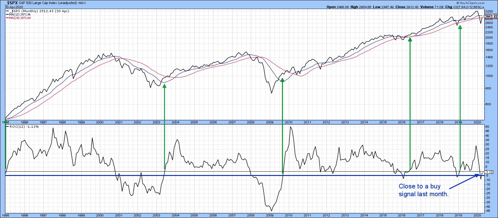 Chart 1 Chart 1
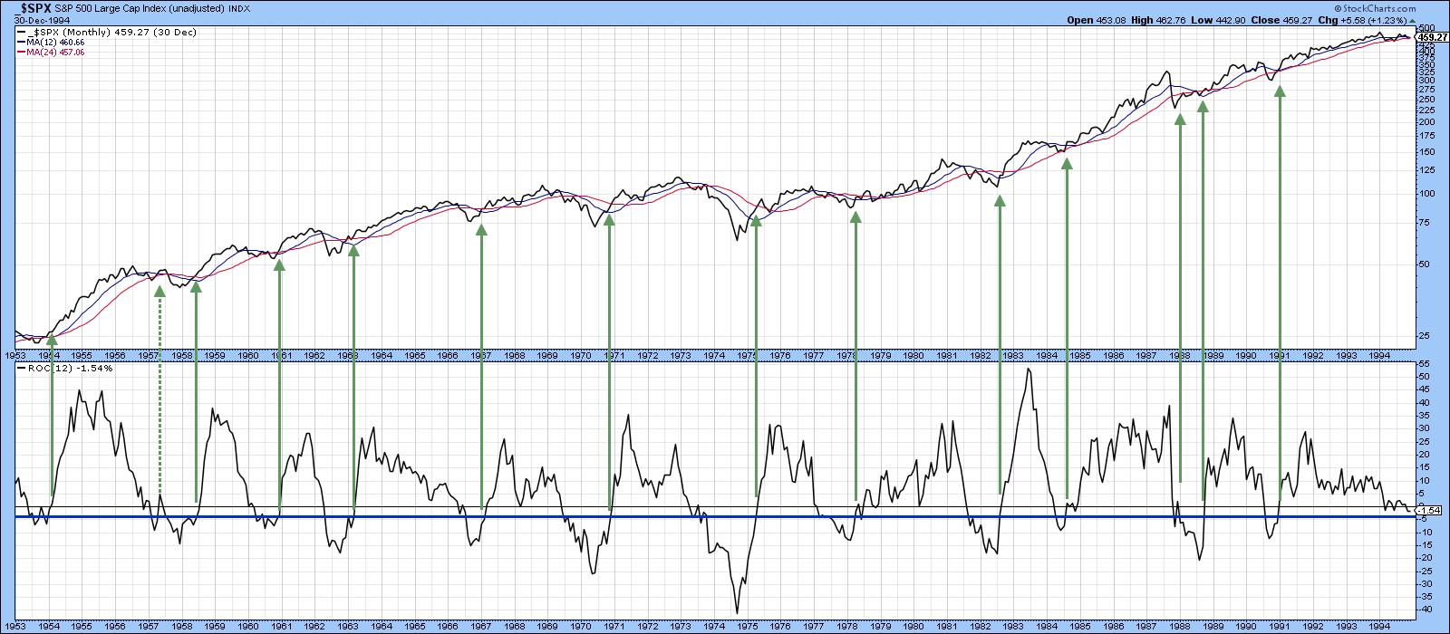 Chart 2 Chart 2
Chart 1 also shows that the model is not yet bullish, as the ROC remains below zero. The reason why this technique interests me is because the closing price for May of last year was 2752 and the latest May 7 price is around 2880. That means that the May 2020 closing low could fall around 120 points or so from current levels and still turn the model bullish. Since the market has risen in excess of 30% off its March 23 intraday low, the question naturally arises as to whether that's possible. The answer is unknowable, of course, but it is possible to point out some benchmarks that place things in greater perspective.
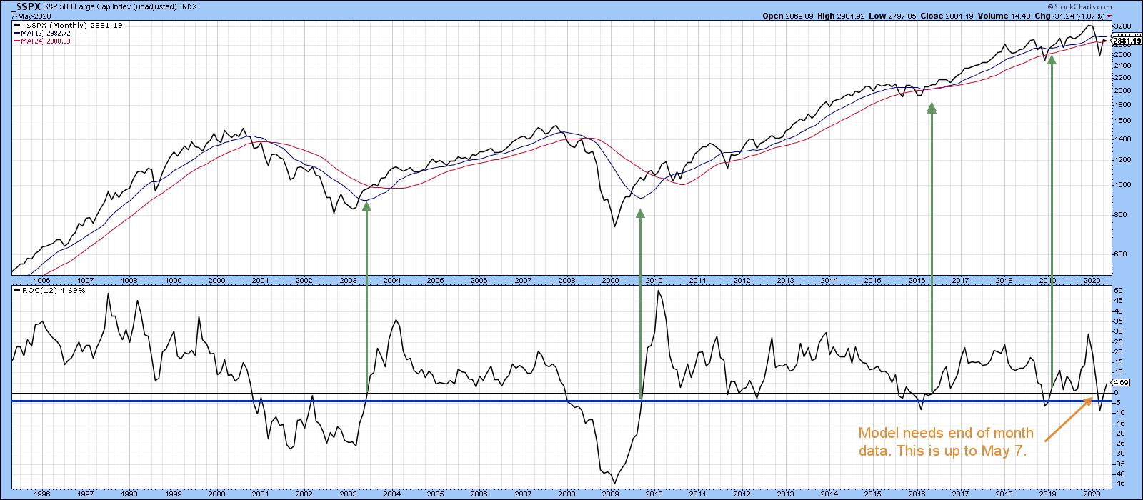 Chart 3 Chart 3
Extreme Overboughts and Oversolds
First, take a look at Chart 4, which features the 10-day MA of the S&P Composite's 12-day ROC. Two events recently happened. The first was an exceptionally extreme oversold reading in March, while the second was a close-to-record overbought condition in April. Normally, these extreme oversolds develop at the tail end of a bear market, when prices have been dropping for a year or more. If they occur close to an all-time peak, as in the 1987 example, this usually indicates a change of sentiment to the bearish side. Such conditions, known as mega-oversolds, offer the first early bird (in terms of time) signal that a new bear market is underway. In the 1987 case, that did not pan out because the mega-oversold was immediately followed by an above-average overbought reading, which had the effect of cancelling it. Remember, markets are nothing more or less than people in action, and people can and do change their minds. It's not therefore unreasonable for markets to do the same thing, as in the 1987 situation (from an extreme pessimistic oversold to a more optimistic above-average overbought reading).
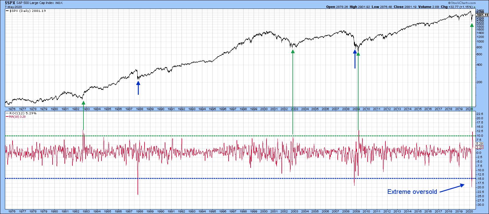 Chart 4 Chart 4
Editor's Note: This is an excerpt of an article that was originally published in Martin Pring's Market Roundup on Thursday, May 7th at 6:59pm ET. Click here to read the full article, which includes Charts 5-6 and a discussion of why we might see a test of the low.
Good luck and good charting,
Martin J. Pring
The views expressed in this article are those of the author and do not necessarily reflect the position or opinion of Pring Turner Capital Group of Walnut Creek or its affiliates.
|
| READ ONLINE → |
|
|
|
| The Mindful Investor |
| Breadth Improves as Uptrend Persists |
| by David Keller |
Most of my guests in recent weeks on The Final Bar have embraced the "we're due for a pullback" thesis. From the very bullish (S&P 3600) to the quite bearish (S&P 2000) and everyone in between, it seems most people feel that the uptrend from the March lows appears to have run its course.
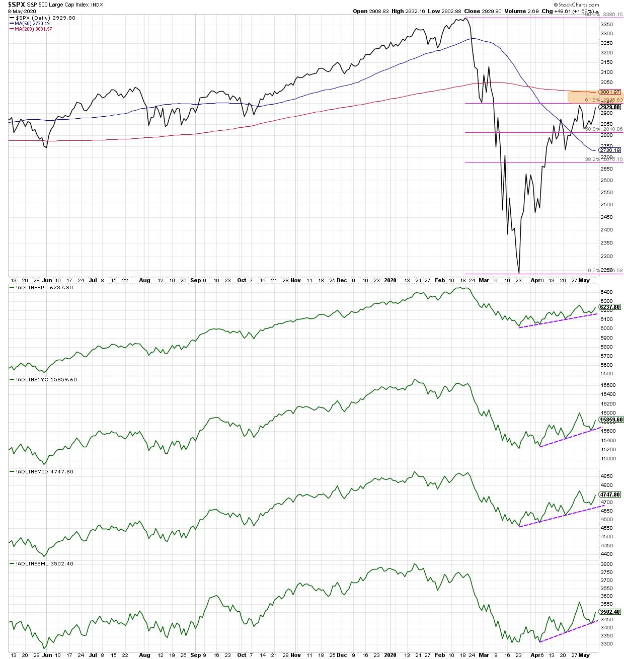
Having said that, the short-term breadth picture actually speaks to a market in decent shape. I've spoken about the bear market rally perspective elsewhere, including the fact that the $SPX has retraced just about 61.8% of its initial selloff, which is in line with previous bear market cycles. Here, I wanted to focus in particular on the breadth characteristics of the last six weeks and why they portray a surprisingly constructive short-term setup.
One of my favorite ways to measure breadth is using the cumulative advance-decline lines, which I do so for the S&P 500, the NYSE, the mid-cap S&P 400 and the small-cap S&P 600.

One of the many sets of divergences at the February market top was where the NYSE and small-cap A/D lines actually made lower peaks, while the S&P 500 index made higher highs. This spoke to a lack of participation from the smaller, more speculative portions of the US equity markets.
Since the March low, however, the advance-decline lines have been moving higher in lockstep. All four breadth indicators have formed a consistent pattern of higher highs and higher lows, in line with the chart of the S&P itself. All cap tiers have participated in the upswing over the last six weeks.
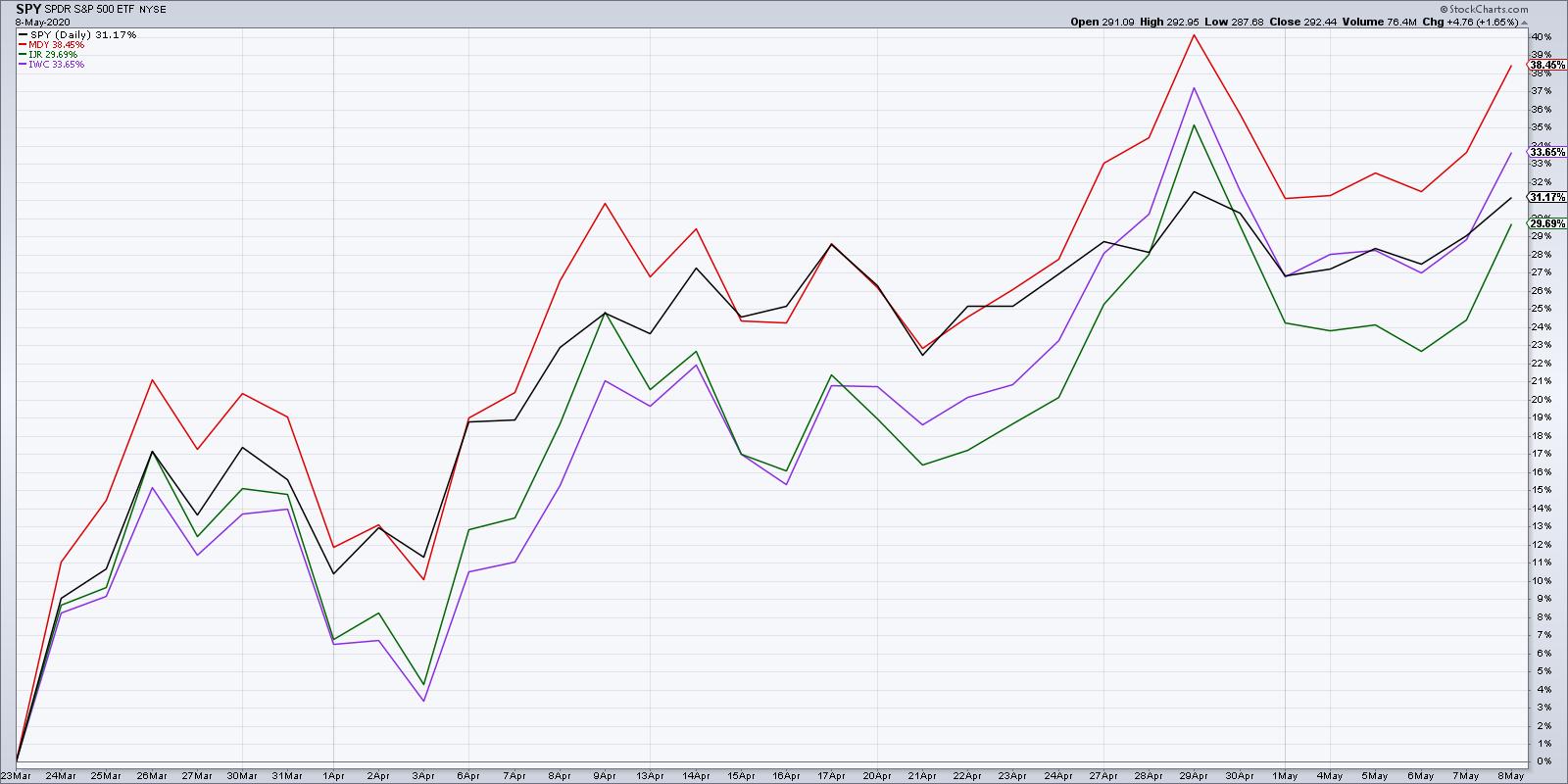
While many investors think that market has been led solely by the mega-cap stocks in technology, Communication Services and Consumer, the strongest performer since the March lows is actually the mid-cap index! So there has indeed been broad participation in this current upswing.

So how does this uptrend in breadth reconcile with the bear market rally thesis?
Quite simply, this is the type of movement that draws in many investors to believe that the bear market is over. Some call this sort of environment a "bull trap", as it sucks investors in and leads them to believe "the worst is already behind us."
The market has impressed with its resiliency. The cumulative advance-decline lines tell us that it's not just the mega caps that are rising, but that a rising tide has indeed lifted all boats. The challenge here is that whether you're a long-term bull or a long-term bear, as both camps likely feel that their particular view has been validated based on the strength of this recent up move.
The most important signal is what comes next.
Option 1 is that the S&P 500 completes the move above the key 3000 level, confirming a break above that final resistance between current levels and the February high (around 3400). The cumulative advance-decline lines continue their trend of higher highs and higher lows, while charts like the biotech index continue to follow through to the upside.
Option 2 is that the S&P 500 starts to falter as it fails to reclaim its 200-day moving average and does not reach above its 61.8% retracement level. Charts like the IBB become failed breakouts as they trade back below recent support levels. Most importantly, the cumulative advance-decline lines in today's chart break below trendline support, eventually leading to lower highs and lower lows.
Based on my studies of market history and price dynamics, I have to assume that Option 2 is much more probable. I also have to admit that Option 1 is a possibility. And I have to insist that the cumulative advance-decline lines will be one important way to determine which of these options becomes reality.
RR#6,
Dave
David Keller, CMT
Chief Market Strategist
StockCharts.com
Disclaimer: This blog is for educational purposes only and should not be construed as financial advice. The ideas and strategies should never be used without first assessing your own personal and financial situation or without consulting a financial professional.
The author does not have a position in mentioned securities at the time of publication. Any opinions expressed herein are solely those of the author and do not in any way represent the views or opinions of any other person or entity.
|
| READ ONLINE → |
|
|
|
|
|
| Trading Places |
| My Model Portfolio Hit an All-Time High Friday - Here are its 10 Component Stocks |
| by Tom Bowley |
The S&P 500 closed at an all-time high on February 19, 2020 when it reached 3386.15. At its Friday close of 2929.80, the benchmark index remained 456.35 points, or 13.48%, shy of that high. February 19th was also the date that I announced our latest portfolio stocks. I use the 19th calendar day of February, May, August and November to "restock" the portfolios with companies that (1) have beaten Wall Street consensus estimates as to both revenues and EPS, (2) are liquid (average volume of at least 200,000 shares per day) and (3) show relative strength vs. their industry peers and the S&P 500. It helps if those industry groups are strong as well.
How Has The Model Portfolio Performed?
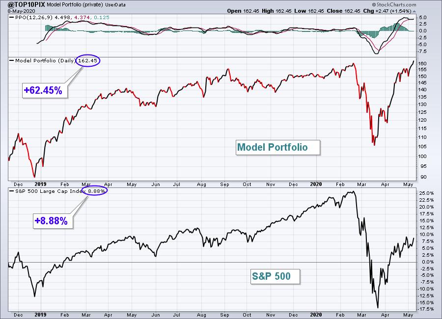
Well, using the User-Defined Index here at StockCharts.com, I've tracked the performance since its inception on November 19, 2018, with the comparative chart of the S&P 500 below it:

In addition to clearing its February top on Friday, it has now gained an astounding 62.45% in 18 months, while the benchmark S&P 500 has gained 8.88% over that same timeframe. That's more than 53 percentage points better. It's widely published that 80% of mutual funds do not beat the S&P 500. We've beaten it 7-fold! To say I'm proud of this performance would be a huge understatement.
How It All Began
I remember when I first created my initial "Strong Earnings ChartList" in 2013. It became so popular with our members that we ended up changing our name from Invested Central to EarningsBeats.com. As a former practicing CPA, who worked in public accounting for 20 years, the idea of wanting to own only companies where management was executing its business plan just made perfect sense to me. I remember seeing companies that would miss estimates get absolutely pummeled by Wall Street. In many of those cases, it took months, even years, for Wall Street to completely forgive these companies for their sins. So I wondered whether trading only companies beating quarterly estimates would make sense and provide the framework for our revised business model. Boy did it ever!
From 2013 through February 2020, I'd estimate that more than 99% of my personal trades came from this Strong Earnings ChartList. It was constantly updated as earnings reports were released, always providing the "best of the best" in terms of earnings reports. That, along with excellent relative strength, is what landed companies on this ChartList. Because this ChartList was comprised of anywhere from 100-350 companies at any given point in time, members kept asking, "What are your FAVORITE stocks on this list? It's hard to narrow down the list from 300 to a manageable number."
The Model Portfolio was born!
What Is The Model Portfolio?
While I wasn't looking for diversification in the sense that all sectors needed to be represented, I was looking to diversify into 10 equal-weighted stocks from 10 different industry groups - preferably leading industry groups. I have found through the years that owning the best relative strength stocks in the best relative strength industry groups is a winning combination. I began providing my Top 10 Stocks on November 19, 2018; here are the quarterly performance results since that time (Model portfolio vs. S&P 500):
- November 19, 2018 - February 19, 2019: +25.67% vs. +3.31%
- February 19, 2019 - May 19, 2019: +3.55% vs. +2.87%
- May 19, 2019 - August 19, 2019: +13.83% vs. +2.24%
- August 19, 2019 - November 19, 2019: -0.67% vs. +6.72%
- November 19, 2019 - February 19, 2020: +9.07% vs. +8.52%
- February 19, 2020 - May 8, 2020 (11 days remain to end of quarter): +1.21% vs. -13.48%
The concept is simple. You own 10 of the best stocks in the U.S. market for three months. Then you replace them with 10 of the best stocks at that time for another 9o days. Rinse and repeat every quarter. It's simply been my way of saying, "these are my favorite 10 stocks (from 10 different industry groups) on the Strong Earnings ChartList." On May 19th, I'll unveil my favorite 10 stocks for next quarter to once again try to beat the S&P 500. Of the 6 quarters since November 2018, the Model portfolio has outperformed 5 out of 6 quarters. That's quite a track record! If you'd like to ensure a spot for the May 19th Top 10 Stocks webinar for EarningsBeats.com members, you can sign up for a fully refundable $7 30-day trial HERE.
What Stocks Have Contributed to This Quarter's Success?
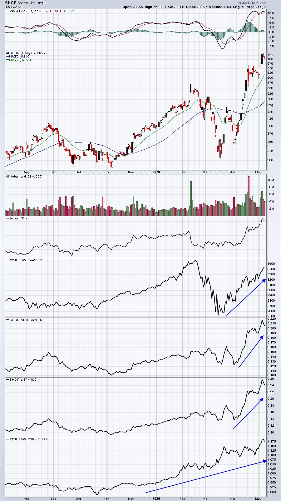
The first amazing stat is that all 10 stocks of the Model Portfolio are currently beating the S&P 500 this quarter. But three have stood out above all the rest. The first is Shopify (SHOP):

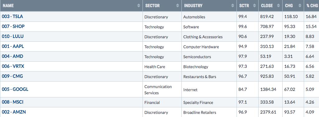
SHOP is exactly what I look for. It's part of one of the best industry groups of the last several years - software ($DJUSSW). It's also a leading software stock, up more than 30% since February 19th. The other two leading stocks for this portfolio have been Amazon.com (AMZN) and Vertex Pharmaceuticals (VRTX), both higher by 9.6% this quarter. Last week, the S&P 500 rose by 3.50%. The Model portfolio gained 8.08% and here are all the stocks in the portfolio and their gains last week:

That's how you crush an index! Every stock gained more than the benchmark S&P 500.
Join Me On Saturday - For FREE
I also would like to invite everyone at StockCharts.com to join me for a very special and free event on Saturday, May 9th at 2pm EST. I've been asked numerous times, "What are your favorite features at StockCharts?" I always answer (1) ChartLists and (2) the Scan Engine. Grayson Roze, VP of Operations, and Bill Shelby, Lead Software Engineer, are two experts from StockCharts on those two subjects who will be joining me for this event tomorrow. You can see the agenda by CLICKING HERE. It will be very educational and provide solid tips to improve your trading results. As a final incentive, we will have drawings throughout the event for free EarningsBeats.com memberships - but you must be present for the LIVE event to be eligible. If you can't make the event LIVE, no worries; we're recording it and will be happy to send you a copy. But you still must follow the link above and be sure to sign up for our free newsletter.
Happy trading!
Tom
|
| READ ONLINE → |
|
|
|
| RRG Charts |
| The Alignment of Daily and Weekly Relative Rotation Graphs |
| by Julius de Kempenaer |

Sometimes it is unclear how daily and weekly RRGs align with each other.
Just to be clear, this is not the same as the difference between daily and weekly RRGs. With regard to that difference, there is a ChartSchool article that explains it in detail.
What we are talking about here is how daily and weekly RRGs are updated with new prices and how they align.
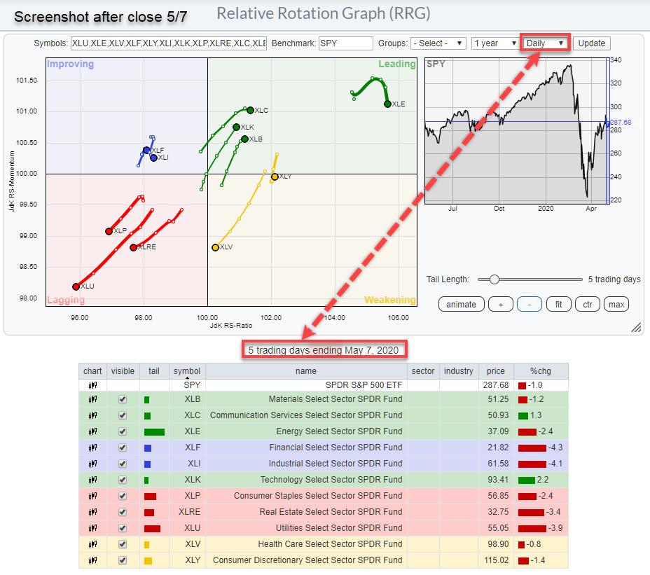
Daily

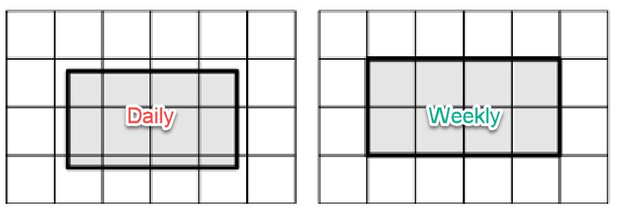
The chart above shows a daily RRG with a five-period (in this case days) tail. The label below the chart indicates that the chart shows "5 trading days ending May 7, 2020". The "5 trading days" refers to the length of the tail. If we slid the tail-length to 10 trading days, the label would say "10 trading days ending May 7, 2020". "Ending May 7" means that the chart is using the last price from May 7.
So far, this is all pretty straightforward. But switching to the weekly RRG can potentially cause some confusion.
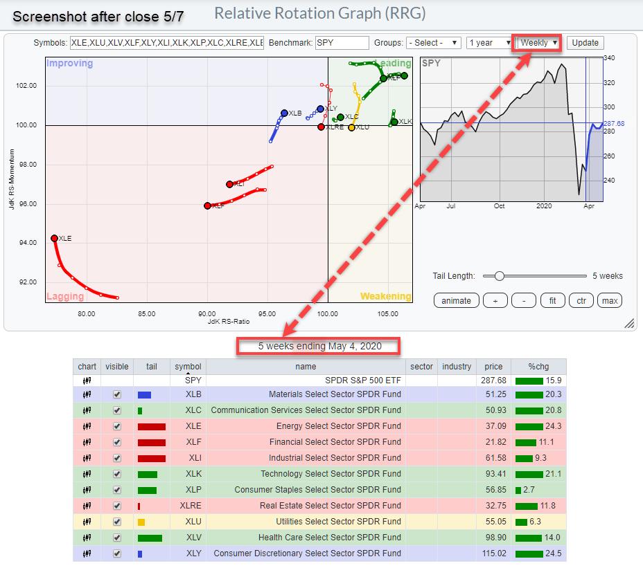
Weekly

On the weekly version of the chart (screenshot snapped at the same time as the daily chart above), we see a similar annotation, but with a subtle, potentially confusing, difference. You can double-check the moment of comparison by looking at the prices in the table below the chart. As you can see, they are identical!
Similar to the daily chart, we have a label reading "5 weeks ending May 4, 2020". The "5 weeks" part is again referring to the length of the tail. Instead of 5 days, the tail is now 5 weeks. That difference shows in the differences between the %chg number in the tables below both charts.
The "ENDING May 4, 2020" part of the label is where confusion can arise.
The screenshot was snapped on May 7, after the close. So why does the label say "May 4"? This has to do with the way StockCharts.com is date/time-stamping bars on charts.
For daily charts, that is pretty obvious - it is the day in question. But when you move to weekly or monthly bars and also to intraday bars (hourly, 10 mins, etc) you have to make a choice. Are you using the date/time stamp at the end of the bar, when the bar has completed, or are you using the date/time stamp at the beginning of the bar, when the bar starts?
The convention at StockCharts is to stamp the bar at the beginning of the period. So, for weekly charts, that means that a bar for the week stat starts May 4 and ends May 8, will be stamped as May-4, even when the actual day is already May-7.
Monthly bars for example are all stamped at the first trading-day of the month.
Hence when you want to indicate that that week is the last week in your observations, like in the label below the RRG, the tail is ending with the week that is beginning May-4.
As said, it may be a bit confusing in the beginning, but when you keep in mind that all these dates are referring to the BEGINNING of a period, it all makes sense!!
What About (Real-Time) Updating?
Now that we know how to look at and read the date-time stamping on the Relative Rotation Graph, what about updating when new prices are coming in?
RRGs are static, so they are not automatically refreshed when new data/prices become available. However, when you refresh an RRG (just click update in the top-right corner), the latest prices will be used and the end-points on the tails will updated accordingly. This means that RRGs will always use the latest available price to update the chart when it is rendered. You can check this for yourself by just clicking the "Update" button during the trading day and checking the prices in the table below the chart.
Daily
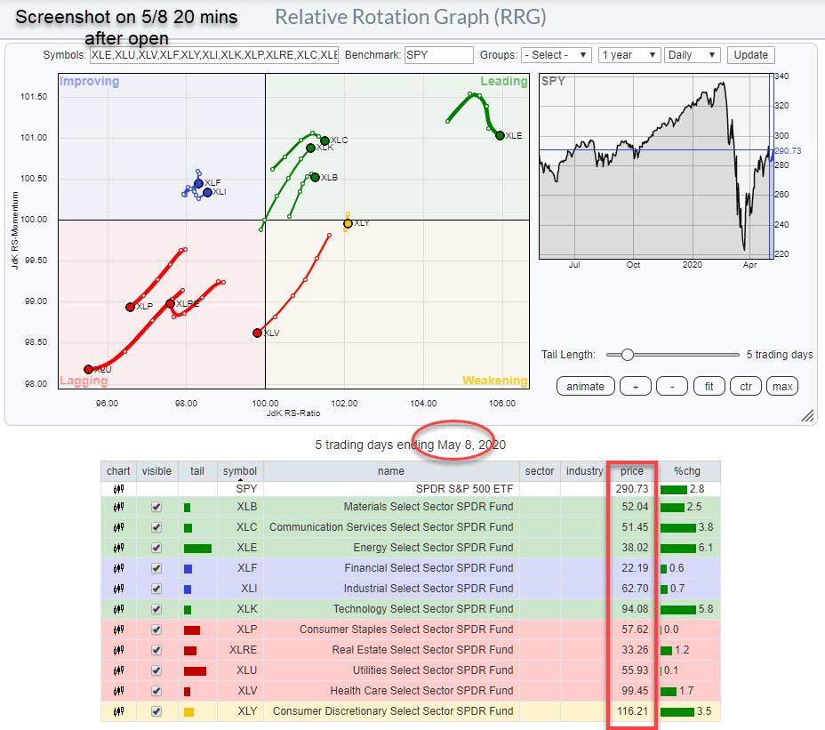
Here is a screenshot of the daily RRG on Friday May-8, 20 minutes after the open.

The prices in the table are now the prices from May-8 at the time of the screenshot.
When you compare this chart to the Daily RRG at the top of the article, with the screenshot taken after the close, you can see that the tails now have shifted forward one node, as a new trading day has started. This is best visible on the tail of XLV, as it has now just crossed over from the weakening quadrant into the lagging quadrant.
The next screenshot was taken 30 minutes after the open on May-8.

The prices are now updated to the new time. The endpoints of the tails have also been updated with the new prices, but this is hardly visible because there is only a minimal difference.
This process will continue during the day until the close. Then, at the open of the next trading day, the tail will shift forward one node and it all starts over again. So remember that the last node on the tail is fluid until that period, in this case a day, closes.
Weekly
On the weekly RRG, a similar thing will happen. Whenever you call a weekly RRG, the latest prices will be used to draw the RRG. The only difference is that the nodes on the tail will only shift one period forward at the start of the new week. The last node on the tail remains fluid the whole week, right up until that week closes after Friday's trading.
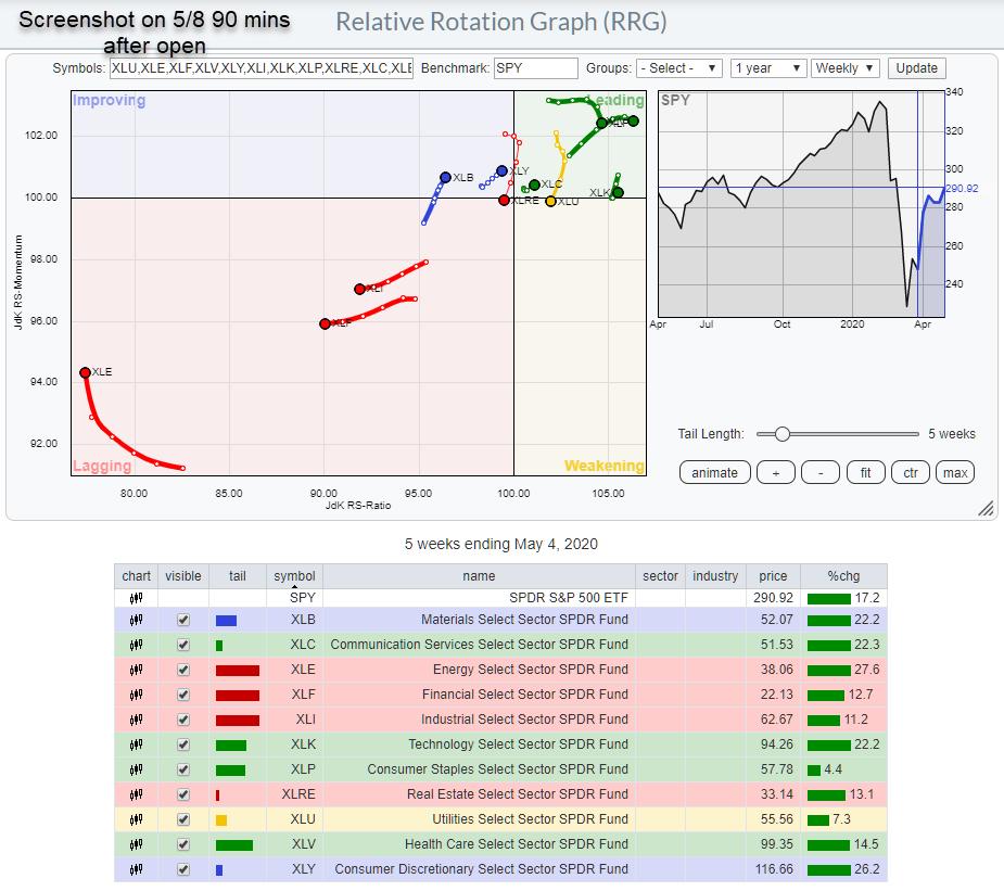
The chart below shows the weekly RRG for May-8, saved 90 minutes after the open.

You can see the change in prices compared to the screenshot after the May-7 close, which is printed higher up in this article. The nodes prior to the last one on the tail are still in the same place, just like where they were on the first screenshot. The last nodes, the endpoint of the tails, have moved, albeit only a little.
The best visible move, I think, is seen on the tail of XLE in the lower left corner, where the last node is now clearly away from the 94 mark on the RS-momentum scale while it was still touching that grid line on the previous screenshot. When this week's closing prices are in, that last node will be fixed. And then, when the market opens again next Monday, the tail will shift forward one period and the updating through the week starts all over again.
I hope this clarified some possible confusions or questions you may have had, even when you did not realize you had them. ;)
Please let me know what you think or when things still remain unclear. Also, I discussed these items in last week's Sector Spotlight show, which you can review here (video starts at the specific segment):
Seasonality and Sector Rotation in US Stocks | Julius de Kempenaer | Sector Spotlight (05.05.20)
My regular blog is the RRG Charts blog. If you would like to receive a notification when a new article is published there, simply "Subscribe" with your email address.
|
| READ ONLINE → |
|
|
|
| The MEM Edge |
| Three Traits that Will Tell You Your Stock is Poised To Trade Much Higher |
| by Mary Ellen McGonagle |
It's been quite a week for the markets, as a gradual reopening from a global lockdown has investors hopeful that economic damage from the pandemic might be stemmed.
And while the S&P 500 posted a healthy gain for the week, it's the Tech-heavy Nasdaq that's been leading the charge higher, with the index up 5.9% this week alone. With individual stocks up even more, you may be finding it difficult to determine the best candidate that will improve your odds of profitably participating in the market's current uptrend.
Below, I'll share with you 3 characteristics of a stock poised to outpace the broader markets using historical precedent. These are among numerous key characteristics I learned from my many years working with William O'Neil & Co. – a company that specializes in uncovering winning outperformers.
The first trait is that the company has to have strong growth prospects in the form of earnings and sales that are trending higher. While that might seem like a difficult feat in a period of historical unemployment and a global economy that's in lockdown, there are many companies reporting results above estimates as their products are facing strong demand.
In fact, over 60% of companies that have reported their most recent quarter have posted positive results, with a select number showing no signs of a slowdown for this year. The response from investors has been enthusiastic as over 75 stocks gapped up in price on the open today alone.
This leads us to the second trait that winning stocks can exhibit, particularly during earnings season: A breakaway gap-up on high volume following an event such as the release of a strong quarterly report. It's not unusual to see a leadership-quality stock rise 20% or more as volume surges above-average.
This last trait in the series, which I'm covering today, is when the gap-up in price, on heavy volume, pushes the stock out of a base pattern. Most commonly, it's a saucer-type base where the stock has pulled back from an attempted new high in price and now blows past that prior high.
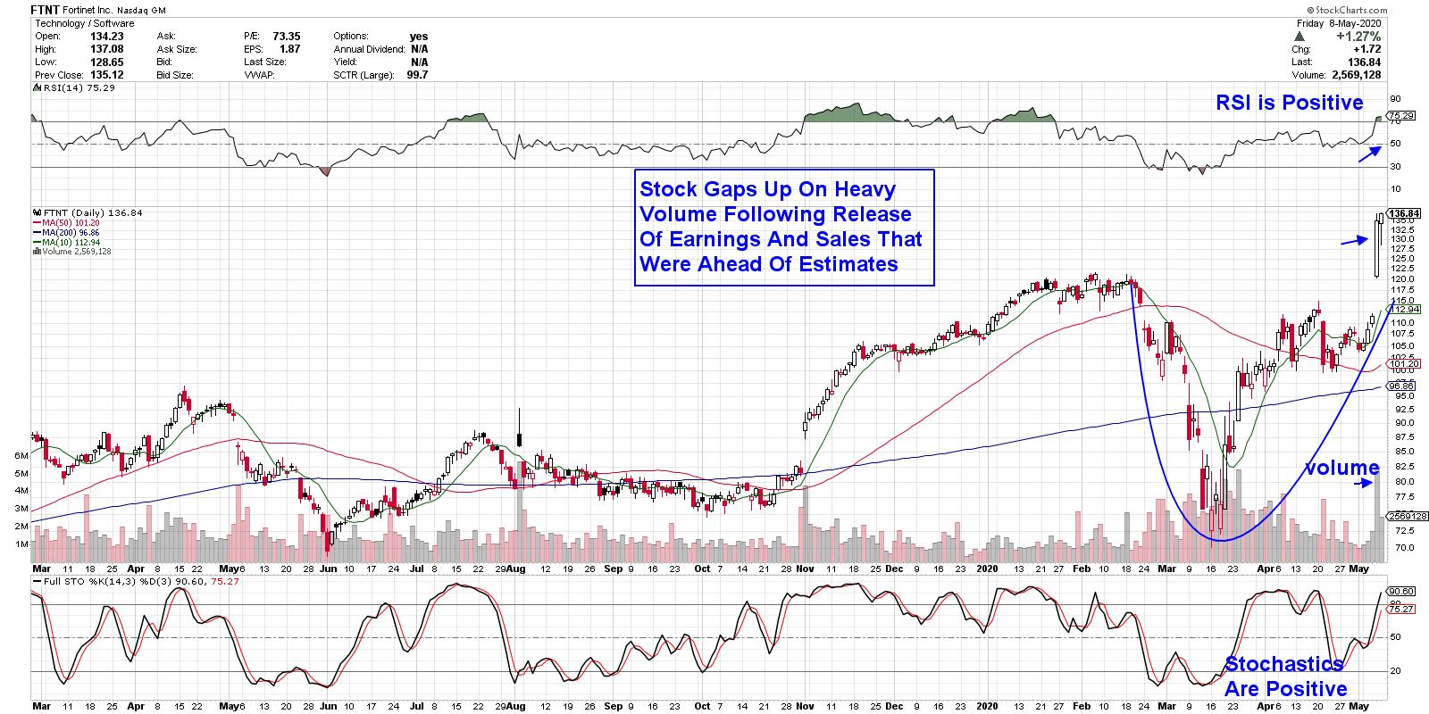
DAILY CHART OF FORTINET, INC. (FTNT)

Above is Fortinet (FTNT), a company that provides cybersecurity solutions worldwide with their firewall security network. The company delivered a strong quarter after beating expectations on revenue, billings and EPS, as increased work-from-home activity drove demand for their products.
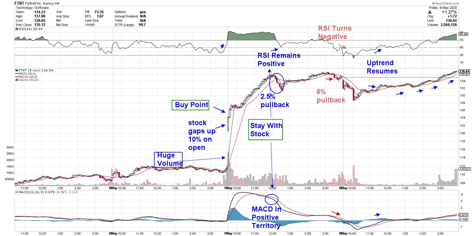
FTNT gapped up 21% on the day on above-average volume and, while the daily chart above is exhibiting bullish characteristics, below I've outlined how to determine a precise entry on the day of the stock's gap up after the open yesterday. In addition, I've highlighted an exit point that would have you sidestepping the 6% pullback from today.
15-MINUTE PRICE CHART OF FORTINET INC. (FTNT)

Using a price chart that drills down to the 15-minute price chart is normally reserved for shorter-term swing traders. However, it can be quite useful for longer-term investors as well, helping to pinpoint an entry point during this period of sharp intraday rallies we've been experiencing.
To begin, you'll want to wait until the first 5-minute bar is posted. When the stock surpasses the high of that bar, you can purchase the stock. You'll also want to make sure you have a confirming RSI and MACD. While FTNT experienced a nominal midday pullback, you'll notice that the RSI remained positive, which would keep you in the stock.
If the stock breaks below its key moving averages, combined with a negative RSI and MACD, shorter-term investors may want to take profits while longer-term investors would use a daily chart to stay with FTNT. Above, you'll see the bullish signals of the intraday, downtrend reversal as the stock broke back above is moving averages, with the other indicators turning positive as well.
To recap, a stock that releases a strong quarterly report with earnings that come in ahead of estimates, coupled with a breakaway gap up on volume that pushes the stock out of a base, will often go on to trade higher. The key here, however, is that the broader markets continue to advance, as you'll need a bullish market backdrop.
Fortinet Inc. is one of many stocks that are poised to trade higher following the release of strong fundamentals. If you'd like to uncover other high-quality growth stocks that will boost your portfolio, take a 4-week trial of my top-performing MEM Edge report for a nominal fee. This bi-weekly report is based on the O'Neil methodology and provides alerts to broad market trend shifts, as well as individual sector analysis and stock picks not seen anywhere else. Use this link here to take a look now!
Warmly,
Mary Ellen McGonagle,
MEM Investment Research
|
| READ ONLINE → |
|
|
|
|
|
| MORE ARTICLES → |
|
 Chart 1
 Chart 2
 Chart 3
 Chart 4
