| THIS WEEK'S ARTICLES |
| The Market Message |
| Big Techs Lead Market Retreat |
| by John Murphy |
A selloff in the biggest tech stocks is putting downside pressure on stocks today; and is helping make the Nasdaq 100 the day's biggest percentage loser. And it looks technically vulnerable to a deeper pullback. The daily bars in Chart 1 show the Nasdaq 100 (QQQ) testing its green 20-day average which is its first line of defense. If that doesn't hold, a pullback toward its 50-day average (blue arrow) would appear more likely. Its short-term momentum indicators are also starting to weaken. The purple line in the upper box shows its 9-day RSI line falling back to the 50 line for the third time in the last month. It hasn't traded below 50 since early April. Its recent pattern of declining peaks has diverged from the rising price action also suggesting some loss of upside momentum. The red MACD histogram bars overlaid over the price bars have fallen below their zero line (red circle) meaning that its daily MACD lines have turned negative. That's another warning of more potential selling.
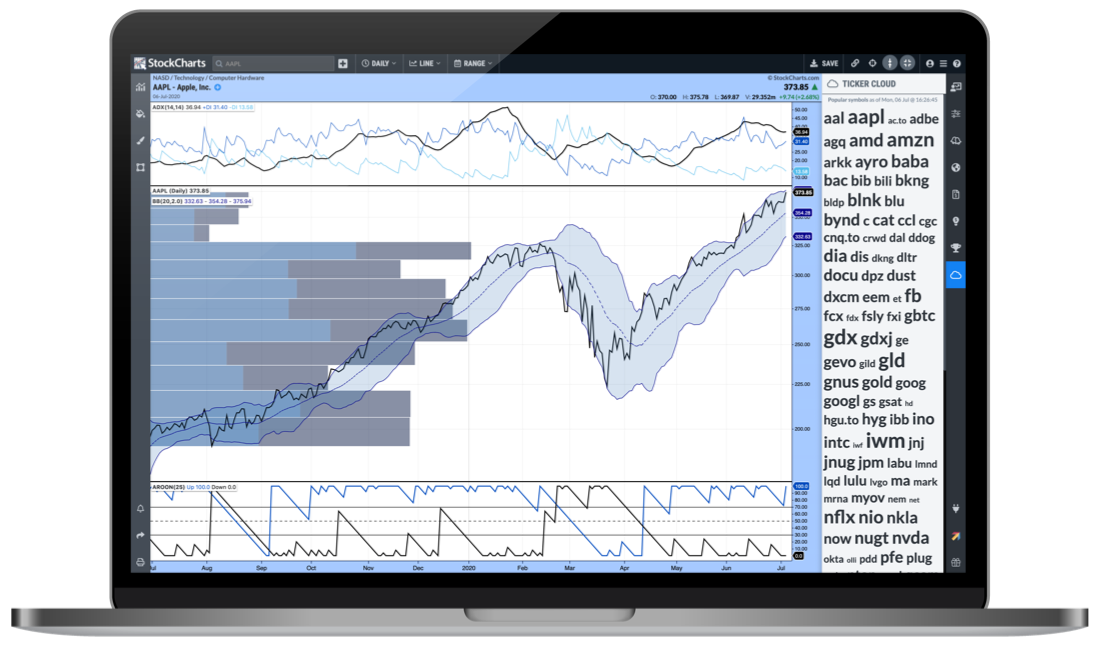
The day's weakest sectors are technology (Apple and Microsoft -4%), communications (Alphabet and Facebook -3%), and consumer cyclicals (Amazon.com -3%). Eight of eleven sectors are ending in the red; with consumer staples, utilities, and financials managing small gains.
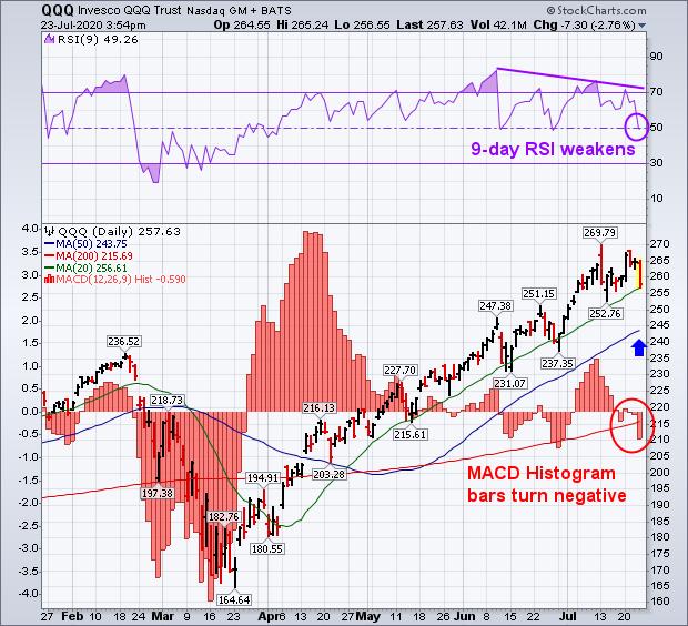 Chart 1 Chart 1
Editor's Note: This is an article that was originally published in John Murphy's Market Message on Thursday, July 23rd at 3:04pm ET.
|
| READ ONLINE → |
|
|
|
|
|
| Art's Charts |
| QQQ Goes on a Bender |
| by Arthur Hill |
 QQQ can do little wrong here in 2020, but the ETF is ripe for a corrective period as it becomes the most extended since 1999. Current conditions, while frothy, are not quite the same as they were in 2000 so I do not expect another crash. For those of us old enough to remember, dotcom stocks were valued using a multiple of sales because there were no earnings at the time! There are earnings this time, but this does not decrease the odds of a correction. QQQ can do little wrong here in 2020, but the ETF is ripe for a corrective period as it becomes the most extended since 1999. Current conditions, while frothy, are not quite the same as they were in 2000 so I do not expect another crash. For those of us old enough to remember, dotcom stocks were valued using a multiple of sales because there were no earnings at the time! There are earnings this time, but this does not decrease the odds of a correction.
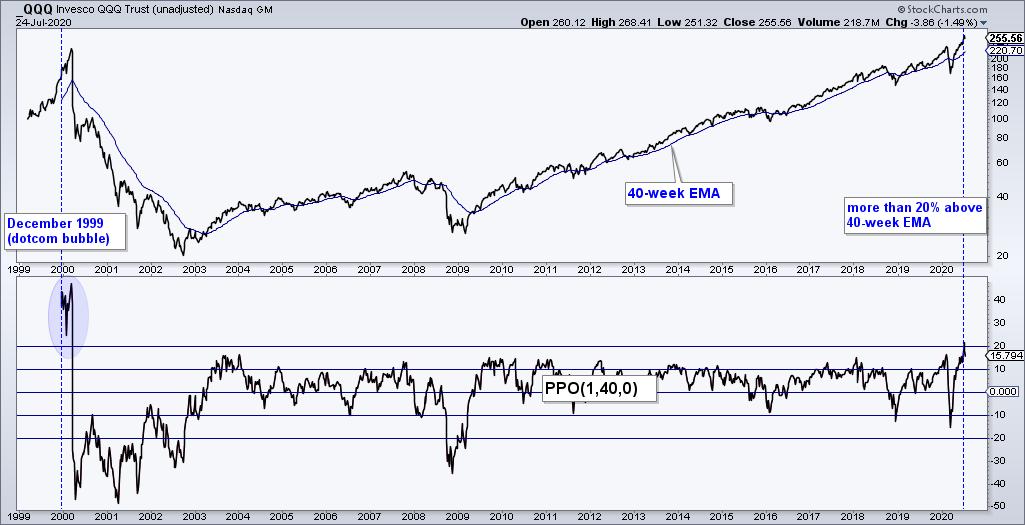
The first chart shows QQQ, the 40-week EMA and the PPO(1,40,1), which measures the percentage difference between the 1-week EMA and 40-week EMA. QQQ is currently over 20% above its 40-week EMA and this is the most since early 2000. QQQ began trading in March 1999 and was over 40% above its 40-week EMA in December 1999. The ETF advanced another 40% into March 2000 and the rest is history.

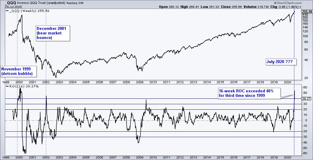
The next chart shows QQQ with the 16-week Rate-of-Change in the indicator window. I chose 16 weeks because this covers the advance from the March low to the July high and I would like to compare it to other 16 week periods. Three weeks ago, 16-week ROC exceeded 40% for the third time since 1999. The first occurred in November 1999. QQQ advanced another 50% into March and then turned lower. The second occurred in January 2002 and marked the peak of a bear market rally.

There are not enough extremely extended instances to build a strategy or to suggest some probabilities. Nevertheless, QQQ is up over 50% and the last pullback greater than 5% occurred on April 1st. QQQ is clearly extended and ripe for a correction, which could involve a sideways consolidation or a pullback to the low 240s.
This week at TrendInvestorPro.com:
Even though the S&P 500 Breadth Model turned net bullish this week, the medium-term uptrends and three key indicators remain the focus as we head into a seasonally weak period. The Bollinger Band breakouts are holding with the Home Construction ETF and Retail SPDR leading. Finance, bank and REIT ETFs are looking shaky though. Gold and Gold Miners continue to lead. All this plus two free ChartLists for StockCharts members.
Click here to take your analysis to the next level!
-------------------------------------------------------
|
| READ ONLINE → |
|
|
|
| The Canadian Technician |
| This is Big Enough to Rock the World |
| by Greg Schnell |
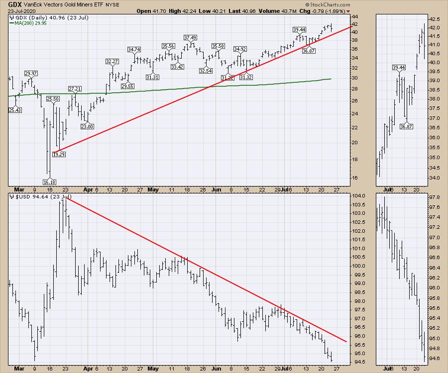
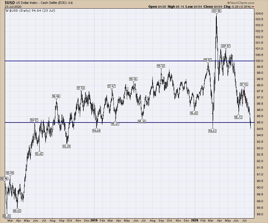
The US Dollar has been dropping for a few months now, but this week it accelerated lower on the break of the two-year trend line. I wrote about the dollar in this Canadian Technician article on Thursday, and its position as the global currency is clearly something to watch.
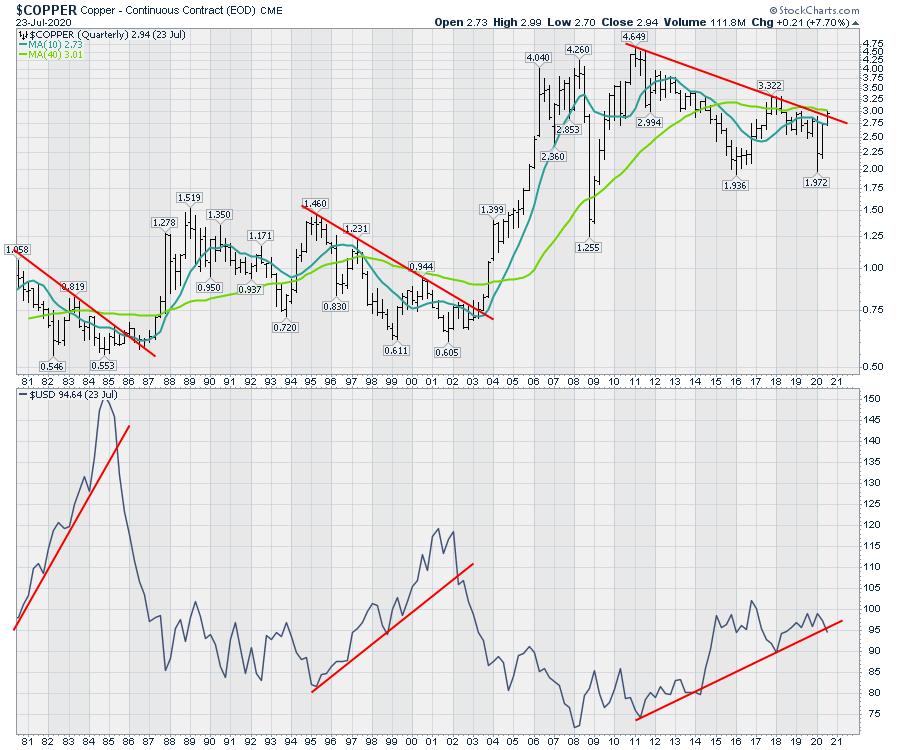
Many long term charts are also testing their trend lines or major levels. On StockCharts TV's Charting The Second Half panel held last Saturday, I mentioned that $COPPER was trying to break out as the dollar breaks down. I did show a 10-year long term chart, but it is even clearer when the chart shows the last two major breakdowns in the dollar.
I have used the quarterly chart setting on StockCharts to generate this chart. This is a macro focus, so it is not a day-to-day look. While the copper move is happening in coordination with a breakdown in the dollar right now, the wiggles don't track that closely. For me, it is more important to be aware of the big picture and try to set up for that.

What we need to watch for over the near term is the bounces in the dollar and Copper reacts. In general, as the dollar falls, commodities rise. I'll be following this macro theme as I like the speed of the moves in commodities and commodity-related trades.
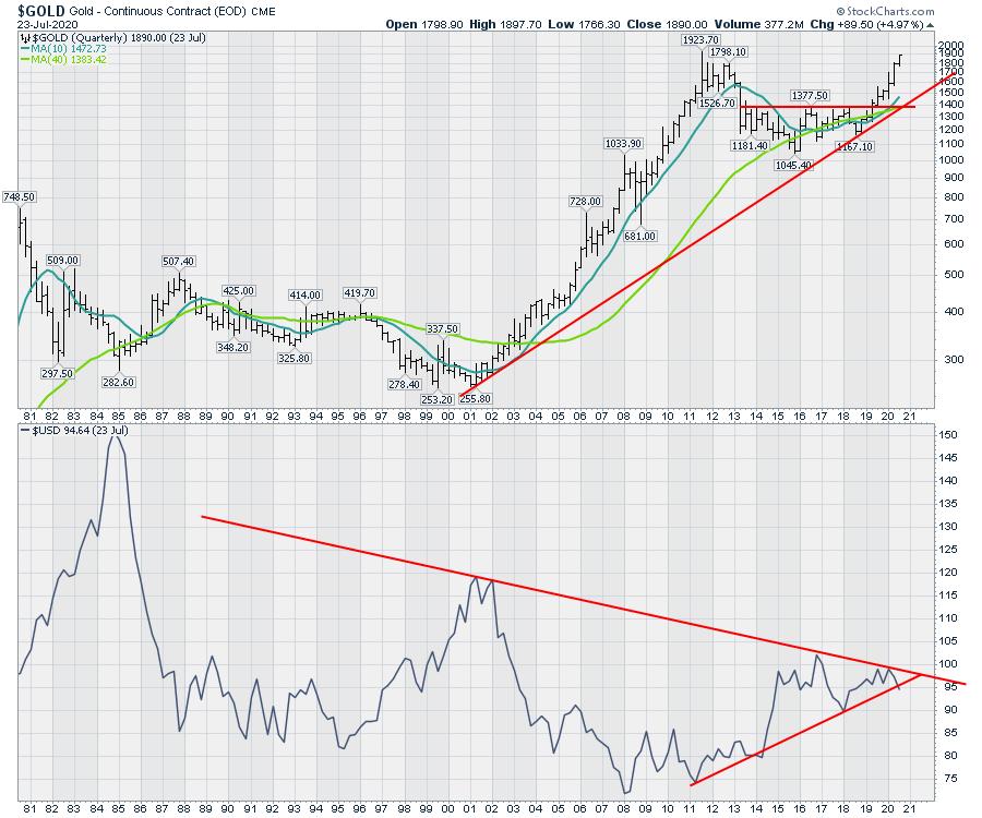
Below is a chart of gold and the US Dollar. I have moved to the larger theme for the dollar, where it is making a lower high on the 40-year chart. But this chart also shows the macro view for these two trend lines. To me, this suggests that the dollar is making a decisive move at a very important inflection point, which is the apex of these two long-term trend lines. So far, the move is lower, below the 10-year uptrend line, but the chart is using quarterly endpoints, not daily closes.

It is important to keep the time scale in context. Whether the dollar stops falling here or continues lower is a big deal on the macro time scale. Setting up a trading bias around the direction of the dollar can be helpful in the big picture, but difficult to hold through day-to-day. A good example of that was the weakness in the gold mining ETF on Thursday, even though the dollar moved lower (last bar on the chart).

As the quarter unfolds, we'll need to be watchful of the US Dollar trend. But this is the quarter that is changing trend if the dollar closes here. For major institutional investors, these can be long-term signals they use to help guide them in allocation. A rising dollar or a falling dollar matters. The last two years has seen a very flat dollar trading in a tight sideways range. Just eyeballing the chart, the dollar traded between 95-100 around 80% of the time.

To conclude, on a daily, weekly, monthly and quarterly basis, the dollar is at a massive point for technicians. The daily is breaking down and the weekly chart made an important break this week. Where it falls on the July month-end could be another important signal change should it close below the 10-year monthly trend line. The decision is happening in front of our eyes. Don't miss the big implications of the world currency changing direction.
I do a lot of macro work for clients who like a wider view. If my views are helpful for setting your macro direction, I've set up a $360 discount you can receive by entering the coupon code "dailyfive" on this link, Greg's Annual Membership. You can learn more about my work by perusing GregSchnell.com. If the macro significance of the US Dollar change this week is news to you, you'll find a lot more ideas how to invest around those changes in my newsletter and video offering.
|
| READ ONLINE → |
|
|
|
|
|
| DecisionPoint |
| Energy Sector Heating Up - Here are Possible Winners |
| by Erin Swenlin |
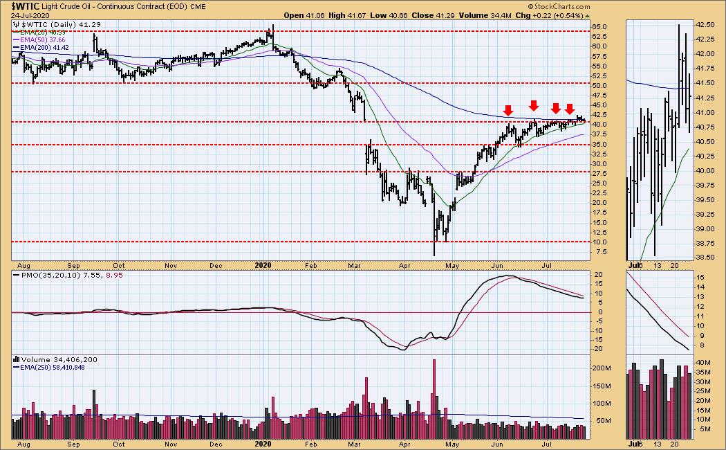
I have been watching the Energy sector closely this week. $WTIC, which I follow daily in the DecisionPoint Alert report, finally broke out and, although the Price Momentum Oscillator (PMO) hasn't turned up, Oil prices are staying above the 20-EMA and have made an attempt to get back above the 200-EMA.

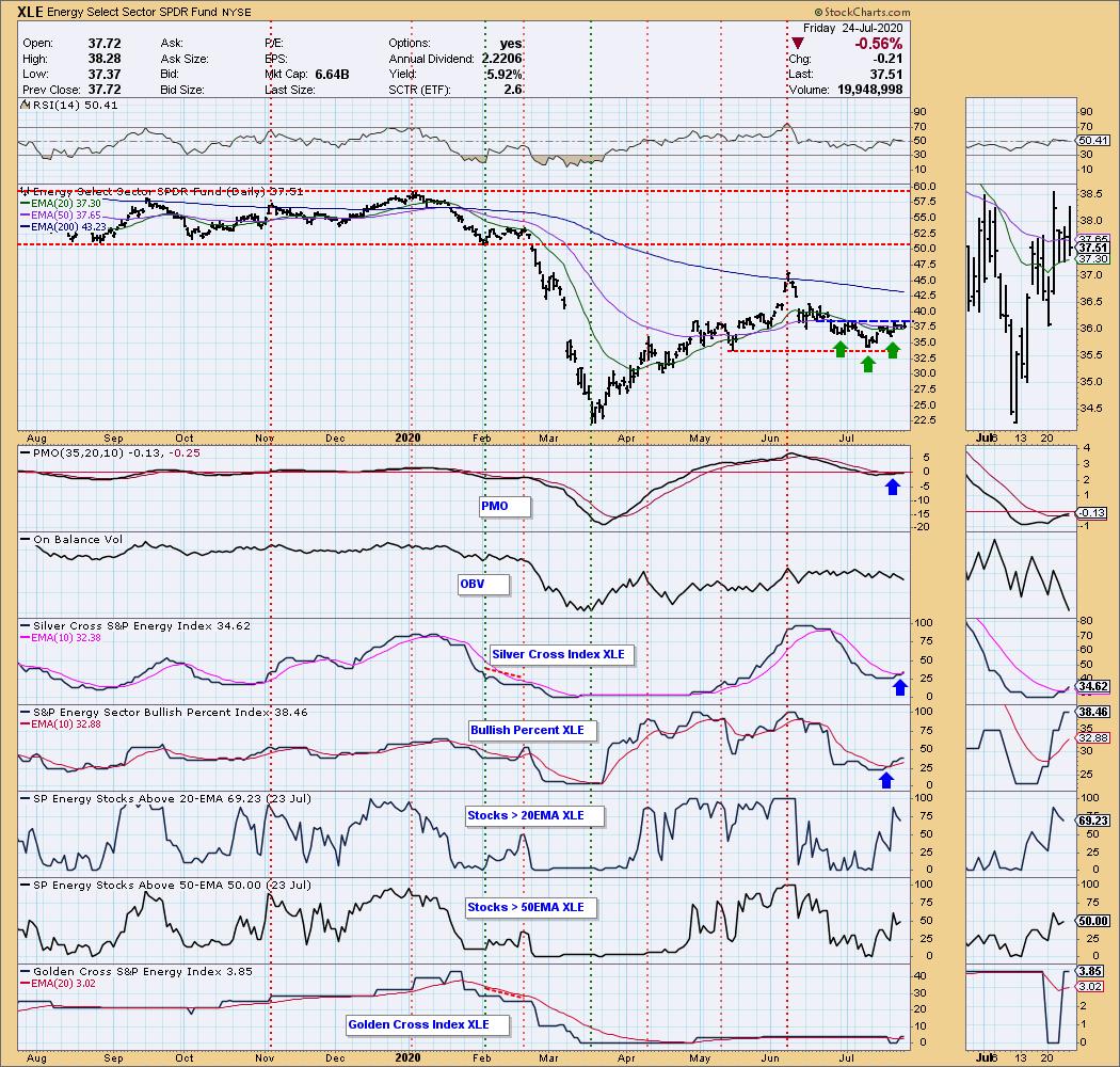
Of course, Oil is only one component of Energy (XLE). Take a look at the bullish chart for the sector. We could be catching this one early. There is a bullish reverse head-and-shoulders that is trying to execute. The PMO gave us a crossover BUY signal yesterday. The 20-EMA is about ready to cross the 50-EMA for a "silver cross" IT Trend Model BUY signal. The Silver Cross Index just had a positive crossover (this index tracks the %stocks on IT Trend Model BUY signals, meaning stocks whose 20-EMA is above their 50-EMA) and we can see a huge improvement on %stocks with prices above their 20/50-EMAs. I also like the look of the BPI.


As investors, we want to accomplish two basic things: (1) Determine the trend and condition of the market and (2) select stocks that will ride that tide. The DecisionPoint Alert helps with the first step, and DecisionPoint Diamonds helps with the second. Go to DecisionPoint.com and SUBSCRIBE TODAY! (Charter Subscriber Discounts Available!)

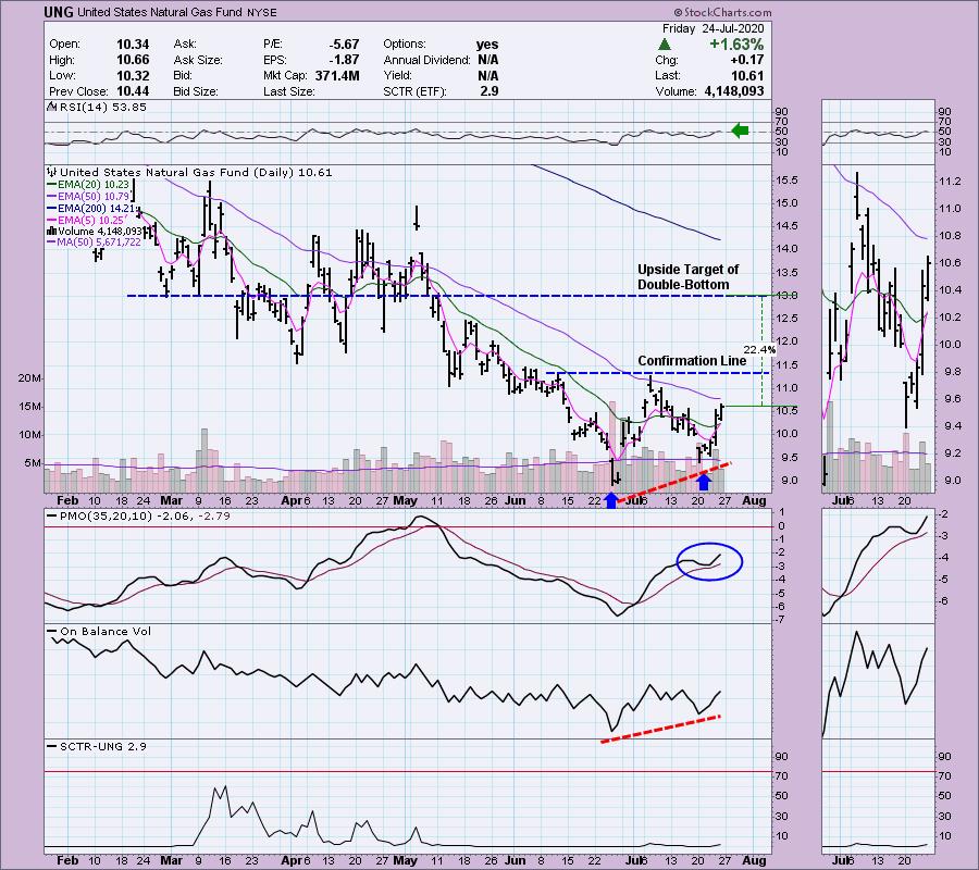
Carl texted me this morning to tell me he had taken a position in US Natural Gas Fund (UNG). It's honestly a favorite of both of ours to get into and out of. For me, it has been hit or miss, so I've avoided it this year. However, the chart is looking very bullish and, after a review, I decided to get a position in UNG as well. The double-bottom is forming (it isn't official until it breaks above the confirmation line) and, if it executes as expected to the upside, the minimum upside target is around $13. That would be a 22%+ gain from the current price today. The RSI is positive and the PMO has bottomed ABOVE its signal line, which is especially bullish. The OBV is confirming. It is a beat-down area, so the SCTR is pretty ugly, but I am not concerned about that right now. It is a symptom of the heavy decline UNG has been experiencing.

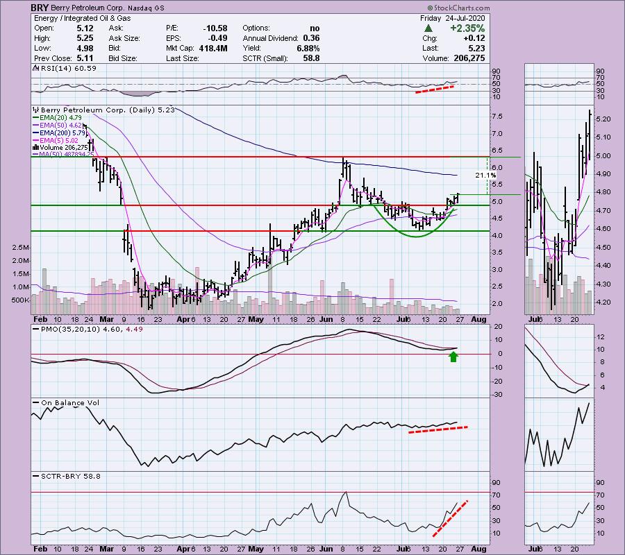
I like this small-cap oil company, Berry Petroleum Corp (BRY). The RSI is now positive and the PMO triggered a crossover BUY signal today. There is a nice cup-shaped bottom and you could even make a case that this is a breakout from a flag formation. The OBV has been confirming this rally and was already hinting at it, as OBV lows stayed relatively flat or rising while price bottoms were in decline. The SCTR has shown huge improvement, which would suggest higher prices. If price could reach the June top, that would be a 21%+ gain.

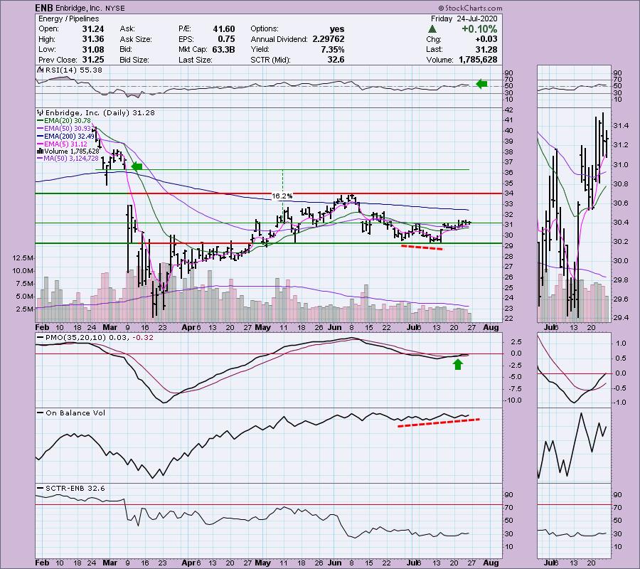
Enbridge Inc (ENB) could be in the early stages of a breakout move. The RSI is positive and the 20-EMA is rising toward a positive cross or "silver cross" of the 50-EMA, which would trigger an IT Trend Model BUY signal. Upside potential, if it can cover the March gap, would be 16%+. The PMO is on a BUY signal and just crossed above the zero line.

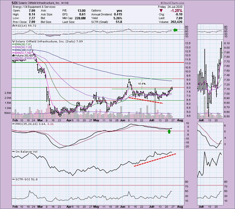
My final choice is Solaris Oilfield Infrastructure Inc (SOI). You'll see a similar cup-shaped bottom. There was an attempt at a breakout, but price fell back. It's still well above the 5-EMA. The RSI is positive and the PMO is on a BUY signal. If price can reach the June top, that would be a nice 15%+ gain.

Conclusion: The Energy sector appears to be heating up as Oil is attempting a breakout. The XLE chart is very bullish and the Energy stocks above with UNG have very nice upside potential. Full disclosure: I own UNG and am likely going to add BRY to my portfolio next week. If you like seeing my picks in ChartWatchers, you'll love the DP Diamonds reports! At $25/mo, you get 60 picks with similar analysis to the above. The price will be going up substantially, so lock in your low rate today!
Happy Charting! - Erin
Technical Analysis is a windsock, not a crystal ball.
Helpful DecisionPoint Links:
DecisionPoint Alert Chart List (subscribers only)
DecisionPoint Golden Cross/Silver Cross Index Chart List (subscribers only)
DecisionPoint Sector Chart List (subscribers only)
DecisionPoint Chart Gallery
Trend Models
Price Momentum Oscillator (PMO)
On Balance Volume
Swenlin Trading Oscillators (STO-B and STO-V)
ITBM and ITVM
SCTR Ranking
|
| READ ONLINE → |
|
|
|
| The MEM Edge |
| Explosive Earnings Are Propelling Stocks Higher In These 2 Surprising Areas |
| by Mary Ellen McGonagle |
It's been proven that strong earnings are the number one driver of a stock's upward advance and with earnings season under way, there's no better time to vet the next set of stocks poised to trade much higher.
So far, over a quarter of companies in the S&P 500 having reported their results for the 2nd quarter and of those, 81% have reported an EPS well above estimates. The next set of outperformers will be among these companies and below I've highlighted two candidates that have reported very strong earnings.
Each name is in the Consumer Discretionary sector where surprising strength is being shown among companies that sell big-ticket items normally purchased during a period of economic expansion. Call it retail therapy, but Americans are buying Automobiles and Houses as if we were entering a golden age of growth and not a recession.
DAILY CHART OF AUTONATION, INC. (AN)
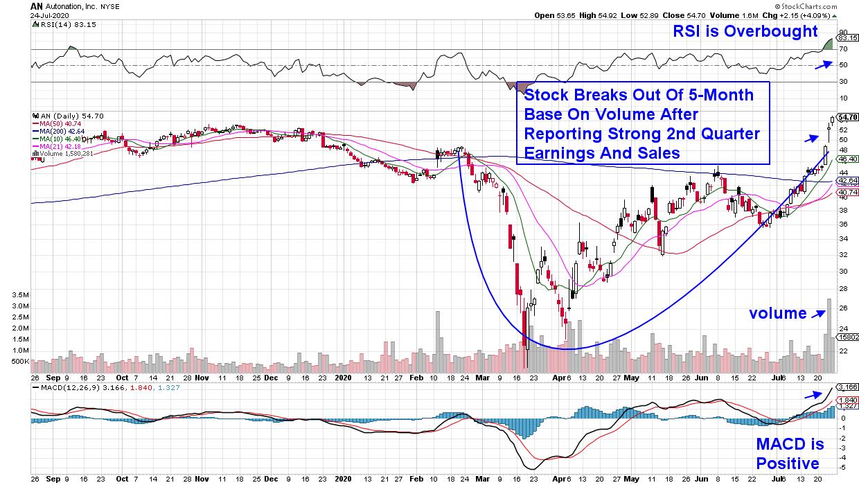
First up is the country's largest car dealership who reported 2nd quarter results this week that were 280% above estimates. In addition, management is very bullish for their company's prospects going forward as they build out another 20 used-car dealerships over the next 3 years.
The surprise results pushed the stock out of a 5-month base and it may well be on its way to a 2 ½ year base breakout very soon. As you may know, the longer the base that a stocks breaks out of, the longer the advance out of that base.
And while the RSI is in an overbought position on its daily chart, the stock appears poised for further near-term upside given the high volume on its breakout and positive MACD. A quick look at AN's monthly chart shows a historical precedence of a bullish recovery out of the 2009 recession.
DAILY CHART OF MERITAGE HOMES CORP. (MTH)

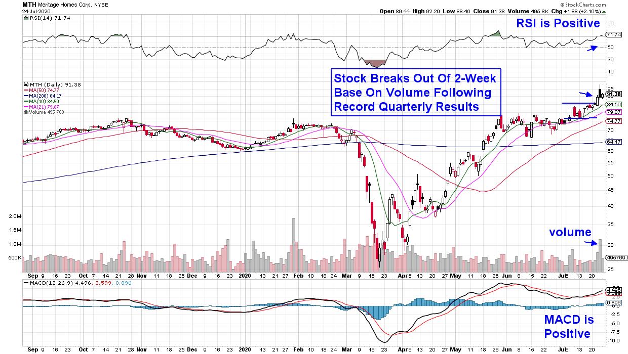
Next up is homebuilder Meritage Homes Corp. (MTH) which reported a record 2nd quarter last week with sales driven mostly by first-time buyers. The company is seeing demand being driven by historically low mortgage rates amid a need for homes that can accommodate entire families working from home.
The stock broke out of a 2-week flat base on volume following the strong report with both a positive RSI and MACD that points to further upside for this stock. Today's economic report of new home sales surging in June to its strongest rate in 13 years is bullish for MTH and other home building stocks.
The one constant in the stocks mentioned above is a move into digital sales which played a role in the record reports for both companies. And of course, these new homes will need to be furnished which will boost the strength already being seen in select online home improvement stocks as this new economy in the face of a historical pandemic continues to take shape.
With earnings season picking up even more next week, we can expect to see other select stocks to show uncommon strength. If you'd like to be alerted to high quality stocks poised to greatly outperform the markets, trial my bi-weekly MEM Edge Report for 4 weeks for a nominal fee. You can check out our track record using that link!
We're entering a period of uncertainty for the markets and the MEM Edge Report will alert you to exit strategies for stocks on our Suggested Holdings List as well as the broader markets.
Warmly,
Mary Ellen McGonagle
President MEM Investment Research
|
| READ ONLINE → |
|
|
|
| ChartWatchers |
| Those Who Are Patient Could REALLY Cash In! |
| by John Hopkins |
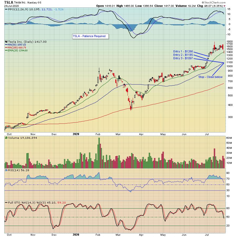
When Tesla (TSLA) reported its earnings last week, they smashed all expectations, both on the top and bottom line. The immediate reaction was mixed, but then we saw the tech sector in general take a hit for a few days in a row, and TSLA did not escape the selling. Instead, it went from a high of 1689 the day after they reported to a low of 1366 by Friday, a nice 20% haircut.
Even before its report, there were multiple analysts and other market observers complaining about TSLA's meteoric run higher and its bloated stock price. After all, the stock had run from just over $420 on January 1 to $1794 at its peak on July 13, a 4+ bagger in just over six months. Perhaps a bit much, with some type of correction making sense.
But regardless of what the critics have been saying about the stock, facts are facts, and the chart shows TSLA has been a sought-after stock that traders have been willing to pay up for. And that is why the company - along with many others that report strong numbers in the current economic environment - will remain at the top of the heap. Investors like winners, especially when they go on sale.
This is where the patience comes in. If you had chased TSLA right after they reported earnings, you wouldn't be happy. But, if you could identify several areas of support and waited for the stock to move towards more attractive entry levels, you might end up with some nice profits.
For example, take a look at the chart below. I've identified 3 specific levels you might consider taking an equal 1/3 position. If all 3 levels were hit, the average cost basis would be $1182. The stop would be any close below the 50-day moving average, currently at 1097. So if the trade stopped out, that's a loss of 7%. However, if the stock held, resumed its march higher and just got back to last Thursday's high of 1689, that would represent a profit of 43% - a 6-to-1 reward to risk. Not too shabby!

The whole point here is that we've already seen a number of companies that have easily beaten earnings expectations, yet have pulled back along with the market correction. And there will be many more that beat their numbers over the next several weeks that could also pull back, becoming high reward-to-risk trading candidates. So you need to be able to zero in on that group of stocks. At EarningsBeats.com, we track every earnings report; those that beat both top and bottom line expectations and have promising charts are added to our "Strong Earnings ChartList." We currently have 210 companies on the list and will be adding many more as earnings season progresses. If you would like to access the full list, just click here to sign up for our FREE EarningsBeats Digest and the list will be sent to you.
At your service,
John Hopkins
EarningsBeats.com
|
| READ ONLINE → |
|
|
|
| MORE ARTICLES → |
|
 Chart 1


 QQQ can do little wrong here in 2020, but the ETF is ripe for a corrective period as it becomes the most extended since 1999. Current conditions, while frothy, are not quite the same as they were in 2000 so I do not expect another crash. For those of us old enough to remember, dotcom stocks were valued using a multiple of sales because there were no earnings at the time! There are earnings this time, but this does not decrease the odds of a correction.