| THIS WEEK'S ARTICLES |
| The Traders Journal |
| The Anchored VWAP Reveals "Hidden Support" In The S&P 500, And The US Total Market Is Still King Of The World |
| by Grayson Roze |
 What a week to be back hosting another episode of "Your Daily Five". As I'm sure you heard, we held a major LIVE event on StockCharts TV yesterday - "Introducing StockChartsACP: The Future of Technical Analysis". Chip, Dave and I sat down for an exclusive series of in-depth discussions with charting legends like John Murphy, Ralph Acampora, Martin Pring, Larry Williams, Arthur Hill, Dave Landry, Mish Schneider and others. It was a wonderful opportunity to hear their perspectives on how charting and technical analysis have evolved over the years and, of course, dig into the features of ACP to explore how these experts are using the platform in their own approach to today's markets. What a week to be back hosting another episode of "Your Daily Five". As I'm sure you heard, we held a major LIVE event on StockCharts TV yesterday - "Introducing StockChartsACP: The Future of Technical Analysis". Chip, Dave and I sat down for an exclusive series of in-depth discussions with charting legends like John Murphy, Ralph Acampora, Martin Pring, Larry Williams, Arthur Hill, Dave Landry, Mish Schneider and others. It was a wonderful opportunity to hear their perspectives on how charting and technical analysis have evolved over the years and, of course, dig into the features of ACP to explore how these experts are using the platform in their own approach to today's markets.
It's tough to follow that up with anything of competing excitement, but if there's anything that can come close, surely it's a new episode of "Your Daily Five" – easily one of my favorite StockCharts TV shows!
Check out today's edition of "Your Daily Five" below:
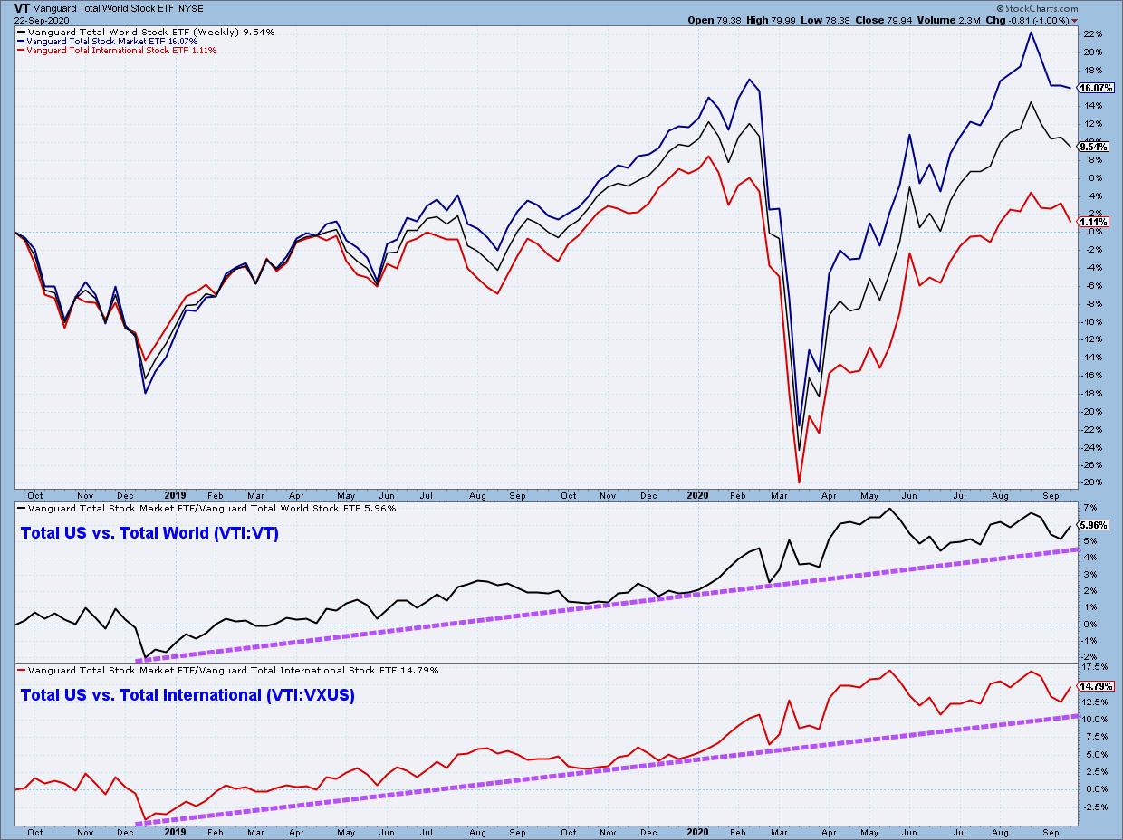
On today's edition, I took a broad, multi-year look at the US Total Market ETF (VTI) vs. the Total World (VT) and Total International (VXUS) counterparts. As you'll see, the ratio charts clearly show that US leadership is continuing, even during the recent pullback.
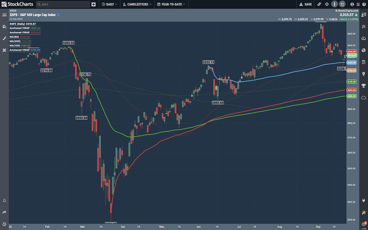
I then pulled up a chart of the S&P 500 with the new Anchored VWAP indicator in StockChartsACP to show a "hidden support" level that I'm watching closely. We'll be detailing a lot more on this exciting new feature of ACP very soon, so stay tuned there – lots of good stuff to come.
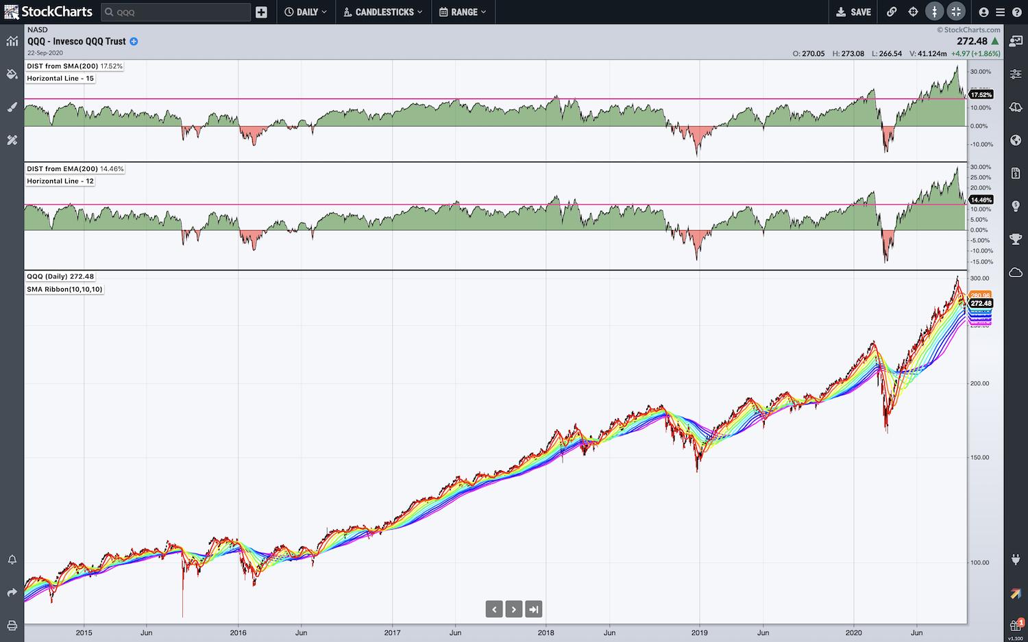
Next up, I took a look at the NASDAQ 100 (QQQ) with a unique Moving Average Ribbon, as well as two "Distance From Moving Average" panels – one showing the distance from the 200-day Simple Moving Average, and the other showing the distance from the 200-day Exponential Moving Average. What we can see on that chart is that the index remains highly extended above its 200-day SMA and EMA.
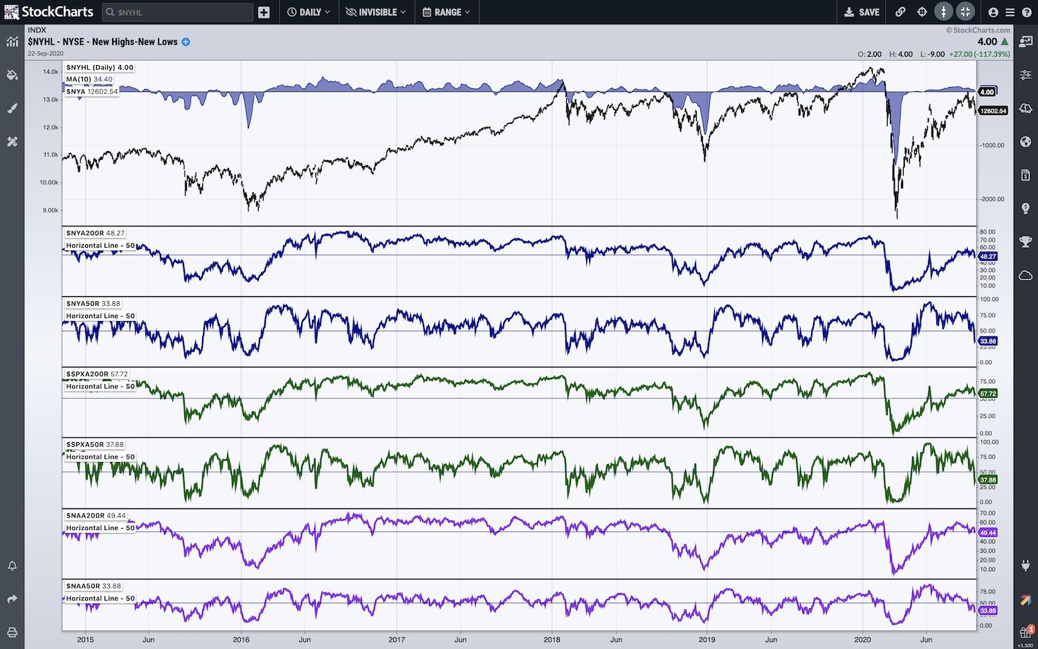
Of course, I had to dive into my classic breadth chart to take a look at how the NYSE, the S&P 500 and the NASDAQ are all holding up. As we see tests of the all-too-crucial 50% level in those breadth measures, I'm keeping a close eye on this chart.
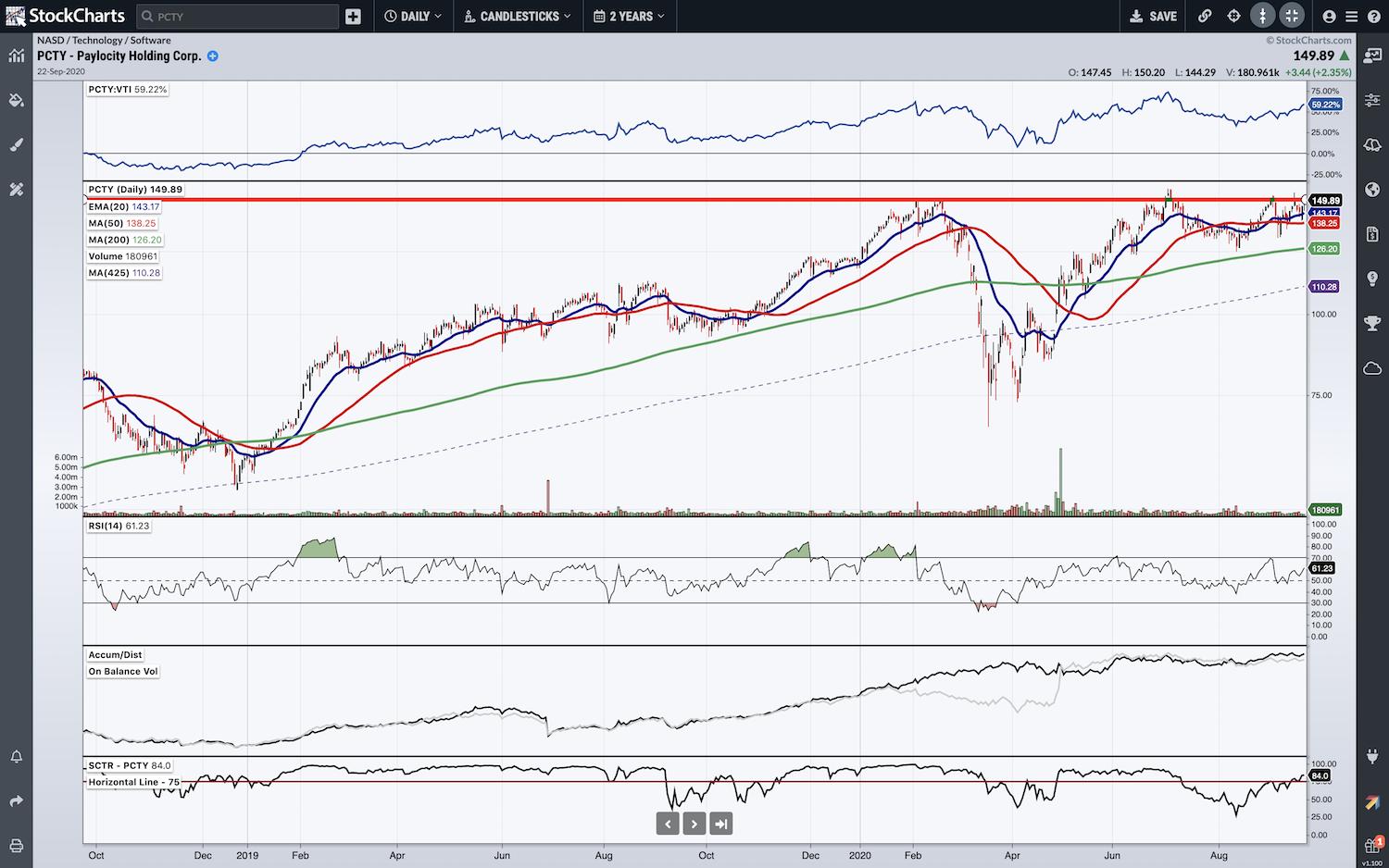
And finally, I shared an individual stock that has my attention at the moment – PCTY (Paylocity). As you'll hear, I'm watching for a breakout above the 150 level and up to new highs, but I love the accumulation this stock is showing and am pleased to see it rising up the SCTR ranks too. Great relative strength in recent weeks, and if the breakout can make it, I'd expect PCTY to become a real runner.
Money In, Eyes Open.
- Grayson Roze
VP of Operations, StockCharts.com
Author, Trading for Dummies (Wiley, 2017)
Author, Tensile Trading: The 10 Essential Stages of Stock Market Mastery (Wiley, 2016)
StockMarketMastery.com
@GraysonRoze
|
| READ ONLINE → |
|
|
|
| The Market Message |
| Applying Moving Averages to the Three Major Stock Indexes |
| by John Murphy |
A lot more attention is being paid to moving average lines this month because they help determine where potential support and resistance levels may lie. Two that have been mentioned quite a bit lately are the 50- and 200-day averages. Moves above and below the 50-day lines help determine the direction of short- to intermediate price moves. While the 200-day lines help determine the direction of major market moves. A third moving average watched by traders is the 100-day average. We'll incorporate that third moving average on today's price charts. The fact that all three major stock indexes fell below their 50-day averages raised the possibility of a drop to one or both of their longer-term averages.
Chart 1 shows the Dow Industrials drawing dangerously close to its red 200-day average and potential chart support along its late-July low (green circle). In addition, the Dow is sitting right on its 100-day average (green line) which may provide some additional support. That might be a logical spot for it to attempt to rebound. In order for that to happen, however, the Dow would have to rise back above its blue 50-day average to improve its short-term picture. In the event that those underlying support levels fail to hold, the next level of more substantial chart lies near its June lows in the vicinity of 25,000.
The daily bars in Chart 2 show the S&P 500 trying to stabilize at its 100-day average (green line) and potential chart chart along its late July low near 3200. Its red 200-day average lies at 3107. There again, the SPX would have to close above is blue 50-day line to strengthen its short-term trend. As with the Dow, the next level of substantial chart support lies along the June lows if the moving average lines don't hold.
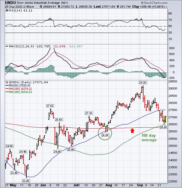 Chart 1 Chart 1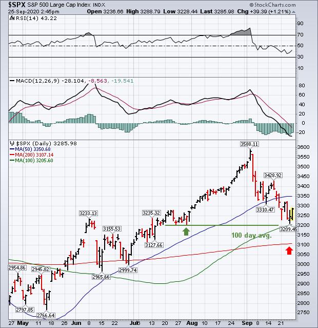 Chart 2 Chart 2
Today's last chart may be the most important of all because it's driven by the large technology stocks that have driven most of this year's stock rally. The daily bars in Chart 3 show the Invesco QQQ Trust (which measures the Nasdaq 100 Index) trading above its green 100-day average and attempting to stabilize. It's already lost more than 10% during September to lead the market lower and enter an official correction. The green horizontal lines plot Fibonacci retracement levels measured from its March low to its early September high. The top line shows a 38% retracement coinciding with its July reaction low near 250. That would represent a significant test of support if the QQQ correction deepens. Because of its stronger performance this year, the QQQ is the furthest away from its 200-day average. It would have to lose 50% of this year's gains to reach that long-term support line. On a shorter-term basis, the QQQ needs a close above its blue 50-day line to sustain any rally attempt.
Keep in mind that the stock market has entered a period of seasonal volatility which is compounded this year by pandemic concerns and uncertainties surrounding the November election. That raises the risk for more market volatility which could last up to and beyond the election. Those factors combined with a weaker technical condition suggest the potential for more stock weakness ahead; or a period of choppier trading. Which warrant a more cautious attitude on stocks over the next couple of months. The moving averages on today's charts offer clues on where some potential support levels may lie below the market if it continues to weaken.
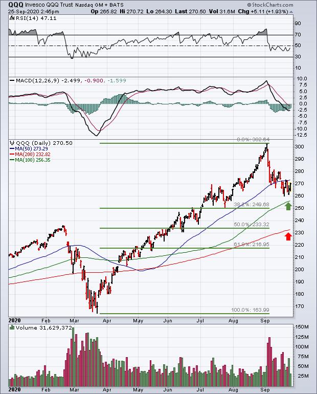 Chart 3 Chart 3
Editor's Note: This is an article that was originally published in John Murphy's Market Message on Friday, September 25th at 2:48pm ET. John Murphy also recently appeared in the "Introducing StockChartsACP: The Future of Technical Analysis" event; you can watch his segment below.
|
| READ ONLINE → |
|
|
|
| The Mindful Investor |
| Better Routines Lead to Better Results |
| by David Keller |
 A consistent imperfect routine is way better than an inconsistent perfect routine. A consistent imperfect routine is way better than an inconsistent perfect routine.
When I've worked with investors that are new to technical analysis, I often find that they spend too much time trying to perfect their analytical approach on a particular chart, and way too little time determining which chart they should be looking at in the first place!
Over the years, I have learned from mentors on how they go about analyzing markets, and what strikes me is the diligent process of following a set routine. Every day I do XYZ, every week I do ABC, and so on.
I developed a "morning coffee routine" that I first started years ago, when I was first learning technical analysis. I have added to and subtracted from the list over time as I have found new techniques and eliminated others.
Here are five observations on how I have set up my on morning coffee routine, which you can access from our list of ChartPacks.
First, we go from long-term to short-term. As a long-term investor, the worst thing I can do is look at short-term data and get caught up in the "flickering ticks" of the daily fluctuations. I want to prime my thinking for the long-term, which means I need to start with a long-term view of equities.
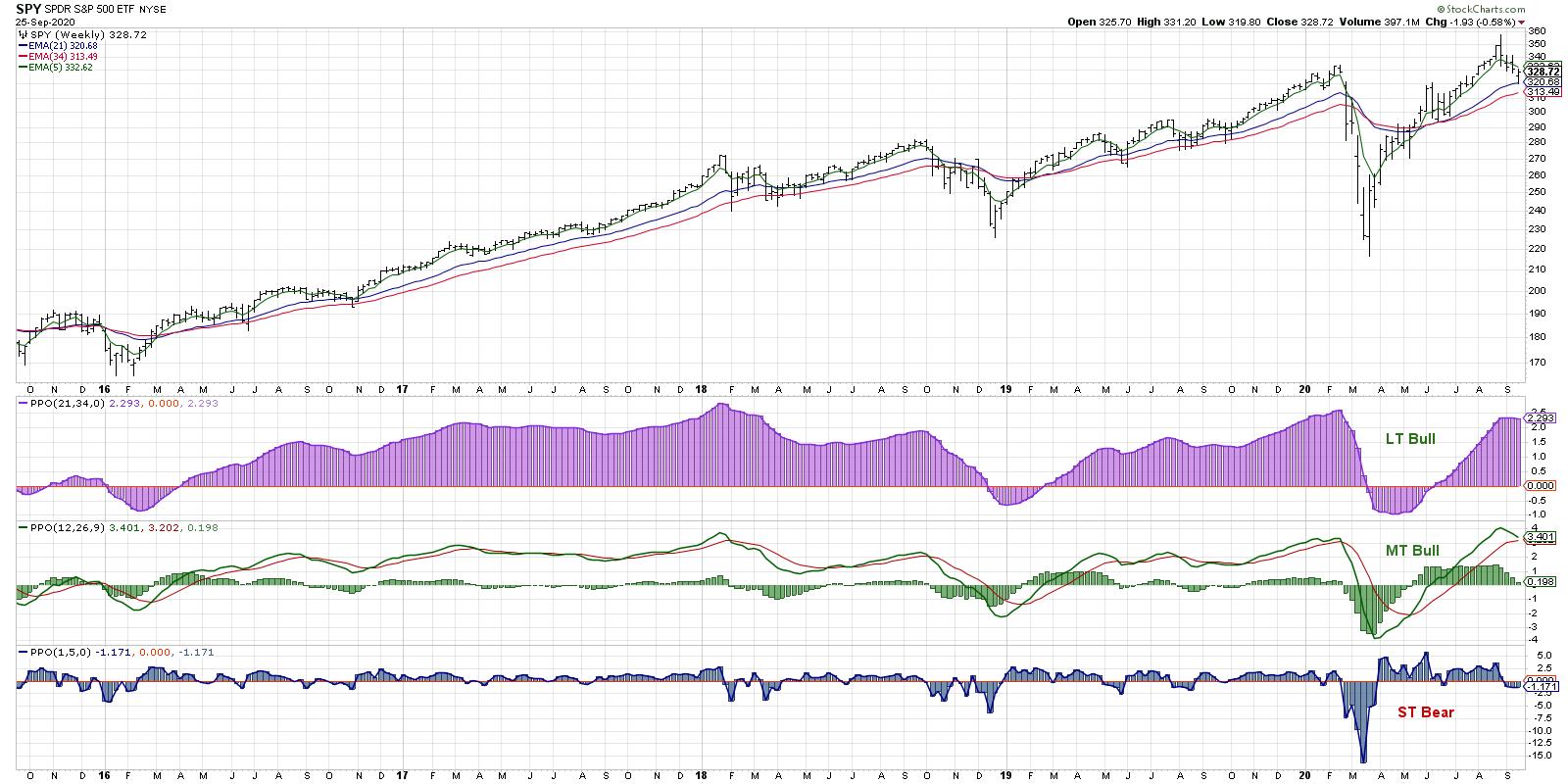
My first chart is a weekly S&P 500 chart using a Market Trend Model that I developed years ago, focused on weekly exponential moving averages.

The long-term trend is defined by the 21- and 34-week EMA, while the medium-term trend is indicated by the weekly PPO using 12- and 26-week EMA. Thus, the first thing I focus on every day is, "What is the long-term trend in the market?"
Second, I go in order through the main steps of my macro process: Price, Breadth and Sentiment.
My next set of charts covers broad equity indices, global equity markets and intermarket analysis. I then dig into breadth indicators, to measure participation, and sentiment indicators, to gauge investor psychology and how that relates to the price trends.
For me, price is most important, with things like breadth and sentiment all serving to either confirm what I'm seeing in price or suggesting something may be amiss.
Third, I move on to sectors and try to determine where institutions are rotating their bets. Julius de Kempenaer's Relative Rotation Graphs have been a staple of my sector work for years, and I still believe it's one of the best ways to understand how institutions are allocating their bets between sectors and themes.

Recently, I've been focusing on the rotation out of mega-cap technology into materials and industrials, as well as the potential emergence of defensive plays like utilities. Between the weekly and daily RRGs, I feel I'm able to get a solid read on sector flows.
Fourth, I dig into individual stocks, usually starting with the 30 members of the Dow Industrials. I know it's not an ideal benchmark for equity investors, but it does hit on many of the key names that I want to follow closely every day. This is also when I tend to run screens for stocks making new 13-week highs or 13-week lows, as this can indicate names in the early stages of a trend reversal.
Fifth, I take a look at my own portfolios, watch lists or client portfolios. Many investors incorrectly put this at the beginning of their process, checking their performance before they dig into all the other charts. By putting my own holdings/stocks/chart of interest at the end, I'm able to first determine what I think about the broad market landscape, then identify how I'm positioned relative to that investment thesis.
Am I positioned correctly for what I see as the most likely outcomes? What would I do given potential alternative scenarios? By starting with the broad market and finishing with my own holdings, I'm able to answer those questions much more effectively.
So there is a "behind the scenes" look at my daily process of reviewing the charts. You're welcome to access these charts from our list of ChartPacks and check out my daily closing bell show, The Final Bar, as I often refer to many of the charts I've discussed in this article.
And now I'll finish with the most important question - What's your daily process?
RR#6,
Dave
David Keller, CMT
Chief Market Strategist
StockCharts.com
Disclaimer: This blog is for educational purposes only and should not be construed as financial advice. The ideas and strategies should never be used without first assessing your own personal and financial situation, or without consulting a financial professional.
The author does not have a position in mentioned securities at the time of publication. Any opinions expressed herein are solely those of the author, and do not in any way represent the views or opinions of any other person or entity.
|
| READ ONLINE → |
|
|
|
|
|
| Trading Places |
| Buy on Rumor? I'm Expecting A BIG Pre-Earnings Surge in These 3 Stocks |
| by Tom Bowley |
Ever heard of the old Wall Street adage, "buy on rumor, sell on news"? You most likely have and, in my opinion, it applies more to earnings season than anything else. Wall Street firms send their analysts out to meet with management teams prior to the end of their quarters. After the quarter ends, companies enter "quiet periods" leading up to their earnings announcements and management teams are not allowed, by law, to discuss performance with Wall Street. So research teams at these firms return just prior to quarter-end and begin buying stocks leading up to actual earnings announcements. Since most companies report on a calendar quarter basis (March 31, June 30, September 30 and December 31st), earnings results typically begin to hit the Street around the 3rd to 4th week of the following month. These pre-earnings advances are FACT, not my speculation. Historically, the S&P 500 performs extremely well in the early part of months that follow calendar quarter ends. Here's the annualized return of the S&P 500 over the past 70 years for the periods reflected:
- January 1-18: +14.20%
- April 1-18: +28.74%
- July 1-18: +24.79%
- October 1-18: +14.48%
The average annual return on the S&P 500 since 1950 is approximately 9%. The "pre-earnings" periods above are all well in excess of the 9% average annual return. This helps to prove the "buy on rumor" theory.
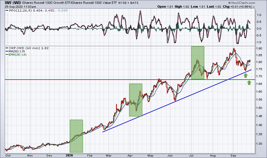
The next thing that you should be aware of is that growth stocks (IWF) have been favored over value stocks (IWD) throughout the past few years, especially in 2020. This ratio (IWF:IWD) perfectly illustrates this market preference:

The relative uptrend remains in play and we just bounced off the uptrend line. The green-shaded areas reflect the last three "pre-earnings" periods. While we have seen some relative volatility, in each case the ratio ended higher than it began. That tells me that I want to be looking for leading growth stocks in leading industries for possible pre-earnings surges.
Here are 3 stocks to consider:
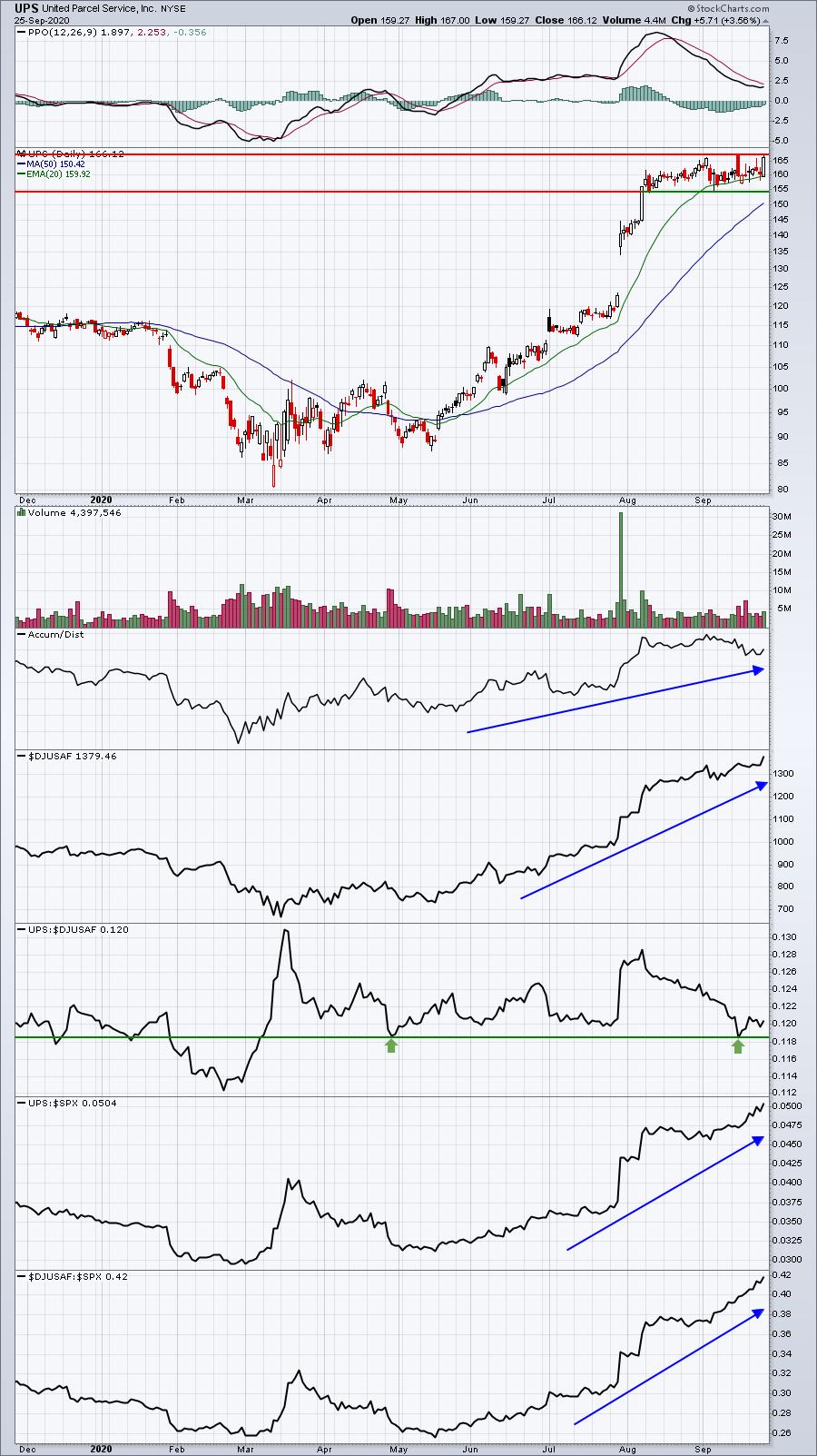
UPS:

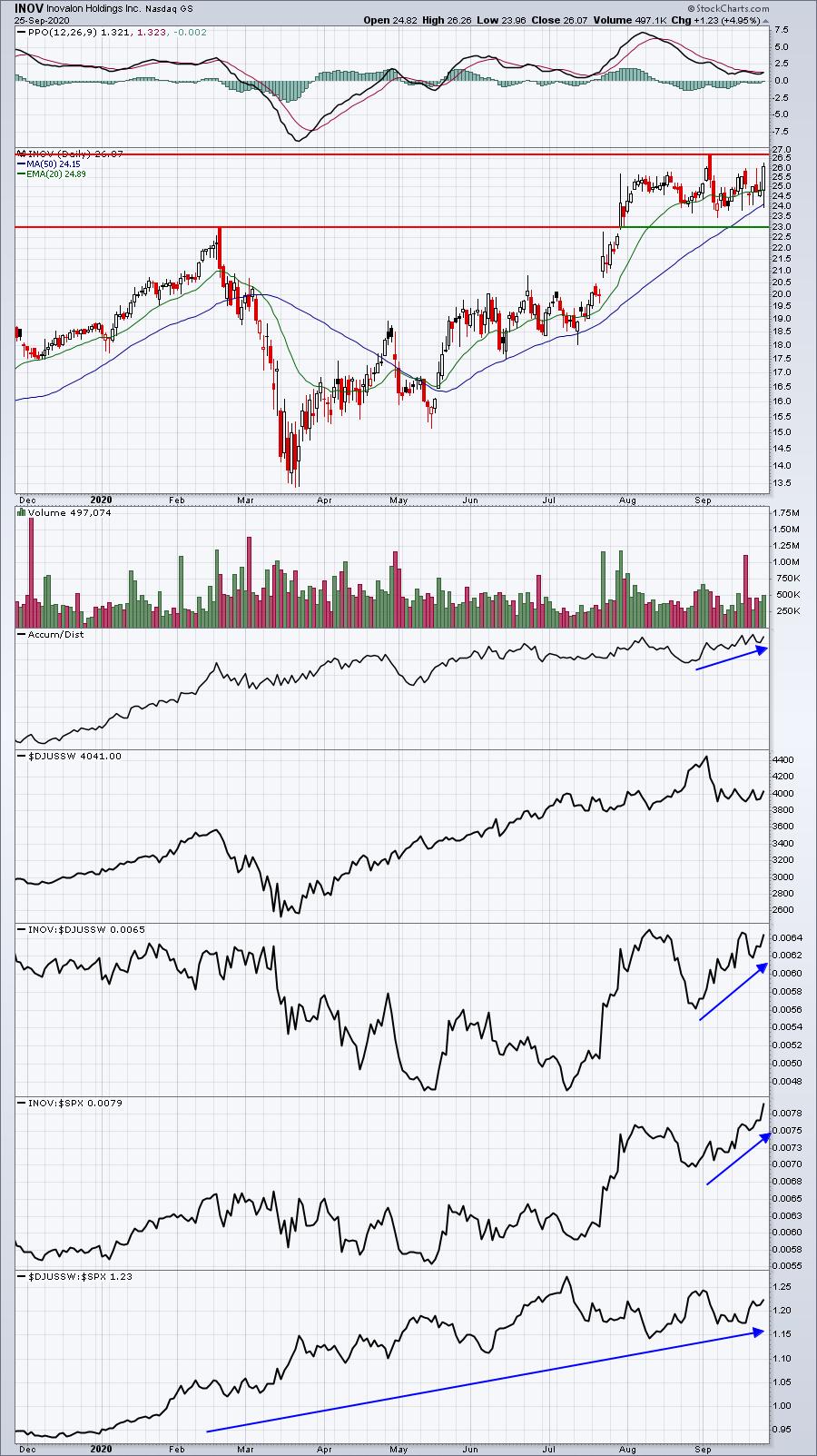
INOV:

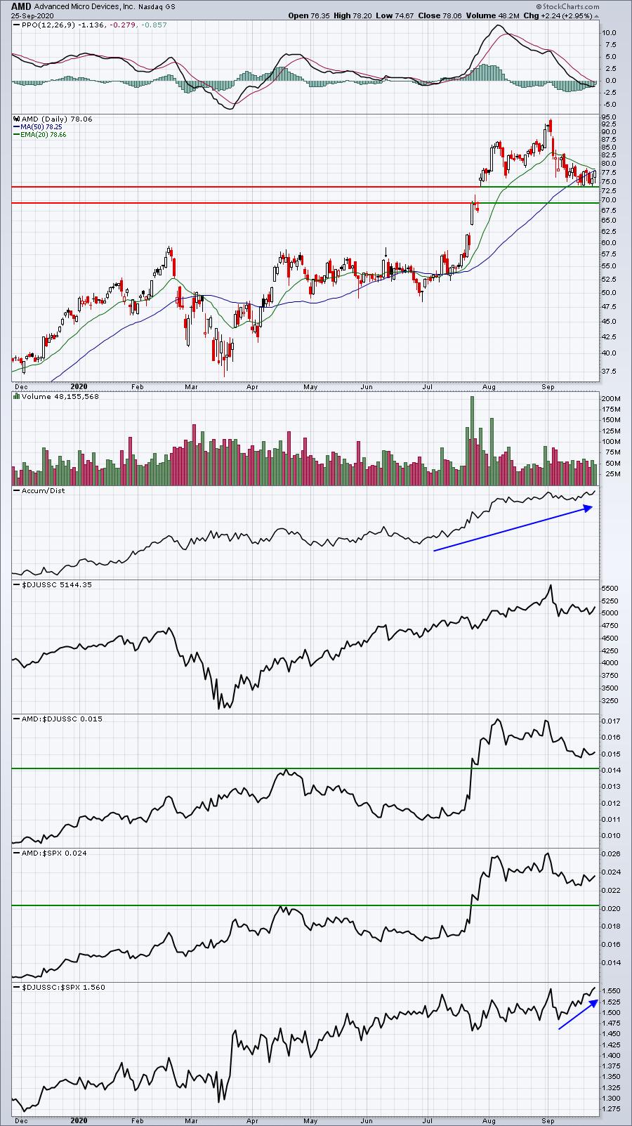
AMD:

All three are in strong industry groups and INOV and AMD are leaders within their respective industries. UPS has performed well, but it just began to bounce on a relative basis off of support. Given the earnings report of FedEx (FDX), I believe we'll see another blowout on UPS. Don't be surprised to see traders stocking up on its stock prior to earnings.
On Saturday, September 26th at 11:00am ET, I plan to host a FREE webinar discussing "short squeeze" stocks - both prior winners and current candidates. Everyone that attends will be given access to our entire Short Squeeze ChartList, which represents the 72 most heavily-shorted U.S. stocks. If you're a StockCharts.com Extra or Pro member, I'll show you how you can download this ChartList directly into your account. For more information and to register, CLICK HERE. We'll send out room instructions to everyone in our EB.com community, including our EB Digest subscribers, on Saturday morning prior to the webinar. If you're reading this article on Saturday morning at 9:00am ET or later, you can go directly to our website (www.earningsbeats.com) and click on the link to our room. We'll add you to our EB Digest. If you read this after our webinar, we'll send out a webinar recording to our entire EB.com community, so no worries there.
Happy trading!
Tom
|
| READ ONLINE → |
|
|
|
|
|
| RRG Charts |
| What Does It Mean When Sectors Fly All Over the Place? |
| by Julius de Kempenaer |

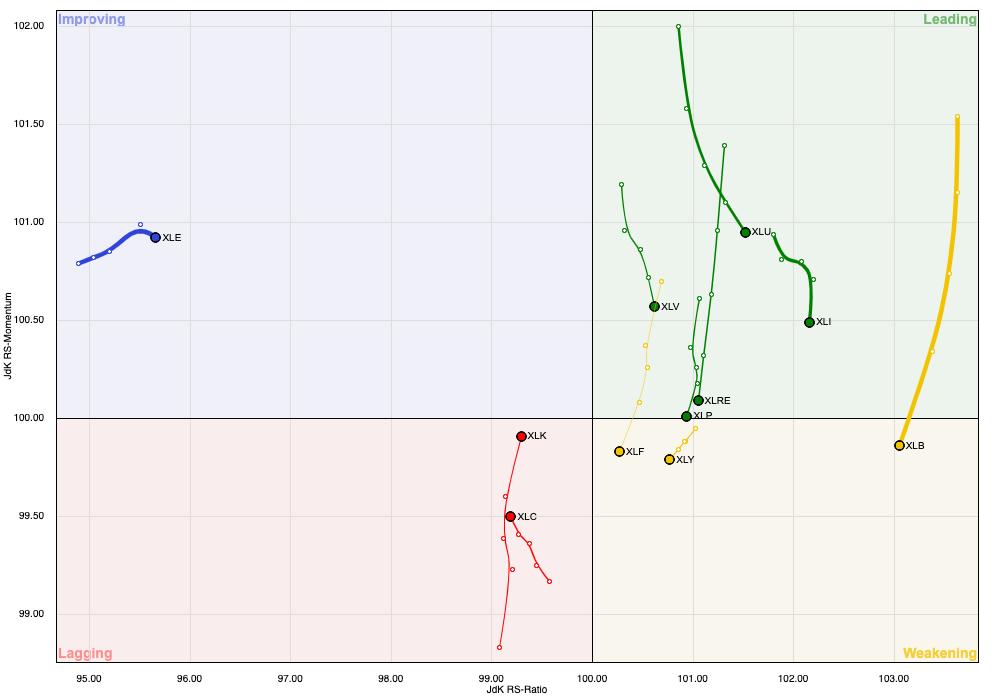
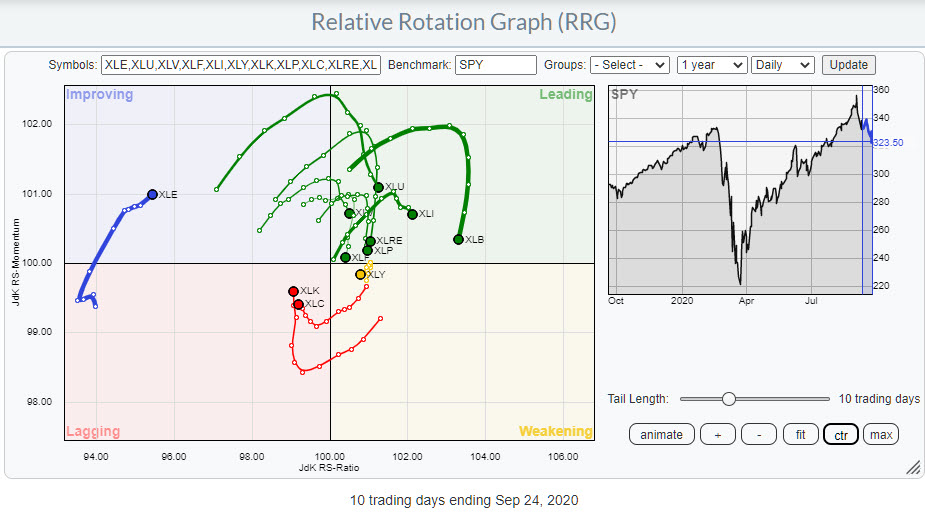
The Relative Rotation Graph above shows the rotation for US sectors on a daily basis over roughly the last two weeks.
The most important observation that we can make from this image is that the rotation currently is very erratic. The tails do not last very long in one quadrant or around a specific heading.
 IMHO, this expressed the uncertainty that is currently present among investors, which seems to match the rising VIX index since mid-August and the higher low that has been put into place this week. A rising VIX typically means uncertainty, which is the one thing investors do not like very much. IMHO, this expressed the uncertainty that is currently present among investors, which seems to match the rising VIX index since mid-August and the higher low that has been put into place this week. A rising VIX typically means uncertainty, which is the one thing investors do not like very much.
If we go back to the RRG, we see a high concentration of sectors inside the leading quadrant, which all have started to roll over very rapidly after hitting this quadrant. On the opposite side, inside the lagging quadrant, we find only two sectors, but they also have started to curl up pretty much immediately after entering that lagging quadrant.
By the way, it is interesting to see the dynamics between large and small sectors based on market capitalization. As this is a so-called "closed universe," the sum of all vectors from the benchmark to each sector weighted by market cap should come out at zero. Since XLK and XLC are large sectors (together they make up just under 40% of total market cap), this means by default that there need to be a lot of sectors on the opposite side. Along similar lines, XLE "must" be far to the left to compensate for the short vector to XLY, which is a much larger sector.
With the daily sector rotation sending us such an erratic and "nervous" message, I wanted to check the price structure on SPY on a daily basis.

In the July 7th edition of Sector Spotlight, I discussed the 322 level in SPY as being important as a resistance level. After the market broke that level, we saw one pullback that tested the 320/322 area as support, before taking off and rallying to a new all-time-high at 357 at the start of this month.
The decline off of this high has now again reached the 320/322 zone, and we have to wait and see if it will again provide the much-needed support for the market.
However, the market structure looks quite different this time. In July, SPY was in an uptrend showing higher highs and higher lows. Currently, today's price action marks the start of a new series of lower highs and lower highs. The recent high at 342 is lower than the 367 peak and, wherever the next low comes in, it will definitely be lower that the previous low at 331.50.
All in all, the short-term outlook, at least, does not look great for SPY.
Given the level of uncertainty, I prefer a weekly RRG to get a handle at sector level.

The main takeaways from this image are:
Technology and Communication Services are (still) inside the weakening quadrant and heading further towards the lagging quadrant. Both sectors are still at a high reading on the RS-Ratio scale, which could allow for a turn back up before hitting lagging, but the increasing RRG-Velocity (distance between observations) is not supportive at the moment.
Communication Discretionary seems to be holding up best inside the leading quadrant, with a very short tail that includes a stable relative trend (in this case upward).
Materials and Industrials are both located inside the leading quadrant on both the daily and the weekly RRG. They are also both going through a setback on the price chart, but, so far, this has not harmed their uptrends.
If this rotation will indeed be bigger, more important and potentially more harmful than what we have seen so far, the sectors inside the improving quadrant, XLP and XLF - and, to a lesser extent, XLU and XLRE inside the lagging quadrant - should be watched for outperformance (shelter), with XLU and XLP being the obvious defensive sectors.
Rotation in the coming week(s) should provide us with a clearer picture.
#StaySafe, --Julius
My regular blog is the RRG Charts blog. If you would like to receive a notification when a new article is published there, simply "Subscribe" with your email address.
|
| READ ONLINE → |
|
|
|
| The MEM Edge |
| This Red-Hot Area Doesn't Care What's Going On in the Rest of the Markets |
| by Mary Ellen McGonagle |
While economic worries have brought the S&P 500 to the brink of a correction this week (defined as a loss of 10% or more from its 52-week high), there's been one area of the market that's holding in remarkably well, with several stocks at or close to new highs.
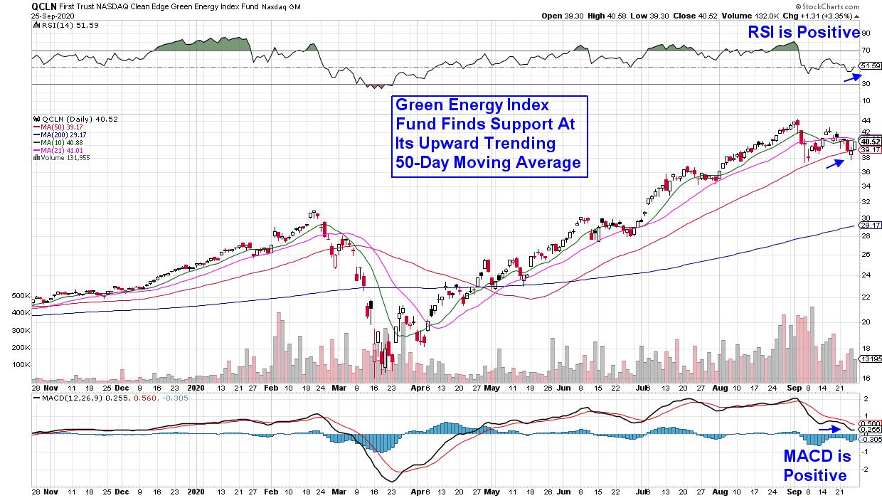
I'm talking about clean-energy stocks, which have sharply outperformed this year and currently appear poised for further upside despite downward pressures seen elsewhere in the markets. Below is a chart of QCLN, which is an index fund with a broad portfolio of US firms in the clean energy industry.
DAILY CHART OF CLEAN EDGE GREEN ENERGY INDEX FUND (QCLN)

QCLN is up 58% year-to-date and the Index counts Nio Inc. (NIO) and Tesla (TSLA) among its top holdings. Both companies are benefitting from a surge in new-energy vehicle sales in China, which has helped push shares up tremendously year-to-date. A break back above its 10- and 21-day moving averages would be bullish for QCLN.
In other areas, Energy experts say alternative power sources are finally economically viable after being subsidized by the government for years. Warren Buffet's January announcement of his intent to build the largest solar-power plant in the U.S. helped push Solar stocks to 52-week highs prior to the bear market.
Buffet's embrace of solar energy makes it clear that the technology to generate and store this alternative power has become progressively more cost-competitive with other sources. The move also helps fulfill his environmental promises from the Paris Climate Change Conference while making economic sense for Berkshire Hathaway.
DAILY CHART OF INVESCO SOLAR ETF (TAN)

State mandates are also driving wider adoption of renewable energy after Nevada's announcement that utilities must get at least half their power from this source by 2030. Just 2 days ago, California announced plans to ban sales of gas-powered cars by 2035. These demands coincide with analysts' expectations that solar and wind power will cost less than coal by 2030.
Residential solar energy provider Sunrun Inc. (RUN) has been a big winner in this alternative energy and this week's news of a 14-year high in new home sales helped pushed the stock to new highs.
DAILY CHART OF SUNRUN INC. (RUN)

Demand for RUN has kept the stock in a strong uptrend while finding support at its upward trending 10-day moving average. With its RSI and MACD in positive territory, the stock is poised for further upside.
While I've marked these stocks as having generally bullish charts, you can review today's MEM Edge Show for my refined view of the current market's condition, as well as an outline of other industries and stocks that are setting up to be leadership areas once we turn bullish again.
In addition, trial my bi-weekly MEM Edge Report for up to the minute insights into the markets. Our Watch List of stocks is continuing to expand and we expect strong upside with your 4-week trial at a nominal fee. Precise entry and exit points are also provided with this top-performing newsletter. Check out a sample here!
Warmly,
Mary Ellen McGonagle / MEM Investment Research
|
| READ ONLINE → |
|
|
|
|
|
| MORE ARTICLES → |
|
 What a week to be back hosting another episode of "Your Daily Five". As I'm sure you heard, we held a major LIVE event on StockCharts TV yesterday - "Introducing StockChartsACP: The Future of Technical Analysis". Chip, Dave and I sat down for an exclusive series of in-depth discussions with charting legends like John Murphy, Ralph Acampora, Martin Pring, Larry Williams, Arthur Hill, Dave Landry, Mish Schneider and others. It was a wonderful opportunity to hear their perspectives on how charting and technical analysis have evolved over the years and, of course, dig into the features of ACP to explore how these experts are using the platform in their own approach to today's markets.


 A consistent imperfect routine is way better than an inconsistent perfect routine.