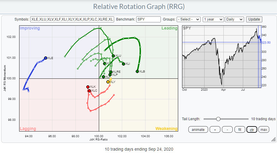
The Relative Rotation Graph above shows the rotation for US sectors on a daily basis over roughly the last two weeks.
The most important observation that we can make from this image is that the rotation currently is very erratic. The tails do not last very long in one quadrant or around a specific heading.
 IMHO, this expressed the uncertainty that is currently present among investors, which seems to match the rising VIX index since mid-August and the higher low that has been put into place this week. A rising VIX typically means uncertainty, which is the one thing investors do not like very much.
If we go back to the RRG, we see a high concentration of sectors inside the leading quadrant, which all have started to roll over very rapidly after hitting this quadrant. On the opposite side, inside the lagging quadrant, we find only two sectors, but they also have started to curl up pretty much immediately after entering that lagging quadrant.
By the way, it is interesting to see the dynamics between large and small sectors based on market capitalization. As this is a so-called "closed universe," the sum of all vectors from the benchmark to each sector weighted by market cap should come out at zero. Since XLK and XLC are large sectors (together they make up just under 40% of total market cap), this means by default that there need to be a lot of sectors on the opposite side. Along similar lines, XLE "must" be far to the left to compensate for the short vector to XLY, which is a much larger sector.
With the daily sector rotation sending us such an erratic and "nervous" message, I wanted to check the price structure on SPY on a daily basis.

In the July 7th edition of Sector Spotlight, I discussed the 322 level in SPY as being important as a resistance level. After the market broke that level, we saw one pullback that tested the 320/322 area as support, before taking off and rallying to a new all-time-high at 357 at the start of this month.
The decline off of this high has now again reached the 320/322 zone, and we have to wait and see if it will again provide the much-needed support for the market.
However, the market structure looks quite different this time. In July, SPY was in an uptrend showing higher highs and higher lows. Currently, today's price action marks the start of a new series of lower lows and lower highs. The recent high at 342 is lower than the 367 peak and, wherever the next low comes in, it will definitely be lower that the previous low at 331.50.
All in all, the short-term outlook, at least, does not look great for SPY.
Given the level of uncertainty, I prefer a weekly RRG to get a handle at sector level.

The main takeaways from this image are:
Technology and Communication Services are (still) inside the weakening quadrant and heading further towards the lagging quadrant. Both sectors are still at a high reading on the RS-Ratio scale, which could allow for a turn back up before hitting lagging, but the increasing RRG-Velocity (distance between observations) is not supportive at the moment.
Consumer Discretionary seems to be holding up best inside the leading quadrant, with a very short tail that includes a stable relative trend (in this case upward).
Materials and Industrials are both located inside the leading quadrant on both the daily and the weekly RRG. They are also both going through a setback on the price chart, but, so far, this has not harmed their uptrends.
If this rotation will indeed be bigger, more important and potentially more harmful than what we have seen so far, the sectors inside the improving quadrant, XLP and XLF - and, to a lesser extent, XLU and XLRE inside the lagging quadrant - should be watched for outperformance (shelter), with XLU and XLP being the obvious defensive sectors.
Rotation in the coming week(s) should provide us with a clearer picture.
#StaySafe, --Julius
My regular blog is the RRG Charts blog. If you would like to receive a notification when a new article is published there, simply "Subscribe" with your email address.
Julius de Kempenaer
Senior Technical Analyst, StockCharts.com
Creator, Relative Rotation Graphs
Founder, RRG Research
Host of: Sector Spotlight
Please find my handles for social media channels under the Bio below.
Feedback, comments or questions are welcome at Juliusdk@stockcharts.com. I cannot promise to respond to each and every message, but I will certainly read them and, where reasonably possible, use the feedback and comments or answer questions.
To discuss RRG with me on S.C.A.N., tag me using the handle Julius_RRG.
RRG, Relative Rotation Graphs, JdK RS-Ratio, and JdK RS-Momentum are registered trademarks of RRG Research.


