| THIS WEEK'S ARTICLES |
| Market Roundup |
| The Gold Bull Market is Likely to Extend Once the Correction Runs its Course |
| by Martin Pring |
Coppock Indicator Using Quarterly Data is Bullish
Long-term Charts show that gold is in a firm uptrend. Take Chart 1, for instance; it tracks the price of the yellow metal on a quarterly basis using a quarterly measure of the Coppock Curve, a momentum indicator originally devised by Edmund Coppock. Coppock once asked a medical professional how long it generally took for human beings to overcome a great shock, such as a relative or good friend's unexpected death from a car accident. The answer was between 11 and 14 months. Utilizing that knowledge, he constructed an indicator that combined an 11- and 14-month ROC. Since that formula returned a fairly jagged result, he decided to smooth it with a 10-month weighted moving average, the result being the Coppock Curve or Indicator.
Coppock applied the curve to the US stock market by observing when its slope turned up from a position below zero, treating such events as primary trend bull market signals. Since markets take longer to build than tear down and because a bear trend fell more into his assessment of a timespan needed to overcome a tragedy, peaks were not treated as sell signals. Consequently, he chose only to observe the buys. Since its inception, technicians have applied the curve to other stock markets around the world, as well as bonds, currencies and commodities, with great success. Like all other indicators, though, it is no holy grail.
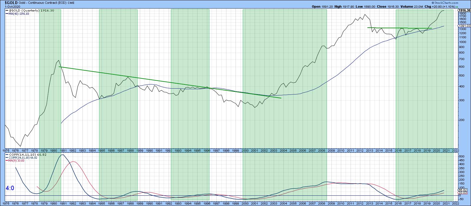 Chart 1 Chart 1
In Chart 1, the indicator has been plotted with the same parameters. The only difference is that quarterly time spans have been substituted for monthly ones. The shaded areas approximate when the Coppock Indicator is in a rising mode. That's happened five times in the last 45 years, each with a varying degree of success. It is currently in a bullish mode, but is not particularly overextended by historical standards. That suggests, but by no means guarantees, there is lots of upside potential yet to be realized.
Monthly-Based Gold Model is a Long Way from a Sell Signal
Chart 2 features my favorite gold model, whereby a 6-month EMA for the gold price is compared to its 15-month counterpart. Buy and sell signals are triggered as crosses above or below zero. The smaller red and green arrows flag the paucity of whipsaws that have developed since the mid-1970s. Also, note that all of the sell signals have, so far, occurred fairly close to the final peak. Given its current elevated reading well above the equilibrium zone, it would seem that the bull market has much further to run.
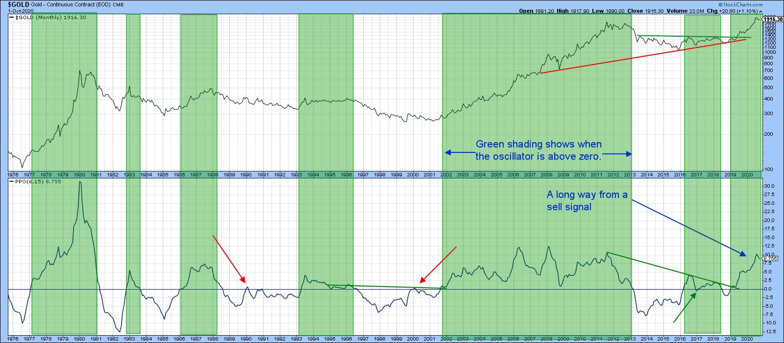 Chart 2 Chart 2
That said, Chart 3 reflects gold in a more accurate form by adjusting the price by the CPI. A rising trend indicates that it is successfully forming its role as an inflation hedge. Since 1971, it has certainly achieved this feat. However, if we take the 1980 or 2010 tops, it has not. That's likely to change if my assumption of higher prices holds true, as it is only about 15% below the 1980 high. In any event, apart from periods around these peaks, you could have purchased gold virtually at any time and outperformed inflation. Recently, the price ran into the secular resistance trendline, joining the 1980 and 2011 peaks, so it's not surprising that it has backed off a bit in the last few weeks.
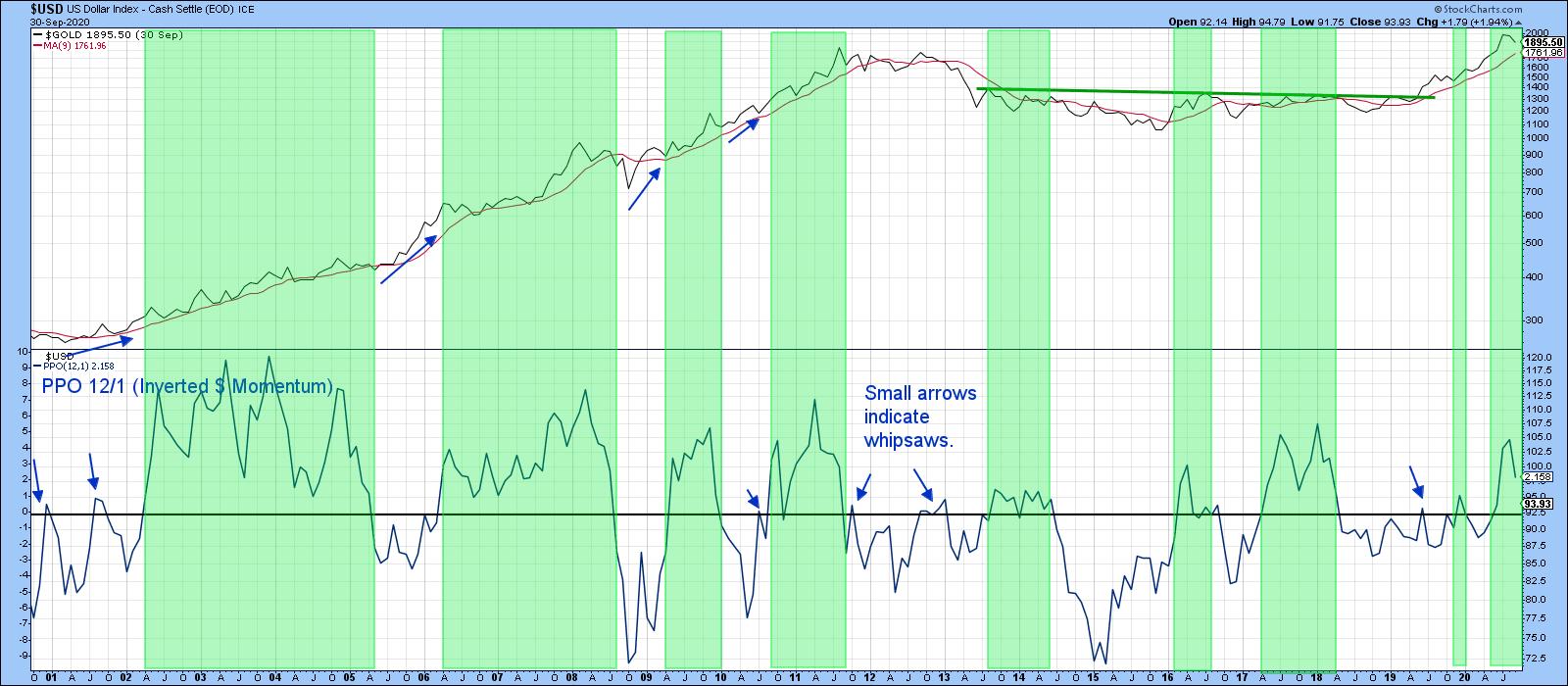 Chart 3 Chart 3
Inflation-Adjusted Gold at Mega Resistance
The oscillator in the lower window of Chart 4 features a PPO for gold relative to its 12-month EMA. Since the price of the yellow metal usually moves inversely to the dollar, the PPO has been calculated with the close representing the divisor. This enables swings in the oscillator to move in sympathy with those in the gold price. The green shadings approximate periods when it is above zero - in other words, when the Dollar Index is below its 12-month EMA. Most of the time, that's bullish for gold, and that has so far been true for the most recent signal. As long as the dollar is trending lower (higher in the chart), it will continue to be a bullish factor for gold. Note that even when the dollar is rising, as represented by the unshaded areas, it does not preclude the gold price from advancing either. You can see that from the blue arrows plotted against the price.
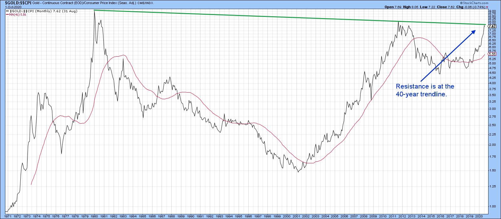 Chart 4 Chart 4
When Will the Correction Have Run its Course?
Chart 5 shows that the price of the Gold Trust has been zig-zagging down in a normal counter-cyclical way since the beginning of August. Markets are very sensitive to oversold conditions when the primary trend is bullish, so the recent oversold reading in the RSI is a positive sign. So too is the fact that the downside break of the red support line did not hold, whipsaws being a sign of a counter-cyclical move. There is therefore a sporting chance that the correction has already seen its low point. Those odds would be significantly enhanced in the event that the price can rally above the green down trendline and (blue) 50-day MA around $183.
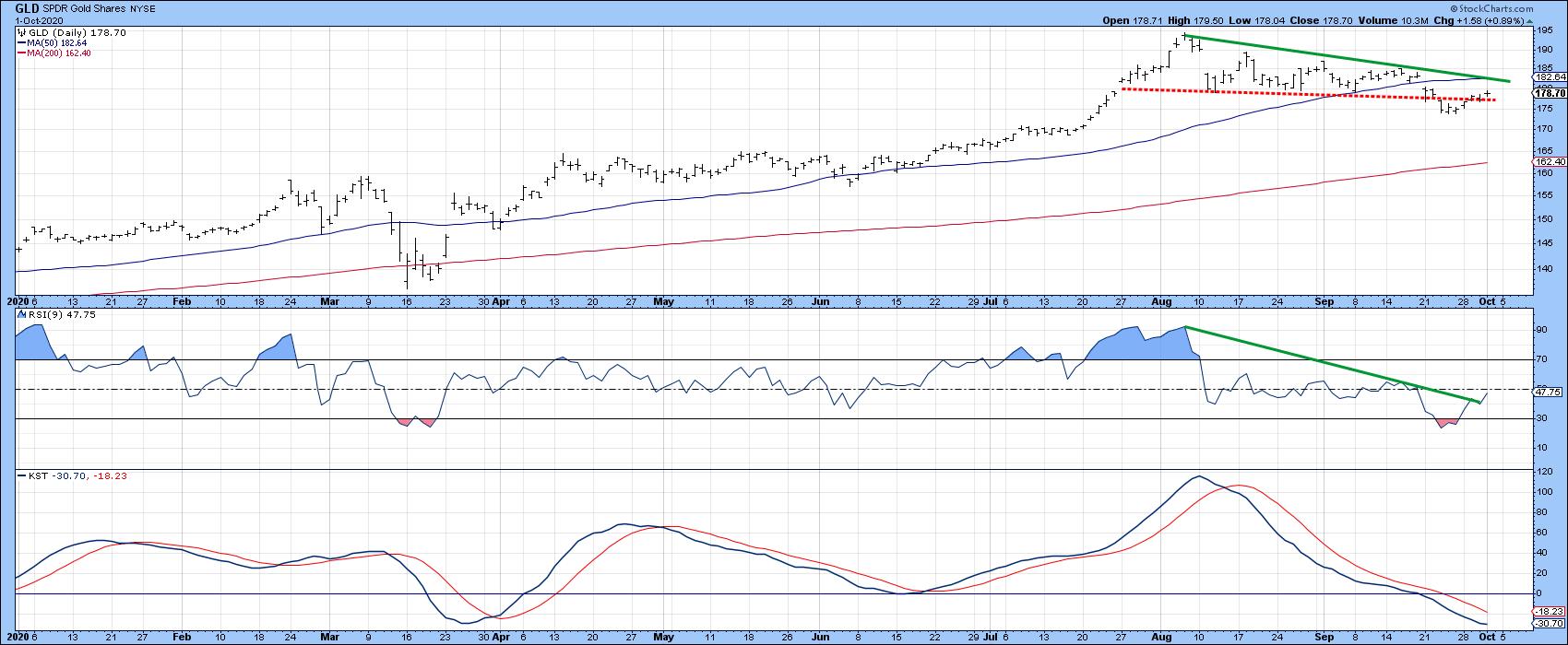 Chart 5 Chart 5
Editor's Note: This article was originally published in Martin Pring's Market Roundup on Thursday, October 1st at 5:49pm ET.
Good luck and good charting,
Martin J. Pring
The views expressed in this article are those of the author and do not necessarily reflect the position or opinion of Pring Turner Capital Group of Walnut Creek or its affiliates.
|
| READ ONLINE → |
|
|
|
| Art's Charts |
| Mind the Gap in SPY |
| by Arthur Hill |
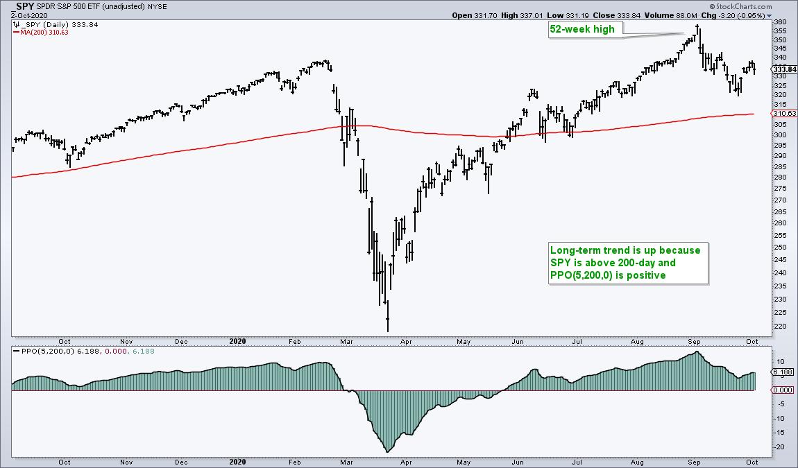
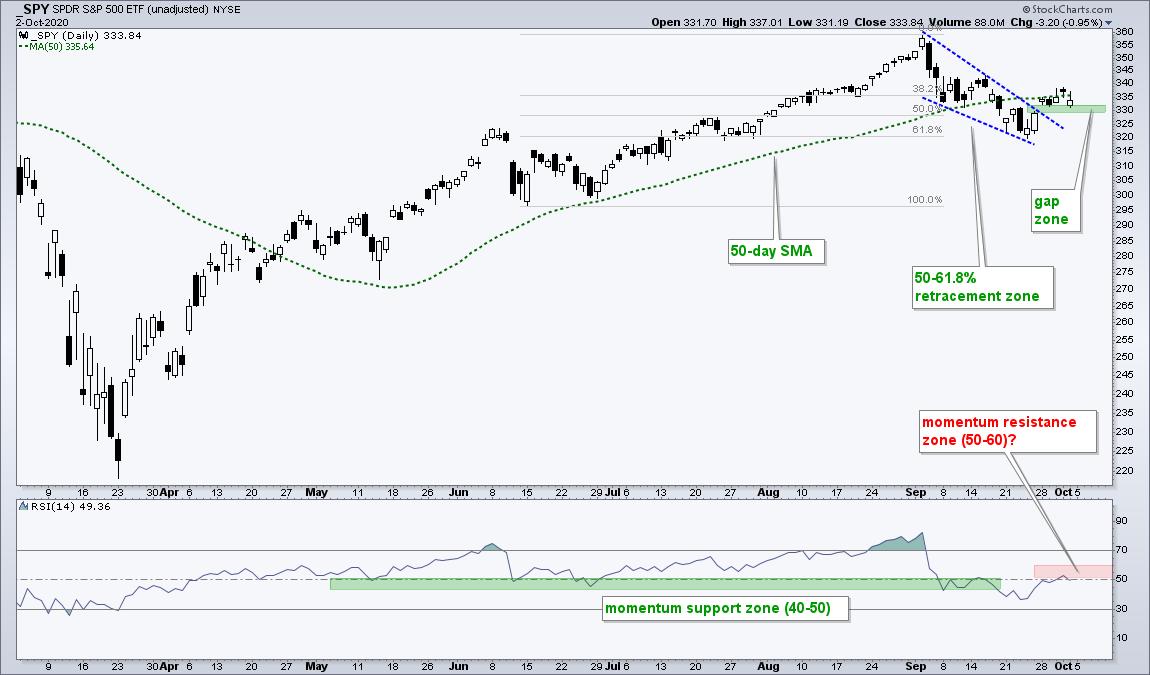
The S&P 500 SPDR (SPY) gapped up on Monday and broke out of a classic correction pattern. The breakout is bullish, but the coast is not entirely clear. Here's what to watch going forward.
First, the long-term trend is up as SPY hit a new high in early September and remains above the 200-day SMA, which is starting to flatten out. After hitting a new high, SPY retraced 50-61.8% of the June-Sept advance with a falling wedge that broke the 50-day SMA. Both the retracement amount and pattern are typical for corrections within a bigger uptrend.

SPY ended this small correction on Monday with a gap and wedge breakout. We have yet to see follow through because SPY fell back on Friday. Nevertheless, the gap and breakout are holding, which means the cup is half full. Chartists should watch this gap going forward because a close below 328 would fill the gap and negate the breakout.

The indicator window shows RSI with a potentially bearish configuration. Notice that the 40-50 zone held in June as SPY corrected, but SPY broke below this zone in the second half of September (green shading). RSI typically ranges between 40 and 80 during an uptrend and this range was broken. In a downtrend, RSI ranges from 60 to 20 with the 50-60 zone representing momentum resistance of sorts. The 50-day SMA may be providing resistance as well.
Short-term, SPY is between a rock and a hard place. There is a little resistance from the 50-day SMA and 50-60 zone for RSI, while there is support from the gap and breakout zone. At this point, I give the bulls the benefit of the doubt because the bigger trend is up and the breakout is holding. A close below 328 calls for a re-evaluation.
There were a lot of falling wedge and flag breakouts in the core ETF chartlist at TrendInvestorPro.com. These patterns were shown in last Saturday's chartbook and the breakouts were updated in Thursday's report. Subscribe today for immediate access to the annotated ETF ChartBook, Market Timing Models and Weekend video.
------------------------------
|
| READ ONLINE → |
|
|
|
|
|
| The Canadian Technician |
| Car Companies Other Than Tesla |
| by Greg Schnell |
This week, I hosted a one-hour special edition of Market Buzz on the Electric Car theme. While I have 29 currently on my list, there are some compelling charts other than Tesla to check out.
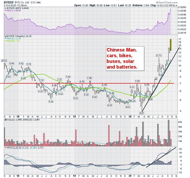
BYD Co. (BYDDF)
BYD is a large manufacturer competing in the electric vehicle space. They also compete in electric bikes, buses, solar panels and batteries. The wide perspective of this company makes a compelling place for all this renewable energy-related price action in the USA, and this week was no exception.

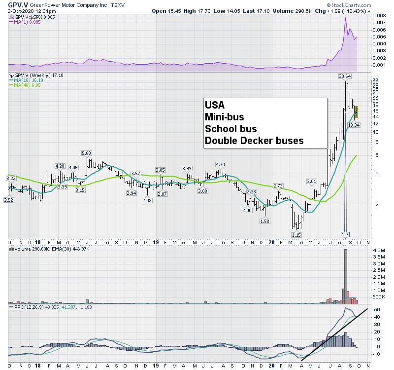
GreenPower Motor Company (GPV.V)
This company is California-based, but they have a Canadian stock market listing. They are also a niche manufacturer using electric propulsion. The focus on mini-buses, buses and double-decker fully electric buses is pretty unique. The stock has had a very strong move, but the recent pullback might be setting up a nice entry.

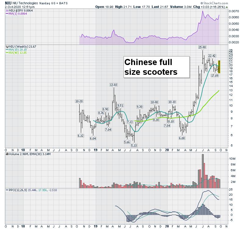
NIU Technologies (NIU)
This is another good example. NIU makes scooters similar to the Vespa Italian scooters. These are not like the lime scooters you see placed around metro centres. I like the chart shape, as it appears to be a flag pattern and it looks set to try the upside soon.

The variety between the different electric propulsion success stories is a compelling reason to investigate names other than Tesla.
If you are interested, here is a link to the one-hour special on Market Buzz.
The Move To ElectricThe renewable energy theme is starting to show up in Tom Bowley and Mary Ellen McGonagle's blogs. I also covered some renewable power companies in the Canadian Technician article this week. I think these themes are interrelated and, if you would like to be kept abreast of the changing investor focus, I'll be producing a newsletter about the various changes in the (Electric Vehicle) EV theme. You can sign up for the newsletter here; I will send you a list of all the electric vehicle companies I am following.
I think it is important to be looking across the space for new ideas. We appear to be on the verge of one of the biggest moves in the car business since the roaring 20s!
|
| READ ONLINE → |
|
|
|
| DecisionPoint |
| Going "Hog Wild"! & Free DP Trading Room with Julius de Kempenaer |
| by Erin Swenlin |
While I love bacon, I did not intentionally pick another "pig"-themed headline (referring to my article on the "pig's ear" chart pattern at this link). For this morning's DecisionPoint "Diamond Mine" trading room (for Diamonds subscribers only), I ran my "Momentum Sleepers" scan and found today's ChartWatchers' Diamond of the Week - and it just so happens to have "HOG" as its stock symbol. Yes, Harley-Davidson is a true diamond in the rough going into next week.
Before I get to that, I wanted to let the Relative Rotation Graph (RRG) enthusiasts know that "Mr. RRG" himself, Julius de Kempenaer, will be joining me in this Monday's FREE DecisionPoint Trading Room (10/5/2020). Register right now to ensure your space and receive the recording if you can't attend! Julius will show us how he uses RRG to trade!
What our subscribers are telling us THIS MONTH:
"I am familiar with most major technicians and have taken courses all over the world. My experience of 55 years has helped me navigate the shark infested waters. You are just one of what I always considered the best resources in the world. It certainly worked for me in the past." - Joe B.
"Thank you again for your valuable insight and spending the time to educate in addition to providing stock tips." - Brandon L.
"I think you are someone terrific with whom I can kick the tires of the stock market. I'm glad to say this at a time when the market has been rough." - Ralph G.
Today's ChartWatchers "Diamond of the Week":
Harley Davidson Inc (HOG)
EARNINGS: 10/20/2020 (BMO)
Harley-Davidson, Inc. is engaged in the manufacture and sale of custom, cruiser and touring motorcycles. It operates through the following segments: Motorcycles & Related Products; and Financial Services. The Motorcycles & Related Products segment manufactures, designs and sells at wholesale on-road Harley-Davidson motorcycles as well as motorcycle parts, accessories, general merchandise and related services. The Financial Services segment is comprised of financing and servicing wholesale inventory receivables and retail consumer loans, primarily for the purchase of Harley-Davidson motorcycles. The company was founded by William Sylvester Harley, Arthur Davidson, Walter C. Davidson, Sr. and William A. Davidson in 1903 and is headquartered in Milwaukee, WI.
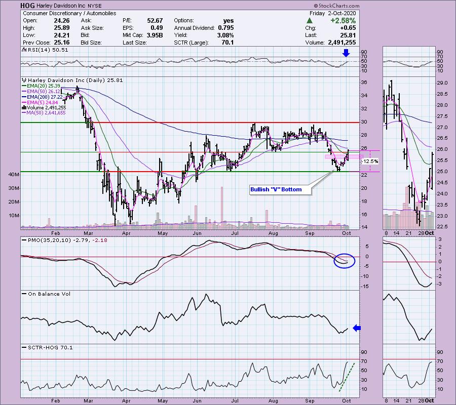
Nice breakout today on HOG! Yesterday, price had nearly closed up the gap and today it finished the job. The PMO has turned up and the RSI just hit positive territory. Volume is beginning to pick up. Price closed above the 20-EMA for the first time since it broke down. We now have a bullish "V" bottom. Once you see about 30% of the right side of the "V" form, the pattern has executed. The expectation of the pattern is a move past the left side of the "V". The SCTR just spiked, which suggests internal and relative strength.

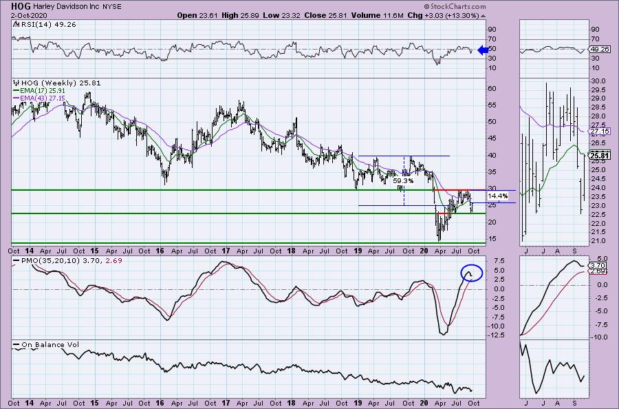
The weekly chart is improving. The PMO had topped in overbought territory, but it is attempting to turn back up above its signal line. The RSI is only tenths of a point away from positive territory above net neutral (50). We also have rising bottoms on the OBV. I'm not pleased that price hit resistance at the 2019 low, but if it could get back there, that would be a tidy 14+% profit. If it can breakout from there, upside potential moves to nearly 60%. I'll feel more bullish in the intermediate term when the PMO actually turns up and the RSI moves above 50.

Don't forget to register for the free trading room on October 5th! Information is below. Once you register, you'll be on the list to receive the recording should you be unable to attend. OR just sign up for our free email list on DecisionPoint.com to be notified of all free events and services!


Don't miss the October 5th free DP Trading Room! I will have guest Julius de Kempenaer from RRG Research. He will show us how he uses RRG to trade!
***Click here to register for this recurring free DecisionPoint Trading Room!***
Did you miss the 9/28 trading room? Here is a link to the recording (password: FT&&l3#K). For best results, copy and paste the password to avoid typos.
DecisionPoint Diamonds are becoming even more indispensable! Not only do you get 60 "Diamonds in the Rough" stocks/ETFs per month, with complete analysis including stops/targets... but there's a Friday Diamonds Recap that will look at the performance of each week's Diamonds and their prospects moving forward. Over the weekend, we clean the slate and start over again.
Included for my Diamonds subscribers only is a one-hour trading room, "The DecisionPoint Diamond Mine" on Fridays. It will provide an opportunity for us to talk live, review current and past Diamonds for possible entries/exits/stops/targets and take your questions and symbol requests in this intimate trading room.
DecisionPoint Alert subscribers continue to enjoy clear, concise analysis of the overall market, including Dollar, Gold, Gold Miners, Oil and Bonds from both Erin and Carl Swenlin. You will be prepared each market day knowing the implications of market behaviors for that day, week or month.
All subscribers have access to our exclusive ChartLists that are annotated and curated by Carl Swenlin. Know what he thinks is important for all of the sectors, indexes, indicators and more.
TRY US OUT! Don't forget, you can give our reports a try with a 1-week free trial by subscribing to the "Bundle" package and using coupon code: dptrialcw.
Happy Charting! - Erin
Technical Analysis is a windsock, not a crystal ball.
Helpful DecisionPoint Links:
DecisionPoint Alert Chart List (subscribers only)
DecisionPoint Golden Cross/Silver Cross Index Chart List (subscribers only)
DecisionPoint Sector Chart List (subscribers only)
DecisionPoint Chart Gallery
Trend Models
Price Momentum Oscillator (PMO)
On Balance Volume
Swenlin Trading Oscillators (STO-B and STO-V)
ITBM and ITVM
SCTR Ranking
|
| READ ONLINE → |
|
|
|
|
|
| ChartWatchers |
| Here are the 2 Stocks Leading Our Powerful Portfolios |
| by John Hopkins |
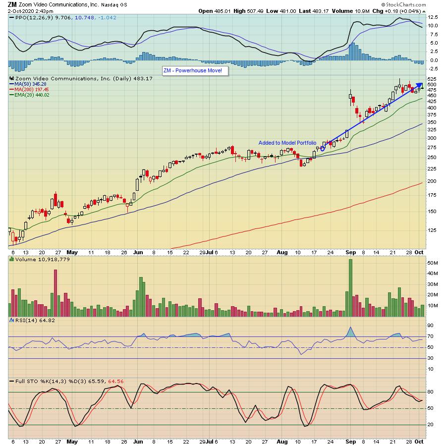
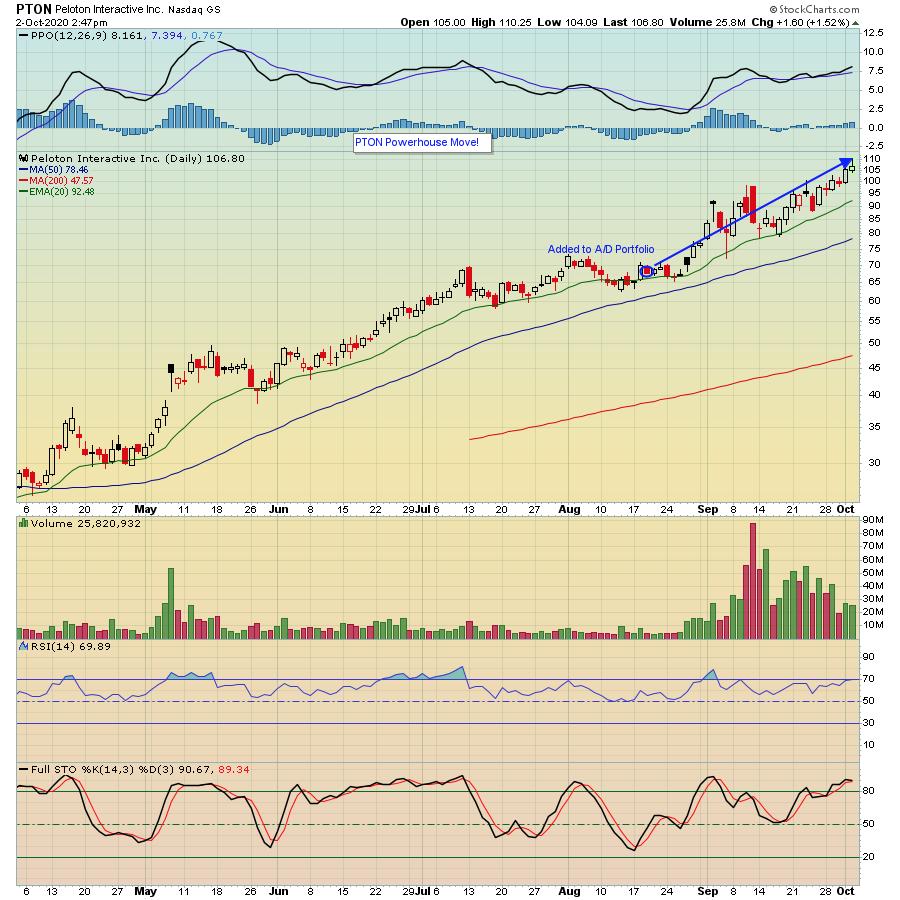
It's very true at the moment that this is a "stock pickers" market, meaning it really makes a big difference which individual stocks you are trading unless you focus more on ETFs. For example, as you can see below, one of the stocks in our "Model" Portfolio, Zoom (ZM) and one in our "Strong Accumulation/Distribution" (A/D) portfolio, Peloton (PTON), have had stunning results since being added on August 19.


In the case of ZM, it has climbed by over 76%, and in the case of PTON, a rise of over 56% compared to the S&P trading flat over the same period of time. These stocks, in turn, have helped to power the Model and A/D portfolios higher, as you can see below.


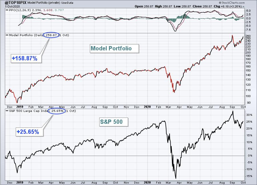
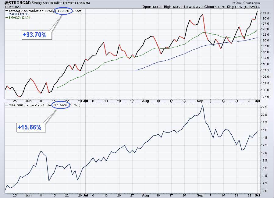
In the case of the Model portfolio, which was first established in November 2018, it has beaten the S&P by a wide margin - up over 158% through last Thursday compared to 25.6% for the S&P since its inception - and for this current quarter, it has risen by 13.9% compared to a flat S&P. The Accumulation/Distribution portfolio (first established in May of this year) has risen 33.7% compared to the S&P of 15.6% during the same period of time. That performance has been helped with some other solid winners in the portfolio, like FSLY and NIO, which has resulted in a return in the A/D portfolio for the current quarter of 12% compared to a flat S&P. Not too shabby!
As usual, not every stock in the Model or A/D portfolios has performed so well since they were added. But if you have a few powerhouses like ZM, PTON, FSLY and NIO in your trading corner, they can dramatically offset those that are lagging.
The process of finding those gems that make it into our portfolios includes scanning and narrowing the list down to a chosen few. They are then tracked using User-Defined Indexes. In fact, our Chief Market Strategist Tom Bowley will be conducting a Webinar this Saturday, October 3 at 11am ET, where he will demonstrate the basics of setting up a User-Defined Index on StockCharts.com. Tom will also demonstrate how our Model Portfolio was established and tracked using this UDI feature. Also, during the event Tom will reveal all 10 stocks in the Model and A/D portfolios - 20 in all - so you can see first hand which stocks are included. If you want to join Tom for this FREE event, just click on this link to get access to the Zoom link. And if you want to be reminded of the event in the morning, you can sign up for our free EarningsBeats Digest, which you will find immensely useful on the same page. Hope to see you there!
At your service,
John Hopkins
EarningsBeats.com
|
| READ ONLINE → |
|
|
|
| MORE ARTICLES → |
|
 Chart 1
 Chart 2
 Chart 3
 Chart 4
 Chart 5
