Coppock Indicator Using Quarterly Data is Bullish
Long-term Charts show that gold is in a firm uptrend. Take Chart 1, for instance; it tracks the price of the yellow metal on a quarterly basis using a quarterly measure of the Coppock Curve, a momentum indicator originally devised by Edmund Coppock. Coppock once asked a medical professional how long it generally took for human beings to overcome a great shock, such as a relative or good friend's unexpected death from a car accident. The answer was between 11 and 14 months. Utilizing that knowledge, he constructed an indicator that combined an 11- and 14-month ROC. Since that formula returned a fairly jagged result, he decided to smooth it with a 10-month weighted moving average, the result being the Coppock Curve or Indicator.
Coppock applied the curve to the US stock market by observing when its slope turned up from a position below zero, treating such events as primary trend bull market signals. Since markets take longer to build than tear down and because a bear trend fell more into his assessment of a timespan needed to overcome a tragedy, peaks were not treated as sell signals. Consequently, he chose only to observe the buys. Since its inception, technicians have applied the curve to other stock markets around the world, as well as bonds, currencies and commodities, with great success. Like all other indicators, though, it is no holy grail.
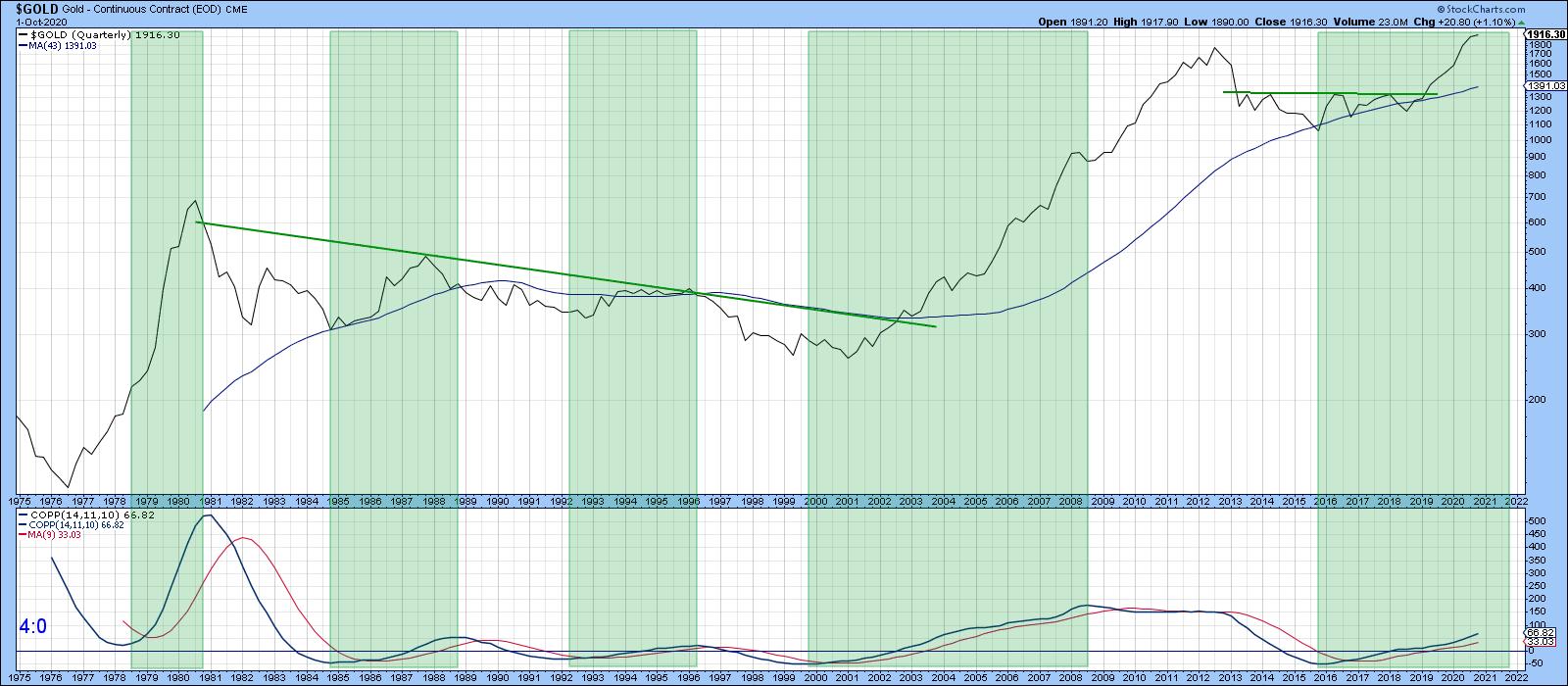 Chart 1
In Chart 1, the indicator has been plotted with the same parameters. The only difference is that quarterly time spans have been substituted for monthly ones. The shaded areas approximate when the Coppock Indicator is in a rising mode. That's happened five times in the last 45 years, each with a varying degree of success. It is currently in a bullish mode, but is not particularly overextended by historical standards. That suggests, but by no means guarantees, there is lots of upside potential yet to be realized.
Monthly-Based Gold Model is a Long Way from a Sell Signal
Chart 2 features my favorite gold model, whereby a 6-month EMA for the gold price is compared to its 15-month counterpart. Buy and sell signals are triggered as crosses above or below zero. The smaller red and green arrows flag the paucity of whipsaws that have developed since the mid-1970s. Also, note that all of the sell signals have, so far, occurred fairly close to the final peak. Given its current elevated reading well above the equilibrium zone, it would seem that the bull market has much further to run.
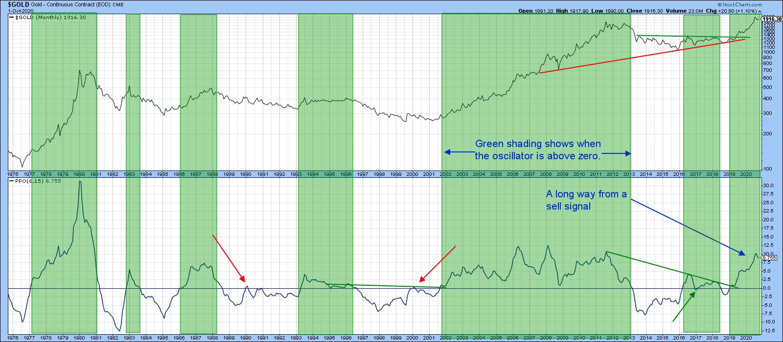 Chart 2
That said, Chart 3 reflects gold in a more accurate form by adjusting the price by the CPI. A rising trend indicates that it is successfully forming its role as an inflation hedge. Since 1971, it has certainly achieved this feat. However, if we take the 1980 or 2010 tops, it has not. That's likely to change if my assumption of higher prices holds true, as it is only about 15% below the 1980 high. In any event, apart from periods around these peaks, you could have purchased gold virtually at any time and outperformed inflation. Recently, the price ran into the secular resistance trendline, joining the 1980 and 2011 peaks, so it's not surprising that it has backed off a bit in the last few weeks.
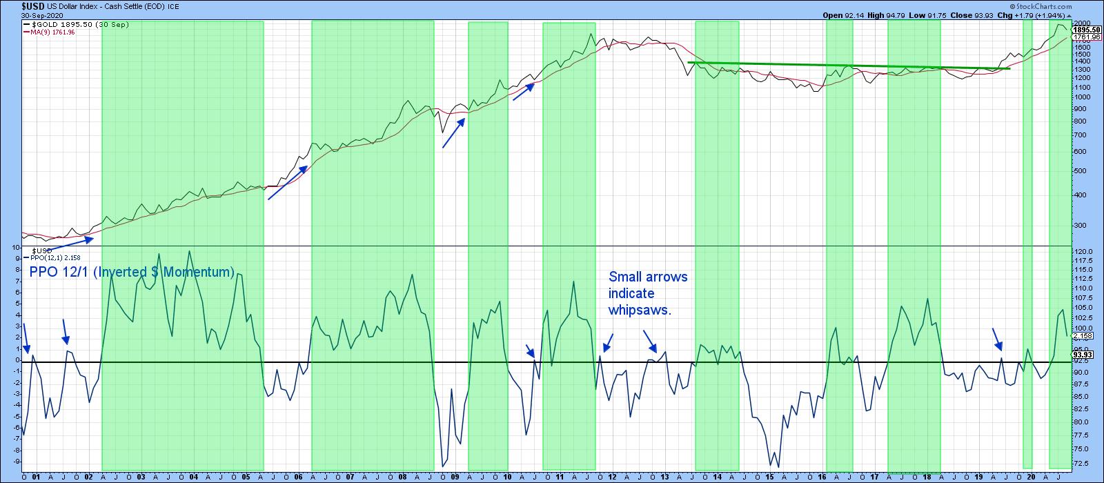 Chart 3
Inflation-Adjusted Gold at Mega Resistance
The oscillator in the lower window of Chart 4 features a PPO for gold relative to its 12-month EMA. Since the price of the yellow metal usually moves inversely to the dollar, the PPO has been calculated with the close representing the divisor. This enables swings in the oscillator to move in sympathy with those in the gold price. The green shadings approximate periods when it is above zero - in other words, when the Dollar Index is below its 12-month EMA. Most of the time, that's bullish for gold, and that has so far been true for the most recent signal. As long as the dollar is trending lower (higher in the chart), it will continue to be a bullish factor for gold. Note that even when the dollar is rising, as represented by the unshaded areas, it does not preclude the gold price from advancing either. You can see that from the blue arrows plotted against the price.
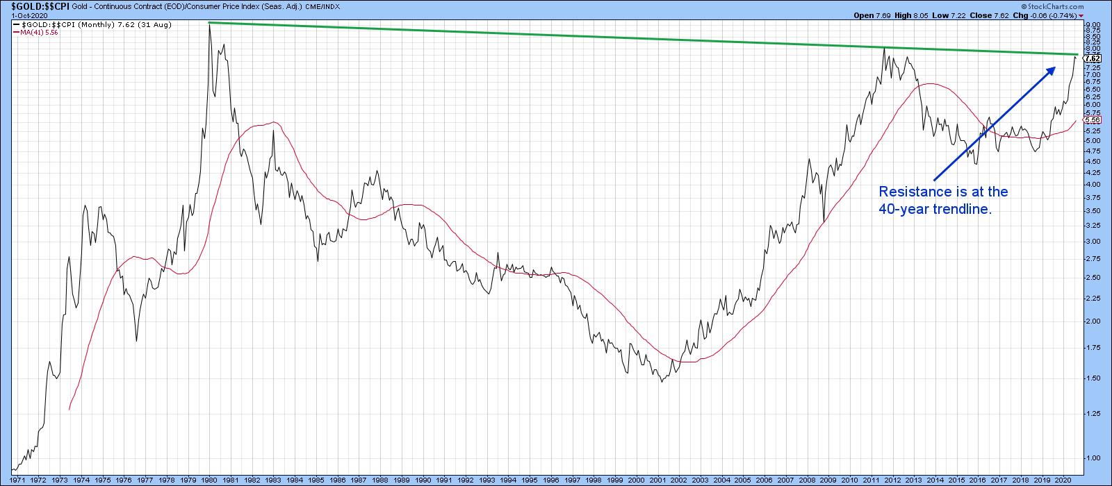 Chart 4
When Will the Correction Have Run its Course?
Chart 5 shows that the price of the Gold Trust has been zig-zagging down in a normal counter-cyclical way since the beginning of August. Markets are very sensitive to oversold conditions when the primary trend is bullish, so the recent oversold reading in the RSI is a positive sign. So too is the fact that the downside break of the red support line did not hold, whipsaws being a sign of a counter-cyclical move. There is therefore a sporting chance that the correction has already seen its low point. Those odds would be significantly enhanced in the event that the price can rally above the green down trendline and (blue) 50-day MA around $183.
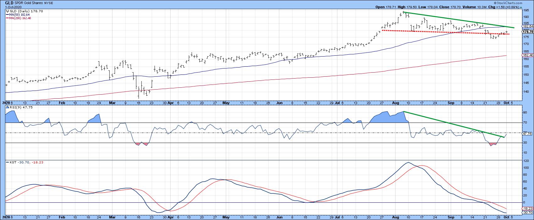 Chart 5
Editor's Note: This article was originally published in Martin Pring's Market Roundup on Thursday, October 1st at 5:49pm ET.
Good luck and good charting,
Martin J. Pring
The views expressed in this article are those of the author and do not necessarily reflect the position or opinion of Pring Turner Capital Group of Walnut Creek or its affiliates.