| THIS WEEK'S ARTICLES |
| The Market Message |
| Big Tech Stocks Weaken |
| by John Murphy |
Four of the biggest tech stocks are weakening today after several of them reported decent earnings. And they're weighing on the rest of the market. Chart 1 shows Amazon.com (AMZN) falling to the lowest level in a month. Chart 2 shows Apple (AAPL) doing the same. Chart 3 shows Microsoft (MSFT) also moving closer to its September low. Chart 4 shows Facebook (FB) falling below its 50-day average and starting to weaken as well. The only bright spot is Alphabet (GOOGL) which is trading higher today. Stock indexes are under pressure and appear headed toward a retest of their September lows. The Dow Industrials are trading below their September low in morning trading and testing their 200-day moving average (see Chart 5).
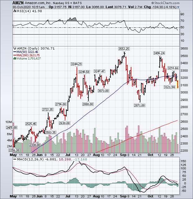 Chart 1 Chart 1
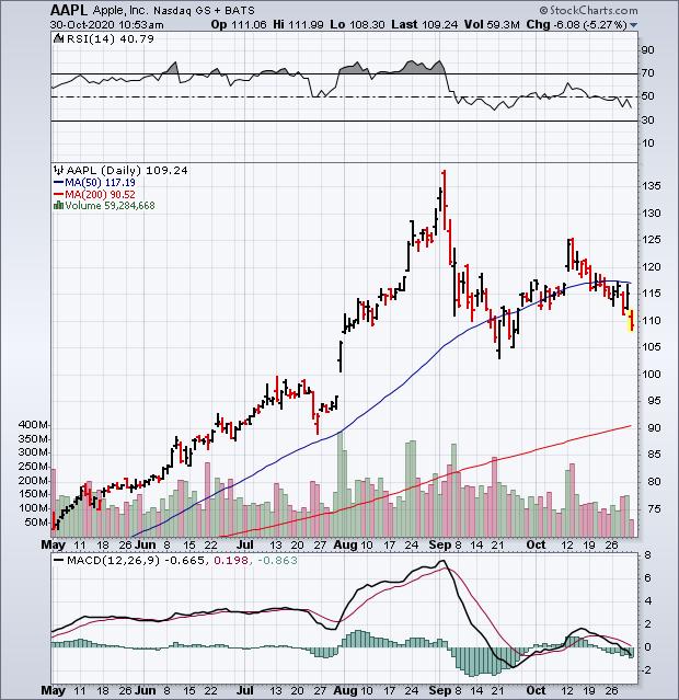 Chart 2 Chart 2
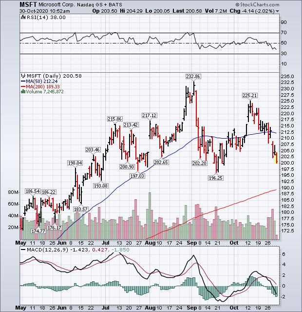 Chart 3 Chart 3
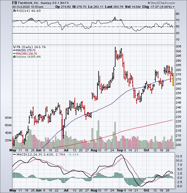 Chart 4 Chart 4
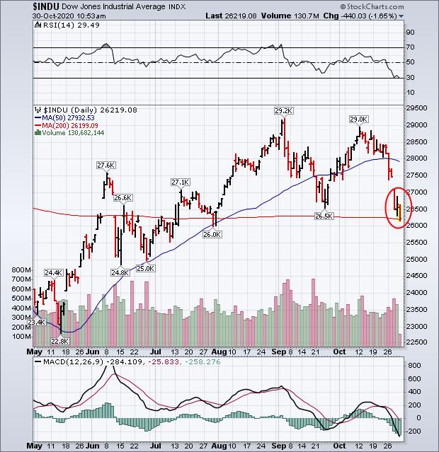 Chart 5 Chart 5
Editor's Note: This is an article that was originally published in John Murphy's Market Message on Friday, October 30th at 10:53am ET.
|
| READ ONLINE → |
|
|
|
| Art's Charts |
| Broad Selling Pressure, but Not Enough to Tip the Scales |
| by Arthur Hill |
 Breadth indicators, such as Advance-Decline Percent, measure the participation behind a move in the underlying index. Sometimes participation is so strong that it tips the scales and signals the start of an extended move. For example, 10-day EMA of SPX AD% triggered a bearish breadth thrust on February 25th and the S&P 500 extended lower. Subsequently, a bullish breadth thrust triggered on April 29th and the advance extended into early September. Downside participation was quite strong the last two weeks, but not enough to tip the scales and trigger a bearish breadth thrust. Let's investigate. Breadth indicators, such as Advance-Decline Percent, measure the participation behind a move in the underlying index. Sometimes participation is so strong that it tips the scales and signals the start of an extended move. For example, 10-day EMA of SPX AD% triggered a bearish breadth thrust on February 25th and the S&P 500 extended lower. Subsequently, a bullish breadth thrust triggered on April 29th and the advance extended into early September. Downside participation was quite strong the last two weeks, but not enough to tip the scales and trigger a bearish breadth thrust. Let's investigate.
AD% measures the percentage of net advances in an index (advances less declines divided by total issues). The chart below shows an example using the S&P 500. AD% is -80% when there are 50 advances and 450 declines ((50 - 450) / 500). This means 90% (450) of stocks in the S&P 500 declined. As we can see with the red shading on the chart below, AD% dipped to -80% or lower three times in the last ten days. There were 214 advances and 285 declines on Friday so AD% will show as -14.2% when updated.

Daily AD% readings can be quite noisy with regular moves above +80% and below -80%. A string of such moves can provide a signal or we can apply a moving average for smoothing. The next chart shows a 10-day EMA of AD%, which I cribbed from Marty Zweig, who also used a 10-day EMA for his breadth thrust indicator. A move above +30% triggers a bullish breadth thrust, while a move below -30% triggers a bearish breadth thrust. As the chart below shows, there was a bearish thrust on February 25th and a bullish signal on April 29th.
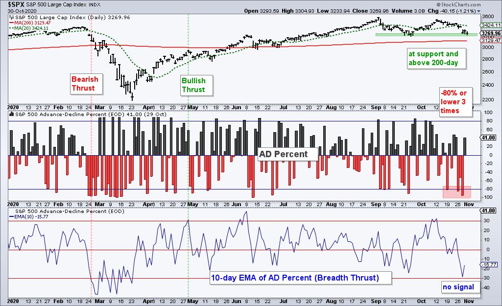
Even with the -14.4% reading on Friday, a bearish breadth thrust will not trigger because the 10-day EMA will be -26.06% when updated. This means the S&P 500 avoided a bearish breadth thrust, is above its 200-day, is short-term oversold and is trading near support from the September lows. Hmm...
You can find these indicators and dozens more on the Essential Breadth Indicator ChartList. This ChartList covers dozens of breadth indicators with over 100 custom charts. It is organized in a logical top-down format to streamline the analysis process. This list is available to subscribers at TrendInvestorPro.com.
Click here to take your analysis process to the next level!
----------------------------------------------------
|
| READ ONLINE → |
|
|
|
| The Canadian Technician |
| How Does This Resolve? |
| by Greg Schnell |
One of the world's most difficult issues seems ready to explode. As the pandemic numbers soar in the second wave, the real problem is the size of the base that it is surging from. When the first wave hit, it multiplied from a small base. In the second wave, the initial base is large. Multiplying from this level could meaningfully overwhelm the hospitals.
Better knowledge of how to treat the condition can help - but only if there is space in the hospital.
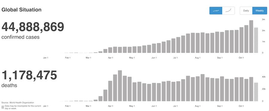
From an investor perspective, month-end is a great time to do wider analysis. We have just lived through the shortest bear market and one of the fastest bull markets ever. As this pandemic adds cases, what are the charts suggesting?
We are breaking the uptrend in this recent bull market. We are also trying to stay positive for the year. It is not uncommon for the stock market to top in September/October, and so far this appears to be setting up as one. Hindsight is 20/20 and, as this is 2020, we will all be looking back at this as a remarkable journey. The promise of riches ahead, as the charts sit dangerously close to a Wile E. Coyote setup. Which one will be right? The wild ride was one for the ages. I'll point out what I see and let you decide where we go from here. We are currently just above the zero line for unchanged on the year on this daily chart. So, if we wanted a chance to do 2020 over, we are here at the starting point once again.
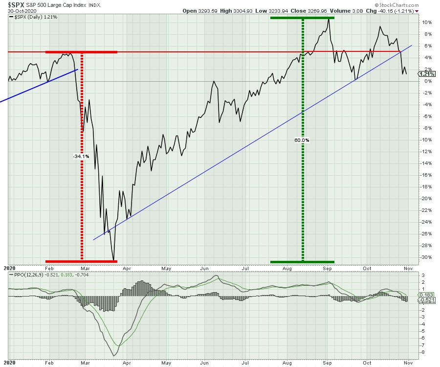
The real question is, what comes next?
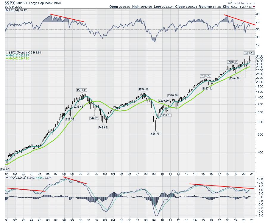
I like to look at the monthly first. A couple of things jump out. The lower highs on the monthly RSI are very concerning. The lower highs on the PPO momentum indicator are worrisome, but previous examples could break either way. However, the lower highs on the PPO, in concert with the lower highs on the RSI, are not a great pair.
It is hard to see the recent monthly price bars, so let's zoom in. This month is an inside bar, where it makes a lower high and a higher low than the previous bar. Inside and outside bars show up more often on the weekly charts and have more value there. An inside bar typically means indecision. Last month (September), we had an outside bar where the price action brackets the entire previous bar - higher high and a lower low. This is usually called a reversal bar. I'll point a few out on the weekly charts below. Looking at the closes on the last three months, we are making lower closes on each bar.
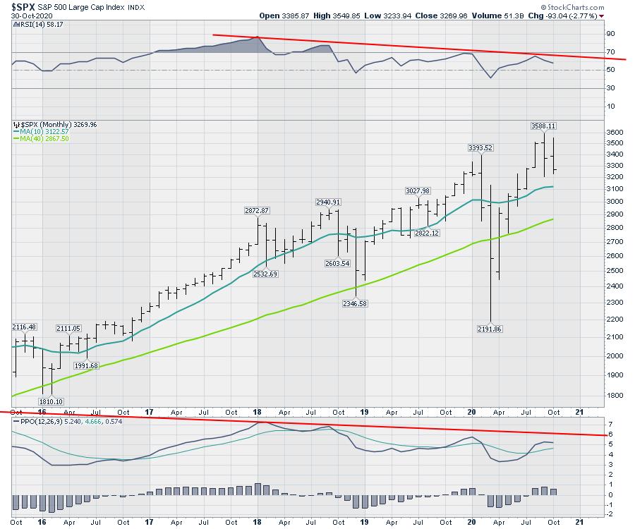
Staying with the chart above, the PPO histogram made a lower high, which suggests the momentum to go higher is clearly waning.
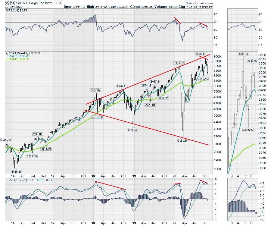
On the weekly chart below, PPO momentum is at a very high level. One of the smaller divergences is this lower high in October, so soon after the September high. The real question about that divergence is that the market shot up "in the most delightful way," to quote Mary Poppins. Meanwhile, the economy was struggling. Now, we have the economic indicators starting to slow while the COVID cases are starting to soar from a very high level. Yesterday, the COVID cases were coming in at 1 per second in the USA. In the Zoom panel, notice the inside bar on the second from the left (late June). On the September top, notice the outside bar. The last week of July was also an inside bar, and it resolved higher on the indecision. So these wide-ranging or narrow-ranging bars can help us spot changes in market direction.
The tech stocks are seemingly soaring to the sky. There's Apple (AAPL), a 4% grower trading as high as 34x earnings that has settled back to 27x earnings. It usually trades under 20x. So we get these church spire peaks in the market, where they zoom up to the last minute, then immediately reverse and plummet.
As day trading becomes a more fashionable hobby, it seems destiny has a way of taking their money away quickly.
The monthly charts are precarious. The optimist in me says stay hopeful for more government cocaine, as they all want to stay in power. Wind the debt spiral up like a tornado, where it's widest at the top, after starting from small beginnings. Governments worldwide are spending like drunks at the bar. Who wants to miss the party? Infrastructure bills and more stimulus, what could go wrong? The weekly chart is breaking. Can they stop it with accelerating COVID?
In the next week, we'll get the election and the Fed. After that is the OPEC group and perhaps a stimulus plan. All those could potentially lower the volatility. But if these corona cases start showing up, with hospitals teeming and people dying in the hallways, it is hard to know how that could influence us as it hits everyone closer to home this time, with such a large percentage of the population watching friends die alone in the hospital.
All that to say, it is a setup that shouldn't be ignored. I have a lot of other charts I am mapping and I will be doing my monthly conference call on Thursday, February 5th. If you would like to see the global macro view right now, you can find memberships on the gregschnell.com home page. I have monthly, quarterly and annually available.
|
| READ ONLINE → |
|
|
|
|
|
| DecisionPoint |
| S&P 10: Lots of Toppy Charts |
| by Erin Swenlin |
These are the ten stocks in the S&P 500 with the highest market capitalization, and they will have a significant effect on the movement of that market index. A quick review will show that they are all going through a topping process, which could prove to be an important turning point - or just a "pause to refresh." It is certainly good reason to stay alert and see how the process resolves on each one.
Apple (AAPL)
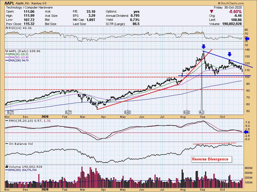
The biggest of the big, AAPL, influences the movement of the markets. For this reason, it's important to know its chart. Like the major markets, Apple is sporting what could be considered a double-top, but I also see another bearish formation, a descending triangle. Regardless of which it is, the minimum downside target remains the same at a conservative $85-$90. Additionally, there is a reverse divergence between price and the OBV. Note that OBV tops rose slightly, but price tops did not. Despite the influx of positive volume, price wasn't able to even challenge that September top. You can see the 4:1 split annotated. Carl pointed out on the DecisionPoint Show just prior to that split that typically you will see a decline after the split - and here we are.

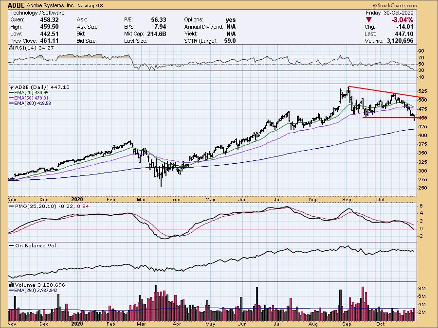
Adobe Systems, Inc. (ADBE)
Price has now broken support at the September bottom and has already breached both the 20/50-EMAs. The 200-EMA could possible hold as support, but we have a PMO that is now below the zero line and a very negative RSI.
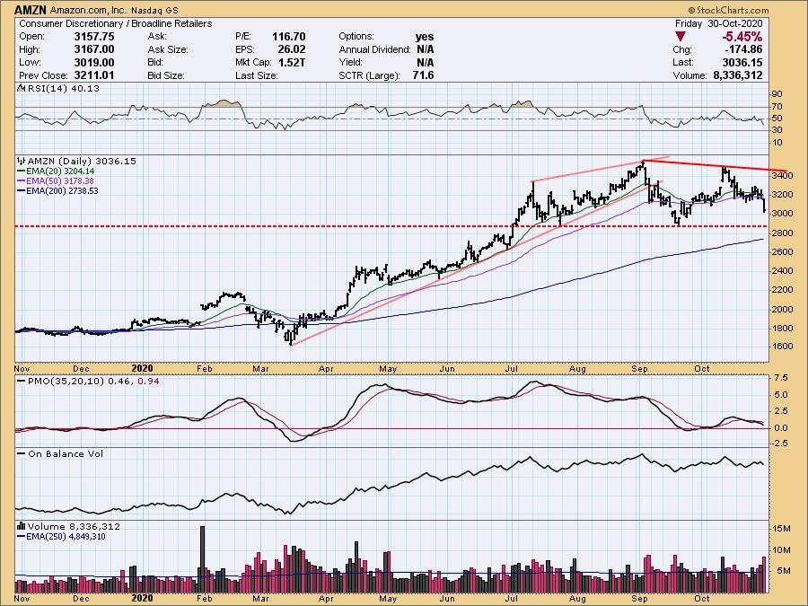
Amazon.com, Inc. (AMZN)
We have a double-top on AMZN, a PMO SELL signal and a negative RSI. Today, a decisive breakdown below the 20-/50-EMAs occurred. Support is nearing, but that is also the confirmation line for the bearish double-top.
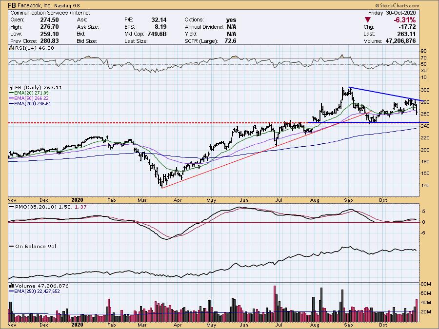
Facebook, Inc. (FB)
Here we have another descending triangle. The PMO has turned down, but is still above the zero line. The RSI is mostly neutral.
 Click here to register in advance for the recurring free DecisionPoint Trading Room! Recordings are available! Click here to register in advance for the recurring free DecisionPoint Trading Room! Recordings are available!
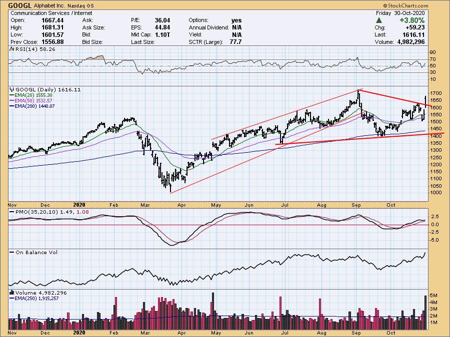
Alphabet (GOOGL)
This is the only stock in this group with a positive move on Friday, but notice that is closed at the low end of the daily range and didn't actually clear the declining tops line.

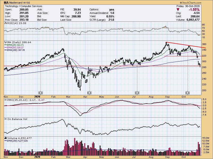
Mastercard (MA)
Mastercard has a very oversold RSI, which is generally a positive; however, we note that oversold conditions can persist in a bear market environment like March.

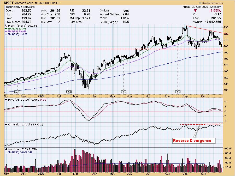
Microsoft Corp (MSFT)
Another double-top, with price readying to test support at the confirmation line and the 200-EMA. We have a reverse divergence as OBV tops are rising as price tops are declining.

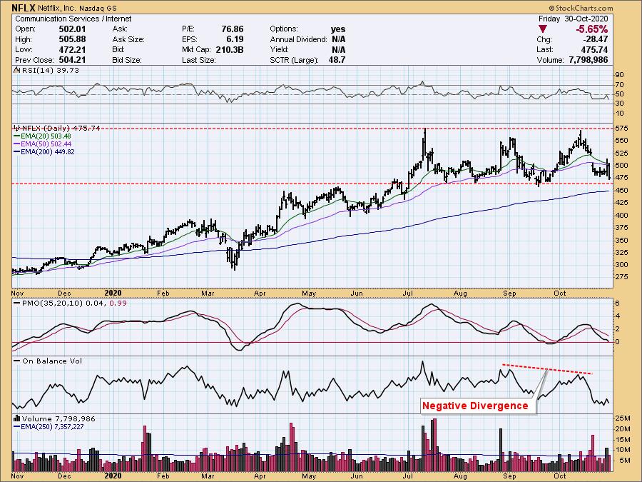
Netflix Inc (NFLX)
NFLX is in a trading range. The PMO is oversold, but the RSI is negative and not quite oversold. There is a negative divergence with the OBV. This support level needs to hold; otherwise, we should expect a difficult decline.

NVIDIA Corp. (NVDA)
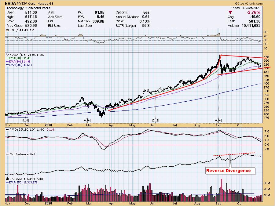
We have a symmetrical triangle on NVDA and price is trying to break down. These are typically continuation patterns, so we would expect an upside breakout. A bearish conclusion to a bullish pattern is typically especially bearish. We also have another reverse divergence. You'll note that, after the split in September, price declined and is currently trading lower.

Visa Inc (V)
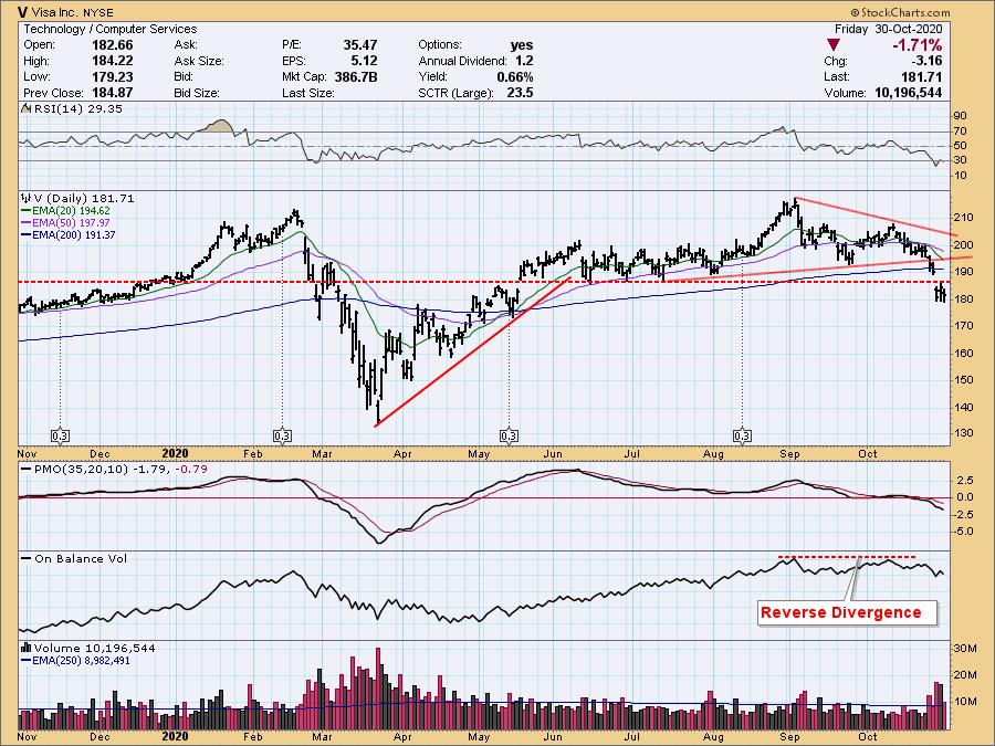
The RSI is oversold, but we can see it maintain that condition in a bear market or correction. We could be looking at an island reversal, but, given the falling PMO, the breakdown below the 200-EMA and other support levels, I would expect more downside for Visa.

Conclusion: These stocks will move the markets due to their large capitalization. It's important we have a grasp on what these charts display. Given the majority are in the process of topping and testing meaningful support levels, we should prepare for further weakness in the market going into the end of the year.
Happy Charting!
- Erin Swenlin, VP, DecisionPoint.com
Technical Analysis is a windsock, not a crystal ball.
Helpful DecisionPoint Links:
DecisionPoint Alert Chart List
DecisionPoint Golden Cross/Silver Cross Index Chart List
DecisionPoint Sector Chart List
DecisionPoint Chart Gallery
Trend Models
Price Momentum Oscillator (PMO)
On Balance Volume
Swenlin Trading Oscillators (STO-B and STO-V)
ITBM and ITVM
SCTR Ranking
|
| READ ONLINE → |
|
|
|
| ChartWatchers |
| Two Companies in Internet Sector Report Blowout Numbers - Who Will Be Next? |
| by John Hopkins |
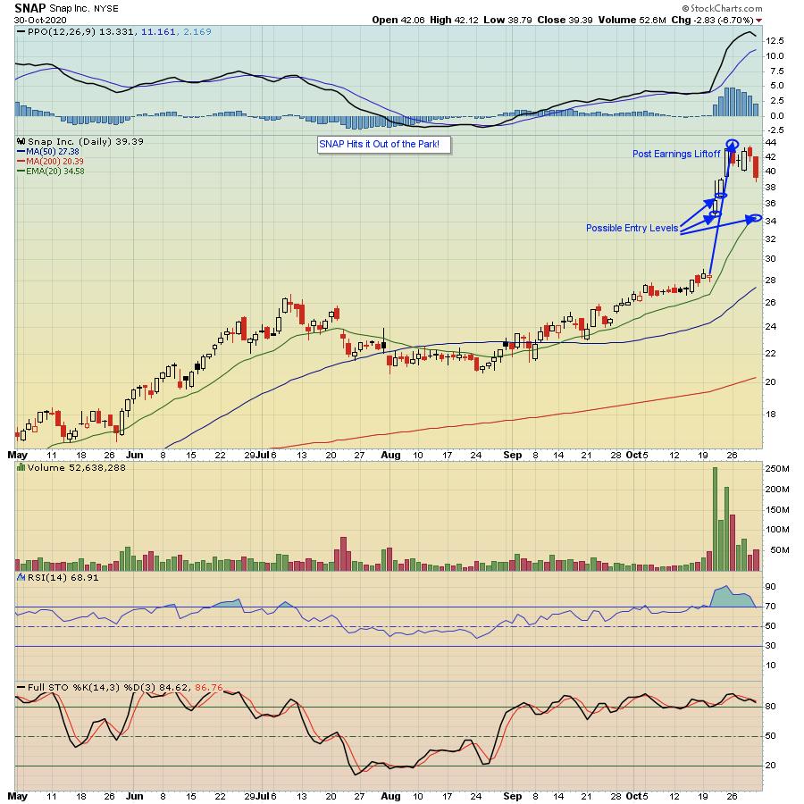
Earnings season is in full swing and, so far, we've seen some really solid results. That might seem counterintuitive, given the bloodbath of late; however, two companies that recently knocked it out of the park were Snap (SNAP) and Pinterest (PINS).

In the case of SNAP, you can see in the chart above that traders loved what they heard and saw, with the company rocketing almost 55% in just a few days after they released their numbers.
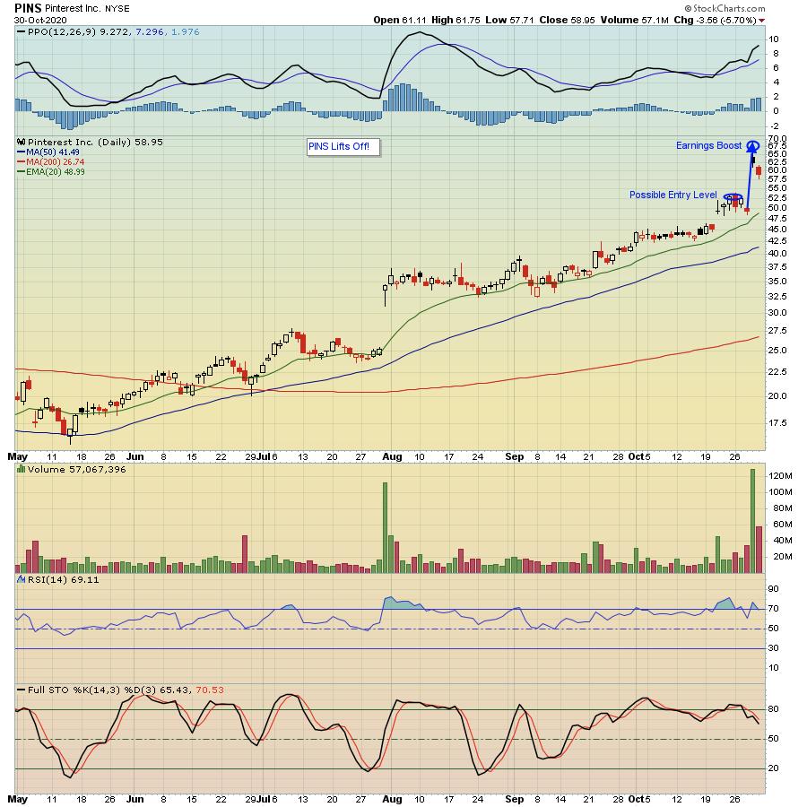
Then there was Pinterest, beating earnings expectations by a mile.

In the case of PINS, the stock rose 40% the day after it reported its numbers. Not too shabby!
The good news for traders is both stocks have pulled back, being swept lower as a result of the overall market slide. And even if they move lower, there's a decent chance both stocks will resume their move higher once the overall market settles down and as traders gravitate to the "best of the best." In fact, these are the types of stocks you should be tracking, especially those that beat both top and bottom line estimates, plus guide higher.
At EarningsBeats.com, that's what we do; scan for companies that beat both top and bottom line expectations and have promising charts. Those stocks end up on our "Strong Earnings ChartList" available to our members. We also like to "look forward" by identifying those stocks that have a high probability of beating expectations. In fact, our Chief Market Strategist Tom Bowley has identified another stock in the Internet Sector that is getting set to report that might see the same type of bullish reaction as SNAP and PINS. If you would like to see Tom's thoughts on the stock, just click on this link and sign up for our FREE EarningsBeats Digest; it will be highlighted in Monday's edition.
In the meantime, keep your eyes out for those companies that post strong numbers, as these are the stocks that are likely to be the most sought after, especially in a choppy market environment.
At your service,
John Hopkins
EarningsBeats.com
|
| READ ONLINE → |
|
|
|
|
|
| MORE ARTICLES → |
|
 Chart 1
 Chart 2
 Chart 3
 Chart 4
 Chart 5
 Breadth indicators, such as Advance-Decline Percent, measure the participation behind a move in the underlying index. Sometimes participation is so strong that it tips the scales and signals the start of an extended move. For example, 10-day EMA of SPX AD% triggered a bearish breadth thrust on February 25th and the S&P 500 extended lower. Subsequently, a bullish breadth thrust triggered on April 29th and the advance extended into early September. Downside participation was quite strong the last two weeks, but not enough to tip the scales and trigger a bearish breadth thrust. Let's investigate.


 Click
Click 