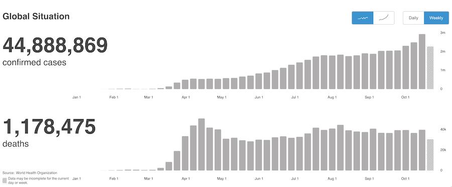
One of the world's most difficult issues seems ready to explode. As the pandemic numbers soar in the second wave, the real problem is the size of the base that it is surging from. When the first wave hit, it multiplied from a small base. In the second wave, the initial base is large. Multiplying from this level could meaningfully overwhelm the hospitals.
Better knowledge of how to treat the condition can help - but only if there is space in the hospital.
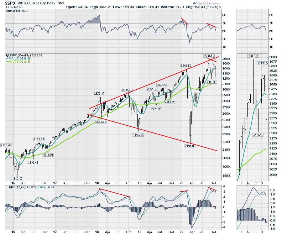
From an investor perspective, month-end is a great time to do wider analysis. We have just lived through the shortest bear market and one of the fastest bull markets ever. As this pandemic adds cases, what are the charts suggesting?
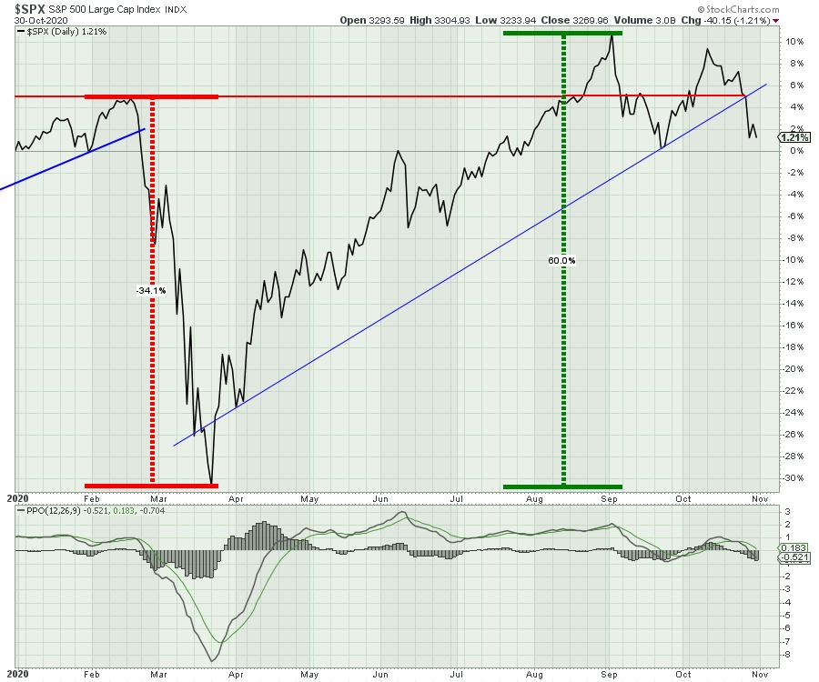
We are breaking the uptrend in this recent bull market. We are also trying to stay positive for the year. It is not uncommon for the stock market to top in September/October, and so far this appears to be setting up as one. Hindsight is 20/20 and, as this is 2020, we will all be looking back at this as a remarkable journey. The promise of riches ahead, as the charts sit dangerously close to a Wile E. Coyote setup. Which one will be right? The wild ride was one for the ages. I'll point out what I see and let you decide where we go from here. We are currently just above the zero line for unchanged on the year on this daily chart. So, if we wanted a chance to do 2020 over, we are here at the starting point once again.
The real question is, what comes next?
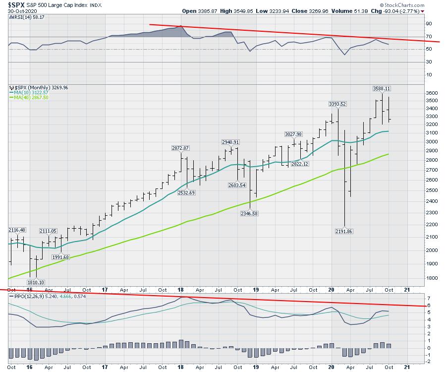
I like to look at the monthly first. A couple of things jump out. The lower highs on the monthly RSI are very concerning. The lower highs on the PPO momentum indicator are worrisome, but previous examples could break either way. However, the lower highs on the PPO, in concert with the lower highs on the RSI, are not a great pair.
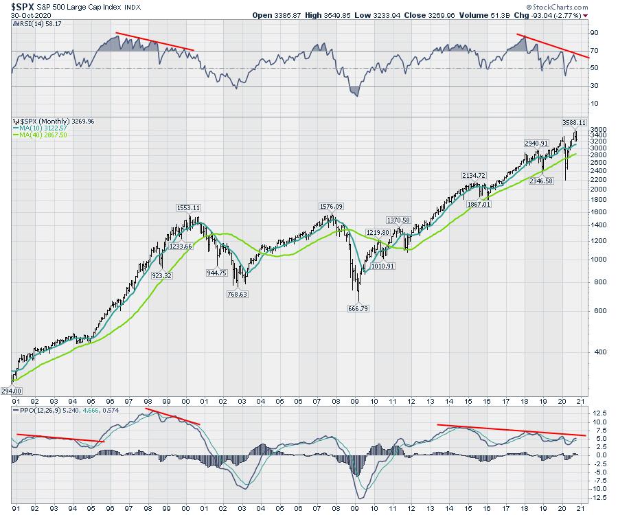
It is hard to see the recent monthly price bars, so let's zoom in. This month is an inside bar, where it makes a lower high and a higher low than the previous bar. Inside and outside bars show up more often on the weekly charts and have more value there. An inside bar typically means indecision. Last month (September), we had an outside bar where the price action brackets the entire previous bar - higher high and a lower low. This is usually called a reversal bar. I'll point a few out on the weekly charts below. Looking at the closes on the last three months, we are making lower closes on each bar.
Staying with the chart above, the PPO histogram made a lower high, which suggests the momentum to go higher is clearly waning.
On the weekly chart below, PPO momentum is at a very high level. One of the smaller divergences is this lower high in October, so soon after the September high. The real question about that divergence is that the market shot up "in the most delightful way," to quote Mary Poppins. Meanwhile, the economy was struggling. Now, we have the economic indicators starting to slow while the COVID cases are starting to soar from a very high level. Yesterday, the COVID cases were coming in at 1 per second in the USA. In the Zoom panel, notice the inside bar on the second from the left (late June). On the September top, notice the outside bar. The last week of July was also an inside bar, and it resolved higher on the indecision. So these wide-ranging or narrow-ranging bars can help us spot changes in market direction.
The tech stocks are seemingly soaring to the sky. There's Apple (AAPL), a 4% grower trading as high as 34x earnings that has settled back to 27x earnings. It usually trades under 20x. So we get these church spire peaks in the market, where they zoom up to the last minute, then immediately reverse and plummet.
As day trading becomes a more fashionable hobby, it seems destiny has a way of taking their money away quickly.
The monthly charts are precarious. The optimist in me says stay hopeful for more government cocaine, as they all want to stay in power. Wind the debt spiral up like a tornado, where it's widest at the top, after starting from small beginnings. Governments worldwide are spending like drunks at the bar. Who wants to miss the party? Infrastructure bills and more stimulus, what could go wrong? The weekly chart is breaking. Can they stop it with accelerating COVID?
In the next week, we'll get the election and the Fed. After that is the OPEC group and perhaps a stimulus plan. All those could potentially lower the volatility. But if these corona cases start showing up, with hospitals teeming and people dying in the hallways, it is hard to know how that could influence us as it hits everyone closer to home this time, with such a large percentage of the population watching friends die alone in the hospital.
All that to say, it is a setup that shouldn't be ignored. I have a lot of other charts I am mapping and I will be doing my monthly conference call on Thursday, November 5th. If you would like to see the global macro view right now, you can find memberships on the gregschnell.com home page. I have monthly, quarterly and annually available.
Good trading,
Greg Schnell, CMT, MFTA
Senior Technical Analyst, StockCharts.com
Author, Stock Charts For Dummies
Want to stay on top of the market's latest intermarket signals?
– Follow @SchnellInvestor on Twitter
– Connect with Greg on LinkedIn
– Subscribe to The Canadian Technician
– Email at info@gregschnell.com


