| THIS WEEK'S ARTICLES |
| John Murphy's Market Message |
| BOND YIELDS CONTINUE TO CLIMB |
| by John Murphy |
TEN-YEAR YIELD EXTENDS UPTREND... The uptrend in bond yields is continuing. The daily bars in Chart 1 show the 10-Year Treasury yield touching a new recovery high in today's trading. That puts the TNX at the highest level since last March. The horizontal line in Chart 2 shows its March high at 1.26% which is its next upside target. The 30-Year Treasury yield has already cleared its spring high and has reached 2.00%. That signals more upside to come for longer maturity bond yields. That means that bond prices are continuing their downtrend. Rising yields are helping make financial stocks one of the day's strongest sectors with help from bank stocks.
 Chart 1 Chart 1
 Chart 2 Chart 2
BANK SPDR NEARS NEW RECORD... The weekly bars in Chart 3 show the S&P Bank SPDR (KBE) rising above a falling trendline drawn over its 2018-2019 highs and nearing a test of its previous high formed three years ago. That's an encouraging picture. Its relative performance is also nearing an important test.
IMPROVING RELATIVE PERFORMANCE...Chart 4 plots a relative strength ratio of the KBE divided by the S&P 500 over the same period. It shows the ratio still in a long-term downtrend but rebounding over the past three months. The most important part of the chart is the falling trendline drawn over its 2018-2019 peaks. The ratio is nearing a test of that falling resistance line. The chart shows how cheap bank stocks are relative to the rest of the market. But that may be changing for the better. Especially if that falling trendline is exceeded.
 Chart 3 Chart 3
 Chart 4 Chart 4
|
| READ ONLINE → |
|
|
|
| ChartWatchers |
| Using Short-Term Momentum to Define the Primary Trend Direction of Stocks, Bonds and the Dollar |
| by Martin Pring |
They say that a rising tide lifts all boats, and so it is with freely traded markets. In the boating world, you can spot a rising tide with a steadily rising boat, but, with markets, the simplest approach is to observe a series of rising peaks and troughs. However, there is another way in which it's possible to observe subtle clues as too the direction of the main trend, which is by observing momentum characteristics. This article will focus on a 9-day RSI, as applied to current market conditions, but other oscillators, such as ROC, could also be used. The principles are the same. I like using the RSI for this particular exercise because its calculation allows you to compare the performance of different securities using a common standard. Moreover, since the RSI returns a series that cannot move above 100 or below zero, it's possible to assign overbought/oversold zones to specific levels for all securities.
There is one more point to make before examining the current position of three markets. These characteristics represent just one piece of evidence in our weight-of-the-evidence approach to trend analysis. It's only one piece because this technique, like all others, is no holy grail, and it fails from time to time.
Bull and Bear Market Characteristics
It's a well-known rule in technical analysis that markets are very sensitive to oversold conditions when the primary trend is positive. It's rather like putting your hand accidentally on a hot stove - touching it causes it to automatically pull away quickly. By the same token, overbought conditions in a bull market are far more plentiful and do not have anywhere near the downside power that they do in a bear market. Another bull market characteristic is that oscillators can remain in an overbought state for an extended period without the usual adverse effect on the price.
When the direction of the primary trend is down, things are reversed in that prices are extremely sensitive to overbought conditions, which themselves tend to be quite rare. That's rather like jumping up to the ceiling and hitting your head against it. The power of the main trend, gravity, pushes you down pretty quickly. In a bear market, oversold conditions are generally followed by trading ranges or weak/non-existent rallies. Let's take a look at some current charts to see some of these points demonstrated.
Chart 1, featuring the S&P, offers a great example. In the May to September 2020 period, the RSI was characterized by two things. First, overbought readings were generally high. Second, the blue shading reminds us that these overbought readings were persistent. Both are signs of a vibrant primary bull market, as is the fact that there were no oversold conditions generated during this period. Between September and November, as a sideways intermediate correction took place, we had two "hot stove" oversold bounces, as flagged by the two green arrows. Since last late last year, the RSI failed to reach the levels of intensity experienced prior to November, nor did the plethora of overbought conditions trigger anything meaningful on the downside. My conclusion is that this analysis continues to signal the all-clear for the bull market. That's backed up by many long-term indicators, especially by the S&P relative to its 12-month MA.
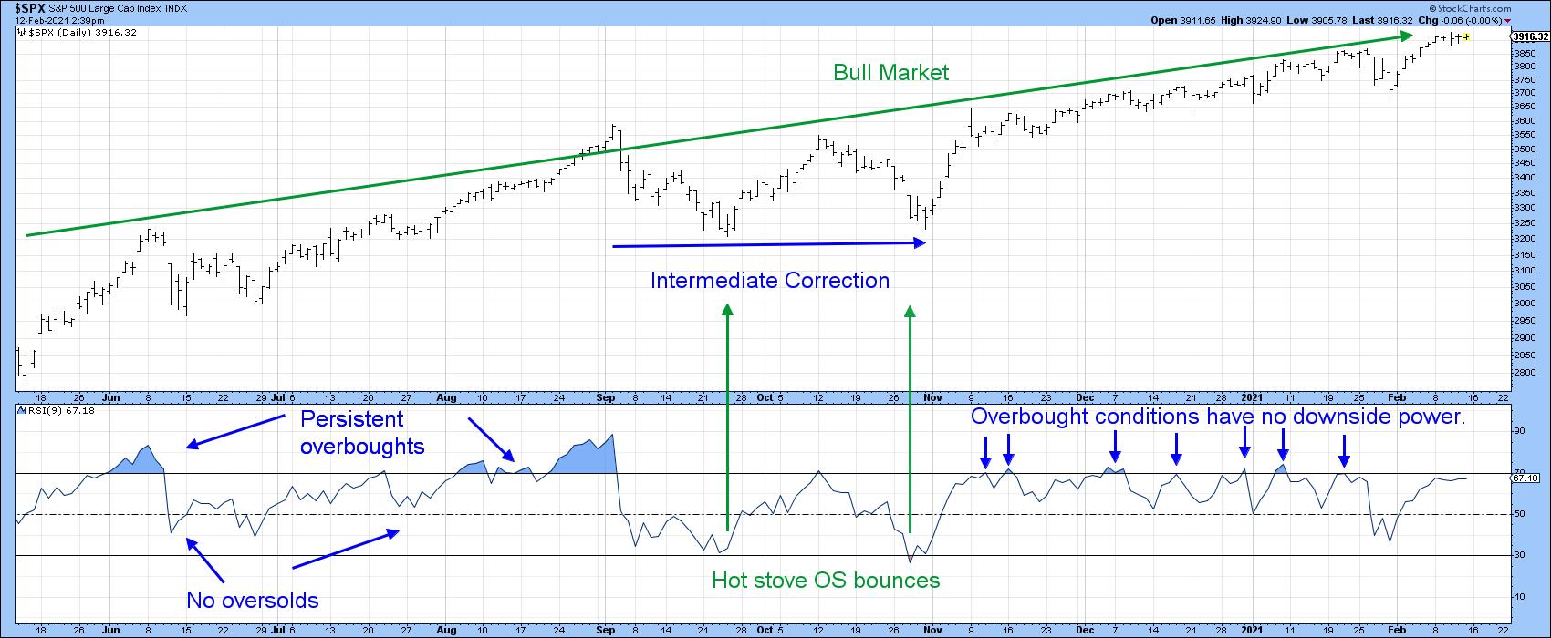 Chart 1 Chart 1
Chart 2, featuring bonds, tells us a different story, as we see a transition from primary bull to primary bear. June to March 2019-2020 was a clear-cut bull market with hot stove bounces and persistent overbought situations. This is then followed by a transitional period, where an oversold bounce in June is followed by a small persistent overbought condition. At that point, there was no indication from RSI characteristics that a bear market was likely to begin. However, by late October, a pattern of weak rallies following oversold conditions hinted at a bear. That pattern has continued since, thereby making it possible to construct a channel in which the RSI bear market trading range is below that of the bull market. Adding to the bearish characteristics was a persistent oversold, as recorded earlier this year.
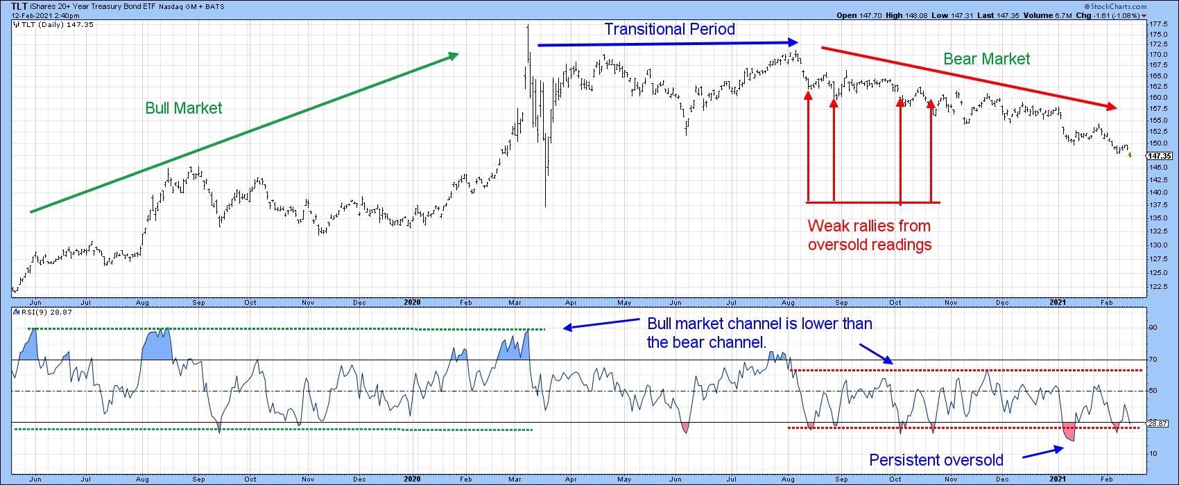 Chart 2 Chart 2
Chart 3 tells us we are on the right track, since two long-term indicators point in a primary bear market direction. That's the MACD dropping below its signal line and the price itself penetrating its 12-month MA. It's important to note that none of this guarantees a bear market, as there are no guarantees in technical analysis. However, it does place the odds strongly in favor of one.
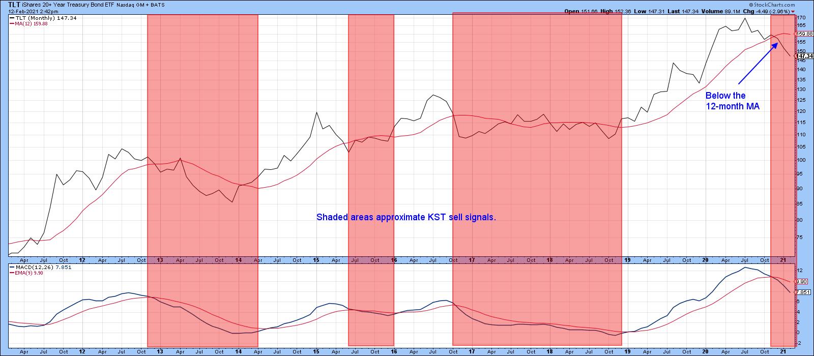 Chart 3 Chart 3
Finally, Chart 4 also offers us some more alternating bull and bear characteristics, but this time for the US Dollar Index. The first thing to note are the three arrows demonstrating the bull characteristic of a hot stove bounce from an oversold reading. We can also see the demarcation between the higher trading channel during the course of the bull market that ended last spring and the lower one reflecting the bear period since. One early hint that the trend had changed at the actual bull market high came from the RSI, which responded extremely quickly to two regular overstretched readings instead of experiencing a higher reading in excess of 70. Later on, in June, it became clearer that the tide may have turned, as the failure of the RSI to record an overbought reading was confirmed by a persistent oversold one.
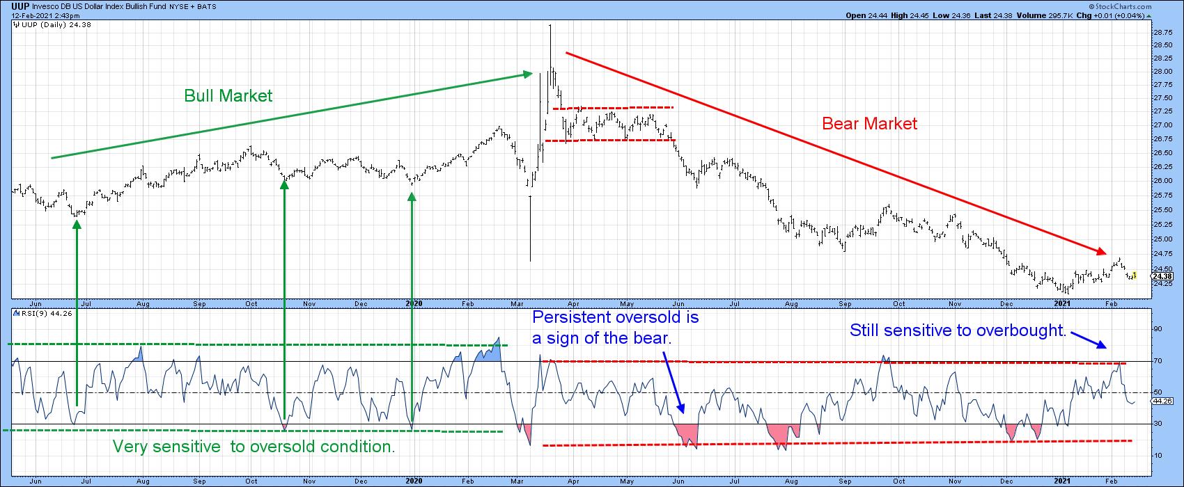 Chart 4 Chart 4
Most recently, the price has broken out from a small base in a similar way to late September's breakout. If the bear market is still in force, then the latest overbought reading should have failed. That's exactly what happened. It therefore meets two bear market characteristics - a failed pattern breakout, now confirmed by a double trendline break, and a quick response to an overbought reading with a decline. If the situation is to be saved, the price would need to take out out last week's high and register a stronger overbought reading. Such action would be the first sign that the price had begun a bull market. Unfortunately for the dollar bulls, it appears that we have another failed pattern, and that's certainly not encouraging.
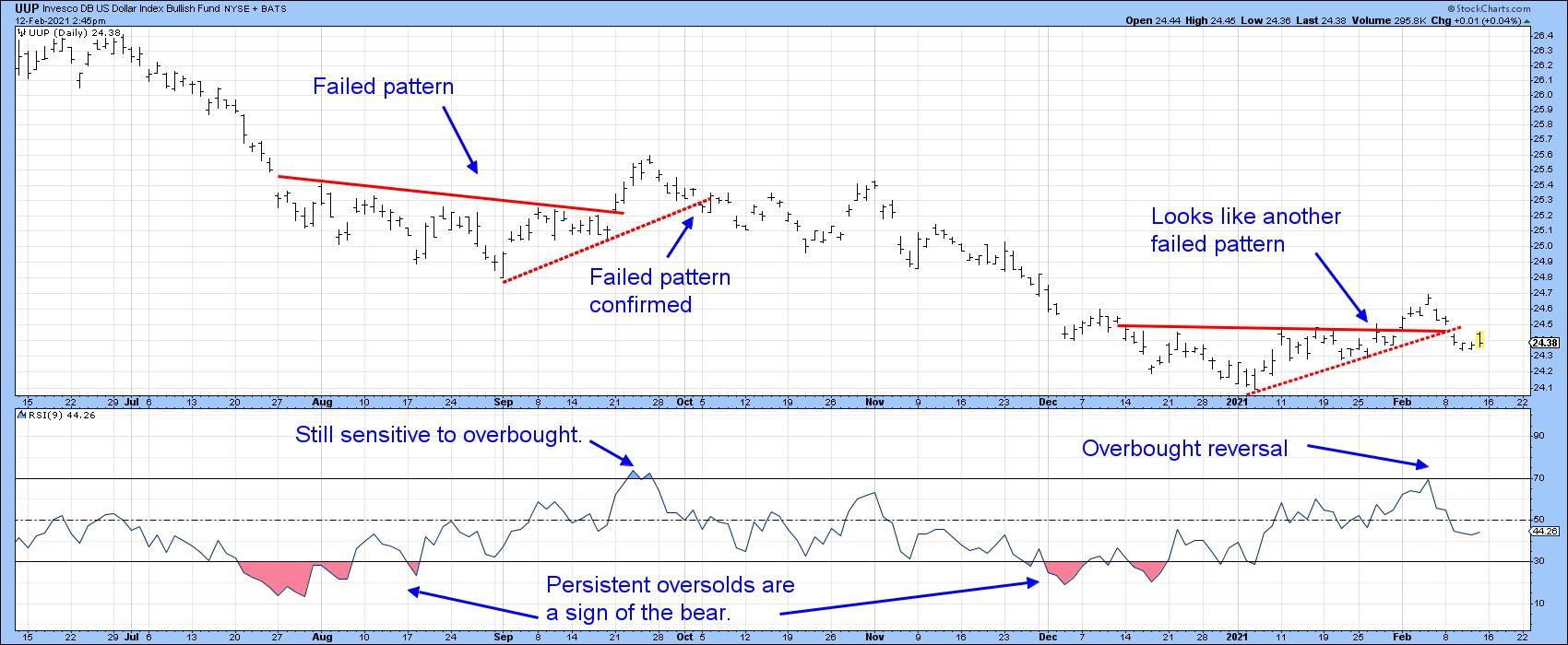 Chart 5 Chart 5
This is an updated version of an article previously published on Monday, February 8th at 4:35pm ET in the member-exclusive blog Martin Pring's Market Roundup.
Good luck and good charting,
Martin J. Pring
The views expressed in this article are those of the author and do not necessarily reflect the position or opinion of Pring Turner Capital Group of Walnut Creek or its affiliates.
|
| READ ONLINE → |
|
|
|
| ChartWatchers |
| Earnings Are Driving The Market, But There Are Two Road Blocks Ahead |
| by Tom Bowley |
The quarterly earnings that have poured out are utterly amazing. We're not just talking slight beats. Corporate America is CRUSHING it and the pent up demand hasn't even kicked in yet. In the meantime, the Fed is content to sit idly by with interest rates hovering near all-time lows. "Nirvana" might not be a strong enough term for what the bulls are feeling right now.
First, let's talk earnings. I keep a Strong Earnings ChartList (SECL), which we provide to our members every 1-2 weeks, as I update it. It involves many hours of researching the absolute best earnings reports, coupled with solid technical indicators. Our philosophy with regard to investing is unique in that we combine both fundamentals and technicals - and it's definitely a winning combination. When I updated our SECL earlier today, our final list comprised 400 companies. Just for fun, I added up the current quarterly earnings per share (EPS) for all 400 companies. The total was $546.98. The total estimates collectively were $419.53. That's an "average earnings beat" of $127.45, or more than 30%!!!
When a company is beating estimates by a wide margin and raising its estimates, Wall Street has to go through the process of recalculating valuations. When these increases occur with interest rates near all-time lows, valuations go through the roof. This isn't rocket science. For CPAs and/or MBAs, these are fairly basic calculations once the variables are determined. The key variables are (1) earnings growth rates to predict future earnings, and (2) interest rates used to discount those future earnings back to the present. In today's interest rate environment, you have to calculate what these future, rapidly-accelerating earnings are worth. This is the part that most of the stock market community simply doesn't understand. Wall Street is currently repricing those companies that are growing their earnings rapidly. It's not just that current earnings are 30% higher. These big earnings reports are changing future earnings growth rates. This has a tremendous multiplier effect. Those who don't understand today's valuations will really have difficulty a year or two from now after pent up demand sends growth soaring in so many industries and individual companies.
I did a little study, because the stock market doesn't go up evenly throughout the year, or even throughout the quarter. History repeats itself and Wall Street bids prices higher in anticipation of strong earnings and then profit taking hits that typically makes even the most bullish investors a bit nervous. Let me explain by comparing historical returns during each calendar quarter. I wanted to see how the stock market performs during the first half of a quarter (during earnings season) vs. the second half of a quarter (just after earnings season). Here are the numbers (annualized returns) on the S&P 500 since 1950:
Quarter 1 (January 1 - March 31):
- 1st half of quarter (Jan 1 - Feb 15): +12.27%
- 2nd half of quarter (Feb 16 - Mar 31): +4.68%
Quarter 2 (April 1 - June 30):
- 1st half of quarter (Apr 1 - May 15): +14.32%
- 2nd half of quarter (May 16 - Jun 30): +1.52%
Quarter 3 (July 1 - September 30):
- 1st half of quarter (Jul 1 - Aug 15): +8.33%
- 2nd half of quarter (Aug 16 - Sep 30): -2.74%
Quarter 4 (October 1 - December 31):
- 1st half of quarter (Oct 1 - Nov 15): +14.44%
- 2nd half of quarter (Nov 16 - Dec 31): +17.67%
Quarter 4 is the most bullish quarter of the year as I've posted on many occasions. The first half of the quarter vs. the second half of the quarter doesn't work for Quarter 4 as December is a very solid month for equities. Both halves of Quarter 4 are extremely bullish.
But look at the other 3 quarters. All of them show much more bullishness during the first half of the quarter than during the second half. I think it's important to mention this because Monday is February 15th. While I believe prices will go higher from February 15th through March 31st, we should temper our expectations based on history. We'll need a period of consolidation and the upcoming six week period is as good a time as any.
This is Road Block #1.
Road Block #2 deals with monthly options expiration. When the masses are loading up on call options, we need to be vigilant about taking profits in stock trades, especially those stocks that are in significant uptrends and are heavily traded in options. Check out this chart of the equity only put call ratio ($CPCE) and the S&P 500 in the panel below:
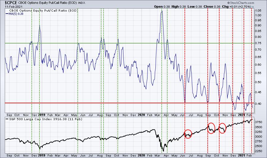
The put call ratio in the top part of the chart is a 5 day moving average. When we've seen that 5 day moving average dip to 0.4 or below, we've seen weakness multiple times (red circles). Market makers have financial incentive to drive prices lower. The past couple months there hasn't been as much of an impact, but it's not like prices went flying higher after these low put call readings. We've basically worked our way through earnings season and we've had a nice run. I believe we'll be higher on March 31st than we are now, but I wouldn't be surprised to see us stagger there given the above chart. We also know from my earlier research that the February 15th to March 31st period is historically much weaker than the preceding 6-week period.
Don't be afraid to book some profits here and raise some cash. Pullbacks will present tremendous opportunities as this secular bull market remains in the very early innings. If you need a reminder of what a secular bull market looks like, here it is:
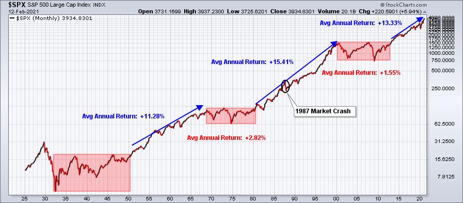
I believe the current secular bull market lasts through the balance of this decade, possibly longer. Let me emphasize that if you're looking 2 years, 5 years, or 10 years down the road, I would NOT change a thing. I'd stay long and ride this secular bull market, including the hiccups along the way. But if you're a short-term trader, then protecting recent profits makes sense as head towards another week of options expiration.
Our next "Stock Market Draft" will be held in a little more than a week. That's when we'll line all of our portfolios with leading stocks in leading industries for the next 90 days. I absolutely LOVE dozens of stocks for next quarter, but I'll make my final decisions after next week's trading. One week before this MAJOR event, we have a Sneak Preview Event to discuss the last quarter's performance, our methodology, key themes, and such. It's an opportunity for everyone to gain a better understanding to our approach at EarningsBeats.com as it's a free public event. Our results have been remarkable and we'd love to have you join us for the Sneak Preview event on Monday, February 15th at 4:30pm ET. For more information and to register (it's FREE), CLICK HERE.
Happy trading!
Tom Bowley, Chief Market Strategist
EarningsBeats.com
"Better Timing. Better Trades."
|
| READ ONLINE → |
|
|
|
|
|
| The Traders Journal |
| You Profit By Respecting The Sacred Trinity Of The Stock Market |
| by Gatis Roze |
 If you can embrace this metaphor, consistent profits are achievable. Think of the stock market as a mythical beast that feeds on truths but its behavior is driven by rumors and beliefs. To tame this creature, your suit of armor must be woven with the finest cloth of emotional control. If you can embrace this metaphor, consistent profits are achievable. Think of the stock market as a mythical beast that feeds on truths but its behavior is driven by rumors and beliefs. To tame this creature, your suit of armor must be woven with the finest cloth of emotional control.
Let's first address the foundation of any successful stock's long term price appreciation. Yes, it's often a long and winding road, but eventually the factuality of steady sales increases and the authenticity of earnings growth will win the battle. This is the playground of the pure fundamentalists who say "just show me the facts."
If only actuality were that straightforward. Corporations have been known to fabricate sales (think about a certain Chinese coffee chain) and earnings do get restated. So, despite being an energetic seeker of the unvarnished truth about an equity, the veracity of your information must always be viewed with some degree of healthy skepticism.
The second leg of the essential trinity is news. In a perfect world, the journalist is your friend — and like you — aspires to present the unvarnished reality. Unfortunately, if you believe that and act upon it, you'll discover you are often led astray. My own take on journalists and newspersons today is that they've become newsmakers. It's all about ratings! They literally create news that's skewed through their own lenses of opinions and then present their perspectives in the hopes you'll embrace it all as gospel fact. Each newsmaker does it differently.
Couple this with today's new instant data flows and social media's ability to spread contagion, and it's easy to understand why irrationality thrives, why the markets swing between wide extremes, and why information accuracy is difficult to ascertain.
Similarly, stock analysts are only human and are also guilty of expressing over reactions — be it exuberance or negativism about a stock. Your objective as an investor is to vanquish these distortions by deploying your own lens of actuality.
I wish I could sell you a set of glasses to wear by which you could magically see only truths and facts. But sadly, you are stuck with the lenses you have. That's okay. You just have to polish those lenses carefully.
The challenge you face as an investor is that you must learn to identify your own false beliefs and expectations to let go of your other potentially harmful notions and perspectives. In my own situation, I feel that I've achieved this by anchoring myself to my charts, not exclusively but first and foremost. There will always be both uncomfortable truths and comfortable truths. Can't change that, and the charts will reflect both of these realities.
But unlike with much of the media where I feel I'm looking at a house of mirrors with limited access to truth, my charts are a clear window through which I can see the resulting actuality of the auctions between buyers and sellers which make up our stock market. I've found that when I truly align my unfiltered perception of reality to the market's reality, I become a consistent money-making machine.
The third leg of the trinity is controlling your emotions as an investor. In Stage 3 of our book, "Tensile Trading: The 10 Essential Stages of Stock Market Mastery", we illustrate how the Investor Self's own behavioral inconsistencies must be first understood and then reigned in. Much like our dealings with family and all the personal issues we bring to that arena, investors must acknowledge that their desires, passions and feelings about money and investments is baggage they also bring to the stock market table. Powerful sentiments, if not fully appreciated.
I once had an exceptional Wizard investor tell me that the best traders don't just accept their mistakes, they delight in their ability to react quickly and change course. I also take this to mean they do so with respect to their own behavioral issues, not just with respect to a particular stock position.
I believe the rules can be summarized as these:
- Aspire to be truthful in your perspective
- Be humble in your convictions.
- Be flexible on your positions.
Let's label it "confident humility." So, there it is. Make money by respecting the sacred trinity of Truths, Beliefs and Behaviors. To paraphrase for my fellow technicians:
• See the Chart
• Believe the Chart
• Act upon the Chart
Trade well; trade with discipline!
- Gatis Roze, MBA, CMT
StockMarketMastery.com
|
| READ ONLINE → |
|
|
|
| ChartWatchers |
| Sector Rotation Model Suggests Bull Market in Stocks Ongoing |
| by Julius de Kempenaer |

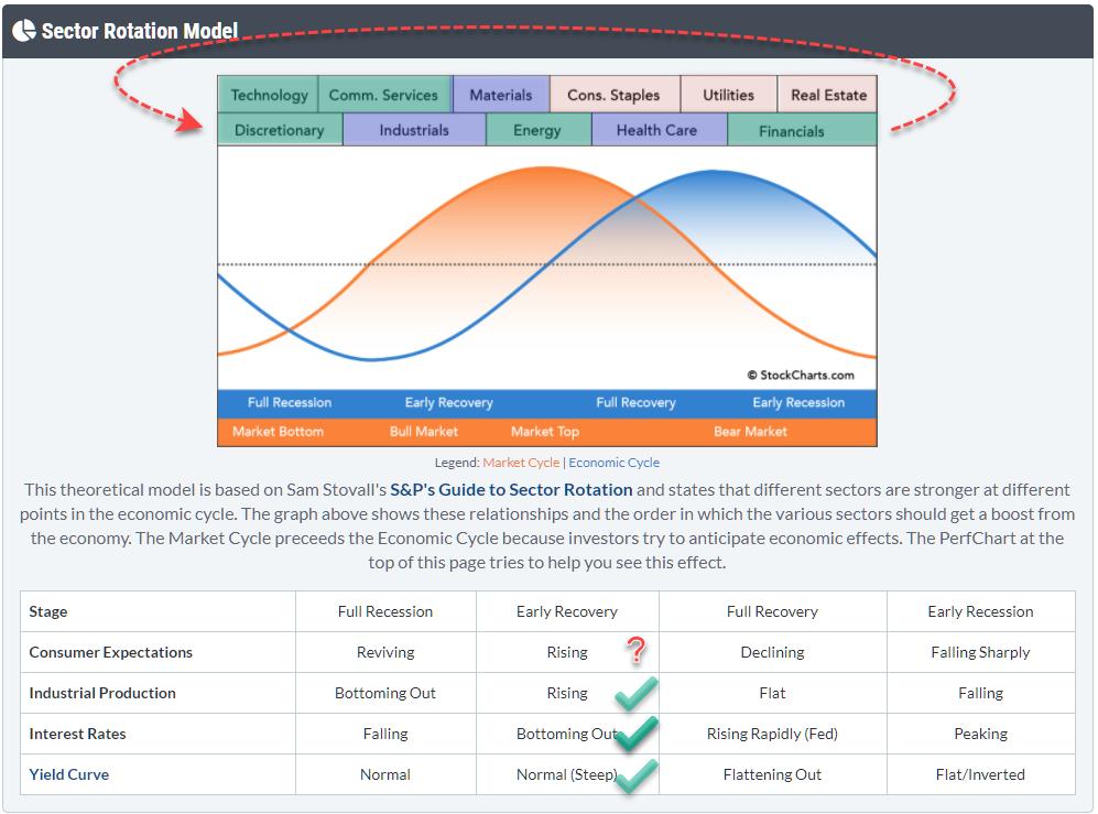
From time to time, I like to check the macro environment and try to see if I can find meaningful clues to draw conclusions from generally accepted theories/models. The Sector Rotation Model (From Sam Stovall's guide to sector rotation) is one of those models that I like to track.
The graph at the top shows the theoretical flow of expected outperformance as it flows through the sector landscape during various phases of the economic cycle. The table underneath it shows four important macroeconomic metrics that need to fit, or support, the flow of the market through the cycles. The idea is that markets follow this cyclical pattern and that, if you know where we currently are in the cycle, we can gauge what's lying ahead of us.
It would be waaaay too easy if markets would always rigorously follow that same pattern with all those metrics in sync. Obviously, that does not happen; there are too many moving variables in play. But what we can do is see how each of these metrics and variables behave and are positioned at this point in time, then work back towards an opinion on the expected behavior for the market.
Sectors

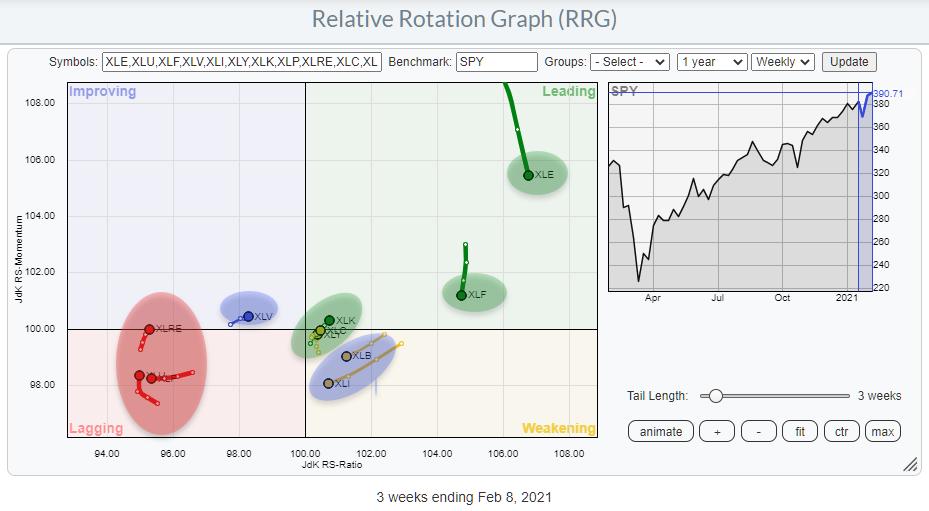
The Relative Rotation Graph above shows the current rotations for all eleven sectors. I have shaded them according to my view of what is bullish (green=outperform), neutral (blue=in line with market) or bearish (red=underperform). I have then copied these colored labels to the sectors at the top of the sector rotation model. And what we can see is that sectors are pretty nicely clustering together on that model chart.
Technology, Communication Services and Consumer Discretionary are all located at the left-hand side where the economy theoretically moves from "Full Recession" to "Early Recovery". But Financials also belongs to that cluster. As this is a cycle, the Financials sector can also be positioned just before Discretionary.
Of the green (outperforming) sectors, only Energy is out of whack, as it usually (out)performs later in the cycle.
The red (underperforming) sectors are also clustering towards the right side of the model. That supports the idea that the center of gravity based on the current sector rotation lies somewhere in the green-shaded area. I have, sort of, eye-balled that center of gravity based on the cluster of green sectors. It's a pretty rough guide anyway.
The blue sectors are not disturbing that rotational picture at all at the moment.
All in all, from a sector rotational perspective, we have a (rough) estimate of where we are in the economic cycle.
Checking the Other Boxes
The next thing we need to do is check how the other metrics (macro variables) are positioned and whether they support or negate the pointer that we got from the sector rotations.
Consumer Expectations

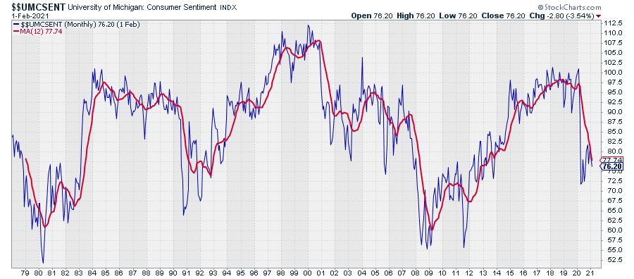
On StockCharts, we carry the University of Michigan Consumer Sentiment Index, which is shown in the chart above.
Reading from the table under the Sector Rotation Model (image at top), we can read that there are four possible states for this metric, each attached to a phase in the economic cycle: Reviving, Rising, Declining or Falling Sharply.
Falling Sharply is what happened at the start of 2020, but over the last months we see a rise. So the big question here is how to qualify that recent move...
Do we see the whole thing as declining? And is this recent rise only a hiccup in a longer decline? Or is it reviving after a decline, associated with a full recession? Or is it already just rising, associated with Early Recovery?
Conclusion: I find this one difficult to pinpoint, so I'm left with a question mark. You can't get all the answers to all the questions. (My wife disagrees, she knows everything ;) )
Industrial Production

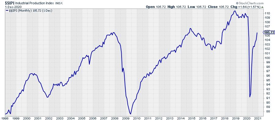
IF the economy is somewhere between Full Recession and bottoming out, then the Industrial Production should be rising. The chart above shows the IPI index and I think we can safely conclude that it is rising after falling sharply at the start of 2020.
Conclusion: Industrial Production fits the assumption that the economy is somewhere between Full Recession and Early Recovery.
Interest Rates

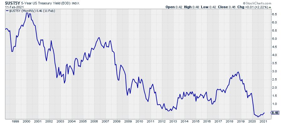
With regard to the direction of interest rates, it depends a bit on which part of the curve you are looking at. The longer-dated yields are definitely on the rise while shorter dated is flat(tish).
The chart above shows the 5-year Treasury yield as sort of middle-of-the-road metric. Bottoming out seems a fairly accurate description of what we see on that chart.
Conclusion: Interest Rates also fit the assumption that the economy is somewhere between Full Recession and Early Recovery.
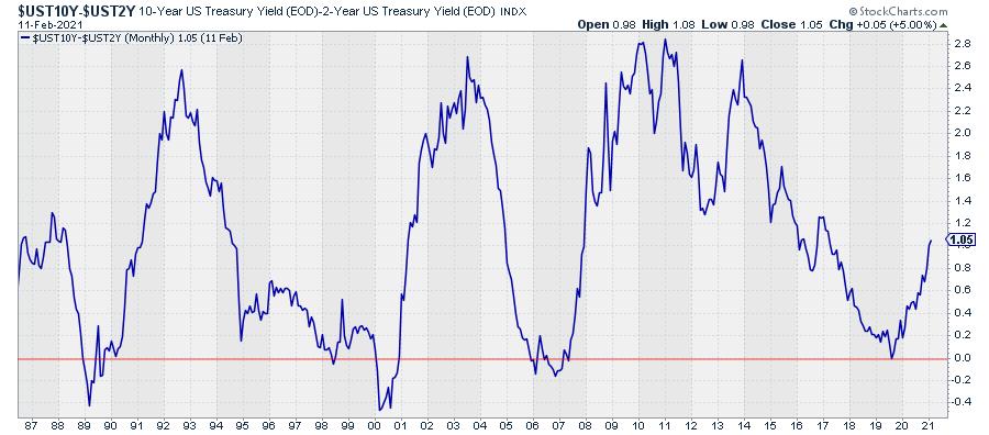
Yield Curve

This one is easy. I have discussed it many times in Sector Spotlight and written articles.
The chart above shows the yield-curve, i.e. the difference between 10-year and 2-year yields. The number is positive, which means that the curve is normally shaped (10-year yields higher than 2-year yields) and it is steep(ening). So the yield curve is moving from normal (Full Recession) to normal-steep (Early Recovery).
Conclusion: The shape and the direction of the yield curve matches the assumption that the economy is somewhere between Full Recession and Early Recovery.
Overall Conclusion
Wrapping it all up, we can conclude that 4 out of the 5 elements of this model are ticking the box for the economy to be positioned somewhere between Full Recession and Early Recovery, which corresponds with a bull market in stocks. The only question mark is the direction of Consumer Expectations.
Four out of Five looks pretty solid to me and leads to the conclusion/expectation that the bull market in stocks is still underway or maybe even has just begun (again).
My regular blog is the RRG Charts blog. If you would like to receive a notification when a new article is published there, simply "Subscribe" with your email address.
|
| READ ONLINE → |
|
|
|
| ChartWatchers |
| Supply-Demand Issues are Pushing Stocks in This Group Much Higher |
| by Mary Ellen McGonagle |
The markets are continuing to hit new highs amid stimulus hopes and a slowly improving economy. Add an accommodative Federal Reserve and the rolling out of a COVID-19 vaccine worldwide, and it's certainly easy to make a case for this bull market.
Select areas are faring much better than others, however, and today I'm highlighting a group that has very strong growth prospects amid a shifting corporate landscape fueled by innovation. The group is Semiconductor chips, which are considered the brains of modern technology. With technological advances taking place across many industries, chip demand has been rapidly increasing.
This chip demand has outpaced supply of late, as the need for more secure and faster data speeds pushed chip sales higher at the start of the pandemic while an unexpected surge in auto and 5G-enabled smartphone sales has reduced supply even more.
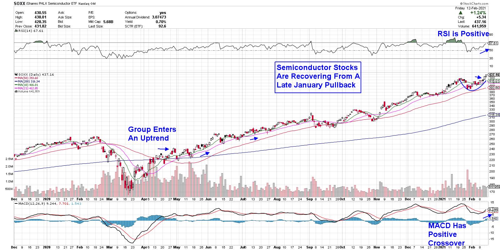
Below is a chart of the PHLX Semiconductor ETF (SOXX) and, as you can see, the group has been in a confirmed uptrend since coming out of last year's bear market.
DAILY CHART OF SEMICONDUCTOR ETF (SOXX)

My MEM Edge Report has been following the move into Semis for some time, with our March 15th report highlighting the pickup in Semi stocks given the need to facilitate a shift away from offices to working from home. We began adding Semiconductor stocks at that time, with select names going on to gain over 110%.
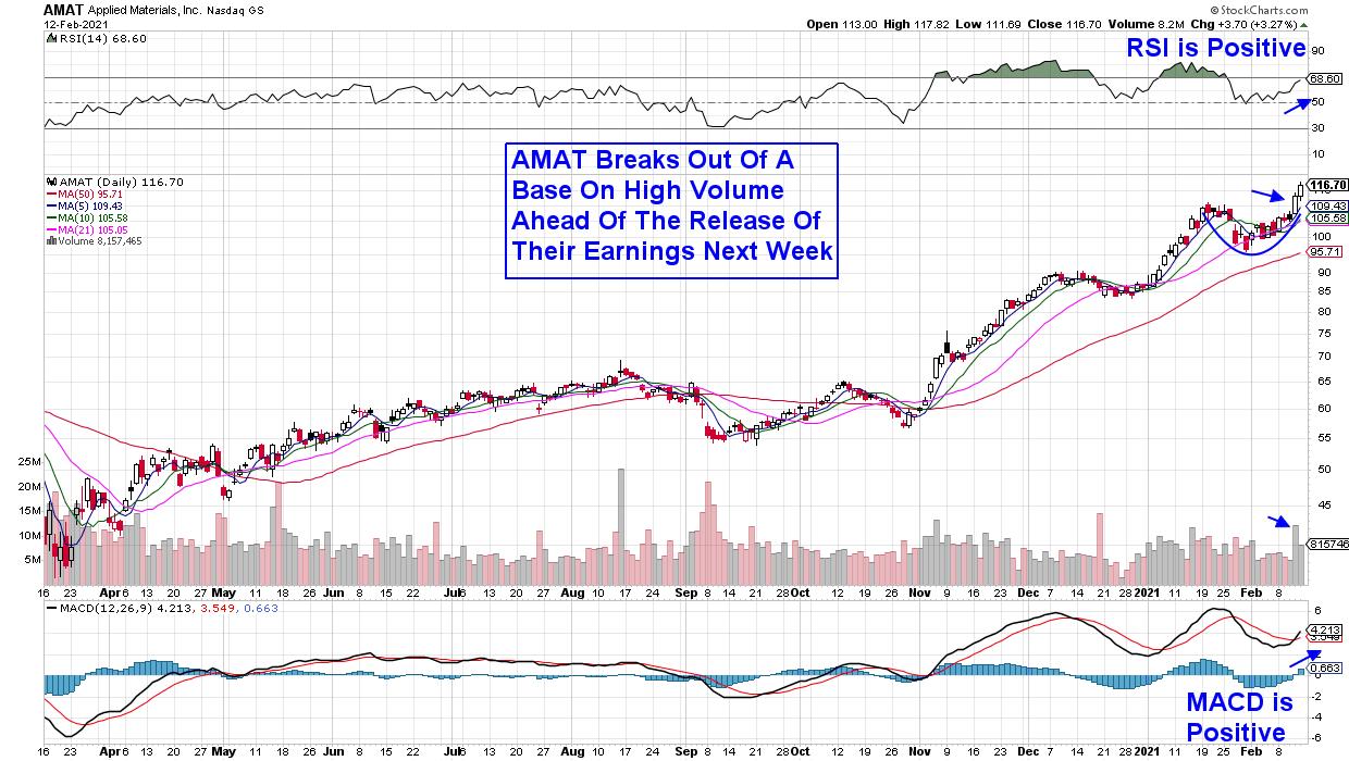
More nuanced themes within Semiconductors have since emerged, with companies that provide the tools to create these complex chips seeing the most demand for their products. This would include Lam Research (LRCX) and Applied Materials (AMAT), which were both among the top 5 performers in the Nasdaq last week with gains over 15%. As you'll see in the charts below, these stocks both have further near-term upside despite last week's sharp advance.
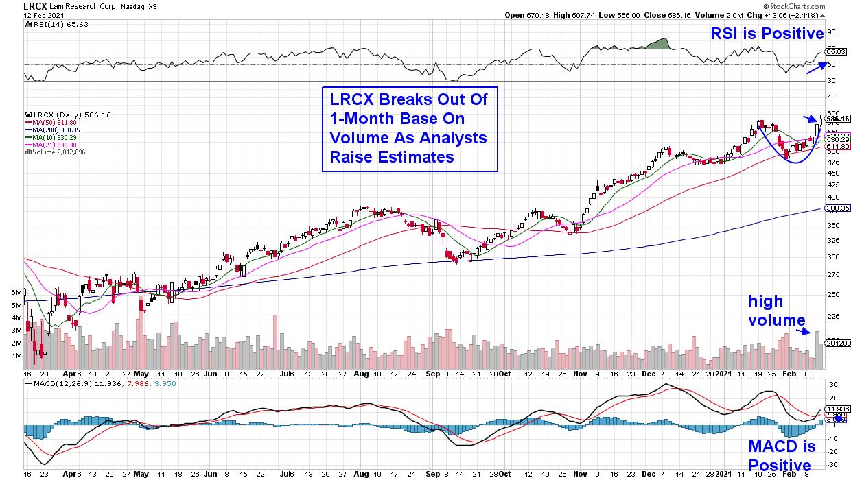
DAILY CHART OF LAM RESEARCH (LRCX)

Lam Research (LRCX) reported strong 4th quarter results in late January that had analysts raising their price target to as high as $670, as management gave a very positive outlook for the remainder of this year due to "strength across all market segments." LRCX broke out of a base on heavy volume, with the MACD posting a positive crossover on its daily chart above.
DAILY CHART OF APPLIED MATERIALS (AMAT)

Applied Materials (AMAT) is due to report their results next Thursday and this week's advance pushed the stock out of a 1-month base and to new highs as analysts are expecting the company to beat estimates while also guiding higher for the year. While AMAT may be priced for perfection prior to releasing their 4th quarter numbers next week, the stock's recent price action points to a leadership name with further upside ahead.
These two stocks have more in common than being in the same red-hot sub-industry group among Semiconductors. They're both on my MEM Edge Report's Suggested Holdings List, with LRCX being added back on Tuesday after reversing its recent downtrend; AMAT had been highlighted as a strong buy in last Sunday's report. Both stocks were originally added to our Suggested Holdings List in late October.
On a final note, the Semiconductor industry has very high barriers to entry, as new chip creations (as well as the tools to manufacture them) have very high complexity and cost. This makes established firms, such as those highlighted, even more valuable in the quest to meet high chip demand.
For those who would like to be alerted to the select stocks poised to benefit from shifts into high-growth industry groups, take a 4-week trial of my MEM Edge Report at a nominal fee. In addition to receiving sector and market insights not seen elsewhere, you'll receive updated sentiment alerts complete with precise entry points for the stocks on our list.
In this Friday's edition of StockCharts TV The MEM Edge, I examine how to trade stocks that bullishly gap up and go on to greater heights. In addition, I share newer areas of the market that are just getting started, while also highlighting strong groups and stocks that will continue to outperform.
Here's To Outperforming The Markets!
Mary Ellen McGonagle
MEM Investment Research
|
| READ ONLINE → |
|
|
|
| Mish's Market Minute |
| Where Does the Economic Modern Family Look Next? |
| by Mish Schneider |

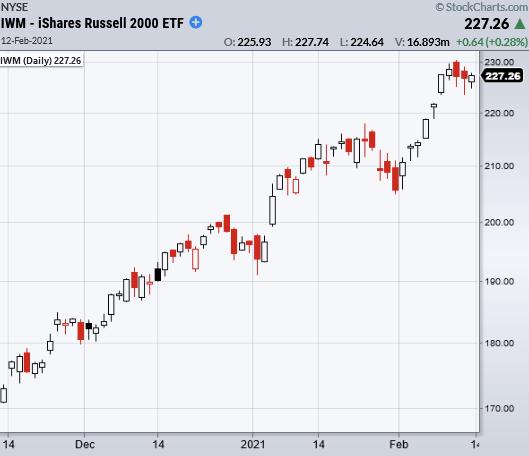
The Economic Modern Family members are all in a bullish phase, with transportation (IYT) leading the charge. A rundown of each member shows Russell 2000 (IWM) putting in some consolidation over Monday's low of 223.40.
Watching IWM instead of larger indices, like the S&P 500, is a better way to grasp the overall market recovery, as IWM represents 2000 small cap companies, whereas the S&P 500 represents only 500 large cap companies. Even the Dow Jones (DIA) only accounts for 30 large cap companies.
Moving on to transportation, or the demand side of the economy, IYT started the week off with a small-range day Monday, but held its ground, proving its stability over the 50-day moving average at 223.61. Friday was a pivotal day for IYT, which broke to new weekly highs. Furthermore, IYT is close to all-time highs at 232.97.
XRT, or Granny Retail, has also done some consolidation work between $75 to $80. Her return to normalcy after a price move up to almost $100 on 1/28 makes trading securities/stocks in this sector much easier. When trading, it is important to look at risk vs. reward, but, with crazy price action as seen in the retail space, it can be tough to plan those levels out in a trade.
Next comes Regional Banks (KRE), who has been holding new support at $60. Knock on wood! If KRE continues upwards, its next test comes from resistance around $63-66 area. (This resistance was created from highs going back to 2018.)
Next, we have Brother Biotech (IBB), who sits between support at the 168 area and highs at 174.04. Then we have Sister Semiconductors (SMH), who yet again made new all-time highs Friday.
Considering how popular new tech issues have become this year and from the surge in resources needed for cryptocurrency mining, the SMH sector looks perfectly positioned for the upcoming year.
This week on StockCharts TV's Mish's Market Minute, Mish covers another 25 top rated stocks that have reported earnings. Her analysis includes actionable advice, with a review from one of last week's picks, Gilead Sciences, Inc. (GILD).
Stocks to note are: DDOG DIS SPG FOXA MAS MAT THC YELP TM KO GM CME Z ORLY TEVA ZNGA VRM SONO IRBT PEP DUK NET HUBS GNRC CYBR
- S&P 500 (SPY): New highs. 385 support
- Russell 2000 (IWM): Inside day. Support 218
- Dow (DIA): 312 support area
- Nasdaq (QQQ): New highs. 330 support area
- KRE (Regional Banks): 60 support
- SMH (Semiconductors): 246 support
- IYT (Transportation): 233 resistance
- IBB (Biotechnology): 168 support area
- XRT (Retail): Needs to clear 81.46
Mish Schneider
MarketGauge.com
Director of Trading Research and Education
Forrest Crist-Ruiz
MarketGauge.com
Assistant Director of Trading Research and Education
|
| READ ONLINE → |
|
|
|
| MORE ARTICLES → |
|
 Chart 1
 Chart 2
 Chart 3
 Chart 4


 If you can embrace this metaphor, consistent profits are achievable. Think of the stock market as a mythical beast that feeds on truths but its behavior is driven by rumors and beliefs. To tame this creature, your suit of armor must be woven with the finest cloth of emotional control.