| THIS WEEK'S ARTICLES |
| John Murphy's Market Message |
| A LOOK AT WEEKLY SECTOR RANKING SHOWS UTILITIES IN THE LEAD |
| by John Murphy |
UTILITIES ARE WEEK'S STRONGEST SECTOR...Chart 1 ranks the week's eleven S&P 500 stock sectors and shows ten of them in the black for the week. Only Communication Services are seeing a small loss. Some other laggards include industrials, financials, and energy. What may seem surprising is that utilities are the week's strongest sector. Other leading sectors include materials, real estate, healthcare, consumer discretionary, and consumer staples. It's also interesting to see a number of defensive sectors having a relatively strong week. That may be simply be investors buying into cheaper parts of the market, or a broadening out of the market rally. Or investors turning a bit more cautious. We'll take a look at how a couple of those defensive sectors are doing. Utilities are one of the quieter parts of the market that don't usually attract a lot of attention. We'll make an exception this week and take a closer look.
 Chart 1 Chart 1
UTILITIES ACHIEVE BULLISH BREAKOUT...The daily bars in Chart 2 show the Utilities Sector SPDR (XLU) rising above its November peak to the reach the highest level in more than a year. That puts it in position to challenge its all-time high formed during the first quarter of last year. Its relative strength ratio in the upper box shows how badly utilities have performed over the last year. So their recent leadership is something new. Utilities aren't the only defensive sector achieving a bullish breakout. So are REITs.
REITS HIT NEW RECORD... Chart 3 shows the Real Estate Sector SPDR (XLRE) rising above its early 2020 high to reach a new record. Among other more defensive sectors, consumer staples and healthcare SPDRs hit new records as well. That could be a sign that investors are themselves turning a bit more defensive.
 Chart 2 Chart 2
 Chart 3 Chart 3
|
| READ ONLINE → |
|
|
|
| ChartWatchers |
| The Impact of Falling Interest Rates |
| by David Keller |
Over the last six weeks, we've seen a dramatic reversal from a rising rate environment to a falling rate environment. While this rotation makes perfect sense from a technical perspective, the fact that the ten-year yield has come down in the face of strong economic data this week is a bit of a head-scratcher.
How would falling rates impact equities and other asset classes, and why is the chart of the ten-year yield the most important chart in the market right now?
First, let's get a good historical perspective. The ultra long-term view of interest rates, courtesy of our Historical Chart Gallery, shows the multi-decade bull market in bonds.
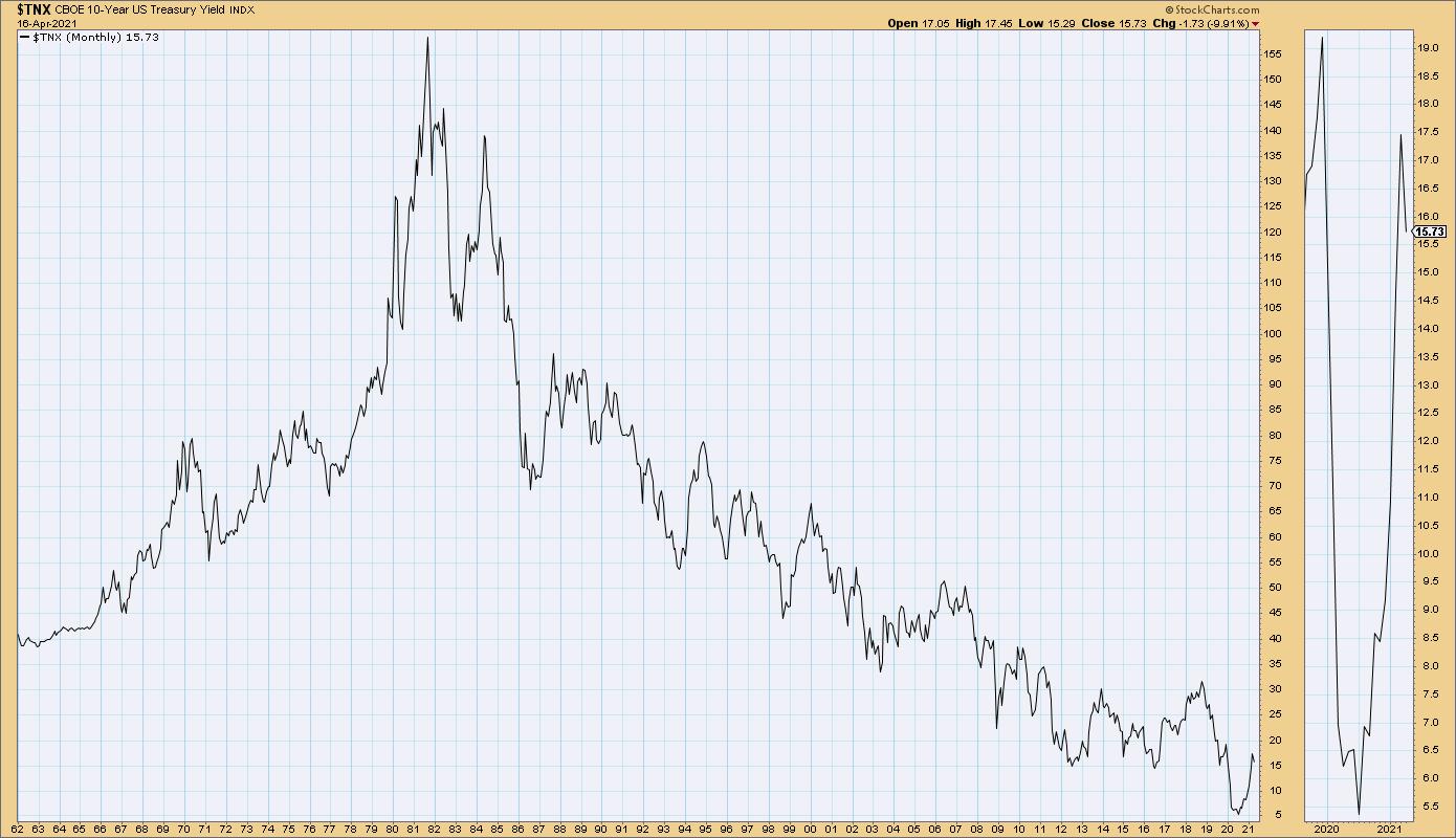
From 1980 through recent years, bond prices have been in a fairly consistent uptrend, which has driven this chart of the ten-year yield lower and lower.
All the recent discussion of interest rates rising? That's the little tiny blip in the far-right side of the chart. The question for many investors is, when will we see rates bottom out and move higher in a significant way?
Zooming into the last two years, you can see that, in the short-term, rates have reversed from a downtrend to an uptrend. While the ten-year yield bottomed in early March 2020, rates didn't really move higher until August-September.
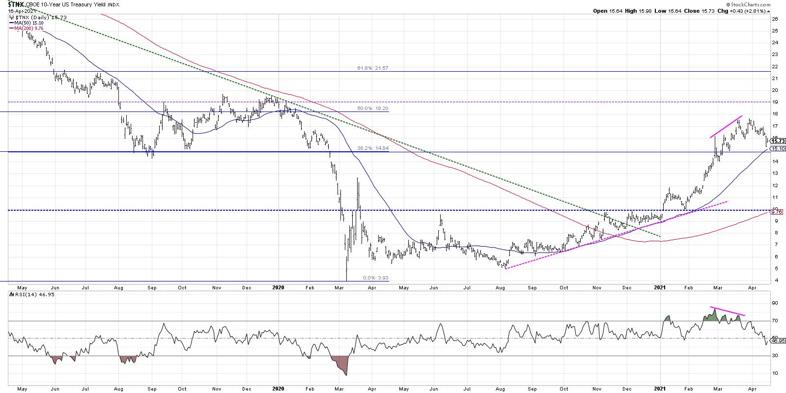
This rise in interest rates was the key catalyst for value-oriented sectors like Financials and Industrials to begin a solid stretch of outperformance through mid-March of this year.
Look at how the chart of the ten-year changed, however, as the yield moved higher in mid-to-late March while the RSI sloped lower. This bearish momentum divergence suggested an upside exhaustion in rates and a likely rally in bond prices. This bounce higher for bonds certainly occurred, which caused Financial stocks to give back some of their recent gains. The chart below shows the clear relationship between the ten-year yield and the relative performance of the Financial sector.
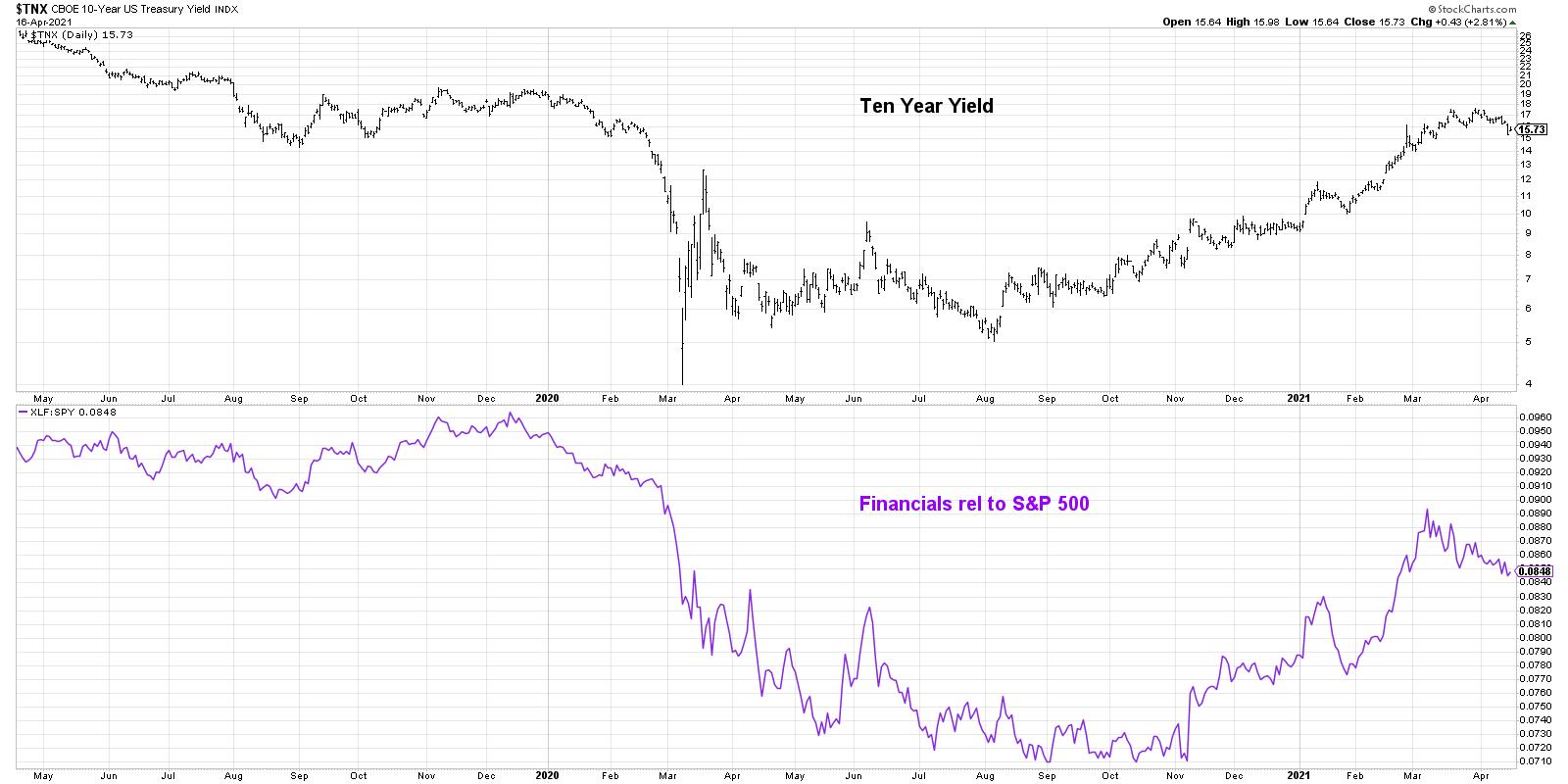
So what's next? Rising rates provide a major headwind to the performance of growth stocks. So the recent pullback in rates has caused growth names like MSFT and others to move higher into April.
As long as the ten-year yield remains above 1.5% (which is reasonable technical support based on Fibonacci retracements, as well as the 50-day moving average) then you could argue the recent rally in bonds was an oversold rally and the downtrend will most likely continue. That would indicate a likely boost for Financials and other value-oriented stocks. If bond prices move higher, pushing the ten-year yield below 1.5% and the RSI below 40 for the $TNX, that would suggest that the long-term downtrend in bond prices is not quite upon us and growth may be the area in which to focus.
Either way, the chart of the ten-year yield is the most important chart to watch in the coming days and weeks.
To digest this article in video format, just head over to my YouTube channel:
RR#6,
Dave
P.S. Ready to upgrade your investment process? Check out my free course on behavioral investing!
David Keller, CMT
Chief Market Strategist
StockCharts.com
Disclaimer: This blog is for educational purposes only and should not be construed as financial advice. The ideas and strategies should never be used without first assessing your own personal and financial situation, or without consulting a financial professional.
The author does not have a position in mentioned securities at the time of publication. Any opinions expressed herein are solely those of the author, and do not in any way represent the views or opinions of any other person or entity.
|
| READ ONLINE → |
|
|
|
| ChartWatchers |
| Base Metals ETF Gets the Squeeze |
| by Arthur Hill |
The DB Base Metals ETF (DBB) is breaking out of a bullish continuation pattern after a Bollinger Band squeeze and this signals a continuation of the long-term uptrend.
The first chart shows the DB Base Metals ETF (DBB) with Heikin-Ashi candlesticks in the top window and normal candlesticks in the lower window. Price action is quite "gappy" on the normal candlestick chart and this makes it harder to see developing patterns. Heikin-Ashi candlesticks remove these gaps by combining price points from two periods to create one candlestick. The formula is shown on the chart.
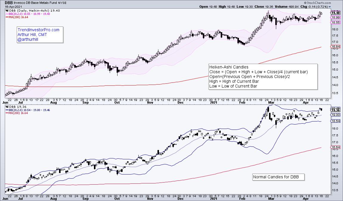
I suspect that DBB is "gappy" because it is based on three commodities in equal weights (copper, aluminum, zinc). Commodities trade 24/7 across the globe and this means DBB is reacting to price action that has already occurred when it opens. Also note that the Bollinger Band values are slightly different (1 cent). This is because the Heikin-Ashi close is different from the normal close.
Now let's get down to the analysis. First and foremost, the long-term trend is up. DBB is above its rising 200-day SMA and the ETF has been hitting 52-week highs on a regular basis since September. Note that I am only interested in short-term bullish setups and signals when the long-term trend is up. Short-term bearish setups and signals are a waste of time in uptrends.
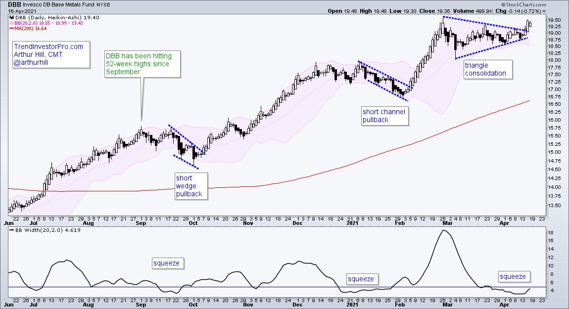
The indicator window shows BandWidth dipping below 5 to identify a Bollinger Band squeeze. This squeeze tells us that volatility is contracting and we should prepare for a volatility expansion (price move). This serves as an alert to monitor price action for a short-term bullish setup.
There are two completed bullish setups and one active bullish setup on the price chart. The blue dashed lines highlight the falling wedge and breakout, falling channel and breakout, and triangle (current pattern). A triangle within an uptrend is a bullish continuation pattern and this week's breakout signals a continuation of the bigger uptrend.
TrendInvestorPro specializes in capturing bullish setups and signals within bigger uptrends. Each week we monitor over 100 ETFs in our core list for trend signals, medium-term bullish setups and short-term triggers. Click here to cut through the noise and get immediate access.
---------------------------------------------------
|
| READ ONLINE → |
|
|
|
|
|
| The Traders Journal |
| How And When You Should Talk To Your Children About Money - And Why You Should Do It NOW! |
| by Gatis Roze |
 A frightening statistic from American Express several years ago found that over 90% of couples consistently defer ever talking about money matters with themselves and their kids. They come up with any manner of reasons not to discuss what is crucial to their lives and their futures. My belief is that talking about money and financial matters must not be a taboo subject. Quite the contrary, it should be mandatory. A frightening statistic from American Express several years ago found that over 90% of couples consistently defer ever talking about money matters with themselves and their kids. They come up with any manner of reasons not to discuss what is crucial to their lives and their futures. My belief is that talking about money and financial matters must not be a taboo subject. Quite the contrary, it should be mandatory.
The objective of parents should not only be to pass on their hard-earned assets but to pass on their experience and values as well. Money should not be put in the same camp as sex or Uncle Wendall's drinking habits. And money should not be yet another thorny topic that goes unspoken. That strategy will do more harm than good. If you don't communicate openly with your kids about money management, you're intentionally placing them instead into the hands of that merciless professor called "experience". The tutorial will be ruthless and the lessons learned both costly and late.
I believe that lessons about money management are best wrapped up in story-like narratives about your personal experiences. But having said that, the prerequisite demands clarity on your part. You must first understand your own beliefs about money before you can discuss the topic with openness and transparency. Do you deem money as security or power or excitement? Or do you consider it a familial responsibility with you as a custodian for future generations? The purity of your own understanding about the role of money in your life will contribute mightily to the focus and simplicity of your message. If you wish for success and stability for your offspring, the first step is to be brutally honest with yourself and challenge the topic in your own mirror.
It can't be overstated that the more truthful you can be about yourself and your own money mentors and the influential people in your life, the more adhesiveness your narrative will find with its young audience. Forthright discussions about the role of money and sincere directness about your personal fears, past decisions, winners and losers will all contribute to a greater embrace by your offspring. Your frankness will encourage their respect.
Please recognize that finances, money and investing is not just about numbers. If you believe it is, you'll miss the target. Deciding not to speak about money may be comfortable today, but if and when you pass, you will have left behind confusion, hardships and unintended consequences for your spouse and kids. Your silence today will triple their pain eventually.
Clinch those moments that present themselves, and when they do, endeavor to understand the needs of the other person — rather than focusing primarily on money management strategies — so there will be less conflict and more mutual understanding. Personal investment methodologies can become a never ending discussion. But explaining one's goals, motives and needs tends to open up conversations that achieve more common ground.
FACT: A recent study of millennials by the CFA Institute found that it is their parents and other key family members who are the paramount influencers when it comes to learning about money management. Don't assume that these skills will be taught in high school or college. Clearly, for those of us who are parents, this money mentorship role remains in our hands.
With that in mind, consider the metaphor of a four-legged table. The first leg being how to spark motivation in your child / mentee. The second leg is to understand the emotional and psychological challenges involved with investing. The third leg is to acquire the tools, skills and routines necessary for mastery. And finally, there is the fourth leg: Action. Without engagement and execution, your mentee will not move forward.

If this money mentorship graphic is "the agenda", then "TADS" should be thought of as the blueprint for your interactions. If your exchanges are strained between you and your mentee, his or her progress is much less likely. "TADS" is simply an acronym for how these these interactions should happen.
T = TUNE IN
Simply listen carefully to one another. Good two-way communication is always necessary for mentorship to be effective.
A = ACCEPT
Be flexible and understanding of the other person's financial inclinations and abilities.
D = DIGNITY
Don't judge the other person's behavior as good or bad; discuss their choices with respect, understanding, and patience.
S = SOLUTION
Search for and settle on a mutually satisfactory solution. It doesn't need to be perfect. Tiny steps are fine.
In hindsight, as a parent, my objective was never to make my son feel an obligation to follow in my footsteps as a money manager. My aspirations for him were simply to acquire adequate financial skills so that he could manage his life and his assets proficiently. With a substantial financial foundation, I hoped that he would thereby be able to apply those same useful skills to any professional career of his own choosing. As it turned out, my son seems to have inherited enough of my genes to lead him down a career path that also involves investing and the stock market. No regrets there! It's all good.
With all this in mind...
I'd like to invite you to join me and Grayson for a very special joint presentation THIS SATURDAY (4/17). We'll be presenting virtually to the AAII Los Angeles and San Diego chapters in a three-part seminar. Registration is FREE, but you must pre-register in advance. CLICK HERE TO REGISTER!
We'll cover the following topics:
- GATIS: "The Most Important Investing Tools I Gave My Son"
- GRAYSON: "It Pays to Be Young: How to Turn Your Age Into Profits"
- GATIS + GRAYSON: "Passing the Financial Baton: But Still Investing Together"
We look forward to seeing you virtually at the event this Saturday!
CLICK HERE TO REGISTER
Trade well; trade with discipline!
- Gatis Roze, MBA, CMT
StockMarketMastery.com
|
| READ ONLINE → |
|
|
|
| Don't Ignore This Chart! |
| Can XLK hold without participation of AAPL & MSFT? |
| by Julius de Kempenaer |

Developments in the technology sector keep me busy, but above all alert.
First of all it's the biggest sector in the S&P 500 and therefore by default an important one to watch. Primarily because you need a lot of power to push the S&P higher when technology is not participating.
On the weekly Relative Rotation Graph, the three largest sectors, Technology, Discretionary, and Health Care are all positioned inside the lagging quadrant. That makes it even more difficult. On the daily RRG the picture has shifted a bit in favor of XLK and XLY but XLV is also pushing further into lagging on that shorter time frame.
So the first question is; will this short term improvement for XLY and XLK be strong enough to turn the weekly tails for those sectors around and back up towards improving? My judgement at the moment; Unlikely, but even IF it happens it will probably be a slow process. All in all that makes me cautious for the S&P 500 in the near term.
Just be aware that "corrections" can also play out over time, it does not necessarily have to be a decline in price. Corrections IMHO are periods in which the market digests the recent buying activity that drove the rally so far.
A closer look into the technology sector reveals that pretty much one stock managed to hold up the performance of the sector in recent months. And that is MSFT.
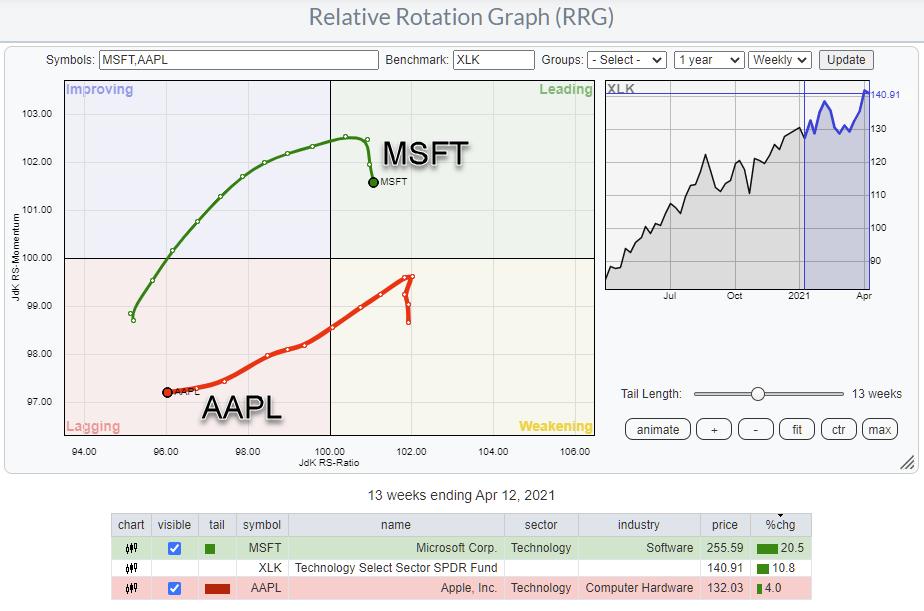
The RRG above isolates the rotations for AAPL and MSFT over the last 13 weeks (quarter). As you can see, and probably already know. AAPL has been the big lagger in the sector. But over the same period MSFT managed to outperform big-time, dragging the sector higher, even despite the relative weakness in AAPL.
So the tail of the MSFT rolling over inside the leading quadrant at relatively low RS-Ratio values is something that puts me on alert.
When both AAPL and MSFT will be showing relative weakness vs XLK and XLK (together with XLY and XLV) shows weakness against SPY it will be very hard for SPY to continue its rally at the recent pace and it may be time for a bit of cooling down, digesting. Even if only in a sideways fashion.

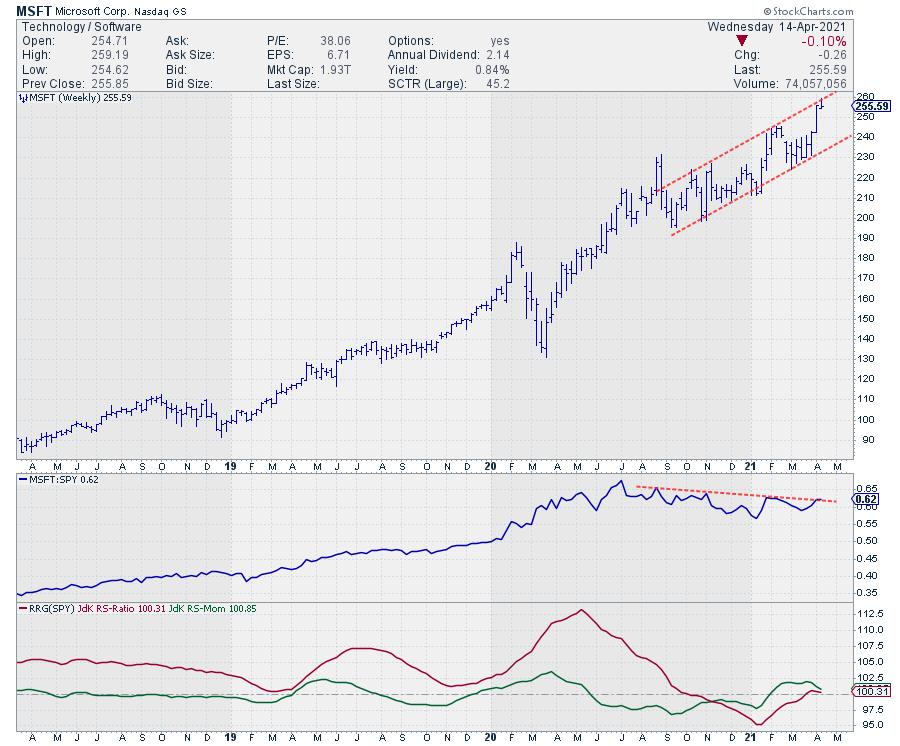
On the weekly chart relative strength of MSFT vs SPY is hitting overhead resistance while RS-Momentum is rolling over downwards again after the first period of weakness in the last few months of 2020.
On the price chart MSFT is bouncing against the rising resistance line which is keeping the stock under pressure for now.

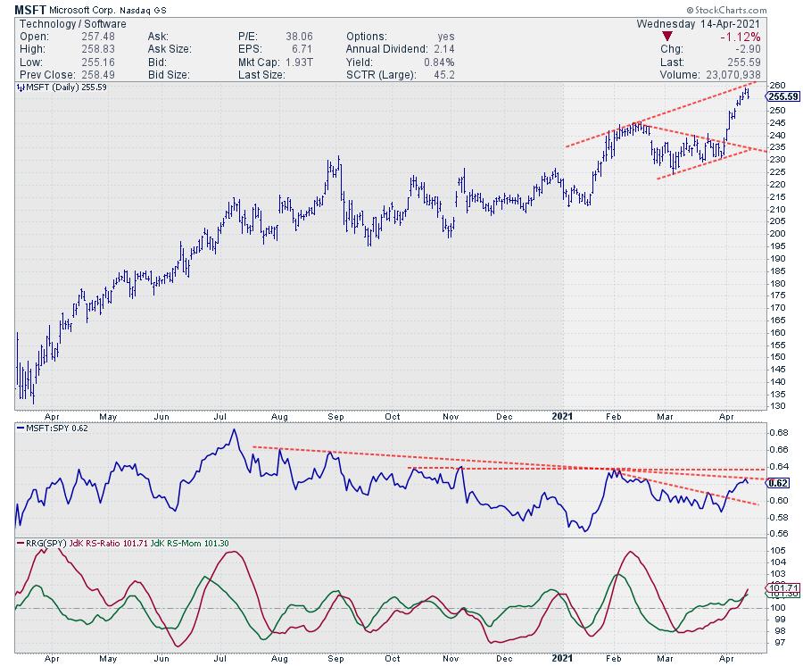
The daily chart shows the same resistance in price showing up as seen on the weekly chart. The RRG=Lines are pointing higher as they are picking up the short term improvement over the last few weeks. But on the relative chart a lot of overhead resistance is clustering slightly above current levels. Unless this cluster of relative resistance can be broken, it will be difficult for the RRG-Lines to push higher.
All in all it seems a tough case for MSFT to push significantly higher under these circumstances and that makes it hard for XLK to push higher and that makes it hard for the S&P 500 to push higher.
#StaySafe, --Julius
My regular blog is the RRG Charts blog. If you would like to receive a notification when a new article is published there, simply "Subscribe" with your email address.
|
| READ ONLINE → |
|
|
|
| ChartWatchers |
| Natural Gas (UNG) Breaks Out of Bullish Double-Bottom! |
| by Erin Swenlin |
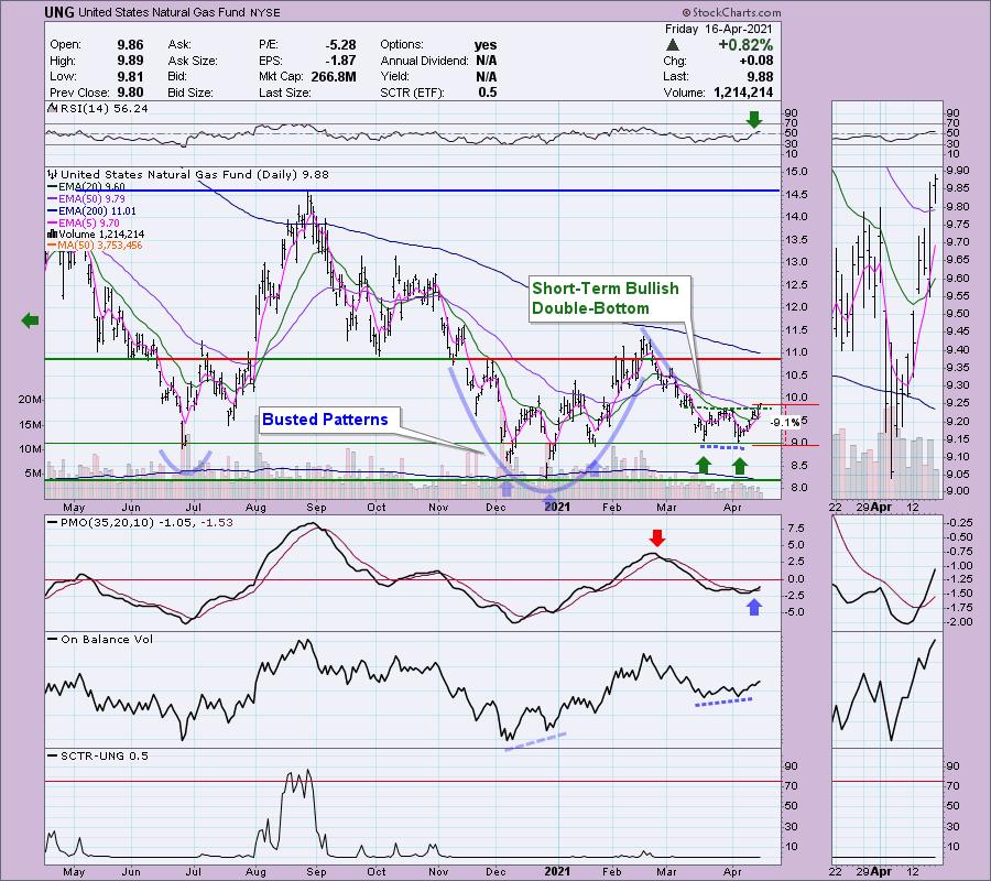
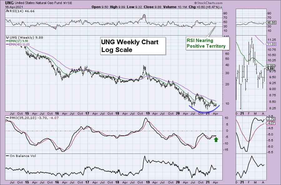
I previously talked about Energy (XLE) being at a possible pivot point on Tuesday. It rallied strongly, leaving us with many potential choices for possible trades. Given the breakout in Crude Oil, one of the charts that I was drawn to on Wednesday was Natural Gas (UNG). Carl and I spotlight UNG often as we follow it closely. The chart has continued to shape up nicely -- since I spotlighted it on Wednesday, it has broken out.
However, I cannot forget that it looked very bullish earlier this year, with a cup and handle pattern as well as a reverse head-and-shoulders. Both patterns busted, which is why I have listed a stop level just below the double-bottom. At the same time, if it turns south and drops below the 20-EMA, I'll likely drop it (full disclosure: I own UNG) and wait for a new set-up.
We have a new short-term double-bottom on UNG, which has broken above the confirmation line of the pattern. The minimum upside target would be about $10.50. There is a new PMO crossover BUY signal and the RSI just hit positive territory. I also note a positive divergence between the OBV bottoms and the price lows of the double-bottom. There are risks, of course; I've already pointed out the busted patterns.
It is very positive to see this new breakout; we didn't have it when I presented this chart Wednesday. Now, instead of strong overhead resistance, we have a strong support level, as it has an overlap of the 50-EMA as well as the confirmation line. I've set a 9% stop that would indicate a breakdown from the double-bottom. As noted above, though, I don't think that I'll let it drop that low before selling it.

Free DecisionPoint Trading Room Mondays Noon ET

Click here to register in advance for the recurring free DecisionPoint Trading Room! Recordings are available!
Let's take a quick peek at the Weekly Chart. It is in log scale so that we can see price movement better. We have a rounded bottom developing. The RSI is rising and should reach positive territory soon. The weekly PMO has just turned up above its signal line and is not overbought. I find that PMO bottoms above the signal line are especially bullish. The one issue I have with this chart is that price hasn't managed to cross above the 17-week EMA.

Conclusion: Overall I am very bullish on UNG. Consider a subscription to DP Diamonds or DP Alert. I presented this set-up on Wednesday to subscribers. Interested in 50% off your first month? Use coupon code: SAVE50 and your first month will be at half price so come check us out here!
Happy Charting! - Erin Swenlin
Technical Analysis is a windsock, not a crystal ball.

Helpful DecisionPoint Links:
DecisionPoint Alert Chart List
DecisionPoint Golden Cross/Silver Cross Index Chart List
DecisionPoint Sector Chart List
DecisionPoint Chart Gallery
Trend Models
Price Momentum Oscillator (PMO)
On Balance Volume
Swenlin Trading Oscillators (STO-B and STO-V)
ITBM and ITVM
SCTR Ranking
DecisionPoint is not a registered investment advisor. Investment and trading decisions are solely your responsibility. DecisionPoint newsletters, blogs or website materials should NOT be interpreted as a recommendation or solicitation to buy or sell any security or to take any specific action.
|
| READ ONLINE → |
|
|
|
| ChartWatchers |
| Which ETFs Currently Provide the Best Opportunities? |
| by John Hopkins |
Some traders focus all of their time, capital and attention on individual stocks. This can be a double-edged sword. On the one hand, focusing on individual stocks can produce outsized gains. But, of course, the opposite is also true; a trade gone bad on an individual stock can be financially painful, which is why some traders opt for ETFs. On the surface, ETFs seem to offer some diversity and protection. But is this always the case? Not necessarily. And this is why you need to fully understand "what lies beneath" each ETF before you add them to your portfolio.
As an example, you may identify an ETF that represents a specific sector that you believe has promise. But do you actually know what specific stocks make up that ETF? Or do you know the weighting of each stock that makes up an ETF? Most traders would say no. But knowing this information could help you make better decisions.
For example, you might decide to buy an ETF that represents small cap stocks, which on the surface might seem like a good idea. But what if there are stocks in the ETF that are technically broken that could have a negative impact on overall performance? You would have no way of knowing this, unless you examined every individual stock in the ETF -- a time-consuming exercise indeed.
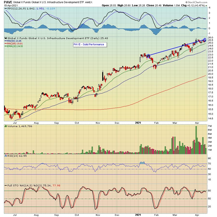
At EarningsBeats.com, we offer a service which includes providing our members with specific ETFs that make up our "Model Portfolio"; those ETF's we believe are poised to outperform the S&P. Since its inception in October of 2020, the Model ETF Portfolio has come close to matching the S&P during that period of time. The most current quarter -- which ends this upcoming Monday -- lagged the S&P, primarily due to the sudden shift from growth to value stocks. But a few of the ETFs in the Model portfolio matched or beat the S&P, like PAVE, which was higher by 13.2% compared to the S&P of close to 10%.

But the prior quarter saw our Model ETF climb higher by almost 17%, compared to the S&P moving 11% higher during the same period of time. And now we are getting ready to unveil a new batch of ETFs this Monday -- which are meant to be held for a full 90 days -- when our Chief Market Strategist Tom Bowley will reveal during a member webinar which ETFs he believes provide the best opportunities given the current market environment. Tom's overall theme as he searches for and unveils those ETFs he believes can outshine the S&P is "Know What You Own," which includes all of the beneath-the-surface homework necessary to identify the "best of the best." If you would like to learn more about this Monday's ETF webinar -- as well as a special FREE event this Saturday, April 17, where Tom will be discussing Q1 Earnings -- just click on this link to register.
In the meantime, if you decide that ETFs suit your trading style rather than individual stocks, make sure you know EXACTLY what you are buying before you commit to the trade.
At your service,
John Hopkins
EarningsBeats.com
|
| READ ONLINE → |
|
|
|
| MORE ARTICLES → |
|
 Chart 1
 Chart 2
 Chart 3


 A frightening statistic from American Express several years ago found that over 90% of couples consistently defer ever talking about money matters with themselves and their kids. They come up with any manner of reasons not to discuss what is crucial to their lives and their futures. My belief is that talking about money and financial matters must not be a taboo subject. Quite the contrary, it should be mandatory.
