| THIS WEEK'S ARTICLES |
| John Murphy's Market Message |
| TEN-YEAR TREASURY YIELD MAY BE BOTTOMING |
| by John Murphy |
TEN-YEAR TREASURY YIELD MAY BE BOTTOMING... A combination of technical factors suggests that the recent decline in bond yields may be at or near a bottom. Chart 1 shows the 10-Year Treasury yield starting to find support near its red 200-day moving average which usually acts as a support line during downside corrections. In addition, its 14-day RSI line in the upper box is bouncing today from its oversold line at 30. Today's gap higher may be another sign that the downside correction in yields may have run its course. Today's rebound in bond yields may also be contributing to a strong rebound in stocks. Ten of eleven sectors are in the black with the biggest gains in financials, materials, energy, and industrials. Financials in particular may be benefiting from today's jump in bond yields.
 Chart 1 Chart 1
BANKS AND FINANCIALS ARE CLOSELY TIED TO YIELDS... Financial stocks are heavily influenced by the direction of bond yields and the yield curve. Falling bond yields have caused the yield curve to flatten which is normally negative for financials. The solid line overlaid on the price bars in Chart 2 plots the XLF/SPX ratio declining since the start of June which had a lot to do with falling bond yields. Chart 2 shows the Financial Sector SPDR (XLF) bouncing sharply today. It needs to clear its 50-day average to regain its uptrend; but today's rebound in encouraging. Its 14-day RSI line in the upper box is close to rising above its mid-50 line which would be a positive sign that short-term momentum is improving. Today's rebound in bond yields may also explain why financials are today's strongest sector. An upturn in bond yields could prove beneficial to financial stocks, and banks in particular.
 Chart 2 Chart 2
BANKS LOOK OVERSOLD... Chart 3 shows the S&P 500 Bank SPDR (KBE) in a downside correction. The green line overlaid on the price bars shows a close correlation between the falling KBE and the 10-Year Treasury yield. Today's jump in the KBE coincides with the rebound in bond yields. Which further suggests that an upturn in bond yields could prove beneficial to bank stocks. In addition, its 14-day RSI line in the upper box is forming a small "double bottom" near its oversold level at 30. That's another sign that the downturn in bank shares may have run its course.
 Chart 3 Chart 3
|
| READ ONLINE → |
|
|
|
| ChartWatchers |
| Three Intermarket Relationships That are at a Critical Point |
| by Martin Pring |
When reviewing my charts last weekend, several jumped out as being at a pretty critical juncture, and therefore worthy of monitoring going forward. A couple of them involved the stock market, so I'll start there.
Two Stock Market Relationships
I have always been fascinated by the relationship between stocks and gold, as these are two completely different asset classes. Stocks offer the potential for growth and a dividend return, though we have not seen much of the latter in the last few years. Gold, on the other hand, is a store of value and historical hedge against instability, especially of the inflationary variety.
Chart 1 shows that this relationship has completed three major swings since 1970; a fourth, favoring stocks, is now underway. That trend began in 2011, but is now running into resistance in the form of the neckline of a potential inverse head-and-shoulders pattern. The ratio is currently above its rising 12-month MA and the long-term KST is also bullish, so an upside breakout is a likely possibility. That resistance line goes all the way back to 2003 and has been touched or approached on numerous occasions. It therefore represents a significant barrier, which, if breached, will signal a multi-year advance favoring equities.
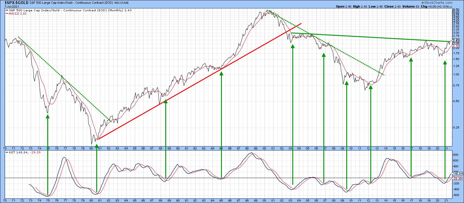 Chart 1 Chart 1
Using the benefit of hindsight, the green shading in Chart 2 flags periods when stocks have outperformed gold for an extended period. If you look at the upper window featuring the S&P, you will see that stocks typically rise, which means that a breakout will not only be bullish for stocks relative to gold but favor stocks in their own right. That observation does not rule out corrections along the way, but speaks to the main trend.
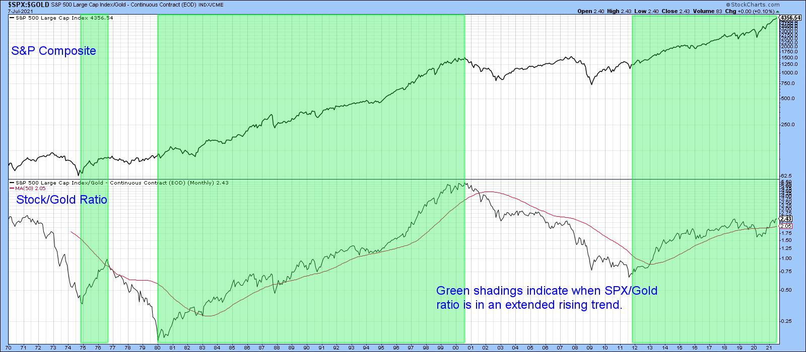 Chart 2 Chart 2
Another intermarket relationship that looks promising for stocks is the ratio between the S&P Composite and the SPDR Consumer Staples (XLP). Generally speaking, staples are an area of the market that investors turn to when they are cautious. That's because these companies tend to pay generous dividends. In addition, since their earnings are more stable, they are easier to predict. Consequently, when the S&P is outperforming staples, it reflects the fact that investors are growing in confidence, so the market tends to rise. When staples are outperforming, investors are in a defensive mood. That's not always bearish for the market, but, by the same token, if trouble is going to arise, that is the time when it usually does.
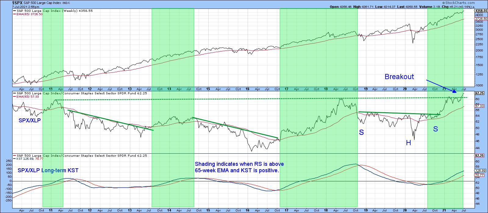 Chart 3 Chart 3
The green shadings in Chart 3 tell us when the ratio is above its 65-week EMA and the long-term KST is trading above its 26-week EMA. You can see from looking at these areas that this is usually bullish for the SPX. The chart also demonstrates that the ratio has broken above a significant down trendline on three occasions in the last 12 years. All were followed by a period of S&P strength. In the last couple of weeks, this relationship has cleared a 10-year trading range, suggesting that a major extension to the 2020 advance is likely.
Chart 4 supports the idea that this is a valid breakout, as the short-term KST has just gone bullish and is by no means overextended.
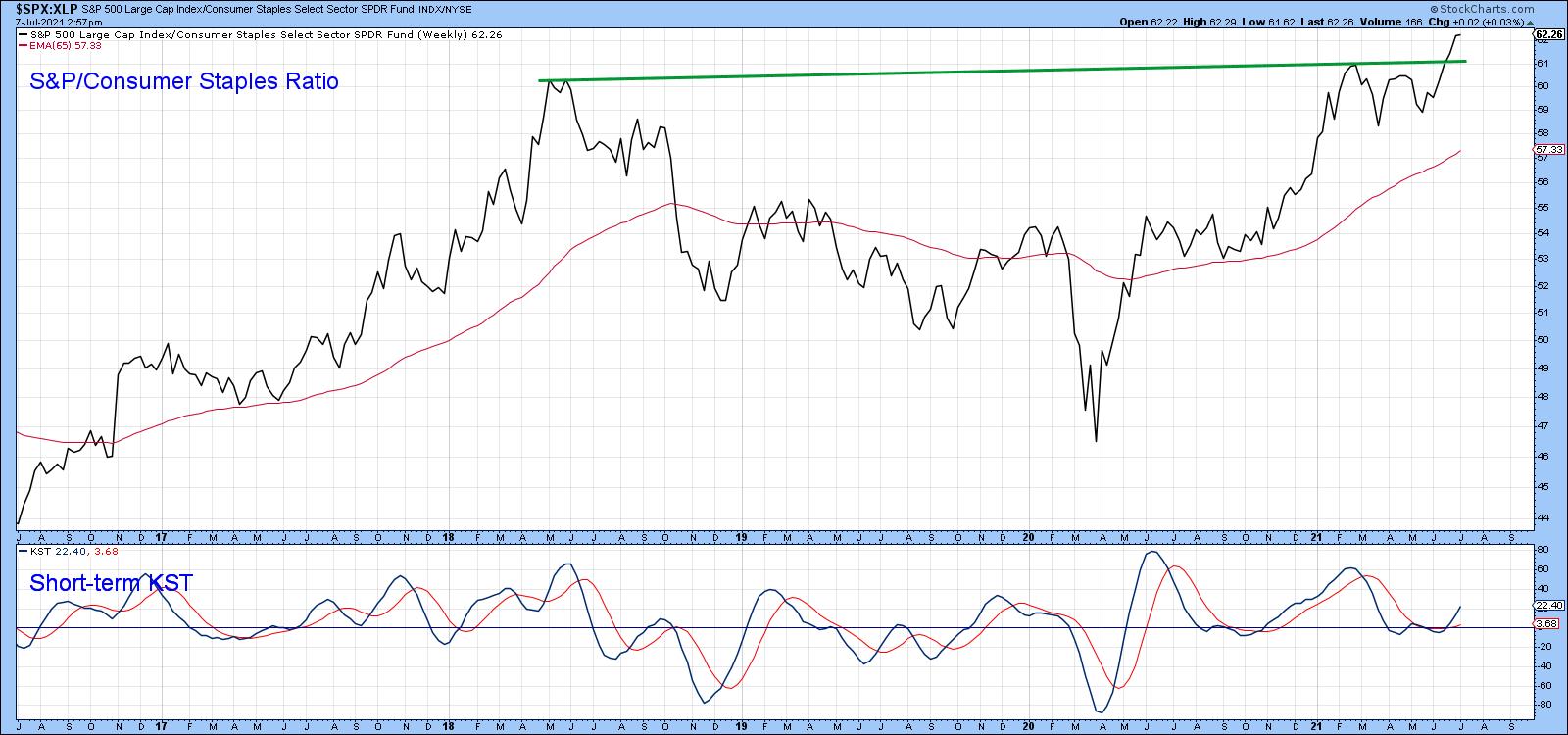 Chart 4 Chart 4
S&P vs the World
Since the financial crisis, the S&P Composite has been in a secular uptrend relative to the MSCI World ETF (ACWI). The ratio has been in a holding pattern since 2020, but, once again, appears to be emerging on the upside. This can be appreciated from from Chart 5, which tells us that it is currently breaking out from a reverse head-and-shoulders consolidation formation. This action is also being supported by the Special K (SPK), which you can read about here. Generally speaking, when a trendline of 9 months or greater duration is violated, that signals an important reversal in this indicator and the price series it is monitoring. A violation of the red signal line acts as supporting evidence. Such a joint break took place on the downside in the middle of last year, a development which was followed by an extended sideways correction.
In the last couple of days, the Special K has managed to edge above its 2020-21 down trend and signal lines once again. Since the short-term KST (in the bottom window) is in a positive mode, it seems likely that these breakouts will become more decisive.
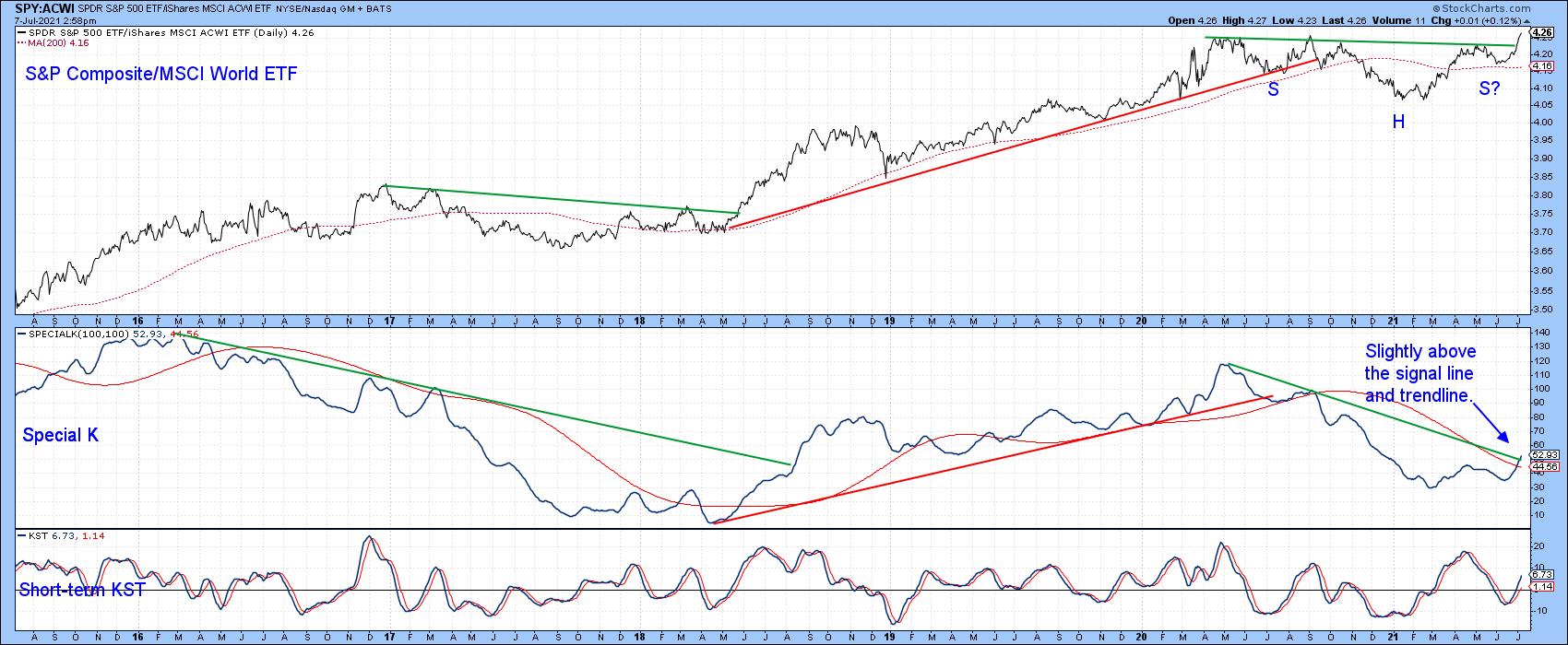 Chart 5 Chart 5
The SPY/ACWI breakout is not occurring in isolation. In that respect, Chart 6 reveals that two other relationships are also favoring the US. The middle panel shows that the S&P is breaking out against the MSCI Europe Australia Far East ETF (EFA). The unweighted S&P (RSP) has seen an even stronger breakout.
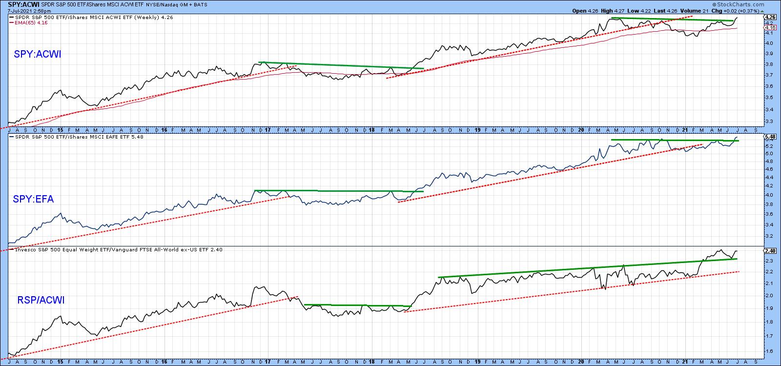 Chart 6 Chart 6
Quite a lot of the time, superior performance by the US relative to the rest of the world involves capital flows that have the effect of boosting the US Dollar Index. That's what appears to be happening now, as the Index looks as though it may be in the final phase of completing a reverse head-and-shoulders pattern. That breakout is likely to materialize because my diffusion indicator monitoring a universe of cross-dollar relationships in a positive trend, and is in a bullish but not overextended mode.
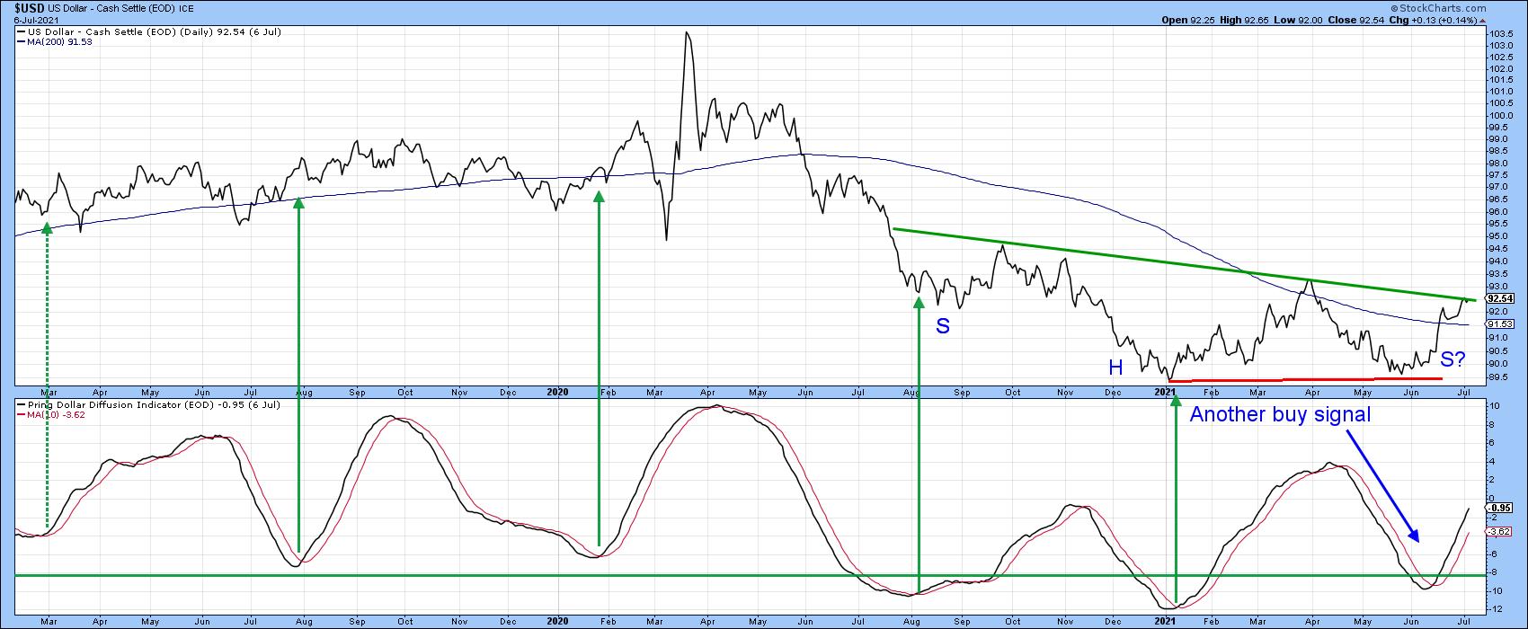 Chart 7 Chart 7
Good luck and good charting,
Martin J. Pring
This article was previously published on Wednesday, July 7th at 8:18pm ET in the member-exclusive blog Martin Pring's Market Roundup.
The views expressed in this article are those of the author and do not necessarily reflect the position or opinion of Pring Turner Capital Group of Walnut Creek or its affiliates.
|
| READ ONLINE → |
|
|
|
| ChartWatchers |
| Steel ETF Makes a Bid to End Correction |
| by Arthur Hill |
 The Steel ETF (SLX) led the market from late October to early May by more than doubling in price. The ETF then fell back with a break of the 50-day SMA in June, but this decline is viewed as a correction within a bigger uptrend. As such, it represents an opportunity and there are signs that this correction is ending. The Steel ETF (SLX) led the market from late October to early May by more than doubling in price. The ETF then fell back with a break of the 50-day SMA in June, but this decline is viewed as a correction within a bigger uptrend. As such, it represents an opportunity and there are signs that this correction is ending.
First and foremost, the big trend is up and this is the dominant force at work. SLX recorded a 52-week high in early May, price is above the rising 200-day and the 50-day is above the 200-day. The ETF was quite extended in early May as RSI hit 80 and the price gain exceeded 100%. A correction was needed to work off overbought conditions, digest these gains and pave the way to further gains.
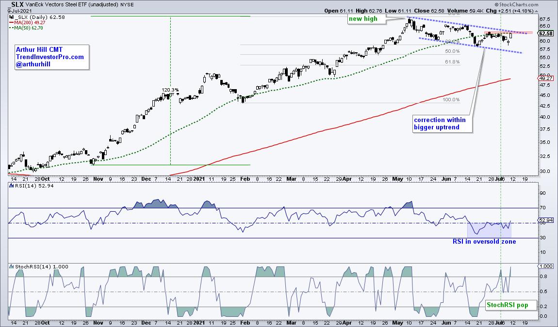
SLX obliged with a falling channel that retraced 38-50 percent of the prior advance. Both the retracement amount and the pattern are typical for corrections within a bigger uptrend. Also note that RSI worked off its overbought condition by dipping into the oversold zone (30-50).
Taken together, the channel, the retracement and oversold RSI represent a bullish setup within a bigger uptrend. Now all we need is a trigger. StochRSI surged above .80 last week and this represents a short-term momentum pop. This is the first sign for a short-term bullish reversal. A channel breakout would provide follow through and signal a continuation of the bigger uptrend.
TrendInvestorpPro.com specializes in finding bullish setups for ETFs in long-term uptrends.
--------------------------------------------------
|
| READ ONLINE → |
|
|
|
|
|
| The Traders Journal |
| The Essential Foundation Of Stock Market Mastery Is Straightforward |
| by Gatis Roze |
 The investment press seems to be writing a good deal these days about mindfulness and living in the present. Similarly, a number of sports analysts are preaching the need of a "back to basics" philosophy for certain struggling athletic franchises. The investment press seems to be writing a good deal these days about mindfulness and living in the present. Similarly, a number of sports analysts are preaching the need of a "back to basics" philosophy for certain struggling athletic franchises.
My own take on all this is less trendy. The straightforward ten-stage paradigm that I've used for my investing endeavors has served me very nicely for decades. I subscribe to the old cliche "if is isn't broken, don't try to fix it". Having said that, the ongoing challenges for myself don't deal with my routines or my investment roadmap. I've got that part nailed! The ongoing roadblocks to producing predictable profits in the markets are those dealing with human nature
I believe there are four destructive "killer" traits that are the opposites of consistency:
- Impulsiveness
- Impatience
- Indecisiveness
- Inconsistency
I've written a good deal about how consistency is the foundation which powers profits. I've maintained for years that focusing on steady persistent habits in executing your routines — rather than focusing on your profits and expectations for positive end results — will actually produce the higher profits you seek. Consistency is the Holy Grail of all your personal psychological disciplines. Read that line again. If you review the ten stages of stock market mastery, you can clearly see that regularity is the fuel powering many of them — be it money management, market analysis, buying, monitoring or selling. Each is best optimized and fueled by a healthy dose of uniform attention.
The bottom line is that consistency should be hailed as the most important tool in your arsenal of personal disciplines. It should also apply to other parts of your life, such as your health. Consistently nurturing your body and mind, consistently doing your weekly house chores, consistently revisiting your personal and financial goals — all move you forward by integrating and reinforcing these with your steady unfailing investment disciplines.
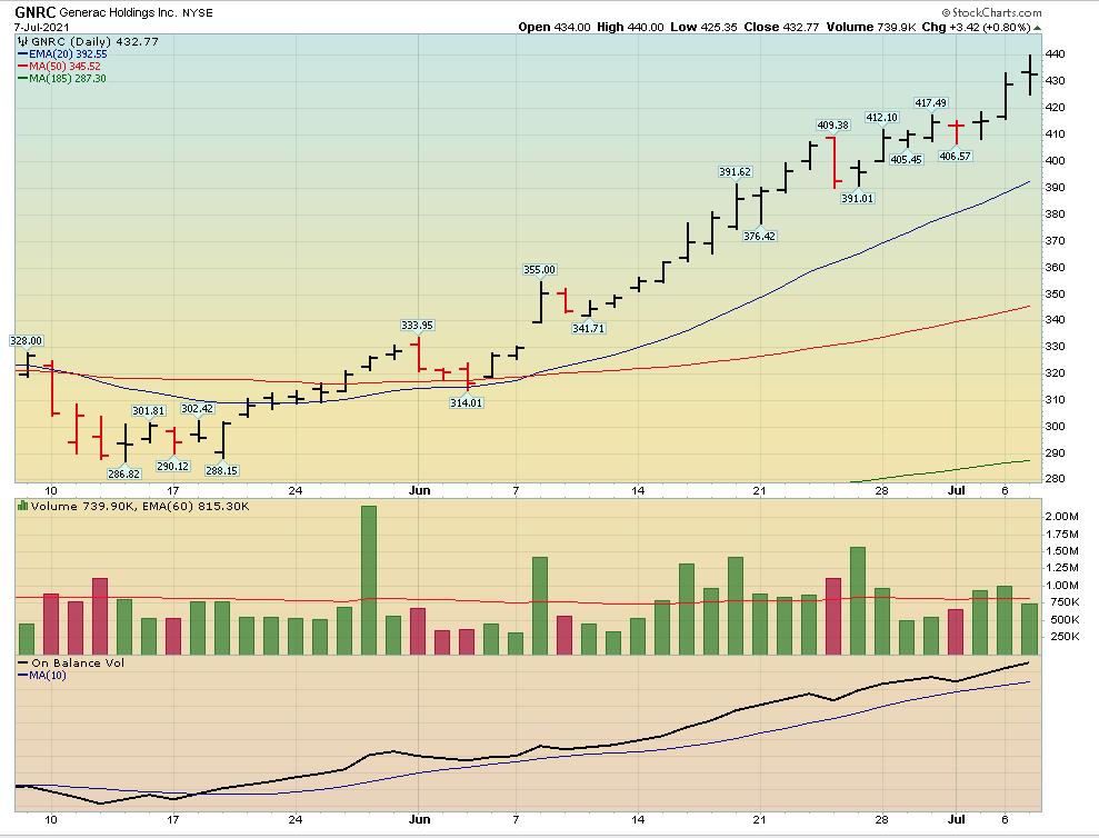
I guarantee that if you make the commitment to yourself to embrace a lifestyle of consistency, your personal and financial life will resemble this chart.

Trade well; trade with discipline!
- Gatis Roze, MBA, CMT
StockMarketMastery.com
|
| READ ONLINE → |
|
|
|
| ChartWatchers |
| DecisionPoint Climax Analysis - Upside Initiation Today |
| by Erin Swenlin |
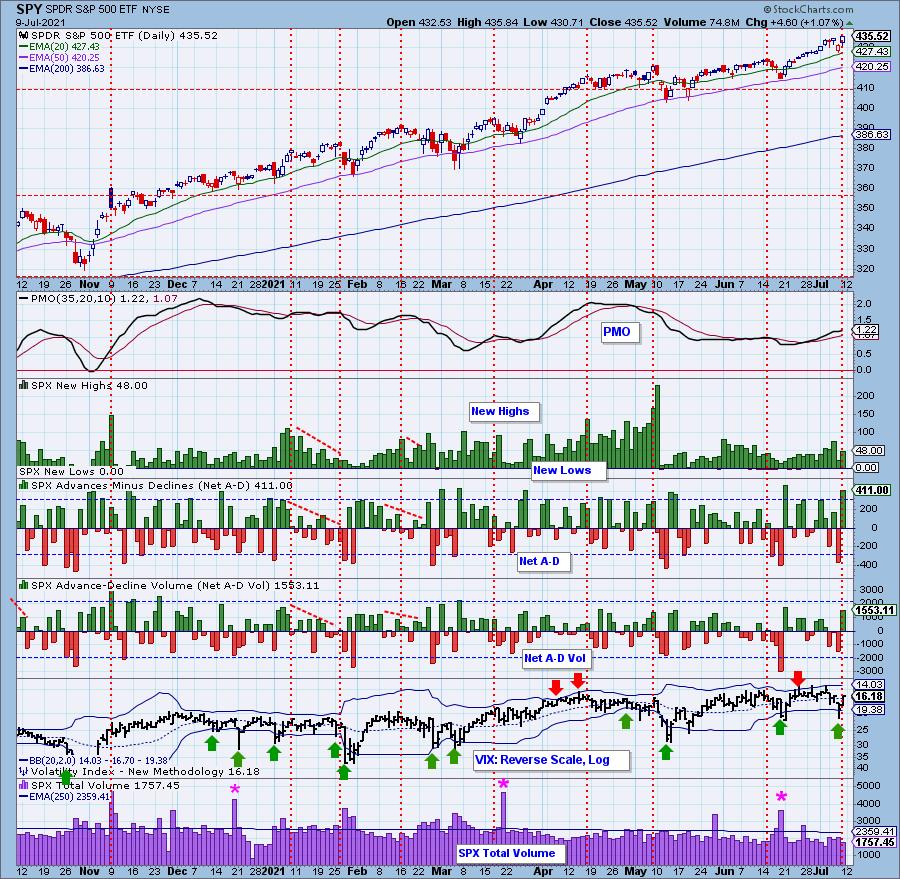
DecisionPoint employs "Climax Analysis" -- and only DecisionPoint.com has it. Determination of "climax days" is invaluable for the short-term trader. We've found that, by analyzing Net Advances-Declines, the VIX, Total Volume and Volume Ratios, we get excellent signals on what to expect over the next day or two of trading. Often, these climaxes will mark the beginning of a longer-term rally or decline as well, which we confirm with our other indicators. Mainly, it keeps you "in the know" on upcoming pivot points. Climax analysis is part of our DecisionPoint Alert report.
This week we had two "climax days" -- yesterday and today. Let's look at each using our "Climax Chart" below. We look for "outside" indicator days, those being days which show a spike or movement outside our thresholds. Sometimes, we get elevated readings that are not quite outside the lines. So how do we confirm these climax days? We use Volume Ratios for the NYSE and SPX.

Let's look at yesterday first. You'll notice that readings yesterday were quite elevated to the downside. Net A-D was outside our climax threshold, but Net A-D Volume was not. It was still a high negative reading, so that sufficed. Note that the VIX moved below the lower Bollinger Band on our inverted scale. Typically, a puncture of the lower Band leads to a rally over the next day or two. There was also elevated Total Volume. This was a "Downside Exhaustion Climax" or selling exhaustion. The expectation was a rally or at least consolidation to follow. It turned out to be prescient, as today we saw a strong market rally.
Today, we have climactic readings to the upside or an "Upside Initiation Climax". We saw an expansion in New Highs, Net A-D had an "outside" day and Net A-D Volume was elevated. The VIX moved back above its EMA on the inverted scale. Now, it is time to look for confirmation on the Volume Ratio charts.
A side note: we invert our VIX because we view punctures of the Bands as a sign of oversold or overbought conditions. Overbought is when investors are too complacent and Oversold is when investors are too nervous, hence we invert. We also use a log scale so we can see all movement more clearly.
Our Sale Ends July 15th!
Get 50% off your first month on any of our subscriptions by using the coupon code: SAVE50

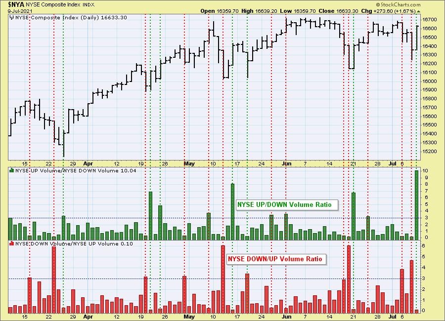
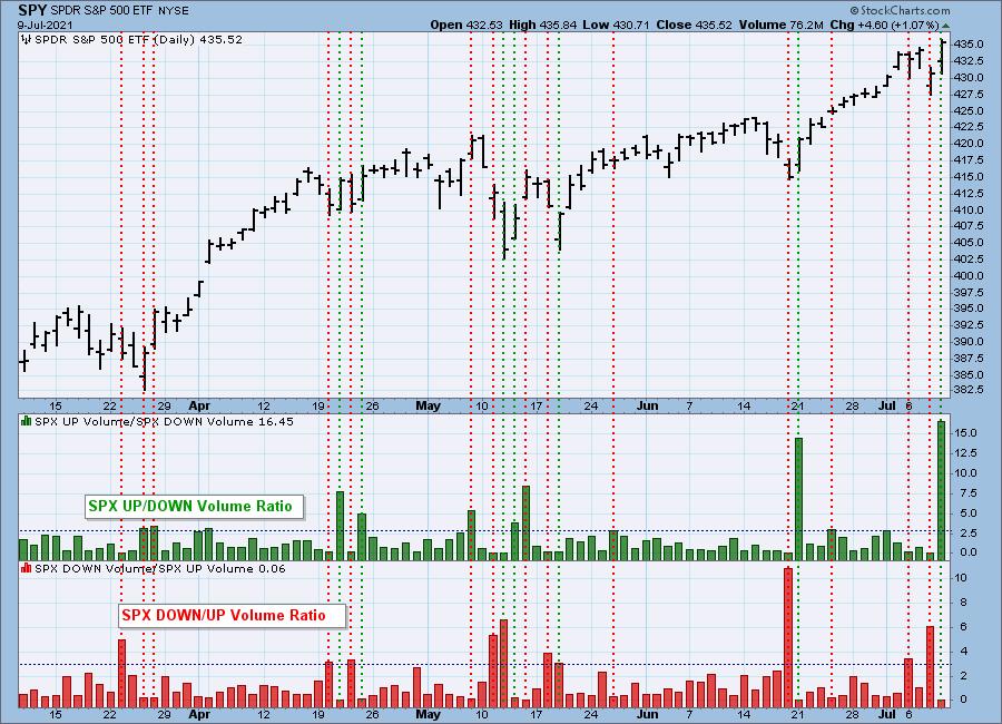
A note on Volume Ratio analysis: NYSE Up/Down and Down/Up volume ratios are also climax detectors. The 9:1 ratio suggested by the late Dr. Martin Zweig in his book, Winning on Wall Street, is especially significant, but we primarily look for spikes outside the normal range to clarify a particular event. We have an NYSE and S&P 500 version of the ratios, and normally they will only be published when there is a notable reading.
Let's see if we have confirmation of yesterday's and today's "climax days." Yesterday, the Down/Up Volume Ratios for both the NYSE and SPX were above our climactic threshold of 3.0. That confirmed yesterday's downside exhaustion climax. Today, we saw upside initiation climax confirmation on the Up/Down Volume Ratios for both the NYSE and SPX.

The S&P 500 version can get different results than the NYSE version because (a) there are only 500 stocks versus a few thousand and (b) those 500 stocks are all large-cap stocks that tend to move with more uniformity.

The question remains: how do we determine if it is an "initiation" or "exhaustion" climax? That's a bit tricky as it isn't always cut and dried. Typically, we look at the trend that preceded the climax. If it seems to be ending a trend, it is considered an "exhaustion", whereas if it is a reversal of a trend, it is considered an "initiation".
Read our conclusion below regarding today's upside initiation climax.
It's FREE! Learn how Erin trades in the free DecisionPoint Trading Room Mondays at Noon ET. Recordings are sent to all registrants!

Click here to register in advance for the recurring free DecisionPoint Trading Room! Recordings are available!

CONCLUSION: Climax analysis is exclusive to DecisionPoint. DecisionPoint Alert subscribers are notified immediately if we see a climax day. Additionally, we look at our other DecisionPoint indicators to confirm climaxes or see if the climaxes will lead to more rally or more decline in the short- to intermediate-term. Today's readings suggest an upside initiation climax. We should expect higher prices, or at least some consolidation, rather than a big decline to begin next week.
Our special is ending next week on July 15th! Take advantage by using coupon code: SAVE50 to get 50% off your first month on all of our subscriptions.
Technical Analysis is a windsock, not a crystal ball.
--Erin Swenlin
(c) Copyright 2021 DecisionPoint.com
Helpful DecisionPoint Links:
DecisionPoint Alert Chart List
DecisionPoint Golden Cross/Silver Cross Index Chart List
DecisionPoint Sector Chart List
DecisionPoint Chart Gallery
Trend Models
Price Momentum Oscillator (PMO)
On Balance Volume
Swenlin Trading Oscillators (STO-B and STO-V)
ITBM and ITVM
SCTR Ranking
DecisionPoint is not a registered investment advisor. Investment and trading decisions are solely your responsibility. DecisionPoint newsletters, blogs or website materials should NOT be interpreted as a recommendation or solicitation to buy or sell any security or to take any specific action.
|
| READ ONLINE → |
|
|
|
| ChartWatchers |
| Focus on the US Dollar |
| by Greg Schnell |
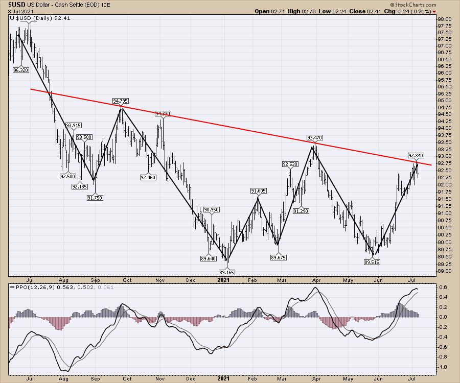
This is a pivotal point for the US Dollar.
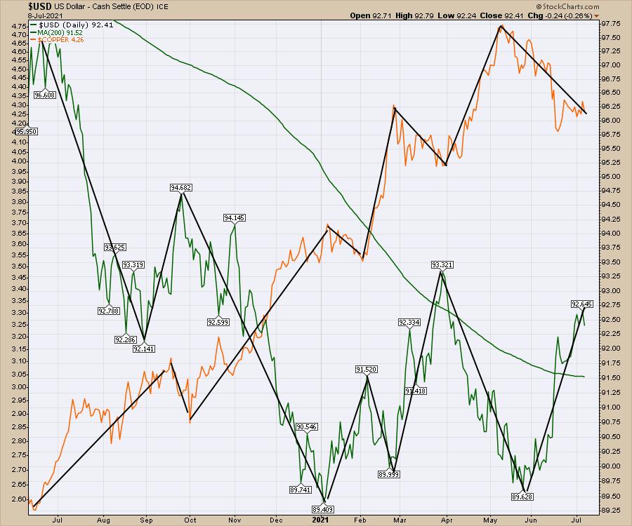
The US Dollar can have meaningful changes on commodities, bond flows and foreign investment, to name a few. I usually watch the effect through commodities, and the wild shake in the commodities recently has been partly due to dollar changes.
An example is Copper topping out the week of March 10th and the US Dollar bottoming shortly after, on March 17. The correlation doesn't have to be to the day, but it is noticeable.

That leads me to the trend line currently facing us on the US Dollar.

While the dollar may reverse to go lower, it is a very important inflection point for the it. I am watching to see if the dollar stalls to set up the next run in the commodity stocks for copper, steel and other industrial metals. If it doesn't reverse, that implies some significant pressure on commodities, which have been downtrending for 2 months.
If you are looking for some portfolio diversity and would like to start leaning towards some of these rapidly-moving commodity stocks, take a test drive at GregSchnell.com/explore. The first two weeks are free and the membership is 40% off right now.
|
| READ ONLINE → |
|
|
|
| ChartWatchers |
| Are Strong AD Lines Suggesting Big Earnings Ahead for These 3 Companies? |
| by Tom Bowley |
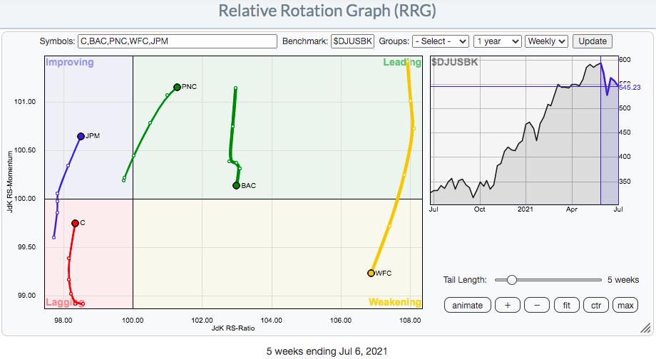
Earnings season kicks off next week, with the big banks getting things started. After a rough stretch with falling treasury yields, the banks index ($DJUSBK) rallied on Friday as yields rebounded. Recently, I provided a relative strength look at key banks reporting next week. Here's a quick recap if you missed my earlier discussion:

Relative strength definitely favors Wells Fargo (WFC), as it's the farthest to the right. While it's in the weakening quadrant, that's not unusual for a leader to consolidate on a relative basis and work through the weakening quadrant before turning back up into leading. I prefer stocks that move mostly on the right side of an RRG chart.
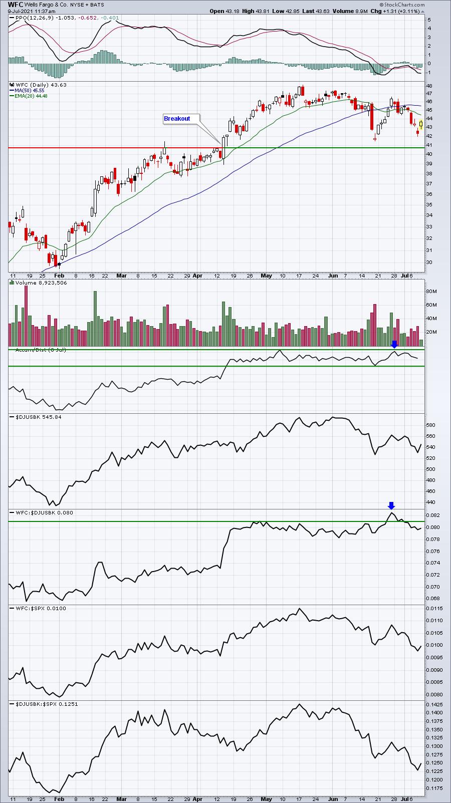
In addition to showing relative strength, the accumulation/distribution line (AD line) remains quite strong on all 3 banks on the right side - WFC, PNC, and BAC. Let's look at the WFC SharpChart:

WFC continues to trade well, despite the challenges that a falling treasury yield environment presents. It remains a leader as it recently broke out again vs. its bank peers. Its AD line remains as strong as any of the banks shown above.
Wall Street seems to be "banking" on a solid report from Wells Fargo, and I'm a believer as well.
Does The AD Line Matter?
I've seen plenty of stocks rise without a strong AD line, so I don't believe a strong AD line is necessary. However, from a common sense perspective, the AD line goes higher any time a stock closes above its daily midpoint range, even if it closes lower than the prior day's close. That's the key difference between the AD line and OBV (On Balance Volume). If a stock closes above its midpoint for the day, in theory there were more buyers than sellers. If this continues over time, a rising AD line should reflect whether a stock is being bought or sold on a net basis. So while it may not be necessary, it is a positive and potentially confirming signal.
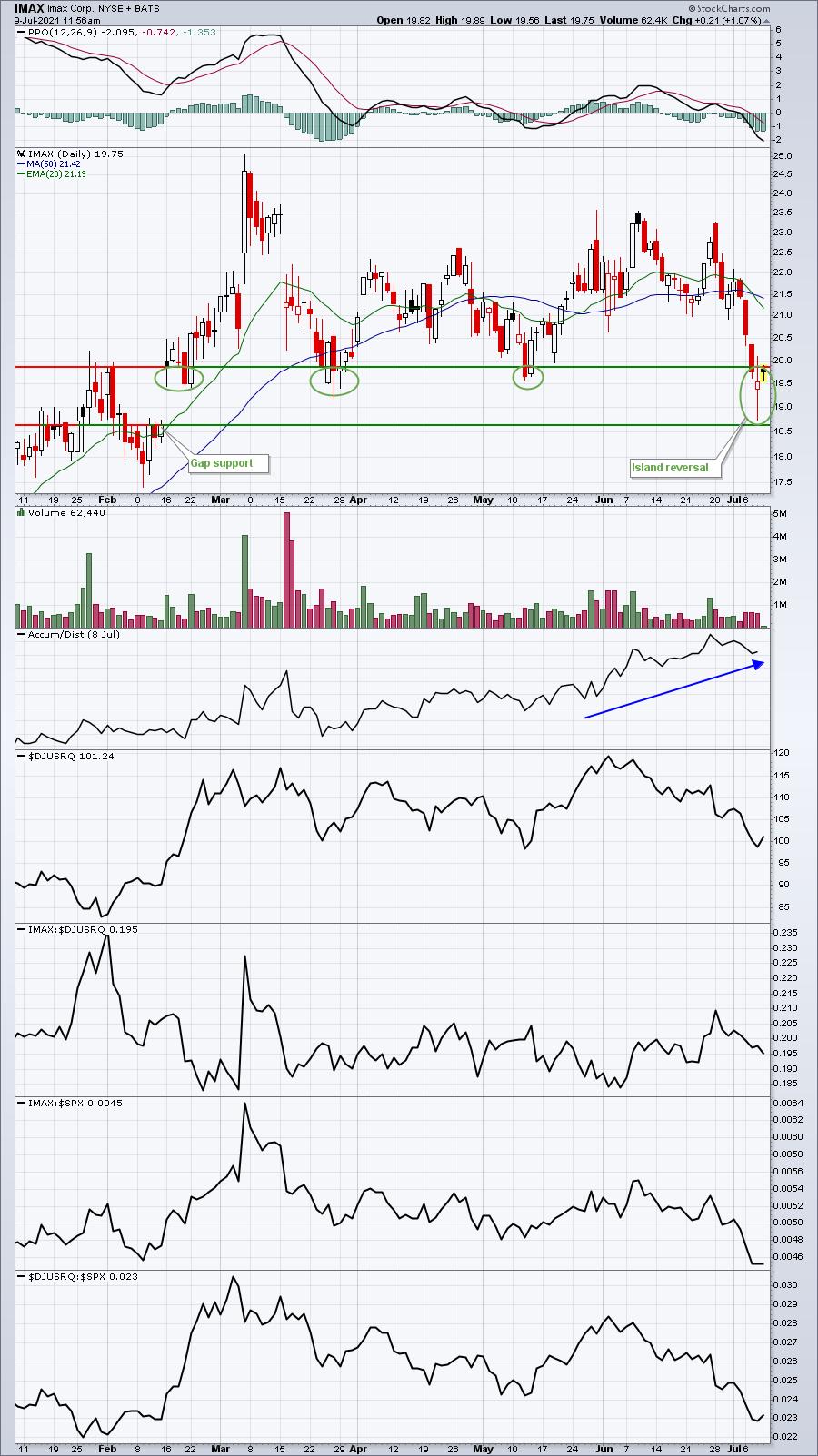
With this in mind, I ran a scan of stocks with RSIs below 50 (recent pullback) and AD lines that have been rising across 4 time frames. Below are 3 companies that are setting new AD line highs, despite price action that's been moving lower. This certainly could be a signal that Wall Street is using this weakness to accumulate before earnings.
IMAX Corp. (IMAX)
IMAX hit a high during the first week of March and hasn't returned to that price level. IMAX was a major beneficiary of the positive vaccine news that was reported on Monday, November 9th last year and the ensuing advance was solid - more than a double in just 4 weeks. During its recent consolidation since that March high, IMAX has seen its AD line push to new highs and continuously trend higher:

I'd want to see gap support at 18.64 hold. Otherwise, I'd want to re-evaluate this trade. Recreational services ($DJUSRQ) have been very weak on a relative basis, but are currently testing key price support on an absolute basis, where we could see a short-term rally. Despite the significant weakness in IMAX shares the past couple weeks, the AD line remains in a very solid uptrend, suggesting possible accumulation. We'll know shortly whether this AD line was a bullish signal.
IMAX reports earnings on July 27th after the market closes.
Ferrari NV (RACE)
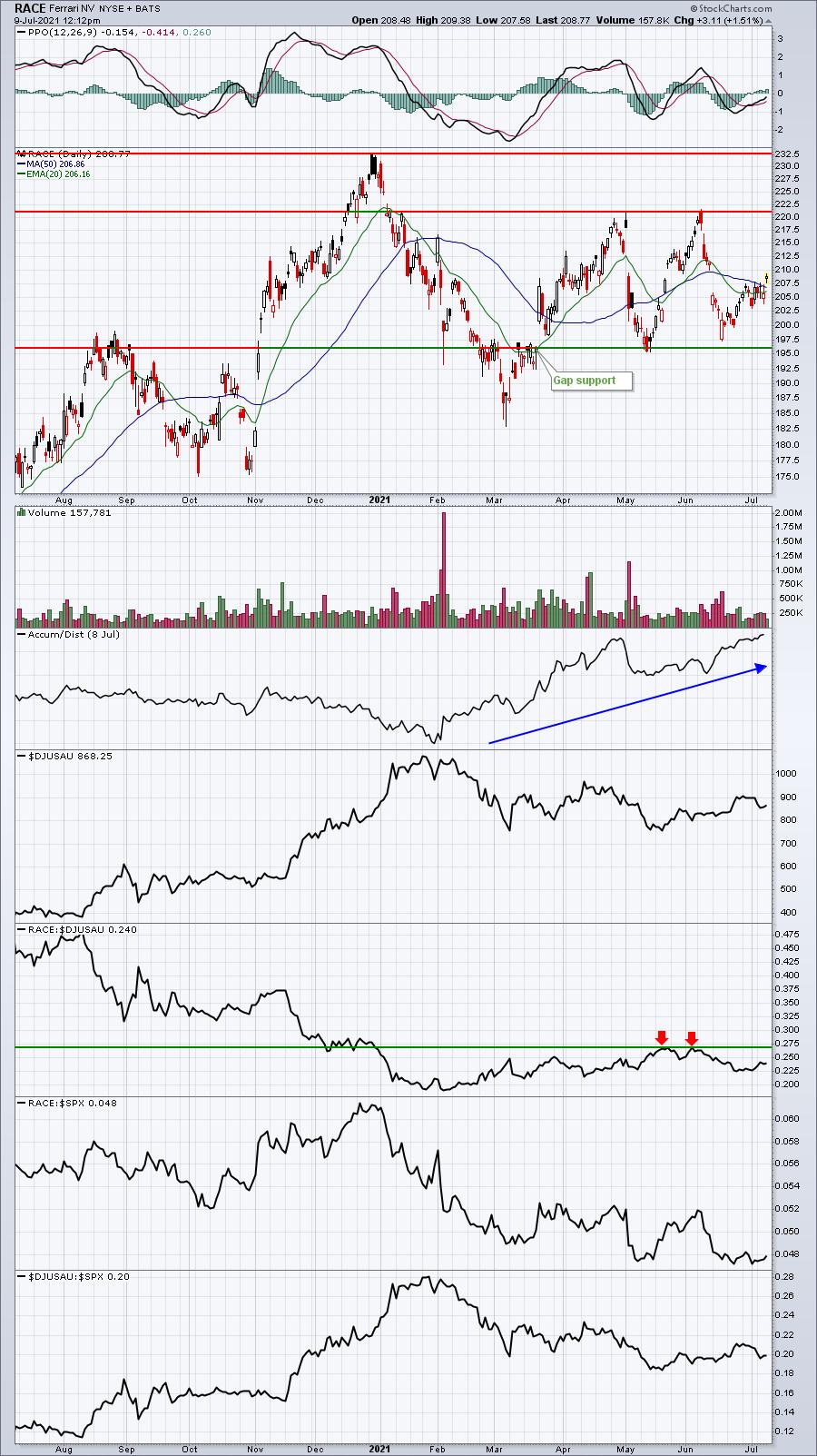
It's been even longer since RACE saw its high - all the way back on December 29th, 2020. It's still roughly 10% off that high, yet its AD line has broken to a new high, which is rather impressive:

We saw a gap higher on Friday to clear both of its key moving averages, so perhaps RACE is ready to begin trending higher and towards the two key price resistance levels that I've annotated above. There are definitely other technical indicators that contradict the strong AD line, namely relative weakness and lack of a defined uptrend. But is the AD line providing us an early signal of an impending advance? We'll find out soon.
RACE reports earnings on August 2nd before the market opens.
Yeti Holdings (YETI)
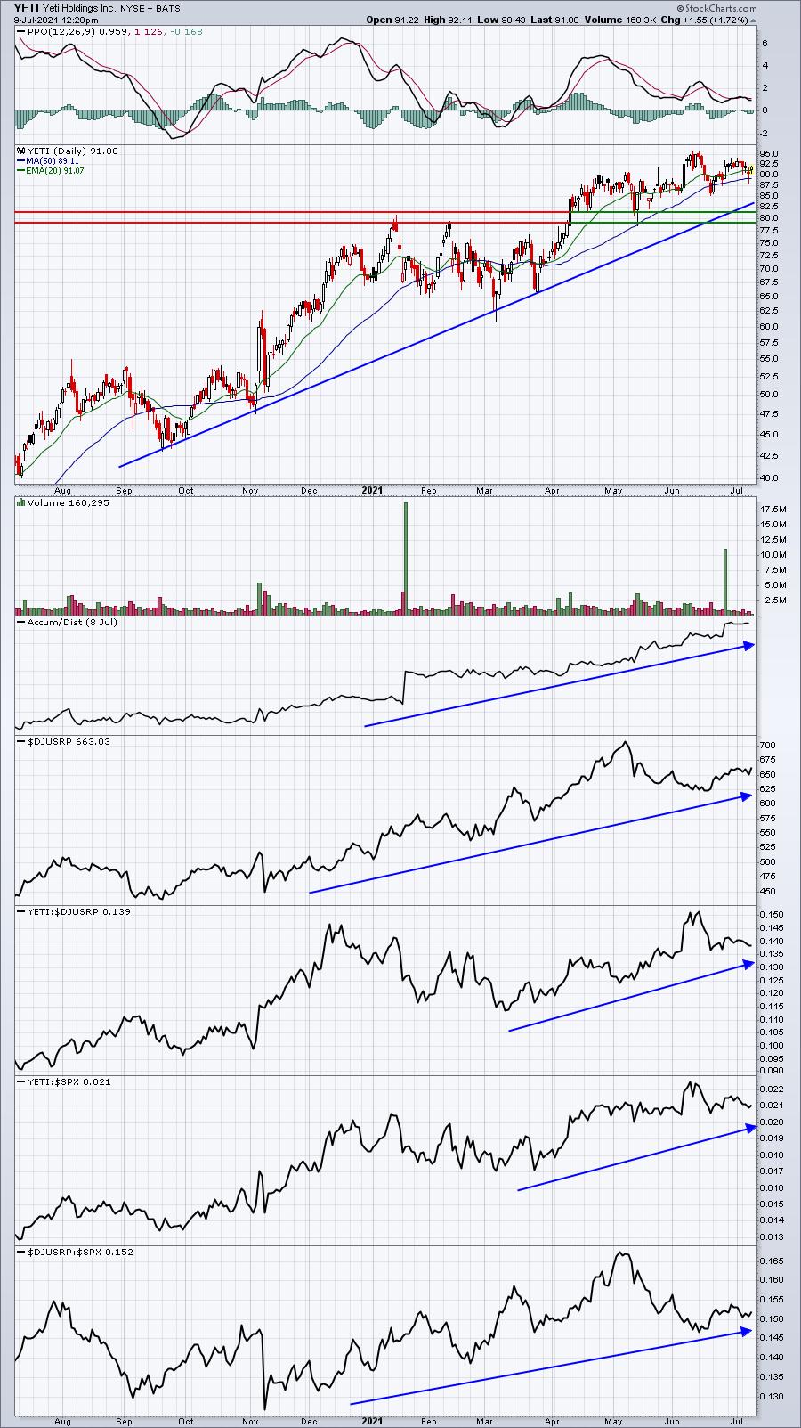
I feel most comfortable about this one. YETI has been an excellent relative performer and its group, recreational products ($DJUSRP), has been stronger than both recreational services and automobiles in 2021. We've seen a bit of absolute price weakness over the past month, but YETI's AD line has powered to new highs:

Unlike the other two stocks that I've provided above, I see few flaws in this chart. Furthermore, I believe consumer discretionary is poised to lead the market higher in the second half of the year. Given the tailwinds of a secular bull market, the strength of the recreational products group and the technical strength of YETI, I believe the new high on the AD line as simply a confirming bullish signal of higher prices ahead.
On Saturday morning, July 10th, at 10:00am ET, I'm hosting a FREE webinar, "Sneak Preview - Q2 Earnings". I'll focus on another 10 or 15 stocks with solid AD lines as they head towards earnings. I'll also cover all major companies that report earnings next week and give my opinion as to whether I expect each company to beat or miss earnings. So if you like the above analysis, then you should enjoy Saturday's webinar. These FREE events are reserved for our EarningsBeats.com community members, which includes our free EB Digest newsletter. If you attend the webinar directly from the link below, we'll be sure to add you to this free newsletter, published 3x a week on Mondays, Wednesdays and Fridays. There is no credit card required and you may unsubscribe at any time.
Click here for the link for Saturday's webinar (the room will be open by 9:00am ET, but the webinar will not begin until 10:00am ET). If you'd like to directly subscribe for our EB Digest newsletter, you can CLICK HERE to enter your name and email address in the area provided.
Happy trading!
Tom
|
| READ ONLINE → |
|
|
|
| RRG Charts |
| Elevated Risk for Stocks |
| by Julius de Kempenaer |

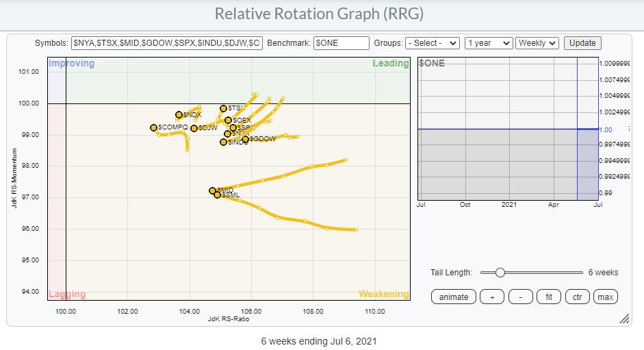
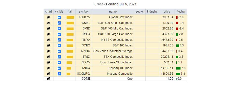
The RRG above shows the ABSOLUTE rotations for a selection of major indexes. Instead of plotting them against a global or otherwise encompassing index, I have plotted them against $ONE to get a handle on their underlying absolute trends. What is noticeable is that they are all inside the weakening quadrant and that the majority is traveling at a negative RRG-Heading. The message here is that the uptrends in the majority of these indexes are slowing down and all of them are losing momentum. You could read this as a measure of breadth for major stock market indexes and, as such, it is sending a negative message.
The indexes on the RRG are listed in the table below.

The only three indexes that are moving higher, and only mildly, on the RS-Momentum scale are the Nasdaq composite, the Nasdaq 100 and the Candian TSX. Only $NDX and $TSX are at a positive RRG-Heading.
The Canadian index is heavily tilted to Energy and Materials-/Commodity-related sectors, which are doing relatively well. And the $NDX, obviously, is driven by major technology stocks, which are going through a good streak at the moment.
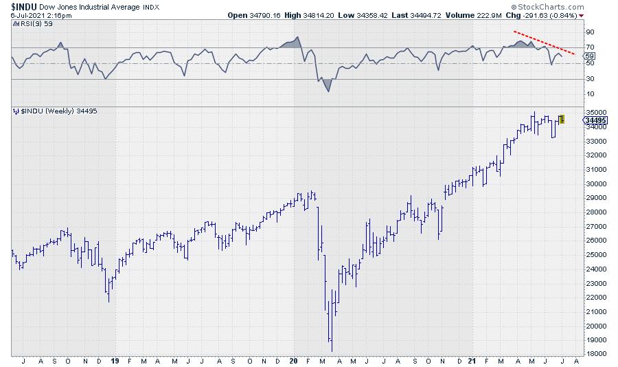
When not looking at relative strength or related forms of analytics, I like to keep things simple. Like many people, I like to use the RSI, especially to spot divergences, as they can be an early warning system for trend changes or at least a pause in the existing trend.
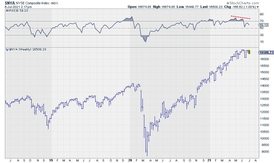
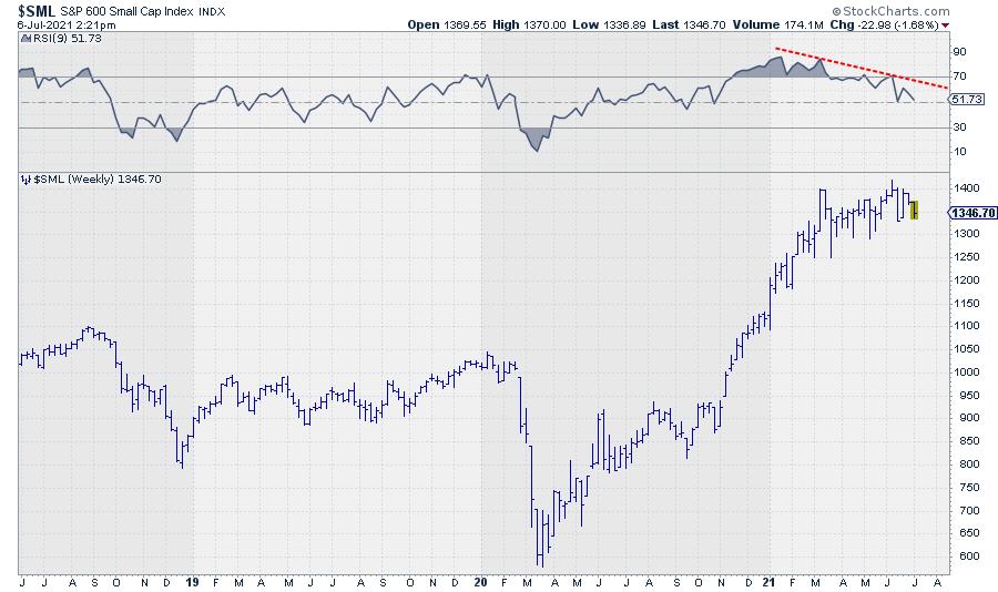
A lot of the indexes in this group are showing very pronounced negative divergences between price and RSI on the weekly charts. BTW, I use a 9-period RSI; I started doing that ages ago and stuck with it. I feel that it is a bit more responsive than the classic 14-day RSI and more easily reaches extreme values, which is what we need to spot divergences.
The most prominent one, IMHO, is spotted in the Dow Jones Industrials index.

But it is also showing up in a broad index, like the NYSE Composite Index.

And very strongly in the Small Cap Index.

What About Sector Strength?
Running the Relative Rotation Graph for sectors against $ONE gives us the picture below.

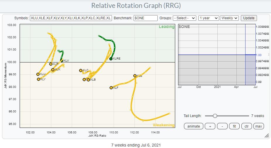
Here also, the dominant position and direction of travel is inside weakening and/or at a negative RRG-Heading.
The Energy sector is moving higher on the JdK RS-Momentum scale, but not on the RS-Ratio scale. Communication Services is marginally picking up in terms of momentum, but lacks trend strength, and the same goes for Technology.
What about Breadth?
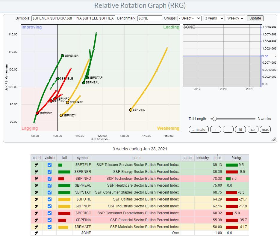
One of the RRGs I like to consult in order to get a handle on breadth is the Relative Rotation Graph, which plots the bullish percent indexes for all sectors.

As a reminder, the bullish percent index shows the percentage of stocks in an index that are on a P&F buy signal. Here is the ChartSchool article.
On the RRG, all tails, except for Energy and Communication Services, are traveling at a negative heading. This means that the trend in the number of stocks on buy-signals has started to decline and the decline is picking up (negative) momentum. Only Energy and Communication Services are moving in the opposite direction.
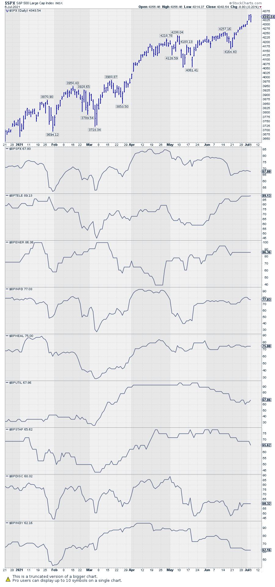
The chart below shows the price of $SPX. The first chart below price is the BP index for $SPX itself. It is immediately visible that the BP for the entire S&P 500 is declining since April and is now below 70%.
The BP index charts for the sector indexes are plotted in descending order. Financials and Materials are not shown, but they are at even lower levels (55% and 50%).

The general tendency is for the number of stocks on P&F buy signals to decline. I do see the breakouts in $SPX and $NDX but, based on all of this information, I have a hard time jumping on board right now. My interpretation is that stock markets are currently at elevated risk levels. As discussed in today's episode of Sector Spotlight, there is plenty of downside available for the S&P and the various sector indexes to decline/correct without damaging the long-term uptrends.
Please note that corrections can take place in price (decline) but also in time. That is to say, a market can digest the buying that resulted in a long and strong rally by a sharp decline, but it can also meander sideways to slightly lower over an extended period of time.
Either way, the upside potential seems limited for the time being.
#StaySafe, --Julius
|
| READ ONLINE → |
|
|
|
| MORE ARTICLES → |
|
 Chart 1
 Chart 2
 Chart 3


 The Steel ETF (SLX) led the market from late October to early May by more than doubling in price. The ETF then fell back with a break of the 50-day SMA in June, but this decline is viewed as a correction within a bigger uptrend. As such, it represents an opportunity and there are signs that this correction is ending.

 The investment press seems to be writing a good deal these days about mindfulness and living in the present. Similarly, a number of sports analysts are preaching the need of a "back to basics" philosophy for certain struggling athletic franchises.