| THIS WEEK'S ARTICLES |
| ChartWatchers |
| New Trend Signal for a Former High Flyer |
| by Arthur Hill |
Today's commentary will start with price chart analysis for the Clean Edge Green Energy ETF (QCLN) and then look at the recent trend signals.
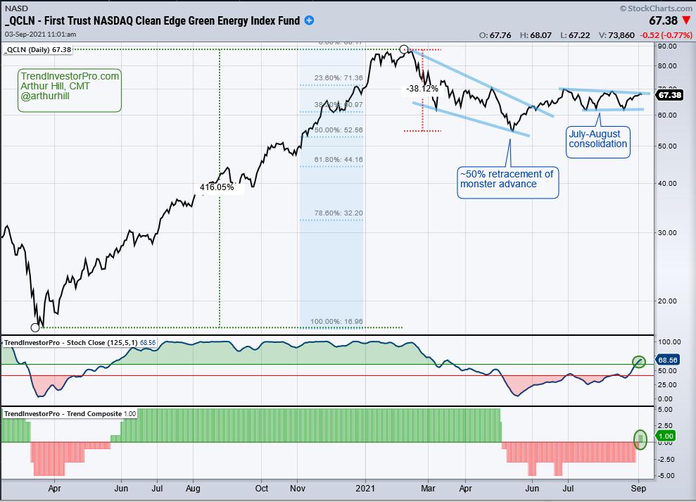
The price chart shows QCLN surging over 400% with a monster advance from the March 2020 low to the February 2021 high. A 38% decline followed as the ETF retraced a little less than half of the prior advance with a falling wedge. Note that the pattern and the retracement amount are typical for corrections after a big advance. QCLN broke out of this wedge in June, consolidated into July-August and is on the verge of a consolidation breakout now. Another breakout would be bullish and argue for a challenge to the February highs.

Now let's look at a systematically driven approach with two trend-following indicators, StochClose (125,5) and the Trend Composite, both of which are part of the TIP Indicator Edge Plugin for StockCharts ACP (details here). StochClose triggered bullish in late May 2020 with a cross above 60 and bearish in early May 2021 with a cross below 40. Even though these signals missed the bottom and the top, they caught the middle of the trend and this was enough for a 130% gain. The Bottom window shows the Trend Composite with similar signals.
These trend indicators turned bearish in early May after the ETF had already fallen over 30% from its high. This is the nature of trend-following: signals lag. Testing and experience suggest that trend signals like these are successful around 40% of the time and the average gain is usually more than three times the average loss. At this point, QCLN has bullish trend signals and these will remain in force until countered with a bearish signal.
Note that several more ETFs triggered bullish for StochClose over the past week and many of these were the high flyers from March 2020 to February 2021. TrendInvestorPro.com tracks these signals for a core list of 128 ETFs. Looking for more trend-following signals and a systematic approach? Check out TrendInvestorPro.com (click here).
*****************************
|
| READ ONLINE → |
|
|
|
| Martin Pring's Market Roundup |
| Several Intermarket Relationships are Signaling Danger for Commodities |
| by Martin Pring |
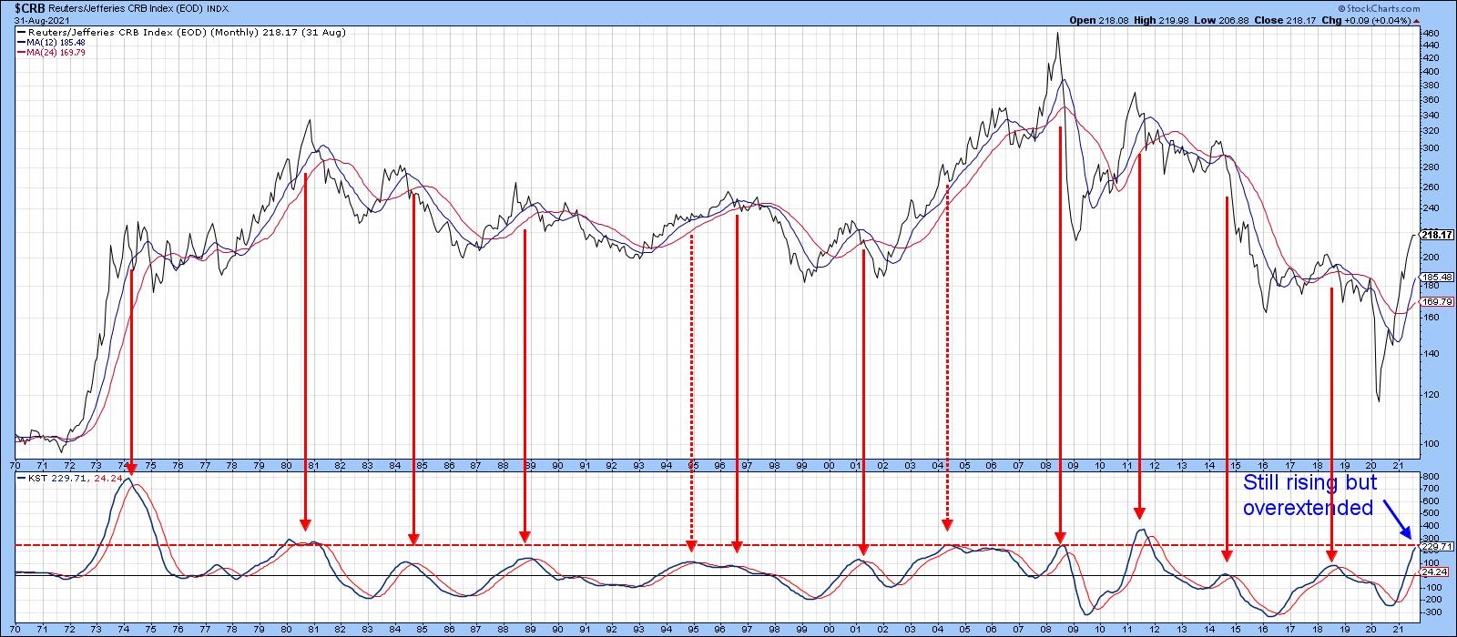
When considered in their own right, commodities, as represented by the CRB Composite, are in a primary bull market. Chart 1, for instance, shows that the Index is above its 12- and 24-month moving averages and the long-term KST is also in a bullish trend. That said, this momentum indicator has reached the red overbought level. Apart from the notable advance in 1974, merely reaching the overstretched zone has consistently indicated the terminal phase of a bull market. That in itself suggests that most of the juice has already been squeezed out of the post-April 2020 bull market. However, there are some other indicators derived from intermarket relationships that offer a better-than-50/50 chance that an intermediate correction, at the very least, is in the wind. These relationships involve gold bonds and the stock market. Let's consider them each in turn.
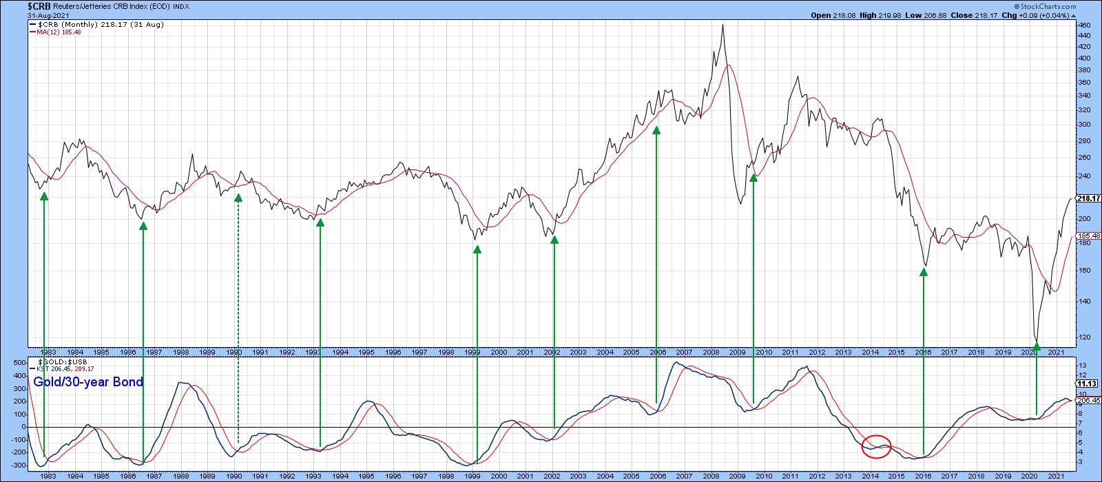
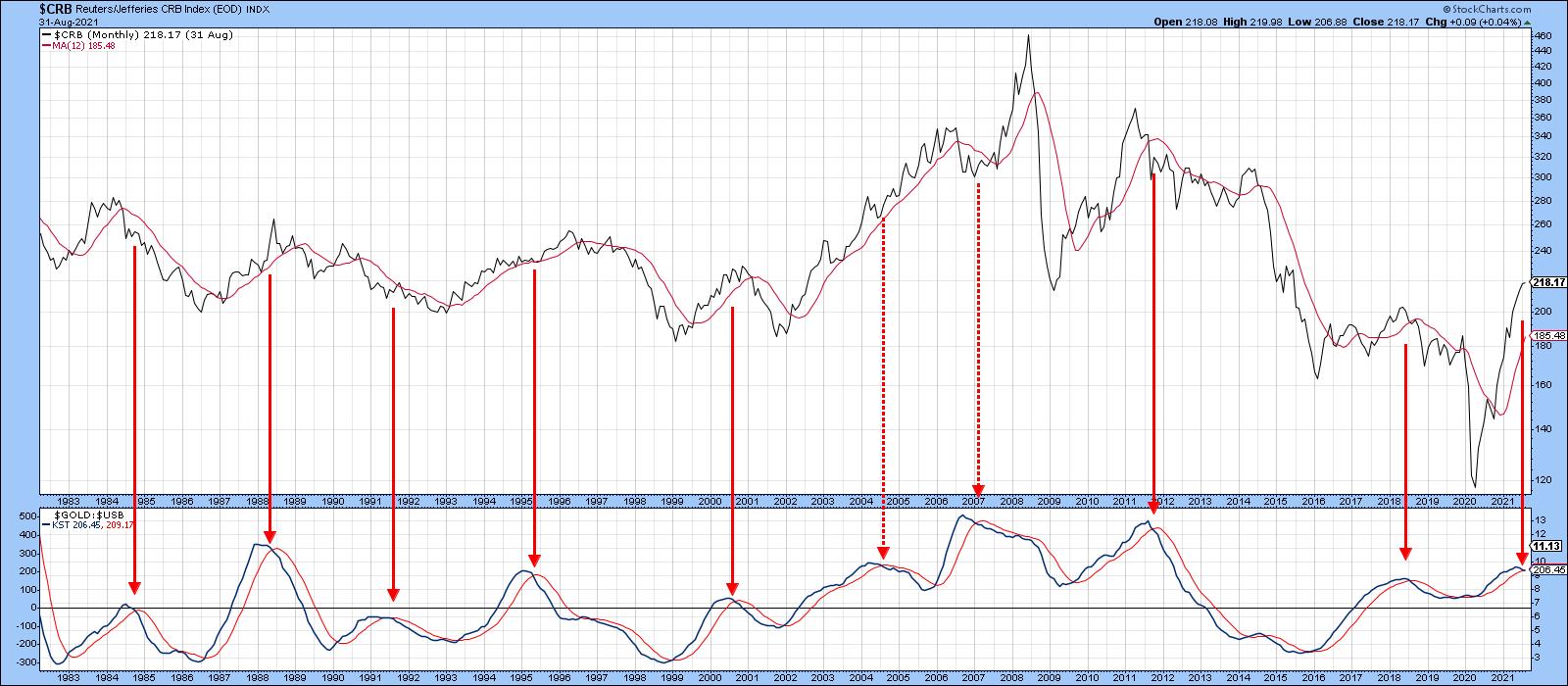
(Before we do, please note that, in all these charts, solid arrows represent successful signals and dashed ones false negatives or positives.)
 Chart 1 Chart 1
Gold vs. Bonds
Chart 2 focuses on the relationship between gold and bonds and what that is saying about the likely trajectory for commodities going forward. Gold tends to discount future commodity price inflation and bonds deflationary trends in financial markets. When gold is outperforming bonds, that is generally bullish for commodities and vice versa. Determining when these changes in trend are about to take place is the tricky part, but applying a long-term KST seems to do the trick. The arrows in Chart 2 show that, when the KST for the Gold/30-year Bond ratio bottoms out, there is a strong possibility that commodities will rise. For example, since 1993, there have been ten such buy signals, only one of which could be deemed a failure.
 Chart 2 Chart 2
Chart 3 shows the sell signals where the 9:2 ratio favoring successful ones also puts the odds in the indicator's favor. The KST has begun to roll over for the twelfth time and has tentatively crossed below its MA again.
 Chart 3 Chart 3
CRB vs. the Inflation/Deflation Index
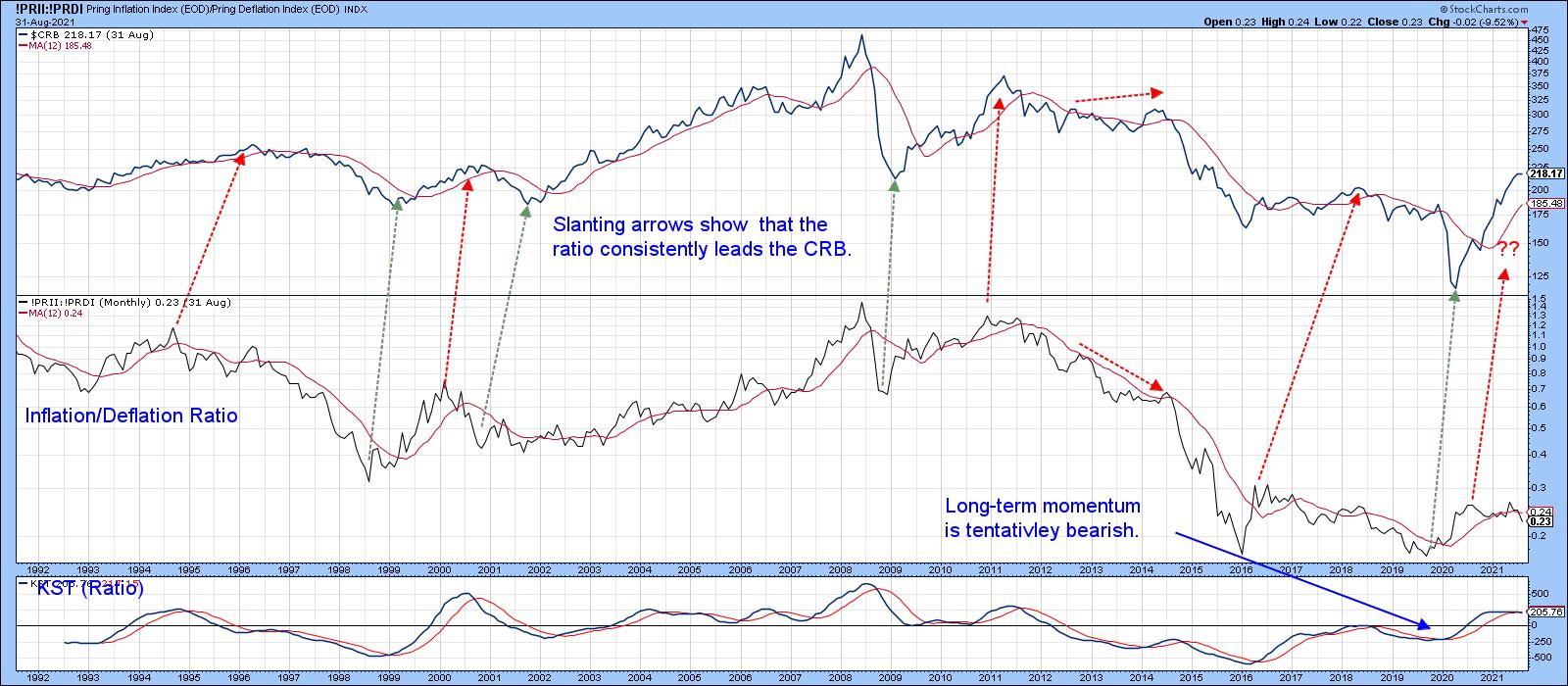
Chart 4 compares the CRB to my Inflation/Deflation Index, which you can read about here. Briefly, it consists of the ratio between an index of S&P industry groups that are sensitive to commodity price swings and another that encompasses groups that tend to benefit from a deflationary environment, when interest rates are falling. It's really the stock market's way of anticipating periods of inflation and deflation.
 Chart 4 Chart 4
Most recently, the ratio bottomed in September of 2019 and the CRB followed suit in March of 2021. The Index has yet to register an identifiable peak, but the ratio topped out in the summer of last year. It looks as if that will be the high for the cycle, as the ratio is now well below its 12-month MA. Moreover, the long-term KST begun to drop below its 9-month MA. Unfortunately, the lead given by the ratio varies considerably. But given the stock market, through this relationship, has been forecasting a CRB high for well over a year, it's probably not that far away.
Gold vs. Commodities
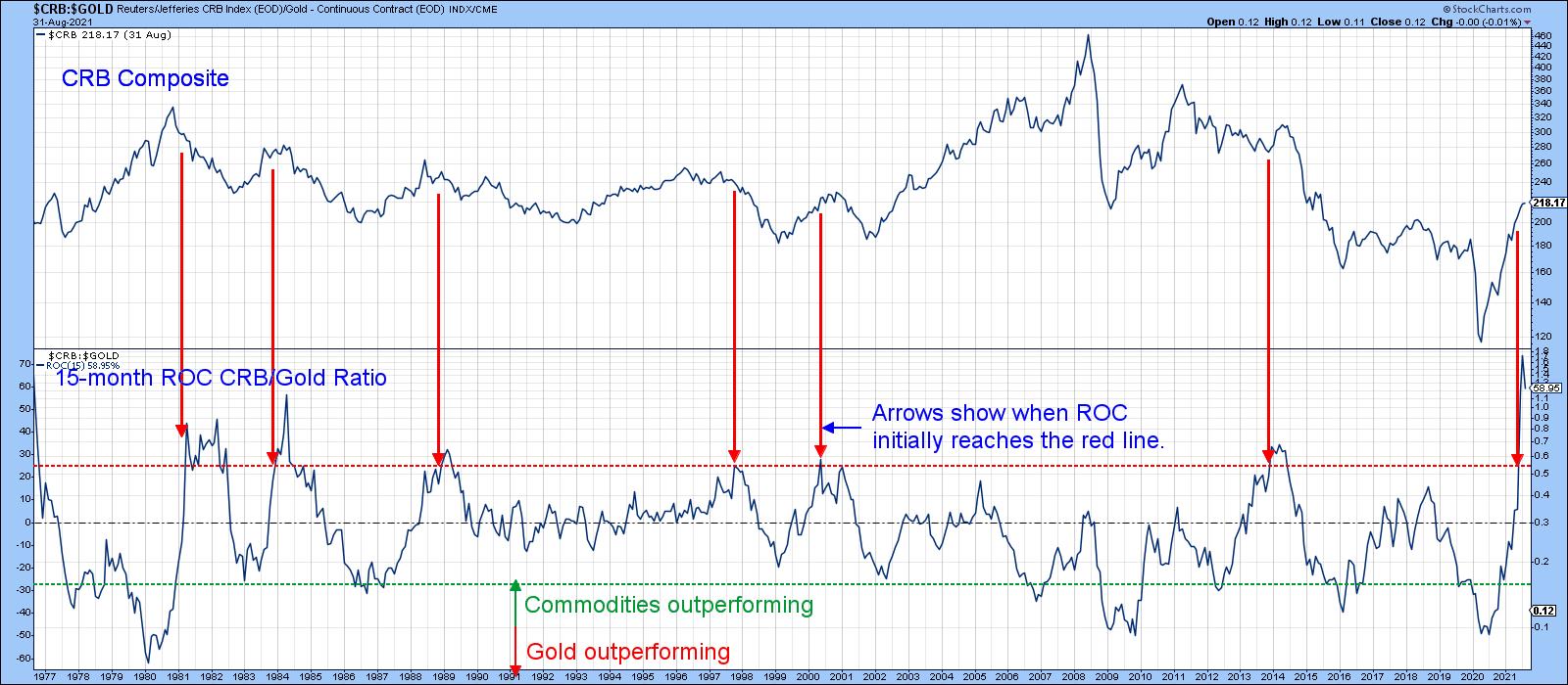
Gold discounts future commodity price inflation to the extent that, when it finally starts to underperform commodities, they tend to rise. Conversely, when the price of the yellow metal starts to outperform, commodities tend to fall.
A 15-month ROC of this CRB/Gold relationship has been plotted in Chart 5. An elevated plot means that commodities have been outperforming gold and vice versa. In that respect, an initial reading above the red line indicates that gold has spent enough time discounting lower commodity prices, so it's about time that the forecast become reality with weakening commodity prices. These instances have been flagged with the vertical lines. This underperformance by gold has consistently been followed by declining commodity prices, so a recent jump to a record gold underperformance offers a definite bearish warning that a downside commodity reversal is likely.
 Chart 5 Chart 5
None of these relationships on their own has a perfect track record. However, when considered as a consensus, they offer a very powerful message that commodities could be closer to some kind of peak than most would suspect. Incidentally, you can update these charts by simply clicking on them.
Good luck and good charting,
Martin J. Pring
The views expressed in this article are those of the author and do not necessarily reflect the position or opinion of Pring Turner Capital Group of Walnut Creek or its affiliates.
|
| READ ONLINE → |
|
|
|
| DecisionPoint |
| Participation Somewhat Improved, but Still Poor |
| by Carl Swenlin, Erin Swenlin |
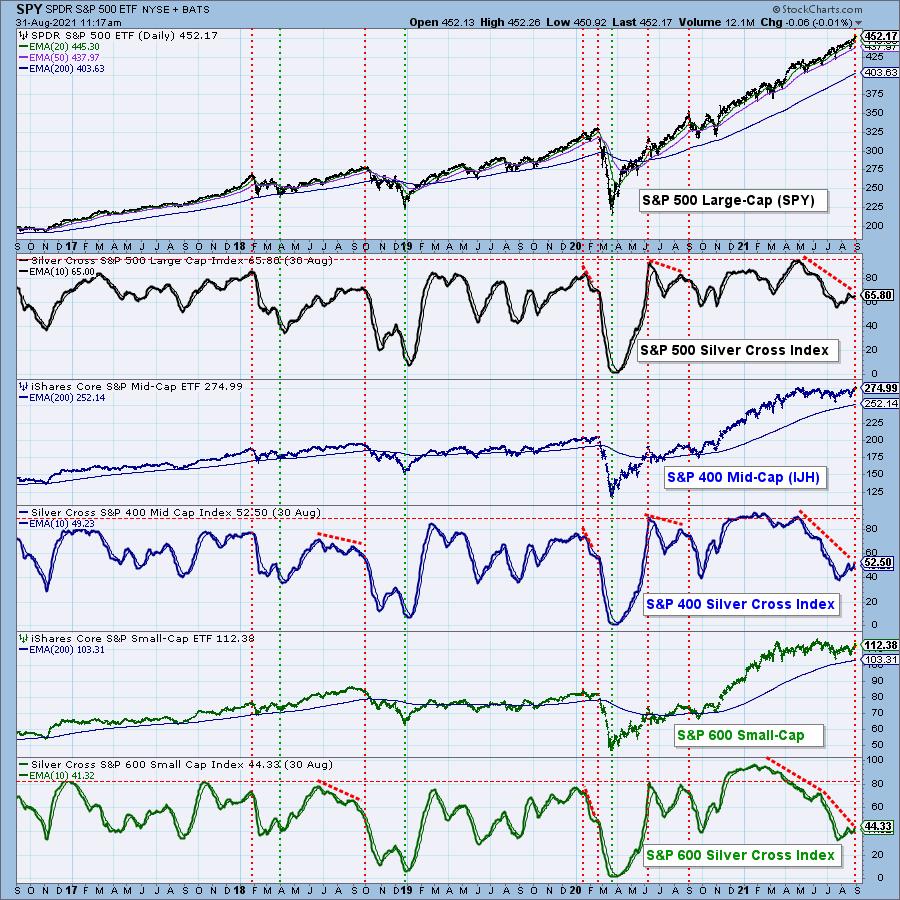
When the 20EMA crosses up through the 50EMA, we consider it to be an intermediate-term BUY signal (aka Silver Cross, as opposed to the Golden Cross, to be discussed later). A few years ago we developed the Silver Cross Index (SCI), which shows the percentage of stocks in a given index that have a Silver Cross status. It gives us a clear picture of the number of stocks that are participating in an advance, or decline. The chart below shows the SCI for the three indexes that compose the S&P 1500 Index. it is not hard to see the severe negative divergences that exist on all three.

As we would expect, the S&P 600 has the lowest percentage of participation (44%), and it has been flat for about six months. The S&P 400 has also been flat but has a little better SCI reading of 53%. The large-cap S&P 500, still rallying after about 16 months, is strongest with an SCI of 66%. Applying a little math we determined that the SCI for the S&P 1500 is 53%. That's really poor and leaves the market vulnerable if current support dries up in the large-cap sector.

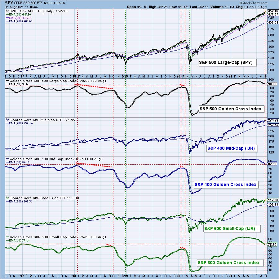
When the 50EMA crosses up though the 200EMA, it is widely considered to be a long-term BUY signal (aka Golden Cross). The Golden Cross Index (GCI) gives us a longer term view of breadth and shows the percentage of stocks in an index that have Golden Cross status. While the GCIs for the three S&P 1500 indexes have pulled back somewhat, the pullbacks have been from record high GCI levels, and they still reflect strength in the longer term. The GCI for the S&P 1500 is 83%.

CONCLUSION: While the SCI shows considerable weakness in the intermediate-term, the GCI tells us that the long-term is fairly solid. We interpret this to mean that stocks without a Silver Cross Buy signal are simply languishing rather than completely falling apart. That's a good thing as far as it goes; however, with roughly half of S&P 1500 stocks in a swoon, there is really no cushion left to absorb the next bit of bad news.

Click here to register in advance for the recurring free DecisionPoint Trading Room! Recordings are available!
Technical Analysis is a windsock, not a crystal ball.
--Carl Swenlin
(c) Copyright 2021 DecisionPoint.com
Helpful DecisionPoint Links:
DecisionPoint Alert Chart List
DecisionPoint Golden Cross/Silver Cross Index Chart List
DecisionPoint Sector Chart List
DecisionPoint Chart Gallery
Trend Models
Price Momentum Oscillator (PMO)
On Balance Volume
Swenlin Trading Oscillators (STO-B and STO-V)
ITBM and ITVM
SCTR Ranking
DecisionPoint is not a registered investment advisor. Investment and trading decisions are solely your responsibility. DecisionPoint newsletters, blogs or website materials should NOT be interpreted as a recommendation or solicitation to buy or sell any security or to take any specific action.
|
| READ ONLINE → |
|
|
|
|
|
| ChartWatchers |
| Catch More of These Stunning Returns! |
| by Greg Schnell |
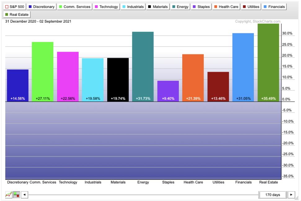
Tech gets all the press these days, as the Energy sector is so small in the SPX weighting. However, it is the second-best sector to produce some of the stunning returns year-to-date. More importantly, I just got a bunch of buy signals suggesting we might be heading into a strong final third of the year. Are you ready to catch more of these stunning energy returns?

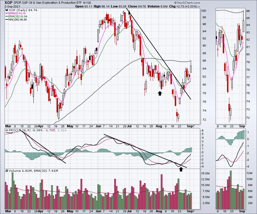
XOP broke out of the 2-month downtrend conclusively this week. This was an aggressive pullback from $100 to $72, while the inventory levels tightened all summer long.

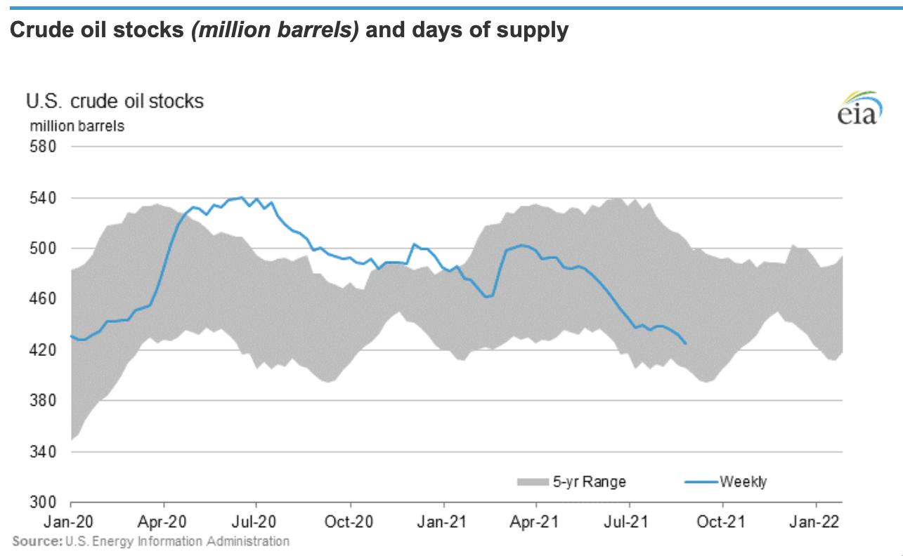
The inventory levels are at the low end of the range and the hurricane season isn't helping. While US production has increased slightly year on year, it is nowhere near 2019 levels.

It all sets up to be a supportive environment for the remainder of the year.
If you would like to try the information from GregSchnell.com, head on over to GregSchnell.com/explore for a two-week free trial and 40% off an annual subscription.
|
| READ ONLINE → |
|
|
|
| RRG Charts |
| Utilities and Staples at Opposite Rotations on RRG; What Does That Tell Us? |
| by Julius de Kempenaer |

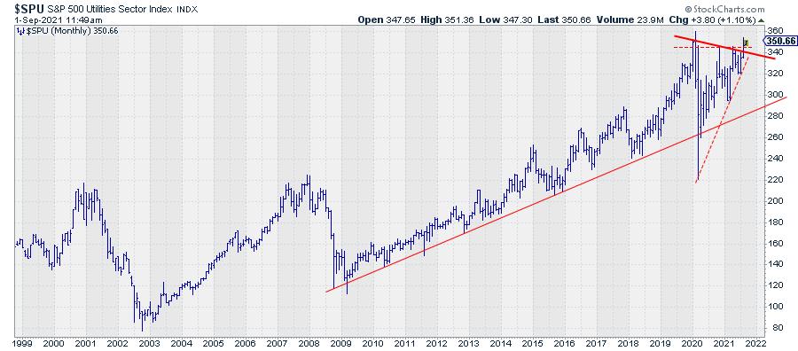
In this week's episode of Sector Spotlight, I focused on the long-term trends using monthly charts. For several months already, most sectors have been in an uptrend on these charts; only the energy sector and the utilities sector did not qualify as such (higher highs and higher lows on the monthly chart). That changed at the end of August when Utilities broke above their November-20 and April-21 highs and, at the same time, took out the slightly falling resistance coming off the early 2020 cluster of highs in Jan, Feb and March.
Obviously that's a good thing, for Utilities that is. Is it also a good thing for the market as a whole? Yes and no, I think.
Clearly, a break higher for utilities and joining all other sectors, except energy, in an uptrend is good. However, downside risks are quite extensive across the board. Also, Utilities is a notoriously DEFENSIVE sector that usually does well when the market does not do so well.
So when Utes sparks to life all of a sudden, I raise my guard.

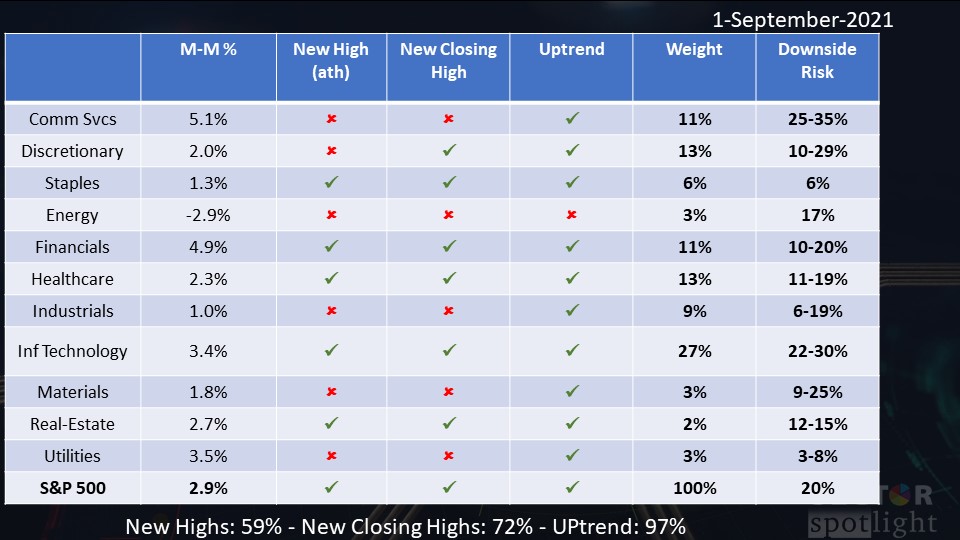
The table above is the one that I always use in the first Sector Spotlight show of the month. It lists all sectors and the S&P 500 with a few columns of data. It is just a very rough overview, but it gives a good, kinda numerical, assessment of the state of the market.
As you can see, 5 out of 11 sectors did not reach an all-time-high nor a new closing high. Consumer Discretionary reached a new closing high, but not a new all-time-high. This means that certainly not ALL sectors are "pushing."
The "UPtrend" column is the metric I am referring to above. All sectors, except for energy, qualify as being in an uptrend. The way I "measure" this is by localizing the highs and lows on the monthly chart and judging whether that rhythm qualifies as higher highs and higher lows, i.e. an uptrend. The weight column helps me to keep an eye on which sectors are heavyweights vs the lighter sectors. Obviously, trends in heavy-weight sectors have a bigger impact on the S&P 500.
A month or two ago, I added the last column, which lists the "percentage risk" for each sector. Again, this is simply (and very roughly) measuring the distance from the current price level to the first, sometimes the second, support levels on these monthly charts. I wanted to get a feel for how much each sector could decline in price without harming the current uptrend. And, as you can see, these numbers are quite significant. And this is all the result of the super-steep rally we have seen since early 2020 and in which we still are.
So why the reservations with regard to the ability for the market to continue higher in the near term?
20% Downside Risk Across the Board
First of all, the simple observation from the table above is that most sectors and the S&P, in general, can drop 10% to 20% in price without harming the long-term uptrend. I believe that is a tradable move.
It does not mean that 100% cash is the best possible portfolio at the moment, but shaving off some of the recent gains and lightening up on equity exposure will not hurt. You could even think about implementing some sort of options strategy to protect the downside a bit while still keeping skin in the game when the market rises further without a meaningful drop.
Personally, I'd rather miss some performance on the upside than getting crushed in a sharp decline.
Opposite Rotations
Another thing that has my attention is the fact that the current sector rotation is confusing.
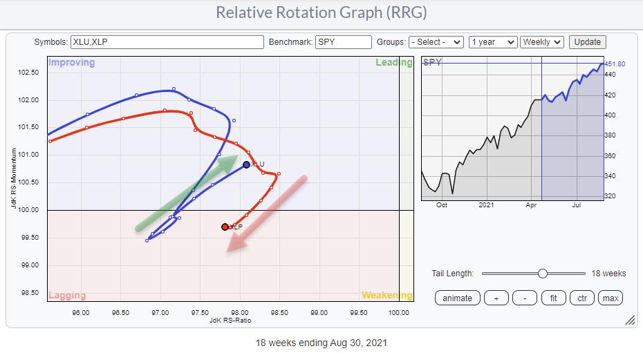
"Normally," whatever that may be, sectors move in herds or flocks. This means that, during a market rally, offensive sectors will lead together while, in a market decline, usually the defensive sectors will lead together. Utilities and Staples, for example, typically move along the same path.

The RRG above shows the tails for Utilities and Staples over the last 18 weeks. The opposite rotation in the last few weeks is notable. For me, that qualifies as an oddity and, very often with such oddities, the unexpected things can tell us something. The way I interpret this opposite rotation for the two most defensive sectors is uncertainty... and if there is one thing investors do not like, it is uncertainty.
Negative Divergence Remains
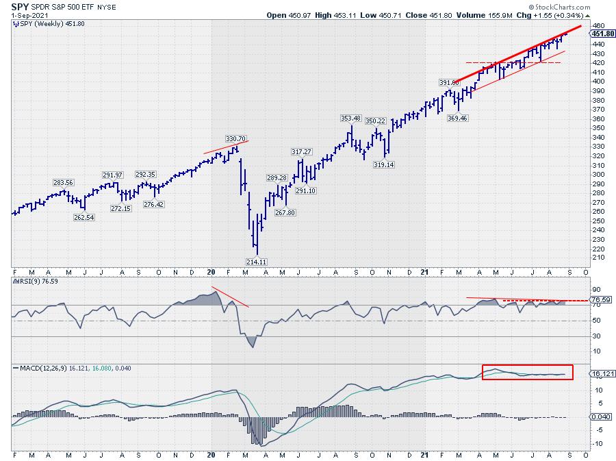
And finally, there still is this negative divergence between price and RSI for the S&P on the weekly chart.

The divergence became a little less strong in the past 2-3 weeks, but it is certainly still there. Also, when you add the MACD, you can see that the MACD line and the trigger line are almost overlaid on each other and moving sideways but not upward anymore -- and clearly lower than the peak in May.
All in all, I believe that the current risk/reward ratio for stocks does not justify a loaded portfolio at the moment.
#StaySafe, --Julius
|
| READ ONLINE → |
|
|
|
| ChartWatchers |
| How to Profit from Strong Earnings Reports While Reducing Risk |
| by John Hopkins |
For a very long time, I have avoided holding stocks that I own into an earnings report. I should explain that I am more of a short-term trader, so I don't like the risk that goes along with holding a stock when they are about to report. And that goes for both the long and short side.
The primary reason I opt to wait until numbers are reported is that I have no way of knowing how the market will react once earnings are released. For example, a company could beat both top- and bottom-line results, guide higher and still move lower. Or a company might miss all expectations and still move higher. It's a crapshoot at best.
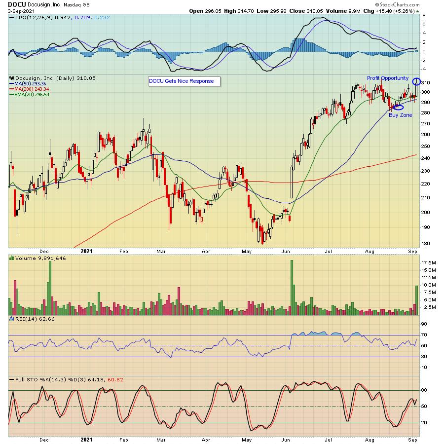
So what I like to do is look at a chart on a company that is about to report its earnings - say, after the bell - and identify key support and resistance numbers while allowing for an exaggerated response higher or lower. I then make my move once I assess what is going on. As an example, take a look at the chart below on Docusign (DOCU), which reported its earnings after the bell this past Thursday.

In this case, I waited until the numbers were announced, watched the market response to see if there was any heavy buying or selling and waited to see if it made any sense to go long or short. What I saw, after the dust had settled some, was the stock pulling back into the 280s, in spite of a strong report. Accordingly, I started buying some shares on the pullback and felt comfortable holding the stock overnight, feeling confident it would be sought after once the trading day began. I was not disappointed, as the stock started strong out of the chute, climbing as high as $314.70 before settling down some, and turned into a nice score.
Now, getting back to my original premise. Let's say I owned the stock into the earnings report, it pulled back $9-10 but didn't rebound? I wouldn't be happy! Instead, I waited for the report to be announced, watched the initial market reaction, and felt comfortable buying some shares on the knee jerk selling. This allowed me to take some risk out of the trade - I got it at a lower price than where the stock closed - and I had a tight stop-loss in mind if it continued lower once I owned the stock.
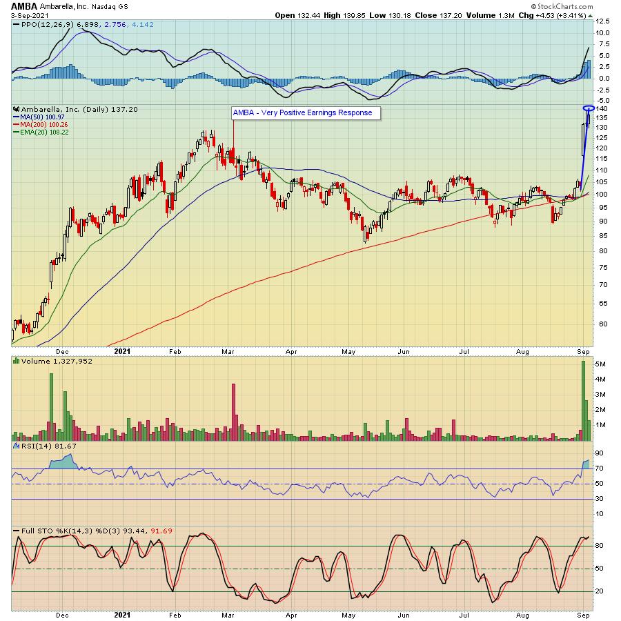
For sure, there are many stories of stocks that soared after a strong earnings report. AMBA comes to mind, as it climbed almost 35% within two days of its recent report, as you can see below.

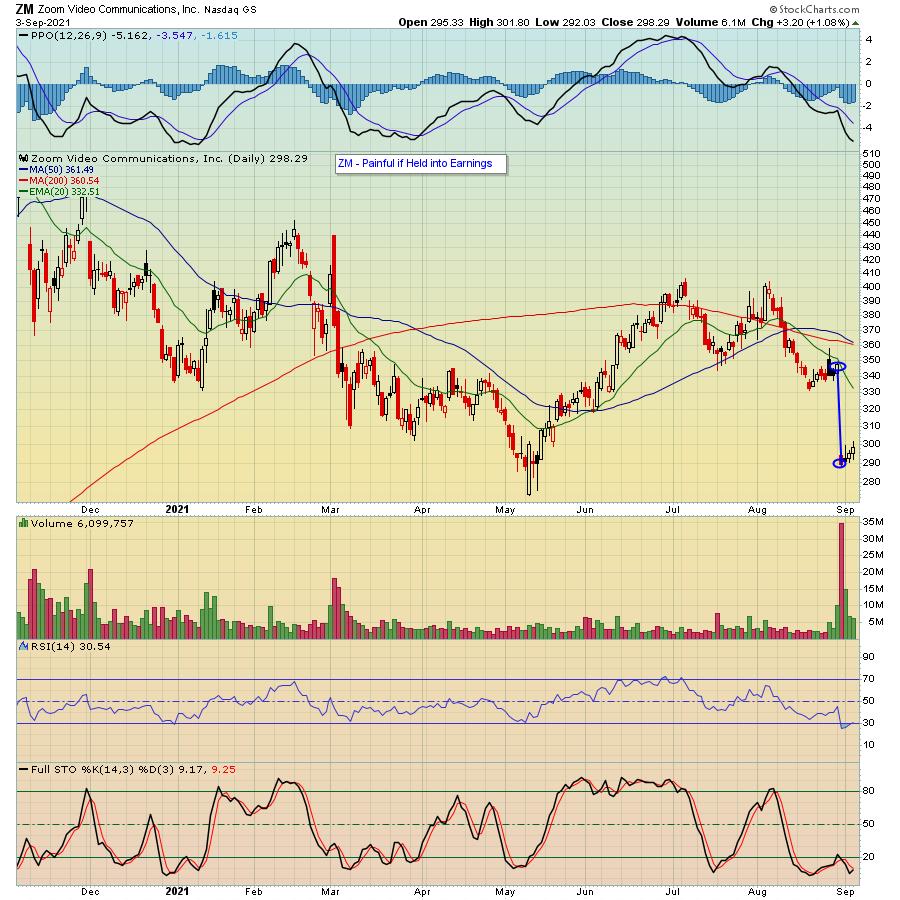
On the flip side, ZM got clobbered when it reported its earnings this past Monday, with the stock losing almost 17% the following day.

The point being, you never know how the market will react to an earnings report; witness the three charts above. You would have LOVED owning AMBA into its report but HATED giving up 17% if you owned ZM when it reported its numbers. Instead, if you watched the reaction on each of the stocks once their numbers were released, you might have been in a better position to make a smart decision while reducing potential risk.
I want to wish everyone a restful holiday weekend and, if you would like to receive our very informative newsletter, the EarningsBeats Digest, just click on this link and you will receive our FREE earnings/market related updates from our Chief Market Strategist Tom Bowley every Monday, Wednesday and Friday.
At your service,
John Hopkins
EarningsBeats.com
|
| READ ONLINE → |
|
|
|
| MORE ARTICLES → |
|
