| THIS WEEK'S ARTICLES |
| John Murphy's Market Message |
| STOCK INDEXES REGAIN 50-DAY LINES |
| by John Murphy |
STOCKS MAKE UP LOST GROUND...Two strong days in a row have more than made back losses suffered on Monday. In addition, some of the short-term technical damage has been repaired. More specifically, 50-day moving averages that were broken on Monday have been regained on the S&P 500 and Nasdaq market. The Dow is also heading back to its 50-day line as shown in Chart 1. Charts 2 and 3 show the S&P 500 and Nasdaq Composite indexes climbing back above their 50-day lines and downside gaps formed on Monday. That's a sign of strength. Stocks are also trading higher on the week even after Monday's sharp plunge. Today's rally is broad based with ten of eleven sectors in the black.
 Chart 1 Chart 1
 Chart 2 Chart 2
 Chart 3 Chart 3
ENERGY AND FINANCIALS ARE DAY'S STRONGEST SECTORS...Higher energy prices continue to benefit energy shares which are the day's strongest sector. Chart 4 shows the Energy Sector SPDR (XLE) trading today at the highest level in more than two months. Financials are right behind. Chart 5 shows the Financial Sector SPDR (XLF) having an especially strong day after regaining its 50-day line. Rising bond yields are contributing to that buying.
 Chart 4 Chart 4
 Chart 5 Chart 5
INDUSTRIALS AND MATERIALS REBOUND FROM 200-DAY LINES...Two of the weakest sectors of late are among the day's sector leaders and are bouncing off moving average support. Chart 6 shows the Industrial Sector SPDR (XLI) bouncing off long-term support at its 200-day moving average. Chart 7 shows the Materials Sector SPDR (XLB) doing the same. That's an encouraging sign for them and the rest of the market.
 Chart 6 Chart 6
 Chart 7 Chart 7
|
| READ ONLINE → |
|
|
|
| The Mindful Investor |
| Why Gold Remains Bearish |
| by David Keller |
Gold has captivated human beings for millennia, infatuated with its appearance and it scarcity. Gold has also attracted investors for its value in hedging inflation and providing a stable store of wealth during periods of uncertainty.
While there are many narratives for gold related to transitory inflation, the Fed's accommodative policies and its value as a safe haven, today we'll focus purely on the technical picture. To put it simply, why does gold remain in a bearish mode, and what would we need to see to rotate to a more bullish outlook?
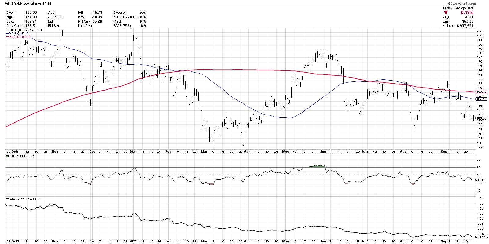
The bear case starts with the moving averages. Here, we have a chart of the gold ETF (GLD) and the 200-day moving average is in red.

Notice how the 200-day moving average sloped higher for the first six months, then sloped lower through the next six months? Moving averages are designed to smooth out the noise of the day-to-day price movements. When you smooth out the noise on the GLD, you can see a clear rotation from bullish trend to bearish trend.

Next, notice how the price is currently below two downward-sloping moving averages. If you drop a list of tickers into the CandleGlance function on StockCharts, you can use the price and two moving averages on each chart to easily separate the leading charts from the lagging charts. GLD is clearly on the lagging list.
Speaking of lagging, the panel at the bottom shows the relative strength of GLD to the S&P 500 ETF (SPY). The relative line has been trending downwards for over a year, demonstrating how investors have not really benefited from owning gold over stocks.
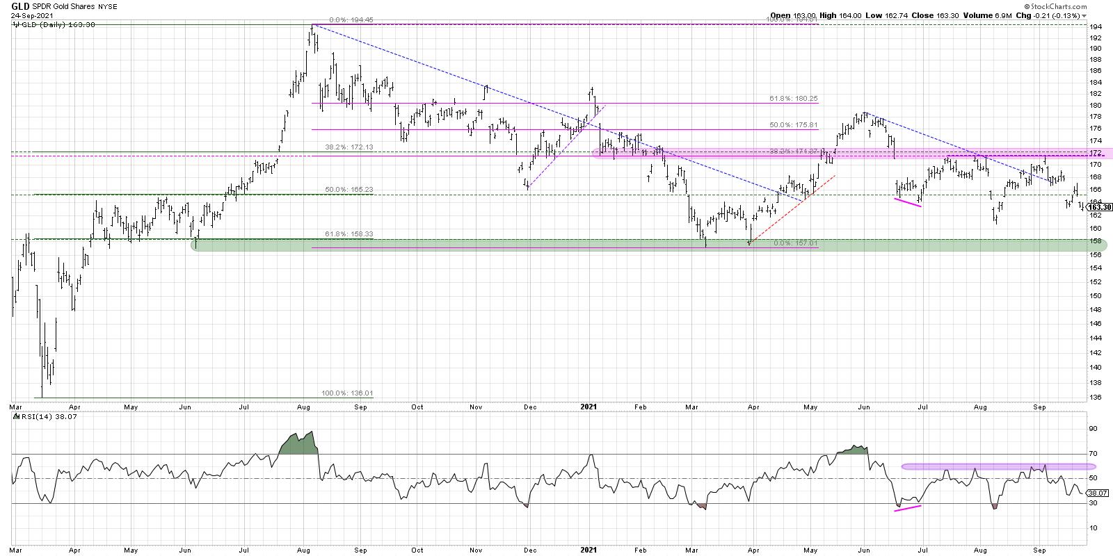
Our second chart brings in three additional data points: RSI, Fibonacci retracements and trendlines.

Here, we can see back to the March 2020 low, where gold and the S&P 500 bottomed out in the same month. Over the subsequent five months, the GLD rallied from a low around 136 to a peak right around 194. From there, it's been a slow and steady decline.
I've drawn a series of trendlines including August 2020-November 2020 and June 2021-August 2021. What do all of the trendlines drawn using significant highs over the last two years have in common? They ended with a failed breakout.
Trendlines are drawn to track the pace of a trend and, when the price breaks through the trendline, that should indicate a trend reversal. In the case of gold, the price has been punctuated by a series of failed breakouts, where the price was unable to hold above the breakout level. A chart where price is unable to breakout and follow-through to the upside is a chart in distribution mode.
Now let's look at Fibonacci retracements. If you take the March 2020 low and the August 2020 peak, 172 would be about a 38.2 retracement between those two extremes. If you instead use the August 2020 high and the March 2021 low, 38.2% of the way back up would give you just above 171. So 171-172 seems to be an important price level given the price extremes over the last two years. Notice how the peaks in May, July, August and September of this year have all been in that range, indicated with a pink shaded area on the chart. So while the price relationships makes sense based on Fibonacci retracements, the real challenge for GLD is the failure to break above that level in September. Until the price can reach above 172.50, confirming a break above Fibonacci and price resistance, the chart remains in a bearish phase.
Finally, we have the RSI at the very bottom of the chart. Since the price peak around 179 in June, the RSI has become oversold during down thrusts and has failed to get above the 60 level on upswings. In bearish market phases, the RSI tends to be unable to get above the 60 level as the entire RSI range moves lower. Until the RSI breaks above 60, this momentum indicator is confirming a bearish phase for gold.
So what would it take to turn this bearish assessment more bullish? As always, I find a checklist to be a simple way to lay out the steps and follow if and when they are triggered. So here goes:
1. GLD makes a higher low.
We may be forming the right shoulder of an inverted head-and-shoulder pattern and the current downswing would have to end above the 161 level. That could indicate an influx of buying power and potentially propel gold to new swing highs.
2. Price gets above 172 and stays there.
Charles Dow tells us that a downtrend is a pattern of lower lows and lower highs. By breaking above 172, the GLD would break that pattern and demonstrate that buyers are willing push the price to new swing highs.
3. RSI reaches above 60 on an upswing.
As long as the RSI remains below 60, the momentum picture will remain bearish. A rally in gold that pushes the RSI above 60 could indicate a rotation to a more bullish outlook.
There are many narratives, both bullish and bearish, related to gold and its importance as an inflation hedge, as a safe haven, even just as a store of value. In the end, none of that matters! Price will tell you most of what you need to know about gold's potential to outperform and its potential benefits to a well-rounded portfolio.
Want to digest this article in video format? Check out my YouTube channel!
RR#6,
Dave
P.S. Ready to upgrade your investment process? Check out my free course on behavioral investing!
David Keller, CMT
Chief Market Strategist
StockCharts.com
Disclaimer: This blog is for educational purposes only and should not be construed as financial advice. The ideas and strategies should never be used without first assessing your own personal and financial situation, or without consulting a financial professional.
The author does hold a position in GLD at the time of publication. Any opinions expressed herein are solely those of the author and do not in any way represent the views or opinions of any other person or entity.
|
| READ ONLINE → |
|
|
|
| Martin Pring's Market Roundup |
| Commodities Experience a False Upside Breakout -- Or Did They? |
| by Martin Pring |
Earlier in the month, I pointed out that the long-term indicators for commodities were still bullish, but getting overbought. At the same time, several intermarket relationships were signaling danger, which suggested some degree of vulnerability. Prices have not moved very much since then, but, bearing in mind that overstretched technical condition, market action is now starting to take on a more ominous tone. In the meantime, those intermarket relationships have continued to point in a southerly direction.
Chart 1 sets the scene from a long-term perspective, as it shows the extended nature of the long-term KST for the CRB Composite. The solid red arrows indicate that KST reversals are usually associated with some kind of bear trend. The two dashed arrows warn that a price drop is not inevitable. At the moment, that point is moot, since the indicator remains in a rising mode. The Index is also above its 12- and 24-month moving averages, further boosting the bull market case.
 Chart 1 Chart 1
That said, recent price action is showing some cracks that could feed over into a more meaningful decline, which might result in a long-term KST sell signal. Chart 2 shows the weekly action of the Bloomberg Commodity ETN (DJP). Last week, the price formed a bearish Pinocchio bar. These one-bar price patterns develop when the intra-bar activity pushes the price through resistance. However, by the close, it is unable to hold above that resistance, thereby resulting in a false breakout. In this case, the resistance took the form of the green trendline that had turned back multiple attempts to clear it. Candlestick fans will also recognize that Pinocchio bar as a bearish gravestone doji.
 Chart 2 Chart 2
Note also that the 9-week RSI has gradually been diverging negatively with the price since its late April peak. The Pinocchio is just one piece of evidence that the trend may have reversed, so it makes sense to look around for some confirmation, thereby raising the odds of a valid signal. In this instance, that would come from a decisive break in the 2020-2021 up trendline, say, at $26.50.
Chart 3 features a daily chart where six previous attempts were made to clear the resistance trendline. The seventh last week has so far proved to be false. Most concerning is the protracted weakness in the indicator in the lower window. This one monitors a universe of individual commodity ETFs registering net new highs over a 50-day period. At the September 15 peak in the DJP, barely any commodities were at new highs, hardly a sign of a healthy market.
 Chart 3 Chart 3
Energy Confirms Last Week's High
One area that did register new high ground was energy, in the form of the Invesco DB Energy Fund (DBE). That said, failure by the price to hold above the horizontal resistance trendline line is a distinct worry, as it suggests that traders who bought on the breakout may be trapped on the wrong side of the market. This matter is likely to be resolved in the near future, as the short-term KST is still in a bullish mode. It is therefore in a position to support a rally above the September 15 high, which would cancel the "false" part of the breakout.
On the other hand, the price is not that far above the blue 50-day MA, a negative crossover of which would offer some confirmation that the September 15 breakout was a false one.
 Chart 4 Chart 4
Dr. Copper Getting Sick?
Copper is an important commodity on the metals side of the ledger. It is shown in Chart 5, together with its Special K indicator. The Special K, which you can read about here, has a strong tendency to peak and trough on a primary trend basis with the price it is monitoring. These major turning points are easy to spot using the benefit of hindsight, but are a bit trickier in real time. One way is to construct a trendline for the price and the indicator. When they are both decisively violated, a valid trend reversal is usually signaled.
Three examples since 2015 have been flagged in the chart. In the current situation, the Special K has already violated its bull market trendline. Since it has turned back numerous reactions, its penetration represents a fairly significant technical event in its own right. The price itself dropped below its dashed up trendline earlier in the year and is now right at the 200-day MA. Also intersecting in the same area is the neckline of a potential head-and-shoulders top. A downside break that can hold would confirm Special K action and suggest some kind of a bear trend. Since copper has reached a critical technical juncture, it needs to be watched very carefully in the period ahead.
 Chart 5 Chart 5
What Do Credit Spreads Say about Commodities?
The final two charts feature the ratio between the iBoxx High Yield and the 7-10-year Treasury ETF (HYG/IEF). When the ratio is advancing, it means traders are gaining confidence, as they show a preference for the higher-yielding and riskier HYG. Those swings in confidence, as you can see from the arrows, show that there is a strong correlation with commodity prices. Recently, these two series have been on diverging paths. Commodities have edged to new highs, but confidence has been slacking off. Who to believe?
 Chart 6 Chart 6
Chart 7 shows that the answer to that question could easily go either way. On the one hand, the ratio is still below its 2018-2021 down trendline. On the other, it remains above its 65-week EMA, which, the small arrows tell us, is a great support/resistance zone. Unfortunately, we not only have a conflict between the three KSTs, but none are in a decisive mode and could easily reverse.
 Chart 7 Chart 7
That combination makes the ratio too close to call. Two points to monitor going forward are a decisive break above the trendline in Chart 7 or a drop below that 65-week EMA. Given its close relationship with commodity prices, such action would also go a long way towards appraising whether the DJP can overcome the negative undertow of its false upside breakout or if will succumb to the long-term overbought technical condition for commodities in general. Please remember, you can update these charts in future by simply clicking on them.
Good luck and good charting,
Martin J. Pring
The views expressed in this article are those of the author and do not necessarily reflect the position or opinion of Pring Turner Capital Group of Walnut Creek or its affiliates.
|
| READ ONLINE → |
|
|
|
|
|
| ChartWatchers |
| This Sector Is Turning The Bullish Corner; Higher Prices Ahead |
| by Tom Bowley |
As you probably know, my background is in public accounting. I practiced as a CPA for two decades prior to turning my full attention to technical analysis. My analysis of the stock market always includes both fundamental and technical analysis, with a historical component sprinkled in. (I never met a spreadsheet I didn't like!) So when I look at the stock market, I don't view it as just whether it's going up or down; I need to look under the hood and really investigate what's making it tick. Is the rally sustainable? Could we be topping? What's leading? What should be leading? I'm always very inquisitive and try to look deeper.
And it's that inquisitiveness that leads me to this ChartWatchers article. Wall Street is turning their attention back to consumer discretionary stocks, so we should too.
Secular Bull Market Leading Sectors
One thing that's crystal clear to me is that we're in a secular bull market that began on April 10, 2013, the day that the S&P 500 cleared its double top from 2000 and 2007. Since that day and through Thursday's close, here are the returns of all 11 sectors (I've included the S&P 500 as the benchmark):
- Technology (XLK): +483.24%
- Communication Services (XLC): +321.11%
- Consumer Discretionary (XLY): +283.21%
- Health Care (XLV): +221.26%
- Financials (XLF): +197.96%
- Industrials (XLI): +183.41%
- S&P 500 ($SPX): +180.21%
- Materials (XLB): +146.63%
- Real Estate (XLRE): +143.40%
- Consumer Staples (XLP): +119.09%
- Utilities (XLU): +117.66%
- Energy (XLE): -12.29%
After looking at the above stats, one other thing is crystal clear to me: aggressive sectors lead by a very wide margin during secular bull markets. Laggards since 2013 include materials and energy, two sectors adversely impacted by a rising dollar environment, and three defensive sectors. The big leaders are what I consider the 3 most aggressive sectors -- technology, communication services and consumer discretionary.
When the market goes through a period of turmoil, I like to analyze which areas outperform and underperform, as heavy selling provides Wall Street an opportunity to rotate into areas believed to be the next winners. I generally like aggressive areas that outperform during periods of market weakness.
This leads me to consumer discretionary, as the XLY is one of two sectors that have gained ground since the S&P 500 topped on September 2nd. While the S&P 500 has dropped nearly 2%, the XLY has gained 0.46%. Money is rotating into the group, but it's difficult to see unless you perform an analysis.
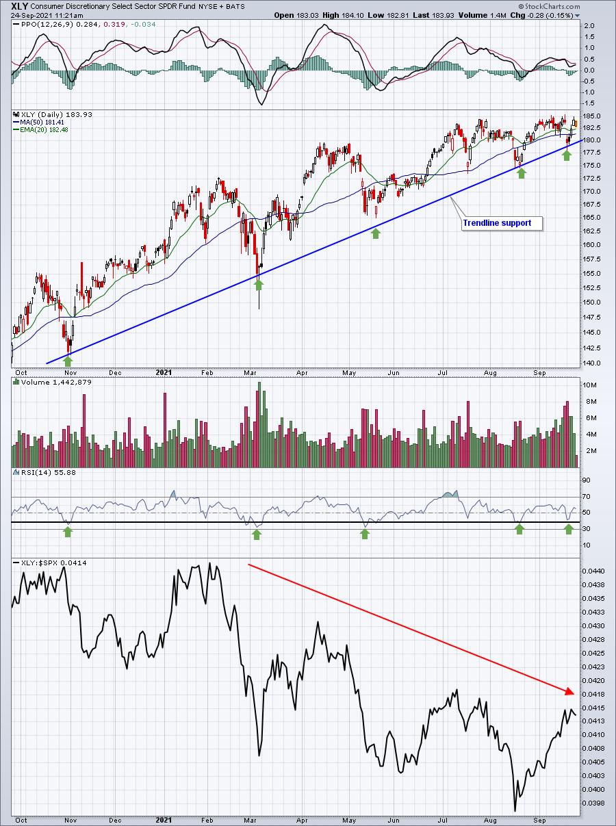
Here's a 1-year chart of XLY absolute and relative strength:

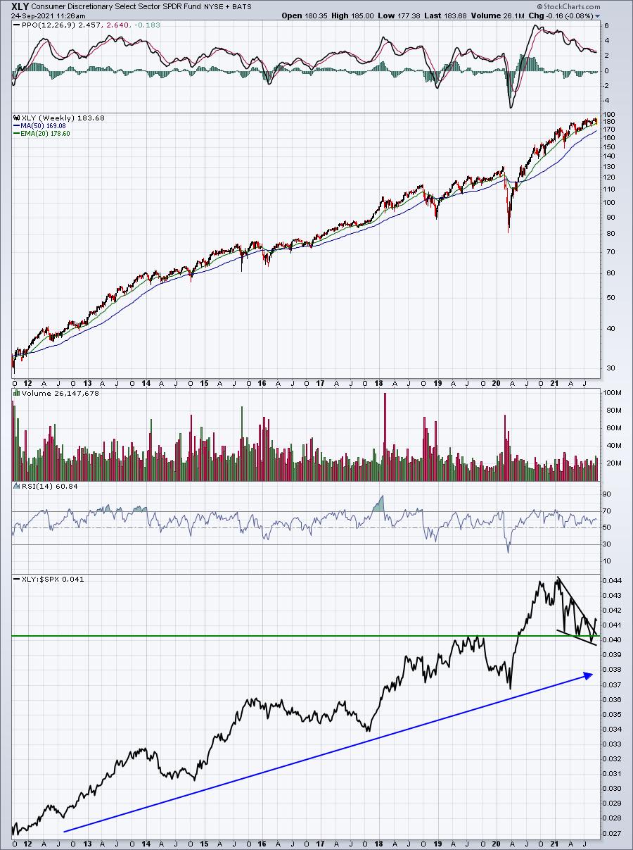
The absolute price uptrend remains in play. Every time the RSI has approached 40, or dipped just beneath it, we've seen a rebound. Those RSI lows have also coincided with connecting points on the trendline (green arrows). So I don't believe there's any denying that an uptrend remains in play. The relative strength, however, is a bit more difficult to figure out. We're still in a pattern of lower relative highs and lower relative lows, which suggests the group still has work to do. But when I stretched out the XLY onto a 10-year weekly chart, the potential breakout in relative strength looked much more bullish to me:

The relative uptrend long-term remains perfectly intact and the recent relative strength in the XLY appears to represent a relative bullish wedge breakout. I believe the only thing we're missing is an absolute breakout on the XLY above 185. Should we get that, I will be fully expecting the XLY to outperform in Q4 and into 2022.
On Monday, I'll be providing my favorite industry groups for Q4 within the consumer discretionary sector in my FREE EB Digest newsletter. It's simple to register; just enter your name and email address HERE and join our community of thousands of traders. There is no credit card required and you may unsubscribe at any time.
Enjoy your weekend and happy trading!
Tom
|
| READ ONLINE → |
|
|
|
|
|
| ChartWatchers |
| Three Climax Days This Week That Were Right On |
| by Carl Swenlin, Erin Swenlin |
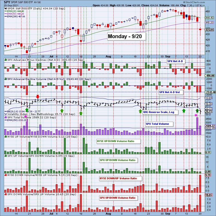
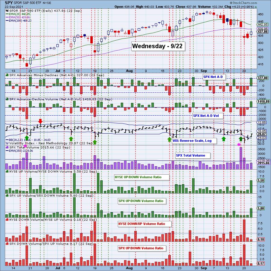
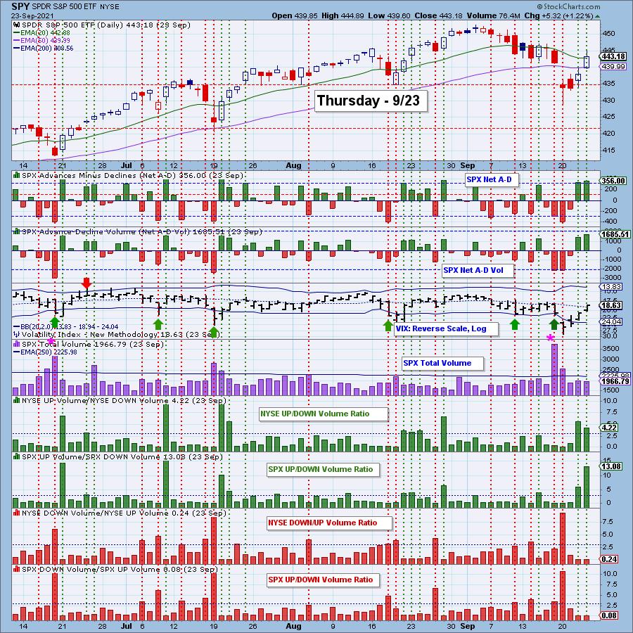
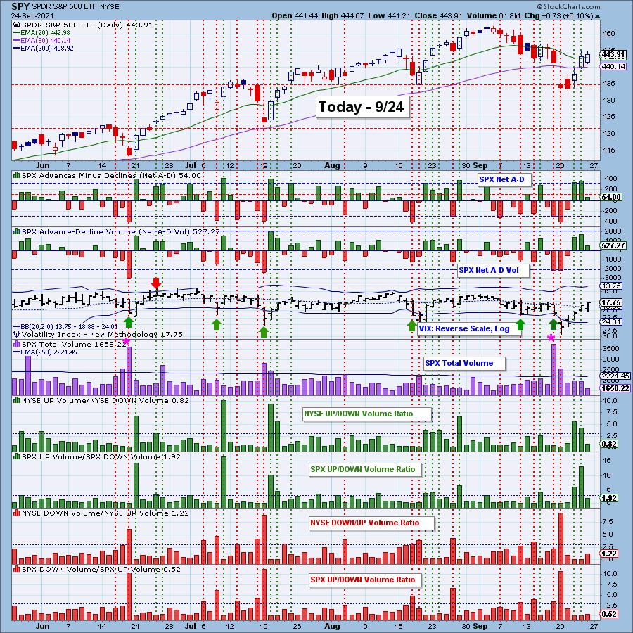
Climax analysis is something unique to DecisionPoint and we've found that "climax days" are highly accurate in determining market bottoms and tops in the very short term.
A climax is a one-day event when market action generates very high readings in (primarily) breadth and volume indicators. We also include the VIX, watching for it to penetrate outside the Bollinger Band envelope. The vertical dotted lines mark climax days -- red for downside climaxes and green for upside. Climaxes are either initiation or exhaustion.

Click here to register in advance for the recurring free DecisionPoint Trading Room! Recordings are available!
Let's go back in time and look at Monday's climax chart. Monday's climax was a clear exhaustion climax. Price had been tumbling lower after reaching all-time highs. It was a frantic day of selling and a gap down on Monday. We saw a puncture of the lower Bollinger Band by the VIX on the inverted scale; another clear indication this was a selling exhaustion.

Two days later, on Wednesday, we saw an upside initiation climax. Earmarks of an initiation: they generally arrive right after exhaustions and they suggest follow-through in the direction of the climax.

Yesterday's upside climax was considered an "exhaustion" as it arrived after an initiation. We told our readers that while it was an exhaustion, we were expecting "churn," not a big decline.

Here is today's climax chart. We didn't see any climactic behavior.

Conclusion: The downside exhaustion climax on Monday was over two weeks from the price high at the beginning of this month, which set the market up for the current rally. The closing price low was on Tuesday and, on Wednesday, we got an upside initiation climax followed immediately by an upside exhaustion climax. Exhaustion climaxes can signal the end of a move or a pause. When they come so soon after the price low as Thursday's did, we tend to expect the more bullish outcome.
There are two things that favor a continuation of the rally: (1) the fact that it began with an initiation climax and (2) that internals were so oversold at the start. Both of these are short-term elements and we will need to see intermediate-term indicators begin to show more improvement. The problem is that the big tech stocks are not coming to life and, while they supported the market as the smaller-cap stocks swooned, they may now be a drag on the market as the smaller-cap stocks attempt to revive.
Be alerted to downside and upside climaxes!
Subscribe to the DP Alert. It is a must-read that you can read in less than 10 minutes. Get coverage of Bitcoin, Yields, Bonds, Dollar, Gold, Gold Miners, Crude Oil and sector rotation. It's invaluable at an incredibly low price of $35/month! Get the best technical analysis for less!
Technical Analysis is a windsock, not a crystal ball.
--Carl & Erin Swenlin
(c) Copyright 2021 DecisionPoint.com
DecisionPoint is not a registered investment advisor. Investment and trading decisions are solely your responsibility. DecisionPoint newsletters, blogs or website materials should NOT be interpreted as a recommendation or solicitation to buy or sell any security or to take any specific action.

Try us out!
Have access to our archived reports going back to 2019.
Subscribe to our "Bundle Package"
Use Coupon Code: DPTRIAL at checkout to receive one free week!
Helpful DecisionPoint Links:
DecisionPoint Alert Chart List
DecisionPoint Golden Cross/Silver Cross Index Chart List
DecisionPoint Sector Chart List
DecisionPoint Chart Gallery
Trend Models
Price Momentum Oscillator (PMO)
On Balance Volume
Swenlin Trading Oscillators (STO-B and STO-V)
ITBM and ITVM
SCTR Ranking
|
| READ ONLINE → |
|
|
|
| ChartWatchers |
| Breaking Down the Financials Sector on RRG |
| by Julius de Kempenaer |

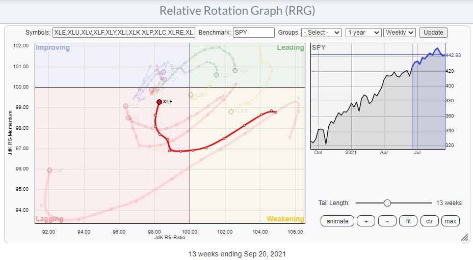
On the Relative Rotation Graph for sectors, the Financials sector, XLF, is positioned inside the lagging quadrant and heading upwards to the improving quadrant. The sector is gaining on the vertical JdK RS-Momentum axis, but not so much (yet) on the horizontal Jdk RS-Ratio axis.

On the price chart, XLF left its rising channel a few weeks ago and, this week, dipped to a low near 36 before jumping back sharply. That recent price action has created the possibility for a double-top formation in the making. Both highs (tops) are located near 38.50 and the in-between low is near 35. That pattern will be completed on a break below that 35 support level.
Looking at the 9-period RSI plotted above the graph, a strong negative divergence can be noted. The second high is located marginally higher than the previous high (see solid red arrow), while the corresponding sequential high in the RSI is significantly lower than the first one, creating a divergence. This is usually a sign for a pause in, or a reversal of, the existing trend.
In case of such a breakdown, the next support level, and expected price target, in that case, is located at the previous breakout level near 31.50. The good news for this sector is coming from a relative perspective. The raw RS-Line (first panel below the price chart) is managing to hold up above its breakout level since mid-February this year. After a sideways move and a re-test of the relative breakout level as support, the decline in the RRG-Lines (lower panel) has now come to a rest and both lines have started to curl upward, causing the current position on the RRG.
In order for a further upward rotation into improving and then into leading, the raw RS-Line needs to break above that falling resistance line, dashed light red, which is connecting the major relative highs since 2016. The downtrend in relative strength goes back even further. A positive impulse for the financials sector as a whole would be triggered when XLF can leave the consolidation area to the upside. Such a move would likely mean the resumption of the previous uptrend, but at a slower pace.
The Groups inside Financials

From the Sector Summary page, we can run a Relative Rotation Graph of the groups that make up the Financials sector. A few of these groups are showing interesting rotations.
Inside the leading quadrant, my attention is drawn to the two green tails that are moving up into the leading quadrant at a strong RRG-Heading; the US Insurance Brokers Index and the US Full Line Insurance index. The US Consumer Finance Index, the US Financial Administration Index, and to a lesser extent the US Reinsurance Index are showing powerful tails inside the lagging quadrant and pointing further into it. The RRG below highlights these tails.

From this chart, we can quickly exclude the three red tails for potential buying opportunities.
DJ US Reinsurance Index

Out of these three, the Reinsurance Index looks to be showing the weakest chart, especially from a relative perspective.
The raw RS-Line has just broken to new lows and has started pulling the RRG-Lines lower again. As the red JdK RS-Ratio line did not manage to move above 100 before turning down again, that means this group rotated from lagging into improving, then back into lagging. Which, as we know, signals the second (or 3rd, etc.) leg of an already-established relative downtrend.
Insurance Brokers

The Insurance Brokers group is deepest inside the leading quadrant. On the price chart, the rising channel is still fully intact, and the group even has some room to decline without leaving that channel. On the relative chart, the bottoming process is nicely visualized; this has led to an improvement for the RRG-Lines, which are now both above 100 and continuing to move higher. This makes insurance brokers the strongest group within the financials sector at the moment.
Full Line Insurance

The Full Line Insurance group is not as far in as Insurance Brokers. On the price chart, the group is pushing against a heavy overhead resistance level between 53-55, while relative strength is also pushing against the upper boundary of a range in which it has been moving since early 2020. An upward break in either of these graphs will very likely cause further improvement and push the group further into the leading quadrant.
Conclusion
All in all, both Insurance Brokers and Full Line insurance seem to be groups in which we can look for stocks to buy. Potential short positions to hedge the market risk for this sector, if you wish to do so, could be found in Consumer Finance, Financial Administration and/or Reinsurance.
#StaySafe and Have a great weekend, --Julius
My regular blog is the RRG Charts blog. If you would like to receive a notification when a new article is published there, "Subscribe" with your email address.
|
| READ ONLINE → |
|
|
|
| ChartWatchers |
| A Hundred Large Cap Stocks are in a Bear Market - And Wall Street is Looking for 35 of Them to Soar |
| by Mary Ellen McGonagle |
While the S&P 500 and the Nasdaq 100 (QQQ) are in striking distance of their early September highs in price, over 20% of the Large Cap stocks within these Indices are in a bear market.* That is to say, they're down at least 20% from their 52-week highs.
Among these 107 stocks that are well off their highs, 35 have a buy rating from at least two-thirds of analysts that were polled by FactSet. In fact, the implied upside potential, using these analysts' price targets, is as high as 68%. I examined the charts of those 35 down and out stocks that Wall Street is embracing, and most of them are in confirmed downtrends with further downside ahead.
There were 3 stocks, however, that are in the throes of reversing their downtrends and, while price targets alone will not edge a stock higher, there are other characteristics that make the stocks below attractive.
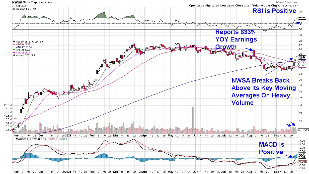
DAILY CHART OF NEWS CORP. (NWSA)

First up is News Corporation (NWSA), which is a media and information services company that's led by Rupert Murdoch. The company reported robust quarterly results in early August, led by growth across all segments. In fact, 2021 has been the most profitable year since the company was founded in 2013. Similar to other digital subscription and streaming services, NWSA's digital ad revenues surged -- particularly in their Real Estate Services area. The stock faltered despite its strong earnings report and has languished below each of its key moving averages until last week's downtrend reversal on heavy volume.
The spark occurred following news that the company had authorized a $1 billion stock-repurchase program, which amounts to 7.8% of their outstanding shares. Recent analyst upgrades also played a part in the NWSA's move into an uptrend. With the stock's RSI in positive territory and the MACD just turning positive, News Corp. is poised to trade higher.
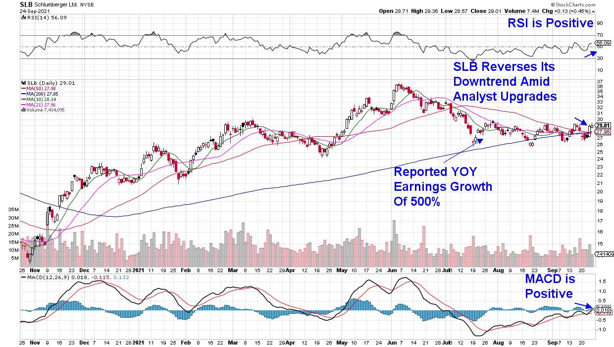
DAILY CHART OF SCHLUMBERGER LTD. (SLB)

Next up is Oil Services company Schlumberger (SLB), which also reversed a lengthy downtrend last week. The company swung to a profit with their 2nd quarter results as higher oilfield activity and tighter capital spending measures helped them beat estimates.
SLB's move into an uptrend is in line with other Energy stocks after the sector turned bullish last week. Studies have proven that a stock's group affiliation accounts for 39% of that stock's price movement.
While SLB is now poised for further upside, subscribers to my MEM Edge Report have been alerted to Oil Producer stocks recently such as Devon Energy (DVN), which gained 11% last week. These stocks trade more in line with the price of oil, which is now close to a 3-year high in price amid increased oil demand.
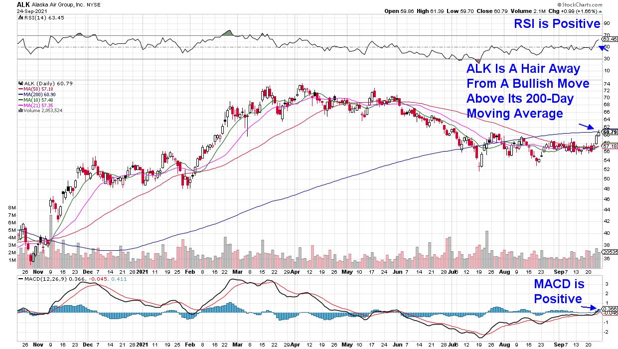
DAILY CHART OF ALASKA AIR GROUP (ALK)

Last up is Alaska Air Group (ALK), which has more work to do but is close to reversing its recent downtrend. Airline stocks in general experienced a late week rally after news that the White House will be easing travel restrictions on visitors vaccinated against COVID-19.
Increased travel within the U.S. is also boosting these stocks. Last week, ALK placed an order for 12 new jets following expanded routes to Central America, as well as regionally in the U.S. A break above its 200-day moving average would provide a bit more conviction that ALK is ready for takeoff.
Over 80% of analysts who cover both Schlumberger (SLB) and News Corp (NWSA) have a buy rating on the stock, while 93% of analysts are bullish on Alaska Airlines. On average, these analysts are calling for a 37% price improvement from here.
While these stocks that are well off their highs may well go on to outperform the markets, my work is centered around higher growing companies that are in sustainable uptrends with even higher upside potential. If you'd like to immediately access this list of high quality growth stocks, use this link here for a 4-week trial of my bi-weekly MEM Edge Report for a nominal fee. You'll also receive market and sector insights not seen anywhere else.
Last week, subscribers received 2 special Alert reports in addition, following an early-week selloff that rattled many investors. Use the link above and I'll help you navigate these tricky markets while alerting you to top candidates poised to outperform.
On this week's edition of StockCharts TV's The MEM Edge, I review the broader markets and highlight the shift into newer sectors. I also review stocks that had major moves last week which, in turn, impacted other stocks in their group.
Warmly,
Mary Ellen McGonagle
President, MEM Investment Research
*This article was based on a report from MarketWatch on September 24th.
|
| READ ONLINE → |
|
|
|
| The Canadian Technician |
| It's Black. |
| by Greg Schnell |
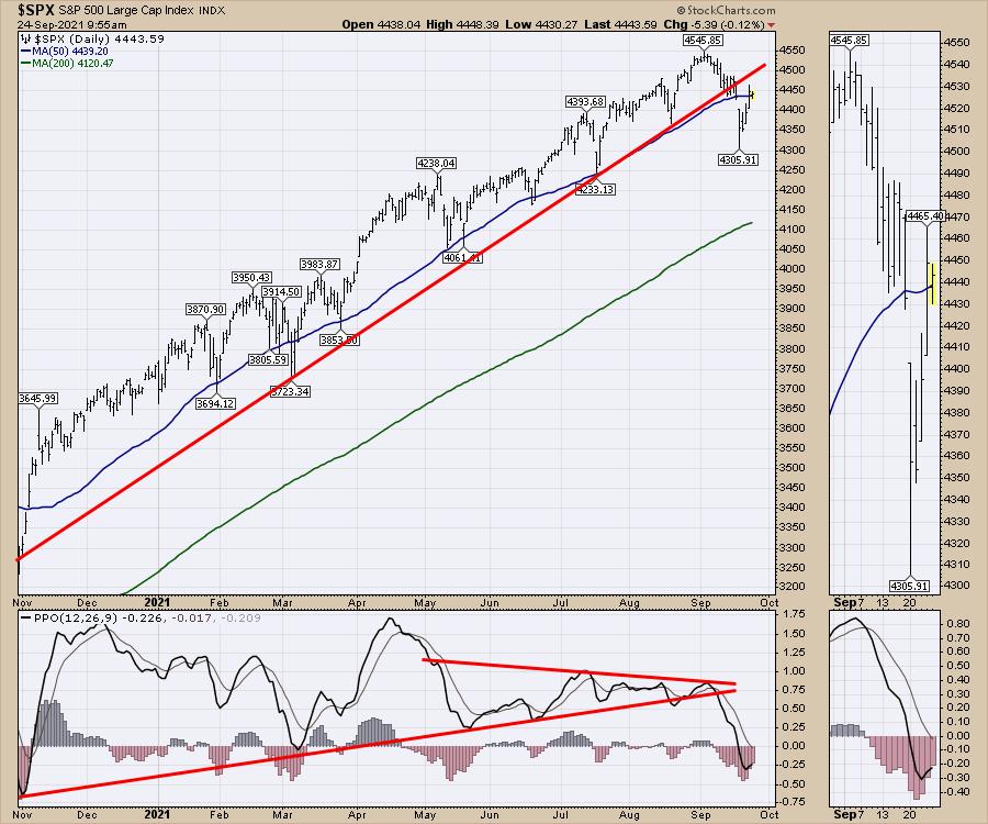
The market has tried to rally since the Monday lows, and we all know the difficulty of trying to figure out which rally is the right one to jump on. Every touch of the 50-day has created a market low. This time, the market is wobbling down around the 50-DMA.

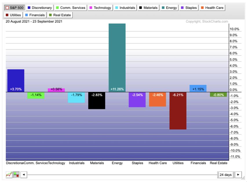
Looking across the sectors, one sector stands out in relative performance compared to the $SPX as the average. There is also one sector that stands out as the biggest loser.
Energy has been rocking it for the last month. Meanwhile, Utilities have been sold off way more than any other sector. What is causing the paradoxical price action? My suggestion is, as utility input costs soar and interest rates turn up, the utility faces pressure on the financial statement. The United Kingdom has seen multiple utility companies fail, with more on the brink.

For investors planning for the green wave, of which I am one, we keep waiting for these green energy stocks to turn up. I have been writing a clean tech newsletter for a year, and it has been disappointing since February. They are not turning up meaningfully.
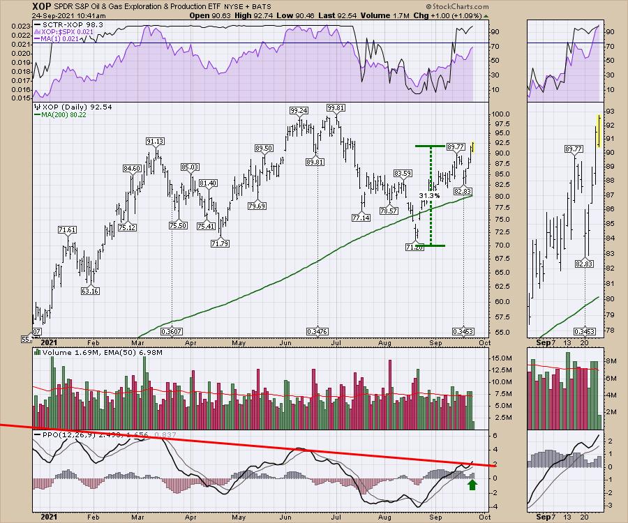
However, the XOP, the oil and gas production ETF, is surging on the back of tight inventories for both natural gas and oil. Expect a lot of government chin-wagging about the oil companies increasing pricing, but the problem lies in the government inaction to allow the metals used in green energy to be mined.
It looks like we are heading to a precipice for energy this winter. Germany and the UK look in serious shortfall. The US oil and gas inventories are staying particularly tight and the shut-ins from Hurricane Ida are also limiting current production flows out of the Gulf of Mexico.
One of the top areas for investing upside appears to be the oil and gas sector, as states move to open natural gas production facilities.

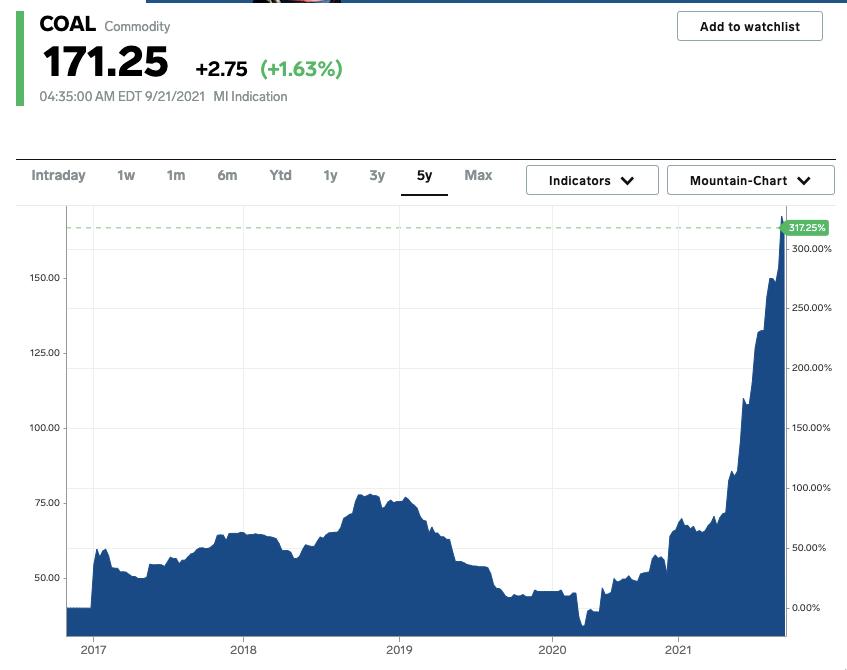
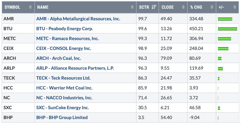
Another area that keeps soaring is Coal. How much are coal prices rising? This much.
 Coal Price Chart: Business Insider Coal Price Chart: Business Insider
Coal exports continue to expand as prices rise due to increased coal demand. On a rainy day in the southwest corner of Canada, a coal terminal loads a barge for export.
 Photo by Greg Schnell Photo by Greg Schnell
As we look at governments around the world, coal is still in demand. This overhead shot of the coal terminal in Guatemala is one example of countries that still rely on coal. Surrounded by water, with large annual rainfall, the country is unable to create substantial power from renewables. Wind, solar and hydro isn't working as a model for this country. They have some renewable energy, but the size of the coal terminal demonstrates their demand.
 Photo by Greg Schnell Photo by Greg Schnell
However, it is still the large demand of coal from China and India that are generating higher prices for coal. Prices are soaring for coal as industrial manufacturers bid up the prices. This also competes with power generation.
We all want a cleaner world, but the reality is, unless we can get renewable materials at low prices with high volume, these countries will continue to use coal. Energy consumption continues to rise, but we don't have a solution moving fast enough to outpace the demand.
Here are some coal names and the price moves year to date.

I don't see any reason to give up on the returns in coal. The Oil and Gas sector looks to be having a solid 4th quarter. If this continues, one of the things that slows down a bull market are expensive commodities. At this point, there seems to be enough momentum to carry these stock prices higher.
|
| READ ONLINE → |
|
|
|
| MORE ARTICLES → |
|
 Chart 1
 Chart 2
 Chart 3
 Chart 4
 Chart 5
 Chart 6
 Chart 7

