| THIS WEEK'S ARTICLES |
| John Murphy's Market Message |
| STOCK INDEXES END WEEK ON A STRONG NOTE |
| by John Murphy |
STOCK INDEXES CLEAR 50-DAY LINES... Stocks are rising again today following yesterday's strong rally. And their technical condition is looking stronger. Chart 1 shows the Dow Industrials rising to the highest level in a month and moving back above its blue 50-day average. Chart 2 shows the S&P 500 trading above its 50-day line as well. The SPX is also trying to clear potential chart resistance at 44.65. Chart 3 shows the Nasdaq Composite trying to also clear its blue line. Eight of eleven sectors are in the green with two notable outperformers.
 Chart 1 Chart 1
 Chart 2 Chart 2
 Chart 3 Chart 3
TWO SECTOR RECORDS... Consumer Discretionary stocks are having an especially strong chart day. Chart 4 shows the XLY surging into new record territory. It's being led higher by hotels and retailers. Financials are continuing to show market leadership. Chart 5 shows the Financial Sector SPDR (XLF) moving into record territory as well. Rising bond yields are are a big reason for their stronger performance. Big banks are also reporting strong earnings.
 Chart 4 Chart 4
 Chart 5 Chart 5
|
| READ ONLINE → |
|
|
|
| ChartWatchers |
| Follow Through with A Big Participation Pop |
| by Arthur Hill |
 Stocks surged for the second Thursday in as many weeks, but this Thursday's surge was a lot different than the previous week. This week's surge featured a strong open and strong close as well as the strongest breadth in four months. What does it mean going forward? Let's investigate. Stocks surged for the second Thursday in as many weeks, but this Thursday's surge was a lot different than the previous week. This week's surge featured a strong open and strong close as well as the strongest breadth in four months. What does it mean going forward? Let's investigate.
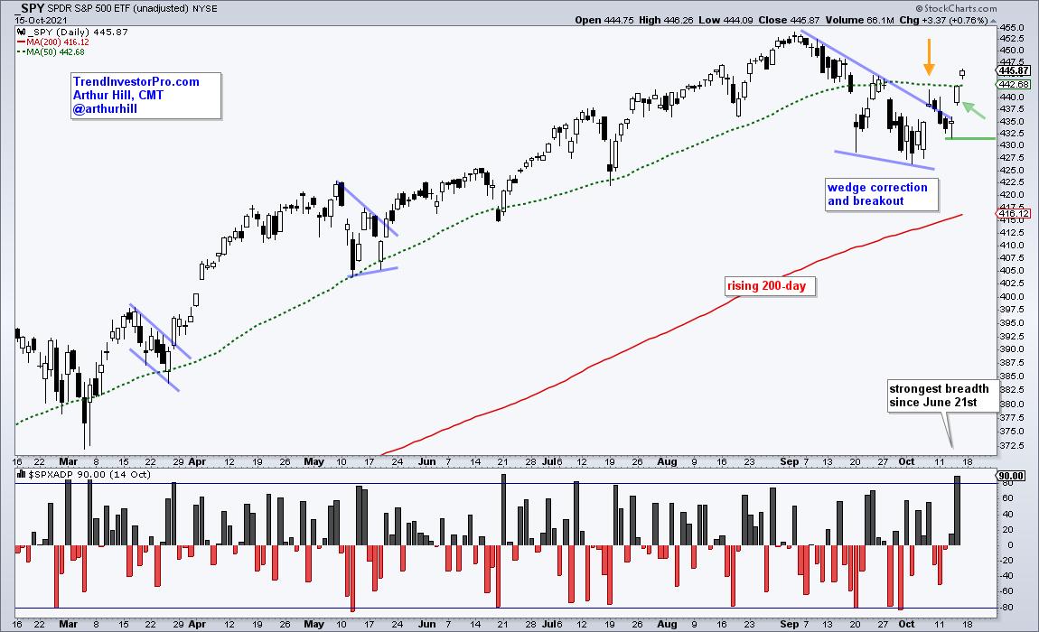
First and foremost, the long-term trend is up for the S&P 500 SPDR (SPY). The ETF hit a new high in early September and remains well above the rising 200-day SMA. The 50-day SMA (green dashed line) is also above the 200-day.
The chart below shows SPY correcting with a falling wedge and attempting a breakout the previous Thursday (yellow arrow). However, SPY closed near the low of the day and fell the next three days. There was no follow through to the opening gap and breadth was not strong.

SPY repeated the opening gap this Thursday and the result was different. Instead of closing near the low, SPY continued higher after the open and closed near the high. Follow through after the gap shows strength and validates the breakout, as does strong breadth.
The indicator window shows S&P 500 Advance-Decline Percent, which is advances less declines divided by total issues. 475 stocks in the S&P 500 advanced on Thursday and only 25 declined. As such, Advance-Decline Percent surged to +90% and hit its highest level since June 21st. This participation pop further validates the breakout.
Looking for more bullish signals and setups? TrendInvestorPro specializes in broad market timing, trend identification for ETFs and finding bullish setups within the bigger uptrend. Click here to subscribe.
--------------------------------------------------
|
| READ ONLINE → |
|
|
|
| The Mindful Investor |
| Three Charts to Watch Through Year-End |
| by David Keller |
This has been a confusing market in so many ways. The S&P 500 moved higher for the first nine months of the year, but many stocks had a very different experience over that time frame. Leadership themes have rotated a number of times, with growth- and value-oriented sectors both spending time at the top of the list.
In the last six weeks, we've experienced a dramatic selloff (of only 6% off all-time highs) and then an equally dramatic recovery (of about 200 S&P points). So what's next?
I recently posted a video outlining four potential scenarios for the S&P 500 between now and year-end. Check it out and let me know which outcome you think is most likely and why!
One of my favorite parts of my role at StockCharts is how I get to compare notes with some very talented technical analysts and strategists. Here are four of the charts that have come up recently in those discussions, each of which are showing more of a bullish tilt and are reminding me to not be too negative in the face of bullish evidence!
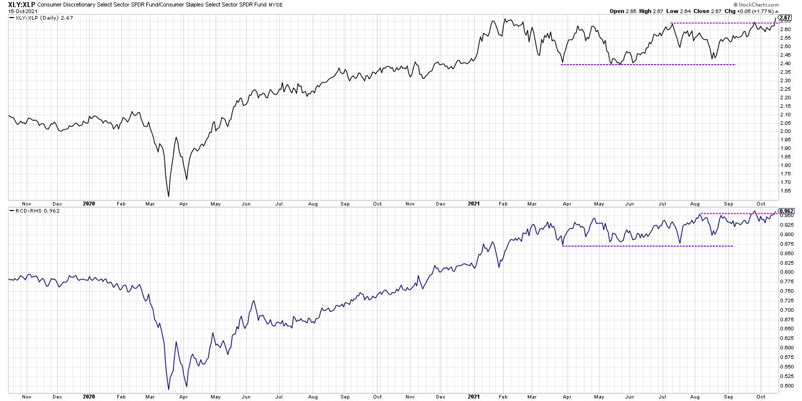
First, we have the offense vs. defense ratio.

One of my Fidelity predecessors, Bill Doane, had a version of this chart in the Fidelity Chart Room. It was a way to track institutional rotation between the offensive and defensive ends of the consumer space. The top panel uses the cap-weighted version with the XLY and XLP. The bottom panel is even more illuminating because it use equal-weighted ETFs for each sector, RCD and RHS.
The XLY is dominated by three stocks: AMZN, HD and TSLA. The equal-weighted version removes this overweight and is a better measure of overall rotation between the two sectors. As you can see, both of these ratios are at or near new highs this week. So, while the S&P 500 remains a bit below its all-time high around 4550, these ratios are showing that investors are still very much positioned for further upside.
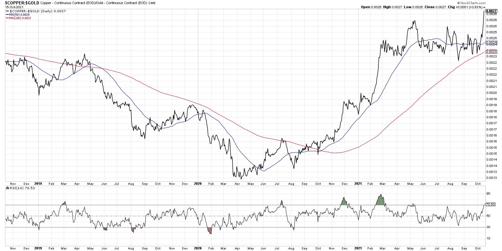
Second, let's look at the copper to gold ratio.

In this week's special event on StockCharts TV, "Chart Madness Revisited", I had an absolute blast debating stock picks and comparing charts with Tom Bowley, Greg Schnell and Grayson Roze.
By the way, you can still access the brackets and fill out your own here!
At one point, we got to the topic of the Materials sector and Tom mentioned the copper to gold ratio, which can be a great way to gauge economic strength. In strong economic conditions, there tends to be more demand for copper and the ratio tends to move higher. Note how this ratio has rotated from the more defensive gold to the relative "offense" of copper, making a new high again this week. The higher this ratio goes, the more it speaks to upside potential for economic conditions.
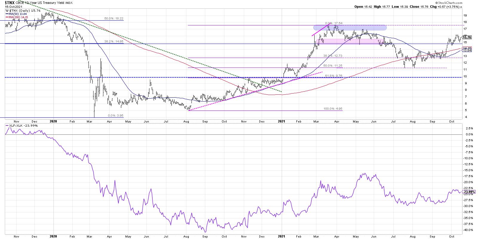
Third, we can look at interest rates and how that relates to sector leadership.

The ten-year yield has risen back to the 1.50-1.75 range, where it was back in March through June of this year. 1.75 certainly could serve resistance for the $TNX, but a break above this level would clear the way to 2% or higher assuming a further deterioration in bond prices.
Why are rates so important?
The bottom ratio shows the Financial sector versus the Technology sector. The relative strength of the XLF is very closely aligned with ten-year yields. If and when rates continue higher, that would be a huge tailwind for banks and big headwind for growth sectors like Technology.
At the end of our Chart Madness Revisited special, I asked each of the experts to give their best idea between now and year-end. Out of the 16 stocks in the original bracket, I selected JPM based in no small part on the chart featured above!
Don't forget to vote on which of these four S&P scenarios you see playing out between now and year end!
RR#6,
Dave
P.S. Ready to upgrade your investment process? Check out my free course on behavioral investing!
David Keller, CMT
Chief Market Strategist
StockCharts.com
Disclaimer: This blog is for educational purposes only and should not be construed as financial advice. The ideas and strategies should never be used without first assessing your own personal and financial situation, or without consulting a financial professional.
The author does not have a position in mentioned securities at the time of publication. Any opinions expressed herein are solely those of the author, and do not in any way represent the views or opinions of any other person or entity.
|
| READ ONLINE → |
|
|
|
|
|
| ChartWatchers |
| Mortgage Rates are Rising - This Chart Says They Will Move Higher Still |
| by Carl Swenlin, Erin Swenlin |
(This is an excerpt from Thursday's (10/14) DecisionPoint Alert)

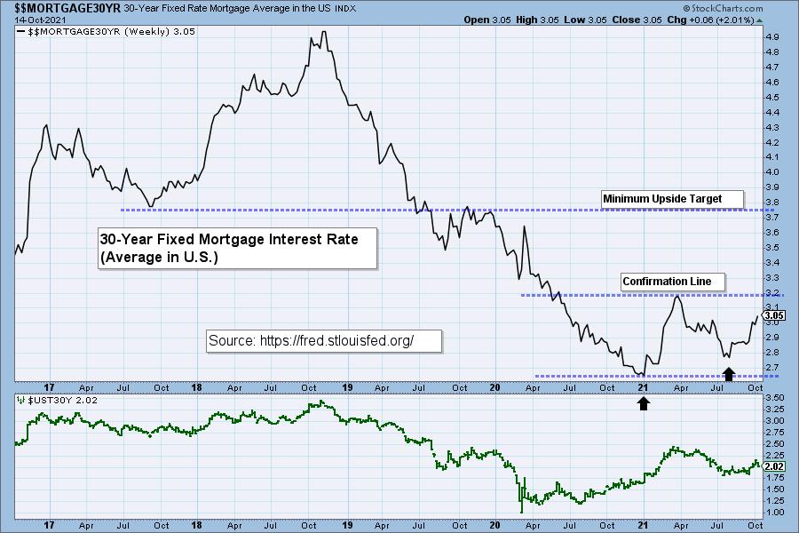
We want to watch the 30-Year Fixed Mortgage Interest Rate, because, for the most part, people buy homes based upon the maximum monthly payment they can afford. As rates rise, a fixed monthly payment will carry a smaller mortgage amount. (See table.) As mortgages are forced to shrink, real estate prices will have to fall, and many sellers will increasingly find that they are upside down with their mortgage. That, or we will now see inflated real estate prices begin to normalize.


Click here to register in advance for the recurring free DecisionPoint Trading Room! Recordings are available!
Right now, rates are rising quickly. Looking at the chart, we see a double-bottom forming. This tells us that rates could continue rising. If it moves above the confirmation line of the double-bottom (that confirms the pattern), the minimum upside target would take rates all the way to 3.75%. Add this to inflation, rising energy costs and other data points and life is about to get harder for home buyers and renters alike.

Technical Analysis is a windsock, not a crystal ball.
--Carl & Erin Swenlin
(c) Copyright 2021 DecisionPoint.com
Helpful DecisionPoint Links:
DecisionPoint Chart Gallery
Trend Models
Price Momentum Oscillator (PMO)
On Balance Volume
Swenlin Trading Oscillators (STO-B and STO-V)
ITBM and ITVM
SCTR Ranking
DecisionPoint is not a registered investment advisor. Investment and trading decisions are solely your responsibility. DecisionPoint newsletters, blogs or website materials should NOT be interpreted as a recommendation or solicitation to buy or sell any security or to take any specific action.
|
| READ ONLINE → |
|
|
|
| Martin Pring's Market Roundup |
| There is a Pretty Good Chance the Correction is Over |
| by Martin Pring |
The S&P peaked in early September, but most other major averages and many internal indicators of breadth have been rangebound since March. Price action this week, though, suggests that there is a good chance this corrective process has run its course and we will see significant new highs well before the end of the year. Chart 1 shows that the NYSE A/D Line in the bottom window, has been consolidating since June and is now back to its high. The common stock variety is also close , but the S&P is still a bit short of registering a new high. However, it has managed to break above its correction down trendline.
 Chart 1 Chart 1
Chart 2 indicates that the short-term KST for the NYSE has only just started to turn up. Given the close proximity of the Index to its previous high, it's a small stretch to anticipate that the KST rally will not result in a breakout.
 Chart 2 Chart 2
Breadth Indicators are Turning
My Dow Diffusion indicator is featured in Chart 3. This series monitors the percentage of Dow components that are in a positive trend. It triggers buy signals when it falls below the green horizontal line and then reverses to the upside. The green arrows show that these signals have fairly consistently been followed by a worthwhile rally. Only the November 2018 signal can be said to be a failure; it has been flagged by the red dashed arrow.
 Chart 3The number of NYSE stocks above a 50-day MA has been correcting for quite a while, indicating that more and more stocks have been losing upward momentum. That could well be changing, as this series appears to have successfully tested its summer low. Indeed, its October bottom was above that set in July, whereas the NYSE was recently lower than July's low. The two sets of green dashed arrows point up similar such positive divergences that have taken place in the last two years. Both were followed by very strong rallies. Chart 3The number of NYSE stocks above a 50-day MA has been correcting for quite a while, indicating that more and more stocks have been losing upward momentum. That could well be changing, as this series appears to have successfully tested its summer low. Indeed, its October bottom was above that set in July, whereas the NYSE was recently lower than July's low. The two sets of green dashed arrows point up similar such positive divergences that have taken place in the last two years. Both were followed by very strong rallies.
 Chart 4 Chart 4
The McClellan Volume Summation (Chart 5) triggers positive signals by experiencing an upside reversal from at or below its green oversold zone. Examples are indicated by the vertical lines. Rallies have pretty consistently followed such events. The summer of 2021 saw a couple of false reversals from the green line. However, the indicator now appears to be experiencing a breakout from a small base that has formed in the oversold zone. The implication is that a more durable advance lies down the road.
 Chart 5Finally, in the breadth department, we see the 10- and 30-day MAs of the percentage of NYSE stocks above their 200-day MA (Chart 6). It's been deteriorating since the start of the year but is now very close to its 30-day MA. The raw data (not shown) has already crossed the 30-day MA and the latest plot does not include Friday's moderately strong rally. Those two factors suggest that a bullish crossover is very likely to take place. Remember, going forwards, you can update any of these charts by simply clicking on them. Chart 5Finally, in the breadth department, we see the 10- and 30-day MAs of the percentage of NYSE stocks above their 200-day MA (Chart 6). It's been deteriorating since the start of the year but is now very close to its 30-day MA. The raw data (not shown) has already crossed the 30-day MA and the latest plot does not include Friday's moderately strong rally. Those two factors suggest that a bullish crossover is very likely to take place. Remember, going forwards, you can update any of these charts by simply clicking on them.
 Chart 6 Chart 6
Sentiment
Chart 7 features the CBOE Options Total Put/Call Ratio, calculated in momentum format by applying a daily KST to the raw data. Reliable buy signals are triggered when investor pessimism is greatest and subsequently reverses towards optimism. In that respect, the solid arrows indicate reversals from at or above the green-dashed horizontal line. The dashed ones flag similar reversals but from the blue line. You would expect that those signals developing from a high level would be followed by stronger advances. However, apart from the December 2018 and March 2020 signals, no consistent pattern is apparent. It looks very much as if the indicator has once again reversed from the blue zone, which suggests that stocks will rally into the year-end period.
 Chart 7 Chart 7
Finally, Chart 8 plots a credit spread relationship between the iBoxx High Yield Bond and the iShares 7-10-year Treasury Bond ETF (HYG/IEF). It reflects swings in confidence as bond investors switch between the higher riskier junk and the relative safety of treasuries. It's by no means a tick-by-tick relationship with the stock market; indeed, there are often long periods of divergence between the two. However, breakouts in the ratio above or below trendlines and or reliable moving averages occasionally provide important stock market signals. Right now, it looks as if the ratio is about to break above a 3-year down trendline. If so, that would imply a strong forthcoming trend of improving investor confidence and a stronger stock market. Note that the short- and long-term KSTs are in a positive mode and their intermediate counterpart has gone flat. It's important to remember that the trendline break is tentative at this stage, but, given the other reliable short-term indicators cited earlier and the rising short-term KST for the ratio, I think there is an excellent chance that we will see a stronger breakout above that resistance trendline in the period directly ahead.
 Chart 8 Chart 8
Conclusion
The major averages and A/D Lines are at resistance and may need to digest recent gains in the next few sessions. However, there are enough positive short-term internal indicators to suggest that the market has a sporting chance of breaking out in the not too-distant future, just in time for the bullish November/April seasonal.
Good luck and good charting,
Martin J. Pring
The views expressed in this article are those of the author and do not necessarily reflect the position or opinion of Pring Turner Capital Group of Walnut Creek or its affiliates.
|
| READ ONLINE → |
|
|
|
| ChartWatchers |
| Starting the Fall Run |
| by Greg Schnell |
After a month of wandering sideways, the market seems to be finding its legs as we enter prime time for earnings season.

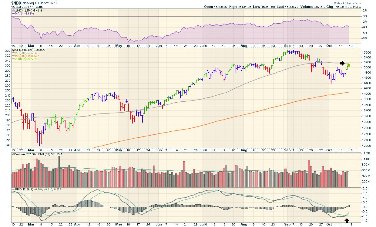
We have a PPO buy signal showing up, just as the market returns to the 50-DMA moving average. What is different this time is that the 50-day moving average has turned down, rather than having a rising slope. That adds a little caution to the optimism, but we have broken the downtrend.
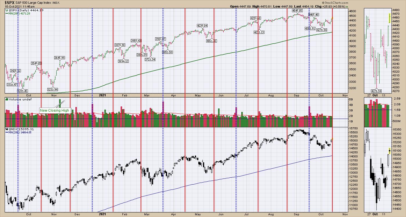
Friday, October 15th also marks Options Expiration day. For the past year, that has not really influenced the market significantly. Friday finds us trading at the same level as the $SPX September Option expiration date. The Nasdaq 100 is currently slightly lower. (Blue lines include quarterly options expiration).

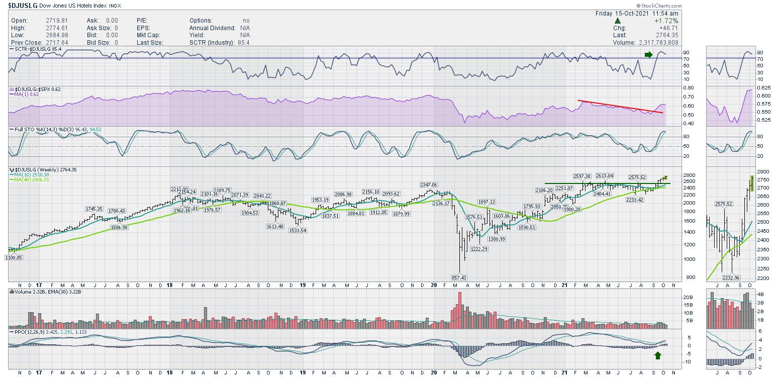
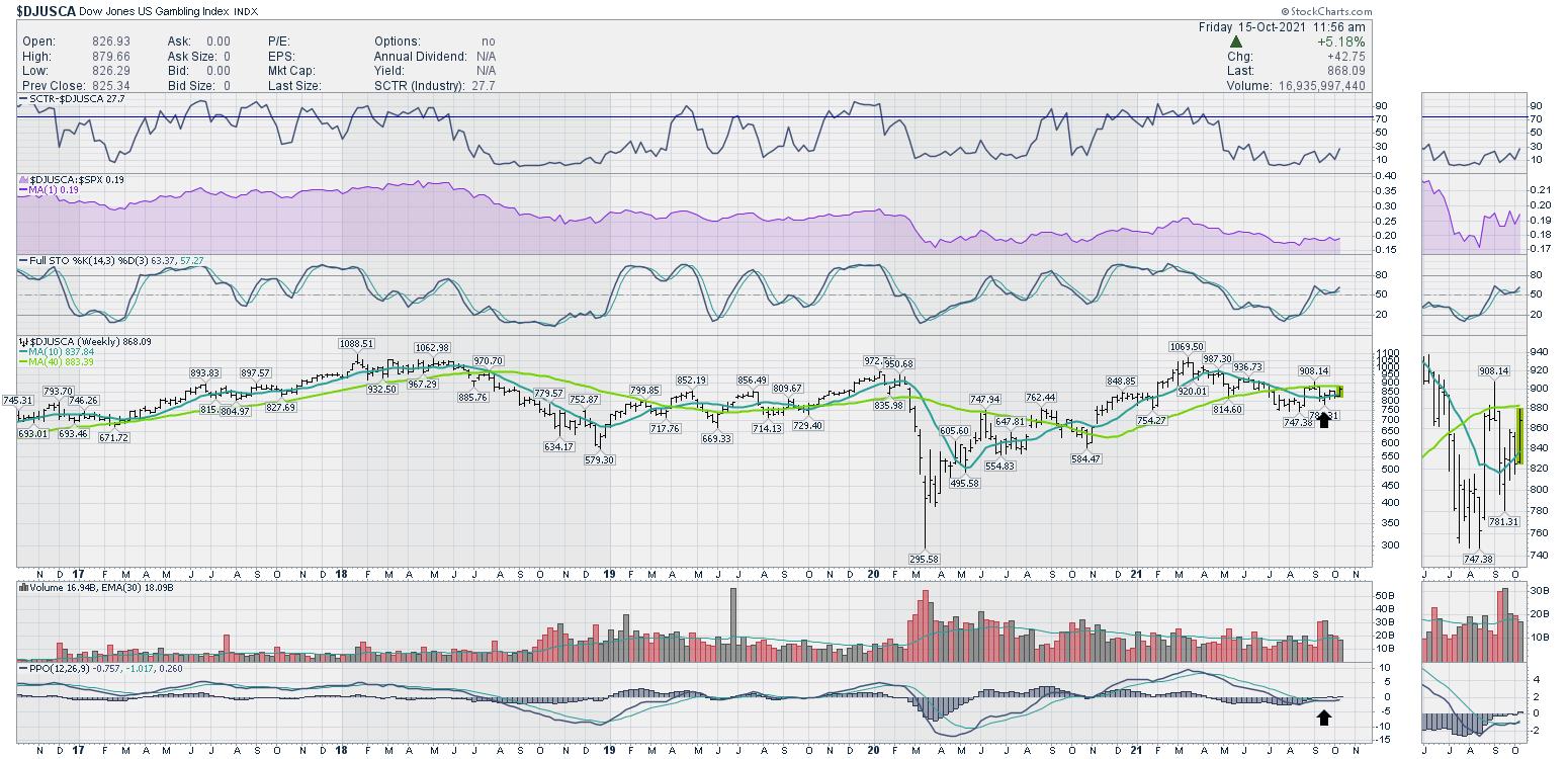
One of the things that happened this week was a significant improvement in momentum. Lots of industry groups started to improve after begrudgingly wandering for the last few months. Travel and Leisure have improved nicely. The chart below is hotels, and it is breaking out to new highs.

An associated group is the gambling group. I have been watching it for the last few weeks. It continues to tread water sideways, but the PPO and the full stochastics are turning up again this week. Nice.

So far, the rally isn't obvious, but there are signs of encouragement. If you would like to know more about industry groups breaking out, check out gregschnell.com/explore for a two-week free trial.
|
| READ ONLINE → |
|
|
|
| ChartWatchers |
| Finding Stocks Under Heavy Accumulation - Three Examples of What I Look For |
| by Tom Bowley |
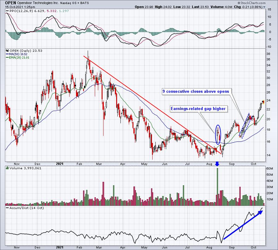
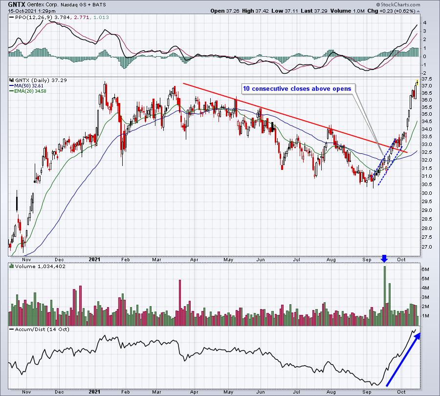
On September 28th, I wrote a "Trading Places" blog article titled "Rising Yields Have A History of Favoring These Stocks; One Such Stock is Being Heavily Accumulated". The stock I wrote about was Opendoor Technologies (OPEN), which, after pulling back temporarily, has exploded higher recently. A second stock that showed similar characteristics was Gentex Corp (GNTX). Here are their respective charts, but pay particular attention to their AD lines (accumulation/distribution lines), which soared after price action broke downtrends:
OPEN:

That is a SERIOUS move to the upside in both price and AD line.
GNTX:

Again, a powerful move to the upside in both price and AD line.
Stocks closing above their opens like this suggest accumulation, in my view. Note that the subsequent moves in both of these stocks was to the upside.
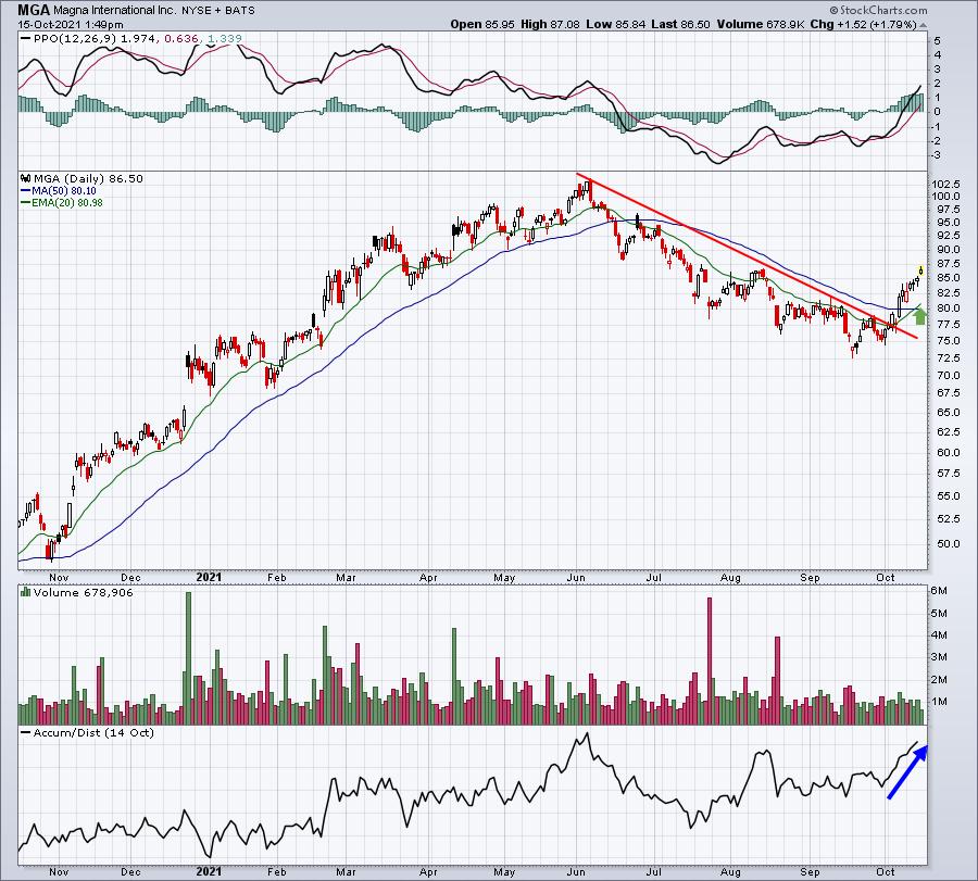
So, I guess the obvious question is......are there other stocks currently setting up in similar fashion? Well, I've begun running these "accumulation scans" frequently and one stock that looks very interesting to me is Magna International (MGA), an auto parts company. I see money rotating into consumer discretionary stocks as a whole, and MGA appears to be a beneficiary of this trend. Its AD line is approaching a breakout, despite the fact that price still needs to rise close to 20% to reach the high set in June:

Like the other two, MGA has broken a lengthy downtrend as it makes its current move higher. I could be picky and wish that volume had been stronger the past two weeks. But the bottom line is that MGA has gone nearly two weeks without a single day of closing below its opening price and that's impressive. The AD line has moved up considerably and the downtrend in price has been broken. My wish list, instead, would include an upcoming pullback and 20-day EMA test (green arrow), which would allow for a much better reward-to-risk entry.
ChartFest 2021
ChartFest 2021 is tomorrow, Saturday, October 16th, at 11:00am ET. Speakers include myself, David Keller (Chief Market Strategist at StockCharts.com and host of StockCharts TV's The Final Bar) and Grayson Roze (Vice President of Operations at StockCharts.com). We will be discussing our routines and how we use the StockCharts.com platform to make better and more informed investing/trading decisions. If you like charts, you'll LOVE ChartFest 2021! Best of all, it's FREE. Need more incentive to attend? How about free ChartLists from each of us to help you navigate the market? And you don't need to attend LIVE. We'll be recording the event and a copy of the recording will be sent to all those registered. To register, CLICK HERE and enter your name and email address.
I hope to see you on Saturday!
Happy trading!
Tom
|
| READ ONLINE → |
|
|
|
| MORE ARTICLES → |
|
 Chart 1
 Chart 2
 Chart 3
 Chart 4
 Chart 5

 Stocks surged for the second Thursday in as many weeks, but this Thursday's surge was a lot different than the previous week. This week's surge featured a strong open and strong close as well as the strongest breadth in four months. What does it mean going forward? Let's investigate.