This has been a confusing market in so many ways. The S&P 500 moved higher for the first nine months of the year, but many stocks had a very different experience over that time frame. Leadership themes have rotated a number of times, with growth- and value-oriented sectors both spending time at the top of the list.
In the last six weeks, we've experienced a dramatic selloff (of only 6% off all-time highs) and then an equally dramatic recovery (of about 200 S&P points). So what's next?
I recently posted a video outlining four potential scenarios for the S&P 500 between now and year-end. Check it out and let me know which outcome you think is most likely and why!
One of my favorite parts of my role at StockCharts is how I get to compare notes with some very talented technical analysts and strategists. Here are four of the charts that have come up recently in those discussions, each of which are showing more of a bullish tilt and are reminding me to not be too negative in the face of bullish evidence!
First, we have the offense vs. defense ratio.
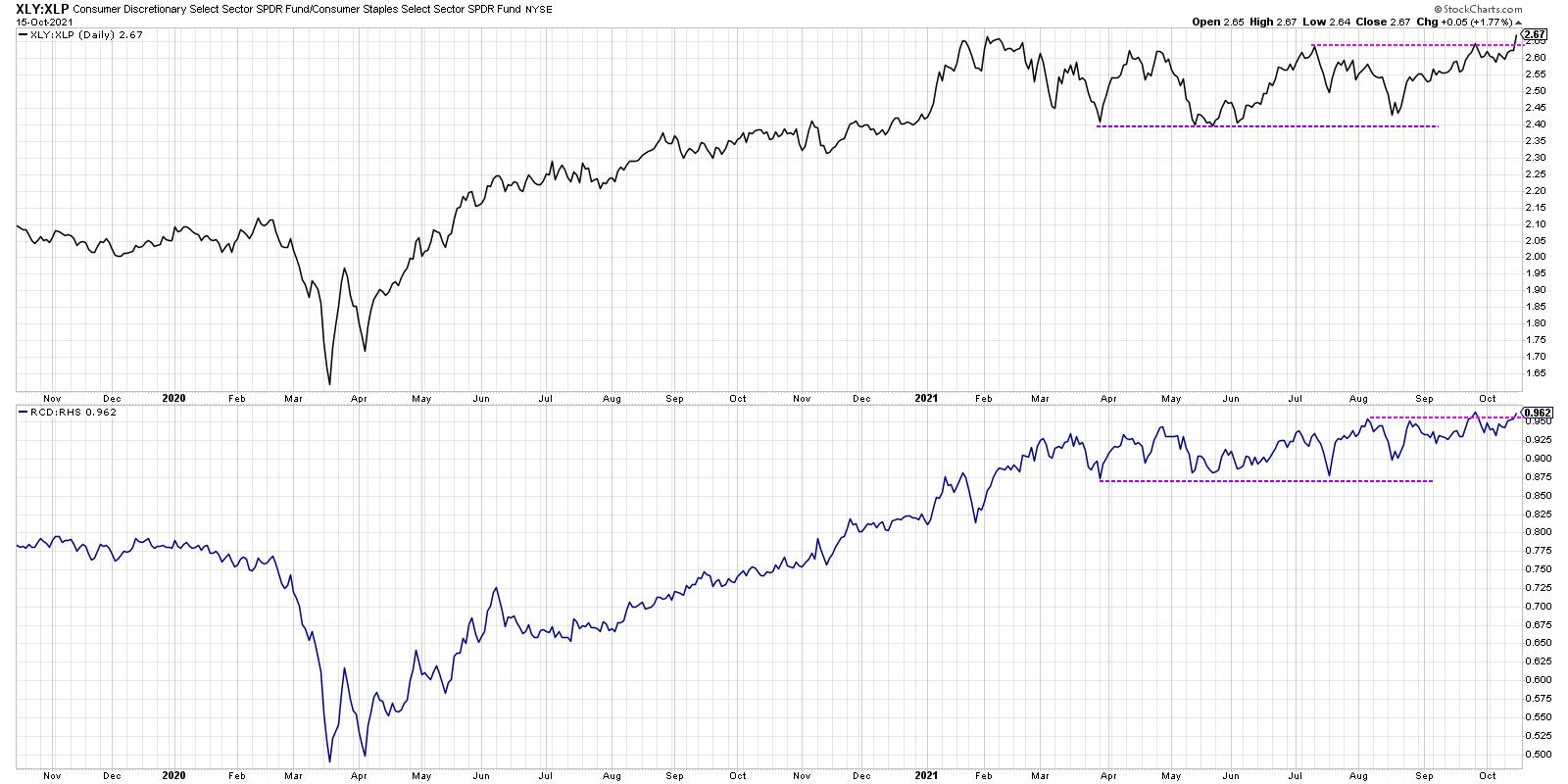
One of my Fidelity predecessors, Bill Doane, had a version of this chart in the Fidelity Chart Room. It was a way to track institutional rotation between the offensive and defensive ends of the consumer space. The top panel uses the cap-weighted version with the XLY and XLP. The bottom panel is even more illuminating because it use equal-weighted ETFs for each sector, RCD and RHS.
The XLY is dominated by three stocks: AMZN, HD and TSLA. The equal-weighted version removes this overweight and is a better measure of overall rotation between the two sectors. As you can see, both of these ratios are at or near new highs this week. So, while the S&P 500 remains a bit below its all-time high around 4550, these ratios are showing that investors are still very much positioned for further upside.
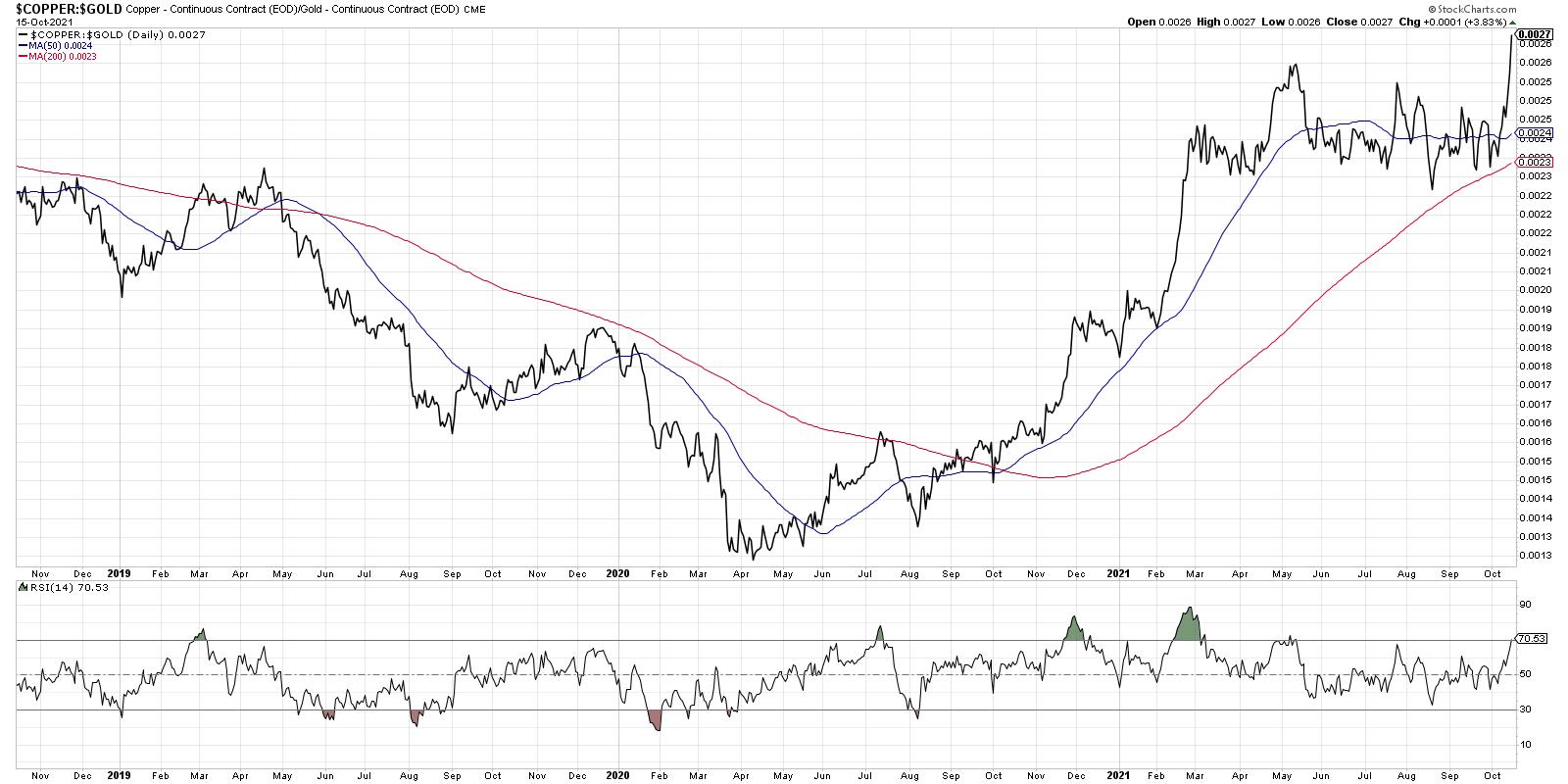
Second, let's look at the copper to gold ratio.
In this week's special event on StockCharts TV, "Chart Madness Revisited", I had an absolute blast debating stock picks and comparing charts with Tom Bowley, Greg Schnell and Grayson Roze.
By the way, you can still access the brackets and fill out your own here!
At one point, we got to the topic of the Materials sector and Tom mentioned the copper to gold ratio, which can be a great way to gauge economic strength. In strong economic conditions, there tends to be more demand for copper and the ratio tends to move higher. Note how this ratio has rotated from the more defensive gold to the relative "offense" of copper, making a new high again this week. The higher this ratio goes, the more it speaks to upside potential for economic conditions.
Third, we can look at interest rates and how that relates to sector leadership.
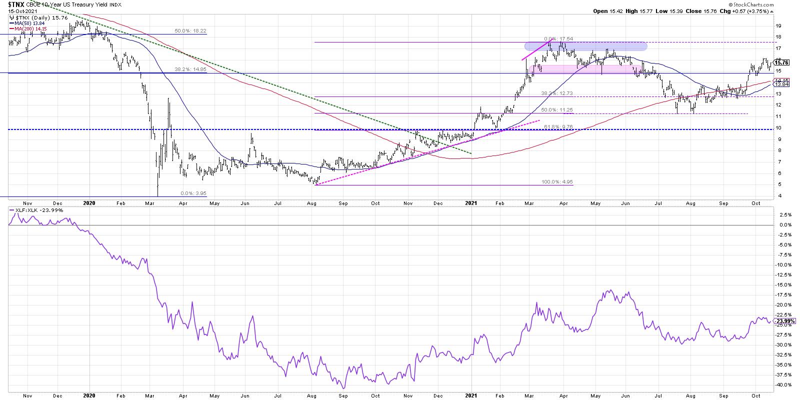
The ten-year yield has risen back to the 1.50-1.75 range, where it was back in March through June of this year. 1.75 certainly could serve resistance for the $TNX, but a break above this level would clear the way to 2% or higher assuming a further deterioration in bond prices.
Why are rates so important?
The bottom ratio shows the Financial sector versus the Technology sector. The relative strength of the XLF is very closely aligned with ten-year yields. If and when rates continue higher, that would be a huge tailwind for banks and big headwind for growth sectors like Technology.
At the end of our Chart Madness Revisited special, I asked each of the experts to give their best idea between now and year-end. Out of the 16 stocks in the original bracket, I selected JPM based in no small part on the chart featured above!
Don't forget to vote on which of these four S&P scenarios you see playing out between now and year end!
RR#6,
Dave
P.S. Ready to upgrade your investment process? Check out my free course on behavioral investing!
David Keller, CMT
Chief Market Strategist
StockCharts.com
Disclaimer: This blog is for educational purposes only and should not be construed as financial advice. The ideas and strategies should never be used without first assessing your own personal and financial situation, or without consulting a financial professional.
The author does not have a position in mentioned securities at the time of publication. Any opinions expressed herein are solely those of the author, and do not in any way represent the views or opinions of any other person or entity.


