| THIS WEEK'S ARTICLES |
| John Murphy's Market Message |
| AIRLINES LEAD INDUSTRIAL SPDR TO A NEW RECORD |
| by John Murphy |
INDUSTRIAL SPDR HITS NEW RECORD... A strong jobs report has boosted major stock indexes into record territory with most sectors also rising. Industrials are one of the day's strongest sectors. Chart 1 shows the Industrial Sector SPDR (XLI) moving into record territory today. It's being led higher by airline stocks which we'll focus on today.
 Chart 1 Chart 1
AIRLINE ETF GAPS HIGHER...Chart 2 shows the US Global Jets ETF (JETS) gapping higher today in heavy trading and testing its 200-day moving average. A close above its early October peak could be enough to signal a bottom in the airline group. Today's rally is part of a rotation into the so-called reopening trade which includes stocks tied to travel and tourism. Encouraging news on the Covid front is certainly helping.
 Chart 2 Chart 2
DELTA AND UAL ARE AIRLINE LEADERS...While all airline stocks are gaining today, the two strongest chart patterns are shown below. Chart 3 shows Delta (DAL) rising above its 200-day moving average and nearing a possible test of its early October peak. Chart 4 shows United Airlines (UAL) already trading above its October high. That makes UAL the strongest of the airlines from a chart standpoint.
 Chart 3 Chart 3
 Chart 4 Chart 4
|
| READ ONLINE → |
|
|
|
| The Mindful Investor |
| When is the S&P 500 No Longer Bullish? |
| by David Keller |
One of the best parts of hosting The Final Bar on StockCharts TV is the opportunity to compare notes with some of the top technical analysts and traders in the markets. In my recent discussions, we've discussed new highs for the S&P 500, Nasdaq, Russell 2000, Dow Industrials, Dow Transports and numerous individual stocks and industry groups. With all of these indexes making new all-time highs, in addition to the seasonal tendencies with strength common in November and December, most of my guests (as well as myself!) are quite justifiably bullish on the equity markets through year-end.
So what would we need to see to turn less constructive on the equity markets here?
Basically, I took my most recent conversations on StockCharts TV, along with what I've been sharing with my Market Misbehavior Premium Members, and came up with one chart to track some of the key indicators.
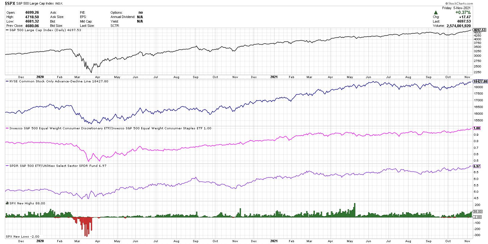
At the top, we have the S&P 500 index on a closing basis for the last two years. It's worth mentioning here that "the most bullish thing the market can do is go up," as was often pointed out by legendary technical analyst Paul Montgomery. The market will tell you when conditions are no longer bullish, and it will tell you by prices rotating lower!
The next panel down (in blue) shows the cumulative advance-decline line for the NYSE using only common stocks. This is one of my favorite ways to determine market breadth conditions, as it is an equal-weighted measure of upside participation. This indicator moving higher tells you that more stocks are closing higher than lower over time. If and when this line starts to turn lower, especially if the S&P price continues to increase, that would suggest that investors are starting to sell stocks even as the index continues in a bullish phase.
Next we have what I call the "Offense vs. Defense Ratio," which is inspired by Bill Doane, one of my predecessors at Fidelity Investments. Here, we're looking at the relative performance of Consumer Discretionary vs. Consumer Staples stocks. Are investors favoring things they want over things they need? When this ratio is moving higher, as it has been fairly consistently since March 2000, that tells you that the offense is on the field. If this ratio would turn lower, it would indicate that investors are getting more defensive and that caution is warranted. One point to note is that we're using the equal-weighted ETFs for these two sectors instead of the normal cap-weighted indexes, mainly to reduce the overweight of AMZN, TSLA and HD in the XLY.
The next panel down (in purple) shows the relative performance of the S&P 500 vs. the Utilities sector. When investors start to turn bearish, they will often rotate to more defensive sectors like Real Estate or Utilities. This ratio has moved higher through most of the last year, confirming that investors are positioned for further market upside. A downturn in this ratio would indicate that people are getting more defensive and expect limited upside for stocks.
At the bottom, we have the daily new 52-week highs and 52-week lows for the S&P 500 members. You'll notice plenty of green bars in recent weeks, showing how there have been a healthy number of stocks making new 52-week highs as the S&P 500 index has done the same.
Toward the end of a bull market phase, you'll see a decline in new highs as stocks begin to pull back and test support. Then you'll often see an increase in 52-week lows (red histogram) as stocks correct even further and begin to make new lows.
So, at this point, all four of these indicators are firmly bullish. That makes sense, given the broad advance for stocks and growing optimism for the equity markets. This chart should help to confirm the current bullish conditions, signal when those conditions are no longer in place and help identify when investors should think more defensively in their portfolios.
Want to digest this article in video format? Check it out on my YouTube channel:
RR#6,
Dave
P.S. Ready to upgrade your investment process? Check out my free course on behavioral investing!
David Keller, CMT
Chief Market Strategist
StockCharts.com
Disclaimer: This blog is for educational purposes only and should not be construed as financial advice. The ideas and strategies should never be used without first assessing your own personal and financial situation, or without consulting a financial professional.
The author does not have a position in mentioned securities at the time of publication. Any opinions expressed herein are solely those of the author, and do not in any way represent the views or opinions of any other person or entity.
|
| READ ONLINE → |
|
|
|
| ChartWatchers |
| 3 Major Leadership Changes in November |
| by Tom Bowley |
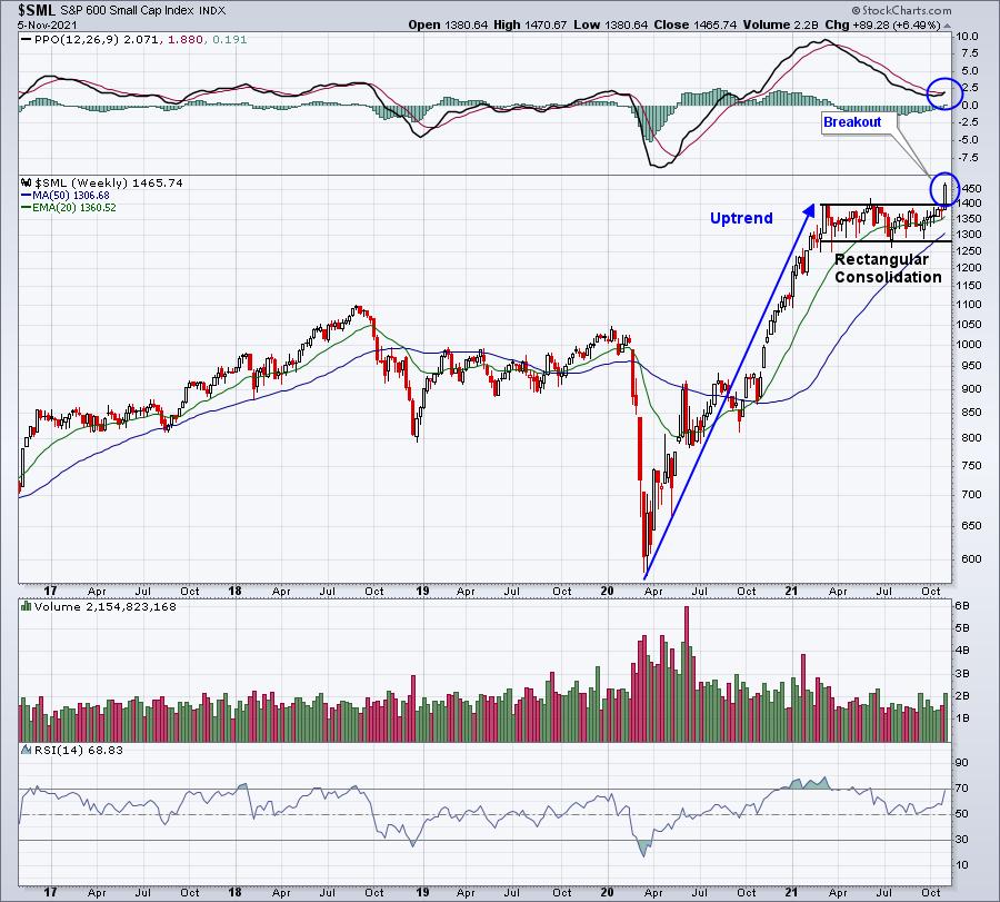
Like most technicians, I take a "top down" approach when it comes to my trading strategy. I start with the overall market, which, I believe, continues to be insanely bullish. My two biggest worries in the market have been alleviated as both small-cap stocks ($SML) and transportation stocks ($TRAN) have broken out to new all-time highs. Both of these groups tend to perform best when the U.S. economy is strong and/or strengthening. The recent breakouts point to further gains ahead:
S&P 600 Small Cap Index ($SML):
Dow Jones Transportation Average ($TRAN):
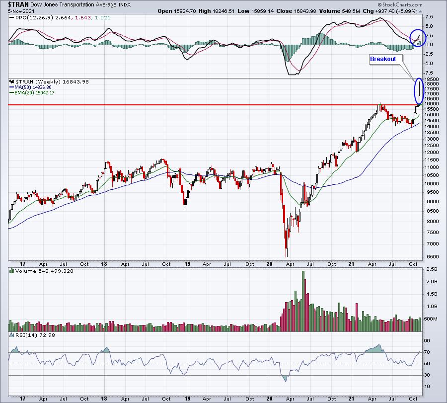
In my opinion, the lack of breakouts and follow through in these two groups has been the single biggest worry of mine relating to the sustainability of the current secular bull market. They were both rectified last week.
New Theme #1 — Renewed Strength in Industrials
Transportation stocks are part of the industrials sector (XLI), which broke out on Friday after several months of consolidation and false breakouts. I believe it's quite likely that this lights a fire under the group for November and, likely, the balance of 2021.
Before I show you the XLI, do you recall what I've recently been writing about consumer discretionary (XLY)? When it broke out on an absolute basis, the XLY relative strength absolutely exploded. Here are the one-month returns of all sectors:
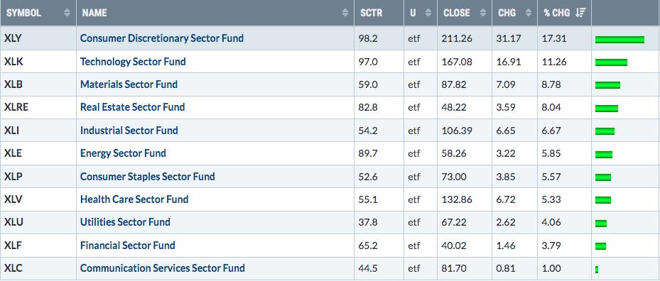
The XLY also had recently tested relative PPO support at -1.0 on its long-term weekly chart, just before this massive outperformance. Check out this chart:
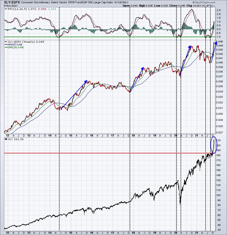
Every time the relative PPO of the XLY:$SPX reaches -1, it's an indication that the consumer discretionary group's relative weakness has run its course and nearing its end. We had just started turning up in terms of relative strength when the XLY made a significant price breakout. That further ignited the group and now we see that massive 1-month, 17% gain in discretionary stocks.
It looks to me like industrials (XLI) are ready to lead for the next month based on their similar chart:
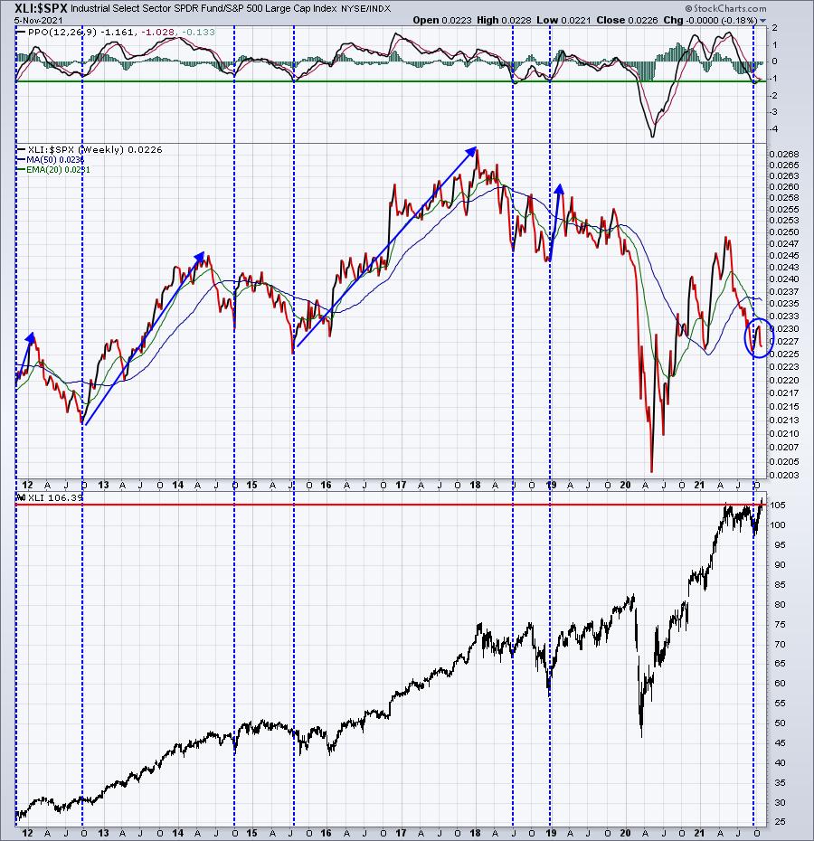
The XLI broke out and closed above 106 for the first time in history at Friday's close. The relative PPO is down near -1, which also has marked key relative bottoms for the XLI. The 2020 pandemic was an exception. Otherwise, the XLI seems to catch fire from this relative level. So this could be the start of significant relative strength, especially given industrials' affinity for November:
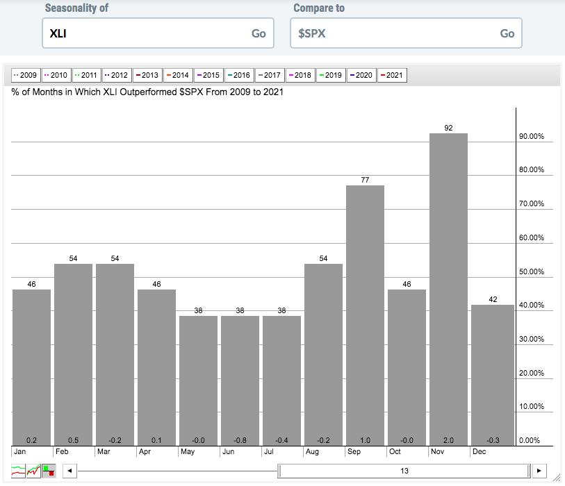
Over the past 13 years, and since the March 2009 bottom, industrials have outperformed the S&P 500 every November but one. The average outperformance is 2 full percentage points. That's the average! The next closest month is September, which is half the November outperformance rate. It's hard to argue against overweighting industrials right now.
New Theme #2 — Growth Stocks over Value Stocks
My favorite growth vs. value ratio is the IWF vs. IWD. It's simply a very quick look at which area of the market that Wall Street prefers — growth or value. When the IWF:IWD ratio is climbing, growth is in favor. When the opposite is true, value is in favor. This is the current picture:
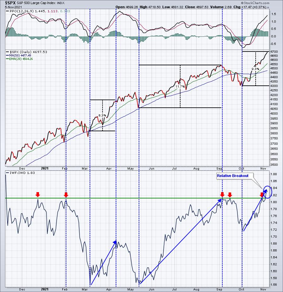
The IWF:IWD ratio is nearing its 52-week high. The chart above highlights the fact that the S&P 500 FLIES when growth is in favor, which it is right now. When the market favors value, it's not a bearish signal. It simply leads to more neutral overall market action. While I do favor growth stocks overall, the breakout in industrials could lead to more value-oriented stocks gaining during the balance of November. That could lead to a stalling of the current market advance.
Also, I select 10 equal-weighted stocks for each of our 4 stock portfolios at EarningsBeats.com each quarter. I generally favor growth stocks, so when growth is outperforming like it is now, our portfolios tend to do quite well. Here are our current quarterly and since-inception results through the Thursday, November 4th close:
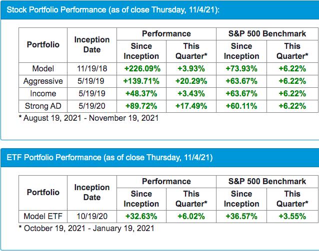
Our next stock portfolio "draft" is less than two weeks away. If you'd like to see which leading stocks we line our portfolios with, you can start your 30-day FREE trial HERE.
New Theme #3 — Semiconductors Are Flying Again
You just can't afford to bet against this industry. I'm seeing breakout after breakout after breakout. When I think growth stocks, my mind immediately turns to semiconductors. There aren't many industry groups, if any, that can grow earnings as rapidly as this group. There are many investors that simply will not buy stocks with PE ratios in the stratosphere. In my opinion, however, those PE ratios are there for a reason, and that reason is HUGE earnings growth in the future being priced in during a period in history with interest rates near all-time lows.
I cannot stress enough how valuable earnings growth is when interest rates are this low. Astute investors will overpay (based on historical standards) for strong earnings growth. It's the reason why the following semiconductor companies sport the PEs they do:
- NVIDIA (NVDA): PE 106
- Xilinx (XLNX): PE 62
- Broadcom (AVGO): PE 41
- Advanced Micro Devices (AMD): PE 42
- Microchip Technology (MCHP): PE 75
- NXP Semiconductors (NXPI): PE 40
- Lattice Semiconductor (LSCC): PE 139
- Brooks Automation (BRKS): PE 78
The companies where you'll find reasonable PEs are companies like Intel (INTC), which has a PE of 10. INTC isn't able to grow its earnings and Wall Street is punishing it and choosing its semiconductor alternatives that are showing explosive growth.
To simplify, I follow the money. Semiconductors have just broken out again vs. the S&P 500, putting them back in their familiar leadership role. That means we want to make sure we have representation in this space. Here's the current technical outlook:
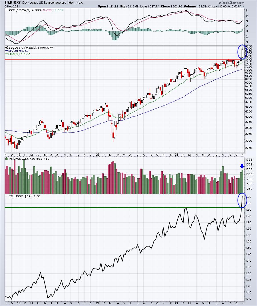
Semiconductors took a relative break for much of 2021, but their recent absolute and relative breakout is likely to lead to further strength. We want to make sure we're adequately represented by the group if we have intentions of beating the benchmark S&P 500.
On Monday in my FREE EB Digest newsletter, I'll be featuring a company that recently reported blowout quarterly earnings numbers and appears poised to move much higher into year end. You can subscribe (free, no credit card required) by CLICKING HERE and providing your name and email address. Feel free to unsubscribe at any time.
Happy trading!
Tom
|
| READ ONLINE → |
|
|
|
|
|
| ChartWatchers |
| First People Buy Cars, Then They Need Parts (and Tires) |
| by Julius de Kempenaer |
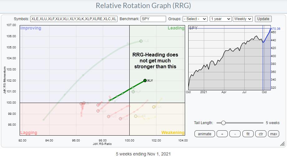
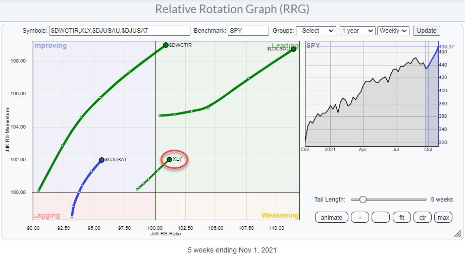
One of the (if not THE) most promising tails on the Relative Rotation Graph for US sectors is on XLY, the Consumer Discretionary sector. Over the last five weeks, the tail on XLY shows an almost straight line into the leading quadrant while gaining on both axes. Things do not get much stronger than this.
Many Groups Inside the Discretionary Sector
However, the Consumer Discretionary sector is very diversified and, therefore, has a lot of different groups. The RRG below shows the rotations for all these groups.
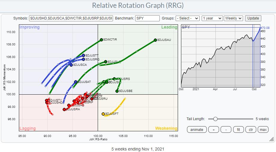
As you can see, the relative trends for these groups inside XLY, using SPY as the benchmark, are quite spread out over the canvas of the RRG. The cluster of groups with red tails inside the lagging quadrant are better avoided, as they are in a relative downtrend vs. the S&P 500 while the sector is in a relative uptrend. A double negative, therefore.
Inside leading and lagging, a few interesting tails are popping up. The same universe on an RRG with XLY as the benchmark gives a more detailed picture. Here, we compare all the groups against the sector index as well as each other, which gives the following image.
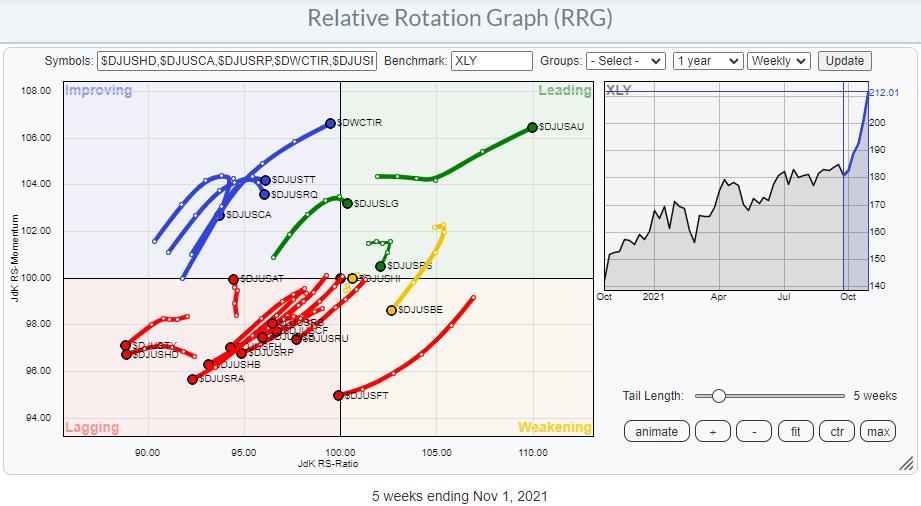
As you can see, the split between the weak tails inside the lagging quadrant and the rest of the graph has now become even more pronounced. The groups that I want to zoom in on for this article are Automobiles (obviously ;) ), Tires and Auto Parts.
The RRG below highlights these three groups against SPY and has XLY on the canvas as a secondary benchmark.
Automobiles
The strong rotation for Automobiles is clearly visible. It is tempting to attribute that all to TSLA, but is it true? In order to find out, we can plot all automobiles on an RRG.
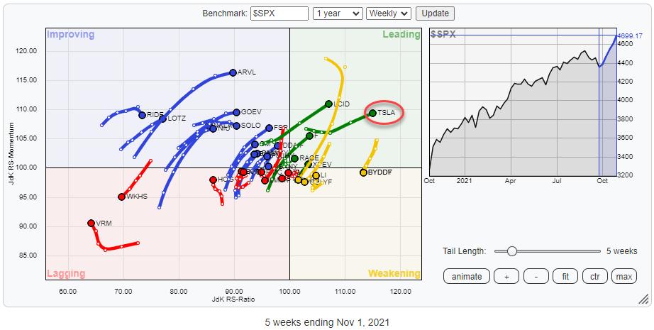 The RRG above shows all automobile stocks against the S&P 500 and, clearly, TSLA stands out, but, as you can see, there are a few more tails that are showing interesting rotations. In particular, LuCID and Ford are showing strong tails at a good RRG-Heading. The RRG above shows all automobile stocks against the S&P 500 and, clearly, TSLA stands out, but, as you can see, there are a few more tails that are showing interesting rotations. In particular, LuCID and Ford are showing strong tails at a good RRG-Heading.
I am going to pass on TSLA for the time being, as I feel the recent steep rise has made the risk/reward for new entries unattractive.
Tires
The Tires group also shows a strong rotation, but this is really only a handful of stocks, with GT being the dominant name by a mile. Nevertheless, the rotation for GT, dragging the group along with it, is strong and looks promising.
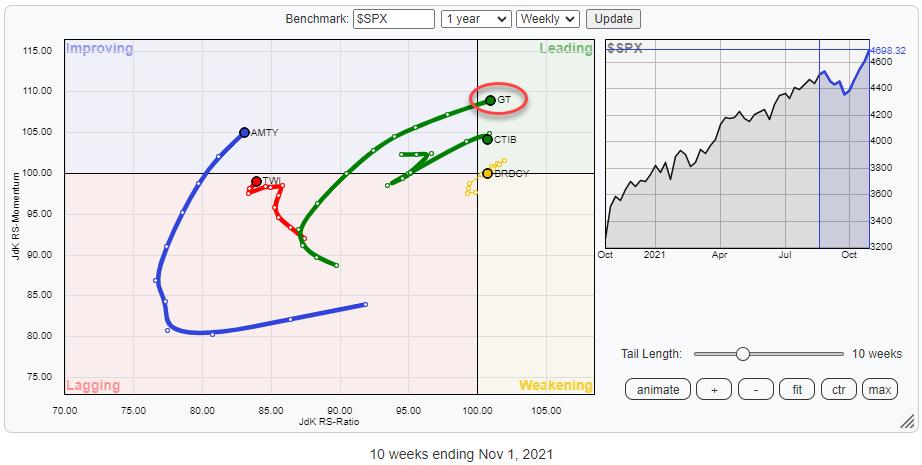
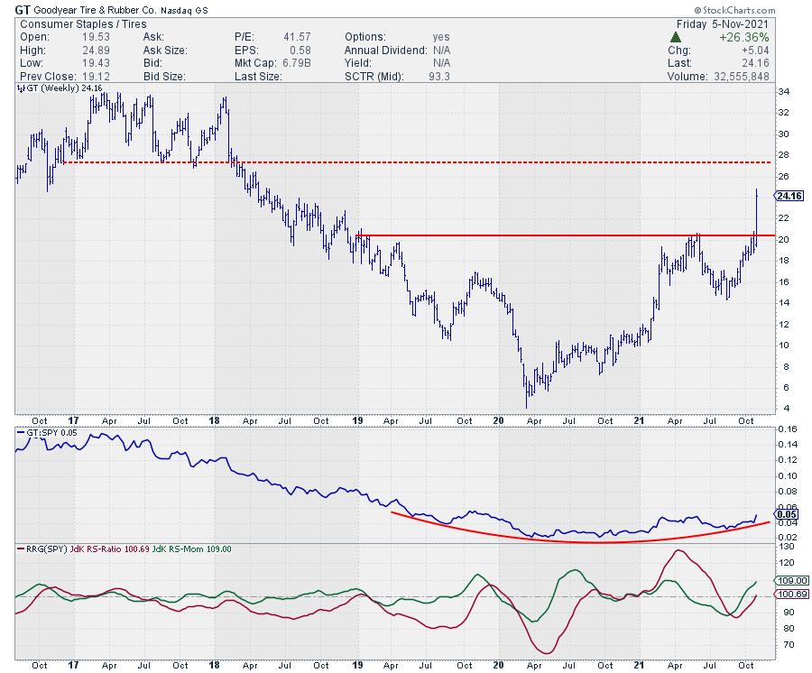
The upward break on the weekly chart is a strong sign in and of itself, but especially in combination with the long-based turnaround in relative strength that can be seen in the raw RS chart.
LT overhead resistance is coming in around $35. Once that gives way, we may see some exploding tires. ;)
Auto Parts
The third group on an interesting trajectory is the Auto Parts group. It is still inside the improving quadrant, but at a strong RRG-Heading and a steady improvement over the last weeks.
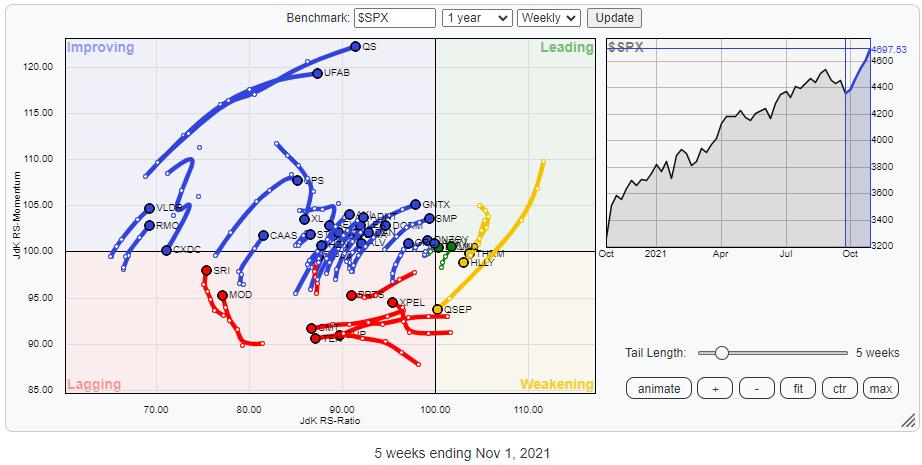
Plotting all stocks in the auto parts group against $SPX gives the RRG above. As expected, the concentration is inside the improving quadrant, with plenty of stocks traveling at a strong RRG-Heading. A few names that pop up are LKQ, QS and VC.
Check out my recent episode of Your Daily Five below for a few interesting stock picks from these groups.
11/2 Your Daily Five : Tesla Isn't The Only Car (Parts) Maker Doing Well
#StaySafe and have a great weekend.
My regular blog is the RRG Charts blog. If you would like to receive a notification when a new article is published there, "Subscribe" with your email address.
|
| READ ONLINE → |
|
|
|
| Art's Charts |
| Trend-Following: The Good, the Bad and the Ugly |
| by Arthur Hill |
 We have all heard of trend-following and many us employ trend indicators in our strategies. But how do these indicators actually perform over an extended period of time and in varying market conditions? Let's look at an example. We have all heard of trend-following and many us employ trend indicators in our strategies. But how do these indicators actually perform over an extended period of time and in varying market conditions? Let's look at an example.
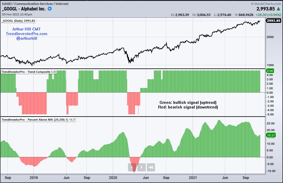
The chart below shows Alphabet (GOOGL) with two trend indicators: the Trend Composite in the middle window and the Percentage Difference between the 20 and 200 day SMAs in the lower window. The signals are quite similar with some whipsaws in 2019 and an extended trend since May 2020. These signals capture the essence of trend-following. There will be whipsaws, but a few good trends should pay for those whipsaws over time.

We do not know, in advance, which signals will result in whipsaws (losses) and which will lead to extended trends. We can however set realistic expectations for trading a strategy. Enter the backtest. Even though past results do not guarantee the same results in the future, we can use backtest results to gain a better understanding and set realistic expectations.
This Saturday, November 6th at Noon ET, I will present an introduction to trend-following on StockCharts TV. I will test the two indicators in the chart above using S&P 500 stocks over the last twenty years. This will allow us to set realistic expectations for returns, drawdowns, win rate, profit factor and more. I will also show some techniques to improve performance. Please join me for this live presentation with a Q&A at the end.
The indicators above are part of the TrendInvestorPro Indicator Edge Plugin for StockCharts ACP (here). Check out TrendInvestorPro (there) to learn more about my services for ETF traders and broad market timers.
-----------------------------------------------------
|
| READ ONLINE → |
|
|
|
| ChartWatchers |
| Ford vs Ferrari — The EV Race is Real and These Stocks are Set to Benefit |
| by Mary Ellen McGonagle |
The Consumer Discretionary sector hit another new high in price last week. While Leisure and Entertainment stocks rallied on Friday's news of Pfizer (PFE)'s highly effective Covid pill, the recent rally in Discretionary stocks has been all about Automobile stocks and, in particular, companies that are winning the EV race. Subscribers to my MEM Edge Report are well aware of who the current winner is, as they've seen Tesla (TSLA) gain 72% since we added it to our Suggested Holdings List on August 1st.
TSLA's gains are on the heels of a strong 3rd quarter, as well as a lucrative deal with Hertz car rental; however, there was a push to new highs last week following the company's news that they've inked a 3-year deal to secure lithium batteries from Chinese supplier Ganfeng. Securing lithium batteries will continue to separate the winners from the losers among auto manufacturers who are looking to meet high consumer demand for electric vehicles.
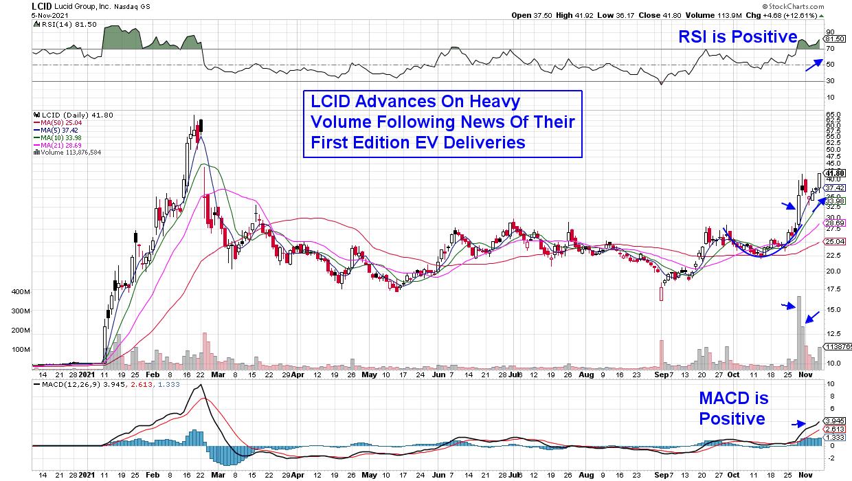
DAILY CHART OF LUCID GROUP, INC. (LCID)
Electric Vehicle company Lucid Group (LCID) sold out of the first release of their Dream Edition sedans, which began delivery last Monday. The company has a reservation list of over 13,000 individuals who are interested in their 2022 edition.
LCID was started in 2007 and their CEO formerly served as VP of Engineering at Tesla. The stock soared on news of their new EV deliveries last week and is now in a confirmed uptrend. A look at the daily chart above will attest to the stock's volatility; however, its current advance is reminiscent of the rally into mid-February, when highly popular names were being run up on high volume. The stock is poised for further near-term upside; however, a tight stop in the 6%-8% range will protect you from unexpected distribution.
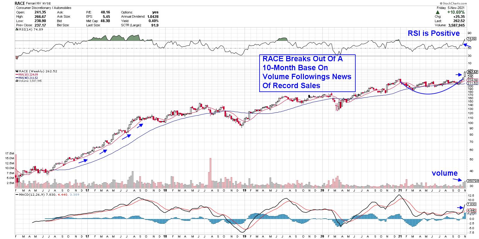
WEEKLY CHART OF FERRARI (RACE)
RACE reported record year-to-date vehicle orders last week despite their hefty starting price of $300,000. Morgan Stanley has tagged the company as their favorite EV stock due to their high technical capabilities and prestige. The company's current growth prospects are reminiscent of 2016 into 2018, during which the stock gained 157%. As you can see on the weekly chart above, a pullback to the 50-day moving average was an ideal buy point.
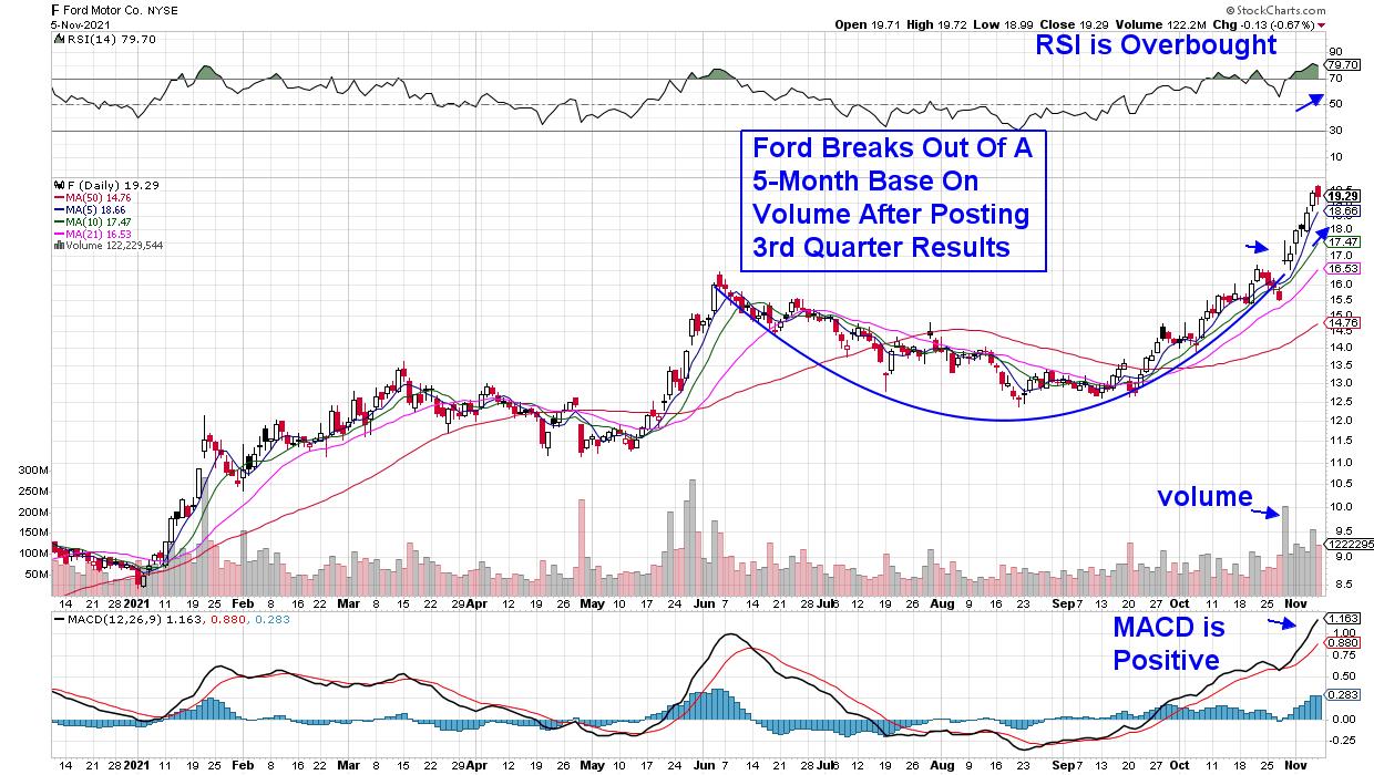
DAILY CHART OF FORD MOTOR CO. (F)
Ford (F) reported their 3rd quarter results in late October and, in addition to coming in 89% above estimates, the company announced plans to repurchase their outstanding $5 billion in junk bonds to help shore up their balance sheet. The news pushed Ford out of a 5-month base on heavy volume. The stock is overbought and I'd be a buyer on a pullback to its 21-day moving average, which is the top of its recent base breakout.
DAILY CHART OF ALBERMARLE CORP. (ALB)
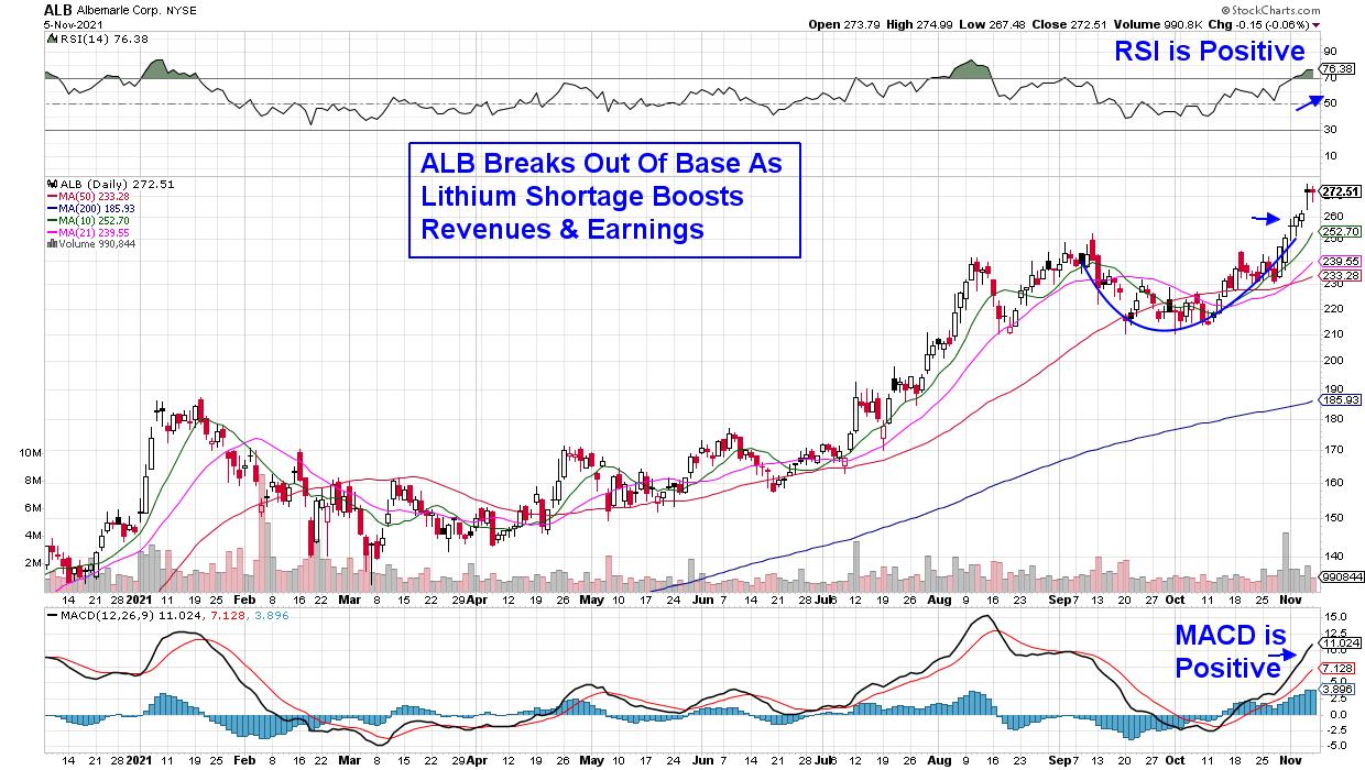
Among producers of lithium used in EV batteries, Albemarle (ALB) supplies about 1/3rd of the world's supply and, as EV production continues to accelerate, the company will continue to benefit. ALB broke out of an 8-week base after posting earnings that were 25% above estimates, putting the stock into a buy zone.
Last week's gains in each of these and other stocks that have rallied following reports of strong earnings and sales has pushed both the S&P 500 and Nasdaq into an overbought position. This technical position on the daily charts of these Indexes has occurred prior to the more pronounced pullbacks we've seen this year.
If you'd like to be alerted to the current market conditions and whether it's safe to put new money to work, trial my MEM Edge bi-weekly Report for 4-weeks for a nominal fee. By using this link, you'll have immediate access to recently released reports going back to January and this week's report will be delivered on Sunday.
In this week's edition of StockCharts TV's The MEM Edge, I reveal what's driving moves into the biggest gainers after earnings, as well as names poised to rally after their upcoming reports. I also highlight areas that have further upside following positive COVID pill news.
Warmly,
Mary Ellen McGonagle, MEM Investment Research
|
| READ ONLINE → |
|
|
|
| Martin Pring's Market Roundup |
| The S&P is at New Highs: Now What, Especially for Small Caps? |
| by Martin Pring |
The major averages have recently been scoring new highs for the year, strongly hinting that the post-May correction has run its course. So where do we go from here? Is the market overbought and likely to digest recent gains, or is a rally into the bullish year-end period a better bet? Most of the indicators I follow are supporting the rally scenario. Let's start with the world and then move down to the US.
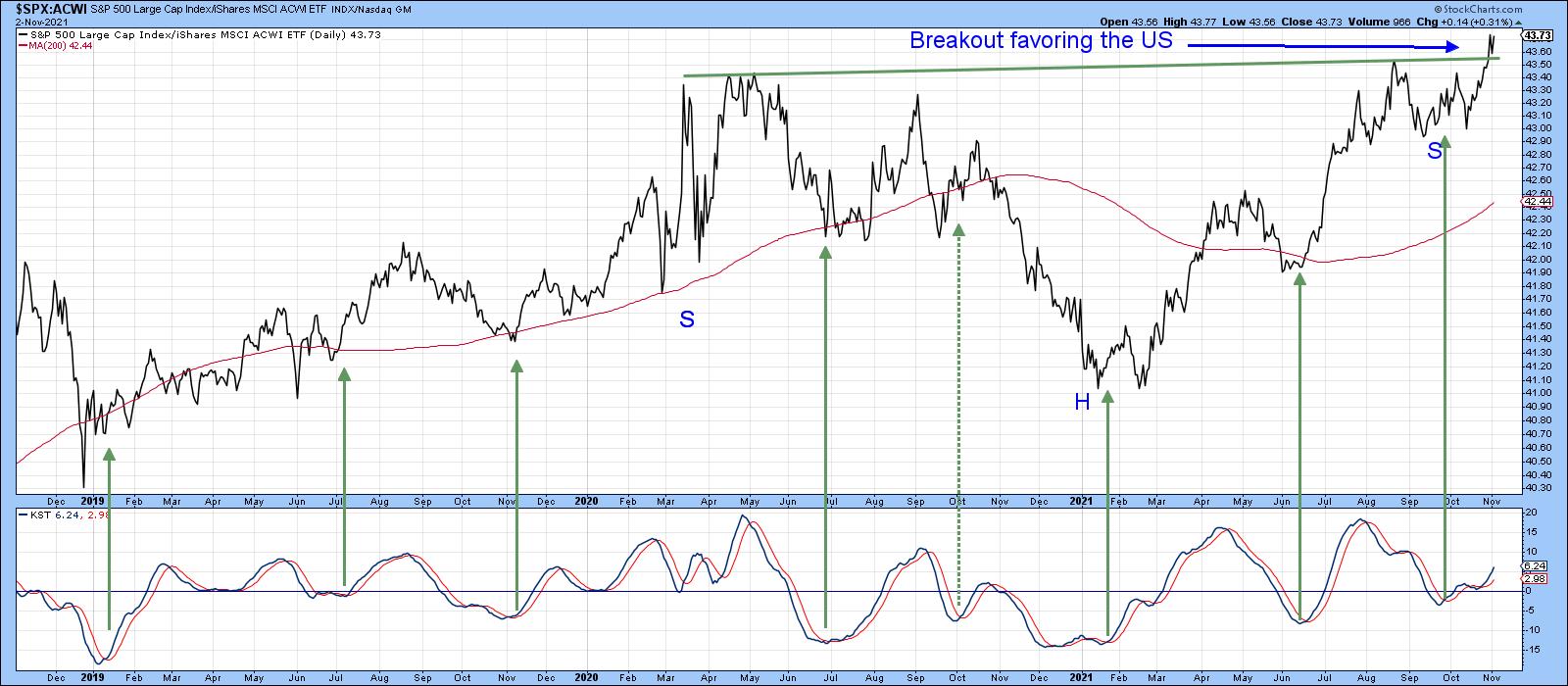
Actually, I should be saying "up" rather than "down" to the US, as Chart 1 shows the performance of the S&P Composite has reached a new high against the MSCI World Stock ETF (ACWI). In doing so, it has completed a nearly 2-year inverse head-and-shoulders pattern, which suggests that the trend of superior US relative performance will extend for a while. Moreover, if we can make the case for stronger global equities, that should speak to an even better performance for the US.
 Chart 1 Chart 1
The Global Picture
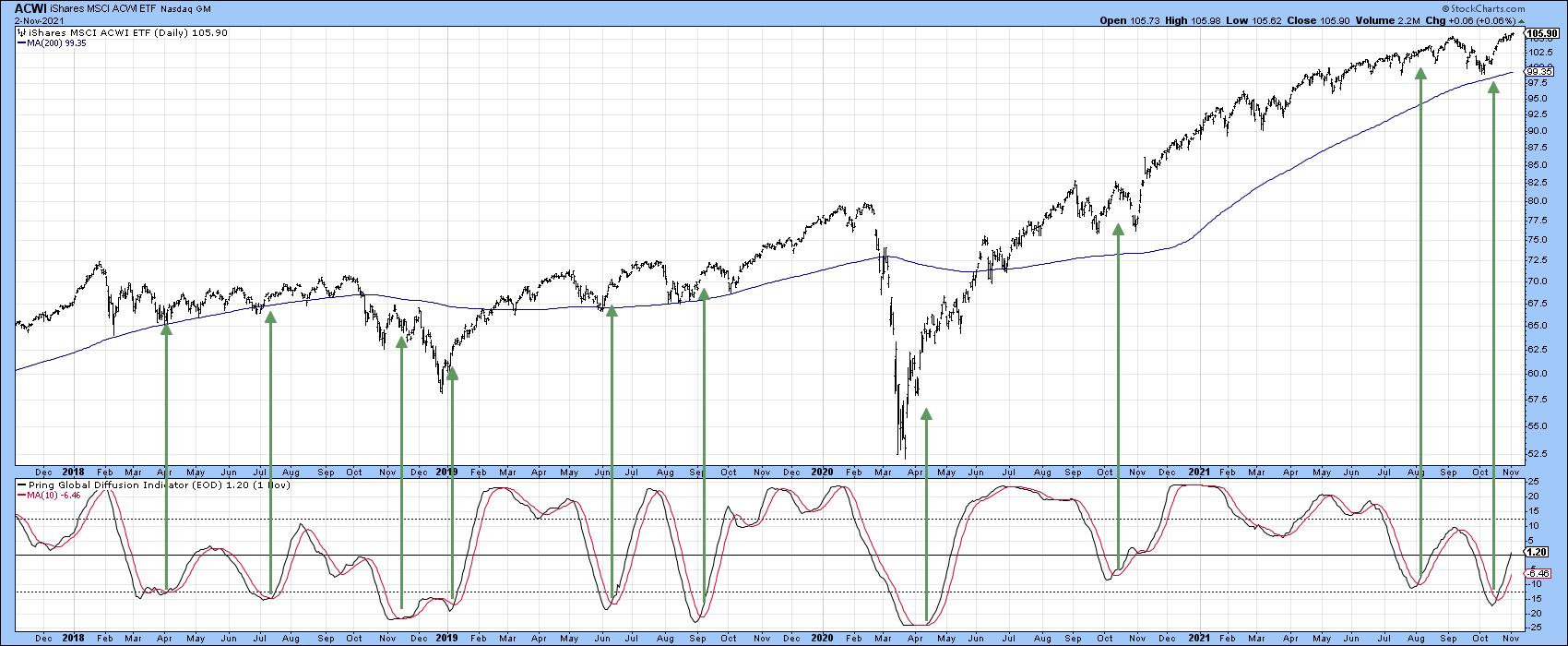
Chart 2 compares the ACWI to my Global Diffusion indicator, which monitors a universe of country ETFs in a positive trend. We know that it is bullishly positioned above its 10-day MA. What we do not know is how long it will remain there. Since the indicator is only just starting to cross above zero, it is leaving plenty of upside potential before experiencing an overbought reading.
 Chart 2 Chart 2
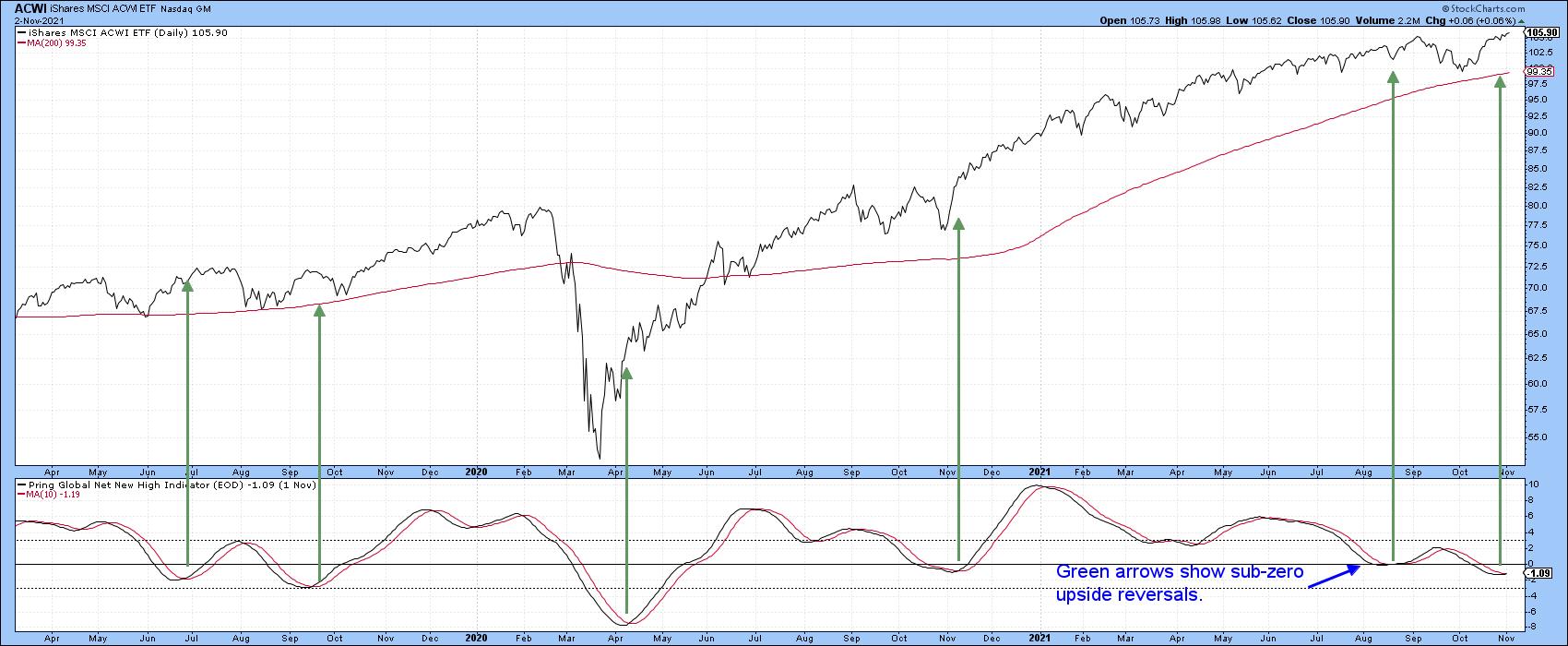
Chart 3 is derived from a similar universe, but this time it is calculated from net new highs based on a 40-day lookback period. Again, we do not know how long the November first buy signal will remain in force, but its relatively subdued reading suggests that that it will be there for a while.
 Chart 3 Chart 3
US Internal Indicators
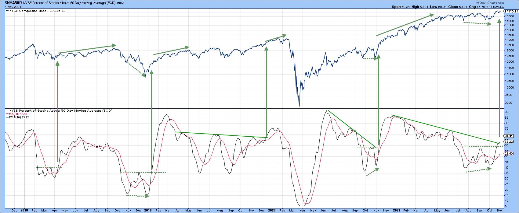
Chart 4 features an indicator based on the number of NYSE stocks above their 50-day MAs. This series, or rather its 10-day MA (plotted in black), peaked way back in June of last year. Notwithstanding the late 2020 rally, it has been correcting ever since. At one point, 40% of NYSE issues were trading below their 50-day MAs. That represents a healthy intermediate correction in an ongoing bull market. Now, the indicator appears to have reversed its downward trajectory, as it has completed a double bottom. Three previous setups since 2017 were all followed by a rally of some kind. Two instances, like the current one, were associated with a positive divergence, where the Index registered a new low but the indicator did not. Currently, the indicator is trying to edge through its 2021 down trendline. A more decisive break would substantially increase the odds of higher prices.
 Chart 4 Chart 4
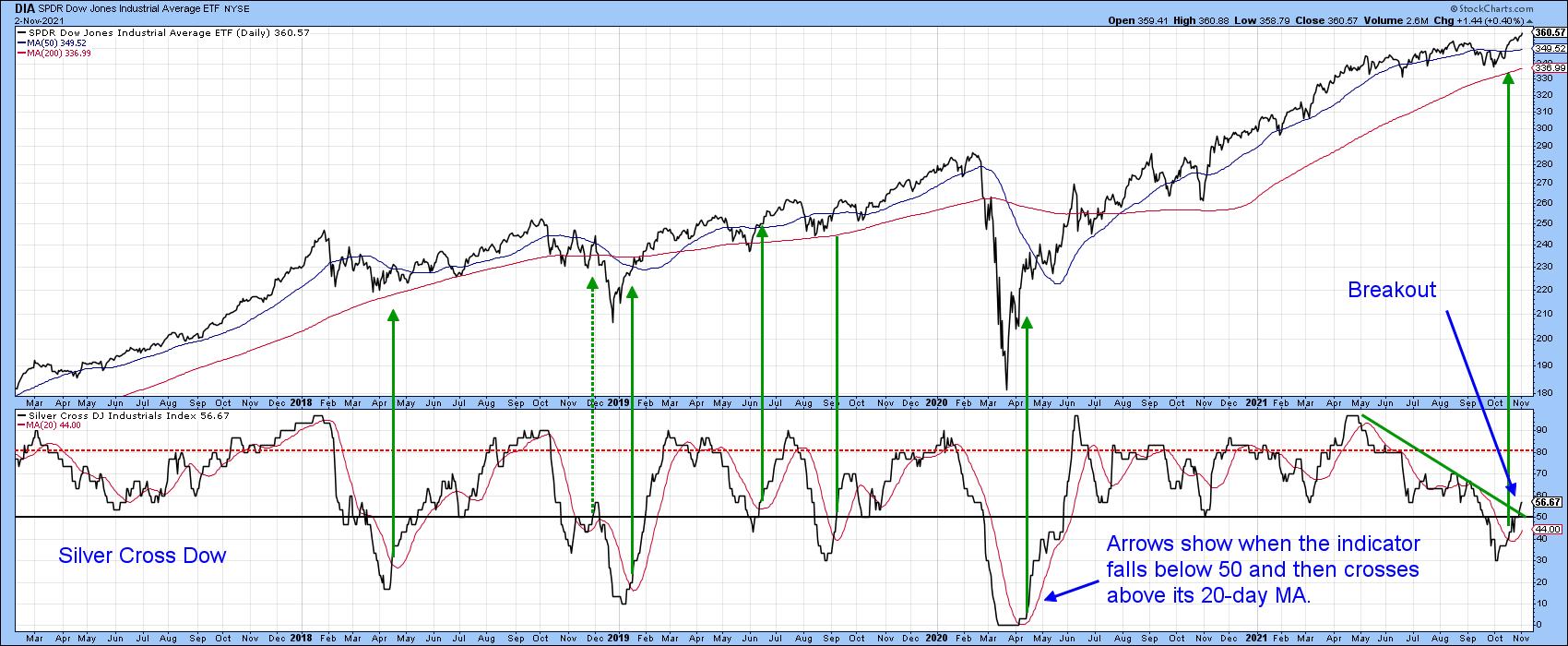
That seems likely, since the number of Dow stocks sporting positive silver crosses has started to rally (Chart 5). A silver cross is positive when the 20-day EMA of an individual Dow component is above its 50-day EMA. The arrows show when the indicator drops below 50% and then crosses above its 20-day MA. Typically, the DJIA itself rallies following such an event; the latest signal was triggered a few sessions ago. The indicator remains in a subdued mode, which is good. More importantly, the break above the May/November down trendline suggests that both it and the 50-day series shown in Chart 4 are headed higher.
 Chart 5 Chart 5
Small Caps Breaking Out
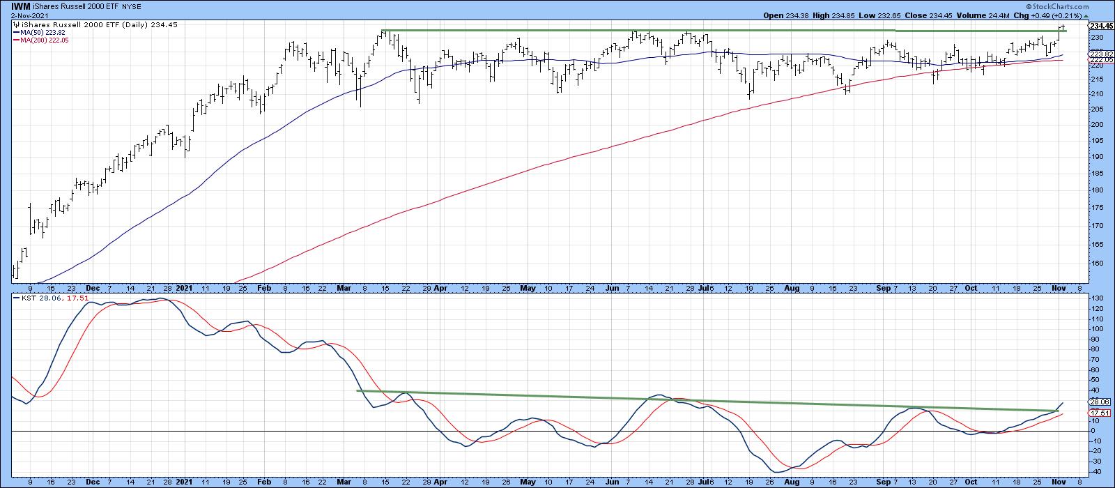
One of the beneficiaries of the post-correction rally has been small caps, in the form of the Russell 2K ETF (IWM). The price (Chart 6) has recently broken out from an eight-month consolidation. This has been supported by a positive daily KST. Note how the 50- and 200-day MAs are trading very closely together and are almost flat. Usually, this type of action indicates a tight balance between buyers and sellers. When resolved, such a setup is often followed by a very sharp advance.
 Chart 6 Chart 6
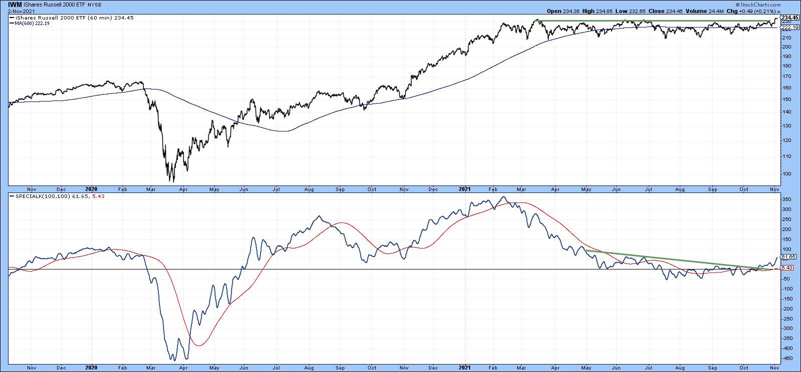
One indicator (Chart 7) that is starting to look prescient is the Special K based on hourly data, as it has clearly completed its post-March corrective period and is moving in complete sympathy with the price.
 Chart 7 Chart 7
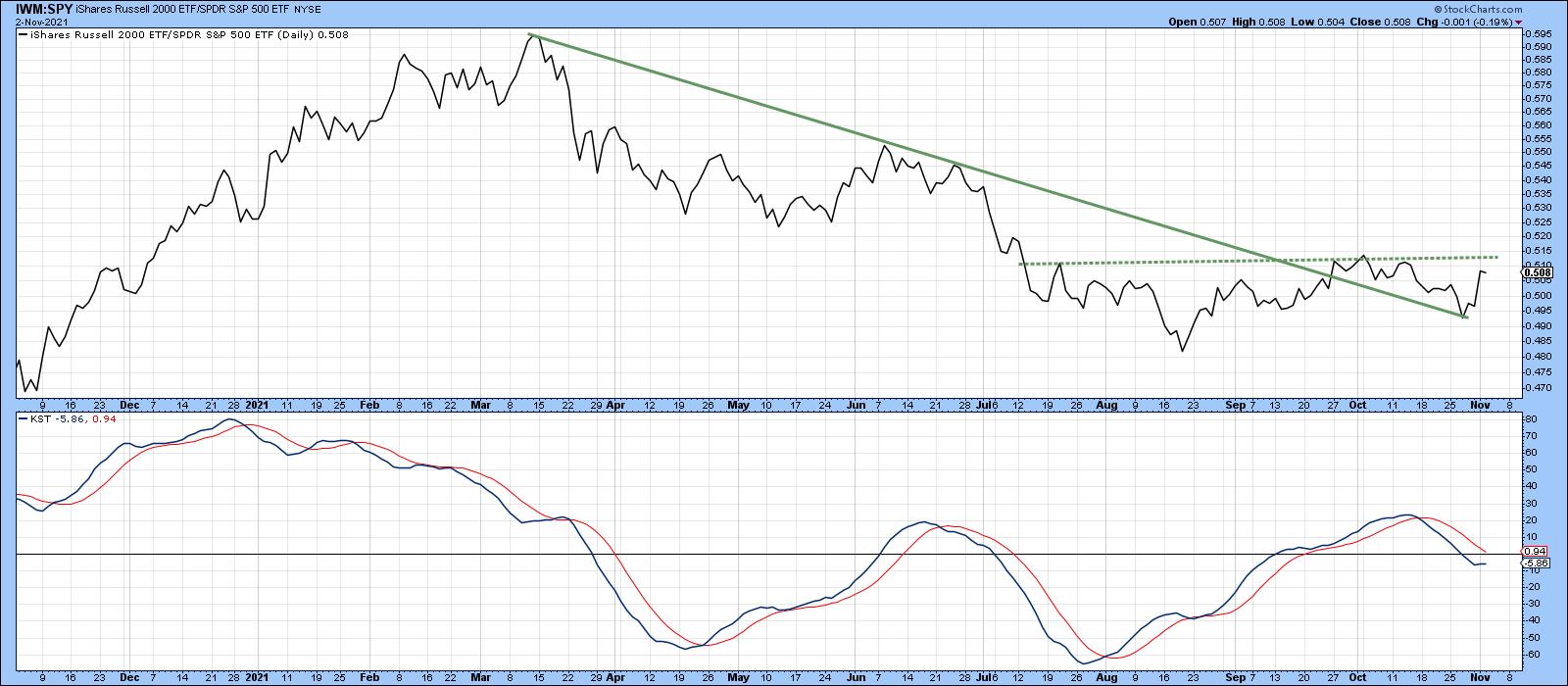
Its RS line, in Chart 8, has violated the down trendline emanating from last March. However, the real challenge lies at the dashed horizontal line, as a move above that would serve as a nice complement to the price breakout in Chart 6.
 Chart 8 Chart 8
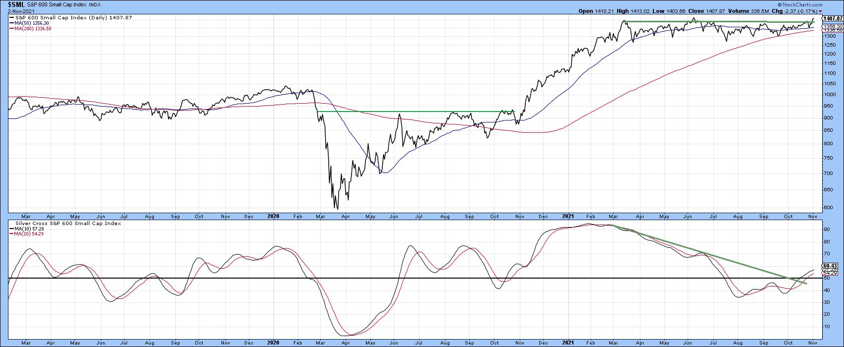
Finally, Chart 9 shows that the silver cross indicator for the S&P 600 Small Cap Index ($SML) has crossed above its MA and the 2021 down trendline, thereby suggesting that the expected advance will gradually broaden.
 Chart 9 Chart 9
Good luck and good charting,
Martin J. Pring
The views expressed in this article are those of the author and do not necessarily reflect the position or opinion of Pring Turner Capital Group of Walnut Creek or its affiliates.
|
| READ ONLINE → |
|
|
|
| Mish's Market Minute |
| How to Improve Your Profit-Taking Rules |
| by Mish Schneider |

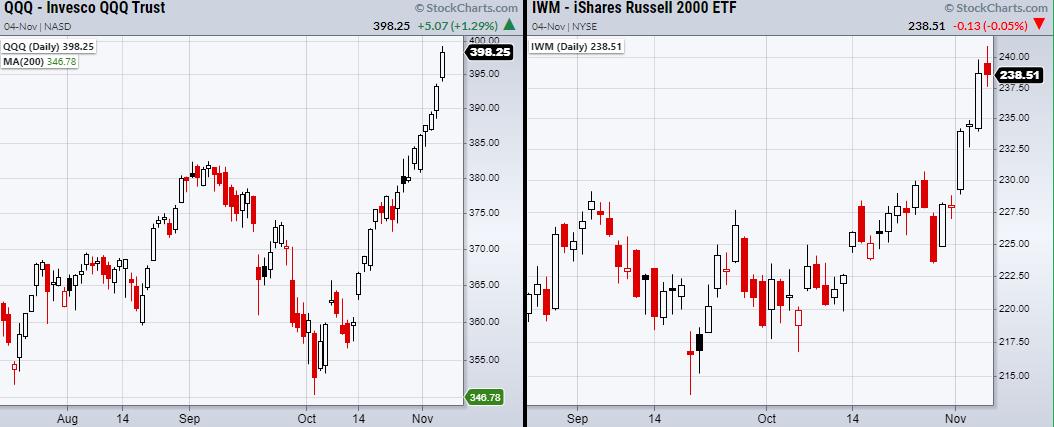
The S&P 500 (SPY) and the Nasdaq 100 (QQQ) both sit at highs, while the small-cap Russell 2000 (IWM) digests its recent breakout.
Triggered from Wednesday's bullish Fed meeting, the overall market has made a huge push Thursday. While many traders are loading up on positions, it is also a great time to sell into strength. This is a smart strategy for taking profits because large moves are often followed by digestion days, where the market consolidates or pulls back for a breather. Knowing where to take profits is a highly debated topic, which is why traders must have pre-determined rules for doing so. One common rule is to place a profit target that is at least double the dollar amount you risked on the trade.
However, no matter where you take a profit, it is highly unlikely you will pick the top. Nonetheless, many traders feel as though they've left money on the table, and while the disappointment can hurt, this is completely normal and part of trading. With that said, selling into strength is a great way to take profits and, paired with some simple rules, can make it even easier to keep your emotions in check while doing so.
To jump right in, we should understand that many traders hate taking profits when they find they could have made much more money. Some even feel the same amount of discomfort comparable to taking a loss on a trade. While this seems like a crazy way to think, it happens more often than you might expect, as, while trading can be very technical, it can also be very emotional. Therefore, we should implement rules to help us trade with confidence and keep our minds clear for the next great trade.
Besides having strict rules as stated before, like selling once you have made a return greater than double your risk, one can also sell small portions of their trade instead of selling the full amount. This may seem simple, but, for example, if you sell 25% of your position into strength, you will not only take profits but also have the confidence to let the trade continue with much less emotional baggage. If the trade sells off, you will feel better knowing you took some profits. On the other hand, if the trade continues higher, you still have most of your position and can incrementally continue to sell. Either way, this gives someone the confidence to let a trade have more space to work and the emotional freedom to better manage the position without focusing too much on dollars made or lost.
Follow Mish on Twitter @marketminute for stock picks and more. Follow Mish on Instagram (mishschneider) for daily morning videos. To see updated media clips, click here.
Watch Mish on TD Ameritrade!
ETF Summary
- S&P 500 (SPY): 454 main support.459 minor support the 10-DMA.
- Russell 2000 (IWM): 234.53 support. Digestion day.
- Dow (DIA): 356.60 support. Doji day.
- Nasdaq (QQQ): New highs. 382.78 main support.
- KRE (Regional Banks): Inside day. 72.90 support area.
- SMH (Semiconductors): Large range day. 277 main support.
- IYT (Transportation): 280 resistance.
- IBB (Biotechnology): 160.27 support the 200-DMA.
- XRT (Retail): Doji day. 98 support area.
Forrest Crist-Ruiz
MarketGauge.com
Assistant Director of Trading Research and Education
|
| READ ONLINE → |
|
|
|
| MORE ARTICLES → |
|
 Chart 1
 Chart 2
 Chart 3
 Chart 4


 The RRG above shows all automobile stocks against the S&P 500 and, clearly, TSLA stands out, but, as you can see, there are a few more tails that are showing interesting rotations. In particular, LuCID and Ford are showing strong tails at a good RRG-Heading.


 We have all heard of trend-following and many us employ trend indicators in our strategies. But how do these indicators actually perform over an extended period of time and in varying market conditions? Let's look at an example.