One of the best parts of hosting The Final Bar on StockCharts TV is the opportunity to compare notes with some of the top technical analysts and traders in the markets. In my recent discussions, we've discussed new highs for the S&P 500, Nasdaq, Russell 2000, Dow Industrials, Dow Transports and numerous individual stocks and industry groups. With all of these indexes making new all-time highs, in addition to the seasonal tendencies with strength common in November and December, most of my guests (as well as myself!) are quite justifiably bullish on the equity markets through year-end.
So what would we need to see to turn less constructive on the equity markets here?
Basically, I took my most recent conversations on StockCharts TV, along with what I've been sharing with my Market Misbehavior Premium Members, and came up with one chart to track some of the key indicators.
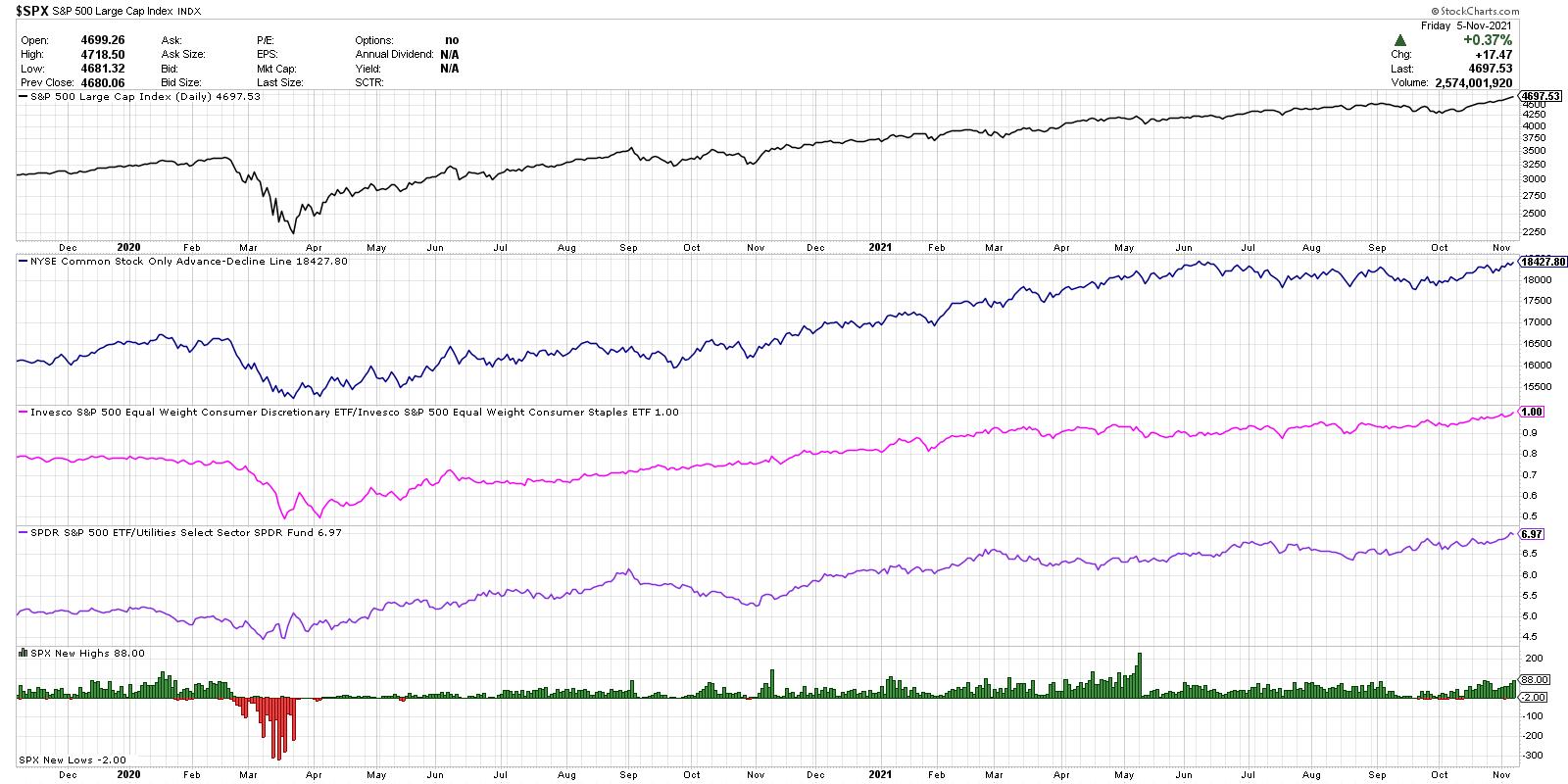
At the top, we have the S&P 500 index on a closing basis for the last two years. It's worth mentioning here that "the most bullish thing the market can do is go up," as was often pointed out by legendary technical analyst Paul Montgomery. The market will tell you when conditions are no longer bullish, and it will tell you by prices rotating lower!
The next panel down (in blue) shows the cumulative advance-decline line for the NYSE using only common stocks. This is one of my favorite ways to determine market breadth conditions, as it is an equal-weighted measure of upside participation. This indicator moving higher tells you that more stocks are closing higher than lower over time. If and when this line starts to turn lower, especially if the S&P price continues to increase, that would suggest that investors are starting to sell stocks even as the index continues in a bullish phase.
Next we have what I call the "Offense vs. Defense Ratio," which is inspired by Bill Doane, one of my predecessors at Fidelity Investments. Here, we're looking at the relative performance of Consumer Discretionary vs. Consumer Staples stocks. Are investors favoring things they want over things they need? When this ratio is moving higher, as it has been fairly consistently since March 2000, that tells you that the offense is on the field. If this ratio would turn lower, it would indicate that investors are getting more defensive and that caution is warranted. One point to note is that we're using the equal-weighted ETFs for these two sectors instead of the normal cap-weighted indexes, mainly to reduce the overweight of AMZN, TSLA and HD in the XLY.
The next panel down (in purple) shows the relative performance of the S&P 500 vs. the Utilities sector. When investors start to turn bearish, they will often rotate to more defensive sectors like Real Estate or Utilities. This ratio has moved higher through most of the last year, confirming that investors are positioned for further market upside. A downturn in this ratio would indicate that people are getting more defensive and expect limited upside for stocks.
At the bottom, we have the daily new 52-week highs and 52-week lows for the S&P 500 members. You'll notice plenty of green bars in recent weeks, showing how there have been a healthy number of stocks making new 52-week highs as the S&P 500 index has done the same.
Toward the end of a bull market phase, you'll see a decline in new highs as stocks begin to pull back and test support. Then you'll often see an increase in 52-week lows (red histogram) as stocks correct even further and begin to make new lows.
So, at this point, all four of these indicators are firmly bullish. That makes sense, given the broad advance for stocks and growing optimism for the equity markets. This chart should help to confirm the current bullish conditions, signal when those conditions are no longer in place and help identify when investors should think more defensively in their portfolios.
Want to digest this article in video format? Check it out on my YouTube channel:
RR#6,
Dave
P.S. Ready to upgrade your investment process? Check out my free course on behavioral investing!
David Keller, CMT
Chief Market Strategist
StockCharts.com
Disclaimer: This blog is for educational purposes only and should not be construed as financial advice. The ideas and strategies should never be used without first assessing your own personal and financial situation, or without consulting a financial professional.
The author does not have a position in mentioned securities at the time of publication. Any opinions expressed herein are solely those of the author, and do not in any way represent the views or opinions of any other person or entity.