| THIS WEEK'S ARTICLES |
| John Murphy's Market Message |
| BOND YIELDS RISE ON MORE HAWKISH FED |
| by John Murphy |
FED MINUTES PUSH STOCKS LOWER... The release of Fed minutes yesterday from its December meeting reflected a more hawkish tone which pushed stocks lower and interest rates higher. The Nasdaq took the biggest hit owing to a big drop in technology shares which are the most vulnerable to rising rates. Chart 1 shows the Nasdaq Composite Index falling back to its December lows where it's trying to stabilize. So far no serious chart damage has been done. It's important, however, for the Nasdaq to stay above those lows. Beneath the surface, this week's market action suggests some rotation out of high multiple tech stocks into more cyclical sectors like energy, financials, and industrials. Energy stocks are benefitting from rising oil prices; while financials are benefiting from rising bond yields.
 Chart 1 Chart 1
ENERGY AND FINANCIALS LEAD... Those two sectors have turned in this week's strongest stock performances. That makes sense from an economic standpoint since both are linked. Rising energy prices are one of the biggest contributing factors to rising inflation which has led to a more aggressive Fed. It's now likely that the Fed will start raising rates in March. Chart 2 shows the Energy Sector SPDR (XLE) rising to a new three-year high this week on the back of rising oil prices. While Chart 3 shows the Financial Sector SPDR (XLF) testing its October high and nearing a new record. The XLF is benefiting from this week's upward spike in bond yields.
 Chart 2 Chart 2
 Chart 3 Chart 3
BOND YIELDS NEAR SPRING HIGHS... Bond yields, which had already been climbing this week, got an added boost from Wednesday's Fed minutes. And they've achieved an upside breakout. Chart 4 shows the 10-Year Treasury yield rising above its fourth quarter high. As a result, the TNX has risen above 1.70% for the first time since the spring. The rising yield now appears headed toward a test of its March high near 1.76%. Rising bond yields are obviously bad for bond prices. Rising interest rates may also create some headwinds for stocks.
 Chart 4 Chart 4
|
| READ ONLINE → |
|
|
|
| ChartWatchers |
| Realistic Expectations for Setups and Signals |
| by Arthur Hill |
 Setting expectations is part of a strategy and this includes expectations for the number of signals we can expect in any given year. Signal frequency, of course, depends on your strategy and timeframe. Short-term mean-reversion strategies generate more signals than swing strategies and swing strategies generate more signals than long-term trend following. Today I would like to share my signal expectations based on a swing trading strategy. Setting expectations is part of a strategy and this includes expectations for the number of signals we can expect in any given year. Signal frequency, of course, depends on your strategy and timeframe. Short-term mean-reversion strategies generate more signals than swing strategies and swing strategies generate more signals than long-term trend following. Today I would like to share my signal expectations based on a swing trading strategy.
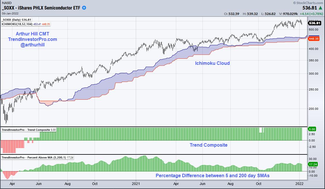
For swing trading, I am looking for tradable pullbacks within bigger uptrends. That's it. The first step is to choose an indicator to define the long-term uptrend. This could be the 5/200 day SMA cross, the Ichimoku Cloud (18,52,104) or the Trend Composite. Indicator selection and parameters are personal choices that should suit your strategy. Just make sure the signals are unambiguous. The trend is either up or down. The 5-day is either above the 200-day SMA or it isn't. Price is above the cloud or below the cloud. The Trend Composite is either positive (uptrend) or negative (downtrend). Of these three, my preference is for the Trend Composite because it aggregates trend signals in five trend-following indicators. You can learn more about this indicator and the TIP Indicator Edge Plugin here.

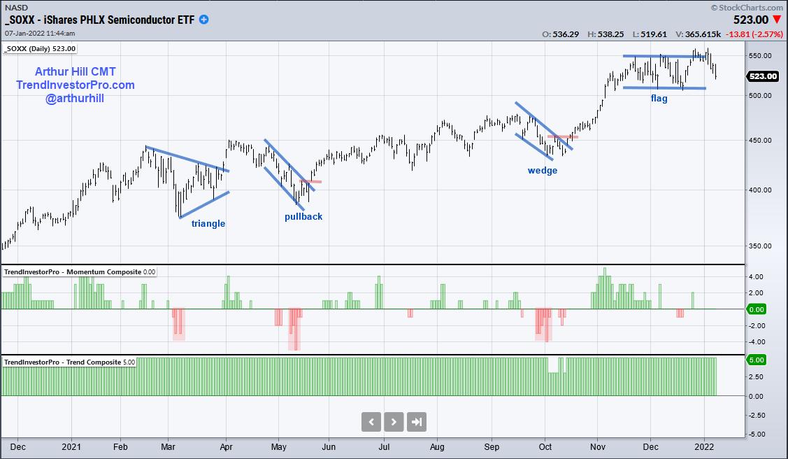
Using the Trend Composite as the first filter, I then look for pullbacks when the bigger trend is up. Downtrends are ignored because I am not interested in short positions. The first step is to have rules to identify a trading setup and I have two rules. First, I am looking for the Momentum Composite to hit -3 or lower, which signals a short-term oversold condition. Second, I am looking for a tradable pattern on the price chart (falling flag, wedge, triangle). The entry signal triggers when there is a short-term upside catalyst or breakout.

The chart above shows the Momentum Composite dipping to -3 or lower three times last year (red shading). Thus, there were only three setups in 12 months. A triangle formed in March and there was a breakout in April. This breakout did not hold and the trade failed. There was another oversold condition in May and a breakout that succeeded. There was then an oversold condition in October and a wedge breakout that succeeded. SOXX is currently forming a rather wide flag, but this setup does not meet my requirements because it did not become oversold first. Pass.
Three to four signals per year might seem limited, but there are over 100 ETFs in my core list covering most bases (stocks, bonds, commodities, currencies). This means there will be plenty of signals in any given year. In fact, we just had some setups and signals in energy-related ETFs. Trading is all about having a process that involves a definable and repeatable strategy. Check out TrendInvestorPro.com to see this process in action.
Thanks for tuning in and best wishes for 2022!
-----------------------------------------------------------
|
| READ ONLINE → |
|
|
|
| Martin Pring's Market Roundup |
| Yields Breaking or About to Break Out All Over |
| by Martin Pring |
I had thought that rates would moderate a little at the beginning of 2022, as the economic growth rate slowed due to COVID and other factors. Not so, as yields across the spectrum have resumed their bull market rally in anticipation of higher inflation and a less accommodative central bank. Even the long end is beginning to come to life.
Mr. Market is Leading the Fed
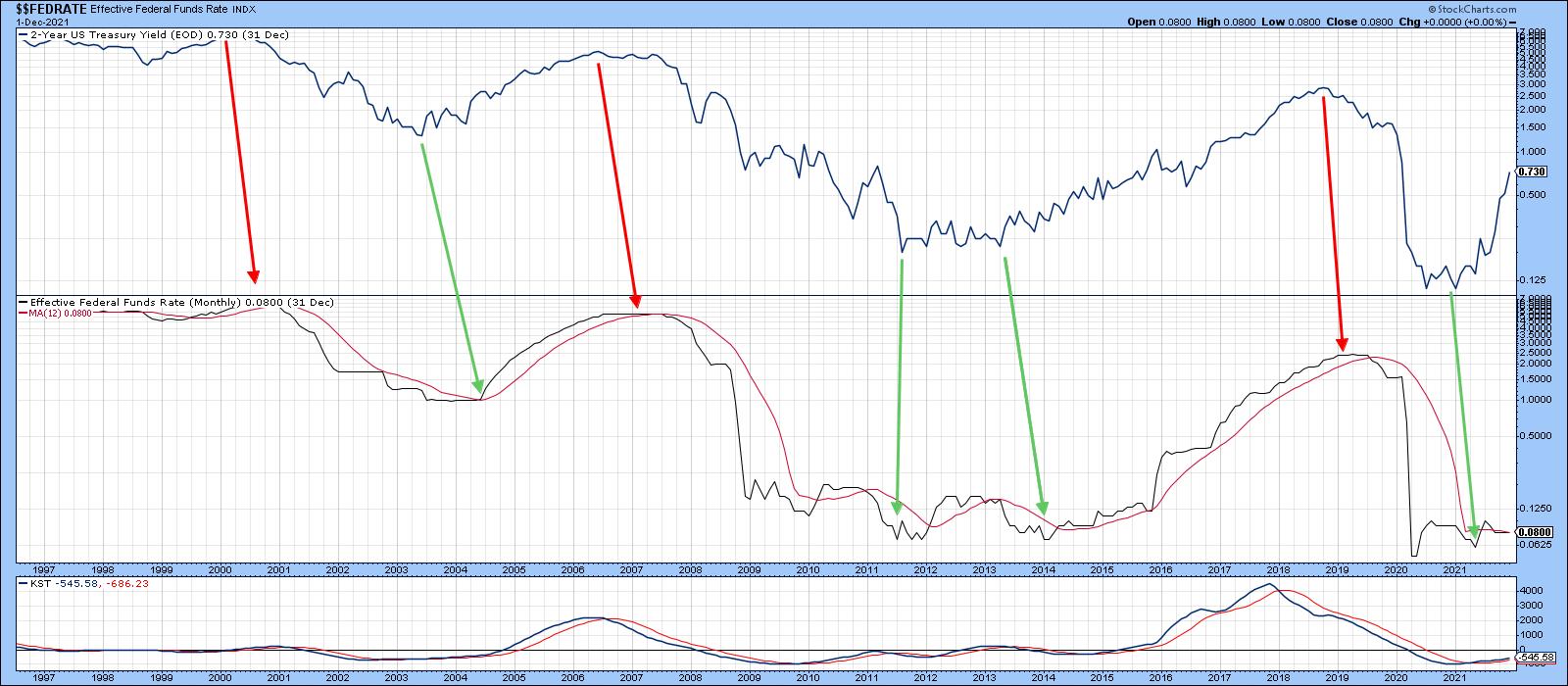
Chart 1 shows the dichotomy between the rest of the market and Fed-influenced money market rates. The top window features the 2-year Treasury yield, while the lower one features the Effective Federal Funds rate, which is controlled by the Fed. The green and red arrows mainly slant to the right, indicating that market forces typically move ahead of the Fed. I always think of the Central Bank being a lagging indicator, just like the rest of the government. Anyone old enough to remember Gerald Ford's "Win Inflation Now" buttons, right at the 1974 inflation peak, will know what I mean. Anyway, back to the chart, where we can see the yield on the 2-year note heading sharply north, well ahead of the Funds rate.
 Chart 1 Chart 1
The 5-Year Yield
The 5-year maturity is also joining the higher yield party. This series recently broke out from a giant downward sloping inverse head-and-shoulders and touched a new recovery high this week. Note that both the intermediate- and long-term KSTs are in a positive mode, indicating that there is probably more to come.
 Chart 2 Chart 2
10-Years and Above
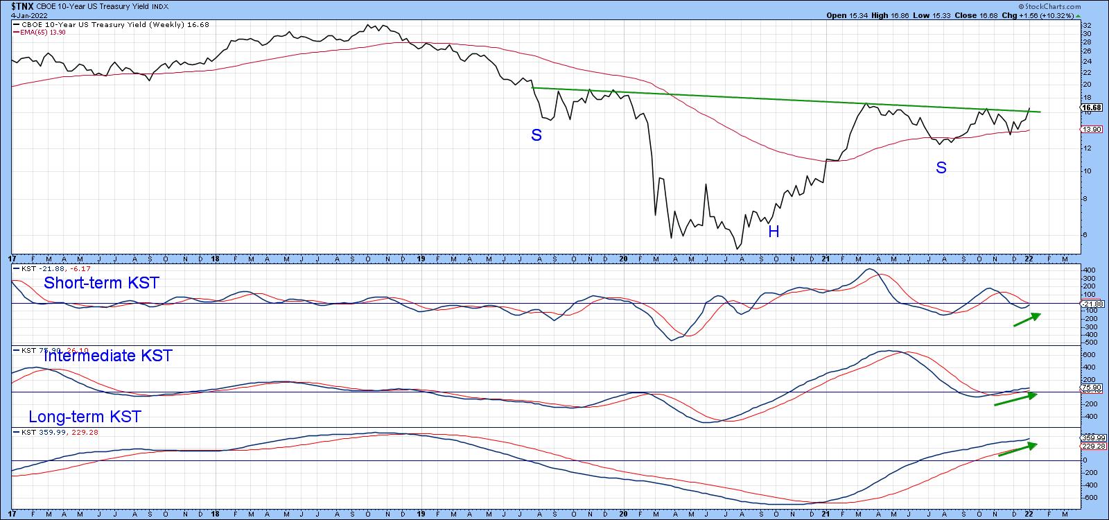
The 10-year series looks as if it is set to mimic the 5-year action, as it has just tentatively broken out from an inverse head-and-shoulders pattern of its own. The chart does show a tentative breakout. However, it's important to note that this is a weekly chart and needs a Friday, as opposed to Tuesday, close to make the break official. It seems likely that that will happen as all three KSTs are in a rising mode.
 Chart 3 Chart 3
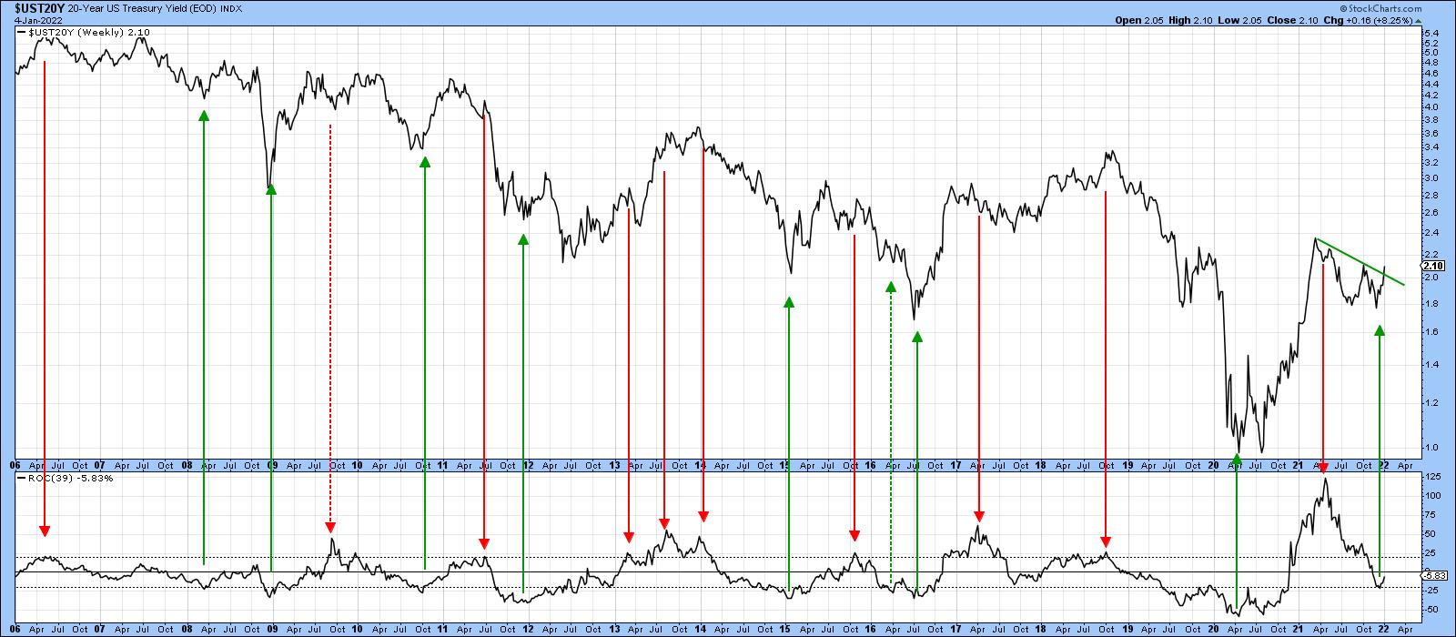
Peaks and troughs in the 39-week ROC for the 20-year yield have often indicated important trend reversals in the yield itself. Previous ones that have taken place from at or beyond the overbought and oversold lines have been flagged by the arrows using the benefit of hindsight.
It's possible that this series has just bounced off another oversold reading, although the reversal is not yet definitive, to be sure. One reason why that is likely to be the case comes from the fact that the yield has just broken above its corrective green down trendline.
 Chart 4 Chart 4
Another arises from the record reading in the ROC that was achieved last year. It's what I call a "mega overbought" condition, where the indicator exceeds any level achieved during the previous bull and bear market. Mega conditions typically signal a change in psychology consistent with a primary trend reversal. In this case, it's an all-time high or a "mega" on-steroids reading, which hints that both primary and secular trend psychology have both reversed.
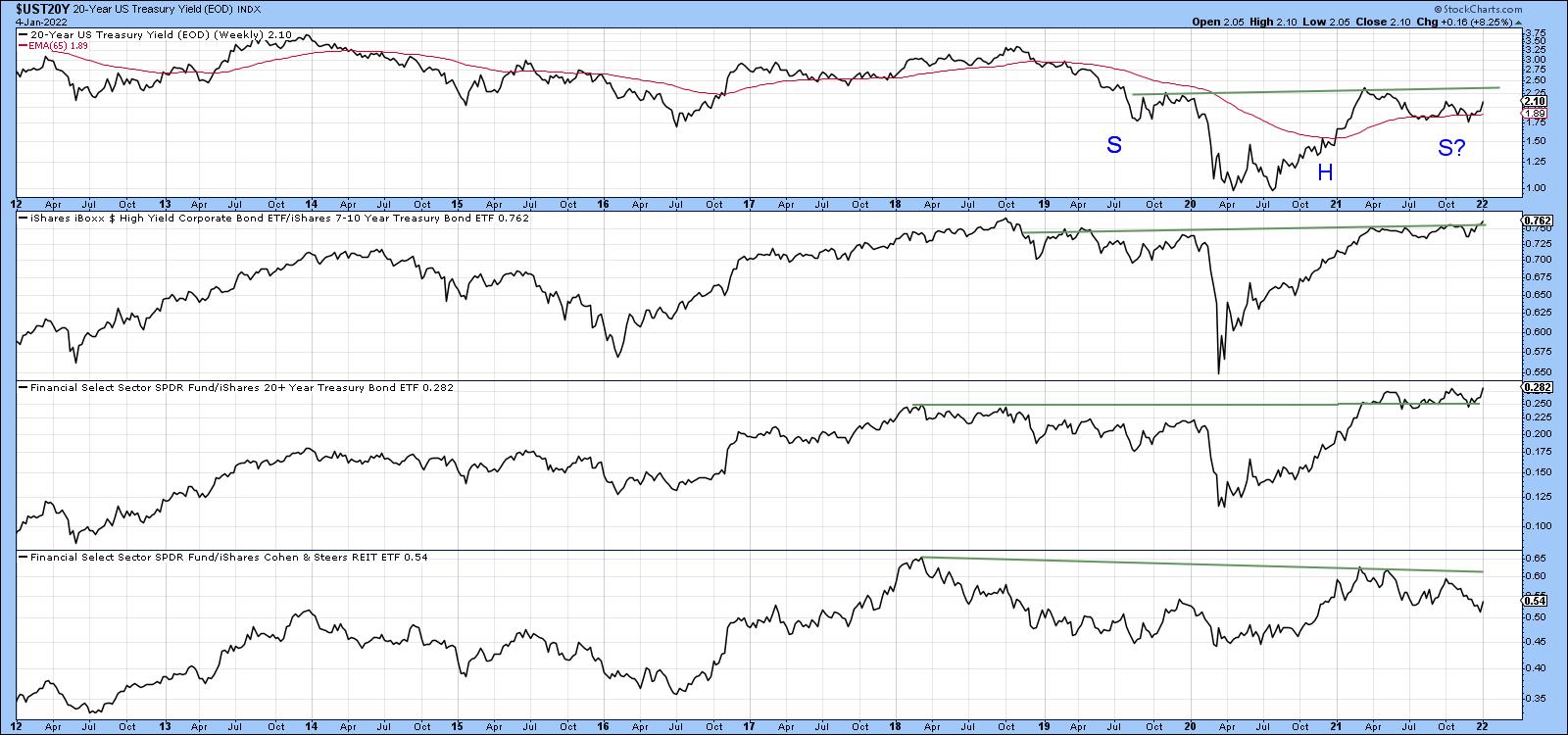
Chart 5 compares the yield on the 20-year maturity to three confidence ratios. A quick overall review of these series shows that swings in confidence track the yield reasonably closely. Note that the High Yield Treasury spread (HYG/IEF), in the second window, has just started to break out, suggesting that it is about to lead the yield itself in that direction.
The third window compares the SPDR Financial ETF (XLF) to the 20-year + Treasury Fund (TLT). It is currently the strongest of these three confidence relationships and is in the process of re-confirming the April breakout that took place from a lower level. The third ratio, that between Financials and REITS (XLF/ICF), also looks as though it may be basing, but has yet to reappear from its Christmas period doldrums.
 Chart 5 Chart 5
Rates are Firming Elsewhere
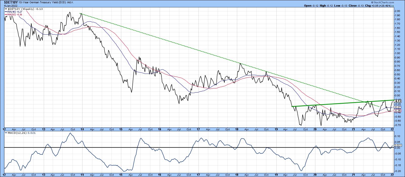
Chart 6 tells us that the German Bund offered an initial sign of a major reversal, as it broke above the dashed bear trendline. Since then, it has been experiencing a trading range and now looks as if it is about to break to the upside. That's a likely probability because the MACD is also positive.
 Chart 6 Chart 6
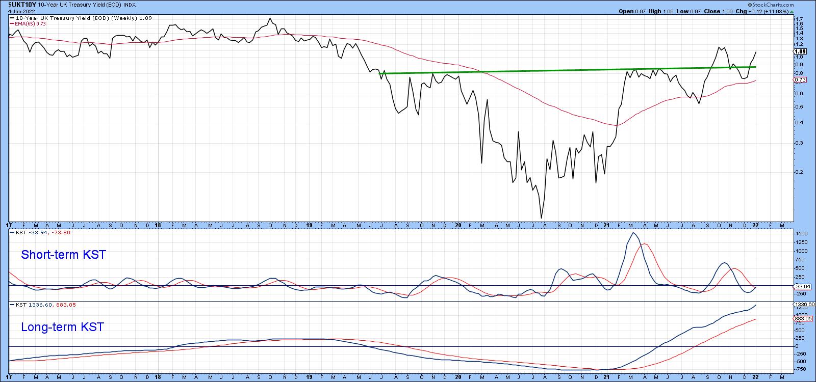
The UK 10-year yield has been leading the way since its equivalent of the German trading range has taken the form of a series of rising peaks and troughs since last year. Both KSTs are positive, so a new bull market high seems likely.
 Chart 7 Chart 7
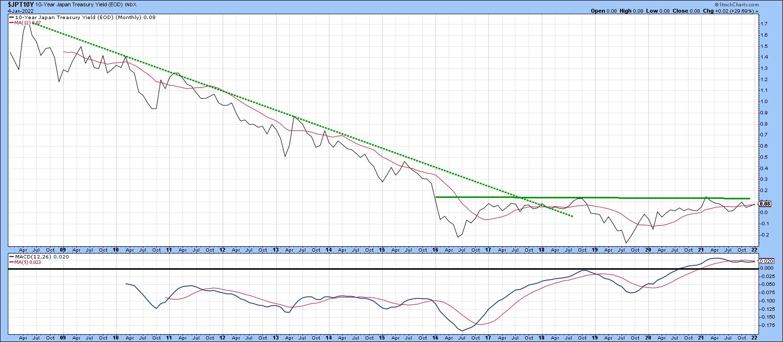
The Japan 10-year series, in Chart 8, also violated a long-term down trendline, but has yet to complete the global bullish picture with a breakout from its 5-year base.
 Chart 8 Chart 8
Good luck and good charting,
Martin J. Pring
The views expressed in this article are those of the author and do not necessarily reflect the position or opinion of Pring Turner Capital Group of Walnut Creek or its affiliates.
|
| READ ONLINE → |
|
|
|
| ChartWatchers |
| Broad Market Bias Assessment |
| by Erin Swenlin |
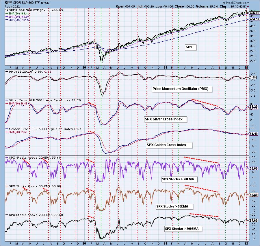
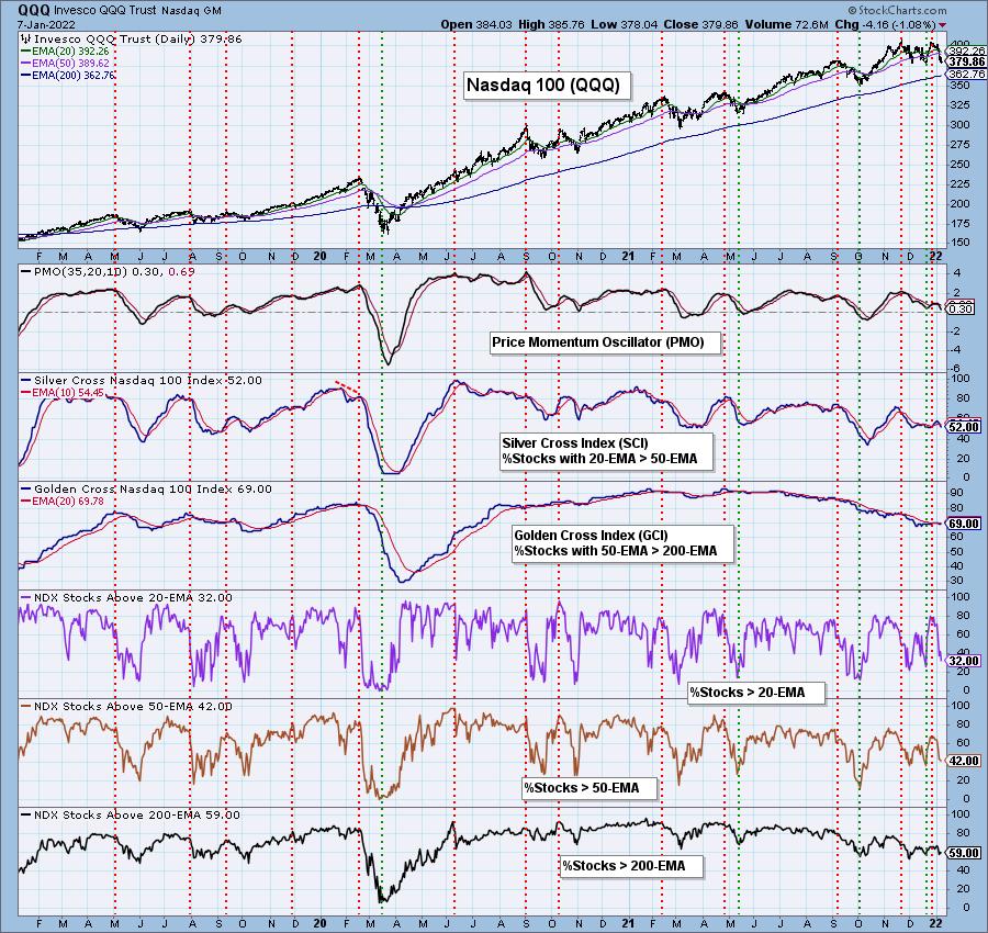
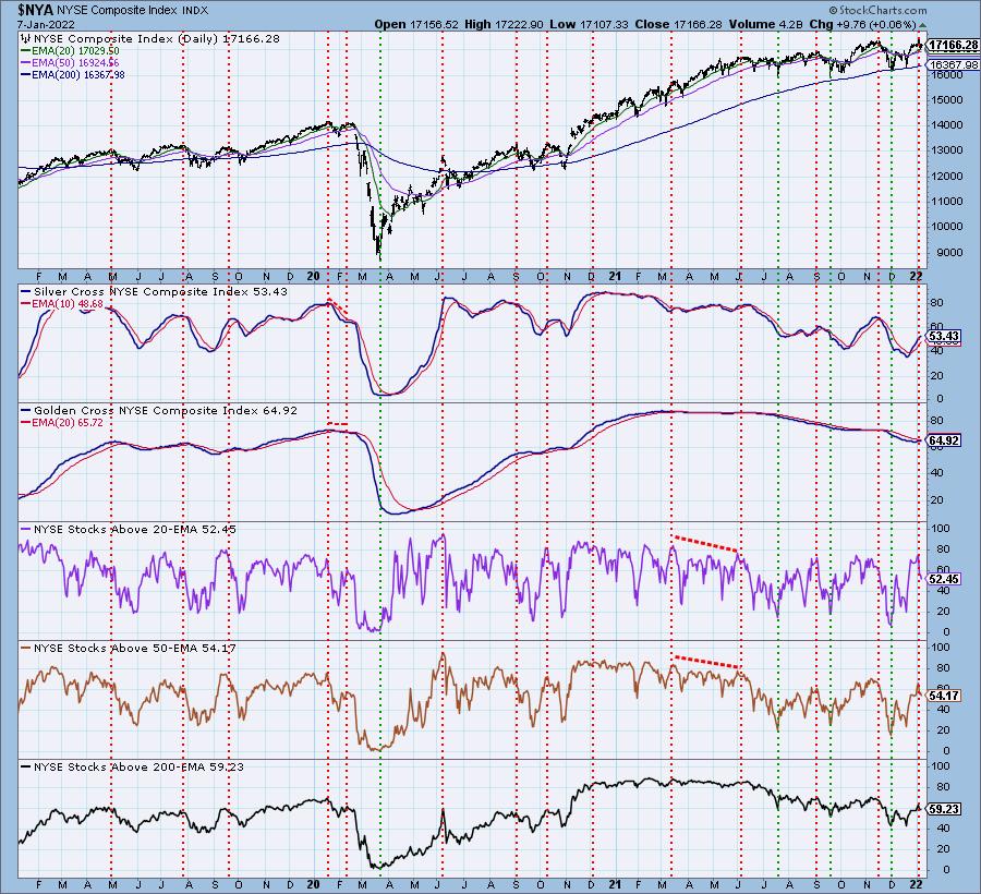
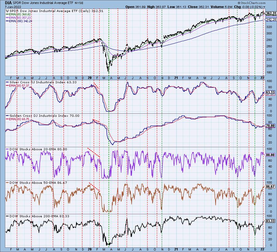
Included in our DP Alert daily report is a section on "Bias Assessment". We've found that, by analyzing the Golden/Silver Cross Indexes (GCI/SCI) along with Participation of Stocks > 20/50/200-day EMAs, we can determine the market bias in all three timeframes.
The GCI measures how many stocks within an index have "golden crosses", 50-day EMAs greater than the 200-day EMA. A stock with this configuration has a long-term bullish bias. The SCI measures how many stocks have a "silver cross", a 20-day EMA that is greater than the 50-day EMA. A stock with this configuration typically has a short-to-intermediate-term bullish bias.
In order to get a golden cross, a stock needs to have price above both the 50/200-day EMAs. Therefore, if we have a lower percentage of stocks below those EMAs, a bearish bias is developing. In order to get a silver cross, a stock needs to have price above both the 20-/50-day EMAs. Therefore, a lower percentage of stocks > 20/50-day EMAs suggests a short- and intermediate-term bearish bias developing.
Now that we know what we're looking for, let's look "under the hood" at four of the major indexes -- SPY, Nasdaq 100 (QQQ), NYSE and Dow 30. We will compare the participation percentages of stocks > 20/50/200-day EMAs to the GCI and SCI.
The SPY displays shows an SCI that is turning down at 71%. Note that %Stocks > 20/50-day EMAs are much lower at 56% and 66%. This means that we have a short- and intermediate-term bearish bias. Long term, the bias is bullish, moving toward neutral. The GCI is at a bullish 81% and is still rising, but we have fewer stocks > 200-day EMAs. This tells me that the prior bullish bias is deteriorating, but, given the high number of stocks with golden crosses, it isn't bearish yet.

Participation is extremely weak within the QQQ and, unfortunately, those participation numbers are not oversold. They can get much worse. The SCI is at 52%, but stocks > 20/50-day EMAs is much lower, giving us a bearish bias in the short- and intermediate-terms. Long-term, there is also a bearish bias, given the GCI is reading below 70% and %Stocks > 200-day EMA is lower.


Click here to register in advance for the recurring free DecisionPoint Trading Room! The link to last Monday's trading room is below!
Free DP Trading Room (12/27) RECORDING LINK:
Topic: DecisionPoint Trading Room
Start Time: Jan 3, 2022 09:00 AM
Meeting Recording Link.
Access Passcode: January#3
For best results, copy and paste the access code to avoid typos.
The NYSE has a bearish 53% reading on the SCI, but it is still rising. Given the percent stocks > 20/50-EMAs is about the same, but moving lower, we would read this as a neutral to bearish bias in the short and intermediate terms. The long-term bias is also bearish given the GCI is below 70% and there are fewer stocks > 200-day EMAs in comparison to the GCI.


The Dow 30 is still looking alright. The %Stocks > 20/50-day EMAs is higher than the SCI, giving us a somewhat bullish bias in the short and intermediate terms. Unfortunately those participation numbers are very overbought. The GCI is at a somewhat bullish 70%, but we know based on 83% having price above their 200-day EMA that we still have a bullish bias in the long term.

All of the charts above are available to our subscribers on our website along with similar charts for all of the sectors, other indexes and Gold Miners. Carl updates the annotations regularly so you can see what he sees.
Happy Charting!
Erin Swenlin, VP and Sr Technical Analyst - DecisionPoint.com
erin@decisionpoint.com
Technical Analysis is a windsock, not a crystal ball. --Carl Swenlin
(c) Copyright 2022 DecisionPoint.com
Helpful DecisionPoint Links:
DecisionPoint Chart Gallery
Trend Models
Price Momentum Oscillator (PMO)
On Balance Volume
Swenlin Trading Oscillators (STO-B and STO-V)
ITBM and ITVM
SCTR Ranking
DecisionPoint is not a registered investment advisor. Investment and trading decisions are solely your responsibility. DecisionPoint newsletters, blogs or website materials should NOT be interpreted as a recommendation or solicitation to buy or sell any security or to take any specific action.
|
| READ ONLINE → |
|
|
|
| ChartWatchers |
| Copper Conundrum |
| by Greg Schnell |
Copper continues to be frustrating. While copper is in high demand, China is a big consumer of raw copper. It's a bit like viewing a mine site from a railway track. Can't see much, so is all we have is the price charts of the stocks to go on.
 Highland Valley Copper Mine - British Columbia, Canada Highland Valley Copper Mine - British Columbia, Canada
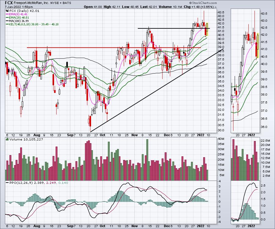
Looking in on FCX, the chart keeps trying to break out. Nobody said trading was easy! Just follow how hard this name has been to trade based on a breakout to a higher high.
The failed breakout in August above the red line was a good example, where it jumped up and immediately reversed. That also happened in the 3rd and 4th week of October. Then, in the second week of November, FCX makes a surge, retreats back below a breakout level, then another huge two-day surge and fails again. Late December, it goes on another run, only to fail to hold the breakout on the first Thursday in January after a church spire candle on the Fed minutes day. Friday it recovers the drop. Whew... tough trading if you are buying breakouts. The quick view is the chart made new highs already in 2022.

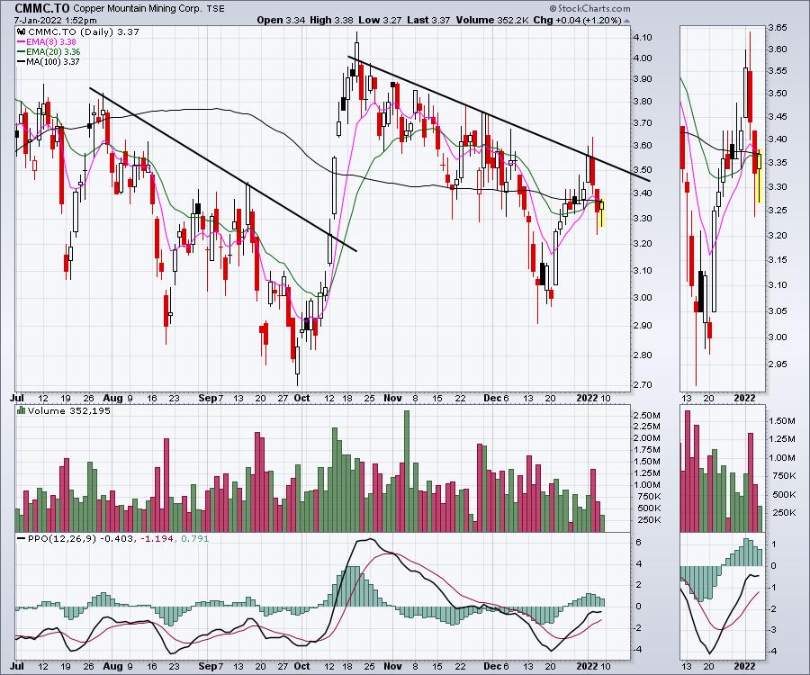
I tried a trade in Copper Mountain in Canada. It gave us a nice firm trend line to work off, but that didn't help. Trading these copper names is not for the weak of heart.

What makes this trade more compelling than ever is the closing down of nuclear plants in California and other places around the world. Many are of the belief that solar and wind can make that power up. Recently, an article I read suggested France had battery backup for less than 2 minutes of consumption at a grid level. So the majority of the entire grid infrastructure from production to storage will need to be completely upgraded.
All of this keeps building into part of the world's looming energy crisis. There is positive news, but the projects need to be vast in size and scale. On my travels today, I found two new grid level power installations of massive scale that were not there two years ago.
The new solar installation near the Hoover Dam in Nevada was vast. It covered massive acreage. The installation continued on both sides of the highway. The power line infrastructure above the solar array was part of the Hoover Dam power generation, so not all these towers were from the solar addition. I will comment on a scale of 1000 acres that have plants removed and call it green energy. Large scale sterilization of the soil or continuous elimination of the plant species? Either way, let's not pretend this is all eco-good.

Here is another shot showing how far the panels go. They extend all the way back to the mountain in the distance!

The point to make from these photos was the size and scale of the power generation and all of this requires massive land as well as large amounts of copper, steel and aluminum elements. This site also had a large battery storage facility on the east end of the property.
After crossing to the east side of the Hoover dam, I found a completely new wind farm that was not there two years ago. The picture doesn't do it justice. I took a picture of 75% of the windmills as it stretched farther left and right. All of this requires copper, aluminum, steel and concrete. This is also spread over multiple sections of land. Infrastructure roads are built into all these sites and power lines are constructed to tie into the existing grid. Once again, this one was close to the Hoover Dam, so I am guessing that it ties into the main transmission line network near there.

While desert landscaping isn't considered agricultural, this vast suction of land for two large infrastructure projects highlights how much new to industry construction is yet to come. Blessed with plenty of sunshine and lots of unowned tracts of land in the desert, I can see these desert valleys filling up with solar and wind infrastructure. I'll let someone else argue about whitewashing the land to build out this urbanized desert infrastructure, but it's hardly a greening of the landscape when everything is bulldozed.
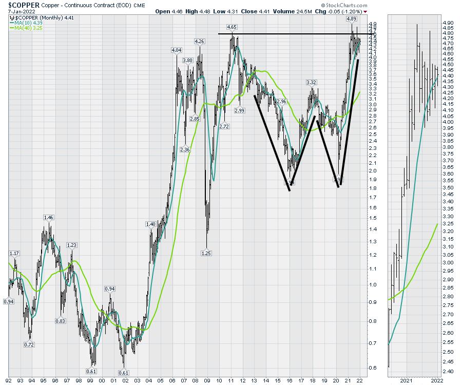
If we are serious about power infrastructure, the speed and scale of this infrastructure installation needs to rise exponentially. When will the global demand for these elements exceed new supply? The copper chart is pushing into the top right corner at all time highs. I expect 2022 to be just the next wave of higher copper prices. That will rely on China also increasing their demand for copper.
This Copper chart pushing and holding near all-time highs suggests this might be the calm before the storm.

So for 2022, I am keeping my eye on the copper miners. As FCX continues to push up above previous highs, it seems only a matter of time before this explodes higher.
|
| READ ONLINE → |
|
|
|
| ChartWatchers |
| Apple (AAPL) Could Be on the Verge of Tumbling, Putting the Entire Stock Market at Risk |
| by Tom Bowley |
We're about to find out.
I liken the current stock market environment to stepping into The Twilight Zone or the Great Unknown. This post-pandemic market has been brutal in terms of rotation. Most growth stocks have tumbled amid the inflation and interest rate uncertainty; unfortunately, the inflation news is going to get worse, starting with this Wednesday's December CPI report. There is good news on the horizon, but we're going to need to be patient and avoid the traps and pitfalls along the way.
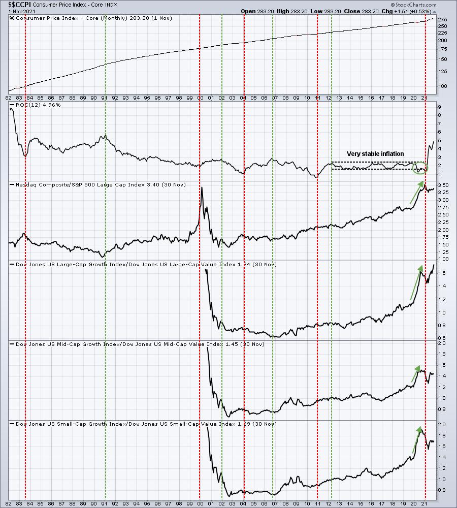
The biggest issue with both higher inflation and higher interest rates is that they eat into valuations of growth companies. There are safe(r) havens, but typically you want to avoid areas of the market where valuations are highly dependent on future earnings growth rates. Hopefully, the following chart will help to explain this visually:

The red-dotted vertical lines mark bottoms in the annual inflation rate, just prior to a significant rise. Think of these as "Stop Signs" or "Red Lights" for growth stocks. The green-dotted vertical lines mark tops in the annual inflation rate. Consider these "Go Signs" or "Green Lights" for growth stocks. Growth stocks tend to struggle significantly relative to value stocks during periods of rising inflation. I see the core inflation rate rising to 6-7% before topping. If I'm right, growth stocks could still have plenty of relative weakness ahead.
The overall market has held up well thus far. Why? Because the dozen or so large-cap stocks that comprise a big portion of the indices have held up very well. But if this market begins to roll over and key leaders like Apple (AAPL) lose support levels, it could get ugly very quickly. ETFs are flush with stocks like AAPL, MSFT, GOOGL, FB, TSLA, etc. Could AAPL fall 20%? 30%? I believe so. First, let's look at the NASDAQ 100 ($NDX) longer-term 10-year weekly chart:

We have seen the NDX soar off the March 2020 low with nary a significant decline. Every new high has been accompanied by a lower weekly PPO since Q3 2020. The bottom panel shows the 12-week ROC. We have not seen a 12-week period that declines since the March 2020 low. The only other time we've seen that during the current secular bull market advance was back in 2015. We actually saw a couple of very insignificant 12-week declines, but, for the most part, the NDX simply kept rising. When it did finally fall, it fell hard in the summer of 2015, falling from a high of nearly 4700 in July 2015 to its subsequent low just beneath 3800 in 5 weeks! Given the higher inflation readings that we'll see over the next 3 months, we should not rule out the possibility of a very significant decline over a fairly short period of time. I believe the odds of such a decline are rising very rapidly.
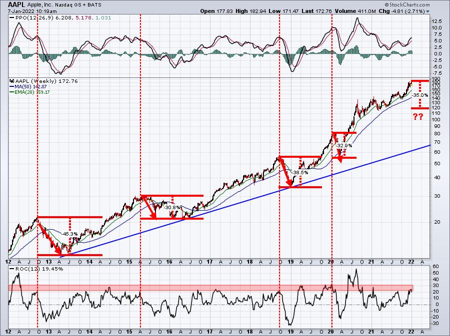
Any large decline in AAPL or MSFT will make investors VERY nervous. And an AAPL, MSFT, GOOGL, etc. falling rapidly will have a HUGE impact on the major indices because they're the largest component stocks. A drop in AAPL of 30% in a short period of time would not be unprecedented at all:

If you look at the last four significant declines on AAPL, they've ALL occurred after AAPL had a 12-week rate of change in the dangerous 20-30% range. We're at 19.45% right now, but we were above 20% recently. It's also very important to point out that not every trip into this ROC 20% or above range has resulted in a decline. This is NO GUARANTEE. Instead, we should view AAPL as a VERY RISKY long proposition at this point, especially knowing that inflation is likely to rise as we move throughout the first few months of 2022.
I'd be a seller of AAPL, or at least I'd have put protection in place.
All of this is just scratching the surface of what we face heading into 2022. I'm nervous. And if you follow my articles, you know that I'm very bullish longer-term. The short-term, however, is extremely risky. I believe we're going to see a 10% correction to possibly a 20% cyclical bear market due to inflation fears and the fears of higher interest rates.
I will be sharing my thoughts on Saturday, January 8th during our 3rd annual Market Vision event that begins at 8:45am ET. If you'd like to be a part of the biggest event of 2022, it only takes a FREE 30-day trial membership at EarningsBeats.com to be a part of it. For more information about the event, our speaker lineup, and how to sign up, CLICK HERE.
I hope to see you at Market Vision 2022. It will be the most important event you attend in 2022!
Happy trading!
Tom
|
| READ ONLINE → |
|
|
|
| RRG Charts |
| Strong Rotation for Defensive Sectors is Keeping S&P Under Pressure |
| by Julius de Kempenaer |

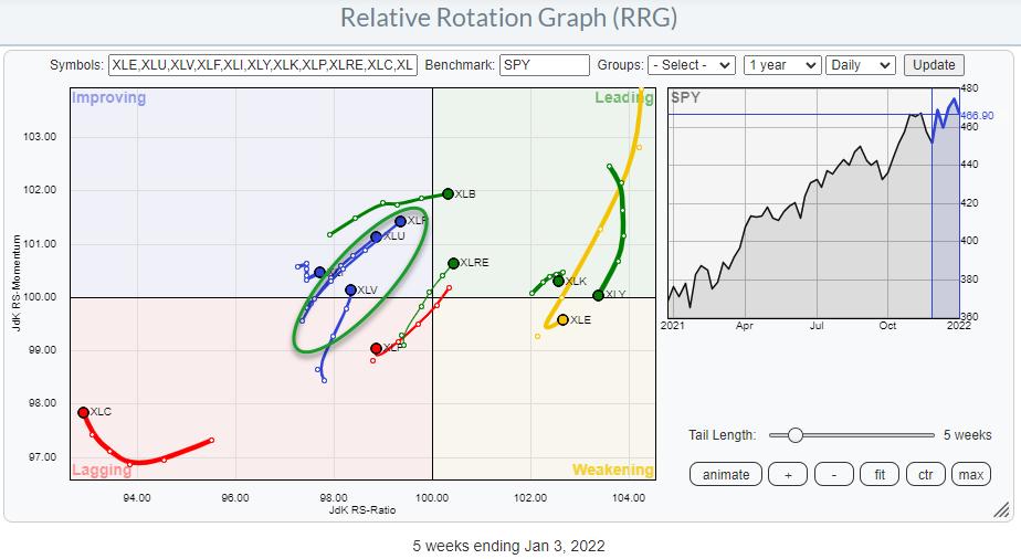
One of the more prominent rotations on the (weekly) Relative Rotation Graph for sectors is the strength displayed by the defensive sectors.
In the RRG above, I have marked an oval around Staples, Utilities and Health Care. These are the three "defensive sectors" in the universe and they are all inside the improving quadrant, traveling at a strong heading towards leading. This type of rotation is usually seen during times of general market weakness when investors seek a safe haven.
Now I am aware of the fact that a bit of a rough week this week, especially last Wednesday. But in the bigger scheme of things, the general trend for the S&P is still rising. Nevertheless, the current strength for defensive is something to be aware of.

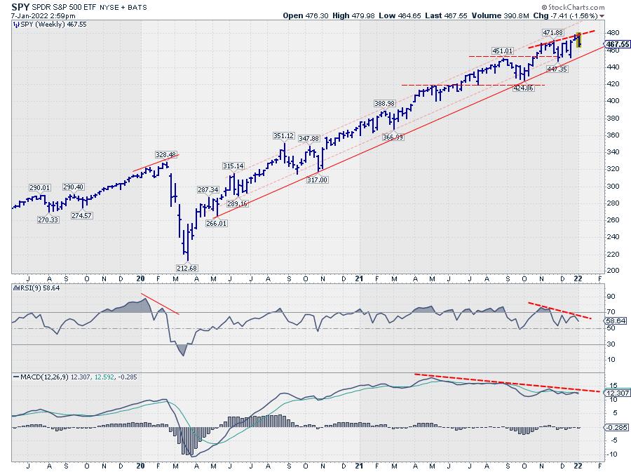
Looking at the chart of the SPY, I have a few observations:
- The series of higher highs and higher lows in price is still intact (+)
- The most recent high did not reach the top of the channel (=/-)
- Price is still above the rising support line that marks the lower boundary (+)
- The negative divergence between price and RSI did come back again (-)
- The negative divergence between price and MACD is still there, but the MACD-line is still way above 0 (=/-)
All in all, I don't think these are signs of a major trend reversal. At least not yet. But it certainly warrants some extra care.
If I break down the universe into three RRGs -- Defensive, Offensive, Sensitive -- this is what we get.
Offensive / Cyclical

The weekly rotations for XLB and XLRE are still good, both are inside leading and at a strong heading. XLY is rapidly rotating towards weakening, but still at a high RS-Ratio reading. The only clear negative here is XLF.
On the daily RRG, XLB is confirming the positive rotation on the weekly so that is strong. XLF is rapidly moving into leading, but we have to wait and see if that is strong enough to pull the weekly tail around and back to improving/leading. XLRE is inside weakening and seems -- seems -- to be turning back up. If that gets proper follow-through next week, we could see XLRE back as a strong sector again.
The only worrisome rotation on the daily is the rolling over tail for XLY inside improving; this will likely put more pressure on the weekly rotation, which is a weak sign.
Defensive

On the weekly RRG, all defensive sectors are rotating strongly into the improving quadrant. Only XLV is slowing down this week.
On the daily chart, all three are inside weakening and the only one NOT YET curling back up towards leading is XLV. All in all, strength for defensive sectors seems to continue.
Sensitive

The sensitive group is mixed. The tails for XLE and XLI look promising, as they are both moving in the same direction on both the weekly and the daily charts. XLC is confirming its weakness in both time frames. The worrisome rotation is for XLK, which is at a short tail on the weekly and seemingly rotating lower towards weakening, while the daily tail moved into lagging this week and seems to be heading further into it.
So all in all, the only sectors showing real relative weakness are Technology, Communication Services and, to a lesser degree, Health Care. And you know what? Together that is around 50% of the market cap in the S&P 500...
Therefore, as long as this rotation continues, it will be difficult for the market to move much higher. We do need to get participation from these sectors back, or at least two out of three, I would say.
Long-term uptrend intact, but be careful near-term.
--Julius
|
| READ ONLINE → |
|
|
|
| MORE ARTICLES → |
|
 Chart 1
 Chart 2
 Chart 3
 Chart 4

 Setting expectations is part of a strategy and this includes expectations for the number of signals we can expect in any given year. Signal frequency, of course, depends on your strategy and timeframe. Short-term mean-reversion strategies generate more signals than swing strategies and swing strategies generate more signals than long-term trend following. Today I would like to share my signal expectations based on a swing trading strategy.