| THIS WEEK'S ARTICLES |
| John Murphy's Market Message |
| INFLATION FEARS PUSH BOND YIELDS HIGHER AND STOCKS LOWER |
| by John Murphy |
STOCKS FAIL TEST OF MOVING AVERAGE LINES... Thursday's CPI report showed January inflation rising 7.5% on an annual basis which was the highest number in four decades (since 1982). That higher inflation number raised prospects for a more aggressive Fed starting next month, and pushed stocks sharply lower and bond yields sharply higher. The 10-Year Treasury yield rose above 2.00% for the first time since the middle of 2019 which coincided with a sharp selloff in stocks. In addition, the three charts below show this week's rally failure in stocks taking place at or near some important moving average lines. Chart 1 shows the Dow Industrials rising briefly above its 50-day moving average before falling back below it on Thursday. It slipped below its 200-day moving average Friday afternoon following a news report that a Russian invasion of Ukraine may be more imminent. That report also pushed gold and oil prices higher.
Chart 2 shows the S&P 500 falling short of its 50-day moving average for the second time; and also slipping below its 200-day moving average this afternoon. There again, that drop on Friday afternoon followed the news report on Ukraine. A weekly close below that red line would be a negative sign for the market. The Nasdaq was the first index to fall below its 200-day line in late January; that previous support line is now acting as an overhead resistance barrier. Chart 3 shows the Nasdaq 100 (QQQ) failing a test of its red line at mid-week (red arrow) before leading the market lower at week's end. Rising bond yields have weighed more heavily on technology stocks which are one of the market's weakest sectors. Technology is Friday's weakest sector, while the jump in the price of oil is making energy Friday's biggest sector gainer.
 Chart 1 Chart 1
 Chart 2 Chart 2
 Chart 3 Chart 3
|
| READ ONLINE → |
|
|
|
| The Mindful Investor |
| The Indicator to Watch for DIS and $SPX |
| by David Keller |
The current chart of Walt Disney Co. (DIS) provides a perfect case study on how the Relative Strength Index (RSI) can be used to better understand the underlying trend in a stock.
Disney rallied off its March 2020 low along with most other names, but the real outperformance began in November 2020. That's where we see the stock gapping higher on earnings releases, as it became clear at the Disney+ streaming service would more than compensate for the COVID-19 impact on their theme parks.
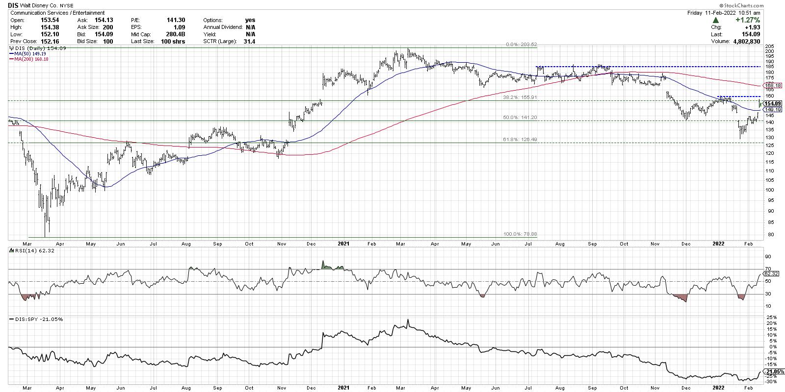
After topping out just above $200 in March 2021, the stock dropped about 18% before settling into a range between $160 and $185.
Look at the RSI indicator and how it behaved during the first half of this chart. The indicator tended to become overbought on rallies and also tended to bottom out around 40 on market pullbacks. Now look at the RSI indicator in the next section, from March 2020 through the present. See how the RSI now tends to become oversold on pullbacks and usually tops out around 60?
Discovering Connie Brown's work on adjusting the overbought/oversold ranges on oscillators was a key moment for me early on in my technical analysis career. What a fantastic improvement on the original work by Welles Wilder, which allows us to use the RSI as a way of not just identifying short-term reversals, but also defining the longer-term trend.
Note: both books are on my recommended reading list here!
This week, Disney gapped higher after earnings as they indicated that the theme parks business was improving and that Disney+ remains in growth mode. So what would we need to see on the chart to confirm a rotation from bearish trend to bullish trend?
First, DIS would need to break above its most recent swing high around $160. That would indicate that enough buying power has emerged to overwhelm the selling pressure that has been prevalent for months on this chart. Next, I'd want to see the RSI break above 60, which would put the RSI in a more classic bullish range. There have been numerous price bounces over the last six months, but none of them have been able to make new swing highs with the RSI breaking above 60. Lastly, a higher low would be the final confirmation of a rotation from bear trend to bull trend. That would suggest that buyers are willing to buy on the dips and buy at a higher level than previously seen.
How can we apply this lesson to the S&P 500 chart?
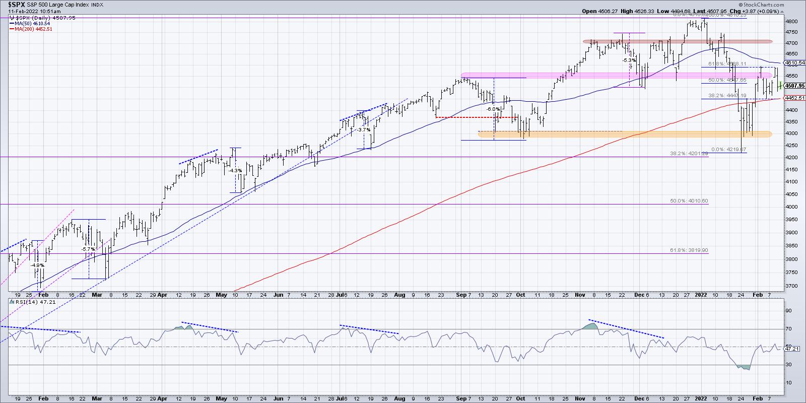
The last time the RSI was overbought was in early November, when the S&P first reached 4700. Subsequent up thrusts in December and January saw the RSI fail to reach much above that crucial 60 level. Also note the bearish momentum divergence, with higher highs in price into January while the RSI was making lower peaks!
The bullishness of the move higher this week has to be questioned when the RSI fails to reach above 60. As long as the RSI remains below 60, and the S&P fails to break above previous swing highs around 4600, this is a chart in distribution mode.
Want to digest this article in video format? Head over to my YouTube channel!
RR#6,
Dave
David Keller, CMT
Chief Market Strategist
StockCharts.com
Disclaimer: This blog is for educational purposes only and should not be construed as financial advice. The ideas and strategies should never be used without first assessing your own personal and financial situation, or without consulting a financial professional.
The author does not have a position in mentioned securities at the time of publication. Any opinions expressed herein are solely those of the author, and do not in any way represent the views or opinions of any other person or entity.
|
| READ ONLINE → |
|
|
|
| ChartWatchers |
| Bear Market Rules Refresher |
| by Erin Swenlin |
 I must sound like "Debbie Downer", given this is my second ChartWatchers article with "bear market" in the title. I am bearish right now, but had to remind myself of "Bear Market Rules" Thursday after getting a little too bullish on Wednesday. I must sound like "Debbie Downer", given this is my second ChartWatchers article with "bear market" in the title. I am bearish right now, but had to remind myself of "Bear Market Rules" Thursday after getting a little too bullish on Wednesday.
As with many in the business, I was beginning to get bullish with the rotation back into the growth areas of the market. We were seeing participation increasing in Discretionary, Technology and, in some cases, Communication Services. We even had a follow-through day (fourth day of a rally) last week. However, on yesterday's decline, I realized that I had forgotten about "Bear Market Rules" as that would've told me to better temper my expectations.
What are "Bear Market Rules"? I did a workshop on this a long time ago, and recently Mary Ellen McGonagle and I talked about them on Chartwise Women.

Click here to register in advance for the recurring free DecisionPoint Trading Room! Below is the recording from last Monday.
Topic: DecisionPoint Trading Room
Start Time: Feb 7, 2022 09:01 AM
Meeting Recording Link.
Access Passcode: February#7
BEAR MARKET RULES:
- Overbought conditions in a bear market -- expect a new down leg.
- Oversold conditions in a bear market -- "thin ice", no solid foundation for price bounces.
- Buying into a bear market is dangerous regardless of the bullishness of the chart.
- Expect bearish conclusions to bullish chart patterns.
- Manage long-term positions as if they were short-term positions.

I'd like to think that my aging short-term memory was the reason that I "forgot" about them, but, I have to say, the charts on Wednesday did look promisingly bullish. After Thursday morning's big drop from the rising trend channel likely due to the CPI report showing accelerating inflation, price was beginning to make its way back to positive territory. Then it fell apart. The breakdown was exacerbated by St. Louis Fed President Bullard suggesting a full percentage point rate hike by July. So it was a double whammy for the market. (I did talk about this possibility on Tuesday with subscribers).
After the market closed on Thursday, we identified an downside initiation climax* to DP Alert subscribers. A downside initiation climax tells us to expect more decline. We were churning this morning and losing ground. Then we got the news that the White House was expecting Russia to invade Ukraine before the finish of the Olympics. The market sold off in earnest.
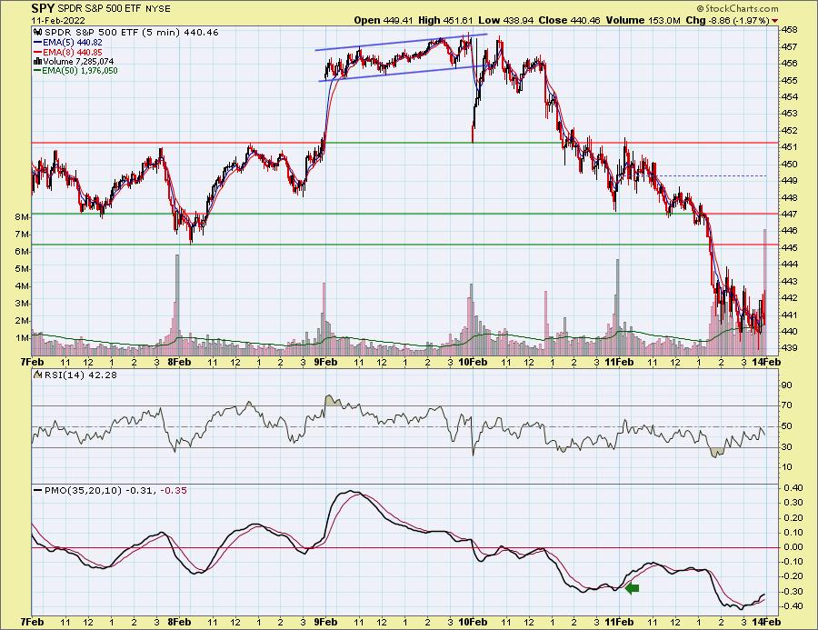
*A climax is a one-day event when market action generates very high readings in (primarily) breadth and volume indicators. We also include the VIX, watching for it to penetrate outside the Bollinger Band envelope. Climaxes indicate either initiation of a price move or exhaustion of the current trend.
Conclusion: When the market is correcting or in a bear market, we need to remember that bullish expectations should be tempered. Oversold conditions that you we see often in bear markets become "thin ice", a poor foundation for an extended rally. That is what I forgot on Wednesday. Lesson learned.
Good luck & good trading!
Erin Swenlin, VP & Sr. Technical Analyst - DecisionPoint.com
Technical Analysis is a windsock, not a crystal ball. --Carl Swenlin
(c) Copyright 2022 DecisionPoint.com
Helpful DecisionPoint Links:
DecisionPoint Alert Chart List
DecisionPoint Golden Cross/Silver Cross Index Chart List
DecisionPoint Sector Chart List
DecisionPoint Chart Gallery
Trend Models
Price Momentum Oscillator (PMO)
On Balance Volume
Swenlin Trading Oscillators (STO-B and STO-V)
ITBM and ITVM
SCTR Ranking
DecisionPoint is not a registered investment advisor. Investment and trading decisions are solely your responsibility. DecisionPoint newsletters, blogs or website materials should NOT be interpreted as a recommendation or solicitation to buy or sell any security or to take any specific action.
|
| READ ONLINE → |
|
|
|
| ChartWatchers |
| What Do Staples, Energy and Financials Have in Common? |
| by Martin Pring |
Before we look at the two-bar reversal, let's first review the long-term technical position for the Dollar Index. It's laid out on a quarterly basis in Chart 1, along with a Coppock momentum indicator. The first thing to note is that the Index is positioned below its secular down trendline, dating from the 1980s. That's not a real plot yet, since the end-of-quarter data required for a quarterly close is not yet available. However, it certainly does indicate that the Index is facing significant overhead resistance.
The Coppock Curve has been completely flat since 2019. That's an awfully long time, reflecting a really tight balance between buyers and sellers. Note that the red up trendline completely covers the 40-quarter MA, telling us that, on a quarterly close basis, the 91.90 level is one of tremendous long-term support. Since the Index is above the trendline and MA, that rates the primary trend as bullish, though I would be much more confident in this view in the event that the Index manages to rally above its secular down trendline.
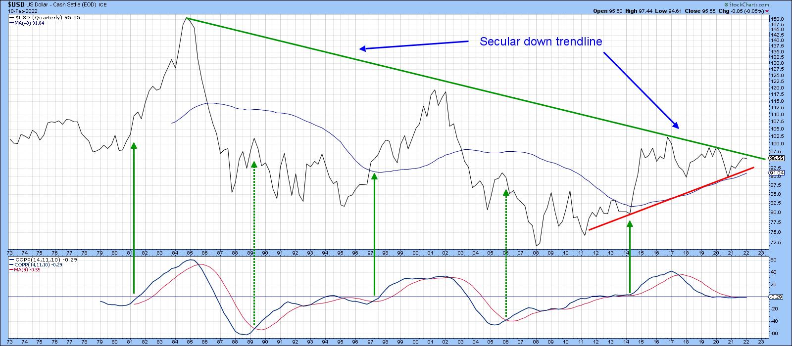 Chart 1 Chart 1
Chart 2 displays monthly data. Since 2015, price action has experienced a giant trading range environment. Each swing in the direction of either of the two converging trendlines has represented a mini-bull or bear market in its own right. Those lines are currently residing in the 90 and 97 areas, which are the two end-of-month benchmarks to beat. Right now, the KST is bullish and the Index is trading above its 12-month MA. In my book, that classifies the primary trend as bullish. In reality, though, the erratic nature of MA crossovers during the trading range means that the real benchmarks remain at the two trendlines. More importantly, from an upside breakout aspect, is the early 2020 high at just under 100. Why there? Because a move above 100 would re-confirm the series of rising peaks and troughs that has been taking place since 2011.
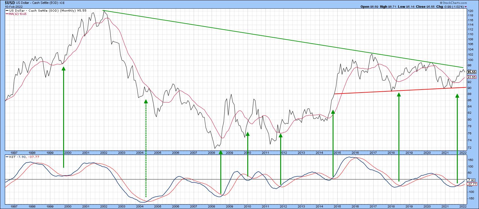 Chart 2 Chart 2
Chart 3 shows some more resistance in the form of the 2015-2022 down trendline for the Special K indicator, which you can read about here. That's important because the Index itself was recently at daily close resistance and appears to have failed the test, which is where our bearish two-bar reversal comes in.
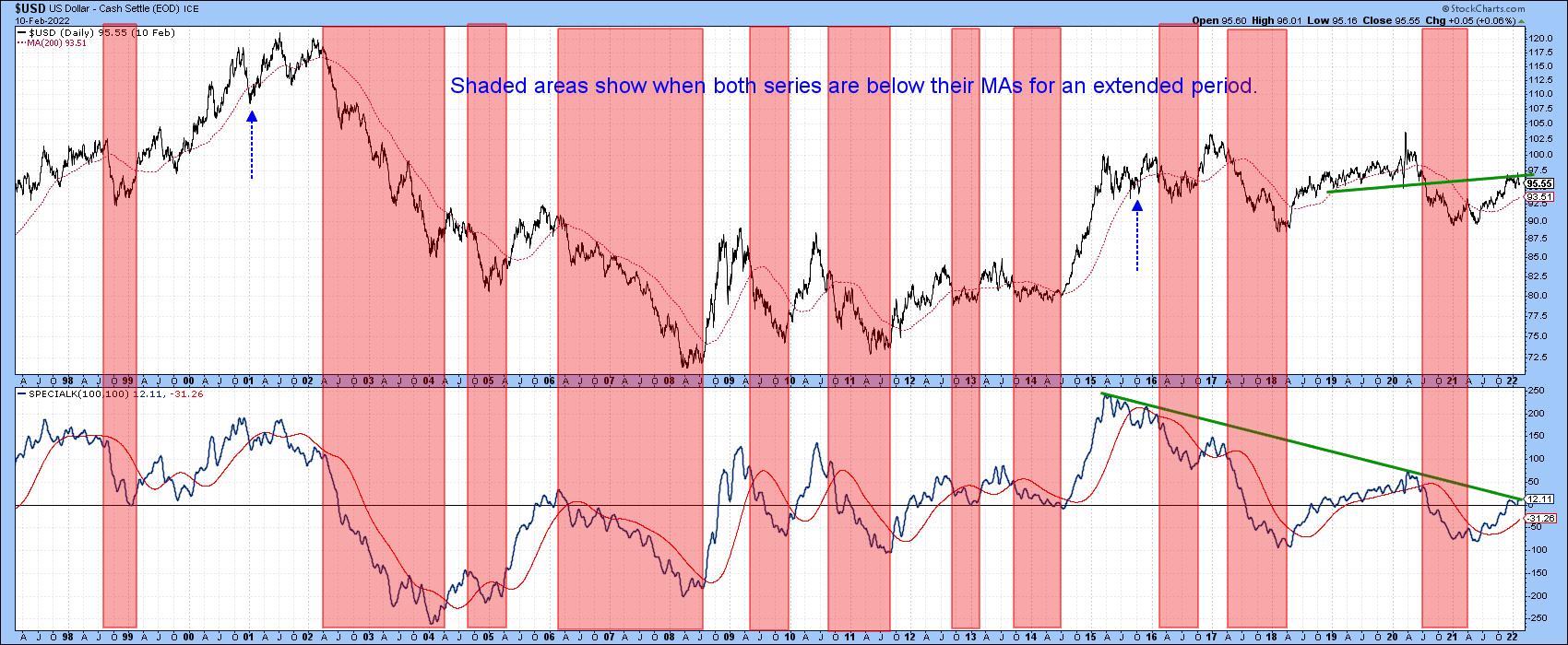 Chart 3 Chart 3
The Two Bar Reversal
Chart 4 shows that the Dollar Index completed the second bar of a bearish weekly two-bar reversal last week. Typically, a bearish two-bar reversal develops after a rally, where the first bar opens near its low and ends near its high. This shows that the buyers are in complete control at the end of the period. The second bar opens around the level of the previous close, but ends the session right back in the area of first bar's open. This action reflects the fact that a market previously dominated by buyers has reverted to one in which sellers are now in control.
To gain significance:
1. First, these two bars should first be wider than those leading up to the pattern, as is the case with January price action. The wider the bars, the bigger the battle between buyers and sellers and the stronger the indicated reversal.
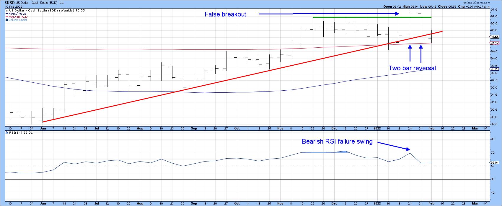 Chart 4 Chart 4
2. Second, expanded activity underscores a more significant buyer/seller conflict and enhances the significance of a specific pattern. There are no volume figures for the Index, but Chart 5 for the Invesco DB US Dollar Index (UUP) reveals a huge expansion of activity on the bearish second bar.
3. Third, the longer the period reflected in the bar, the longer its effect is likely to be. Thus, a two-bar reversal on a 10-minute chart has nowhere near the significance as one that appears on a monthly bar and so forth. These are weekly bars and are expected to have a negative effect for between 5-10 weeks. That could take the form of a decline or, less likely, a sideways consolidation below the top of the two bars.
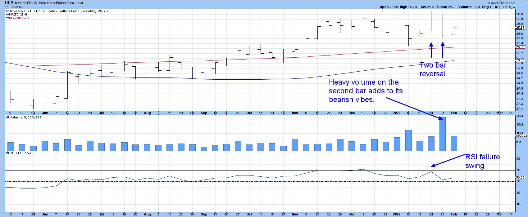 Chart 5 Chart 5
4. Finally, since two-bar reversals should have something to reverse, they should consequently be preceded by some form of advance. In our example, the two bars were preceded by a rally and a 9-week trading range -- not exactly a textbook case. However, this formation, as Chart 5 shows, represented a false breakout above that trading range. That's pretty serious, since such whipsaws are typically followed by above-average price moves in the opposite direction to the break. One caveat is that the two-bar reversal is only one piece of trend reversal evidence. I like to see some form of additional proof as confirmation. In this instance, we would need to see a decisive negative break that can hold below the red up trendline and 200-week MA.
Chart 6 also shows the false break, but this time using daily close data. It, too, offers a good confirmation benchmark, with a daily close under the 2022 up trendline, say, at 95.
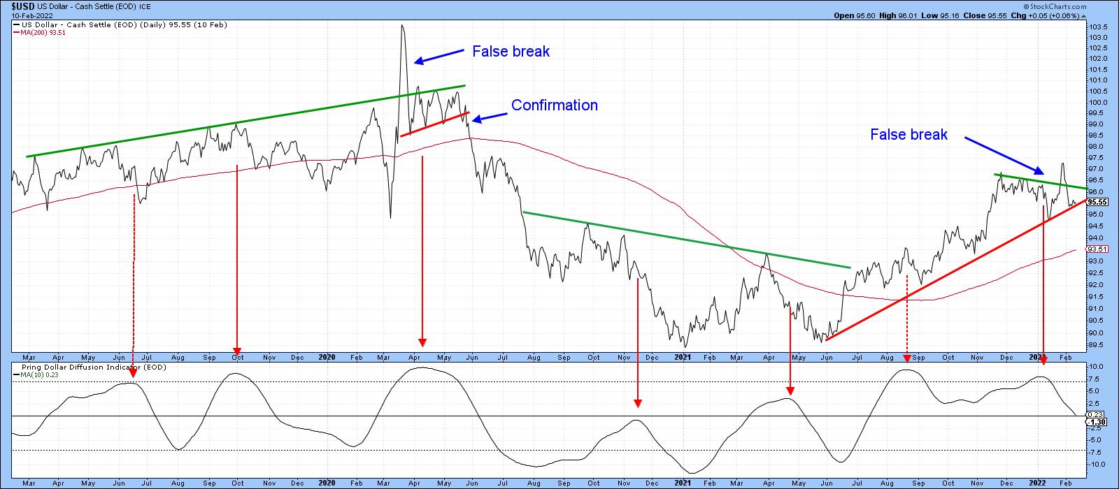 Chart 6 Chart 6
Conclusion
The Dollar Index is in a primary uptrend and nothing has yet taken place to subvert that view. However, the bearish two-bar reversal, if confirmed, suggests that the bull market case is likely to be tested in the coming weeks. If that happens, I would expect to see the price of gold, which has been pretty quiet recently, experience a memorable rally.
This article is an updated version of an article previously published on Monday, February 7 at 6:27pm ET in the member-exclusive blog Martin Pring's Market Roundup.
Good luck and good charting,
Martin J. Pring
The views expressed in this article are those of the author and do not necessarily reflect the position or opinion of Pring Turner Capital Group of Walnut Creek or its affiliates.
|
| READ ONLINE → |
|
|
|
| The Traders Journal |
| Sushi Investing, Part 2: How To Sell Equities Before The Expiration Date |
| by Gatis Roze |
Within the stock market, selling profitably is considered an art. In the real world, most folks love art and are happy to talk about it. Institutional investors will talk about the "art of the exit" before they buy an equity. So why is it that individual investors deem it "uncool".
I believe that part of it has to do with the inner struggles most investors experience when it comes to selling their equities. They can't seem to get their own egos out of the way, and they fail to acknowledge their own demons. As Mark Douglas wrote, most investors get wrapped up in some variation of the Four Fears:
- Fear of losing money
- Missing an opportunity
- Leaving money on the table
- Being wrong
Most individual investors perceive themselves as intelligent individuals with muscular money managements skills. Often they've been winners in other arenas of life, and winners are not wired to focus on their losses with a radical candor the markets demand.
Once again, I'm reminded of Charles Darwin's famous quote, "It is not the strongest of the species that survives, nor the most intelligent that survives. It is the one that is most adaptable to change." Your losses require — indeed clamor for — introspective review. I've always envisioned my losses as tuition paid to the University of Wall Street. But God forbid if I pay tuition twice for the same lesson!
There are two ways I deal with my trading losses. The first type of loss is usually the result of the laws of probability, and my methodology expects these. I expect it. I don't like it, but my thinking is that I'll take this small loss and now I'm one step closer to my next big gainer.
The second type of loss is altogether something else. Losses that result from ignoring my trading plan or my selling disciplines and thereby falling into some bad behaviors of human nature requires serious introspection and brutal self-honesty. I know better. And I know I mustn't let it happen again.
So now building upon all these foundations learned from the Dennis Rodman defensive basketball metaphor (Part 1) to embracing the "Investor Self", how did you make out with the selling role-play in last week's blog with respect to Redfin (RDFN), 1 Life Healthcare (ONEM) and Pinterest (PINS)?
I heard from a number of you who felt this was an extremely valuable exercise. In fact, in the two-day Stock Market Mastery seminars that Grayson and I taught before the pandemic (and hope to do so again), we'd spend hours on the three stages dealing with Exit Strategies and Selling disciplines (i.e. Stage #3 -The Investor Self; Stage #8 - Monitoring; Stage #9 - Selling). As homework, attendees were asked to paper trade 50 equities and execute their selling methodologies. The comprehension and absorption were immediate. Yes, the cliche applies: "practice makes perfect".
In a spirit of full disclosure, I've decided to make this a three-part blog. Candidly, my motivation is threefold.
- I benefit from revisiting my own exit disciplines.
- Acquiring the skills necessary to execute timely sells is an extremely high-leverage activity and produces consistent profits. It warrants the effort.
- For those readers who are truly committed to up their investing game, I'd like to help facilitate that with a bit more foundation building — which I call homework. So here's the Game Plan. Before I present Part 3 of this series, I challenge you to execute the following curriculum:
- Paper trade 50 equities from your past investment or pick 50 from the StockCharts.com scan list of new lows. Apply the three peaks sell methodology and then apply your personal exit strategy.
- Read the three chapters in our book which I listed above.
- Review some of the 13 Traders Journal Blogs that I've written and archived under Stage #9 - Selling.
- Watch this short video clip of the famous scene from the movie "A Few Good Men" where Tom Cruise demands Jack Nicholson tell him the truth. Colonel Jessup (Nicholson) responds with radical candor: "You can't handle the truth....etc." It's a flawless parallel to the stock market. The markets talk to you truthfully each day. Are you able to hear, accept and act upon those truths? Find a mirror. Stare into it. Say to yourself, "I can now handle the truth — give it to me!!"
If you do these four steps, you'll be ready for Part 3 of Sushi Investing. In the meantime, here is our three-peaks "basic" selling methodology. Back test it on your own past trades. Don't let its simplicity fool you. That's its strength. When you see the three peaks, you know how and when to sell. Then it's merely having the discipline to pull the trigger.
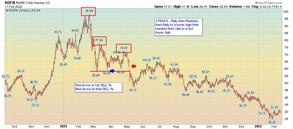


Trade well; trade with discipline!
Gatis Roze, MBA, CMT
StockMarketMastery.com
|
| READ ONLINE → |
|
|
|
| ChartWatchers |
| Trouble In FAANG(sta's) Paradise |
| by Julius de Kempenaer |
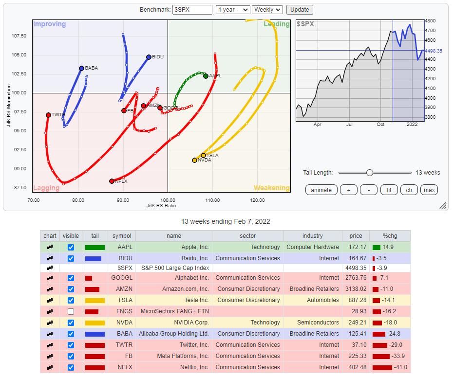
This Relative Rotation Graph shows the rotation for the NYFANG+ members over the last thirteen weeks (quarter). Plotting this universe against the S&P 500 index clearly shows the weakness that crept into this universe recently.
Leading Quadrant
AAPL is the only stock that managed to keep up inside the leading quadrant, but, as you can see, the RRG-Velocity (week-to-week distances on the tail) has decreased strongly, indicating a fading momentum, and the tail is starting to roll over.
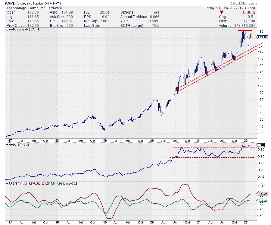
On the price chart AAPL is still holding up above its rising support line and relative strength is still above its breakout level, albeit not by much. Putting in a first lower high on the price chart and falling back into the range on the RS-chart in the coming weeks will be signs of more weakness ahead.
Weakening Quadrant
Inside the weakening quadrant, we find TSLA and NVDA.
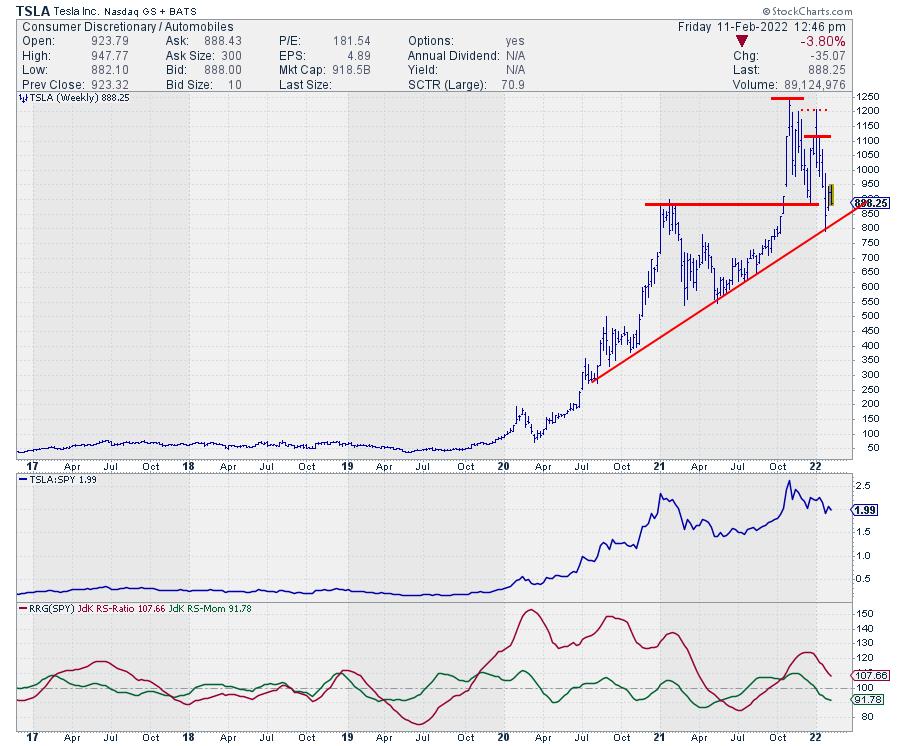
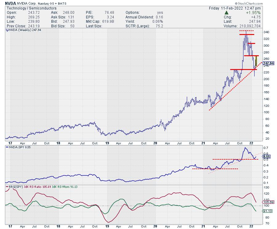
Both stocks are already in a pattern of lower highs and lower highs on their weekly charts. For now, they both managed to bounce off the long-term support lines that are connecting the major lows over the last 12-18 months. Breaking these support levels will very likely also cause a further deterioration of relative strength and eventually push both TSLA and NVDA into the lagging quadrant.
Lagging Quadrant
The lagging quadrant is pretty crowded. TWTR is the lowest on the JdK RS-Ratio scale and currently going through a recovery that, so far, is only momentum-based (vertical move on RRG). No sign of improvement in terms of relative strength yet.
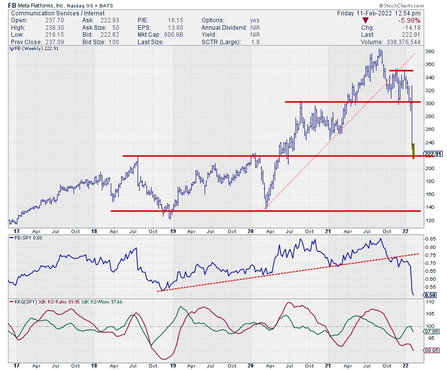
Most of you will be familiar with the chart of FB, as it recently came crashing down. At the moment, FB is resting at long-term horizontal support and, given the magnitude of the drop, a serious bounce is absolutely possible. Trading the move is probably not for the faint of heart, as the damage to the charts, both price and relative, is done and is huge.
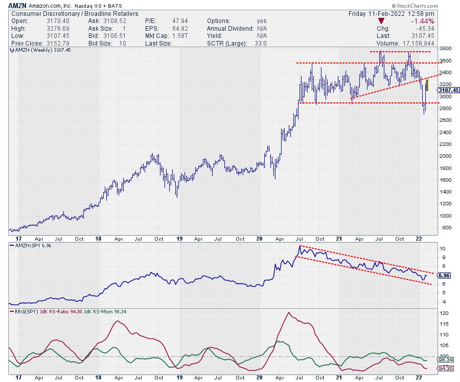
AMZN was in a relative downtrend for a while already before the recent drop in price. The relative picture has not changed, only gotten stronger. AMZN is an underperformer!! When the price sets a new lower high in the coming weeks, the relative weakness will start to spill over to the price chart as well. The downside risk here is significantly higher than the upside potential.
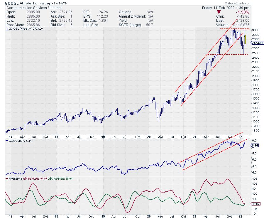
GOOGL is also positioned inside the lagging quadrant, but at a tail that is a lot less long than others on the graph, and it has started to pick up a bit of positive RS-Momentum in the last three weeks. Nevertheless, the chart (above) does not look fantastic. Price dropped out of its rising channel at the beginning of the year after the RS-line dropped out of its channel in December. A rhythm of lower highs and lower lows has already started to emerge on this weekly chart. Here also, downside risk is much more imminent than upside potential.
The tail on NFLX is the most telling. Very long, indicating a lot of power, and at an RRG-Heading between 180-270, losing on both scales. With a 50% loss since mid-November, the damage on the charts for NFLX is severe.
Improving Quadrant
The two stocks inside the improving quadrant are BABA and BIDU.
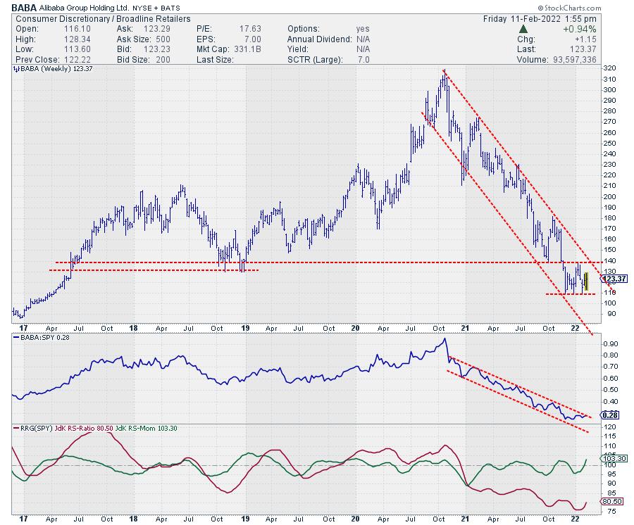
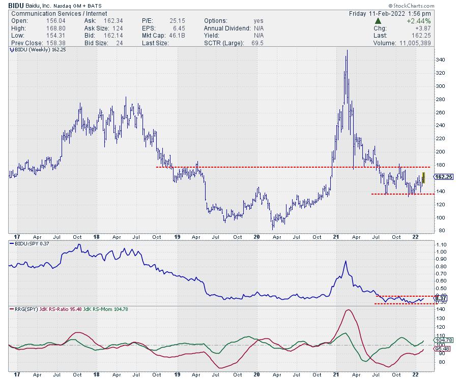
Both stocks completed a rotation lagging-improving-lagging and have recently returned into the improving quadrant again. The charts above show that the improvement is purely relative in nature, as their price trends have been very weak since late 2020 and the start of 2021. The stabilization at very low levels, while other members of the universe are dropping, is now causing relative improvement for these stocks.
They are now both caught in trading ranges, BABA between 110-140 and BIDU between 135-170. As BABA is still inside its downward channel, it looks like BIDU is in slightly better shape. In both cases, we need upward breaks above significant resistance levels in order to get things back on track.
These are some of the major stocks in the US in terms of market capitalization. The fact that they are predominantly moving lower and showing weak tails on the RRG suggests that there is some trouble in the FAANG(sta's) Paradise.
Have a great weekend and #StaySafe, --Julius
My regular blog is the RRG Charts blog. If you would like to receive a notification when a new article is published there, "Subscribe" with your email address.
|
| READ ONLINE → |
|
|
|
| ChartWatchers |
| Vice Stocks That are Tailored for the Current Market Environment |
| by Mary Ellen McGonagle |
I don't have to tell you that these markets have been tough.
Last week was particularly trying, as we were seeing signs of a downtrend reversal before Thursday's high inflation report, coupled with heightened tensions between Russia and Ukraine, pushed the markets back into a downtrend, The headfake reversal came with increased volatility and it's enough to drive an investor to drink. Or to tobacco. Heck, even gambling at a casino sounds like a good idea about now.
In all seriousness, stocks from these areas have a history of performing well during tough market environments. The Dow Jones Gambling Index gained 63% during the first year of the Tech bubble burst in 2000, while the Dow Jones Tobacco Index gained 145% that year. Brewers gained 75% in 2000, with the stock we're highlighting today from this group gaining even more.
DAILY CHART OF PHILLIP MORRIS (PM)
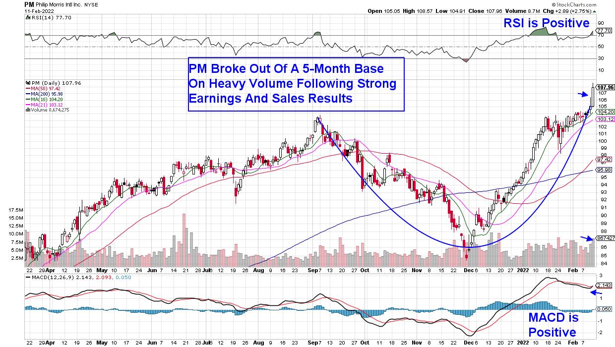
Let's take a look at a well-known Tobacco company, Phillip Morris (PM). The company has seen growth in emerging markets, which has countered a slowdown in the U.S. and Europe. The real future for the company, however, is their heated tobacco system, which the company claims is much less harmful than traditional cigarettes. Sales of this product have surged and, yesterday, PM broke out of a 5-month base on volume after reporting strong 4th quarter results, with management guiding higher for earnings this year.
Tobacco stocks are often viewed as being protected against inflation, given the sector's strong pricing power and ability to raise prices. Phillip Morris's 4.9%-yield is a bonus as well, as higher-yielding stocks are known to outperform during periods of rising interest rates.
DAILY CHART OF BOYD GAMING CORP. (BYD)
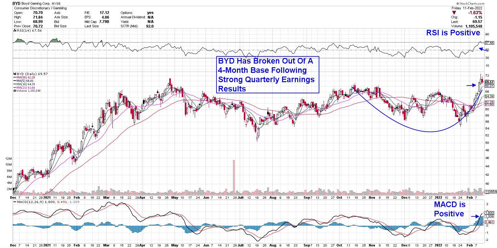
Among Gambling companies, Boyd (BYD) has been trending higher following the release of 4th-quarter results earlier this month. The company came in with earnings that were 193% above last year, as easing COVID-related restrictions have brought operations back to full capacity.
The news pushed BYD into an uptrend on above-average volume, which helped push the stock out of a 4-month base. The stock can be bought on a pullback to its 5-day moving average, as its positive RSI and MACD point to further near-term upside.
DAILY CHART OF MOLSON COORS BREWING CO. (TAP)
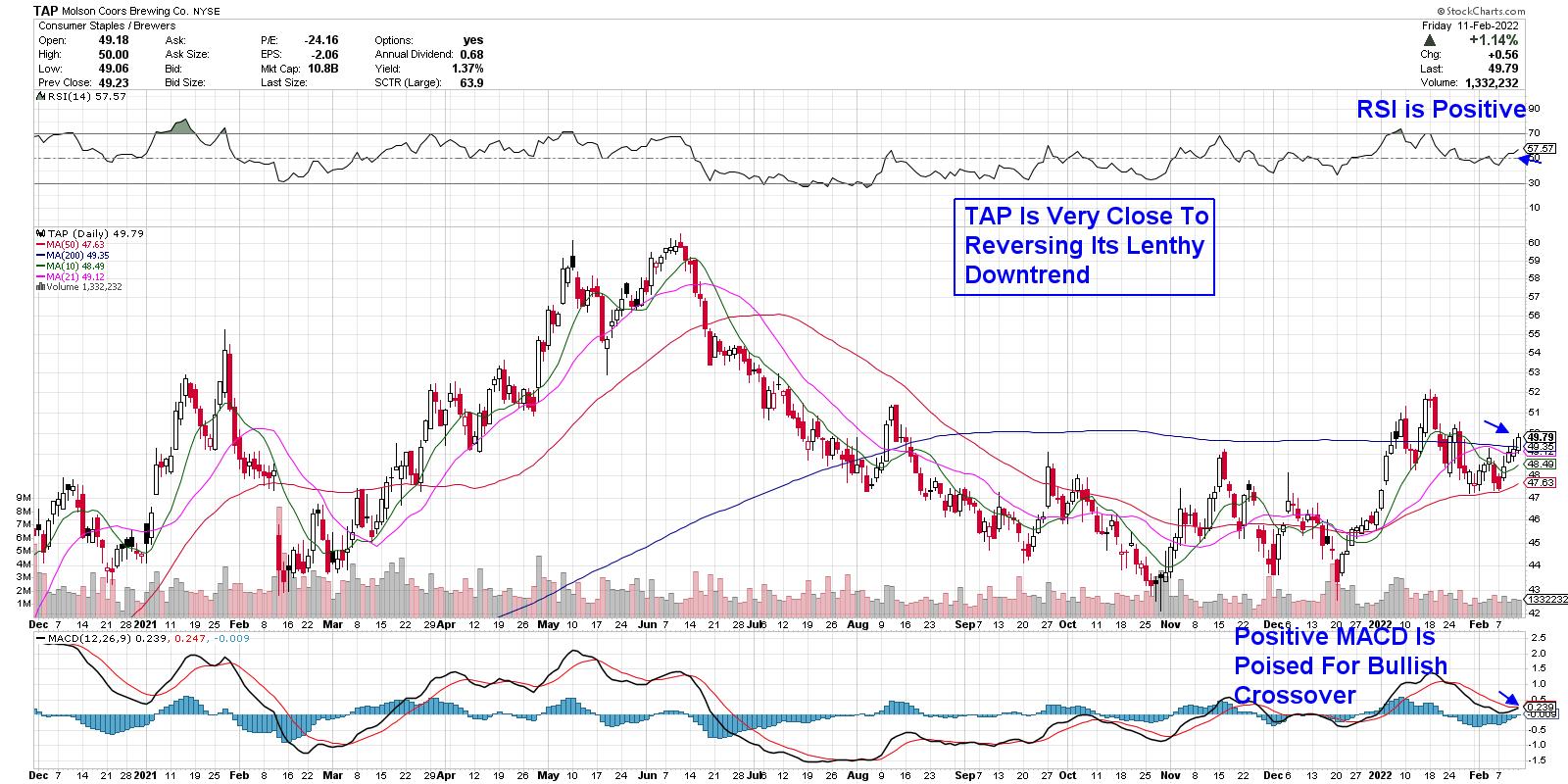
Last up is beer manufacturer Molson Coors (TAP), which is in the throes of attempting to reverse a lengthy downtrend; this has put the stock at a P/E of 13 times last year's earnings. The company has ventured into the metaverse with their Meta Lite Bar, just in time for the Super Bowl. TAP announced a new venture with Coca-Cola (KOLA) in late January, where they'll be launching spiked juices under the Simply brand. The Simply brand is Coca Cola's 2nd largest in terms of revenue and the partnership should help boost Molson's bottom line down the road.
TAP would need to move further above its 200-day moving average on volume before reversing its downtrend. The 2.7%-yielder already has a positive RSI and MACD, with a bullish crossover taking place.
As mentioned, the markets have been tough, and the currently high volatility is expected to be with us for a while as the Federal Reserve -- and investors -- will be focused on every economic data report in the coming months. It's a very uncertain period and, if you'd like to be alerted to when the markets turn positive again, as well as other areas we expect to do well despite an ailing market, use this link here to trial my twice weekly MEM Edge Report for 4 weeks at a nominal fee.
Last year, this top-performing newsletter posted over 110 suggested holdings and 75% of them were winning stocks. Of the losing names, the average loss was 4%. Use this link here and you'll gain immediate access to my most recent reports.
On this week's edition of StockCharts TV's The MEM Edge, I review where the markets are headed and which areas are poised to weather the increased volatility. I also share where to reduce your exposure as the Fed begins their interest rate hike cycle.
Warmly,
Mary Ellen McGonagle, MEM Investment Research
|
| READ ONLINE → |
|
|
|
| Art's Charts |
| Metals & Mining SPDR Goes for Relative and Absolute Breakouts |
| by Arthur Hill |
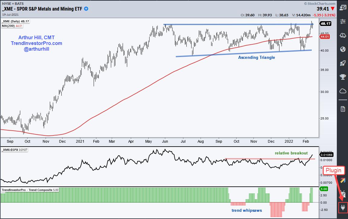
 It's been a rough year for much of the market, but the Metals & Mining SPDR (XME) is bucking the selling pressure as it challenges its 2021 highs and the price relative breaks out. There is also a big bullish continuation pattern at work. Note that 40% of XME components are in the steel group and 14% in aluminum. It's been a rough year for much of the market, but the Metals & Mining SPDR (XME) is bucking the selling pressure as it challenges its 2021 highs and the price relative breaks out. There is also a big bullish continuation pattern at work. Note that 40% of XME components are in the steel group and 14% in aluminum.
The chart below shows XME more than doubling from late September to late May and then embarking on a long consolidation. And I do mean long. The ETF traded flat for over six months and most trend indicators whipsawed in the process, including the Trend Composite.
Despite these whipsaws, the overall structure of the chart is bullish. A consolidation after a big advance is typically a bullish continuation pattern. The consolidation works off overextended conditions and digests big gains. It is the pause that refreshes.

There is also a slight rise in the lower trendline and the pattern looks like an Ascending Triangle, which is a bullish continuation pattern. A breakout would signal an end to this consolidation and a resumption of the prior advance.
The middle window shows the XME:SPY ratio rising into May as XME outperformed and falling into mid December as XME underperformed. Notice that the ratio broke out here in February and this means XME is outperforming in 2022.
The bottom window shows the Trend Composite whipsawing from September to January. The indicator flipped back to bullish on February 8th. Trend indicators catch good trends, but they are also prone to whipsaws. It is just something we must live with. For now, XME looks poised to break out on the price chart, the ETF shows relative strength and the Trend Composite is on the same page.
The Trend Composite is one of 11 indicators in the TrendInvestorPro Indicator Edge Plugin for StockCharts ACP. Other indicators include the Momentum Composite and ATR Trailing Stop. Click here to learn more.
This month we started a multi-part series on a Trend Composite Strategy at TrendInvestorPro. Part 1 covers the indicators and the methodology. Part 2 puts the indicator to the test with 97 ETFs. Next week we will run portfolio level tests and this series will continue for the next several weeks. Click here for more information on TrendInvestorPro.
-----------------------------------------------------------------------
|
| READ ONLINE → |
|
|
|
| DecisionPoint |
| Squeezing the Real Estate Bubble |
| by Carl Swenlin |
In a January 20 article Jeremy Grantham proposed that there are currently bubbles in housing, equities, and bonds, and a half-bubble in commodities. In this article I will only address the current housing bubble. An immediate response might be, "What bubble?" We continue to hear how inventories are so lean, and how bidding for for homes is so fierce that buyers being forced to offer far above the listing price to be competitive. Don't look now, but buying frenzies are kind of typical for market tops. The problem, of course, is that rising interest rates will squeeze buyers out of the market.
The question asked by most buyers is usually, "How much per month?" There is usually a maximum amount that a buyer can afford, and that is controlled by the price of the home and the interest rate (30-year fixed). Either one of these factors alone can shut down a buyer.
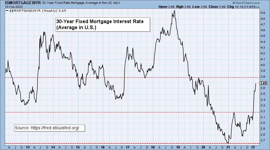
This week the 30-year fixed rate hit a two-year high of 3.69%.

For about a year we have been tracking the effect that rising interest rates are having on potential buyers. On the chart below we started with the rate of 2.65% on January 7, 2021, which was the lowest point of the last 50 years (by a long way!). Assuming a loan amount of $500,000, we get an arbitrary maximum payment of $2,015. In order to keep that payment amount with the current rate of 3.69%, the maximum amount the buyer can borrow is $438,400, which is 12.3% less than at our starting point of $500,000.


As we said before, another factor putting houses even farther out of reach of buyers is rising home prices. According to the Case-Shiller page on the Real Estate Decoded web site, home prices in the U.S. have increased 16.9% from January 2021 through November 2021.
CONCLUSION: Once again, we are approaching a financial crisis caused by real estate. (Thank you, Federal Reserve!) Remembering that it only took single bubbles in 2000 (equities) and 2007 (housing) to cause major problems for the financial markets, what will it be like to experience the collapse of three-and-a-half bubbles?

Click here to register in advance for the recurring free DecisionPoint Trading Room! Recordings are available!
Technical Analysis is a windsock, not a crystal ball.
--Carl Swenlin
(c) Copyright 2022 DecisionPoint.com
Helpful DecisionPoint Links:
DecisionPoint Alert Chart List
DecisionPoint Golden Cross/Silver Cross Index Chart List
DecisionPoint Sector Chart List
DecisionPoint Chart Gallery
Trend Models
Price Momentum Oscillator (PMO)
On Balance Volume
Swenlin Trading Oscillators (STO-B and STO-V)
ITBM and ITVM
SCTR Ranking
DecisionPoint is not a registered investment advisor. Investment and trading decisions are solely your responsibility. DecisionPoint newsletters, blogs or website materials should NOT be interpreted as a recommendation or solicitation to buy or sell any security or to take any specific action.
|
| READ ONLINE → |
|
|
|
| ChartWatchers |
| As the Market's Wild Ride Continued, I Did Some Shopping |
| by John Hopkins |
I sat down to write my article Friday morning and each time I thought I had the right headline -- I didn't!
You see, it's different when the market is green, the VIX is calm, all is well. It's another thing when the NASDAQ is down over 400 points and 750 off from the prior day's high and the VIX suddenly spikes 25%. So the message starts to change. Your thinking goes from "Opportunities Abound" to "How bad could this get?" As usual, it's probably somewhere in-between.
For example, though the NASDAQ remains well off of its all-time high, it's also quite a bit higher than the January 24 low, when the market had gone into a tailspin. Could we revisit that 13,094 level? You bet. But just think about everything that's been thrown at the market lately, including the likelihood of multiple Fed rate increases, the increased tensions between Russia and Ukraine, a new strand of virus that threatened to close things down again, a spike in inflation the likes of which we haven't seen since the early 1980s... that's a LOT for the market to absorb. Yet here we are, with all of the major indexes still substantially higher than they were from that January 24 low.
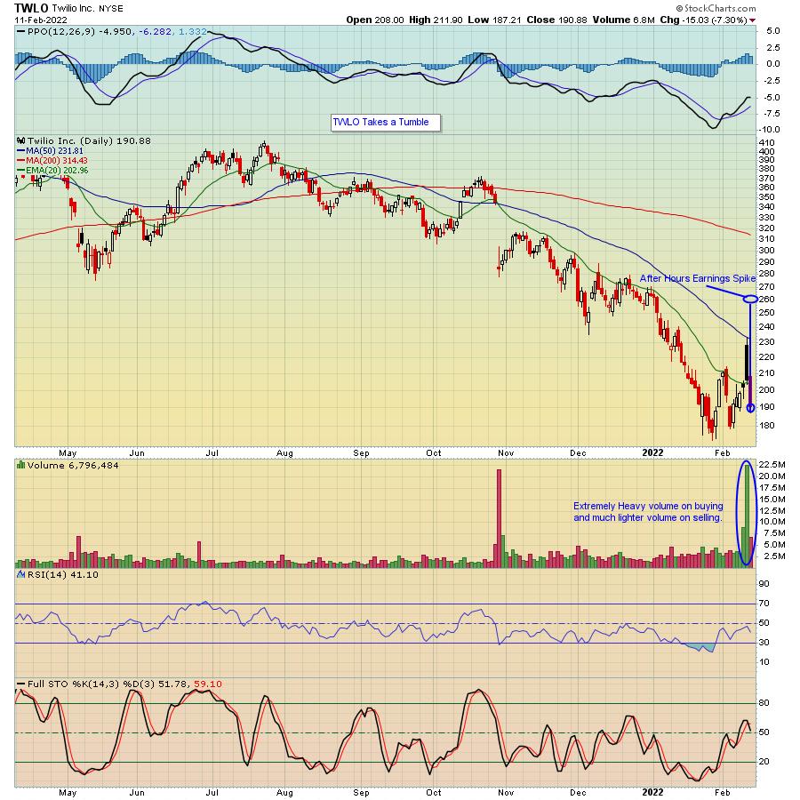
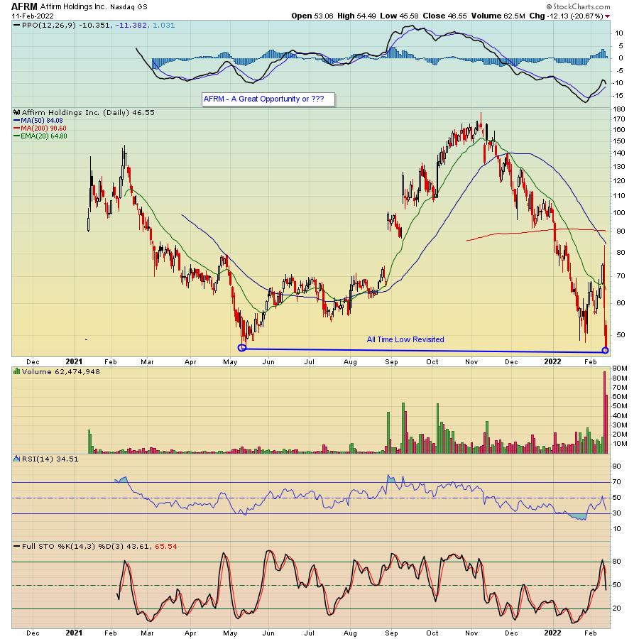
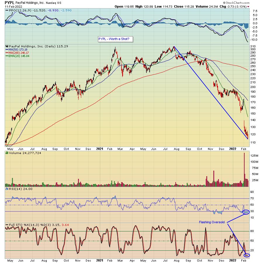
So what's one to do on a day like we had on Friday? One option is to just step to the sidelines and wait things out. Probably not a bad idea. Well, in my case, I went shopping! In fact, I saw myself shopping on the heavily discounted aisle, nibbling on some very beaten-down stocks including TWLO, AFRM and PYPL. Did I get them at rock bottom prices? I'm going to find out.
In the case of TWLO -- who released decent earnings last Wednesday -- the stock had a wild ride of its own, spiking as high as $260+ (after hours) after the earnings release (on what was seen as positive news) to a low of $187.21 on Friday. That $70+ turnaround caught my attention (even though the stock did take a technical hit), as did the huge green volume bar on Thursday compared to the much lighter red volume bar on Friday.

After I went to the TWLO aisle, I turned my attention to highly discounted AFRM aisle, with the stock going from a high of $176.65 three months earlier to a low of $45.58 on Friday after they had reported earnings and "only" guided 5% higher for 2022, apparently some kind of disappointment, enough to take it lower by 21% on Friday. It did manage to close very slightly above its all time low of $46.50, but not by much.

Finally, I moved into the PYPL aisle, where I saw the stock had been discounted a few hundred points from its July 26, 2021 high. Not only that, but both the RSI and Stochastics are showing the stock is very oversold, so I decided "I'll take some of that!"

Will I ultimately come out ahead on any of the three buys? Time will tell. And these are NOT recommendations for anyone else. But I do like the idea of getting involved with companies with bright futures that have gotten pummeled for any number of reasons. If I'm wrong, I won't feel as bad (especially in the pocketbook) as I might have felt had I bought any of them at their highs and rode them down to current levels. THAT would have been painful. And I won't let things get out of hand; I'll have reasonable stops in place in case I'm wrong.
In the meantime, this current bear market is going to create a lot of stress for a lot of traders. How bad might it get and what might we expect with this recent bout of selling? One way to find out is to join our Chief Market Strategist Tom Bowley when he conducts a VERY timely webinar this Saturday at 10:00am EST, "The Anatomy of a Cyclical Bear Market." To learn more about how you can participate at NO COST, just click here.
The wild rides we've seen in the market are likely to continue for a while; there's no telling how low the major indexes will go. But if you keep your wits about you, it's possible you will find opportunities that did not exist even a few months back. Be careful to protect your capital in case things go against you, but remember also that the majority of traders like to pile in when things look the brightest and go into a shell when things look their worst. Maybe trying to find something in-between isn't a bad idea.
At your service,
John Hopkins
EarningsBeats.com
|
| READ ONLINE → |
|
|
|
| MORE ARTICLES → |
|
 Chart 1
 Chart 2
 Chart 3


 I must sound like "Debbie Downer", given this is my second ChartWatchers article with "bear market" in the title. I am bearish right now, but had to remind myself of "Bear Market Rules" Thursday after getting a little too bullish on Wednesday.


 It's been a rough year for much of the market, but the Metals & Mining SPDR (XME) is bucking the selling pressure as it challenges its 2021 highs and the price relative breaks out. There is also a big bullish continuation pattern at work. Note that 40% of XME components are in the steel group and 14% in aluminum.