| THIS WEEK'S ARTICLES |
| John Murphy's Market Message |
| STOCK INDEXES BREAK JANUARY LOWS |
| by John Murphy |
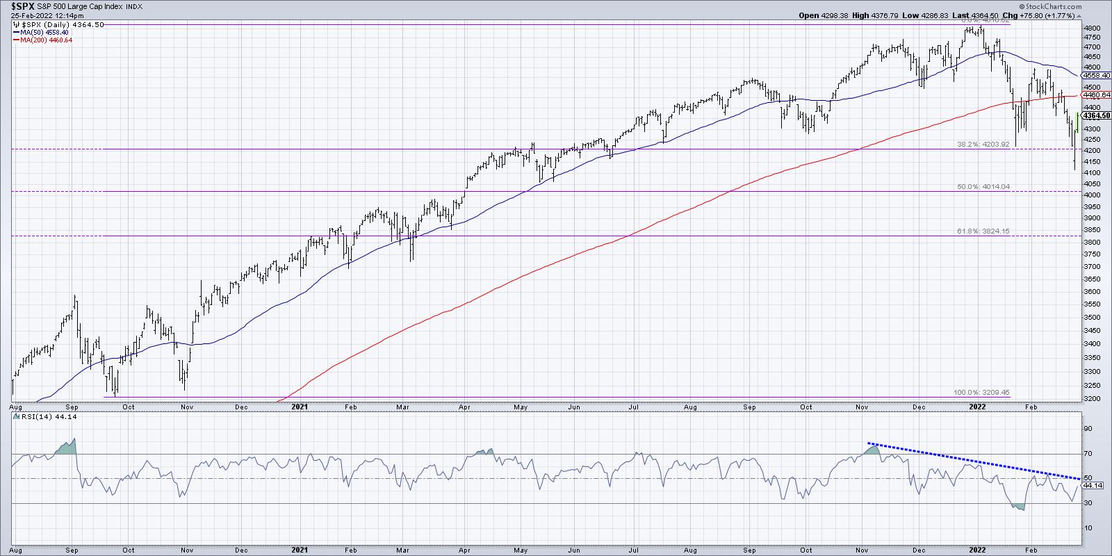
STOCK INDEXES REACH NEW LOWS ON RUSSIAN INVASION... News of a full-scale Russian invasion of Ukraine is pushing global stocks sharply lower and pushing money into traditional safe havens like gold, oil, and bonds. The price of West Texas crude oil spiked to $100 this morning while gold prices also spiked higher. Gold has now reached the highest level since 2020. Agricultural prices are trading sharply higher. Some money is also flowing into Treasury bonds which are bouncing. All eleven stock sectors are in the red. Over the past week, the strongest stock sectors have been defensive in nature which include energy, healthcare, utilities, real estate, and consumer staples. Weakest sectors include consumer discretionary stocks, technology, financials, and industrials. Today's big stock drop has pushed major stocks indexes below their January lows. Chart 1 shows the Dow Industrials falling to the lowest level since last March. Charts 2 and 3 show the S&P 500 and Nasdaq 100 (QQQ) falling to the lowest level since last spring.
BACK TO THE 1970s?... Stagflation refers to a period of rising inflation coinciding with a slower global economy. Some of us are old enough to remember the stagflation of the 1970s which lasted for most of that decade. It was a good time for commodities which rose sharply, but not good for bonds and stocks. A lot of the current trends resemble the start of that inflationary period. To complicate matters, the Fed is expected to start raising rates next month. It remains to be seen if the current situation in Ukraine causes the Fed to be less aggressive in raising rates. Even it it does, rising energy prices around the globe suggest that inflationary pressures will continue to rise which will make the Fed's job even harder. Rising rates risk hurting the stock market even further as well as the economy. That's the definition of stagflation.
 Chart 1 Chart 1
 Chart 2 Chart 2
 Chart 3 Chart 3
|
| READ ONLINE → |
|
|
|
| The Mindful Investor |
| Playing Price Swings and the Risks of Leverage |
| by David Keller |
"There is nothing more painfully bullish than a bear market rally."
- Dave Keller, The Final Bar, February 24, 2022
We've been tracking the signs of distribution since November of last year. As the S&P 500 made new highs into December and January, the underlying conditions of the market were changing. Breadth conditions started to deteriorate, with bearish divergences in the advance-decline lines. We also noted bearish momentum divergences as the S&P 500 was making new highs on lower RSI readings. We even discuss the Hindenburg Omen and why the confirmed signals in late 2021 suggested a painful start to 2022.
Now, the S&P 500 has reached its first downside Fibonacci target around 4200. That's the 38.2% retracement level based on the move from the September 2020 low and the January 2022 high.

When the S&P first reached the 4200 area in mid-January, we saw about a 9% bounce from intraday low to the next swing high in early February. On a closing basis, this was about a 6% upside move. Then, we continued the longer-term downtrend to reach 4200 again this week. In neither case did we actually close below 4200, which is an important data point to keep in mind!
While I believe the longer-term trend remains lower, and I remain convinced that the low is not yet in for this down move, I do recognize that short-term strength suggests upside potential before the next leg down.
So how do we play this sort of environment? Honestly, the answer to that question very much depends on your time frame. If you're a medium to long-term investor, as I am, then my Market Trend Model remains bearish, which indicates that we remain a risk-off environment until proven otherwise. That leads me to the latter half of this week as a countertrend move, a.k.a. a bear market rally. Bear market rallies tend to be super quick, super powerful and super seductive.
So how do we differentiate a bear market rally from a true market bottom? Four things come to mind...
- A higher low. A downtrend is a series of lower lows and lower highs. An uptrend is a series of higher highs and higher lows. How can we confirm a rotation from a bear market phase to a bull market phase on any time frame? You need a higher low.
- Improvement in breadth conditions. Breadth has been deteriorating, with the cumulative advance-decline line for the NYSE undercutting its low from 4th quarter 2021. The A-D lines turning higher would indicate that individual names are bouncing enough to confirm a new uptrend.
- Improvement in price momentum. The S&P saw its RSI slope steadily lower as it made new highs in December and January (see the S&P 500 chart above). That downtrend in momentum continued as the price move lower over the last six weeks. I would need to see the RSI break above trendline resistance, then continue above a level of 60, before I would believe any sort of significant uptrend is in place.
- Price break above resistance. As the market bounces higher, we now need to consider potential resistance levels. An uptrend with staying power needs to push above established resistance levels to confirm that buying power is enough to overwhelm any potential selling pressure. The 200-day moving average current sits around 4460, and the previous swing high is right at 4600. If and when the S&P breaks above 4600, you will hear my voice become much less cautious and much more "long and strong" as the all-time highs around 4800 would be much more attainable.
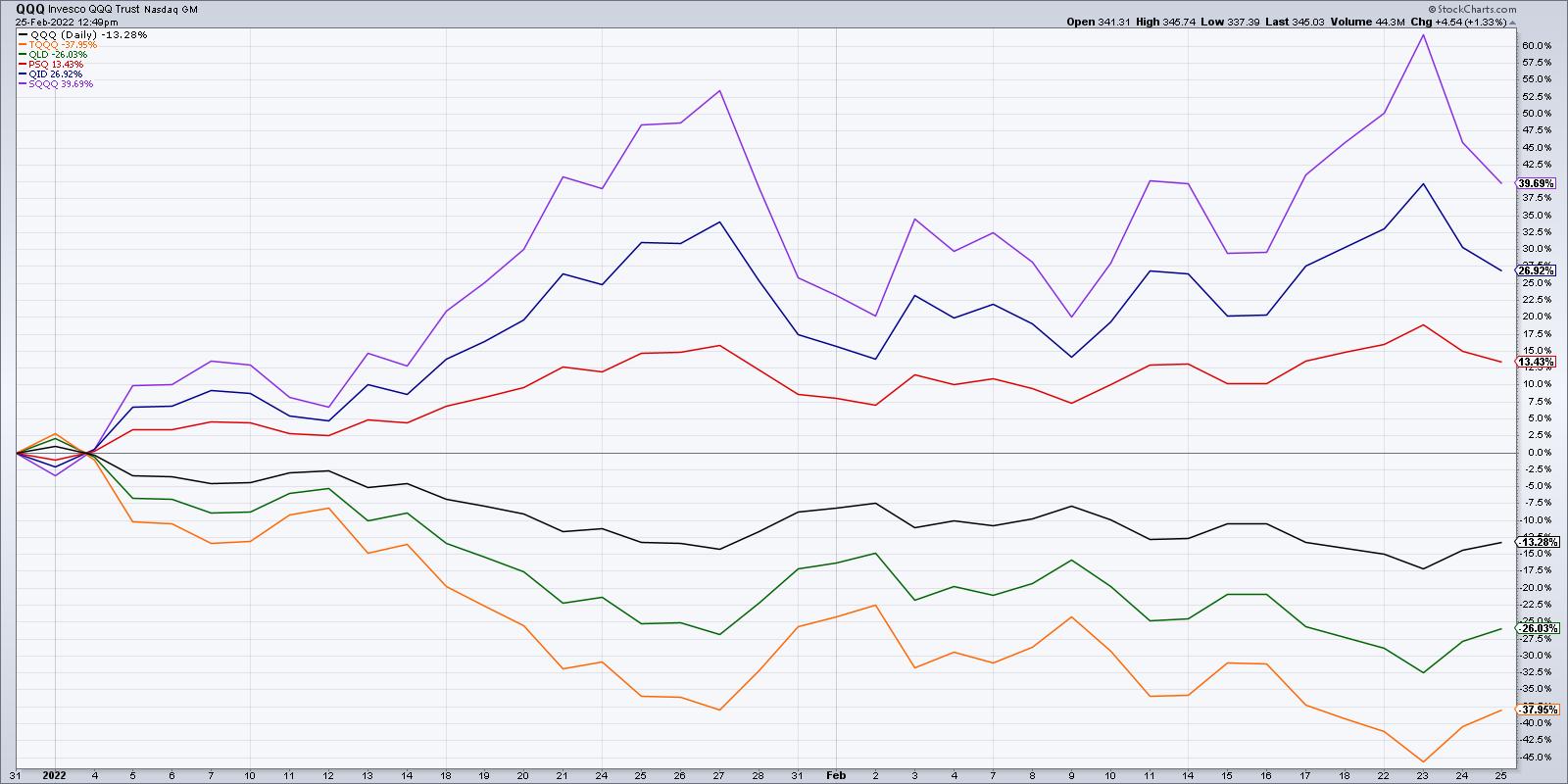
Now what about leveraged ETFs? When the market moves lower, I'm often asked about inverse ETFs and their cousins, the leveraged inverse ETFs. Do these vehicles make sense for short-term traders? Absolutely. Actually, that is for whom they were created! Inverse ETFs were designed to track the inverse daily returns of the underlying index. So if the QQQ is up 1% today, the PSQ will be down right around 1%. The leveraged forms simply track 2x or 3x of that daily return.
Here's a chart of the QQQ along with the 2x and 3x leveraged long ETFs, along with the inverse 1x, 2x and 3x leveraged ETFs.

Should they be used by long-term investors? Yes, if you understand the risks that are embedded in the structure of the individual products!
My latest YouTube video breaks down some of the risks involved and how long-term investors can use these inverse and leveraged products!
RR#6,
Dave
David Keller, CMT
Chief Market Strategist
StockCharts.com
Disclaimer: This blog is for educational purposes only and should not be construed as financial advice. The ideas and strategies should never be used without first assessing your own personal and financial situation, or without consulting a financial professional.
The author does not have a position in mentioned securities at the time of publication. Any opinions expressed herein are solely those of the author, and do not in any way represent the views or opinions of any other person or entity.
|
| READ ONLINE → |
|
|
|
| ChartWatchers |
| Breakouts Galore in This Suddenly Surging Industry |
| by Tom Bowley |
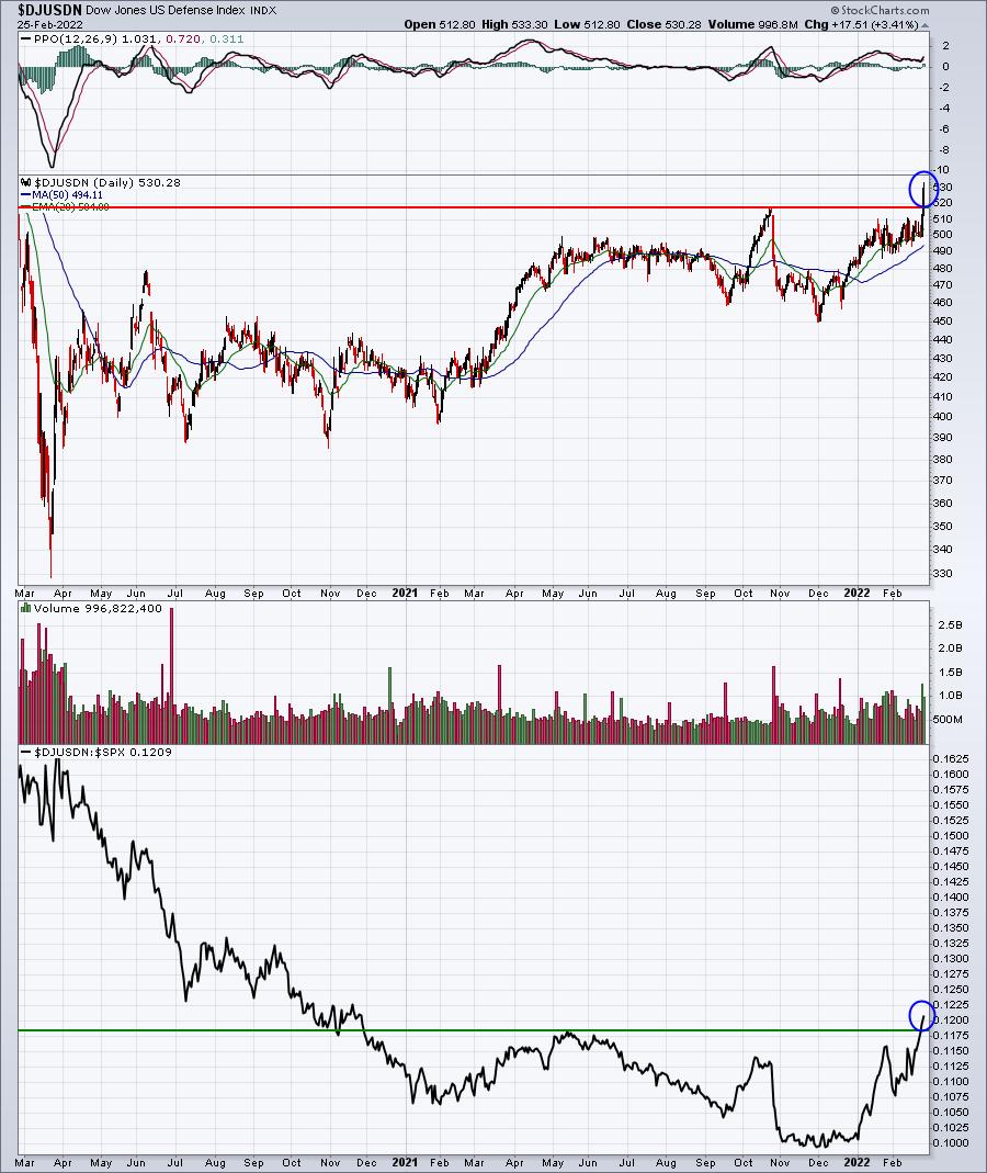
I'm a fan of relative strength and, even in a market that's been whipsawing back and forth, leaders emerge and you need to be vigilant in seeking them out. One such group hadn't shown relative strength in many months, but that changed in 2022 as we're now seeing absolute and relative breakouts.
Welcome back, defense industry!
Here's a 2-year daily chart that shows the group finally breaking out on an absolute basis above the October 2022 high. It's also moved to a 15-month relative high. Check this out:

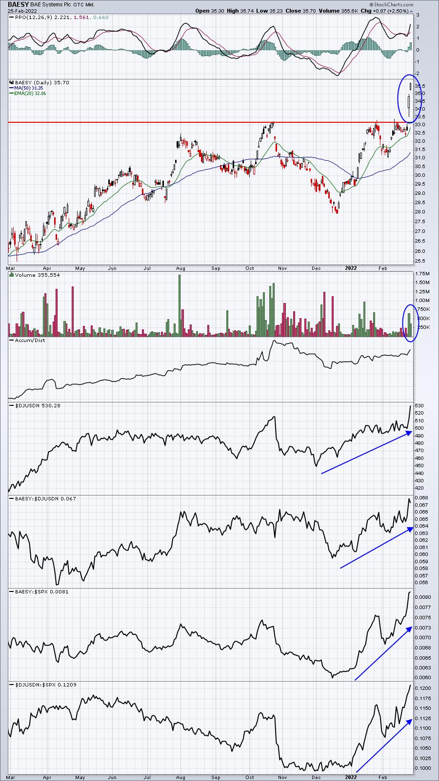
There are some big winners in the industry right now. Here are 3 really nice breakouts this week:
BAESY:

This chart looks superb, but volume on the stock can be really light sometimes. Therefore, I'd prefer the next two.
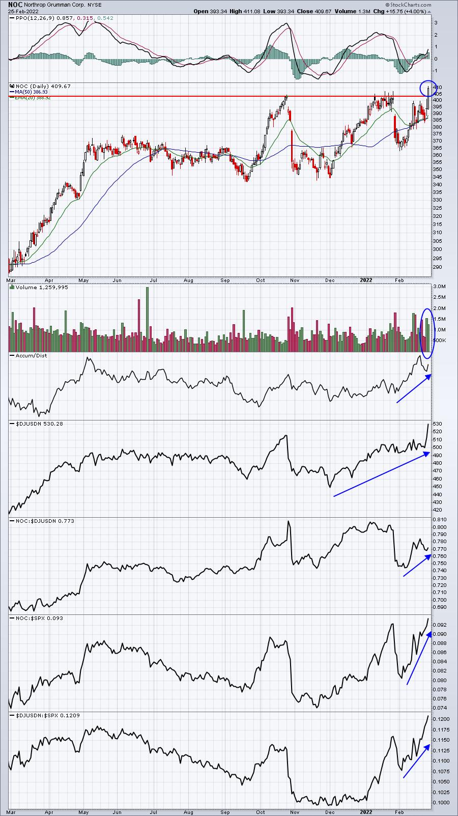
NOC:

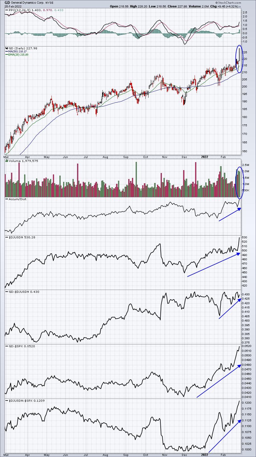
GD:

All 3 of these charts look solid to me. I expect that we'll see higher prices. When we put together our portfolios at EarningsBeats.com a few days ago, we featured one defense stock which, I believe, is better than the 3 above. In addition to breaking out on heavy volume like the other 3, this particular defense stock sports a 2.88% dividend yield and has raised its dividend every year for the last two decades. I'm featuring this defense stock on Monday in our EB Digest newsletter, which is completely FREE. There is no credit card required and you may unsubscribe at any time.
CLICK HERE to register with your name and email address and we'll get you set up to receive Monday's stock.
Happy trading!
Tom
|
| READ ONLINE → |
|
|
|
| Martin Pring's Market Roundup |
| Major Top or Double Bottom? |
| by Martin Pring |
In a recent late January article, I pointed out that many market averages had fallen to key support levels at a time when a lot of them were experiencing selling climaxes. This kind of condition is usually followed by a rally or basing period, but I also noted that other indexes, including the World Stock ETF, Wilshire 5000 and Russell Small Cap ETF, had already broken to the downside. My conclusion was that "while a relief rally may well develop, now is not the time to be playing hero. Better to take risks at higher levels when the dust has settled."
On Monday, many of those indexes returned to those late January lows. This time, volume is lower, which throws out the possibility that small double bottom formations are being formed. In order to be valid, of course, we would need to see a break above the February retracement high, but the possibility is there.
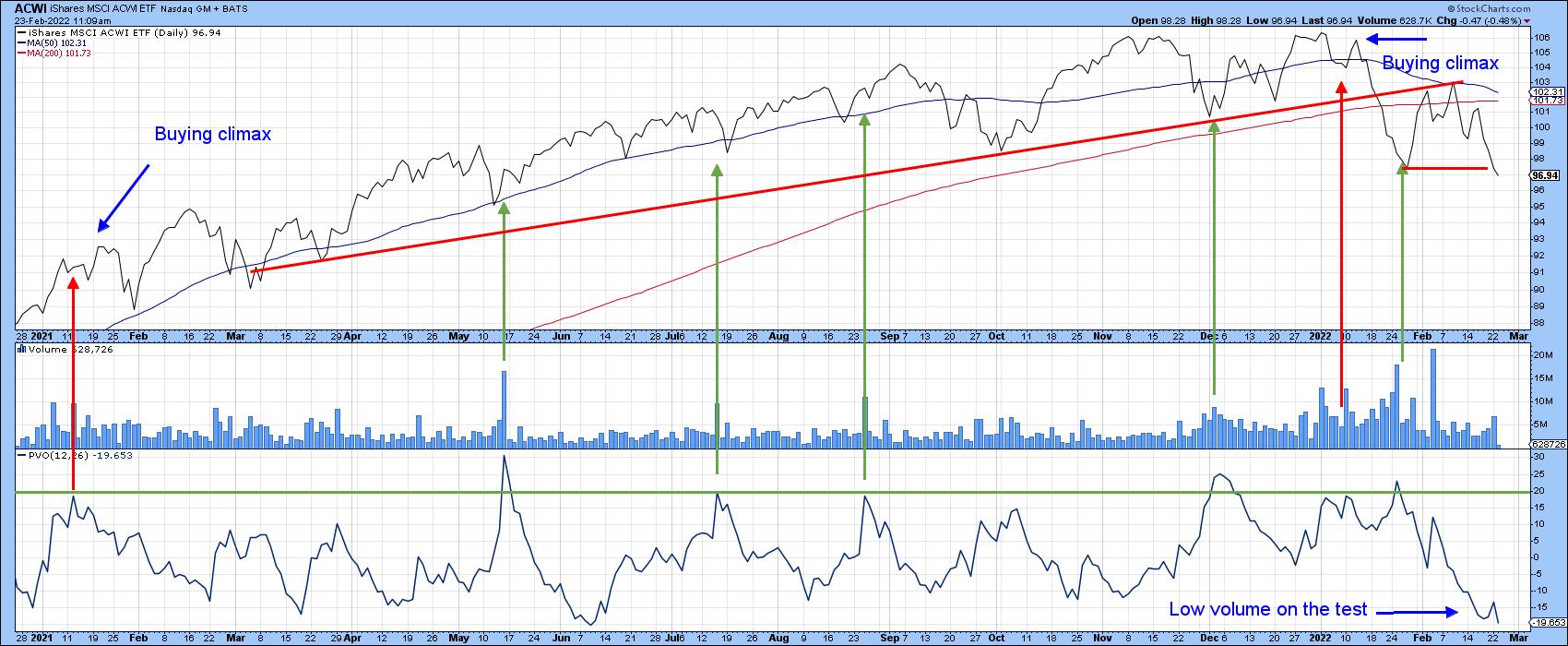
Chart 1 shows an example using the World Stock ETF (ACWI). The elevated volume bars and PVO indicate the characteristics of a selling climax at the end of January. The low current reading in the PVO shows that the February test is being accompanied by far less activity. A rally above the February retracement high would complete a double bottom formation.
 Chart 1 Chart 1
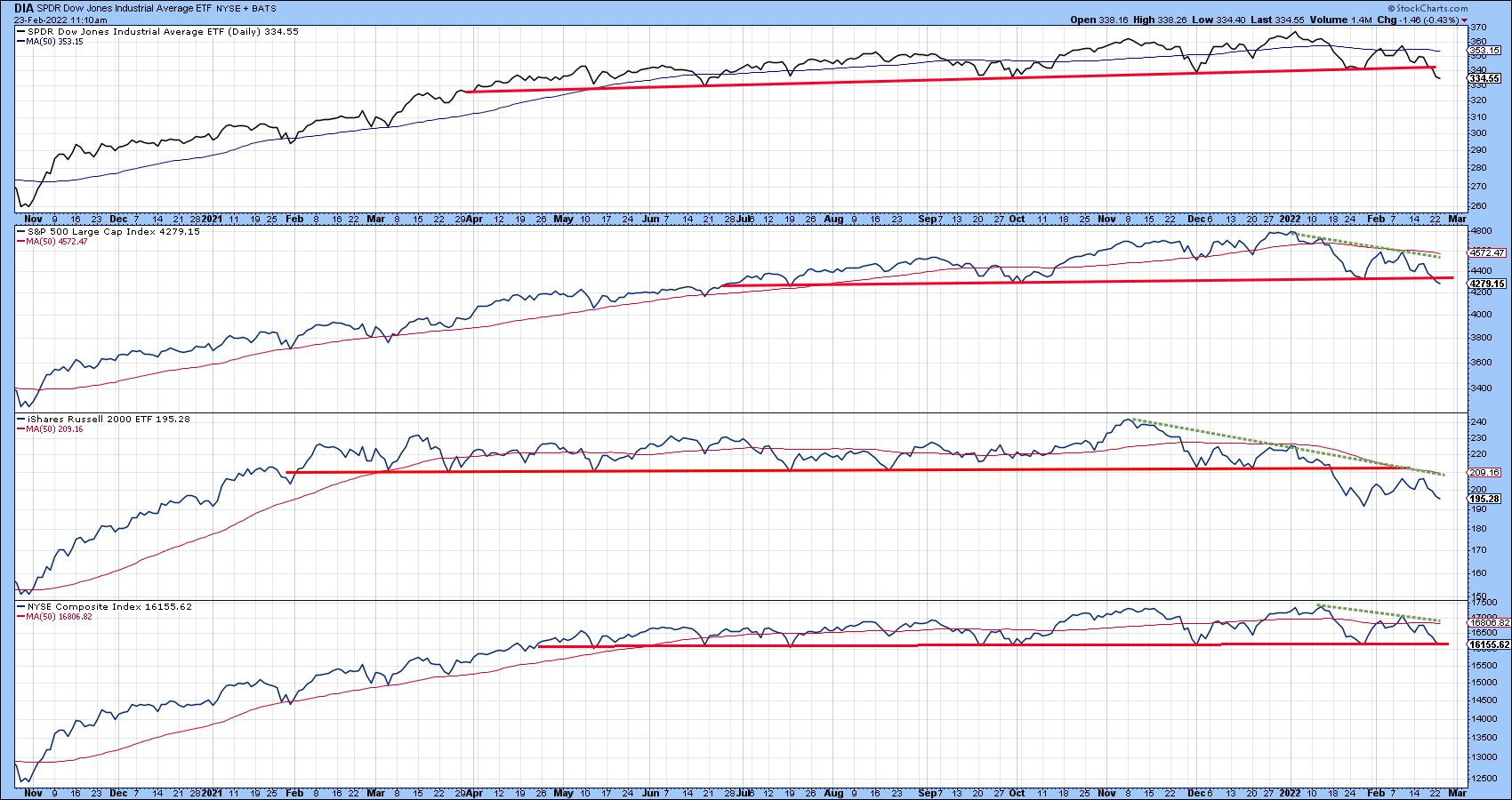
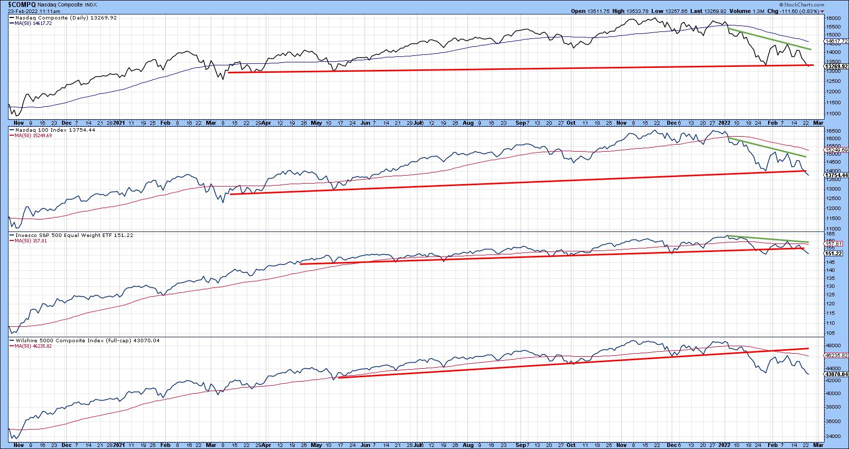
Charts 2 and 3 show that the stakes are pretty high going forward, as all the market averages are at or have begun to edge bellow key support trendlines that could mark the bases of numerous major top formations. Those that are have already completed a top are currently testing their late January bottoms. The red lines have literally been drawn. Does the double bottom scenario pan out, or is the topping-out process more likely to prevail?
 Chart 2 Chart 2
 Chart 3 Chart 3
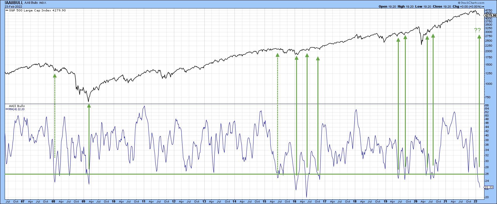
One convincing sign for the double bottom possibility comes from the AAII weekly poll of bullish investors, which has sunk to a level below the green horizontal line in Chart 4. The solid green arrows show that upside reversals from at or below this number have usually marked important buying opportunities as the crowd turns bearish on the market. Two exceptions, in 2008 and 2015, warn us that this is not a perfect approach. It is perhaps no coincidence that both signals were triggered in the early stages of a bear market in the 2008 instance, or a mini-bear in the 2015 example.
 Chart 4 Chart 4
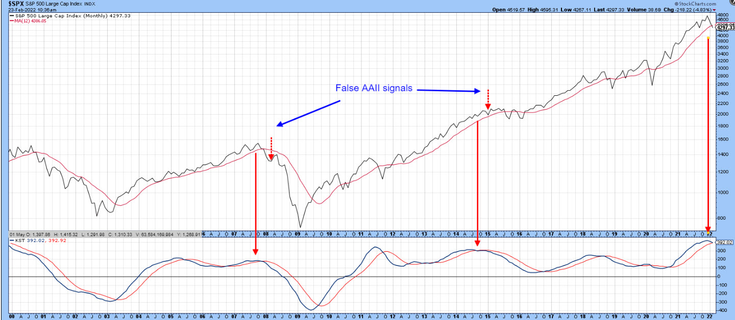
Chart 5 puts the current picture in more of a historical perspective, where we can see that the long-term KST is rolling over. It looks as if the S&P has crossed below its 12-month MA, but we need to remember that its not quite the end of the month yet, so it's not yet an official plot. There are two reasons for featuring it. First, it shows that there is a good chance that US equities are in the early stages of some kind of bear market. Second, it illustrates that both of those failed AAII buy signals developed at a similar place in the cycle, i.e. just after a long-term KST peak.
 Chart 5 Chart 5
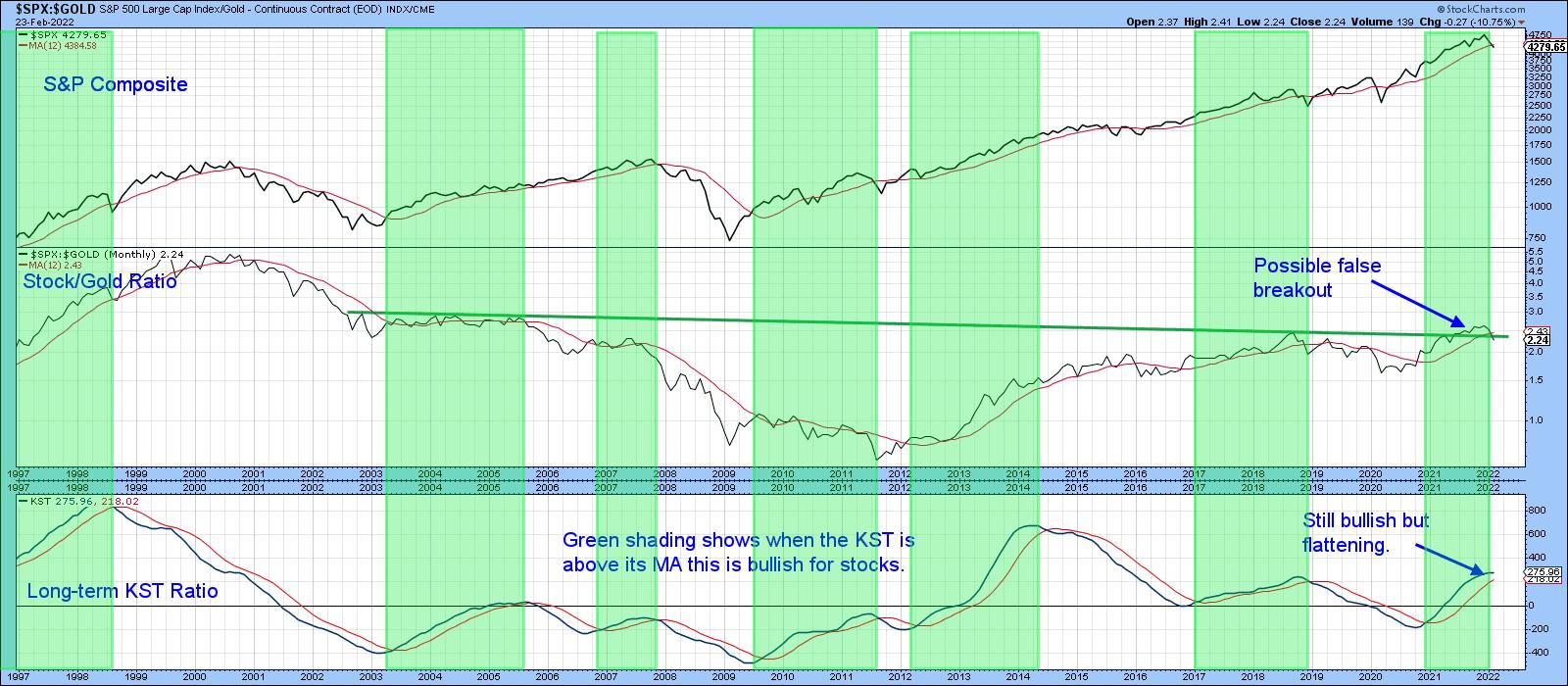
Finally, something else worth monitoring is the ratio between stocks and gold. Usually, when this relationship is in a rising mode favoring stocks, equities rally in their own right, as it means traders are downplaying the safe haven benefits of holding gold. The green shadings in Chart 6, which flag periods when the KST for the ratio is in a rising trend, testify to that. In mid-2021, this relationship broke to the upside, but has since dropped below its breakout trendline and 12-month MA. The KST is still bullish, but may not remain that way for long should the breakout turn out to be a whipsaw.
 Chart 6 Chart 6
The unshaded areas on the chart tell us when the KST is declining. These periods are not necessarily bearish for stocks, but, if they are going to experience trouble, these are the kind of conditions under which equities are most vulnerable. Once again, those latest plots are not yet official because the end-of-month data is not available. Please remember you can always update this chart later by simply clicking on it.
Good luck and good charting,
Martin J. Pring
The views expressed in this article are those of the author and do not necessarily reflect the position or opinion of Pring Turner Capital Group of Walnut Creek or its affiliates.
|
| READ ONLINE → |
|
|
|
| ChartWatchers |
| Waking Up in Europe on Thursday Morning |
| by Julius de Kempenaer |

What a surreal experience it was waking up on Thursday morning. Switching on the news and seeing that Russia has actually invaded Ukraine. For us Europeans, wars since WWII have always been fought far away from home in Afghanistan, former Yugoslavia, Iraq, Iran, Kuwait, etc. But this is literally in our backyard on the Eastern border of Europe.
And although Ukraine is not a member of NATO, it's damn close...
US Stocks Are Weakening vs Rest Of The World
In last week's episode of Sector Spotlight, I already had taken a quick look at foreign markets, mainly to see if there were/are any alternatives to the US market, which was and still is in a corrective pattern.
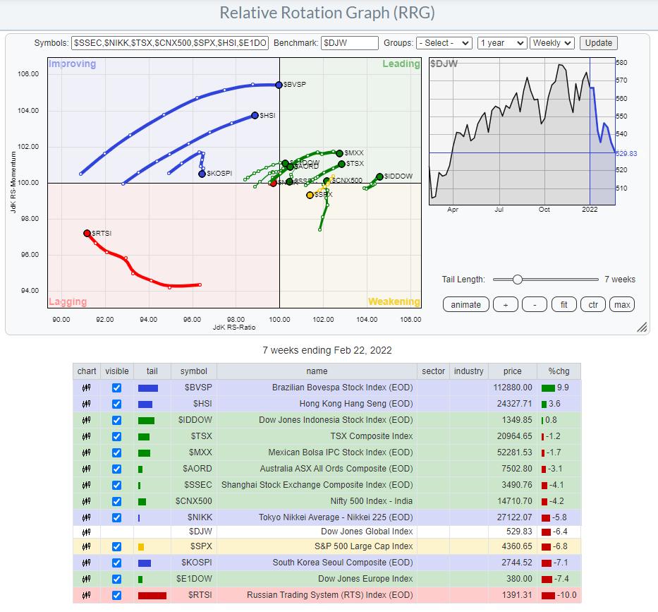
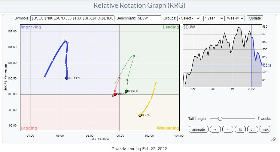
When we start by looking at the rotation of SPY vs the Dow Jones Global Index ($DJW), we find its tail inside the weakening quadrant and heading lower on both axes, resulting in a negative RRG-Heading.

The only other markets that have tails at a negative RRG-Heading are Korea ($KOSPI), Japan ($NIKK), and China ($SSEC). Looking at the world from a bigger perspective, these are the markets that are currently better avoided, as they are exhibiting negative relative trends.

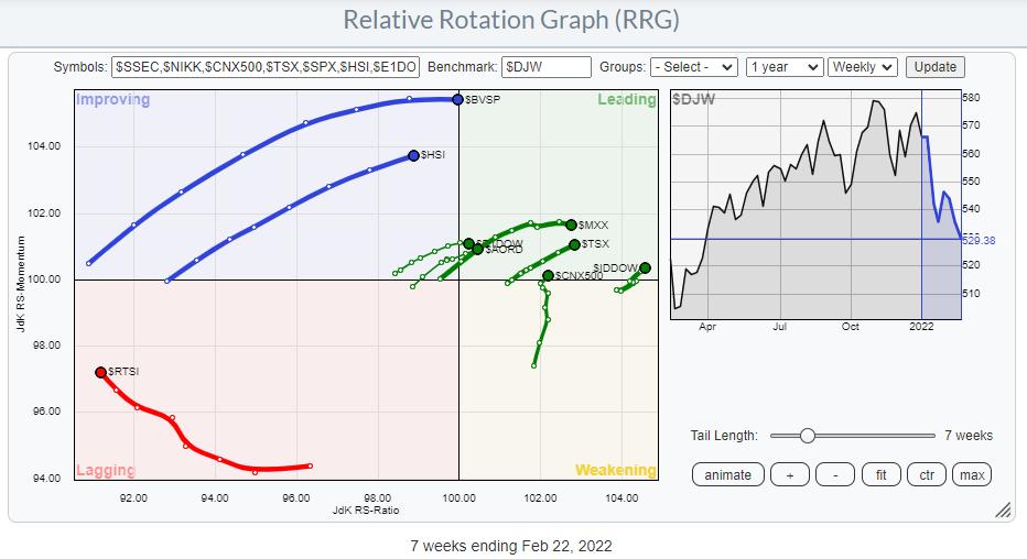
All other tails in this universe are showing tails at a positive RRG-Heading, except for Russia ($RTSI) inside the lagging quadrant.

War is Damaging Russian Stock Market
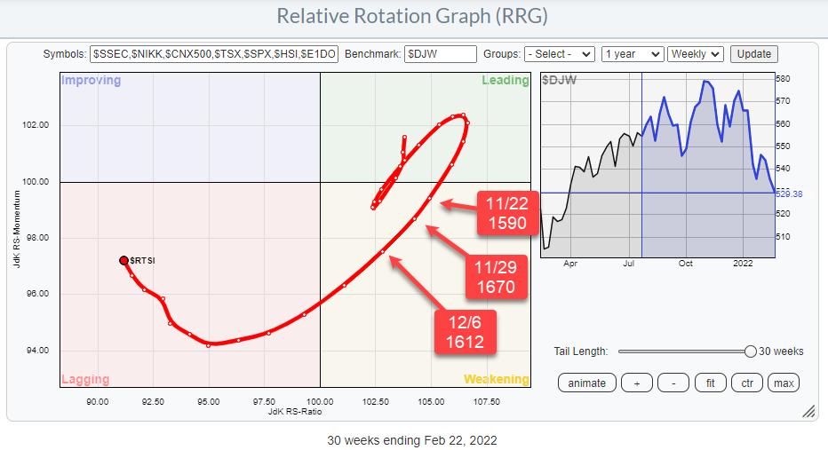
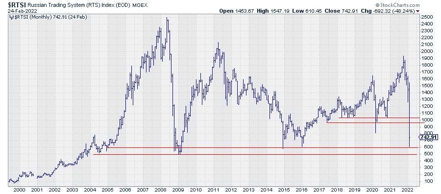
Isolating the tail for Russia shows the deterioration starting in the last weeks of November and picking up speed at the start of November, subsequently rapidly pushing into the lagging quadrant. Over the last few weeks, the Russian tail has crept up on the RS-Momentum scale while still losing relative strength vs. the rest of the world.
Given the very low reading on the JdK RS-Ratio scale, the distance from the center, and the disconnect from other markets, it is very unlikely that this rotation will be the start of a long-lasting improving rotation. A more likely scenario will be a rotation on the left-hand side of the RRG, underscoring the weakness of the $RTSI.

The monthly chart of the $RTSI index shows how much damage was done to the chart this month so far. What strikes me is that the low of the month so far is pretty much exactly at the lows of 2014 and 2016 and close to, or in the area of, the bottoms in 2008/9 and 2004/5. It remains astonishing, imho, how markets seek and are attracted back to levels that were set many years ago.
We are already seeing some big bounces but, given the magnitude of the decline, these are still very limited. I'm afraid this market will need a lot of time to digest all this selling pressure. Enough reason, among others, to pass on investments in Russia for the time being.
Alternatives?
Of course, especially for retail investors, cash is an alternative. But if you would like to keep some allocation to stocks, it is a good idea to broaden your horizon outside the US.
The third RRG above, showing the tails that are traveling at a positive RRG-Heading, provides you with possibilities that are worth a further investigation. Going over their individual charts, I found two markets that may offer an alternative to the US.
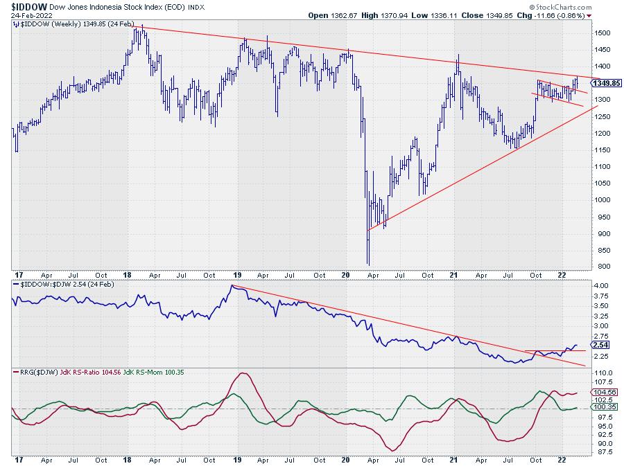
Indonesia

On the Relative Rotation Graph, $IDDOW has the highest reading on the RS-Ratio scale and has just returned into the leading quadrant after a rotation through weakening. This makes it an interesting tail to look at. Bringing up the price chart for the Indonesian stock market shows that $IDDOW has just broken from a short consolidation pattern and is now pushing against falling resistance, which is running over the major highs of the last four years.
The RS-line has already taken out its overhead resistance level after breaking its falling resistance back in October of last year. This puts Indonesia at the forefront of international stock markets; a break above resistance in the price chart will very likely add more fuel to the (relative) rally.
Canada

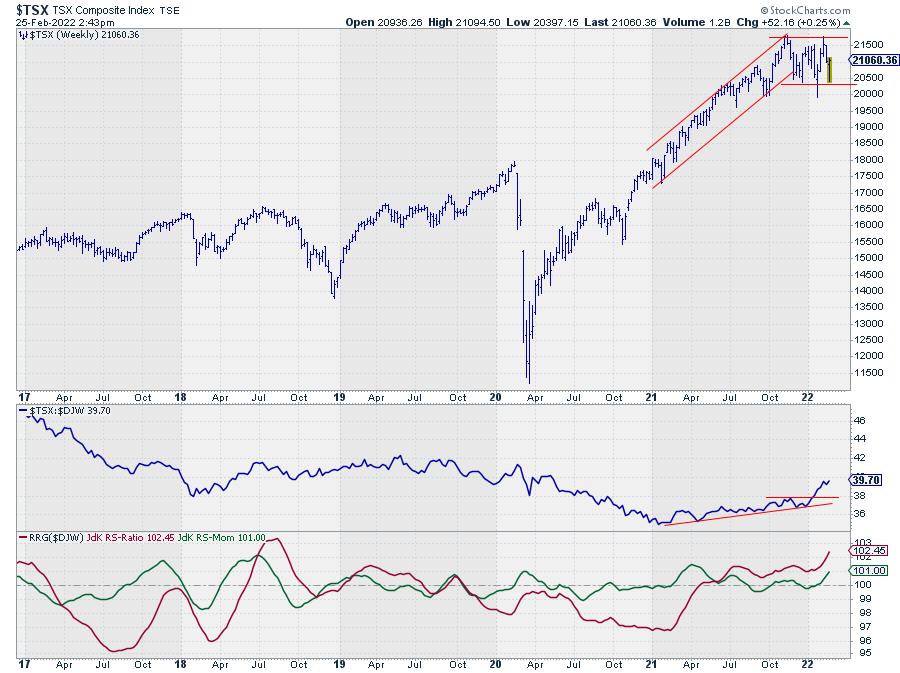
In line with other international stock markets, the Canadian TSX index started to move more or less sideways at the end of last year. But it did not complete a topping formation. Not yet, that is, as a break below horizontal support near 20000 would damage the picture in terms of price.
Like $IDDOW, $TSX has also completed a rotation through weakening, re-entering the leading quadrant six weeks ago. Especially with the increasing RRG-Velocity, this is an interesting tail/market to watch, as it seems poised to push higher on a relative basis. The current strength of commodities, especially energy-related, will be a good push in the back for this index.
Stock markets, in general, remain vulnerable. Indonesia and Canada may offer (relative) alternatives. As a US-based investor, the iShares MSCI Indonesia ETF (EIDO) and the iShares MSCI Canada (EWC), both quoted in USD, are instruments that can be used to create exposure to these markets.
Please remember that they are quoted in USD, so the currency exchange rate between the Indonesian rupiah and the US dollar, as well as the Canadian dollar vs. the US dollar, will affect performance. With the current strength of the USD vs. most other world currencies, this may actually be an additional source of performance.
Have a great weekend and #StaySafe, --Julius
My regular blog is the RRG Charts blog. If you would like to receive a notification when a new article is published there, "Subscribe" with your email address.
|
| READ ONLINE → |
|
|
|
| ChartWatchers |
| How to Take Advantage of Expected Shortages Amidst Russia-Ukraine Crisis |
| by Mary Ellen McGonagle |
Russia's invasion of Ukraine is expected to create a sudden shortage of key products in the U.S. that, in turn, will aggravate already high inflation rates. A hard-pressed Federal Reserve will now have to prevent consumer prices from rising out of control while lowering their rate hikes in the face of geopolitical turmoil. The risk of disruption to a U.S. economic recovery that's already been hampered by new variants of COVID-19 is real.
There may be a silver lining for investors in several areas, however, as rising prices mean an increase in select underlying securities. While Russia accounts for only 0.1% of sales to companies in the S&P 500, the country controls big segments of the commodity markets which are already experiencing low inventories worldwide.
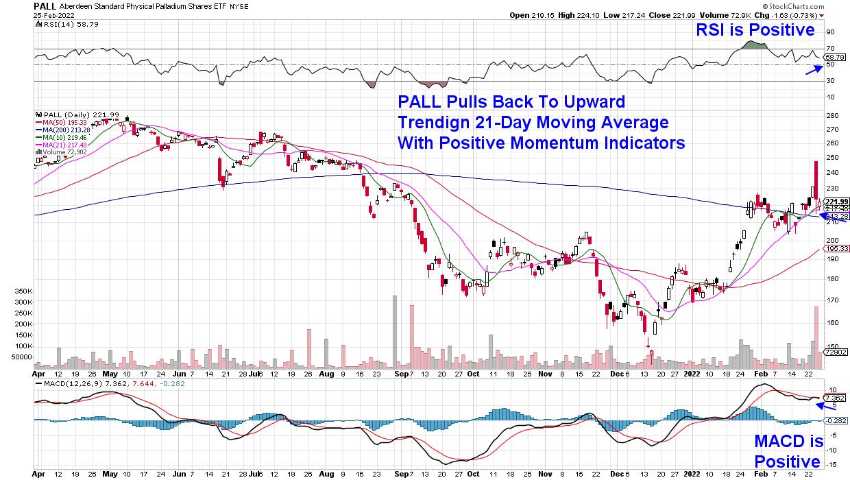
DAILY CHART OF PALLADIUM SHARES ETF (PALL)

To begin, the country dominates the market in the mining of platinum and palladium; both metals are used extensively in automobiles, as well as other industrial markets. One of the largest ETFs, PALL, is shown above; it has pulled back to its upward trending 21-day moving average with both its RSI and MACD in positive territory.
Platinum and palladium prices have rallied since the start of this year, and their steep rise in price would be expected to continue should the Ukraine situation get worse.
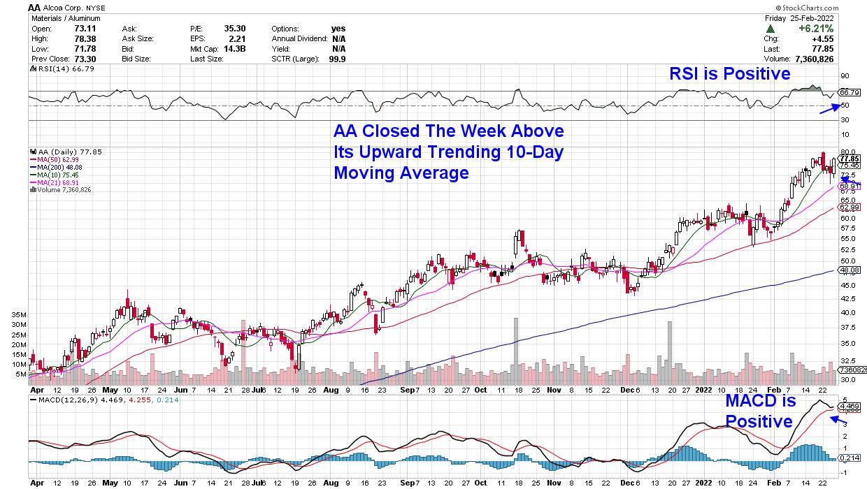
DAILY CHART OF ALCOA CORP. (AA)

Russia accounted for 6% of global aluminum and 5% of nickel supply in 2021 and, last week, aluminum prices hit an all-time high while nickel reached a decade-plus high. According to JPMorgan, inventories of these base metals are already extremely low, which leaves "very little additional cushion for further supply disruptions."
Alcoa (AA) produces and sells aluminum products globally, with their primary customers in the transportation, construction and packaging markets. The company reported Q4 results that were 23% above estimates, with management anticipating continued growth into the remainder of this year. AA is moving back into an overbought position and can be bought on a pullback.
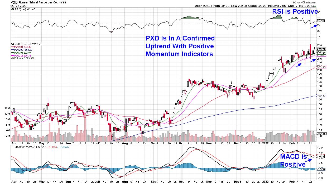
DAILY CHART OF PIONEER NATURAL RESOURCES CO. (PXD)

Russia is the third-largest producer of oil in the world, and any disruption to their production volumes will continue to impact already-high oil prices. Energy stocks, which had already been on the rise due to increased oil demand, remain in an uptrend.
Pioneer Natural Resources (PXD) produces oil and gas in the Midland Basin in West Texas and is among the fastest-growing companies based on their most recent quarterly earnings and sales results. PXD also offers a 2.5% yield and recently increased their share repurchase program due to high free cash flow and low debt.
The stock is among several Oil companies that were added to the Suggested Holdings List of my MEM Edge Report in January. I intend to add an additional Energy stock to this twice-weekly report on Sunday that you won't want to miss, as well as detailed analysis of the broader markets that will also be included.
It's been a turbulent period for the markets and you'll want expert guidance during these trying times. Use this link here to trial my MEM Edge Report for 4 weeks at a nominal fee.
On this week's edition of StockCharts TV's The MEM Edge, I review the broader markets following the sharp rally into the week's close. I also share hot spot areas and stocks being pushed into uptrends due to the conflict between Russia and Ukraine.
Warmly,
Mary Ellen McGonagle, MEM Investment Research
|
| READ ONLINE → |
|
|
|
| Dancing with the Trend |
| Noise is Deafening! |
| by Greg Morris |

With the media constantly blaming this down market on Ukraine, I thought this article would be timely.
Just in the course of a normal week, we are bombarded with information from sources such as the FED, television analysts, brokerage firm analysts, economists' projections, newspapers, junk mail, neighbors, war reporters, fake news, etc. Making investment decisions without a plan or methodology is truly a gamble. And to think that there are academic types who advocate that the markets are efficient, which means everyone has all the available information at the same time, and therefore cannot possibly get an advantage over anyone else is preposterous! Then when you add the "investors are rational" tag, it gets even worse. What I think is truly sad is that our educational system is tied to this drastically common and unchallenged line of thinking.
All of this is noise - period. Noise is the short-term interference that causes investors to deviate from a well thought out investment plan. Noise is difficult to ignore because at the time it seems so important. The emotional roller coaster of trying to utilize all this information can have a devastating affect on your wealth...and your health. Most investors would do well to read a weekly publication on Sunday afternoon. This would summarize the events of the entire week and then be a couple of days old upon reading.
Here are some of the problems with all this noise: Have you ever noticed how Wall Street and the elected officials try to "explain away" any negative information or market indicator? Eventually when there are mounting numbers of negative reports, it becomes almost comical. There are other types of noise that affect investor's perceptions about investing. These are the myths that proliferate on Wall Street and most of the financial community. I will go on record stating that all of these noise events cannot be found on a long-term chart of any market index (with the dates removed). Why is this? Free markets trend (ebb and flow) based upon the laws of supply and demand, which is the grand total of opinion of all who are actively participating in the market with real money. Remember this – it does not require the opinions of market analysts, television personalities, brokerage experts, or anyone similar to affect the thinking of others. See the problem? They are feeding you, if not creating, noise.
Some of the myths I was referring to that cannot be pointed out on a chart are as follows. Disasters – most people think disasters have lasting affects on the markets. Do you know that within five market trading days after 9/11, the market began an up move that rose over 20%? Other examples are Eisenhower's heart attack, the Kennedy assassination, major hurricanes (Gloria), war (other than when they close the exchanges), Oklahoma City bombing, on and on. So why do people think they have lasting affects on the markets? Simply because at the time it is a horrible event and you cannot imagine life afterwards. Most people extrapolate the short-term (noise) into the future. Sorry, that just does not play out in the long-term trends of a freely traded market.
Additionally, there is a strong belief that the stock market goes up over the long run. It does! Unfortunately, the insertion of your life and your period for accumulating wealth may not fall in sync with the good long-term up trends of the market. I consider that most have a wealth accumulation period from their 40s to the early 60s (about 20 years), realizing that everyone is different. I have a friend who became an institutional broker in the very early 1980s and retired in 2000. He readily admits he lived a charmed life and knows it was just luck that he was a broker during the last great bull market. Sadly, Wall Street wants you to think it is always a bull market.
All of the noise is difficult to ignore because at the time it seems so important. This is further support for a sound rules-based technical model that totally eliminates all of this noise and the associated emotions that it creates. As I already stated, most investors would be better off with professional money management – let someone else filter the noise. Of course, I'm talking about those money managers who use a defined process. Next time you get excited about some event or news item, think of it as raw meat thrown into a pool full of piranhas. The pool is calm, and then as soon as the meat hits the water, there is a flutter and splashing that lasts for just a few minutes; the meat is gone, and the pool is once again calm. Just a couple more thoughts! Remember, the biggest and most frequent sources of noise are the quarterly earnings reports. Finally, beware when you hear "it is different this time," as it probably is not.
Dance with the Trend,
Greg Morris
|
| READ ONLINE → |
|
|
|
| DecisionPoint |
| Six Bear Markets and Five Bull Markets In Under Three Years |
| by Carl Swenlin |
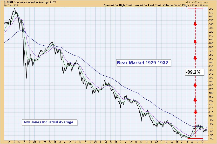
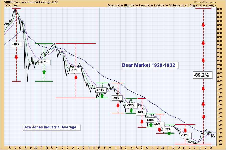
Periodically, to scare the kiddies we bring out the boogie man chart of the 1929-1932 Bear Market. It is a stunning picture upon which I have gazed many times. A decline of nearly ninety percent in just under three years. Recently,it occurred to me that there is much more going on in that picture than I have heretofore realized. Inside this monster secular bear market are a series of "cyclical" bear and bull markets. I've put parents around the word cyclical because this series of reversals was far from what we consider normal. A typical bull/bear market cycle is about four years -- 2.5 years for the bull and 1.5 years for the bear. At least, that's what I was told. All in all I can't say that reality fits that template most of the time. Certainly not of late.

If we define a bull or bear market as being a price move of over 20%, from the 1929 top to the 1932 bottom there were six bear markets and five bull markets. Just eyeballing the duration of each one, we have 10 that were five months or less, and one that lasted eight months. Then after the final bear market bottom, the Dow doubled in two months (not annotated). Talk about volatility.

The point of my showing this ancient history is that it is probably a way you haven't looked at it before. It also reminds me of the kind of volatility we have witnessed in the last few years. And with the hair-trigger trading systems that abound, we're likely to see a lot more of the same. How you are going operate in these conditions is something to think about.
-- Carl Swenlin

Technical Analysis is a windsock, not a crystal ball. --Carl Swenlin
(c) Copyright 2022 DecisionPoint.com
Helpful DecisionPoint Links:
DecisionPoint Alert Chart List
DecisionPoint Golden Cross/Silver Cross Index Chart List
DecisionPoint Sector Chart List
DecisionPoint Chart Gallery
Trend Models
Price Momentum Oscillator (PMO)
On Balance Volume
Swenlin Trading Oscillators (STO-B and STO-V)
ITBM and ITVM
SCTR Ranking
DecisionPoint is not a registered investment advisor. Investment and trading decisions are solely your responsibility. DecisionPoint newsletters, blogs or website materials should NOT be interpreted as a recommendation or solicitation to buy or sell any security or to take any specific action.
|
| READ ONLINE → |
|
|
|
| The Canadian Technician |
| The What's Working Religion |
| by Greg Schnell |
After a big rally on Thursday, the market is trying to hold and consolidate heading into the weekend. With volatility still high, I'm looking around for what to invest in.
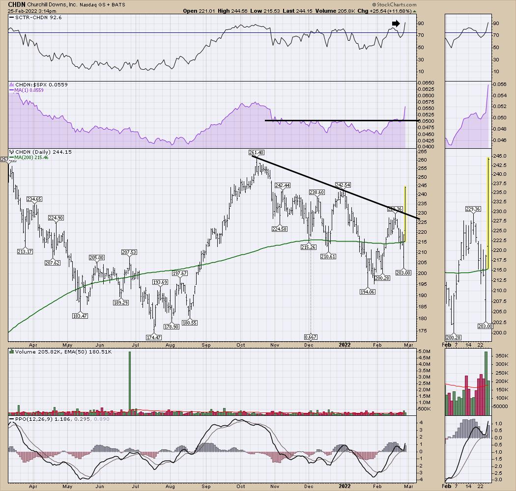
I noticed a couple of gaming names popping up. Churchill Downs (CHDN) had a huge day on Friday. A little consolidation would make for a nice entry as the stock breaks the October-to-February downtrend.

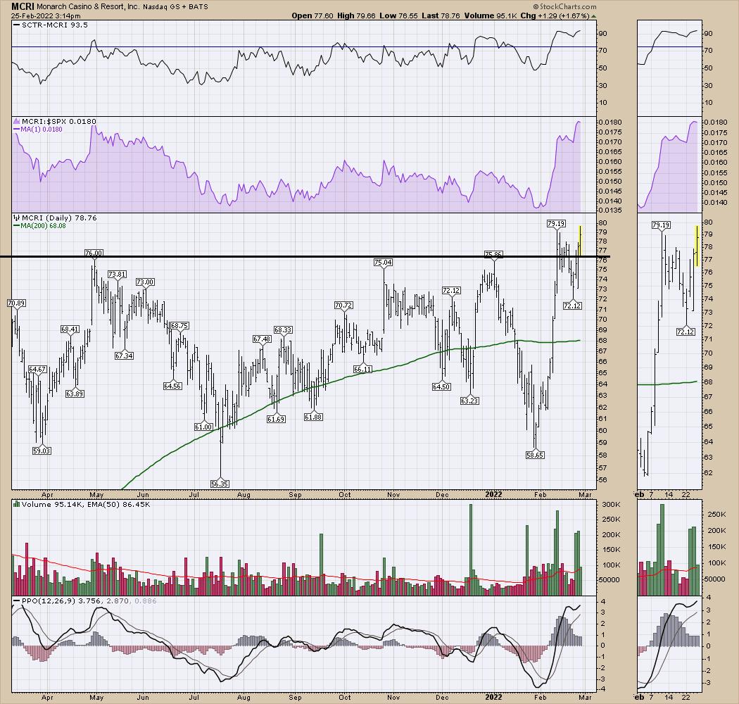
Monarch Casino & Resort (MCRI) looks like it is getting set to run after a breakout, pullback and a renewed push. The SCTR is at its highest on the chart. Lots of big green volume candles recently.

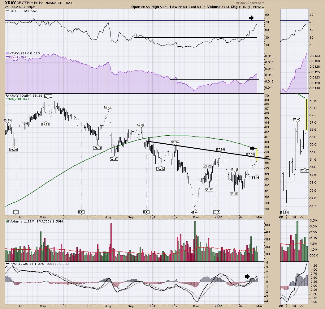
The healthcare supplier DENTSPLY (XRAY) appears to be breaking out of a basing pattern. The 200-DMA has a little resistance overhead, but the relative strength shown recently (see SCTR) suggests this may be more than just a filling.

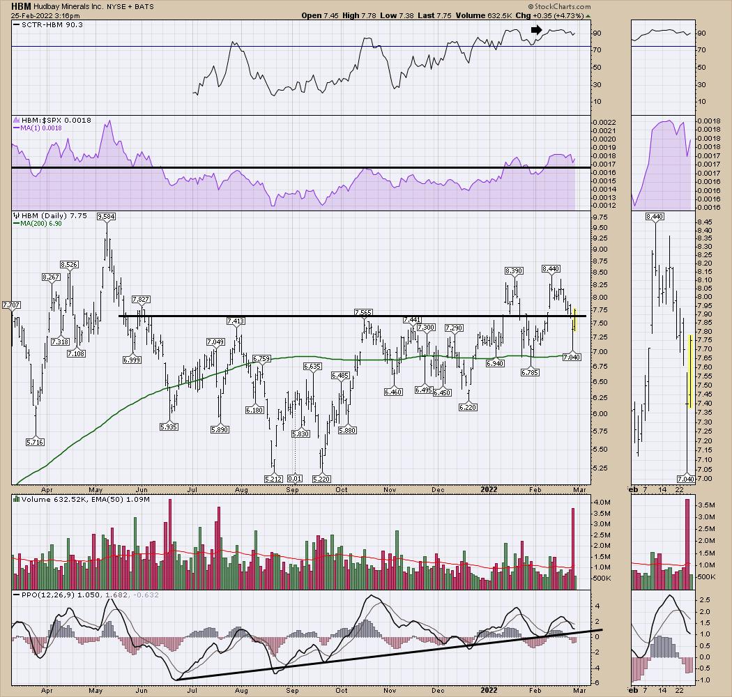
Two other nice charts are in the materials space, which I continue to love. The first is HudBay Minerals (HBM), which broke out in January and has been consolidating around the breakout level. The SCTR suggests it is one of the stronger charts out there. With Thursday's big volume selling candle, this looks pretty good bouncing off the 200-DMA. I want to keep my eye on the momentum uptrend on the PPO; I don't want that to get broken here.

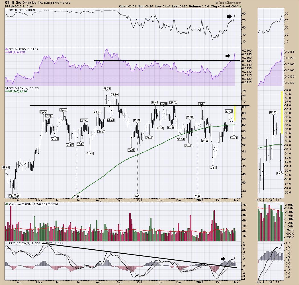
Lastly is Steel Dynamics (STLD). The chart looks set to break above resistance, as the SCTR shows it is one of the stronger charts out there. I like the change in trend on the PPO.

Should be a good weekend to snoop around and find nice setups.
Good trading,
Greg Schnell, CMT, MFTA
|
| READ ONLINE → |
|
|
|
| MORE ARTICLES → |
|
 Chart 1
 Chart 2
 Chart 3

