| THIS WEEK'S ARTICLES |
| ChartWatchers |
| Three Implications if Commodities Outperform Stocks |
| by Martin Pring |
Chart 1 shows that, starting in early 2020, stocks began to slowly but quietly underperform commodities. Since the start of this year, though, this trend has begun to really accelerate on the downside, i.e. moving in favor of commodities. The center window also shows that, when a lengthy trendline of this relationship has been violated, an extended move in the opposite direction typically follows.
The red trendline dating from 2011 was violated in early 2021 and has already had a negative effect on the ratio. However, bearing in mind the length of the penetrated line and the fact that the KST of the ratio has only just crossed below zero, it seems likely that the trend of superior commodity performance will extend much further. Our signal to the contrary would arise if the ratio can move above the dashed-green down trendline and 24-month MA. If not, what are the likely implications?
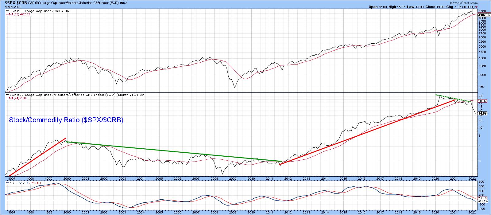 Chart 1 Chart 1
Possibility of a Secular Bear Market for Stocks
Chart 2 displays the ratio back to 1964, but, this time, compares it to the inflation-adjusted S&P Composite. When considering long periods of time, adjusting the equity index by consumer price inflation makes sense. After all, if your stock portfolio rises 10% and inflation is at, say, 12%, the portfolio is actually losing purchasing value. To me, that's a bearish state of affairs.
Using the benefit of hindsight to identify the actual peaks and troughs, the pink shadings flag the two secular bear markets that have developed in the last 60 years or so. Both largely occurred when the stock/commodity ratio was trading below its 41-month MA, although the ellipses indicate those relatively brief periods when it was not. By the same token, secular bull markets rarely, if ever, saw the ratio drop below its MA. If that happened, it was usually a one-month whipsaw. These misleading breaks have been flagged by the small-dashed arrows. It is also true to say that neither secular bull experienced as decisive a MA crossover as the one that has already taken place. The implication is that a secular bear may well be underway.
That said, it's important to note that this crossover represents just one piece of evidence. We need more. Also, the ratio did cross marginally below its MA at the end of January. However, the latest, more decisive, plot is only based on four trading days in March. In order to make it official, we need end-of-month data. I am really showing the chart to point out that this relationship is very close to triggering a major long-term signal, indicating the overall environment may have become more like 1965-1982 or 2000-2009, as opposed to 2009-2021. For stock market investors, inflation, as I emphasized in my 2022 outlook, will very much matter as the year unfolds.
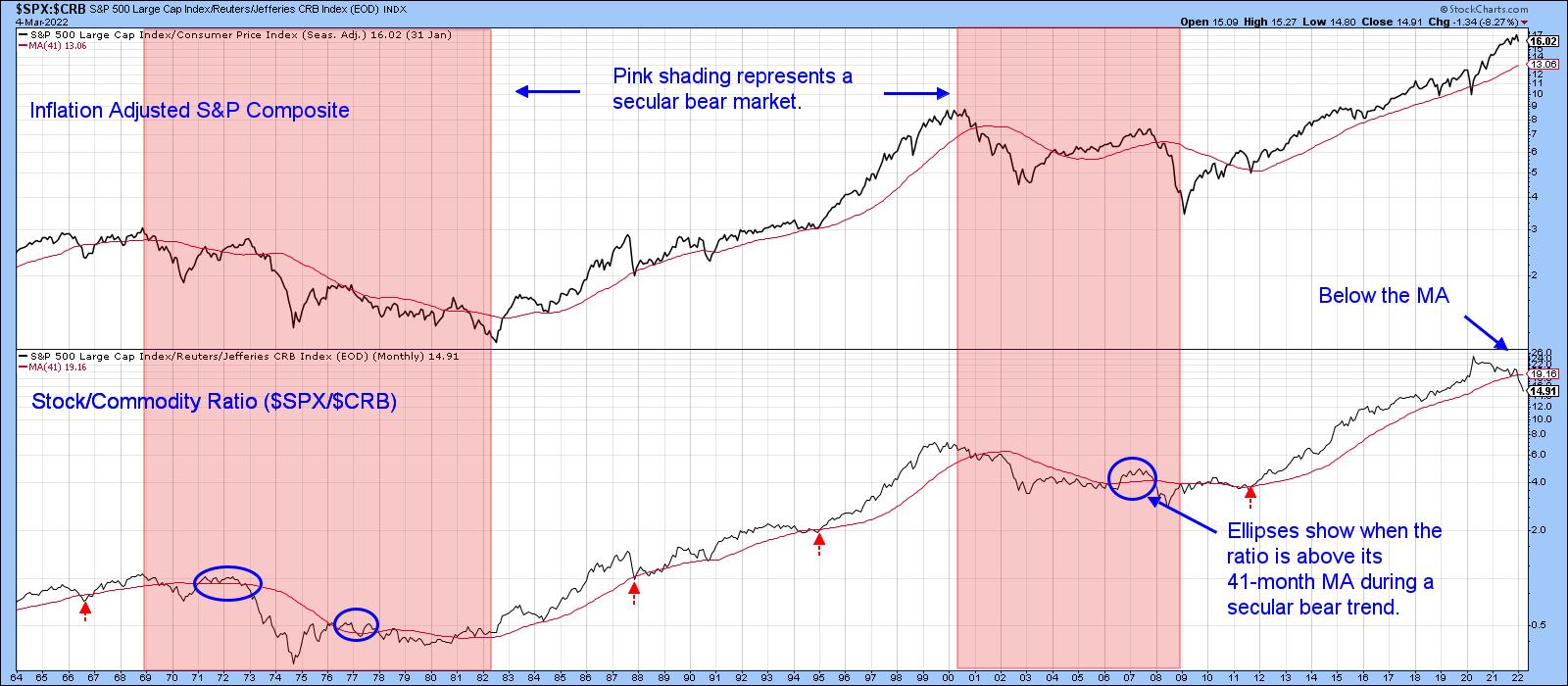 Chart 2 Chart 2
Inflation-Sensitive Stocks Likely to Outperform on a Long-Term Basis
My Inflation Index, which you can read about here, comprises several S&P industry groups that respond positively to inflationary conditions. For instance, mining and energy stocks. The Index is featured in Chart 3, alongside the Commodity/Stock ratio. Note that I have switched the components from the two previous charts in order to reflect inflationary (up) and deflationary (down) trends. There is a rough correlation between the two series, but, since the stocks included in the Inflation Index are subject to swings in the stock market, there are some occasional glaring differences between them. For example, the Index bottomed in early 2016, whereas the ratio hit its low point in early 2020.
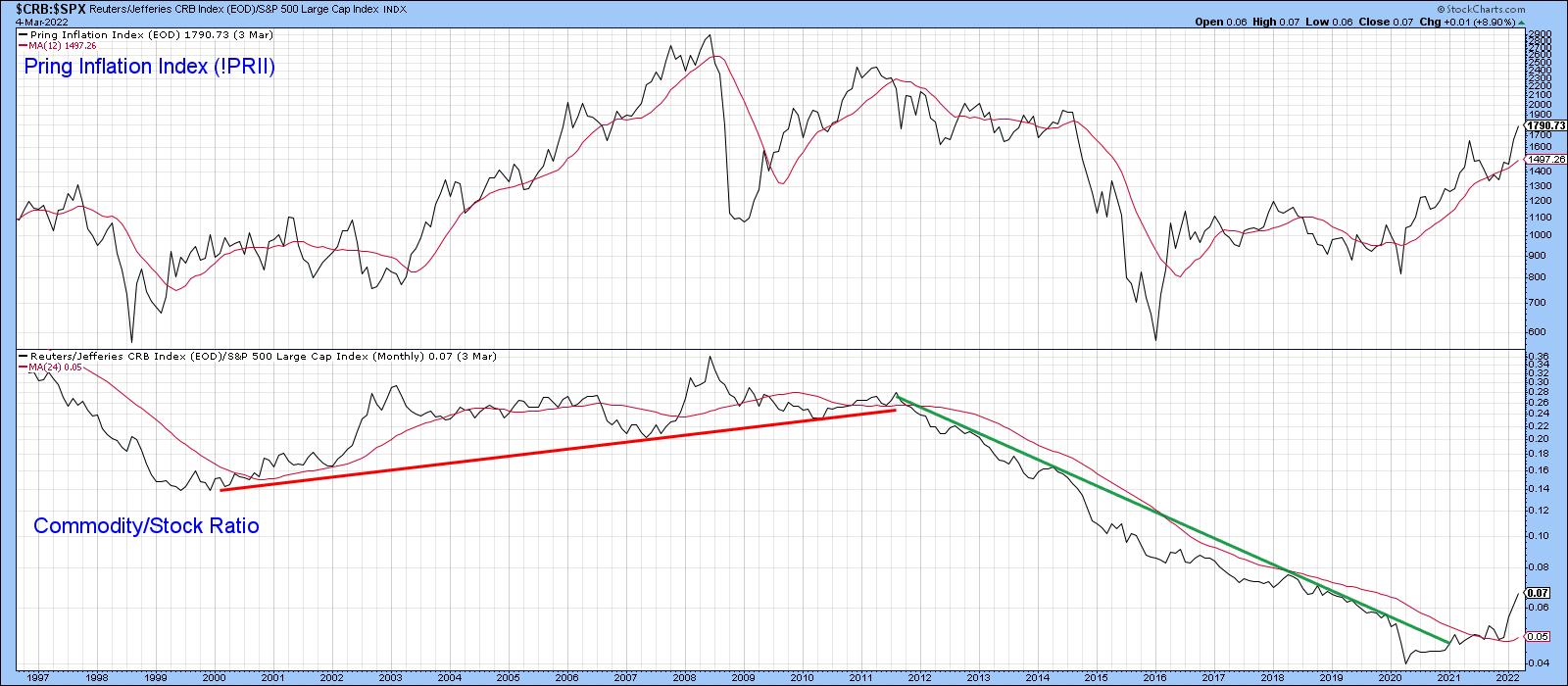 Chart 3 Chart 3
Fast forward to Chart 4, which compares the relative action of the Index to the S&P, and you can see that there is a much closer relationship. If I am right about the change in trend between the stock/commodity or commodity/stock relationship, then the implication would be for a long-term superior relative performance by these inflation-sensitive stocks.
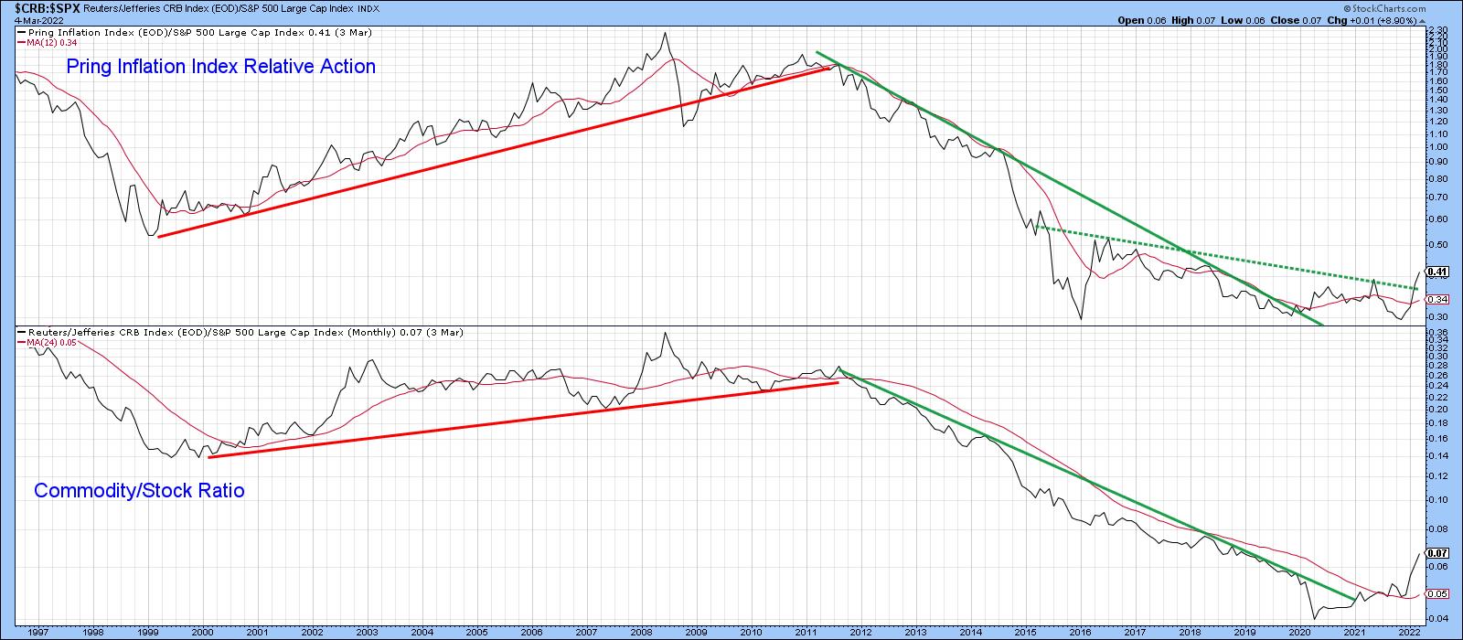 Chart 4 Chart 4
Higher Oil Prices are Likely Over the Long Term
There is no doubt that the oil price is overstretched on a short- and intermediate-term basis and, therefore, subject to an unexpected shakeout at any time. However, Chart 5 shows that it has broken out on both an absolute and relative basis against the S&P.
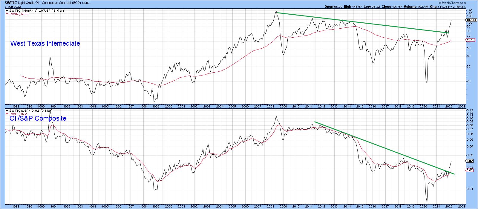 Chart 5 Chart 5
Finally, Chart 6 tells us in the second panel that oil is on the verge of breaking out in a relative sense against the CRB Composite. It's already tentatively above the 2013-2022 resistance trendline. Again, though, it's important to note that this is a monthly line chart; the official close will not be known until March 31.
 Chart 6 Chart 6
This article is an updated version of an article previously published on Wednesday, March 2nd at 6:19pm ET in the member-exclusive blog Martin Pring's Market Roundup.
Good luck and good charting,
Martin J. Pring
The views expressed in this article are those of the author and do not necessarily reflect the position or opinion of Pring Turner Capital Group of Walnut Creek or its affiliates.
|
| READ ONLINE → |
|
|
|
| John Murphy's Market Message |
| GLOBAL STOCKS REMAIN UNDER PRESSURE AS CRUDE OIL TESTS OVERHEAD RESISTANCE |
| by John Murphy |
WEST TEXAS CRUDE OIL REACHES 11-YEAR HIGH... The war in Ukraine continues to push oil prices sharply higher along with other commodities. That includes metals and agricultural products. Gold continues to gain ground as a traditional haven during times of rising inflation and increased global tensions. Some defensive money is also moving into the relative safety of Treasury bonds. That combination is keeping global stocks under pressure. The main focus, however, is on the rising price of energy. The monthly bars in Chart 1 show West Intermediate Crude Oil testing the previous highs set in 2013 and 2011 between $114 and $112. The WTIC is trading today near $111. Normally, it would be expected for the price of oil to stall near those previous highs. But things aren't normal right now. Even if oil were stall temporarily, expectations are for it to keep rising. That would of course increase global inflation pressures. Which will put even more pressure on global central bankers to start raising interest rates more aggressively to combat surging inflation. The war in Ukraine is also pushing grain prices sharply higher.
GRAIN PRICES REACH MULTI-YEAR HIGHS... We normally don't place as much importance on the direction of grain prices. But the recent surge to multi-year highs also holds bad news on the inflation front. The next four charts are plotted through Thursday. The monthly bars in Chart 2 show the price of corn rising to the highest level in ten years. While Chart 3 shows the price of wheat rising to the highest level since 2008. Chart 4 shows soybeans testing their highs reached during 2012. Those are big gains and carry bad news for food inflation. What's even more disturbing is that the current surge in commodity prices is broad-based.
COMMODITY RALLY IS BROAD-BASED...The monthly bars in Chart 5 show the S&P GSCI Commodity Index (plotted through Thursday) climbing to the highest level in 14 years. Rising commodity prices are usually a leading indicator of inflation which then flows into producer and consumer prices. Today's charts suggest that inflationary pressures are going to get a lot worse. And as one Fed official suggested this week, that inflation is likely to be with us for sometime.
 Chart 1 Chart 1
 Chart 2 Chart 2
 Chart 3 Chart 3
 Chart 4 Chart 4
 Chart 5 Chart 5
|
| READ ONLINE → |
|
|
|
| ChartWatchers |
| Silver Plays Catchup with the Other Commodities |
| by Arthur Hill |
 The pickings are rather slim in the market with just 61 of the 276 ETFs in the TrendInvestorPro Master List in uptrends. Unsurprisingly, most of the ETFs in uptrends are related to commodities (energy, metals, agriculture). Outside of commodities, we are seeing uptrends in ETFs related to consumer staples, utilities, aerospace-defense, agribusiness, infrastructure, steel and banks. The pickings are rather slim in the market with just 61 of the 276 ETFs in the TrendInvestorPro Master List in uptrends. Unsurprisingly, most of the ETFs in uptrends are related to commodities (energy, metals, agriculture). Outside of commodities, we are seeing uptrends in ETFs related to consumer staples, utilities, aerospace-defense, agribusiness, infrastructure, steel and banks.
The Silver ETF (SLV) is one of the commodity ETFs in an uptrend and its uptrend signal is rather recent (as of February 24th). In addition, the chart sports a large Double Bottom and the ETF is challenging resistance. The green zone shows two lows in the 20 area and the red zone marks resistance from the November high. A breakout, which is happening right now, would confirm the pattern and target a move to new highs.
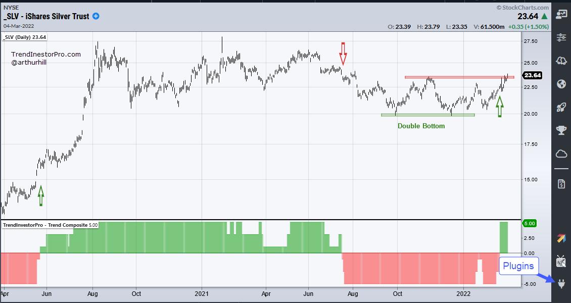
The bottom window shows the Trend Composite with three signals in the last two years (red/green arrows). Trend signals will never catch the exact bottom or top, but they can profit from the middle when a trend takes hold. The Trend Composite is now at +5, which means all five indicators are on bullish signals. You can learn about the Trend Composite here.
This week's Next Level Charting video (here) covered broad market conditions, the technical picture for SPY, QQQ and IJR, as well as some big breakouts in ETFs related to steel, aerospace-defense and agriculture.
TrendInvestorPro focuses on ETFs with uptrends and leading charts. Once the trend is in place, we monitor the charts for pullbacks and entry opportunities. Click here to learn more and gain immediate access.
The Trend Composite is one of 11 indicators in the TrendInvestorPro Indicator Edge Plugin for StockCharts ACP. Other indicators include the Momentum Composite and ATR Trailing Stop. Click here to learn more.
---------------------------------------------------
|
| READ ONLINE → |
|
|
|
| The Traders Journal |
| Sushi Investing, Part 3: A Final Chapter Of The Secrets To Selling |
| by Gatis Roze |
For those of you who've been investing for decades, you'll immediately grasp the significance and truth of Market Wizard Stanley Druckenmiller's quote: "Every great money manager I've ever met, all they want to talk about is their mistakes. There's a great humility there."
As this is the third and final blog in my series "Sushi Investing", about one's selling methodology, I feel the opening salvo once again should address the "Investor Self" (Chapter 3 in our book) upon which every profitable exit strategy must exist. As investors or traders, we must first be able to get our arms around this essential foundational tree. Once the Investor Self is mastered, the exit mechanics are relatively straightforward.
In Part 2 of "Sushi Investing", I offered a simple yet effective Three Peaks selling methodology. For those of you who did the suggested homework — applying the methodology to 50 charts — you likely discovered both how straightforward and clean this approach is and how surprisingly profitable as well. Remember that profits don't just magically appear in your account created but Market Gods. It's your defensive methodology that takes these profits as they present themselves — while simultaneously cutting off losers when the markets tell you so. A slow burn defense of tearing off the bandage slowly will only cause more financial pain. Don't trip over your own ego in your need to be right. You'll end up as collateral damage instead.
Okay - let's dive into the granular details of my own exit methodology. A few years ago in the Traders Journal, I produced a popular series of "Action Practice" investing exercises. I think it's appropriate here to invite you to look over those archives. To do so, just search The Traders Journal blog for "Action Practice". One of the blogs dealt with selling. I would also encourage readers to review another blog I wrote entitled "The Art of Selling Well: Part II" in which I describe in more detail the six basic elements of my own selling paradigm. Those elements are:
- Price Relative
- Trend
- Volume-based Signals
- Momentum
- Bearish Patterns
- Personal Money Management Rules
So let's move on to review the three stocks - Redfin Corp (RDFN), 1Life Healthcare (ONEM), and Pinterest Inc. (PINS) - and examine how the evidence accumulated to shift the probabilities towards a sell decision.
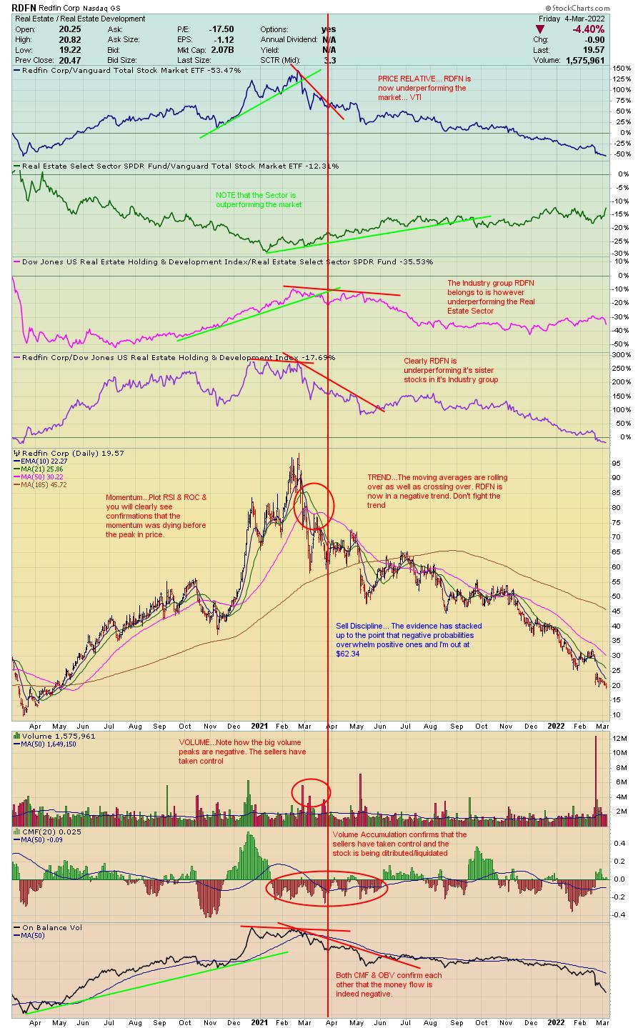
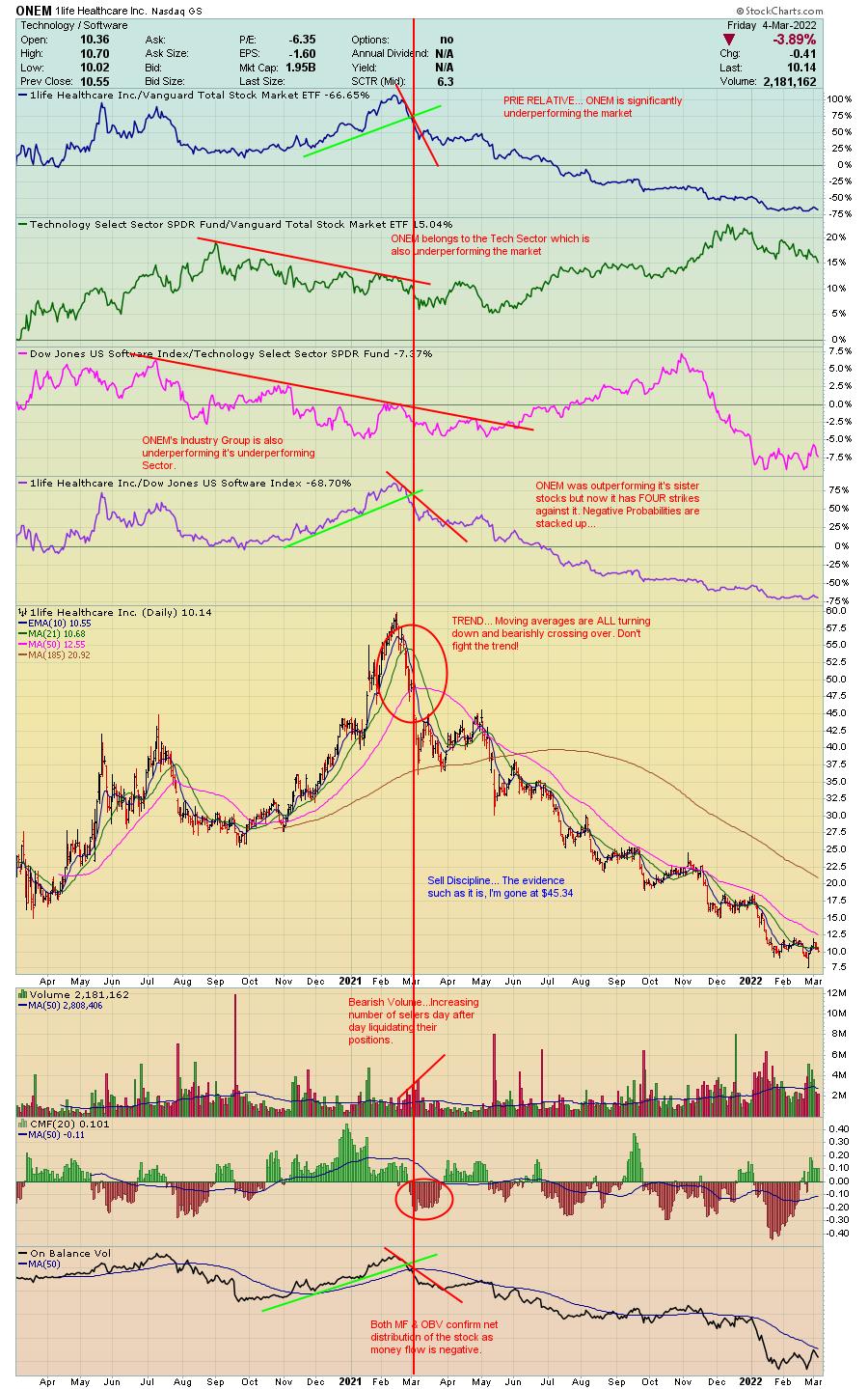
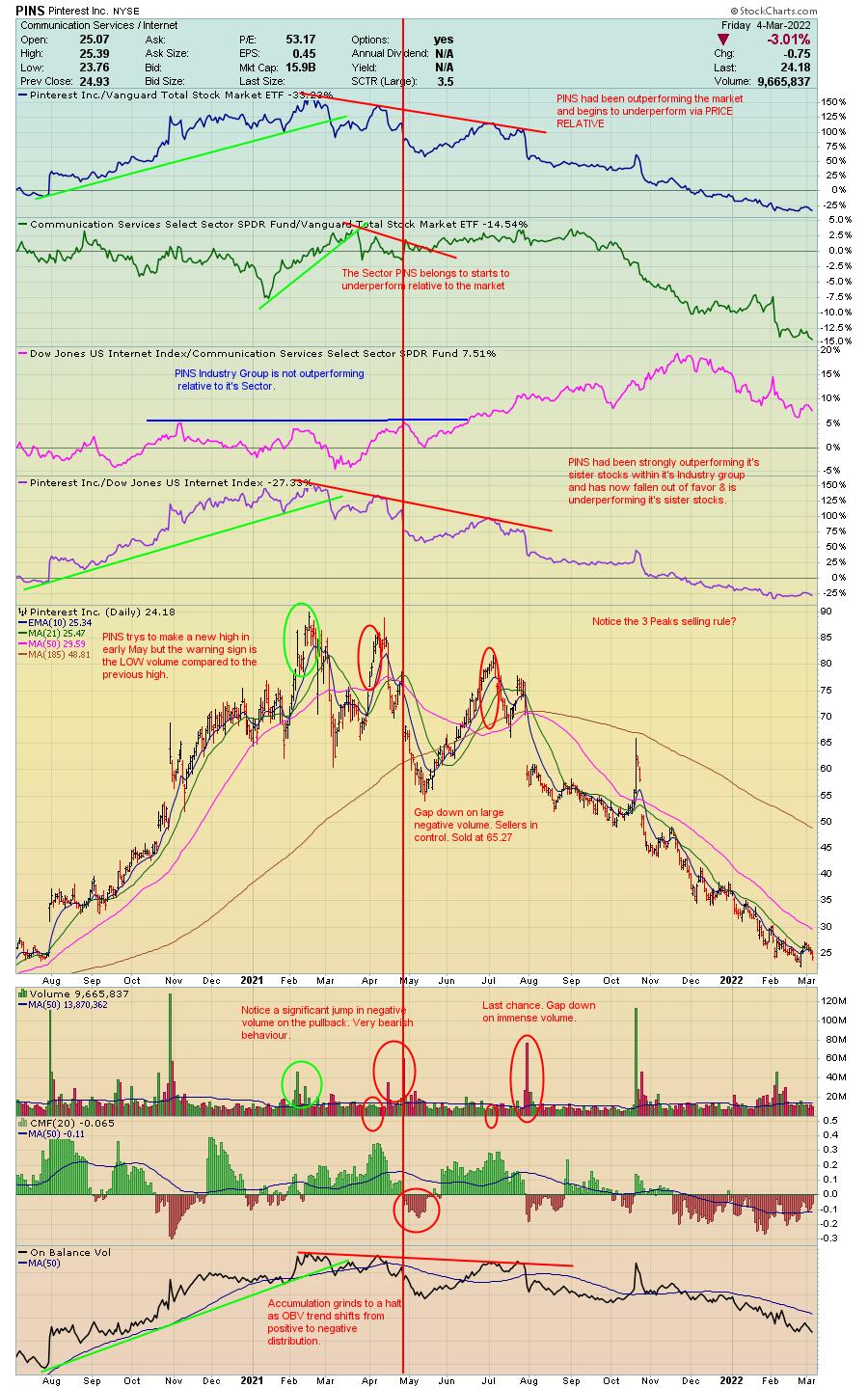
The bottom line is that as an investor, you must tackle your fears head on, push your ego aside and act appropriately to what the markets are telling you. They are always right!
Trade well; trade with discipline!
Gatis Roze, MBA, CMT
StockMarketMastery.com
|
| READ ONLINE → |
|
|
|
| Mish's Market Minute |
| Timing Entries for Fast-Paced Hot Sectors |
| by Mish Schneider |
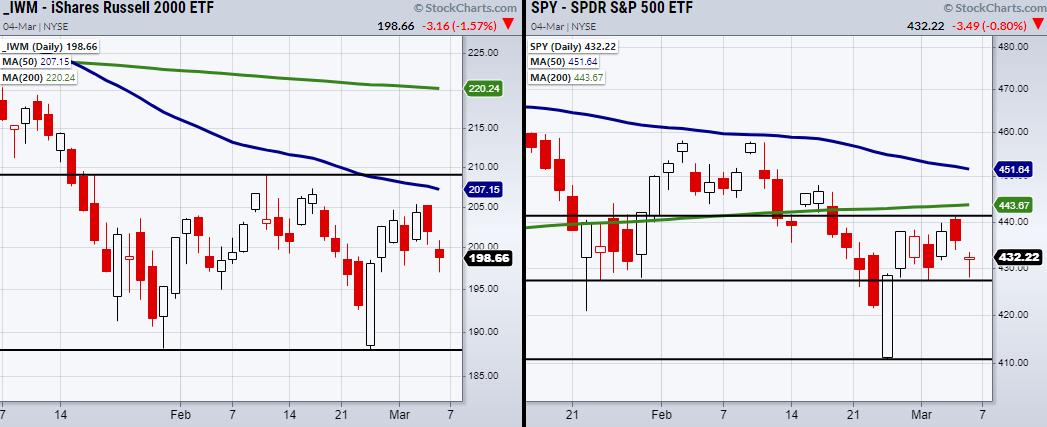
The past couple of weeks have given us a new range to watch in the stock market.
A positive jobs report has been seemingly muted by indecision within the major indices. Therefore, we can look at the new ranges the Russell 2000 (IWM) has formed, along with watching the S&P 500 (SPY) to grasp a complete view of the markets' direction on a short-term basis. To break down our current rangebound situation, we can look at the above charts of IWM and the SPY.
IWM is currently trading in the middle of its range, with a double bottom at $187.92 and the top near $209. On the other hand, the SPY is not as easy to nail down. Though the SPY's main low is at $410.64, it is still attempting to hold the $427 price area. Additionally, the SPY has resistance to clear at $441. This gives us important levels to watch for overall market direction if they clear or break.
Having said that, even with the current market environment, certain sectors, including oil, precious metals and soft commodities, have made large recent moves. For many traders, large runs can cause FOMO (Fear Of Missing Out); however, even with their large price increases, they can and probably will continue to outperform the overall market.
How to enter the top performers is the tricky part, but definitely worth the learning curve. One way we look for an entry into a fast-moving symbol is by waiting for a small pullback, where we can find consolidation before a breakout to new highs. When using this method, it's important to wait for the break to new highs, since the pullback created a new resistance level. For example, on Friday, Gold (GLD) broke to new highs after clearing $182.60 from 2/24.
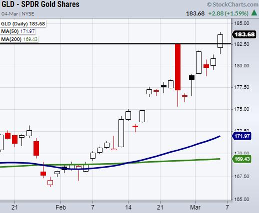
The great thing about breakouts is that if you want to play them very tight, you will always have the breakout level to tell you if you are wrong or right on the trade. Many traders like to buy on the dip itself and risk a continued dip, or locking up their capital while they wait for the symbol to clear past the recent high.
The beauty of breakout trades is having a specific level where you know if the trade is working or not. If the symbol pulls under the breakout level, you can make a quick exit with a minor loss and patiently wait for the next breakout setup. Though there is often chop and fakeouts in breakout trades, the idea is to keep losses small and wait for the next opportunity if the initial entry fails. While we have specific intraday market timing techniques we teach along with a breakout, this basic setup gives a great way to enter a trade.
One last note is that, if your breakout level does not hold, you should always have a predetermined price you will exit the trade if the setup fails. This level should also be determined by the amount of money you are willing to risk on the given trade.
Follow Mish on Twitter @marketminute for stock picks and more. Follow Mish on Instagram (mishschneider) for daily morning videos. To see updated media clips, click here.
On this week's edition of StockCharts TV's Mish's Market Minute, Mish shares with you her favorite trade setups now that earnings season is almost over. With the market still in the middle of a range, there are still some great setups to watch for whether the market goes up or down.
After that, watch Mish's latest appearance on Yahoo! Finance. (Despite the thumbnail, the video below is fully functional.)
ETF Summary
- S&P 500 (SPY): 441 resistance.
- Russell 2000 (IWM): 208-209 resistance.
- Dow (DIA): 331 support.
- Nasdaq (QQQ): 334 support.
- KRE (Regional Banks): Watching to hold the 200-DMA at $69.27.
- SMH (Semiconductors): 246.76 support.
- IYT (Transportation): Choppy. 261 area to clear.
- IBB (Biotechnology): Needs to stay over 122.
- XRT (Retail): 75 support.
Forrest Crist-Ruiz
MarketGauge.com
Assistant Director of Trading Research and Education
|
| READ ONLINE → |
|
|
|
| ChartWatchers |
| These Three Charts Look Ready to Go Ballistic! |
| by Greg Schnell |
Investing in March is bringing some new challenges to the world. If you have had massive success in Technology investing in the last ten years, then this article is for you. I am trying to divert your attention to the explosive setup showing up right now!
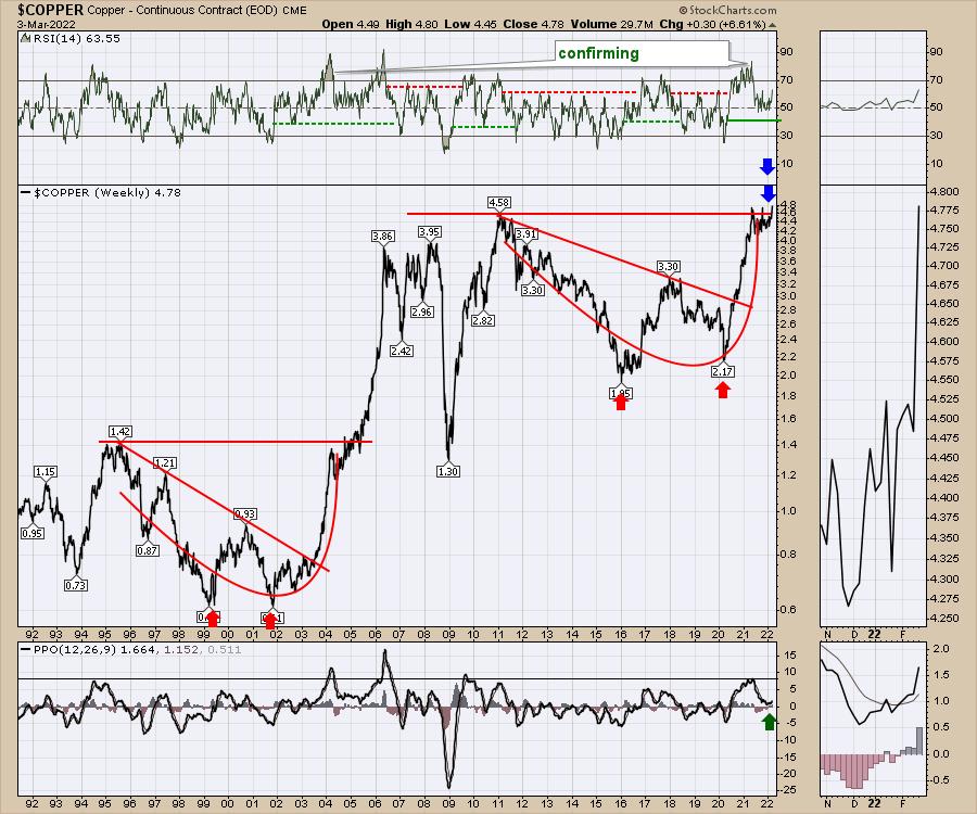
Three charts that are on my must watch list are the charts of Copper, Oil and Gold. Notice the similarities of the Copper pattern so far to the historical pattern in 2005. The prior weekly closing high in 2011 was $4.58. In 2021, we tried to break and hold above that level but retreated. This week, another sudden surge looks ready to smelt some copper at an all-time high. The previous pattern saw copper triple as it broke out and surged for a year. If that happens again, Copper would be $14. My suggestion is that even $7 would be a remarkable surge. Stay tuned, as we are literally right there right now.
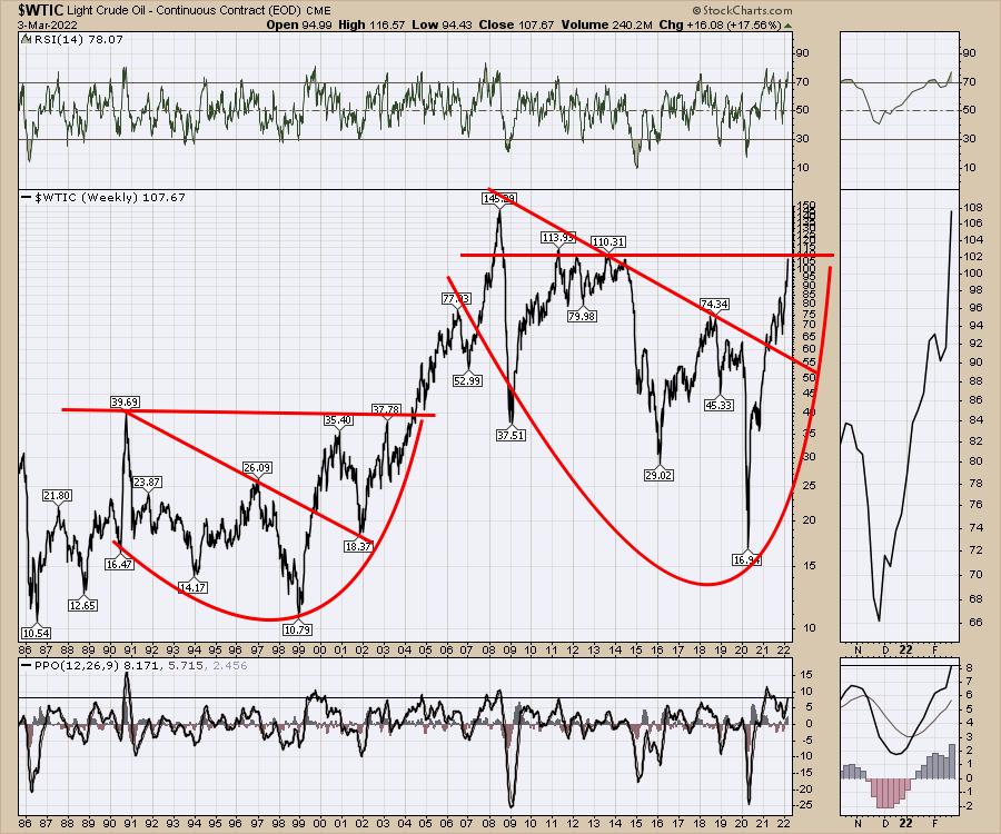
The second chart that is giving us roughly the same pattern as copper is crude oil. The breakout there was $37 to $145, which was a 4x move. That would suggest oil soaring to $440. Okay, even I can't get my head around $440, but a double to $220 would be possible! The previous breakout was 2005.
For investors, the same pattern setup is in Gold. Guess when that breakout happened. Yes, it was also in 2005.
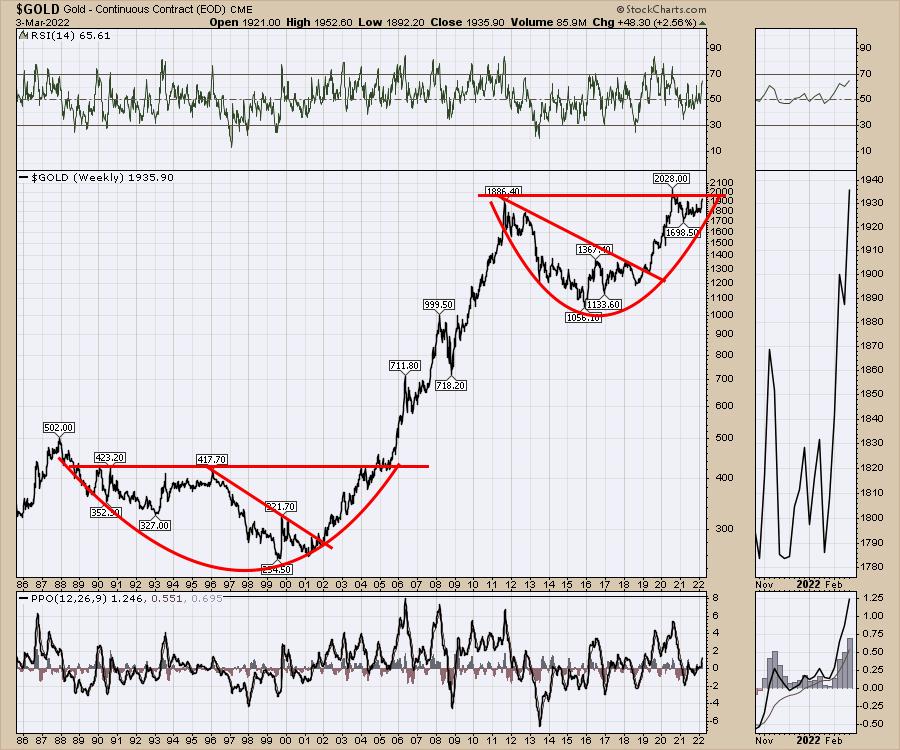
I think the message might just be that, if you loved investing in technology for big gains, it might be time to look across to commodities. I don't think it is a fluke that these big patterns are setting up on all the charts at the same time, like they did back in 2005.
If you would like some help following commodity-related investing, this would be the window to do it. Check out the one month starter package at OspreyStrategic.org for just $7. I'm pretty sure you'll enjoy the ride!
|
| READ ONLINE → |
|
|
|
| Wyckoff Power Charting |
| Distribution or Re-Accumulation? |
| by Bruce Fraser |
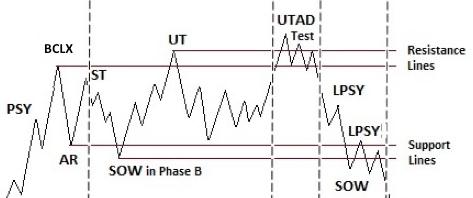 Join Johni Scan and me for Monday's (2/28/2022) "Your Daily Five" where we focus on Distribution and Re-Accumulation characteristics. Both begin in nearly the same manner but conclude very differently. A Re-accumulation is a range-bound condition that forms after an uptrend. It is a pause or preparation phase for a fresh new leg of a larger uptrend. Join Johni Scan and me for Monday's (2/28/2022) "Your Daily Five" where we focus on Distribution and Re-Accumulation characteristics. Both begin in nearly the same manner but conclude very differently. A Re-accumulation is a range-bound condition that forms after an uptrend. It is a pause or preparation phase for a fresh new leg of a larger uptrend.
A Distribution is a range-bound price structure that precedes a markdown (downtrend) after completion of the prior uptrend. Re-accumulations often scare traders and investors into believing that a Distribution is forming which can cause them to exit their positions. Re-accumulations form repeatedly in a major uptrend. Distributions, on the other hand, result in a reversal of trend into what Wyckoffians call a Markdown Phase.
Any rally that follows last week's extreme low will then need to be judged for how well it can reach and exceed overhead resistance, among other characteristics, to determine the possible emergence of Re-accumulation or the descent into a Markdown and completion of Distribution. Also discussed in Monday's episode are the internal positive divergences in breadth studies, extreme bearish sentiment that has emerged, and Point & Figure count objectives and their status.

S&P 500 ($SPX) with Wyckoff Interpretation
S&P 500 Chart Notes:
- Following the Upthrust (UT & Test) volatility increases, and volume expands.
- Not Unusual to have multiple Sign-of-Weakness (SoW) and Last Point of Supply (LPSY) chart events.
- If Re-Accumulation, the price low often appears at about the 1/3 to ½ point of the completed structure.
- If Re-Accumulation, look for the next rally phase to be stronger than the January rally, as a constructive sign of confirmation.
- If Distribution, then demand will be poor on the rally with diminishing price and volume characteristics, and a (likely) lower high into a second LPSY.
- Re-Accumulations can take months to form and are evidence of stock absorption by strong hands (see suggested reading list below).
All the Best,
Bruce
@rdwyckoff
Disclaimer: This blog is for educational purposes only and should not be construed as financial advice. The ideas and strategies should never be used without first assessing your own personal and financial situation, or without consulting a financial professional.
Video Link
Your Daily Five for Monday February 28, 2022
Additional Reading:
Rev Up with Reaccumulation Trading Ranges | Wyckoff Power Charting
Reaccumulation Roundup | Wyckoff Power Charting
Distribution Definitions | Wyckoff Power Charting
|
| READ ONLINE → |
|
|
|
| ChartWatchers |
| A Few Diamonds in the Rough |
| by John Hopkins |
With the market in turmoil and volatility at a very high level, traders continue to be stymied -- it's tough to make any money unless you are decidedly short. But, underneath the surface there are still some stocks that continue to perform extremely well, or could be close to a near-term bottom, and these are the ones that could present some nice opportunities for those who are patient.
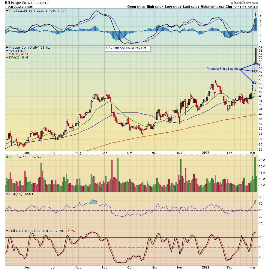
Let's look at Kroger (KR), which recently reported earnings; since then, shares have soared close to 30% in just a few trading days.

Watching KR move substantially higher even with most of the market under fire is heartening. And the opportunity -- unless you are already long the stock -- could come along on any decent pullback. And a pullback could be coming with the stock now very extended.
To me, the first level to think about entering a position would be just above $54, which is roughly $5 lower. Even better if the stock were to pull back to a level just above $52, with a tight stop in case it moves below that level; this would take the stock back to the $49+ level, another place to consider adding shares.
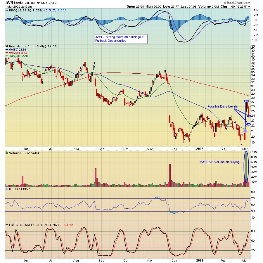
Another stock that reported strong numbers and gapped up 40% on its earnings is Nordstom's (JWN), which has pulled back to a level that could make it a nice trade.

Nordstrom is nowhere close to Kroger's chart, but the volume on the buying shows there was a lot of buyer interest once earnings were released. And now it is caught up in the overall market selling, which I believe makes it a compelling buy (full disclosure, I took a position on Friday) with maybe a partial position near its current level and again if it pulls back back near its 20-/50-day moving averages.
In this market, it's very tough to pull the trigger on any position on the long side. But, if you are looking to participate in the substantial pullback we've seen so far, then you might as well zero in on those companies that recently reported strong earnings that are bucking the trend. In the meantime, if you're interested in getting timely market/earnings information every M, W and F, sign up for our FREE EarningsBeats Digest and let our Chief Market Strategist Tom Bowley guide you through these difficult times.
At your service,
John Hopkins
EarningsBeats.com
|
| READ ONLINE → |
|
|
|
| ChartWatchers |
| Technology Sector and Tech Indexes in "Official" Bear Markets |
| by Carl Swenlin, Erin Swenlin |
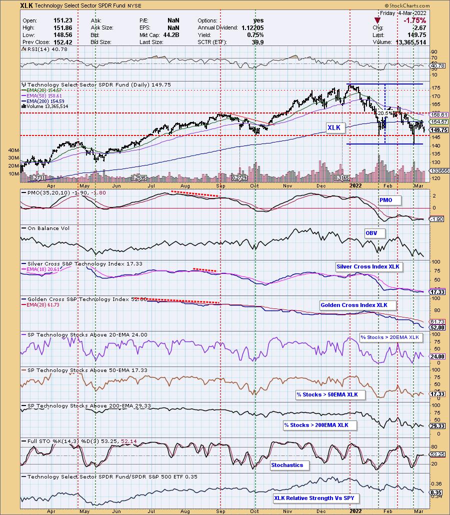
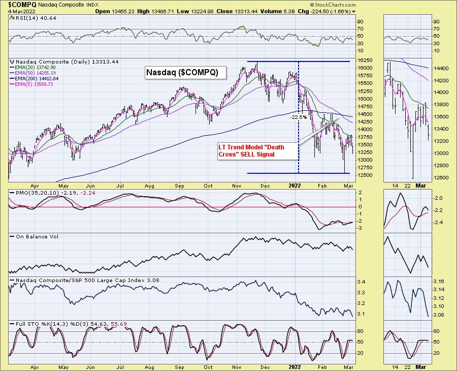
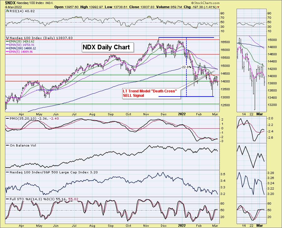
It occurred to us, after we discussed the "Death Crosses" (50-day EMA dropping below the 200-day EMA) on the NDX and Nasdaq 100 in yesterday's subscriber-only DecisionPoint Alert, that we should investigate the actual damage done. The tech-heavy NDX and Nasdaq 100 are in bear markets, along with Technology (XLK).
We've been questioned about our discussion of the SPY being in a bear market because we don't have a 20+% decline yet. Well, if you go by that "official" 20% number, XLK, NDX and Nasdaq are all in "official" bear markets. Let's look at all three.
XLK looks particularly bearish right now. Price has failed at the 200-day EMA and the PMO has topped beneath its signal line. It just had a short bear market rally, but it is back to declining. From its high to its recent low, it is a slightly-more-than-20% decline. Participation is lacking, with only 17% of stocks having a 20-day EMA > 50-day EMA (a "Silver Cross") and less than a quarter with price > 20-EMA. Only about half of the sector have "golden crosses" (50-EMA > 200-EMA), meaning they are in a bull market. The rest, we assume, are in bear markets.

PARTICIPATION and BIAS Assessment: The following chart objectively shows the depth and trend of participation in two time frames.
- Intermediate-Term - the Silver Cross Index (SCI) shows the percentage of SPX stocks on IT Trend Model BUY signals (20-EMA > 50-EMA). The opposite of the Silver Cross is a "Dark Cross" -- those stocks are, at the very least, in a correction.
- Long-Term - the Golden Cross Index (GCI) shows the percentage of SPX stocks on LT Trend Model BUY signals (50-EMA > 200-EMA). The opposite of a Golden Cross is the "Death Cross" -- those stocks are in a bear market.

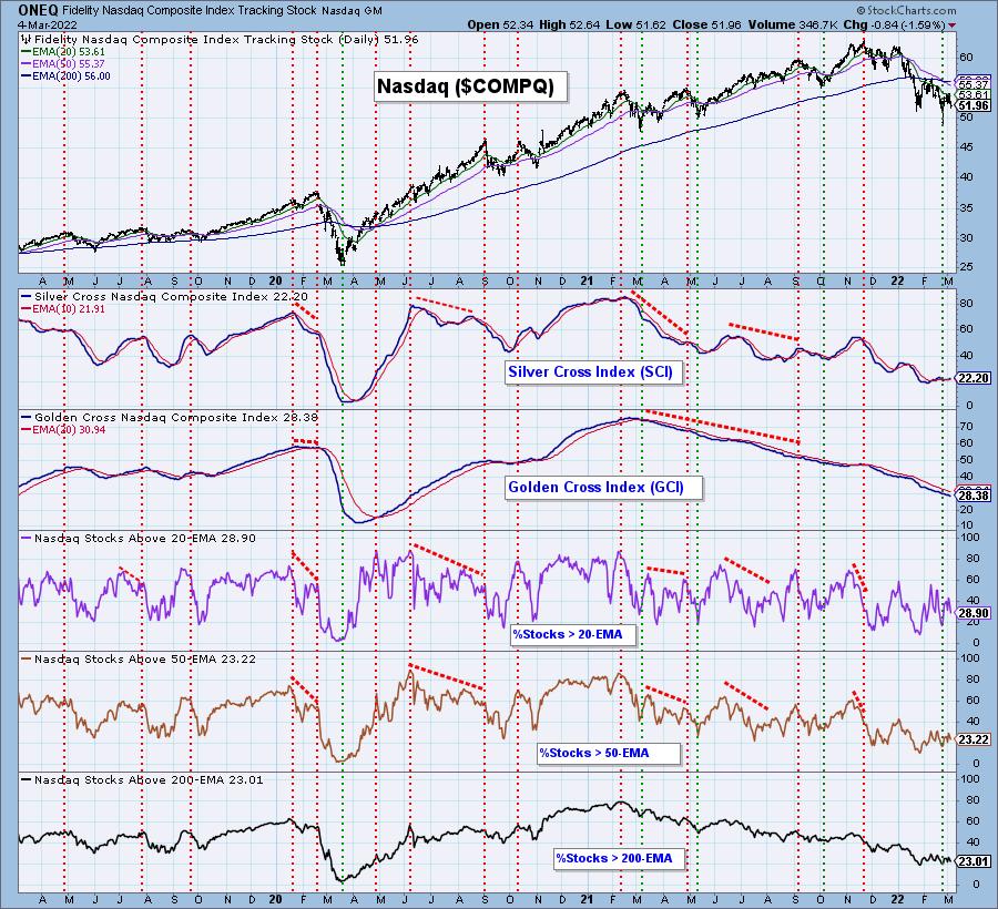
The Nasdaq ($COMPQ) had its "Death Cross" a few weeks ago. It is down over 22% from top to bottom.

Below is the Participation chart for the Nasdaq. Both the SCI and GCI are at very bearish levels, below 30%.

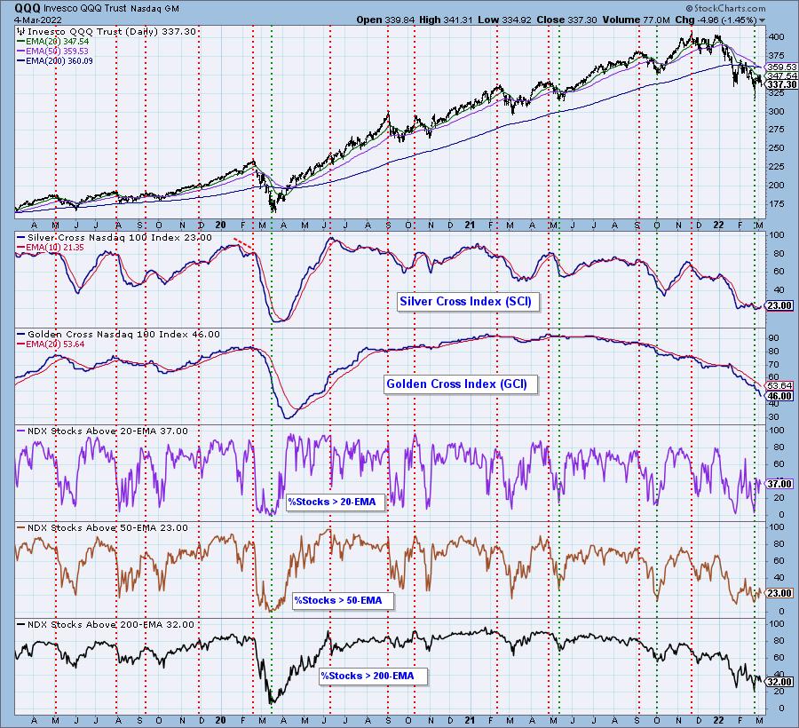
The NDX had a Death Cross yesterday. It was down a little over 22% from all-time high to the last low.

Below is the participation chart for the NDX. The SCI is at a paltry 23% and the 46% reading on the GCI tells us that more than half of the index are in bear markets themselves.

Conclusion: Aggressive sectors like Technology continue to be very weak. There are wartime beneficiaries out there like Crude Oil, Gold, Specialty Chemicals, Metals and Mining, to name a few. Erin has been following these closely in the subscriber-only DecisionPoint Diamonds reports. She had some very successful stock picks from these areas that had "Diamonds in the Rough" finishing this week in the green.
Don't miss this FREE upcoming educational opportunity to see Erin present at the "4th Annual Women Teach Investing" conference! If you can't go, the recording will be sent to registrants. She will be presenting her market timing tools that will help you improve your trading entries and exits. You'll also get a follow-up eBook where Erin covers bear market rules. Support Erin and click HERE to register for free.
Good Luck & Good Trading!
Carl & Erin Swenlin

Click here to register for the recurring free DecisionPoint Trading Room! Check out her latest recording:
- Topic: DecisionPoint Trading Room RECORDING
- Start Time: Feb 28, 2022 09:00 AM
- Meeting Recording Link.
- Access Passcode: Feb#28th
Technical Analysis is a windsock, not a crystal ball. --Carl Swenlin
(c) Copyright 2022 DecisionPoint.com
Helpful DecisionPoint Links:
DecisionPoint Alert Chart List
DecisionPoint Golden Cross/Silver Cross Index Chart List
DecisionPoint Sector Chart List
DecisionPoint Chart Gallery
Trend Models
Price Momentum Oscillator (PMO)
On Balance Volume
Swenlin Trading Oscillators (STO-B and STO-V)
ITBM and ITVM
SCTR Ranking
Bear Market Rules
DecisionPoint is not a registered investment advisor. Investment and trading decisions are solely your responsibility. DecisionPoint newsletters, blogs or website materials should NOT be interpreted as a recommendation or solicitation to buy or sell any security or to take any specific action.
|
| READ ONLINE → |
|
|
|
| MORE ARTICLES → |
|
 Chart 1
 Chart 2
 Chart 3
 Chart 4
 Chart 5
 Chart 6


 The pickings are rather slim in the market with just 61 of the 276 ETFs in the


 Join Johni Scan and me for Monday's (2/28/2022) "Your Daily Five" where we focus on Distribution and Re-Accumulation characteristics. Both begin in nearly the same manner but conclude very differently. A Re-accumulation is a range-bound condition that forms after an uptrend. It is a pause or preparation phase for a fresh new leg of a larger uptrend.
