| THIS WEEK'S ARTICLES |
| John Murphy's Market Message |
| SURGE IN COMMODITY PRICES IS TYPICAL LATE - CYCLE BEHAVIOR |
| by John Murphy |
STOCKS USUALLY PEAK AFTER BONDS... One of the most important features of intermarket analysis is the rotation that normally takes place between bonds, stocks, and commodities at major turning points in the business cycle. That rotation between the three asset classes is especially relevant to the current global situation. Those major turns usually start in the bond market which peaks first. Rising interest rates (and the prospect for even higher rates) eventually causes stocks to peak. The main factor pushing rates higher is a strong surge in commodity markets, and oil in particular, which causes the Fed to start raising rates to slow down the inflationary spiral. At that point, commodity prices become the strongest asset class while bonds and stocks weaken. And that's where we appear to be in the current environment.
SURGING COMMODITY PRICES ARE BAD FOR STOCKS AND THE ECONOMY... Chart 1 shows bonds, stocks, and commodities following the normal rotational script and in the proper order -- starting with bonds. The green bars show Treasury bond prices peaking during 2020 and declining since then. Notice that the 2020 peak in bond prices coincided with an upturn in commodity prices which is also part of the rotational process. Stocks normally peak next. The black bars show the S&P 500 peaking at the start of this year. It's likely that stocks have seen their highs for this cycle. Rising commodity prices are a major reason for the stock market peak. The brown line shows the surge in commodity prices over the past few months being a major contributing factor to weakness in stocks. Spiking oil prices are a big part of the decline in stock prices. Surging commodity prices force the Fed to start rising interest rates to combat that inflationary spiral. That normally causes the economy to slow which usually leads to a recession. And stagflation.
BACK TO THE STAGFLATION OF THE 1970S... Rising commodity prices in the face of a slowing economy are likely to lead to stagflation for the first time since the 1970s. Stagflation occurs when a slowing economy coincides with rising inflation. That combination is good for commodity traders, but bad for bonds and stocks. It also puts the Fed in a very difficult position. It has to raise rates to combat inflation. Rising rates, however are likely to push the U.S. economy into recession. Judging from the commodity price charts which are at or near record highs, the inflationary cycle is likely to last for some time. It lasted for an entire decade during the 1970s.
Chart 2 shows the S&P GSCI Commodity Index surging to the highest level since 2008. Which strongly suggests that the inflationary spiral is likely to continue. That's won't be good for bonds, stocks, or the economy.
 Chart 1 Chart 1
 Chart 2 Chart 2
|
| READ ONLINE → |
|
|
|
| The Mindful Investor |
| The Line in the Sand for AAPL |
| by David Keller |
The major equity averages finished the week in a position of weakness, with the S&P 500 index once again testing the key support level of 4200.
We've talked about the 4200 level many times for the S&P 500, most recently in terms of that relates to the bullish momentum divergences we've noticed on the SPX and a number of large-cap stocks. When the S&P and Nasdaq are testing key support levels, it's often a good idea to check out some of the larger names that comprise those indexes. The major averages will be unable to hold support if mega-cap stocks are unable to do the same.
That brings us to the chart of Apple (AAPL), which, up until this week, has shown fairly consistent outperformance over the last nine months.
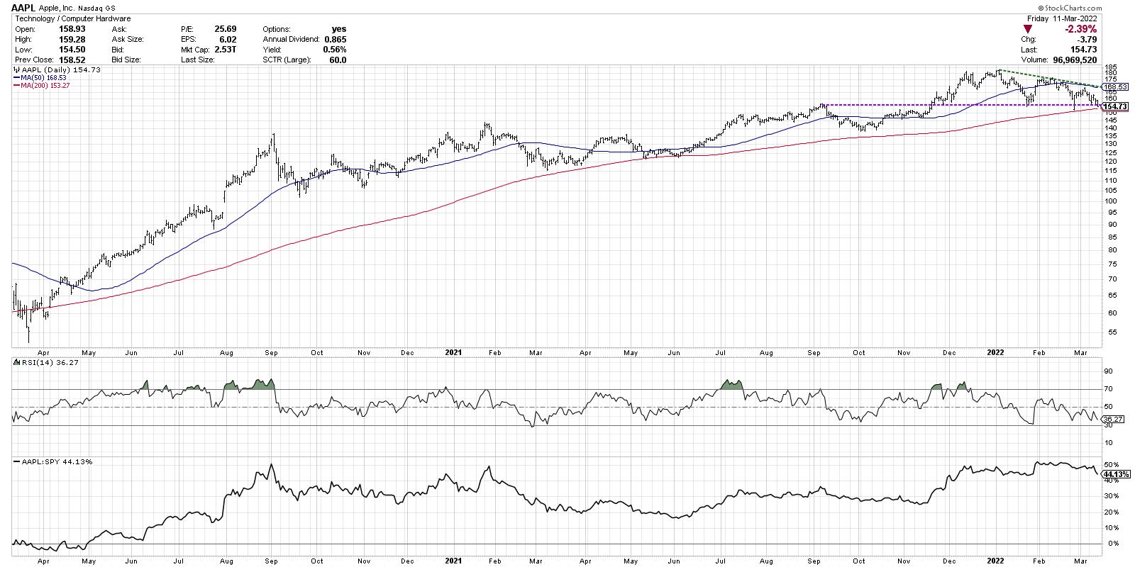
AAPL first reached the $155 level in September 2021; then, in November, the stock broke above that level and successfully retested it from above. Apple then gained another 25 points to reach its eventual peak around $180 in early December. From there, the stock has pounded out a steady pattern of lower highs, so far putting in a lower high in February and March.
Now we find this mega-cap technology name pulling back once again to the $155 level. Previous lows in January and February have occurred right around this same price point.

What's different this time is that it also coincides with the 200-day moving average. Do we once again see an influx of buying power to cause the stock to bounce once again off $155? Market bulls had better hope so. Because if AAPL breaks support at $155 (which I believe it will, most likely next week), then the next level of potential support would be in the 132-140 range. The low in October 2021 was around $140, and the first Fibonacci support level (using the March 2020 and January 2022 range) comes in around $132.
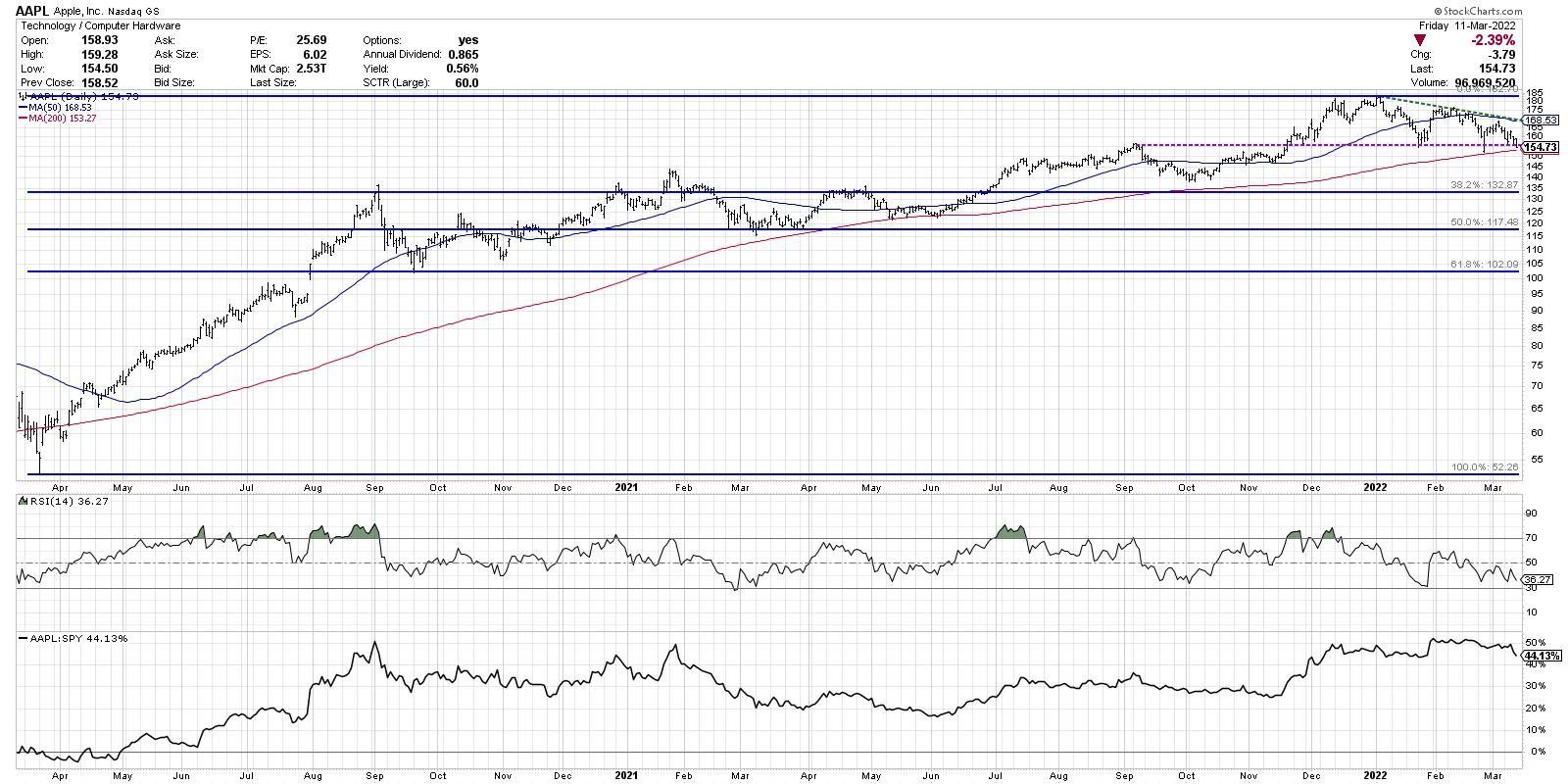
What would tell me this bearish thesis is incorrect? Two things come to mind.
First, AAPL would need to break above trendline resistance using the January and February peaks. The trendline currently sits right around $168. The 50-day moving average is right around this price level as well, so a move above $168 would clear two important technical hurdles.
The other indicator I'm watching is RSI. The RSI for Apple has been in a bearish configuration (below 60) since December of last year. If the RSI would break back above 60 on a price bounce, that could indicate an influx of buyers with enough momentum to push the price even higher.
As investors are dealing with a number of concerning macro themes in recent weeks, the Fed meeting coming up next week could be just the catalyst to move charts like AAPL into a new downward phase of this bear market experience.
Want to digest this article in video format? Just head over to my YouTube channel!
RR#6,
Dave
David Keller, CMT
Chief Market Strategist
StockCharts.com
Disclaimer: This blog is for educational purposes only and should not be construed as financial advice. The ideas and strategies should never be used without first assessing your own personal and financial situation, or without consulting a financial professional.
The author does not have a position in mentioned securities at the time of publication. Any opinions expressed herein are solely those of the author, and do not in any way represent the views or opinions of any other person or entity.
|
| READ ONLINE → |
|
|
|
| ChartWatchers |
| Which Energy Stocks Should You Be Watching? |
| by Julius de Kempenaer |
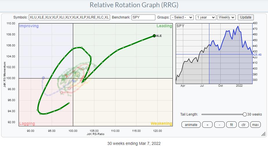
It's very clear that the Energy sector is the strongest sector inside the S&P 500 over the last several months.
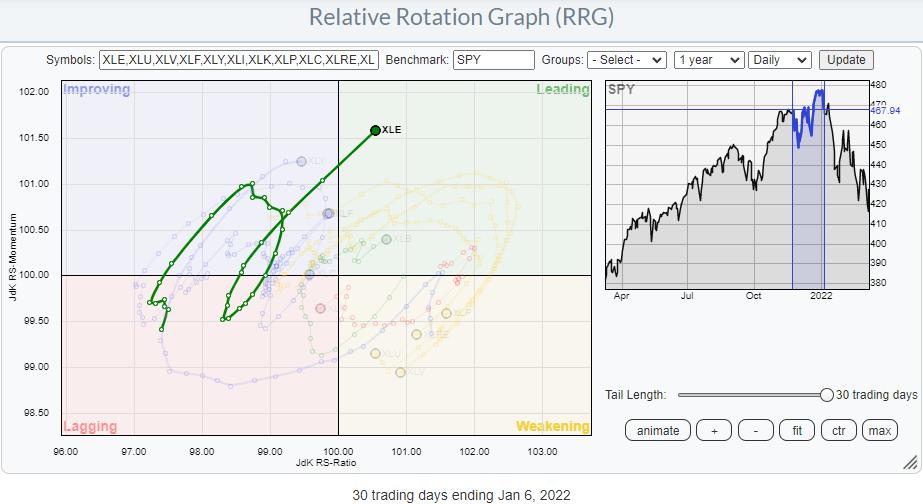
The tail on the Relative Rotation Graph above shows the rotation that the sector went through. The "hook" back up to leading from weakening at the start of the year is one of these very rapid rotations that simply went too fast to be picked up by the weekly time frame. The RRG below shows the daily rotation during that period, and the clockwise rotational shape is clearly visible.
For this article, I want to drill down into the individual stocks that make up the Energy sector, trying to find out if all are equally strong.
XLE vs $ONE
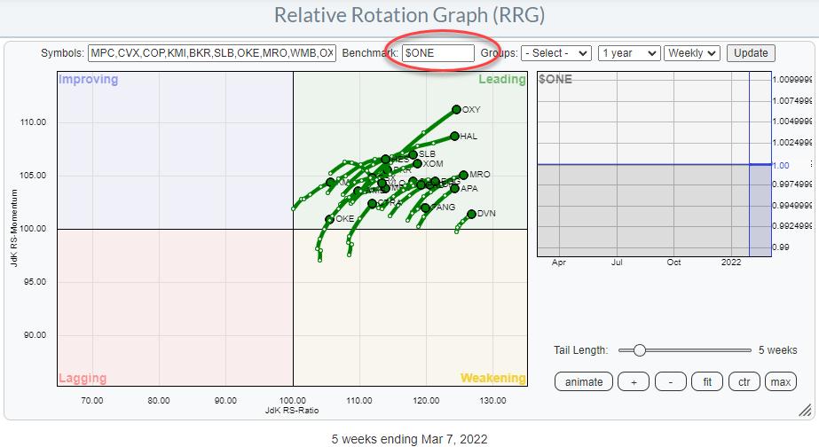
With the general market under pressure recently, I have started to use $ONE as the benchmark a bit more often, as this gives a good insight into the absolute price trends that are present inside a universe of securities.
In my 1/14 ChartWatchers article "Using RRG for Visual Inspection of Market and Sector Breadth", I explain how using $ONE as your benchmark for RRG can be used to visually inspect a sector for "breadth". The RRG above is an updated version of the graph for XLE that was used in that article. As you can see, the big picture has not changed much.
All energy stocks are still inside the leading quadrant and most are also still traveling at a strong RRG-Heading. The only difference that the keen observer will note is the level on the JdK RS-Ratio scale. In January, the mid of that cluster of tails was around 107. At the moment, the mid of the cluster is almost at 120!! That is a big move.
With the dominant direction of the tails still being within the 0-90 degree angle, the outlook for the sector remains strong.
Heavyweights Continue To Dominate
When we bring back XLE as the benchmark for the sector, things are shifting.
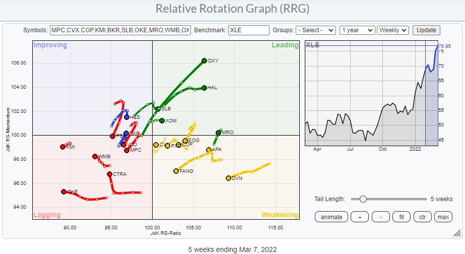
This RRG shows the XLE stocks against XLE as the benchmark. Inside the Energy sector, CVX and XOM are the dominant stocks, each accounting for more than 22% of the sector. All other stocks are below 5% market cap within the sector. When we isolate these two tails on a single RRG, we can see how they drive the sector performance.
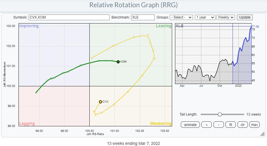
XOM is steady inside the leading quadrant and recently began slowing down a bit in terms of relative momentum, while CVX went through a very strong rotation before rolling over mid-January. This rotation is now picking up strength again on the JdK RS-Momentum axis and starting to head back towards the leading quadrant at a strong RRG-Heading.
This means that the two largest holdings inside Energy are still driving the sector. That's a good thing.
Looking for Additional Strength
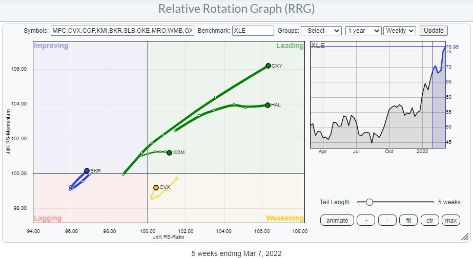
Diving deeper into the energy universe, I have highlighted the tails that are at a strong RRG-Heading. This brings back the number of tails on the canvas to four. I have added XOM to the graph because of its weight in the sector together with CVX.
From this image, OXY, HAL and BKR remain as opportunities.
The long tails on OXY and HAL suggest that they have already made a big move, which is confirmed when you bring up the individual charts. These are strong trends and there is no reason to sell right now. But getting in a new position is a different story. It feels like chasing a move at these levels.
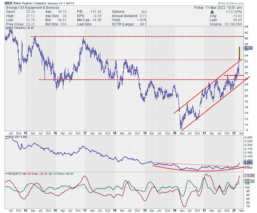
BKR is a different story. The tail is still at the left-hand side of the graph, but is rotating from lagging into improving at the moment and starting to travel at a strong heading again. This makes it the most interesting one of the tails on the graph, as it seems to have much more potential left than the others.
Despite the fact that BKR also already made a big move higher, there seems to be more in store, especially as its price managed to break out of its rising channel at the upper boundary, coinciding with horizontal resistance coming from 2017-2018 peaks. As long as BKR can hold above this 32 area or, even better, drop back to it and set a new low there, things are looking good.
Next resistance is expected near $40.
Have a great weekend, --Julius
My regular blog is the RRG Charts blog. If you would like to receive a notification when a new article is published there, "Subscribe" with your email address.
|
| READ ONLINE → |
|
|
|
|
|
| ChartWatchers |
| These Stocks Will Help You Hedge Against Inflation |
| by Mary Ellen McGonagle |
As reported on Thursday, the rate of inflation in February rose to a 40-year high, with the U.S. facing even higher levels as the Russian war on Ukraine continues. Prices for oil, wheat and other commodities impacted by the war have already risen to decade-highs, with many metals reaching levels not seen in years.
This high inflation poses risks to many consumer-related areas of the market, as spending is reduced in the face of rising prices. In addition, stocks with high growth continue to get pummeled as the future value of their earnings are reduced. For those seeking to reduce inflation risk, the best plan is to invest in companies that are increasing their dividends. In fact, the faster the dividend growth, the better, as studies show that these stocks will considerably outperform the broader markets.*
Subscribers to my MEM Edge Report have already been alerted to one such stocks, as oil producer Occidental (OXY) recently announced an increase to their dividend in late February. The stock has gained 68% since we added it to our buy list in early January on the heels of robust 4th quarter results. Below are other stocks not on our list for your consideration.
DAILY CHART OF ELI LILLY & CO. (LLY)
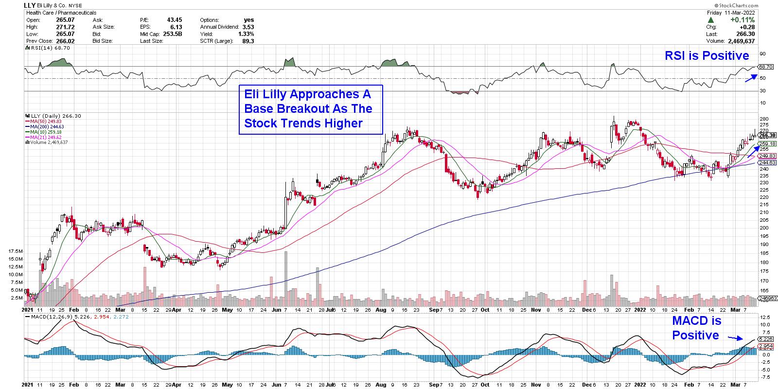
Eli Lilly (LLY) is an ideal candidate, as the well-known Pharmaceutical company has raised their dividend by 15.3% over the past 12 months. This is far higher than the 7.6% increase in inflation that was just reported.
The company has even more going for it, as they've been able to increase prices for their various drugs without any pushback while not seeing higher material costs to create these drugs. LLY is in an uptrend after breaking back above each of its moving averages as it moves closer to a base breakout at $284.
DAILY CHART OF GENERAL DYNAMICS (GD)
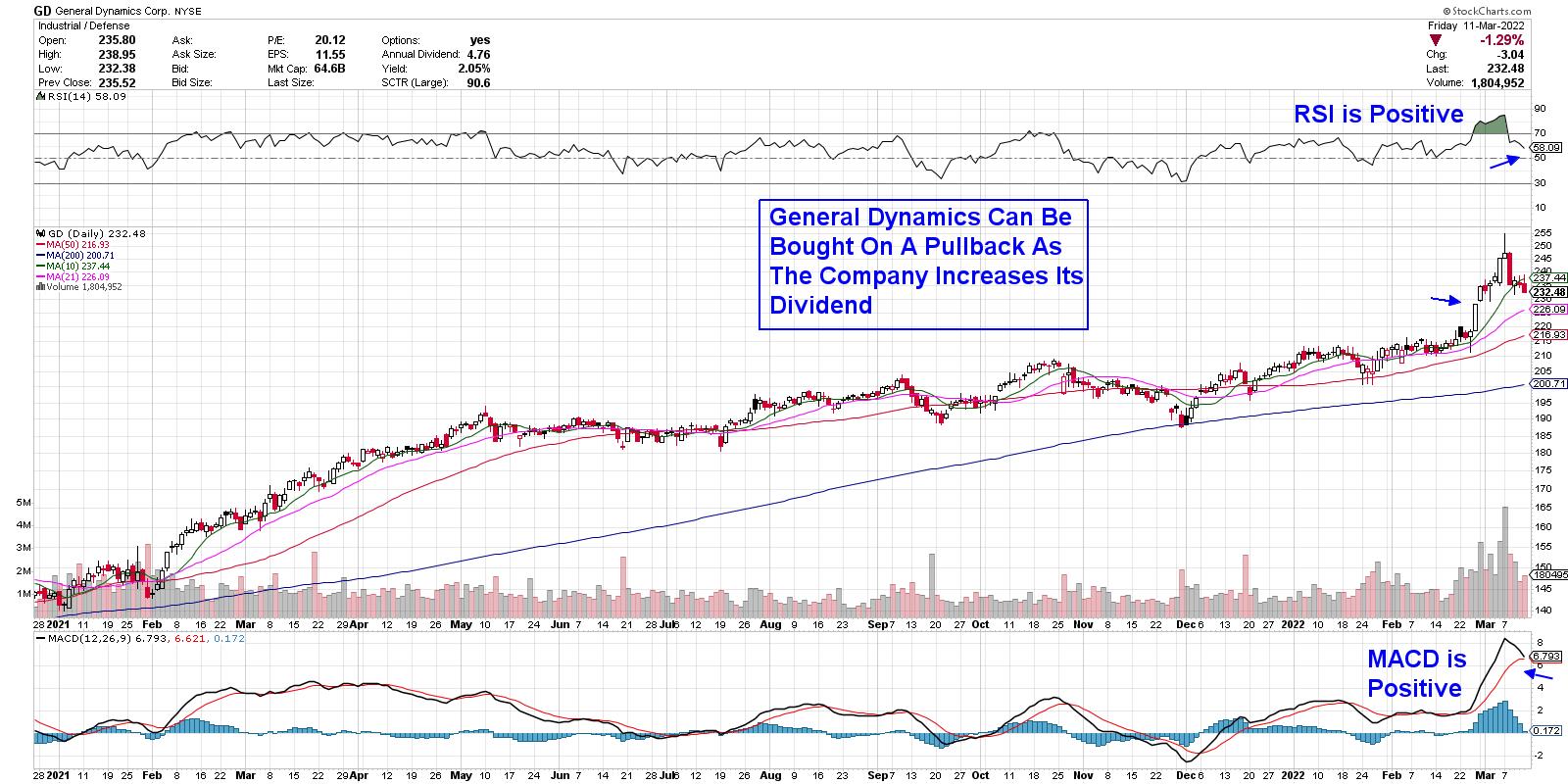
Aerospace/Defense company General Dynamics (GD) recently announced an increase in their dividend after releasing earnings that were above estimates earlier this year. The company is one of the top shipbuilding and land weapons providers and analysts are raising earnings estimates for next year, as they're well-positioned to capitalize on increased military needs in the face of Russia's attack on Ukraine.
GD is currently extended following its recent run-up; however, its 2.2% dividend coupled with a P/E that's 20x last year's earnings, make this stock a solid hedge given renewed demand for advanced weapons and technology systems. Look for a pullback to the $228 level as an entry point.
While the broader markets are in a downtrend, select stocks, such as those listed above, are expected to continue to outperform due to continued demand for their products, coupled with their attractive yields. Both of these stocks outperformed during the stagflation period of the late 1970s as well, as investors sought a hedge against high inflation.
It's been a difficult period for the markets, as intraday volatility remains high. There are areas of the market that have been able to withstand this, however, such as commodity stocks on our MEM Edge Report. If you'd like immediate access to these stocks as well as be alerted to broader market conditions, take a 4-week trial of my twice weekly report for a nominal fee. You can use this link here.
On this week's edition of StockCharts TV's The MEM Edge reviews the rotation that continues to take place as the markets grapple with inflation and rate hike fears. She also shares how to trade the pullback in stocks on the move.
Warmly,
Mary Ellen McGonagle, MEM Investment Research
|
| READ ONLINE → |
|
|
|
| Dancing with the Trend |
| Fear and Greed |
| by Greg Morris |
 I cannot tell you the number of times an investor has asked, "Considering the difficulties of the past few months, do you still believe in your investment process?" These questions always concerned me because I never once considered not believing in my process for managing money just because of short-term whipsaws and volatility. I have written often, maybe too often, that the single most important trait to have for the long-term success of my process was discipline. You must have discipline to stick with your strategy during the inevitable periods when the results are less than perfect. There are two emotions that can override intelligence and consume investors and their money, testing their discipline to stick with the process, and those are fear and greed. I cannot tell you the number of times an investor has asked, "Considering the difficulties of the past few months, do you still believe in your investment process?" These questions always concerned me because I never once considered not believing in my process for managing money just because of short-term whipsaws and volatility. I have written often, maybe too often, that the single most important trait to have for the long-term success of my process was discipline. You must have discipline to stick with your strategy during the inevitable periods when the results are less than perfect. There are two emotions that can override intelligence and consume investors and their money, testing their discipline to stick with the process, and those are fear and greed.
The greed factor drives some into the futile quest to always be right. When their investment flavor of the week begins to taste stale, they start noticing all the other choices around them. The financial media fuels this "grass is greener" mentality by making all investors think everyone else is doing better. Take for example a story in a newspaper headlined, "How One Investor Holds on in Hard Times." The article begins by telling about an investor whose account dropped from $200,000 to $128,000, but "... he didn't panic; instead he held on. Not only have his holdings bounced back, they're up nearly 50% since April 1." The greedy investor reading that would be pulling their hair with frustration that they were not up 50% since the first of April - this guy's approach must be a better way to invest.
But further in the story, you find that the "just hang on and don't worry" scenario painted in the first two paragraphs is not really true. It turns out, our investing hero admits that he has made about 40 trades so far this year, down from 120 last year because of a "lack of time." He has repositioned his portfolio from "overvalued" technology stocks to biotech, and he says the research required to manage his account only takes 20 to 30 hours per week. Is the grass in that pasture really greener?
I often ask investors if they think there is a perfect investment strategy. They always answer "No, of course not." Then they're dumbstruck by the next question, "Then why do you keep changing investment strategies?" With a fearful investor, every time the short-term results are negative they become convinced they're going to lose everything and they retreat to what they believe is a safer strategy. Sadly, their "safe" strategy is probably the worst choice because in an attempt to evade market risk, they fall prey to the greatest risks of all – inflation and inadequate performance. They'll never "lose" money, but their purchasing power will erode over time, and they may suffer the indignity of running out of money late in life. Regardless of what motivates an investor to abandon ship during difficult times, one thing is clear - they almost always jump when the storm is almost over. They tend to suffer through the worst phases of an investment strategy but never hang around long enough to enjoy the good times.
I've said it before and I'll say it again, it is foolish to make long-term decisions based on short-term results and I will always have the discipline to keep that from happening.
Speaking of discipline, here's a fact: I have been on some sort of a diet much of my adult life. I was driving with my wife in the north Georgia mountains the other day and stopped at an old filling station for gasoline. It was a really old out-of-date station where I had to pay for the gas inside. I see some candy bars near the cash register, so I buy one. I knew my wife would not want one, so I was eating it as I approached the car. When I got in, she said, "You just don't have any discipline!" I said, "That is not true because you do not know how many of these I wanted." If you have found a strategy you are comfortable with and have done due diligence in its process, then you MUST also have the discipline to stick with it.
Dance with the Trend,
Greg Morris
|
| READ ONLINE → |
|
|
|
| Martin Pring's Market Roundup |
| A Tale of Two Sectors |
| by Martin Pring |
The Business Cycle and Sector Rotation
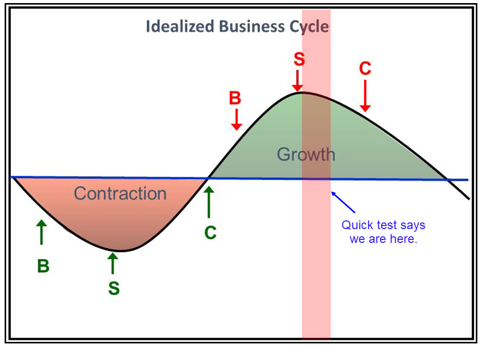
The business cycle undergoes a set series of chronological events which are also related to primary trend peaks in bonds stocks and commodities, as laid out in Figure 1. You can read about this concept in greater detail here. Based on the position of these three markets relative to their 12-month moving averages, we are currently somewhere in the area being flagged by the vertical pink shading. That's because the commodity market is the only one above its MA.
I am drawing this to your attention because the position of the cycle often has a significant influence on the relative performance of the various sectors and industry groups. At the beginning of the cycle, by the arrow labelled S for the stock market bottom, the Fed has already begun to inject liquidity into the system, which has the effect of softening interest rates. That fact, combined with weak economic activity acting as a moderating force on inflation, encourages consumers to raise their spending. It's also the signal for equity investors to purchase consumer cyclicals, which normally outperform in a relative sense at this stage of the cycle. Figure 1; Source: Martin Pring's Intermarket Review Figure 1; Source: Martin Pring's Intermarket Review
Further along the curve, as displayed in Figure 1, economic conditions tighten and the inflationary part of the cycle gets underway. That's a bearish factor for consumer spending in the discretionary area, but a bullish one for metals, whose prices are rising because of the tightness in the system. Thus, we have the tale of two sectors consumer cyclicals, which should be underperforming at this stage of the cycle, and miscellaneous metals, which should be doing better. What, though, do the charts say?
Consumer Cyclicals Fading
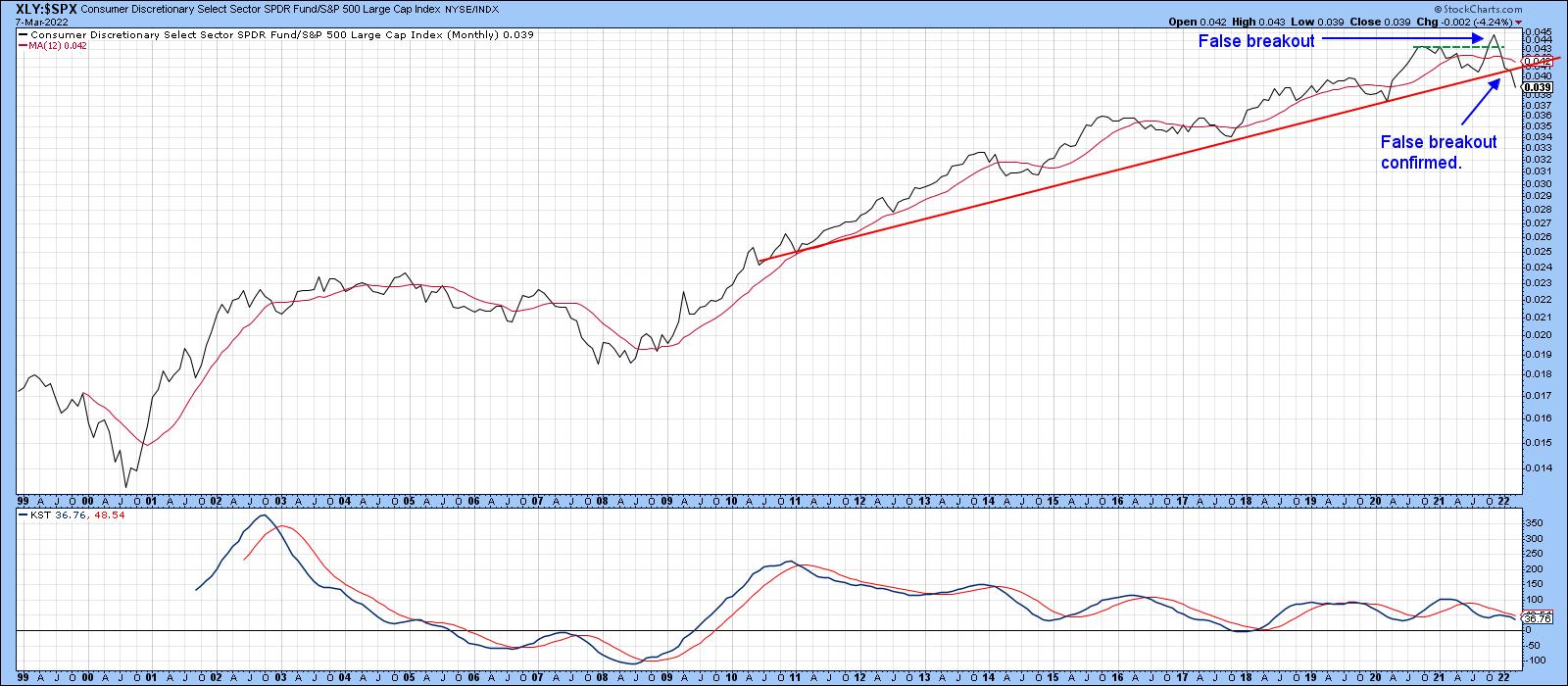
Chart 1 features the long-term relative strength line of the SPDR Consumer Cyclicals (XLY) versus the S&P. It certainly supports the idea that the cycle is in a later stage. After all, the RS line is below its 12-month MA and the long-term KST is also in a negative mode. Equally important is the fact that the RS line experienced a false upside breakout late last year. Whipsaws, such as this, are often followed by above-average moves in the opposite direction to the breakout, as traders scramble to get back on the right side of the market. That breakout has now been confirmed by the RS line dropping below its 2010-2022 up trendline. This one has much more serious consequences since the line is lengthy and has been touched or approached on several occasions.
The new downtrend now underway is likely to morph into something greater than a normal cyclical retreat; something more characteristic of the 2002-2008 period, perhaps? It's worth noting that, between 2002-2009, commodity prices rallied sharply, not unlike the present situation.
 Chart 1 Chart 1
I have a series of chart lists using the same long-term template as Chart 1. The individual charts compare a specific sector to each of the others. This approach then helps to discover the strongest and weakest sectors from a long-term perspective. A review of the XLY, compared to other sectors, confirms that, almost universally, these cross-sector relationships have broken down technically.
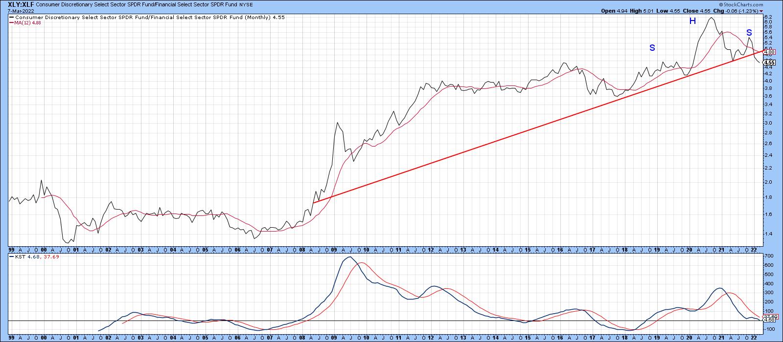
Chart 2, for instance, compares consumer cyclicals to financials (XLY/XLF). The ratio has broken a long-term up trendline and completed an upward-sloping head-and-shoulders top. Further weakness shows up in the anemic KST rally that accompanied the late 2021 high.
 Chart 2 Chart 2
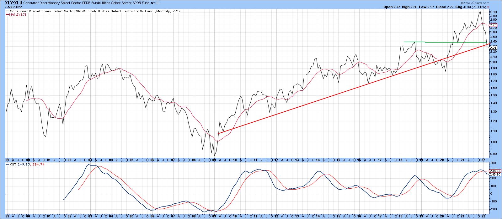
Chart 3 pits the XLY against the staid SPDR Utilities (XLU). Here, we see a long-term KST sell signal supporting the recent break below the two trendlines.
 Chart 3 Chart 3
Metals Emerging
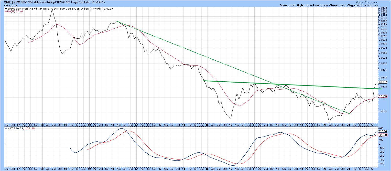
For the last year, energy has by far been the best-performing sector. However, another area, which is also consistent with superior late-stage cycle performance, is metals. In that respect, Chart 4 compares the SPDR Metals and Mining ETF (XME) to the S&P Composite. In mid-2020, the RS line violated the dashed secular down trendline, which told us that downside momentum had dissipated. It's now gone one step further by completing a seven-year double bottom. That action, along with the re-accelerating KST, suggests that the trend of superior performance by the XME is likely to extend for several years to come.
 Chart 4 Chart 4
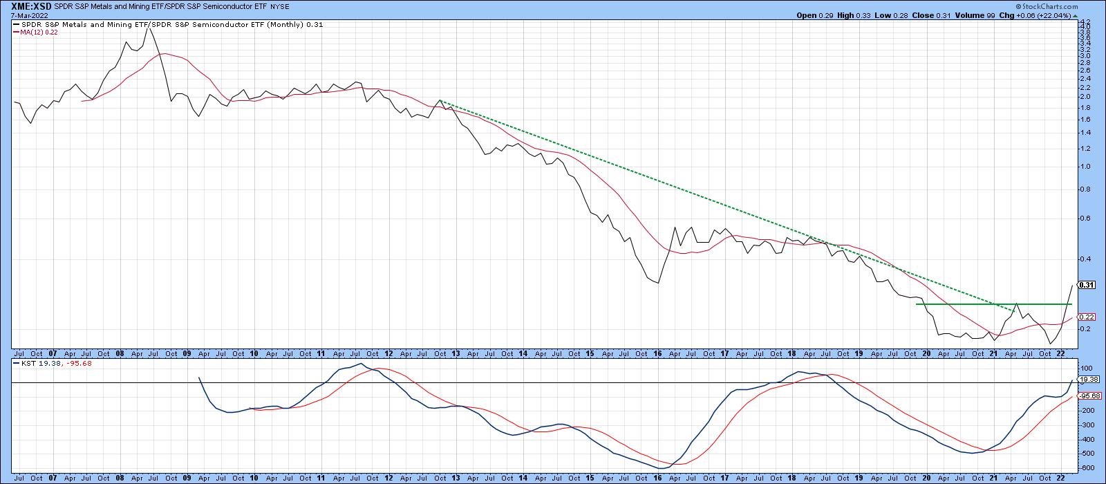
Chart 5 compares the XME to the SPDR Semiconductor ETF. It seems to have reversed its 14-year down trend in relative strength, as it, too, has completed a double bottom formation.
 Chart 5 Chart 5
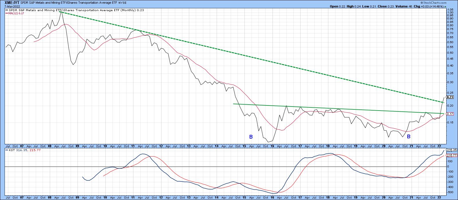
In Chart 6, the cross relationship is with the iShares Transportation Average (IYT). In this instance, the secular down trendline has only just been penetrated. More importantly, though, the ratio has completed and broken out from a 7-year double bottom formation.
 Chart 6 Chart 6
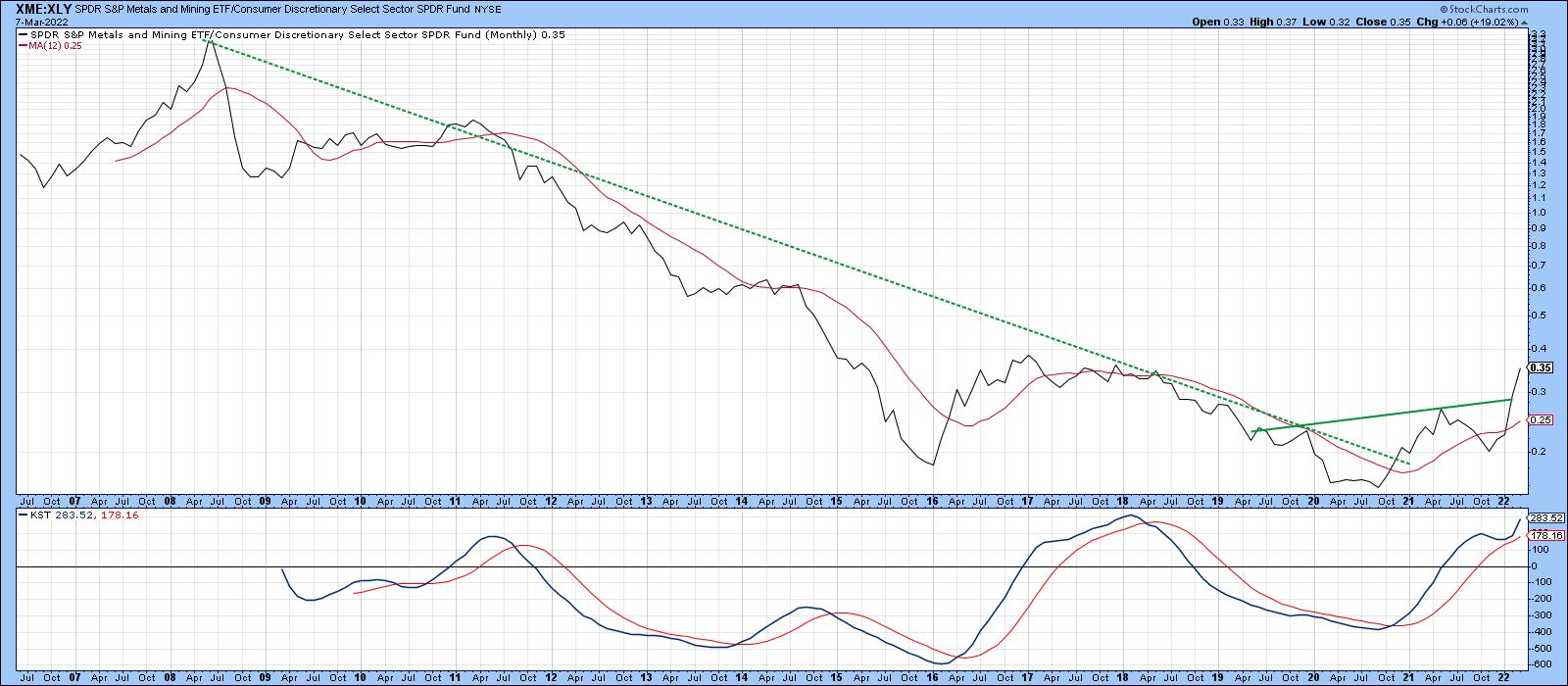
Finally, Chart 7 indicates that the XME, having penetrated its secular down trendline against the XLY, has now completed a 3-year inverse head-and-shoulders formation. The KST has also begun to re-accelerate sharply on the upside.
 Chart 7 Chart 7
Conclusion
Many of these relationships are overextended on a short-term basis and could well correct near-term, but the overall message is that the last couple of years have seen a basic long-term change in the relative fortunes of cyclicals and metals, a tale of two sectors indeed.
Good luck and good charting,
Martin J. Pring
The views expressed in this article are those of the author and do not necessarily reflect the position or opinion of Pring Turner Capital Group of Walnut Creek or its affiliates.
|
| READ ONLINE → |
|
|
|
| Top Advisors Corner |
| Continued Weakness in High-Yield Bonds |
| by Tom McClellan |

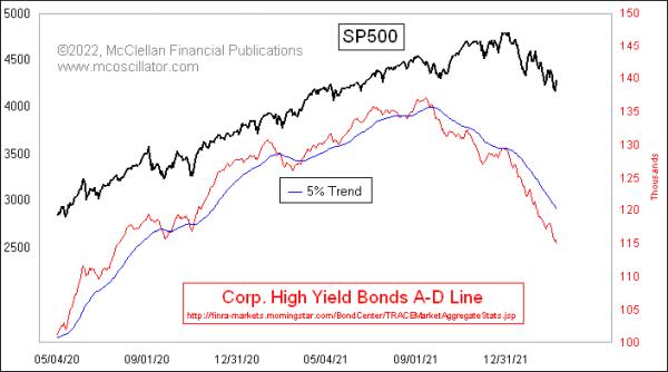
The Daily A-D Line for corporate high yield bonds continues to look quite ugly. That is a concern for the overall stock market, because high-yield bonds drink from the same liquidity pool as stocks do, and these bonds are arguably more sensitive than stocks are to liquidity problems.
So it is not good news to see these canaries in the coal mine still doing poorly. Their message is that liquidity is still in short supply, so much so that these least deserving of issues are going hungry. That says conditions are not good for the rest of the stock market.
There is the possibility, though, that we are seeing a case of too much of a bad thing, which could turn into a good thing. When an A-D Line is so negative for so long, it can create an oversold condition that we look for and find in certain indicators. The McClellan Summation Index that my parents developed is particularly well suited for that task.
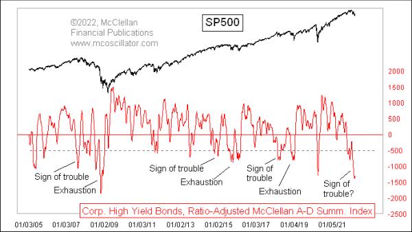
This next chart shows a Ratio-Adjusted Summation Index (RASI) for these A-D data on high yield bonds. It is currently showing us a pretty deeply oversold indication. But there is more to the story it tells us.

When there has been a long quiet period for this indicator, with mostly positive indicator readings, then that period of calm begs for a corrective period. But what we have seen since 2005 (when these data first began in FINRA's dataset) that there is an interesting two-step pattern to the major corrective periods.
The first step is a type of a warning shot, or a "sign of trouble" to come. That leads first to a rebound, then to a more permanent exhaustion event some months later, which finishes the corrective period. This current dip arguably fits into that "sign of trouble" category.
Frustrating that categorization was the last such dip, which occurred in March 2020 during the COVID Crash. That is an obvious exception that does not fit my nice categorization, which I propose to set aside as an anomaly brought about by a government shutdown of the economy, not by a cyclical liquidity phenomenon.
If this hypothesis is correct about the current dip being a "sign of trouble", and if there is another bout of weakness yet to come, then this downtrend is not yet over. We don't have enough samples since 2005 to say exactly what the "flash to bang time" is between the sign of trouble and the exhaustion event, but it should be at least a few months.
That is a point for the really long term buy-and-hold crowd to focus on. Traders can take note of this big oversold condition, as, even it if is just a "sign of trouble", it can still lead to an impressive bounce before the real trouble comes in the "exhaustion event". That remains a task for the market to perform several months from now and, at some point soon, we should get to see the hesitant bounce from this "sign of trouble" oversold condition.
|
| READ ONLINE → |
|
|
|
| Mish's Market Minute |
| Strength in Commodities Ends the Week |
| by Mish Schneider |

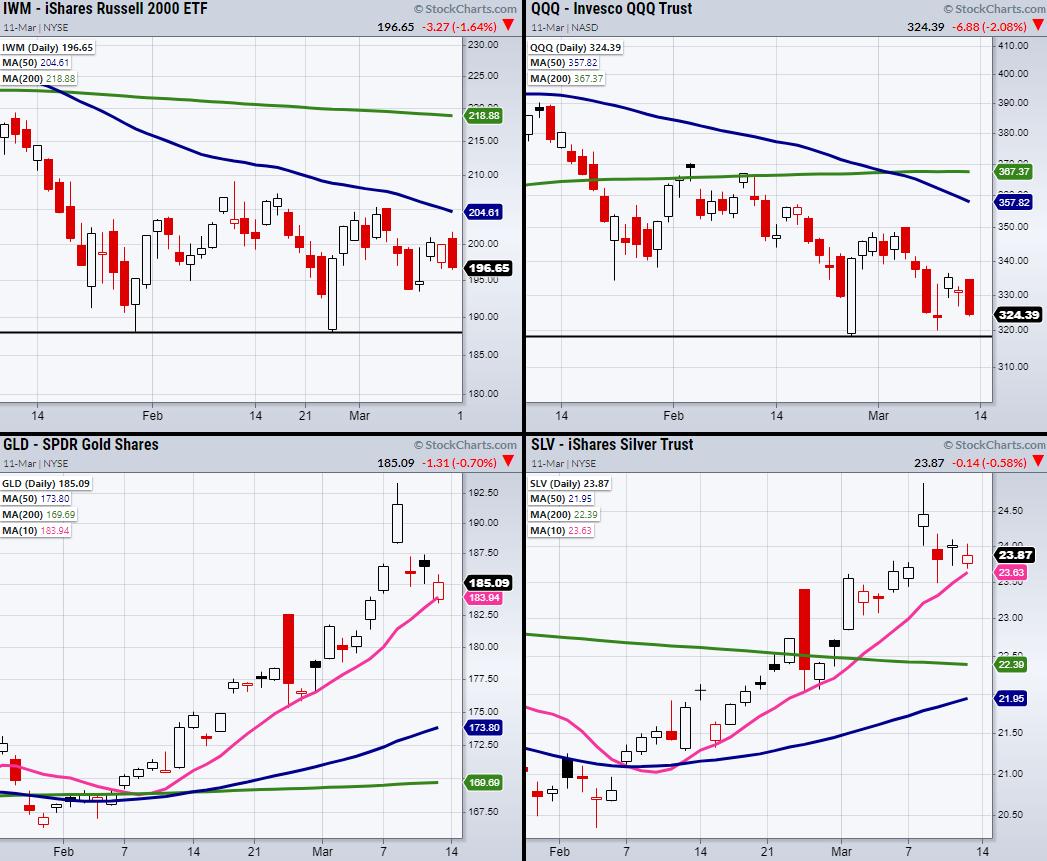
Major indices end on a weak note, with the Russell 2000 (IWM) and the Nasdaq 100 (QQQ) closing down 1.5%. With that said, gold (GLD) and silver (SLV), while down half a percent, are holding a strong uptrend over their 10-day moving average. Soft commodities are also sitting in an uptrend compared to the overall stock market. Therefore, with the indices moving closer to their pivotal support levels, we should keep watch for trade setups in the commodities space.
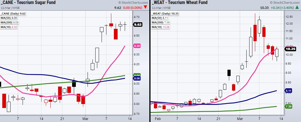
The above chart of the small-cap index (IWM) and the Nasdaq 100 (QQQ) both have main support from 2/24 (Black Lines); $318 for the QQQ and $188 for IWM. While we have seen large price runs in the precious metals, soft commodities, such as Sugar (CANE), Wheat (WEAT) made large moves last week and have now put in some consolidative price action.

CANE is especially interesting if it can clear its recent high at $9.74, as it has stayed in a tight range over the past 6 trading days. On the other hand, WEAT is teetering near its 10-DMA at $10.39 and could use more time before it's ready to push higher. If WEAT can hold over $10, next we can watch for it to clear through last Wednesday's high of $10.70.
Follow Mish on Twitter @marketminute for stock picks and more. Follow Mish on Instagram (mishschneider) for daily morning videos. To see updated media clips, click here.
During these turbulent times, Biotechnology stands out as a really good opportunity once the markets stabilize. On this week's edition of StockCharts TV's Mish's Market Minute, Mish explains the difference between cyclical and non-cyclical, then pinpoints which stocks could be ready to go.
ETF Summary
- S&P 500 (SPY): 410-415 support.
- Russell 2000 (IWM): 193 support.
- Dow (DIA): 322-326 support.
- Nasdaq (QQQ): 318 support.
- KRE (Regional Banks): Needs to hold over 69 the 200-DMA.
- SMH (Semiconductors): 239 next support.
- IYT (Transportation): 243-245 support area. Resistance 264.
- IBB (Biotechnology): 118 support.
- XRT (Retail): 78 resistance. 72 to hold.
Forrest Crist-Ruiz
MarketGauge.com
Assistant Director of Trading Research and Education
|
| READ ONLINE → |
|
|
|
| MORE ARTICLES → |
|
 Chart 1
 Chart 2


 I cannot tell you the number of times an investor has asked, "Considering the difficulties of the past few months, do you still believe in your investment process?" These questions always concerned me because I never once considered not believing in my process for managing money just because of short-term whipsaws and volatility. I have written often, maybe too often, that the single most important trait to have for the long-term success of my process was discipline. You must have discipline to stick with your strategy during the inevitable periods when the results are less than perfect. There are two emotions that can override intelligence and consume investors and their money, testing their discipline to stick with the process, and those are fear and greed.