| THIS WEEK'S ARTICLES |
| The Mindful Investor |
| The Renewed Rise of Bitcoin |
| by David Keller |
In hosting The Final Bar on StockCharts TV, I get the opportunity to ask successful traders and market practitioners which charts are top of mind in their process at any given time. I've found this to be a fantastic way to track market sentiment from some of the top technical analysts in the industry, and it has helped me broaden out my own process of market analysis.
When we invite someone on the show, we let them bring whatever charts they want. So it can be very interesting to see which charts make the cut, given the fact that they could pretty much discuss any financial topic. So when two of my three guests chose to make a bullish argument for Bitcoin, it certainly made me take another close look at the chart.
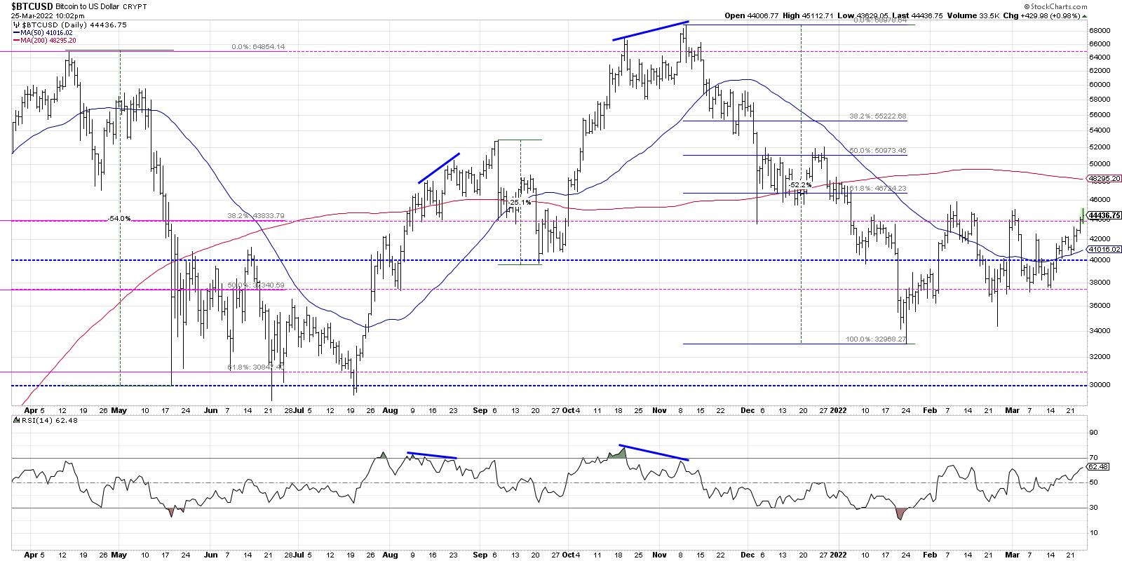
Roman Bogomazov of Wyckoff Analytics spoke of the consolidation phase for Bitcoin over the last three months. He stressed that the crypto would need break out of that pattern to the upside, and, when it did (which was likely), then there was upside all the way to the previous all-time highs in the 61,000-64,000 range.
I would absolutely echo Roman's take on the chart, including the higher lows in February and March, which speak to increased buying power over the last two months. And with the positive move on Friday, Bitcoin appears to have broken out of Roman's consolidation range, opening up the way to much higher price targets.
Back on Tuesday, I had the pleasure of speaking with legendary trader and technical analyst Peter Brandt. Peter took a fairly long-term view of Bitcoin and reflected how the crypto has essentially been rangebound since early 2021.
Now granted, that's a pretty wide range between 28,000 and 68,000, but his point is very well taken. The Bitcoin story is evolving not over days and weeks, but over months and years. As I like to say, "Make short-term decisions with short-term charts and long-term decisions with long-term charts."
Peter's point was twofold. First, Bitcoin is at the lower end of the range, and has plenty of opportunity to retest the upper end of that range near the 2021 highs. Second, the long-term story is bullish, and investors should understand that the long-term potential is positive until proven otherwise.
I like to remind investors that certain products, like leveraged ETFs, futures and cryptocurrencies, provide the opportunity for significant upside, but also significant downside. The potential opportunities are worth it as long as you weigh the potential risks.
My conversations with Roman Bogomazov and Peter Brandt confirmed what I have seen on my chart of Bitcoin. The short-term consolidation phase appears to be resolving to the upside, and there is plenty of daylight between current levels and the November 2021 highs.
RR#6,
Dave
P.S. Ready to upgrade your investment process? Check out my YouTube channel!
David Keller, CMT
Chief Market Strategist
StockCharts.com
Disclaimer: This blog is for educational purposes only and should not be construed as financial advice. The ideas and strategies should never be used without first assessing your own personal and financial situation, or without consulting a financial professional.
The author does not have a position in mentioned securities at the time of publication. Any opinions expressed herein are solely those of the author, and do not in any way represent the views or opinions of any other person or entity.
|
| READ ONLINE → |
|
|
|
| ChartWatchers |
| Is this Bear Market Rally Ending? These 2 Charts Will Tell Us |
| by Tom Bowley |
Rallies and selloffs can be so crazy during volatile periods, and 2022 definitely qualifies as volatile. The Volatility Index ($VIX) has now been elevated and above 20 every single day since January 18th. That's roughly 9 weeks. It comes after a year in which the VIX has bottomed in the 14-16 range. The only time this century that we've seen the VIX rise off of lows beneath 15, before then trading for 9 continuous weeks or more above 20, was 2020, as the pandemic unfolded. In other words, all pandemics aside, this is new territory. There remains a TON of nervousness in the market, which is why we MUST stay on guard for the possibility of further downside action.
I remain fully convinced that we're in a secular bull market and any weakness that we see throughout 2022 will dissipate; we'll eventually return to new all-time highs later this year or in 2023. The timing of the all-time highs will be based off of whether the bottom is already in. If the February low sticks, then I think we could see a new high in 2022 after a period of consolidation. However, if we have another leg lower and we pierce that February low, then I wouldn't expect to see a full recovery to new highs until 2023.
Post-Pandemic Traders are at It Again
One big problem the stock market faces is that many new investors cannot believe the stock market could actually be in a bear market, cyclical or otherwise. Despite the nervousness displayed by the elevated VIX, traders are pouring right back into equity calls during this rally. In fact, the 5-day moving average of the equity-only put call ratio ($CPCE) has reached its lowest level of 2022, indicative of excessive bullishness. The 5-day moving average has reached a level where key tops have formed in the past:
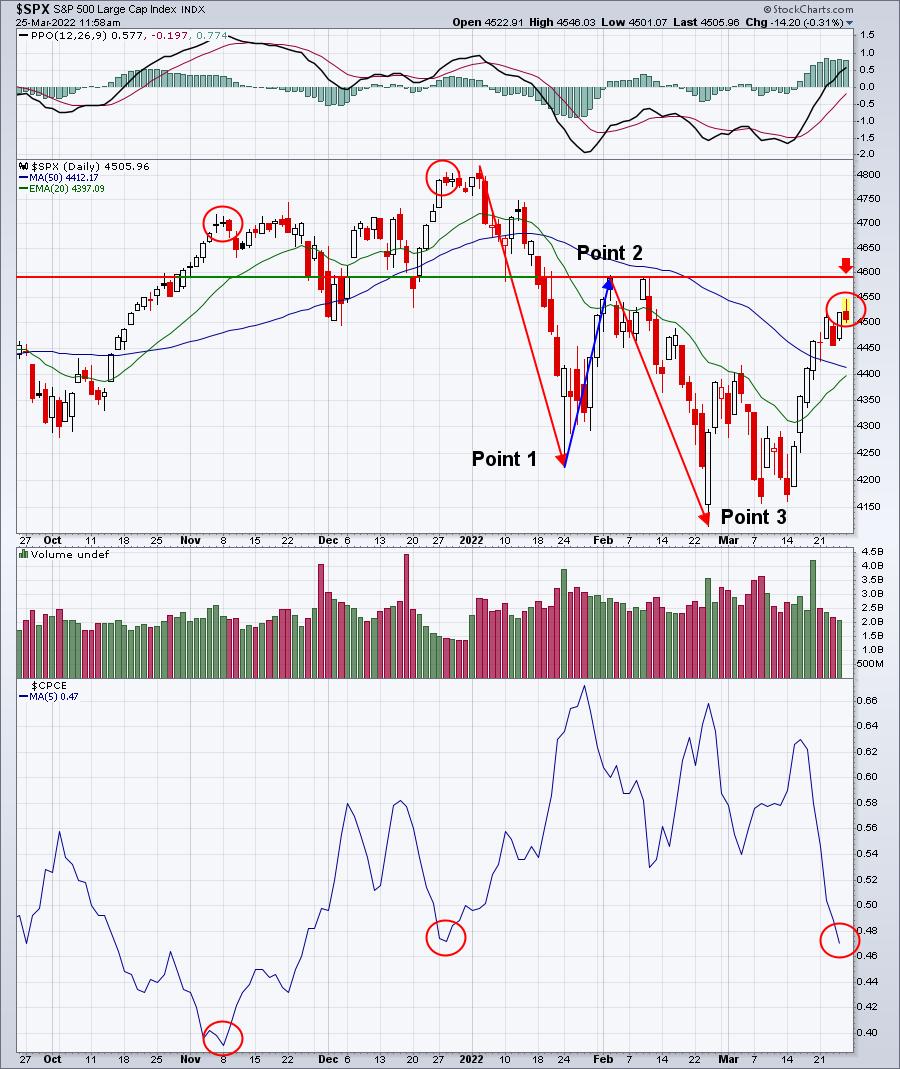
The red circles highlight the recent periods of bullishness in the options world. You can see the result each time as the S&P 500 generally tops. Will it matter this time? Probably, but we'll see. The other key point on this chart is the current 2022 downtrend. A downtrend is nothing more than a series of lower highs and lows. I've marked these above as Points 1, 2 and 3. The red arrow highlights the level that must be cleared to potentially reverse this downtrend by clearing Point 2. Until that happens, we must remain on alert for another potential leg lower in U.S. equities.
Beneath the Surface, Signals are Weakening
Listen, nothing provides us any guarantees. But Wall Street does send us messages from time to time, which will tell us a story if we're only willing to listen. I have a list of "sustainability ratios" that I like to watch to help guide me during rallies and declines. They appear in the panels below the QQQ price chart. While the more aggressive NASDAQ 100 (QQQ is the ETF that tracks this index) just keeps motoring higher, Wall Street is sending us a smoke signal. Check out this chart:
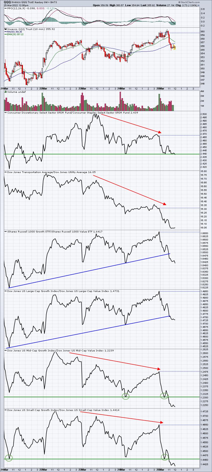
While the QQQ has been trending higher the past five days, several key ratios have put on the brakes and even shifted to reverse. Again, this isn't a guarantee that the market won't go higher, but it certainly lets us know that Wall Street's appetite for risk has changed. All I can say is that rallies don't tend to last if Wall Street isn't willing to continue taking risks.
The only real key area of remaining relative strength this week belongs to the large-cap growth names. They appear to have broken their relative uptrend line, but I wouldn't say they've completely broken down at this point.
If we do top today, or before the 4600 level on the S&P 500 is cleared, then I suspect we're going to see another rapid decline in the days ahead. How will that unfold? Well, that's what I plan to discuss in our free EB Digest newsletter on Monday. To register, simply provide your name and email address HERE. There is no credit card required and you may unsubscribe at any time. Also, we'll maintain your privacy as we do not provide email addresses to any third party.
Happy trading!
Tom
|
| READ ONLINE → |
|
|
|
| ChartWatchers |
| Burglar or Bank Robber? Time to Watch Your Wallet and Stock Portfolio! |
| by Martin Pring |
In October 2021, we made the case for a new secular commodity bull market and concluded that this environment would likely spill back into the economy and stock market. That process is already underway, as the NASDAQ Composite was recently down 20% from its high, compared to a drop of 12% for the S&P 500. The former was heralded by the financial press as "entering bear market territory", whereas the latter was deemed to be in "correction mode". To us, this is a non-helpful and intellectually lazy way of defining corrections and bear markets. After all, most corrections are pretty-well over, or certainly more than half-way completed, by the time the magic 10% mark has been crossed; the same is true for bear markets. It would be more useful to know that the market had entered a correction close to the day it started than at the -10% mark. That's impossible, of course, but we think it's possible to classify these unpleasant periods for investors using a different approach.
Magnitude and Duration of a Bear Market Depends on the Direction of the Secular Trend
Chart 1 features a slide from our 2022 Pring Turner client event. The green and red arrows flag the five secular or very long-term trends that have developed since the 1950's. The smaller pink-shaded ellipses indicate mini-bear markets, which are induced by a relatively short and mild recession. The larger ones zero in on more lengthy and deep recessions. The blue ellipses reflect economic slowdowns, where the growth path of the economy slows but never contracts in a meaningful way, as it does during a recession. Even so, equities typically experience a 10-20% sell-off in anticipation a slowdown. It is evident that the large ellipses are also associated with secular bears, where structural economic and financial imbalances abound. We call these "bank robbers" because they result in a devastating 40-60% loss over an extended 18-month-or-so period.
Chart 1 - Burglars vs. Bank Robbers and the Secular Trend
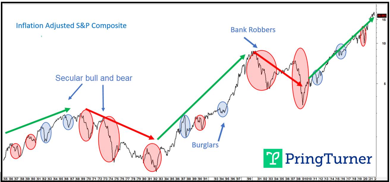 Cyclical bear markets that develop in secular bull markets are painful but contained; not so for secular bears. Cyclical bear markets that develop in secular bull markets are painful but contained; not so for secular bears.
On the other hand, a string of small ellipses, which we call "burglars" due to the fact they are more of a temporary irritant to portfolio growth prospects, act in a similar way as a pit stop during a car race. Both represent a shorter-term setback that allows for refueling before extending the journey. The pit stop allows the car to finish the race in better shape. In a similar vein, the digestion of gains that takes place during a burglar allows both the market and the economy to catch their breath and re-energize, thereby enabling an extension to the secular uptrend. Burglars occasionally result in a sharp 25% drop, as in 1962 and 2020. 1987 was a 35% decline. Mercifully, these "magnitude" bears are brief. More often, though, burglars take the form of a milder markdown, but exert their pain in the form of a confusing multi-month trading range, like 2015-2016. We call them "duration" burglars.
Evidence of a Bear Market
At this juncture, the evidence points to a cyclical bear market, both globally and in the US. Unfortunately, it is too early to say whether it will be a burglar or bank robber. All we can say is that risk levels are more elevated than they were previously and, for portfolio managers, that means taking a more defensive stance. Two reliable indications of weakness come from a slowdown in global economic growth and a jump in the US CPI above its traditional warning level of 5%. Chart 2 sets out the global situation by comparing the MSCI World Stock ETF (ACWI) to a derivative of the OECD amplitude-adjusted LEI. When the derivative drops below its 6-month MA and this is confirmed by the ACWI also penetrating its 9-month MA, a red bearish highlight appears in the chart. This model has been negative now for two consecutive months and is likely to grow more so, as the recent re-acceleration of food and energy prices feeds back into global spending patterns.
Chart 2 - MSCI World Index vs. an OECD LEI Derivative
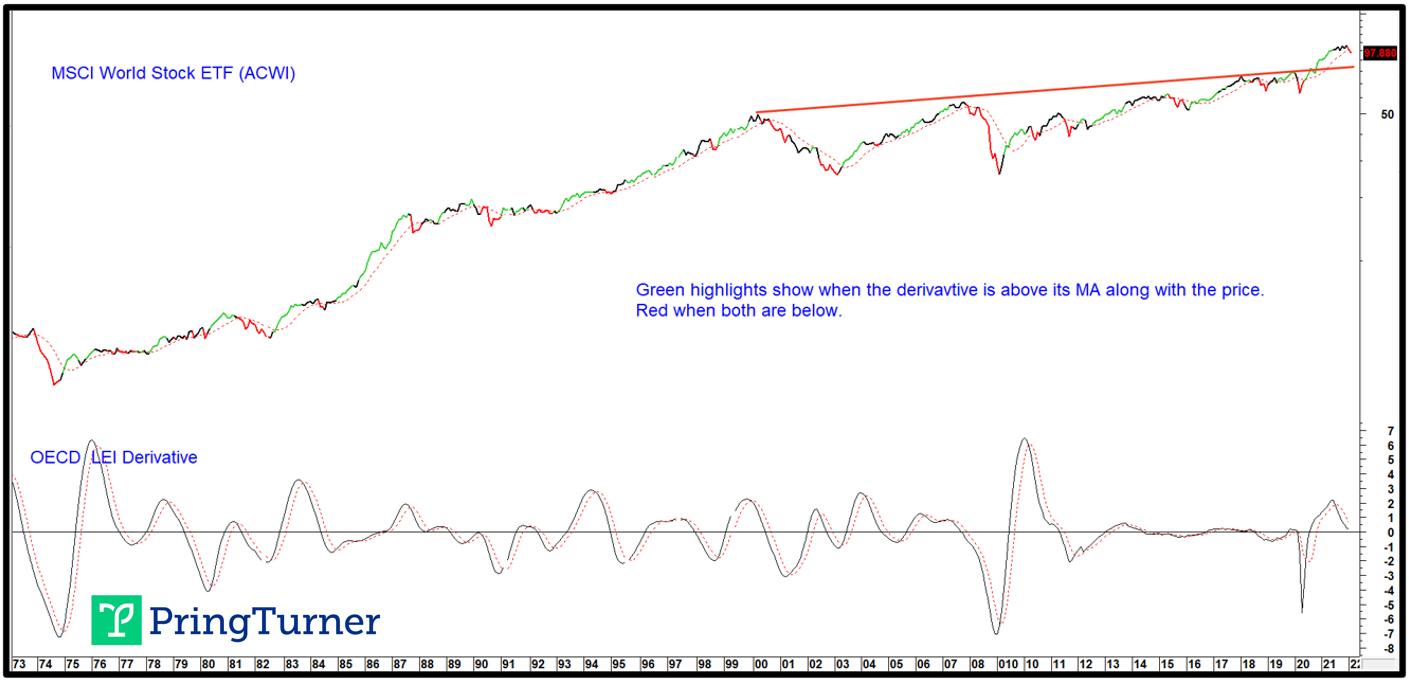 Bearish outcomes develop when both series are below their MAs.Chart 3 pits the inflation-adjusted S&P Composite to the annualized CPI. The solid vertical lines indicate when the CPI reaches a point where spending patterns are disrupted and, thereby, stock market returns. That level appears to be around 5%. Looking to the right of these lines, it is apparent that inflation-adjusted equities suffer. The two dotted ones indicate situations where the drop had already taken place (1984) or there was no bear market at all (1951). Both developed under the context of a secular bull market, as reflected in the green shading. This relationship can be traced all the way back to the 1870s, with similar results. Bearish outcomes develop when both series are below their MAs.Chart 3 pits the inflation-adjusted S&P Composite to the annualized CPI. The solid vertical lines indicate when the CPI reaches a point where spending patterns are disrupted and, thereby, stock market returns. That level appears to be around 5%. Looking to the right of these lines, it is apparent that inflation-adjusted equities suffer. The two dotted ones indicate situations where the drop had already taken place (1984) or there was no bear market at all (1951). Both developed under the context of a secular bull market, as reflected in the green shading. This relationship can be traced all the way back to the 1870s, with similar results.
Chart 3 - US Equities and the Annualized CPI
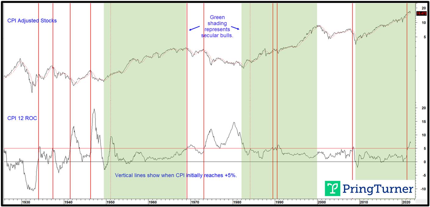 When the CPI reaches 5%, equities sell off, mildly in a secular bull and sharply under the context of a secular bear. When the CPI reaches 5%, equities sell off, mildly in a secular bull and sharply under the context of a secular bear.
The Secular Trend
Since direction of the secular trend of inflation-adjusted equities determines the character of a primary bear market, the question naturally arises as to its current direction. In terms of a reversal, the simple answer is that it's too early to tell. Until proven otherwise, the benefit of the doubt should be given to the post-financial crisis secular bull market. After all, we are talking about a price move generally lasting 15-20 or so years. Surely, it would be unrealistic to conclude that a reversal had taken place less than 90 days from the early January high. What we can do is point to some indicators that have a good track record identifying previous secular reversals and see where they currently stand.
One price oscillator that has identified the previous four secular peaks is calculated from a ratio between a 60-month and 360-month EMA (5-/30-years), shown in Chart 4. The red arrows indicating those peaks developed in a fairly timely fashion. Nevertheless, it is important to note that this chart encompasses a 120-year time span, so a small space represents several months of data. By way of an example, the 1929 peak was signaled well before the 1932 low, but just after the crash. At the end of February, both the oscillator and its 48-month EMA were rising and therefore offering no sign of a secular reversal.
Chart 4 - Inflation-Adjusted S&P Comp vs. a Secular Price Oscillator
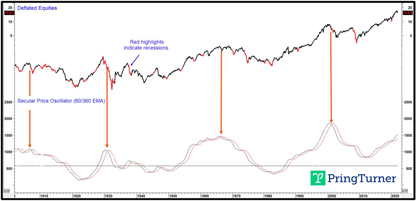 When the secular price oscillator crosses below its 41-month MA expect a secular bear. When the secular price oscillator crosses below its 41-month MA expect a secular bear.
Chart 5 compares real stock prices to the Shiller P/E and a price oscillator using the 24-/240-month parameters. There is no doubt that this measure of sentiment and valuation is at a dangerously elevated level, only exceeded for a few years in the 1990s.
The high level warns that long-term optimism is excessive, with many careless investment decisions just waiting to be revealed. Warren Buffett's analogy regarding naked swimmers comes to mind. These naked swimmers, though, are exposed when the tide recedes. In market speak, that's when the long-term trend of the Shiller P/E reverses. The arrows flag periods when the oscillator drops below its 41-month MA from an extended level. All crossovers were associated with a decline in the Shiller P/E and equity prices. The four thick ones isolate secular turning points. A cyclical or primary trend reversal developed following the three smaller dashed arrows. This indicator is still marching higher and not, therefore, offering any evidence of an impending secular top. If we are correct in our assumption of a further extension to the secular uptrend after the current cyclical bear market has run its course, Chart 5 indicates a possible upside limit in the form of the extended resistance trendline, which is around the 50 level.
Chart 5 - Inflation-Adjusted S&P Composite vs. the Shiller P/E
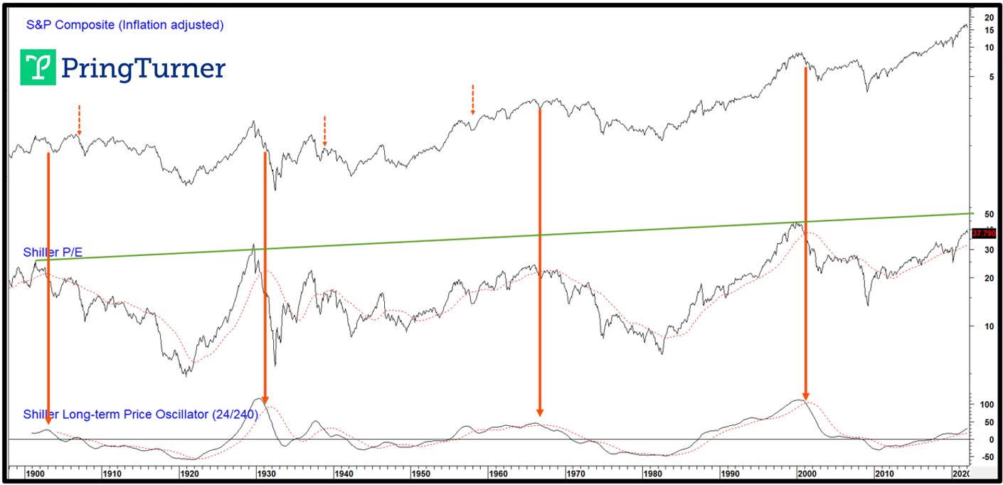 When the Shiller P/E price oscillator peaks, a secular bear is usually underway. When the Shiller P/E price oscillator peaks, a secular bear is usually underway.
At some point, unstable commodity price trends, which reflect structural imbalances for the economy, adversely affect stock prices. From an inflationary point of view, the triggering point arises when the inversely-plotted commodity price oscillator in Chart 6 crosses below its MA. This earns a red highlight in the CPI-adjusted Stock chart and is its way of warning that the secular trend is now positive for commodities. Ignoring the false signal in the ellipse, the remaining crossovers were all followed by a secular bear market for stocks. In two instances (1937 and 1973), the drop was immediate. On the other hand, the 1899 and 2005 signals were both followed by a delayed secular bear for equity prices. The 1929-32 drop was not indicated in any way by this approach because it fell victim to excessive deflationary, not inflationary, pressures.
Chart 6 - Real Stocks vs. an Inverted Commodity Price Oscillator
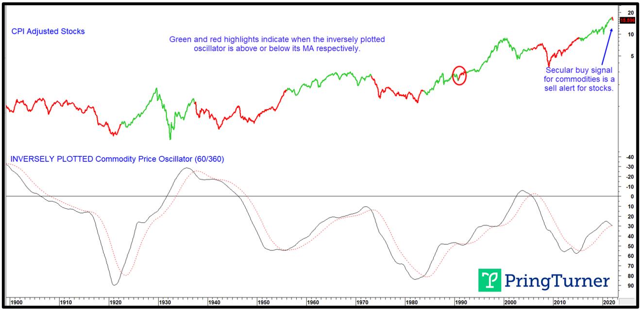 Secular bull markets for commodities coincide with secular bear markets for stocks. Secular bull markets for commodities coincide with secular bear markets for stocks.
Based on the experience of the last 130 or so years, the oscillator is arguing in favor of a secular bear for stocks, but evenly split as to whether it begins now or later. That is one reason why we cannot be adamant in our view, as suggested in Charts 4 and 5, of a likely extension to the secular bull in equity prices.
Conclusion
Most of the long-term indicators we follow are confirming some kind of a cyclical weakness for stocks. Since we do not know whether price action since the end of December represents a burglar or bank robber, it's as well from a primary trend point of view to stay cautious, even though washed-out sentiment and other indicators are indicating the probability of a near-term retracement rally. One characteristic common to almost all bank robbers is that, once a negative MA crossover has taken place, it remains that way until after the final low is in. Consequently, if the S&P 500 should quickly regain its 12-month MA, which is currently around 4,400, it would represent a burglar characteristic. Should that prove to be the case, most, if not all, of the downside action may already have taken place. This would imply a duration burglar with a multi-month trading range. In any event, portfolio managers should be more defensively positioned for now. As the evidence changes in the weeks and months ahead, either favorably or not, additional steps toward offense or defense will be necessary. Navigating safely around both a cyclical and secular turning point for stocks and commodities will be vitally important to protecting and growing wealth. Get the latest updates by joining our community of 2,500+ subscribers by clicking this link.
Good luck and good charting,
Martin J. Pring
This article was originally published on March 21, 2022 in Martin Pring's Technical Corner on PringTurner.com. All images are sourced from Martin Pring's Intermarket Review.
Disclaimer: Pring Turner is a Financial Advisor headquartered in Walnut Creek CA, and is registered with the Securities and Exchange Commission under the Investment Advisers Act of 1940. The views represented herein are Pring Turner's own and all information is obtained from sources believed to be accurate and reliable. This information should not be considered a solicitation or offer to provide any service in any jurisdiction where it would be unlawful to do so. All indices are unmanaged and are not available for direct investment. Past performance does not guarantee future results.
|
| READ ONLINE → |
|
|
|
| ChartWatchers |
| A New Round of Crypto Strength Seems to be Around the Corner! |
| by Julius de Kempenaer |

The interest in Bitcoin or, more generally, cryptocurrencies comes and goes, and the moves are highly volatile from time to time. Nevertheless, this investment space is becoming more and more mainstream and, no matter what your personal opinion is, it is more and more a force to be reckoned with. Keeping an eye on the crypto space using Relative Rotation Graphs can easily be done.
Crypto as an Asset Class
With an increasing number of institutional investors allocating (small) parts of their portfolios to crypto investments, the case can definitely be made for Crypto as an asset class. When using a Relative Rotation Graph to plot the rotation for various asset classes, we can simply add $BTCUSD to the universe as a proxy for "crypto" investments.
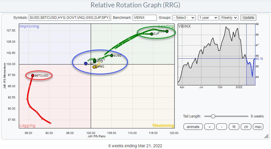
The Relative Rotation Graph above is the RRG I mostly use when looking at the rotations of asset classes. The benchmark here is VBINX, which is a 60-40 (stocks-bonds) balanced index fund.
This is a sol called "open universe", which means that the benchmark does not cover all the securities in the universe. This can cause wide rotations for certain securities which are not included in the benchmark, as there is no relation between the two.
On this RRG, you can clearly see the tails for both commodity ETFs far away inside the leading quadrant. Commodities are not included in VBINX. Additionally, the tail for Bitcoin, also not included in VBIN, is far to the left in the lagging quadrant.
Allocations to asset classes that are not included in your benchmark can offer good opportunities to outperform that benchmark, as they can move independently... BUT that can also cause a lot of pain when you have allocated money outside the benchmark and that allocation does not keep up with your benchmark. So risk management is very important in those cases. It's always important, but now even more so.
(Of course, you can argue whether BTC is the correct representation for allocations to crypto in general but I'll get to that later.)
Looking at the rotation of BTC over the last months, it is clear that it went through a rough patch vis-a-vis stocks, especially towards the end of 2021, when BTC dropped from a peak above $65k to a low near $35k at the beginning of 2022.
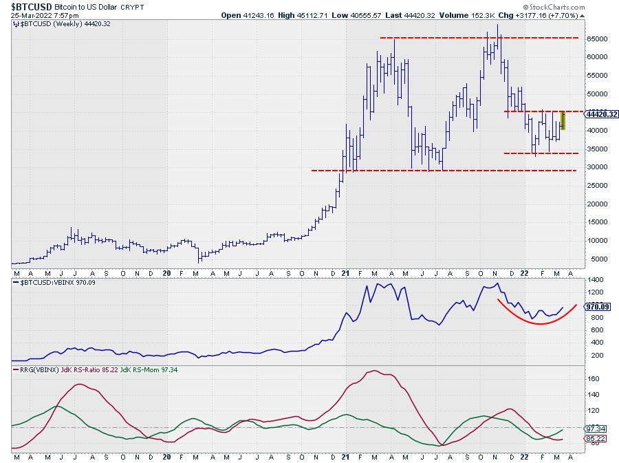
After reaching that low near $35k, BTC stabilized in a wide range between $35k-$45/46k. This stabilization is now causing the tail on the RRG to move up towards the improving quadrant. For the first time since October, the BTC tail has picked up a positive RRG-Heading (0-90) again.
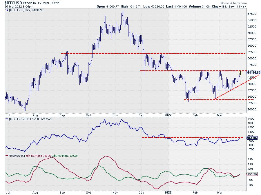
The daily chart above shows this range in a bit more detail, and also shows that the market is currently working on an attempt to break that upper boundary. No doubt that a break above roughly $46k will trigger more upside movement towards the next level near $52.5k, which will very likely also have a positive impact on its relative strength against VBINX.
Crypto is More Than Just BTC
With thousands of different coins available already, "crypto investments" are arguably more than just BTC. As BTC still is, and will probably remain for quite some time, the benchmark for crypto investments, I prefer to use $BTCUSD as the proxy for the entire asset class on the asset class RRG. However, in the next investment layer, it is very well possible to dive deeper into the crypto space to see if there are currencies/coins that are more or less interesting than BTC itself.
There is a pre-defined group of cryptocurrencies available on the RRG page, which holds a universe of widely-traded coins. One option is to plot this universe against the USD as the benchmark, but I prefer to use the second option and plot the universe of cryptos against BTC to see if any are showing especially strong or weak rotations vs. the mother of all cryptos.
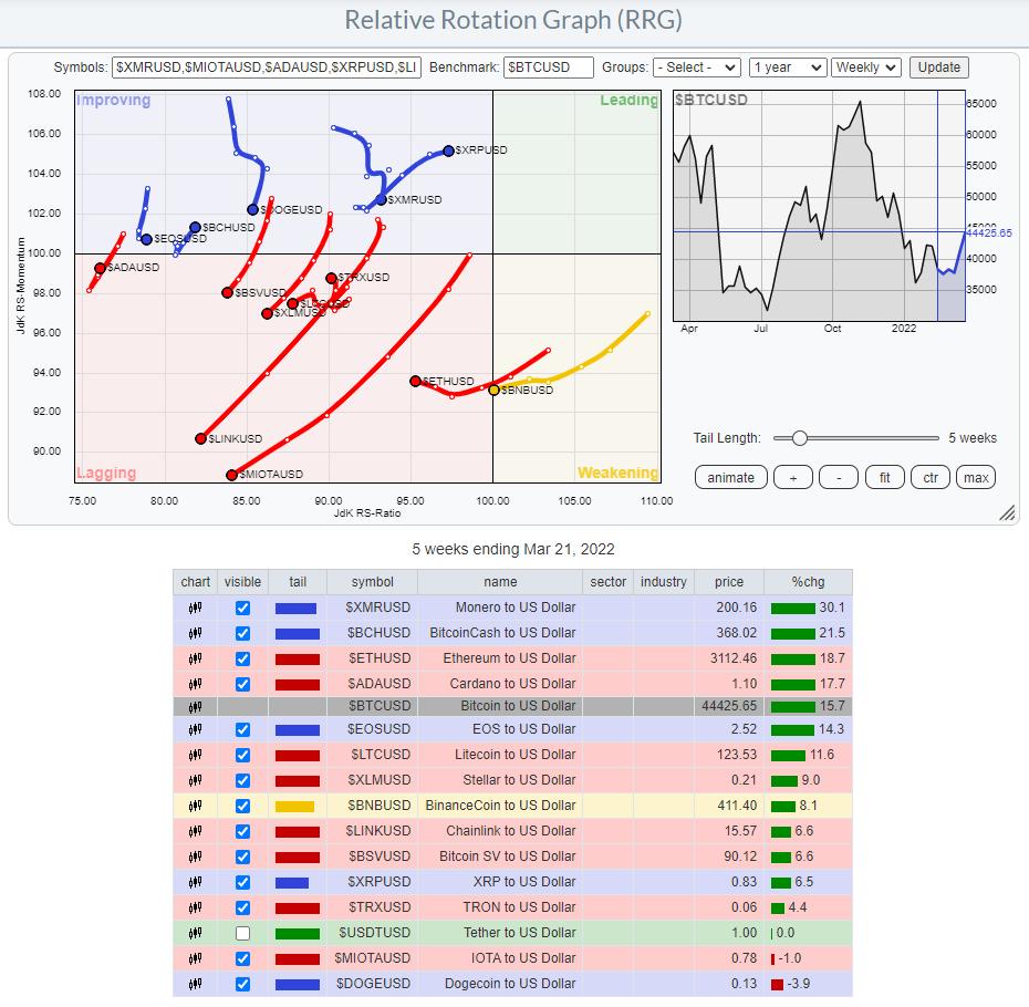
This weekly RRG does not show even one tail inside the leading quadrant, and the majority of tails are at a negative RRG-Heading vs. BTC. This is a pretty clear message saying that BTC is leading the way at the moment. And looking at the BTC chart, as discussed above, it will very likely be leading the way UP!
And this could be good news. In the past few "crypto waves" we have seen a repeating pattern where BTC would lead the initial charge which was then later followed by a new "alt season". On the weekly RRG, this is not very well visible yet. But when we switch the crypto RRG to daily, things change.
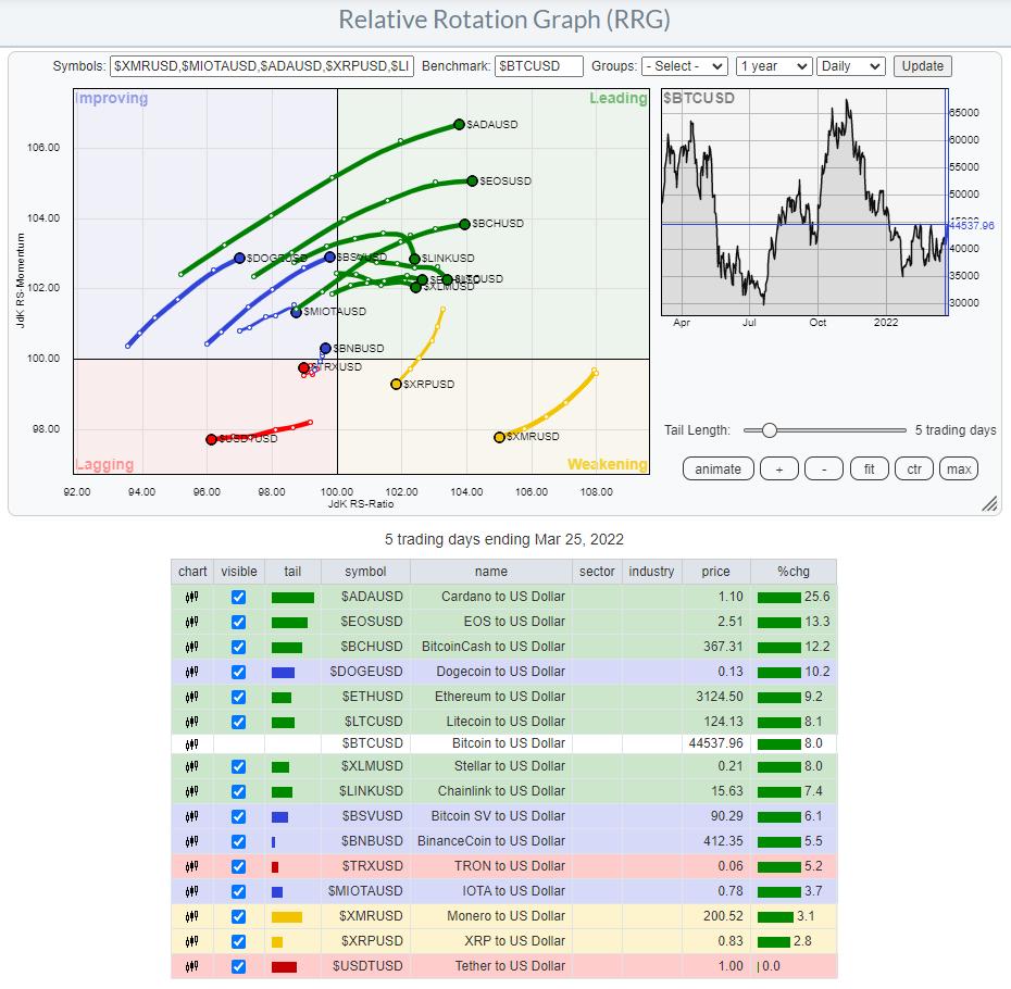
In this picture, the general direction for the tails of the alt-coins has changed to predominantly Northeast, suggesting relative uptrends and outperformance vs BTC.
Stay Mainstream or Go Alt...?
All in all, the crypto space seems to be coming to life again. Those who are not too adventurous can stick to straightforward BTC allocations (there are plenty of ways to create exposure nowadays) to benefit from the increasing strength. Those who are happy to dig a bit deeper and think/invest outside the crypto box will benefit from checking out a few of the coins with long green daily tails pushing further into the leading quadrant.
Have a great weekend and #StaySafe, --Julius
My regular blog is the RRG Charts blog. If you would like to receive a notification when a new article is published there, "Subscribe" with your email address.
|
| READ ONLINE → |
|
|
|
| ChartWatchers |
| The Markets Have Bottomed - Here's Where You Need to be Investing |
| by Mary Ellen McGonagle |
Over the past 2 weeks, the S&P 500 has managed to reverse a good part of this year's losses with a rally that's put the markets back into an uptrend that began on March 16th. Subscribers to my MEM Edge Report were immediately alerted to this new uptrend when the S&P 500 posted a bullish follow-through day, through the use of a system that's identified every market bottom going back over 40 years.
DAILY CHART OF S&P 500 INDEX
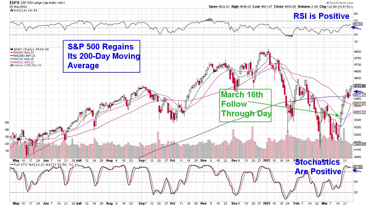
When the markets enter a new uptrend, that often marks an ideal time to identify new leadership stocks that will go on to trade higher than the broader markets. Historically, these leadership stocks possess several characteristics, among those being that they will be the first out of the gate among their peers, as their industry group begins to turn positive. Additionally, the company will exhibit strong growth prospects.
For example, as the markets entered a new uptrend on the 16th, we highlighted the Semiconductor group as being close to reversing its downtrend, while also identifying Nvidia (NVDA) as a leadership name in this group. NVDA's strong growth prospects is one reason, while the fact that it turned positive ahead of its peers was another, following its break back above its 50- and 200-day moving averages last Friday.
While I believe NVDA will continue to outpace the markets, as well as 2 other Semiconductor stocks I'll be adding in my Sunday MEM Edge Report, there are other areas of the market that are poised to trade higher as well. Specifically, stocks that act as a hedge against inflation are also ideal at this juncture. With inflation currently at a 40-year high and increased Oil prices pointing to a prolonged period of higher prices, buying high-yield stocks is a great hedge. The reason is that these high-dividend companies often have cyclical business models that hold up well when prices rise, as they have strong pricing power that allows them to maintain high profits.
DAILY CHART OF S&P 500 HIGH DIVIDEND ETF (SPDY)
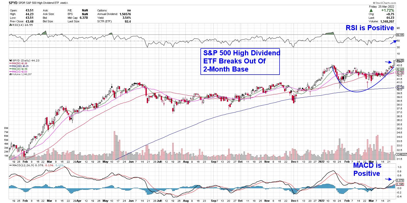
A diversified ETF that contains high dividend stocks would be a great way to gain exposure. Below is a chart of the S&P 500 High Dividend ETF (SPYD), which broke out of a 2-month base today on its way to greater heights. SPYD is composed of 80 high-dividend-yielding companies within the S&P 500, including top Energy and REIT stocks. In addition, this ETF provides a 3.5% yield.
It's been a trying period for investors this year, with crosscurrents taking place amid Russia's invasion of Ukraine as well as a shift in the Federal Reserve's monetary policy. Add in high inflation and rising interest rates and it's enough to discourage most investors. If you'd like expert guidance during these trying times, trial my twice weekly MEM Edge Report for 4 weeks for a nominal fee. In addition to highlighting sectors and industry groups poised to benefit from the current environment, you'll also be provided with top stock candidates that will benefit.
I hope you'll take advantage of this special offer.
On this week's edition of StockCharts TV's The MEM Edge, I review where the strength in the markets is and ways that you can capitalize on it. I also share stocks and ETFs that are breaking out of bases, as well as turnarounds that are taking place.
Warmly,
Mary Ellen McGonagle, MEM Investment Research
|
| READ ONLINE → |
|
|
|
| The Traders Journal |
| How I Combat Disinformation And Prevent It From Corrupting My Portfolio With 5 Essential Tools |
| by Gatis Roze |
 Recently, academic researchers have proven and quantified the impact of fake news and how it sways stock prices to the tune of approximately 7% with small-caps, 5% with mid-caps and somewhat less with large-caps. Disinformation and propaganda is all around us. As investors, we must be attuned to how these affect our portfolios. Recently, academic researchers have proven and quantified the impact of fake news and how it sways stock prices to the tune of approximately 7% with small-caps, 5% with mid-caps and somewhat less with large-caps. Disinformation and propaganda is all around us. As investors, we must be attuned to how these affect our portfolios.
The current global environment illustrates this labyrinth of untruths. President Vladimir Putin's propaganda has been so effective within Russia that The Seattle Times recently reported that some 58% of Russians support his so-called "anti-Nazi" justification for invading Ukraine. Another recent example is all the disinformation and anti-vaccination propaganda - undermining both the measles vaccine for children and the COVID-19 vaccination efforts.
Before I offer you my five tools and the steps I take to protect my portfolio from news fraudsters, I'm reminded of Senator Daniel Webster's quote from his Congressional speech in 1833. "The study of money, above all other fields, is one in which complexity is used to disguise truth or to evade truth." I believe that disinformation, misinformation and fake news are all synonyms. However, in today's politically charged partisan news landscape, I believe it's also synonymous with "something that someone does not agree with."
It is my sincere thinking that the exchange of accurate information is the essential lubricant that facilitates reasonable people to live free and conduct commerce and maintain functional effective financial markets.
Today, unfortunately, our beliefs have been so eroded that no one trusts anyone anymore when it comes to the news. We've all become leery of the blurred lines between truth and lies. If you are not leery of today's news, you should be.
I find it fascinating that modern library science courses teach one to think like Sherlock Holmes — teaching "lateral reading" to unearth clues to the truth. Here in Seattle, the University of Washington has a class entitled "Calling Bullshit in the Age of Big Data." The university also hosts an annual event for librarians and teachers called "Misinfo Day." How's that for being mainstream and validating my thesis?
We know that we must do something to protect our assets. But what can we do as investors? So here's my own personal roadmap to information hygiene.
TOOL #1
Acknowledge the reality of disinformation and remain vigilant. This takes discipline. Don't let your guard down — ever. If it sounds too good to be true, or it sounds too negative, odds are the truth is somewhere in the middle. And don't get emotional. In our book, there's an entire chapter on the Investor Self which will help you stay objective and keep an even keel. As Benjamin Graham said, "The market is a pendulum that forever swings between unsustainable optimism and unjustified pessimism." As your market intuition grows, you'll become better at sniffing out the deep fakes.
TOOL #2
Know the sources of the information. A major red flag for myself is when there's a lack of transparency or the writer remains anonymous. I stick to large credible news sources that are willing to direct me to corroborating sources and links. I will often copy the headline into Google's search engine and see if the results yield other known credible news sources. Only then am I inclined to embrace the news as true. The caveat here is to recognize that every media source has a bias.
TOOL #3
Scientists have designed remarkable algorithms which facilitate machine learning to catch fake news. There are a number of websites that do fact-checking, but my personal favorite is mediabiasfactcheck.com. This website has a nifty system of color-coded dots and a scale from zero-to-ten to rate both bias and factual accuracy. That leads to my next tool. The best we can do as investors is to stack the probabilities of truth in our favor. There is no 100% certainty, but we can get close.
TOOL #4
The fourth tool is really to challenge you as investors — you must have a clear and well laid-out methodology. My personal probability enhancer is the 10-stage paradigm I've followed for decades. No single stage can guarantee investment success, but collectively the 10 stages all contribute positive probabilities and together they produce a consistent profitable result. In other words, no single piece of disinformation alone can cause the collapse of your portfolio. It virtually puts the wind at your back and insulates you from fake news, disinformation and disaster.
For the thousands of you who've read our book, this probability-based approach clearly makes sense. For those less familiar with the 10 stages, I struggle with how best to convince you of the merits that this multi-step approach offers. So I've decided that the easiest way is to simply "make you an offer you cannot refuse." We'll make our 2-disc instructional blue ray DVD available at a discount of 65% ($49.95).
TOOL #5
Finally, the most important tool is your charts. Vladimir Putin can spin his propaganda campaign, but the focus needs to be on what he actually does, not on what he says. The same is true in the stock markets. Remember that it's an auction market where buyers and sellers are brought together and essentially vote using their real money with the result being a price chart. They cast an average of 6 Billion votes in a trading day. In statistics, this is called a "statistically significant sample size." Regardless of what the media proclaims, what talking heads shout or the financial fundamentals may report, all of these factors are reflected in the price chart of an equity in question. In other words, your charts won't lie to you. Trust what you see — not what you hear or read.
As I've repeated so many times before, the stock market is the world's most sophisticated disinformation machine ever created. Trust your charts.
Trade well; trade with discipline!
Gatis Roze, MBA, CMT
StockMarketMastery.com
|
| READ ONLINE → |
|
|
|
| DecisionPoint |
| Bear Market Breakout? |
| by Carl Swenlin |
At DecisionPoint.com we have been operating on the assumption that we are in a bear market. We won't know for sure until the market declines 20% or more, but that seems a bit late to begin responding to what appears to be bear market action.
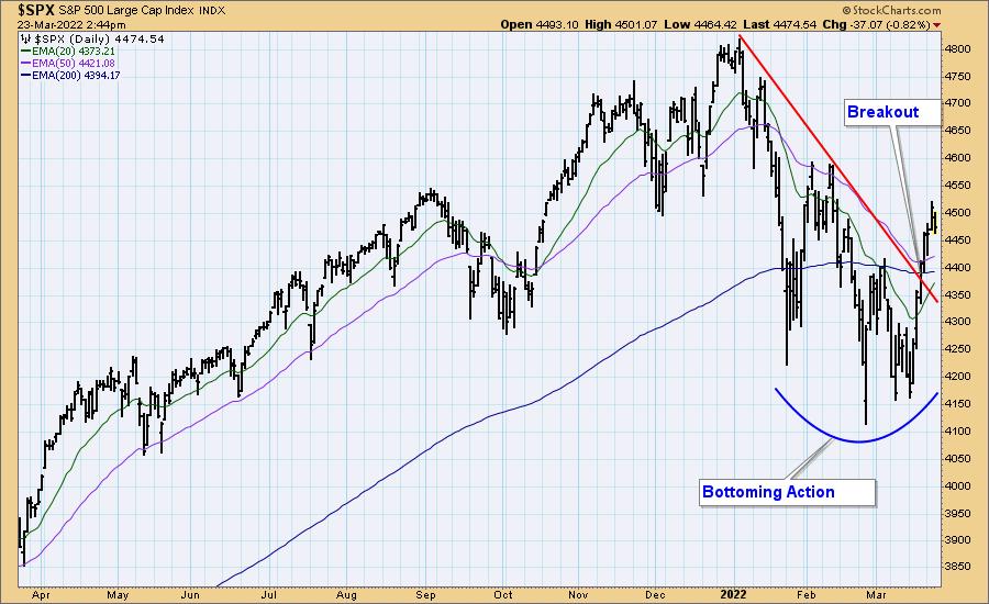
The market recently went through two months of some nice bottoming action, then it made a strong break above the declining tops line. Can we now breathe more easily regarding bear market prospects? No one knows how this will resolve, but over the years I have learned to be wary of breakouts. Let me show you why.

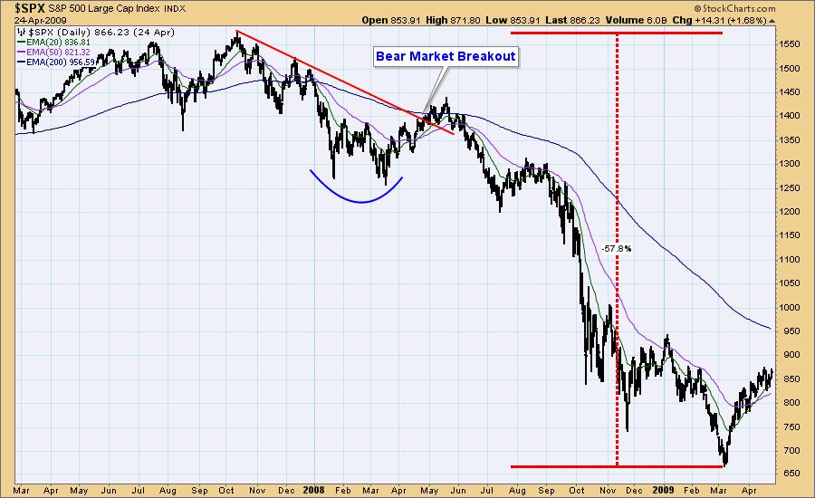
In early-2008 the market appeared to make a solid bottom, and a breakout took place soon after. But it was a fake-out, which was followed by the lion's share of the nearly -58% bear market decline.
There were at least four "fake-out breakouts" during the 2000-2002 Bear Market decline. They offered great promise, but ultimately failed to prevent the -50% decline.
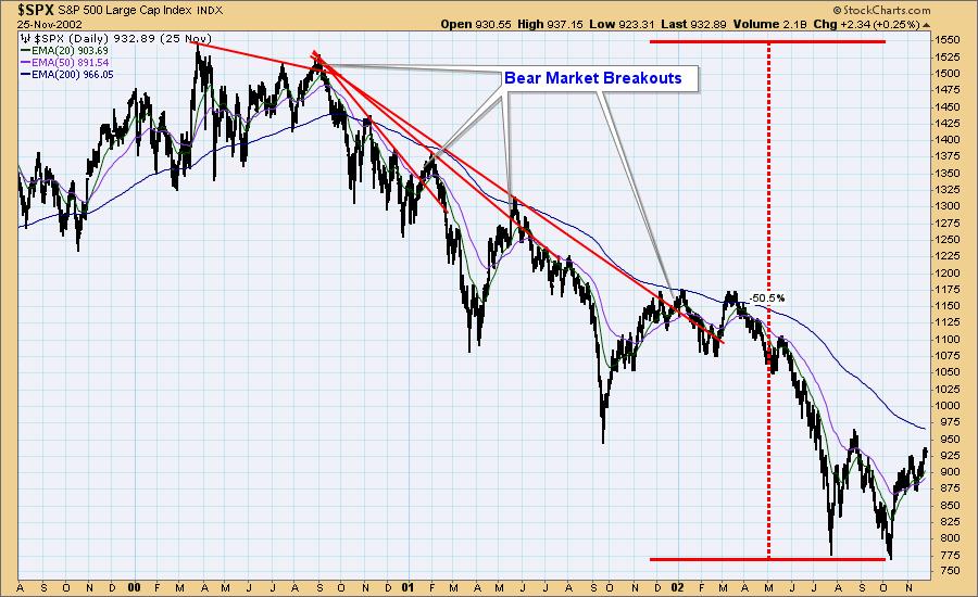
Conclusion: Breakouts are often signals that a down trend has ended, and sometimes not. We are proceeding on the assumption that the bear market has not ended.
Technical Analysis is a windsock, not a crystal ball. --Carl Swenlin
(c) Copyright 2022 DecisionPoint.com
Helpful DecisionPoint Links:
DecisionPoint Alert Chart List
DecisionPoint Golden Cross/Silver Cross Index Chart List
DecisionPoint Sector Chart List
DecisionPoint Chart Gallery
Trend Models
Price Momentum Oscillator (PMO)
On Balance Volume
Swenlin Trading Oscillators (STO-B and STO-V)
ITBM and ITVM
SCTR Ranking
Bear Market Rules
DecisionPoint is not a registered investment advisor. Investment and trading decisions are solely your responsibility. DecisionPoint newsletters, blogs or website materials should NOT be interpreted as a recommendation or solicitation to buy or sell any security or to take any specific action.
|
| READ ONLINE → |
|
|
|
| The Canadian Technician |
| Getting Our Trading Back on the Rails |
| by Greg Schnell |
The stock market has a pretty big slam lower to start the year. However, the massive rally off last week's lows will mean the monthly and quarterly data won't look nearly as bad.
- January was down 5.2% from the December close to the January close.
- February was down 3.1% from the January close to the February close.
- March is up 2.7% from the February close to March month-to-date.
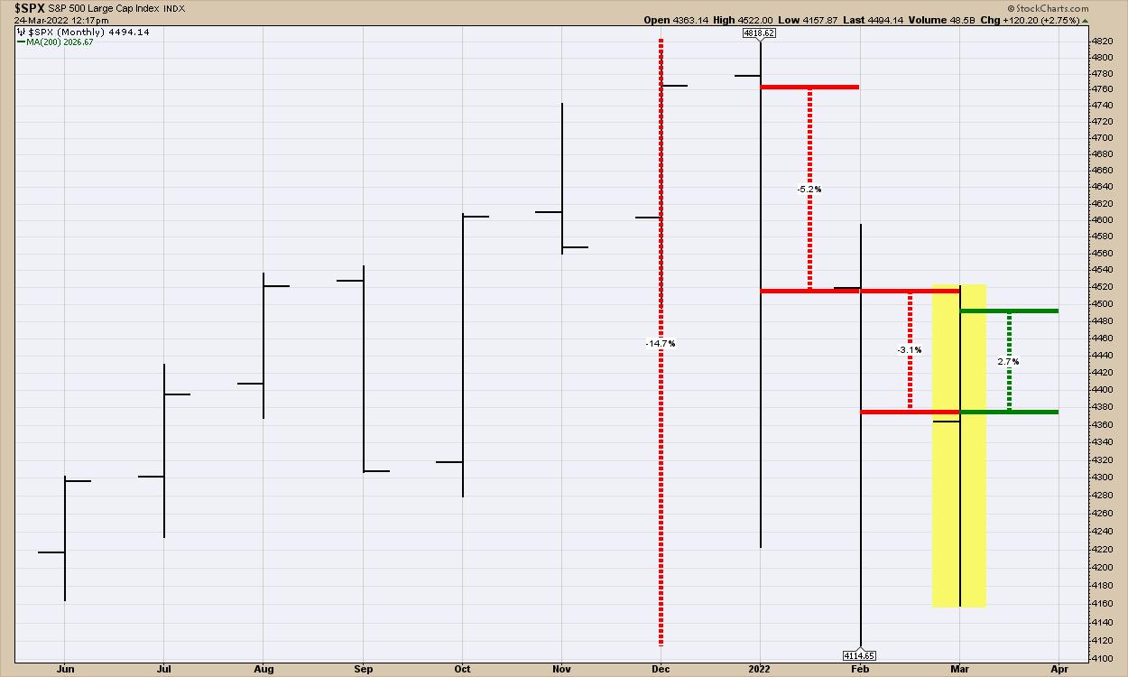
While those months sound minor both ways, it was the 35 trading days from the January highs to the February lows being down 14.7% that make it hard.
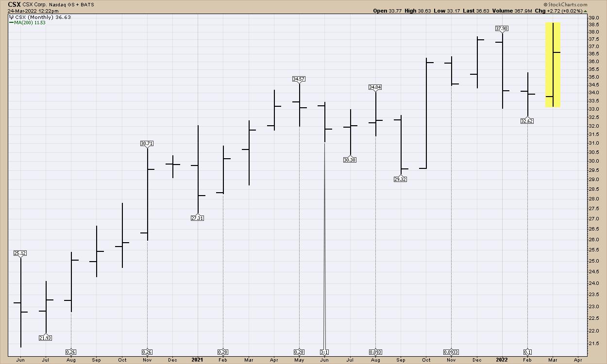
One group that held up well through the market correction was the railways. Here is CSX. Just a zoomed-out view, monthly price bars. This stock made new highs in March while the general market was recovering.
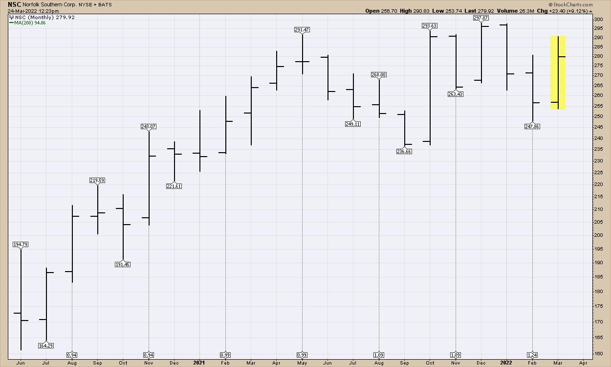
Here is NSC, Norfolk Southern. It has been consolidating, but still looks strong. This is the weakest chart of the publicly-traded railways.
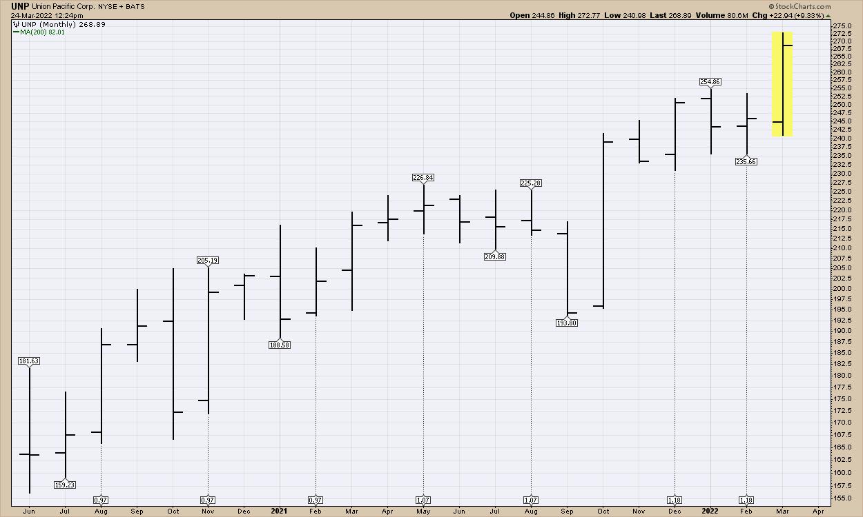
UNP - Union Pacific Railway. This is a monster, blowing out to the top of the chart in March.
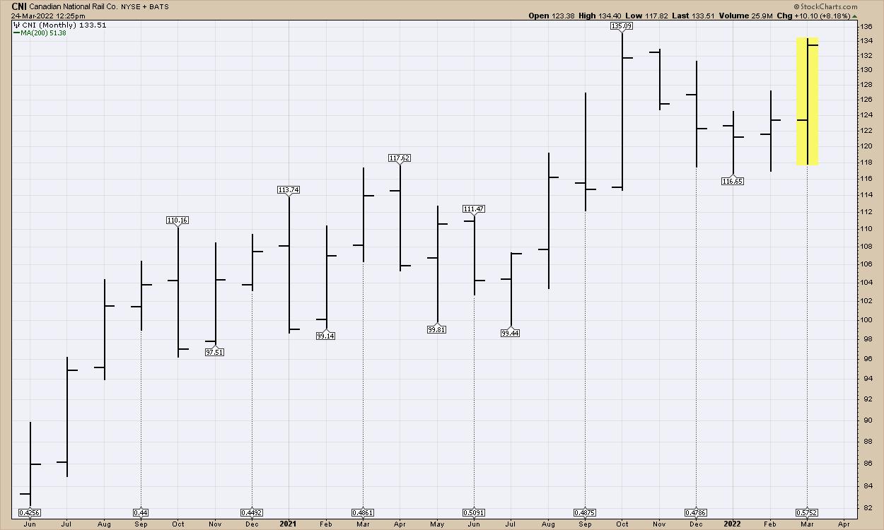
CN - Canadian National Railway. Another chart ready to blow through the top.
CP (Canadian Pacific Railway) recently acquired KSU. The stock is surging this month and is threatening the top of the chart.
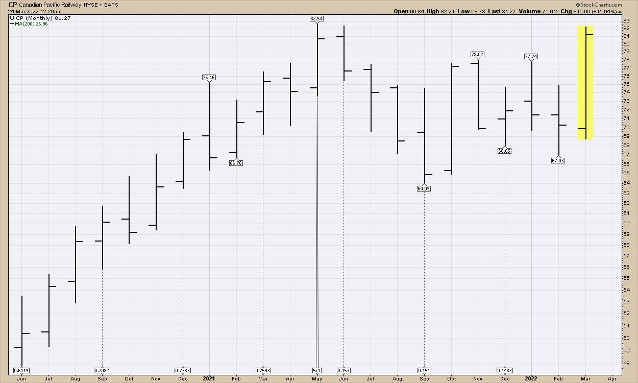
Just leaving out all the details of the January to March move in the railway stocks, you would never know there was a difficult correction. It looks like a solid area to be enjoying higher highs as the industry narrows into a smaller oligopoly.
We continue to roll out new trading ideas as the market moves from down to up. If you would like to try the information at Osprey Strategic, head over to the home page and subscribe at OspreyStrategic.org.
|
| READ ONLINE → |
|
|
|
| Dancing with the Trend |
| WHY do Most Investors do so Poorly? |
| by Greg Morris |
 There are a number of companies that track performance for various asset classes, including the performance of investors. Table A, from J.P. Morgan, shows the Average Investor's 20-year annualized returns of only 2.3%. I have reproduced the small print below the table because it explains the process used. And I cannot read the small print. There are a number of companies that track performance for various asset classes, including the performance of investors. Table A, from J.P. Morgan, shows the Average Investor's 20-year annualized returns of only 2.3%. I have reproduced the small print below the table because it explains the process used. And I cannot read the small print.
Source: J.P. Morgan Asset Management; (Top) Barclays, FactSet, Standard & Poor's; (Bottom) Dalbar Inc.
Indexes used are as follows: REITS: NAREIT Equity REIT Index, EAFE: MSCI EAFE, Oil: WTI Index, Bonds: Barclays U.S. Aggregate Index, Homes: median sale price of existing single-family homes, Gold: USD/troy oz, Inflation: CPI. 60/40: A balanced portfolio with 60% invested in S&P 500 Index and 40% invested in high quality U.S. fixed income, represented by the Barclays U.S. Aggregate Index. The portfolio is rebalanced annually. Average asset allocation investor return is based on an analysis by Dalbar Inc., which utilizes the net of aggregate mutual fund sales, redemptions and exchanges each month as a measure of investor behavior. Returns are annualized (and total return where applicable) and represent the 20-year period ending 12/31/16 to match Dalbar's most recent analysis.
Guide to the Markets – U.S. Data are as of September 30, 2017.
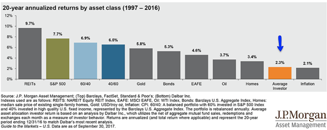 Table A Table A
To further show how poorly the average investor does, Table B compares various time periods of investor returns versus the markets. Keep something in mind, when looking at average returns of investors, the process could very well be flawed. It is impossible to know the returns of all investors; and probably impossible to know how many investors there are. Most of this data is generated by ICI, the Investment Company Institute which is the Mutual Fund tracking company.
Here's something funny about average. If you ask a large group where they stand relative to average; 75% will say they are above average. I'm planning a future article on the deception of average.
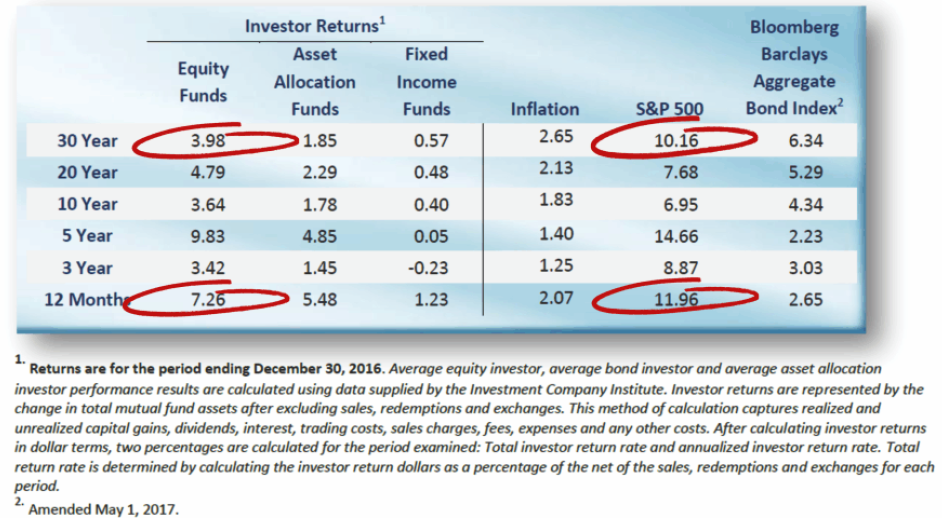 Table B Table B
My friend, Lance Roberts let me steal the below chart from him. It shows that investors over all time periods underperform.
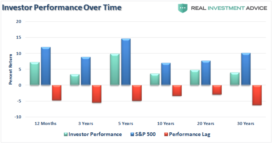 Table C Table C
So hopefully at this point you will accept that the average investor does not do a good job at investing; keeping in mind that StockCharts.com subscribers are not average. Why do investors as a whole perform so poorly? Of course, no one really knows, but my guess is that the average investor let's his/her emotions get involved in the decision making and they do not follow a process. I have written a number of articles called "Know Thyself," which highlight all the various investor frailties that work against them. I have also often written about following a model (process).
Another issue that is probably common with the below average investor is chasing performance by moving from one hot fund/strategy to the next. I've always said those Morningstar Star rankings should be a hint as to where not to be invested. Top performers rarely stay there; you want to find a strategy that makes you comfortable. A good list of stocks to buy is published every day in almost all newspapers; it is called the 52-week New Highs. These stocks have proven they can go up, so why not get onboard one of them? And that brings up another investor frailty; thinking that a stock on that list has already gone up and won't continue. That's the very foolishness that keeps them below average.
True Confession! I used to be a horrible investor. I read earnings reports, subscribed to newsletters, did all the usual stuff an uninformed investor would think is the correct thing to do. After many years of being a horrible investor and finally relying on technical analysis instead of all that nonsense, things improved. For the past 20 years I have relied solely upon a rules-based trend following model. And follow it religiously. That alone eliminates all the emotions and poor decisions. And you can play a lot of golf.
I do believe that if you are reading blogs on StockCharts.com and are a subscriber to StockCharts.com you are probably in the above average camp; congratulations!
Dance with the Trend,
Greg Morris
|
| READ ONLINE → |
|
|
|
| MORE ARTICLES → |
|


 Recently, academic researchers have proven and quantified the impact of fake news and how it sways stock prices to the tune of approximately 7% with small-caps, 5% with mid-caps and somewhat less with large-caps. Disinformation and propaganda is all around us. As investors, we must be attuned to how these affect our portfolios.


 There are a number of companies that track performance for various asset classes, including the performance of investors. Table A, from J.P. Morgan, shows the Average Investor's 20-year annualized returns of only 2.3%. I have reproduced the small print below the table because it explains the process used. And I cannot read the small print.
 Table A
 Table B
 Table C
