In October 2021, we made the case for a new secular commodity bull market and concluded that this environment would likely spill back into the economy and stock market. That process is already underway, as the NASDAQ Composite was recently down 20% from its high, compared to a drop of 12% for the S&P 500. The former was heralded by the financial press as "entering bear market territory", whereas the latter was deemed to be in "correction mode". To us, this is a non-helpful and intellectually lazy way of defining corrections and bear markets. After all, most corrections are pretty-well over, or certainly more than half-way completed, by the time the magic 10% mark has been crossed; the same is true for bear markets. It would be more useful to know that the market had entered a correction close to the day it started than at the -10% mark. That's impossible, of course, but we think it's possible to classify these unpleasant periods for investors using a different approach.
Magnitude and Duration of a Bear Market Depends on the Direction of the Secular Trend
Chart 1 features a slide from our 2022 Pring Turner client event. The green and red arrows flag the five secular or very long-term trends that have developed since the 1950's. The smaller pink-shaded ellipses indicate mini-bear markets, which are induced by a relatively short and mild recession. The larger ones zero in on more lengthy and deep recessions. The blue ellipses reflect economic slowdowns, where the growth path of the economy slows but never contracts in a meaningful way, as it does during a recession. Even so, equities typically experience a 10-20% sell-off in anticipation a slowdown. It is evident that the large ellipses are also associated with secular bears, where structural economic and financial imbalances abound. We call these "bank robbers" because they result in a devastating 40-60% loss over an extended 18-month-or-so period.
Chart 1 - Burglars vs. Bank Robbers and the Secular Trend
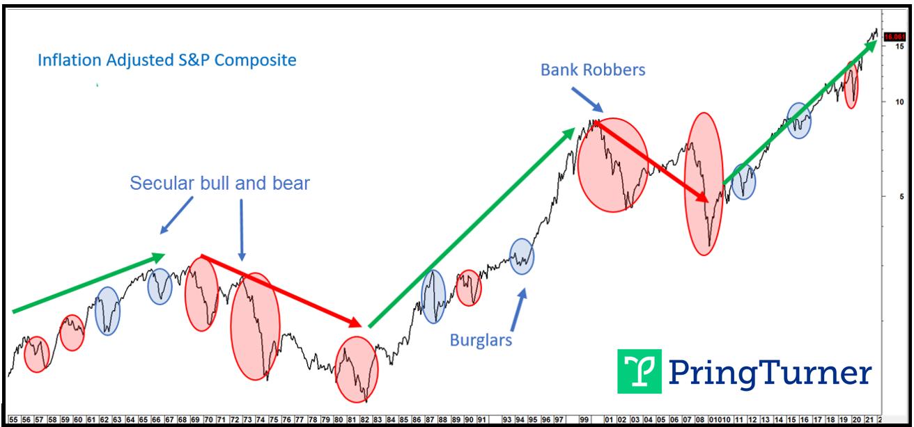 Cyclical bear markets that develop in secular bull markets are painful but contained; not so for secular bears.
On the other hand, a string of small ellipses, which we call "burglars" due to the fact they are more of a temporary irritant to portfolio growth prospects, act in a similar way as a pit stop during a car race. Both represent a shorter-term setback that allows for refueling before extending the journey. The pit stop allows the car to finish the race in better shape. In a similar vein, the digestion of gains that takes place during a burglar allows both the market and the economy to catch their breath and re-energize, thereby enabling an extension to the secular uptrend. Burglars occasionally result in a sharp 25% drop, as in 1962 and 2020. 1987 was a 35% decline. Mercifully, these "magnitude" bears are brief. More often, though, burglars take the form of a milder markdown, but exert their pain in the form of a confusing multi-month trading range, like 2015-2016. We call them "duration" burglars.
Evidence of a Bear Market
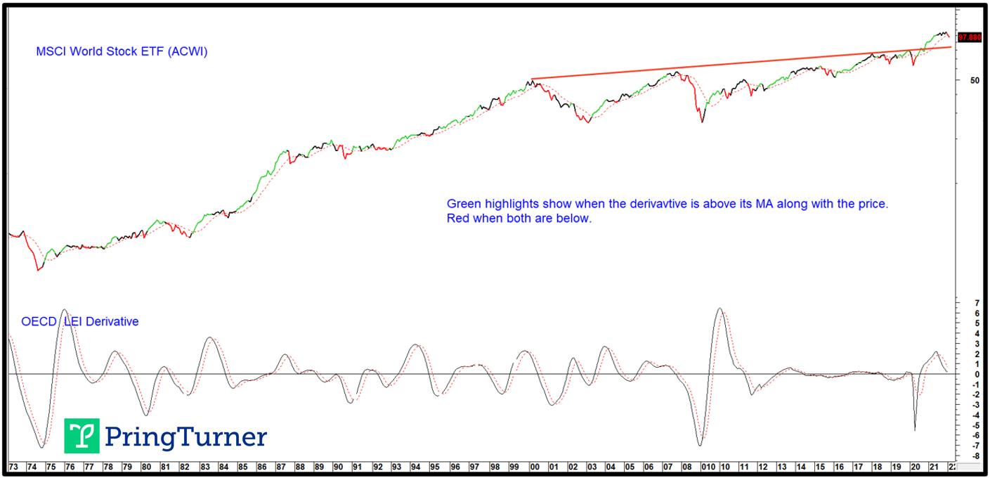
At this juncture, the evidence points to a cyclical bear market, both globally and in the US. Unfortunately, it is too early to say whether it will be a burglar or bank robber. All we can say is that risk levels are more elevated than they were previously and, for portfolio managers, that means taking a more defensive stance. Two reliable indications of weakness come from a slowdown in global economic growth and a jump in the US CPI above its traditional warning level of 5%. Chart 2 sets out the global situation by comparing the MSCI World Stock ETF (ACWI) to a derivative of the OECD amplitude-adjusted LEI. When the derivative drops below its 6-month MA and this is confirmed by the ACWI also penetrating its 9-month MA, a red bearish highlight appears in the chart. This model has been negative now for two consecutive months and is likely to grow more so, as the recent re-acceleration of food and energy prices feeds back into global spending patterns.
Chart 2 - MSCI World Index vs. an OECD LEI Derivative
 Bearish outcomes develop when both series are below their MAs.Chart 3 pits the inflation-adjusted S&P Composite to the annualized CPI. The solid vertical lines indicate when the CPI reaches a point where spending patterns are disrupted and, thereby, stock market returns. That level appears to be around 5%. Looking to the right of these lines, it is apparent that inflation-adjusted equities suffer. The two dotted ones indicate situations where the drop had already taken place (1984) or there was no bear market at all (1951). Both developed under the context of a secular bull market, as reflected in the green shading. This relationship can be traced all the way back to the 1870s, with similar results.
Chart 3 - US Equities and the Annualized CPI
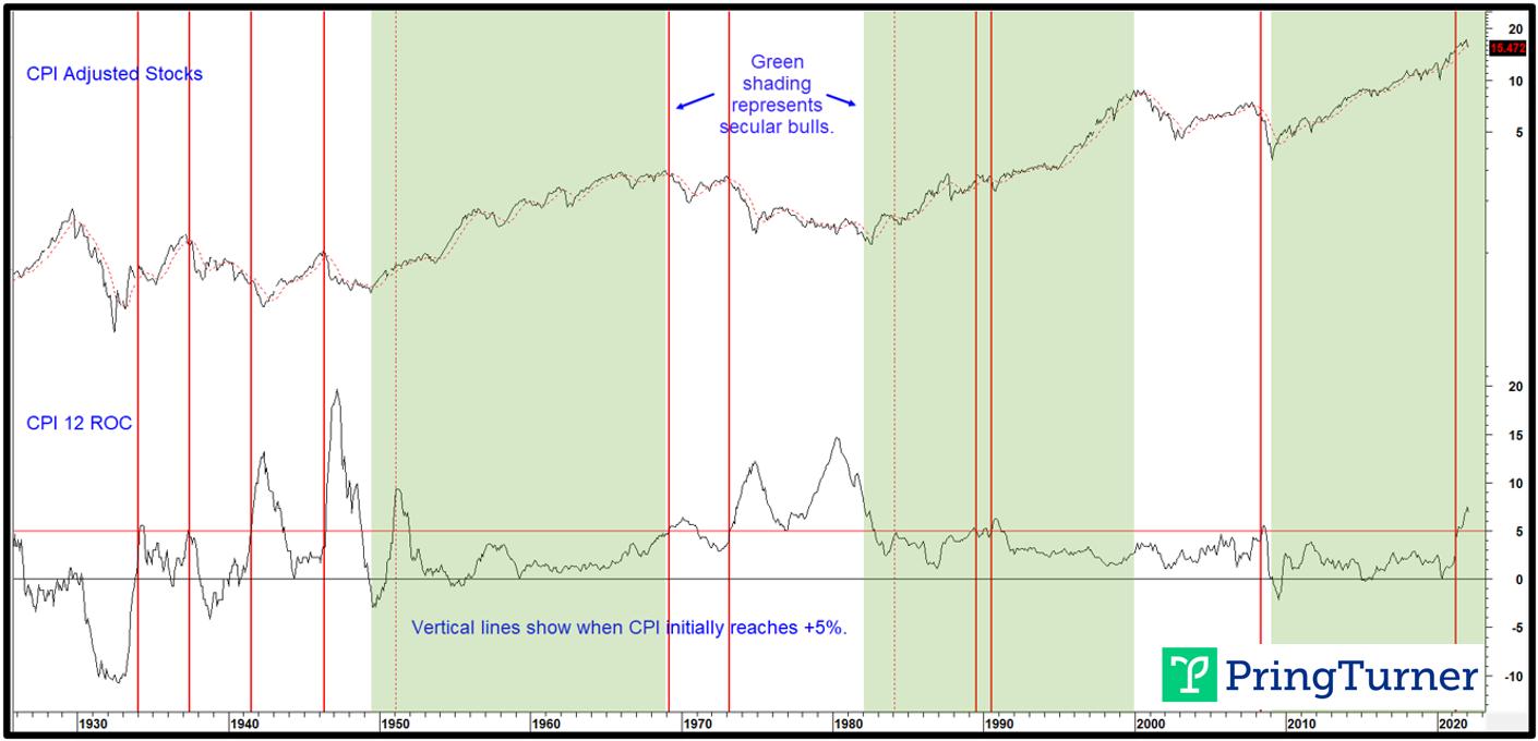 When the CPI reaches 5%, equities sell off, mildly in a secular bull and sharply under the context of a secular bear.
The Secular Trend
Since direction of the secular trend of inflation-adjusted equities determines the character of a primary bear market, the question naturally arises as to its current direction. In terms of a reversal, the simple answer is that it's too early to tell. Until proven otherwise, the benefit of the doubt should be given to the post-financial crisis secular bull market. After all, we are talking about a price move generally lasting 15-20 or so years. Surely, it would be unrealistic to conclude that a reversal had taken place less than 90 days from the early January high. What we can do is point to some indicators that have a good track record identifying previous secular reversals and see where they currently stand.
One price oscillator that has identified the previous four secular peaks is calculated from a ratio between a 60-month and 360-month EMA (5-/30-years), shown in Chart 4. The red arrows indicating those peaks developed in a fairly timely fashion. Nevertheless, it is important to note that this chart encompasses a 120-year time span, so a small space represents several months of data. By way of an example, the 1929 peak was signaled well before the 1932 low, but just after the crash. At the end of February, both the oscillator and its 48-month EMA were rising and therefore offering no sign of a secular reversal.
Chart 4 - Inflation-Adjusted S&P Comp vs. a Secular Price Oscillator
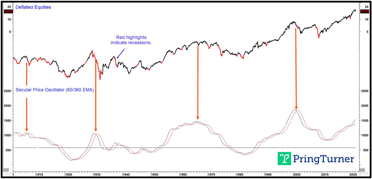 When the secular price oscillator crosses below its 41-month MA expect a secular bear.
Chart 5 compares real stock prices to the Shiller P/E and a price oscillator using the 24-/240-month parameters. There is no doubt that this measure of sentiment and valuation is at a dangerously elevated level, only exceeded for a few years in the 1990s.
The high level warns that long-term optimism is excessive, with many careless investment decisions just waiting to be revealed. Warren Buffett's analogy regarding naked swimmers comes to mind. These naked swimmers, though, are exposed when the tide recedes. In market speak, that's when the long-term trend of the Shiller P/E reverses. The arrows flag periods when the oscillator drops below its 41-month MA from an extended level. All crossovers were associated with a decline in the Shiller P/E and equity prices. The four thick ones isolate secular turning points. A cyclical or primary trend reversal developed following the three smaller dashed arrows. This indicator is still marching higher and not, therefore, offering any evidence of an impending secular top. If we are correct in our assumption of a further extension to the secular uptrend after the current cyclical bear market has run its course, Chart 5 indicates a possible upside limit in the form of the extended resistance trendline, which is around the 50 level.
Chart 5 - Inflation-Adjusted S&P Composite vs. the Shiller P/E
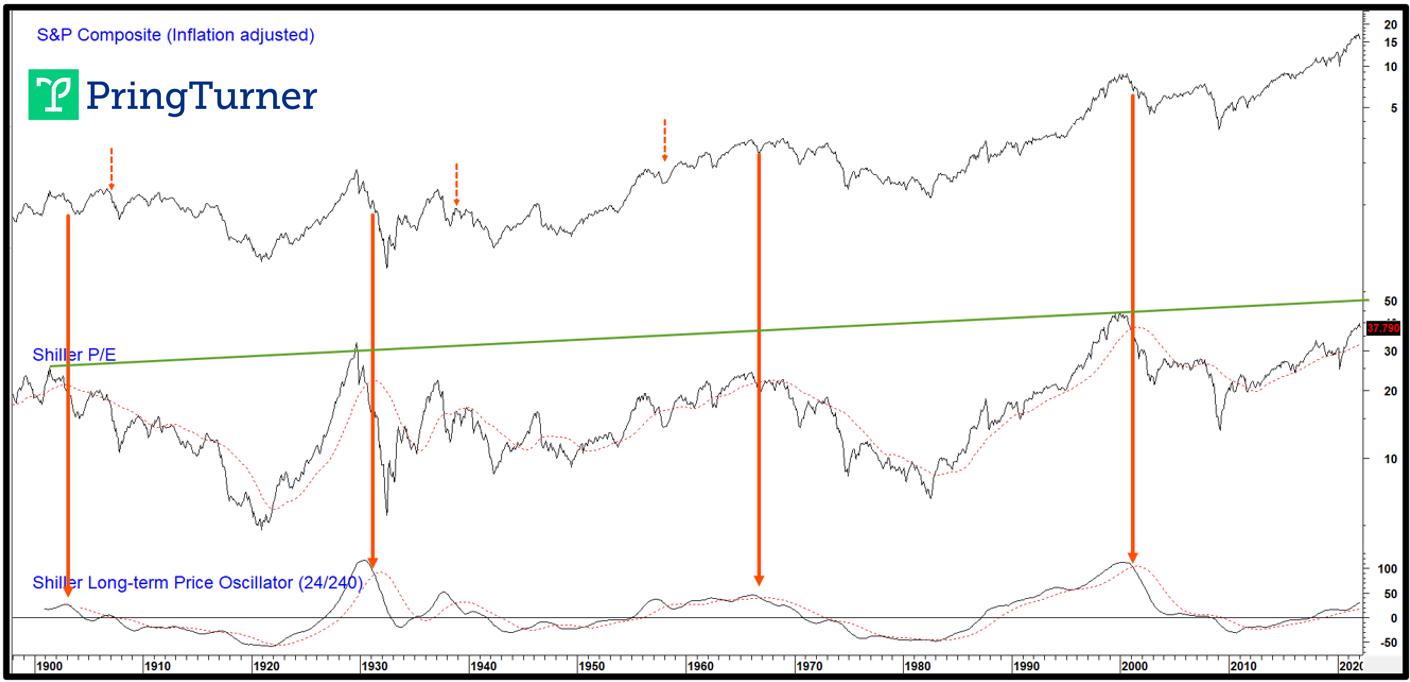 When the Shiller P/E price oscillator peaks, a secular bear is usually underway.
At some point, unstable commodity price trends, which reflect structural imbalances for the economy, adversely affect stock prices. From an inflationary point of view, the triggering point arises when the inversely-plotted commodity price oscillator in Chart 6 crosses below its MA. This earns a red highlight in the CPI-adjusted Stock chart and is its way of warning that the secular trend is now positive for commodities. Ignoring the false signal in the ellipse, the remaining crossovers were all followed by a secular bear market for stocks. In two instances (1937 and 1973), the drop was immediate. On the other hand, the 1899 and 2005 signals were both followed by a delayed secular bear for equity prices. The 1929-32 drop was not indicated in any way by this approach because it fell victim to excessive deflationary, not inflationary, pressures.
Chart 6 - Real Stocks vs. an Inverted Commodity Price Oscillator
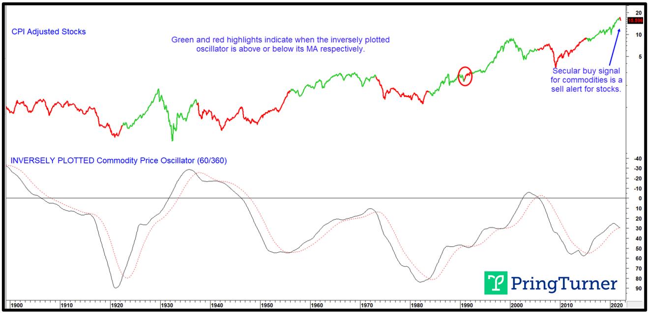 Secular bull markets for commodities coincide with secular bear markets for stocks.
Based on the experience of the last 130 or so years, the oscillator is arguing in favor of a secular bear for stocks, but evenly split as to whether it begins now or later. That is one reason why we cannot be adamant in our view, as suggested in Charts 4 and 5, of a likely extension to the secular bull in equity prices.
Conclusion
Most of the long-term indicators we follow are confirming some kind of a cyclical weakness for stocks. Since we do not know whether price action since the end of December represents a burglar or bank robber, it's as well from a primary trend point of view to stay cautious, even though washed-out sentiment and other indicators are indicating the probability of a near-term retracement rally. One characteristic common to almost all bank robbers is that, once a negative MA crossover has taken place, it remains that way until after the final low is in. Consequently, if the S&P 500 should quickly regain its 12-month MA, which is currently around 4,400, it would represent a burglar characteristic. Should that prove to be the case, most, if not all, of the downside action may already have taken place. This would imply a duration burglar with a multi-month trading range. In any event, portfolio managers should be more defensively positioned for now. As the evidence changes in the weeks and months ahead, either favorably or not, additional steps toward offense or defense will be necessary. Navigating safely around both a cyclical and secular turning point for stocks and commodities will be vitally important to protecting and growing wealth. Get the latest updates by joining our community of 2,500+ subscribers by clicking this link.
Good luck and good charting,
Martin J. Pring
This article was originally published on March 21, 2022 in Martin Pring's Technical Corner on PringTurner.com. All images are sourced from Martin Pring's Intermarket Review.
Disclaimer: Pring Turner is a Financial Advisor headquartered in Walnut Creek CA, and is registered with the Securities and Exchange Commission under the Investment Advisers Act of 1940. The views represented herein are Pring Turner's own and all information is obtained from sources believed to be accurate and reliable. This information should not be considered a solicitation or offer to provide any service in any jurisdiction where it would be unlawful to do so. All indices are unmanaged and are not available for direct investment. Past performance does not guarantee future results.