| THIS WEEK'S ARTICLES |
| ChartWatchers |
| Has the Bitcoin Bubble Burst? |
| by Martin Pring |
In early December of last year, I wrote an article on whether Bitcoin had reached the tipping point in terms of signaling a peak in the crypto bubble. Some may disagree about the "bubble" label; however, it seems to me that a financial category coming out of nowhere 10-years or so ago and reaching a $3 trillion capitalization at its November 2021 peak (13% of US GDP) is an extraordinary and probably unprecedented feat. Looked at another way, the price stood at $164 in 2015 and touched $68,000 last November.
There is no doubt that the blockchain concept is sound, but so was the technology underpinning the tech bubble in the year 2,000. It was just that the prices of technology companies had got ahead of themselves. My conclusion last December was that that some cracks had begun to appear in the Bitcoin technical position, but the consensus of evidence continued to point to an uptrend. In the intervening months, the technical position has deteriorated further. Also, the charts have established some key support levels beyond which one could use to reasonably argue that the bubble has burst.
Bitcoin Momentum
One of the techniques for calling a bubble top is to observe an 18-month ROC and see when, following a lengthy advance, it reaches the 200% level and then reverses. A reading north of 200% is important because it indicates a doubling in price over a period of a year-and-a-half. Research shows that this is a very rare occurrence. For example, the very volatile copper price has only achieved it once, in the late 1970s. The S&P has never touched 200%, not even in 1929. The highest peak for any commodity, currency or stock market (not stocks), that I have ever observed was 500% for silver in 1980. My studies, covering 30+ examples spread over centuries of data, indicate that after the ROC peaks above 200%, it has taken an average of 15 years to regain the bubble high.
The reason I bring this up is that, in 2017, the ROC for Bitcoin topped out at an unprecedented 2000% and took only 3 years to recapture its losses, way shorter than the average recovery period. Chart 1 shows that the ROC has been in an uptrend since its 2020 low. The two 2021 highs clocked in at a remarkable 600%. It only looks low in the chart because of the remarkably high 2017 reading. The ROC has now set up a negative divergence with the price, because the November 2021 high surpassed that established earlier in the year. Note also that both series are below their respective MAs. More important is the fact that the ROC has recently dropped below its up trendline, thereby confirming that, as far as momentum is concerned, a reversal has taken place.
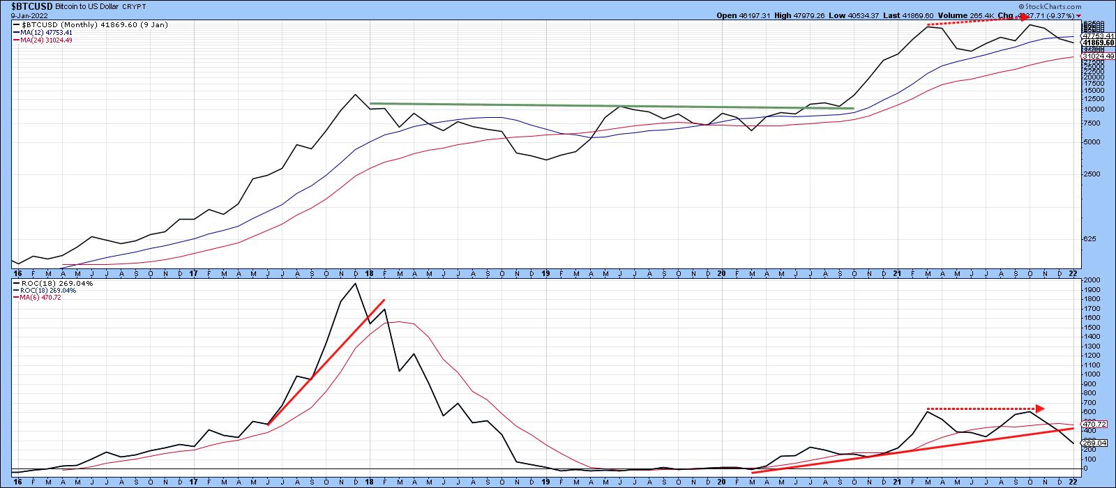 Chart 1 Chart 1
A loss of upside momentum can also be seen from Chart 2, where it is evident that the price is once again struggling in its battle to remain above its secular up trendline, as well as its 40- and 65-week MAs.
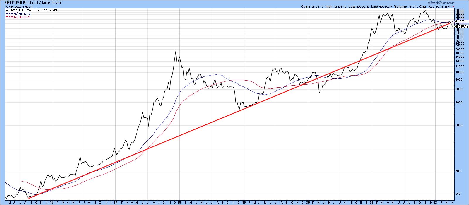 Chart 2 Chart 2
Relative Action is also Slipping
Chart 3 shows that, between 2017 and early 2021, Bitcoin was confirming every new high with a similar new high in its relative line with the S&P. The two dashed arrows indicate that was not the case in November 2021, when the price touched an unconfirmed new high, but the RS line made a lower one. It is now resting precariously on its 2021-22 support trendline. The declining KST for relative action suggests that support will soon give way.
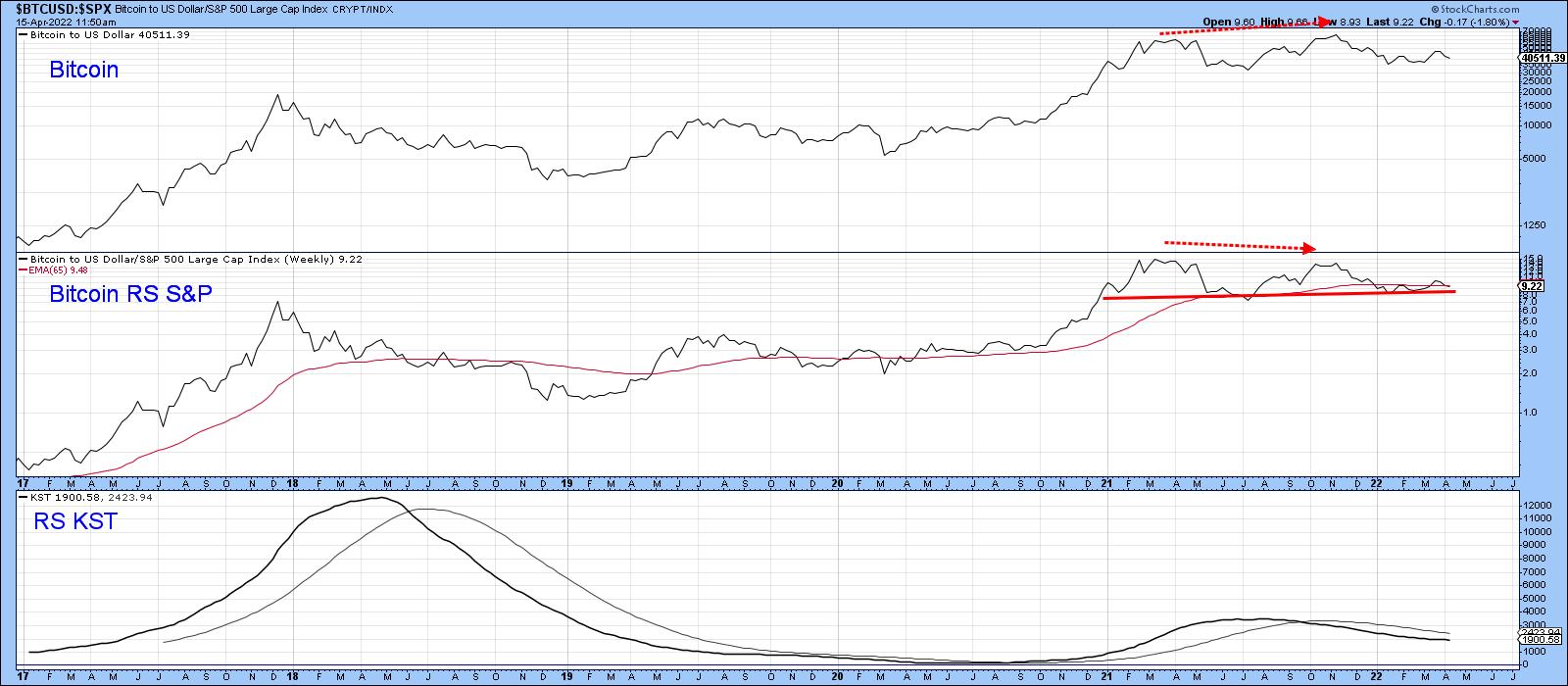 Chart 3 Chart 3
Bitcoin has also lost its mojo against commodity prices, in the form of the CRB Composite, as seen in Chart 4. In this instance, the RS line has not only diverged negatively, but has violated its (dashed) 2019-2022 up trendline and 65-week EMA. Most serious of all is the completion of a double top formation.
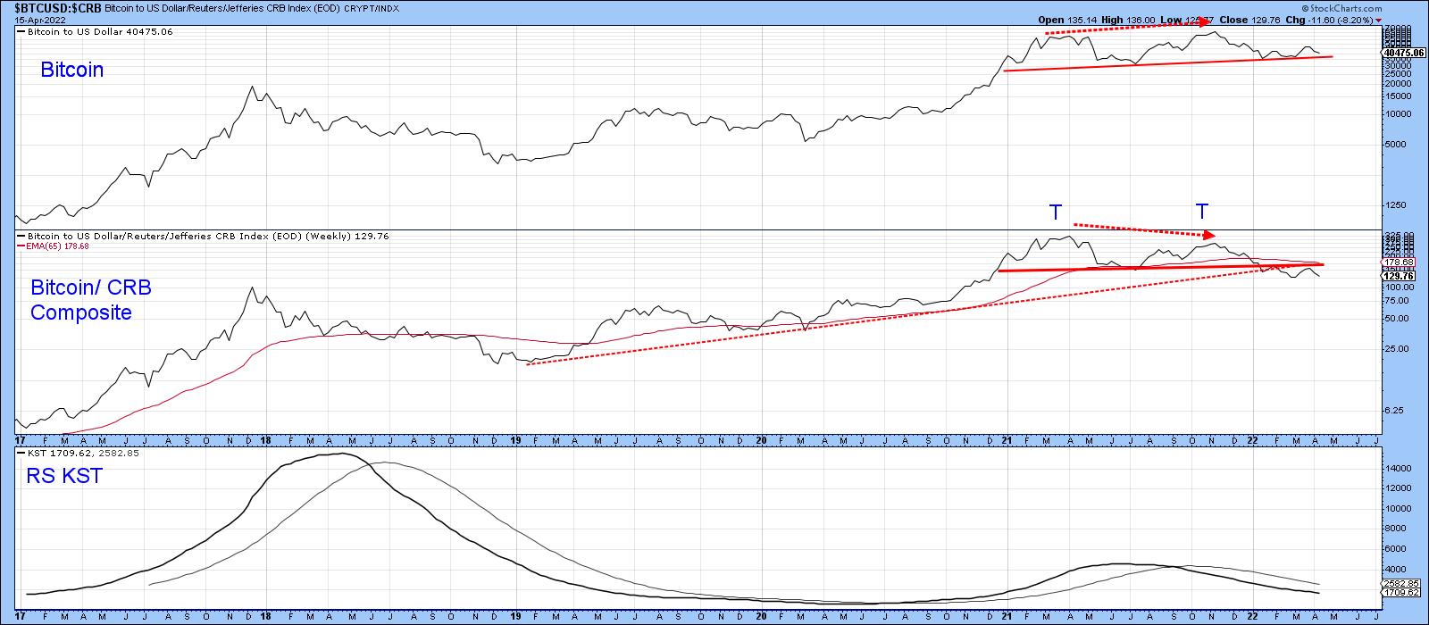 Chart 4 Chart 4
Price Action Looks Toppy
A basic true and tested tool in the technical arsenal is provided by peak-and-trough analysis. In that respect, Chart 5 flags the major rallies and reactions since 2019. Throughout the whole period, the series of rising peaks and troughs has been intact. That said, the most recent 2022 advance has so far failed to take out the previous peak set last November. It may well do so. All we know on that front is that the January-March rally retraced at 38% of the previous decline. That's enough to qualify the January low and March highs as legitimate benchmarks for peak-trough analysis.
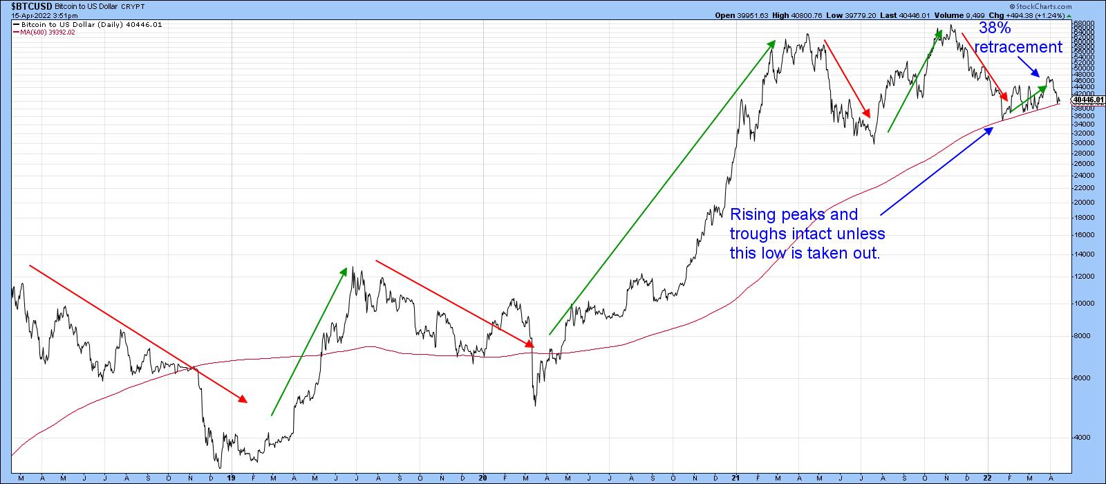 Chart 5 Chart 5
Drilling down on the rally, we see a lot to be concerned about in Chart 6. One of the characteristics of a bear market advance is a false breakout from a price pattern. That's exactly what happened in late March. False breakouts are typically followed by above-average moves in the opposite direction to the breakout as traders scramble to get back on the right side of the trend, which is what appears to have been happening in the last couple of weeks. Failure of the price to clear its 200-day MA is another sign of the bear.
The level to watch now on a daily close basis is $35,000, since that marks the starting point of the 2022 rally. If that is taken out, the upward peak trough progression will be reversed, which, in all likelihood, will indicate that the November 2021 was a bubble-bursting event.
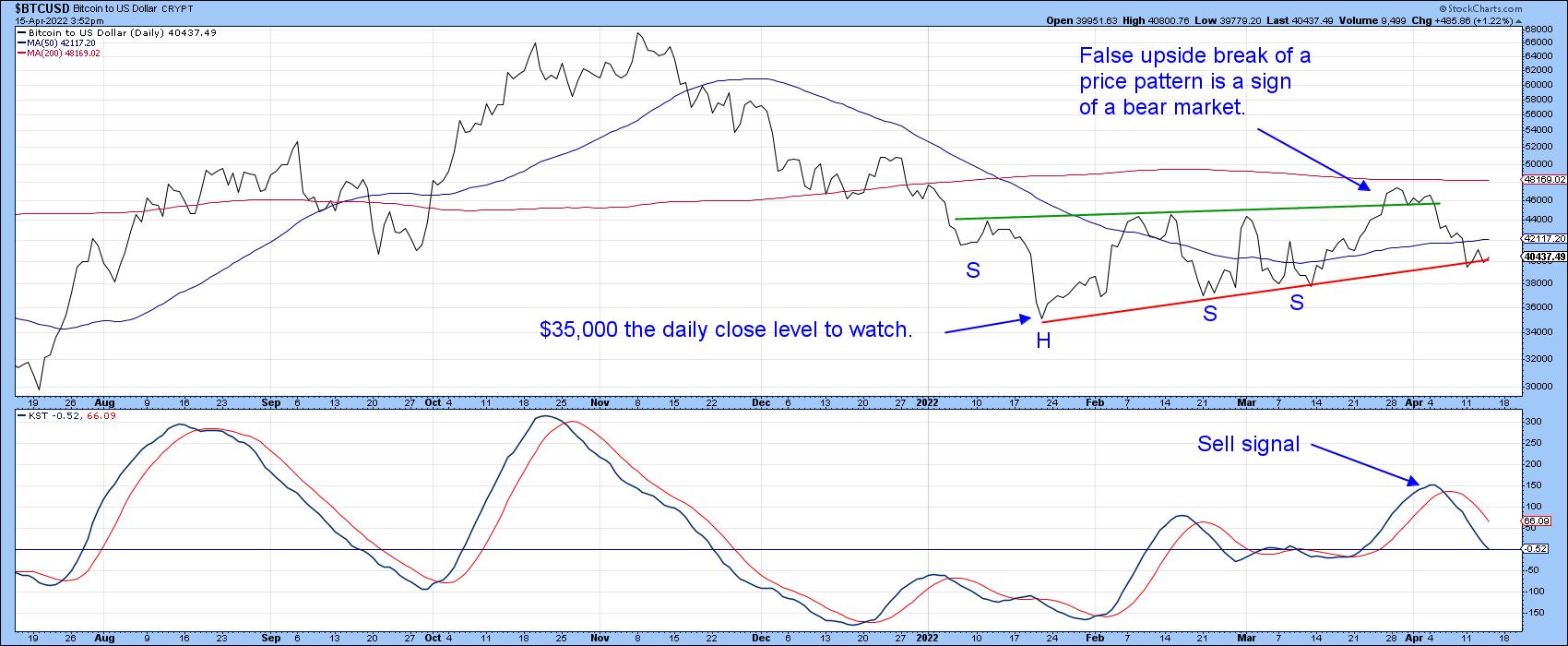 Chart 6 Chart 6
Finally, Chart 7, based on weekly data, shows the potential for a large head-and-shoulders top. Note that the recent rally failed to break above the 52-week MA. The top has not yet been completed, as that will require a Friday close under the neckline and, to be safe, a close under the January Friday close low of $35,280.
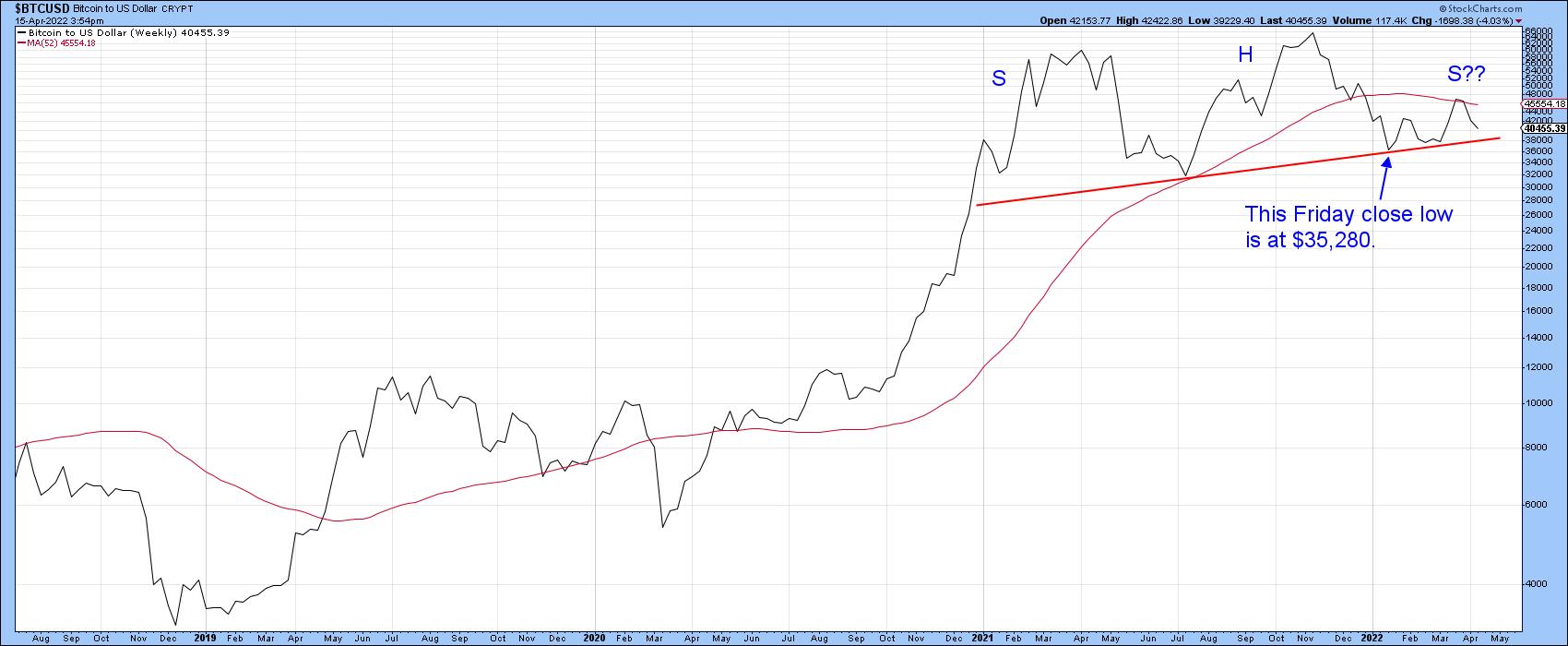 Chart 7 Chart 7
Conclusion
Bitcoin continues to experience a gradual technical deterioration, but this has not yet been confirmed with the completion of a top. When any market rises rapidly over an extended period, seemingly never to go down again, confidence naturally builds up a head of steam. That optimism results in complacency and careless decisions. With interest rates rising rapidly, potentially affecting margin accounts, now could be as good a time as any for starting to take some bets off the table.
This article is an updated version of an article previously published on Monday, April 11 at 7:09pm ET in the member-exclusive blog Martin Pring's Market Roundup.
Good luck and good charting,
Martin J. Pring
The views expressed in this article are those of the author and do not necessarily reflect the position or opinion of Pring Turner Capital Group of Walnut Creek or its affiliates.
|
| READ ONLINE → |
|
|
|
| ChartWatchers |
| A Defensive Picture No Matter How you Slice It |
| by Arthur Hill |
 Sector PerfCharts provide clear performance snapshots of the market mood and the market mood is defensive. The PerfCharts below show the percentage change for the S&P 500 SPDR (SPY) and the eleven sectors. These sectors can be divided into three groups: offensive sectors, defensive sectors and other. Sector PerfCharts provide clear performance snapshots of the market mood and the market mood is defensive. The PerfCharts below show the percentage change for the S&P 500 SPDR (SPY) and the eleven sectors. These sectors can be divided into three groups: offensive sectors, defensive sectors and other.
The Technology SPDR (XLK), Communication Services SPDR (XLC), Finance SPDR (XLF), Industrials SPDR (XLI) and Consumer Discretionary SPDR (XLY) are the five offensive sectors. The market is in risk-on mode and playing offense when these are leading. These five sectors also account for around two thirds of the S&p 500.
The Healthcare SPDR (XLV), Consumer Staples SPDR (XLP) and Utilities SPDR (XLU) are the defensive sectors. Even though XLV has some biotechs, healthcare is something we need no matter what. Consumer Staples and Utilities are clearly defensive because we need these products/services regardless of economic circumstances. The Real Estate SPDR (XLRE), Energy SPDR (XLE) and Materials SPDR (XLB) are the last three sectors and somewhat difficult to pigeonhole.
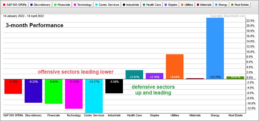
The first PerfChart shows three-month performance. SPY is down 5.8% and the five offensive sectors are also down. XLY, XLF, XLK and XLC are down more than SPY and leading lower. XLI is down less, but still down. The defensive sectors, XLV, XLU and XLU, are up and leading. This is clearly a risk-off environment and is continues as we extend the timeframe.
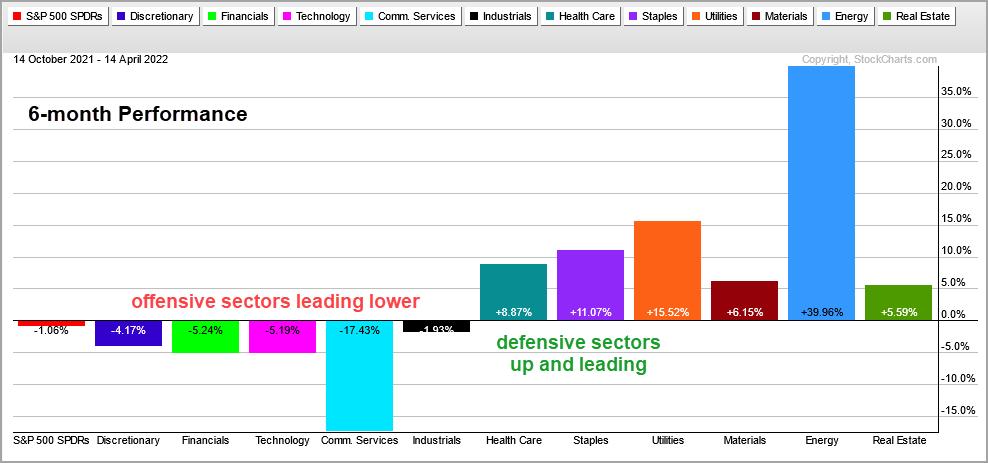
The next PerfChart shows six-month performance. SPY is down around 1% and the offensive sectors are down more. They are leading lower and this is not a healthy picture. The defensive sectors are up and leading.
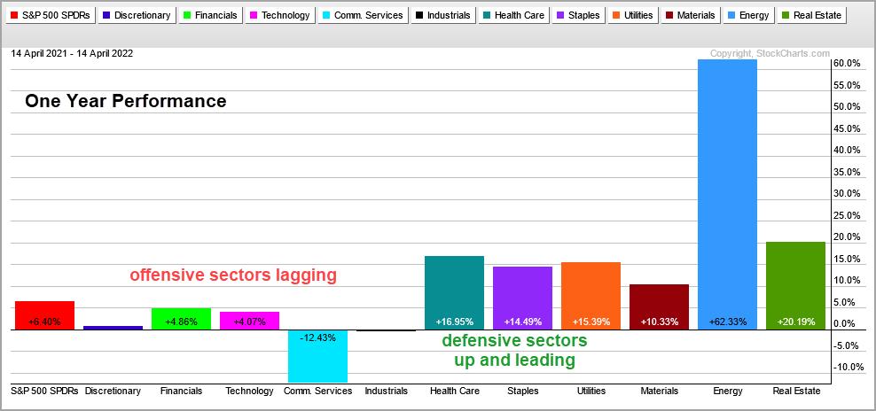
The next PerfChart shows one year performance. SPY is up a modest 6.4%, but only three of the offensive sectors are up and they are up less than SPY (lagging). The other two are down. The defensive sectors are up double digits and picking up the slack.
This week at TrendInvestorPro, I covered the new signal in the Composite Breadth Model and weakness under the surface with the percentage of stocks above the 200-day SMA. Tuesday's report and Wednesday's video analyzed the recent breakouts in gold and silver. Click here for immediate access.
In this week's Next Level Charting video (here), I showed how broad market conditions can influence my chart assessments (breadth, offensive/defensive performance). SPY is holding up, but it is not a leader and there are stronger ETFs out there. Namely, XLB.
The Trend Composite, Momentum Composite, ATR Trailing Stop and eight other indicators are part of the TIP Indicator Edge Plugin for StockCharts ACP. Click here to take your analysis process to the next level.
---------------------------------------
|
| READ ONLINE → |
|
|
|
| John Murphy's Market Message |
| STOCKS END THE WEEK ON THE DOWNSIDE |
| by John Murphy |
STOCKS CONTINUE TO WEAKEN... The technical condition of major U.S. stock indexes continues to weaken. All three shown below lost more ground during the week. Chart 1 shows the Dow Industrials meeting overhead resistance near their red 200-day moving average. Chart 2 shows the S&P 500 trading both moving average lines. Chart 3 shows the Invesco QQQ trust doing the same. The QQQ has been the weakest of the three indexes because of continued weakness in the technology sector. The tech sector saw the biggest losses over the past week. It's also the weakest sector year-t0-date. Rising bond yields, which hit another three year high, are a big part of the weakness in technology stocks.
 Chart 1 Chart 1
 Chart 2 Chart 2
 Chart 3 Chart 3
SECTOR ALIGNMENTS SEND WARNINGS... While we normally use major stock indexes to gauge the direction of the stock market, sector alignments also tell us a lot about the health of the stock market and the economy. And those alignments have been sending warning signals. Chart 4 shows how sectors have done since the start of the year. The first warning comes from energy being the market's strongest sector year-to-date. That's a negative warning because energy leadership is usually a late cycle phenomenon which suggests that an economic expansion is nearing completion. That's because rising energy prices raise inflation concerns which forces the Fed to raise rates which usually leads to an economic recession. And stocks weaken in anticipation of a possible recession. There are other warnings as well.
OTHER WARNINGS... One of the other signs that the stock market and the economy are weakening is a rotation into defensive market sectors. The two other sectors that are still in the black for the year are utilities and consumer staples. That's where investors usually go when they're turning more bearish. And a bearish stock market is a warning for the economy. That's because stocks usually peak well before the start of a recession. That makes stocks a leading indicator of the economy. So far, the sector alignments shown in Chart 4 are following the usual intermarket script for a stock market that is peaking and an economy that is heading into contraction.
 Chart 4 Chart 4
|
| READ ONLINE → |
|
|
|
| ChartWatchers |
| Tectonic Shifts are Occurring |
| by Greg Schnell |
It's been a difficult year for investors focused on what used to be working.
I've noticed a small, subtle trend that has started to emerge at the beginning of each month. It has been focused towards the Nasdaq, but financials and consumer discretionary have also been hit. The purpose of this article is to not get caught in the weeds by staring at these smaller trends. You'll see charts like this on the daily view, but I'd like to change the context as we roll through the article.
The Little Picture
The market has started a correction to begin each month this year. Is this a significant data collection model with four points in a row working?
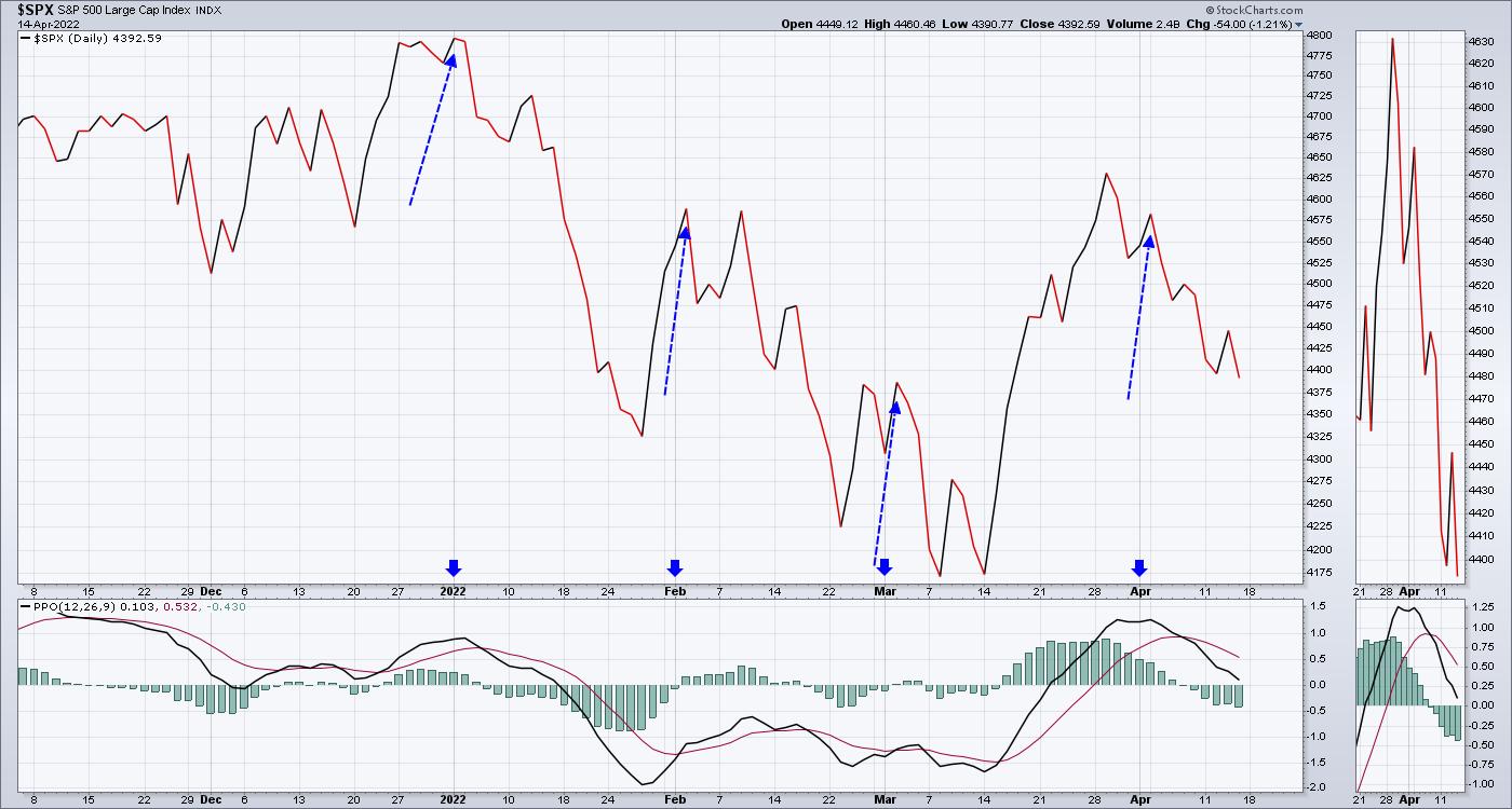
Two of the downtrends (January and February) ended shortly after Options expiration. The March rally started heading into options expiration (March 18th), but once again failed after month end. That leaves us in an awkward situation. As Options Expiration took place on April 14th, can we rally from here to month end or will earnings fail to be a catalyst?
It has been a tricky market to judge. Can we move higher from here? This is a short-term view, but the big picture is also changing. What I think is more important is understanding the shifting sands underneath our feet, regardless of what the next few weeks bring.
Long-Term Timeframes
I am much more worried that some very long trends are breaking and, eventually, things just go haywire. You can see subtle changes in charts week in and week out, but big trend changes are important. When they happen, it is not obvious at first, but, all of a sudden, they start to accelerate.
What are those long trends? The charts below show some major changes that are noteworthy, as we are still in close proximity to the trend lines.
Currencies
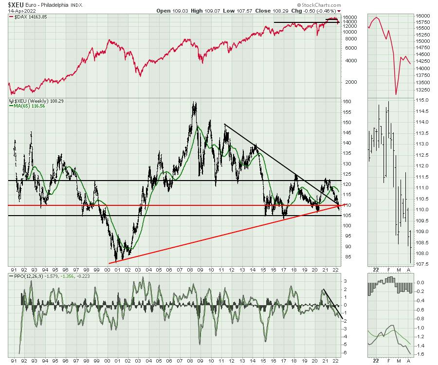
The Euro is breaking the 20-year uptrend. This uptrend started when the Euro became the transaction cash for the Eurozone on January 1, 2002. The surge above the down trend started when the COVID-motivated central banks started kicking money around. Since the SPAC bubble in 2021, the Euro has been slipping. It has now taken out the big uptrend and the next important horizontal support is 105. What happens if there is a steady march away from the Euro?
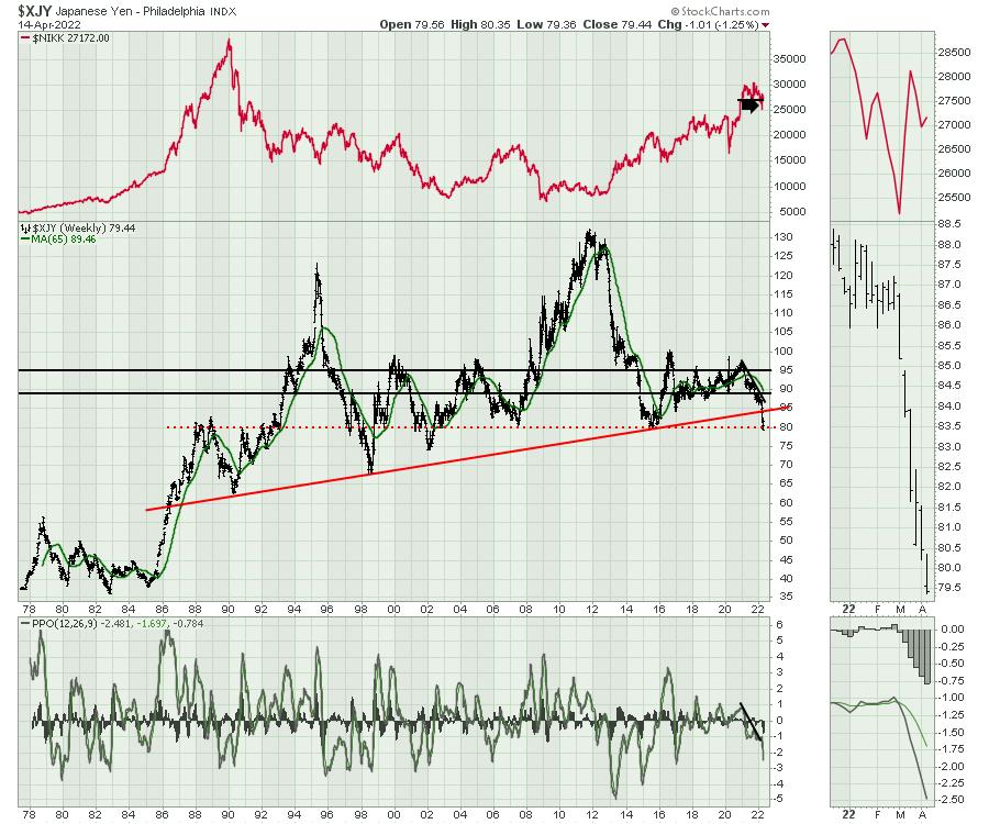
Another long-term trend broke on the Japanese Yen. The big 35-year uptrend broke a few weeks ago. The Yen has taken on a waterfall approach, moving down below the horizontal support of the last 20 years. That's a big deal. Like the Euro, we must ask what will happen if the rush away from the Yen continues, as it has dropped over 10% since the beginning of the year and closed near the lows again.
The US Dollar Index is also breaking out as well. The Dollar shot up on COVID briefly, violating the trend line. The current move looks more sustainable.There is significant friction or resistance at 105. Back in 2000, as the stock markets rolled over, the Dollar also surged above 105. What happens if everyone moves aggressively into the Dollar?
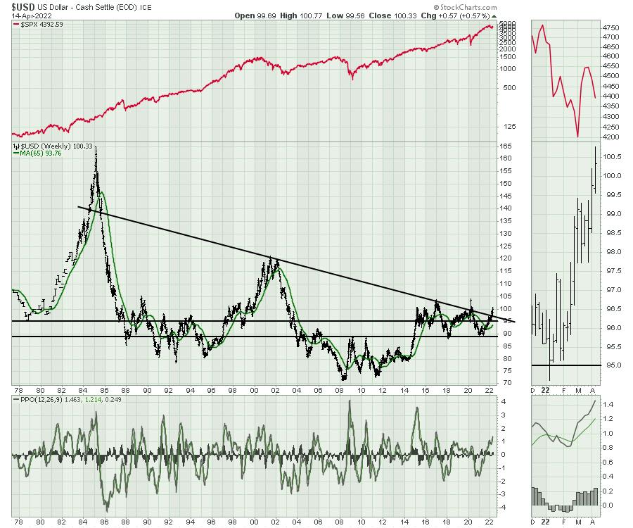
The breaking of these currency trend lines are worrying. These are seismic shifts in global monetary systems and they are rolling out a little further each week. When trend lines that represent the length of a career are breaking, there are very few people who know how to deal with those changes.
Bonds
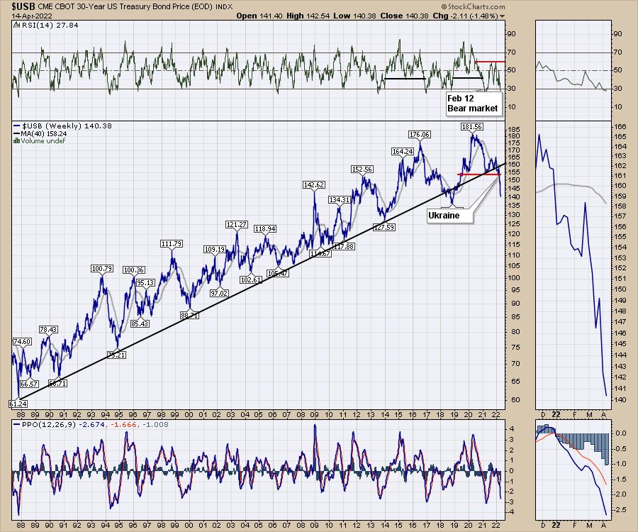
In the bond market, there are lots of trend lines to talk about. I've used the 30-year bond price to show what is happening. I put the Ukraine comment on the chart on February 24th. We were clearly moving outside the trend line before, but the acceleration down in price has been large.
Commodities
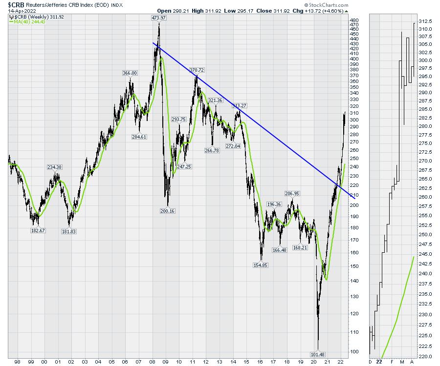
The charts above include changes in currencies and bonds. The commodity charts are soaring as well.
Tech Stocks
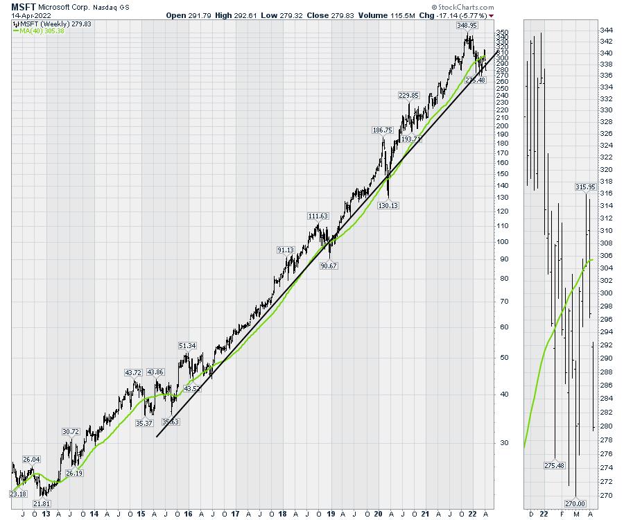
Tech stocks are testing long-term uptrends. The world is changing rapidly and the charts are all leaning towards big historical changes. Look how close MSFT is to breaking away here:
One thing that is becoming apparent to me is the four asset classes are all changing. Stay abreast of the changes on the charts as the fundamental data will start to disintegrate long after the charts have.
If you would like to be kept abreast of these macro level moves, I invite you to try the $7 first month offer at OspreyStrategic.org.
|
| READ ONLINE → |
|
|
|
| Dancing with the Trend |
| Whipsaws |
| by Grant Morris, Greg Morris |
 We think it is a good time to revisit a topic that is always top of mind for tactical money managers and investors in rules-based strategies like trend following; and that is whipsaws. We think it is a good time to revisit a topic that is always top of mind for tactical money managers and investors in rules-based strategies like trend following; and that is whipsaws.
Whipsaw trades are the one issue that will constantly concern investors using trend following strategies. Whipsaw trades can cause losses or cause you to miss out on gains, and aside from those monetary impacts, they are difficult to tolerate emotionally. If you are going to do anything different than being a buy & hold investor, you are always going to compare to "what could have been" if you were using a buy & hold strategy.
A whipsaw is basically a trade or change in your investment position that the market does not cooperate with. There are two ways to get whipsawed when trend following. One is to move from being invested to being defensive (i.e., selling) and then the market moves higher and forces you to buy back in at a higher price.

This type of whipsaw does not necessarily cause losses in your account but does cause you to miss out on gains. This trade makes investors think that if they stayed invested and not sold when they did, their account value would have increased; "Everyone else is getting rich and I'm not!"
The second type of whipsaw is when you are defensive and move to being invested (i.e., buying) and the market moves down after you enter, forcing you to sell at a lower price.

This type of whipsaw does cause losses in the account and makes you think that if you weren't so anxious to buy, you could have bought in later at a lower price; "I'm buying high and selling low, this strategy is not working!"
Whipsaws are an inevitable consequence of eschewing the buy and hold approach that will eventually cause you to become a victim of a bear market. Whipsaws are the "cost of doing business" if you want to avoid the devastation that comes during bear markets. We know this fact to be true, watching the market plummet from the sidelines is not a bad thing, emotionally or financially. We never know if a few down days are going to turn into a correction, or if a correction is going to turn into a bear market. No one can reliably predict such things (even though countless people try), but at least we are always prepared for the worst outcome. That is why we accept whipsaw trades in our trend following approach – for the benefit of the downside protection our selling rules provide. It allows us to try to participate in the good times and avoid the bad times. Are the calls always correct? Are the trades always positive? Definitely not, but we know that there is only one thing worse than being wrong, and that is staying wrong.
We don't think there is any way to get over whipsaw trades. We hate them, our clients hate them, and people quit using investing strategies because of them. Yet, they are never going away, they are absolutely part of the process and cannot be avoided. We think it just takes experience to get used to whipsaws, if one ever does. Taking a longer-term view of a strategy's investment results and not focusing on the current trade that may not be working is one way to make whipsaws more tolerable.
There are, however, ways to reduce the number of whipsaw trades that occur in any rules-based strategy, and that is to de-sensitize the model to the market's actions; one such example would be using wider stops. We caution against this approach to whipsaws as it may reduce the frequency of them, but can also reduce overall performance, especially during bear markets. Having wider stops means you'll stay invested during more uptrends, as smaller pullbacks do not trigger selling, but you'll inevitably not get out of the way as quickly during corrections and bear markets, forcing you to ride the market down further before selling. Know that whatever stop level you choose, there will be times when the market does not cooperate. Adjusting a model based upon sound principles so that the whipsaws in the recent past are reduced or eliminated likely leads to whipsaws at other times and worse returns where it matters most – in the future.
Ironically, most buy & hold investors are really just very de-sensitized tactical investors, because they do eventually sell near market lows when the pain of further losses is far more than they can tolerate! Very few have the ability to always implement the "hold" portion of buy & hold, and we don't think it is a good plan for most investors with serious money at stake. We think it is better to accept the whipsaws and avoid the devastation of bear markets.
Dance with the Trend,
Greg Morris
Grant Morris
|
| READ ONLINE → |
|
|
|
|
|
| RRG Charts |
| Sector Rotation Model Signals Economy Moving Towards Early Recession |
| by Julius de Kempenaer |

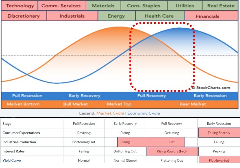
Every quarter, I try to do an update of the Sector Rotation Model. We have the framework as described by Sam Stovall here on the site. The image above shows my interpretation of the various factors that affect this model.
Across the top, you will find the eleven sectors. The orange sine-wave represents the (stock) market cycle, while the blue line represents "the economy" as they move through the various stages. Below the graph is a table that shows four macroeconomic metrics that influence the economy and the market and how they usually behave in each phase.
Sectors

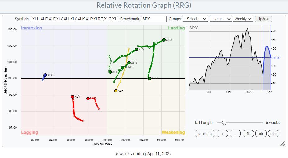
The sectors at the top of the framework indicate which sectors usually do well during which phase of the economy. I am taking the reverse approach. I am looking at which sectors are doing well at the moment and trying to detect in which phase we are from there. In order to do that, I have shaded the sectors across the top of the framework based on (my interpretation of) their current rotations. At the moment, the picture could not be more clear. Very often, the colors vary and are a bit mixed, but, at the moment, it is very clear how the red- and green-shaded sectors are aligned.
Defense rules!
Macro-Economic Factors
An important, often overlooked, part of the sector rotation model is the interpretation of the macro-economic factors that are used as gauges for the economy. I have a set of four charts in a public chartlist that I update from time to time and use to shade the areas below the framework.

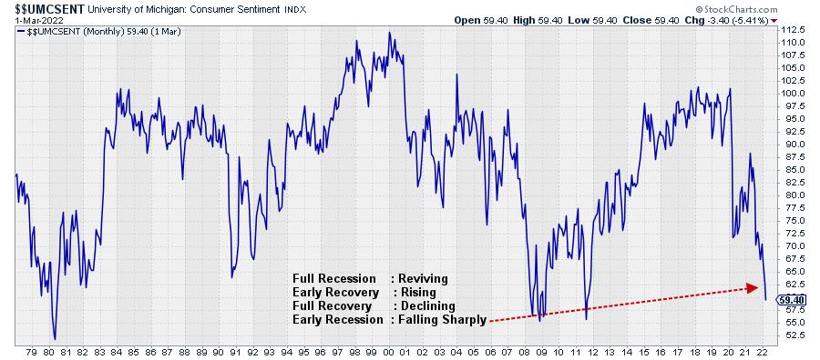
The first factor is "Consumer Expectations". Within the SC database, we have $$UMCSENT, the University of Michigan Sentiment Index, which I use as a gauge. In the text block on the chart, I have listed the four phases and the typical behavior of that indicator belonging to that phase. So here, IMHO, the index is falling sharply, which aligns with Early Recession in the framework.

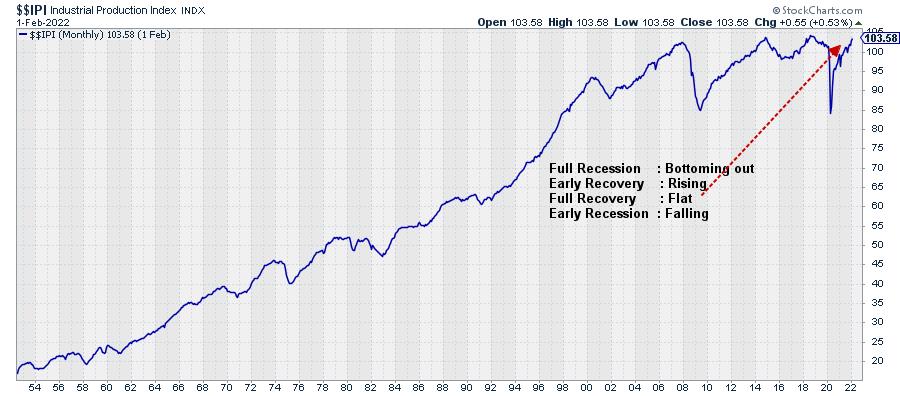
The second indicator is $$IPI, the Industrial Production Index. This index is still rising, but not as fast it used to be. So my judgement is that this aligns somewhere between Early Recovery and Full Recovery. It's definitely not falling, nor is it bottoming out.

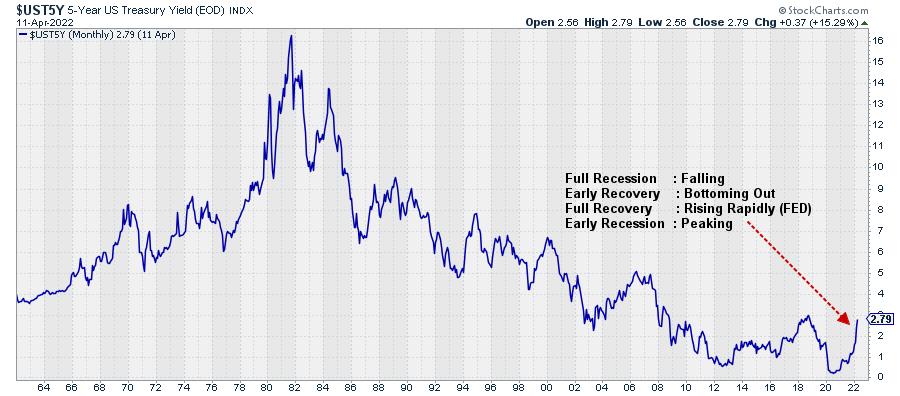
Interest rates are represented by the 5-year yield on government bonds (middle of the curve). I think this qualifies as rising rapidly, but it could well be close to peaking, as it is nearing a heavy overhead resistance level coming off the previous high. So this puts the movement in rates somewhere between Full Recovery and Early Recession.

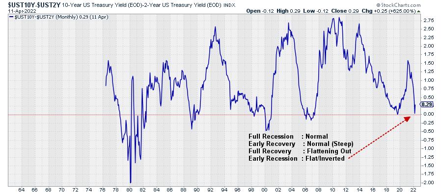
Finally, we have the yield curve, 10-year minus 2-year. This metric came down fast in the last few months and has almost reached zero. As you know, levels below zero mean that the yield curve is inverted. That has not happened yet, but, at 0.19 I feel comfortable labeling this as flat (and very close to an inversion). This aligns with the early recession phase.
The readings taken from these four charts are shaded in the table below the framework, as displayed at the top of this article.
Conclusion
Putting all this information together, the sectors that are outperforming at the moment, in combination with the readings from the four macro-economic factors, lead to the conclusion that the economy is moving from a full recovery more towards the early recession phase. At the same time, that means that the (stock) market is now beyond its top and in, or heading towards, a bear market.
There is no way to tell how long and deep that recession will be and how strong that bear market will be. But I believe there is enough reason to remain very cautious with regard to the broader stock market.
#StaySafe, --Julius
|
| READ ONLINE → |
|
|
|
| ChartWatchers |
| Finding Opportunities as Earnings Season Kicks into High Gear |
| by John Hopkins |
It's that time of the year, Q1 Earnings Season, when thousands of companies reveal their numbers, including the good, the bad and the ugly. We've already seen a bit of everything, but that will pale in comparison to what is about to happen, with companies like IBM, Johnson & Johnson, Lockheed Martin and Netflix scheduled to post their numbers this Tuesday. Then, on Wednesday, we'll hear from Proctor & Gamble and Tesla, just to name a few large-cap companies that will give traders an early glimpse of what is about to come.
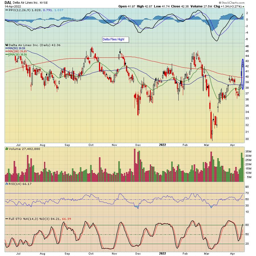
Just this past week, we saw that traders were disappointed in earnings from JP Morgan (JPM), Carmax (KMX) and Bed, Bath & Beyond (BBBY), to name a few. On the flip side, traders applauded Delta Airlines (DAL) for posting some strong numbers, with the stock moving higher in spite of the market selloff to end the week.

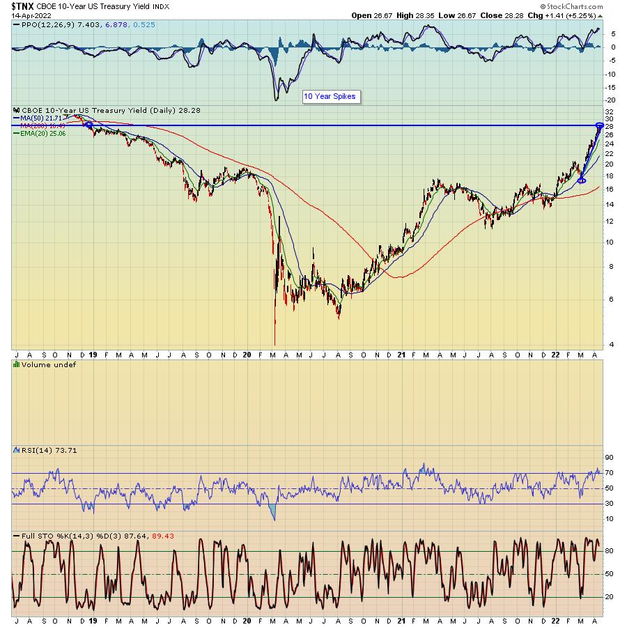
What makes this earnings season so interesting is the current market environment and the economic backdrop; high volatility with a negative tone along with continuing signs of high inflation. And we've seen the yield on the 10-Year Treasury Note go from 1.68% on March 1 to Thursday's high of 2.83% (its highest level in almost 3.5 years), with traders wondering how the increase in rates might affect future earnings.

Needless to say (though I will say it), traders don't really have a clear idea how the market will respond to individual earnings. Why? Because we might well see and hear a lot of companies beat or even exceed expectations but guide lower, or even withhold any future guidance, with uncertainty looming.
This is why you need to be very careful holding individual stocks into their respective earnings reports -- i.e., this particular quarter might be even trickier than normal. Instead, you should consider waiting for companies to post numbers, gauge the market reaction and then make an assessment; was the reaction positive or negative and is there a post-earnings opportunity to take a long or short position?
Trust me when I say this is a VERY tricky process, starting with identifying which companies are reporting earnings, to assessing the initial market reaction, to zeroing in on key price and technical support levels to making trading decisions on those stocks that "make the cut", including identifying key entry and stop levels.
In order to help members of the StockCharts and EarningsBeats communities navigate this complicated process, our Chief Market Strategist Tom Bowley will be conducting a FREE webinar this Monday, April 18 at 4:30 PM eastern, "Q1 Earnings, Sneak Preview". During this timely event, Tom will take a look ahead to upcoming earnings reports to identify companies that could post blowout numbers, as well as those that might come up short, while discussing strategies to profit on both the long and short side. You can learn more about this event, as well as other key webinars scheduled over the next two weeks, by clicking here.
Every earnings season brings with it both challenges and opportunities. You might find this particular quarter to be even more daunting than usual, so just make sure you are prepared for what is about to come.
At your service,
John Hopkins
EarningsBeats.com
|
| READ ONLINE → |
|
|
|
| Trading Places with Tom Bowley |
| This Approach Is The Absolute Best Approach To Earnings Season |
| by Tom Bowley |
While our primary focus at EarningsBeats.com is technical analysis, we combine that technical approach with fundamental analysis as well. Earnings is what we do. Prior to earnings reports, we're scouting for those companies most likely to report better-than-expected earnings and also the opposite - companies we want to avoid heading into earnings. Relative strength holds the key in both cases. Wall Street meets with management teams until their respective quarter end. Based on what they see and what they hear, they reposition themselves into stocks with strong stories and out of stocks that are likely to disappoint. Since we don't have the luxury of sitting down with management teams, our approach must focus on "hearing the story" from the charts rather than the management teams - and that's exactly what we do.
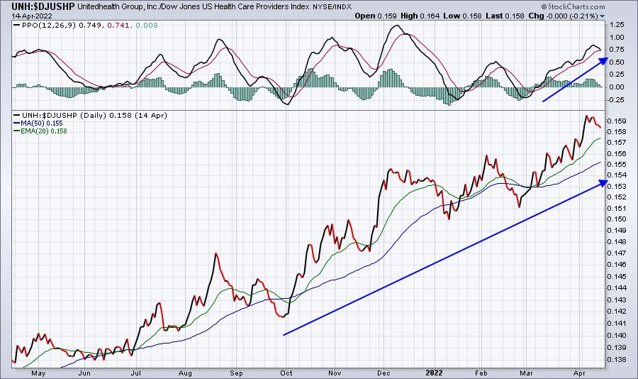
Over the past few quarters, we've developed an "Upcoming Earnings Relative Strength ChartList". In this ChartList, we organize companies that (1) will be reporting in the week ahead, (2) have market capitalizations over $1 billion, and (3) trade at least 200,000 shares a day over the past quarter to ensure liquidity. The truly unique part of this ChartList is that every chart is in relative strength form. For instance, last week Unitedhealth Group (UNH) reported its earnings and they were fantastic. UNH beat consensus estimates on both its top line (revenues) and bottom line (EPS). On one of my Trading Places LIVE shows last week, I had pointed out the good, the ok, and the ugly among upcoming earnings reports. UNH was the "good". Any time a stock is leading its industry group higher and its industry group is one of the strongest vs. the S&P 500, that's a great combination and one in which I expect to see great quarterly results. UNH did not disappoint. Let's look at UNH on a relative strength basis as it headed into earnings last week:

The price chart is a relative price chart of the UNH vs. its peer group - health care providers ($DJUSHP). By typing in the symbol "UNH:$DJUSHP", the price chart shows us how UNH is trading relative to its peers. I think it's rather obvious that it's in an uptrend. The PPO measures momentum, but since this a relative chart, it's actually measuring the relative momentum of UNH vs. its peers. Again, we're looking at an exceptionally strong chart.
UNH posted superb numbers. Here's a quick look at their numbers vs. Wall Street consensus estimates:
- Revenues: $80.15 billion (actual) vs. $78.76 billion (estimate)
- EPS: $5.49 (actual) vs. $5.37 (estimate)
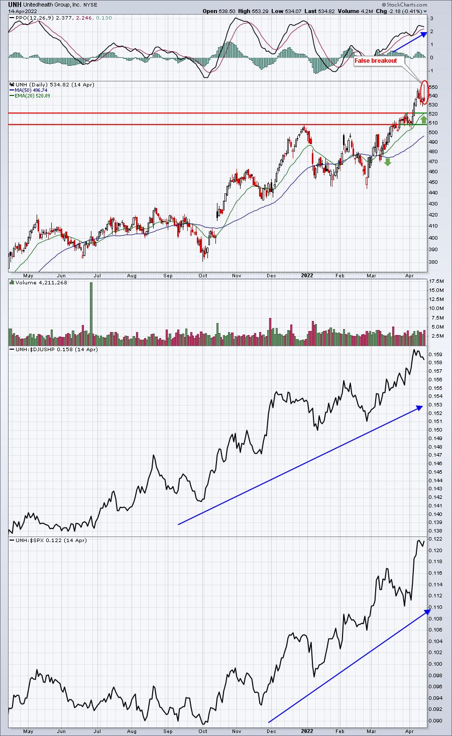
UNH did exactly what I'd expect - report better-than-expected numbers. The next question is, "how did Wall Street react to this great news?" Initially, it gapped higher, moved to an all-time high intraday, then sold off into the close. UNH experienced the "buy on rumor, sell on news." Let me be clear that just because UNH showed great relative strength and reported excellent results, that does not mean we'll see a huge advance. Remember, Wall Street was buying ON THE WAY UP and PRIOR to the quarterly results. Let the short-term selling be your friend and help you to enter at a better price. This requires a bit of patience. Look at the absolute chart on UNH:

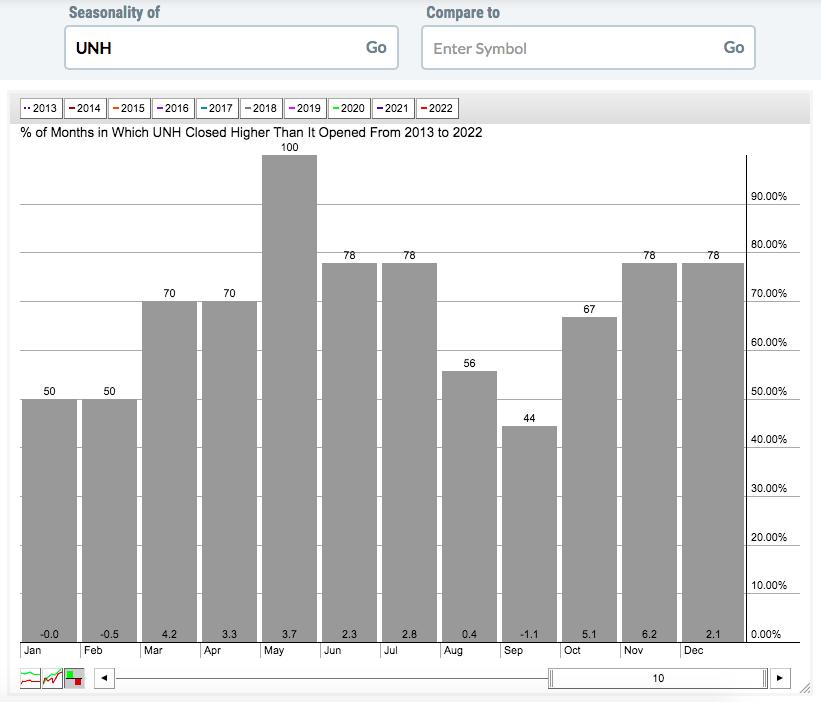
I like entry on the 20-day EMA test (green arrow). There's fairly solid short-term price support in the 510-520 area, so I'd expect to see buyers in that zone. I see good things ahead for UNH, especially given UNH's historical affinity for the month of May. It's risen every year over the past decade, check it out:

On Monday, April 18th, I'll feature an upcoming earnings report in our FREE EB Digest newsletter. It's an industry-leading company, just like UNH. But that's not all. For all of our EB Digest subscribers, I'll share our Upcoming Earnings Relative Strength ChartList where you can compare the relative strength of every company reporting next week (that met our criteria listed earlier). Our EB Digest is completely free and there is no credit card required. And then I'll host a FREE "Q1 Earnings: Sneak Preview" webinar on Monday, April 18th at 4:30pm ET. I'll describe how I use this ChartList to prepare for and uncover great trades. If you'd like to see the featured chart on Monday and register for Monday's webinar, simply CLICK HERE and enter your name and email address! I hope to see you on Monday!
Happy trading!
Tom
|
| READ ONLINE → |
|
|
|
| MORE ARTICLES → |
|
 Chart 1
 Chart 2
 Chart 3
 Chart 4
 Chart 5
 Chart 6
 Chart 7

 Sector PerfCharts provide clear performance snapshots of the market mood and the market mood is defensive. The PerfCharts below show the percentage change for the S&P 500 SPDR (SPY) and the eleven sectors. These sectors can be divided into three groups: offensive sectors, defensive sectors and other.


 We think it is a good time to revisit a topic that is always top of mind for tactical money managers and investors in rules-based strategies like trend following; and that is whipsaws.


