| THIS WEEK'S ARTICLES |
| John Murphy's Market Message |
| SHORT-TERM STOCK REBOUND NOT THAT IMPRESSIVE |
| by John Murphy |
NOT MUCH OF REBOUND...This time last week it seemed clear that stocks had put in a short-term bottom marking the start of a potential bear market rally. So far at least, that rally hasn't gone very far. The three charts shown below show the same overhead resistance lines that have yet to be tested. The daily bars in Chart 1 show the Dow Industrials ending the week on the defensive after retracing 50% of their March to May downtrend. That's a normal spot to expect some selling to re-surface. The Dow also remains below its 50-day average.
Chart 2 shows the S&P 500 meeting resistance at its 38% Fibonacci retracement line. In addition, the SPX is meeting resistance near its March bottom. That's not unusual since broken support levels usually act as overhead resistance. The SPX has also fallen short of testing its 50-day average. The same is true of the Nasdaq which has led the market decline.
Chart 3 shows the Invesco QQQ Trust which tracks the Nasdaq 100 meeting resistance at its 38% retracement line and broken support along its March. In addition, the chart shows volume remaining light during the rally attempt. That's a pretty weak rebound. The QQQ also failed to reach its 50-day average.
 Chart 1 Chart 1
 Chart 2 Chart 2
 Chart 3 Chart 3
|
| READ ONLINE → |
|
|
|
| The Mindful Investor |
| Lighter Volume Screams Market Top |
| by David Keller |
I've written that bear market rallies can be sudden, severe and seductive. The move off the lows in May certainly seems to check all three boxes! Using analysis of price action, breadth indicators and volume techniques, I'll show how the similarities between the current market upswing and the late March rally continue to build.
First, let's review the facts based on price.

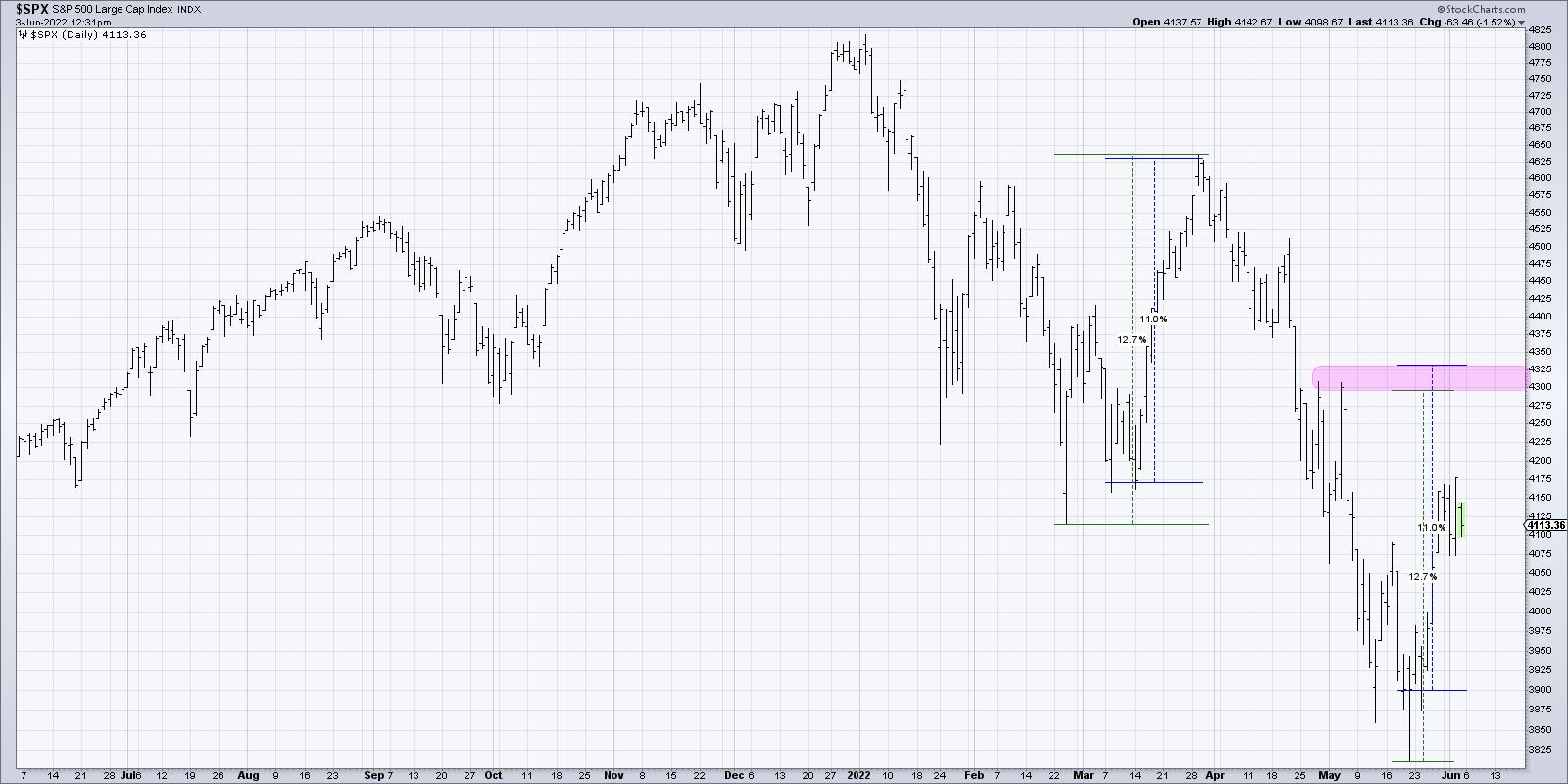
The March rally took the S&P 500 from a low around 4125 to a peak of around 4625 in about 3-4 weeks, depending on whether you measure the low from the intraday low in late February or the closing low in mid-March. This bear market rally phase pushed the S&P higher by 11.0% on a closing basis and 12.7% on an intraday basis.
How does that compare to the current rally?
We are only about three weeks in and so far the S&P is up about 6.5% on a closing basis. For a similar upswing to the March rally, that would measure up to the 4300-4325 range. This would bring us right back to the swing high in late April/early May and would also represent a 50% retracement of the January to May decline.
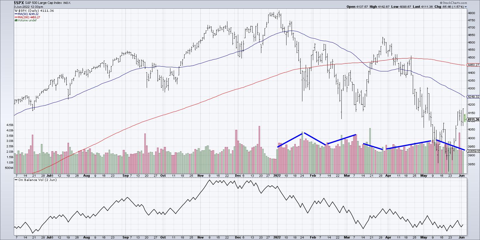
What can the volume tell us about market sentiment? If we simply look at the trend in daily volume bars, you'll notice a classic bear market configuration.

Volume has been trending higher in downtrend legs and has been lighter on rallies. So basically, selling pressure has been palpable to push the S&P to new lows, and then limited buying power comes in to push the index in a countertrend move higher. In particular, the volume readings over the last two weeks have been very similar to the anemic volume witnessed in late March.
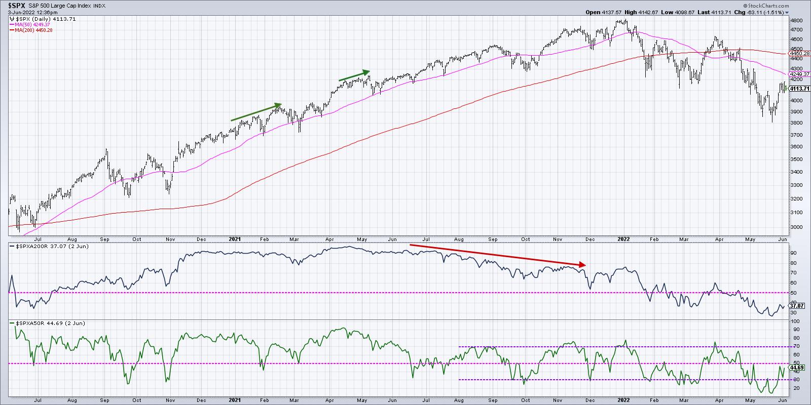
Finally, we have market breadth. What can this tell us about participation in this rally by individual stocks?
As of Thursday's close, 45% of the S&P members were above their 50-day moving average. In late March, that indicator reached all the way up to 70%, which showed that many individual stocks had regained their footing and participated in the uptrend.

Do we need more stocks to eclipse their 50-day moving average before the bear market rally is completed? Perhaps. Although there is no guarantee that the current bear market rally would look anything like the one from late March. But I do think making simple comparisons like this can help put the current market into proper context.
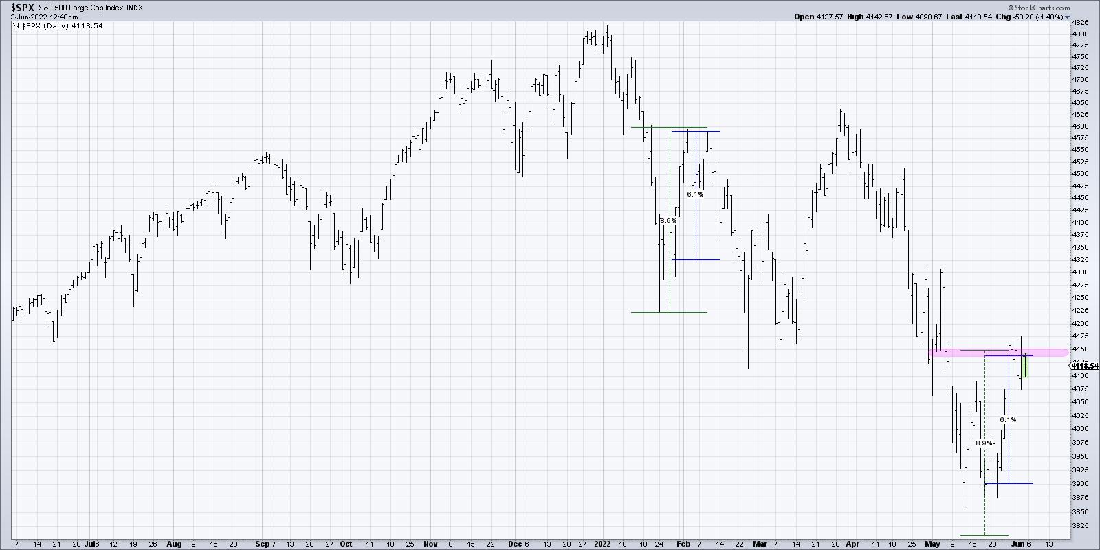
As an alternate hypothesis, what if this week's rally is more like early February? In that case, the S&P rallied 6-9% depending on whether you measure from the intraday low or the closing low.

If you do a similar measurement from last month's lows, then that would suggest we reached the potential top last Friday. The rest of this week has been about consolidating at that upside objective.
If you look at the breadth conditions and volume trends, you'll see that they line up pretty well. The markets never repeat themselves, but they often rhyme. By comparing the current move to previous similar conditions, we can start to think about what may be similar or different from those previous occurrences.
Whether we are more closely tracking the early February rally or the uptrend in March, I am fairly comfortable in labeling this a bear market rally. Bulls have much more to prove before this market can be given an "all clear" with a bullish outlook.
Want to learn more about the 50-day and 200-day moving averages? Head over to my YouTube channel!
RR#6,
Dave
P.S. Ready to upgrade your investment process? Check out my YouTube channel!
David Keller, CMT
Chief Market Strategist
StockCharts.com
Disclaimer: This blog is for educational purposes only and should not be construed as financial advice. The ideas and strategies should never be used without first assessing your own personal and financial situation, or without consulting a financial professional.
The author does not have a position in mentioned securities at the time of publication. Any opinions expressed herein are solely those of the author, and do not in any way represent the views or opinions of any other person or entity.
|
| READ ONLINE → |
|
|
|
| Martin Pring's Market Roundup |
| Gold: Either in a Hard Place or a Sweet Spot |
| by Martin Pring |
The long-term technical position of gold is extremely finely balanced and could easily tip into a full-fledged bear market, or start a new secular up leg to the bull trend that began in the opening years of this century.
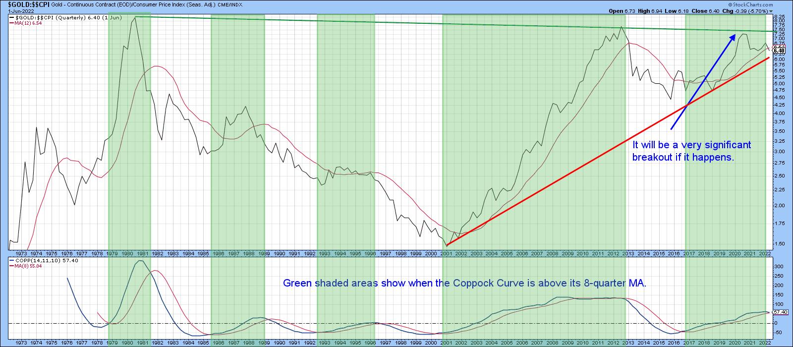
Chart 1 really says it all. First, it expresses gold adjusted by the CPI, so we can easily see whether the yellow metal is acting as a hedge against inflation. Second, the price is trading just below its 12-quarter moving average. That's not an official print, though, because the end of the quarter does not occur until the close of June trading. We still have some way to go. Third, the Coppock Curve, in the bottom window, is just about to cross below its MA. The green shading shows that previous periods when it has been trading above its 8-quarter MA have generally been bullish. A double negative crossover by the price and momentum would imply a bear market, previous examples of which can be observed from the unshaded areas on the chart. Finally, if a sell signal is avoided and gold rallies above the green resistance trendline, it will have experienced a massive upside breakout, with substantial upside potential. Don't forget that's a 40-year resistance trendline. Since gold has a habit of anticipating inflation or disinflation, the eventual outcome will have significant implications for both.
 Chart 1 Chart 1
Gold vs. Commodities
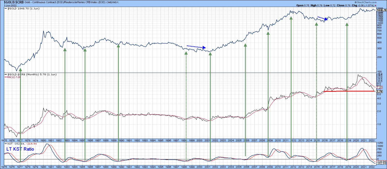
Chart 2 tells us that gold has a habit of anticipating commodity price moves. The center window compares its price to the CRB Composite. A rising relationship means that gold is outperforming commodities, and vice versa. It seems that, when gold is doing better than the CRB, the price of the yellow metal itself moves up, as it is discounting higher commodity prices. When that discounting process has run its course and the yellow metal begins to underperform commodities, gold itself declines. The ratio has been declining since the summer of 2020 and has now reached support in the form of the red trendline. The green arrows approximate the points when the KST of this relationship crosses above its MA. Usually, such action is followed by a gold rally. At the moment, the KST is declining. However, it has reached its most oversold reading in the history covered by the chart, so a reversal could take place at any time. Until it does, this relationship remains a bearish factor.
 Chart 2 Chart 2
Gold Speculators vs Gold Hedgers
One characteristic of a healthy gold bull market is when it can rely on support from gold shares. That's because the shares tend to discount the average future price, as opposed to the price itself. As a result, gold shares often lead the metal when prices for both are in a bull market. That said, there are differences in the performance of gold miners that hedge all or part of their profits in the futures market and those that do not. Companies that do not generally outperform hedgers during a gold bull market because they are naturally more leveraged on a rising price.
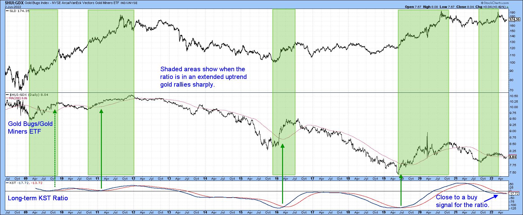
It's possible to pick up that differential in a limited way by comparing the Gold Bugs Index ($HUI) (non-hedgers) with the Vectors Gold Miners Fund (GDX). This relationship is shown in the center panel of Chart 3. Using the benefit of hindsight, the shaded areas represent periods when the ratio was rising. Note that the price of the Gold Trust Gold Fund (GLD) has a consistent habit of rising sharply under such conditions. The trend of that relationship is currently negative, but you can see that its long-term KST, in the bottom window, has gone completely flat, a possible sweet spot for gold itself.
 Chart 3 Chart 3
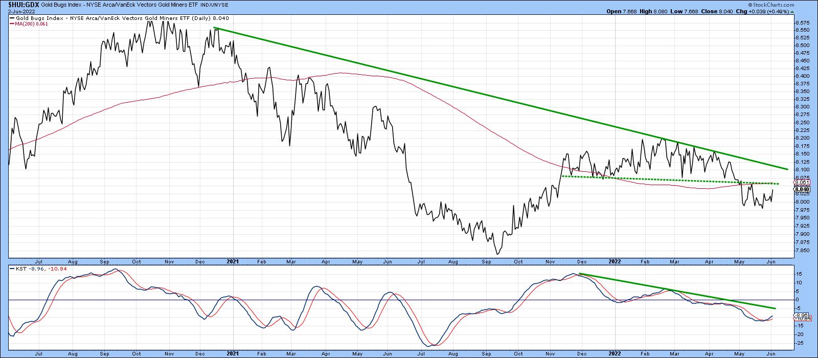
Chart 4 takes us on a deeper dive, where we can see that the short-term KST for this relationship has just gone bullish. The ratio itself is trying to form a base, the completion of which would result in a positive 200-day MA crossover.
 Chart 4 Chart 4
Gold Miners Bullish Percentage is Oversold
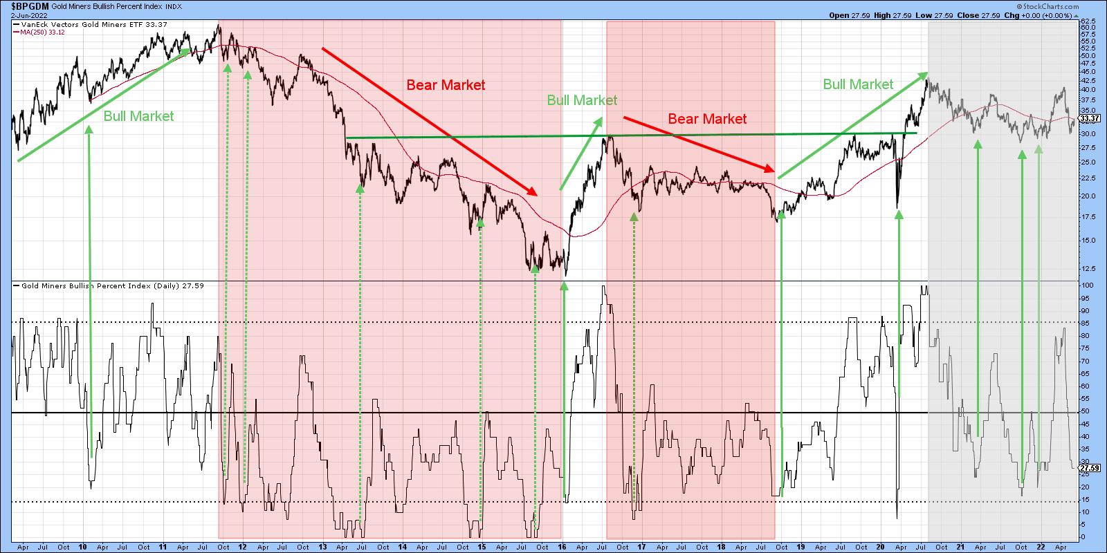
Based on the perspective of hindsight, the pink-shaded and white (unshaded) areas in Chart 5 flag bullish and bearish markets. Note how the price is so much more sensitive to oversold conditions in a bull market, often failing to reach the actual 15% level. By the same token, the pink-shaded bear markets fail to experience a truly overbought condition at 85%.
The period since the end of 2020 is shaded in gray since it truly is a gray area, having touched both 15% and 85%. The oscillator is still in a declining mode but, if this is a bull market, it is at the kind of level where we might expect to see a quick turnaround.
 Chart 5 Chart 5
Gold and Gold Shares KSTs Start to Turn Up
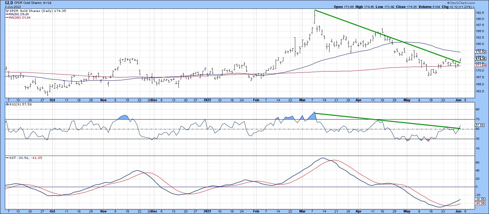
Finally, Charts 6 and 7 show that both the metal and shares have experienced some short-term upside breakouts. In terms of the metal, they take the form of the April/June down trendline for both the price and the 9-day RSI, as well as a positive 200-day MA crossover and short-term KST buy signal.
 Chart 6 Chart 6
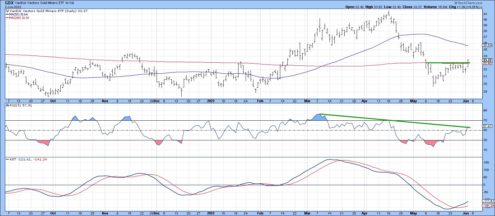
In the case of the GDX, a small base has been completed and a positive 200-day MA crossover achieved. The KST is bullish, but the RSI has not quite cleared its down trendline.
 Chart 7 Chart 7
Conclusion
The next few weeks will probably decide whether the gold price is in a hard place or a sweet spot. The distinction is super important, not just for the price of the yellow metal, but for the long-term outlook for inflation or disinflation.
Good luck and good charting,
Martin J. Pring
The views expressed in this article are those of the author and do not necessarily reflect the position or opinion of Pring Turner Capital Group of Walnut Creek or its affiliates.
|
| READ ONLINE → |
|
|
|
|
|
| The Canadian Technician |
| Why Stress Out Now? |
| by Greg Schnell |
On this week's Market Buzz, I walked through the end-of-month charts for the rest of the world, which are sitting at a positive but precarious situation. The question for us all is: Are we heading into a prolonged bear market?

The European markets have rallied for 3 weeks already, while the US markets have only been rallying for a week.
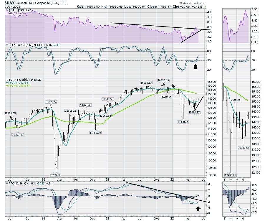
Here is an example of Germany on a weekly chart. A few positive surprises. The Full Stochastic indicator on a weekly chart soaring higher above 50 is a great visual! Usually, in bull markets, this will bounce up around the 50 level, whereas, in continuing bear markets ,it will roll down as it rallies up from the lows at the 50 level. So the continuing rally on this indicator suggests more strength.
The Weekly PPO (momentum) is giving a positive cross for the first time since 2022 began. The low in early May was a nice turn higher. This is a great start and, as price progresses higher, this will rise up.
Those are the positives on my indicators. The next view is to stare into the price chart. The price has moved above the up-sloping 10-week moving average (WMA), which is very positive. The 10-week moving average is a short-term overlay that helps us notice the short-term price trend. As it flattened out in 2021, it told us to be a little more cautious.
The bigger question now is the 40-WMA, which is a long-term moving average of 3/4 of a year. It is down-sloping and is positioned just where the market broke down below support at 15000. While we can have short-term rallies at any time, the bigger question is if this market completely rolls over as it rallies up to 15000. We would call this a back test of the support/resistance level of 15000 if it fails.
Looking at the black trend line on the PPO, the indicator could rally a little more, but if it fails at the black trend line, that would suggest a much bigger problem for this chart. Historically, during a bear market, the PPO will stay below zero and roll over below zero, marking severe weakness.

When I look at most of the European markets, they look about the same.
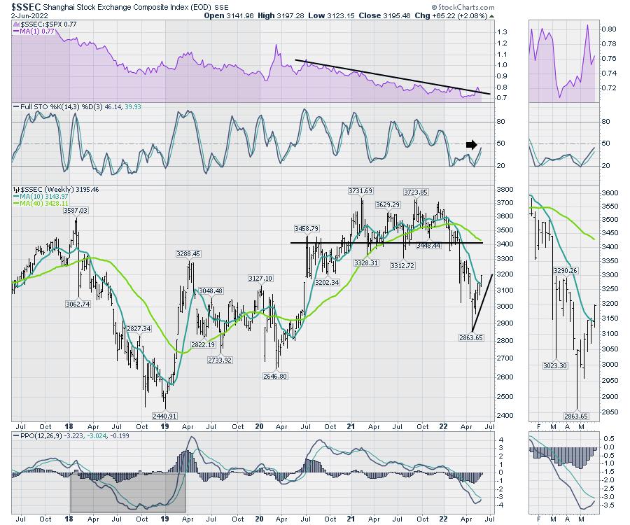
Rolling into the Chinese market, they have been having trouble getting the COVID situation under control. However, that market has been rallying for 6 weeks. It pushed above a down-sloping 10 WMA to start the month of June. The chart has similar characteristics to the German market, falling below support at 3400 and now rallying back up to the underside of that line, which is now resistance.
The full stochastic is still below 50 but still pointed up. The PPO momentum indicator has not triggered a buy signal yet.
I highlighted the bear market of 2018 for the Shanghai market during the tariff tussle. Notice how the indicator does not rally above zero until it is over.

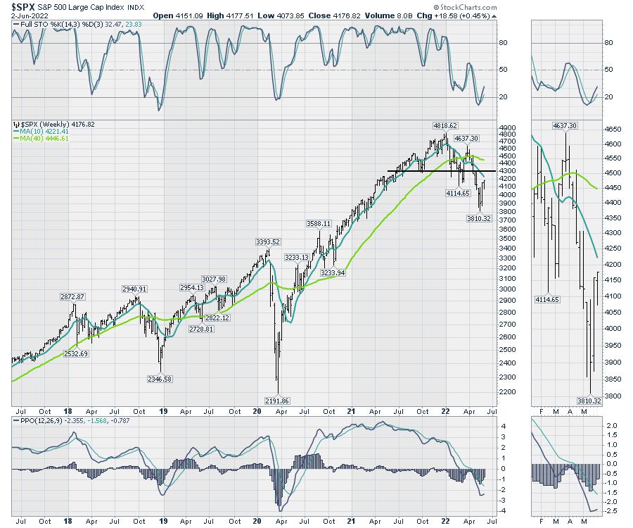
Now let's use the same setting for the $SPX. It would appear that everything is just a few weeks behind the rest of the world.

As long as the markets can continue to rally globally, that is a helpful backdrop for the US rally to continue. The fact that the US rally is the last one to start is a little odd, as the US market is typically a leader.
The message this week from Jamie Dimon of JP Morgan was definitely concerning. As the leader of one of the worlds biggest banks, the guy doesn't usually relay pessimism to the masses. He's a straight shooter, but chooses his words carefully. When he uses the hurricane word with economics, it's a bit of a gulp moment! See here.
How to trade it? I think you want to be nimble. If this rolls back down, it could be a bigger drop than most of us are expecting. For now, the charts are tilted higher!
|
| READ ONLINE → |
|
|
|
| RRG Charts |
| Defense Still Leads With a Pocket Of Strength in Commodity Chemicals |
| by Julius de Kempenaer |

Breaking down the US sector universe into three groups (as opposed to two) -- Offensive/Cyclical, Defensive and Sensitive -- shows the current rotations as seen in the Relative Rotation Graphs above.
It is pretty clear, IMHO, that the defensive group (still) stands out. All three sectors -- Consumer Staples, Healthcare and Utilities -- are positioned inside the leading quadrant. While Staples picked up, Utilities and Healthcare have started to lose some Relative Momentum in the past weeks. The high JdK RS-Ratio readings and the fact that all tails are still moving higher on this axis indicates that these relative UPtrends are still intact.
The group of offensive/cyclical sectors shows Consumer Discretionary and Financials inside the lagging quadrant and traveling at a negative RRG-Heading. Real-Estate and Materials are inside the leading quadrant, where Real-Estate recently sharply hooked down.
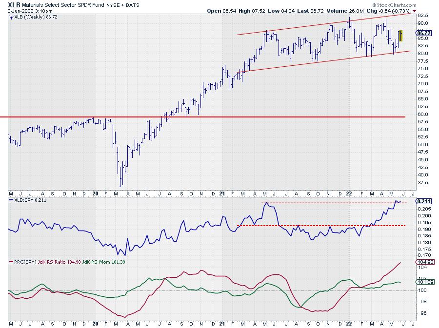
The Materials sector was, and probably still is, the odd one out in this group. Only this week, the sector lost some relative momentum, but, over the last 10 weeks, the tail on XLB has moved at a very nice RRG-Heading further into the leading quadrant, making it one of the more interesting and stable sectors in the universe recently.
In the group of sensitive sectors, obviously, Energy stands out, far to the right and still at very high JdK RS-Ratio readings. And, over a few weeks, the sharp drop on the RS-Momentum axis seems to be stalling just above 100.
Communication Services is the weakest sector in this group based on the low RS-Ratio reading, but, as you may recall, we have discussed the fact that XLC has reached a very long-term support level and is still holding up in that region. This lowered the speed of the relative downtrend and thus a pick-up in relative momentum, putting XLC inside the improving quadrant.
To a lesser degree, the same goes for the Technology sector. The decline in both price and relative strength has come to a temporary(?) standstill and is showing a small rally. Other than that, it is way too early to call for a reversal of the trend, which is still down.
Industrials is still inside the leading quadrant, but close to the benchmark and close to crossing over into weakening.
All in all, defensive sectors remain strong, while cyclical and the growth sectors inside sensitive remain weak. There are some signs of improvement, but, for the time being, these look more like recoveries rather than reversals.
Price Trends
With the current weakness in the stock market, it often pays to use $ONE as the benchmark for RRGs to get a handle on the trends in price, rather than relative.

This makes it crystal clear that all offensive sectors are in a downtrend. All three defensive sectors are on the right-hand side of the graph, hence in uptrends, but two are losing momentum. And in the group of sensitive sectors, three sectors are clearly inside the lagging quadrant and moving lower.
All in all, a significant part of the market, especially when you look at market capitalization, is now in a downtrend.
This is not an environment that points to a new rally being around the corner.
Materials

The price chart for XLB remains within the boundaries of its uptrend and has just started a new up-leg after testing the lower boundary.
The strong relative rotation of the Materials sector in these market conditions makes me want to investigate the group rotations inside that sector.

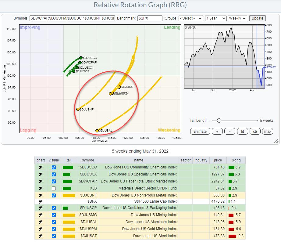
This RRG shows the rotations for the groups inside the materials sector (plotted against $SPX) and it clearly shows two things:
- As the universe is plotted against the S&P500 index, the fact that all groups are to the right of the benchmark confirms the current strength of the sector.
- A very clear split in two sides...
First, there is the group inside the leading quadrant, which is at a positive RRG-Heading moving deeper into the quadrant. And then there is another group, all inside weakening and moving at a negative RRG-Heading. This group also has significantly longer tails than the group that is moving into the leading quadrant.
The theme for this group moving inside the weakening quadrant is very clear: Metals and Mining. All these groups are related to some form of metals or mining of those metals. Hence, within the Materials sectors, the Metals and Mining groups are better avoided for the time being. They have played an important role in leading the sector higher in recent months, but they seem to be taking a breather now.
Commodity Chemicals, Specialty Chemicals and Paper seem to be the preferred groups in the coming weeks.
Commodity Chemicals

Out of these three groups, Commodity Chemicals has the highest RS-Momentum reading of the groups that are pointing further into leading.
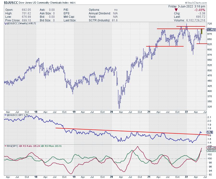
The chart above shows the upward break in relative strength after a multi-year downtrend. In the price chart, $DJUSCC is pushing against overhead resistance in the range between 700-710. Once that area gives way, there will be much more upside potential for the commodity chemicals group.
All in all, defensive sectors remain strongest which is counterintuitive to a bull market. Like always, it is possible to identify pockets of (relative) strength that offer opportunities. Just be aware that you are investing in a weak environment for the stock market in general.
Have a great weekend, #Staysafe, and don't forget to tune in to Sector Spotlight on StockCharts TV every Tuesday from 10.30-11.00 AM ET or replay on YouTube or our on-demand channels, --Julius
|
| READ ONLINE → |
|
|
|
| The MEM Edge |
| Small-Cap Stocks Held Up The Best Last Week. Here's Why You Need to Pay Attention |
| by Mary Ellen McGonagle |
The Russell 2000 Small Cap Index peaked in price late last year. With inflation rates not seen in 40 years and interest rates headed higher, this Index has taken a beating, with a 23.5% decline that puts it in bear market territory.
Small-cap stocks have had plenty of hurdles during this current period of economic uncertainty, amid borrowing costs that are on the rise and wage and supply costs increasing in the face of inflation. These smaller companies are generally considered riskier investments and, when investor confidence wavers, they tend to get hit the hardest.
Market experts are beginning to believe that the Russell 2000 has fallen enough, based on historical precedence. Researchers at BofA Global Research recently noted that small-cap stocks are close to their average decline in times that precede a possible recession. In addition, while small-caps historically have struggled during difficult periods, they greatly outperform in the early stages of a young bull market.
For example, coming out of the 2020 bear market, the small-cap Russell 2000 outperformed the much larger S&P 500 by a significant margin, as can be seen in the chart below.
RUSSELL 2000 VS S&P 500 PERCENT CHANGE OUT OF 2020 BEAR MARKET
While it's unclear when a true bull market will be under way, that eventual leadership is one reason that money managers say it's important to stay on top of small-cap stocks.
Another consideration at this time is the low price to earnings ratio, which puts the Russell 2000 at its lowest valuation ever, since first being tracked in 1985. Below are two small-cap stocks which were big winners out of the 2020 bear market; both are currently trading at low multiples while posting strong earnings recently that were well above estimates.
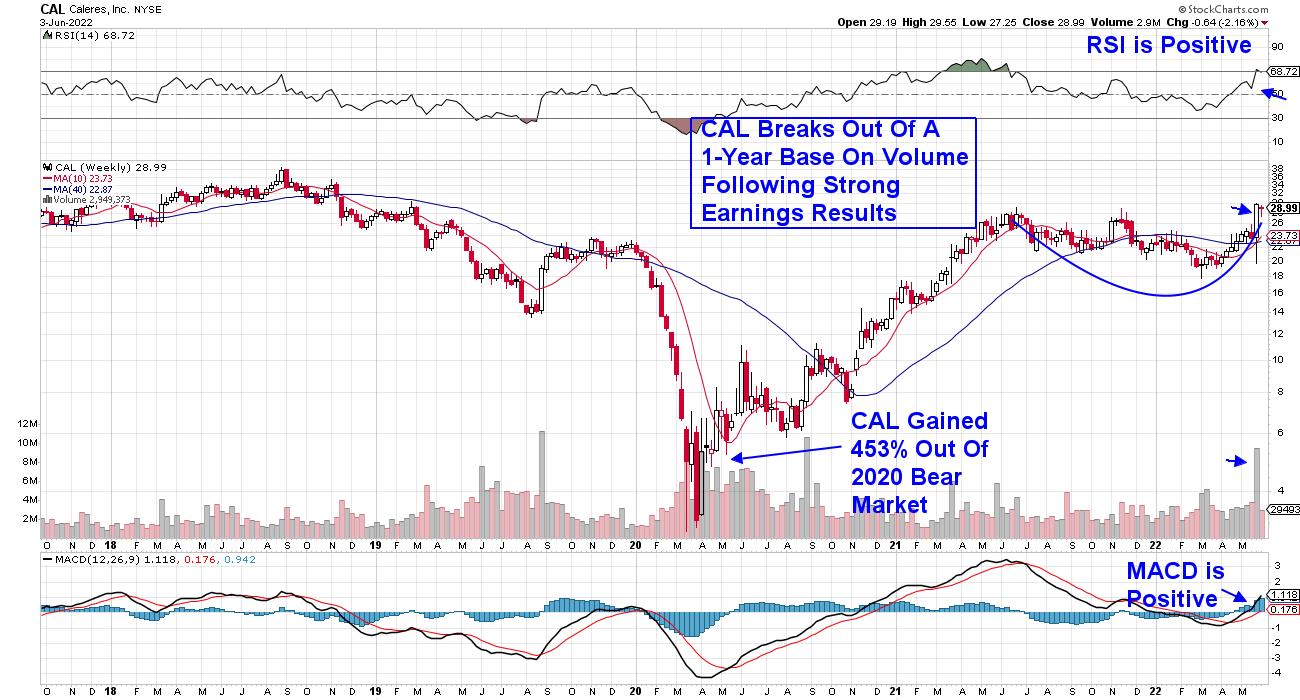
WEEKLY CHART OF CALERES, INC. (CAL)

First up is Caleres Inc. (CAL), which operates over 1,000 footwear stores worldwide under the names Famous Footwear and Naturalizer. The company reported quarterly earnings growth of 120% vs. last year, which was 59% above estimates.
In line with other footwear retailers, the company cited huge growth in dressy shoes as more people engage in social events and in-person work. This move away from more casual wear is expected to continue as more people go to postponed weddings and other events. Claeres broke out of a 1-year base on volume and trades at 6x trailing 4 quarter earnings.
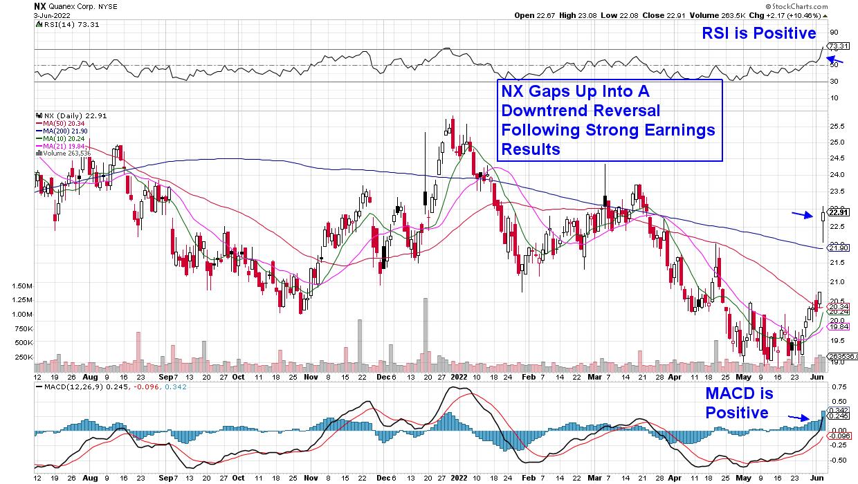
DAILY CHART OF QUANEX CORP. (NX)

Next up is Quanex Building Products (NX), which manufactures products for building and remodeling. The company reported quarterly results that were 86% better than last year and 87% above estimates. In addition, management guided estimates higher for the remainder of this year while reaffirming their dividend yield of 1.4%.
Quanex Building gapped up on volume following the release of their results, which reversed its recent downtrend. The stock trades at 10x trailing earnings and is poised to eventually break out of a 3-month base breakout at $24.5.
While small-cap stocks have been outperforming large-cap stocks for the past 5 weeks, other areas of the market are also firming up. Late last month, the S&P 500 posted a follow-through day, which uses a system that's identified every market bottom going back over many market cycles.
In addition to closely monitoring price action in the market, other characteristics need to be in place before a new, long-term bull market is put in place. If you'd like to uncover these needed criteria and be alerted to whether they're currently in place, trial my twice weekly MEM Edge Report at a nominal fee. You'll also gain access to our select list of curated buy ideas. Our top pick is up over 100% since being suggested.
Use the link above to gain immediate access!
On this week's edition of StockCharts TV's The MEM Edge, I review pockets of strength in this dire market and why select stocks are poised to trade higher. I also look at key factors that will continue to drive price action in the broader markets.
Warmly,
Mary Ellen McGonagle, MEM Investment Research
|
| READ ONLINE → |
|
|
|
| Trading Places with Tom Bowley |
| There's A Lot To Like About This Rally |
| by Tom Bowley |
Hands down, this is the best day of 2022. There have been better days in terms of percentage performance, but considering the negative economic news this morning, it's quite noteworthy that money is rotating into aggressive sectors at the expense of defensive sectors.
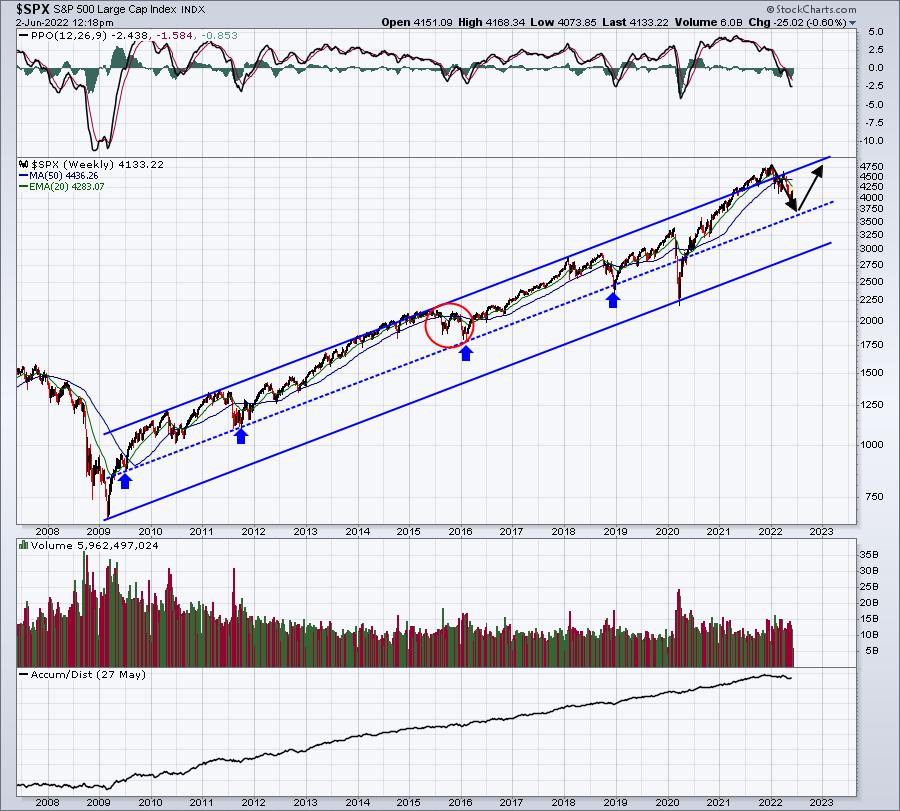
At our MarketVision 2022 event on January 8th, 2022, I presented the following S&P 500 chart and where I thought we were heading. I gave my prediction for 2022 and here it was on the S&P 500:

That's a pretty darn accurate forecast from a time in which we had just enjoyed an all-time high. Also, keep in mind that I don't offer many bearish forecasts. But I saw this one coming. One key signal was the bearish rotation into defensive sectors in December 2021 as the S&P 500 surged to a new all-time high. End of story.
But it's now time to write the next bullish chapter of this secular bull market. Wall Street is accumulating beaten-down growth stocks and today it was obvious. We had just received the May ADP employment report this morning and it showed a miss. The economy was worse than we thought. Buying growth stocks as the economy shows signs of weakening makes little sense. But it's also what bottoms are made of. Just like at the top when it made no sense for money to rotate to defense, it makes no sense now to rotate to aggressive stocks. Yet that's what Wall Street is doing.
Could we see another low in the S&P 500? I'd say yes, though I would lower the probability to perhaps 20-25% chance. If you'd asked me the same question yesterday, I'd probably have said 50-60% chance.
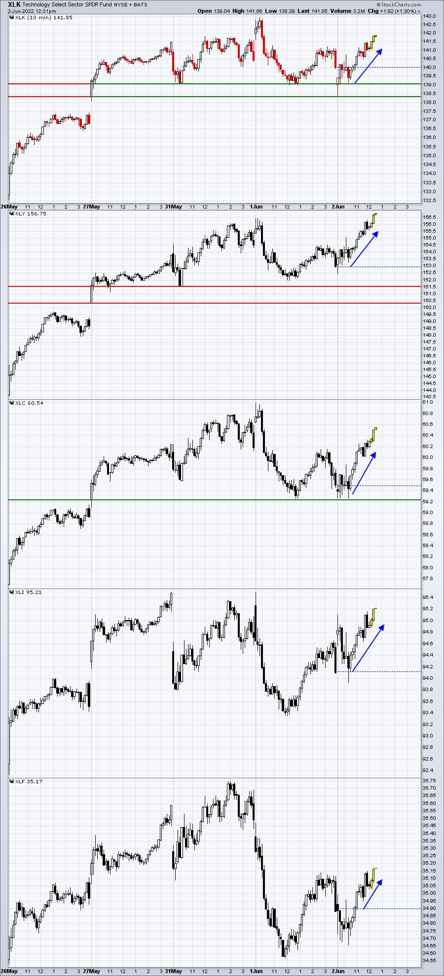
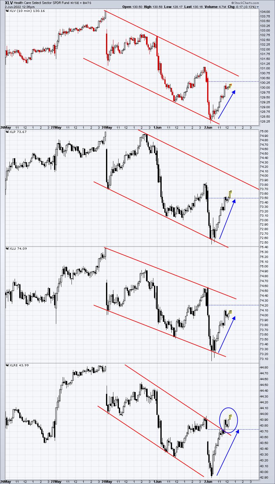
So let's take a look at today's action. With the surprisingly disappointing news this morning, let's check out how the aggressive sectors (XLK, XLY, XLC, XLF, and XLI) reacted vs. the defensive sectors (XLV, XLP, XLU, XLRE):
Aggressive Sectors:

After bad economics news surfaces, the aggressive sectors are all up nicely and have mostly traded in positive territory today, despite the Dow Jones dropping 300 points this morning - before turning positive.
Defensive Sectors:


The S&P 500 has been rising, and we normally see aggressive sectors outperform during a rally. That aggressive outperformance, by itself, isn't necessarily reason to become overly bullish. Most bear market rallies will see that. However, in this particular case, we've already rallied to key resistance levels AND we received bad economic news. The initial pre-market reaction was negative as futures turned from positive to negative. We were setting up for the next leg lower. And then we weren't. Money rotated into "risk on" areas of the market, a signal I look for at market bottoms.
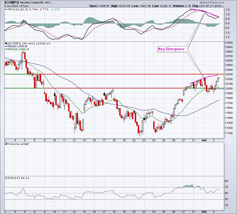
Now, there's always the "other side of the story" and we have a big nonfarm payrolls report on deck. A big miss there and perhaps we see more of a normal response tomorrow with aggressive groups dropping. There's also a negative divergence on the NASDAQ hourly chart as it attempts to move to a new high:

It would seem the closer we get to 12300, the bigger the short-term downside risk. But even if we sell off from here, I believe the groundwork is being laid for a MAJOR market bottom ahead and that's important to keep in mind.
One stock is really catching my eye on the long side and I'll be writing about it tomorrow in my Friday EB Digest newsletter. To subscribe for FREE (no credit card required), CLICK HERE.
Happy trading!
Tom
|
| READ ONLINE → |
|
|
|
| Top Advisors Corner |
| Flat M2 Growth Means Flat Period for Stocks |
| by Tom McClellan |

Part of the Fed's response to COVID-19 in 2020 was a dramatic increase in the money supply, pushing up the money supply measure known as M2 at the fastest rate in the history of record-keeping. That rise was already underway when COVID hit, and the Fed's actions just boosted it some more. Not surprisingly, we are seeing consumer price inflation now, because the price of anything is a measurement of money per unit of stuff. If the money increases dramatically but the amount of stuff stays the same or goes down, then the money/stuff ratio has to adjust.
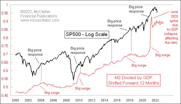
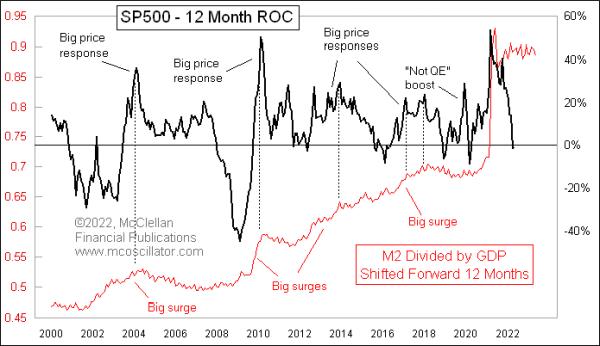
M2 has an important relationship also with the stock market, but teasing that out takes a couple of tweaks. This week's chart adjusts the raw M2 data by dividing it by GDP. If the money supply is increasing at the same rate that GDP is growing, then this line goes flat, which is the condition we are seeing right now. The other tweak is that I have shifted forward the plot of M2/GDP by 12 months, in order to illustrate how big changes in that ratio tend to get echoed a year later as big moves in the stock market.
That is true, at least for the big upward surges in M2. We don't see big downward moves in M2/GDP, yet we do see big bear markets for stocks. So M2 does not explain everything. But it is fair to say that when there is a big surge upward in M2/GDP, we see a big surge for stocks about a year later. And we saw that this time with the big bull market following the March-April 2020 COVID Crash.
Now we are in the "expired growth" phase, when the flat M2/GDP ratio says no more big party for the stock market. This can also be seen when we look at the 12-month rate of change (ROC) of the S&P 500 versus the M2/GDP ratio. The same 12-month offset works here too:

The big upward surges in the M2/GDP ratio reliably lead to big surges a year later for stock prices. And then. when the punchbowl gets taken away, the party falls flat. We have at least a year of a non-partying environment for the stock market.
It is worth noting that this relationship has not always worked this way. Back in the 1960s, it was more of a coincident relationship. In the 1980s and 1990s, that shifted to a 6-month leading indication, and now it is out to 12 months. I cannot explain that shift, but it is detailed in this prior article.
Someday in the future, the Fed will again decide to goose the money supply over some unknown emergency, and we will get another big stock market response. But that day is not now.
|
| READ ONLINE → |
|
|
|
| MORE ARTICLES → |
|
 Chart 1
 Chart 2
 Chart 3

