| THIS WEEK'S ARTICLES |
| The Mindful Investor |
| Looking For a Bottom? Watch RSI. |
| by David Keller |
When the market is in a confirmed downtrend, which I certainly believe it is, your investor game needs to rotate from a focus on capital growth to a focus on capital preservation. As long as the trend remains negative, and the price momentum remains bearish, there is no real reason to consider taking on additional risk.

Where would we expect to see price momentum improve? I always go back to the Sam Stovall model of sector rotation. Once equities are in an established bear phase, and economic conditions begin to deteriorate, it's all about the leadership out of the eventual market bottom. What tends to perform well as the market bottoms out? The growthy sectors like Technology and Consumer Discretionary.
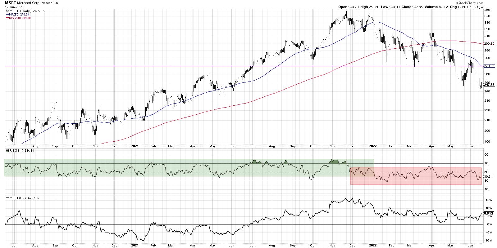
That's brings us to today's example, which includes a fantastic illustration of using RSI ranges to determine the overall market phase. From mid-2020 through the end of 2021, Microsoft (MSFT) was in a clear uptrend pattern of higher highs and higher lows.

The RSI during this period tended to become overbought on upswings and rarely reached below 40 on any pullbacks. This particular phenomenon, where the entire range of the RSI shifts higher during a bull move, is one of the reasons why Connie Brown's fantastic book Technical Analysis for the Trading Professional is featured on my recommended reading list.
Now look what happened in December 2021. The RSI basically hovered around the 50 level for about four weeks, bouncing between 40 and 60. This pattern basically indicates an absence of price momentum, or a market in equilibrium. Then, in January of this year, the RSI went below 40 on the way to becoming oversold in late January. Even though MSFT has rallied a number of times during the bear market of 2022, the RSI has never reached much above the 60 level.
The entire RSI range tends to shift lower during a downtrend, often becoming oversold on down legs and rarely reaching above 60 on price bounces.
Going to back to Sam Stovall's work on sector rotation, I would want to see charts like MSFT improve to confirm that the broader bear market in stocks was nearing an end. Without strong performance from FAANG stocks like Microsoft, there just isn't enough market cap to push the S&P 500 and Nasdaq to new swing highs. So that means that when MSFT bounces (which it certainly will at some point), I'll be watching this chart to see if the RSI reaches above 60. That would indicate a potential bullish rotation, an exhaustion of sellers, and an influx of buyers.
Until charts like MSFT see a dramatic improvement in price momentum using RSI, the bear market phase is very much still in play.
RR#6,
Dave
P.S. Ready to upgrade your investment process? Check out my YouTube channel!
David Keller, CMT
Chief Market Strategist
StockCharts.com
Disclaimer: This blog is for educational purposes only and should not be construed as financial advice. The ideas and strategies should never be used without first assessing your own personal and financial situation, or without consulting a financial professional.
The author does not have a position in mentioned securities at the time of publication. Any opinions expressed herein are solely those of the author, and do not in any way represent the views or opinions of any other person or entity.
|
| READ ONLINE → |
|
|
|
| Martin Pring's Market Roundup |
| Four Charts that are Acting in an Unintuitive Way |
| by Martin Pring |
Prices often move in the opposite direction to the expectations of most investors and traders. In many cases, that happens because the latest news has already been factored into prices and market participants have already begun to anticipate the next development. For example, a group of institutions might like the longer-term prospects for a specific company, but a really bad earnings report is expected in the immediate future, so it's better to buy after the report has been published. As a result, the price sells off sharply following the report's release and the institutions, having got the bad news out of the way, buy into the dip, as they use the report as a low-risk accumulation opportunity. To the casual observer, this seems like a strange action, as the stock ends the session either well up from its lows or even up on the day.
That's not quite the same thing that I had in mind for this article, as I am more interested in comparing what might be expected from a generally accepted narrative to what the chart is actually saying. First, though, a quick word on gold.
False Breakout by Gold
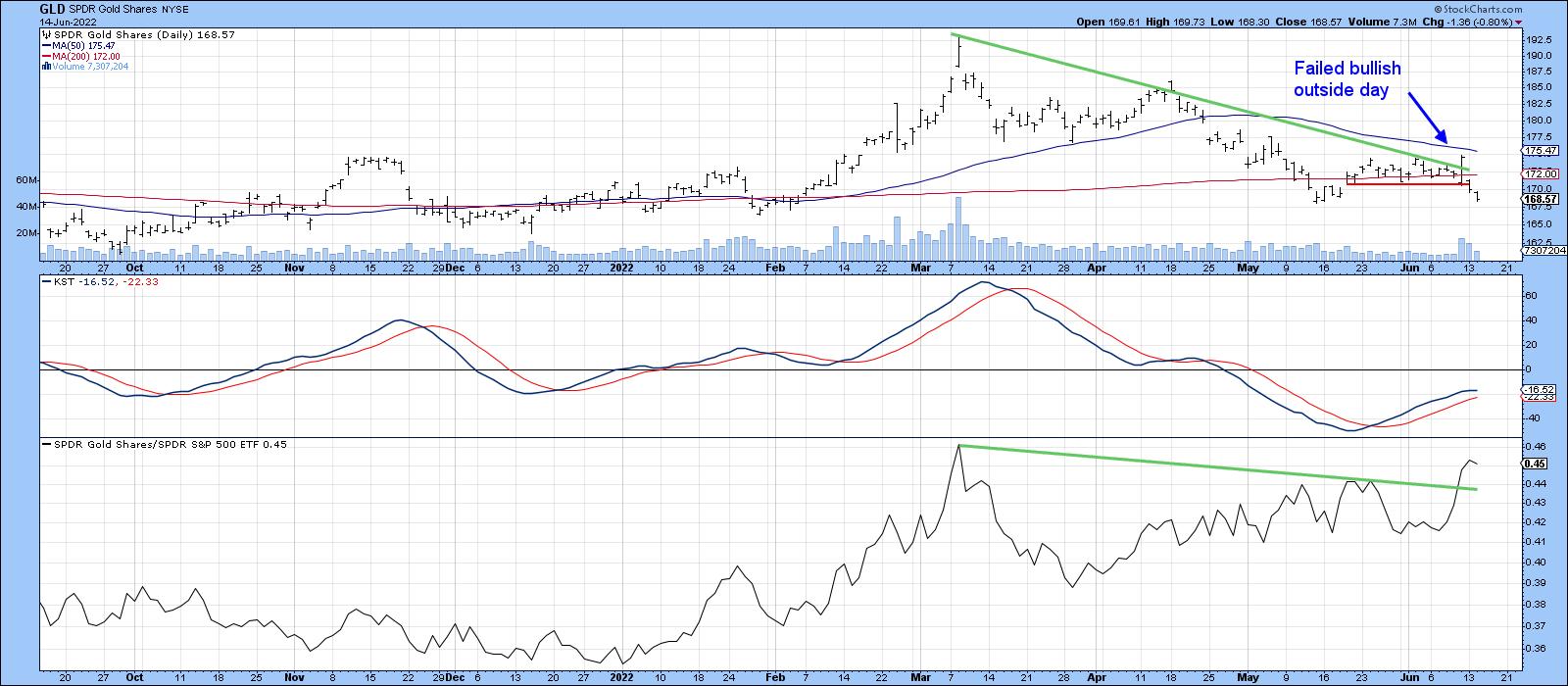
Last week, I wrote a piece pointing out that the long-term technical position for gold was finely balanced, but that short-term action suggested that the indicators were moving in a positive direction that had the potential to tip things in favor of a positive breakout. I used the trendline break and outside bar in Chart 1 as evidence.
 Chart 1 Chart 1
As you can see, that scenario did not play out, as the breakout was false. Also, the price has dropped back below its 200-day MA and the small support trendline. It can always regroup and make another breakout attempt, of course. Nevertheless, we need to be very careful, as false breakouts are typically followed by above-average price moves in the opposite direction to the breakout, but I digress.
Narrative: The Sanctions are Really Hurting Russia
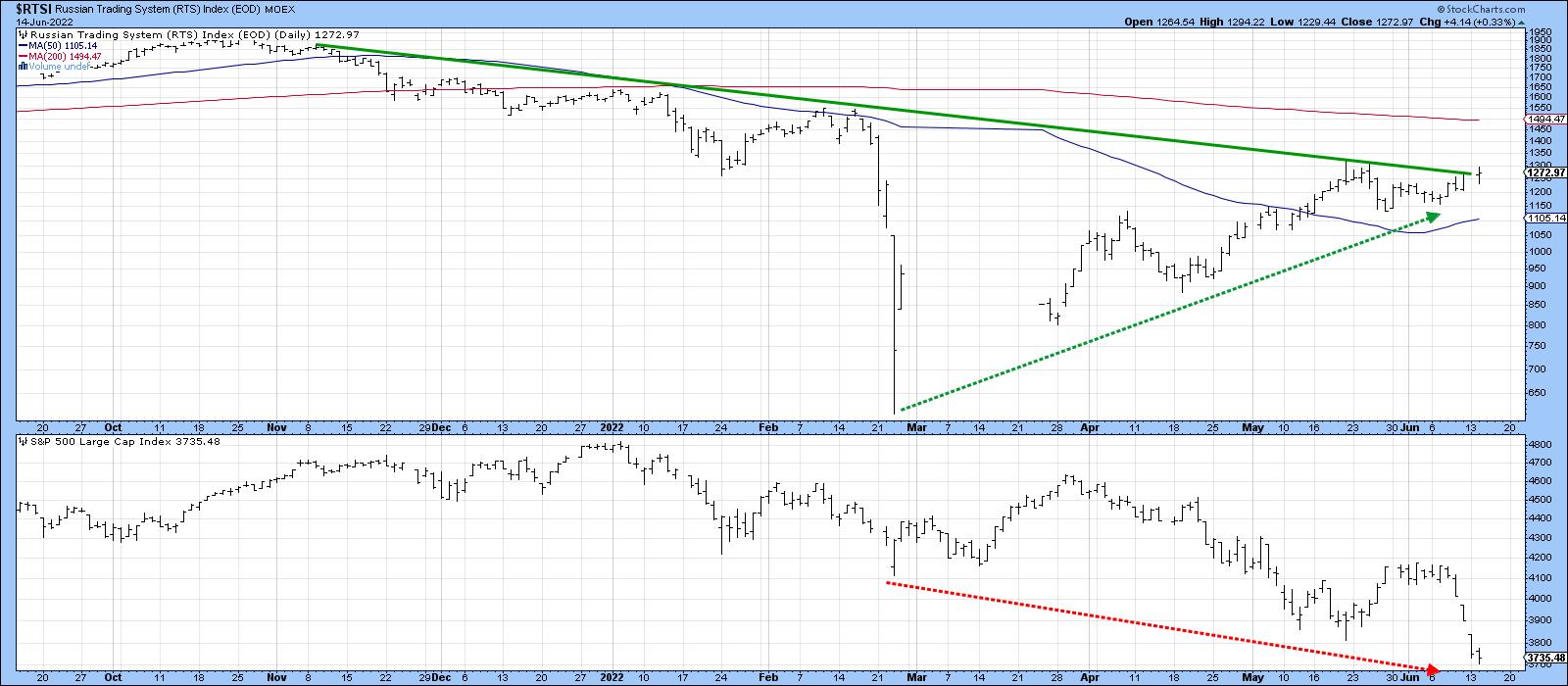
Most of us would have expected the sanctions to badly affect the Russian economy, hurting the stock market and currency. However, if we look at a chart of the Russian Trading System, you can see that, since the Ukraine invasion began, the Russian market has gone up and the US down.
Now, I can hear some of you saying that the $RTSI is denominated in rubles whereas the $SPX is denominated in high-flying dollars. Consequently, this chart gives a false sense of strength.
 Chart 2 Chart 2
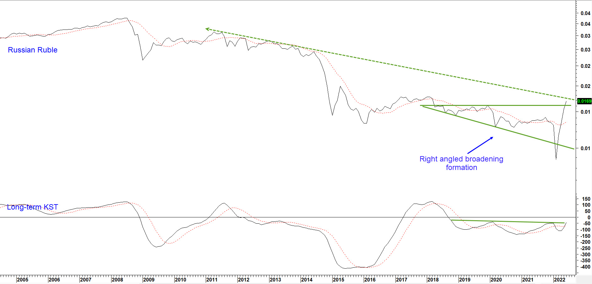
However, Chart 3, featuring the ruble, shows that it has actually risen during this period and is now back to its late-2017 highs. It obviously faces some resistance in the form of its secular down trendline, but a positive KST and tentative breakout from a right-angled broadening formation, a particularly bullish pattern, suggests that the bearish narrative is unlikely to play out. More to the point, the recent positive $RTSI performance is not currency-based, but is even better when the rising ruble is taken into consideration. If the name "ruble" was left off this chart, I would have to say it is bullish.
 Chart 3 Chart 3
Narrative: Gas Prices are at a Record High
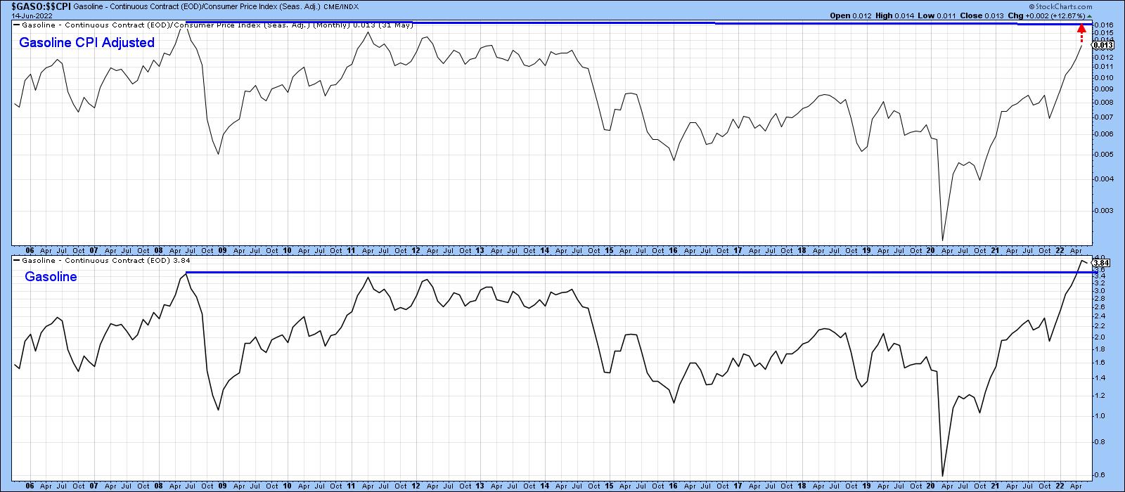
That's true, but when adjusted for inflation, they are still very high, but certainly not at a record. That was established in 2008, as shown in Chart 4. For the record, inflation-adjusted oil prices are below both their 2008 and 1980 peaks. Unfortunately, they are getting close to both.
 Chart 4 Chart 4
Narrative: The Economy is Headed for Recession
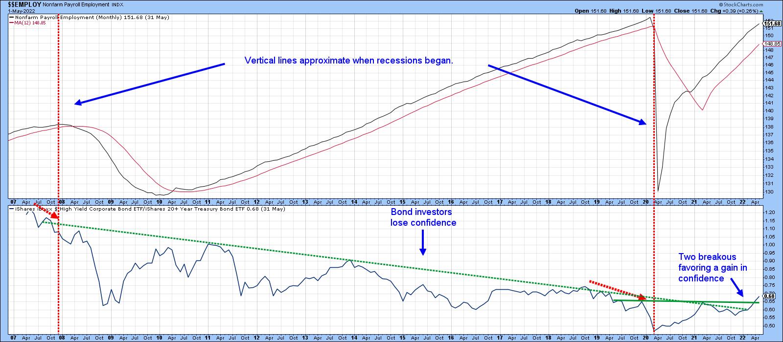
The recent sharp retreat for stocks has spurred talk of an imminent recession. Given 200-years of business cycle data that has recorded recessions on a regular basis, forecasting a business cycle one or two years out is not exactly a profile in forecasting courage. There are certainly many indicators pointing to a slowdown in growth, but, in my view, a consensus for a recession is not yet in place. It could happen if things unravel quickly, but that's not likely according to Chart 5.
Chart 5 compares the iBoxx High Yield ETF to the iShares 20+Year Treasury ETF (HYG/TLT). The two vertical lines approximate the beginning of two recessions. You can see that they were preceded by a decline in the ratio. That action indicated bond investors were beginning to become concerned about economic conditions and, therefore, possible defaults. What shocks me about this chart is that, far from showing concern, the ratio has instead broken above its secular down trendline and completed the 2019-2022 base. A rising ratio means that investors are growing in confidence, since they are favoring risky high-yielding paper over the lower yields and safety of treasuries. Consequently, the chart completely fails to support the recessionary narrative.
 Chart 5 Chart 5
Good luck and good charting,
Martin J. Pring
The views expressed in this article are those of the author and do not necessarily reflect the position or opinion of Pring Turner Capital Group of Walnut Creek or its affiliates.
|
| READ ONLINE → |
|
|
|
| DecisionPoint |
| Of 90 Industry Groups, Only TWO Have Rising Momentum! |
| by Erin Swenlin |
We know it is bad out there -- we don't have to tell you that. But the technicals are now proving to us how bad it really is. Just so you know, these two industry groups' Price Momentum Oscillators (PMOs) only began rising today; so prior to today, EVERY industry group had falling momentum... EVERY SINGLE ONE.
Every Friday for DecisionPoint Diamonds subscribers, I provide a "Sector to Watch" and an "Industry Group to Watch". This week was a challenge. As I clicked through each of the 90 industry groups covered in the Industry Group Summary on StockCharts.com, I was shocked to see that none had rising momentum... I had to call up the actual charts to examine if the PMO had maybe turned up, as it was an eye test. If it looked remotely like the PMO had turned up, I had to call up a "thumbnail" on the chart.
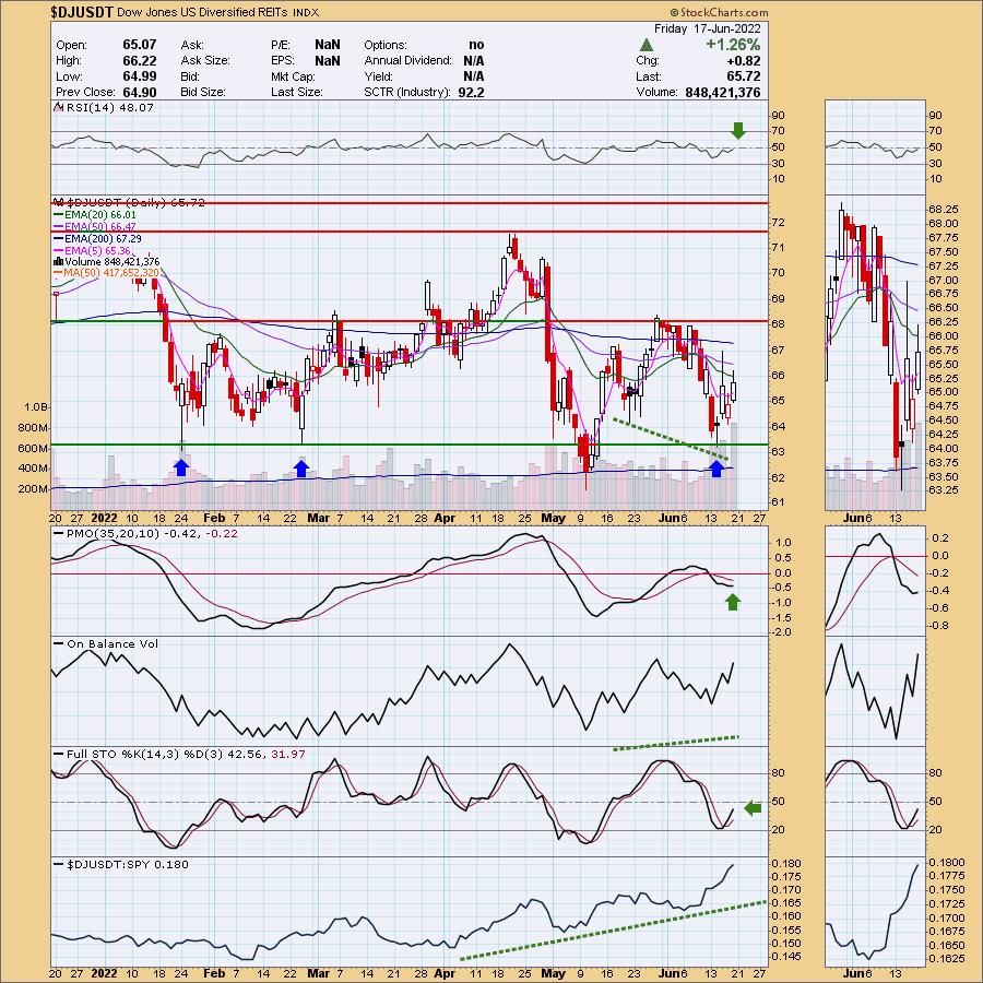
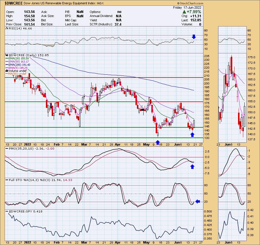
<Drum roll> Envelope, please... and the two industry groups with rising momentum are... Diversified REITs ($DJUSDT) and Renewable Energy ($DWCREE)!
Let's review the charts.

*** Bear Market Special ***
Now more than ever, you need DecisionPoint analysis! Let us help you maneuver through treacherous market conditions!
We've decided to put together a "Bear Market" discount. Right now, using Coupon Code: BEARS, you can get your first month of the "Bundle" package for only $14 (regularly $68)! Cancel anytime! If you decide you only want just the DP Alert or just DP Diamonds, notify us and we'll adjust your account.
We have a strong positive divergence that led into this current rally on this industry group, which suggests the rally will get legs. Without a thumbnail, you wouldn't really know the PMO is rising at all. The RSI is still negative, but is rising now and Stochastics look good as they move up out of negative territory. It is a clear winner against the SPY. In the Diamond Mine trading room, we picked out a few stocks in this area that had potential, but I'll keep mum in respect of my subscribers.


Click here to register in advance for the recurring free DecisionPoint Trading Room! Recordings are available!
This looks promising for Renewable Energy, but I have to say that I wouldn't want to jump into this area in a bear market. It is already volatile. The PMO may have turned up on $DWCREE, but on the Solar ETF, TAN, it has not. However, this chart is shaping up. The RSI is nearing positive territory, Stochastics are rising again and, this week, it was a clear outperformer against the SPY. It's extremely early to call it, but it does look like a bullish double-bottom is developing. Looking at the relative strength line, though, you can see how volatile it is.

Conclusion: We knew it was bad, but not how bad. Prior to today, there were NO industry groups with rising momentum. Today, we now have two rising PMOs. Usually we will see "pockets of strength" among the industry groups. Given we are not seeing pockets, it is a clear indication of how oversold and beat down this market is. Unfortunately, we believe there is much more downside to absorb with occasional bear market rallies. As usual, we will keep our subscribers updated.
Technical Analysis is a windsock, not a crystal ball. --Carl Swenlin
(c) Copyright 2022 DecisionPoint.com
Helpful DecisionPoint Links:
DecisionPoint Alert Chart List
DecisionPoint Golden Cross/Silver Cross Index Chart List
DecisionPoint Sector Chart List
DecisionPoint Chart Gallery
Trend Models
Price Momentum Oscillator (PMO)
On Balance Volume
Swenlin Trading Oscillators (STO-B and STO-V)
ITBM and ITVM
SCTR Ranking
Bear Market Rules
DecisionPoint is not a registered investment advisor. Investment and trading decisions are solely your responsibility. DecisionPoint newsletters, blogs or website materials should NOT be interpreted as a recommendation or solicitation to buy or sell any security or to take any specific action.
|
| READ ONLINE → |
|
|
|
| RRG Charts |
| One Lone Ranger Inside the Technology Sector |
| by Julius de Kempenaer |
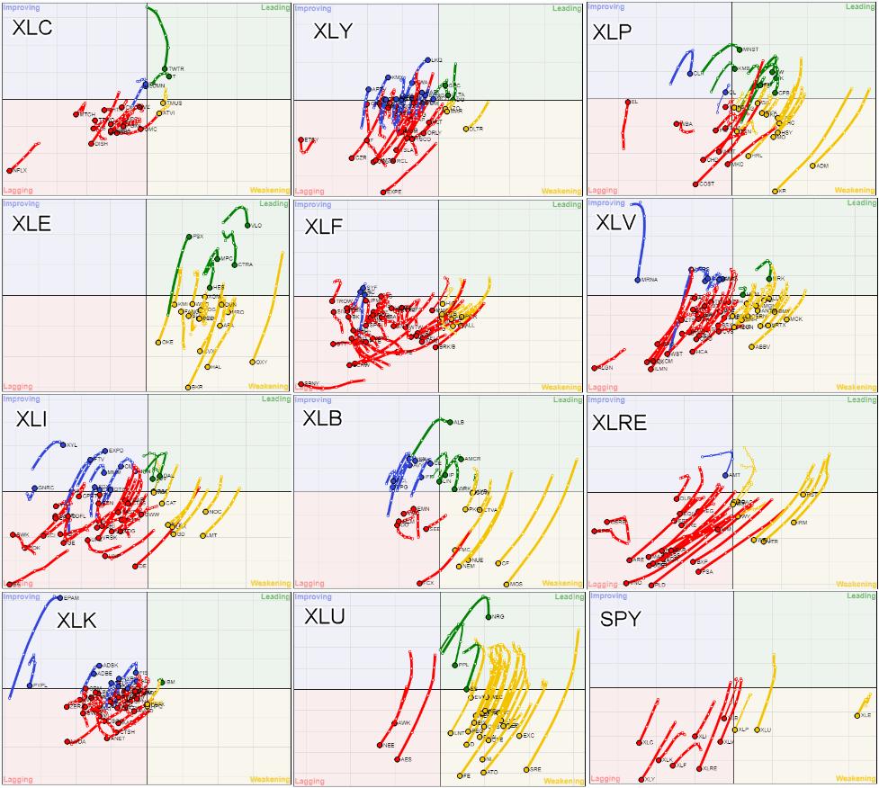
In my previous article, as well as in Tuesday's Sector Spotlight show, I touched on using Relative Rotation Graphs for gauging market breadth, showing this combination chart.

This image combines 12 Relative Rotation Graphs using $ONE as the benchmark, and it tells me, and I hope you as well, so much.
At the bottom right is the RRG for the sectors against $ONE. This chart in and of itself speaks volumes. Except for XLP, XLU and XLE, all tails are inside the lagging quadrant, meaning that these sectors are in downtrends based on price. Also, these downtrends are still getting stronger while they are dropping further on the JdK RS-Momentum scale.
The three sectors that are inside the weakening quadrant have been holding up so far, but they have started to lose momentum and are close to also rotating into the lagging quadrant. It is very obvious that, with such rotational trajectories for all sectors based on price, it will be very hard for the S&P 500 to start a new uptrend. I'm afraid that needs time, as the market will need a while to digest the current selling pressure.
Glancing over all these price-based RRGs will quickly make you realize how weak the current market environment is. There are a few tails that stand out from the bulk, but that is not even close enough to start thinking about a turnaround. Hence, the basic message remains to stay very cautious with long positions, or over-weighting stocks in your portfolio.
Information Technology
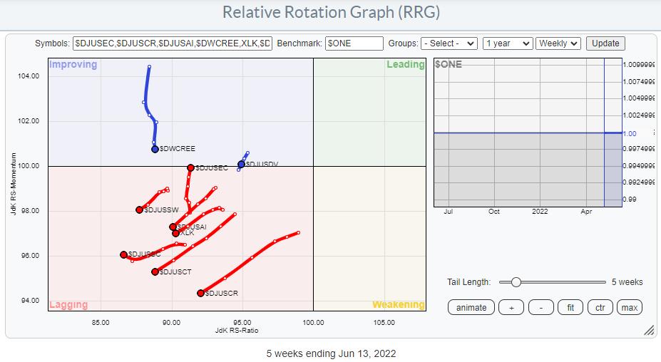
For this article, I want to zoom in and focus on the technology sector, starting with the Relative Rotation Graph of the industries inside the technology sector, visualized in the same way against $ONE.

This image clearly confirms what we already saw on the RRG for the individual stocks. The declines and the downtrends in the technology sector are broad-based, and they are still in full force. The only group that is moving higher, at least on the RS-Momentum scale, is Electrical Components and Equipment. But even that price chart is looking horrible.
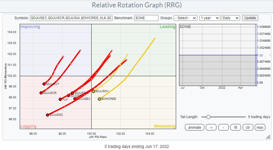
Running that same universe of groups in technology on a $ONE RRG on daily data underscores the general direction.

Not much to add here.
Tech Stocks Against $ONE
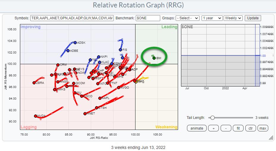
The RRG below is the blown-up version of the XLK chart in the grid above. It shows the individual stocks inside XLK against $ONE on a weekly basis. I have ticked off the tails for PYPL and EPAM, as they distort the image too much.

Again, in line with most other sectors, the majority of the stocks are inside the lagging quadrant, or at least on the left-hand side of the graph, and the dominant RRG-Heading is negative.
Except for one... IBM. IBM's tail is inside the leading quadrant and very short compared to the other tails on the plot. This means that:
- IBM is in an uptrend based on price (leading quadrant)
- That trend is very stable (short tail)
Reason enough to check out that chart.
IBM

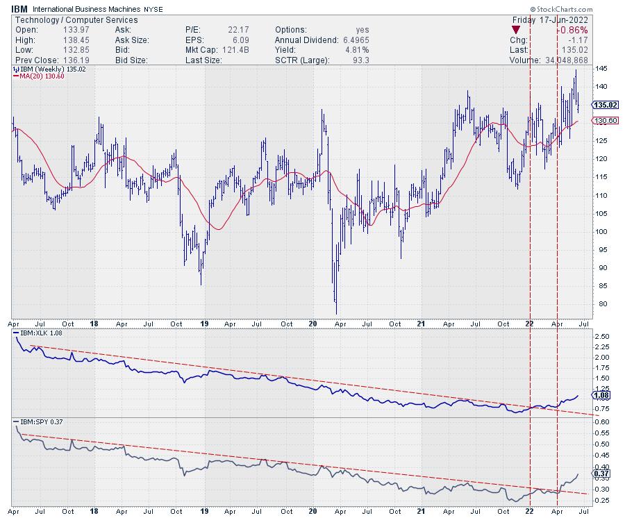
This is the chart for ticker IBM. In the first pane below the chart is relative strength against XLK, while, in the second pane, we have relative strength vs. SPY.
The turnaround in RS against the market is clearly visible. The long-term falling trendline in RS against XLK was broken at the start of this year, and the falling trendline in RS against SPY followed in April.
On the price chart, we are seeing a general tendency of higher highs and higher lows since early 2020 and a clear sequence of HHs and HLs since the start of this year. Given the declines in most stocks since the start of this year, that makes IBM an outperformer.
Adjusted vs. Unadjusted
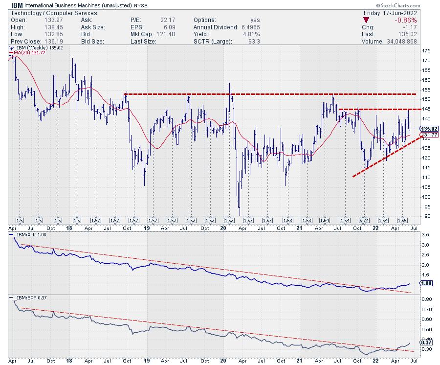
However, there is one thing that you need to keep in mind with stocks like this. StockCharts.com's default setting is to display total return data, which means the chart gets adjusted for paid dividends.
For a high dividend-yielding stock like IBM (almost 5% at the current price), I prefer to label support and resistance on the unadjusted chart.

In this chart, you see the unadjusted price chart for IBM, including the dividends it has paid over the past years. The adjustments have therefore been quite big, and they change the chart significantly.
The series of higher lows is still very much visible and underscoring the current strength. Resistance is coming in around 145, followed by 152.50. In current conditions, this makes it a strong chart. IBM is well above its recent lows, above its 20-week moving average and pushing against resistance.
All in all, this makes good ole BIG BLUE an interesting stock within the technology sector.
|
| READ ONLINE → |
|
|
|
| Trading Places with Tom Bowley |
| Do Your Homework and Get Better Grades Trading PLUS 3 Trade Setups |
| by Tom Bowley |
I remember many years ago, I was fascinated by the fast-moving, low-dollar stocks. It just seemed like easy money. Let me give you one piece of advice. When you think something is "easy money", run for the hills. To give you a business analogy, those volatile low-dollar stocks are "job hoppers." You know there's something wrong, but you hire them anyway. What happens? In the middle of a big project, they leave and head for another employer. I always seemed to have similar results with small stocks. I typically ignored the warning signs and bought them anyway, just knowing that big profits were around the corner. Hello losses!
Instead of "big move potential", look for the leaders. Let's go back to that business analogy for a moment. If you're a business owner, do you think it would be better to hire those possessing tremendous leadership skills (and maybe pay up a little bit) or would you hire underperformers, hoping that they'll be different when they work for you? After being in business for myself for the better part of 30 years now, I know how I'd answer that question. Why should we treat investing/trading any differently? Do you want excitement or do you want to make money?
The answers to these questions (and more) are truly the inspiration behind all the research that we do at EarningsBeats.com. We "pre-qualify" your stocks for you. Granted, 2022 has been a difficult market to buy much of anything - outside of a very strong energy (XLE) sector. But I firmly believe our (bulls) time is coming. Patience is the key. If you're a trader, you want to trade. I get it. Ultimately, however, my desire to make money outweighs my desire to simply trade for the sake of trading. This is my livelihood and cash is my product. Preserving that cash during difficult cyclical bear markets is absolutely paramount - above all else. Sure, I try to make money with a trade here or there, but expectations MUST be lowered significantly during a volatile period like the one we're experiencing. I sleep so much better at night right now when I'm primarily in cash. Overtrading on the long side is the worst strategy possible now, unless again, you're trading energy stocks. That's really the only group that's been working consistently in 2022.
So let's get back to that research that we do at EarningsBeats.com. Doing your homework is a necessary component of successful and profitable trading. Success rarely just happens. There's typically a lot of hard work that goes into being successful and trading is no different. We keep ChartLists at StockCharts.com to organize all of our research. There is certain criteria to be met for any stock to be included on our various ChartLists. We have a number of ChartLists, but the following are three flagship ChartLists:
- Strong Earnings ChartList (SECL)
- Strong AD ChartList (SADCL)
- Raised Guidance ChartList (RGCL)
Let's discuss each of these.
Strong Earnings ChartList (SECL)
I review thousands and thousands of earnings reports every quarter. I begin to narrow down this massive list of potential trading candidates by only including those companies that beat Wall Street consensus estimates as to both revenues and EPS. This is a significant fundamental piece of our research. To me, this is just common sense. Management teams that are executing their business plans and are able to beat expectations on both the top and bottom lines are management teams that I'm going to trust more when they provide future guidance. Doesn't that just make sense? So I start with this. I then look at the chart of each company to make sure it's liquid (ie, trading more than 200,000 shares daily). Then my final filter is relative strength. It's extremely important to me that a company is either a leader in its industry OR at least that its industry group is strong. The first two criteria are very objective. This last one - providing a technical review - is definitely more subjective. This SECL typically is comprised of roughly 250-500 companies at any given point in time. A company that is added to the SECL will remain on this list until it approaches its next earnings date. It'll then be removed. If it reports its next quarterly results and meets the three criteria again, it'll be re-added. Our SECL is similar to a revolving door of great companies coming in and then departing a couple months later.
Here's an example of a company that was recently added to this ChartList:
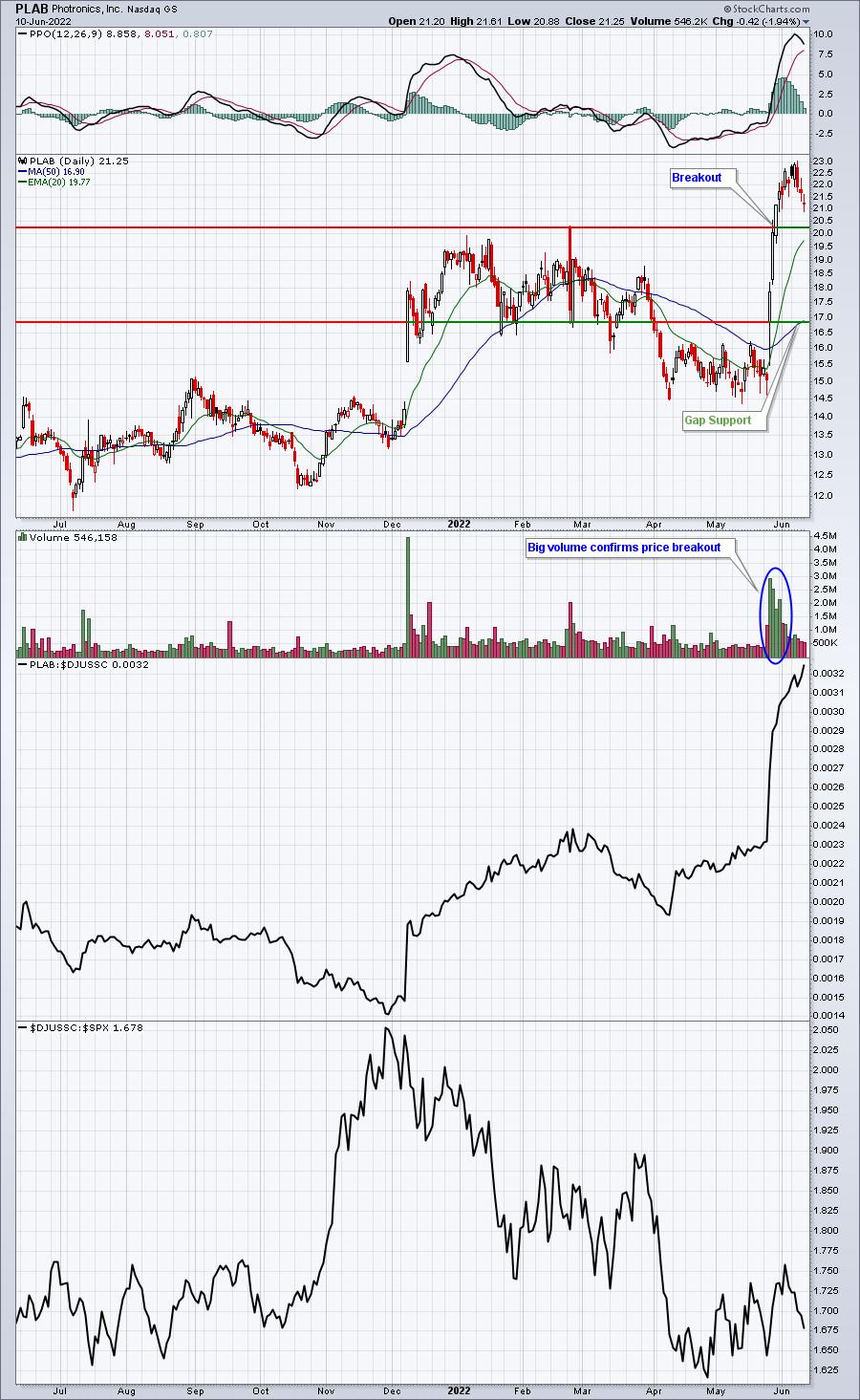
Phototronics, Inc. (PLAB):
- Revenues: $204.51 mil (actual) vs. $192.55 mil (estimate)
- EPS: $.49 (actual) vs. $.35 (estimate)
That's an easy revenue and EPS beat in a very difficult market environment. The following PLAB chart shows both liquidity and relative strength:

That middle panel shows PLAB vs. its semiconductor peers ($DJUSSC). I think it's safe to say that PLAB is currently a leader in the DJUSSC. Right now, we have 270 charts on our SECL. That means there are 269 other charts like PLAB - all annotated with key price support levels - for our members to consider for possible trades. This is the homework we do.
Strong AD ChartList (SADCL)
This ChartList is put together strictly based on SCTR (StockCharts Technical Rank) scores above 70-75 in recent months PLUS a rising accumulation/distribution line (AD line). So in order to be included on this ChartList, a stock must show relative strength in the form of a SCTR score above 70 (objective criteria) and a strong or strengthening AD line (subjective criteria). To understand what these stocks are truly telling us, you must understand how AD lines are calculated. Rather than give you the formula, let me just say that the AD line is a cumulative reading that goes up and down based on volume AND where a stock closes relative to its intraday high and low. Stocks that finish above their trading range midpoint see rising values, while stocks that finish below their trading range midpoint see falling values. Stocks with strong AD lines tend to perform well off early intraday lows.
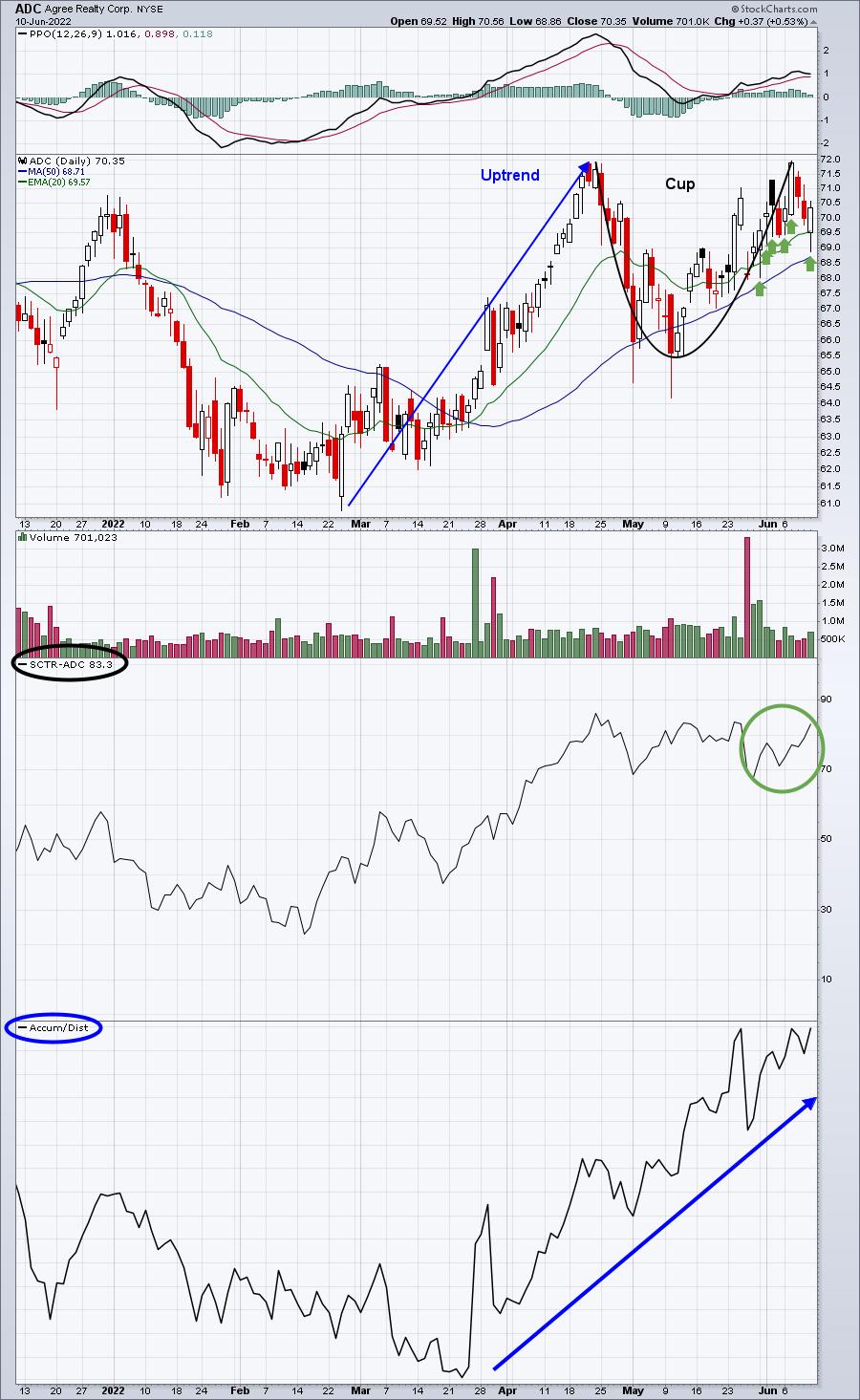
Here's an example of what I look for:

Agree Realty Corp (AGC) is an example of a stock with a steadily-rising AD line. It also just printed a handle on its 20-day EMA test to follow the cup that formed over the prior 6-7 weeks. But I want you to look at the rising AD line since late March. That's certainly one sign of accumulation. Market makers have a duty to acquire shares for their institutional clients at the best price possible. Early morning selling can trigger many traders to sell prematurely. When institutions accumulate, it'll typically result in prices rising throughout the day. Those green arrows highlight several days where AGC closes well above intraday lows. I like to use our Strong AD ChartList stocks as potential trading candidates in the morning - if they're trading lower. It always helps to have other corroborating technical evidence like a cup with handle pattern or a 20-day EMA test to confirm a solid trading opportunity.
There are 348 charts on this ChartList currently.
Raised Guidance ChartList (RGCL)
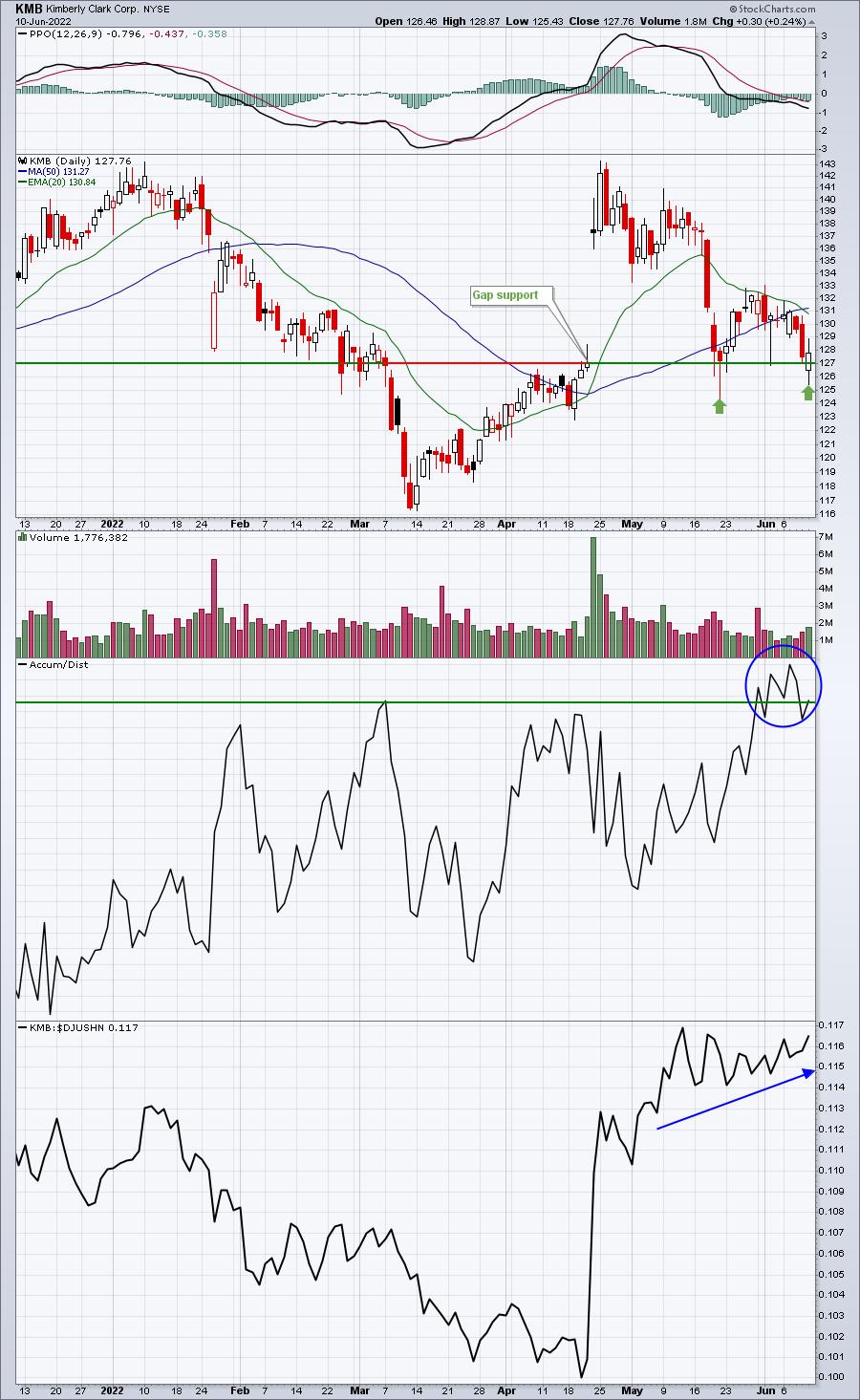
This one is rather self-explanatory. If a company raises guidance - revenues and/or EPS - we add it to our RGCL unless volume is too thin - typically if the average is less than 200,000 shares a day. When Kimberly Clark Corp (KMB) reported better-than-expected revenues and EPS in April, they also raised guidance for the upcoming quarter. It's taken six weeks, but KMB has potentially just printed a double bottom at key gap support:

I don't currently own KMB (or either of the two stocks previously discussed), but I do REALLY like this setup. First, KMB is a defensive stock, which will have a much better chance of appreciation if the market continues to fall, because money typically rotates from aggressive sectors to defensive sectors during selloffs. If it does continue moving lower, we're near a critical gap support level, so a fairly tight stop can be placed to minimize any loss. Next, as KMB falls back near a 2-month low, its AD line is on the verge of breaking out, suggesting that morning weakness could present an excellent opportunity for an intraday reversal and profit. Finally, check out KMB's relative strength vs. its industry peers - straight up.
KMB is 1 of 404 stocks currently on our RGCL.
Bullish Trifecta ChartList (BTCL)
The 3 ChartLists above are 3 different angles to take to identify potential trading candidates. They feature 1022 charts that meet our strict rules for inclusion in each specific ChartList. But what would happen if we combined ALL the filters of all 3 ChartLists? Well, we feature that ChartList too. It's called our Bullish Trifecta ChartList (BTCL). There are 37 common companies on the 3 featured ChartLists above and they comprise our BTCL. These are what I'd consider the "best of the best". The S&P 500 has fallen 2.50% over the past month, while the average GAIN among these 37 stocks is +0.16%. That means this widely-diversified group of 37 stocks has outperformed the S&P 500 by 2.66 percentage points in just the last 30 days. If you're trying to outperform the benchmark, it sure seems like trading stocks off this list would increase your odds.
On Monday, June 13th, I'll feature 1 of these 37 companies on our FREE EB Digest newsletter. I'll also provide a link and password to the ENTIRE ChartList. If you're a StockCharts.com Extra or Pro member, you'll be able to download this ChartList directly into your account. If you're a Basic member or a non-member at StockCharts.com, then you'll be able to VIEW the charts, but you won't be able to download them. Either way, you'll see which stocks you should be watching in the days and weeks ahead - especially if we're able to eventually print a capitulatory bottom. CLICK HERE to sign up for our EB Digest and to receive these 37 names!
Happy trading!
Tom
|
| READ ONLINE → |
|
|
|
|
|
| Mish's Market Minute |
| Mish's Daily: When the Trend is Not Your Friend -- A Trading Plan |
| by Mish Schneider |

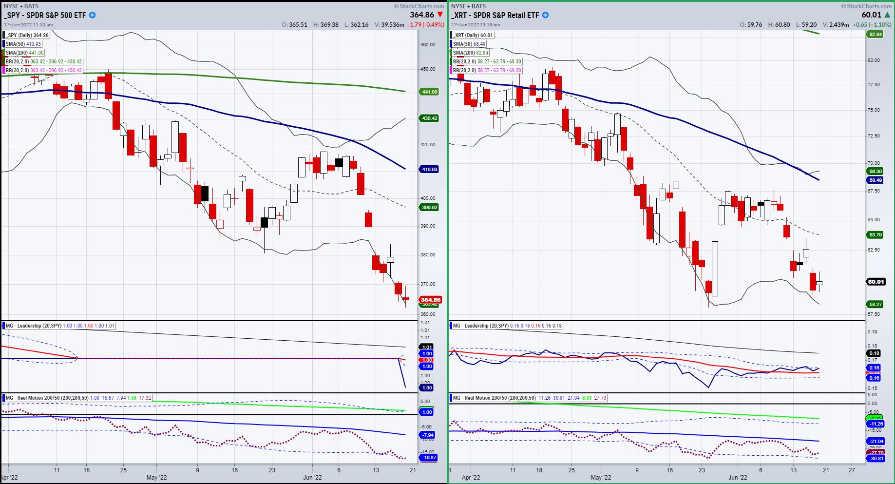
Currently, if we look at the S&P 500 and the Retail Sector through XRT, our foregone conclusion is that, for the most part, equities are a huge distraction. The obvious trend is down, but is it that obvious at current levels?
Looking at the SPY chart, we could be setting up for a mean reversion trade (bear market bounce that take SPY back to 380.) So, selling right now? Maybe, but SPY has to break 360. And Granny Retail (XRT), also in a downtrend, has some good bottoming action, is outperforming the SPY and the momentum on the Real Motion indicator is holding up.
That makes it fairly simple. XRT holds here and clears back over the 200-week moving average and 62.50 level to rally more bringing the SPY up along with it. Or, SPY fails 360 and drags XRT down further, potentially breaking harder below the 200-WMA or close to 50.00.
So if it is that simple, why do we think equities are more of a distraction right now?

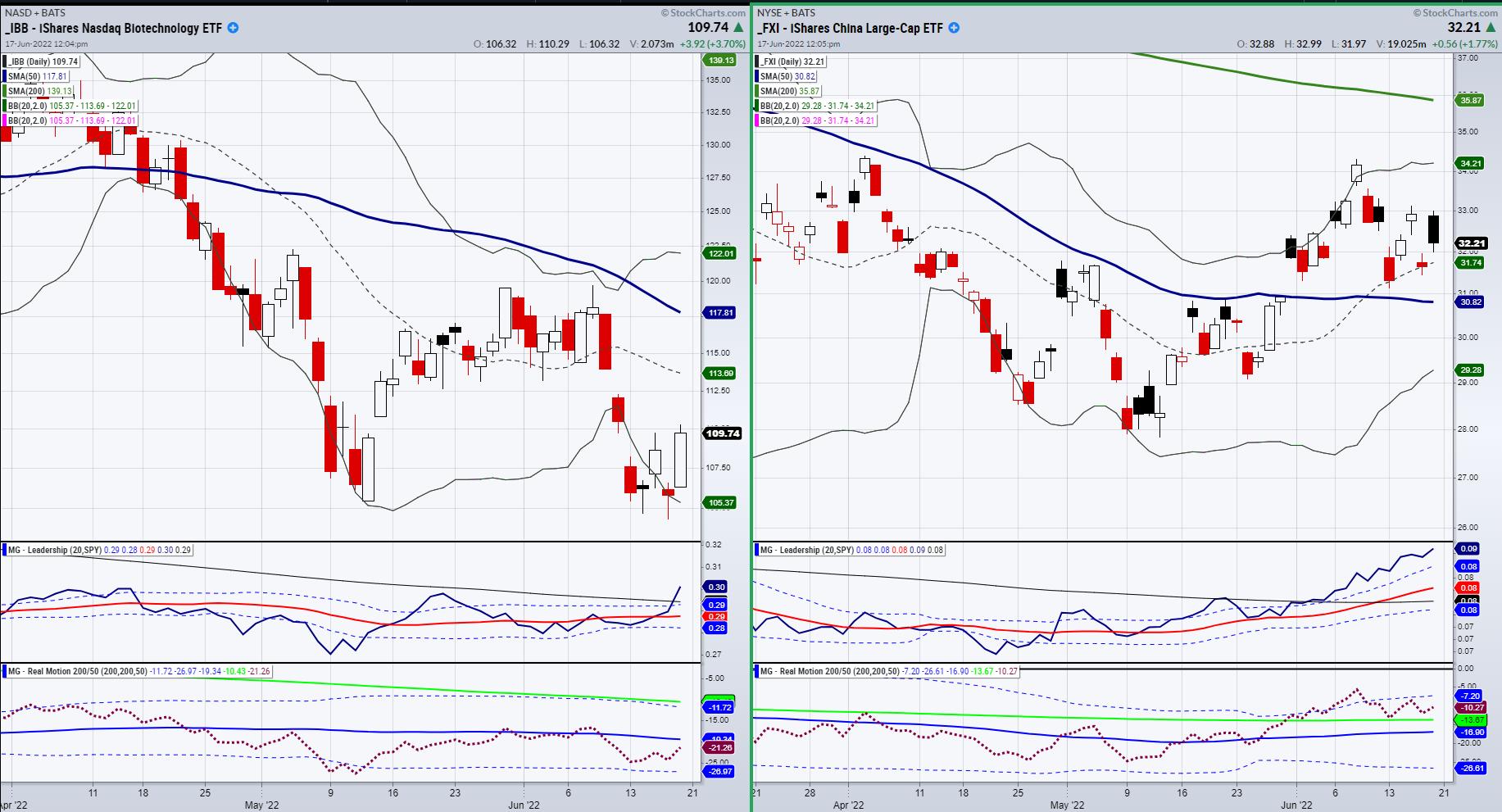
Trends are supposed to be your friend. But right now, the trend feels a bit treacherous for both the bears and the bulls. Biotechnology (IBB), the first to bottom in 2009 after the mortgage crisis, has been in a strong downtrend and is well under the 200-WMA. However, IBB also is outperforming the SPY and showing some balance in momentum. Can it hold up if SPY fails 260? Doubtful.
So, what do we like right now? China, Commodities and Cannabis.

We are all about opportunity with the best risk. China (FXI) is in a position in our portfolio that is looking like an add. As the U.S. does QT, China is doing QE.
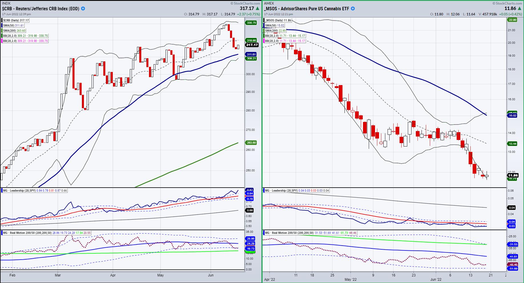
Commodities (CRB) has been in an uptrend and is correcting into support. With the worst global inflation rates in 40 years and stagflation on the horizon, we will continue to add to our tactical positions in commodities.
Cannabis (MSOS), which we are aside in right now, continues to intrigue us. If equities rise, so will that sector. And if equities fall, the momentum indicates that the selling there has pretty much dried up.
Our portfolios remain in the black and, for those individuals underwater, stay tuned for more ways to inflation-proof your portfolio and mitigate inflation. We see attractive sectors and are waiting for the right time to execute.
Follow Mish on Twitter @marketminute for stock picks and more. Follow Mish on Instagram (mishschneider) for daily morning videos. To see updated media clips, click here.
Mish in the Media
Mish presented the "Quick and Dirty on Inflation" on BizFirst AM.
Mish made a guest appearance on Fox Business with Neil Cavuto!
Read Mish's new article on inflation for CMC Markets here!
Mish was a guest on the Tuesday, June 14th edition of StockCharts TV's The Final Bar with David Keller, where she talks looking for a bounce from the Retail ETF (XRT) and downside targets for Bitcoin.
Mish appeared on "Chart School" with Charles Payne on Fox Business:
Watch Mish cover her Economic Family on the Money Show!
Mish sit downs with Jared Blikre to discuss her history, investing and the future in this video from Yahoo Finance!

ETF Summary
- S&P 500 (SPY): 380 resistance, 374 pivotal support, 360 major support.
- Russell 2000 (IWM): 159 support, 175-177 big resistance.
- Dow (DIA): 294 support.
- Nasdaq (QQQ): 290 resistance 263 big support.
- KRE (Regional Banks): 56 the 200-WMA, 60 resistance.
- SMH (Semiconductors): 195 some minor support with 220 resistance.
- IYT (Transportation): 211.87 the 200-WMA resistance, 192 support.
- IBB (Biotechnology): Still potential double bottom-110 pivotal-112.50 resistance.
- XRT (Retail): 60.62 the important 200-WMA support closed just below-a gap up Tuesday would look compelling for a rally.
Mish Schneider
MarketGauge.com
Director of Trading Research and Education
|
| READ ONLINE → |
|
|
|
| Top Advisors Corner |
| Corporate Bonds Show Oversold Condition For T-Bonds |
| by Tom McClellan |

Last week, I wrote about some of the corporate bond Advance-Decline (A-D) data published by FINRA. The high yield bonds behave more like the stock market than like T-Bonds, so their behavior can be an indication about liquidity that will come around and affect the stock market. The investment-grade bonds are a different story, as they behave more like T-Bonds. Their A-D data is still valuable, if interpreted in the right way.
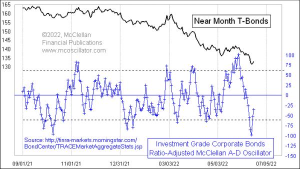
This week's chart looks at a Ratio-Adjusted McClellan Oscillator for the investment-grade bond A-D data. On June 14, 2022, it reached its lowest reading since the COVID Crash in March 2020 (not shown). Extreme readings like this are pretty uniformly exhaustive in their nature, helping to signal washout selloffs in T-Bond prices.
Bond traders have understandably gotten worried about inflation recently. If the value of the dollar is falling by 8+% per year, then the real future value of all your coupon payments on a bond investment will naturally go down. When those worries reach a climax, it shows up as investors collectively abandoning their supposedly high-grade corporate bonds. And that gets reflected in a big oversold reading for this McClellan Oscillator.
During this price downtrend, we have also seen some overbought readings that did a good job of marking price tops. For this particular version of the McClellan A-D Oscillator, overbought readings more uniformly mark short term tops, as opposed to signaling initiation of a strong uptrend as we often see in the stock market.
In a concerted downtrend, it is possible for the bond market (or stocks, or anything) to ignore an oversold condition. But when we see the biggest oversold condition in a couple of years, it tends to draw our attention and tell us that something special is happening.
|
| READ ONLINE → |
|
|
|
| MORE ARTICLES → |
|

