| THIS WEEK'S ARTICLES |
| John Murphy's Market Message |
| DOW TESTS RESISTANCE NEAR AUGUST HIGH |
| by John Murphy |
DOW LEADS WHILE SPX AND QQQ LAG BEHIND... The fourth quarter rally in stocks may be losing some upside momentum. That's especially true of the Dow. Chart 1 shows the Dow Industrials approaching formidable overhead resistance at their August highs. That may be hard to overcome. Charts 2 and 3 show the rest of the market lagging behind the Dow. And well within their major downtrends. Chart 2 shows the S&P 500 still trading below its 200-day moving average (red arrow) and a major downtrend line drawn over its 2022 highs. Chart 3 shows the Invesco QQQ Trust in an even weaker technical condition. Those two weaker indexes may offer a more realistic view of the market as a whole. It's also worth noting that their 9-day RSI lines are nearing overbought territory. The main message from those three charts is that stocks are benefiting from recent good news on inflation and normal yearend seasonal strength. But they still remain in major downtrends. Weekly sector rankings also show a more defensive mood.
 Chart 1 Chart 1
 Chart 2 Chart 2
 Chart 3 Chart 3
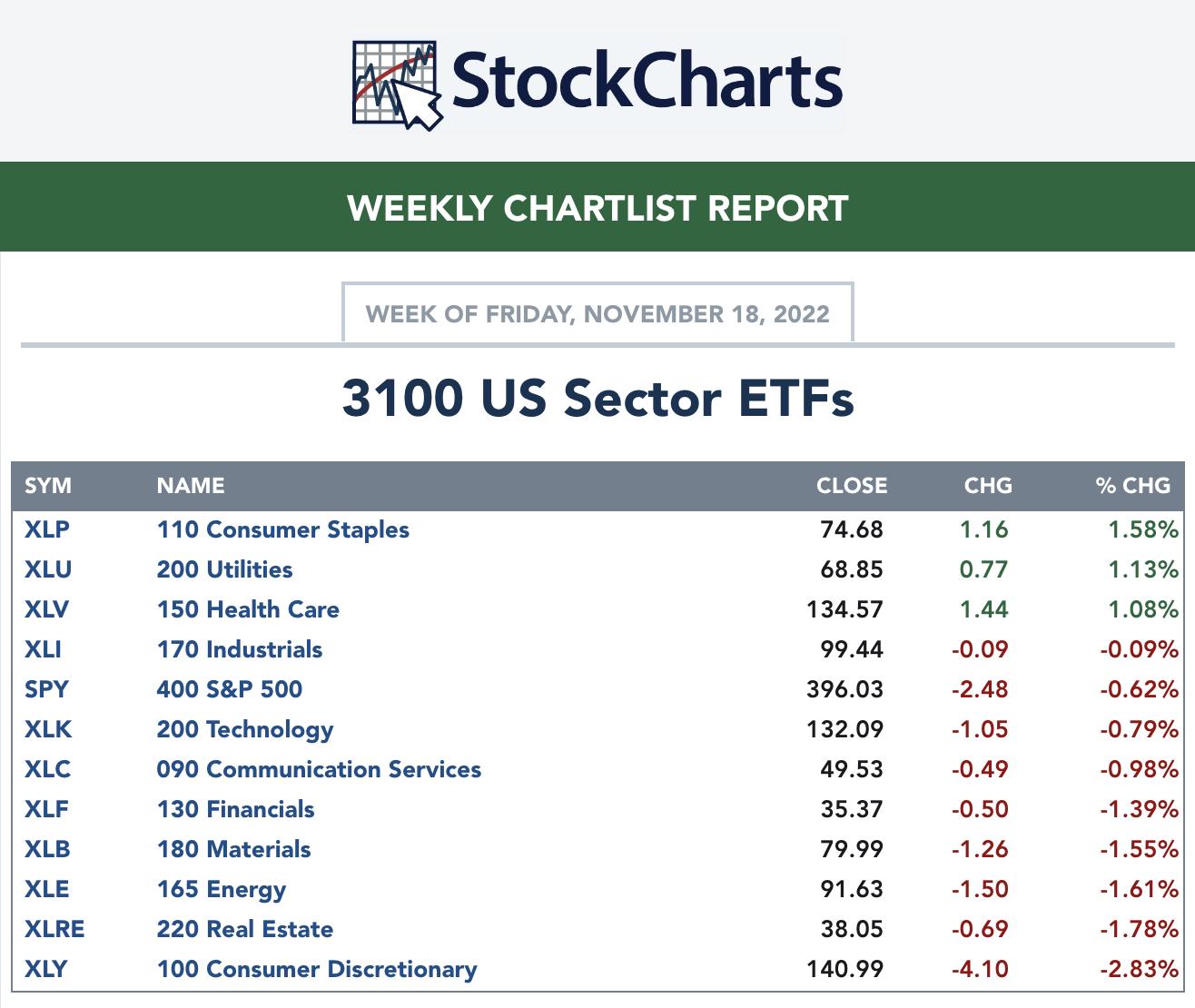
DEFENSIVE LEADERSHIP... The weekly sector ranking in Chart 4 show Consumer Staples, Utilities, and Healthcare as the week's sector leaders. That's usually a sign that investors are turning more defensive. In addition, economically-sensitive Consumer Discretionary stocks were the week's worst performers. Energy stocks also had a relative soft week owing to a roughly 10% drop in the price of crude oil. Most other commodities also lost ground. The good news there is that lower prices may be signaling lower inflation pressures. The bad news is that lower commodity prices often signal a more recessionary environment. Another potential recessionary warning came from the yield curve.
 Chart 4 Chart 4
ANOTHER YIELD CURVE INVERSION... Yield curve inversions take place when a short-term interest rate exceeds a longer term rate. During the summer, the spread between the 2-year and 10-year Treasury yields fell below zero which is a traditional signal of an impending recession. This week the spread between the three month and 10-Year Treasury yields also fell below the zero line resulting in an inverted yield curve (red circle). The monthly bars in Chart 5 also show that version of the yield curve falling to the lowest level since 2007. Historically, that yield curve inversion has predicted 12 out of the last 11 recessions. In other words, it gave only one false positive. That's a pretty good track record and increases the odds of an economic recession. That normally carries bad news for stocks.
 Chart 5 Chart 5
|
| READ ONLINE → |
|
|
|
| Art's Charts |
| Trend-Followers Get the Whip, while Swing Traders Catch the Ride (Free) |
| by Arthur Hill |
 2022 has been a tough market for trend-followers, but swing traders have been able to catch a few rides. Trend-followers are suffering because whipsaws are above average this year. A whipsaw occurs when an uptrend cannot extend after a bullish trend signal and the trade results in a loss. 2022 has been a tough market for trend-followers, but swing traders have been able to catch a few rides. Trend-followers are suffering because whipsaws are above average this year. A whipsaw occurs when an uptrend cannot extend after a bullish trend signal and the trade results in a loss.
Before looking at some trend-following stats, note that I am using a database of 105 ETFs with trading history back to at least 2007. These ETFs include US stock-based ETFs (index, sector, industry group), commodity ETFs, bond ETFs and currency ETFs. There are no international stock ETFs in this list. I am using the Trend Composite for trend signals in this test. A cross above zero triggers a bullish trend signal, while a cross below zero triggers a bearish trend signal. The Trend Composite and ten other indicators are part of the TIP Indicator Edge Plugin for StockCharts ACP.
From January 2007 to December 2021, there were 1739 bullish Trend Composite signals and 44.34 percent of these resulted in further gains before the Trend Composite triggered bearish. The average gain was 18.28% and the average loss was 4.48%. There were 104 bullish Trend Composite signals so far this year and only 19.23% of these resulted in a profit. The average gain was 2.97% and the average loss was 5.41%. 2022 has been a tough year for trend-following. 
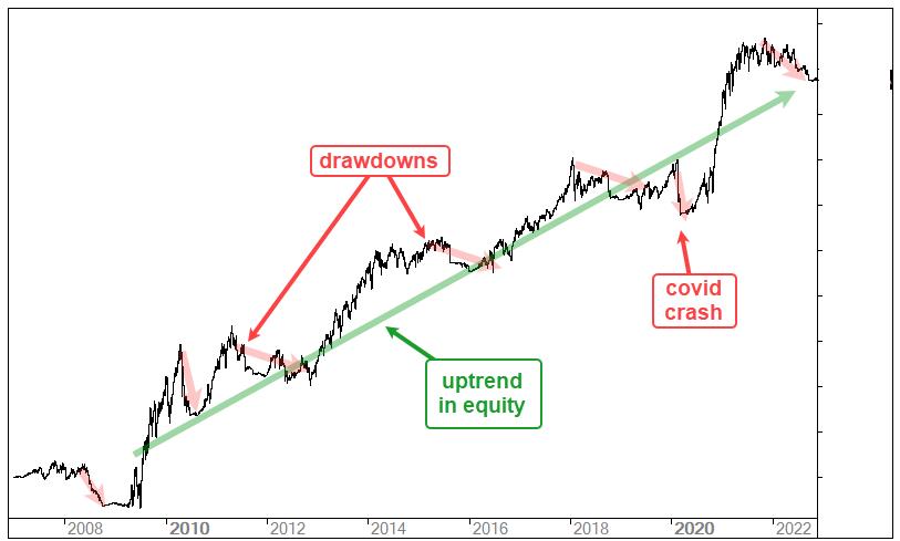
The chart above shows a performance example for a generic trend-following strategy. The strategy performs well over time as the equity curve moves from the lower left to the upper right (2007 to 2022). There are, however, drawdowns along the way and these drawdown periods can last more than a year (red arrow lines). Trend-following strategies work well when markets trend and suffer drawdowns when markets do not trend. **it happens. Check out $SPX from 2007 to 2022 for reference.
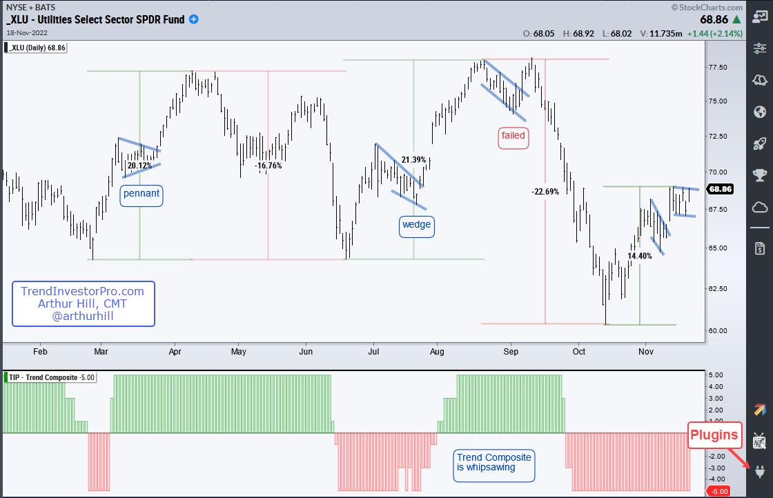
We have all heard of diversification for a portfolio, but traders can also consider diversification for their strategies. Mean-reversion and swing trading strategies differ from trend-following strategies and have a better chance of success when markets do not trend. The chart below shows the Utilities SPDR (XLU) with the Trend Composite (bottom window) whipsawing this year as the ETF produced five double-digit swings since late February (+20%, -16.8%, +21.4%, -22.7%, +14.4%). The blue lines show short-term bullish continuation patterns that swing traders could use to trade the short-term moves.

As the chart above shows, the March pennant and the July wedge led to big moves, but the early September flag breakout was a failure. Currently, XLU broke out of a falling flag with a surge last week Thursday (10-Nov) and formed another bull flag the last six days. A breakout would be short-term bullish. Note that swing trading strategies require more monitoring and traders often use profit targets to lock-in gains.
TrendInvestorPro tracks Trend Composite signals for the 274 ETFs in our MasterList and ranks these ETFs according to price performance. Our reports and videos highlight chart setups with dozens of ETFs featured each week. Click here for immediate access.
The Trend Composite, Momentum Composite, ATR Trailing Stop and eight other indicators are part of the TrendInvestorPro Indicator Edge Plugin for StockCharts ACP. Click here to learn more and take your analysis process to the next level.
---------------------------------------
|
| READ ONLINE → |
|
|
|
| MARK YOUR CALENDARS... |
 |
|
| The Mindful Investor |
| Limited Upside Until This Chart Changes |
| by David Keller |
I was reviewing my weekly ChartList reports this afternoon and noticed this one, showing the top performing sectors for the week.

Only three of the 11 S&P 500 sectors were up on the week: Consumer Staples, Utilities and Health Care. Not exactly an offensive powerhouse on the top of the leader list, right?
But seeing Consumer Staples in the top spot led me to review my favorite chart to track: Offense vs. Defense for the equity markets.

This chart shows the relative performance of offense (Consumer Discretionary) vs. defense (Consumer Staples) in the consumer space. Basically, this is comparing "things people want" vs. "things people need" and can be a great indication of overall risk appetite for equities.
The top panel is using the cap-weighted ETFs (XLY and XLP) while the bottom ratio includes the equal-weighted versions (RCD and RHS). I prefer the equal-weighted ratio, as the XLY is heavily skewed to just three stocks -- AMZN, TSLA and HD -- and I'd much rather get a broader sense of rotation in these sectors.
After both of these ratios made a new low in the 2nd quarter, they moved higher as the S&P 500 rallied in July and August. Notice how the cap-weighted version broke to a new swing high in August, while the equal-weighted version did not? This was a great bearish tell in my opinion, signifying that there wasn't enough expansion into Consumer Discretionary.
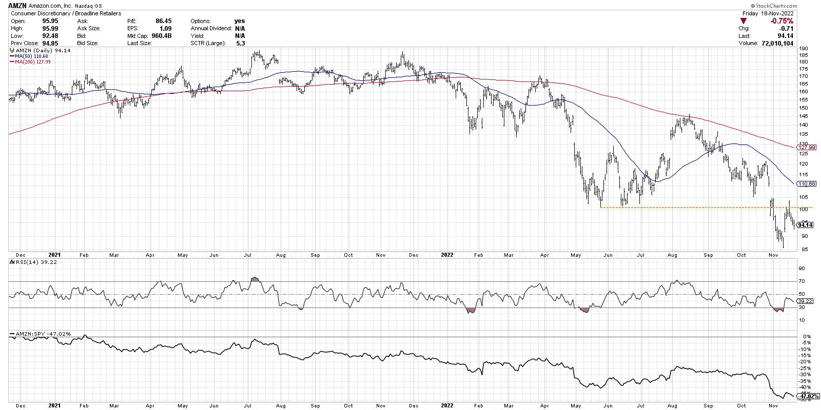
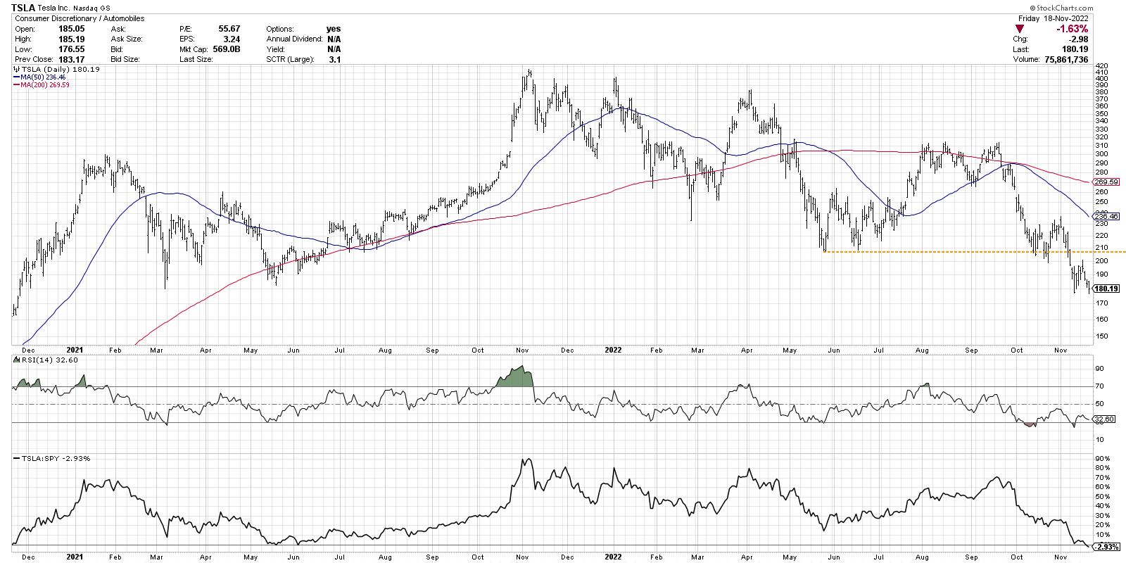
More recently, the cap-weighted version has been struggling, as mega-cap stocks AMZN and TSLA have been in a confirmed downtrend. Here, we see AMZN dropping once again retesting the recent breakdown below $100.

And here is TSLA, making a new 52-week low again this week.

As opposed to the cap-weighted version, the equal-weighted version of the offense-defense ratio recently tested its June high. In last weekend's report to my Market Misbehavior premium members, we noted that if this ratio were to break to a new swing high, that could indicate a broader advance for the S&P 500. Instead, this week saw the S&P 500 essentially tread water at -0.6%, while the equal-weighted offense vs. defense ratio pulled back from its previous resistance level.
As the S&P 500 tests its 200-day moving average, similar to what we saw back in August, I'm monitoring price and breadth measures to see if we build enough positive momentum to propel through the 200-day moving average, and perhaps reach to the August peak or even higher. But until Consumer Discretionary begins to outperform Consumer Staples once again, I'm skeptical of the upside possibilities for the major equity averages.
So what's next for the S&P 500? I see four potential future paths for this index, from the very bullish (SPX 4800) to the very bearish (SPX 3200). Which scenario do you see as most likely, and why? Check out the video and let me know in the comments!
RR#6,
Dave
P.S. Ready to upgrade your investment process? Check out my YouTube channel!
David Keller, CMT
Chief Market Strategist
StockCharts.com
Disclaimer: This blog is for educational purposes only and should not be construed as financial advice. The ideas and strategies should never be used without first assessing your own personal and financial situation, or without consulting a financial professional.
The author does not have a position in mentioned securities at the time of publication. Any opinions expressed herein are solely those of the author, and do not in any way represent the views or opinions of any other person or entity.
|
| READ ONLINE → |
|
|
|
| DecisionPoint |
| Mortgage Rates Drop Sharply - Time to Review XLRE |
| by Erin Swenlin, Carl Swenlin |
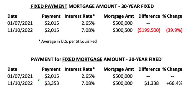
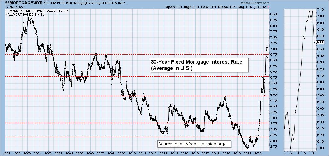
We watch the 30-Year Fixed Mortgage Interest Rate because, for the most part, people buy homes based upon the maximum monthly payment they can afford. As rates rise, a fixed monthly payment will carry a smaller mortgage amount. As buying power has been shrinking, home prices have come under pressure.
This week, the 30-Year Fixed Rate fell from 7.08 to 6.61. What strikes us about this is that it appears that mortgage rates are lagging behind Treasury yields by about a month. Since Treasury yields are currently rising again, this week's dip in mortgage rates is not likely to persist, but homebuyers can hope.


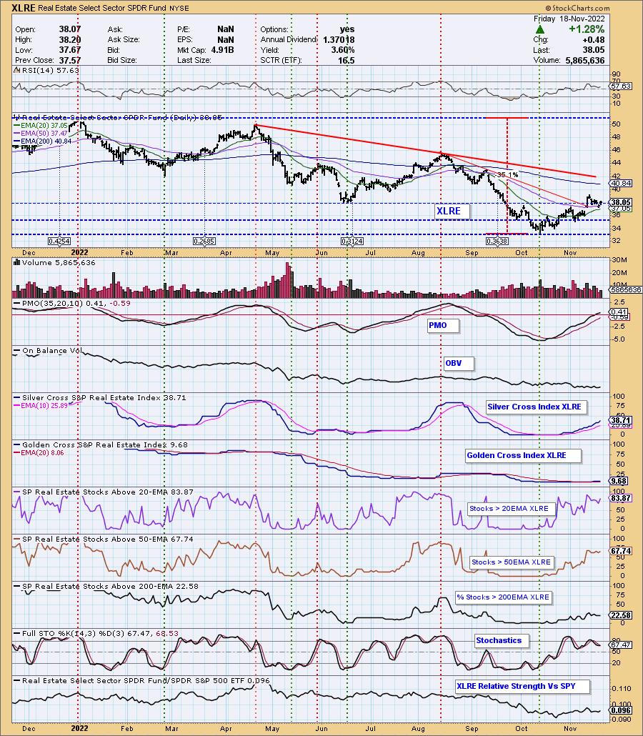
Is the Real Estate sector now poised to do well? It actually looks pretty good right now. After price fell and tested the 20/50-day EMAs, it managed to close above the 50-day EMA today and above the June low. The RSI is positive and the PMO is now rising above the zero line. Best of all, the Silver Cross Index (SCI) and Golden Cross Index (GCI) are both rising. Participation is robust enough to look for a rally continuation. Stochastics and relative strength are both turning back up.

Conclusion: Mortgage rates moved much lower this week. This is likely to provide some relief for home buyers and by the looks of the XLRE chart, it could push price higher moving into next week.
Good Luck & Good Trading!
Carl Swenlin and Erin Swenlin
Watch the latest episode of DecisionPoint on StockCharts TV's YouTube channel here!

Technical Analysis is a windsock, not a crystal ball. --Carl Swenlin
(c) Copyright 2022 DecisionPoint.com
Helpful DecisionPoint Links:
DecisionPoint Alert Chart List
DecisionPoint Golden Cross/Silver Cross Index Chart List
DecisionPoint Sector Chart List
DecisionPoint Chart Gallery
Trend Models
Price Momentum Oscillator (PMO)
On Balance Volume
Swenlin Trading Oscillators (STO-B and STO-V)
ITBM and ITVM
SCTR Ranking
Bear Market Rules
DecisionPoint is not a registered investment advisor. Investment and trading decisions are solely your responsibility. DecisionPoint newsletters, blogs or website materials should NOT be interpreted as a recommendation or solicitation to buy or sell any security or to take any specific action.
|
| READ ONLINE → |
|
|
|
| The Traders Journal |
| The Pearls Of Wisdom I Took Away From ChartCon 2022: Part 2 |
| by Gatis Roze |

Gosh, I was pleased that so many of you emailed me with your own pearls of wisdom gleaned from ChartCon 2022. It shows once again that investors can look at the same chart and have vastly different takeaways. Likewise, they can attend the same investment conference and have a diverse spectrum of takeaways.
You gotta love it! Welcome to our investor ecosystem. In this blog, I'll share more nuggets and gems from the conference — from both the front of the house (what you saw on your screen) as well as the back after the cameras went dark.
Nugget #1: Science points us to research that specific routines yield the best results. A recent example is the gym where I workout has new elliptical trainers with optimized science-based routines programmed into the unit. Sure, I can do my own custom thing. But lo and behold, I've discovered that the optimized routines do indeed yield the best results.
Similarly, David Keller's presentation at ChartCon highlighted the substantial parallels between trading and piloting a plane. Both have comparable consequences if your approach to either is dysfunctional and undisciplined. In a plane, you crash and die. With investing, you nose dive your portfolio and crash financially. It's ominous in both arenas if you try to operate without guardrails such as removing your emotions from the equation, being disciplined with your checklists and focusing on consistent routines.
Flying and trading are best served with a big dose of stability. Trust me on this! With piloting a plane, there is specific settled science that you must follow to join the essential circle of competence and stay alive. With investing our circle of competence requires a collection of ChartLists and routines which act as our financial fortress to protect our assets and prevent nose dives in our portfolios.
Your collection of ChartLists, your routines and your discipline to follow the program alleviates the failings that novice investors encounter. Grayson and I have made our entire investing ecosystem of ChartLists and routines 100% transparent and available to you if you're interested.
Nugget #2: Last week's Nugget #3 described this rule: "Don't read any investment book unless it's recommended by two or more people you truly respect." A corollary to this rule applies to periodicals as well. There are over 7,000 print consumer magazines circulated in the USA. That's a lot of rabbit holes down which you can get very lost. Many are like watering astro-turf and expecting it to grow. At ChartCon, it was evident that most attendees gravitated to the same three periodicals. Yes, we all have other information pipelines on the internet that we tap into. But for the comprehensive global view of business, commerce and economics, the best view from 30,000 feet is rendered by The Wall Street Journal, The Economist and Barron's. Like a best friend, they consistently stand by your side to enlighten and educate you on current affairs and how these events are impacting your assets.
Nugget #3: This insight was part observational and part conversational. It resulted from knowing the backgrounds of the attendees in detail. I've known some for nearly four decades — hence the observational portion. The other half was reinforced in conversations focused on longevity and survival in the investment arena. These same principles kept percolating to the top.
In a bull market, no one needs staying power. Anyone can coast along with the up trend when the going is good. If you only practice coasting, a coaster you'll become. A successful investor's secret attribute is to never coast. Discipline yourself to adhere to your methodology and follow your routines — even as everyone around you is coasting. When the trend changes, the bear easily catches the coasters. You stand a remarkably strong fighting chance of surviving and prospering if you are faithful in watering the seeds of your methodology throughout all the market cycles. With the probabilities at your back, you become the ultimate financial warrior. Warriors don't coast!
Nugget #4: Marty Zweig often said, "The market is smarter than I am, so I bend." Rigid perspectives and sizable egos will be dealt with promptly. These have no place in your personality as an investor. Any stock market facing us is manageable if we bring to the table the appropriate emotional attitude. It's our own emotional response that determines our profits and losses. You've achieved Nirvana when you are able to calmly remain humble yet still have this reasonable confidence in your emotional abilities to do the right thing in all types of markets. Yes, it's still about Stage 3 — The Investor Self.
Nugget #5: Power is a loaded word across infinite disciplines and arenas , but with different meanings in each. For example:
- The power of weather and Mother Nature
- The power of the Presidency
- The power of our laws and legal system
In our investment arena, I submit to you that power is in large part based on decisiveness. The foundation of such decisiveness rests on multiple pre-formulated scenarios. Multiple plans formed in anticipation of various events that might possibly occur. Bullish and bearish scenarios built during periods of calm and minimal noise. Best fabricated during hours when the market is closed.
Two powers acting hand-in-hand. "The Power of the Calm" facilitates execution as necessary to utilize "The Power of Decisiveness." A compelling combination that holds a higher probability of producing profits. The reason for this essential partnership is that we investors must embrace the reality that we'll never ever have all the information we'd like about an equity or the markets. We each operate at different percentages of information. Some of us will pull the trigger with 60%, while others hope for 80%.
We must understand that the stock market is constantly feeding us a diet of bullish and bearish information — albeit each morsel at a higher or lower price. If you wait for 90% of what is known to show up on your plate, the opportunity will have vaporized and your financial meal spoiled. Focus instead on formulating multiple scenarios and doing those things you can to put the winds of probability at your back. Your objective is to clinch and grasp every probability enhancer to become the ultimate "Investor Probabilitarian" who is then able and willing to exercise his or her own "Power of Decisiveness." The foundation of which resides in calm preparation.
Nugget #6: By now, I assume I've got your buy-in on the fact that consistent winning performances are built on routines. If you missed that point after two days of ChartCon, I'm shattered. But here's the other 50%. Learn to love the structure, the organization and yes, the routines. When I was training and competing in track and field during college, my norm on most days was two workouts. Sometimes it was tough. But surprisingly, I found the routines intoxicating and productive.
Similarly, years later with my investing disciplines, I still find my routines intoxicating. Yes, a portion of my intoxication can be directly linked to winning results. I ran some very competitive collegiate races, and likewise I've achieved compelling portfolio results. My routines are not drudgery. My routines are all about producing my next profitable sequel. I'm addicted to the cycle. I'm intoxicated by my routines. Remember, you become what you practice!
Trade well; trade with discipline!
Gatis Roze, MBA, CMT
StockMarketMastery.com
|
| READ ONLINE → |
|
|
|
| The MEM Edge |
| Thanksgiving Week is Historically Positive. Will This Year Deliver a Blockbuster or a Turkey? |
| by Mary Ellen McGonagle |
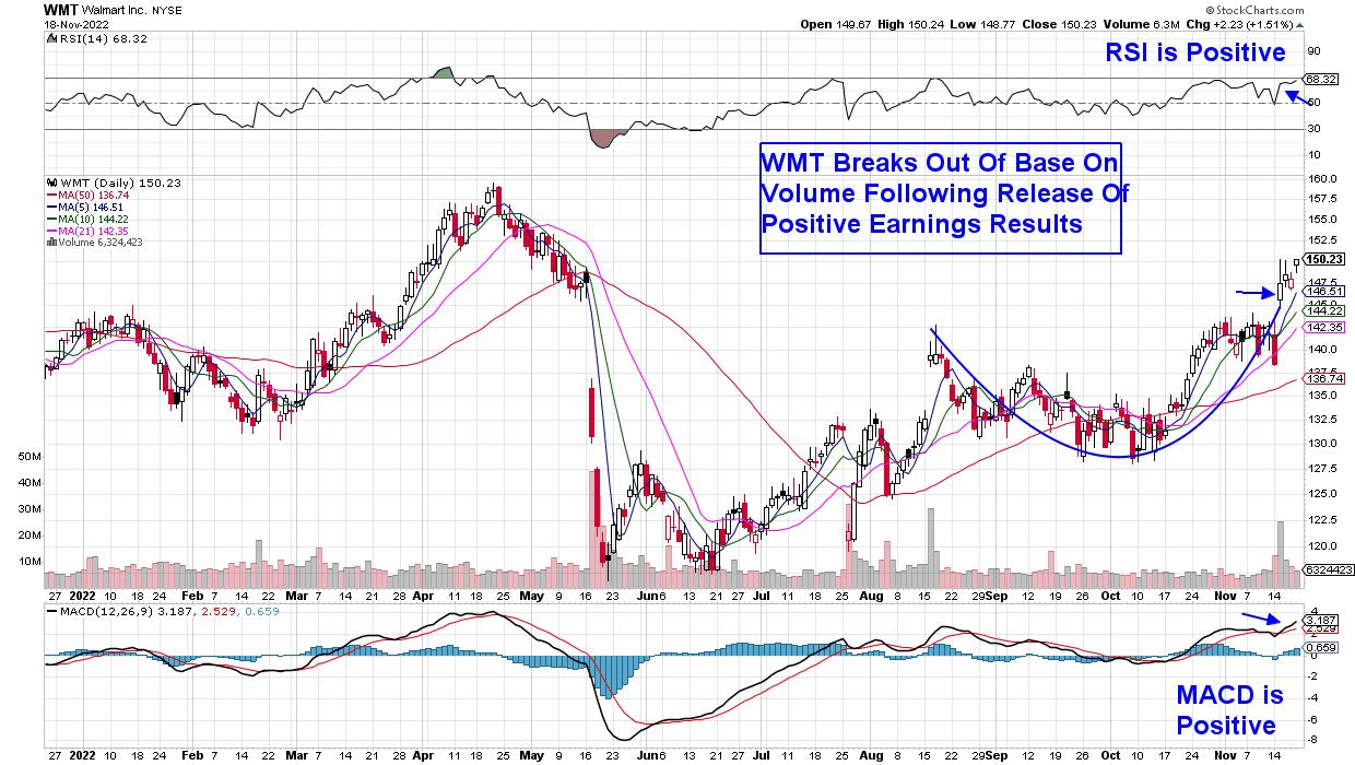
The markets ended the week flat-to-down as investors digested remarks from Fed officials, who were intent on removing pivot hopes that followed soft CPI and PPI reports. Both inflation reports came in below expected, which was certainly encouraging. Mixed earnings reports from major retailers Walmart (WMT) and Target (TGT) also kept bullishness at bay last week.
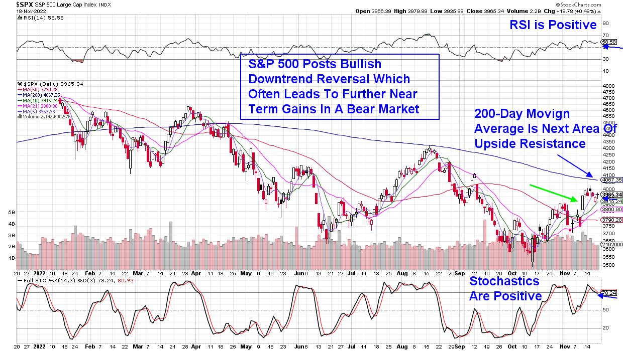
Next week is the Thanksgiving holiday period and, typically, the markets perform well. There are obstacles, however, as highlighted in the chart of the S&P 500 below. Also of note is that, on Wednesday, the Federal Reserve will be releasing notes from their most recent meeting, and any hint of an elevated interest rate hike cycle may send the bulls into hiding.
DAILY CHART OF S&P 500 INDEX

While the markets lost ground during a choppy period last week, a sharp rally the prior Thursday pushed the S&P 500 into a near-term uptrend. The move also improved breadth in this Index, so that almost 85% of stocks are now trading above their key 50-day moving average. Not all stocks are in a position to trade higher, however, as only 50% are above both their 50- and 200-day moving averages.
Overall, however, there are a significant number of stocks in a bullish position and, among those, my work shows that stocks that have already reported 3rd quarter earnings and offer a yield higher than the S&P 500's average of 1.7% are exhibiting the most potential to trade higher. This is particularly true if the stock is in an area of the market that can fare well during a recessionary period. Today's leading economic index data for the U.S. has some economists forecasting that we're already in a recession after it showed a 0.8% decline for October. This was the eighth straight decline in the leading index.
Subscribers to my MEM Edge Report are well aware of my predisposition toward stocks that are recession-proof, while also exhibiting the growth needed to attract investors. Among recent winners, the report added Walmart (WMT) as a buy idea late last month, which put subscribers in a position to take part in this week's rally. Going back to the 2008 recession-led bear market, WMT was among the top ten performers after gaining 15.6% while the markets were down 37% for the year.
DAILY CHART OF WALMART (WMT)
Other areas of the market are currently faring well also, with the Dow Jones Industrial Average down only 7.8% year-to-date even as the S&P 500 has lost more than double this amount. The Dow has a number of higher-yielding names that are acting well, and several names from this Index are also on my Suggested Holdings List.
If you'd like immediate access to these stocks, as well as insights into what to anticipate within the markets and sectors as we head into year-end, use this link here for a 4-week trial at a nominal fee. This twice weekly report also provides special alert reports should we see a shift in the markets.
May you and your family enjoy the start of this year's holiday season!
In this episode of StockCharts TV's The MEM Edge, I take a look at the continuing theme of stocks being driven higher by positive earnings reports. I close the show with some "thanksgiving" food-related stocks, as Consumer Staples were the top-performing area this week.
Warmly,
Mary Ellen McGonagle - MEM Investment Research
|
| READ ONLINE → |
|
|
|
| ChartWatchers |
| Inverted Yield Curve and Recessions: An Odd Couple |
| by Jayanthi Gopalakrishnan |

Read or listen to any financial media outlet and you're likely to hear the words "inverted yield curve." What does that mean and, more importantly, what does it mean for your investments?
The shape of the yield curve may not have made the top of your list of discussion topics at past holiday parties. But this year, it might make it to the number one spot. People are feeling inflation pain, they're concerned about higher interest rates, and they're worried the economy may plunge into a recession. So, it may be a good time to brush up on why it's important to understand the dynamics of Treasury yields, and what it means when the yield curve inverts. But before diving into the inverted yield curve, it may be helpful to understand the yield curve in general, namely its typical shape and what its shape indicates.
What is a Yield Curve?
A yield curve is a chart of bond yields. Although yield curves can be created for any bond, investors and traders pay attention to the U.S. Treasury yield curves. Why? Because they represent the interest rate the U.S. government pays to borrow money, which varies depending on the time and length of the loan. Typically, longer-term loans will carry a higher interest rate than shorter-term loans. In this scenario, the yield curve would slope upward—an indication of economic expansion. But economies don't always expand. Sometimes the yield curve is flat, which could be a sign of a slowing economy with modest growth. Once in a while the yield curve inverts, which can be a sign of a weakening economy. When the yield curve flattens or inverts, the relationship between yield curves and recessions can get a little complicated.
Why Pay Attention to the Yield Curve?
The yield curve gives you a "big picture" view of the stock market and the health of the overall economy. When interest rates rise, mortgage rates, car loans, or any other types of loans rise in tandem. And that can impact consumer confidence levels. Lending slows, businesses invest less, and people buy less. All these factors could lead to slower growth.
When investors start to worry about a slowdown in the economy, they generally consider investing in long-term bonds. The increase in demand sends long-term bond yields lower. Demand for short-term bonds decreases and the lower demand sends short-term Treasury yields higher.
Bond prices and yields move in opposite directions. When bond prices rise, yields go lower.
Another factor also plays into the dynamics—the Fed. When the Fed raises rates, short-term bond yields move higher.
If long-term bond yields are unchanged and short-term yields rise, the yield curve will likely flatten. But sometimes, a fall in demand and the Fed's decision to raise rates can result in an inverted yield curve. This is the opposite of what typically takes place during an economic expansion, which is why an inverted yield curve could be a sign of a potential recession.
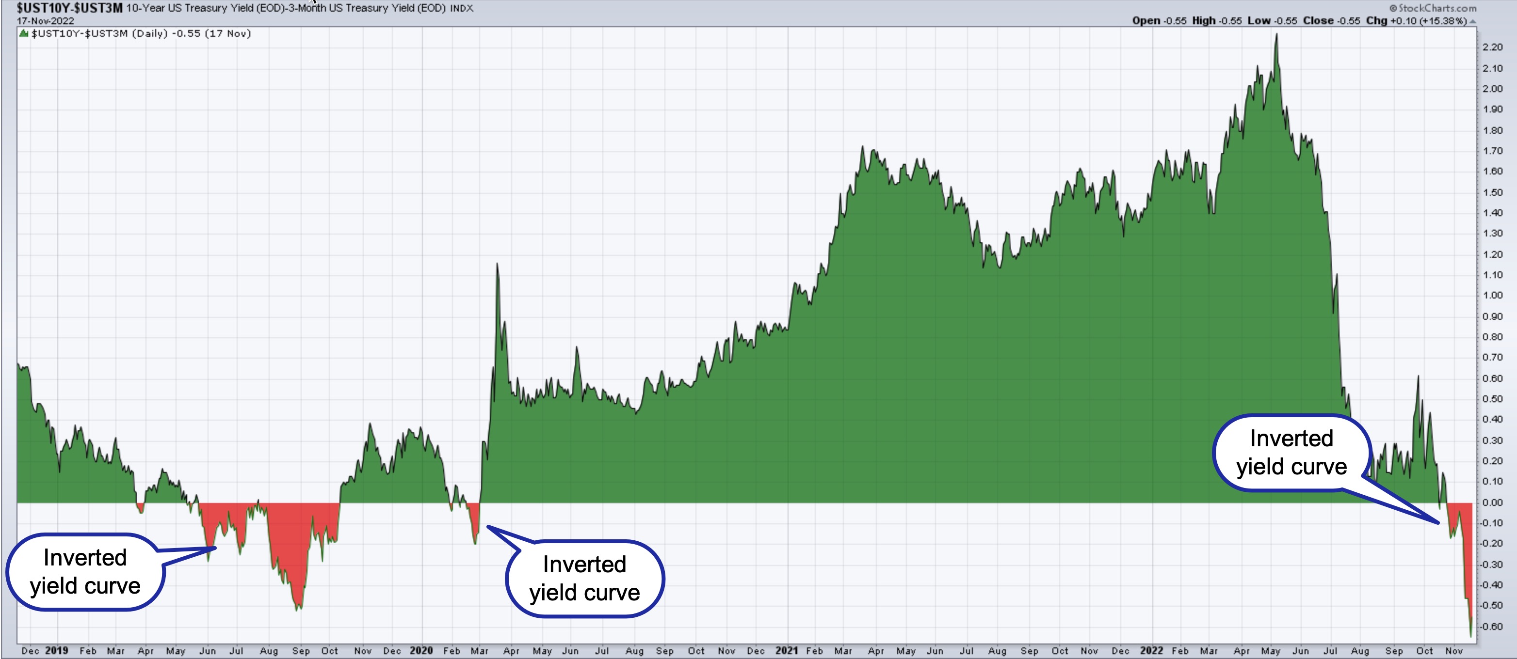
Economists often look at the spread between the ten-year Treasury note rate and the three-month Treasury bill rate (see chart below) as a recession predictor.

CHART 1: SPREAD BETWEEN 10-YEAR AND 3-MONTH U.S. TREASURIES. The spread between the longer ten-year Treasury note and the three-month Treasury bill is in negative territory, implying the yield curve is inverted. The last time we saw a yield curve inversion was back in 2019 and briefly in 2020 before the COVID-19 outbreak. Source: StockCharts.com
From the chart above, you can see the yield curve has inverted. The general thinking is that, when the Fed tightens interest rates too much, the yield curve inverts. We're seeing that play out. As we heard from the last Fed press conference, the Fed is worried about high inflation and will keep tightening until inflation comes down to an acceptable level. But it takes time to feel the full effects of the Fed's tightening, which is why the yield curve can act as a leading indicator.
There are other ways to look at the yield curve. You can look at the spread between the ten-year and two-year Treasury rates. Julius de Kempenaer, chief technical analyst at StockCharts, stated, in a recent StockCharts TV segment of his show Sector Spotlight, "When the 10-year yield is lower than the two-year yield, it means that giving your money to the government for two years gets you a higher yield than giving your money to the government for ten years." Yield curve inversions may not happen often, but they're not impossible.
Does an Inverted Yield Curve = Recession?
Not always. If you go back 40 years, every time the 10-year rate fell below the three-month one, more often than not, a recession followed. But it didn't happen every time. For example, the last time we saw an inversion in the ten-year and three-month yield curve was in 2019. At the time, there were fears that perhaps the expanding economy following The Great Recession could be slowing down or coming to an end. But it didn't really pan out that way in the long run. There was a short time after the COVID-19 outbreak when concerns rose about the potential of a global recession, but the stock markets rallied after that.
It can take several months or a year or two before the effects of monetary policy are felt. Sometimes, a recession may not even happen. So, instead of looking at the yield curve as a recession predictor, think of it as an indicator that paints a picture of overall economic conditions.
Seeing the stock market come off its lows is exciting. While it maybe tempting to adopt the "buy the dip" mentality, always keep the big picture in mind. A stock market that appears to be strengthening in a time of economic uncertainty may not be sustainable. That's not to say you shouldn't trade; it just means that, if you do want to add positions to your portfolio, do so knowing that economic fundamentals may not be aligned with the stock market.
We're going through an inflationary period, interest rates are rising, and geopolitical tensions continue. Interest rates are probably going to rise more. We got a hint of that from comments made by St. Louis Fed President James Bullard, who suggested the Fed may have to raise rates to 7% before we see a Fed pivot. That may be a long way off.
Let's hope that's not the case. Regardless, given current uncertainties, it's best to keep the yield curve in your rearview mirror. Have a risk management strategy in place—protect your winning trades using stops, recognize when your emotions influence your decisions, and be disciplined. Ultimately, your goal is to protect your portfolio. Understanding relationships between macro factors and making trading decisions based on those relationships makes you a smarter trader and investor.
How to Track the Yield Curve on StockCharts
The most direct way to track the yield curve is:
- Login to your StockCharts account
- Select your preferred chart type—SharpCharts, StockChartsACP, and so on
- Enter $UST10Y-$UST3M in the symbol box
- Try out different chart types from the Type dropdown menu
- Select overlays and indicators from the respective dropdown menus
- Save the chart to your ChartLists
For more ideas, be sure to check out the StockCharts in Focus video below.
Keep an eye out for our Cyber Monday sale, coming soon.

For more ways to track yield curves and interest rates, be sure to check out the StockCharts in Focus video below.
|
| READ ONLINE → |
|
|
|
| The Canadian Technician |
| Commodities: Economic Indicators You Can't Ignore |
| by Greg Schnell |
The commodities tried to rally, but stalled this week at very important technical locations.
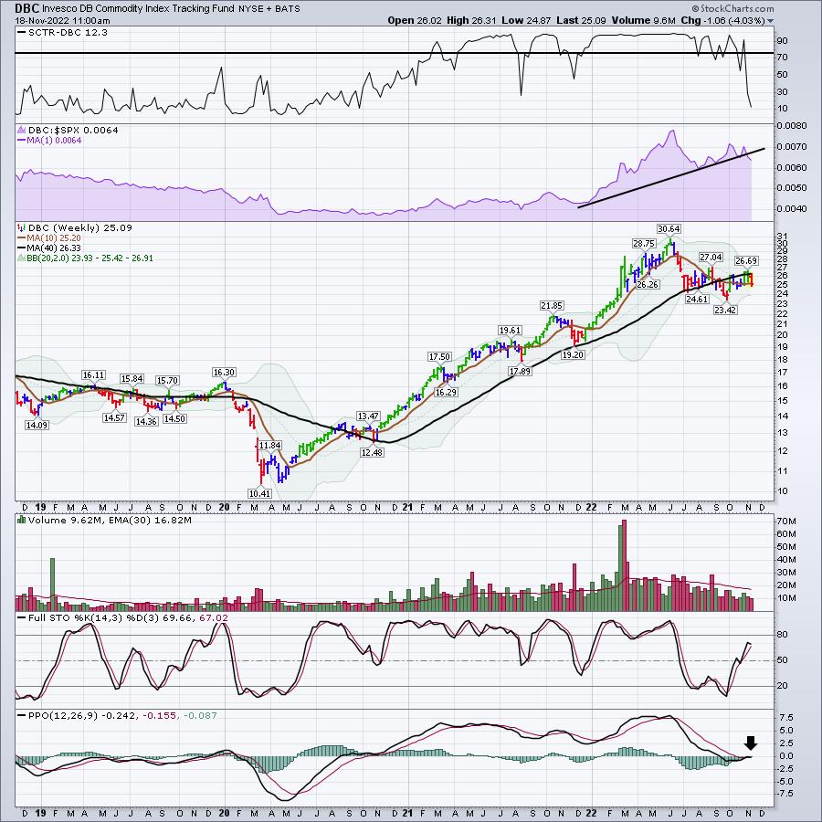
For example, the Invesco DB Commodity Index Tracking Fund (DBC) weekly chart doesn't look very good.
- The StockCharts Technical Ranking (SCTR) is plummeting after 1.5 years of strength
- First red candle since October started
- Relative strength in purple is breaking
- No volume
- PPO momentum is right at zero and struggling to go higher.

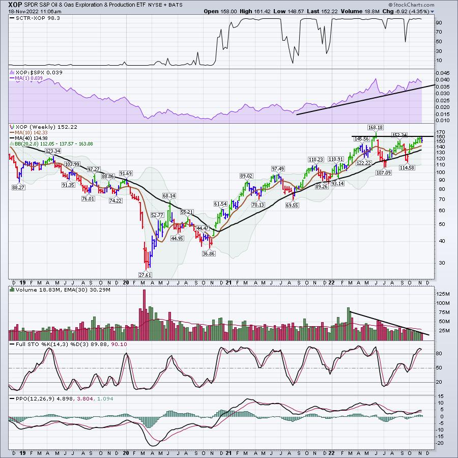
Now let's look at the SPDR S&P Oil & Gas Exploration & Production (XOP) (see chart below):

Oil exploration companies are struggling to take out the spring highs. They have been here for three weeks.
- Testing a prior high and struggling. Not uncommon, but hardly euphoric based on what the indexes are doing. The SPDR Dow Jones Industrial Average (DIA) is up 20% off the lows
- First blue candle at least hints at a weakening trend
- No volume coming in
- PPO losing upside momentum.
I would say this is still a strong chart, but ,based on the DBC chart above, it is worth watching closely.

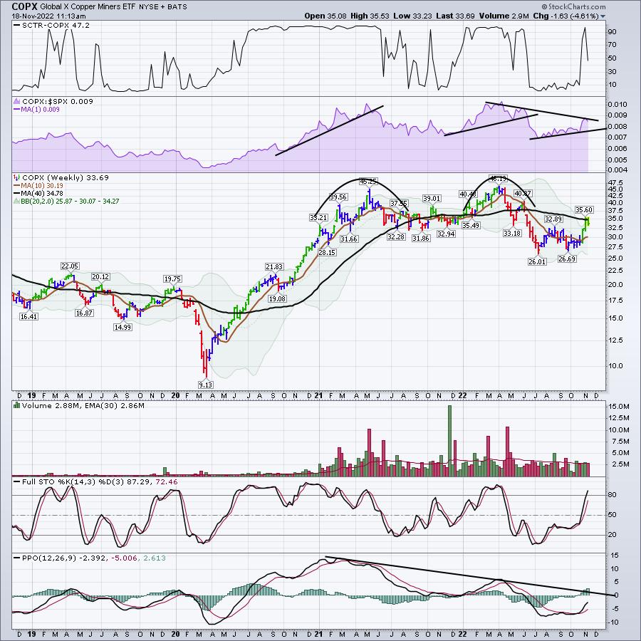
I was thrilled to see copper break out, only to then see copper miners bang their heads on the 40-period weighted moving average, an important resistance until broken. The SCTR ranking is failing to hold up and the PPO is below zero; it needs to continue to accelerate higher.

For me, it's starting to look a lot less likely that commodities can soar. One week doesn't make a trend. I'll have a lot more in my weekend newsletter. It's critically important that we understand the economic indicators like housing, copper, oil, including commodities in general. If you would like to see what we offer, feel free to try a subscription for $7 at OspreyStrategic.org. It will let you check out our past picks and newsletters as well.
|
| READ ONLINE → |
|
|
|
| MORE ARTICLES → |
|
 Chart 1
 Chart 2
  Chart 3
 Chart 4
 Chart 5

 2022 has been a tough market for trend-followers, but swing traders have been able to catch a few rides. Trend-followers are suffering because whipsaws are above average this year. A whipsaw occurs when an uptrend cannot extend after a bullish trend signal and the trade results in a loss.