| THIS WEEK'S ARTICLES |
| John Murphy's Market Message |
| DOW HITS SEVEN-MONTH HIGH WHILE THE REST OF THE MARKET LAGS BEHIND |
| by John Murphy |
DOW CONTINUES TO LEAD... The market ended the Thanksgiving week with the Dow gaining ground on Friday while the S&P 500 and and Nasdaq ended the day lower. For the week, all three gained ground with the Dow in the lead and the Nasdaq turning in the weakest performance. That trend is symptomatic of market performance over the past couple of months with the technology sector holding the Nasdaq and S&P 500 back; while money has rotated out of technology (and economically-sensitive consumer discretionary stocks) and into defensive stock groups like staples, utilities, and healthcare (more on that shortly). Money has also been flowing into industrials, financials, and materials.
Chart 1 shows the Dow Industrials rising above their August peak to reach the highest level in seven months. The other two major indexes lagged behind. Chart 2 shows the S&P 500 gaining ground on the week but remaining below its 200-day moving average -- and well below its August high. That paints a much weaker market picture. Relative weakness in technology stocks is one of the major factors holding the SPX back. That weakness in also reflected in much weaker performance by the Nasdaq market. Chart 3 shows the Invesco QQQ Trust still trading below its 100-day moving average (green line) and even further below its 200-day line. While this week's upside breakout in the Dow Industrials is encouraging from a charting standpoint, the fact that the other major stock indexes are lagging so far behind the Dow has kept the market's major downtrend intact and warrants a continuing cautious market view.
SEASONAL BUYING... Stocks are also being supported by traditional seasonal yearend strength which could contribute to the usual Santa Claus rally. Stocks, however, could run into more trouble in the new year once seasonal strength has run its course. That cautious outlook may help explain why investors are buying defensive healthcare stocks.
 Chart 1 Chart 1
 Chart 2 Chart 2
 Chart 3 Chart 3
HEALTHCARE SPDR MAY HAVE BOTTOMED... The message from October 28 suggested that the healthcare sector offered investors a defensive market sector with upside potential. It also suggested that the sector might be bottoming. Chart 4 shows the Health Care SPDR (XLV) clearing its summer peak to reach the highest level since April. Combined with its two lows formed during June and October, the chart has taken a more bullish look. The October message also suggested that biotechs were looking stronger. Since then, they've been the strongest part of the XLV. Chart 5 shows the Nasdaq Biotechnology iShares on the verge of clearing their August high. Two important features in favor of healthcare is its relatively strong chart pattern and the fact that it offers defensive protection in a dangerous economic environment.
 Chart 4 Chart 4
 Chart 5 Chart 5
|
| READ ONLINE → |
|
|
|
| The Canadian Technician |
| Some Bull Market Sectors are Forming |
| by Greg Schnell |
As the market changes from bear to bull, there should be a market rotation away from defensives.
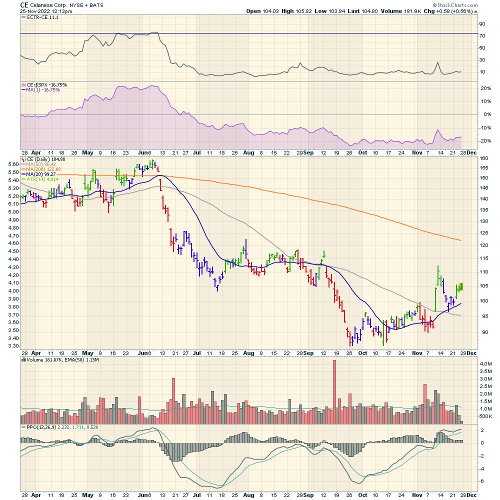
While defensives and financials are still performing well, Industrials are also leading the way. It might not have the charm of something the younger generation has been yelling about, but I just heard that Warren Buffet and Charlie Munger were buying Celanese (CE) shares in chunks. This chart is not the shape for technicians, but it is the shape for value buyers starting to push the price up.
So what chart shapes do technicians like? One entry style I like is breakouts above trend lines, or stocks making new 3-month, 6-month, or 1-year highs. I created a scan to find stocks that made a new high anytime this month (November 2022), and there were 312. That is very positive, considering how the market indexes are well below the highs.
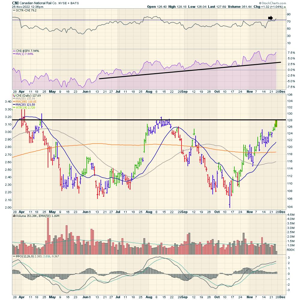
An example of a nice chart for me is CN Rail (CNI), which is in a strong sector. There are a few reasons I can list for why I like the chart; the SCTR is breaking above 75, the purple area shows the stock outperforming the S&P 500, and the stock is trying to break out to new six-month highs. One for the watch list.
As the market changes complexion, it can be really profitable to find new market leaders. I will be hosting an information session on Tuesday, November 29th about the work we do at Osprey Strategic and how we approach the market. Live attendees will have an opportunity to win a StockCharts for Dummies book!
As well, any new clients are welcome to join in and listen to the monthly client conference call on Wednesday November 30th at 5 PM ET. We'll share some of the stock ideas we like and why the market is so mixed. We like to make money when the backdrop is positive, and we'll talk about how we do that on Tuesday.
|
| READ ONLINE → |
|
|
|
| MARK YOUR CALENDARS... |
 |
|
| Martin Pring's Market Roundup |
| What Does the Wall-to-Wall Media Coverage of the FTX Collapse Mean? |
| by Martin Pring |
Last May, I wrote an article entitled "Bitcoin Bubble Finally Bursts", where I laid out the technical case for substantially lower prices. It was partially based on the fact that the 18-month ROC had peaked from a level in excess of 200%. My research, featuring 26 case studies of markets (not individual stocks) spread over hundreds of years, indicated that, whenever the 18-month ROC peaked from a reading in excess of 200% following several years of advance, that was enough to kill the bull market in question. Indeed, the average decline following such action was 67%, requiring an average of 20 years to recapture all those losses.
Chart 1 shows that the Bitcoin ROC hit a record-shattering 2,400% in 2017. Remarkably, it only took three years to recapture the subsequent 80% decline. In 2021, the Bitcoin ROC reached a more modest, but still significant, 750%. The previous record in excess of 500% had been held by silver in 1980. The loss has so far approximated 75%, so the drop is definitely in the ballpark of downside activity for burst bubbles.
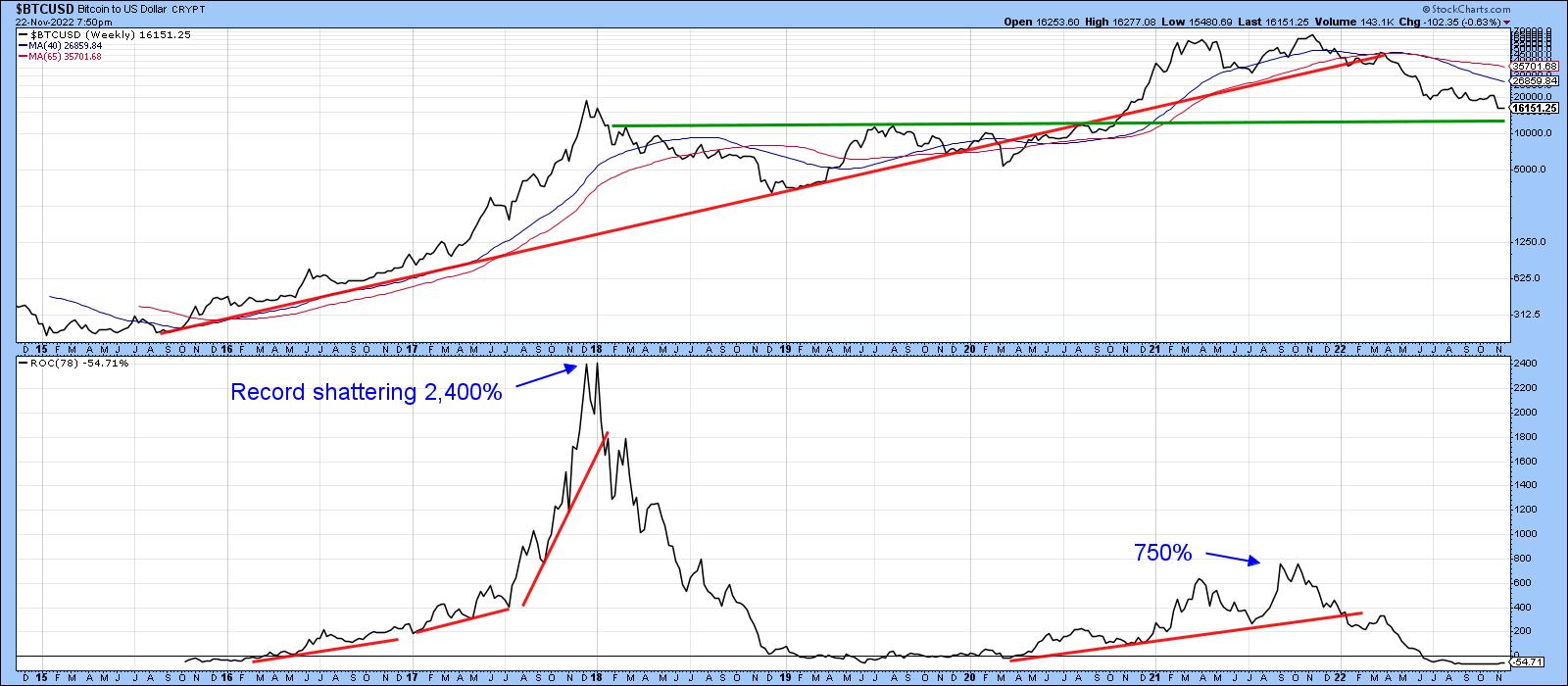 Chart 1 Chart 1
One of the characteristics of an unwinding of a bubble is the exposure of over-leveraged players. Indeed, I concluded the article by saying "with easy money no longer available, watch out below, as there are likely to be a substantial number of Warren Buffet's naked and fraudulent swimmers yet to be exposed." That brings us to the recent wall-to-wall coverage of the FTX collapse, resulting in cover stories for The Economist, Businessweek and Forbes. When such events grab the attention of the general-purpose media and public, in addition to regular market participants, it is often a good time to examine the charts for a possible reversal. After all, if everyone is aware of a problem, it's likely that it has already been factored into the price. From a contrarian aspect, then, it's a good idea to take a second look at the technical position to see what, if anything, has changed.
Chart 2 indicates the price recently completed a head-and-shoulders top and exceeded its minimum ultimate downside objective of around $20,000. Prices often move in multiples of the objective. Interestingly, a double count indicates a move to the $10,000-$12,000 zone, where there is substantial support as flagged by in the vicinity of the 2019 and 2020 rally highs. To be clear, this is not meant as a prediction, but more as a statement of possibilities.
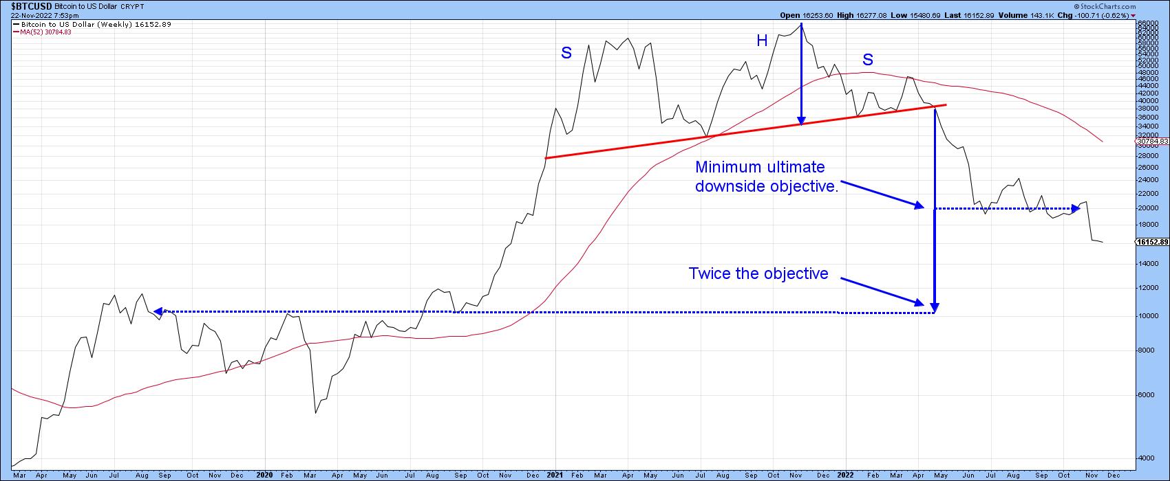 Chart 2 Chart 2
The pink shadings in Chart 3 point up when the 6-month EMA of the price is below its 15-month counterpart. This indicates a current bearish environment, especially as the price just violated its secular up trendline and 50-month MA in a fairly decisive manner. Markets reflect people in action; people can and do change their minds, so it's always possible that the break could turn out to be a whipsaw. The FTX collapse and publicity offers potential justification for such an outcome. However, it's never a wise policy to bet on a false signal until suspicion is outweighed by actual evidence.
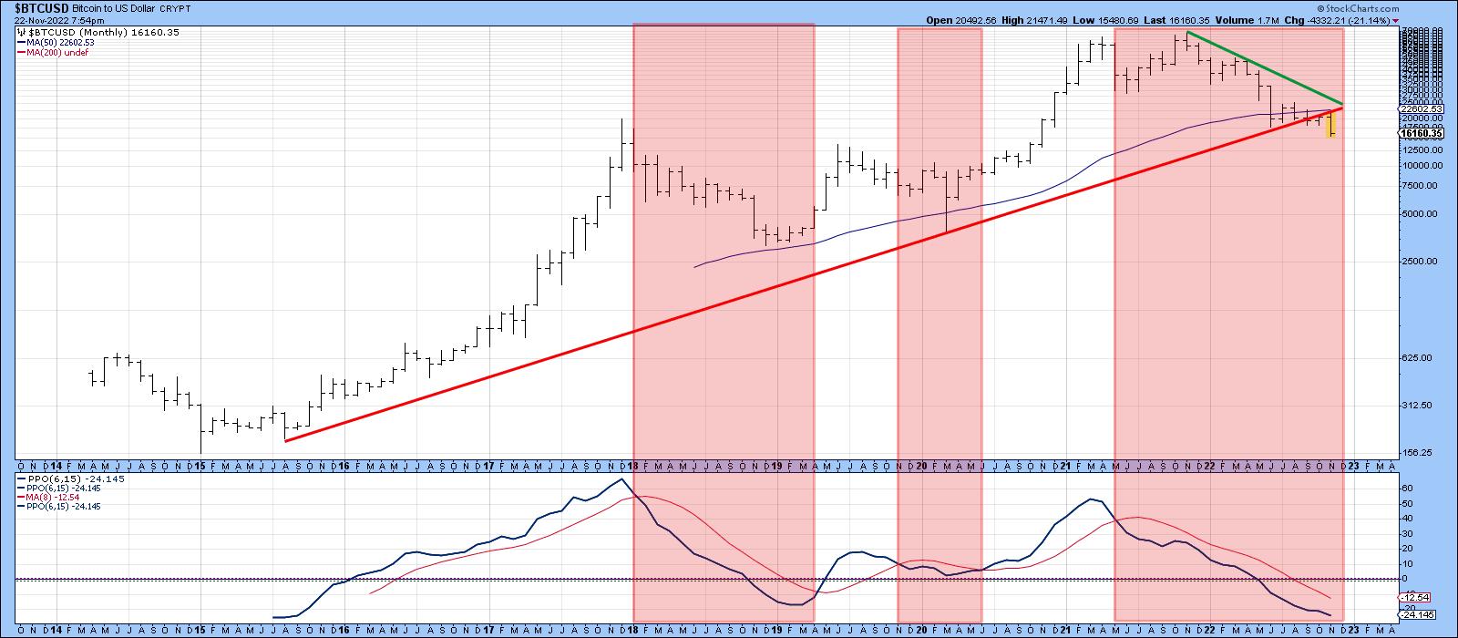 Chart 3 Chart 3
At first glance the break (Chart 4) looks valid, as the price traces out and subsequently completes a bearish consolidation head-and-shoulders. That's perfectly right and proper. However, there is one thing, apart from contrary thinking, which worries me about the validity of the break, and that lies with giant bullish selling climax immediately following the breakout.
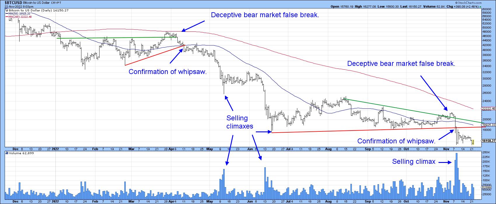 Chart 4 Chart 4
Drilling down to more recent activity in Chart 5, we see the possibility that the climax represents the first low in a double bottom formation. It certainly has the characteristics of one, with heavy volume accompanying the first bottom and substantially less on the second. A decisive drop below this trading range would, of course, invalidate the double bottom scenario. Double bottoms, though, must be confirmed, with the price experiencing an upside breakout. That's an event that has obviously not happened yet. A starting point would be a rally that takes the price north of its red breakdown trendline and 50-day MA at around the 18,000-18,500 zone. However, we need to be very careful, as the likelihood of one of history's largest bubbles taking less than a year to unwind seems a little optimistic.
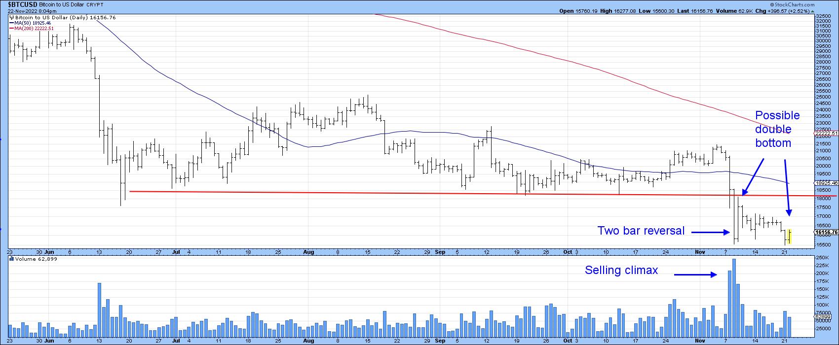 Chart 5 Chart 5
Good luck and good charting,
Martin J. Pring
The views expressed in this article are those of the author and do not necessarily reflect the position or opinion of Pring Turner Capital Group of Walnut Creek or its affiliates.
|
| READ ONLINE → |
|
|
|
| DecisionPoint |
| Industrials Sector Gets Golden Cross BUY Signal |
| by Carl Swenlin |
Today the Industrial Select Sector SPDR (XLI) 50-day exponential moving average (EMA) crossed up through the 200-day EMA (Golden Cross), generating an LT Trend Model BUY signal. While this is an encouraging event, we note that most indicators on the chart below are overbought -- specifically, the PMO, Silver Cross Index*, and Percent Stocks Above 20/50/200EMAs. In a bull market, overbought conditions do not necessarily imply a rally's end, but in a bear market, it is most likely that we will see a price top soon. That said, we have marked a double bottom, roughly July and October, with the confirmation line drawn across the August top. Price has eased above that line, implying a continued bullish outcome.
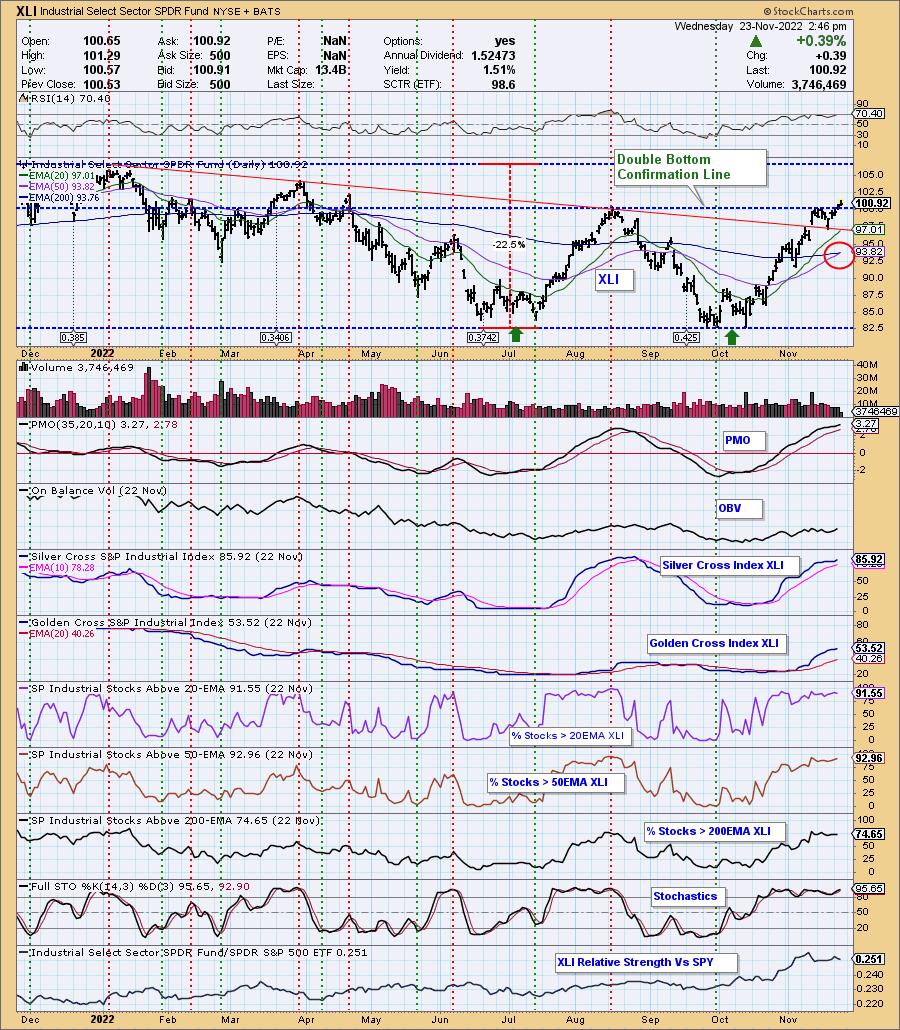
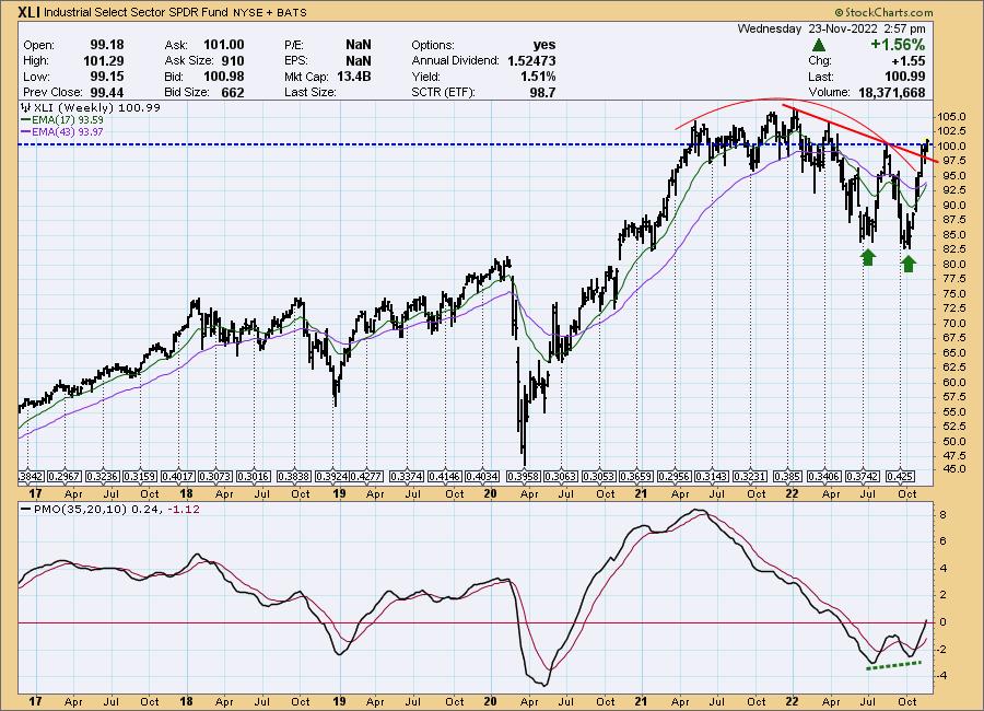
I always like to check the weekly chart to get a longer-term perspective, and I must say that this makes me more bullish about the situation. We can see a bearish rounded top terminated by the bullish double bottom, and the declining tops line has been decisively penetrated to the upside. Especially positive, the weekly PMO is rising from a double bottom that has formed a positive divergence. (The second PMO bottom is higher than the first, while the corresponding price bottom is lower.)
Positive and Negative Signs
The Industrials Sector (XLI) is showing positive signs and negative signs, but this is not particularly unusual in technical analysis. The weekly chart is strongly positive, in my opinion. The daily chart is mixed, the negative signs being overbought internals. If we are transitioning into a new bull market, the overbought condition won't matter. If the bear market resumes, none of the positive signs will matter. I personally believe that we're in a bear market rally, so caution is advised.
* The Silver Cross Index is the percentage of index component stocks with the 20EMA above the 50EMA.
Watch the latest episode of DecisionPoint on StockCharts TV's YouTube channel here!

Technical Analysis is a windsock, not a crystal ball. --Carl Swenlin
(c) Copyright 2022 DecisionPoint.com
Helpful DecisionPoint Links:
DecisionPoint Alert Chart List
DecisionPoint Golden Cross/Silver Cross Index Chart List
DecisionPoint Sector Chart List
DecisionPoint Chart Gallery
Trend Models
Price Momentum Oscillator (PMO)
On Balance Volume
Swenlin Trading Oscillators (STO-B and STO-V)
ITBM and ITVM
SCTR Ranking
Bear Market Rules
DecisionPoint is not a registered investment advisor. Investment and trading decisions are solely your responsibility. DecisionPoint newsletters, blogs or website materials should NOT be interpreted as a recommendation or solicitation to buy or sell any security or to take any specific action.
|
| READ ONLINE → |
|
|
|
| StockCharts In Focus |
| Dividends: Are Adjusted or Unadjusted Charts the Way To Go? |
| by Jayanthi Gopalakrishnan |
 Gustavo Fring Gustavo Fring
Hey Chartwatchers! Have you ever thought about how dividends may impact the price of your dividend-paying stocks or funds?
Dividends are like the cherry on the cake. They give you a little extra money for investing in a company. Not all stocks pay dividends, but for those that do, there are a few things you should know.
Unless you rely on those dividends for your everyday expenses and have opted to receive the dividends as cash payments, your dividends most likely automatically get reinvested. That means more shares for you, which is great, but you may not be aware of how much those dividends impact the price of your investment.
Generally, when a dividend is paid out, the stock price falls by that dividend amount. Because the stock price is adjusted downward, you may not notice the price change when you look at a chart of the stock.
Explore the Dividend Tools in StockCharts
When you pull up a chart, it's probably been adjusted for dividends. But maybe you're curious to find out if the dividends you receive are worth the investment. Or perhaps you're thinking of selling a dividend-paying stock and want to determine if the dividends you receive make the stock worth holding onto for a little longer. Maybe you just want to know how much the dividends you receive help your investment. It's sort of like how much better a cake tastes with the cherry on top.
To help make these decisions, consider comparing an adjusted chart with an unadjusted one.
How To View an Unadjusted Chart
This is pretty simple. All you have to do is add an underscore before the symbol and hit "enter". This will bring up an unadjusted chart. Remember, it's adjusted only for dividends; not stock splits. An unadjusted chart by itself may not reveal much, but, when you compare it against an adjusted chart, you can see how dividends impact price (see chart 1).
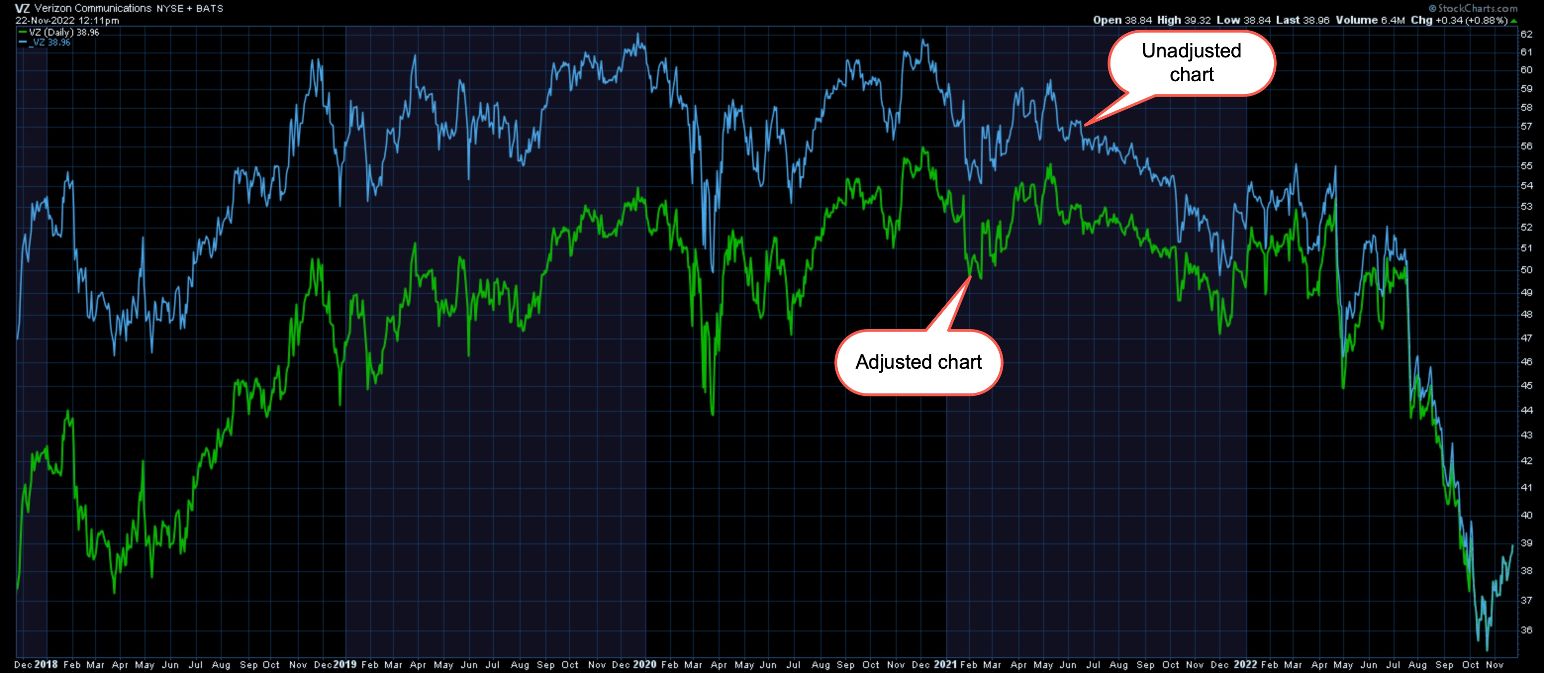 CHART 1: ADJUSTED VS. UNADJUSTED. One is not necessarily better than the other, but comparing the two gives you an idea of how dividends impact the price of the stock. Chart source: SharpCharts from StockCharts.com CHART 1: ADJUSTED VS. UNADJUSTED. One is not necessarily better than the other, but comparing the two gives you an idea of how dividends impact the price of the stock. Chart source: SharpCharts from StockCharts.com
Chart 1 compares an adjusted and unadjusted chart of Verizon Communications (VZ). Here's how you can bring up the chart.
- Enter VZ in the symbol box and from Chart Attributes, select Type. This chart uses a Solid Line type, which looks at pure price action. If you prefer to view the chart in terms of percent performance, select Performance from the dropdown menu.
- Select Price (same scale) from the Overlays and, in the Parameter box, enter _VZ. Click on Update and you'll see the adjusted and unadjusted charts overlaid. This allows you to compare the two. Make sure you choose to display the charts in different colors so you can easily see the difference between the two.
- Go back a few years to see the impact of dividends. The chart in this example goes back five years.
The unadjusted chart (blue line), for the most part, is at a higher price, which is expected. In the most recent quarter, the two lines are highly correlated, probably because the dividend hasn't been paid out yet.
Comparing price action or price performance of adjusted and unadjusted charts is only one piece of the puzzle. It's also helpful to know when companies pay out dividends and how much they pay out.
3 More Dividend Tools in SharpCharts
There are some other tools you could use to sharpen your dividend knowledge. For example, using the same chart of VZ, remove all indicators and overlays (see chart 2).
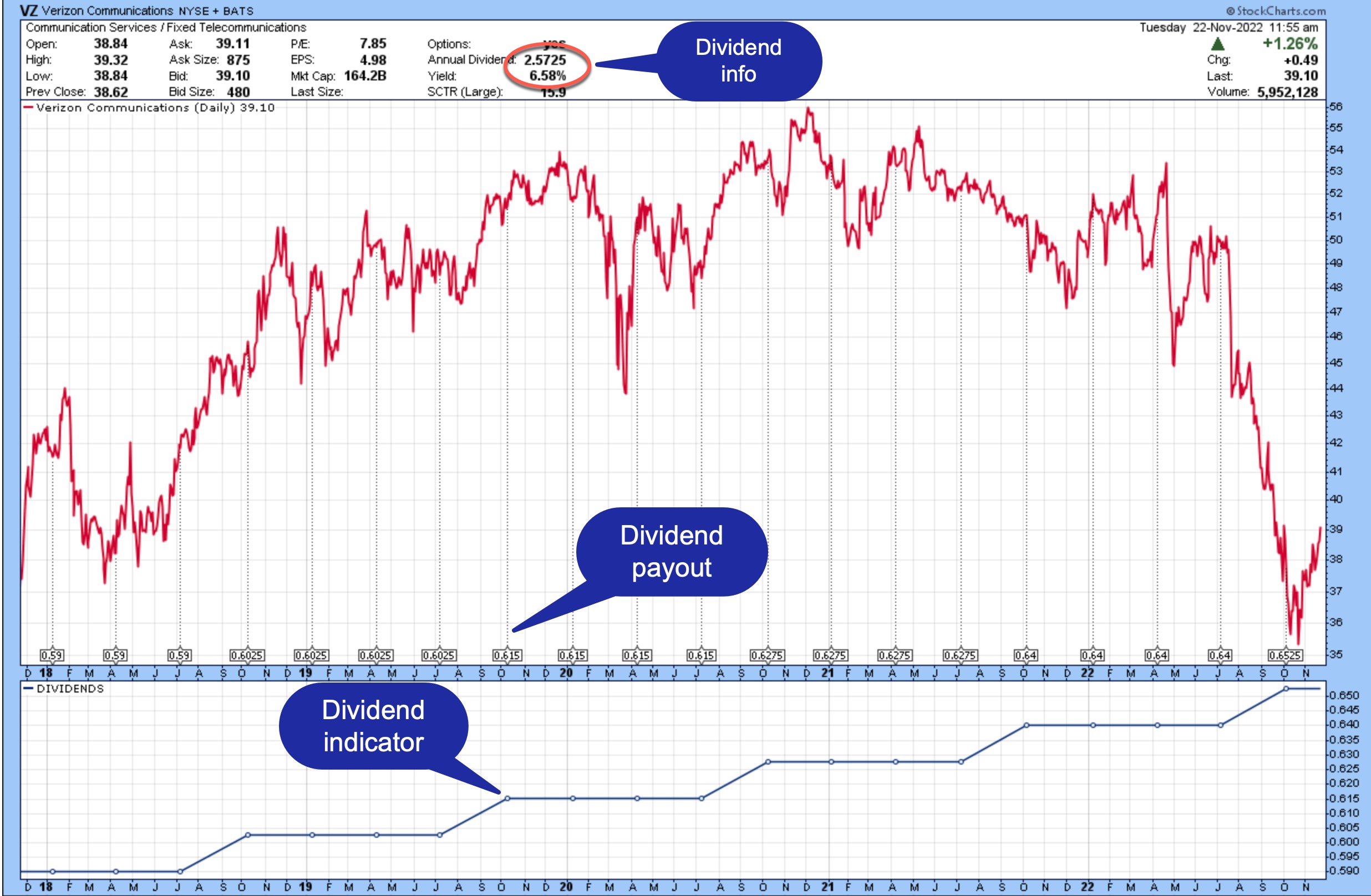 CHART 2: FULL QUOTE, EVENTS, AND DIVIDEND INDICATOR. These additional tools can provide further insight into any dividend-paying stocks or funds. Chart source: SharpCharts from StockCharts.com. CHART 2: FULL QUOTE, EVENTS, AND DIVIDEND INDICATOR. These additional tools can provide further insight into any dividend-paying stocks or funds. Chart source: SharpCharts from StockCharts.com.
- Check the Full Quote box under Chart Attributes. This brings up the full quote area across the top of the chart. If the stock pays a dividend, you'll see the annual dividend and the dividend yield displayed. Note that these are 12-month trailing values.
- In the Overlays section, select Events from the dropdown menu and click on Update. Along the time axis, you'll see the dividend payout amounts.
- In the Indicators section, select Dividends. The dividend indicator plots dividend values over time. You can place the indicator either above or below the price chart. This allows you to line up the dividend payout and the indicator, so you can see if dividends grew and by how much.
You can compare adjusted and unadjusted dividend charts in StockChartsACP as well. Be sure to watch the StockCharts in Focus video below to explore more dividend tools.
How To Use Dividend Information

Similar to how you build bond ladders or CD ladders, you could ladder your dividends. By using the dividend tools discussed in this article, you can see when the stocks or funds you own, or are considering investing in, pay dividends. Based on the information you gathered, you could strategize investing in stocks so you receive dividends on a regular basis, such as every month or every two months. But since dividends aren't guaranteed and they vary, so you can't plan on receiving a certain amount.
If that exercise proves to be too time-consuming, you could consider mutual funds or exchange-traded funds. But remember, dividends from funds can vary even more than with stocks since the buying and selling of stocks in those funds are decided by the fund management team.
Another factor to keep in mind is that dividends are taxable. So, if you receive dividends, be sure to consult with your tax advisor.
The Bottom Line
Like the cherry on the cake, dividends can be a "nice to have" benefit, especially if you're a long-term investor. If you opt to reinvest them, you could own more shares, which in turn could potentially help increase your overall returns. If you choose to receive a dividend check, it can help bring in additional income. Either way, it helps to know how much those dividends are going to be. That's where looking at adjusted-versus-unadjusted dividend charts can help. Add in the other dividend tools, and you are in a better position to make investment decisions on those dividend-paying stocks or funds.
Explore the dividend tools in StockCharts
Jayanthi Gopalakrishnan
Director, Site Content
StockCharts.com
Disclaimer: This blog is for educational purposes only and should not be construed as financial advice. The ideas and strategies should never be used without first assessing your own personal and financial situation, or without consulting a financial professional.
|
| READ ONLINE → |
|
|
|
| StockCharts In Focus |
| Here's How You Can Get 4 FREE MONTHS Of StockCharts Premium Membership On Monday, Nov. 28th |
| by Grayson Roze |
 The countdown is on people! We're less than two days away from the BIGGEST sale of the year here at StockCharts. The countdown is on people! We're less than two days away from the BIGGEST sale of the year here at StockCharts.
For one day only this Cyber Monday, you can get up to 4 FREE MONTHS of StockCharts service when you sign up for a new account or renew your existing membership. That means savings of as much as $159.80 off our regular subscription pricing!
So here's the deal: sign up or renew for 12 months and you'll get an extra 4 MONTHS of service for free. Alternatively, you can sign up or renew for 6 months and you'll get an extra 2 months of service for free.
As our longtime StockCharts members know, this is THE day to sign up. Whether you're extending a current subscription or joining as a member for the very first time, you'll lock in our absolute best pricing of the year - period.
If you're an existing member...
You can renew your membership with our special Cyber Monday deal and the additional free months will be added to the end of your existing service. If your account is set to expire within the next 12 months (i.e. before the next Cyber Monday), you'll save big by renewing now with the Cyber Monday deal. You can check your account's expiration date by going to the Your Account page and looking for the date listed under "Renewal Cycle" on the Membership Details section.
If you're not a StockCharts member...
This is the perfect time to sign up and unlock all of our premium tools at a discounted rate! You'll get access to our most powerful features like saved chart storage, technical scanning, custom alerts, exclusive ACP plug-ins and more. Plus, you'll be able to create bigger, better, more advanced charts without the restrictions of our free tools.
(oh, and by the way... you can even sign up for a free 1-month trial now before the sale hits on Monday and you'll effectively get a bonus month on top of the Cyber Monday deal you choose!)
We'll send out a reminder on the day of the sale and will make it easy to find on StockCharts too, but I highly recommend you mark your calendars now so that when Monday rolls around you'll be ready to pounce. And when Monday does come around, you can click here to sign up for the Cyber Monday special!
We've got all the details for you
For a little more detail about how the special works and some guidance on whether or not it makes sense for your specific account, check out this week's edition of "StockCharts In Focus". We'll tell you everything you need to know to catch the Cyber Monday sale on the 28th.
Check out the video below to watch now!
Chart on, my friends.
Grayson Roze
VP of Operations, StockCharts.com
Author, Trading For Dummies (Wiley, 2017)
Author, Tensile Trading: The 10 Essential Stages of Stock Market Mastery (Wiley, 2016)
Twitter: @GraysonRoze
|
| READ ONLINE → |
|
|
|
| Trading Places with Tom Bowley |
| The Three Key Ingredients Of Stock Portfolio Construction |
| by Tom Bowley |
I always stress the importance of combining technical and fundamental analysis. I practiced in public accounting for more than 20 years, with most of that time spent at a large, regional CPA firm in the Washington DC area. While I believe technical analysis is an absolute necessity to observe price/volume trends, perform relative strength analysis, and find appropriate entry and exit points in individual stocks using technical tools, there is also no substitute for a company's management that beats competitors and excels in producing results that exceed Wall Street's expectations. Accelerating revenue and earnings growth leads to higher multiples and, ultimately, bigger and faster profits for traders. Using an investing or trading strategy that combines both is paramount to wealth accumulation, in my opinion.
But there's a third supplementary ingredient that should be added as well. You need to understand seasonal influences that can drive stock prices higher. The seasonality tool here at StockCharts.com is quite likely underused. I spend a great deal of time researching seasonality and even produce a monthly seasonality report for members each month. If you'd like to see our October Seasonality report, check out the offer in the last paragraph of this article below. I rarely use seasonality as the reason to buy or sell a stock. Rather, I use it to confirm the technical and fundamental reasons I'd want to buy or sell a stock. Let me give show you how we've constructed our portfolios to benefit from strong periods and weather the more difficult times. Then I'll discuss how we include seasonality in our research.
Portfolio Construction
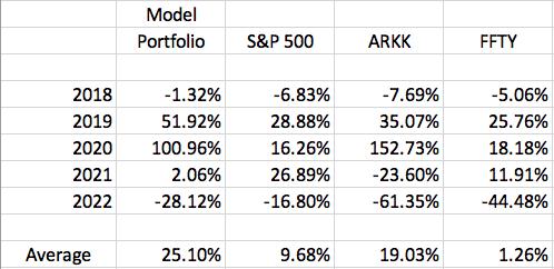
We just completed our Model Portfolio's 16th quarter of performance and our cumulative results have been stunning. By following our strategy of "technicals plus fundamentals plus seasonality", we've delivered results that are unmatched in the industry - all documented with quarterly video recordings where we've announced the 10 equal-weighted stocks included in the portfolio. We then track our portfolio results daily on our website. Our inception date for our Model Portfolio was November 19, 2018 and here are the results on an annual basis, relative to the benchmark S&P 500 and two very well-known ETFs, ARK Innovation (ARKK - Cathie Wood) and Innovator IBD 50 Fund (FFTY) which seeks to track results of the IBD 50 Index, Investor Business Daily's signature investing tool):

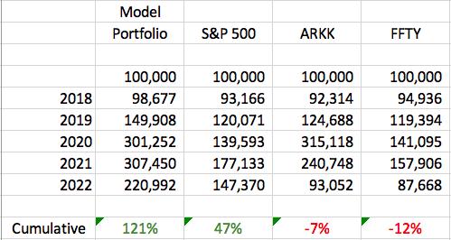
While ARKK seems to be fairly close to us, just six percentage points lower, its ridiculously large drawdown in both 2021 and 2022 was devastating to investors. Assume you start with 100,000. Here's how your investment would have performed cumulatively from November 19, 2018 through November 18, 2022:

As great as Cathie Woods' ARK funds performed in 2019 and 2020, they gave it all back ... and then some during the last two years. Unfortunately, "confirmation bias" contributed to her and her funds' demise. While I completely agree with her that growth is the way to go for those willing and able to take on higher risk, she was shockingly unwilling to adjust her strategy during a nasty cyclical bear market. In the midst of a complete revaluing of growth stocks, you don't keep buying. It was a devastating mistake on her part and the damage has been done.
Our Model Portfolio (and our other two portfolios, Aggressive and Income) are constructed every 90 days, taking all new information (market environment, most recent earnings, the Fed, etc.) into account. Fortunately, we moved away from most growth stocks on February 19, our scheduled quarterly date to redesign our portfolios. Here's how we performed since that time and through Friday's close:

Despite still including some growth stocks, our Model Portfolio managed to stay fairly close to the S&P 500 Index and our Aggressive (-2.50%) and Income Portfolios (-5.00%) actually beat that benchmark since February 19. We adjusted our growth strategy to a mixed growth/value approach to help preserve capital during what would likely be a tumultuous period and await a much better time to invest more heavily in growth. It's paid off.
Cathie Wood, with 20/20 hindsight, made the same mistake that individual investors make and doubled, tripled, then quadrupled down. That's how behavioral biases—the inability to consider alternative strategies—work. She wasted a lot of people's money in the process.
Seasonality
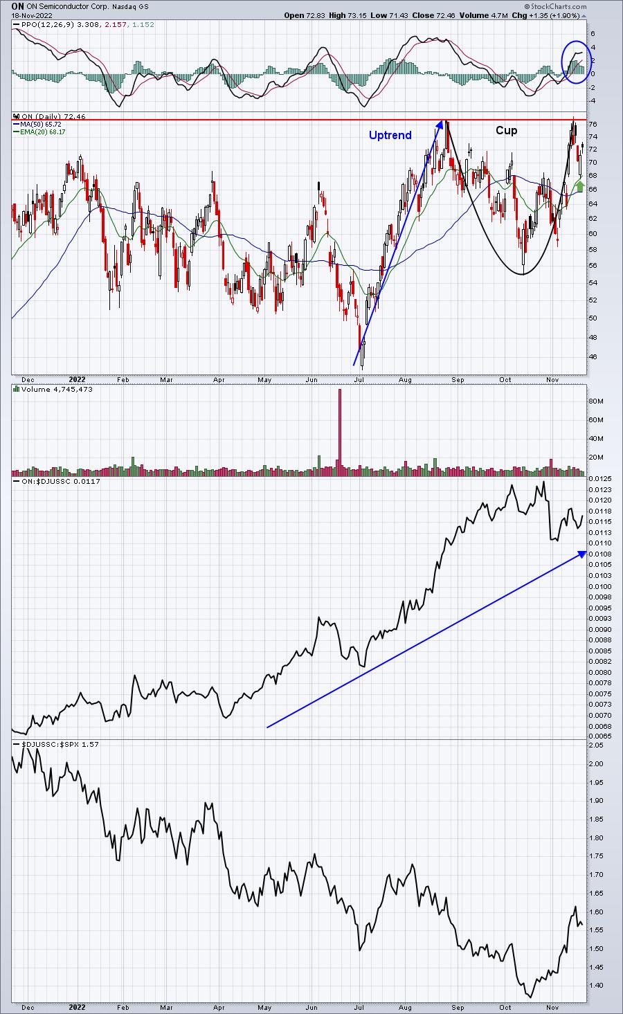
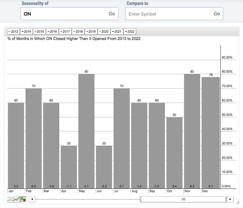
First, it's important to understand the limitations of seasonality. Again, it's simply a confirming signal, not a primary one. We don't add stocks to our portfolios, because they have strong seasonal trends alone. But if we like a stock on a technical and fundamental basis and the company also shows strong seasonal tendencies for the upcoming period, then that can be a deciding factor. Consider ON Semiconductor (ON). As you can see from the chart below, it's been one of the best semiconductor stocks ($DJUSSC).

Then there are the fundamentals. Despite many semiconductors falling short of revenue and/or EPS estimates this past quarter, ON was able to easily beat both. Revenues were $2.19 billion vs. $2.12 billion and EPS came in at $1.45, well ahead of the $1.32 estimate. This is the type of company that will be rewarded when money rotates more and more back toward growth.
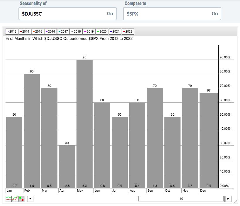
Now let's look at seasonality, first with the semiconductor industry:

The $DJUSSC enjoys solid market behavior during the months of November to February, which covers our next Model Portfolio quarter (11/19 through 2/19). The average outperformance of the $DJUSSC vs. the S&P 500 Index is 5.4 percentage points during this period. Outside of May, this is clearly the strongest period of relative outperformance for semis since 2013, the start of our current secular bull market. I treat 2013 as the start rather than 2009, because we didn't clear the double top on the S&P 500 Index from 2000 and 2007 until April 10, 2013. ON really loves this time of year. Check out ON's seasonality chart:

ON has averaged gaining 23.4% during the November to February period throughout this secular bull market. During the other eight months, ON has averaged gaining just 8.2%. If growth stocks return to favor, as I expect them to, ON could see a very big move over the next few months.
On Monday, I'll be providing our FREE EB Digest subscribers another stock poised to benefit from seasonal tailwinds in the next quarter. It's a second stock included in our current Model Portfolio. I'll give you a hint. This company has enjoyed an AVERAGE RETURN of more than 20% from December 31st through February 19th since going public in 2002. THAT is an average of a 20% gain over just a 50-day period - a crazy strong seasonal tendency! CLICK HERE to join our EB Digest newsletter with just your name and email address. There is no credit card required and you may unsubscribe at any time.
Finally, our BEST DEAL of the year is underway. Check out our Fall Special and the significant savings by clicking the link. We will not offer a better deal to join EarningsBeats.com, so be sure to check it out NOW!
Happy trading!
Tom
|
| READ ONLINE → |
|
|
|
| Dancing with the Trend |
| Astronomical Daze |
| by Greg Morris |
This article has absolutely nothing to do with trend following or the markets. I have two friends; one whose birthday is June 21 and the other whose birthday is December 21. The one in December always said she got shortchanged because she thought it was the shortest day of the year. I wrote this for them. Enjoy!
Let's begin with some things you need to know.
What we think we know: The shortest day of the year is December 21st (or very close to then) and the longest day of the year is June 21st (or very close to then).
Tropic of Cancer, latitude approximately 23°27′ N of the Equator. This latitude corresponds to the northernmost declination of the Sun's ecliptic to the equator. At the summer solstice in the Northern Hemisphere, around June 21, the Sun attains its greatest declination north and is directly over the Tropic of Cancer.
Tropic of Capricorn, latitude approximately 23°27′ S of the Equator. This latitude corresponds to the southernmost declination of the Sun's ecliptic to the equator. At the winter solstice in the Northern Hemisphere, around December 21, the Sun is directly over the Tropic of Capricorn
Kepler's Laws of Planetary Motion
(1) All planets move about the Sun in elliptical orbits, having the Sun as one of the foci.
(2) A radius vector joining any planet to the Sun sweeps out equal areas in equal lengths of time.
(3) The squares of the sidereal periods (of revolution) of the planets are directly proportional to the cubes of their mean distances from the Sun.
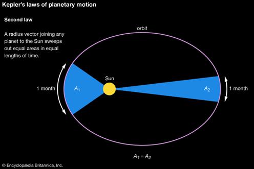
It is Kepler's 2nd law that we need to understand. Below is an example of this law where the elliptical planetary movement sweeps out equal areas in equal time.

Left side Right side
Please reference Image 2 to help understand the next two paragraphs.
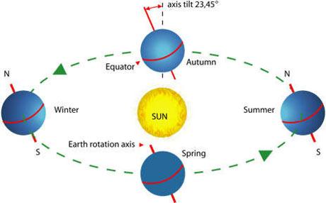
Hence, when the Earth is closer to the Sun (left side) it is sweeping a much larger arc than when it is further away from the Sun (right side). Here is another tidbit most do not realize. When the Earth is closest to the Sun (left side) the northern hemisphere is experiencing winter (December 21) because the tilt is away from the Sun and the Sun is over the Tropic of Capricorn. When it is further from the Sun (right side) the northern hemisphere is experiencing summer (June 21) because the Sun is over the Tropic of Cancer.
How can that be? Winter when closer to the Sun? It is because at that time the Earth is tilted away from the Sun (Tropic of Capricorn) which also explains why the southern hemisphere is experiencing summer and is generally warmer for two reasons: (1) the Earth is tilted so that in the southern hemisphere the Sun is closer, and (2) the southern hemisphere has considerably more water area.

Image 2
Okay, back to the purpose of this piece. How long is a day? Most will answer that it is 24 hours. Well, sort of, as that is how we attempt to measure a day but remember every four years we add a day on February 29th. That means each year we lose 6 hours. The best way to think of an actual or astronomical day is to put a stake in the ground and measure the shadow from one rotation to the next – that is an astronomical day.
If the Earth is closer to the Sun (left side) then the larger arc takes the shadow a longer period to make a full rotation. Hence in the winter (December 21), it is the longest astronomical day. Hey, we always thought December 21st was the shortest day, what's up? That terminology only applies to the day being the period of daylight. December 21 is the day with the least amount of daylight because the Sun is at its lowest point in the Earth's tilt. But it is the longest astronomical day.
Greg Morris
|
| READ ONLINE → |
|
|
|
| MORE ARTICLES → |
|
 Chart 1
 Chart 2
 Chart 3
 Chart 4
 Chart 5


 The countdown is on people! We're less than two days away from the