| THIS WEEK'S ARTICLES |
| John Murphy's Market Message |
| STOCK INDEXES STRUGGLE BELOW RESISTANCE LEVELS |
| by John Murphy |
STOCK INDEXES CONTINUE TO STRUGGLE WITH OVERHEAD RESISTANCE... The expected yearend rally has taken major stock indexes up against some formidable overhead resistance barriers. So far, the rally hasn't been enough to reverse the market's major downtrend. While seasonal trends are usually favorable during the fourth quarter, they usually turn more negative during the first quarter. Which suggests that the yearend rally is running out of time.
Chart 1 shows the Dow Industrials trading back below their August peak after briefly exceeding it last week. Its daily RSI line (upper box) and MACD lines (lower box) have started to weaken which suggests loss of upside momentum. Although the Dow remains above its 200-day moving average, it appears to be stalling near its August peak.
Chart 2 shows the S&P 500 falling back below its 200-day line after briefly exceeding it. That has the look of potential rally failure. Its daily momentum lines are also weakening.
Chart 3 shows the Invesco QQQ Trust starting to weaken as well and remaining well below its 200-day line. The Nasdaq remains the weakest of the three major stock indexes.
 Chart 1 Chart 1
 Chart 2 Chart 2
 Chart 3 Chart 3
OIL PRICES CONTINUE TO PLUNGE...One of the most prominent intermarket trends is the continuing plunge in commodity prices, and oil in particular. The daily bars in Chart 4 show Light Crude Oil (through Thursday) falling to the lowest level in a year. WTIC suffered a weekly loss of -10% which is its worst performance since April. It has also given back all of its gains for the year. That's taking a heavy toll on energy stocks (more on that shortly). While falling commodity prices may be signalling some easing in inflation, it's not necessarily a good sign. That's because bonds, stocks, and commodities usually peak and trough in a predictable order. At major peaks in the business cycle, bonds are usually the first to peak as inflation starts to build and the Fed starts raising interest rates. Stocks, which peaked at the start of the year, are usually the second to peak. There again, rising inflation takes its toll on stocks. Commodities are the third market to peak, and usually signal that the economy is entering a recession. That's where we appear to be now.
 Chart 4 Chart 4
SECTOR RANKING REMAINS DEFENSIVE...Chart 5 ranks sector performance for the past week. And it paints a defensive picture. The week's top peformers are utilities, healthcare, real estate, and consumer staples. Some of the more economically-sensitive sectors like consumer cyclicals show relative weakness. Energy stocks were the week's worst sector owing to the continuing plunge in energy prices. Falling energy prices reflect falling demand which is usually a sign of economic weakness. The sector ranking in Chart 5 isn't very encouraging and show investors continuing to favor defensive market sectors as weaker economically-sensitive issues reflect loss of confidence in the economy.
 Chart 5 Chart 5
|
| READ ONLINE → |
|
|
|
|
|
| The Mindful Investor |
| And That's Why We Wait for the Close |
| by David Keller |
I've now been hosting our closing bell show, The Final Bar, for over three years. It's been such a fascinating experience to use my daily show as a way to focus my own analytical process, and I truly believe that hosting a show like this has helped me navigate uncharted waters (pun intended) much more effectively than I would have otherwise.
Why We Wait for The Final Bar
We called the show "The Final Bar" for three main reasons. The first reason was that my experiences in music have taught me that the final bar, or the very end of the piece, can tell you a great deal about what has come before. And no matter what you remember from an entire piece of music, you always remember the final bar.
The second reason was that, when I taught technical analysis at the university level, I would always teach people to start at the most recent price, that is, the final bar. Start with today, then go to the left. Which support and resistance levels seem important? Those are the ones you should probably follow going forward.
"All large losses begin as small losses."
What sets successful investors apart from others? Their ability to manage risk, admit when they're wrong, recognize shifts in market dynamics, and take decisive action when the markets demand.
In our latest free webinar, I'll share best practices I've learned from successful investors on how to manage risk by maximizing gains and minimizing losses. Let's talk through some recent charts and review how technical analysis can help you survive to invest another day! Sign up HERE for this free event on Tuesday 12/13!
The final reason was from conversations with one of my mentors in the industry, Jeff Weiss. Jeff taught me to be a patient investor and to do so by waiting for the close. On a daily, weekly, or monthly chart, avoid drawing conclusions before the close of the bar is confirmed by the end of the current period.
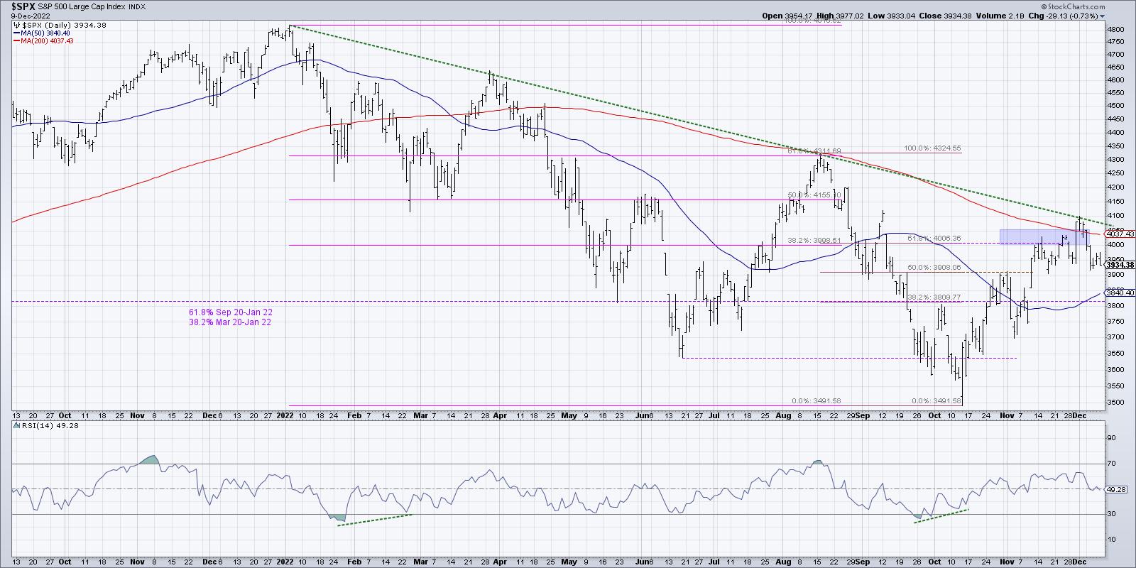
So Friday's price action took me back to all of these lessons, as the S&P 500 and Nasdaq took what appeared to be a choppy sideways session and turned it into a pattern of distribution.

By waiting for the end of the week, and the end of Friday's session, you would have gotten a more complete sense of how this week ended up being a downside follow-through after last week's test of the 200-day moving average.
So where does that leave the markets going into next week's Fed meeting?
The dreaded shooting star pattern
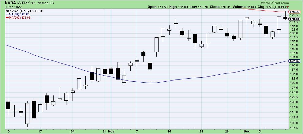
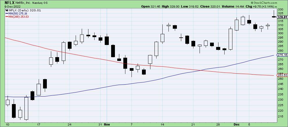
Stocks like NVDA and NFLX have had incredible runs since their lows earlier in the year. While NFLX hit its low for 2022 (year-to-date) back in May, NVDA did so in October. Both names have accelerated off their lows in recent weeks. But a review of the candle charts on Friday shows that both of them dropped a shooting star pattern suggesting, upside exhaustion.

NVDA is up about 60% from its October low and has formed a sort of ascending wedge pattern in recent weeks. This rally has pushed the stock up to the 200-day moving average, which served as resistance for the S&P 500 and many individual stocks as well.
The shooting star pattern involves a limited lower shadow, long upper shadow, and both the open and close are near the lows of the day. This pattern only appears in an uptrend, as, in a downtrend, the same candle would be termed an "inverted hammer".
This shooting star candle suggests an initial rally during the trading day eventually fizzled out, and the market settled back down to around the opening price. After a big up move, it indicates an exhaustion in the uptrend and increased likelihood of a downside correction.
You'll notice a similar candle pattern for Netflix, although this occurred after the stock has already broken above its own 200-day moving average.

Here we see the upside acceleration after NFLX broke above the 200-day, followed by a retest of this long-term barometer in early November. This week, the stock moved on to a new swing high before Friday's session became another shooting star candle.
So NFLX opened on Friday and moved to a new swing high, only to see that advance repelled as the price moved back toward the low for the session. Again, upside momentum was exhausted.
The S&P 500 into Next Week
So where does that leave the major averages? Well, when mega-cap names like NVDA and NFLX are showing bearish candle patterns, I immediately become skeptical of the probability of further upside -- at least, until we see a short-term reaction to Friday's close.

The S&P 500's rally phase may have reached its climax, with a break above the 200-day moving average and a test of long-term trendline resistance perhaps proving too much for bulls to overcome.
My conversation with Frank Cappelleri on Thursday focused on the lack of upside follow-through we have noticed on the S&P 500 index. In bull market phases, charts tend to break out and keep going higher. In bear market phases, charts will often experience "false breakouts" where price moves above resistance and then quickly reverts back lower. We are seeing much more of the latter.
Next week we have the Fed meeting, and we also are now in the meat of the seasonally strongest part of the year. I'm talking with Jeff Hirsch of the Stock Trader's Almanac on Monday's show and will hope to dig a little more into seasonal strength in December, which is often followed by seasonal weakness in January.
What will the future hold? None of us knows for sure. But I do know that, by starting with the final bar, we can be much better prepared for any potential outcomes!
RR#6,
Dave
P.S. Ready to upgrade your investment process? Check out my YouTube channel!
David Keller, CMT
Chief Market Strategist
StockCharts.com
Disclaimer: This blog is for educational purposes only and should not be construed as financial advice. The ideas and strategies should never be used without first assessing your own personal and financial situation, or without consulting a financial professional.
The author does not have a position in mentioned securities at the time of publication. Any opinions expressed herein are solely those of the author, and do not in any way represent the views or opinions of any other person or entity.
|
| READ ONLINE → |
|
|
|
| Martin Pring's Market Roundup |
| Is Gold a Buy or a Sell? |
| by Martin Pring |
The price of gold has been on a tear recently, bouncing sharply from its October low. It could be a good time to see whether this is the start of a new bull market or just a flash in the pan. Let's begin with the big picture and work our way down to the short-term aspects.
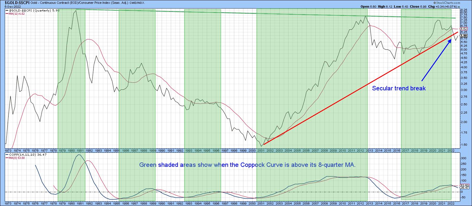
The first chart plots the price of gold on a quarterly basis. It's been deflated by the CPI in order to appreciate gold's ability to act as an inflation hedge. It all depends on where you buy it, of course, but by and large, unless gold was purchased close to any of the three highs in 1980, 2012, and late 2020, it would have provided an acceptable hedge. A break above the green resistance trendline would, of course, have been super bullish. However, a break beneath the 2000–2022 secular up trendline has taken place first. That penetration was confirmed by the quarterly Coppock Indicator crossing below its eight-quarter moving average (MA), thereby pushing the chart into a long-term bearish mode. The white areas, where the indicator is below its MA, tell you that price is at its most vulnerable under such an environment.
 CHART 1: QUARTERLY CHART OF GOLD. Chart source: StockCharts.com. For illustrative purposes only. CHART 1: QUARTERLY CHART OF GOLD. Chart source: StockCharts.com. For illustrative purposes only.
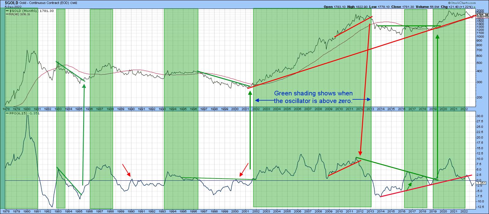
Chart 2 features the price in nominal terms and offers a more optimistic note since the latest rally has enabled it to move back above the extended secular up trendline and the 48-month MA, which had also previously been breached. That throws open the possibility the downside break will turn out to be a whipsaw. False breaks are typically followed by above-average price moves in the opposite direction, as traders scramble to get back to the right side of the market and the capitulation caused by the downside break leaves prices clear of serious overhead resistance.
One thing the price will have to overcome is the bearish status of the percentage price oscillator (PPO) in the bottom window. The oscillator goes bullish for prices when it moves above zero. Extended periods when this has been the case have been flagged by the green shading. If you look carefully, you can see three small arrows which denote whipsaw crossovers by the oscillator. These, however, are few and far between, given the chart's 40-year history. At the moment, the model is in a bearish mode, as the oscillator is slightly below zero. However, it would not take much to reverse that position.
One aspect that should be respected is that the PPO arrived in a sub-zero position following the rupture of its 2014–2022 up trendline. The ability to construct trendlines for this indicator has been rare. The arrows joining the PPO to the price, though, indicate that previous PPO trendline violations have been followed by important price moves. That does not mean that the 2000–2022 break is guaranteed to be valid, but it does raise the bar for forecasting a whipsaw a tad higher.
 CHART 2: GOLD AND THE PERCENTAGE PRICE OSCILLATOR. The PPO is slightly below zero but it would be worth keeping an eye on to see if there's a reversal. Chart source: StockCharts.com. For illustrative purposes only. CHART 2: GOLD AND THE PERCENTAGE PRICE OSCILLATOR. The PPO is slightly below zero but it would be worth keeping an eye on to see if there's a reversal. Chart source: StockCharts.com. For illustrative purposes only.
In order to prove a false move beyond a reasonable doubt, we have to make sure that price confirms with some kind of a trend break. So, let's take a look at the post-2020 price activity more closely. Bear in mind that markets reflect people in action, and people can and do change their minds. That means that markets can as well.
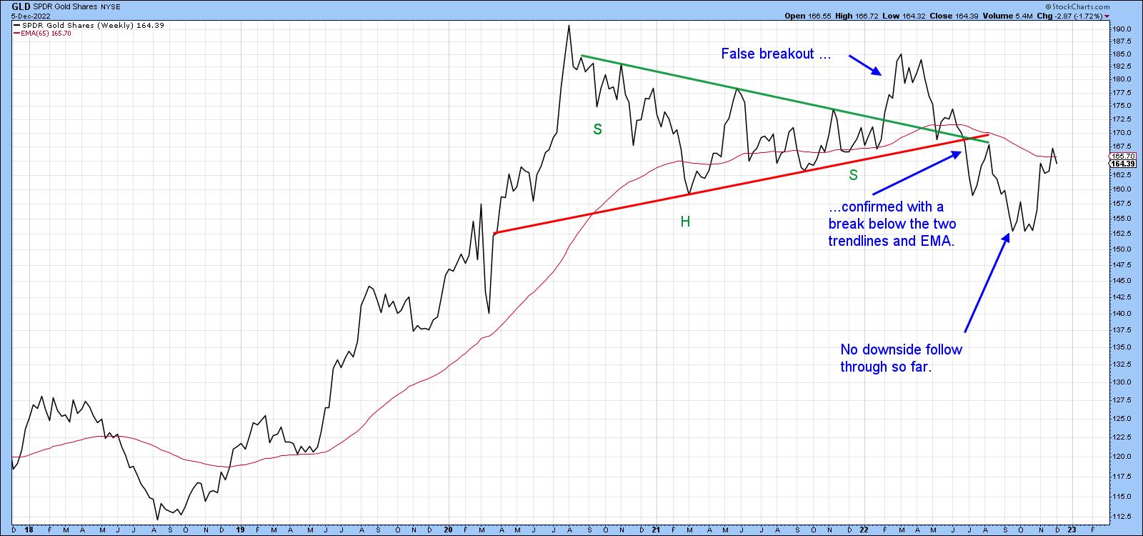
In the chart of SPDR Gold Shares (GLD) in chart 3, you see that in early 2022, price broke out from a downward-sloping reverse head-and-shoulders. Ultimately, this proved to be an invalid move, which was confirmed when the price dropped below both trendlines and the 65-week exponential moving average (EMA). That should have been a signal for an above-average decline, especially because of the breakdowns featured in charts 1 and 2. That did not prove to be the case, as the late November rally replaced what should have been more follow-through on the downside.
 CHART 3: WILL THE LATE NOVEMBER RALLY FOLLOW THROUGH? So far, there has been no downside follow through. All the more reason to keep an eye on the yellow metal. Chart source: StockCharts.com. For illustrative purposes only. CHART 3: WILL THE LATE NOVEMBER RALLY FOLLOW THROUGH? So far, there has been no downside follow through. All the more reason to keep an eye on the yellow metal. Chart source: StockCharts.com. For illustrative purposes only.
At this point, nothing has fundamentally changed from the original breakdown, except that the nominal price is back above the extended secular bull market trendline in chart 2. It could change, though, if that break is confirmed by price action indicating that traders have changed their minds once again and are now looking for a bullish outcome.
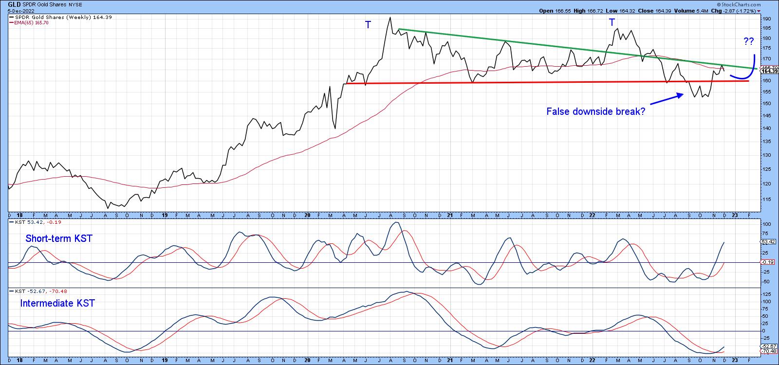
In chart 4, the breakdown trendline has been re-drawn to reflect a double top. The price didn't hold below it for very long and has now found resistance at the 65-week EMA and extended green trendline. I have traced out a possible upside breakout that would greatly increase the odds that September's downside break was indeed spurious. Remember, this isn't a prediction. It's merely a possible scenario.
 CHART 4: AN UPSIDE BREAKOUT IN GOLD? GLD has now found resistance at the 65-week EMA and the extended green trendline. There's a chance GLD could break out to the upside. Chart source: StockCharts.com. For illustrative purposes only. CHART 4: AN UPSIDE BREAKOUT IN GOLD? GLD has now found resistance at the 65-week EMA and the extended green trendline. There's a chance GLD could break out to the upside. Chart source: StockCharts.com. For illustrative purposes only.
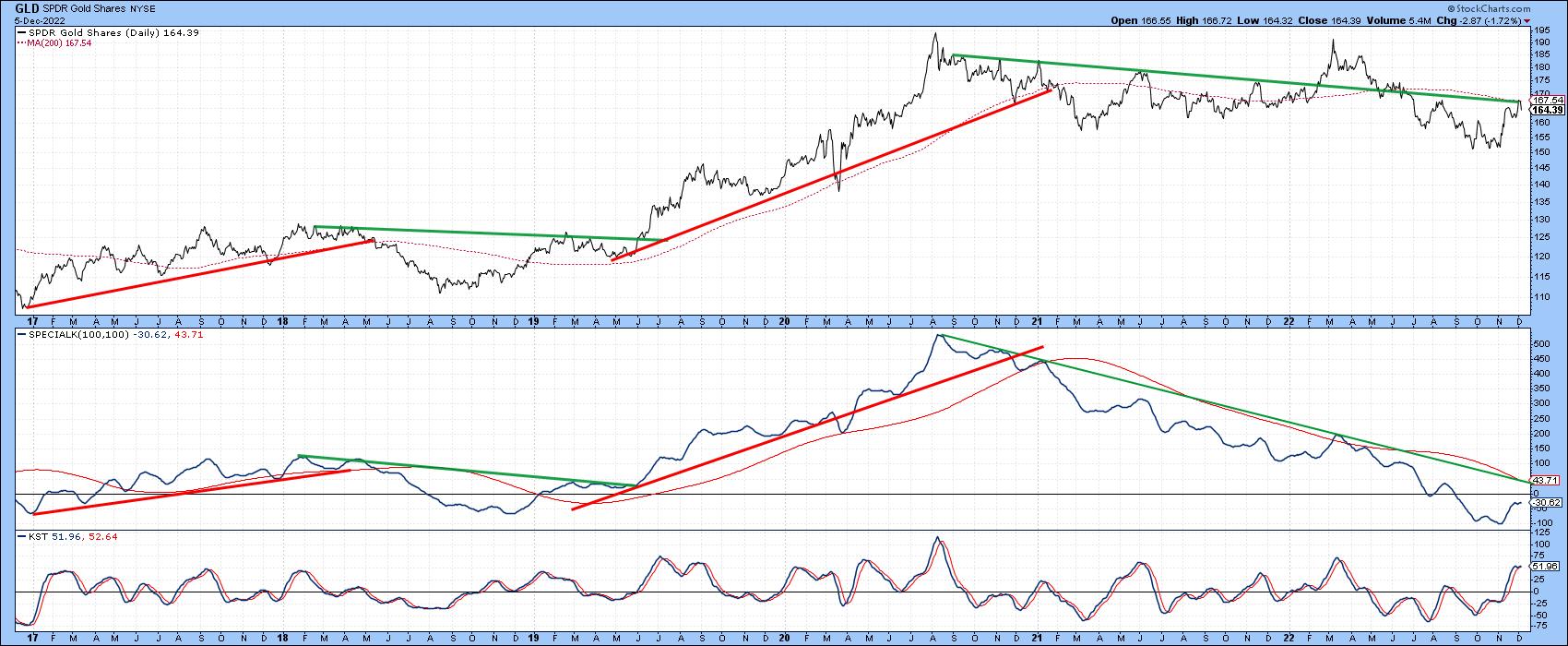
Finally, chart 5 compares the GLD to a Special K (SPK) momentum indicator, which you can read about here. The trend of the price and SPK generally move together, so knowing the long-term direction of the momentum indicator really helps with ascertaining that for the price. The jagged nature of the SPK lends itself to trend line construction and the crossovers of its red signal line also help in identifying trends. This smooths out the jaggedness of the indicator. The SPK has been in a downtrend for some time but isn't far away from crossing above its signal line and 2020–2022 down trendline. A daily close that can hold above the $171-173 area would probably do the trick.
Remember, you can always update this chart going forward by clicking on it.
 CHART 5: GLD AND ITS LONG-TERM TREND. The KST indicator helps to identify the long-term momentum direction. Chart source: StockCharts.com. For illustrative purposes only. CHART 5: GLD AND ITS LONG-TERM TREND. The KST indicator helps to identify the long-term momentum direction. Chart source: StockCharts.com. For illustrative purposes only.
The $170 Level in Gold
The longer-term Coppock and PPO indicators are bearish for gold, but there is a possibility that the price may have experienced a false downside break. Evidence in the form of price confirmation is required first. That would likely happen with a Friday close for the GLD that can hold above the $170 area. Until then, the whipsaw scenario remains unproven.
Good luck and good charting,
Martin J. Pring
The views expressed in this article are those of the author and do not necessarily reflect the position or opinion of Pring Turner Capital Group of Walnut Creek or its affiliates.
|
| READ ONLINE → |
|
|
|
| RRG Charts |
| Stock Market View: Look Beyond The Length of Your Nose! |
| by Julius de Kempenaer |

EUR/USD Under Pressure From Long-Term Resistance
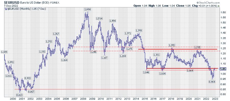
The EUR/USD ($EURUSD) relationship has been under pressure since late 2021, when a peak was set at 1.2350. In a steady downtrend, EUR/USD declined to a recent low of 0.9540. During this decline, a significant support level around 1.05 was broken.
This break caused a serious change in the characteristics of the EUR/USD chart. Until July, the euro moved in a broad trading range against the U.S. dollar. The lows of 2015, 2016, and 2020 marked the lower boundary of that range, around 1.05. The peaks of 2018 and 2020, near 1.25, marked the upper edge. Going back in time, you can see how this upper boundary/resistance area had served as support between 2008–2014.
The recent break below the significant horizontal support area around 1.05, imho, can be compared with the break of support at the end of 2014, when EUR/USD sank below the area around 1.25.
The recent rally out of the August low is the first recovery rally since the start of the decline from 1.15. The former support zone near 1.05 is expected, and already starting to serve as a massive overhead resistance level.
Short-Term Rotation Gaining Strength
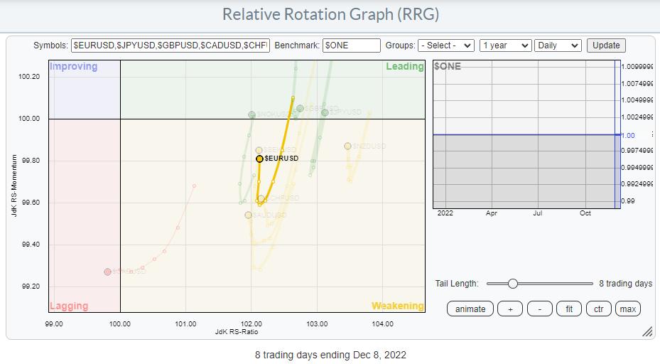
Looking at the relationships of all G10 currencies on a daily Relative Rotation Graph shows the $EURUSD inside the weakening quadrant, but turning back up toward leading, suggesting that a new period of U.S. dollar weakness is underway. And given the majority of the moves on the monthly chart and the broad support and resistance zones, that is very possible.

This situation is an excellent example of why it is always important to be aware of the bigger picture and look beyond what is right in front of you. The direct translation of a Dutch proverb would be, "You need to look beyond the length of your nose."
Putting Price Action Into Perspective

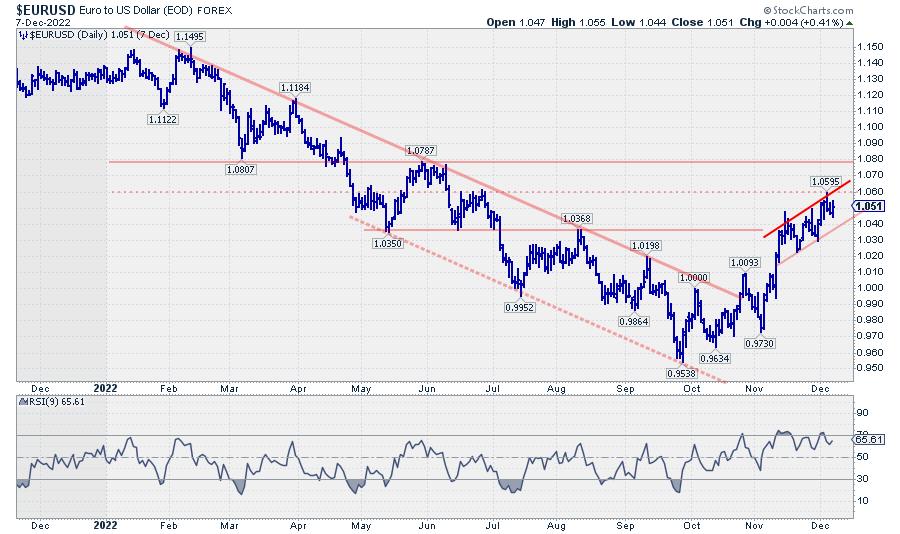
It's easy to read this daily chart of EUR/USD from a bullish perspective. "A long winding downtrend was recently reversed, and a new uptrend—higher highs, and higher lows—is underway. The market is now approaching some overhead resistance at 1.06, then 1.08, etc..."
Knowing what is going on on that monthly chart, I am now reading the developments on the daily chart and the above daily RRG very differently.
The recent rally is the first recovery rally after a long period of falling EUR/USD rates, and this rally is now nearing a major resistance area, which lies around 1.05 but could even be stretched to 1.08. After the initial strength, the rate of change has already started to drop, signaling the first signs of fatigue for this move.
In the bigger scheme of things, that means that the upside potential for EUR/USD is somewhere between 0.01–0.03, while the downside risk, back towards the recent low at 0.95, is 0.10.
Surely, short-term traders will have plenty of opportunities to trade the move up with tight stops. But investors with a longer-term horizon or U.S.-based investors investing in overseas securities need to be aware of this longer-term picture.
Looking Outside of the US
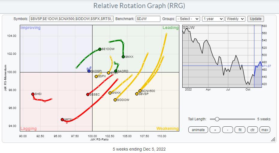
The Relative Rotation Graph for international markets is a good starting point to find opportunities outside the U.S. market.

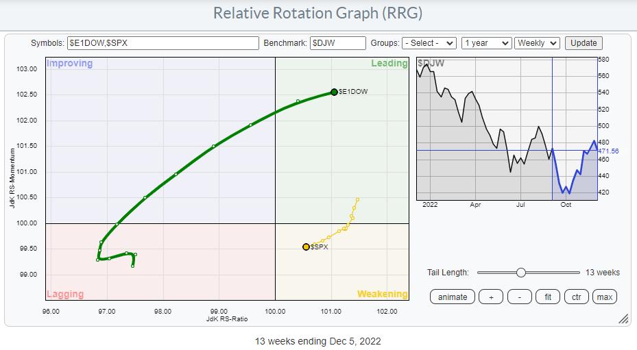
This RRG shows how most international markets deteriorate against the DJ World index. The DJ Europe index, however, is showing strength and pushing into the leading quadrant. This opposite rotation becomes clearer when you zoom in on the tails for Europe and the U.S.

The strength in favor of Europe over the U.S. is visible, with the power of the move in Europe reflected in the length of the tail vs. the length of the tail on the S&P 500 Index ($SPX).

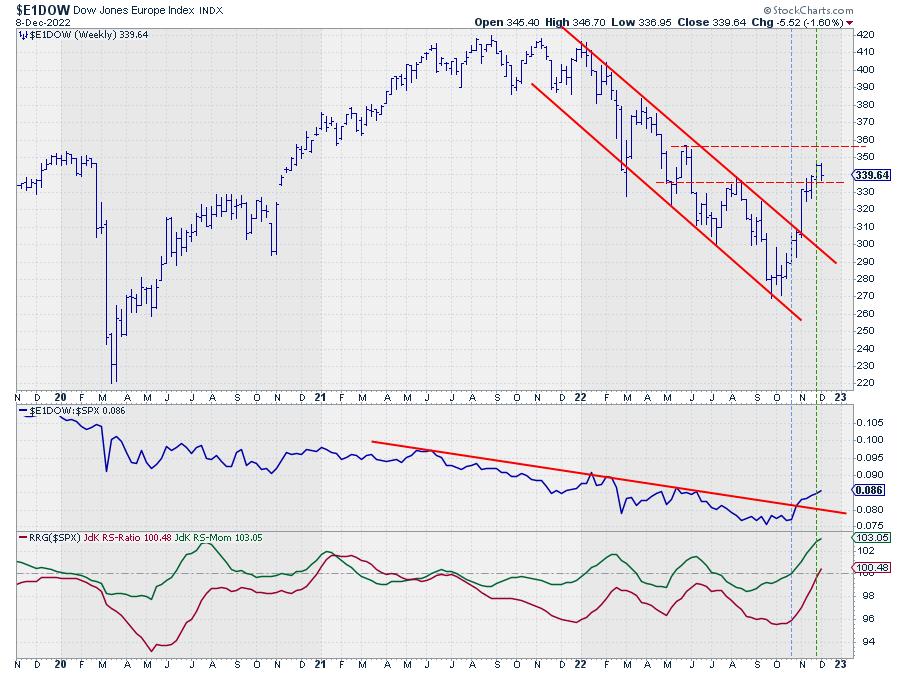
The direct comparison between the U.S. and Europe on the chart above shows the same information as on the RRG in another 1-1 format.
We know the chart of $SPX is pushing against resistance coming off that falling resistance line from the peak at the start of the year. $E1DOW has had a similar falling resistance line since the beginning of the year (see chart above), with even more touchpoints than $SPX. However, the upward break in Europe is very visible, and this is now dragging the relative strength against $SPX up and out of its relative downtrend.
Towards the end of the year and most likely going into the new year, the message is clear: "Europe beats the US."
#StaySafe and Have a great weekend, --Julius
|
| READ ONLINE → |
|
|
|
| Dancing with the Trend |
| Why Some Make Stock Market Forecasts |
| by Greg Morris |

Why are there entire businesses set up to make stock market forecasts? The answer is quite simple; forecasting exists because there is a giant market for it. Investors/traders thirst for forecasts. Here is the real question; why do investors want to hear/read forecasts?
"Those who have knowledge don't predict. Those who predict don't have knowledge." Lao Tzu
So that there can be no confusion, I want to state my honest heartfelt opinion on forecasting: I adamantly believe there is no one that knows what the stock market will do tomorrow, next week, next month, next year, or at any time in the future—period.
Hindsight is a wonderful tool to use to know why something might have occurred in the past, but rarely do you know the cause during the event itself. The prediction business is gigantic. William Sherden, in "The Fortune Sellers," claimed that in 1998 the prediction business accounted for $200 Billion worth of mostly erroneous predictions. Can you imagine with the growth of the internet and globalization, what that industry is today? Frightening! As Oaktree Capital Management's Howard Marks says, "You cannot predict, but you can prepare."
Sherden states that the title "second oldest profession" usually goes to lawyers and consultants, but prognosticators are the rightful owners. Early records from 5,000 years ago show that forecasting was practiced in the ancient world in the form of divination, the art of telling the future by seeing patterns and clues in everything from animal entrails to celestial patterns. Isaac Asimov wrote in "Future Days," such was the eagerness of people to believe these augers that they had great power and could usually count on being well supported by a grateful, or fearful, public. I'm not so sure most of this isn't applicable today. Sherden did much research into the numbers of people directly involved in forecasting and this data was from 1998. They are staggering and growing. And let's not forget that one of the largest selling newspapers in the country is the National Enquirer. Below are some of the findings on forecasting from Sherden's book.
- No better than guessing
- No long-term accuracy
- Cannot predict turning points
- No leading forecasters
- No forecaster was better with specific statistics
- No one ideology was better
- Consensus forecasts do not improve accuracy
- Psychological bias distorts forecasters
- Increased sophistication does not improve accuracy
- No improvement over the years.
A weather forecaster will have an exceptional record if he says that tomorrow will be just like today. If I were a weather forecaster, I would tend to err on the side of bad weather instead of good weather. Then if you're wrong, most won't notice. It's when you forecast good weather and it isn't, then they will notice. Most market prognosticators tend to have a bullish or bearish bias in their forecasts. Bullish forecasts are generally well accepted, especially by the Wall Street community, and bearish forecasting is a giant business because it infringes on investors' fears.
"Given the difficulties forecasting the future, it is very useful to simply know the present." Unknown.
Barry Ritholtz (The Big Picture blog) pointed out how ridiculous the forecasting business has become, in particular, the end-of-the-year forecasts for the next year or the best stocks to own. Here's an example from the August 14, 2000 issue of Fortune magazine by David Rynecki on "10 Stocks to Last the Decade."
August 14, 2000:
1. Nokia (NOK: $54)
2. Nortel Networks (NT: $77)
3. Enron (ENE: $73)
4. Oracle (ORCL: $74)
5. Broadcom (BRCM: $237)
6. Viacom (VIA: $69)
7. Univision (UVN: $113)
8. Charles Schwab (SCH: $36)
9. Morgan Stanley Dean Witter (MWD: $89)
10. Genentech (DNA: $150)
Closing prices December 19, 2012:
1. Nokia (NOK: $4.22)
2. Nortel Networks ($0)
3. Enron ($0)
4. Oracle (ORCL: $34.22)
5. Broadcom (BRCM: $33.28)
6. Viacom (VIA: $54.17)
7. Univision ($?)
8. Charles Schwab (SCH: $14.61)
9. Morgan Stanley Dean Witter (MWD: $14.20)
10. Genentech (Takeover at $95 share)
Ritholtz goes on to say, "The portfolio managed to lose 74.31%, with three bankruptcies, one bailout, and not a single winner in the bunch. Even the Roche Holdings takeover of Genentech was 37% below the suggested purchase price. Had you merely bought the SPDR S&P 500 ETF (SPY), you would have seen a gain of over 23%."
I think most investors or traders want to read or hear forecasts to find one or more that support their hope about the market's direction. If you are a true technical analyst with discipline and confidence, you don't need to read or hear a forecast. However, that is a tall order and one most are not equipped to deal with. Of course, I'm not talking about StockCharts.com readers.
Remember, no one knows the future!
Always ask why,
Greg Morris
|
| READ ONLINE → |
|
|
|
| ChartWatchers |
| Top 5 Reasons You Need to Use the Stock Trader's Almanac |
| by Jayanthi Gopalakrishnan |

As 2022 comes to a close, it's time to start thinking about next year's investment and trading roadmap.
It happens every year, and this year is no different. The end of the year, among other things, is a time for reflection and thinking about the following year. For individual investors and traders, it means a time to strategize your investment plan. No doubt 2022 was a challenging year. The bull market stalled, Russia invaded Ukraine, interest rates rose, and inflation impacted just about everyone.
If there was one phrase to describe the 2022 stock market, it would be "jumping just like a pogo stick", springing up on good news, and falling on bad. It's possible that a similar type of behavior may dominate the financial markets in 2023. If it does, it means you will need to be more strategic, disciplined, and engaged with the markets. But there's no way of knowing what could happen in the stock markets. That's why having the Stock Trader's Almanac 2023 (herein referred to as "Almanac") as part of your trading toolkit can be a helpful guide as you plan your trades for the next year.
How Can the Almanac Help?
Imagine being alerted to favorable trading days, or knowing the probability of the Dow Jones Industrial Average, S&P 500 Index, and Nasdaq Composite rising on any given trading day. Want to get a heads-up on what to expect around options expirations and holidays? Also, given that 2023 is a pre-election year, what unique characteristics will you need to consider? While there are no guarantees when it comes to the financial market, having the Almanac at arm's length can help you connect with the market, which, in turn, can increase your market awareness.
There are many ways the Almanac can help. You can identify bullish and bearish days; you can see the probability of up days for the three broader indexes in each day in the planner; you can get stock and exchange-traded fund (ETF) updates; and you can get many more valuable insights. Here are five important ones.
1. January Indicator Trifecta: Santa Claus Rally, January Barometer, First Five Days
You've probably heard of the Santa Claus Rally—it starts at the end of December and carries into the first two trading days in January. According to the Almanac, since 1969, the average gain during this short period is 1.3% and, if Santa fails to show up, either a bear market is lurking or, later in the year, you could pick up a handful of stocks for a bargain.

January is an important month in the stock markets. Heard the adage, "As January goes, so goes the year?" That's the premise of the January Barometer. In the Almanac, you'll find a graphic representation of the January Barometer, which compares the January change to the full-year change. The data goes as far back as 1950 and you'll see that only a few years were major errors.
You may be anxious to start trading on the first trading day of 2023, but it may be wiser to wait it out and see how the first five trading days of the year pan out. The Almanac has a short write-up about how January's first five trading days can be an early warning system for the year. For example, the Almanac states, "S&P gains in January's first five days preceded full-year gains 83% of the time, 13 of last 18 pre-election years followed first five day's direction." It goes on to provide helpful statistics, such as how the indexes performed during the month, which years were the best performers, which years were the worst, performance during options expiration week, and so on.
How To Use the Info in StockCharts
- Bring up a daily chart of the S&P 500 Index ($SPX).
- If the best day for $SPX was on January 3, 2001, from the Range dropdown menu, click Select Start/End (use December 31, 2000–December 31, 2001).
- Then, compare it with the five-day change and the year change.
- Follow a similar process for the worst day, try it with other indexes, and try out different dates from the Almanac. Have fun with it.
2. The Sweet Spot of the 4-Year Cycle: Q4 Midterm Year to Q2 Pre-Election Year
Remember, 2023 is the third year of a presidential term. According to the Almanac, there has only been one down year in the third year of a presidential term since 1939. The four-year political stock market cycle is interesting—there's a strong chance we may have seen the midterm bottom in October 2022. What does this mean going forward? Once again, the Almanac can provide some insight.
3. The Best Months Switching Strategies
These strategies have a 72-year track record and can form a base to plan your trading strategies for 2023. While reading about the different strategies, make notes in the planner so you can put your thoughts down, plan ahead, and modify when necessary.
Four of the switching strategies are:
- "Best Six Months"
- MACD-Timing With "Best Six Months"
- Nasdaq's "Best Eight Months" With MACD Timing
- Triple Returns, Fewer Trades: Best 6 + 4-year Cycle
It's worth knowing each of these strategies, as they could help you potentially do better than a buy-and-hold investment strategy.
4. More Seasonal Patterns
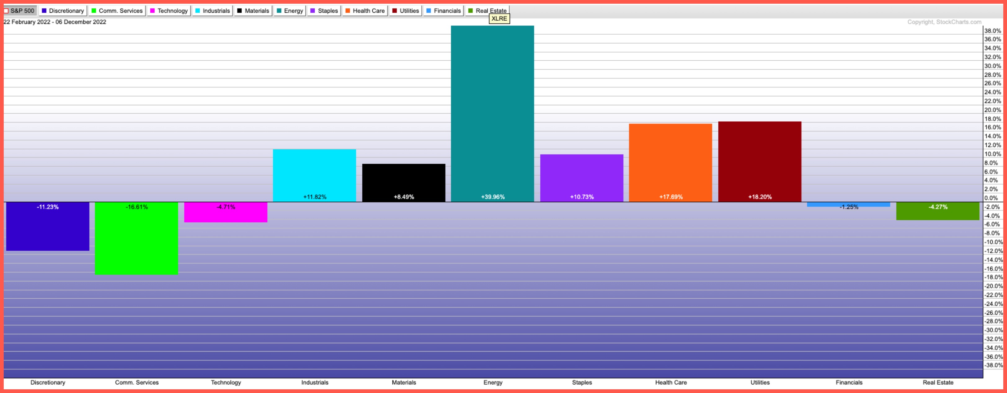
What's the best month for the Dow Jones Industrial Average? What about the other indexes? In the 2023 Almanac, you'll find seasonal pattern charts for the broader indexes for pre-election years vs. all years. This visual representation gives you an idea of which months are likely to perform better than others. In short, you'll know when to potentially add, hold, or sell positions.
5. Sector Seasonality
If you've been involved with the markets for a while, you should know that different sectors go through positive and negative seasonal periods. So which sectors should you be holding, and when? You'll find a sector index seasonality table listing the various sector indexes represented by their ETF proxy.
The start and end of the seasonality are displayed along with the 25-, 10-, and 5-year average percentage returns. Each month is divided into three parts—beginning, middle, and end. Can you guess which month is positive for most of the sectors?
If you have the Almanac, you can start looking at the sectors a month or so ahead of when the seasonality begins. Again, make notes in the planner to give you a heads-up. Consider creating an Almanac ChartList in your StockCharts platform.

Some Sector Tools in StockCharts
- The Sector Summary in StockCharts displays the performance of the 11 S&P sectors.
- The Industry Summary breaks down the sectors even further by looking at specific industries within the sectors.
- The Sector PerfChart is an interactive visual chart that displays sector performance.
 CHART 1: INDUSTRY PERFORMANCE. The S&P Sector ETFs PerfCharts shows you the performance of the 11 S&P sectors. Chart source: StockCharts.com. For illustrative purposes only. CHART 1: INDUSTRY PERFORMANCE. The S&P Sector ETFs PerfCharts shows you the performance of the 11 S&P sectors. Chart source: StockCharts.com. For illustrative purposes only.
The Bottom Line
When it comes to the stock markets, you can never be truly prepared. The best you can do is work with probabilities, and the Almanac can be a big help. It gives you an overall view of the market, zeros in on different cyclical patterns, and drills down to fundamental and technical indicators. The month-by-month strategies, and the explanations of seasonal trends and sector performances, can help you become a more empowered trader and investor.
One last word: Keep an eye on the December closing low. That, as you'll find out from the Almanac, can have a big impact on next year's performance. So get a head start and start planning for 2023. Then, it's on to the next-next year.
Jeff Hirsch, Editor in Chief of the Stock Trader's Almanac (order here!) will be a guest on The Final Bar on December 12, 2022. Tune in!

Disclaimer: This blog is for educational purposes only and should not be construed as financial advice. The ideas and strategies should never be used without first assessing your own personal and financial situation, or without consulting a financial professional.
|
| READ ONLINE → |
|
|
|
| The Canadian Technician |
| Energy Names Implode |
| by Greg Schnell |
Energy stocks got rocked this week. Inventory data doesn't seem to matter. Russia doesn't seem to matter. For me, the charts have been weak for a while, but they got hammered this week.
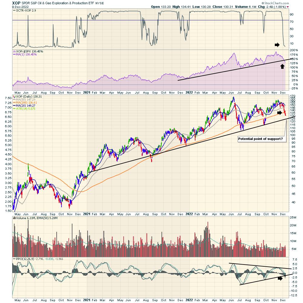
XOP
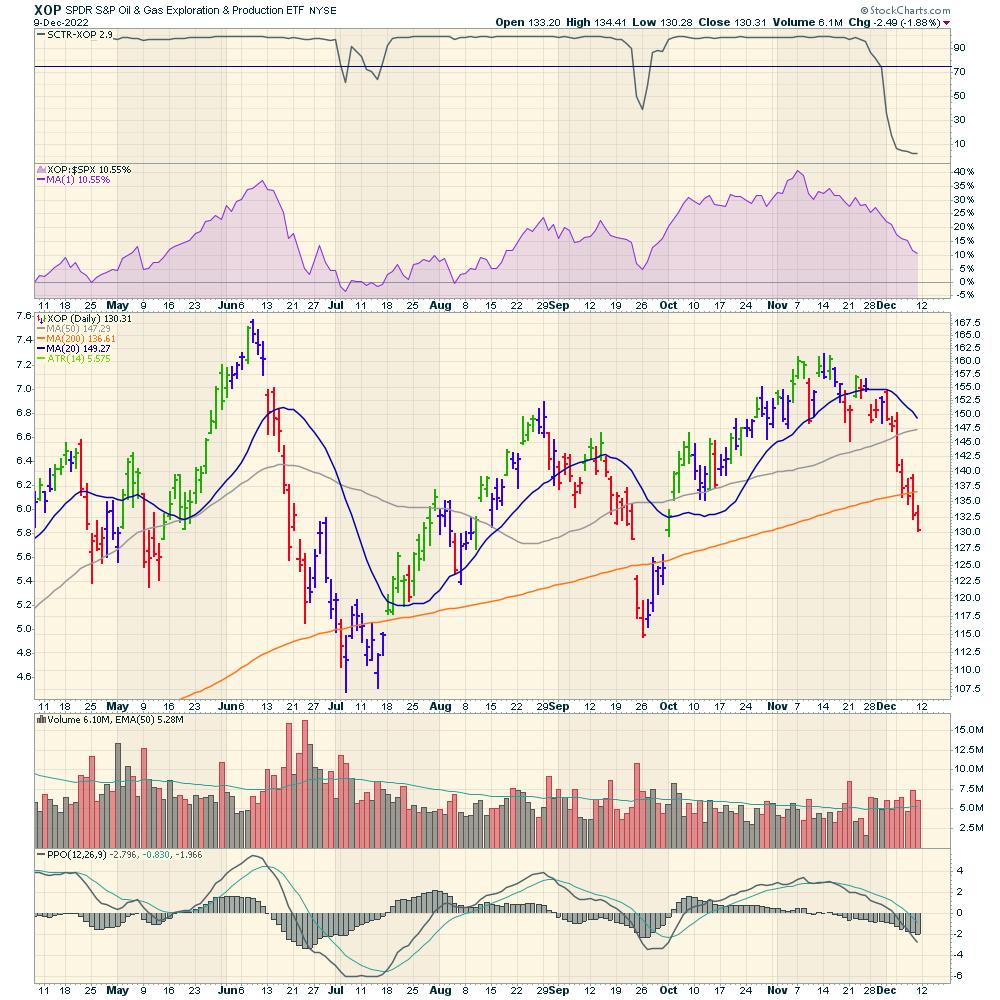
XOP was down on the week but, more importantly, the indicators are all breaking down.
- The SCTR is a relative ranking of how strong the price action is compared to other ETFs. It is currently one of the worst charts for price action, as it is only outperforming 2.9% of the ETFs.
- Relative strength compared to the $SPX has been declining in a straight line for 5 weeks.
- Price has fallen below the 20-, 50-, and 200-DMA. It looks awful. Eventually there will be a bottom, but none of the moving averages have worked so far.
- Volume is above average on most selling days.
- PPO - a momentum indicator is pointing straight down at this point.

XOP extended range
When we zoom out on this chart, a few more important things show up.
- This is the lowest SCTR level of the year. Actually, this is the lowest rating since oil started to rally in 2020!
- The 2022 relative strength up trend is firmly broken.
- Looking at the price chart, there is a trend line that may provide potential support. More on that later.
- The PPO has been coiling for the last 6 months and now is breaking down. This breakdown just started, so it would be very early to start betting on upside here.

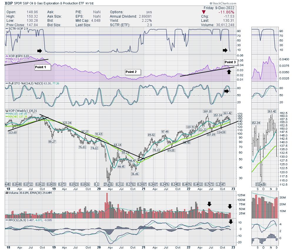
XOP weekly
When we look at the weekly chart, this looks like a long-term transition point.
Compare point 1 to point 3. Notice most of the indicators failing in a similar manner. The full stochastic has a different look when comparing, but it is breaking down. Point 2 was when everything got bullish.

There is never an exit sign at the top, but there is an exit on a chart. Emotionally, it's hard to sell winners when the 'fundamentals' look bullish. But that is why the chart made it to a high point. Investors are sniffing this out as changing conditions.
Clients at Osprey Strategic were cautioned on energy for 5 weeks. It has been working lower, but this week was a drain opening in the energy bathtub. For the broader market, clients have been on hold for two weeks before the big move down, protecting profits. If you are not aware of the PLUMB system, and would like more information, try a one-month subscription for $7. It can really help protect profits in a timely manner!
|
| READ ONLINE → |
|
|
|
| MORE ARTICLES → |
|
 Chart 1
 Chart 2
 Chart 3
 Chart 4
 Chart 5


