| THIS WEEK'S ARTICLES |
| John Murphy's Market Message |
| RISING RATES WEIGH ON STOCKS |
| by John Murphy |
BOND YIELDS ARE CLIMBING... Last week's message showed the 10-Year Treasury yield bouncing off its 200-day moving average suggesting that a rebound in yields might be starting. Chart 1 shows the TNX climbing above its 50-day moving average and a falling trendline extending back to its October high. That resulted in a drop in bond prices. Chart 2 shows the 7-10 Treasury iShares (IEF) falling below moving average lines to reach the lowest level in a month. That combination contributed to profit-taking in an overbought stock market.
 Chart 1 Chart 1
 Chart 2 Chart 2
SMALL CAP RESISTANCE... Last week's message showed small cap stocks leading the stock market rally. Chart 3, however, shows Russell 2000 iShares up against a major resistance barrier at its August peak (red arrows). In addition, its 9-day RSI line in the upper box shows the IWM reaching overbought territory over 70. That combination also contributed to this week's profit-taking. No serious damage was done to the stock uptrend. The green horizontal trendline shows the IWM remaining above initial support along its December peak.
NASDAQ PULLBACK...The Nasdaq market suffered the week's biggest loss owing mainly to weaker technology stocks which are more negatively impacted by rising interest rates. Chart 4 shows the Invesco QQQ Trust pulling back from an overbought condition, but remaining above potential support along its December peak. Energy stocks were the week's strongest sector following a rebound in the price of oil. .
 Chart 3 Chart 3
 Chart 4 Chart 4
ENERGY STOCKS REBOUND...Energy stocks were the only sector to gain ground this week. Chart 5 shows the Energy Sector SPDR (XLE) ending the week back over its 50-day moving average. The XLE appears to be consolidating between its November high and its December low in a potential "triangular" formation as shown by its converging trendlines. That type of continuation pattern normally suggests that higher prices are in store. An 8% jump in the price of crude oil gave a big boost to the XLE (see gray area). So did a production cut announced by Russia.
Stocks and bonds rallied over the previous three months on hopes that inflation might be dropping which might tempt the Fed to slow or halt its rate-hiking campaign. This week's jump in oil prices, however, and buying of energy shares might partially explain the jump in interest rates and profit-taking in stocks. Which is why it's necessary to keep an eye on the direction of rates. Falling yields supported the current stock rally. Rising yields could have the opposite effect.
 Chart 5 Chart 5
|
| READ ONLINE → |
|
|
|
| Martin Pring's Market Roundup |
| Momentum for This Interasset Relationship Just Reversed. What Are the Implications? |
| by Martin Pring |
Every business cycle has an inflationary and deflationary part to it. And if you know the prevailing phase, it can be enormously helpful. For example, when inflation is dominating, it's usually a favorable environment for commodities and commodity defensive sectors, such as mining and energy. At such times, it's also a good idea to lower exposure to long-dated bonds.
Conversely, during the deflationary stage, it generally pays to downplay inflation-sensitive sectors and emphasize those performing relatively well during periods of economic weakness. This would include Utilities, Health Care, and Consumer Staples. Note the word "general" has been emphasized, because individual sectors don't always react in an expected manner during the course of every cycle. You can read more about the relationship between the various asset categories and the business cycle in a series of articles starting here.
The Inflationary/Deflationary Cycle
To take advantage of the trends in different sectors, it's important to identify changes in the inflation/deflation relationship. Fortunately, business activity is cyclical in nature, as each cycle rotates from an inflationary to a deflationary part. That enables us to follow this chronological sequence by way of long-term smoothed momentum. My preference is to use the Know Sure Thing (KST). However, moving average convergence/divergence (MACD), based on monthly data, is also helpful. The series used here is the ultimate inflation/deflation relationship, that between (inflation-sensitive) commodities and (deflation-sensitive) bonds.
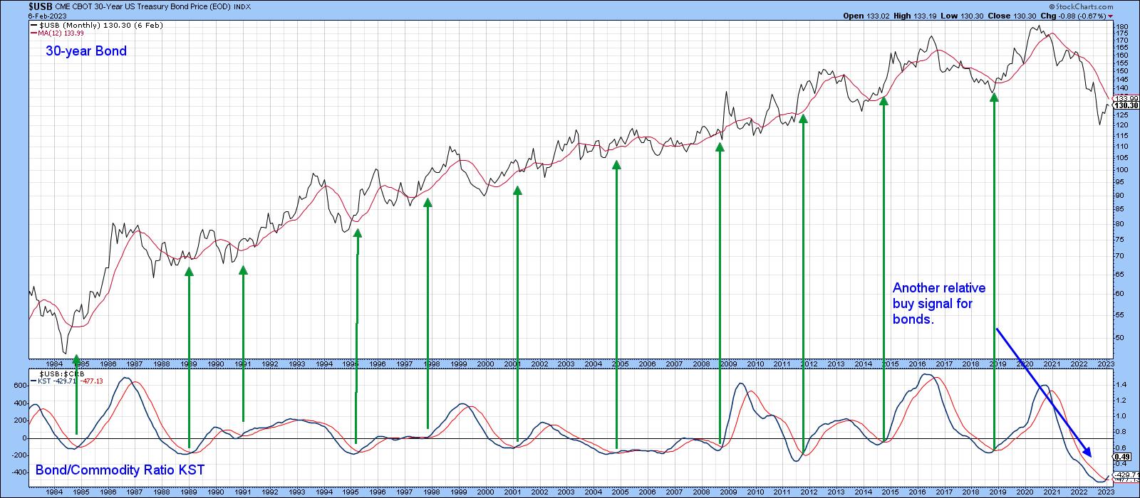
Chart 1 plots the long-term KST for the relationship between the 30-year U.S. Treasury Bond ($USB) and the CRB Index ($CRB), rather than the commodity/bond ratio. This is done to correspond with fluctuations in bond prices, which are plotted in the upper window. In this way, rising momentum reflects deflationary conditions. Note how it fell between mid-2020 and late last year, as commodities rallied and bonds, thanks to Fed action, fell. Now the KST has bottomed and crossed above its nine-month moving average (MA). The arrows, marking previous positive KST MA crossovers, show that this kind of action is usually followed by rising bond prices in their own right, not just against commodities.
There are two caveats. First, all previous signals took place during a secular uptrend, when bear markets were brief and bull markets stronger. That made it easier for buy signals to be profitable. Now, the price is below that blue 96-month MA, which suggests the secular trend has reversed to the downside. If true, it means buy signals will face a secular headwind. Second, the ratio itself remains below its red 12-month MA, so the price still needs to confirm the improving momentum.
You can update these charts by clicking on them. And you can save the updated charts in a ChartList.
 CHART 1: BOND/COMMODITY RATIO KST. The indicator shows that the secular trend may have reversed.Chart source: StockCharts.com. For illustrative purposes only. CHART 1: BOND/COMMODITY RATIO KST. The indicator shows that the secular trend may have reversed.Chart source: StockCharts.com. For illustrative purposes only.
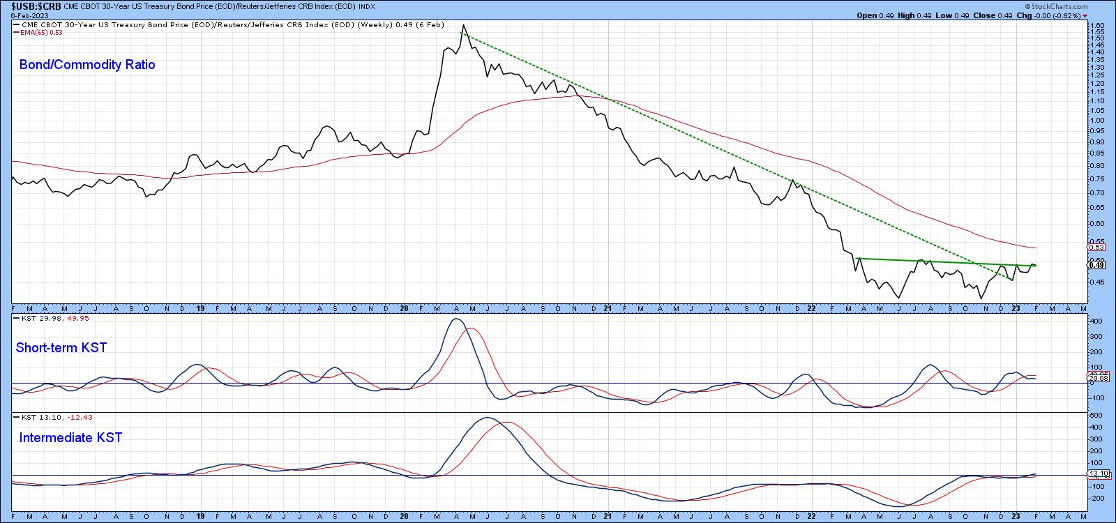
One area to monitor going forward is the ratio itself. It's featured in Chart 2, on a weekly basis, together with two indecisive KSTs. It seems likely that this vacillation would be resolved with a decisive Friday close that holds above the horizontal trendline at, say, 0.51. In doing so, this would argue for a substantially higher ratio and, by implication, firmer bond prices and a positive 12-month MA crossover by the $USB.
 CHART 2: BOND/COMMODITY RATIO. The short-term and intermediate-term KST indicates indecisiveness. Keep an eye out for the indicators to move above the horizontal trendline. Chart source: StockCharts.com. For illustrative purposes only. CHART 2: BOND/COMMODITY RATIO. The short-term and intermediate-term KST indicates indecisiveness. Keep an eye out for the indicators to move above the horizontal trendline. Chart source: StockCharts.com. For illustrative purposes only.
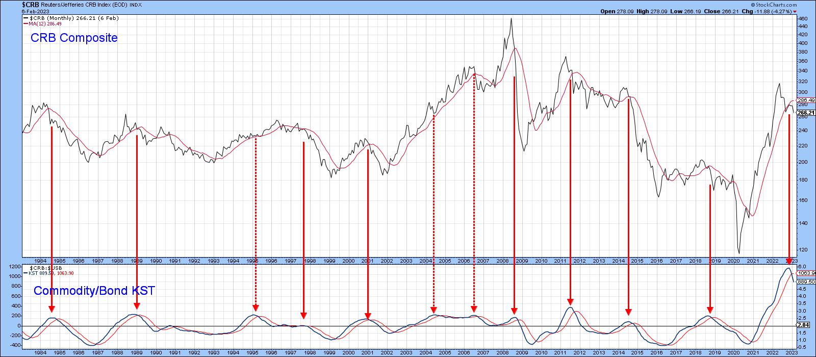
Chart 3 compares the CRB Composite with a KST calculated from the Commodity/Bond relationship. It, of course, is mirroring bond/commodity momentum. The red arrows tell us that it's normal for these KST sell signals to be followed by a declining CRB. The three dashed ones indicate that this isn't always the case. Since one of my key secular indicators has been pointing to a secular commodity bull for some time, it's not out of the question that a primary trend commodity bear market could take the form of a trading range, rather than an actual decline.
 CHART 3: CRB VS. COMMODITY/BOND KST. While there's a chance that commodities may decline, don't rule out the possibility of commodities moving within a trading range. Chart source: StockCharts.com. For illustrative purposes only. CHART 3: CRB VS. COMMODITY/BOND KST. While there's a chance that commodities may decline, don't rule out the possibility of commodities moving within a trading range. Chart source: StockCharts.com. For illustrative purposes only.
What Does the Change in the Commodity/Bond Ratio Mean for Equities?
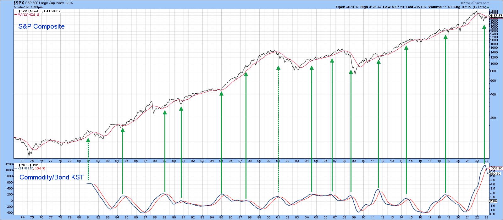
The question arises as to what a commodity/bond downside reversal means for stocks themselves. History tells us that equities thrive in an environment where commodity prices are relatively stable in either direction. That's because sharply moving commodity prices reflect instability and instability implies uncertainty. The stock market abhors uncertainty. Chart 4 tends to confirm that conclusion, since the green arrows, marking the KST peaks, are almost all followed by an extended period of rising prices.
 CHART 4: WILL EQUITIES THRIVE? The commodity/bond KST with the S&P 500 index suggests that equities may move higher. Chart source: StockCharts.com. For illustrative purposes only. CHART 4: WILL EQUITIES THRIVE? The commodity/bond KST with the S&P 500 index suggests that equities may move higher. Chart source: StockCharts.com. For illustrative purposes only.
A Quick Note on the Secular Trend for Equities
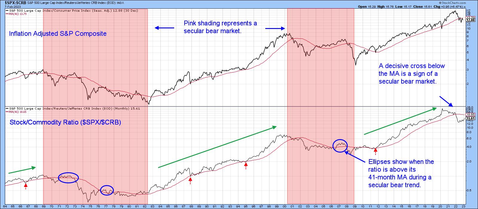
Using the benefit of hindsight, the pink-shaded areas in Chart 5 reflect secular bear markets for the inflation-adjusted S&P 500 index. Note that the stock/commodity ratio (middle window) crossed decisively below its 41-month MA at the beginning of 2022. This is important because it hasn't decisively penetrated this average during any of the secular bull markets that have taken place since 1964. This suggested that a secular bear market began in January 2022. Of course, the crossover represents only one piece of evidence of a secular reversal. If valid, though, it suggests the potential bull move signaled by Chart 4 and rationalized by my article published last week, could be relatively contained. In that respect, a rebound by the stock/commodity ratio to its 41-month MA would be a good starting point.
 CHART 5: SECULAR BEAR MARKET IN EQUITIES? It's possible as indicated by the stock/commodity ratio but given the potential for bull moves in the previous chart, it's possible that a bull move in equities may be contained. Chart source: StockCharts.com. For illustrative purposes only. CHART 5: SECULAR BEAR MARKET IN EQUITIES? It's possible as indicated by the stock/commodity ratio but given the potential for bull moves in the previous chart, it's possible that a bull move in equities may be contained. Chart source: StockCharts.com. For illustrative purposes only.
Good luck and good charting,
Martin J. Pring
The views expressed in this article are those of the author and do not necessarily reflect the position or opinion of Pring Turner Capital Group of Walnut Creek or its affiliates.
|
| READ ONLINE → |
|
|
|
| The Mindful Investor |
| Three Concerning Signs for Stocks |
| by David Keller |
I've recognized the strength displayed by the S&P 500 and Nasdaq Composite off the October lows. I've written about the New Dow Theory buy signal and the improvement in breadth indicators like the percent of stocks above moving averages. So, while I am not as all-in uber-bullish as my friend Tom Bowley, I certainly will admit that the strength we have seen thus far in 2023 usually leads to further strength down the road.
Three charts I'm watching suggest that we may be in short-term pullback mode, with a non-zero probability that it leads to a retest of the December lows. Will this represent a better entry point for investors that have missed all the bullishness of the last six weeks?
Bullish Percent Index Becomes Less Bullish
First, let's review a breadth indicator driven entirely by point & figure charts.

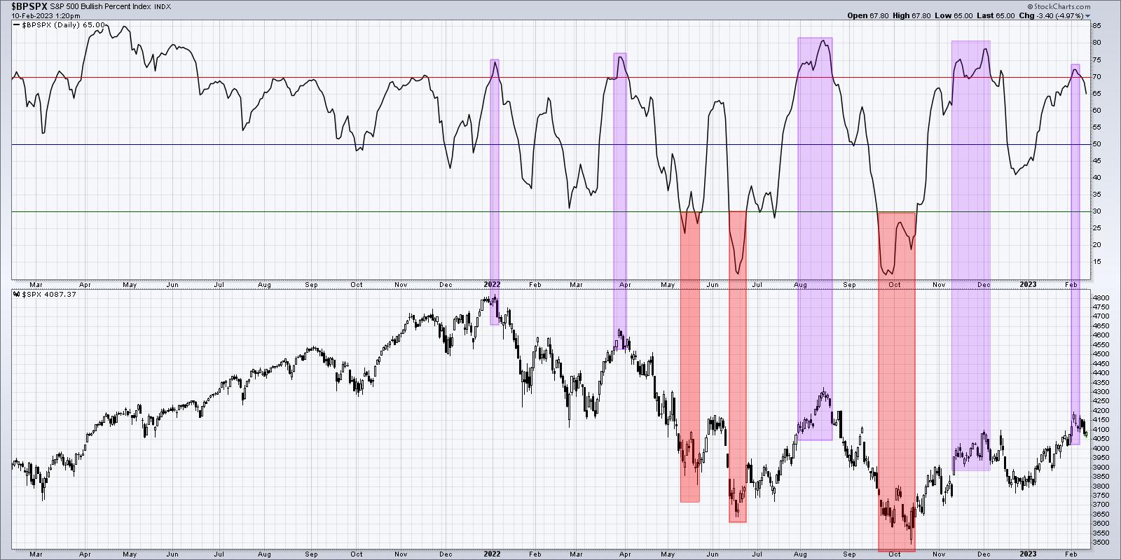
The Bullish Percent Index was one of the most helpful indicators to navigate 2022. Most of the major tops last year saw this indicator move above 70 toward the end of the upswing, then right back below 70 to indicate a downside reversal. We also had three buy signals, where the indicator dipped below 30 and then back higher. Two of those times beautifully indicated the June and October lows.
At the end of January, the Bullish Percent Index pushed above the key 70 level, suggesting the latter stages of a bull move. This week, we have noted this indicator has moved back below the 70 level, which suggests a new leg down for the S&P 500.
McClellan Oscillator No Longer Bullish
I shared a video last week about the McClellan Oscillator, a well-designed adaptation of advance-decline data.

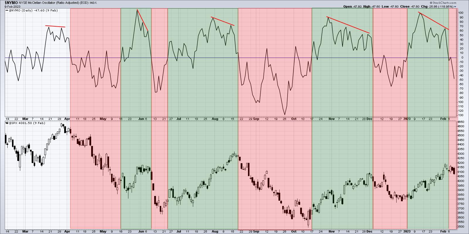
Simply put, the market is bullish when the McClellan Oscillator is above zero, and bearish when it is below zero. There's certainly more to the indicator, including the bearish divergences indicated with red lines on my chart.
But if you look at what the S&P 500 has done when the indicator is above zero vs. below zero, you can see why this breakdown is an important gauge of market breadth and should give bulls some pause about next couple weeks.
An Foreboding Increase in Volatility
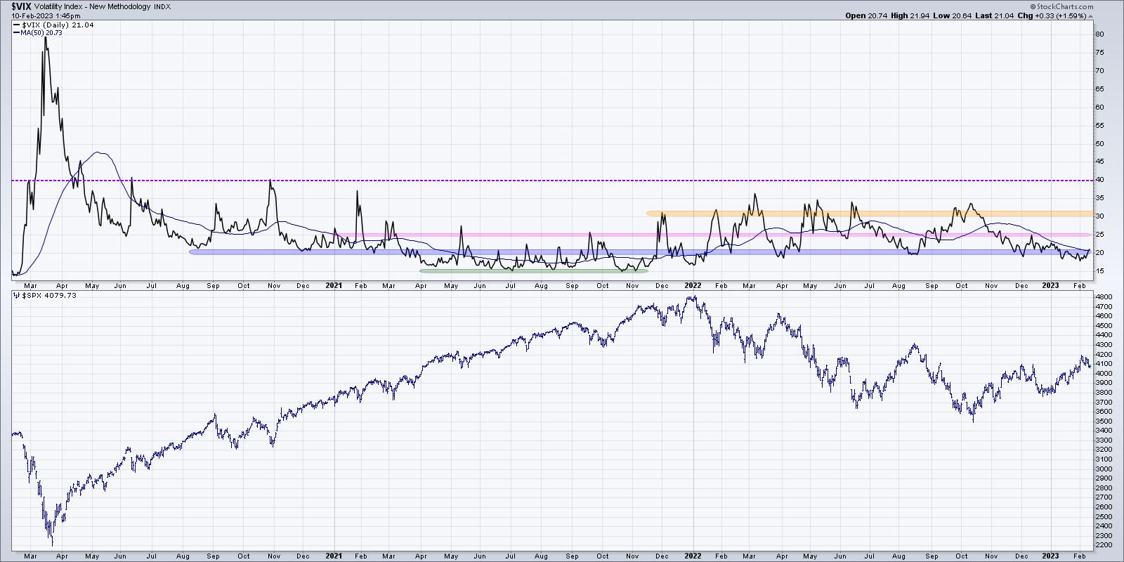
Finally, we can look at volatility, which has remained fairly low since December of last year.

I had a great conversation with Katie Stockton recently about the prospects for the market to rally on lower volatility, which is something we really hadn't seen since the October low. Well, this week, the VIX pushed back above the 20 level, which may be the beginning of a return to a higher volatility regime.
Why is high volatility a concern? Well, the market doesn't tend to rally on high volatility. The reason is that, when investors get nervous and panic, they tend to sell quickly and anxiously. This pushes the VIX, or the "fear gauge", higher to reflect investor uncertainty.
Markets tend to have sustained advances on lower volatility because investors tend to accumulate shares over time during a bull market phase. We don't anxiously accumulate shares (although that can happen in the "irrational exuberance" phase at the end of bull markets!), so a market uptrend with a relatively low VIX would be pretty bullish. As the VIX has moved back above 20, we're faced with weakening price characteristics as the SPX dips below 4100, declining breadth indicators with similar signals to previous corrective moves, and stocks like GOOG in a freefall.
Bullish on stocks here? The indicators we shared today could mean an even better entry point to ride the next bull move higher. But these indicators will need to improve, as, otherwise, they suggest a more painful downdraft than some may expect.
Want to learn more about how we use RSI to analyze price momentum? Hit my YouTube channel.
RR#6,
Dave
P.S. Ready to upgrade your investment process? Check out my free behavioral investing course!
David Keller, CMT
Chief Market Strategist
StockCharts.com
Disclaimer: This blog is for educational purposes only and should not be construed as financial advice. The ideas and strategies should never be used without first assessing your own personal and financial situation, or without consulting a financial professional.
The author does not have a position in mentioned securities at the time of publication. Any opinions expressed herein are solely those of the author and do not in any way represent the views or opinions of any other person or entity.
|
| READ ONLINE → |
|
|
|
|
|
| RRG Charts |
| This is Your Most Important Decision |
| by Julius de Kempenaer |

I talk about it almost every week in Sector Spotlight, but I just realized that I have not written about it for quite a while.
The investment decision that has the most significant impact on your results...
Asset Allocation.
Many, especially retail investors, are so focused on the stock market and finding good stocks or sectors to invest in that they forget that other asset classes are out there. And that could be a costly mistake!
In the academic world, many studies have been written on this subject, probably kicked off by the work of Brinson, Hood, and Beebower in the '80s in their study "Determinants of Portfolio Performance". To quote;
BHB asserted that asset allocation is the primary determinant of a portfolio's return variability, with security selection and market timing (together, active management) playing minor roles. BHB's 1986 study examined the quarterly returns of 91 large U.S. pension funds over the 1974 to 1983 period, comparing the returns to those of a hypothetical fund holding the same average asset allocation in indexed investments. A linear time-series regression yielded an average R-squared of 93.6%, leading BHB to conclude that asset allocation explained 93.6% of the variation in a portfolio's quarterly returns.
Now be careful, as this 93.6% is the explanation of the variation in the portfolio's returns -- not the returns themselves.
Nevertheless, it is safe to assume that your asset allocation decisions have a significant impact. Asset allocation should be an integral part of your workflow; maybe not on a daily or even a weekly basis, but I suggest taking a look at least once a month.
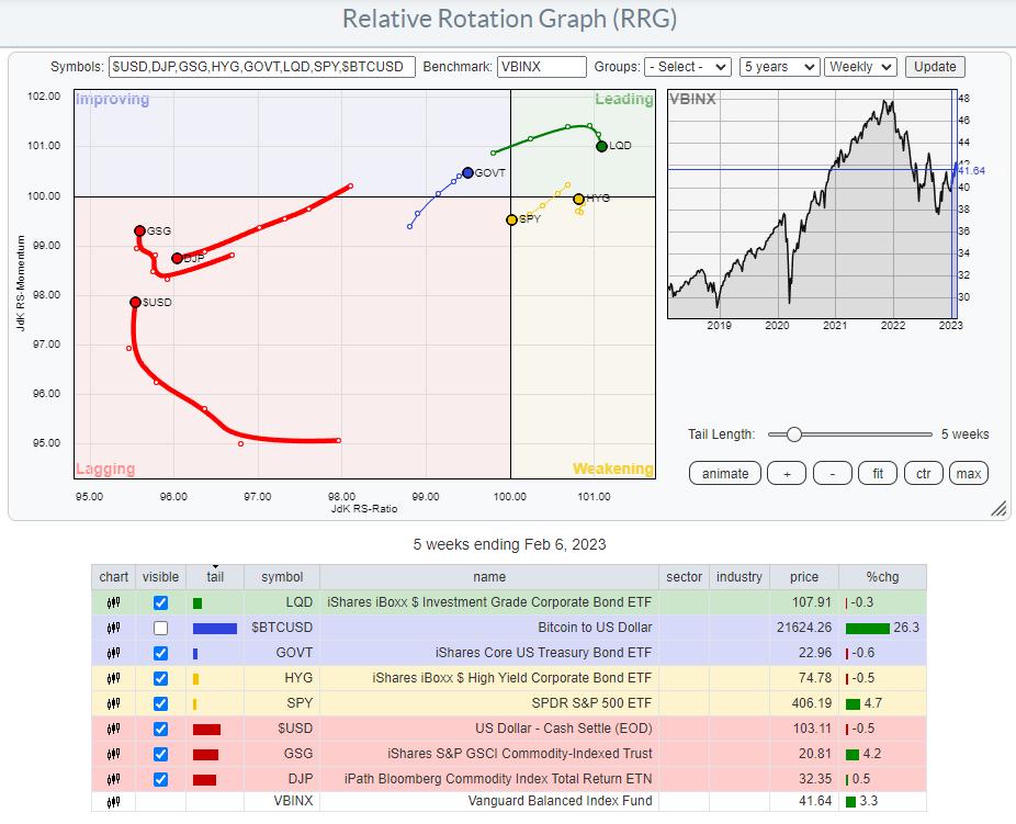
I have gotten used to a setup where I use a few ETFs to track the rotation of major asset classes. You can see that in the RRG at the top of this article. $BTCUSD is switched off as it is so far away from the benchmark that it distorts the image for the remaining asset classes.
The benchmark that I prefer to use is VBINX. That balanced index fund holds 60% in stocks and 40% in bonds, which is a typical balanced portfolio. Adding a few asset classes outside the benchmark allows an investor to find alternative investments that will enable them to "outperform" that benchmark.
The most important reason to think about and actively manage your asset allocation is to mitigate risks associated with the various investments, especially stocks. Even when you decide to stay at a high level with your investment and just buy SPY as a proxy for the stock market, your allocation to SPY will lose value when stocks go down.
Managing your asset allocation will help prevent big swings in your investment portfolio. Unless you are a high-rolling punter (pun intended), that is most likely what you are after.
Commodities and $USD Are Lagging.
Looking at the current state of Asset Class rotation, we find the tails for commodities inside the lagging quadrant, with GSG picking up relative momentum recently. The relative trend for this asset class remains down and is, therefore, less interesting for investments, as stocks and bonds (our VBINX benchmark) are doing much better now.
Also inside the lagging quadrant, we find the $USD. While it has started to pick up relative momentum over the last weeks, it is still at the lowest RS-Ratio reading in this universe. This tells me that, at least over the previous months, investment in foreign currencies would have done better than in USD, but the deterioration is getting less, and things are starting to look better for USD-based investments. This is information I would consider when I am looking for exposure to foreign markets. It is especially important to consider when investing in foreign markets using ETFs listed on US markets and quoted in USD.
Correlation

The remaining tails on the RRG show the rotations for the asset classes included in our benchmark. GOVT is an ETF that tracks the aggregated performance of US government bonds over all maturities on the Yield Curve. LQD tracks a portfolio of corporate bonds, and HYG does the same for High Yield bonds. SPY, of course, follows the asset class stocks.
Even though GOVT, LQD, and HYG are all fixed income-related asset classes, they have different risk profiles. These differences are best visualized using the correlation indicator.

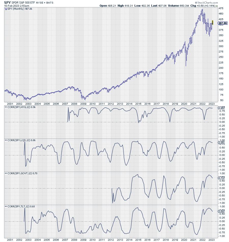
The chart above shows the monthly price chart for SPY, followed by the 12-month correlations with HYG, LQD, and GOVT. In the last pane, I added the correlation with TLT, as it has more history than GOVT. The correlation between TLT and GOVT is very high and moves around 0.90.
We can see here that HYG has the highest correlation with SPY; it is always positive and mostly above 0.75. That means that HYG will move very much in line with SPY. The correlation for LQD is less; here we see a correlation reading which is still predominantly above zero. But sometimes it dips into negative territory and generally shows much more fluctuations.
GOVT/TLT, finally, show the least constant correlation with SPY, meaning that they go through significant periods of noncorrelated performance. To mitigate the risks in one asset class, you want to look for another asset class with a low or, even better, negative correlation.
Another way to get a handle on correlations on StockCharts.com is to use the Correlation view.

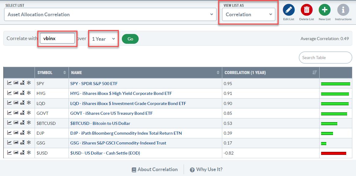
You can find the correlation view in the dropdown on your ChartLists page. The view will show you the symbols in your ChartList, and you can set the symbol you want to calculate the correlations against and the period over which you want to know the correlations.
In the example above, I have created a list with the asset classes that I use in the RRG, set the benchmark to VBINX, and the period to 1 year, matching the correlations shown in the SPY chart with the correlations against the fixed income asset classes above.
The big difference is that the charts show the change in correlations over time, while the table just provides a snapshot of the current values. The correlation charts also show that the correlations between these fixed-income ETFs and SPY have recently started to come down.
Stocks vs. Fixed Income Asset Classes
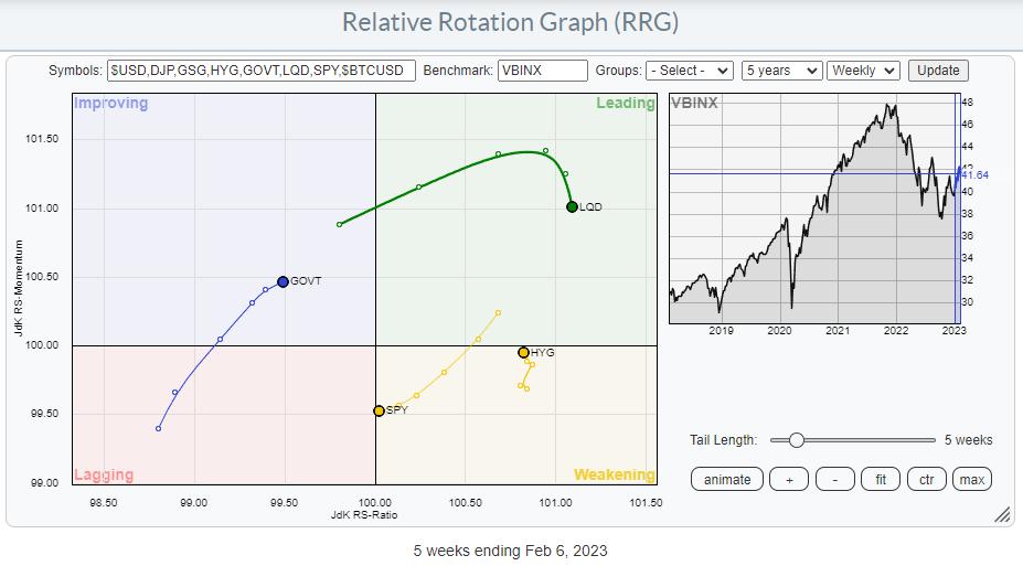
LQD and HYG show the highest readings on the RS-Ratio scale. LQD has just started to roll over, while HYG began moving in the opposite direction. This shows a preference for HYG over LQD, hence a preference for the "riskier" asset class High-Yield over the "less risky" Corporate bonds.
The BIG decision, of course, is between Stocks (SPY) and (Government) bonds (GOVT). SPY is still located to the right of GOVT, which points to a preference for Stocks over Bonds. The RRG-Heading, on the other hand, is negative for SPY and positive for GOVT. When one crosses over the other on the RS-Ratio scale, that is considered a change in trend. The wider the distance on the RS-Momentum scale, the more meaningful that trend change is. Looking at the length of the tails and RRG-Velocity (the distance between the nodes on the tail), we can see that it is shrinking, which means that the move is losing power, increasing the odds of rolling in the opposite direction. i.e., SPY curling back up and GOVT rolling over.
The 1-1 comparison between SPY and GOVT may come in helpful here.

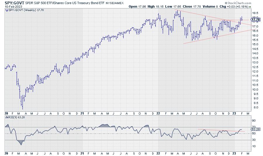
This chart shows the ratio between SPY and GOVT and how it contracted since March last year. This contraction is reflected in the tails moving closer together on the Relative Rotation Graph over the previous 6-7 weeks.
The slowdown in RRG-Velocity (distance between the nodes getting shorter) combined with the ratio trying to break out of the triangle-like consolidation and correlation between SPY and GOVT declining, leads to the belief that the market is setting up for a new, renewed, further improvement of stocks over bonds in coming weeks.
#StayAlert and have a great weekend, --Julius
|
| READ ONLINE → |
|
|
|
| ChartWatchers |
| Disney Stock: A "Small World" Worth Buying? |
| by Jayanthi Gopalakrishnan, Karl Montevirgen |
 Photo by Stas Knop/Pexels.com Photo by Stas Knop/Pexels.com
Disney reported Q1 FY23 earnings on Wednesday, February 8, 2023, after the close. The company beat earnings per share and revenue estimates, and total Disney+ subscriptions were higher than expected.
Successive peaks and dips in rapid order may be thrilling for most roller coaster enthusiasts, but, on Wall Street, not so much, especially when it comes to earnings. But that's the mix Disney (DIS) has been serving on the earnings front since November 2021—a tandem streak of misses and beats.
This fueled a volatile ride for share prices, with investors white-knuckling a -58% drop from peak to trough (March 2021 to December 2022). But share prices have had some bounceback respite leading up to Disney's Q1 FY23 earnings report (see chart below).

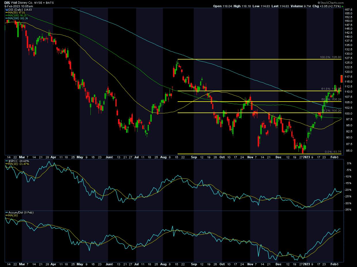
CHART 1: DISNEY'S STOCK PRICE POST-EARNINGS. After beating earnings estimates, Disney's stock price rose, gapping up at the open on Thursday, but pulling back and filling the gap. Relative strength with respect to the S&P 500 Consumer Discretionary Sector index ($SPCC), displayed in the top sub-chart, is trending higher. So is the accumulation/distribution line (lower sub-chart). Click on chart for the live version.Chart source: StockCharts.com. For illustrative purposes.
From a Technical Perspective
Since December 2022, Disney's stock has had a relatively steep climb, breaking above the 38.2% and 50% Fibonacci retracement levels.
- Analyzing Fib retracement levels. Prior to the earnings report, the stock bounced from its December lows. If you apply Fib retracement levels from the August high to the December low, you'll see the stock was hovering slightly above the 61.8% Fib retracement level. This can be a critical "make-or-break" level—a push above it can signal a potential bullish reversal and not just a "retracement." This appears to be the case in the early hours of trading, despite the initial bearish rejection of its opening at $118.04—a runaway gap that took quite a jump from the previous day's closing price of $111.78.
- Price relative/relative strength. Looking at the performance of Disney's stock against the S&P 500 Consumer Discretionary Sector index ($SPCC), since the November 2022 low, the relative strength has been trending up, as indicated by the 10-day moving average overlay.
- Cumulative flow of money. The accumulation distribution line has also been trending higher, indicating that money is flowing into the stock. This further confirms the underlying trend in the stock's price.
Before jumping into the stock, it's a good idea to get an idea of what Disney's future plans are. This can help determine if the stock is better as a short-term play or a longer-term investment.
Fundamentally Speaking
Disney's Q1 earnings report might have provided a huge relief for investors. After last quarter's earnings call, investors probably expected to see muted growth, particularly in its Disney+ segment. That's sort of what happened, but not in a way that was expected: less-than-feared losses turned out to be bullish news.

In contrast, the big winner was Disney's theme parks, products, hotels, and other experience-based offerings. This segment saw revenue growth of 21% over the last quarter.
After the earnings report, Disney shares were up over 5% after the close. This trend continued with prices slightly higher ahead of the open on Thursday with a gap up at the open. But price pulled back during the trading day. There's a strong chance the runaway gap could get filled. Keep an eye on those Fib retracement levels, which could act as support and resistance levels. There's a chance the stock could head up toward its August high, or it could pull back to the 61.8% Fib retracement level.
Does This Make Disney a Longer-Term Investment?
One earnings report doesn't necessarily make a trend. In his first earnings season since his return, CEO Bob Iger pledged "significant transformation" that would lead the company toward "sustained growth and profitability" along with expense reductions.
Some of Disney's plans for the future include the following:
- Creation of three core business units. The company plans to divvy up into the following three units:
Disney Entertainment. Streaming, film, and television would fall under this umbrella.
- ESPN. This would be all ESPN networks, ESPN+, and international sports channels. Looks like Disney's still holding on to ESPN instead of spinning it off. Live sports could be lucrative, but how that's likely to play out in a declining cable television environment remains to be seen.
- Disney Parks, Experiences, and Products. Theme parks, resorts, cruise lines, and Disney's consumer products, games, and publishing businesses would fall into this business unit.
Cost-cutting measures to the tune of $5.5 billion. That includes 7,000 job cuts.
Bringing back dividends by the end of 2023. This would be a big plus for investors given that Disney suspended dividends in 2020 due to Covid-19.
Future plans look promising, but one area of focus will be the highly competitive streaming business. Iger wants to focus on ‘creativity', which could mean we could see the entertainment division come up with some interesting titles.
Iger's got a lot on his plate, especially if he plans to stay there only for two years. Will he keep the roller coaster enthusiasts coming back for more, but tame the peaks and dips in Disney's stock price? Or, will this "small world" of a company find itself increasingly beset by challenges the more it expands?
Disclaimer: This blog is for educational purposes only and should not be construed as financial advice. The ideas and strategies should never be used without first assessing your own personal and financial situation, or without consulting a financial professional.
|
| READ ONLINE → |
|
|
|
| Top Advisors Corner |
| Golden Cross Carries Some Little-Known Magic |
| by Tom McClellan |

On Feb. 2, 2023, the S&P 500 completed what is known by technical analysts as a "Golden Cross", which is when the 50-day simple moving average crosses above the 200-day. It has an okay, but not amazing, track record of catching the big trending moves, although as with any trend-following system there are some bad signals.
I want to introduce you this week to another way of looking at the Golden Cross, and its supposedly evil twin the Death Cross (which is when the MAs cross going the other way). The key insight is about what is happening with prices at the moment of the crossing. What I have noticed over the years is that the behavior of prices at that moment will tell us something about what happens next to prices.
This is related to the principle known as a "rainbow convergence", something I talk about a lot in my Daily Edition concerning shorter term exponential moving averages (EMAs), and which I addressed in a February 2019 Chart in Focus article. And this same principle works with other pairings of moving averages, including the 50- and 200-day simple moving averages.
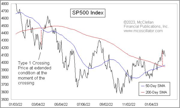
In a Type 1 crossing (or Type 1 rainbow convergence), prices are extended pretty far away from the price point of the moving average crossover. In those cases, the moment of the crossing most often marks a reversal point. It can be a temporary reversal, or a more significant one.
We can see an example of a Type 1 convergence in the chart above, when there was a crossover back in March 2022. That was a so-called Death Cross, which is supposed to be a bearish sign. But instead of living up to that bad omen right away, prices reversed at the moment of the convergence and mounted an 11% countertrend rally. Eventually, prices turned back down again from that countertrend rally, and did finally live up to the bearish signal of the Death Cross, but it was unpleasant at first for those who saw that Death Cross as an immediate bearish signal and took action based on it.
There is a second type of behavior at the moment of the crossing that I call a Type 2 event. It involves seeing prices retrace back toward the price-time point of the MA crossing, and what usually ensues is a resumption of the trend that preceded the retracement.
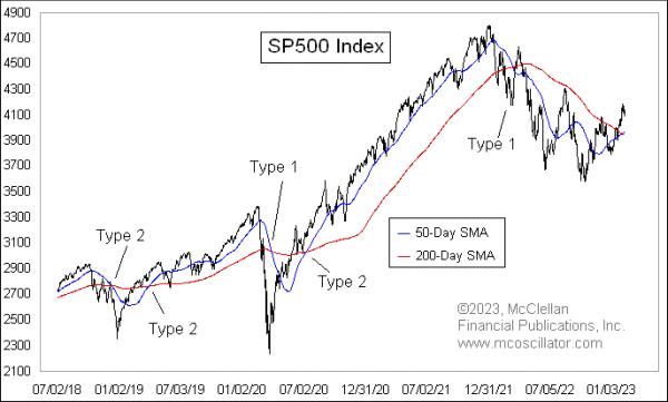
The chart below takes a longer look at the S&P 500, with examples of both Type 1 and Type 2 events.

Looking closely, we see that, when there is a Type 2 crossing and prices retrace back toward the crossing point, the trend resumes after that retracement. But when there is a Type 1, there is more often a reversal, at least temporarily. This is the key insight: the immediate meaning of the Golden Cross or the Death Cross is different depending on how prices are behaving when the crossing is happening.
That brings us to the current crossing that happened on Feb. 2, 2023. In this case, that day marked the exact top of the recent up move, and prices are reversing downward, as opposed to manifesting the supposedly bullish implications of the Golden Cross.
It does not always work out quite this precisely. For example, the price bottom of the COVID Crash on March 23, 2020 was a week before the crossing of the two MAs, but that is still pretty close in time. And that was a pretty dramatic Type 1 crossing event that, sure enough, brought a reversal, which in that case was a permanent reversal and not just a temporary one.
I have seen this principle work with other pairings of moving averages, although I have not spent the time to test every possible combination to see how universal it is. If you have a different pairing of simple moving averages (SMAs) or exponential ones (EMAs) that you like to use, I encourage you to test out this idea to see if it works for them, as opposed to just assuming that it will.
And then the next time you hear an analyst talking about a Golden Cross or a Death Cross and claiming that it means a bullish or a bearish message, take a look first to see how prices are behaving relative to that crossing point. Because now you know about the special magic message embedded in that information.
|
| READ ONLINE → |
|
|
|
| Don't Ignore This Chart! |
| Will Shutterstock Buck the Bear Trend? |
| by Karl Montevirgen |

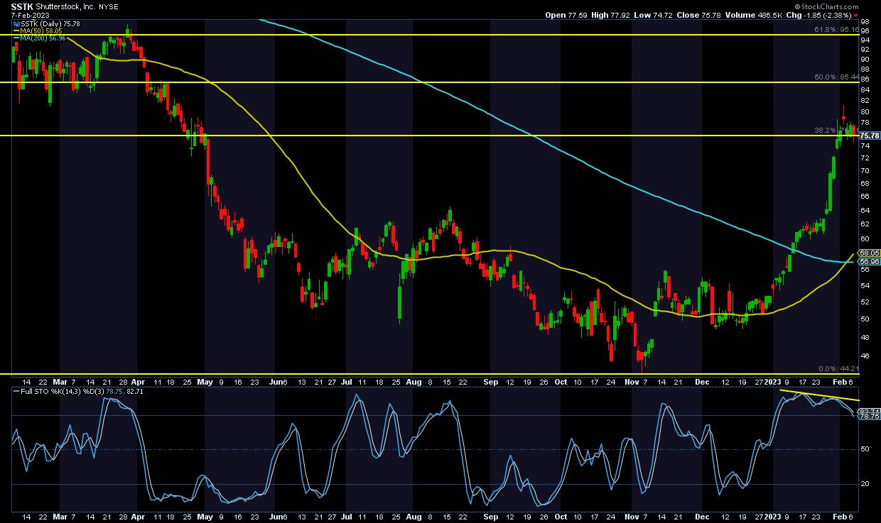
Shutterstock (SSTK), the American creative content solutions firm, has been riding a doozy of a downtrend from October 2021 to the end of 2022. Aside from the bear mauling, SSTK's fundamentals weren't entirely disappointing. There were two positive (yet dwindling) earnings and revenue "beats," one mixed earnings report, and, finally, a full-on negative miss on both counts in Q2 before hints of a mixed recovery in Q3, punctuated by an earnings beat and a revenue miss.
Still, the last report did very little to kindle "green shoots" in market sentiment. The company even received a stinging downgrade in November from investment bank JMP Securities, because of increased competition from generative AI. According to the bank, Shutterstock's stock photos may lose value because of AI's ability to generate images from simple text prompts.
But that narrative changed in January 2023. A flurry of announcements hinted that Shutterstock wasn't going to be overrun by the AI trend. The company was making strides to claim a sizable stake in the coming "singularity" engine.
SSTK Claims a Stake in the "Singularity" Space
Perhaps it was a matter of seizing opportunity, hedging against near-term disruption, or gaining early favor with the future "masters" of singularized humankind. Either way, SSTK announced its strategic partnerships with key AI players Meta, OpenAI, and LG AI Research in an effort to advance generative AI research (the very thing analysts claimed would disrupt SSTK's future prospects). SSTK also launched its own generative AI-based creative platform, one that creates visuals based on (you guessed it) text prompts.
To sweeten the deal for its shareholders, SSTK also increased its dividend (by $0.27 per share) payout by 13% over the previous quarter. Dividends based on the current price level amounts to a 1.41% yield.
SSTK share price surged 50% following the announcements and is now up 41% YTD, just as it's slated to report Q4 22 earnings on Thursday, February 9, 2023, before the open.
SSTK's Sector and Industry Rankings
Let's step back and look at SSTK's place within its larger Communication Services sector performance. Looking back on a three-month period...
- The Communications Services Sector fund (XLC) sector is outpacing all 11 S&P sectors, with a strong gain of 26.16% and a StockCharts Technical Ranking (SCTR) rating of 91.4. Now let's zoom in to see industry performance.

- Among the six industries within the sector, Publishing holds the highest SCTR score (83.5) based on a three-month lookback.

- And within that industry group, SSTK holds the highest SCTR score of 91.8, placing its technical favorability at the top range of potential performers.

SSTK's Technical Picture on the Eve of Earnings
 CHART 1: SHUTTERSTOCK'S DAILY PRICE CHART PRE-EARNINGS. SSTK has a few things going for it: a Golden Cross, it's up against its 38.2% Fib retracement level, and a fundamental pivot. But a divergence between price and the stochastic oscillator could mean a reversal may be underway. Chart source: StockCharts.com. For illustrative purposes only. CHART 1: SHUTTERSTOCK'S DAILY PRICE CHART PRE-EARNINGS. SSTK has a few things going for it: a Golden Cross, it's up against its 38.2% Fib retracement level, and a fundamental pivot. But a divergence between price and the stochastic oscillator could mean a reversal may be underway. Chart source: StockCharts.com. For illustrative purposes only.
In the above chart, you can see the impact that the announcements have had on SSTK's share price.
- Using the Fibonacci retracement levels from the October 2021 high of 126.12 and November 2022 low of 44.40, SSTK broke above its 38.2% retracement levels but stalled and pulled back.
- The swing leading to SSTK's eight-month high at 81.23 correlates with a divergence on the stochastic oscillator, suggesting a near-term reversal that is underway.
- SSTK's strong momentum was enough to generate a Golden Cross reading. The 50-day moving average (yellow line) is now above the 200-day moving average (blue line).
Will SSTK Shock or Shutter Come Earnings?
Much is riding on SSTK's earnings report on Thursday (February 9), as traders weigh the prospect of any earnings beat, miss, or mix and guidance against the longer-term prospects that set the stock to surge in January.
A dismal earnings report could send SSTK down below the $60 range, putting SSTK's technical (along with its fundamental) prospects in question. Be sure to add this stock to one of your ChartLists. When the earnings report is released, consider any developments in company guidance and other partnership announcements.
If the earnings report surprises and the stock moves higher, there's a lot of upside room. If you are going to open a long position, the 38.2% Fib level would be a potential stop level. SSTK may be playing the long game, but developments in the AI space are also moving at an accelerated rate.

Disclaimer: This blog is for educational purposes only and should not be construed as financial advice. The ideas and strategies should never be used without first assessing your own personal and financial situation, or without consulting a financial professional.
|
| READ ONLINE → |
|
|
|
| MORE ARTICLES → |
|
 Chart 1
 Chart 2
 Chart 3
 Chart 4
 Chart 5

