| THIS WEEK'S ARTICLES |
| The Mindful Investor |
| Absolutely Everything Goes Up |
| by David Keller |
The ARK Innovation Fund has been going down for a while now. In fact, I've become so used to ARKK underperforming the S&P 500 that I almost did a double take last month when I recognized that the trend appeared to have changed.
Today, we'll discuss why this ETF has been a chronic underperformer, how the top holdings of ARKK have fueled a dramatic turnaround to a bullish phase, and what renewed strength in emerging technology plays means for the markets.
Endless Downside for ARK Innovation
There's no denying that Cathie Wood has done an impeccable job marketing her firm and her methodology for identifying potential winners. The reality, however, has been a story of chronic underperformance.
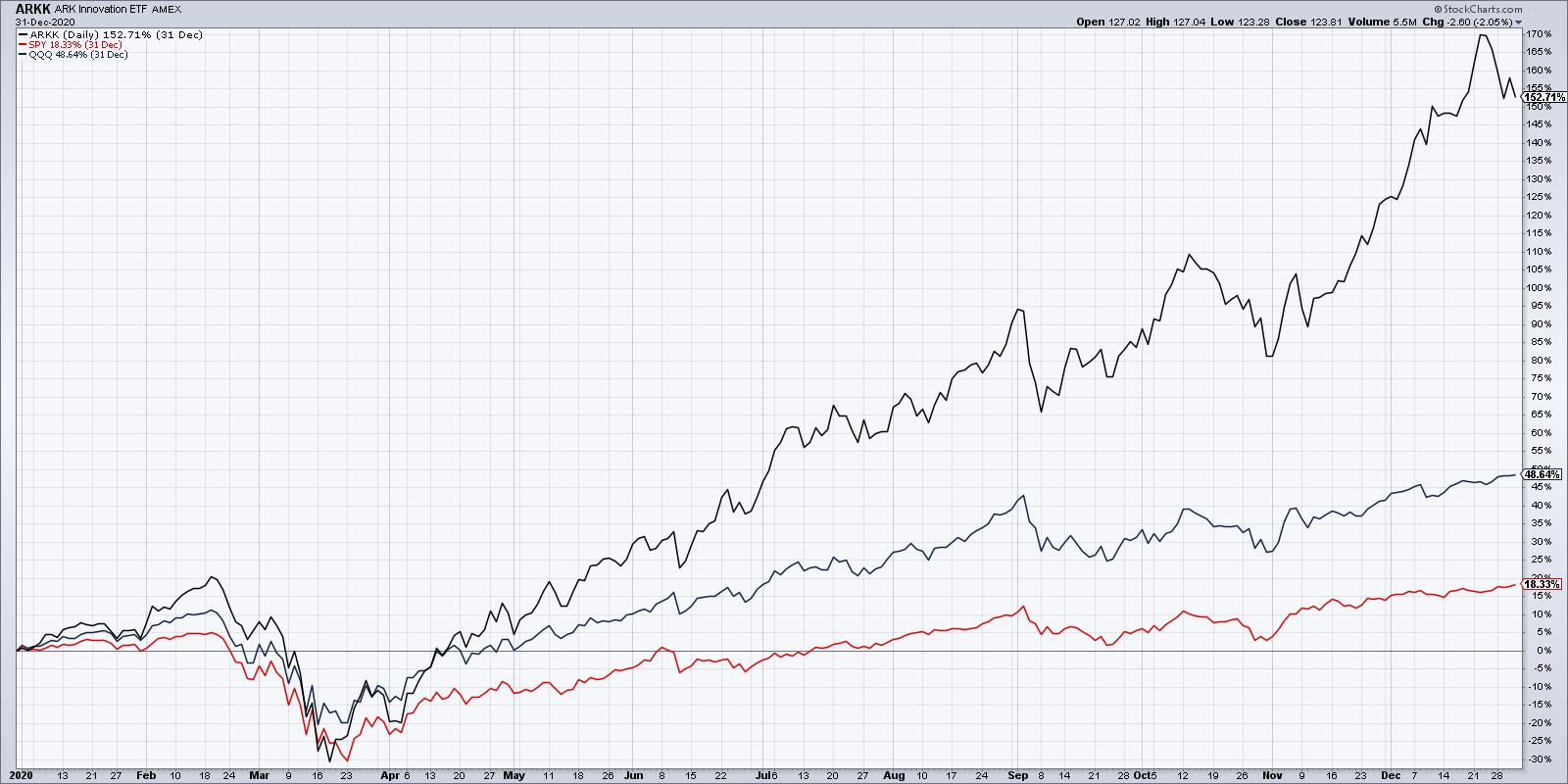
In 2020, in the depths of the COVID pandemic, ARKK was up over 150% for the year. This far outpaced the 49% gain for the Nasdaq 100 and the measly 18% rise for the S&P 500. While we were wiping off every individual grape in the grocery bag and settling in for a long stretch of working from home, the technologies that allowed that to happen drove ARKK's holdings to a strong year for performance.
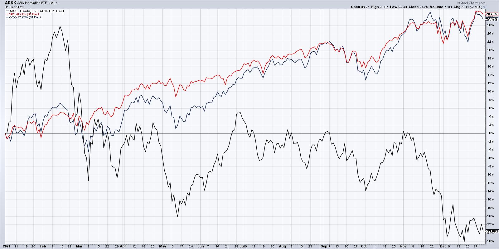
In 2021, leadership shifted in a big way, with the mega-cap FAANG stocks starting to dominate our thinking, and the initial rally in pandemic names like PTON and ZM started to fizzle. ARKK was down 24%, while the Nasdaq 100 and S&P 500 both gained over 26% for the year.
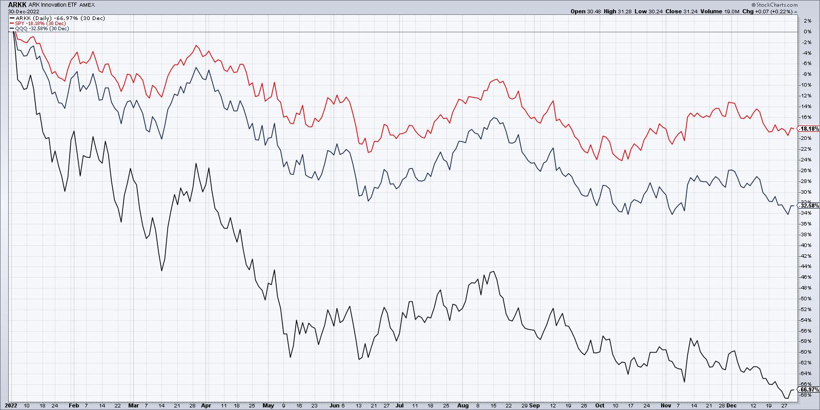
In 2022, the bear market drove everything lower, and ARKK's -67% for the calendar year meant it again dramatically underperformed the major averages. The Nasdaq 100 was down about 33% in 2022 and the S&P 500 shed 18% of its value.
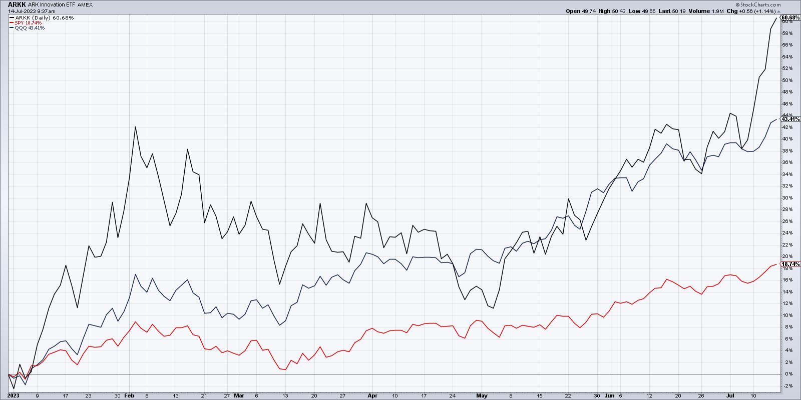
That brings us to 2023, where the ARK Innovation ETF has gained over 60% year-to-date, tripling the return on the S&P 500 and far outpacing the Nasdaq 100's 43% gain. The names that were hurting ARKK's returns the most now appear to be driving the fund to a strong year of outperformance.
So basically, as long as emerging technology is considered market leadership, the ARK Innovation ETF has been a fantastic play to take advantage of that theme. Unfortunately, that has not been the case since 2020. Perhaps now, it's time to revisit this theme?
Breaking Down the Top Holdings
Let's go through the five top holdings of the ARK Innovation Fund, and see how this ETF has been able to turn around performance and turn up the returns.
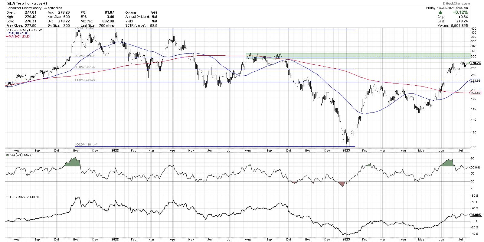
ARKK's biggest position is Tesla (TSLA), and it's interesting to note that TSLA actually made a new low in January while the S&P 500 and Nasdaq bottomed out in October. After an initial rally to start the year, the stock pulled back in March and April before turning higher in May. That February peak was right around a 38.2% retracement of the November 2021 to January 2023 selloff.
Now we see TSLA is approaching "big round number" resistance around $300, which also represents the 61.8% Fibonacci retracement level. A series of price peaks around $310 tells me to expect resistance in the $300-310 area, shaded in green on my chart.
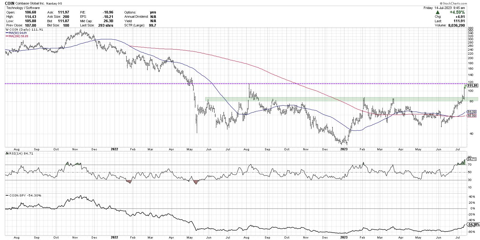
Coinbase (COIN) has ridden the crypto recovery theme higher in 2023, and this week brought further upside catalysts for a stock that has already tripled off its January low. The February and March highs just above $80 were my main resistance zone, and that was broken with authority this week en route to pushing above $100 and beyond.
Now, the August 2022 high is in play, and the extremely overbought conditions suggest to me that there is most likely more gas left in the tank. The kicker is that once COIN breaks above $120, there isn't much technical resistance until all the way up to around $200.
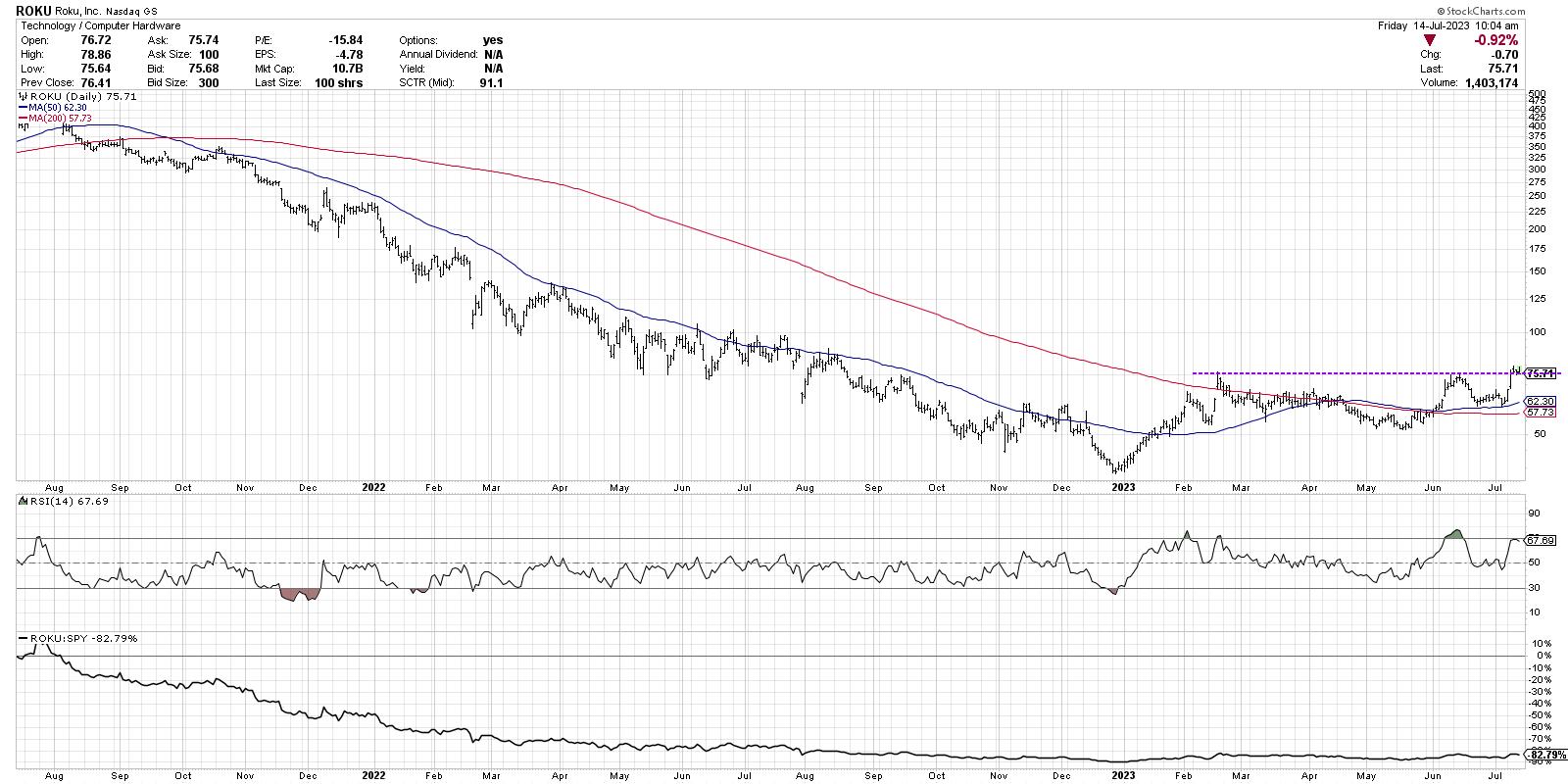
The chart of Roku (ROKU) is the story of ARKK in a nutshell. The left two-thirds of my chart display a painfully consistent downtrend of lower lows and lower highs. But that just makes the clear higher low in May of this year that much more meaningful!
Now the stock has completed a classic rotation above the 200-day moving average, and this week pushed to a new swing high above $75. As long the $75 level holds, I would say this is a confirmed uptrend.
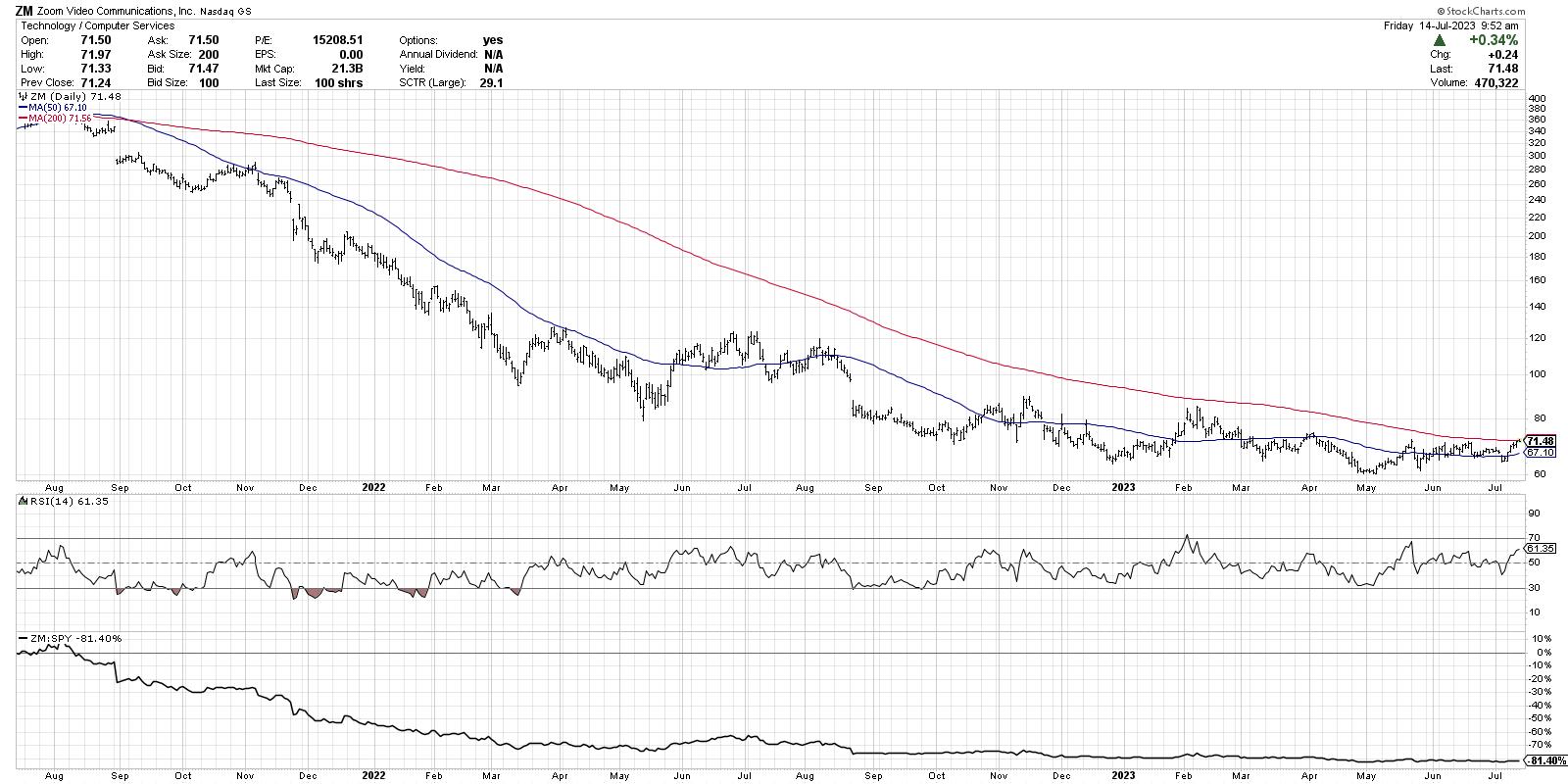
Now we have our first example of a key holding that still looks like it's in a downward spiral. While all the previous stocks we discussed bottomed out in January, Zoom (ZM) actually made a new low again in May. For now, the $60 level has held as support, but I've not seen enough buying power on the chart to confirm an upside reversal.
The stock is now testing its 200-day moving average, which means it could "pull a ROKU" and complete that bullish rotation. But it just hasn't done so yet.
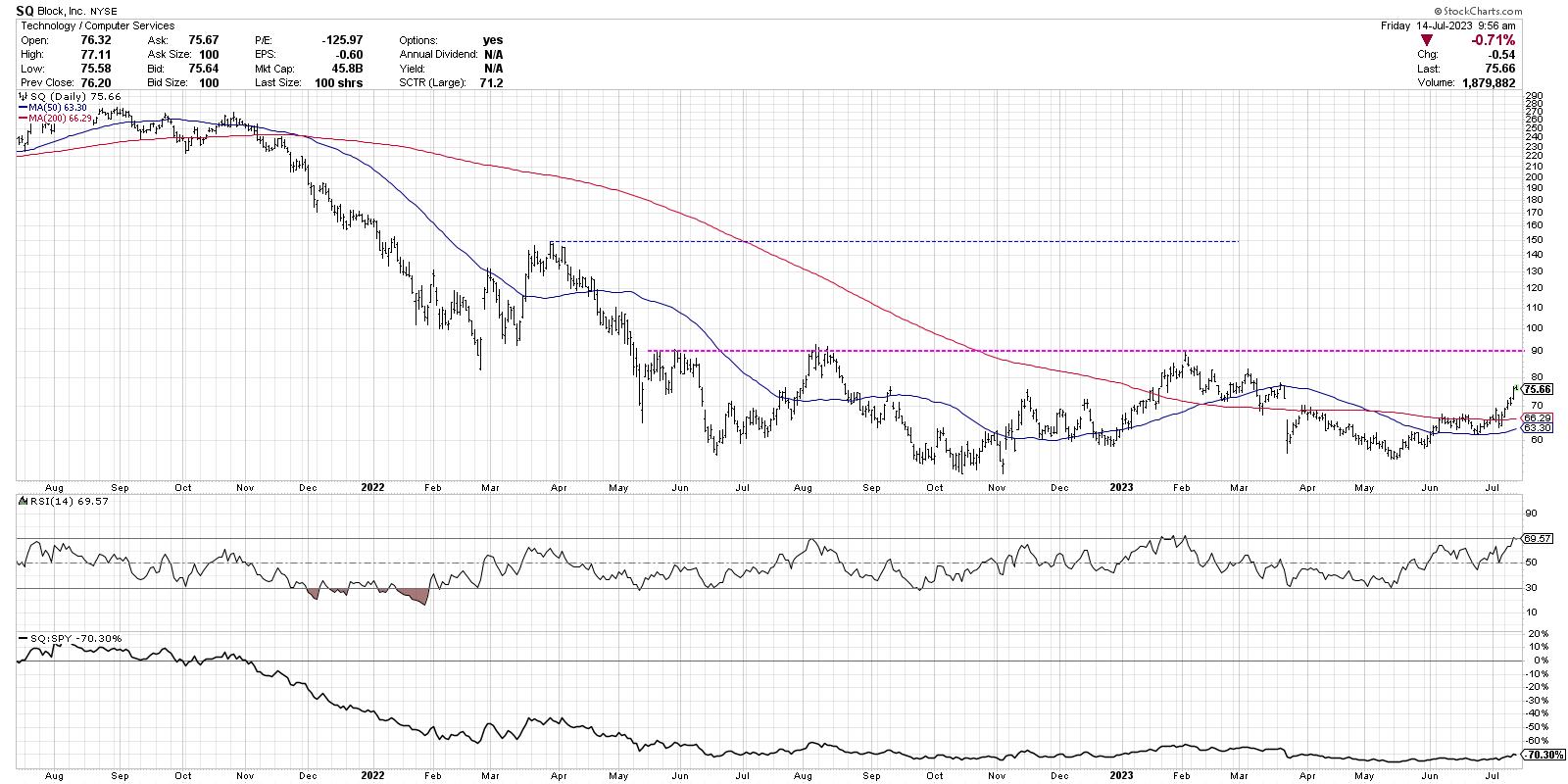
Block (SQ) is another chart that I would say still has much to prove. The May low around $55 is right around the October 2022 low, so, for now, support has held fast. But until this chart pushes above well-established resistance around $90 (pink dashed line), I would consider this a basing pattern and not much more.
Renewed Strength In Forgotten Stocks
What does it mean that charts like ROKU have seen such a dramatic rotation from bearish phase to bullish phase? And how does that relate to the bearish divergences we've seen in the mega-cap growth stocks?
I would say this is part of a larger rotation away from the dominance of the FAANG stocks and into other areas of the market. And I think that's not just about the smaller technology names and small-cap stocks, but also other sectors like industrials and financials, which are also catching a bid here.
The story of the first half of 2023 was a story of narrow leadership and the mega caps versus everything else. Now, we are seeing a bit of an "everything rally" that includes other asset classes like commodities and cryptocurrencies.
We still may see some bearish pullback scenarios play out, and it's always worth considering the implications of a broader decline in the major benchmarks. But for now, the strength in charts like ARKK suggest that the bullish market phase has more upside in store.
RR#6,
Dave
P.S. Ready to upgrade your investment process? Check out my free behavioral investing course!
David Keller, CMT
Chief Market Strategist
StockCharts.com
Disclaimer: This blog is for educational purposes only and should not be construed as financial advice. The ideas and strategies should never be used without first assessing your own personal and financial situation, or without consulting a financial professional.
The author does not have a position in mentioned securities at the time of publication. Any opinions expressed herein are solely those of the author and do not in any way represent the views or opinions of any other person or entity.
|
| READ ONLINE → |
|
|
|
| Martin Pring's Market Roundup |
| Commodities are in a Bear Market, But These Indicators Say That Could Soon Change |
| by Martin Pring |
I have been bearish on the primary trend of commodities for some time whilst still maintaining a bullish stance on their secular or very long-term trend. In other words, negative over a 9-month-to-2-year outlook, but constructive on a 10-to-20-year one. The secular aspect is important, because history shows primary bear markets are relatively subdued in both magnitude and duration under the context of a secular bull. On that basis, it could be time to anticipate a reversal from the downtrend that began 19 months ago, back in January 2022.
Chart 1, featuring the CRB Composite, shows that the Index is below its 12-month MA and also sporting a bearish long-term KST. Not much doubt about a downtrend using this approach.
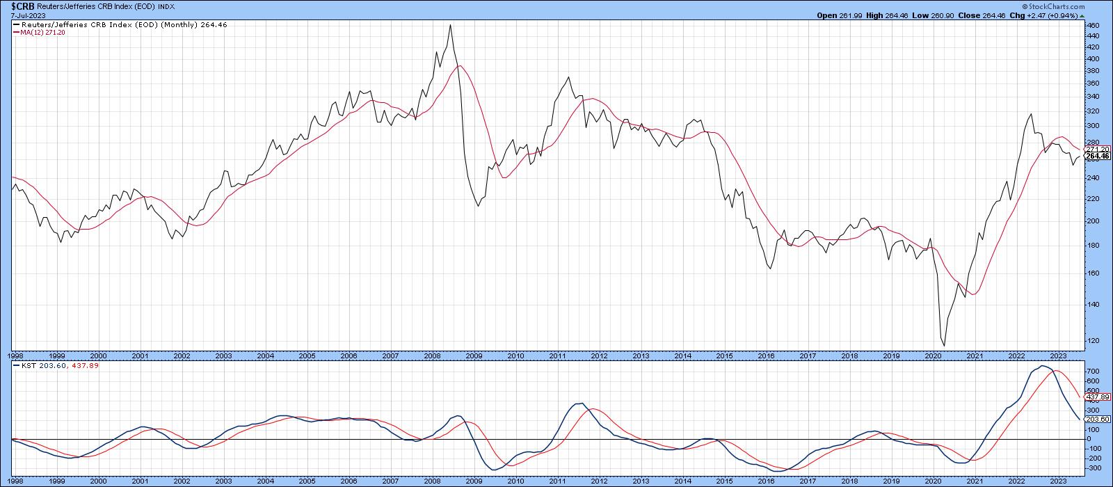 Chart 1 Chart 1
Nevertheless, it is often the case for primary bears developing in a contra secular way to quickly and unexpectedly rotate to the bullish side, resulting in unwelcome lags for the longer-term indicators, such as those featured in the chart. In other words, if the bear market is over, we would not expect to have this confirmed until some time after the fact. That said, there are other markets and relationships that move in sympathy with or anticipate commodity trend reversals, which we should consider.
Commodities vs. the Stock Market
One of these relationships is derived from the internal battle in the stock market between inflation and deflation sensitive stocks, in the form of my Inflation/Deflation Ratio, discussed here. The ratio is constructed from two indexes (!PRII and !PRDI) specifically designed to replicate stocks that are sensitive to inflationary and deflationary conditions.
Chart 2 compares it to the CRB Composite. The arrows connect many of the reversal points and slant to the right because the stock market, in the form of the ratio, has a strong tendency to lead commodities. This relationship bottomed last October and has failed to confirm lower lows being set by the CRB, which is positive. Unfortunately, the leads and lags vary and occasionally are not present, so it cannot be used as a precise timing device.
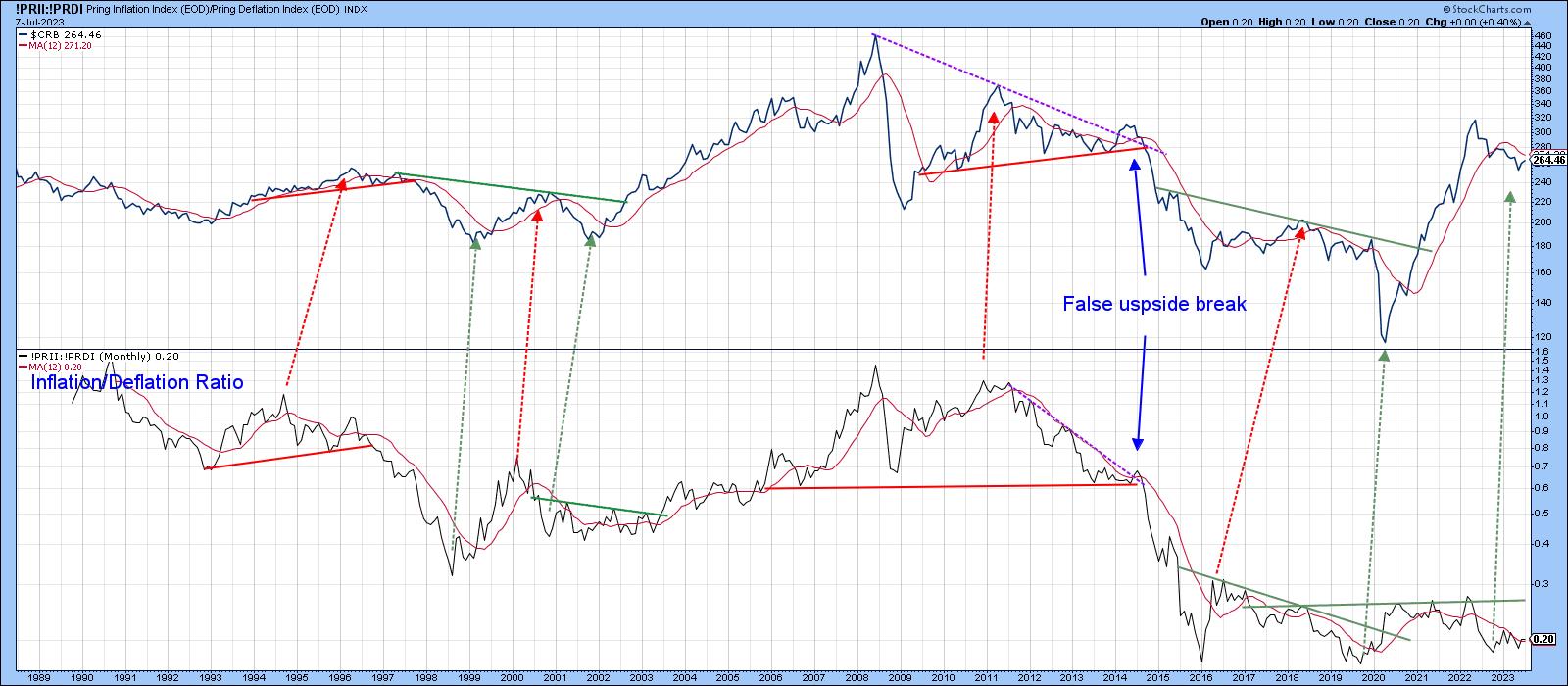 Chart 2 Chart 2
That said, Chart 3 compares a long-term KST of the ratio to the CRB. The solid green arrows tell us that KST buy signals have consistently identified important buying opportunities for commodities. The dashed ones remind us that this is not a perfect approach. Early data for July indicate another buy signal has just been given. However, this is a monthly chart, and the final plot only counts when we have a July, month-end close. Since this is a very smooth and deliberate indicator, chances are that, unless there is a sharp decline between now and then, this indicator will remain in the bullish camp.
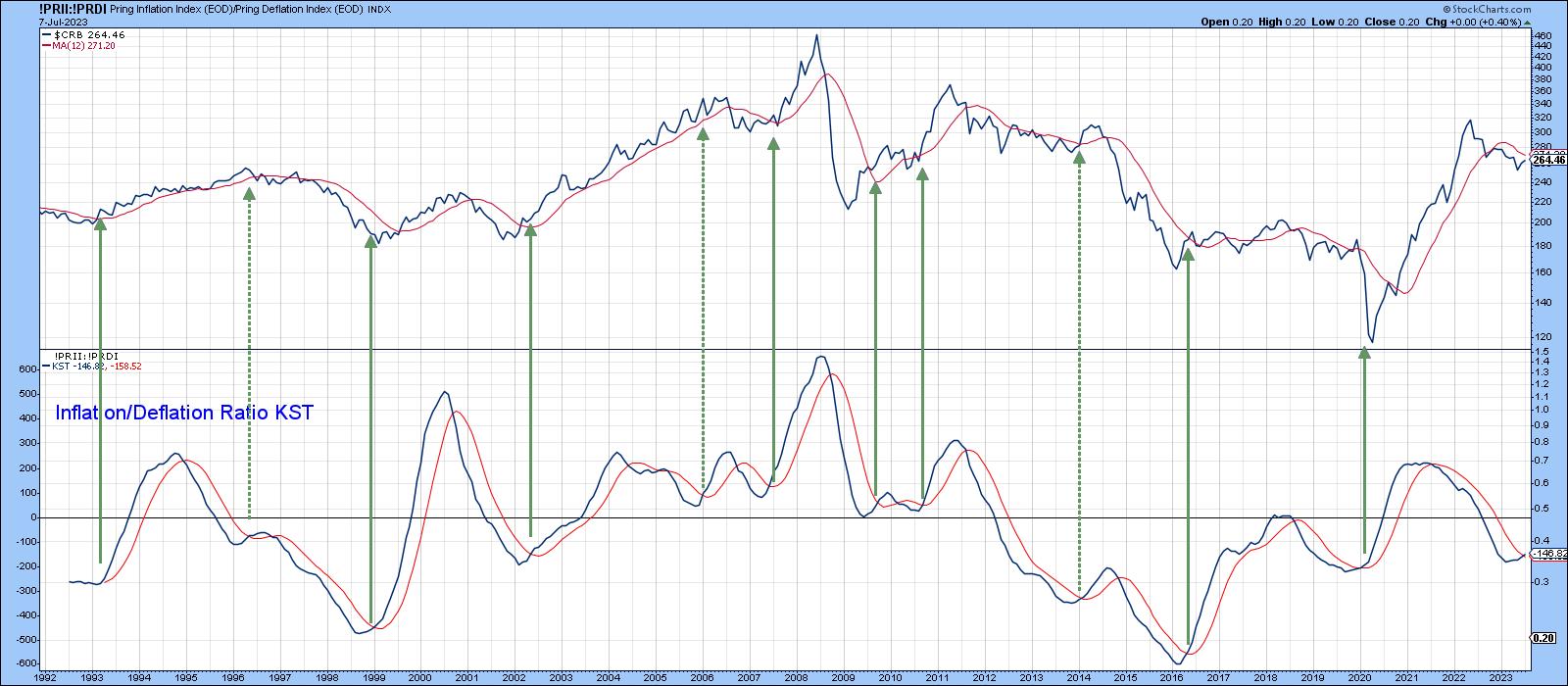 Chart 3 Chart 3
Commodity-Sensitive Currencies
The resource sector for the Canadian and Australian currencies has always been important; so much so that Charts 4 and 5 can be used to reliably identify a primary trend reversal in the CRB Composite. Buy signals are triggered by the long-term KST turning up from a sub-zero position. Additional evidence is often provided with joint trendline breaks from both the currency and the commodity index. Tentative July data suggests an imminent KST signal and a too-close-to-call Canadian dollar trendline break. No cigars yet, but certainly warranting a close look going forward.
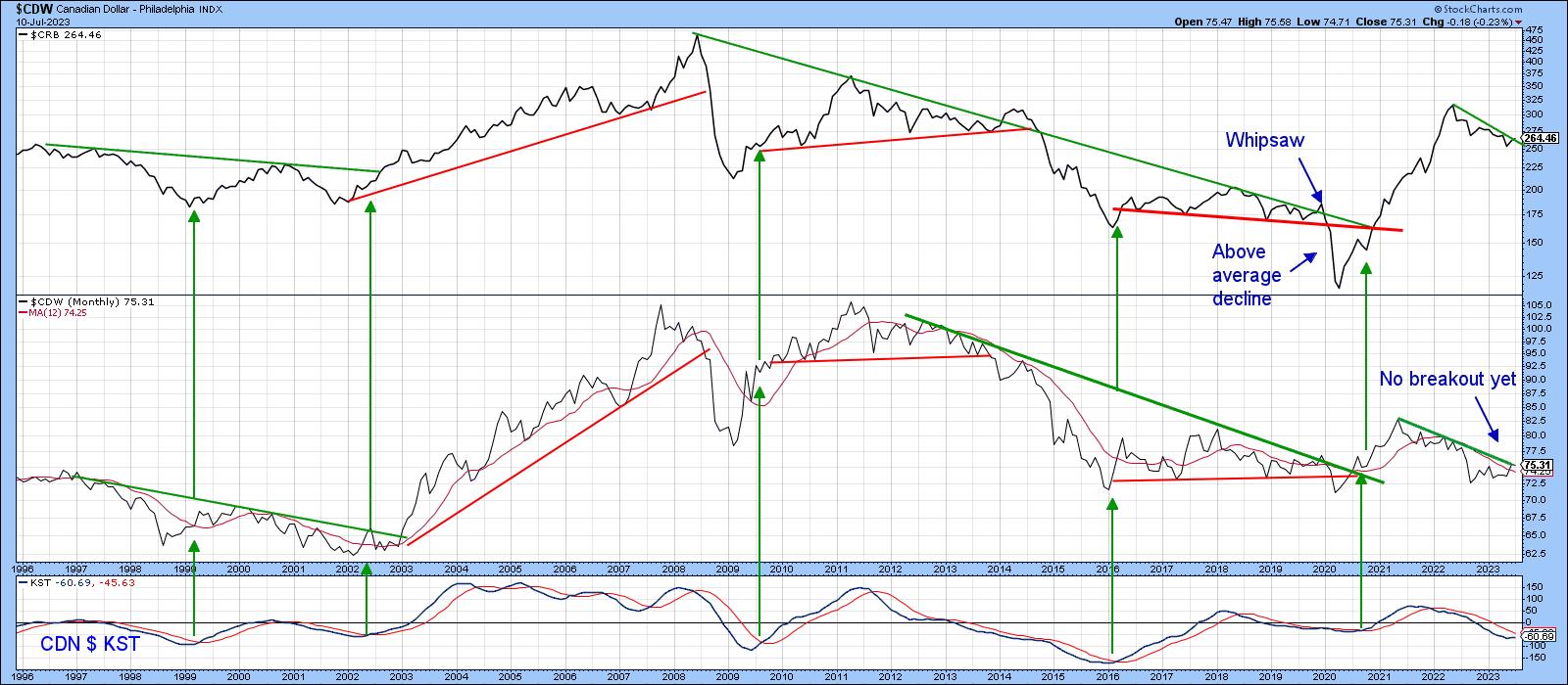 Chart 4 Chart 4
A similar picture is being painted by the Aussie currency.
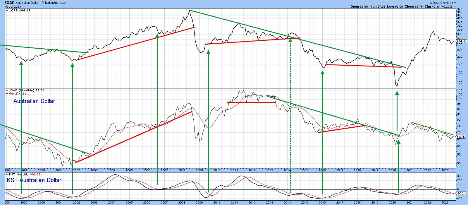 Chart 5 Chart 5
Changes in the Level of Bond Traders' Confidence
The red and green arrows in Chart 6 show that, most of the time, changes in the ratio between high yield and good quality bonds (HYG/IEF) move in similar swings as commodity prices. When investors favor riskier high yield paper over the safety of governments, it reflects confidence which spills into the commodity pits, and vice versa. Recently, both series have been constrained by trendlines, a downward one for the CRB and a horizontal one for the ratio. The down trendline can be constructed in different ways, but it seems likely that Friday close that can hold above the 273-5 area would represent a reliable signal that the trend had changed to bullish.
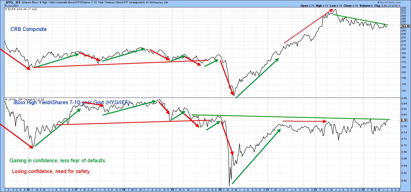 Chart 6 Chart 6
Dr. Copper Could be Paying a House Call
Finally, copper is widely used in many industries and is often used as a bellweather for the economy. Although it has a small weight in the Index (base metals in total only represent 13%), the copper price trends seems to track it quite well.
In this respect, the green-shaded areas in Chart 7 demonstrate that the trend for the CRB is usually positive when the copper KST is trading above its 9-month MA, while the unshaded white areas indicate that prices are at their most vulnerable when it is below its MA. That's a condition that has been in force for the last year. However, this momentum indicator has begun to stabilize, suggesting that a turn may not be that far away.
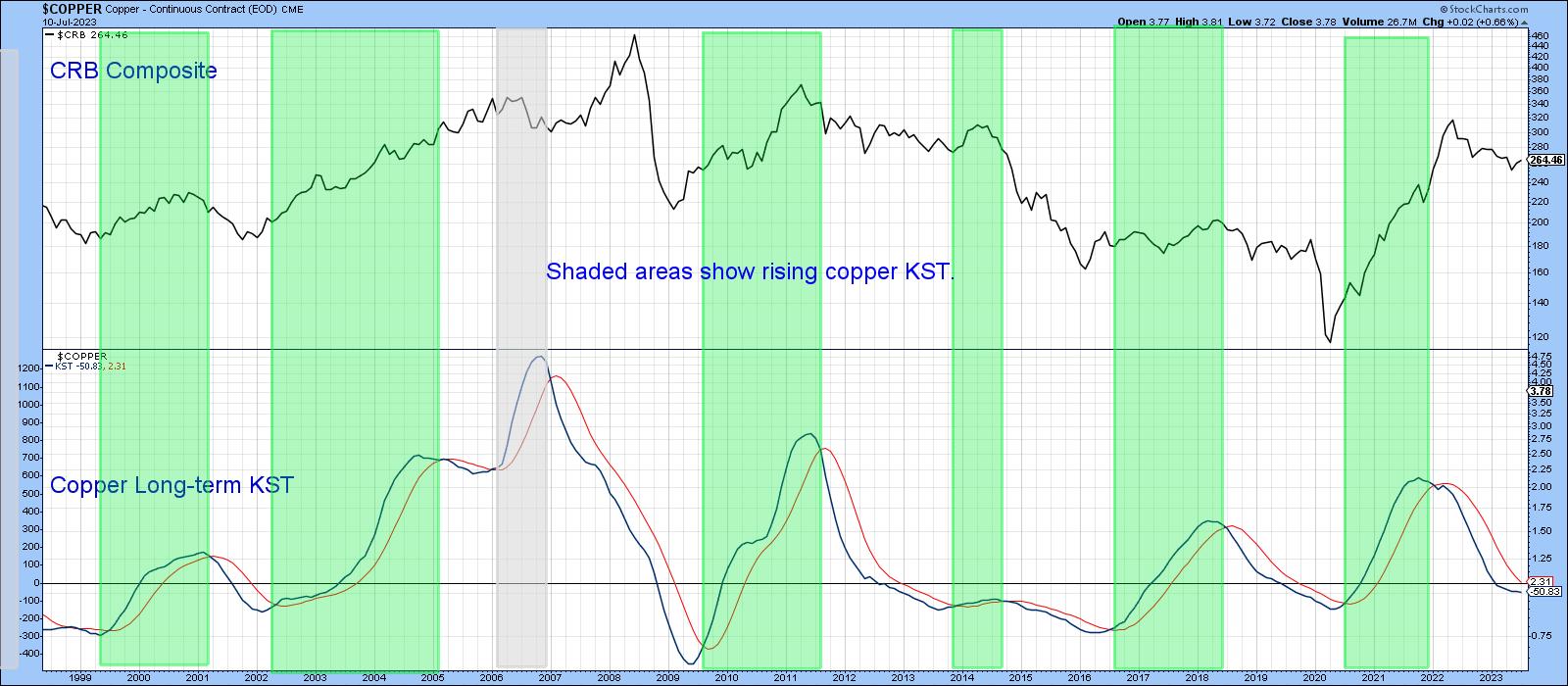 Chart 7 Chart 7
Finally, Chart 8 compares the DB Commodity Fund (DBC) to my diffusion indicator, which monitors a basket of commodities above their 50-day moving average. It looks to be in the process of triggering a short-term buy signal, which, in turn, suggests a challenge of that down trendline. A decisive close that can hold above the previous short-term high at $23.60 would probably be sufficient to reinforce the tentative buy signals being transmitted by the other charts. Until then, a watch-and-see policy is appropriate.
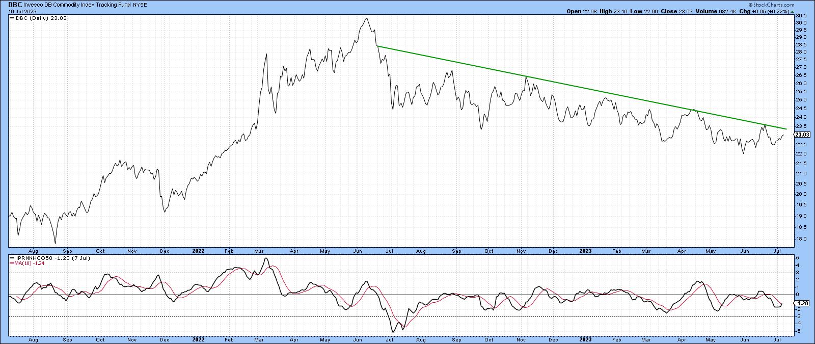 Chart 8 Chart 8
Good luck and good charting,
Martin J. Pring
The views expressed in this article are those of the author and do not necessarily reflect the position or opinion of Pring Turner Capital Group of Walnut Creek or its affiliates.
|
| READ ONLINE → |
|
|
|
| ChartWatchers |
| Earnings Season in Full Swing: What You Can Expect |
| by Jayanthi Gopalakrishnan |

As the trading week ends, the better-than-expected earnings from three big banks, Delta Airlines (DAL), and Pepsi Co (PEP) added more excitement to end an exciting trading week.
The one sticking point is the University of Michigan consumer sentiment survey, which showed that confidence in the economy boomed but suggested that inflation may not be as soft as the CPI and PPI indicated earlier this week. That news saw a bit of a selloff in the S&P 500 index ($SPX) and the Nasdaq Composite ($COMPQ) but the Dow Jones Industrial Average ($INDU) closed higher, its best weekly performance since March. Communication Services and Technology sectors are still holding strong, which has brought more investor optimism into the financial market.
You have probably heard about how the largest seven stocks have been driving the stock market rally. But it looks like other stocks are joining that rally. If you look up the chart of the Direxion Nasdaq-100 Equal Weighted Index (QQQE) and compare it with the Invesco QQQ Trust (QQQ), the two have been moving in sync. And the Accumulation/Distribution line in the lower panel shows that accumulation is rising—an indication of good upside follow-through.
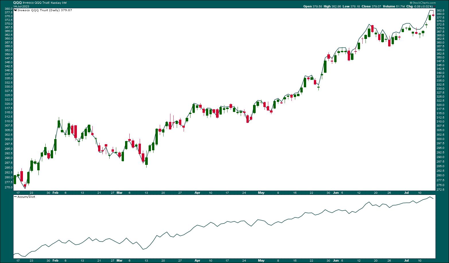
CHART 1: MARKET PARTICIPATION IS BROADENING. QQQE and QQQ are moving in sync, and accumulation is trending higher. Chart source: StockCharts.com (click on chart for live version). For educational purposes.
There's a lot of positive momentum in the market. Many stocks are reaching new all-time highs or 52-week highs. If you run these two scans, you may be surprised at the number of stocks and ETFs that meet the scan criteria.
 How to Run Scans. From Your Dashboard or Charts & Tools, scroll down to the Sample Scan Library. Click Browse Scan Library and run the New All-Time Highs and New 52-Week Highs scans. How to Run Scans. From Your Dashboard or Charts & Tools, scroll down to the Sample Scan Library. Click Browse Scan Library and run the New All-Time Highs and New 52-Week Highs scans.
When so many stocks and ETFs are reaching new highs, it's hard to argue against a bull market. Great traders trade with the trend. And when the market has strong momentum behind it, it's best to take advantage of trading opportunities.
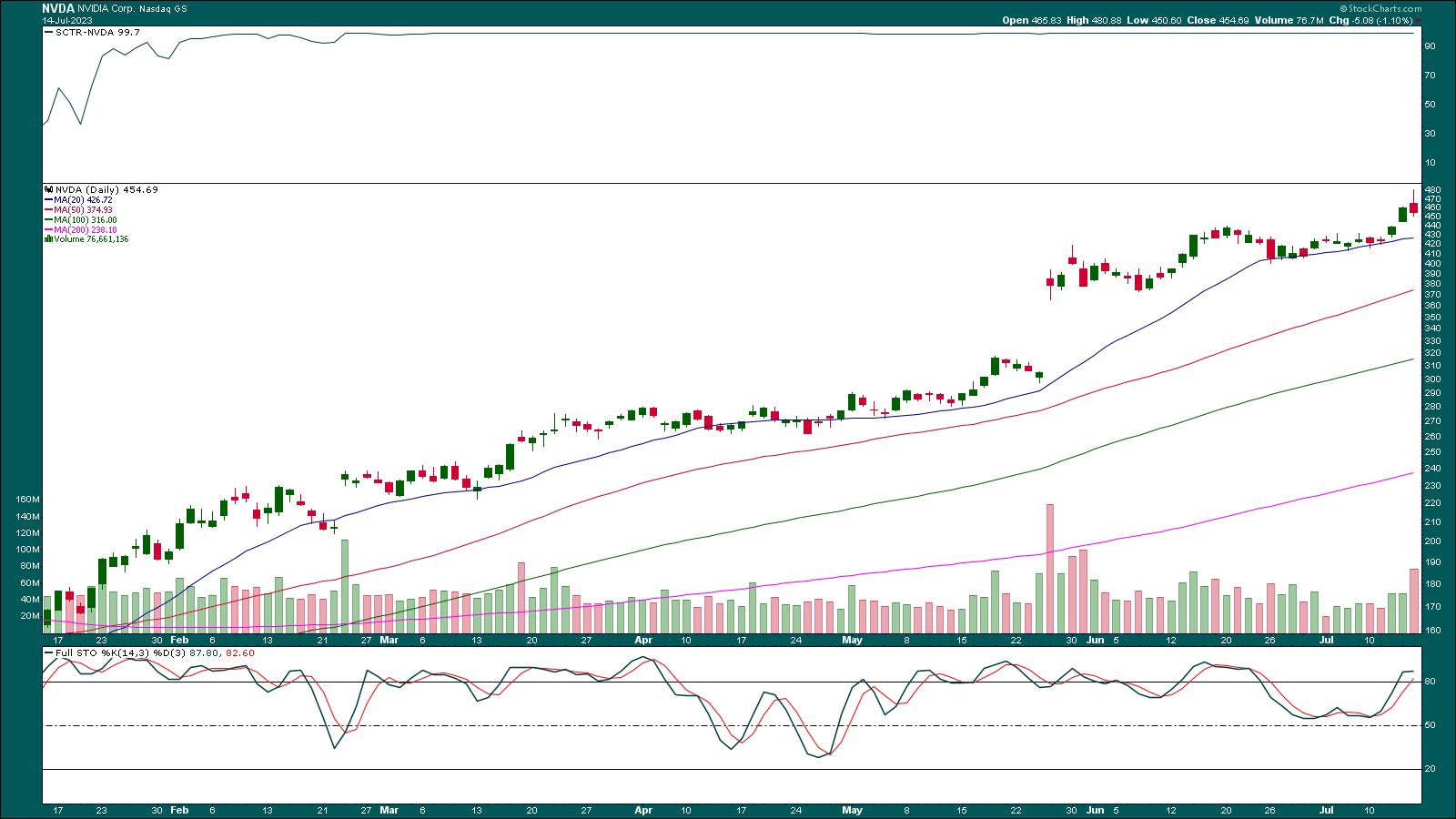
There's the likelihood of many of these stocks reaching overbought levels, which may make them pullback candidates. Using shorter moving averages such as the 20- or 25-day can act as an initial support level for a pullback. One example is the daily chart of Nvidia Corp. (NVDA) below.

IS NVDA READY FOR A PULLBACK? NVDA may be entering overbought territory. Keep an eye on the stochastic oscillator, especially if the stock pulls back to its 20-day moving average. Chart source: StockCharts.com (click chart for live version). For educational purposes.
NVDA has been a top-ranking SCTR candidate since February 2023. Looking at the Stochastic Oscillator in the bottom panel, you see that, when the stock pulled back to its 20-day moving average, the stochastic fell. But the stochastic didn't reach the 50 level. When NVDA bounced off the 20-day MA and rallied higher, the stochastic oscillator turned higher and moved into overbought territory. Looking at the stochastic oscillator, the stock may have further upside movement. If it pulls back to the 20-day MA, it could present a buying opportunity.
Great traders trade with the trend.
And now that smaller caps, other sectors such as Industrials, and international equities are showing signs of catching up with the larger caps, there may be some lower-priced stocks you can jump on.
Earnings Season is Here
So far, this quarter's earnings have been solid but this is just the start. Next week is chock full of earnings. Wall St. will focus on guidance, since that will indicate what to expect in the future. In a rising market, a little bit of bad news could send stocks lower. So, it's a good idea to keep an eye on the big picture. A couple of points to keep in mind as we head into the thick of earning season:
- The US Dollar Index ($USD) has fallen below 100. The last time the index was at this level was in April 2022. The lower dollar sent gold, silver, and copper prices higher.
- Crude oil prices showed signs of a rebound but fell after hitting resistance at its 200-day moving average.
- Bond yields are also lower. The 10-Year US Treasury Yield Index ($TNX) is trading around 3.8%, which is well below its >4% levels it reached in early July.
The Bottom Line
If the S&P 500 closes above 4500, there's a chance it could reach its all-time high of 4818.62. The index may hit resistance close to the 4637 level (March 2023 highs), but it may not be a very strong level. And if the S&P 500 pulls back, look at the 4200 level as a support, which aligns with the 200-week moving average. It may also be worth keeping an eye on earnings. Some heavyweights are reporting next week (see below for a list), and any mention of weak guidance could impact the stock market.
End of Week Wrap Up
US equity indexes mixed; volatility down
- $SPX down 0.10% at 4505.42, $INDU up 0.33% at 34509.03 (best week since March); $COMPQ down 0.18% at 14113.70
- $VIX down 2.28% at 13.30
- Best performing sector for the week: Consumer Discretionary
- Worst performing sector for the week: Energy
- Top 5 Large Cap SCTR stocks: Super Micro Computer, Inc. (SMCI), NVIDIA Corp. (NVDA), Coinbase Global Inc. (COIN), Palantir Technologies, Inc. (PLTR), DraftKings Inc. (DKNG)
On the Radar Next Week
- Earnings season in full swing. Some companies reporting next week: Bank of America (BAC), Morgan Stanley (MS), Charles Schwab (SCWB), Goldman Sachs (GS); Tesla (TSLA), Netflix (NFLX), United Airlines (UAL), American Airlines (AAL), Taiwan Semiconductor Manufacturing Co. (TSMC), Johnson and Johnson (JNJ), and much more.
- June US Retail Sales
- June US Housing Starts
- July Philadelphia Fed Manufacturing Index

Disclaimer: This blog is for educational purposes only and should not be construed as financial advice. The ideas and strategies should never be used without first assessing your own personal and financial situation, or without consulting a financial professional.
|
| READ ONLINE → |
|
|
|
| The Canadian Technician |
| Emerging Market Bond Fund ETFs Look Good |
| by Greg Schnell |
US bond yields dropped sharply this week.
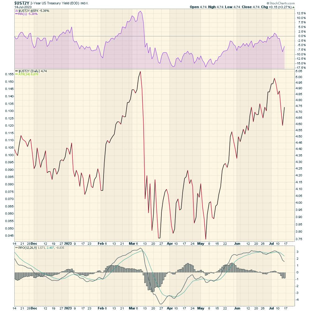
Below is the 2-year yield. One of the important technical characteristics of the chart is a double top. When a chart tests a prior high, we want to see if it succeeds or fails at the prior level that was resistance once before. Clearly the 2-year stopped and did a hard reversal. This pattern suggests the recent top could be a more intermediate top for the bond market, rather than just a short-term stall in price action.

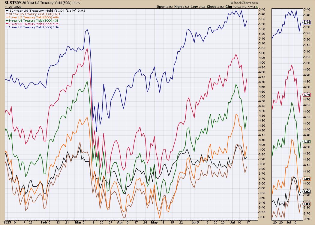
With such a big focus on equity market gains recently, perhaps the bond market is waking up. The short-term notes have higher yields than longer-term bonds, which means the yield is inverted. You would expect a lender to get a higher rate of interest for loaning further out into the future. When they don't get that premium, it is called an inverted yield curve.
What I noticed about the yield chart for the USA was the speed of the decline this week. The 2-year yield is down 40 basis points, or almost 10% from last week's high. The 3- and 5-year yields were down even more on a percentage basis!
The spread between the 5-year yield and the 30-year yield last week was more than 30 basis points. On Thursday, the difference was just 3 points, so the spread dropped 90%. If we have put in the highs for the bond yields, that means we have put in the lows for the bond prices. Even if the bond market continues to drift sideways, the investor is still collecting a significant yield. But if we do have a recession next year, and typically the bond prices will rise as the Fed lowers rates, paying us yield and capital gain.

On the Market Buzz episode this week, I showed how the rest of the world equity charts were starting to slip. Will this perhaps start a rotation into bonds in foreign markets?
I started to hunt down some foreign government bond ETFs perking up. There were some bond charts that showed up as more interesting than in recent weeks. As an example, emerging market bond fund ETFs look good based on the charts. One of the things to watch for: if bond prices start to rally, will we have equity market weakness?
This leads to two scenarios:
- If the rest of world is entering the recession before America, perhaps their government bonds are starting to move higher, which could provide a regular dividend payment and capital gains.
- On the other hand, if the recession fears are overblown, then some of the other high yield or corporate bond charts might improve more as the central banks pause or start lowering rates.
Let's look at both ideas below.
Emerging Market High Yield Bonds
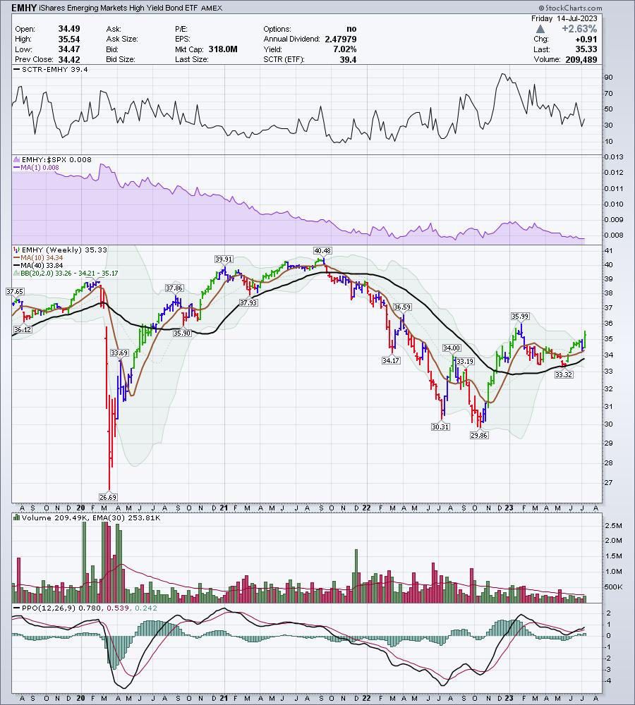
The case for emerging market high yield bonds getting better is shown below.
The chart ticker is EMHY. The chart is high yield emerging markets. This chart pays a 7% dividend and is starting to break out to the upside; that suggests an improving outlook.

Corporate Bonds
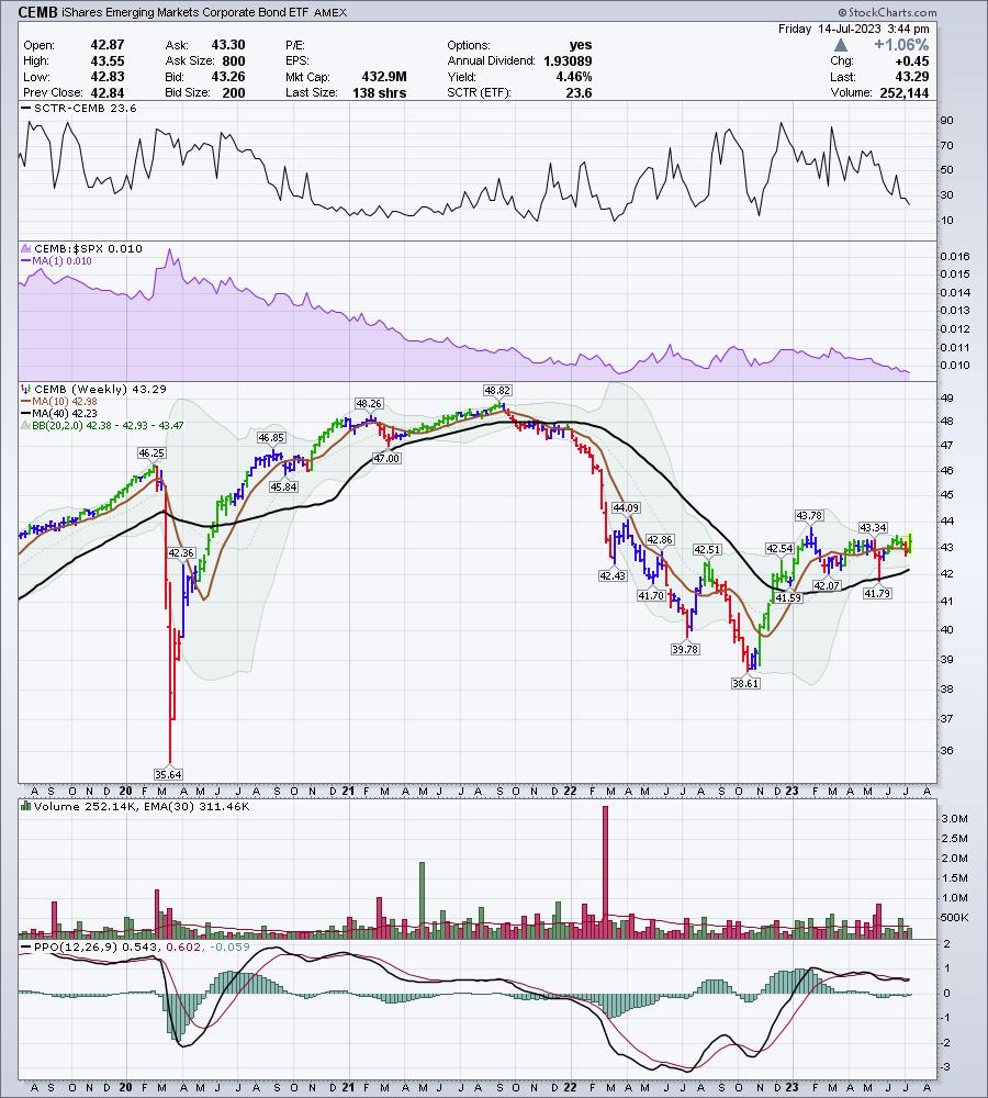
The next chart is for emerging market corporate bonds, but not high yield (higher risk). This chart is also turning up, and made the highest high since February. It pays a 4.4% dividend. Are the emerging market economies starting to improve as both of these charts are looking good?

Government Bonds
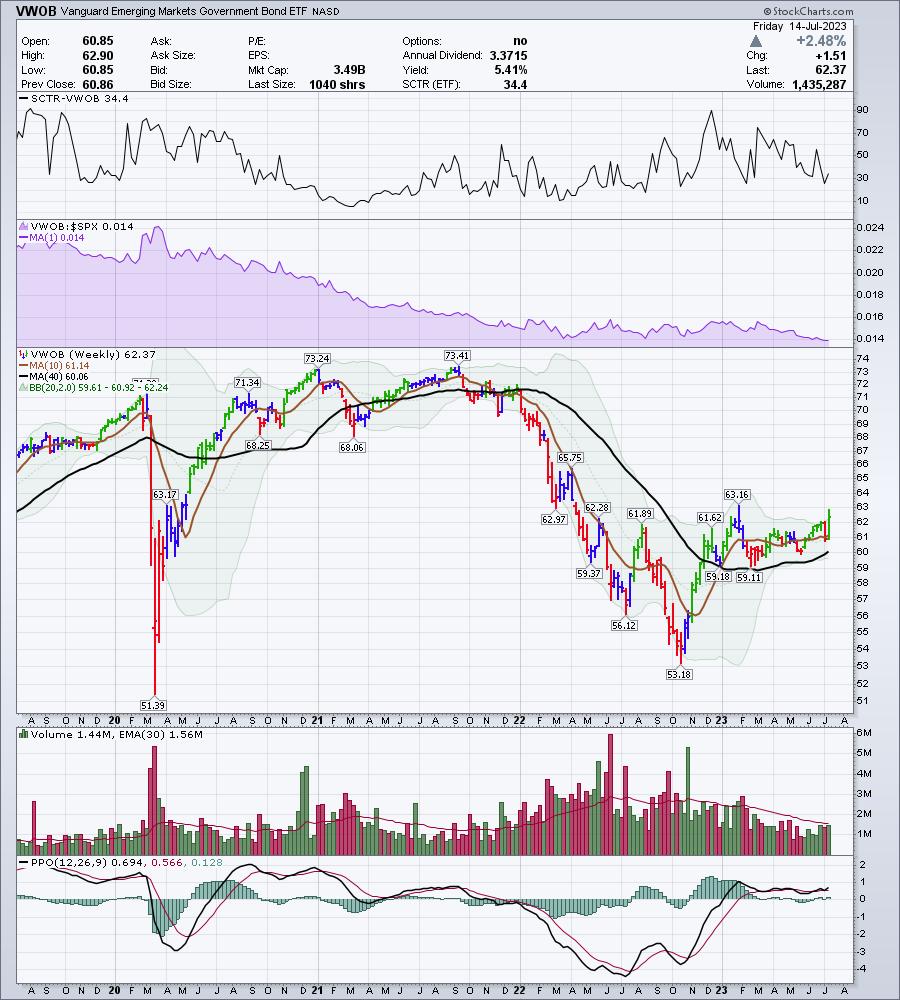
Now, if the emerging market world struggles, as their equity charts appear to be saying, it might be better to buy emerging market government bonds in an economic downturn. In 2022, we had an interesting year, as both bonds and equities fell together. Usually, we tend to see bonds do well when stocks are weakening. If we are going back to a normal rotation, perhaps we'll see the interest in government bond markets perk up. As yields fall, bond prices rise. Capturing a yield, as well as capital appreciation, makes the trade work out nicely. The yield is 5.4% on this government bond ETF!

What these charts suggest to me is that the highs for the emerging market bond yields are in, and we are starting to see bond prices rise. Will high yields continue to go higher with government bonds?
Every week, the stock market continues to surprise on the upside. We have been talking about the big moves up in commodities over the last few weeks. I'll have a lot more ideas after rolling through the charts this weekend. If you would like to sample our work, there is a $7 one-month trial subscription offer that you can try at OspreyStrategic.org. This will also allow you to read up on our past newsletters and watch our previous videos.
One of the things our members have found helpful is the Osprey Opportunities page, with good looking charts provided based on themes or industries.

I think you'll find using the Osprey Opportunities pages to be helpful. Feel free to try it at OspreyStrategic.org for just $7!
|
| READ ONLINE → |
|
|
|
|
|
| RRG Charts |
| Low Vol-to-High Beta Stock Rotation is Surging |
| by Julius de Kempenaer |
In this week's episode of Sector Spotlight, I discussed the rotation out of defensive sectors into more offensive sectors. The ongoing rotation, I should say, as it is a process that has been underway for a while already.
This rotation is sending a pretty clear risk-on message.
Keep on Checking
However, it is always good to double-check any assessment and see if we can find confirmations or reasons why the assumption might be in danger.
One of the ratios that can serve in such a capacity is the relationship between high beta and low volatility stocks. Invesco's High Beta (SPHB) and Low Vol (SPLV) ETFs are perfectly suitable to monitor that relationship.
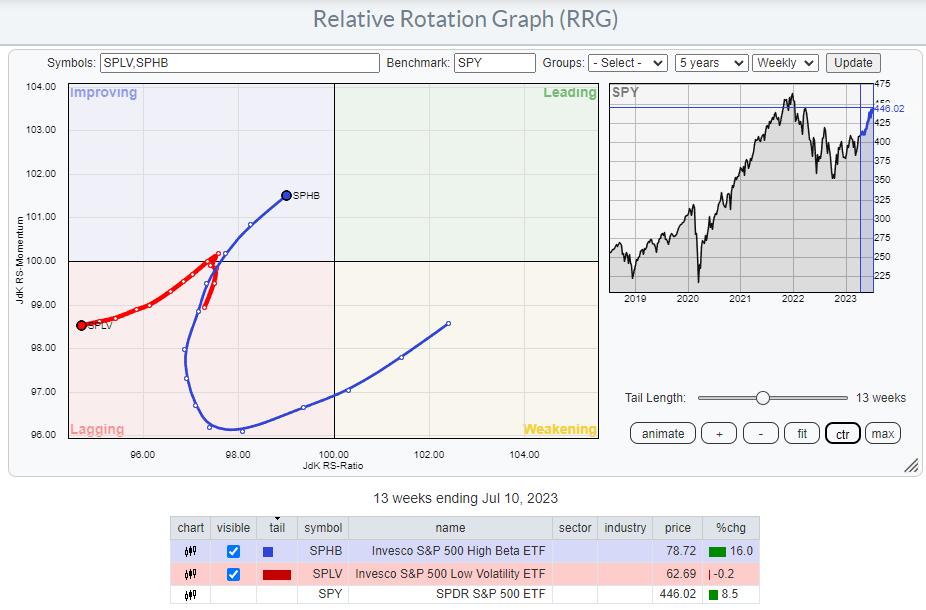
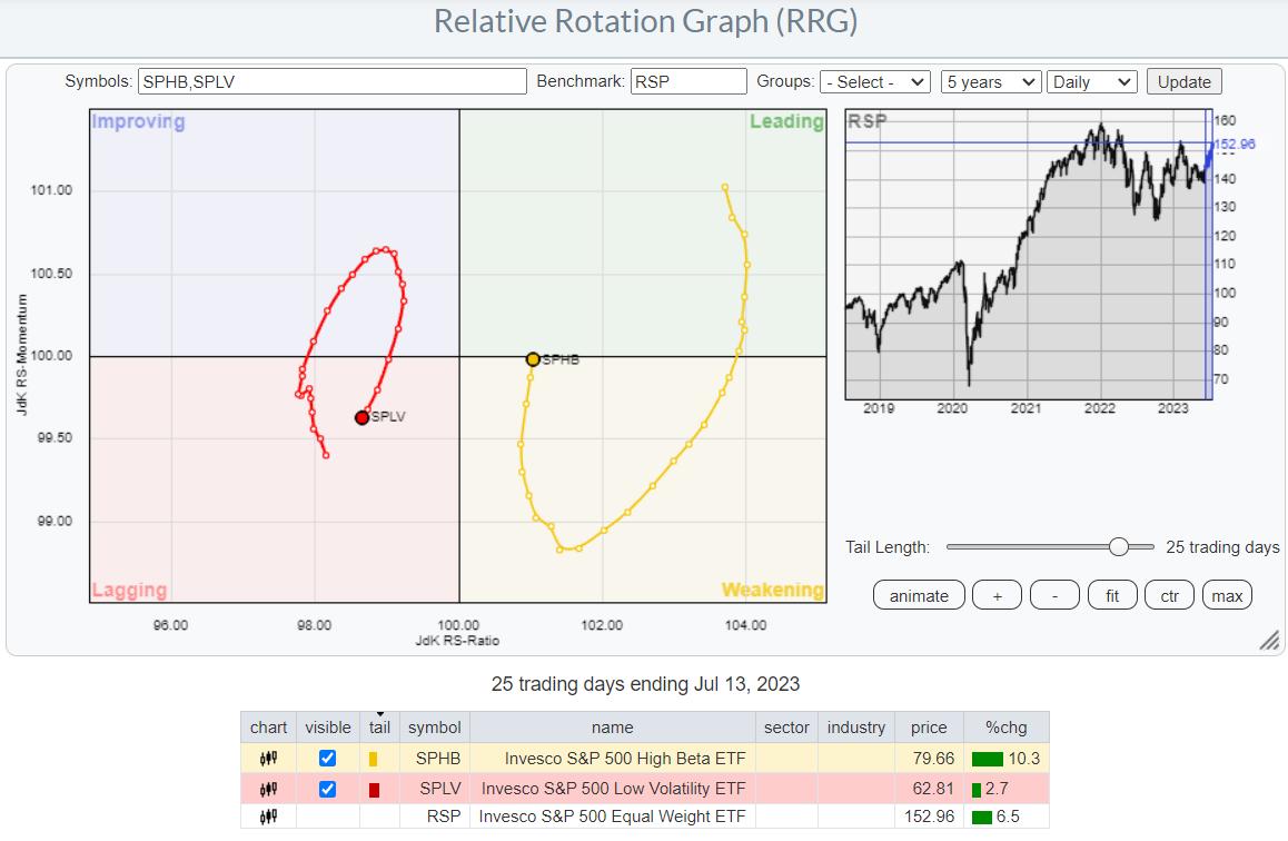
The Relative Rotation Graph below shows the rotation of these two ETFs, using SPY as the benchmark.

It is interesting to see how both tails are on the left-hand side of the graph. A few facts cause this:
- Both ETFs cover only 100 stocks each, while SPY holds all 500 names in the S&P 500 index. As a result, this RRG shows a so-called limited open universe.
- SPHB and SPLV are equal-weight ETFs. At their rebalancing dates, SPHB selects the 100 stocks inside the S&P 500 index with the highest BETA values over the last 12 months. SPLV selects the 100 stocks inside the S&P 500 index with the lowest-realized Volatility over the last 12 months.
We can see the impact of the comparison with the cap-weighted SPY.
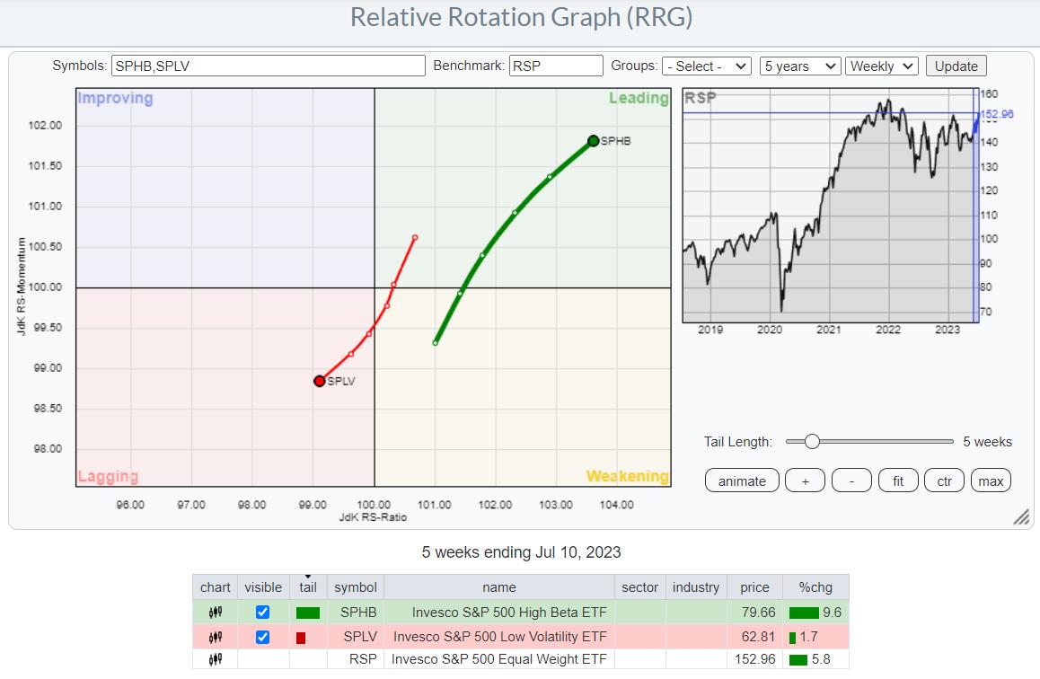
A better way to show this relationship on a Relative Rotation Graph, therefore, is to use RSP, the equal-weight S&P 500 index, as the benchmark.

This visualization paints a much clearer picture of the strength of High Beta over Low Vol, and the rotation confirms the Risk-ON conclusion based on the current sector rotation.
Daily

The daily RRG for this combination of ETFs fully confirms the strength of High Beta over Low Vol. The tails are completing a rotation on the same side of the graph, signaling that a strong relative up-/downtrend is underway. With SPHB just about to re-enter the leading quadrant and SPLV returning into lagging, after a short rotation through improving, a new leg higher in the rotation seems to be starting.
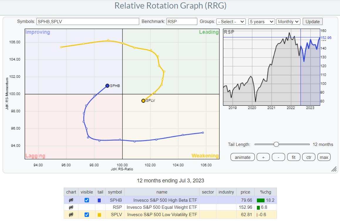
Monthly

The third and final confirmation comes from the same relationship on a monthly RRG. Here we see a big rotation that has been in favor of Low Vol for quite some time, but the tails have recently rotated into RRG-Headings that favor SPHB.
With the tail for SPHB inside the improving quadrant at a strong RRG-Heading, and SPLV moving into weakening at a negative heading, the tide also seems to be turning on the longer monthly time frame. In essence, it looks like things are just starting here.
Price is the Bottom Line
As always, price is the bottom line in any potential trade.

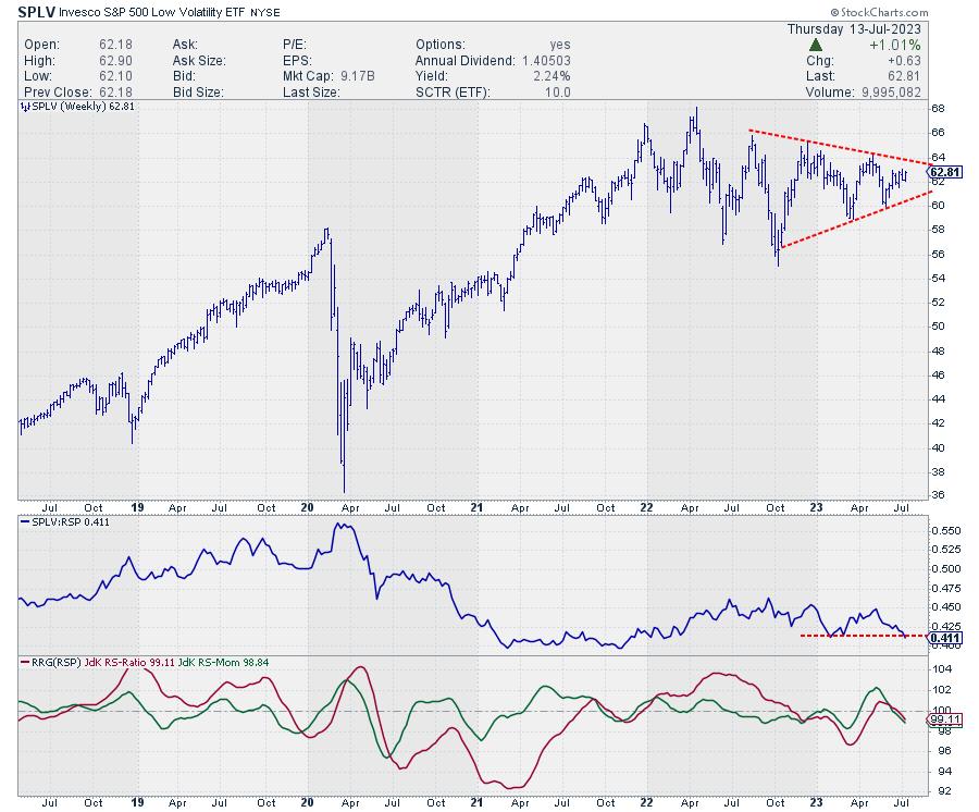
The chart of SPLV shows how it is trading in a sideways pattern that is moving into a triangle consolidation. With the general market moving higher, that is resulting in a falling relative strength line, which in its turn, is causing the RRG-Lines to sink below 100 and push SPLV into the lagging quadrant. This is on the weekly time frame.

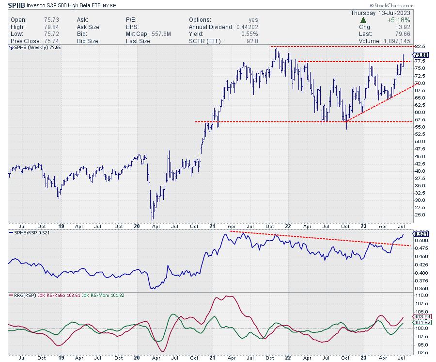
The chart for SPHB looks significantly different. It is breaking above its previous high THIS WEEK, so the break is very fresh.
The raw RS-Line recently broke above a down-sloping resistance line that ran over the highs since early 2021, and the JdK RS-Ratio line bottomed out above 100 and is now on the rise again.
Conclusion
All in all, the RRG on three different time frames, in combination with the price charts and their relatives, is underscoring the risk-ON perception fed by the current sector rotation.
#StayAlert --Julius
|
| READ ONLINE → |
|
|
|
| DecisionPoint |
| Technology Long-Term Double-Top? |
| by Erin Swenlin |
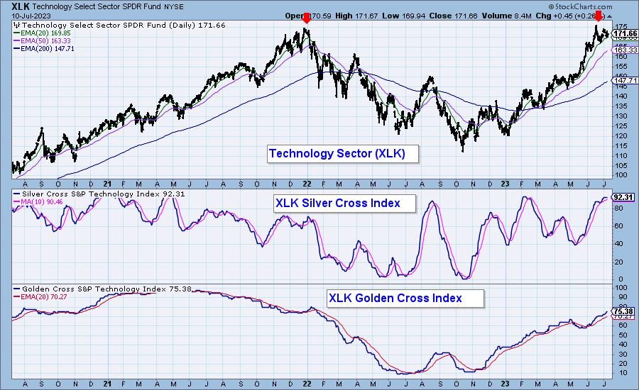
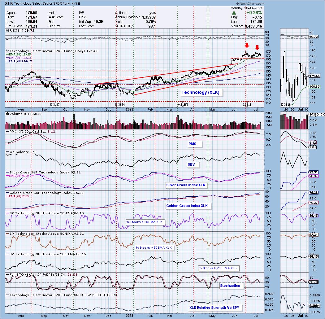
Admittedly it is early, very early to make a pronouncement that a double-top is "in", but we do have a second top and it could be THE top. We've annotated the prior long-term top from 2021. Technology's bear market began in earnest at that time. The Silver Cross Index was not as high as it is now. It is very overbought.
Granted the Golden Cross Index is rising and could rise higher. Many of the stocks within the sector have EMAs that are configured as XLK. Price is well above both the 50/200-day EMAs. The loss of a Golden Cross requires price to move below the 200-day EMA, that is a long way down for many of the very overbought stocks within Technology.

We have a bearish Adam & Eve double-top in the short-term on XLK that suggests at the very least a pullback. The PMO is in decline after bearishly topping beneath the signal line. Participation is holding strong, but is overbought in all timeframes. Nowhere left for those indicators to go except down.

Conclusion: Technology is very overbought and we could be looking at a long-term double-top. At a minimum we have a short-term double-top that suggests a pullback. We will want to watch the Silver Cross Index closely, if we see a drop beneath the signal line it will be character change or "bearish shift".
Subscribers have access to the Golden Cross/Silver Cross Indexes for nine indexes, 11 sectors and five industry groups.
Get Two Weeks FREE!
Come try out the DecisionPoint Alert and DecisionPoint Diamonds reports for free! Just use coupon code: DPTRIAL2 and you get two free weeks! Cancel at anytime.
Learn more about DecisionPoint.com:
Watch the latest episode of DecisionPoint on StockCharts TV's YouTube channel here!

Technical Analysis is a windsock, not a crystal ball. --Carl Swenlin
(c) Copyright 2023 DecisionPoint.com
Helpful DecisionPoint Links:
DecisionPoint Alert Chart List
DecisionPoint Golden Cross/Silver Cross Index Chart List
DecisionPoint Sector Chart List
DecisionPoint Chart Gallery
Trend Models
Price Momentum Oscillator (PMO)
On Balance Volume
Swenlin Trading Oscillators (STO-B and STO-V)
ITBM and ITVM
SCTR Ranking
Bear Market Rules
DecisionPoint is not a registered investment advisor. Investment and trading decisions are solely your responsibility. DecisionPoint newsletters, blogs or website materials should NOT be interpreted as a recommendation or solicitation to buy or sell any security or to take any specific action.
|
| READ ONLINE → |
|
|
|
| Mish's Market Minute |
| David and Goliath, or the Small vs. Large Caps |
| by Mish Schneider |

In the Bible story, David and Goliath represent resilience and overcoming odds. David, a small sheepherder, places a stone in a sling to hurl at Goliath's head. David gets a clean hit and Goliath falls. David then uses Goliath's sword to kill and decapitate the giant.
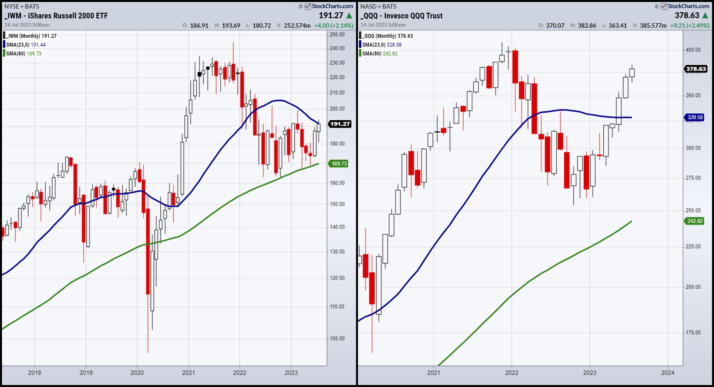
If we look at the small caps and the large caps as seen through the lens of IWM and QQQ, it certainly has similarities to the parable.
Small caps, like David, have had to overcome odds to show resilience. In October 2022, both IWM and QQQs bottomed out. Then, in February 2023, it almost looked like the small caps were ripe to take out the 23-month moving average in blue (or about a 2-year business cycle)... until the commercial bank crisis.
If you are new to the Dailys, I have written extensively on the 2-year cycle as key this year, given the bull run of 2021 and the bear run of 2022. This year, we knew could be pivotal. But is it really?
Once the small caps fell from the key resistance, Goliath woke up. Large caps began to rally, departing from the weakness of the small caps. QQQs kept going and, by May, cleared the 23-month, and off it went. Meanwhile, IWM struggled to hang on to the 80-month or about the 6-to-8-year business cycle low. Except for the COVID crash, IWM has been above the 6-8 year low for over a decade. In fact, we avoided the recession from a technical perspective as not only did that business cycle low hold, but in June the IWM began to run up as well.
Anyway, back to our story. It seemed that, this past week, small caps were once again ripe to run. Of course, NASDAQ has not stopped. After all, technology, according to market sentiment is the savior of everything... but is it really?
Here is where David v. Goliath comes in. Small caps once again ran right to the 23-month moving average and closed the week below it. Now, it may clear it later on this month. If IWM does clear, we think that will take some thunder from the large caps with another rotation to value, but not necessarily the final blow for QQQs. However, if IWM cannot clear, then we can begin to speculate that David has slung the rock at NASDAQ's giant head. Only this time, they both may fall.
Why might IWM not clear the 23-month MA? Inflation, Fed hikes, bonds back in vogue, poor earnings, consumers cutting back??? Take your pick. It is though, too soon to tell.
But let's end with a potential stone.

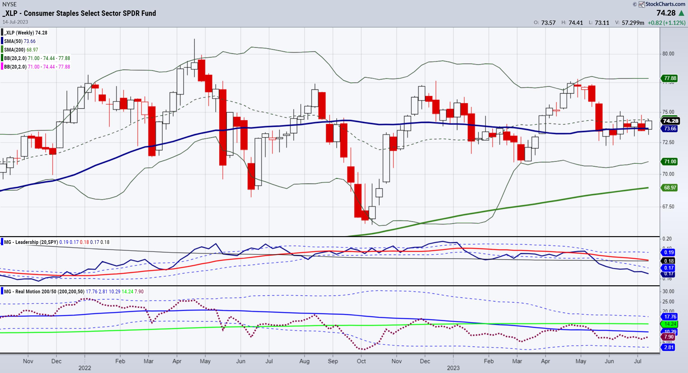
Consumer Staples (XLP).
As this just cleared the 50-daily moving average, a move over 75.00 could indeed signal that the consumer is shifting away from toys, and more towards things they really need.
For more detailed trading information about our blended models, tools and trader education courses, contact Rob Quinn, our Chief Strategy Consultant, to learn more.

"I grew my money tree and so can you!" - Mish Schneider
Get your copy of Plant Your Money Tree: A Guide to Growing Your Wealth and a special bonus here.
Follow Mish on Twitter @marketminute for stock picks and more. Follow Mish on Instagram (mishschneider) for daily morning videos. To see updated media clips, click here.
Mish talks her approach to being a professional trader in this Options Insight interview with Imran Lakha.
Nicole Petallides and Mish discuss crypto, basic materials, inflation and gold in this appearance on TD Ameritrade.
Mish and Ash Bennington cover a lot in this video from Real Vision, discussing everything from the Fed, to inflation, to the incredible move in stocks and what is next.
Mish talks day-trading tactics, currency pairs, gold, oil, and sugar futures in this video from CMC Markets.
Mish and Angie Miles talk tech, small caps and one new stock in this appearance on Business First AM.
Mish examines the old adage "Don't Fight the Fed" in this interview on Business First AM.
Mish and Charles Payne talk the Fed, CPI, Inflation, yields, bonds and sectors she likes on Fox Business' Making Money with Charles Payne.
Mish, Brad Smith and Diane King Hall discuss and project on topics like earnings, inflation, yield curve and market direction in this appearance on Yahoo Finance.
Mish reviews her first-quarter trades in this appearance on Business First AM.
Mish talks women in the trading space and covers a wide variety of ideas in this interview for FreeFX.
Mish runs through bonds, modern family, commodities ahead of PCE on Benzinga.
Coming Up:
July 21: BNN Bloomberg
ETF Summary
- S&P 500 (SPY): 450 pivotal area failed 440 support.
- Russell 2000 (IWM): 193 is the 23-month holy grail.
- Dow (DIA): 34,000 pivotal.
- Nasdaq (QQQ): Great weekly close, so IWM will definitely be key.
- Regional banks (KRE): 42.00-44.00 range.
- Semiconductors (SMH): Where Goliath goes, so do semis -- another potential reversal top.
- Transportation (IYT): Under 250, some trouble.
- Biotechnology (IBB): 121-130 range.
- Retail (XRT): 65.00 key support for this coming week.
Mish Schneider
MarketGauge.com
Director of Trading Research and Education
|
| READ ONLINE → |
|
|
|
| ChartWatchers |
| Bank Earnings Showdown: Emerging Trends You Need To Know |
| by Jayanthi Gopalakrishnan, Karl Montevirgen |

Bank earnings hold a lot of weight on Wall Street. This week, the intensity is set to ratchet up as investors, Wall St., and the Fed closely watch how the banks have performed since their last earnings. Three of the largest US banks—JPMorgan Chase (JPM), Wells Fargo (WFC), and Citigroup (C)—are slated to report their Q2 2023 earnings this Friday.
Bank Earnings as Economic Bellwethers
Last month, the big banks passed the annual Fed stress test. This gave investors a sigh of relief, especially after the banking crisis in March.
Banks also operated in a high-interest rate environment, making them a tough read for investors. How so? Banks can benefit from higher rates, which means increased borrowing costs and cooler loan activity. Investors may choose risk-off mode, preferring fixed income to stocks. Worst case scenario: high interest rates escalate the risk of triggering a recession.
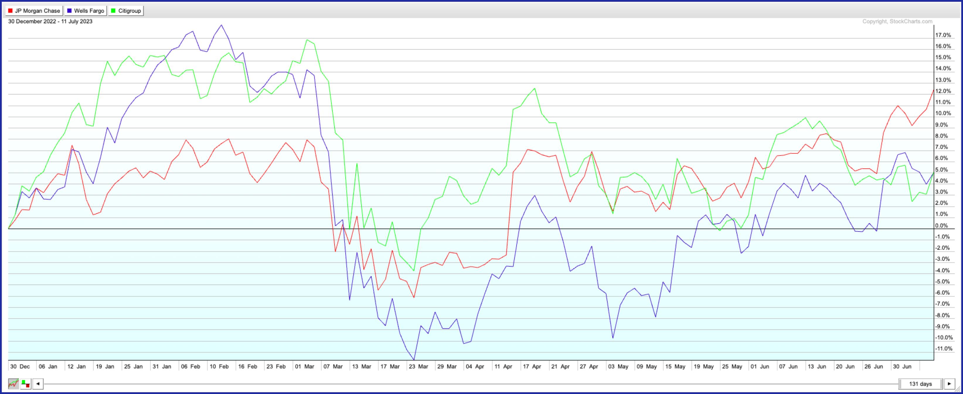
So far, the year-to-date market performance presents a mixed bag. JPMorgan Chase leads the trio with a 12% rise, with Wells Fargo and Citigroup following at around 5%.

CHART 1: YTD PERFCHARTS COMPARING JPM, WFC, AND C. After plunging valuations in March triggered by the banking crisis, there's been a steady recovery, with JPM taking the lead, followed by WFC and C.Chart source: StockCharts.com. For educational purposes.
Ahead of these earnings reports, the question remains: will the momentum hold, or might we expect a few headwind surprises?
What's the Word on the Street?
JPMorgan Chase (JPM) had a blowout first quarter and significantly raised its guidance for the second quarter. The bank's resilience and revenue were driven by a substantial increase in net interest income (what it generates through its lending activities after subtracting what it owes to depositors). JPM's well-positioned given its strong balance sheet, operational efficiency, and significant growth opportunities, such as its recent acquisition of First Republic Bank.
Wells Fargo has also shown resilience in the face of the March banking crisis, managing to turn the year around with its shares currently in the green. WFC's net interest income remains healthy, and the bank expects it to increase by 10% this year. In addition to share repurchases and a relatively strong capital position, WFC's asset cap (yes, remember its penalization for the fake account scandal?) is expected to be removed soon. That signals growth opportunities and potential long-term upside.
What happens when Too Big To Fail meets bargain basement prices? You get Citigroup. The bank has seen better days, valuation-wise. But with its new leadership, Citi is attempting to turn the ship around, shedding many of its international branches and bolstering its wealth management and bond trading operations. Its low price-to-earnings and price-to-book ratios might also make it attractive to some. It's easy to think that the stock is simply overvalued, but does that make it a good prospect for a buy?

If Any of These Banks are Good Buys—When or Where Should You Pull the Trigger?
What might signal a favorable buy trigger? This is where technical analysis can be invaluable. While fundamental analysis can give you a strategic framework for trading decisions, the precise timing and execution of trades heavily rely on technical analysis. In short, technical analysis makes fundamental data more precisely actionable.
Chase Keeps Getting Bigger
When a stock reaches a 52-week high, it may be time to pay attention. JPM triggered several predefined scans in StockCharts in the last few days—Moved Above Upper Keltner Channel, New 52-week Highs, Moved Above Upper Bollinger Band, and more. That could change, but when a stock has triggered many scans that indicate the stock is likely to move higher, it's worth adding the stock to one of your ChartLists.

StockCharts Tip. From Your Dashboard or Charts & Tools, click on Symbol Summary and enter the stock symbol. At the bottom of the page, you'll see the Predefined Scans the stock triggered.
JP Morgan Chase faces the headwinds most bank stocks face—deposit outflows, credit softening, cooling of loan growth, and weakening credit trends. But the stock is showing strength. If you look at the weekly chart, you'll see that the stock has been moving higher since October 2022, and it looks like it could be a long-term play, given that there's no heavy resistance looming between where the stock's price is and the stock's October 2021 high.
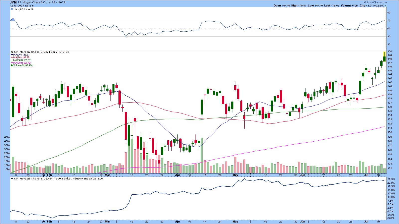
Switching over to the daily chart, since the beginning of the year, JPM's stock price has risen over 12%.

CHART 2: JP MORGAN CHASE RISING HIGHER. The stock is trading above its 20-day moving average, the RSI is sitting at the 70 level, and relative strength compared to the S&P 500 Banks Industry Index ($GSPBKI) is close to 22%.Chart source: StockCharts.com (click chart for live version). For educational purposes.
The stock is trading above its 20-day simple moving average (SMA), which is trending upwards. The relative strength index (RSI) has just crossed above the 70 level. A move higher would increase the bullishness of the current reading. The relative strength, with respect to the S&P 500 Banks Industry Index ($GSPBKI), is close to 40%.
If JP Morgan Chase announces strong earnings and guidance, the stock could soar.
Wells Fargo Looks Choppy
WFC had its fair share of obstacles on the regulatory front, but that looks like it may be in the rearview mirror. The weekly chart shows the stock price has been moving up and down, with no clear direction.
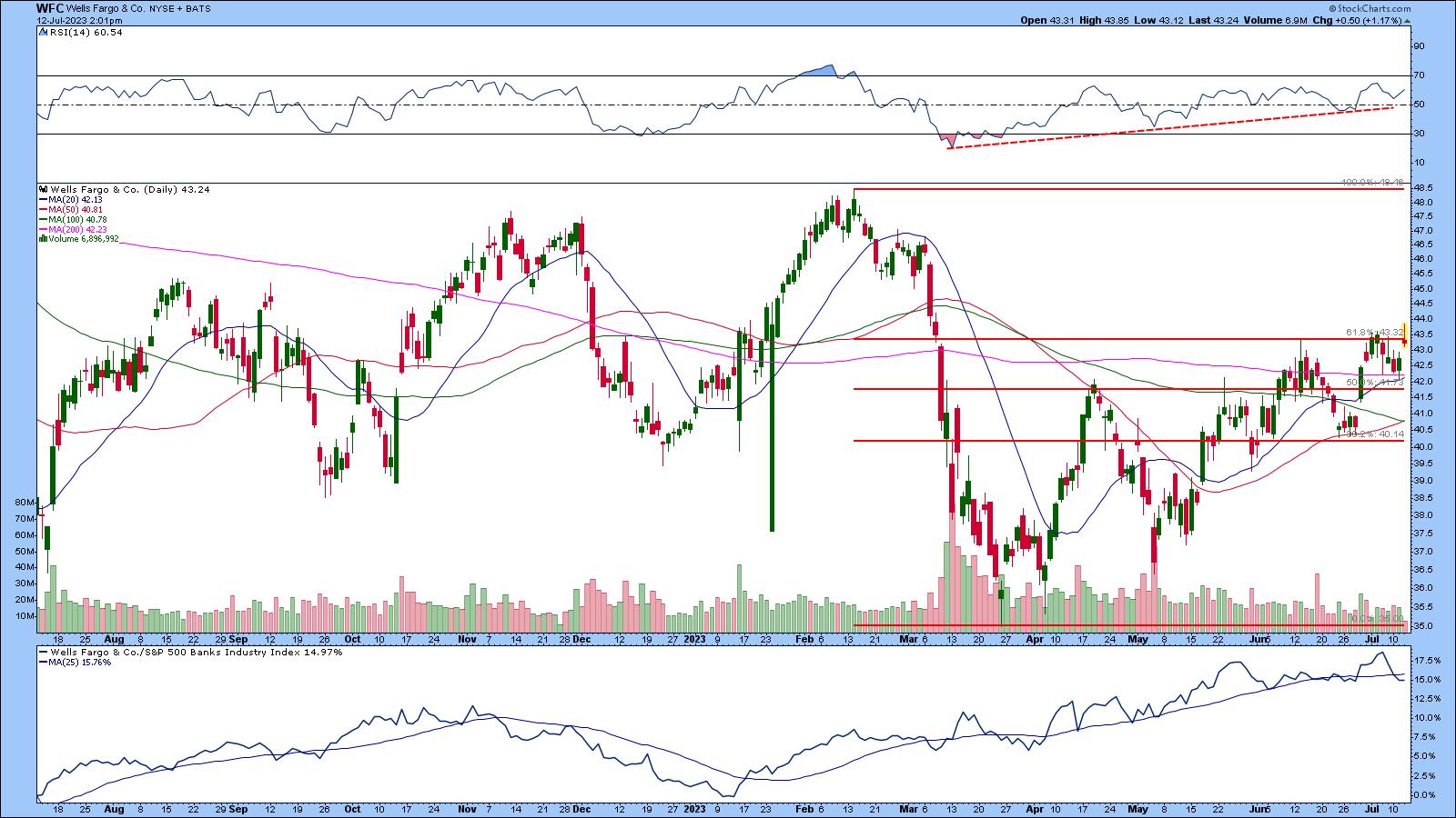
In the daily chart, price has to break above the 61.8% retracement level. A break through this level could give the stock price a chance to challenge its February highs.

CHART 3: WILL WELLS FARGO'S STOCK BREAK ABOVE THE 61.8% FIBONACCI RETRACEMENT LEVEL? It all depends on their earnings report. A break to the upside could see the stock price reach its February highs. The RSI is trending higher, and relative strength with respect to the banking industry is at 15.75%.Chart source: StockCharts.com. For educational purposes.
The RSI is trending higher, and its relative strength vs. the banking industry is above 15%, just below the 25-day moving average of the indicator. If WFC beats earnings expectations, the stock could get a boost. The Symbol Summary shows WFC triggered a few predefined scans that indicate a potential upside move.
Citigroup Has to Play Catch Up
C's stock price has had a pretty rough road. The weekly chart shows the stock has trended lower since June 2021, but looks like it's been in a base since August 2022.
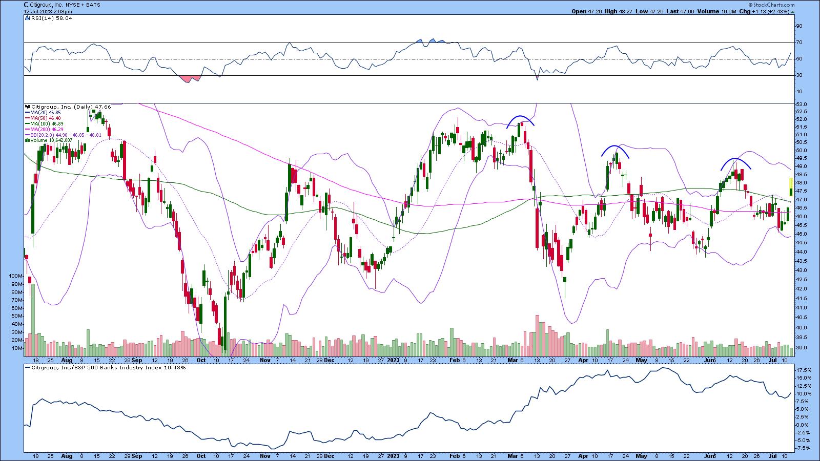
The daily chart shows a similar picture. For the stock to make a comeback, it must break its pattern of lower highs.

CHART 4: WHICH WAY FOR CITIGROUP? If the company beats earnings expectations, there's a chance the stock price could move to the upside, but it has a ways to go before catching up with the rest of the pack.Chart source: StockCharts.com. For educational purposes.
When a stock is trading sideways, it helps to use an indicator that looks at trend and momentum, such as Bollinger Bands®. C has been trading within the Bollinger Bands with no clear breakout in either direction. The RSI has been moving between 30 and 70 and relative strength vs. the banking industry is at around 10%. The big question is, if C meets or beats expectations, will it be enough to boost the stock price enough to catch up to the rest of the pack?
The Bottom Line
Eyes are firmly on Wall Street's heavyweights: JPMorgan Chase, Wells Fargo, and Citigroup. Will they beat the odds or buckle under?
JP Morgan may be the clear winner, but if Wells Fargo and Citigroup offer solid earnings or guidance, they could be good bargains for investors. Keep an eye on critical resistance levels. If the stocks look like they have upside momentum, they could be good longer-term investments.

Disclaimer: This blog is for educational purposes only and should not be construed as financial advice. The ideas and strategies should never be used without first assessing your own personal and financial situation, or without consulting a financial professional.
|
| READ ONLINE → |
|
|
|
| MORE ARTICLES → |
|


 How to Run Scans. From Your Dashboard or Charts & Tools, scroll down to the Sample Scan Library. Click Browse Scan Library and run the New All-Time Highs and New 52-Week Highs scans.