| THIS WEEK'S ARTICLES |
| John Murphy's Market Message |
| TEN-YEAR BOND YIELD NEARS UPSIDE BREAKOUT |
| by John Murphy |
TEN-YEAR YIELD TESTING OCTOBER HIGH... Last week's message suggested that rising bond yields (along with rising energy prices) was one of the factors that could push an overbought stock market into a downside pullback. More on that shortly. The big story of the week, however, was how much higher bond yields could climb. The daily bars in Chart 1 show the 10-Year Treasury yield in the process of testing its previous high formed last October. A Friday pullback prevented an upside breakout from taking place. But the major trend of the TNX appears to favor higher bond yields. Chart 2 suggests how much higher they might rise if last October's high is taken out.
 Chart 1 Chart 1
A LONGER RANGE LOOK AT YIELDS... The monthly bars in Chart 2 show that the long-term downtrend in bond yields has reversed to the upside. And it shows the 10-Year yield testing its high formed last October. If and when that high is exceeded, that would put the TNX at the highest level since 2007. And the high formed that year would become a potential upside target. The red circle shows that high to be above the 5.00% level (5.31% to be exact). That big a move raises the risk for stocks which usually don't do well in a rising rate environment.
 Chart 2 Chart 2
MONTHLY SECTOR RANKING... Chart 3 ranks the eleven S&P 500 sectors since mid-July when bond yields started rising. Not surprisingly, energy has been the market's strongest sector over the last month as energy prices started rising. As suggested last week, rising energy prices have been one of the factors pushing bond yields higher. At the same time, technology stocks have been the market's weakest sector. That makes sense since tech stocks are usually negatively impacted by rising bond yields. Their divergent trends are shown in the two charts below.
 Chart 3 Chart 3
ENERGY STOCKS LEAD... The daily bars in Chart 4 show the Energy SPDR (XLE) maintaining its uptrend after exceeding its April high which is now providing support. The rising solid line which plots the XLE/SPX ratio shows energy leadership over the last month (along with rising energy prices). Fears that rising energy may boost inflation numbers is one of the factors pushing bond yields higher. That's not good for technology shares.
 Chart 4 Chart 4
TECH SHARES WEAKEN... The daily bars in Chart 5 show the Technology SPDR (XLK) losing ground over the last month as bond yields (and energy prices) turned up. The falling red line plots the XLK/SPX ratio which shows relative weakness in that sector. The chart also shows the XLK falling below its blue 50-day average. That confirms that its short-trend has turned down. The good news is that the XLK is finding some support at its green 100-day average. What happens from here may depend on the direction of bond yields.
Seasonal factors may also account for some of the recent stock selling. As shown last week, August and September are usually the market's weakest calendar months. That may also keep stocks on the defensive.
 Chart 5 Chart 5
|
| READ ONLINE → |
|
|
|
|
|
| Larry Williams Focus On Stocks |
| Larry's "Family Gathering" Full Webinar -- AVAILABLE NOW! |
| by Larry Williams |
 Larry's "Family Gathering" webinar is now available! Whether you missed it and need to catch up, or just want to review the information Larry presented, you can now see the full recording below. Larry's "Family Gathering" webinar is now available! Whether you missed it and need to catch up, or just want to review the information Larry presented, you can now see the full recording below.
In this special presentation, Larry discusses market cycles in detail, outlines his proprietary indicators, and examines big-name ticker symbols and more. He engages directly with his viewers through audience questions, fielded by co-host Louise Stapleton, and gives his opinion on audience-requested stocks.
Watch the full video here! Originally recorded August 17, 2023.
|
| READ ONLINE → |
|
|
|
| Martin Pring's Market Roundup |
| Is this a Normal Correction? Or Could It Be the Start of Something Much Bigger? |
| by Martin Pring |
The recent rise in interest rates and energy prices is certainly a cause for concern should these trends extend in any meaningful way over the next few months. After all, we are just about to enter September, which is seasonally the worst month of the year for stocks. Following that, there is the crisis-prone month of October. It is also true that many indicators remain in overbought territory and AAII numbers are heavily skewed to the bulls, so it's not difficult from a contrarian aspect to adopt a bearish stance.
This correction probably has further to go, but, until proven otherwise, this is still a bull market. The late great Richard Russell used to remind us that surprises come in the direction of the main trend, which, if our bull market scenario pans out, means the correction could well be over when we least expect it.
The Main Trend
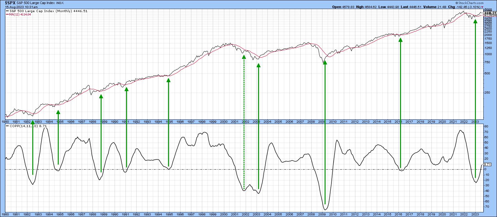
Chart 1 sets the scene with the Coppock Curve. With one exception in 2022, this indicator has signaled all the bull markets since 1980 and remains at a relatively subdued reading. More to the point, it is showing no signs of a downside reversal. The S&P is also well above its 12-month MA, so no sign of trouble there either.
 Chart 1 Chart 1
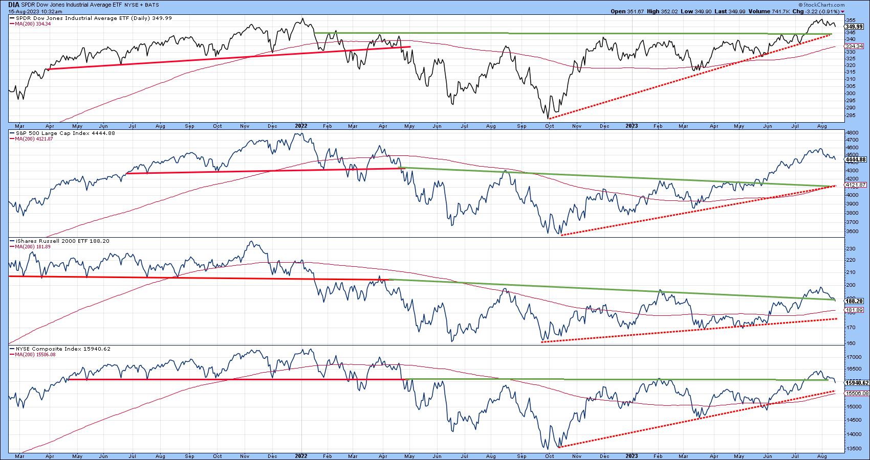
Chart 2 features the Dow, Russell 2000, and the S&P and NYSE Composites. All are experiencing a series of rising peaks and troughs and are comfortably above their 200-day moving averages. One thing to watch out for is the fact that the Russell and NYSE Composite are very close to their extended breakout trendlines. If those are violated, that could well trigger a test of their moving averages and dashed red bull market trendlines.
 Chart 2 Chart 2
This Time It's Different
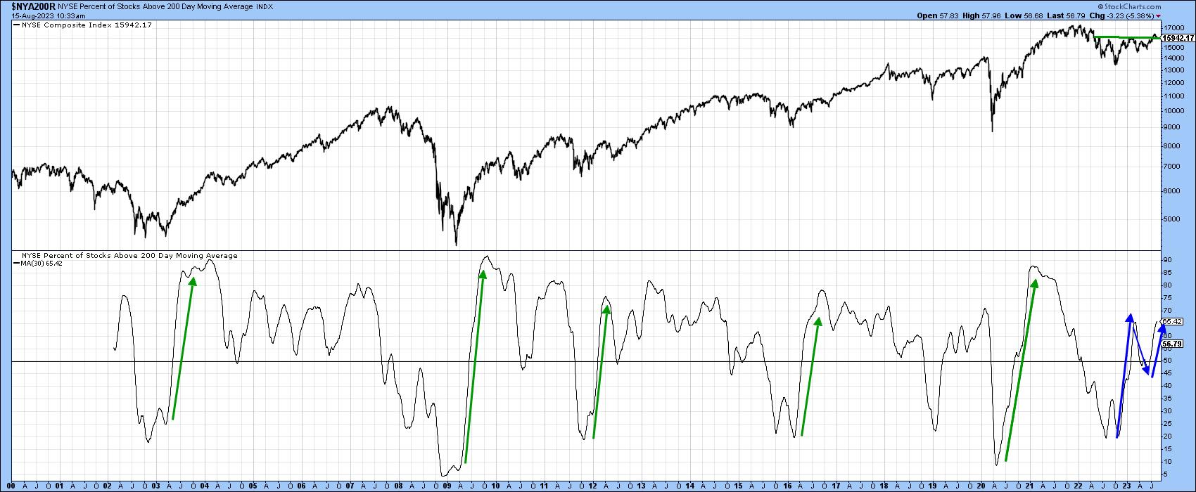
That said, there is no doubt that this bull market is acting in a different way than most others preceding it. We can see this in Chart 3, featuring the percentage of NYSE stocks trading above their 200-day moving averages. The green arrows flag the rally off the previous five bear and mini-bear markets. Note how they were literally straight-line affairs, initially peaking at an extended level. Now consider the rally off last October's low. Rather than being a straight line, this advance took the form of an upward zig-zag. This was a positive move, but had nowhere near the power of its predecessors.
 Chart 3 Chart 3
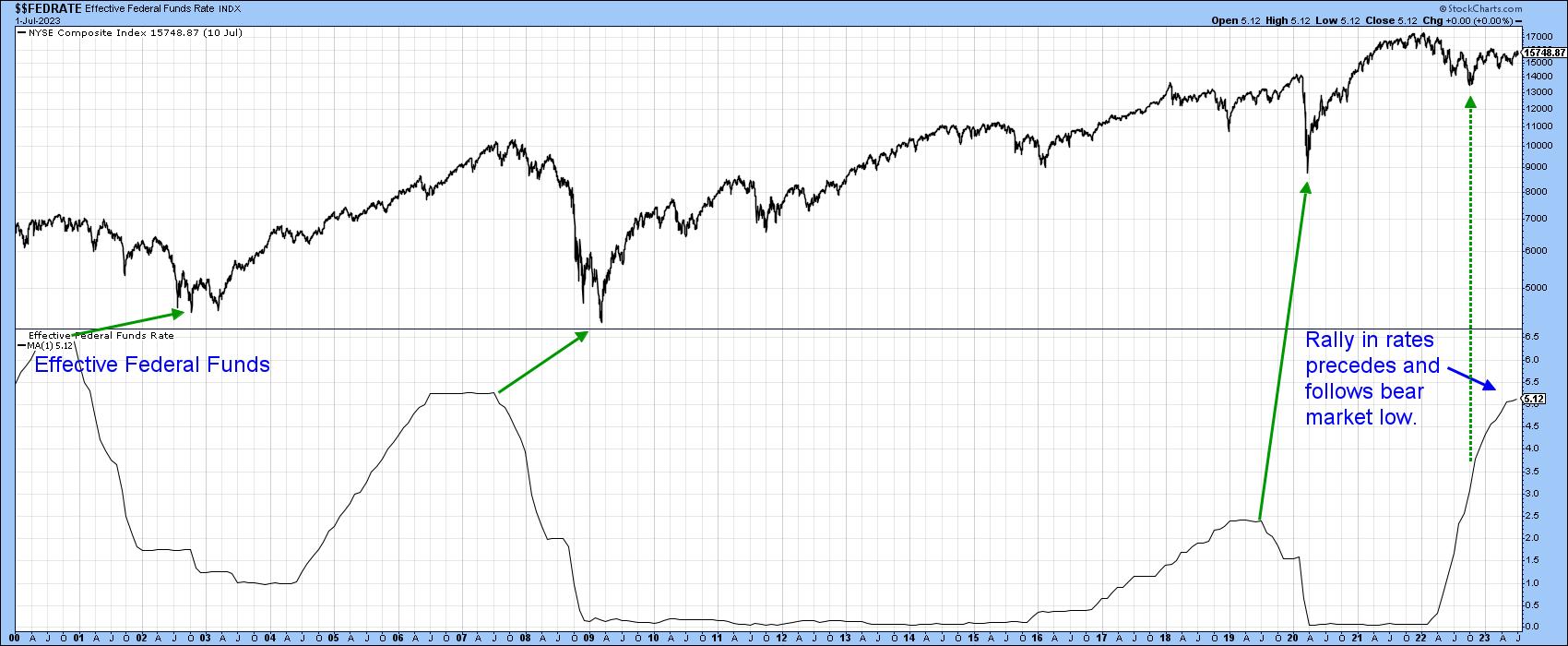
The reason probably lies in the fact that the three bear markets that were associated with recessions -- 2000-2002, 2007-2009, and 2020 -- were all preceded by a sharp and protracted decline in interest rates. In that respect, Chart 4 tells us what we already know, that last October's bottom was not only preceded by higher rates, but is being followed by them as well. For more on this potential headwind, you might want to read this article. The point I am trying to make is the current trend is bullish for equities, but we should expect less in terms of duration, magnitude, or both for the 2022-?? cycle than previous ones. It's important to remember that the lower rates reflect a weak economy, where corporate breakevens are significantly lowered. Consequently, when the economy begins to recover, increased revenues go directly to the bottom line, and an explosive stock market follows. In the current situation, the unrelenting rise in short-term rates is likely to constrain the primary bull market.
 Chart 4 Chart 4
The Correction
The indicators I rely on are still flashing corrective vibes. Remember, this can take the form of a trading range as well as a decline, so it's possible that the support for the Russell and NYSE Composite in Chart 2 could still hold as part of an ongoing sideways retracement move.
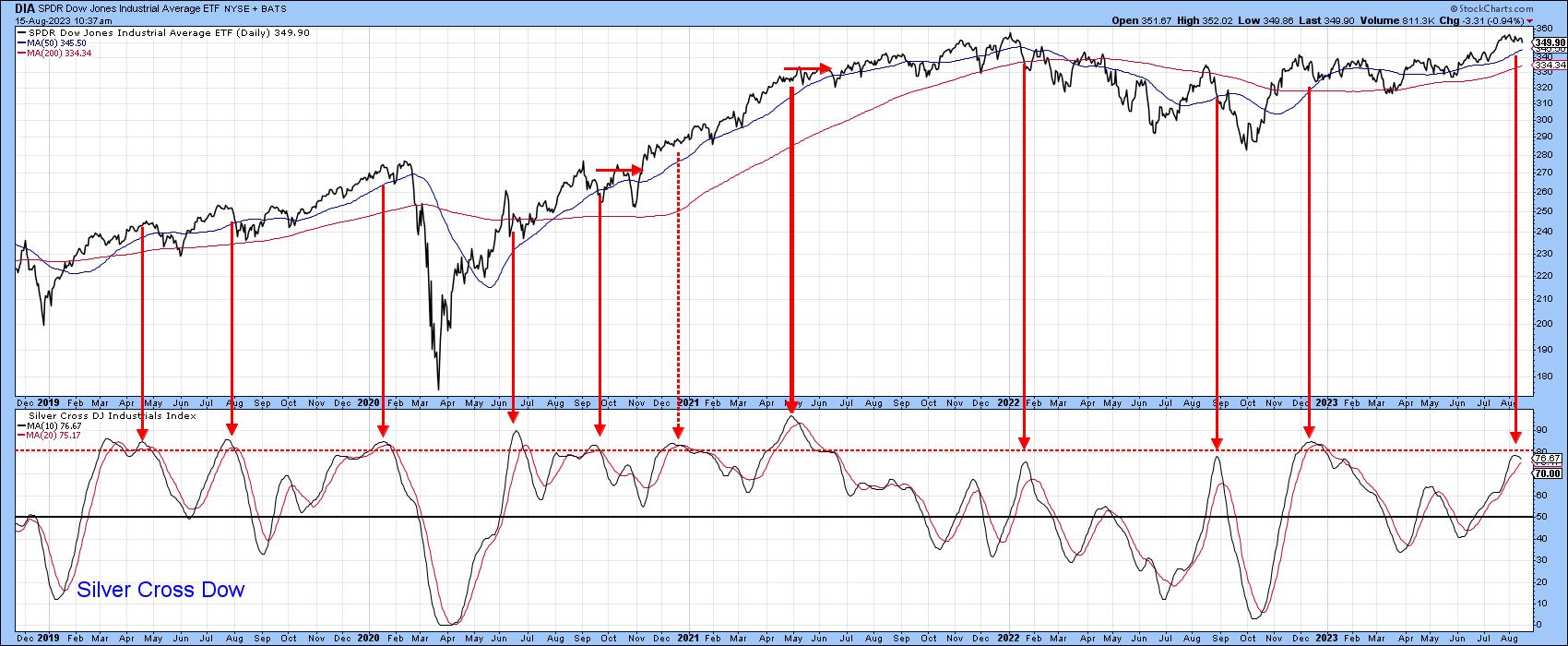
One short-term indicator that has reliably signaled the termination of a correction in a bull market is the silver cross. Chart 5, for instance, features an indicator calculated from the percentage of DJIA components with a positive silver cross (20-day above 50-day MA). It has started to roll over from an overbought level. Previous sell signals have been flagged with red arrows. Most were followed by a short-term correction of some type, especially those that were triggered under the context of a bear market. It is obviously closer to a sell than buy signal.
 Chart 5 Chart 5
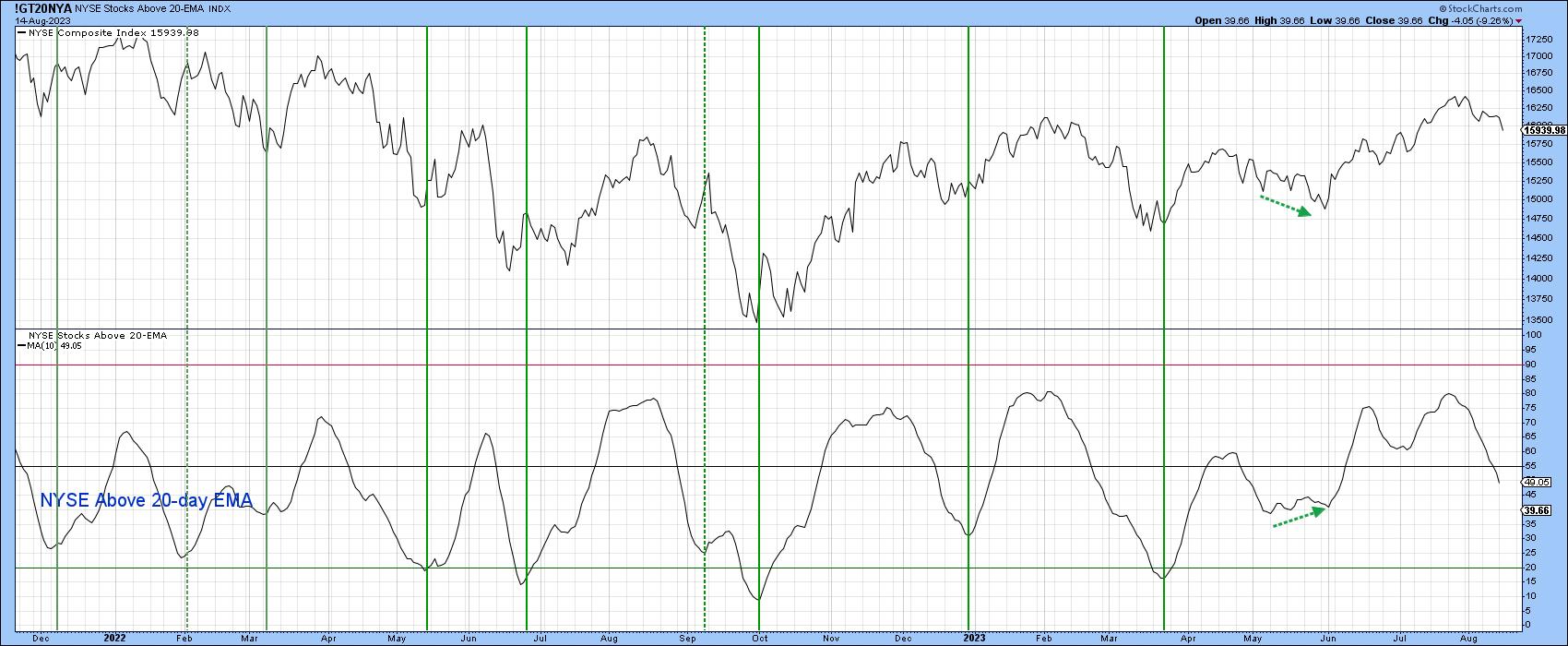
Chart 6 features the percentage of NYSE stocks above their 20-day EMA. This indicator has been bearish for some time and is now at a neutral level; no sign of a buy signal here.
 Chart 6 Chart 6
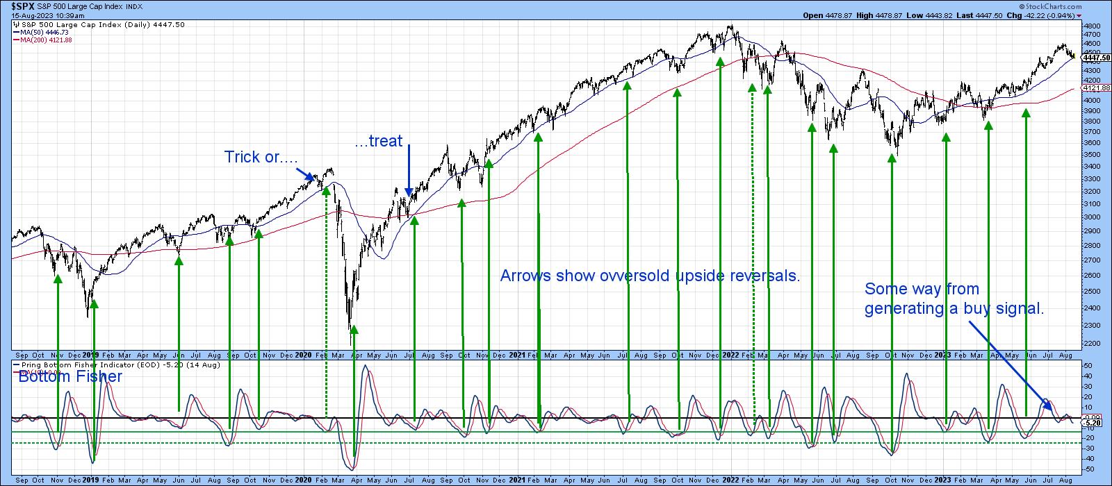
The indicator that I am following most closely, though, is my Bottom Fisher (!PRBFISH), which you can read about here. This series is valued for its ability to "fish" for bottoms more than anything else. It triggers buy signals and earns a green arrow when it drops to one of the green horizontal oversold lines, and then reverses to the upside. Generally speaking, the lower the level at which the reversal takes place, the stronger the signal. Clearly the "fisher" is some way from generating a signal, which suggests the August correction has further to run.
Remember, you can update any of these charts by clicking on them. You can even save them in a ChartList or as a ChartStyle.
 Chart 7 Chart 7
Good luck and good charting,
Martin J. Pring
The views expressed in this article are those of the author and do not necessarily reflect the position or opinion of Pring Turner Capital Group of Walnut Creek or its affiliates.
|
| READ ONLINE → |
|
|
|
| The Mindful Investor |
| Are You Ready for a Huge Selloff? |
| by David Keller |
We first saw the mega-cap technology names rotate lower, with Apple (AAPL) and Microsoft (MSFT) breaking down after clear bearish divergences. We now have almost all of the "Magnificent Seven" growth stocks breaking down through their 50-day moving averages, joining about 55% of the S&P 500 members in doing so.
Is this really the time to be bullish? Well, yes and no, depending on your time frame. My base case is for further downside in August into September, setting the benchmarks up for a nice rally in the fourth quarter. But the essence of what I call "probabilistic analysis," of which I'm a big proponent, is to force yourself to consider alternatives and think through various scenarios.
I feel that investors are sometimes caught on the wrong side of the markets not because of a lack of conviction, but a lack of imagination. If we can think through different potential scenarios now, then we should be much better prepared when something unusual happens next!
I'm super excited for our next free webcast, THE GREAT ROTATION OF 2023. We'll talk seasonal tendencies, sector rotation, breadth dynamics, and leadership shifts with all the charts. If you're struggling to keep up with leadership shifts and competing narratives, let us help you cut through noise and focus on the message of the markets.
We're going live on Tuesday, August 22nd at 1:00pm ET. Sign up for this free webcast right HERE!
This also gives me another chance to post something completely opposite to Tom "The Bull" Bowley, which is always a pleasure. To be clear, his article this week makes some excellent points on sentiment shifts suggesting optimism here. But let's get back to stretching our thinking with a bearish alternative or two.
Today, I'll briefly break down the current conditions in terms of price and breadth indicators. We'll then review some signals that could confirm further downside potential and what we'd need to see to turn away from a bearish thesis.
What are the Current Market Conditions?
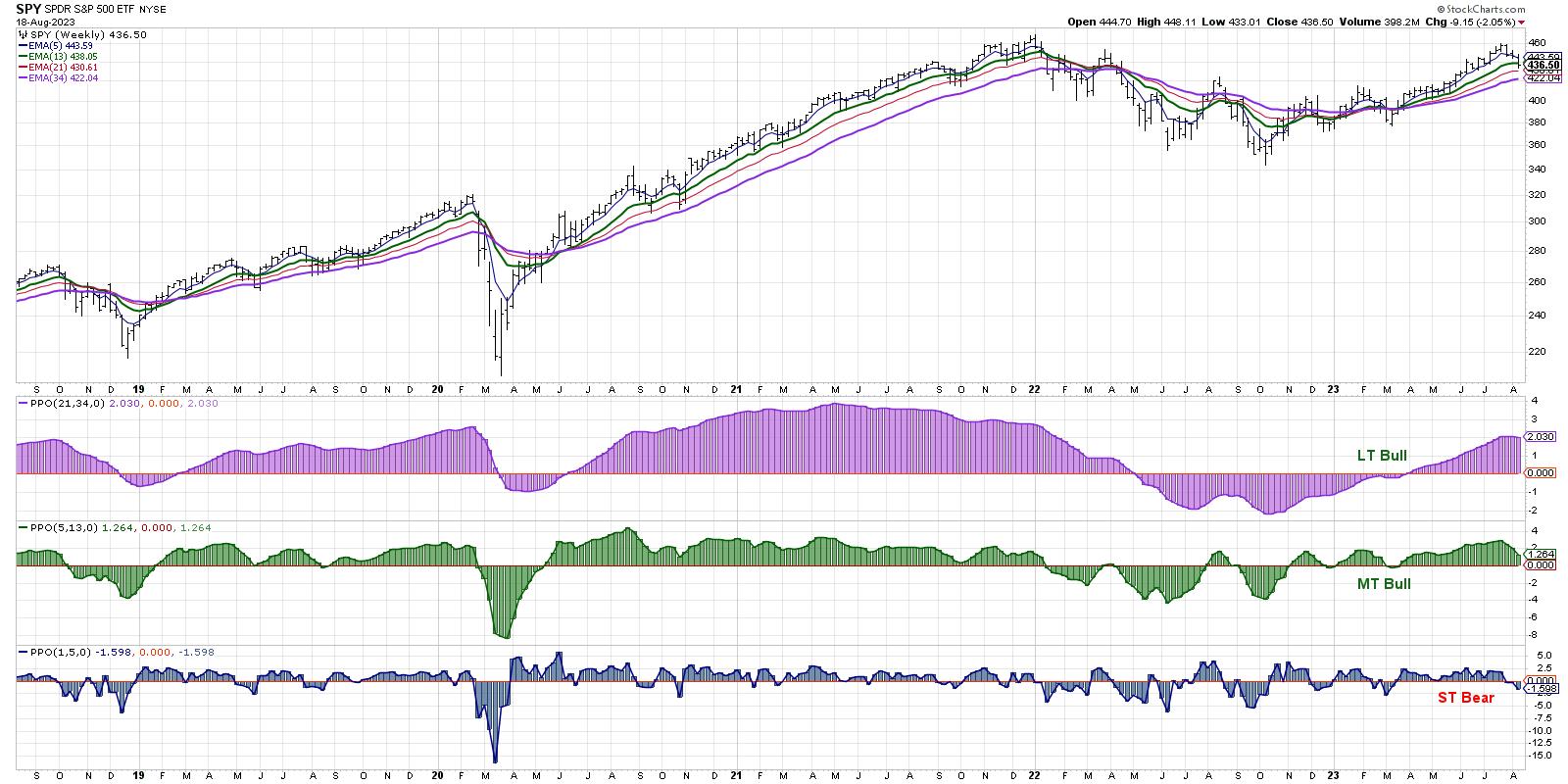
When in doubt, follow the trend in the markets. And that trend is currently down. Well, it actually depends on your timeframe. Our Market Trend Model is bearish on the short-term, but still bullish on the medium-term and long-term.

I tend to use the medium-term model as a primary indicator of "risk-on" or "risk-off" conditions, so this would suggest that, even though we've seen short-term weakness, the primary trend is still higher.
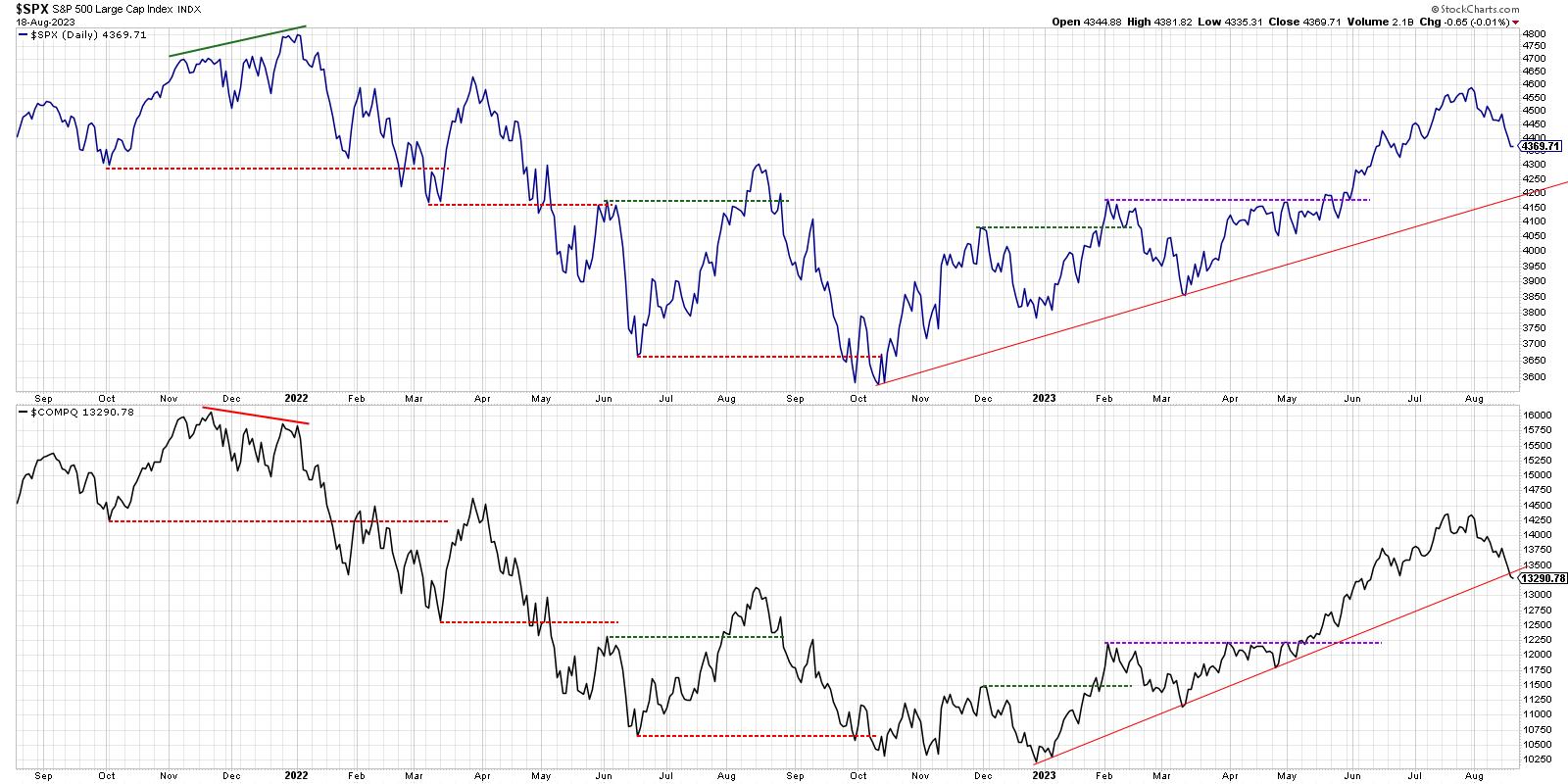
A chart of the S&P 500 and Nasdaq, which I use as a New Dow Theory indicator inspired by Charles Dow's original work, shows that the S&P 500 index is still above a trendline, using closing prices from October 2022 and March 2023.

Here's the problem. Note how the growth-dominated Nasdaq 100 ETF has already broken down through a similar trendline? An argument could be made that the current selloff is being driven by growth stocks, but could eventually be magnified when everything else starts to rotate lower. That leads me to market breadth indicators, where we'll focus on the 50-day moving average.
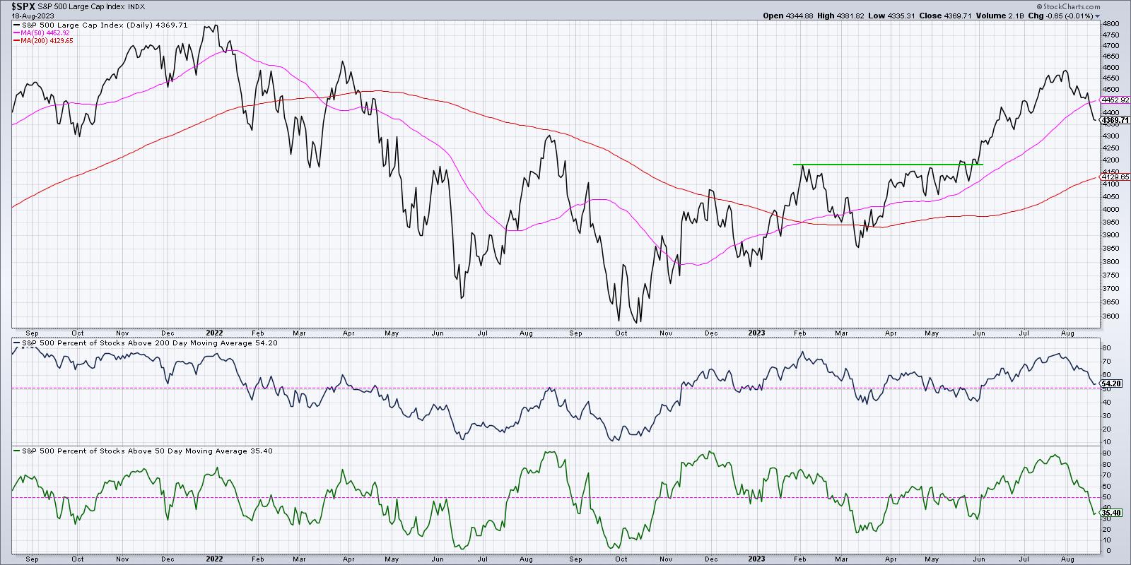
About four weeks ago, 90% of the S&P 500 members were above their 50-day moving average. Now that reading is closer to 35%.

Even more concerning is the panel just above, which shows the percent of S&P 500 stocks above their 200-day moving average. Generally speaking, bulls should want this indicator to remain above 50%, because waterfall declines tend to happen when more than half of the S&P 500 members are unable to hold this key long-term barometer.
The last three times that this indicator dipped below 50%, it ended up being a buyable dip. Signals in May 2023, March 2023, and December 2022 were all higher lows. But look further to the left and you can see that a breakdown like this has also been the beginning of much larger declines in terms of price and time. So while there's a chance it's a brief pullback, there's also a chance that it's much worse from here.
What Would Confirm Further Downside?
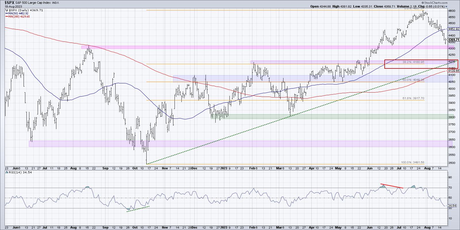
I would say that as long as a pullback here stalls out above SPX 4200, then you have to consider this a tactical pullback within a primary uptrend. This would mean that the S&P 500 remains above the 38.2% Fibonacci support level, as well as important trendline support based on the October 2022 and March 2023 levels.

The 200-day moving average should not be too far below either, likely in the 4150-4200 range depending on how quickly this decline would progress. So we have a confluence of support, with multiple indicators all keying in on the same level.
But what if the S&P fails to find support at 4200? I was taught that all large losses begin as small losses. If we're unable to hold 4200, then the chances of a waterfall decline increase in a big way. In that scenario, mega-cap growth names would have moved much lower in August, and an absence of buyers would lead to additional selling as investors run for the exits.
We've already seen bearish momentum divergences, initial breakdowns of short-term moving averages, and meaningful declines in breadth indicators. All that's left is a fail to hold key support. If that happens, be prepared for further downside potential.
What Would Negate the Bearish Thesis?
To be clear, I hope this bearish scenario does not play out. I believe 4200 will hold, and the seasonal studies would suggest that the fourth quarter will likely be stronger than a generally weak third quarter. So what would confirm to me that the bear thesis is no longer playing out as outlined above?
In the words of legendary technical analyst Paul Montgomery, "The most bullish thing the market can do is go up." Quite simply, prices of risk assets would have to stop going down and start going up again. That would mean momentum indicators like RSI would become oversold, but then turn higher. Perhaps we would see some bullish momentum divergences as stocks approach key moving average resistance, providing a glimmer of hope in dark times.
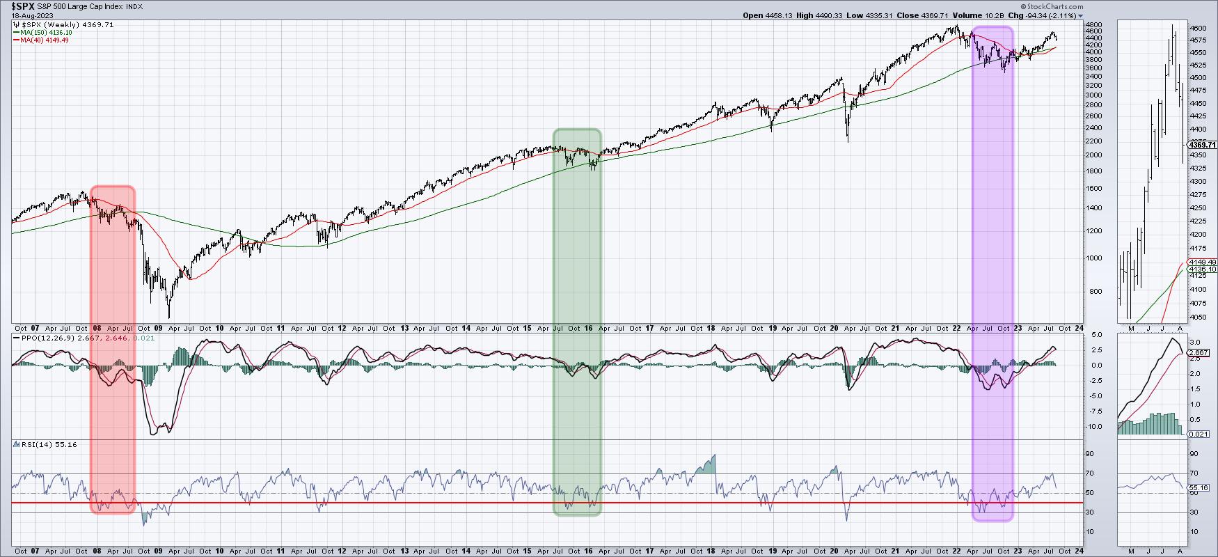
The weekly MACD, which is dangerously close to a major sell signal, would need to turn back higher. Look back in 2012 and 2013 for examples of initial sell signals that just never really materialized. Once the MACD indicator turned back higher, it often confirmed a resumption of the primary uptrend.

Whether you are bullish or bearish or decidedly undecided, it's important to consider all the possible future paths for stocks. Think about how your portfolio would weather certain conditions, how you would manage positions and minimize risk if the market moves against you, and how you would recognize the changing character of the markets.
Only by considering what could happen can we be best prepared for what will happen!
Want to learn more about probabilistic analysis and see how it works with individual stocks? Head over to my YouTube channel for a review of TSLA with four potential future paths!
RR#6,
Dave
P.S. Ready to upgrade your investment process? Check out my free behavioral investing course!
David Keller, CMT
Chief Market Strategist
StockCharts.com
Disclaimer: This blog is for educational purposes only and should not be construed as financial advice. The ideas and strategies should never be used without first assessing your own personal and financial situation, or without consulting a financial professional.
The author does not have a position in mentioned securities at the time of publication. Any opinions expressed herein are solely those of the author and do not in any way represent the views or opinions of any other person or entity.
|
| READ ONLINE → |
|
|
|
|
|
| ChartWatchers |
| Stock Market Rebounds: After Volatile Week Market Beats Bearish Pressure |
| by Jayanthi Gopalakrishnan |

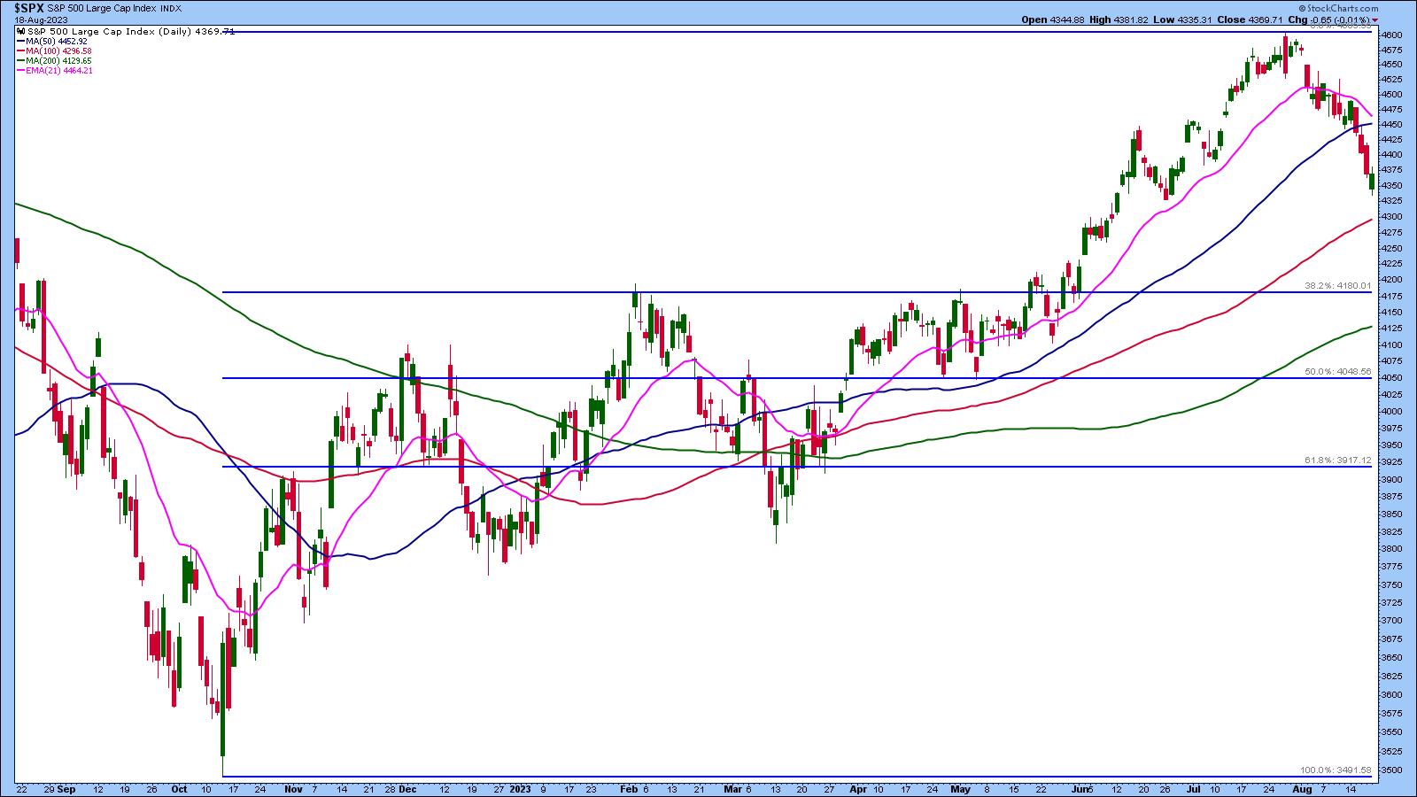
This week's stock market activity gave us an unpleasant reminder of how equities can turn on a dime. The possibility of further interest rate hikes from the Federal Reserve and China's economic woes were the main reasons for the sharp selloff we saw after the S&P 500 index ($SPX) broke below its 50-day moving average.

CHART 1: DAILY CHART OF S&P 500 INDEX. After falling below its 50-day moving average, $SPX has been in free fall. It remains to be seen if today's rebound will reverse the trend.Chart source: StockCharts.com (click chart for live version). For educational purposes.The US Dollar ($USD) and volatility ($VIX) have shown signs of life after a relatively long hibernation. VIX went as high as its 200-day moving average before retreating.
The ripple effects were felt in Asian and European markets. Evergrande's filing for bankruptcy protection in the US hurt China's real estate sector. According to a Barron's report, the real estate industry makes up about 30% of China's GDP. Another real estate company, Country Garden Holdings, will no longer be listed on the Hang Seng Index after it showed signs of distress—losses and missed payments.
And it's not just the real estate sector feeling the pain. Stocks like Alibaba (BABA), JD.com (JD), and Baidu (BIDU) all slumped.
US Feels the Side Effects
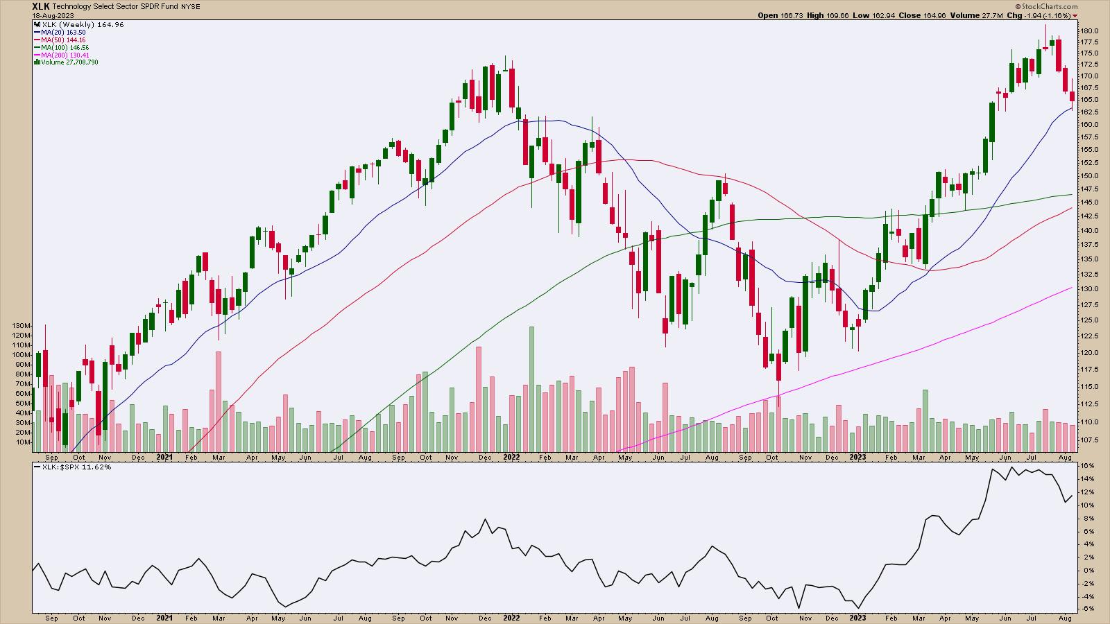
The weakness in China's technology stocks spilled over into the US stock market. The Technology and Communication Services sectors were hit pretty hard this week, although Tech ended up being the best-performing sector from a weekly perspective. The weekly chart of the Technology Select Sector SPDR (XLK) below shows three straight lower weeks. The 20-week moving average could be a support level for XLK.

CHART 2: TECHNOLOGY SELECT SECTOR SPDR (XLK) FALLS FOR THREE STRAIGHT WEEKS. Will XLK bounce off its 20-week moving average or will the ETF's value decline further? It all depends on investor expectations next week. Chart source: StockCharts.com (click on chart for live version). For educational purposes.
The Magnificent Seven Stocks—Tesla (TSLA), Apple (AAPL), Amazon (AMZN), NVIDIA (NVDA), Microsoft (MSFT), Alphabet (GOOGL), and Meta (META)—may be losing their status symbol. They are all lower for the week.
It almost seems like yesterday when these seven stocks propelled the S&P 500 to its 52-week highs. Investors were looking for the index to reach its October 2022 all-time high. That's the reality—anything can happen in the market when you least expect it.
On the flip side, energy stocks are on the rise. The Energy Select Sector SPDR (XLE) is bouncing off its 20-day simple moving average. XLE has a high StockCharts Technical Rank (SCTR) score, and its relative strength against the S&P 500 index is trending higher.
Things Ain't Great in Cryptoland Either
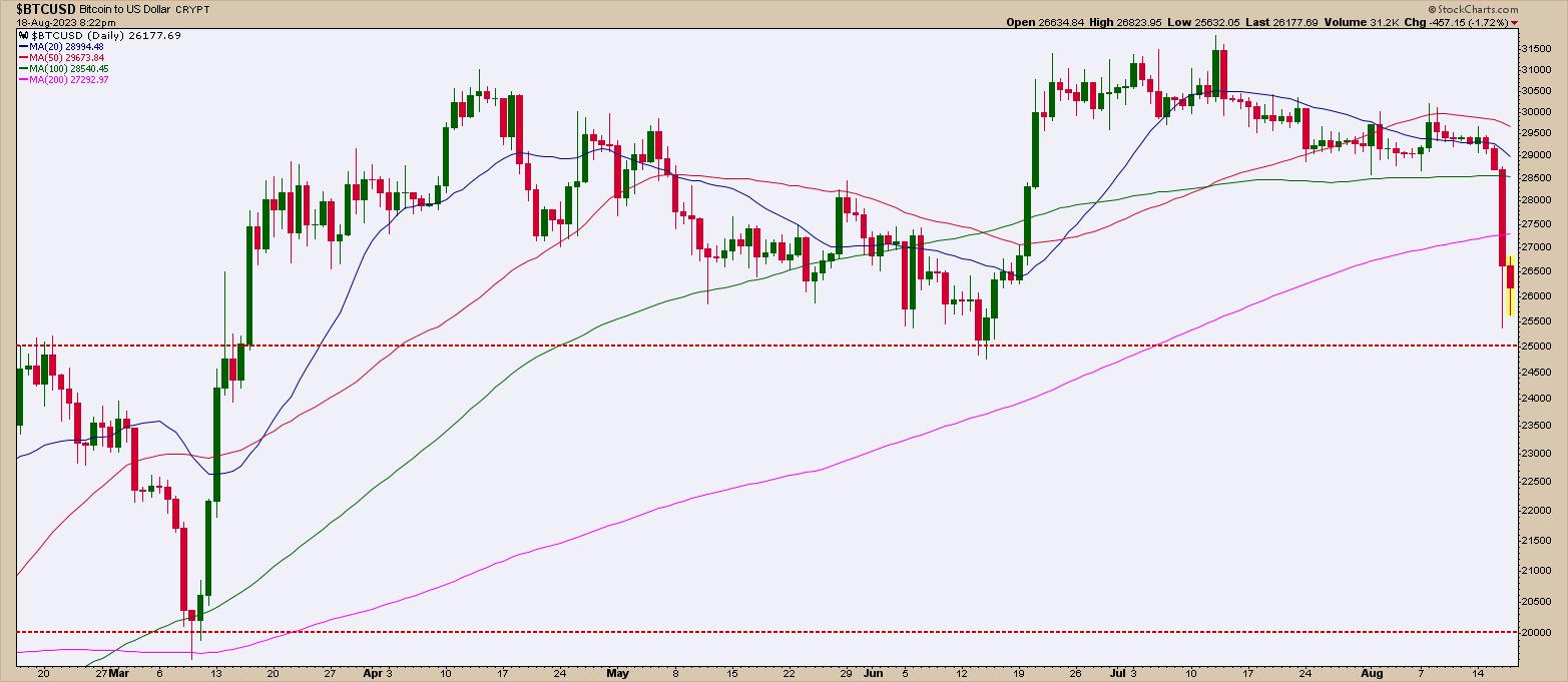
Did Elon Musk's decision to sell Bitcoin ($BTC) spur the massive selloff? It may have something to do with it, but since Bitcoin's price took a hard hit, there may be other reasons for the selloff in the crypto market. Looking at the chart of $BTCUSD, it looks like price may stay within the $25,000–$30,000 range, but if price falls below $25,000, it could go as low as $20,000, its next support level.

CHART 3: BITCOIN GETS CRUSHED AND APPROACHES SUPPORT LEVEL. After a massive price fall, Bitcoin could stay within a trading range between $25000 and $30,000. A break below $25,000 could be bearish, bringing Bitcoin's value to $20,000. Chart source: StockCharts.com (click chart for live version). For educational purposes.
The Perfect Storm

US Treasury yields trending higher, the possibility of further interest rate hikes by the Fed, China's economic troubles, and Bitcoin's selloff—it's enough to chew on before the market opens on Monday. After a rough week, seeing if buyers will enter the stage next week is worth watching. After what seemed as though it could be a horrifying end to the trading week, the major indexes closed well off their lows, and started moving higher during the last 15 minutes of the trading day. The return of the buyers could be a bullish sign at the end of a pretty grim trading week. The rebound off the lows suggests that the optimism could bring a little zip on Monday.
There's not much in economic data next week that investors are anxiously awaiting. So be sure to watch any support levels carefully and determine if there's enough momentum to make it worth buying the dip. It may also be worth putting the market aside for a couple days. Monday could bring surprises.
End of Week Wrap Up
US equity indexes mixed; volatility down
- $SPX down 0.01% at 4370.03, $INDU up 0.08% at 34501.88; $COMPQ down 0.2% at 13290.78
- $VIX down 3.52% at 17.26
- Best performing sector for the week: Technology
- Worst performing sector for the week: Consumer Discretionary
- Top 5 Large Cap SCTR stocks: Super Micro Computer (SMCI); Celsius Holdings (CELH); NVIDIA (NVDA); Eli Lilly (LLY); XP Inc. (XP)
On the Radar Next Week
- July existing home sales
- July new home sales
- July Durable Goods Orders
- Fed speeches
- Jackson Hole symposium kicks off
Disclaimer: This blog is for educational purposes only and should not be construed as financial advice. The ideas and strategies should never be used without first assessing your own personal and financial situation, or without consulting a financial professional.
|
| READ ONLINE → |
|
|
|
| Trading Places with Tom Bowley |
| Are You Ready for a Huge Rally? |
| by Tom Bowley |
It was one month ago that I discussed the serious (short-term) warning signs that the stock market faced. I summed it up pretty well on a Your Daily Five recording that aired on July 19th. Calling weakness after it hits is easy, but discussing objectively the warning signs BEFORE the market drops is where our value at EarningsBeats.com begins. If you didn't get a chance to see this Your Daily Five video, here it is:
Tom "The Bull" Bowley is Bearish? What?!?!
In it, I discussed two sentiment indicators:
- Volatility Index ($VIX), highlighting the positive correlation with the S&P 500, suggesting a market downturn approaching.
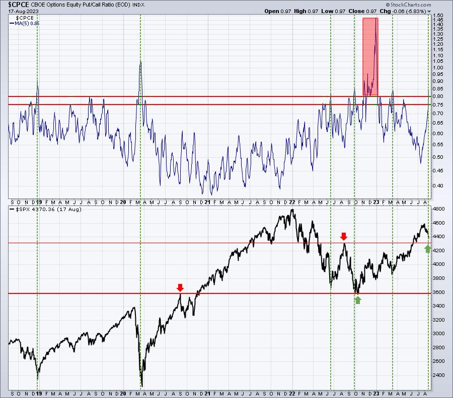
- Equity-only put call ratio ($CPCE), pointing out that the 5-day moving average had dropped to a 15-month low. Extremely low readings on this moving average have historically coincided with market tops.
I also discussed the bearish historical time of the calendar month (the 19th to the 25th has proven to be EASILY the worst time of ALL calendar months), with negative divergences everywhere on daily charts. I even suggested that Tesla (TSLA), which was trading at 293 at the time, could fall to 230. It's actually at 216 this morning (last time I checked). These are "before the market drops" calls.
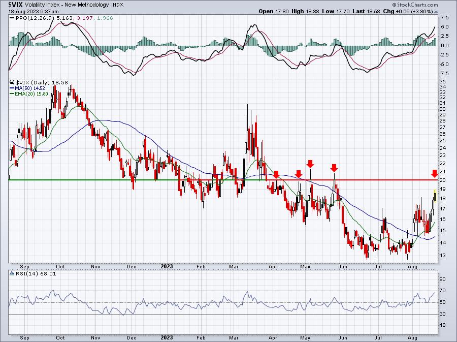
So where do we stand now? Well, Volatility ($VIX) has pretty significant resistance at 20, and that's where I thought the VIX could run -- in a worst-case scenario. Here's the VIX chart:

We're getting close to where the VIX has failed over the past 4-5 months. Could it rally past this level? Sure, anything is possible. But if I'm right about this secular bull market, then I doubt we see a close above 20. We'll see.
How about that 5-day moving average of the put call ratio ($CPCE)? Well, we've gone from extreme complacency in mid-July to extreme pessimism currently. This moving average has reached .85 as of yesterday's close. I believe this is THE most telling indication of how stretched we are right now to the downside. Check out this turnabout:

A little over a month ago, this 5-day moving average was below .50, its lowest reading since April 2022 during the height of the cyclical bear market. And in just a few weeks, bearishness has sent our 5-day moving average of the CPCE to .85, its HIGHEST level since March. If you recall, that level of extreme pessimism helped to launch the massive rally we experienced over the summer. Don't fear what others fear. Take advantage of it.
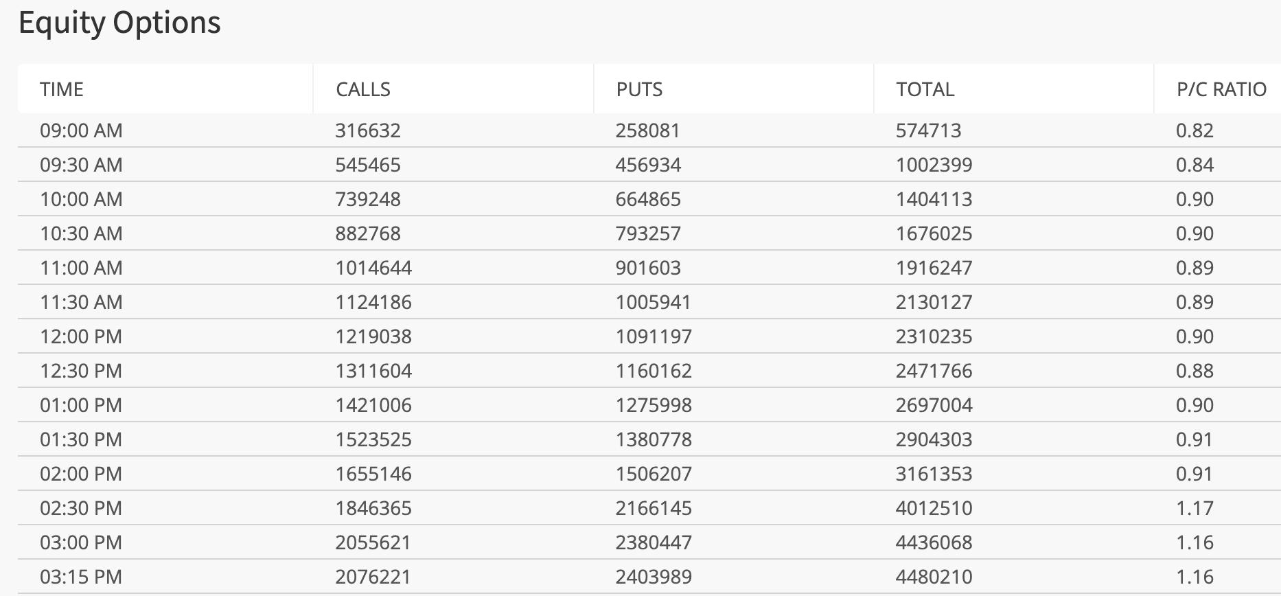
One final note on the CPCE. Here's the table of cumulative half-hour readings of the CPCE over at CBOE.com. To move the cumulative reading like it moved in the final 3 readings is EXTRAORDINARY. Retail traders were buying puts hand over fist in the final hour or so of trading on Thursday. The masses rarely get it right. Check out this table:

This is CENTRAL TIME, one hour behind those of us on the east coast. So the 2pm reading CT is 3pm ET. So in that half hour from 3:00pm-3:30pm ET yesterday, the individual half-hour readings came in at 3.45!!!! That smells like capitulation to me! I'll be watching these half-hour readings throughout the day today.
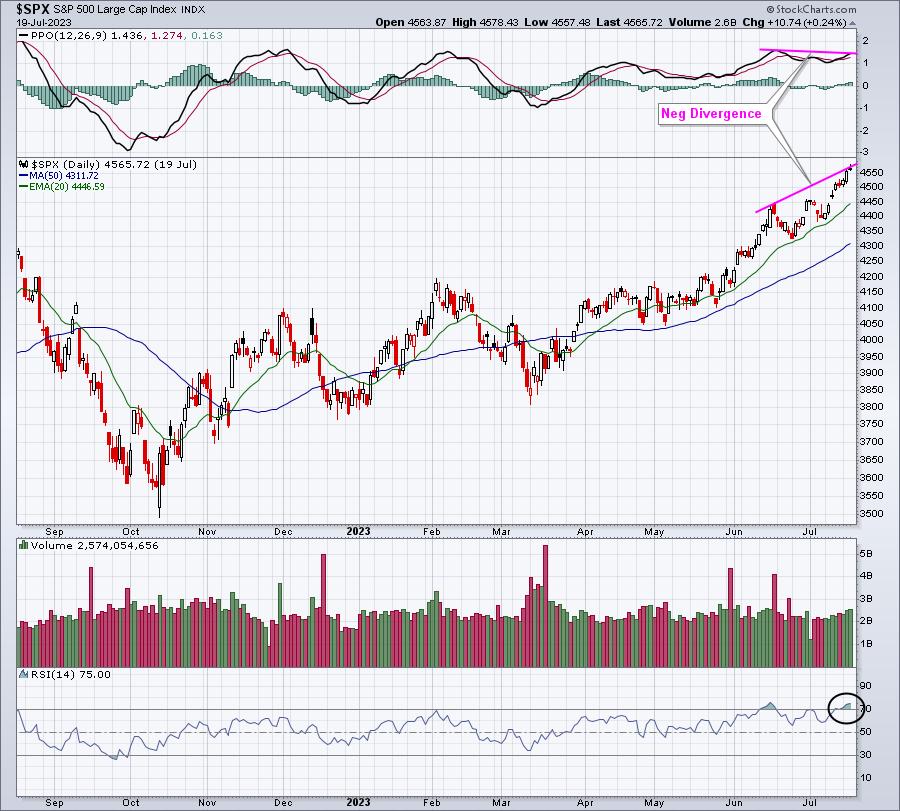
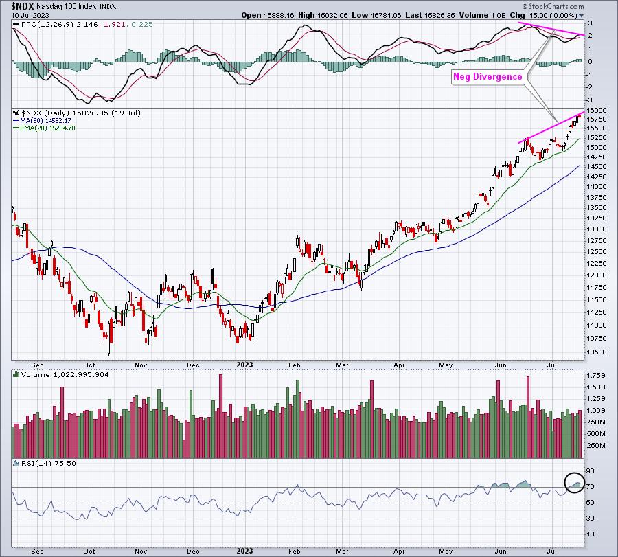
Next, it's always important to watch negative divergences. These warnings should never be taken lightly, as they typically precede more significant selloffs during secular bull market advances. Here is how the S&P 500 ($SPX) and NASDAQ 100 ($NDX) looked on July 19th, the day I recorded my last Your Daily Five:
S&P 500:

The RSI was at 75, indicative of very overbought conditions, and the negative divergence suggested slowing momentum. This combination, along with the sentiment issues, didn't guarantee us that prices would drop, but they certainly SCREAMED at us that the risk of a drop had increased significantly. Now we know the result.
NASDAQ 100:

This negative divergence was even more pronounced. Again, we now know the result of these warning signs.
It's important to note that we're also in the worst calendar period of the year. Unlike those spewing "Go Away in May", I've actually done the research to correctly point out that the worst period of the year is from July 17th (close) to September 26th (close). All of this current weakness has been during this weak summer period -- once again.
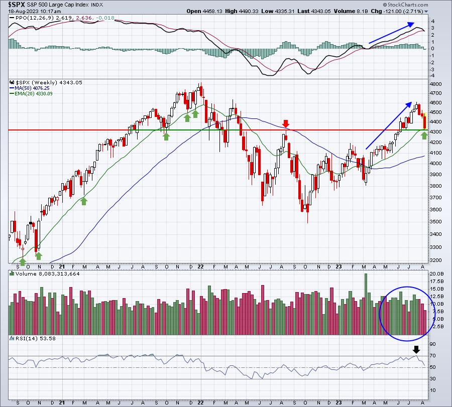
So do the technical indications support a potential reversal back to the upside? I say yes. When I pointed out the potential for selling a month ago, I indicated that my "worst-case scenario" for a continuing secular bull market advance would be retesting the August breakout on the S&P 500 at 4305, while simultaneously testing the rising 20-week EMA. Here's a current view of the longer-term weekly chart, highlighting the last 3 years:

If I didn't listen to any news stories and this chart was the only thing I had to look at, I'd say the following:
- Volume trends are strong (rises have been on heavy volume, currently selloff on lighter volume)
- Weekly PPO has been accelerating to the upside throughout 2023, right up until the July high
- Weekly RSI became overbought at the July high, suggesting a possible pullback to relieve overbought conditions
- We've pulled back to test the rising 20-week EMA, which has a history of support market advances
But here's the problem: nothing is rational when big selloffs approach bottoms. Volatility sends stocks gaining and losing much higher percentages on a daily basis, and the whipsaw action can be very alarming. Plus, if you're off by 1-3 days on a bottom, it can mean another 5% or more to the downside, which makes you question your signals.
If I'm being totally objective, again ignoring the short-term volatility and emotional toll, mid-July's story was one of caution and suggested minimizing risk. The current environment, however, is the mostly opposite of what we saw one month ago. This is the time to hold your nose and buy.
Just my opinion.
Happy trading!
Tom
|
| READ ONLINE → |
|
|
|
| The Canadian Technician |
| A Red Bar on the Homebuilders ETF |
| by Greg Schnell |
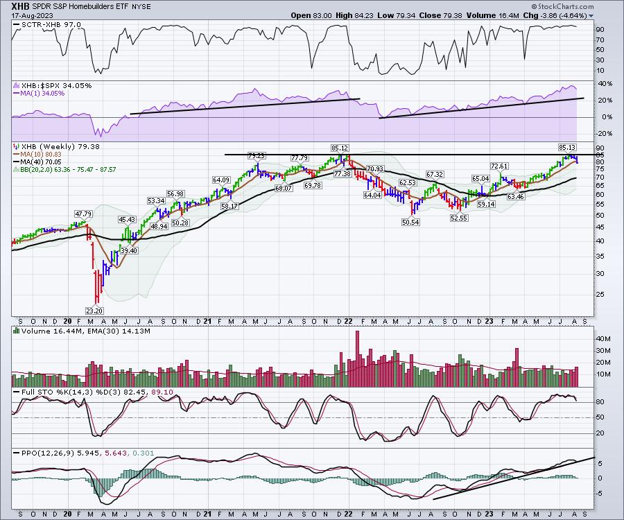
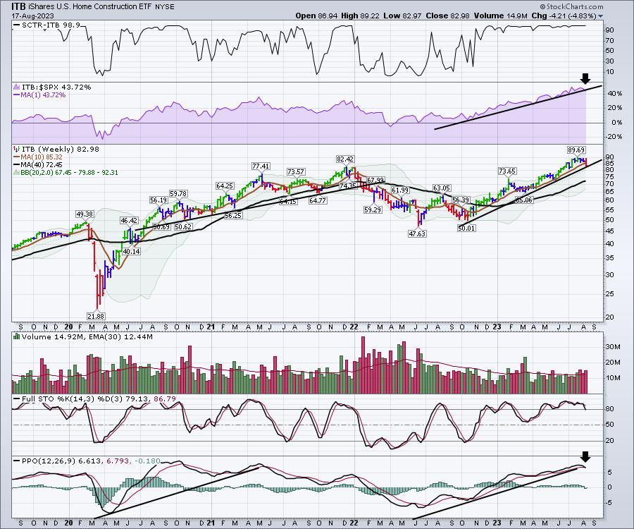
Homebuilders have been on an unbelievably big run. Looking at two relevant ETFs, we can see that one is at prior highs, while the other broke out to fresh new highs. Let's start there.
XHB was recently at a prior high, and the ITB made newer highs. Amazingly, XHB -- the homebuilders ETF -- got within 0.01 cent of the prior high, then pulled back below the 10-week moving average on Thursday. Everything is still in an uptrend! The only real sign of weakness is the potential for a sell signal on the PPO.
- The SCTR is still at 97.0, which is very strong.
- Relative strength compared to the $SPX is in purple, and is still near the highs. If it started to break the trend line from early April, that would be another signal of weakness.
- Price stalled at the prior high.
- Volume has been strong. This is after Thursday's move, and Friday's volume will be an Options Expiration, so it could have a big volume bar to finish the week.
- Full stochastic shows price still trading in the top of the range for the last 3 months of the year, so no real new news there.
- PPO is trying to hold on the uptrend, but will be very close to a sell signal.
That's a pretty strong basket of signals.

ITB, the home construction ETF, looks a little different this week. Namely, this is the first red week on the price panel since the lows of last October! Price is still holding on the trend line, but the red bar is a warning.
All of the other trends recorded on the chart above are intact, with one exception: the PPO is already on a sell signal.

The real question to ask for me is whether or not this is the end of this big trend. I don't know if it is or not, but all the trends are being tested. It's a good time to be careful, in case it starts to break down.
|
| READ ONLINE → |
|
|
|
| The MEM Edge |
| Today's Price Action Could Be the Start of a Rally Attempt |
| by Mary Ellen McGonagle |
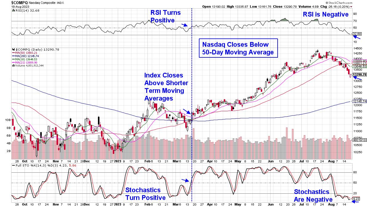
The market's August slump deepened this past week, with each of the major Indexes dropping more than 2% as Treasury yields hit a 15-year high. That said, today's price action could signal the start of a rally attempt, after the broader markets closed in the upper half of their trading range for the day on decent volume.
One day does not make a market, however, and in the chart below I've highlighted the characteristics needed to fully signal that a new uptrend is in place. As you'll see, a close of the markets back above resistance with positive momentum indicators is key. Other factors will also be needed, particularly for the Nasdaq, as this tech-heavy Index is filled with Growth stocks, which fare poorly in a rising interest rate environment. Using the 10-year Treasury bond, we'll need yields to fall back below 4%, at the very least.
 Daily Chart of Nasdaq Composite Index Daily Chart of Nasdaq Composite Index
Bond yields may have room to rise further, however, as they tend to peak just before the Federal Reserve reaches the end of their rate hike cycle. Next week should provide further clues on monetary policy, as Fed Chair Powell will make his annual speech at Jackson Hole next Friday.
Before then, leading chip provider Nvidia (NVDA) will be releasing earnings on Wednesday after the market's close. The company's previous report sparked a sharp rally in Semiconductor stocks, which began in late May on news of outsized demand for their AI chips. NVDA's comments regarding growth prospects going forward will be closely watched; however, investors' response to the news will be more telling. If the stock moves sideways or trades lower despite positive news, it will signal the continuation of a risk-off sentiment, similar to last week's decline, despite news of a more advanced AI chip due out next year.
Whether the markets turn positive over the next week or not, investors should be building their watchlist in anticipation. From my work, this list will include high-quality stocks which have pulled back despite posting strong earnings and sales or guiding growth higher into next year. I'd advise sorting your list by sector as well, so that when group leadership is revealed, you'll be better prepared. According to a study by famed investor Wiliam O'Neil, Sector and Industry Group affiliation of your stock accounts for almost 50% of your stock's price appreciation or deterioration.
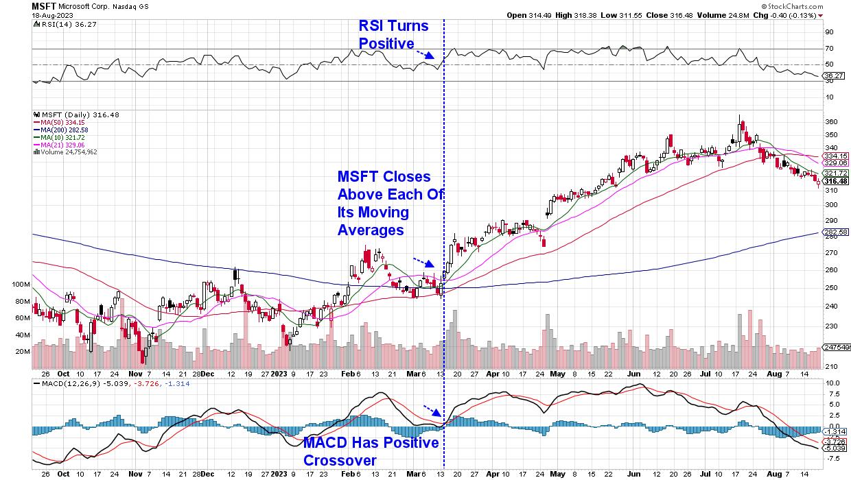
While Microsoft has recently pulled back due to reporting weak earnings, I've included the chart below to share with you the signals that indicated a new uptrend that took place in mid-March. As you may recall, interest rates began to decline at that time.
 Daily Chart of Microsoft (MSFT) Daily Chart of Microsoft (MSFT)
For those who'd like to be alerted to the new uptrend in the markets when it takes place and to also have access to my highly curated watchlist, use this link here to gain immediate access to recent reports. You'll also receive buy ideas as stocks are added to the Suggested Holdings List as well. This list alerted subscribers to Nvidia (NVDA) in January, as well as other leading Semiconductor stocks that went on to far outpace the markets.
Warmly,
Mary Ellen McGonagle, MEM Investment Research
|
| READ ONLINE → |
|
|
|
| ChartWatchers |
| Sizable Selloff: Fed Minutes Crushes Stock Market, Yields Rise |
| by Jayanthi Gopalakrishnan |

Better-than-expected earnings from Target (ticker symbol: TGT) and TJX Cos (ticker symbol: TJX), as well as better-than-expected US industrial output, threw some optimism into a market that was looking grim. But the Fed minutes didn't do much to help. Investor sentiment turned more pessimistic as the Fed indicated that inflation was still a concern.
Technical Perspective of the S&P 500 Index
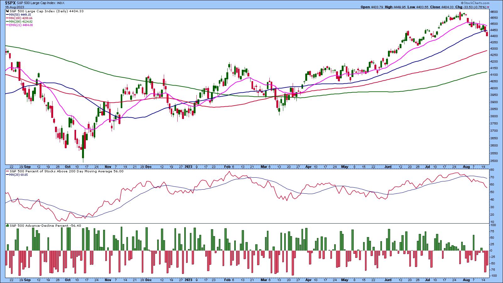
When the S&P 500 index ($SPX) falls below its 50-day simple moving average (SMA) after it has been trading above it for about five months, investors get concerned and are left wondering if the index will fall further, whether they should sell their stocks, or if they should just hold on to them and hope this is just temporary.

CHART 1: S&P 500 INDEX CLOSES BELOW ITS 50-DAY SIMPLE MOVING AVERAGE. Market internals are also indicating weakness, which could mean equities could fall further.Chart source: StockCharts.com (click chart for live version). For educational purposes.
In addition to the S&P 500 index trading below its 50-day SMA, the percentage of stocks in the index trading below the 200-day moving average is just above 50%. And the S&P 500 Advance-Decline Percent is in negative territory. That Wednesday's high was below the 50-day SMA suggests a greater probability of the S&P 500 index closing lower for the week.
Treasury Yields Rise
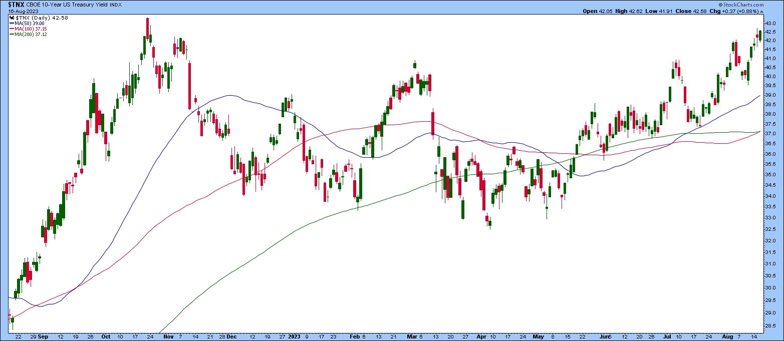
When the broader equity indexes fall, it's worth paying attention to Treasury yields. If you pull up the chart of the 10-Year US Treasury Yield Index ($TNX), you'll notice it's been trending higher; it's at its November 2022 levels and has the potential to rise to its October 2022 levels. The $TNX closed near its high on Wednesday, showing a good probability of a continued move higher. If yields continue to rise, investors will hesitate to invest in stocks.

CHART 2: 10-YEAR US TREASURY YIELD INDEX TRENDS HIGHER. As yields rise, investors will shy away from investing in growth stocks.Chart source: StockCharts (click chart for live version). For educational purposes.
Strong retail numbers and better-than-expected industrial production indicate the US economy is still strong, and inflation is coming down. At least, that's what more recent economic data is suggesting.
This isn't necessarily a negative scenario, given that other countries are still facing higher inflation and are likely to raise interest rates further. During a conversation between Raphael Bostic, President & CEO of the Federal Reserve Bank of Atlanta, and Ed Bastian, CEO of Delta Airlines, Bostic mentioned that the Fed's job is to ensure that monetary policy sets the economy on an even trajectory. And if the Fed does it well, there will be more economic prosperity. It's no wonder investors pay attention to what the Fed says.
The Fed minutes on Wednesday indicated that inflation is still a concern and there could be further monetary policy tightening in the future. This wasn't exactly music to the market's ears. Equity indexes fell slightly on the news, and Treasury yields rose—pretty much the same as pre-Fed minutes, as the Fed takes a "wait and see" approach. The broader equity indexes moved up and down without directional commitment, but closed sharply lower.
As long as the trend in Treasury yields remains as is, growth stocks may gain less attention than they have in the more recent past. But that doesn't necessarily mean you should shy away from equities. There are so many different asset groups, after all.
Where Should You Invest?
If you've invested in the market for a while, you know that, when the overall equity market moves lower, it doesn't necessarily mean every market segment is heading lower. There are always opportunities in the market. This is why checking Your Dashboard should be a part of your trading routine.
Scrolling through the Market Summary gives you a quick overview of the overall market. Identifying which areas are green in a sea of red is easy. Try to see if you can spot some anomalies. The Sector Summary is a great way to see which sectors and industries are performing better than others, and the SCTR Report shows technically strong stocks.
And at a time when just about everything looks weak, except for maybe the CBOE Volatility Index ($VIX), it may be time to take some profits off the table and wait it out. Remember, managing your risks is the key to becoming a great trader.

Disclaimer: This blog is for educational purposes only and should not be construed as financial advice. The ideas and strategies should never be used without first assessing your own personal and financial situation, or without consulting a financial professional.
|
| READ ONLINE → |
|
|
|
| RRG Charts |
| US Stocks Are Lagging The World For Now, But This Alternative Could Skyrocket |
| by Julius de Kempenaer |

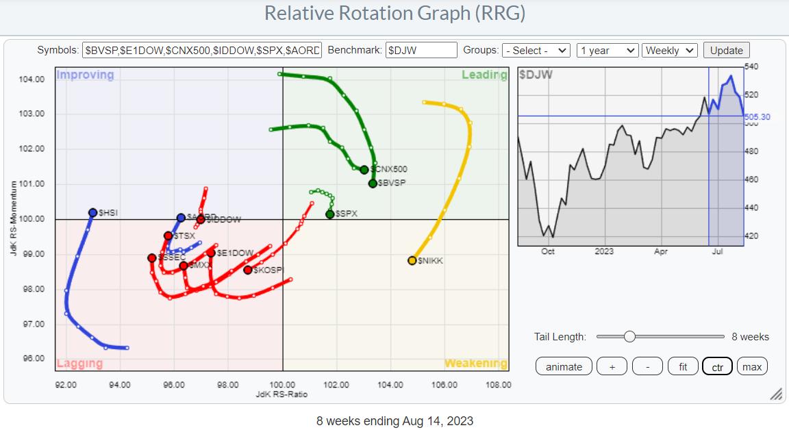
Let's take a look at the rotation of stock markets around the world. The Relative Rotation Graph above shows the rotational patterns for some major stock market indices worldwide. An interesting thing we see here is that there is a high concentration of tails inside the leading and the lagging quadrant, while there are only a handful inside improving and weakening.
Shift in Leadership
This type of rotation is typical for a shift in leadership. The strong moves in India, Brazil, Japan, and the US have now rolled over, and all four markets are showing a tail that is moving lower on the JdK RS-Momentum axis. Not so much (yet) on the JdK RS-Ratio axis.
The lagging quadrant is a bit cluttered, but when we isolate the tails (you can do that by selecting the symbol in the table below the RRG chart), you can see that only the Korean $KOSPI index is continuing further into the lagging quadrant at a negative RRG-Heading. All others have curled upward, or are in the process of doing so, and are subsequently heading towards improving.
Hong Kong ($HSI), Australia ($AORD), and Indonesia ($IDDOW) have just crossed over into the improving quadrant. Indonesia shows the more interesting rotation, as its tail has rapidly rotated back from a negative RRG-heading into a positive one. Out of the indices on the right-hand side, it's obviously the S&P 500 we want to keep an eye on.
Probably a Temporary Setback in the S&P

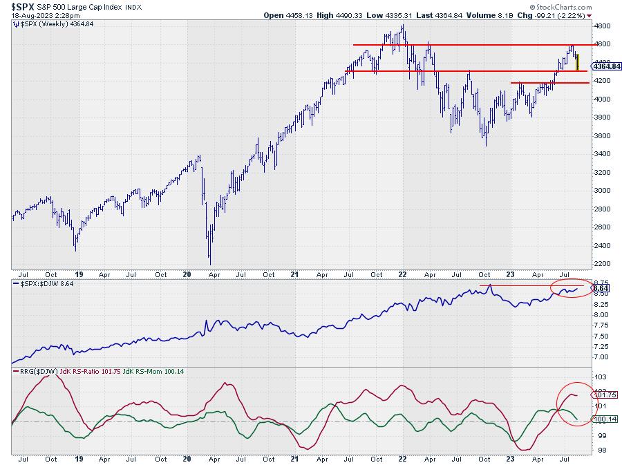
On the RRG, the tail for the S&P 500 is still inside the leading quadrant, but is rolling over and close to crossing into weakening.
The chart above shows the S&P on a weekly scale, in combination with raw Relative Strength and the RRG-Lines. So far, the technical support and resistance levels are respected quite well. After breaking 4.325 in an upward direction, $SPX rallied to the level of the March 22 peak near 4.600, where a new high was put into place, indicating that supply got the upper hand in that area.
At the moment, the market is back to the breakout level and starting to test the area around 4.325 as support. The overhead pressure has caused relative strength to lose momentum and flatten out a bit over the last few weeks, which is causing the RRG-Lines to roll over. With the RS-Ratio still at fairly high levels, this tail still has the room to complete a rotation leading-weakening-leading.
In an ideal scenario, the market should now find support near 4.325 and start building a new base (higher low), out of which a new rally can start for a new attempt to move past 4.600. Without damaging the current trend, it would even be possible for $SPX to move back to the 4.200 area and find support there. Below 4.200, the current trend will get into serious trouble.
From a relative perspective, a break of relative strength above the late 2023 high will put the US back on the international map as one of the leading markets. This will need to happen in the next few weeks, say 4-6, in order for the RS-Ratio line to put in a new low above 100 and cause that leading-weakening-leading rotation.
Indonesia Ready to Rally?

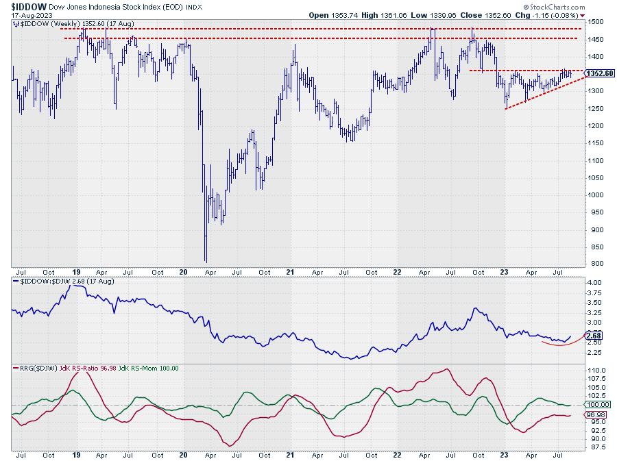
The tail on the DJ Indonesia index on the left-hand side of the graph shows a rapid rotation back into a positive RRG-Heading and a push into the leading quadrant. This suggests that more improvement is underway. The big question is whether this will also only be a temporary move or be more sustainable.
Looking at the price graph above shows that the Indonesian market has been trading in an ascending triangle formation since the start of the year, with the horizontal (resistance) side around 1.360. As soon as that barrier gives way, new upside potential will be unlocked that could push $IDDOW up to the area between 1.450-1.500.
That area is particularly important, as it is the region where major highs have been formed since 2018. This means that, for more than five years now, massive supply has hit the market between 1.450-1.500. Imagine what could happen when the market has fully absorbed that supply...
I always compare these setups with a spring that has been put under pressure for a long time. A lot of energy is then contained, and when that spring gets let loose, it will unleash a lot of power. In other words, once $IDDOW is able to clear the 1.450-1.500 range, a lot of upside potential will get unlocked. Definitely a market to watch.
US investors can use the iShares MSCI Indonesia ETF (EIDO) to get exposure to the Indonesian market.
#StayAlert and have a great weekend, --Julius
|
| READ ONLINE → |
|
|
|
| MORE ARTICLES → |
|
 Chart 1
 Chart 2
 Chart 3
 Chart 4
 Chart 5

 Larry's "Family Gathering" webinar is now available! Whether you missed it and need to catch up, or just want to review the information Larry presented, you can now see the full recording below.