| THIS WEEK'S ARTICLES |
| The Mindful Investor |
| Dow Theory Flashes Bear Signal |
| by David Keller |
Dow Theory is based on the foundational work of Charles Dow, considered the "Father of Technical Analysis." Many of the tools we employ to better analyze market structure and investor sentiment, from trend analysis to index construction, are derived from Dow's original essays from the early 20th century.
Dow compared two indexes to gauge the strength of the economy: the Dow Industrials which represented the producers of goods, and the Dow Railroads, which tracked the distributors of goods. If both of these indexes confirmed new highs, then economic conditions were strong and the markets were in a bullish phase.
In the modern age of financial analysis, when the Dow Industrials and Dow Transports (which evolved from the original railroad index) do not confirm a new high, we have a "bearish confirmation," which indicates trend exhaustion. One of my guests this week on The Final Bar, Jeff Huge of JWH Investment Partners, highlighted this Dow Theory signal, leading us to dig deeper into the methodology. Today, we'll walk through what this indicator implies for stocks in Q2, and also explore two more modern versions of Dow Theory.

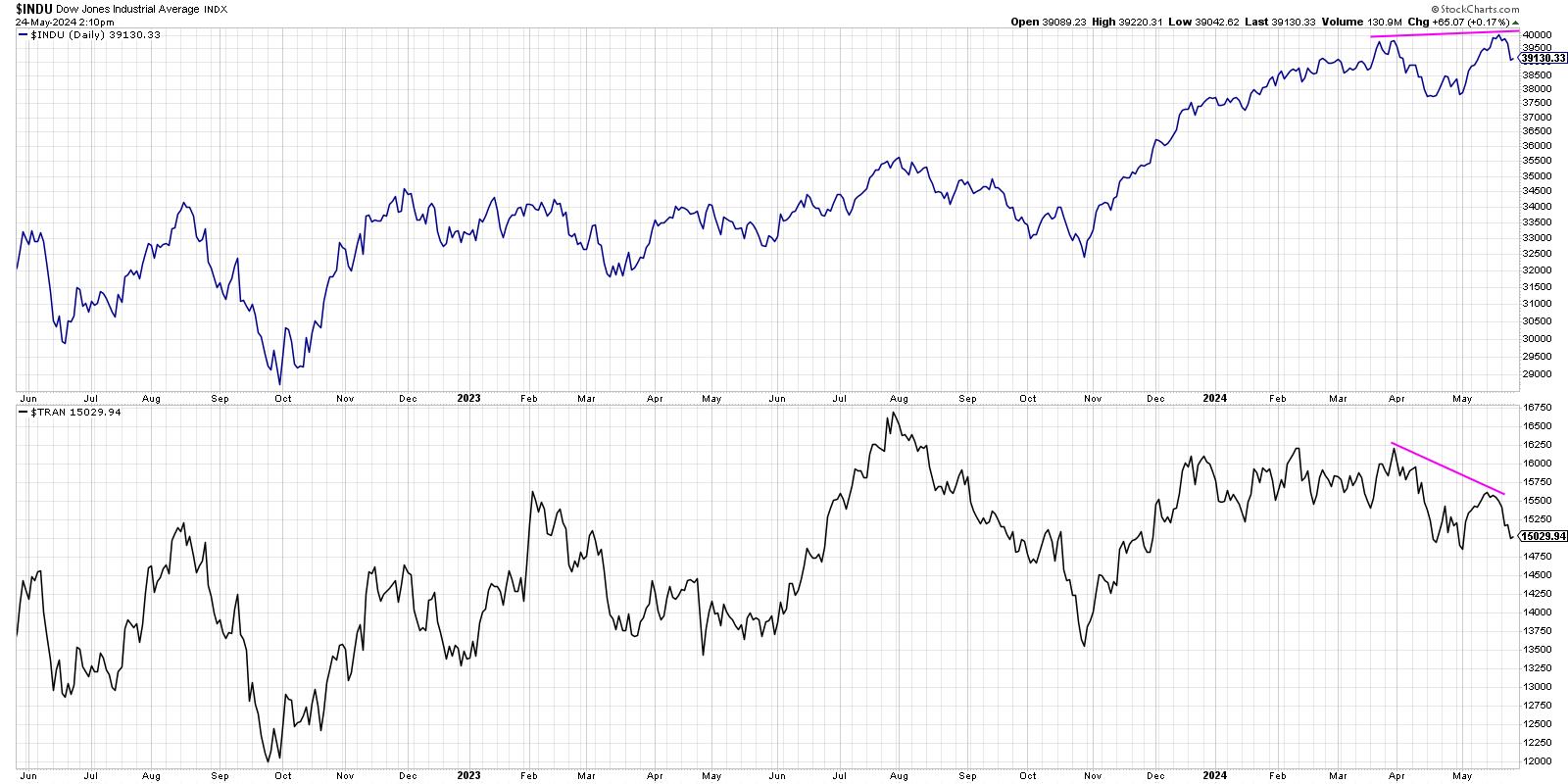
Here, we are showing the traditional version of Dow Theory, with the Dow Industrials in the top panel and the Dow Transports in the bottom panel. Note how the Dow Industrials made a new all-time high recently, pushing above 40,000 for the first time in history. Also note how the Dow Transports have not confirmed this recent high, actually trending lower over the last two months. Because only one of the indexes has made a new high, and that breakout was not confirmed by the other index, Dow would suggest that there is internal weakness in the market and a likely major market top.
Proponents of traditional Dow Theory would cite the long-term success of these signals, which have often provided an excellent early warning sign of danger ahead. Detractors would explain that the Dow Industrials index in 2024 includes lots of "non-industrial" names like banks and service companies. For example, technology stocks like Microsoft and Salesforce are part of the Dow Industrials! And companies like Amazon.com are not included in the Dow Transports, even though they have an exceptionally robust built-in distribution network.
So what else can we do to apply Dow's theory in 2024? What about if we use the S&P 500 to represent the "old economy" names and the Nasdaq Composite to track the "new economy" companies?

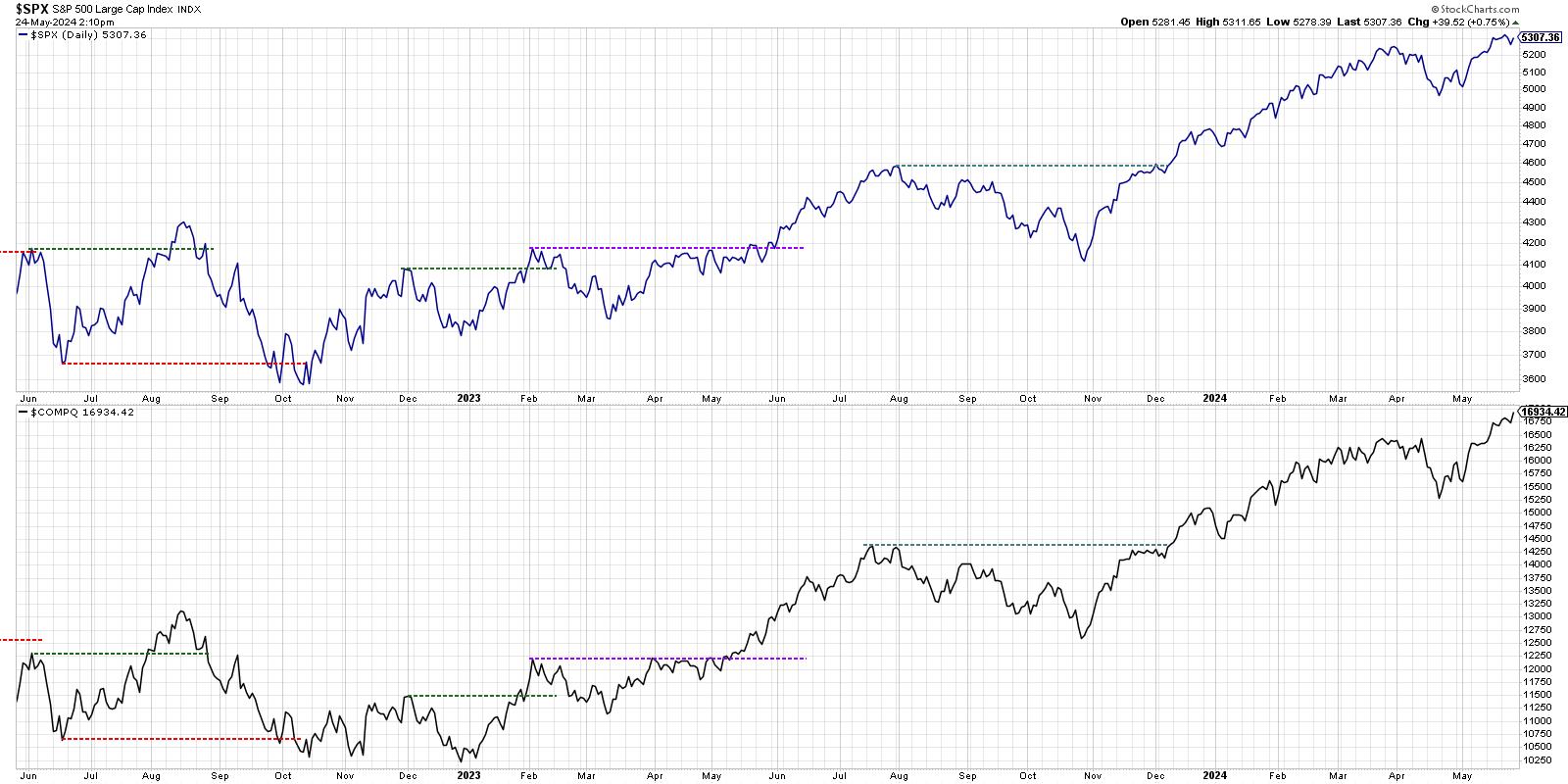
When we go with this "New Dow Theory", we realize that both the S&P 500 and Nasdaq Composite have already achieved new all-time highs in May 2024. So there is no bearish non-confirmation as we see with traditional Dow Theory. The problem with this approach? The mega-cap growth stocks dominate both of these market cap-weighted indexes! So we're essentially double counting the largest names.
This has led to me to what I call the "Newer Dow Theory", using equal-weighted indexes for the S&P 500 and the Nasdaq 100. This should effectively neutralize the mega-cap overweight, particularly in the S&P 500 index.

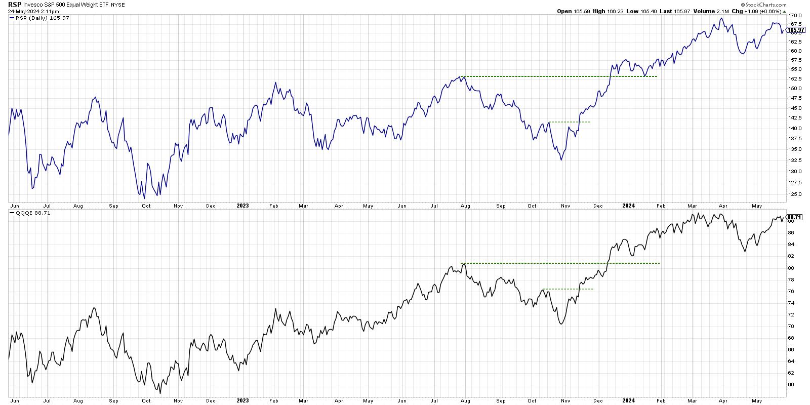
This is where things get a little more concerning for market bulls. While the S&P 500 has already made a new all-time high in Q2, the equal-weighted S&P is still below its March high. And the equal-weighted Nasdaq 100, while holding up quite well in recent weeks, has also failed to push to a new all-time high.
For now, this Newer Dow Theory comparison suggests market weakness, using Charles Dow's simple analysis of market trends. As he determined over 120 years ago, an uptrend is a pattern of higher highs and higher lows. So, if the highs aren't getting higher, the uptrend should be brought into question.
Thus, while traditional Dow Theory has already flashed a bearish signal, I'm watching this Newer Dow Theory as May transitions into June. If we get a bearish non-confirmation on this final chart, or if neither equal-weighted index manages to score another new high, market bears may be proven right as we enter the summer months!
RR#6,
Dave
P.S. Ready to upgrade your investment process? Check out my free behavioral investing course!
David Keller, CMT
Chief Market Strategist
StockCharts.com
Disclaimer: This blog is for educational purposes only and should not be construed as financial advice. The ideas and strategies should never be used without first assessing your own personal and financial situation, or without consulting a financial professional.
The author does not have a position in mentioned securities at the time of publication. Any opinions expressed herein are solely those of the author and do not in any way represent the views or opinions of any other person or entity.
|
| READ ONLINE → |
|
|
|
| Martin Pring's Market Roundup |
| MEMBERS ONLY |
| What Does Today's Outside Bars in the S&P and NASDAQ Mean Going Forward |
| by Martin Pring |
|
A couple of weeks ago, I wrote an upbeat article on the US stock market opining that the correction was over. I still think that's the case, but I do have to note that a bearish outside bar formed on both the S&P and NASDAQ on Thursday...
|
| READ ONLINE → |
|
|
|
| ChartWatchers |
| Stock Market Ends Week on Optimistic Note, With a Few Surprises |
| by Jayanthi Gopalakrishnan |

It was a roller-coaster week in the stock market, a reminder that, when markets are trading at their all-time highs, it pays to be cautious. Any negative news can trigger emotions, resulting in a domino effect reaction.
In the early part of the week, the stock market was pretty lethargic, with investors waiting for Nvidia's earnings. When NVDA earnings were announced after the close on Wednesday, the stock price soared in after-hours trading. The upside move continued when the market opened on Thursday, with the stock price closing at a record high on Friday.
However, despite NVDAs' rally, the rest of the market threw some surprises. On Thursday, there was a significant selloff, which threw many investors off. The broader equity indexes fell, as did precious metals.
The May Purchasers Manufacturing Index (PMI) came in higher than expected, which may have reminded investors that the strong economy could mean higher rates for longer. The FOMC minutes this week suggested that Fed members aren't confident that inflation has come down enough to warrant rate cuts any time soon.
On Friday, the S&P 500 ($SPX) and Nasdaq Composite ($COMPQ) recovered some of Thursday's losses. This was a surprise; you'd think the selloff would continue ahead of the Memorial Day weekend.
Follow the live chart!
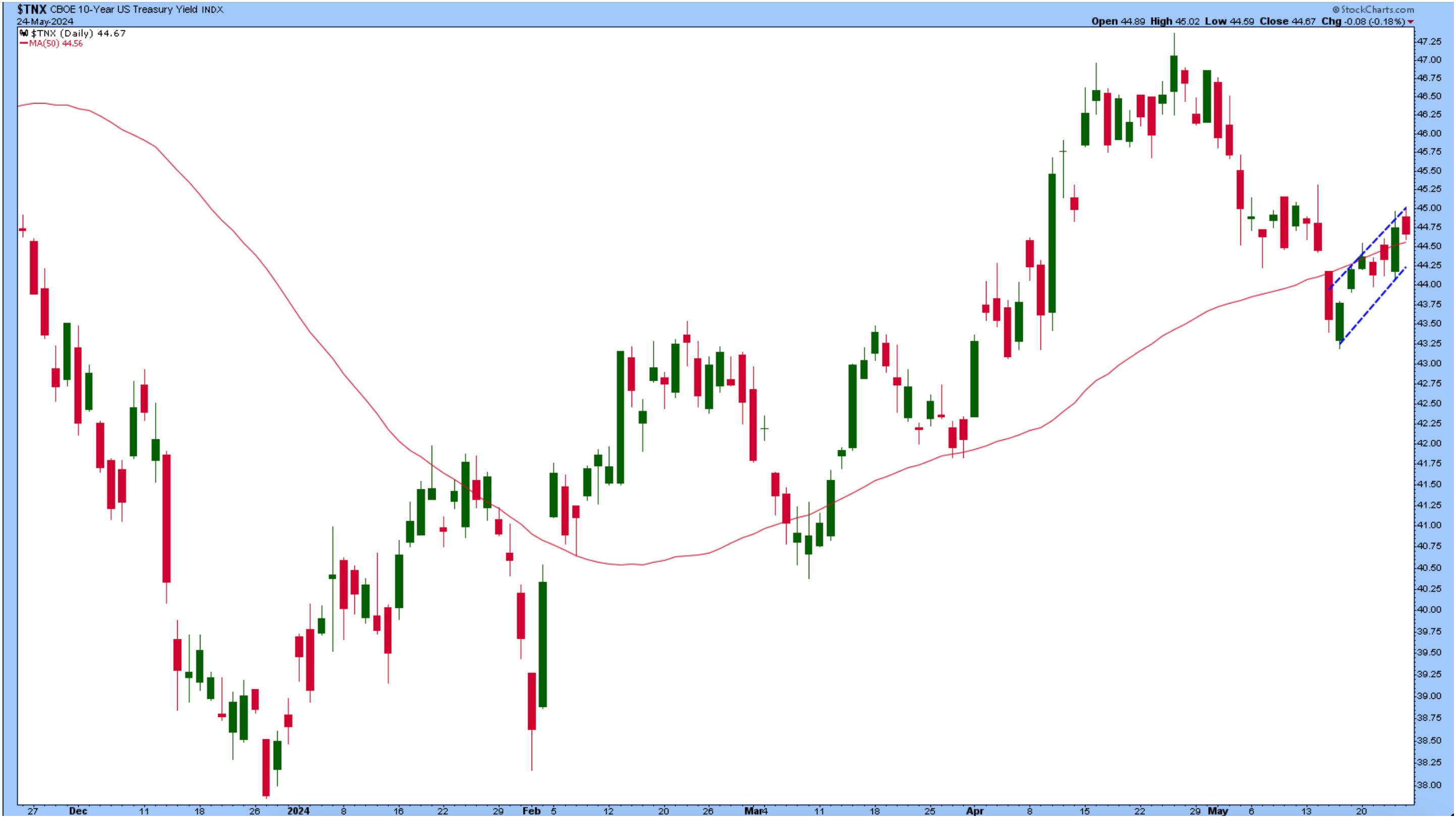
Another interesting area is the price action in US Treasury yields, which seem to. be going through a consolidation pattern. Until they break out of this pattern, there's no telling which way yields will go. The Fed is committed to bring inflation to 2%, but we don't know how long it'll take to get there.
CHART 1. 10-YEAR US TREASURY YIELDS IN CONSOLIDATION. Yields could break out in either direction. A lot depends on future economic data points. Chart source: StockCharts.com. For educational purposes.
A comforting thought is that the CBOE Volatility Index ($VIX) is low, indicating that investors aren't fearful. This supports a bull market thesis. It's challenging to forecast which direction the stock market will move, and we could see continued sideways movement for a while, especially after the FOMC minutes.
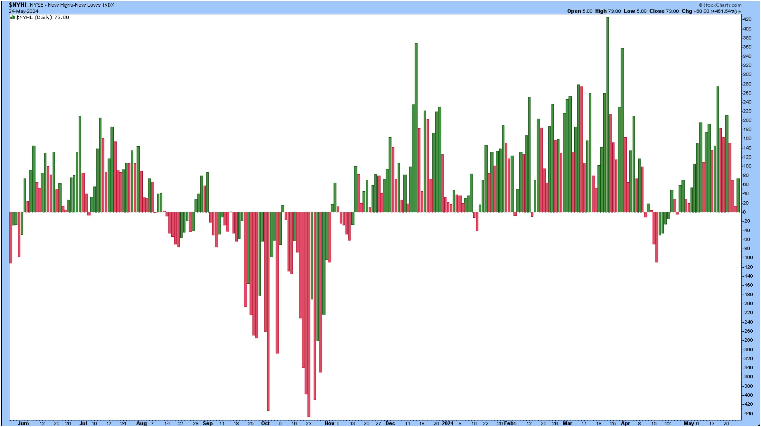
You can sense the presence of investor enthusiasm as stocks continue to reach all-time highs. Over 100 stocks hit an all-time high (check out the New All-Time Highs Predefined StockCharts scan). The New Highs-New Lows index ($NYHL) also shows more new highs than lows, although the number of new highs is not as high as it was in recent weeks (see chart below).

CHART 2. NEW HIGHS - NEW LOWS. The number of new highs is greater than the number of new lows. Chart source: StockCharts.com. For educational purposes.
A Few Stocks to Note
Follow the live chart!
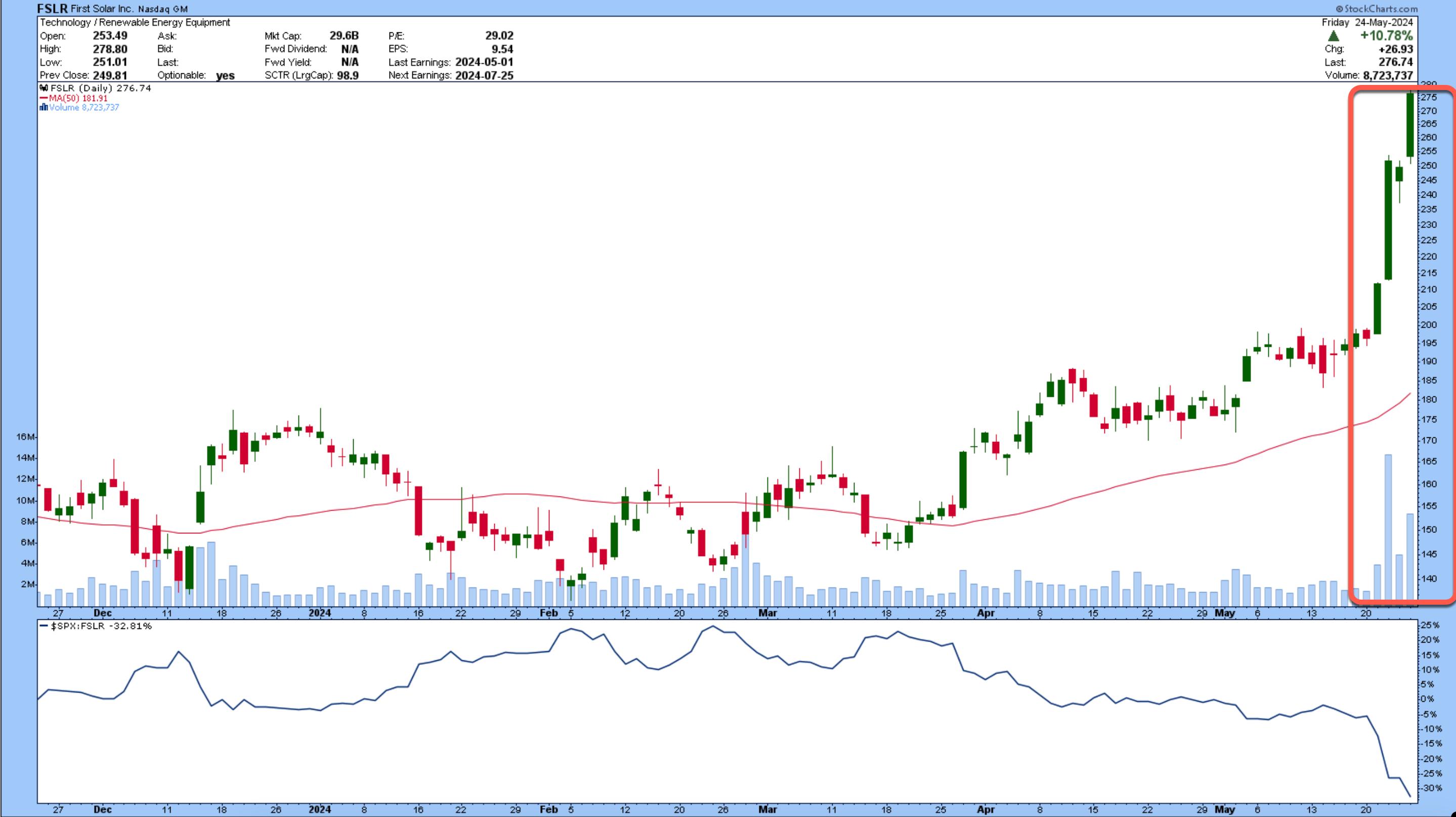
Look at how First Solar (FSLR) performed this week. The stock surged, surpassing its last high of around $230 about a year ago. Despite FSLR's rise, its relative strength compared to the S&P 500 index is at -32.81%. It's got a lot of catching up to do.

CHART 3. FSLR JUMPS ON THE AI RIDE. The AI infrastructure needs to depend on energy companies and
What makes the stock appealing? FSLR has attracted the attention of analysts as a company that will benefit from the AI revolution. There's a lot of talk about how the increased capacity of data centers will require energy, and FSLR could be one company that would benefit from the increased demand.
FSLR made it to three StockCharts Predefined Scans—New 52-Week Highs, Moved Above Upper Price Channel, P&F Double Top Breakout.
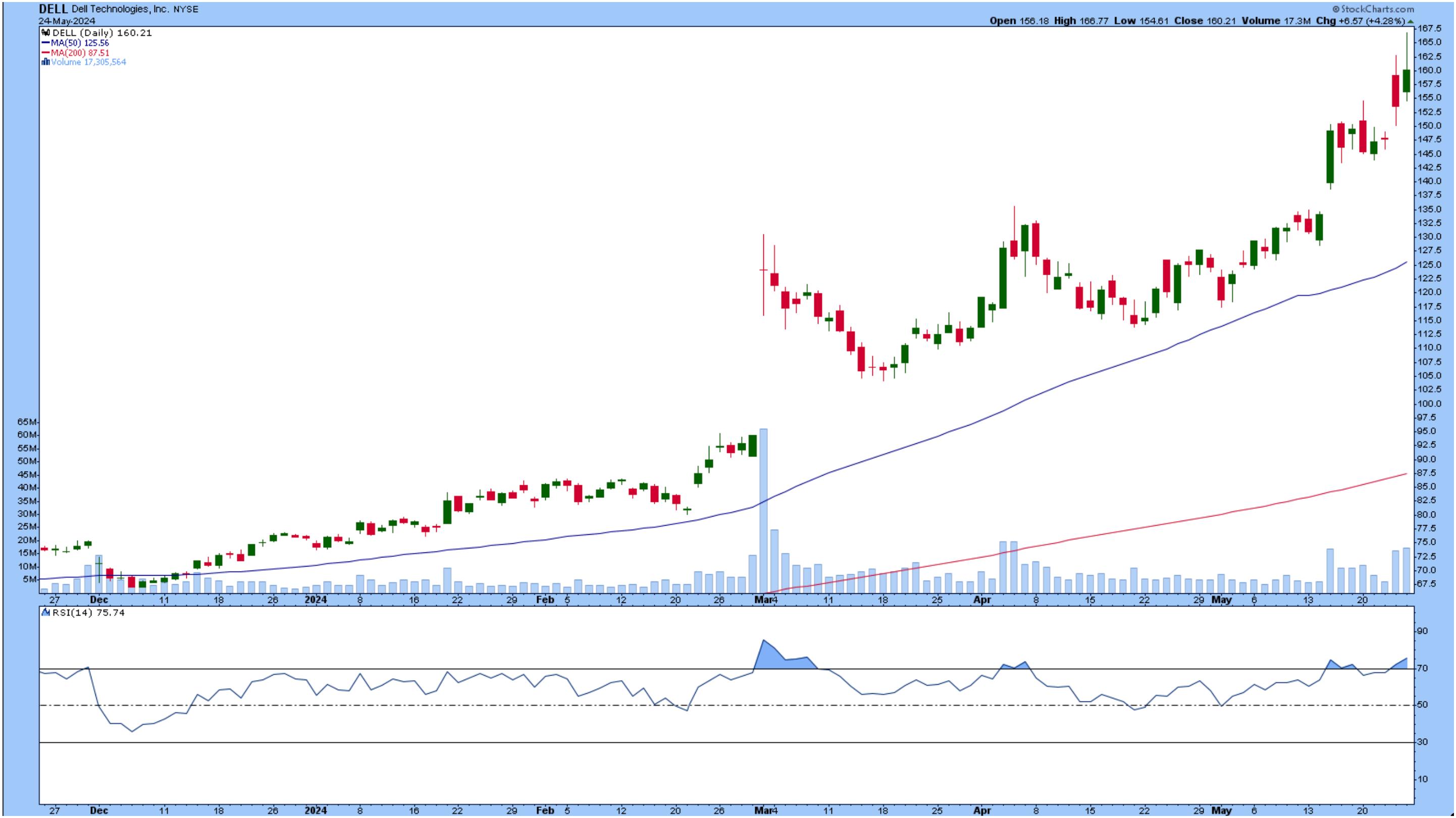
Another stock that hit a new high is Dell Technologies (DELL), again because of its contribution to the AI space. From the daily chart of DELL (see below), the stock is in an upward trend, and its relative strength index (RSI) has just crossed above the 70 level.
Follow the live chart!
The stock also reached the top 5 SCTR stocks (see end-of-week wrap-up below). Will the strength continue? We'll find out when the company announces earnings next week.

CHART 4. DELL HITS NEW HIGHS. The stock has been gaining strength and is trading well above its 50-day simple moving average. Will earnings push this stock higher? Chart source: StockCharts.com. For educational purposes.
Closing Thoughts
With NVDA earnings in the rearview mirror, could FSLR or DELL be the next stock investors will get excited about? You can't rule it out. This market hits you with surprises, so be prepared for anything. Even though the market went through its ups and downs this week, the overall sentiment appears to be bullish, a good way to start the holiday weekend.
End-of-Week Wrap-Up

- S&P 500 closes up at 5,304.72, Dow Jones Industrial Average up 0.01% at 39,069.59; Nasdaq Composite up 1.1% at 16,920.79
- $VIX down 6.66% at 11.92
- Best performing sector for the week: Technology
- Worst performing sector for the week: Energy
- Top 5 Large Cap SCTR stocks: MicroStrategy Inc. (MSTR); Vistra Energy Corp. (VST); Super Micro Computer, Inc. (SMCI); Vertiv Holdings (VRT); Dell Technologies (DELL)
On the Radar Next Week
- Earnings from Salesforce (CRM), Abercrombie and Fitch (ANF), Dell Technologies (DELL).
- March Home Prices
- Consumer Confidence
- April PCE
- Fed speeches
Disclaimer: This blog is for educational purposes only and should not be construed as financial advice. The ideas and strategies should never be used without first assessing your own personal and financial situation, or without consulting a financial professional.
|
| READ ONLINE → |
|
|
|
| OptionsPlay |
| Hedging the S&P 500 All-Time Highs With Options |
| by Tony Zhang |

As equity markets print new all-time highs and the CBOE Volatility Index ($VIX) prints 52-week lows, this should be considered a bullish outlook by all accounts.
However, when you look under the hood, the internals with this rally concern me and, in my opinion, warrant buying some protection at these all-time highs.
Time to Play Defense?
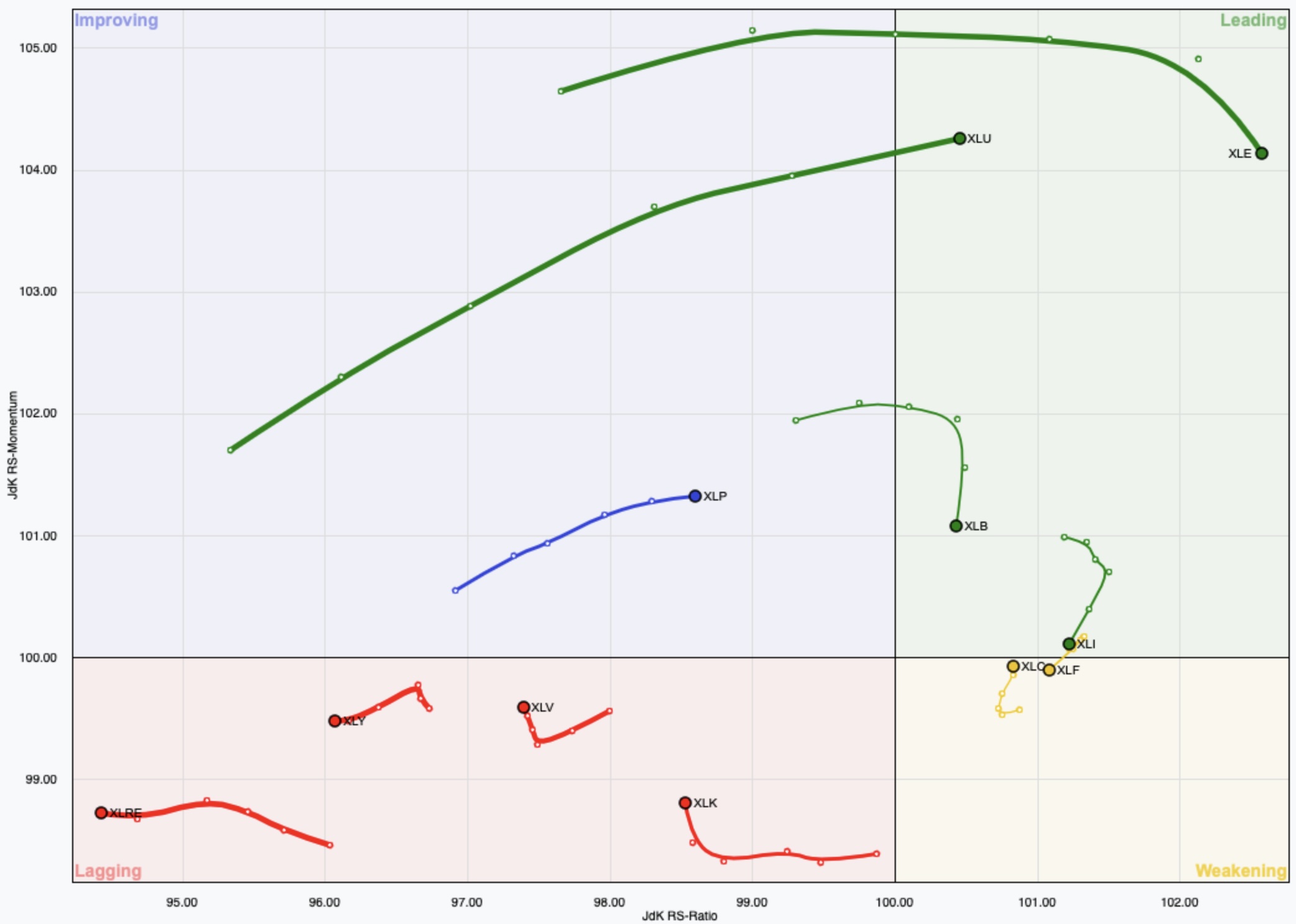
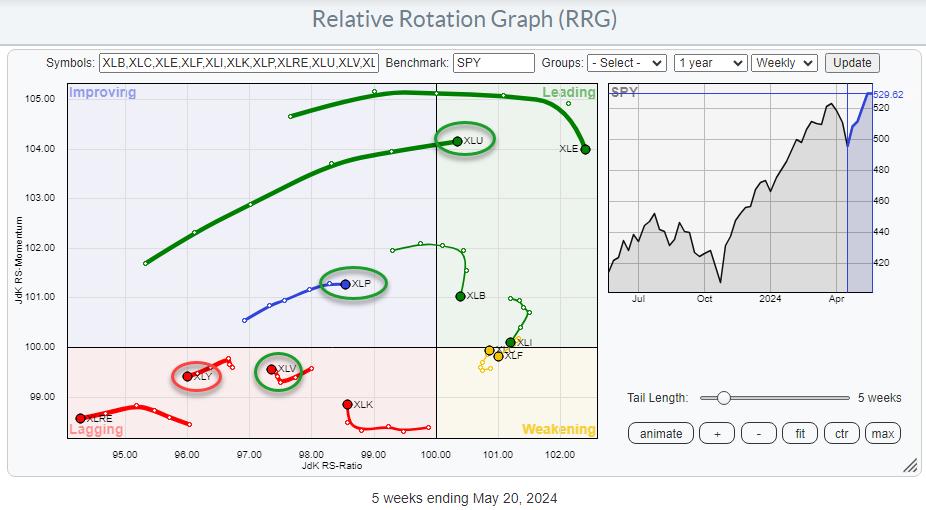
Firstly, as Julius de Kempenaer, Senior Technical Analyst at StockCharts.com pointed out earlier this week, if you look at the Sector Rotation RRG Chart below, you can see that, over the past five weeks, the rally in the S&P 500 has been led by Utilities, Energy and Staples. While Technology has started to show a slight increase in strength this week, the market's overall tone is clearly in defense. With Materials and Industrials also rolling over, we simply lack the confidence to call a strong bull market on the recent all-time highs.

CHART 1. SECTOR ROTATION RRG CHART. Utilities, Energy, and Consumer Staples led the rally in the S&P 500 index.Chart source: StockCharts.com. For educational purposes.
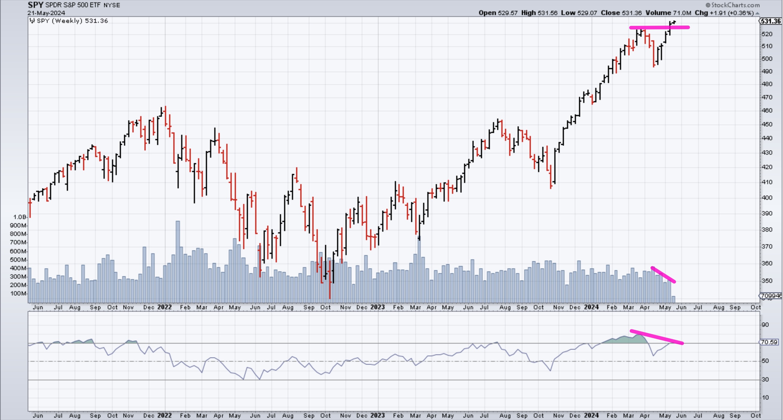
Now, if you look at a chart of the SPDR S&P 500 ETF (SPY), you see that the new all-time highs were not confirmed with a new high on the Relative Strength Index (RSI) momentum indicator; this suggests that buyers are exhausted, and may lack the strength to continue higher. Additionally, volume has been increasing on down weeks and decreasing on up weeks, which is further evidence that this bull market lacks strength.

CHART 2. WEEKLY CHART OF THE SPY. The S&P 500's new highs have not been confirmed by a new high in the RSI, and volume is declining on up weeks. These indicate that the bull market doesn't have strength.Chart source: StockCharts.com. For educational purposes.
Planning Your Strategy
There are two possible ways this can play out. The offensive sectors, such as Technology, Discretionary, Materials, and Industrials, can start leading again; alternatively, the S&P 500 could begin to roll over.
With the VIX trading around the 12 handle, my view is that it costs us very little to buy some protection, and it would allow you to remain fully invested in the markets. This would allow further upside participation if the offensive sectors returned to life, while giving up a small percentage of your portfolio for the hedge. And this would provide downside protection if the markets were to roll over.
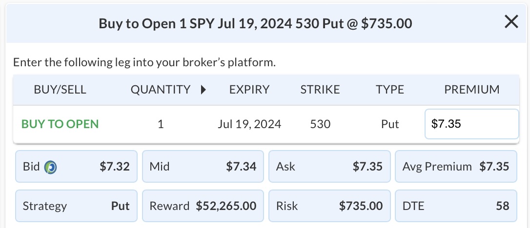
I'm going out to the July expiration, and buying the $530 puts on SPY for a $7.35 debit, which is only 1.3% of SPY's value to buy over two months of protection. I'm choosing a strike price with a delta of 40, which translates to $0.40 of profits for every $1 drop in SPY.
Note: Options data is available in StockCharts in the Summary Pages.

As you can see, the potential reward for risking $735 is very favorable. If SPY declines in value, all things equal, the put's value will increase. Remember, when you buy a put, you have the right to sell the underlying at the strike price before expiration date. You could also sell the contract before expiration. If SPY is above the strike price at expiration, you can let the contract expire worthless and just lose the premium.

|
| READ ONLINE → |
|
|
|
| DecisionPoint |
| Market Looks Toppy |
| by Carl Swenlin |
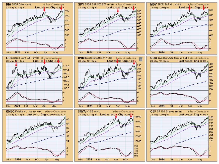
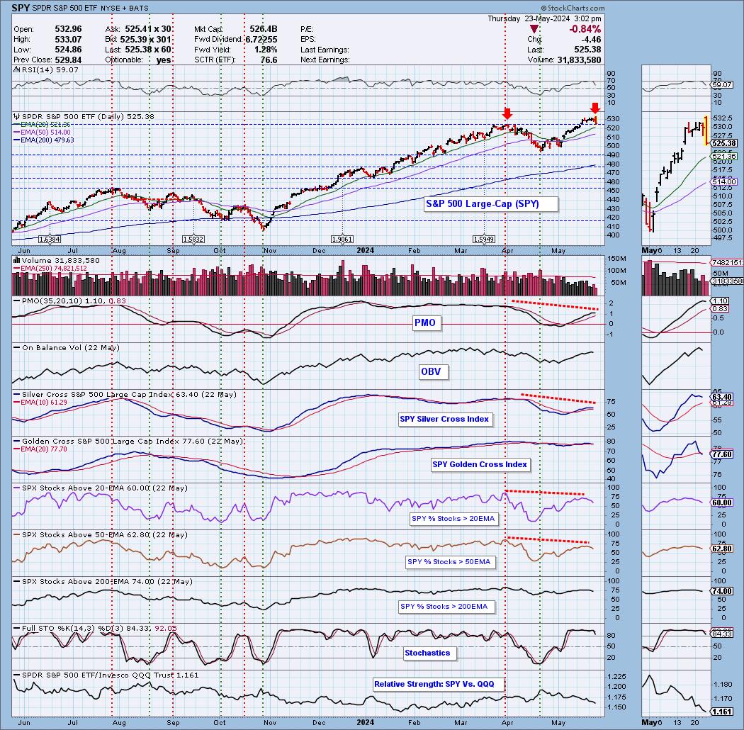
In spite of the massive celebration of Nvidia's earnings report, we are seeing troublesome signs that the market is in the process of putting in a top. There are double top formations on six of the nine major indexes we follow, but the three indexes that haven't topped yet, Nasdaq 100, S&P 100, and Nasdaq Composite, have heavy influence from big tech stocks.

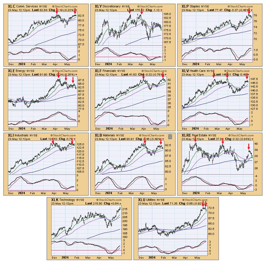
We also have double or triple tops on nine of the eleven S&P 500 Sectors. Of the two remaining sectors, only Technology (XLK) hasn't topped. Consumer Staples (XPL) doesn't have a double top, but it does appear to have topped--a double is not required.

As we were writing this article, the market made new, all-time highs intraday, but it reversed quite sharply, supposedly because of worry that the Fed won't cut rates this year. We prefer to think it had more to do with the technical problems (many negative divergences) we see on the chart below.

Conclusion: The superb performance of the technology sector, and Nvidia in particular, has drawn attention away from other areas of the market where the picture is not so stellar. While most of those areas are not yet in a ditch, price action is telling us to prepare for potential problems in the near future.
Learn more about DecisionPoint.com:
Watch the latest episode of the DecisionPointTrading Room on DP's YouTube channel here!

Try us out for two weeks with a trial subscription!
Use coupon code: DPTRIAL2 at checkout!
Technical Analysis is a windsock, not a crystal ball. --Carl Swenlin
(c) Copyright 2024 DecisionPoint.com
Disclaimer: This blog is for educational purposes only and should not be construed as financial advice. The ideas and strategies should never be used without first assessing your own personal and financial situation, or without consulting a financial professional. Any opinions expressed herein are solely those of the author, and do not in any way represent the views or opinions of any other person or entity.
DecisionPoint is not a registered investment advisor. Investment and trading decisions are solely your responsibility. DecisionPoint newsletters, blogs or website materials should NOT be interpreted as a recommendation or solicitation to buy or sell any security or to take any specific action.
Helpful DecisionPoint Links:
Trend Models
Price Momentum Oscillator (PMO)
On Balance Volume
Swenlin Trading Oscillators (STO-B and STO-V)
ITBM and ITVM
SCTR Ranking
Bear Market Rules
|
| READ ONLINE → |
|
|
|
| RRG Charts |
| Surge in TSLA and Strong AMZN Not Enough |
| by Julius de Kempenaer |

Concerns Remain
My concerns about current market developments, which I voiced in last week's article, are still valid. The current sector rotation, as it is visible on the relative rotation graph above, is not supportive of a strong rise in the S&P 500.
The strong headings, especially for the tails of XLU and XLP, suggest that the rotation to defensive sectors is ongoing. The pickup of relative momentum in the healthcare sector (XLV) adds to that observation. Another tail, which is not in line with a strong bull market in $SPX, is XLY, inside the lagging quadrant and traveling lower on the JdK RS-Ratio scale at a negative RRG heading.
AMZN & TSLA are Not Able to Pull the Sector Up
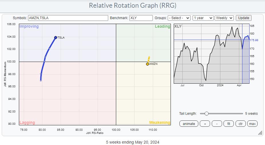
An interesting observation about the rotation of the consumer discretionary sector is that only two stocks—Amazon and Tesla—make up a large part of it. Together, they represent roughly 38% of the sector's total market capitalization. You usually see a huge impact of a few mega-/large-cap stocks on the direction of the sector as a whole, but that is not the case here.
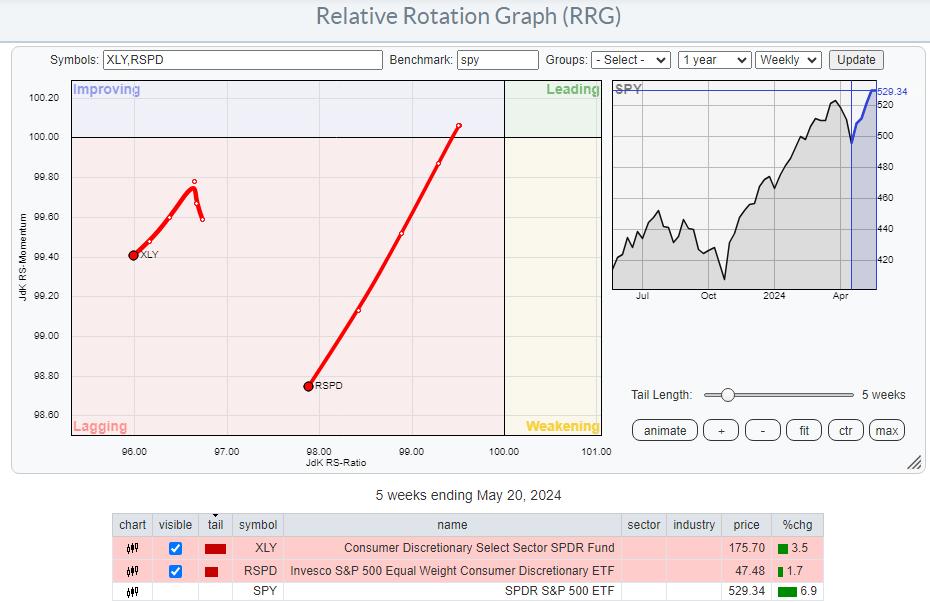
Both stocks outperformed the Consumer Discretionary Index, showing positive returns, over the past 5 weeks, while XLY was underperforming SPY.
Both stocks are at different locations on the RRG, but both contribute positively. Amazon shows a very short tail and has just crossed from the leading quadrant into weakening. Its short tail indicates that this stock is in a stable relative uptrend. On the other hand, Tesla shows a longer tail and is moving from the lagging quadrant into improving, on a positive RRG heading.

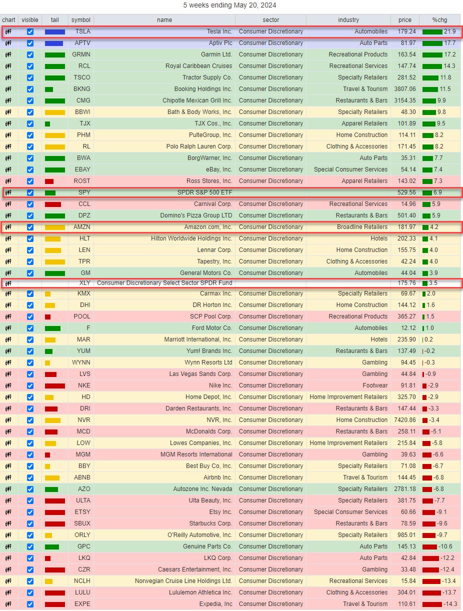
The performance table, which you can find below the relative rotation graph, highlights the differences in performance for the two stocks versus the consumer discretionary sector index. Tesla rose almost 22%, and Amazon added 4.2% over the last five weeks, while XLY only gained 3.5%. I have added SPY as a reference, which showed a performance of almost 7% over the same period.
So what does it mean when a large sector like consumer discretionary is underperforming the S&P 500 while 1/3 of its market capitalization is outperforming the sector?
It means that, under the hood, the situation for the sector as a whole is even worse.

This can be visualized by using the equal-weight sector rotation instead of the cap-weighted sector rotation. The RRG above shows the tails for both XLY and RSPD using SPY as the benchmark. Both are well inside the lagging quadrant, but note the steepness of the tail for RSPD and its length compared to XLY.
Despite the lower reading on the RS-ratio scale for RSPD, the longer tail and the lower reading on the RS-momentum scale suggest that more relative downside is underway. So far, AMZN and TSLA have not been able to turn this situation around on a sector level.
Only Large-Cap Growth

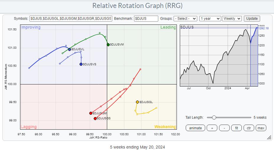
The last observation I want to share with you for this article is the difference in rotation between large-, mid-, and small-cap stocks across both the value and growth segments.
In the RRG above, we see large-cap growth as the only sector on a positive RRG-Heading, and inside, the weakening quadrant is on its way back toward the leading quadrant. This rotation suggests a new up-leg in an already established relative uptrend is underway.
ALL other tails are rolling over and rotating toward the lagging quadrant, or already in there.
This means that the current market strength is mainly driven by the large-cap growth segment, which includes NYFANG+ and MAG7 stocks that have a huge impact on the performance of $SPX.
So far, it's working out alright, but for how long? As always, this discrepancy could resolve itself in one of these two ways: either by the $SPX dropping in price to get back in line with the more defensive rotation or, and this is also a very possible scenario, a prolonged sideways move to digest recent gains. There is another option, however, in that the sector rotation could move toward more offensive sectors and mid- and small-cap segments, joining their large-cap counterparts in more positive territory on the RRG.
#StayAlert and have a great weekend. --Julius
Please note: Sector Spotlight has been discontinued, but I am back on the StockCharts.com YouTube channel with a weekly show, usually on Mondays.
|
| READ ONLINE → |
|
|
|
| Fill The Gap by CMT Association |
| Stock Market Behavior: Separating Signal From Noise |
| by Stewart Taylor |

My initial intent was to focus on the number of major equity indices near their all-time highs or attempting to break out of long-term ranges, and how their behaviors around those prior highs over coming months will likely offer significant insight into what comes next. It's evolved into something else, which I will share with you here.
Making Sense of the Stock Market's Randomness
I am convinced that most market fluctuations are random, mostly untradable noise. Yet most who work with the financial markets for a living must translate meaningless behavior into a continuous narrative for clients and employers. Importantly, once a narrative is publicly expressed, the analyst/trader becomes entrapped in that narrative, and all the resultant behavioral biases that being identified with a view entails. Working in the institutional setting, my solution was to focus on longer timeframes.
When patterns occur at the proper position on the chart, they become much more valuable and actionable.
Part of the technician's evolution is finding the style that best suits their emotional and risk management tolerance. For me, it was a long and sometimes painful journey. One of my toughest challenges was finding a systematic approach to separating signal from noise. In other words, when is market behavior important, and when is it not? And if it is, how do I subsequently fashion a trade to take advantage of the informational advantage?
Anyone who has traded for a living knows that market behaviors and patterns are often unreliable. This is particularly true if they are occurring in a trending market and well away from substantive support or resistance (the most obvious exception being early-stage trends and climax/ending structures). Don't get me wrong; trading-focused systematic entries to established trends can work well. However, I prefer to enter initial positions into trends in their early stages, where I have tighter control over risk management and where my macro opinion, hopefully divergent from the dominant market narrative, is more likely to be a change catalyst.
When patterns occur at the proper position on the chart, they become much more valuable and actionable. To be fair, I don't ignore day-to-day shifts; staring at tens of thousands of charts for years has given me a decent feel for the short-term fluctuations. However, I place less emphasis on building trading plans or adjusting my positions around them, and I try to avoid labeling them as meaningful for anything more than a short-term trade. In these cases, my chart analysis typically consists of a cursory glance at the price-volume relationships and a general view of the chart. On the other hand, solid confluences of support and resistance that have been well-defined in the weekly and monthly perspectives are my wheelhouse. When I find these markets, I focus on them intently.
In my process, I actively scan for markets, testing well-defined price junctures in their weekly and monthly perspectives. At these junctures, the price/volume behavior combinations in the daily, weekly, and even hourly perspectives become meaningful and often produce actionable insight.
As a professional fixed-income trader, I have always been envious of non-constrained traders who had thousands of global stocks, equity indices, currencies, and commodities across multiple time perspectives to choose from. A fat pitch is always set up somewhere, as long as you are dogged enough to find it.
On To the Charts!
Multiple global equity markets are testing important prior highs, many from monthly perspectives, others from weekly perspectives. These are the situations in which signal quality is high, the price/volume relationships become more important, and where, oftentimes, new trends with quality risk reward tolerances are set up.
These are all charts that have recently moved onto my watch list.
MSCI Italy Capped ETF
The iShares MSCI Italy Capped ETF (EWI) represents a point in case.

CHART 1. Monthly Chart of EWI.
Italy recently moved modestly above the top of a two-decade-long trading range. From this position, even small daily perspective fluctuations generate meaningful information. Importantly, with the long trading range acting as a potential cause, potential breakout targets are much higher, and even a failure back toward the trading range lows would produce roughly a 40–45% return. It's pretty simple: either the market:
- A) Is breaking out, or
- B) Has washed out the top of the range, sucked in weak hands, and will soon fail back into the range leaving weak hands trapped.
Upon examining the chart, I initially thought it was indeed breaking out of its decade-long trading range.
- The September 2022 low (B) was higher than the prior low (A).
- During the last decline toward the range lows (34.53–20.99) there were significant signs of accumulation.
- The market is clearly above the most immediate horizontal resistance( 34.45–34.53) and just above the 36.88 resistance.
- Corrections since breaking out have mostly taken the form of bull flags or pennants.
However, there are a few caveats.
- Momentum is significantly over-extended in all time frames.
- The weekly slow stochastic is diverging and threatening to roll over.
- The monthly slow stochastic is attempting to roll over.
- EWI is close to the top of the daily, weekly, and monthly Bollinger Bands.
- Multiple price channel tops confluence in the 38.00 area of the chart.
- Volume has declined markedly as the market rallied over the last 19 months. This suggests a lack of selling pressure rather than strong demand.
- Since 2011, the peaks have been running in the mid 40-month range. It's currently at 35 months.
- While above the most recent resistance, the 2009 high at 43.54 should offer strong resistance.
Suppose the market is ready to pull back. In that case, the price-volume relationships, pattern, behavior relative to support and resistance zone, and other traditional technical relationships should allow early entry into the next meaningful directional move.
For now, I suspect the market may be breaking out in the long term, but the long laundry list of concerns suggests that a pullback is likely to develop before the next strong trending phase begins. The behaviors on the pullback and where the pullback holds (most likely the broken C–D resistance) will be critical (see chart below).

CHART 2. Watch to see if the pullback holds at the C-D resistance in EWI.
The Nikkei 225
The Nikkei is another major market that's testing its all-time high. The monthly chart below shows the index is at all-time highs and at a channel top. This is clearly a chart to add to my watchlist.
 CHART 3. Monthly Chart of the Japan Stock Market Index (JP225). CHART 3. Monthly Chart of the Japan Stock Market Index (JP225).
MSCI India ETF
India is interesting. There has been a very positive change in the reporting on India's economic outlook, and the market recently moved to a new all-time high. However, note the swell in volume and poor upside result generated by that volume (see monthly chart of iShares MSCI India ETF (INDA) below). I suspect strong hands are selling the rally.

CHART 4. Monthly Chart of iShares MSCI India ETF (INDA). And on a final note, many of the topics and techniques discussed in this post are part of the CMT Association's Chartered Market Technician's curriculum.

Disclaimer: Shared content and posted charts are intended to be used for informational and educational purposes only. The CMT Association does not offer, and this information shall not be understood or construed as, financial advice or investment recommendations. The information provided is not a substitute for advice from an investment professional. The CMT Association does not accept liability for any financial loss or damage our audience may incur.
|
| READ ONLINE → |
|
|
|
| Trading Places with Tom Bowley |
| One Potentially Big Problem Is Lurking For The Bulls This Summer |
| by Tom Bowley |
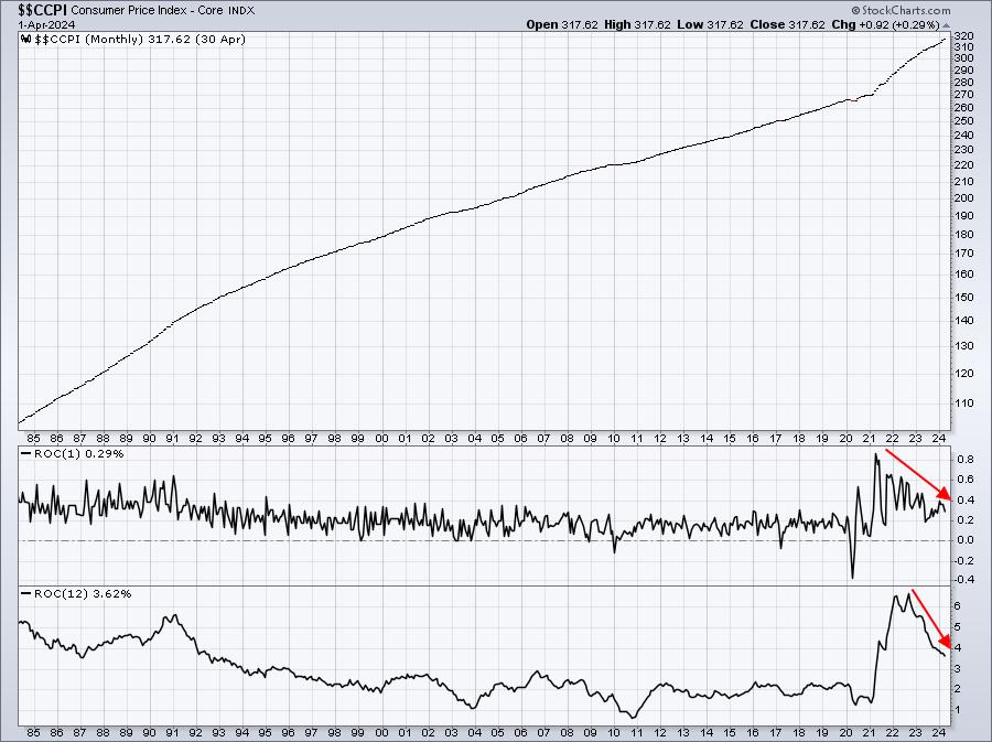
Last week's rally to record highs was due, at least in part, to a rather tame CPI report released on Wednesday. Inflation has been at the heart of nearly every rally and every decline over the past few years. Clearly, we saw inflation soaring throughout 2021 and 2022, but since then, the annual core CPI has been consistently dropping, despite a Fed that says they haven't seen enough of a drop toward their 2% target level to warrant a fed funds rate decrease. Here's the Core CPI chart that illustrates the rise and fall of inflation since the 2020 pandemic began:

Call me crazy, but I see an annual Core CPI rate that is tumbling. History tells us that when inflation peaks and rolls over, it's a very bullish signal for U.S. equities. 2023 and 2024 has been no different. However, there is one inflation problem that no one is really talking about.
Inflation Likely To Climb This Summer
There's like to be a few negative/bearish analyst comments this summer. The reason? In 2023, the June (+0.19%), July (+0.23%), and August (+0.23%) represented the 3 lowest monthly core CPI readings. That means that these monthly readings in the same 3 months as 2023 will need to come in extremely low or there'll be brief 3-month spike in the annual core rate of inflation at the consumer level. We know the stock market doesn't like uncertainty of any kind and a 3-month move higher in inflation could trigger that uncertainty.
Keep in mind that the June, July, and August readings are generally reported within the first 10 days to 2 weeks of the following month. So if we see weakness from these readings, it'll likely be from mid-July through mid-September.
Presidential Election Year Cycle
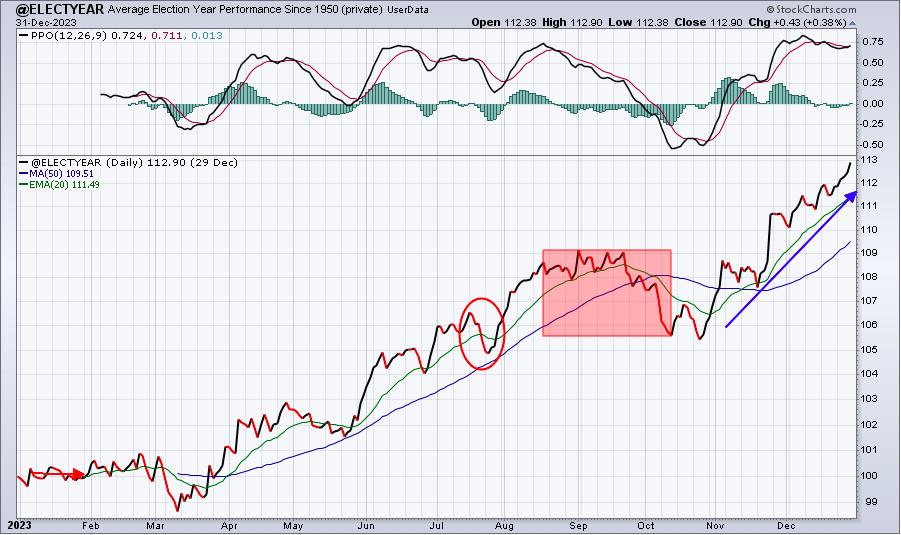
Finally, let's review the typical price action during a Presidential election year:

During this cycle, we tend to see very strong runs to the upside in late-May, June, and into early July. Given that our major indices just broke to new all-time record highs after a period of consolidation, this potential bullish scenario looks like a solid one to me.
But when those June, July, and August CPI readings come out, just think back to this article. This could be a real threat to our major indices over the late summer months.
I spoke, in much more detail, about this possible inflation scenario unfolding later this year during my "EB Weekly Market Recap" video at YouTube.com. Be sure to check it out and hit the "Like" button. If you haven't already done so, be sure to "Subscribe" to our YouTube channel as well, so that you don't miss future EB.com videos!
Spring Special Has Begun!
Our absolute best membership deal of the year started last week. If you'd like to check out our service and save A LOT of money simultaneously, please CLICK HERE for more information on the deal.
Happy trading!
Tom
|
| READ ONLINE → |
|
|
|
| Don't Ignore This Chart! |
| Surprise! These Grocery Stocks are Crushing 2024 Targets |
| by Karl Montevirgen |

While wealthier consumers benefit from higher stock and real estate valuations, lower-wage Americans are crushed by high prices, and many fall behind in credit card debt. Meanwhile, the Fed has been telegraphing that inflation may be much stickier than initially expected.
Still, consumers have to shop for basic staples, like groceries. If inflation persists, investing in staples makes sense. But large retailers that are also go-tos for "grocery" items are uniquely diversified, and their operations are differentiated and complex.
When considering major Consumer Staples sector companies such as Walmart (WMT), Costco (COST), Sprouts Farmers Market (SFM), and Kroger (KR), it's important to note that Walmart and Costco are generally categorized under "General Merchandise Stores" or "Discount Stores." In contrast, Sprouts and Kroger are categorized specifically under "Food Retailers." However, all four companies compete in the grocery space—a vital arena considering today's inflationary climate.
So, in light of this common ground of competition, how might you determine which companies might be more favorable/investible than the next?
The Four Retailers At–a-Glance
A big-picture glance at all four stocks using StockChartsACP Layouts shows that WMT, COST, and SFM are all exhibiting strong uptrends and have notched record highs. KR is the only stock among the four currently pulling back, having failed to challenge its 2022 high of $59.70.

CHART 1. DAILY CHARTS OF WALMART, COSTCO, SPROUTS FARMERS MARKET, AND KROGER. WMT, COST, and SFM are in all-time high territory while KR is dipping.Chart source: StockChartsACP. For educational purposes.
Walmart Gaps Up, But Can It Sustain Its Upward Momentum?

CHART 2. DAILY CHART OF WALMART. Note the breakaway gap with a strong historical tendency to keep moving higher. But where's the volume behind the move?Chart source: StockCharts.com. For educational purposes.
WMT exhibited a strong surge post-earnings by way of a breakaway gap, which, by the way, has a low probability of getting filled within a week (1%), according to technical analyst Thomas Bulkowki. Yet, if you look at the volume, which shows little follow-up, it's not the only indication that the stock may be due for a pullback. The Money Flow Index (MFI), a volume-weighted RSI, shows a flat-to-slightly-bearish diversion; its buying pressure falls as prices continue rising, indicating a potential pullback.
Still, its relative performance against the Staples sector (XLP) and the S&P 500 ($SPX) is relatively strong, nearly 15% and 10%, respectively.
Although runaway gaps tend not to get filled right away, other technical factors say it's bound to happen soon. Still, it's up in the air. And you'd have to weigh this against the fundamentally informed analyst targets (and overall economic situation) to determine whether it's a strong investment.
Costco is Skyrocketing Higher
Costco's performance in comparison to its sector and the S&P 500—27% and 22%, respectively—is notable, but not exceptional. However, the MFI shows the stock is in overbought territory with a slight bearish divergence. This indicates that the buying pressure that has driven its valuation may be weakening. If COST experiences a pullback, it may find support at previous swing highs of $775.75 and $750.

CHART 3. DAILY CHART OF COSTCO. COST is surging ahead, yet watch out for the dwindling volume.Chart source: StockCharts.com. For educational purposes.
Sprouts Farmers Market's Steady Uptrend

CHART 4. DAILY CHART OF SPROUTS FARMERS MARKET. Note that SFM, once a "hidden gem," is among the most impressive performers in the staples sector.Chart source: StockCharts.com. For educational purposes.
Also in all-time-high territory is SFM. Covered last December in the article Sprouts Farmers Market: A Hidden Gem on the Corner of Wall and Main Street?, SFM's rally turned out to be one of the more impressive performers in the sector. It's outperforming its sector by nearly 78% and the S&P by a little over 70%, making it the strongest performer among the four in this article.
While SFM has entered "overbought" territory once again, and its decreasing volume doesn't appear that it can sustain its rally without a pause, SFM is likely to continue surprising Wall Street in the quarters to come. So, it's a stock you might consider after a favorable pullback and a strong indication of a bullish reversal.
Kroger: A Pullback or Reversion?
Kroger is the weakest performer among the four discussed in this article. Its most recent high at $59 is a third retest of its $59.70 high in 2022, after which, as you can see, it failed. However, if you are bullish on Kroger, or if you're looking to accumulate it as part of a diversification strategy, you might want to wait for it to pull back to its 50% Fibonacci retracement level near the $51 range.

CHART 5. DAILY CHART OF KROGER. Is there still a reason to be bullish on KR? It's the worst performer of the bunch. But if you want to accumulate KR, it's approaching a reasonable buy level.Chart source: StockCharts.com. For educational purposes.
The Takeaway
Staples stocks might not be glamorous, but in a high-inflation environment, some of these seemingly boring stocks turned out to be the hottest performers on Wall Street. Major players like Walmart, Costco, Sprouts Farmers Market, and Kroger benefit from persistent demand for groceries. Notably, Walmart, Costco, and Sprouts are hitting all-time highs, while Kroger is lagging. Interestingly, 2024 analyst targets for these stocks have often been exceeded, highlighting Wall Street's underestimation of their potential.

Disclaimer: This blog is for educational purposes only and should not be construed as financial advice. The ideas and strategies should never be used without first assessing your own personal and financial situation, or without consulting a financial professional.
|
| READ ONLINE → |
|
|
|
| MORE ARTICLES → |
|
