| THIS WEEK'S ARTICLES |
| The Mindful Investor with David Keller, CMT |
| The Chart to Help Navigate a Summer Market Top |
| by David Keller |
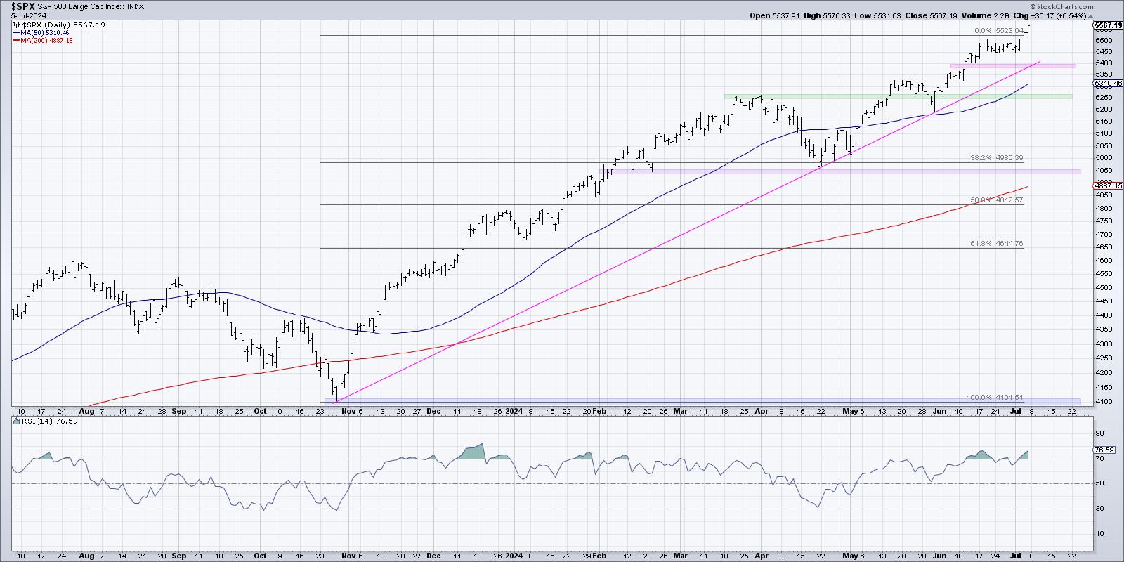
A thorough analysis of seasonal trends for the S&P 500 over the last 12 years provides two key takeaways: there is usually a major market top in the summer, and there is often a major market low in the fall. So, on top of simply analyzing the chart of the S&P 500, what else can we do to anticipate and validate a potential market top?
I would suggest that sector rotation could be key here, because the current uptrend is being driven by a very small number of sectors (actually just one, to be completely honest). Any adjustment to that configuration would constitute a "change of character" for this market, and most likely coincide with the summer market top many are expecting.

While the daily chart of the S&P 500 appears fairly consistent in 2024, aside from a two-week drop in early April, we have to remember that this market had a very different complexion before and after that market low. Before the April pullback, this was a broad advance, with most sectors thriving as the "everything rally" propelled the equity benchmarks higher. In May and June, and now into July, this has been more of a narrow rally, with a small number of mega-cap growth stocks thriving while most stocks have struggled.

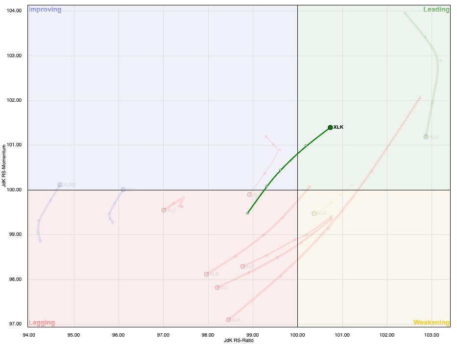
I love the simplicity of the RRG graph in visualizing the rotation of the 11 S&P 500 sectors. The weekly RRG shows that it's clearly been "the technology show" for weeks, as the XLK is the only sector in the Leading quadrant and moving up and to the right. Now, let's take a deeper look at the relative performance of the S&P 500 sectors in three buckets: growth leadership, value leadership, and defensive sectors.
Defensive sector performance is one of the seven items on my Market Top Checklist. Want to see the other six, and get help navigating a potential summer market top? Check out our Market Misbehavior premium membership and use code STOCKCHARTS for 20% off your first 12 months!
Value Sectors Thrived in Q1, Struggled in Q2
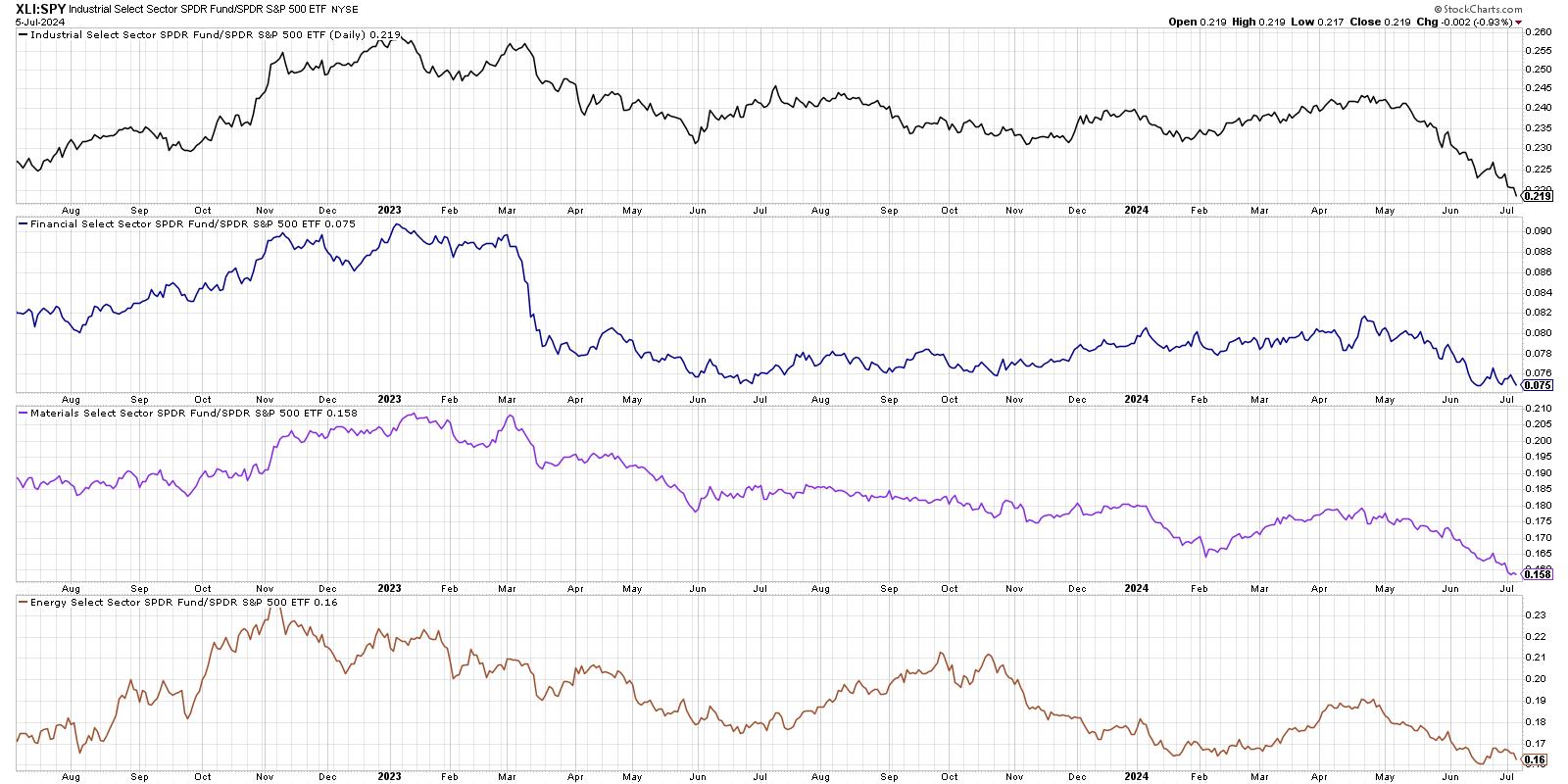
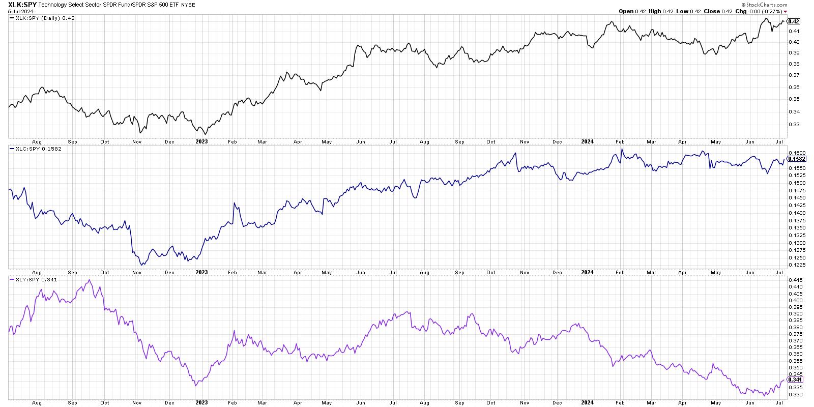
In this series of charts, each line represents a simple ratio of the performance of one sector versus the S&P 500 index. If the line is going up, that means the sector has been outperforming. If the line is trending lower, that means the sector underperformed during that period.

We can see here that the Industrial, Financial, Materials, and Energy sectors have all underperformed the SPX since the April market low. While these sectors all were outperforming in Q1, all four of them are at or near new relative lows as we enter Q3. While the S&P 500 and Nasdaq have been pushing higher, these sectors have not been a part of that success story!
Technology is the Only Sector with Strong Relative Strength
From mid-April to early July, only one of the S&P 500 sectors has actually managed to outperform the benchmark in a meaningful way, that being Technology. While the Consumer Discretionary sector has popped higher in recent weeks driven by AMZN and TSLA, and Communication Services has basically performed in line with the S&P 500, Technology has had the strongest run of relative performance.

Given the dominance of the AI trade in 2024, it's no surprise how Technology is clear outlier in terms of relative performance. And if there's one thing I've learned from a career as a technical analyst, it's to stick with winning trades as long as they keep winning!
Defensive Sectors May Be the Most Important to Watch
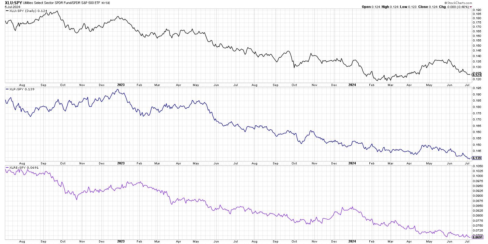
So that leaves us with three defensive sectors which don't tend to attract flows unless investors are afraid to own anything else. And all three have underperformed over the last 12 months, reinforcing the bullish sentiment still evident in the stock market.

Utilities stocks had a brief rally in April and May, during a period when most of their earnings calls were focused on power needs for artificial intelligence. But it didn't take long for that short-term phase to end, and Utilities once again lagged behind the major equity benchmarks.
This chart is one that I feature on my Market Top Checklist, because improvement in the relative strength of defensive sectors suggests that institutional investors are trying to hide out during a period of market uncertainty. And while these three sectors have occasionally outperformed during a bull market phase, their relative lines usually only turn higher during a bear market environment.
For now, the sector relative charts tell the story of a narrow market advance driven by Technology. I would argue that this same set of charts can tell you much of what you need to know to navigate a potential leadership rotation and even a likely market top in the summer months of 2024!
RR#6,
Dave
P.S. Ready to upgrade your investment process? Check out my free behavioral investing course!
David Keller, CMT
Chief Market Strategist
StockCharts.com
Disclaimer: This blog is for educational purposes only and should not be construed as financial advice. The ideas and strategies should never be used without first assessing your own personal and financial situation, or without consulting a financial professional.
The author does not have a position in mentioned securities at the time of publication. Any opinions expressed herein are solely those of the author and do not in any way represent the views or opinions of any other person or entity.
|
| READ ONLINE → |
|
|
|
| Larry Williams Focus On Stocks |
| MEMBERS ONLY |
| What to Expect This Month | Focus on Stocks: July 2024 |
| by Larry Williams |
|
Historically, July has seen stock prices move higher almost 80% of the time, cementing this in our trader's notebook as a time to stay home and trade. Others can vacation this month! Chart 1 is my true seasonal pattern for the Dow for the last 124 years...
|
| READ ONLINE → |
|
|
|
| ChartWatchers |
| An Awesome Breakthrough in S&P 500 and Nasdaq: Will the Momentum Continue? |
| by Jayanthi Gopalakrishnan |

If you were taking time off from the stock market, since it wasn't doing much in the last week or so, you're in for a nice surprise.
July is considered a good month for stocks, and the first trading week of the month, albeit short, didn't indicate otherwise. It may have been a short trading week, but a lot happened—ECB forum, Fed minutes, PMI data, a new UK Prime Minister, and the June jobs report—to help push the equity market out of its doldrums.
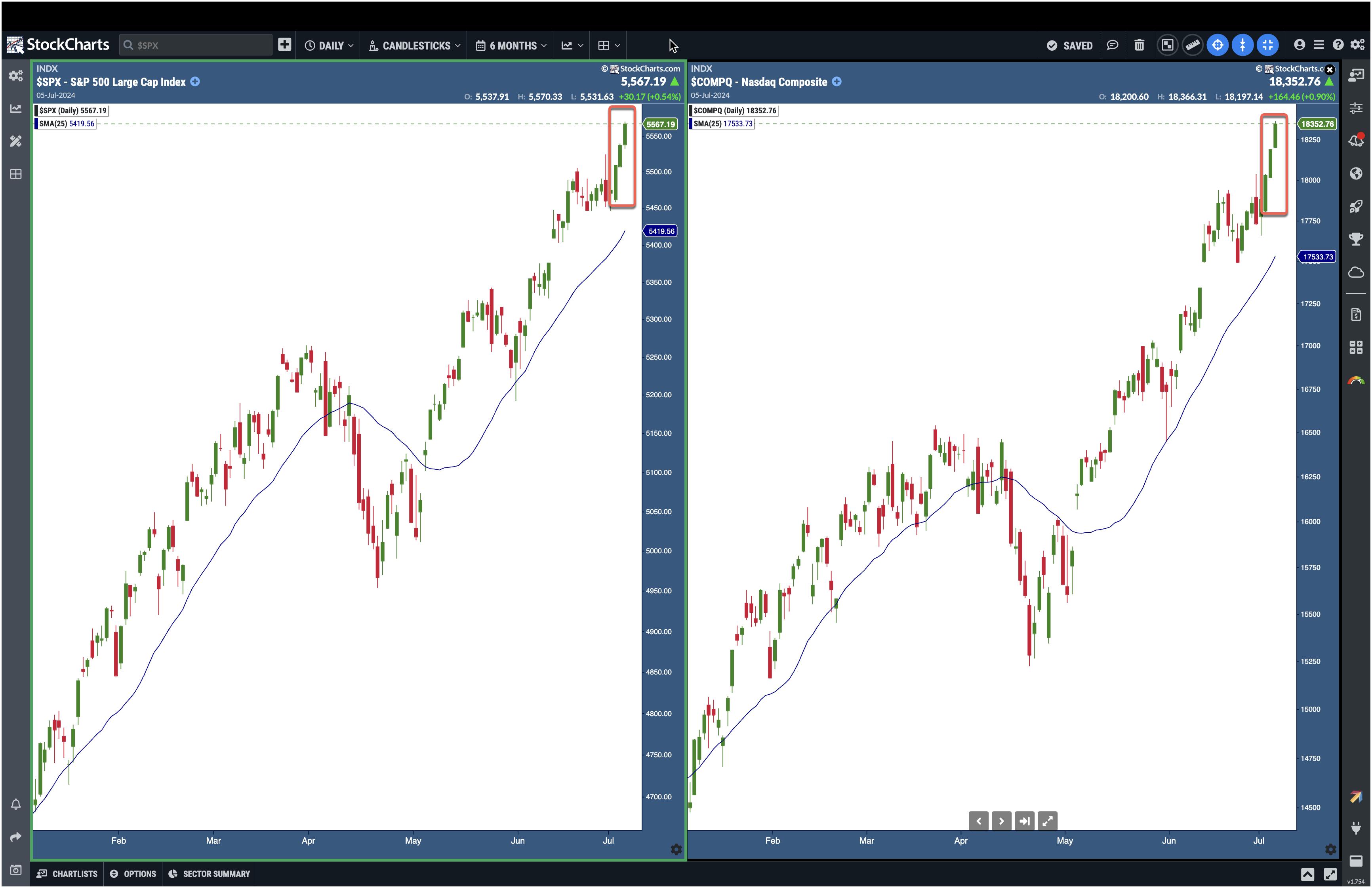
The S&P 500 ($SPX) and Nasdaq Composite ($COMPQ) have broken out of their sideways move and show directional bias toward the upside. Precious metals, i.e. gold ($GOLD) and silver ($SILVER), are moving higher after a pullback. Crude oil prices are consolidating after rising for about a month. The US Dollar Index ($USD) has pulled back and is trading close to a support level.
Looking at the daily chart of the S&P 500 and Nasdaq Composite below, you see a candlestick pattern resembling the three white soldiers. This is an indication that buying pressure remains strong.

CHART 1. BULLISH CHART PATTERN IN THE S&P 500 AND NASDAQ COMPOSITE. The indexes broke out of their sideways move and continued rising. A follow-through next week would mean further upside.Chart source: StockChartsACP. For educational purposes.
NVDA Still Strong
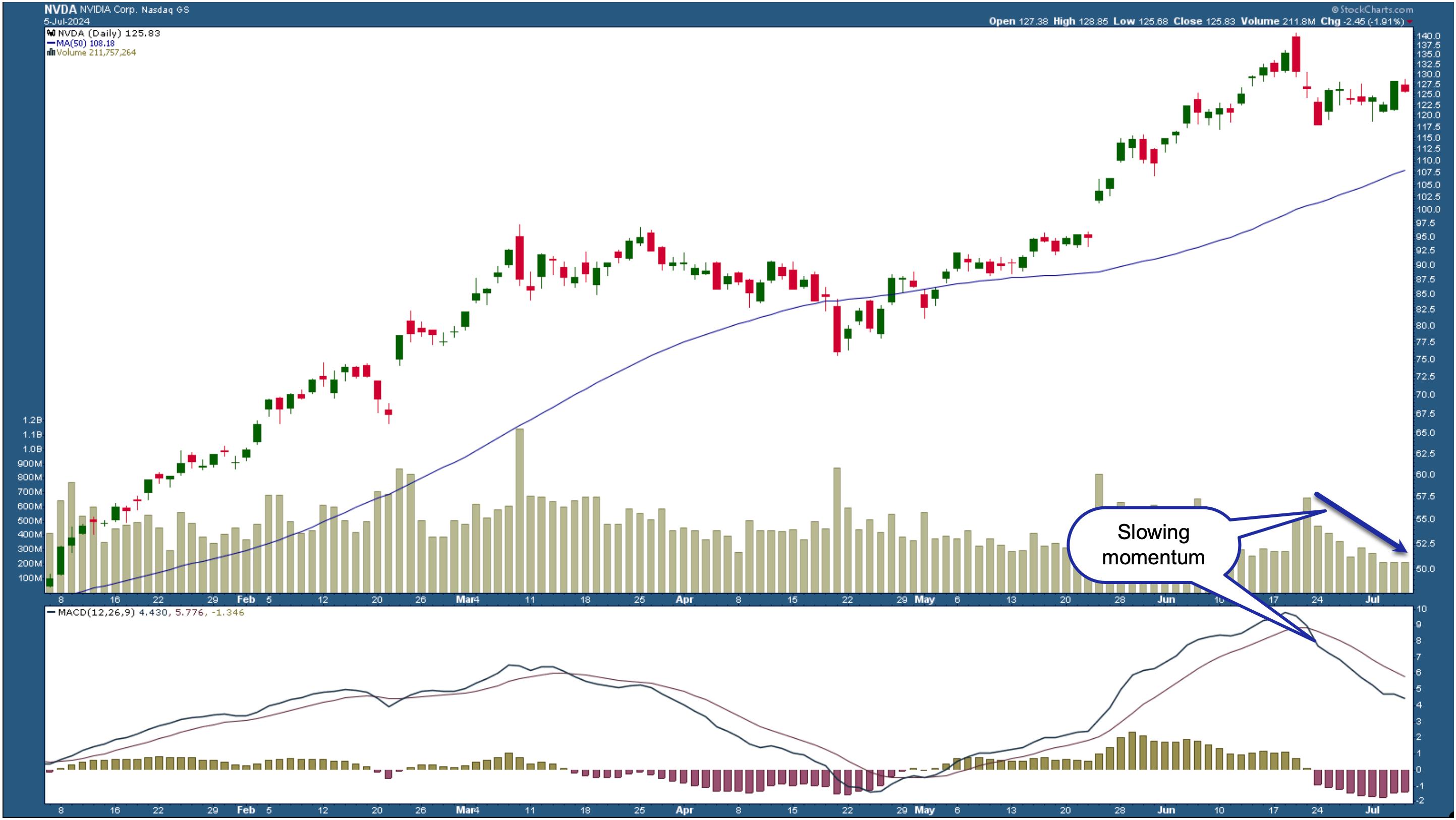
There was some concern that the broader market, especially technology stocks, would pull back after NVDIA's stock price. But if you look at the daily chart of NVDA stock below, it's trading well above its 50-day simple moving average (SMA).

CHART 2. DAILY CHART OF NVDA STOCK. Even though NVDA's stock price pulled back, the overall trend is still up. However, momentum is slowing. This could change next week and is worth watching. Chart source: StockCharts.com. For educational purposes.
The overall trend is up, but that doesn't mean NVDA's stock price will hit new highs soon. If you look at the moving average convergence/divergence (MACD) indicator, the MACD line has crossed below the signal line and is trending lower. Volume also has declined. Both these indicators suggest that momentum is slowing. This type of price action is typical of a holiday weekend and shortened trading week, so it may not be an accurate representation. If there's continued follow-through next week, it would be a more confirming signal.
Bitcoin: The Weak Link
While equities are trending higher, Bitcoin is facing headwinds. Investors are still coming to grips with Mt. Gox's collapse and the news that it'll repay its creditors $8.5 billion in crypto. This would mean those who receive coins in their crypto wallets will probably liquidate them, causing Bitcoin prices to fall further.
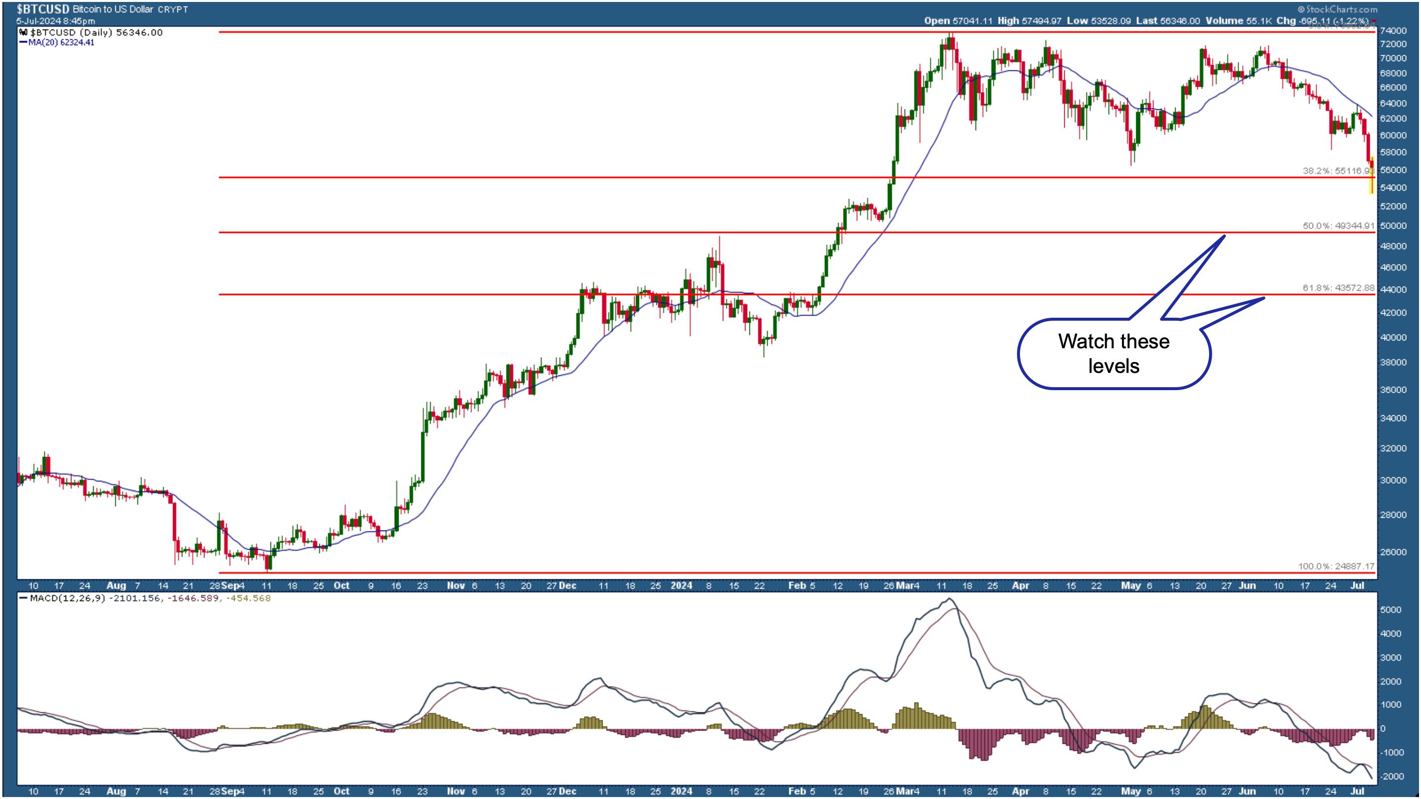
Looking at the daily chart of Bitcoin to US Dollar ($BTCUSD), it's trading at its February levels. It's also bouncing off the 38.2% Fibonacci retracement level (based on the September 2023 lows to March 2024 high).

CHART 3. DAILY CHART OF BITCOIN TO US DOLLAR. Bitcoin is trading at its February 2024 levels. Price could fall lower and hit the 50% and 61.8% Fibonacci retracement levels.Chart source: StockCharts.com. For educational purposes.
The MACD in the lower panel shows the cryptocurrency is losing momentum. If the weak momentum continues, Bitcoin could go as low as its 50% and 61.8% Fibonacci retracement levels. Keep an eye on these levels!
Bonds Prices On the Move
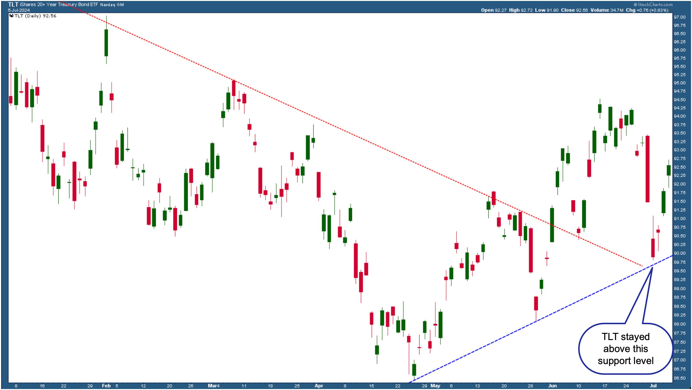
Treasury yields fell after a slightly cooler June jobs report. This increased bond prices (interest rates and bond prices move in opposite directions), a welcome reversal after the sharp July 1 decline. This price action can be seen in the iShares 20+ Year Treasury Bond ETF (TLT).
The chart below shows TLT coming close to breaking below a strong support level. That TLT has bounced off this support level and reversed, which is an indication of the high probability of a Fed interest rate cut by this year.

CHART 4. DAILY CHART OF ISHARES 20+ YEAR TREASURY BOND ETF (TLT). TLT held on to the support of the blue-dashed trendline and reversed.Chart source: StockCharts.com. For educational purposes.
If next week's June CPI and PPI data suggest inflation continues to cool, interest rate cuts become more likely. Treasury yields could fall further, which means bond prices will rise.
According to the CME FedWatch Tool, the probability of a September interest rate cut sits at around 70%, as of this writing.
Stocks will likely get a boost from the increased probability of an interest rate cut in the September Fed meeting. Next week's inflation data and Fed Chairman Powell's statement could impact the stock market's direction. There are some areas investors should watch.
Add the following two charts to your StockCharts ChartLists.
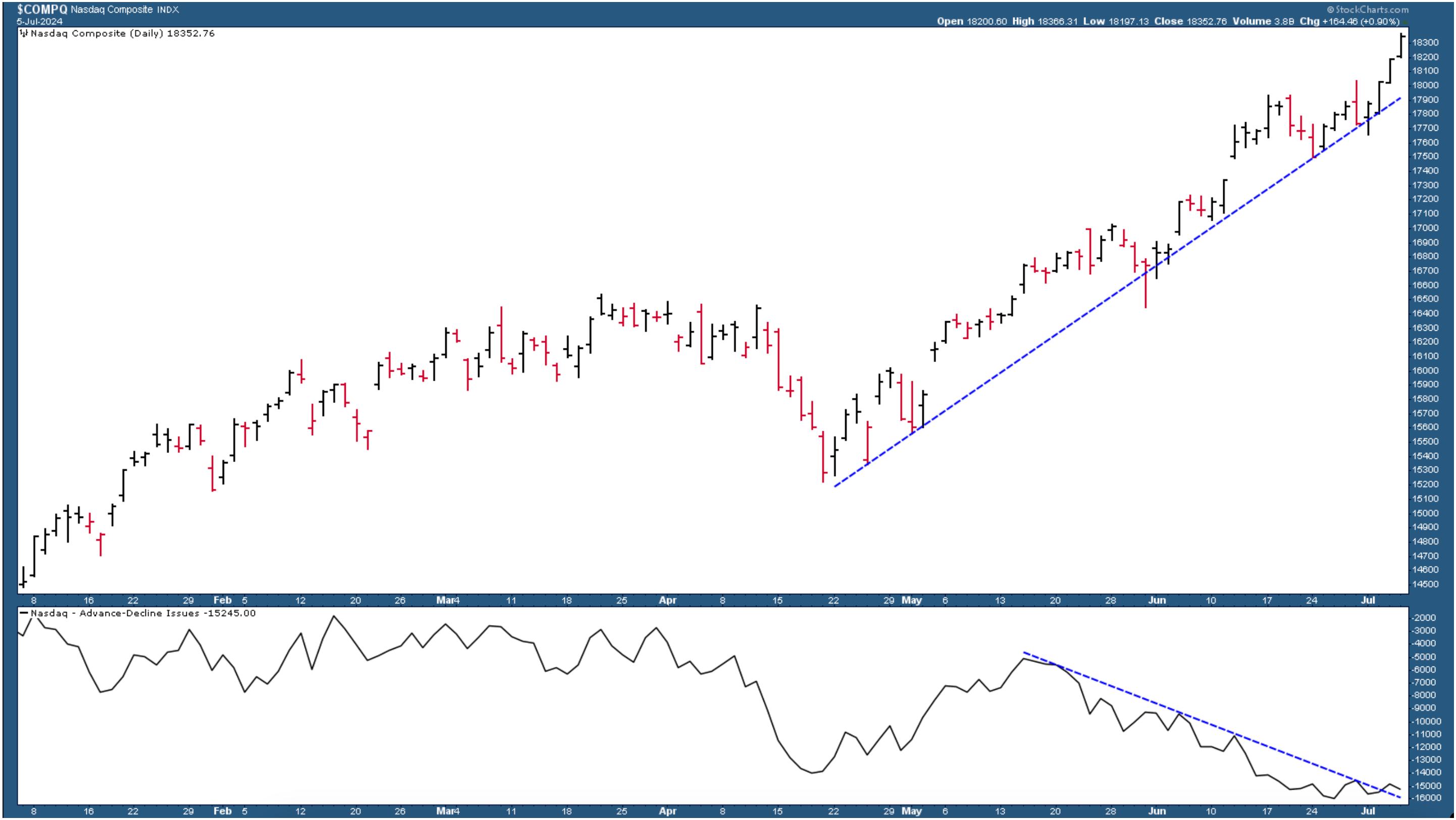
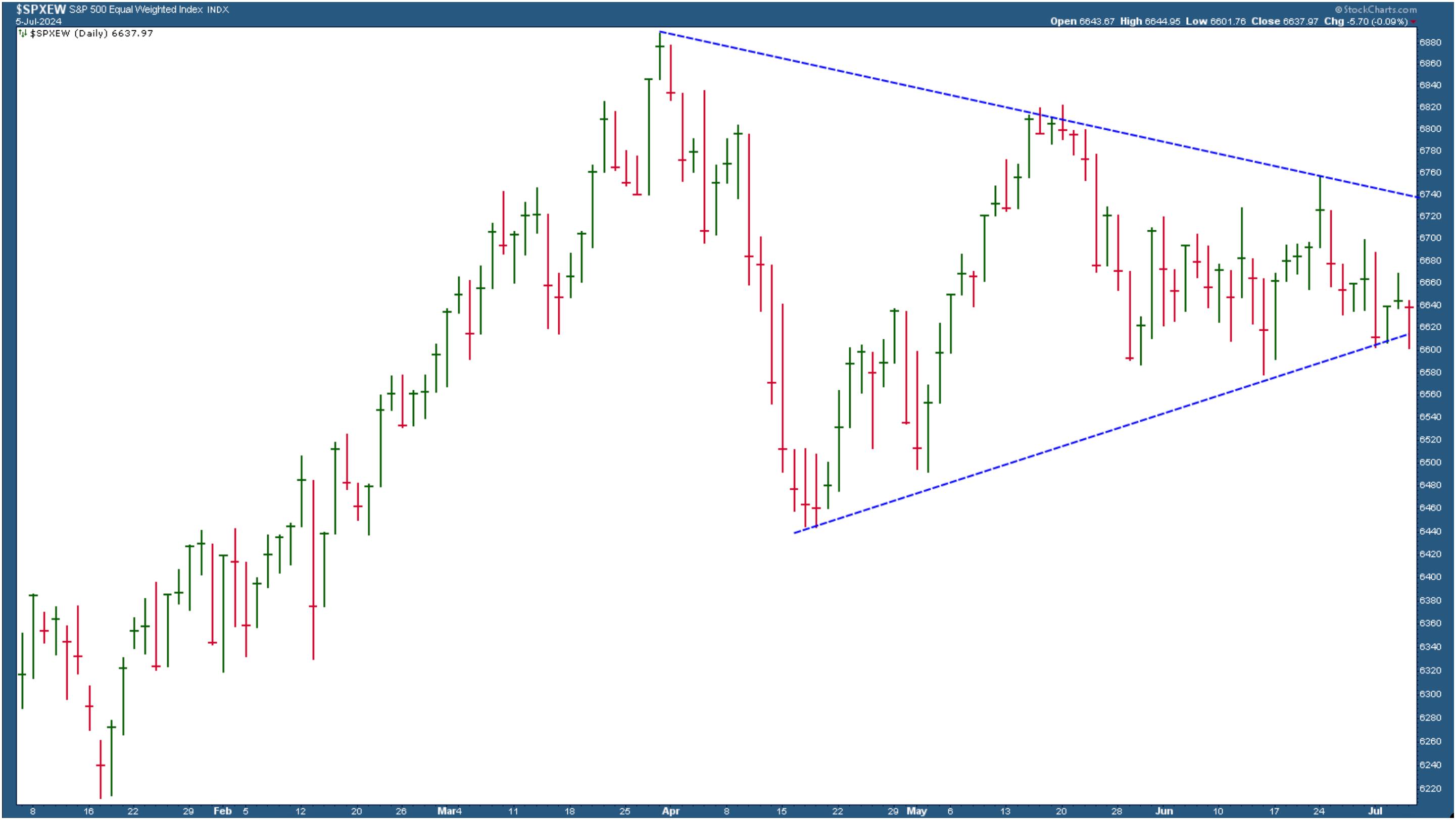
One shows the divergence between the price action in the Nasdaq Composite and its Advance-Decline line. The other shows the S&P 500 Equal Weighted Index in a consolidation pattern. The direction of these charts could give you a heads-up on the overall stock market direction.

CHART 5. NASDAQ DIVERGES FROM ADVANCE-DECLINE ISSUES LINE.

CHART 6. THE S&P 500 EQUAL WEIGHTED INDEX IS CONSOLIDATING.
End-of-Week Wrap-Up
- S&P 500 closed up 1.95% for the week, at 5567.19; Dow Jones Industrial Average up 0.66% for the week at 39,375.87; Nasdaq Composite closed up 3.5% for the week at 18,352.76
- $VIX up 0.32% for the week closing at 12.48
- Best performing sector for the week: Consumer Discretionary
- Worst performing sector for the week: Energy
- Top 5 Large Cap SCTR stocks: NVIDIA (NVDA); Super Micro Computer, Inc. (SMCI); Vistra Energy (VST); Applovin Corp (APP); Taiwan Semiconductor Mfg. (TSM)
On the Radar Next Week

- June CPI
- June PPI
- Fed Chair Powell Testimony
- Treasury Secretary Yellen Testimony
- Fed speeches from Barr, Powell, Goolsbee, and Bostic
Disclaimer: This blog is for educational purposes only and should not be construed as financial advice. The ideas and strategies should never be used without first assessing your own personal and financial situation, or without consulting a financial professional.
|
| READ ONLINE → |
|
|
|
| Martin Pring's Market Roundup |
| MEMBERS ONLY |
| Has Housing Topped Out for the Cycle? |
| by Martin Pring |
|
Residential housing is not important for its size relative to GDP, which, according to Copilot, is about 3-5%...
|
| READ ONLINE → |
|
|
|
| RRG Charts |
| Unmasking Market Moves: Why Focusing on Individual Stocks Beats Indexes in 2024 |
| by Julius de Kempenaer |
Many chatter and mentions of weak or narrow breadth are floating around these days. I plead guilty as well.
I want to approach this from another angle using some of the major US stock indices for this article.
I usually examine the market using sectors or a growth/value/size breakdown, with the S&P and Dow Jones indices playing a major role. But there is more.
Major US Stockmarket Indices
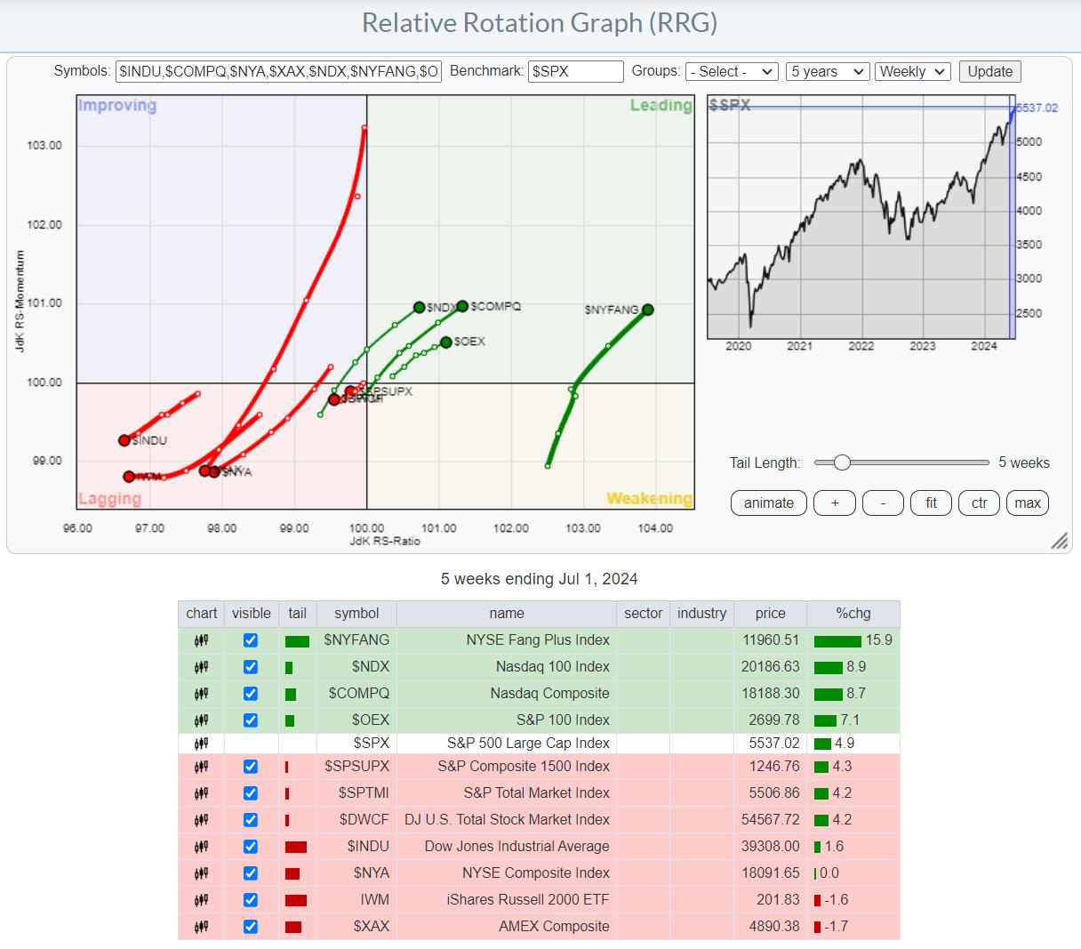
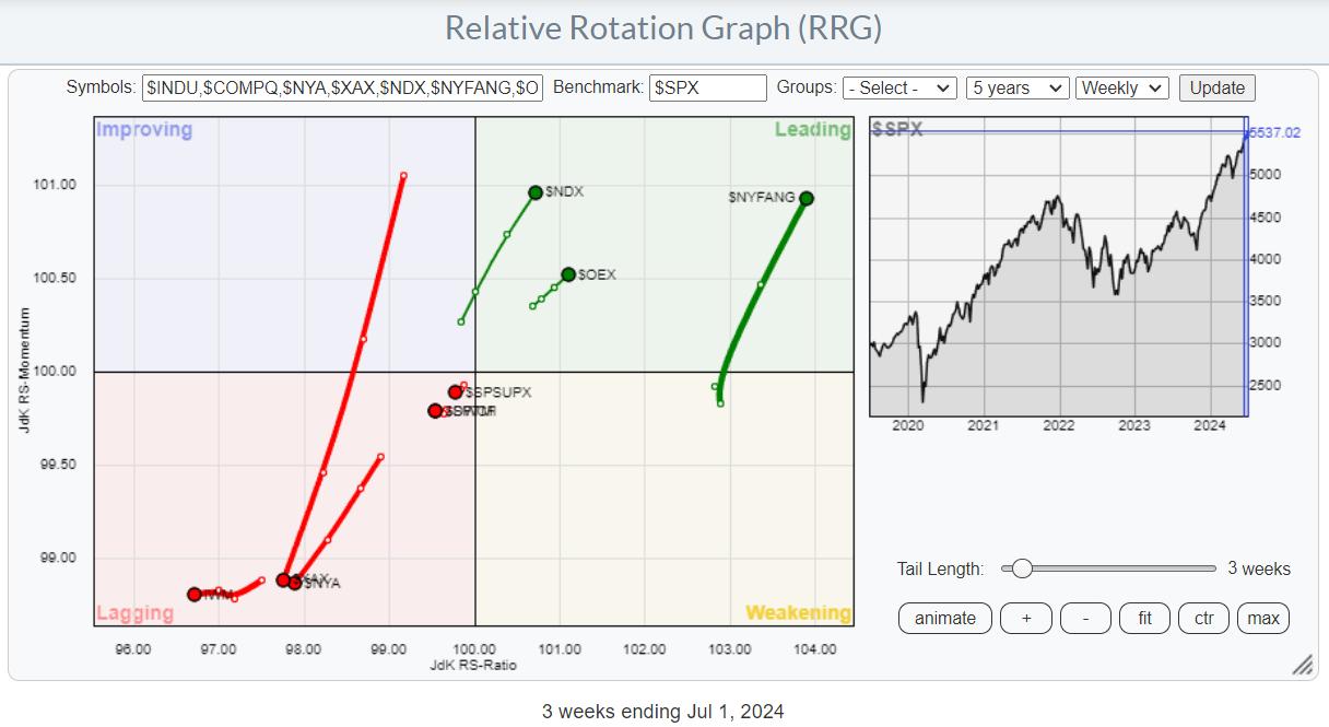
The first RRG shows the rotation of some of the major US stock market indices against the benchmark S&P 500.

I have added the table below the graph as a legend for the symbols on the tails, as they may not be so mainstream.
The tails and the accompanying performances are shown over a five-week period. All the broader indices are camping inside the lagging quadrant and traveling at a negative RRG-Heading, while the narrower-based indices are inside the leading quadrant and on a strong, 0-90 degrees RRG-heading.
There is no index inside the improving quadrant or the weakening quadrant. This indicates the clear split between these two groups.
The only exception concerning "broader" indices is the Nasdaq Composite index ($COMPQ) with 2500 stocks. However, this index is, very, heavily tilted toward the software & It services and technology equipment stocks. The exception on the "narrower" indices is the DJ Industrials index, which has a relatively low exposure to the technology sector, also because of its price-weighted approach.

When I remove $COMPQ and $INDU and set the tail length to 3 weeks for better visibility, this is the chart that remains. I found it interesting that the further you go to the right, the smaller the index becomes in terms of stocks in the index, not necessarily in market capitalization.
NY FANG Beats All
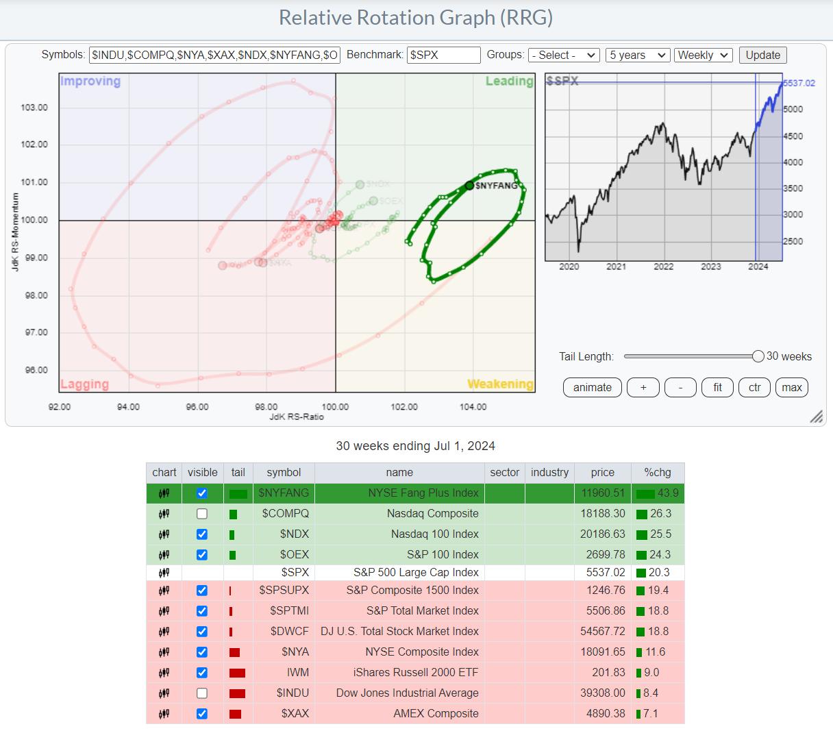
The next step was to zoom in on the rotation of $NYFANG.

When I set the tail length to 30 weeks, the exact same indices show up on top, with $NYFANG handsomely beating all other indices in this group. When you open up this RRG, live (click on the chart), you have to scroll back to 3/13/2023 before $NYFANG drops from the first place over a 30-week period. That's a pretty impressive period (trend).
Even Inside The NY FANG Index, The Base is Narrow
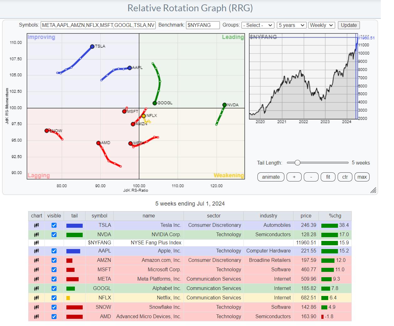
And finally, let's zoom in on the members of the NY FANG index.

This RRG shows the rotation for the NYFANG members against $NYFANG. The first observation is a high concentration of stocks inside the lagging quadrant. Except for SNOW and AMD, they have beaten the S&P 500 over this 5-week period. But not $NYFANG. Only TWO stocks have outperformed $NYFANG over this 5-week period: TSLA and NVDA.
Looking back, 30 weeks shows that only NVDA, META, and NFLX have beaten $NYFANG.
The big spread between the top and bottom of the list, +38.4% for TSLA and -1.8 % for AMD, also shows that the performances are very stock-specific. Even within the same sector, big differences show up. MSFT (Technology/ software) shows an 11% gain vs. SNOW in the same group, with a 4.9% gain.
The difference is even bigger in semiconductors. NVDA (Technology/semiconductors) +17% against a loss of 1.8% for AMD in the same group.
The main takeaway from all this, IMHO, is that the foundation is indeed narrow and concentrated in large cap, offensive/growth stocks. This group of stocks can still keep the S&P 500 going up or at least remain sideways during transition periods. This is caused by individual stocks rotating through very strong, relative trends.
As long as this situation persists, I believe it will be much more important to focus on individual stocks first, then sectors, and only then the broader market.
Happy Fourth Of July, --Julius
|
| READ ONLINE → |
|
|
|
| Trading Places with Tom Bowley |
| Here's Why You Should Be Buying Software NOW |
| by Tom Bowley |
The recovery in semiconductor shares ($DJUSSC) last week, in my opinion, was quite weak. Much of the strength occurred by 10am ET, and the balance of the days really didn't see much progress back to the upside. Accordingly, I'd call the rebound more market maker manipulation than anything else. I believe we're going to see a difficult period for the semiconductors for awhile and, make no mistake about it, I've been VERY bullish semiconductors in 2024 thus far.
I do see a further rise ahead for U.S. equities, but if semiconductors, which account for 11% of the S&P 500 and 25% of the NASDAQ, don't perform as well in the second half of the year, what areas might pick up the slack and lead our market higher?
Software
We just saw a solid quarterly earnings report from Adobe Systems (ADBE) and the stock exploded higher, gaining more than 20% since that report two weeks ago. Overall, however, software had been lagging on a relative basis. In fact, its relative performance over the past 6 months (1st half of 2024) hasn't been exciting at all:

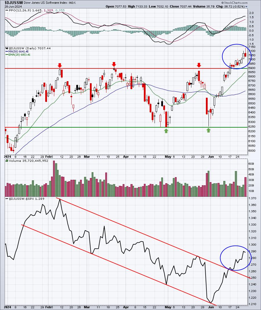
Over the past two weeks, though, the character of the software chart has changed. We've seen an absolute price breakout above a period of consolidation that's lasted for months. Note, in the bottom panel, that software also broke its relative down channel. In other words, its 5-month period of underperforming appears to have ended.
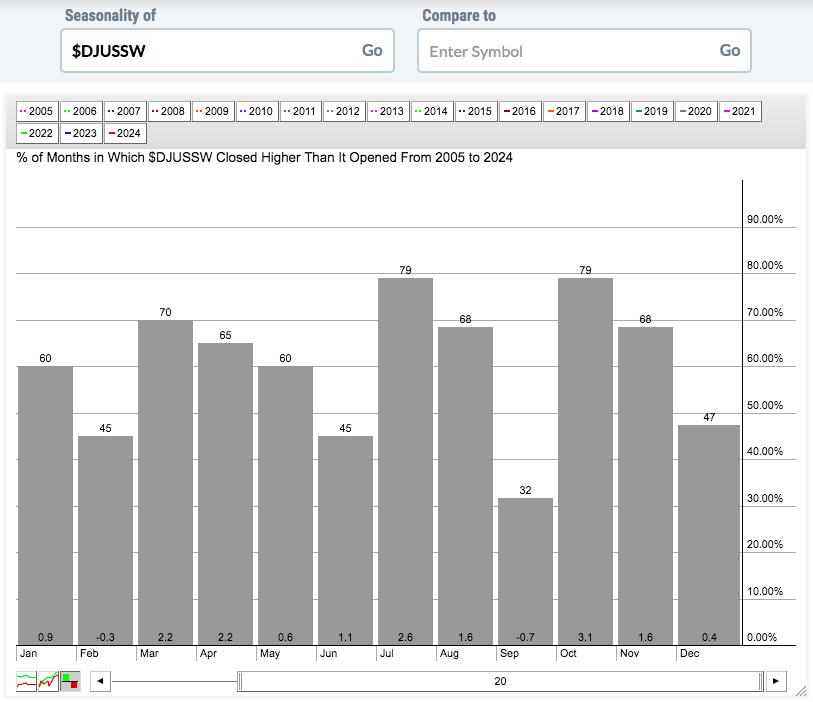
You should also be aware that software stocks have the tendency to outperform during the first month of all calendar quarters. I'll summarize that in a moment, but first here's the visual seasonality chart:

And here's the summary of how quarterly performance breaks down for the group:
- Month 1 (January, April, July, October): +8.8%
- Month 2 (February, May, August, November): +3.5%
- Month 3 (March, June, September, December): +3.0%
It's also worth noting that July (+2.6%) is the 2nd best calendar month of the year for software, trailing only October (+3.1%). The fact that software just broke out after a lengthy basing period only adds to the bullishness here.
To drive home this seasonality point even further, consider that since this secular bull market began in 2013, software has risen EVERY YEAR during July and its average July return has been 3.7%. It's very easy to get behind the software space right now.
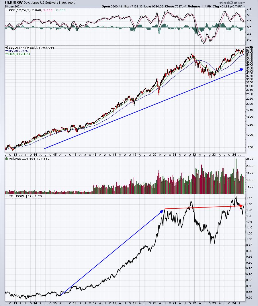
One final point about software's leadership during the current secular bull market. While it hasn't really been a great leader the past few years as relative strength vs. the S&P 500 has been going up, then down, the long-term relative picture is quite different. Check out how strong software has been, at times, leading the secular bull market advance:

From 2015 through part of 2020, software not only soared on an absolute price basis, but check out its relative strength. This is one of those industry groups that can scream higher on a relative basis as well, and I believe we could be starting one of those periods. The $DJUSSW:$SPX ratio is almost exactly where it was in mid-2020. We've seen no "net" leadership over the past 3 years. I do expect that to change and the recent price breakout may have just sparked the group.
During my Weekly Market Recap video, I discuss software at length and highlight several key software stocks worth considering for a big second half run. Simply click on the link for this week's show, "Here's Why Software Will EXPLODE In The 2nd Half of 2024" and feel free to leave me a comment. Also, please be sure to hit the "Like" button and "Subscribe" to our YouTube channel while you're there.
I will also be highlighting a software stock in my FREE EB Digest newsletter on Monday. If you're not already a free subscriber, CLICK HERE and sign up with your name and email address. You don't need a credit card and you may unsubscribe at any time.
Thanks so much for your support!
Happy trading!
Tom
|
| READ ONLINE → |
|
|
|
| DecisionPoint |
| S&P 500 Earnings Results Are In for 2024 Q1 and Market Is Still Overvalued |
| by Carl Swenlin |
S&P 500 earnings are in for 2024 Q1, and here is our valuation analysis.
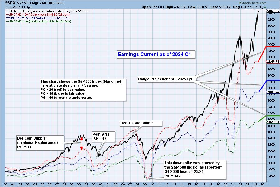
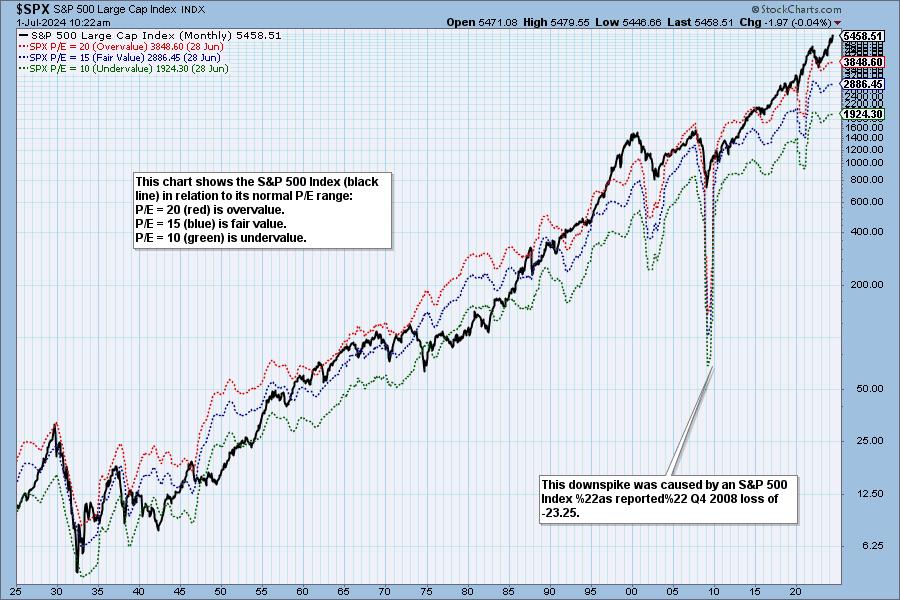
The following chart shows the normal value range of the S&P 500 Index, indicating where the S&P 500 would have to be in order to have an overvalued P/E of 20 (red line), a fairly valued P/E of 15 (blue line), or an undervalued P/E of 10 (green line). Annotations on the right side of the chart show where the range is projected to be, based upon earnings estimates through 2025 Q1.


Historically, price has usually remained below the top of the normal value range (red line); however, since about 1998, it has not been uncommon for price to exceed normal overvalue levels, sometimes by a lot. The market has been mostly overvalued since 1992, and it has not been undervalued since 1984. We could say that this is the "new normal," except that it isn't normal by GAAP (Generally Accepted Accounting Principles) standards.

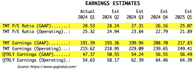
We use GAAP earnings as the basis for our analysis. The table below shows earnings projections through March 2025. Keep in mind that the P/E estimates are calculated based upon the S&P 500 close as of March 29, 2024. They will change daily depending on where the market goes from here. It is notable that the P/E is outside the normal range.

The following table shows where the bands are projected be, based upon earnings estimates through 2025 Q1.

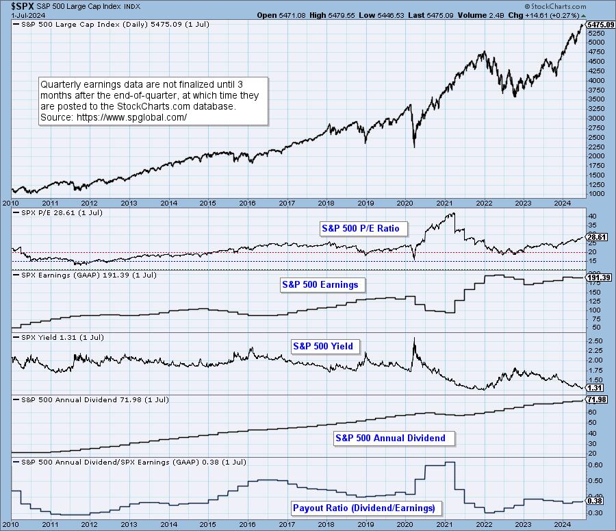
This DecisionPoint chart keeps track of S&P 500 fundamentals, P/E, and yield, and it is updated daily -- not that you need to watch it that closely, but it is up-to-date when you need it.

CONCLUSION: The market is still very overvalued and the P/E is still well above the normal range. Earnings have ticked down, but are projected to trend higher for the next four quarters. Being overvalued doesn't require an immediate decline to bring valuation back within the normal range, but high valuation applies negative pressure to the market environment.
Watch the latest episode of DecisionPoint on StockCharts TV's YouTube channel here!
(c) Copyright 2024 DecisionPoint.com
Technical Analysis is a windsock, not a crystal ball.
Disclaimer: This blog is for educational purposes only and should not be construed as financial advice. The ideas and strategies should never be used without first assessing your own personal and financial situation, or without consulting a financial professional. Any opinions expressed herein are solely those of the author, and do not in any way represent the views or opinions of any other person or entity.
DecisionPoint is not a registered investment advisor. Investment and trading decisions are solely your responsibility. DecisionPoint newsletters, blogs or website materials should NOT be interpreted as a recommendation or solicitation to buy or sell any security or to take any specific action.
Helpful DecisionPoint Links:
DecisionPoint Alert Chart List
DecisionPoint Golden Cross/Silver Cross Index Chart List
DecisionPoint Sector Chart List
DecisionPoint Chart Gallery
Trend Models
Price Momentum Oscillator (PMO)
On Balance Volume
Swenlin Trading Oscillators (STO-B and STO-V)
ITBM and ITVM
SCTR Ranking
Bear Market Rules
|
| READ ONLINE → |
|
|
|
| Don't Ignore This Chart! |
| Could AMZN's Stock Hit $3 Trillion Valuation? What You Need To Know |
| by Karl Montevirgen |

Amazon (AMZN) has broken out into all-time high territory, closing at $200.02 (above last week's all-time high mark of $199.84).
AMZN stock is firing on all cylinders and ready to take on all AI titans as it enters the space from the e-commerce angle. Some analysts believe Amazon's AI initiatives—particularly in healthcare, advertising, e-commerce, and cloud computing—could push the company towards a massive $3 trillion valuation.
Amazon dominates US e-commerce with a whopping 37.6% market share, and its AWS leads the cloud market. Given its dominant position and AI adoption, analysts predict nearly 30% annual earnings growth for the next few years.
Analyzing AMZN Stock, Technically
Technically, as is the case fundamentally, AMZN's price action is firing on all cylinders (see chart below).

CHART 1. DAILY CHART OF AMAZON. Amazon's SCTR score is over the 90 line, which is exceedingly bullish.Chart source: StockCharts.com. For educational purposes.
AMZN's SCTR score is now soaring above the 90 line (dashed line in top panel), which indicates technical bullishness across several indicators and timeframes. Based on the Chaikin Money Flow (CMF) reading, buying pressure and momentum show no signs of slowing.
Eyes on AMZN Stock Breakout Point
Amazon just breached the $199.84 level (see heavy dotted-blue line on AMZN stock price chart), entering all-time high territory. Analysts' top price target is $245, which could change based on broader economic conditions and Amazon's AI moves in the coming quarters.
All rallies take a break. If AMZN's stock price dips, the following are key support zones to watch for buying opportunities:
- First stop. Between $191 and $192, where AMZN broke above its 2021 all-time highs.
- Next up. Amazon's price often bounces off the 50-day and 100-day simple moving averages (SMAs), which investors use as entry points. These might continue to be solid buy zones.
- Broader range. The Ichimoku Cloud lays out additional support levels, aligning with current supports. The green, rising, and widening cloud is a bullish sign.
It's About Earnings
Amazon expects to report its next earnings on August 1, 2024, after market close (this is subject to change). Earnings results and guidance can significantly sway market sentiment, so keep a close eye on the levels if you're trying to time your buys (or sells).
The Bottom Line
AMZN's stock price smashed its all-time high, closing at $200.02. With its dominance in e-commerce and cloud computing, and now combined with new AI initiatives, some analysts see a path to a $3 trillion valuation. Technically, Amazon's indicators are bullish, with the SCTR score soaring and strong buying momentum. Keep an eye on support zones if the stock dips, and watch out for the next earnings report.

Disclaimer: This blog is for educational purposes only and should not be construed as financial advice. The ideas and strategies should never be used without first assessing your own personal and financial situation, or without consulting a financial professional.
|
| READ ONLINE → |
|
|
|
| MORE ARTICLES → |
|
