| THIS WEEK'S ARTICLES |
| The Mindful Investor w/ David Keller, CMT |
| What Does a Market Top Look Like? |
| by David Keller |
The S&P 500 remains in a primary uptrend, as confirmed by a fairly consistent pattern of higher highs and higher lows. But what would confirm that a top is in place for our major equity benchmarks? To answer that, it may be helpful to review other charts that have recently experienced tops, as the technical configurations are often quite similar.
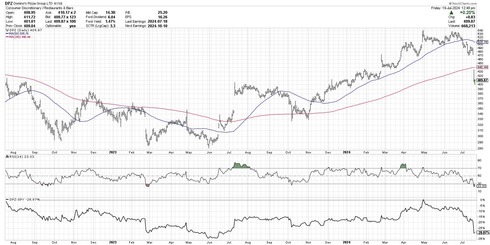
Today, we'll review the recent price action in Domino's Pizza Group (DPZ), identify the key technical characteristics that define its recent downswing, and relate that to what we may see on the S&P 500 chart.
An Accumulation Phase Occurs When Buyers Outweigh Sellers
Before we can confirm a bearish rotation on a chart like DPZ, we first need to clearly define the uptrend phase that happens beforehand. This goes back to classic Dow Theory, and also combines technical indicators like moving averages to track the upward pace of price action.
After many months of underperformance, small caps are starting to thrive again. How should investors think about small cap stocks, what factors are contributing to this outperformance, and what does all this tells us about leadership rotation in the coming months? Join me for my next FREE webcast, Small Caps, Big Dreams: The Great Rotation of 2024, as we answer these questions and more! Sign up today and mark your calendar for Wednesday, July 24th at 1pm ET.

From the October 2023 low through the end of April 2024, Domino's experienced a classic Dow Theory uptrend formed by a pattern of higher highs and higher lows. Each move higher shows that buying power is overcoming any selling pressure that develops, and the higher lows show that dip buyers are interested in accumulating shares on short-term weakness. The price remained above two upward-sloping moving averages, and the RSI remained in a bullish range, generally above the 40 level.
The Checklist to Identify a Distribution Phase
Note how all of those factors changed in May and June. Instead of making another new 52-week high in June, the price stalled out at its previous peak. Instead of achieving another higher low on the next pullback, the price broke below the May swing low around $500. The RSI broke below 40 soon after, indicating a rapid deterioration in price momentum.
So while this week's gap lower surprised many market practitioners, mindful investors would have recognized all the classic signs of distribution before this week's sudden drop.
The Signs to Watch for the S&P 500
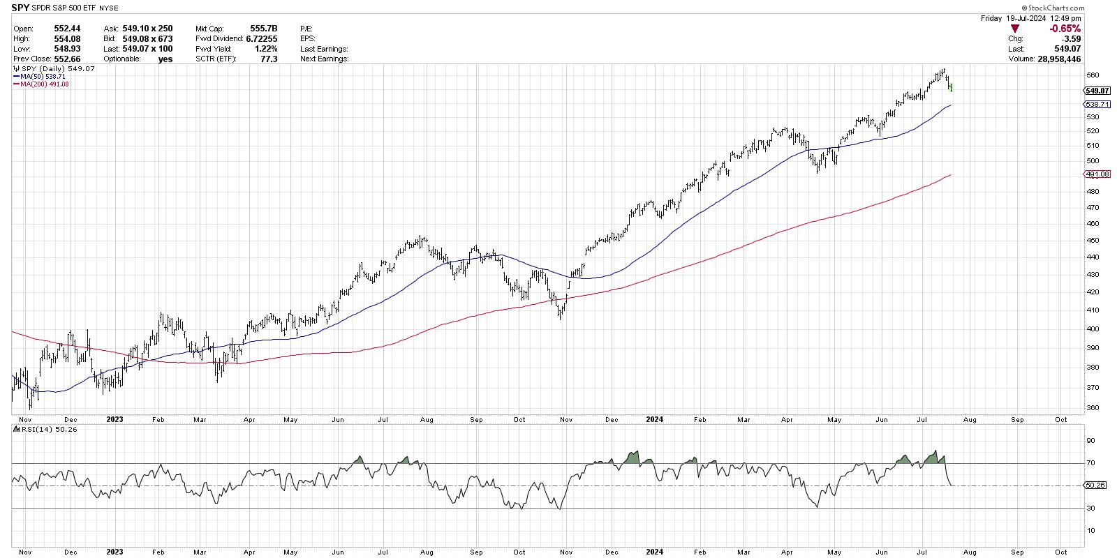
How does this relate to the S&P 500 chart? For now, the SPY is still in a primary uptrend of higher highs and higher lows. The price remains above two upward-sloping moving averages, and the RSI remained above 40 even after Friday's drop.

What would tell us that the S&P 500 has rotated to a distribution phase? Simply follow the playbook that DPZ displayed in recent months. Look for a failed attempt at a new high, which would suggest an exhaustion of buyers. Note if the subsequent pullback is unable to hold the late June low around $540, which would mean that dip buyers are no longer willing to buy on short-term weakness. And pay attention to the RSI, because if it breaks below 40 on a pullback, that is often a predecessor of much weaker price action.
No one knows what will happen next for the S&P 500. But the good news is that we can review the lessons of market history and notice what consistent patterns have occurred at previous market topics. As I was often reminded in my early days in the industry, "History doesn't repeat itself, but it often rhymes!"
RR#6,
Dave
P.S. Ready to upgrade your investment process? Check out my free behavioral investing course!
David Keller, CMT
Chief Market Strategist
StockCharts.com
Disclaimer: This blog is for educational purposes only and should not be construed as financial advice. The ideas and strategies should never be used without first assessing your own personal and financial situation, or without consulting a financial professional.
The author does not have a position in mentioned securities at the time of publication. Any opinions expressed herein are solely those of the author and do not in any way represent the views or opinions of any other person or entity.
|
| READ ONLINE → |
|
|
|
| Larry Williams Focus On Stocks |
| MEMBERS ONLY |
| Election Year Patterns | Larry's "Family Gathering" July 18, 2024 Recording |
| by Larry Williams |
|
What stocks right now does Larry have his eye on? Which ones is he saying "see you later... for now"? And which ones does he not like very much at all? In this month's Family Gathering video, Larry presents an in-depth discussion on the patterns we seeing during an election year...
|
| READ ONLINE → |
|
|
|
| Art's Charts |
| Small-caps Break Out and Lead - Now What? |
| by Arthur Hill |
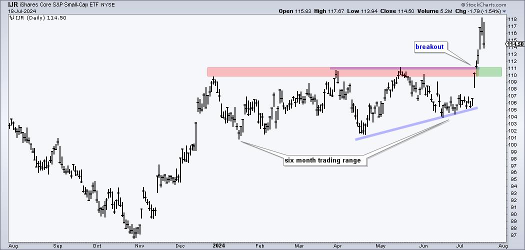
Small-caps took the lead over the last two weeks with the S&P SmallCap 600 SPDR (IJR) surging over 10% in five days and hitting a new high. IJR also broke out of a long consolidation and this breakout is bullish. There are now three possibilities going forward. First, IJR continues higher without looking back. Second, IJR tests the breakout zone with a throwback. Third, IJR fails to hold its breakout and turns bearish. Let's look at the current chart and some prior breakouts for insights. We covered the recent setups and breakouts in small-caps, mid-caps and non-tech stocks in our reports and videos at ChartTrader (here).
The first chart shows the current situation. IJR surged with the broader market from late October to December and then embarked on a six month trading range. As we will see, IJR is no stranger to long, and frustrating, trading ranges. IJR formed an ascending triangle in the second half of this range and broke out with a big surge the last two weeks. This breakout is bullish and a strong breakout should hold. A close below 109 would erase more than half of this surge and call for a re-evaluation.

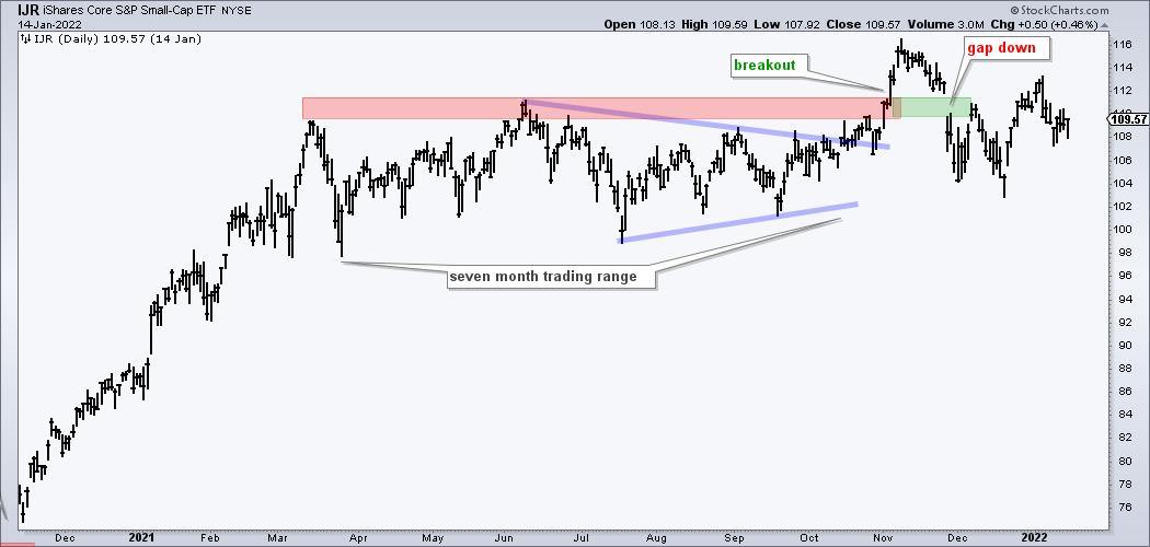
The next chart shows IJR with a breakout that failed to hold. After a big advance from November to March, IJR embarked on a seven month trading range. A symmetrical triangle (blue lines) formed in the second half and the ETF broke out with a big move in November. A strong breakout should hold with broken resistance turning into the first support zone. IJR did not hold this breakout as it gapped below the breakout zone in late November. This gap and sharp decline through the breakout zone were the first signs that something was wrong.

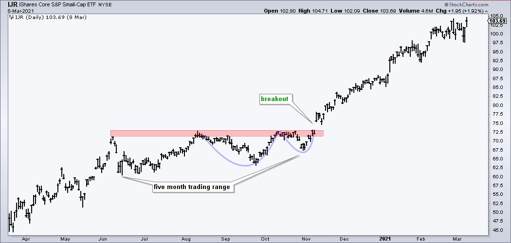
The next chart shows IJR with a breakout and continuation higher. IJR bottomed in March 2020 and advanced until early June. The ETF then embarked on a five month trading range that lasted until October. A classic cup-with-handle formed (blue lines) in the second half and IJR broke out with a gap-surge in November. The ETF never looked back and advanced over the next three months. This is the strongest scenario for a breakout, but we are not seeing this as IJR fell 2% the last two days.

There are two key takeaways. First, IJR and small-caps can and do get stuck in trading ranges. They go through trending periods, but are also prone to extended periods of sideway price action. Second, a strong breakout should hold and the breakout zone is the first area to watch going forward. Be careful if we see a sudden and sharp decline back through the breakout zone.
ChartTrader reports and videos covered setups in the S&P MidCap 400 SPDR (MDY) and S&P 500 EW ETF (RSP) in late June and updated these charts with our analysis this week. We also featured a number of non-tech stocks with bullish continuation patterns and breakouts. Click here to learn more.
//////////////////////////////////////////////////
|
| READ ONLINE → |
|
|
|
| Martin Pring's Market Roundup |
| MEMBERS ONLY |
| These Two Sectors are Showing Promising Silver Cross Setups |
| by Martin Pring |
|
A silver cross occurs when a 20-day MA crosses above its 50-day counterpart. While far from perfect, such signals enable you to ride a persistent trend. However, like all trend following techniques, problems can occur in a trading range environment...
|
| READ ONLINE → |
|
|
|
| ChartWatchers |
| Important Market Breadth Indicators to Watch: Making Sense of Three Consecutive Down Days |
| by Jayanthi Gopalakrishnan |

Seasonally, the first two weeks of July have been great for the stock market. Now that the first two weeks of July are behind us, will the stock market take a breather until September? After how the market acted this week, it certainly feels that way.
Let's start with a synopsis of the broader indexes, followed by an analysis of market breadth indicators.
A July Pullback?
This week, there were some dynamics in the financial markets worth pondering. The S&P 500 index ($SPX) hit a record high on Tuesday and then gapped lower on Wednesday, with the selloff continuing on Thursday and Friday. Three substantial consecutive down days triggered fears among investors and led to a selloff in large-cap mega-growth tech stocks.
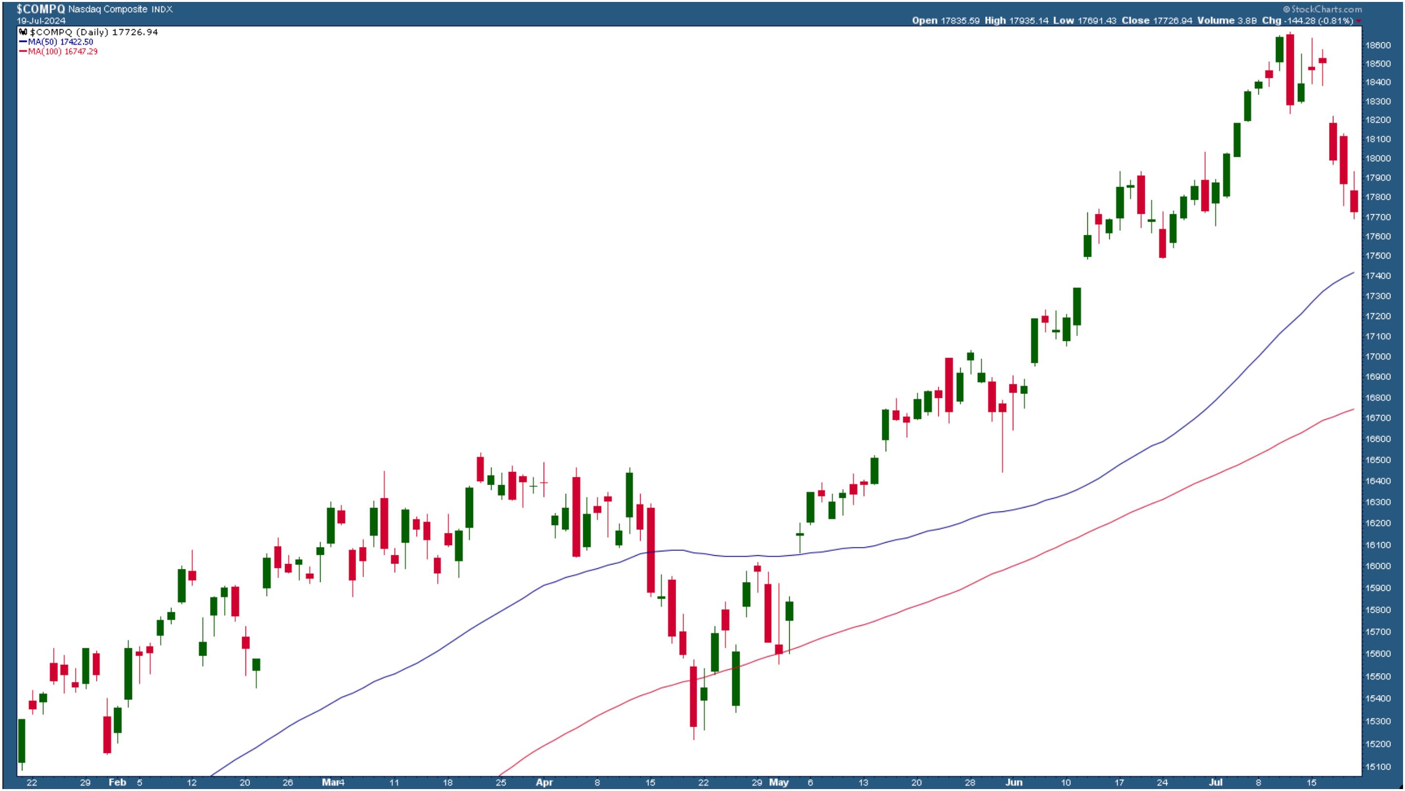
The Nasdaq Composite ($COMPQ) was hit the hardest. The daily chart of the Nasdaq below paints a picture of the magnitude of the selloff.

CHART 1. THE NASDAQ SELLOFF. The Nasdaq Composite went through a significant selloff for three consecutive days.Chart source: StockCharts.com. For educational purposes.
The selloff on July 11, a 1.95% drop, indicated how much the Nasdaq Composite could drop in one day. That's to be expected when the index is as toppy as it is. On a positive note, the Nasdaq is still trading above its 50-day simple moving average (SMA).
Semiconductor weakness brought down the Nasdaq and S&P 500. The strong bull rally in the stock market stemmed from the strength in semis, but the narrative changed this week.
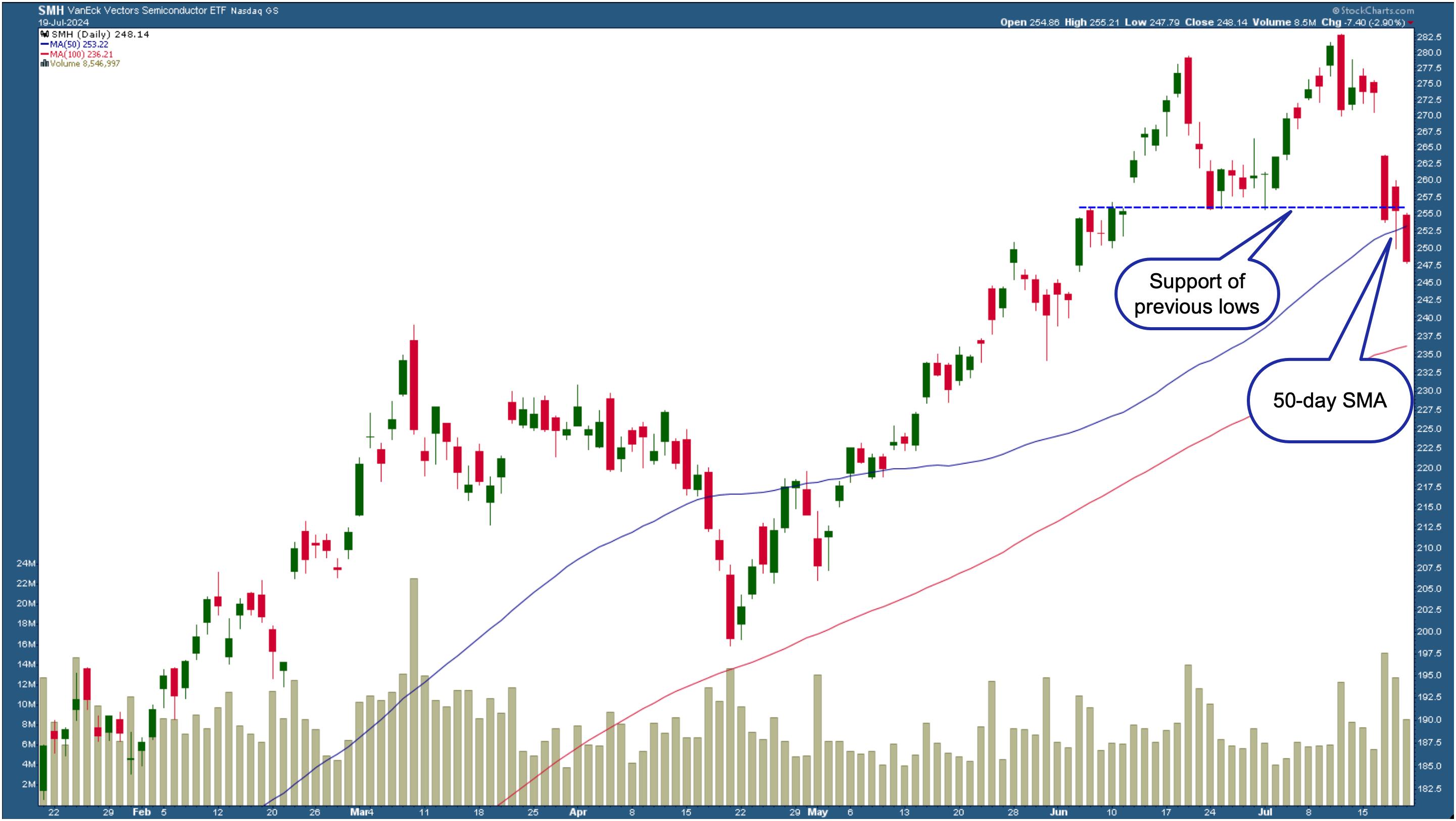
The chart of the VanEck Semiconductor ETF (SMH) paints a grim picture of the fall in semiconductor stocks. SMH has broken below two important levels. One is the support level from previous lows. The second and more concerning one is that it dropped below its 50-day SMA and closed at the lower end of the candlestick bar.

CHART 2. DAILY CHART OF THE VANECK VECTORS SEMICONDUCTOR ETF (SMH). The ETF has broken below the support of its previous lows and the 50-day SMA. The next level to watch is the 100-day SMA.Chart source: StockCharts.com. For educational purposes.
And while the S&P 500 and Nasdaq gapped lower, things were slightly different with the Dow Jones Industrial Average ($INDU). On Wednesday, the index hit an all-time high, but followed the S&P 500 and Nasdaq with a downward move on Thursday and Friday.
Can Small Cap Stocks Hold Their Ground?
If you were tuned in to the media, you'd have heard the word "rotation" mentioned several times. While the big broad indexes were selling off, small-cap stocks rose out of their slumber. Were investors selling off their big winners and investing in small caps? It's possible, given that interest rate cuts will likely occur in 2024.
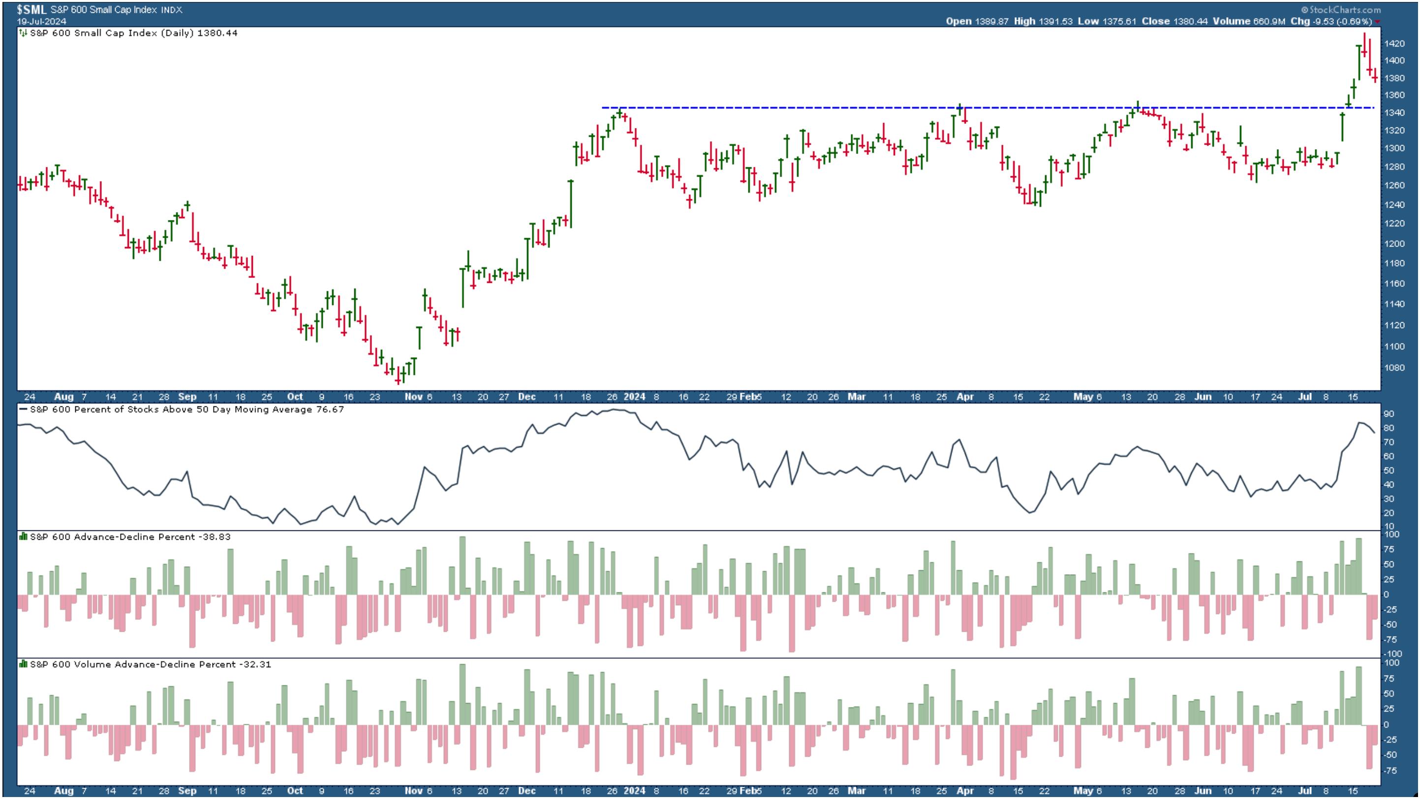
But, on Friday, small caps also joined in the selloff (see chart below). However, the S&P 500 Small Cap Index ($SML) didn't break the support level of its previous highs. The lower panels show that market internals are weakening, so it's possible that small caps can fall below the blue-dashed support level if there's more of the same next week.

CHART 3. SMALL CAPS SELLOFF BUT HAVEN'T BROKEN BELOW SUPPORT. The market internals in small-cap stocks are weakening, which could lead to the index falling below its support level.Chart source: StockCharts.com. For educational purposes.
It was an all across-the-board sell-off. Even precious metals and bond prices fell. Very little of the market was in green territory on Friday. Head to the Market Summary page on your StockCharts platform and scroll down the long list, and you'll see there are a few greens in a sea of red.
Homebuilders, regional banks, and biotechs were some of the more relevant industries in the green. And, of course, cryptocurrencies were the winners, with Bitcoin leading the pack.
The Rise in Volatility
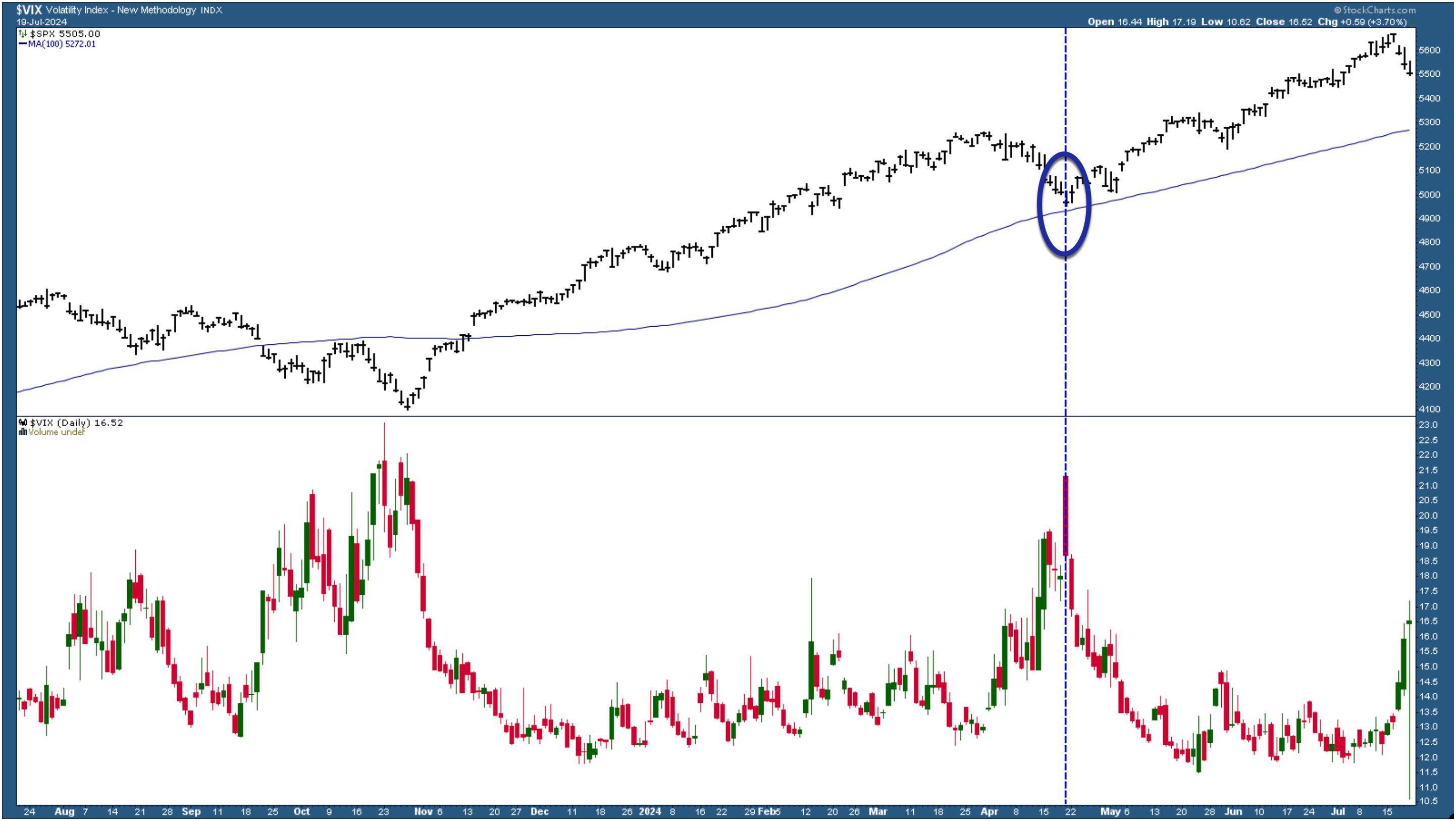
Given the magnitude of this week's selloff, it's no surprise the CBOR Volatility Index ($VIX) spiked higher. This suggests that fear amongst investors is on the rise. The bigger question is if this will remain this way for a while. The chart of the VIX below shows that it pulled back slightly toward the end of the trading day.

CHART 4. WATCH THE VIX. The VIX is a great fear gauge. The last time it spiked was when the S&P 500 corrected. Will this time be similar, or will it go even higher?Chart source: StockCharts.com. For educational purposes.
More important, notice how the VIX reacted in April 2024, the last time it spiked. That was when the S&P 500 corrected to its 100-day SMA, after which it resumed its uptrend. Can we expect a similar situation to take place this time? It's possible, although this time it may be more important to see if the S&P 500 falls below its 50-day SMA.
It Helps to Look at Stock Market Internals
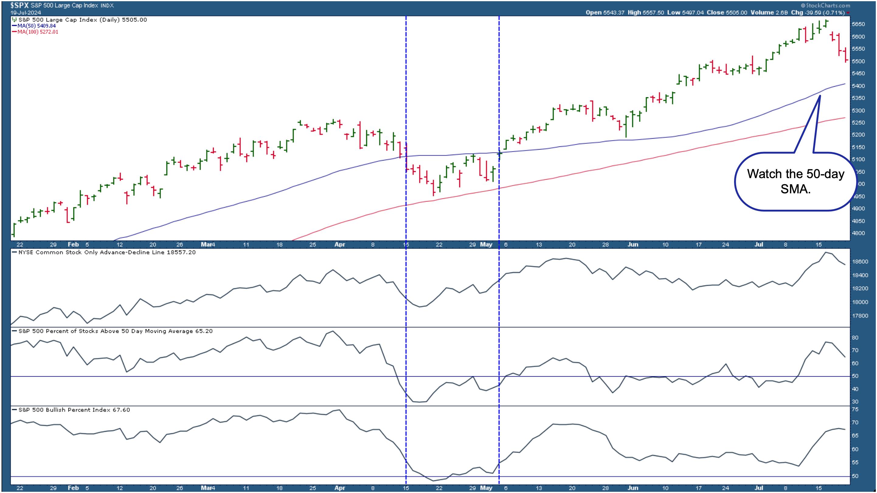
In the daily chart of the S&P 500 below, you see the index is trading above its 50-day SMA. So far, breadth indicators suggest that the bullish trend is still in play.

CHART 5. MARKET BREADTH INDICATORS AREN'T SIGNALING A BEAR MARKET YET. The S&P 500 is still above its 50-day SMA. Market breadth indicators, NYSE Advance-Decline Line, Percent of S&P 500 stocks trading above their 50-day SMA, and the S&P 500 Bullish Percent Index are showing signs of slowing down, but not necessarily weakness.Chart source: StockCharts.com. For educational purposes.
Points to note in the above chart are as follows:
- The NYSE Advance-Decline Line is starting to show signs of weakening but, relatively speaking, it's still high.
- The percentage of S&P 500 stocks trading above their 50-day SMA is above 50, although it also is starting to trend lower.
- The S&P 500 Bullish Percent Index is flattening out.
All three breadth indicators are indicating a slowing-down, but market breadth isn't weak. Compare this with what happened in April. Let's focus on the area between the two blue dashed vertical lines.
- The NYSE Advance-Decline line was in a downward trajectory, flattened out, and reversed.
- The percentage of S&P 500 stocks above its 50-day SMA fell drastically and went below the 50 level.
- The S&P 500 Bullish Percent Index fell below 50, but for a short time.
Closing Position
The charts presented here are an example. Feel free to apply different moving averages for your analysis. Assuming you're looking at the chart in Chart 5, if the S&P 500 falls below the 50-day SMA, it would be time to tread carefully. Corrections are healthy and necessary and, as long as they are corrections, they could open up opportunities to load up on some stocks or exchange-traded funds (ETFs). It depends on how weak the market internals are, which is why indicators included in the chart can be helpful.
Stay one step ahead of the market. Explore the different market breadth indicators available in StockCharts.
End-of-Week Wrap-Up

- S&P 500 closed down 1.97% for the week, at 5505; Dow Jones Industrial Average up 0.72% for the week at 40,287.53; Nasdaq Composite closed down 3.65% for the week at 17726.94
- $VIX up 32.58% for the week closing at 16.52
- Best performing sector for the week: Energy
- Worst performing sector for the week: Technology
- Top 5 Large Cap SCTR stocks: MicroStrategy, Inc. (MSTR); Insmed Inc. (INSM); Carvana Co. (CVNA); Arm Holdings (ARM); Robinhood Markets, Inc. (HOOD)
On the Radar Next Week
- June Existing Home Sales
- June PCE Price Index
- June Durable Goods Orders
- Earnings from Alphabet (GOOGL), Tesla (TSLA), Verizon Communications (VZ), Visa Inc. (V), Coca-Cola Co. (KO), Qualcomm Inc. (QCOM), PulteGroup (PHM), among many others.
Disclaimer: This blog is for educational purposes only and should not be construed as financial advice. The ideas and strategies should never be used without first assessing your own personal and financial situation, or without consulting a financial professional.
|
| READ ONLINE → |
|
|
|
| RRG Charts |
| Will This Sector Rotation Be the Start of Something Bigger? |
| by Julius de Kempenaer |

Strong Rotations on Daily RRG
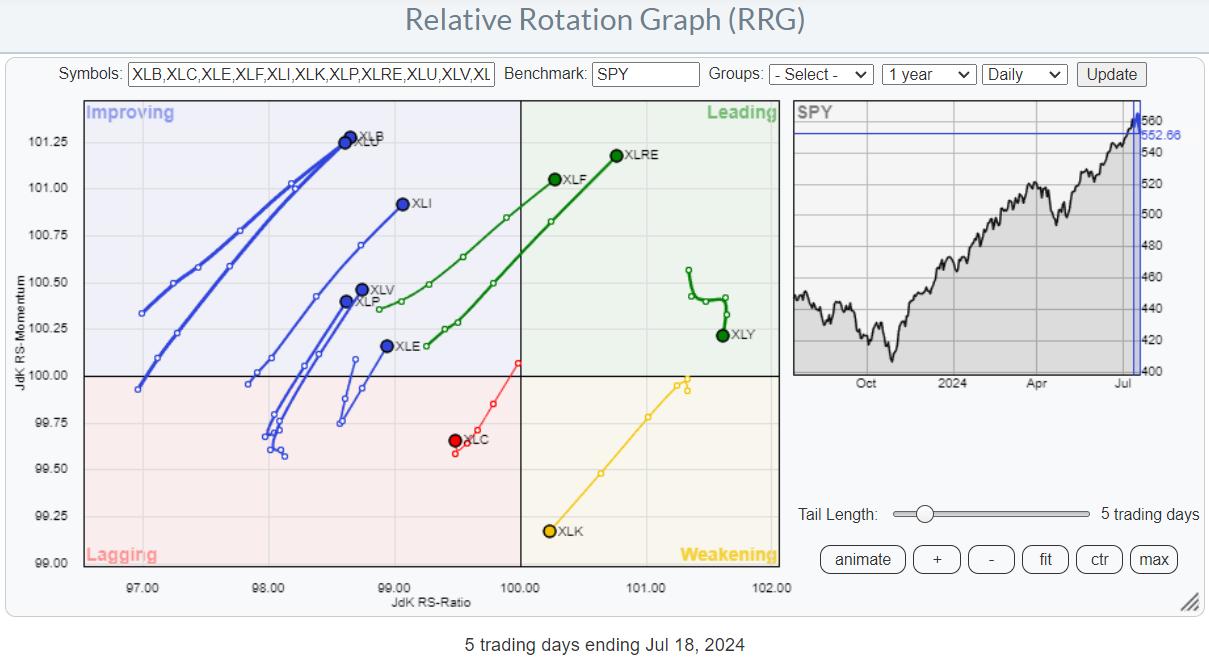
This daily RRG shows the sector rotation over the last five days. With only one more trading day to go (Friday, 7/19), the emerging trends are becoming clearer. The only sector that has been driving the market higher is now the only sector inside the weakening quadrant, on a negative RRG-Heading and close to crossing over into lagging.
Consumer Discretionary is rolling over inside the leading quadrant, indicating that it is losing some of its recent strength. Communication Services is the only sector inside the lagging quadrant, but it is bravely attempting to curl back up.
All other sectors show long tails, indicating strength behind the move, and on a positive RRG-Heading either inside the improving quadrant or already inside leading.

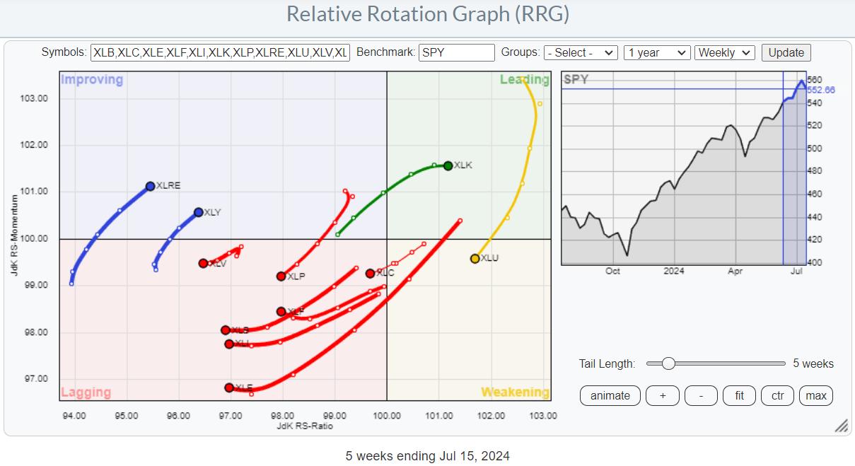
Can The Weekly RRG Keep Up?
Comparing this week's rotations with those currently visible on the weekly RRG reveals some fairly opposite moves. On the weekly RRG, XLK is still inside the leading quadrant, and only this week seems to be losing some relative momentum. Only Real Estate and Consumer Discretionary are also on a positive RRG-Heading while still being low on the RS-Ratio scale. All other sectors are on negative RRG-Headings.
We see now that the market capitalization knife is cutting on both sides. When technology stocks, especially semiconductors, rallied, the technology sector led the market higher. But we now see these same groups leading the charge on the downside.

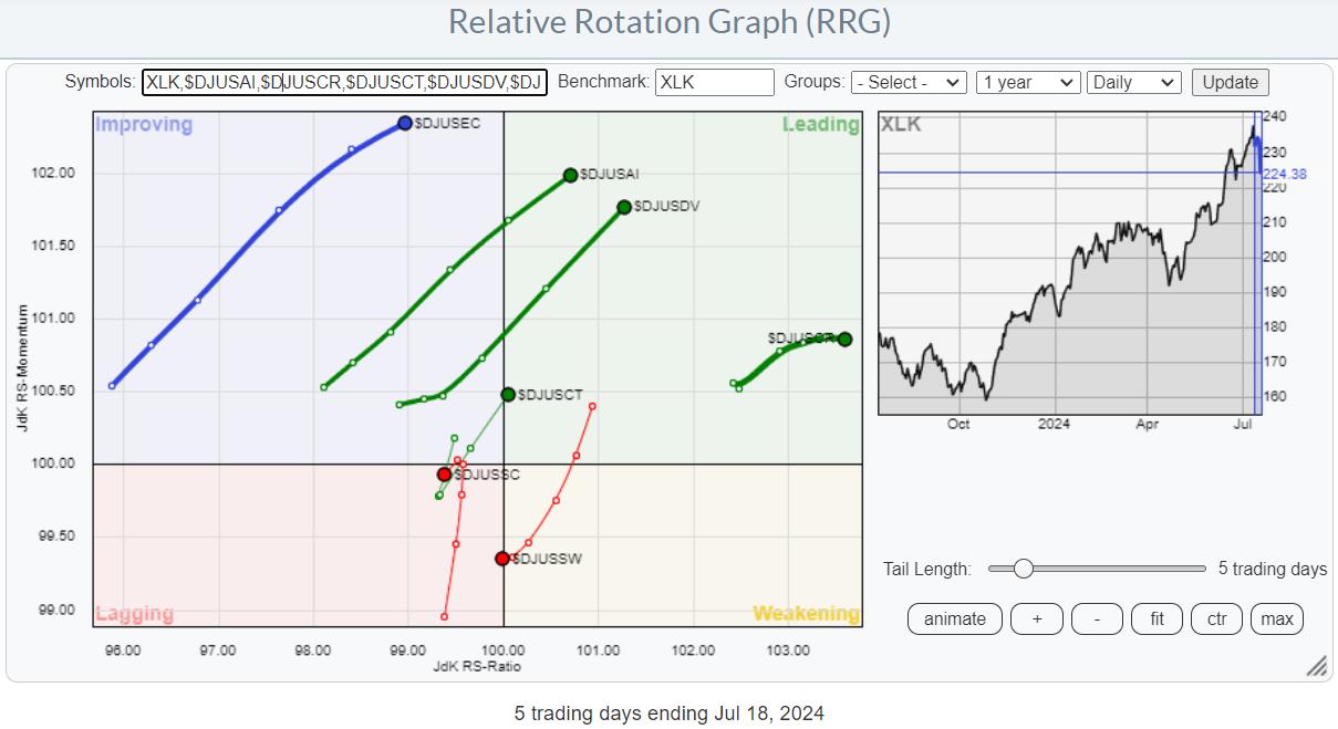
This is the daily RRG showing the industries inside the technology sector. You can see that semiconductor and software stocks are pushing into the lagging quadrant against XLK as the benchmark. We have already seen how XLK is heading toward the leading quadrant.
The observation that the other industries inside technology are on a positive heading and improving or leading shows how heavy the impact of the weakness in software and semiconductors is on XLK's move.

The table above shows how Semiconductors is the only group underperforming XLK in the last five days. Only computer services and telecommunications equipment stocks outperformed the S&P 500 index.
Technology Is A Drag
Hence, this heavyweight sector (XLK), led by its most important group (Semiconductors), is a big drag on the S&P 500.
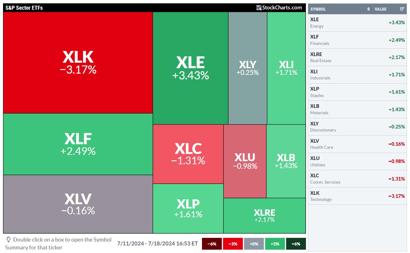
This can be nicely visualized by a market carpet chart showing performance over the last five days.

Even though most sectors have shown positive returns over the period, XLK's -3.17% drags the S&P 500's performance down to minus 0.7%.
Market Cap is Truly a two-edged sword.
But How Will This Work Out in the Coming Days/Weeks?
The longer-term trend on the weekly RRG still shows Technology as the leading sector. When the price trend is also still moving upward, I would generally prefer to remain in the longer-term uptrend and watch for the shorter, daily tails to catch up and get back in sync with the weekly.
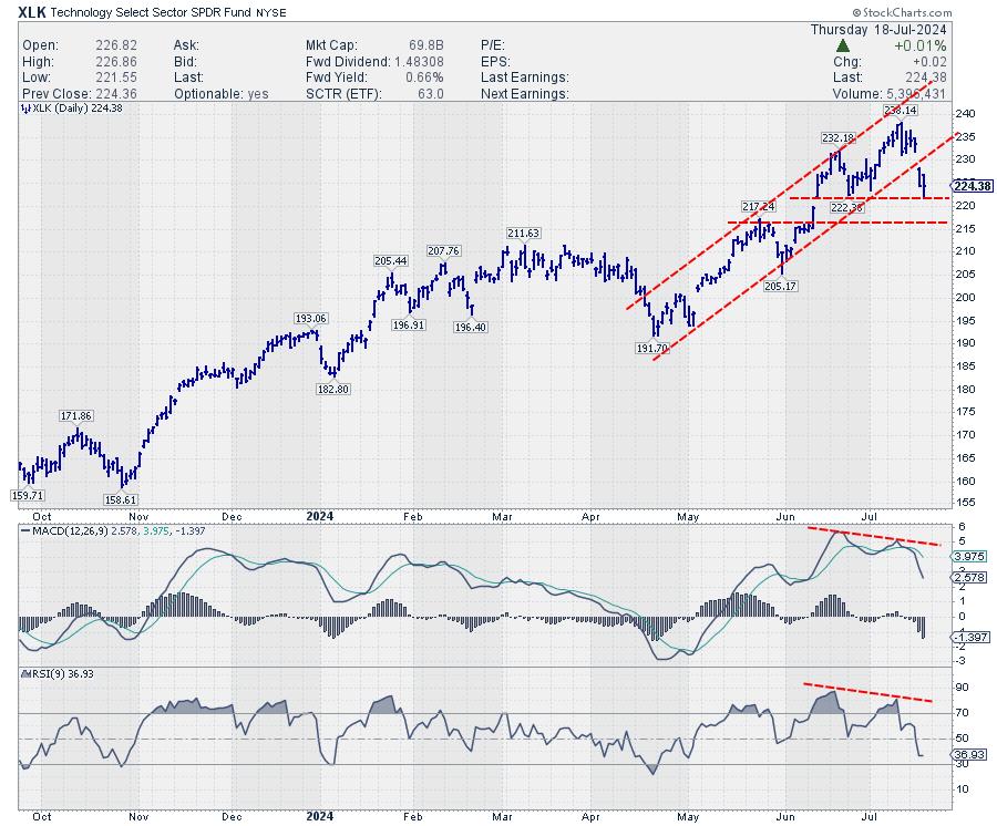
And this is where things are getting a little tricky. The price trend, certainly on the daily chart, got damaged.

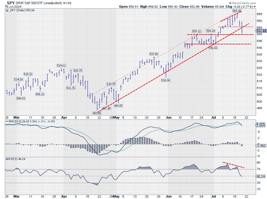
The price gapped lower and closed below the rising support line, which marks the lower boundary of the rising channel that had been in play since April. Price is now resting at support near 222.40, the level of the previous low, while both the MACD and the RSI show a strong negative divergence.
The downward break from the channel is the first trigger that signals the execution of the negative divergence. The second and probably final trigger will be a break of support around 222.40. When such a move occurs, and XLK starts to decline further, it will likely start to negatively affect the rotation on the weekly RRG and drag the XLK tail lower and out of the leading quadrant.
The sector's upside potential is currently becoming problematic, with resistance levels in the gap area between 228.30 and 231.56. If support breaks, downside risk will open up.

The negative divergence on the SPY chart is even more pronounced. The support level to watch here is 550, while upside potential is limited to 555, and, after that, the level of the rising support line of the former rising channel.
We are very likely, facing at least some sideways movement in the S&P 500.
The answer to "Will this be the beginning of something bigger?" will probably surface in the next few weeks.
#StayAlert --Julius
|
| READ ONLINE → |
|
|
|
| DecisionPoint |
| Double Top on Semiconductors (SMH) |
| by Erin Swenlin |
(This is an excerpt from the subscriber-only DecisionPoint Alert)
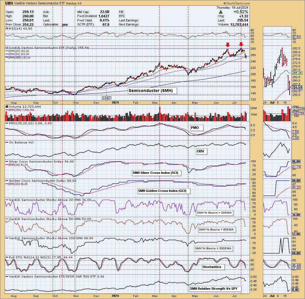
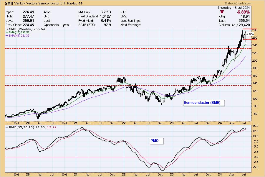
We noticed a double top on the Semiconductor industry group (SMH) that looks very much like the NVIDIA (NVDA) chart. NVDA is clearly the bellwether for the group, and it appears all of the Semiconductors are feeling the pain. The downside target of this pattern would take price to at least 239.00. That would be the "minimum" downside target.
Participation is lagging. You can see how many stocks have lost support at their 20/50-day EMAs. The Silver Cross Index is still at a very healthy level, so, while many have lost support, they still have their 20-day EMAs above the 50-day EMAs. All is not lost, but certainly the declining PMO suggests more downside.

SMH has been running hot since the 2022 low. It did see some corrections along the way, and it appears we are going in for another correction. So far, this correction is only a 9.9% decline. We would look for more given the topping weekly PMO.

Learn more about DecisionPoint.com:
Watch the latest episode of the DecisionPointTrading Room on DP's YouTube channel here!

Try us out for two weeks with a trial subscription!
Use coupon code: DPTRIAL2 at checkout!
Technical Analysis is a windsock, not a crystal ball. -- Carl Swenlin
(c) Copyright 2024 DecisionPoint.com
Disclaimer: This blog is for educational purposes only and should not be construed as financial advice. The ideas and strategies should never be used without first assessing your own personal and financial situation, or without consulting a financial professional. Any opinions expressed herein are solely those of the author, and do not in any way represent the views or opinions of any other person or entity.
DecisionPoint is not a registered investment advisor. Investment and trading decisions are solely your responsibility. DecisionPoint newsletters, blogs or website materials should NOT be interpreted as a recommendation or solicitation to buy or sell any security or to take any specific action.
Helpful DecisionPoint Links:
Trend Models
Price Momentum Oscillator (PMO)
On Balance Volume
Swenlin Trading Oscillators (STO-B and STO-V)
ITBM and ITVM
SCTR Ranking
Bear Market Rules
|
| READ ONLINE → |
|
|
|
| Don't Ignore This Chart! |
| Why Homebuilder Stocks are on Fire Right Now! |
| by Karl Montevirgen |

Homebuilder stocks are experiencing a significant rally as markets anticipate a rate cut in September, and possibly more before the end of 2024.
What Triggered the Bullish Turn?
Earlier this week, Fed Chair Jerome Powell hinted at rate cuts later this year. He didn't say when, but he did mention the Fed won't wait for inflation to drop to 2% to make a move.
In the June 2023 article, Homebuilder Stocks are Soaring, But Is It a Good Time to Buy?, I noted that the homebuilding industry—specifically, D.R. Horton (DHI), Lennar (LEN), PulteGroup (PHM), and Toll Brothers (TOL)—was soaring, but technicals warned of a gradual drop in momentum. That dip took three months to fully play out, thanks to high mortgage rates and rising construction costs dampening the housing market. But then, in November, a couple of technical and fundamental catalysts converged.
Looking at SPDR S&P Homebuilders as an Industry Proxy

CHART 1. WEEKLY CHART OF SPDR S&P HOMEBUILDERS ETF (XHB). This ETF represents the homebuilder industry and gives a broad view of the largest stocks in the industry.
Note XHB includes homebuilding and homebuilding-related stocks. Not all stocks in the index are homebuilders.
Technical Bounce Off Support. Longer-term investors saw the dip as an ideal buying point for many stocks. The XHB weekly chart shows the homebuilders' index bouncing off the 50-period Simple Moving Average (SMA). For individual stocks on a daily chart, you would see a bounce off the 200-day SMA (see green arrow pointing to the November breakout), which gets relatively close to the weekly SMA shown above.
Fundamental Catalyst. On the fundamental side of things, a huge drop in consumer prices (the first in four years), reduced lumber prices (cutting building costs), and positive earnings reports all contributed to market optimism and a breakout from the downtrend line (see blue trend line) in November.
The price action in June 2023 suggested waiting for a "sizable dip" before pulling the trigger. That dip came, and if you got in, it would have been a favorable ride.
As for this week's rally catalyst, beginning with a similar breakout (see green arrow pointing to the July breakout) to the last one discussed above, it was Jerome Powell's statement that the Fed may not wait for inflation to drop down to 2%. So, where are we today?
DR Horton (DHI) Surges Forward
DHI is set to keep shining in 2024. Analysts predict revenue will grow thanks to the ongoing housing shortage. You can follow DHI's live chart here.

CHART 2. DAILY CHART OF DR HORTON. DHI doesn't quite look like it's topping (yet?).
DHI's StockChartsTechnicalRank (SCTR) score just shot above the 90 line, signifying that several technical indicators are giving bullish readings across multiple timeframes. But will it hold?
DHI's breakaway gap at $142 was followed by a strong parabolic surge, leading to a runaway gap at $164. Though there's no indication a pullback is anywhere in sight, when it finally occurs, you might expect support at $165 (see blue dotted line), the highest swing point marking DHI's ascent into all-time high territory, or below that, $158, the most recent and significant swing high. Below that, you might find support at the 200-day SMA (which has served as a strong support level several times in the past).
Also note that, according to the Relative Strength Index (RSI), DHI has entered "overbought" territory. And if you're curious about DHI's relative performance against its peers, the stock is surprisingly underperforming XHB by over -1% (see panel displaying DHI:XHB).
Toll Brothers Inc (TOL)—High-End Outperformer
TOL is poised to continue benefiting from high demand despite higher mortgage rates. A luxury home builder, TOL also has strong geographic diversification, both contributing to its growth potential. To link to TOL's live chart, click here.

CHART 3. DAILY CHART OF TOLL BROTHERS. Pinpointing support levels can be tricky here, so it helps to bring in the volume to see where heavy trading was concentrated.
Similar to DHI, TOL's SCTR score also jumped above the 90 line. But unlike DHI, TOL is outperforming its peers by over 12%. Pay close attention to the shooting star that appears to be forming. It indicates a strong rejection from the top, signaling a potential bearish reversal. The RSI reading is also approaching the 70 line. If it goes above 70, it could be interpreted as overbought.
Since TOL broke out of a wide and volatile trading range with numerous swing points, pinpointing support levels can be tricky. To clarify, the chart uses the Volume-by-Price indicator to identify support and resistance levels around zones of heavy trading activity.
Potential support (see blue dotted lines) can be found at $124, $116, and $106 (note that this level also marks a critical resistance level from Dec 2023 to Feb 2024). Also, pay attention to the the 200-day SMA, which should coincide with a level within this range.
PulteGroup Inc (PHM)—Second Strongest Performer
PulteGroup is currently outperforming its industry by over 11%. Despite a tough economic climate, PHM's management is optimistic about 2024. They expect strong performance driven by a solid job market and potentially lower interest rates. Here's a link to PHM's live chart.

CHART 4. DAILY CHART OF PULTEGROUP. The pin bar and falling SCTR indicate it may be time for a breather.
PHM almost reached a high of $130 before sellers jumped in and pushed the stock back toward its opening price, creating a pin bar (or shooting star) formation. If it does pull back in the near term, you can find support at the rising trend line (see blue dotted line), which is currently at $112.50 and rising. Should that fail, there's always the 200-day SMA, which, as you can see, has provided a strong support level in past dips.
Lennar Group (LEN)—Still the Laggard
Last June 2023, LEN was the laggard of the four. It is still underperforming its industry by over -2%. Despite this, its revenue rose 8% year-over-year, and a strong backlog points to a solid 2024. Analysts believe Lennar's focus on efficiency and strong demand will support its growth. View LEN's live chart.

CHART 5. DAILY CHART OF LENNAR GROUP. Similar to TOL, volume helped identify a strong potential support level.
The pin bar in the last session looks like it's about to go negative. Given the messy trading range, it was necessary to use Volume-by-Price to identify a stronger potential support level at $150. The 200-day SMA may also be another support option, and it looks like it's about to converge with the $150 mark.
Reaching the Close
Homebuilder stocks are on a roll, thanks to Fed Chair Jerome Powell hinting at upcoming rate cuts. While past rallies saw dips due to high mortgage rates and construction costs at the time, falling consumer prices, construction costs, and upcoming rate cuts (when they take place) may all serve as bullish catalysts for further growth. Keep an eye on the support levels. Even if the stocks don't dip now, they'll eventually have to take a breather. So, add the charts to your ChartLists and be ready to jump in when the time is right.

Disclaimer: This blog is for educational purposes only and should not be construed as financial advice. The ideas and strategies should never be used without first assessing your own personal and financial situation, or without consulting a financial professional.
|
| READ ONLINE → |
|
|
|
| Art's Charts |
| Using Nasdaq 100 Specific Breadth to Measure Risk Appetite |
| by Arthur Hill |
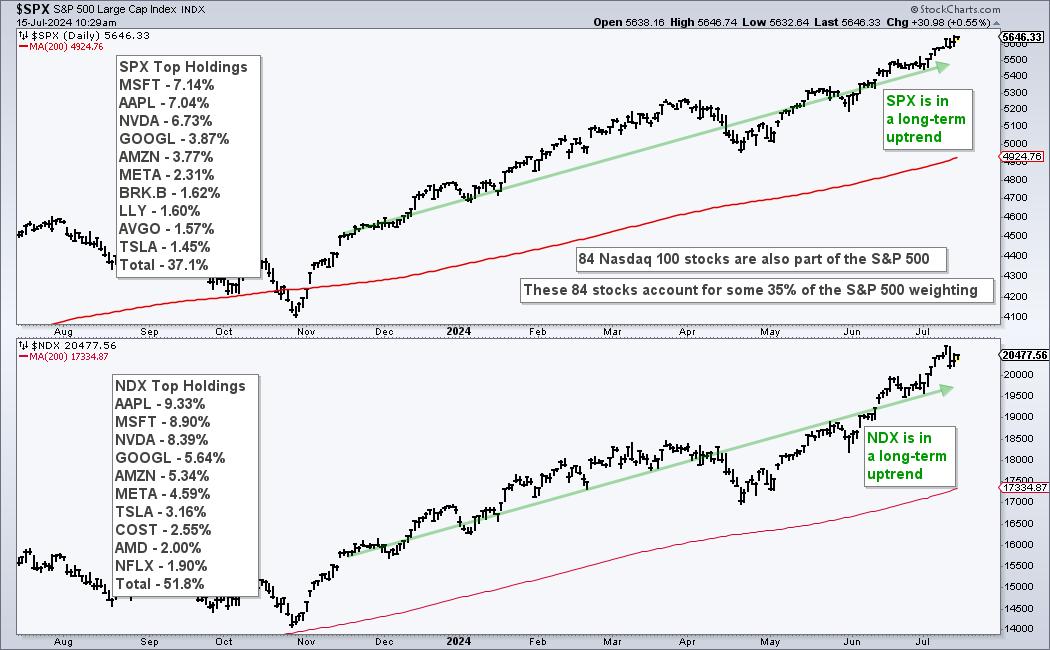
The Nasdaq 100 is a major driver in the stock market and Nasdaq 100 breadth indicators should be part of our broad market analysis routine. 84 Nasdaq 100 stocks (16.8%) are also in the S&P 500 and their weighting accounts for over 30% of the S&P 500. In fact, the six largest stocks in the S&P 500 come from Nasdaq 100 and account for 31.26%. The chart below shows the holdings for each index. Also note that both are in long-term uptrends.

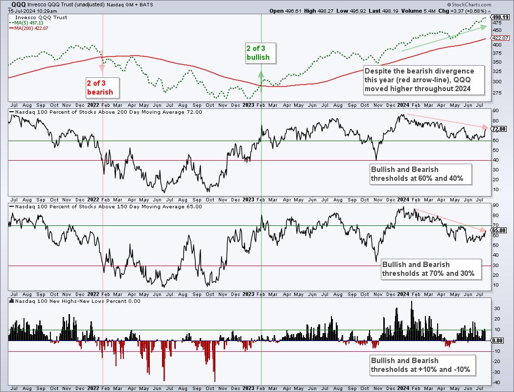
Nasdaq 100 stocks also represent the risk appetite within the stock market. These stocks typically have higher growth rates and higher Betas. Chartists can track performance for Nasdaq 100 stocks using Nasdaq 100 specific breadth indicators. I want to trade Nasdaq 100 stocks and be fully invested when these indicators are bullish. I want to shun Nasdaq 100 stocks and raise cash when these indicators are bearish. We use a similar model for our Dual-Momentum Rotation Strategies at TrendInvestorPro. To this end, I am using three long-term breadth indicators to quantify Nasdaq 100 conditions. The chart below shows the percentage of Nasdaq 100 stocks above their 150 and 200 day SMAs as well as 52-week High-Low Percent. The latter is the percentage of 52-week highs less the percentage of 52-week lows.

All three indicators are long-term oriented and I am using bullish/bearish thresholds for signals. Divergences do not figure into my analysis because these are, more often than not, just distractions. Notice how QQQ advanced even as bearish divergences formed throughout 2024 (red arrow-lines). I will stick to the signals and ignore the nuance. NDX %Above 200-day SMA turns bullish with a move above 60% and stays bullish until a bearish signal triggers with is a cross below 40%. Adding signal thresholds above/below the midpoint (50%) reduces whipsaws. NDX %Above 150-day turns bullish with a move above 70% and bearish with a move below 30%. These thresholds are wider because the moving average is shorter. And finally, NDX High-Low Percent turns bullish with a move above +10% and bearish with a move below -10%.
Using all three indicators, chartists can take a weight of the evidence approach for assessing the Nasdaq 100. The bulls rule when two of the three indicators are on bull signals and the bears rule when two of the three are on bearish signals. A bearish signal triggered in January 2022 and a bullish signal triggered in early February 2023.
TrendInvestorPro recently introduced a market timing model based on long-term breadth indicators for the S&P 500 and Nasdaq 100. We published an extensive report and video describing this model and how it compares to models that use small-cap breadth. This model will be used for our Dual Momentum Rotation Strategy that trade Nasdaq 100 and S&P 500 stocks. Click here to subscribe and gain immediate access.
////////////////////////////////////////
|
| READ ONLINE → |
|
|
|
| MORE ARTICLES → |
|
