The S&P 500 remains in a primary uptrend, as confirmed by a fairly consistent pattern of higher highs and higher lows. But what would confirm that a top is in place for our major equity benchmarks? To answer that, it may be helpful to review other charts that have recently experienced tops, as the technical configurations are often quite similar.
Today, we'll review the recent price action in Domino's Pizza Group (DPZ), identify the key technical characteristics that define its recent downswing, and relate that to what we may see on the S&P 500 chart.
An Accumulation Phase Occurs When Buyers Outweigh Sellers
Before we can confirm a bearish rotation on a chart like DPZ, we first need to clearly define the uptrend phase that happens beforehand. This goes back to classic Dow Theory, and also combines technical indicators like moving averages to track the upward pace of price action.
After many months of underperformance, small caps are starting to thrive again. How should investors think about small cap stocks, what factors are contributing to this outperformance, and what does all this tells us about leadership rotation in the coming months? Join me for my next FREE webcast, Small Caps, Big Dreams: The Great Rotation of 2024, as we answer these questions and more! Sign up today and mark your calendar for Wednesday, July 24th at 1pm ET.
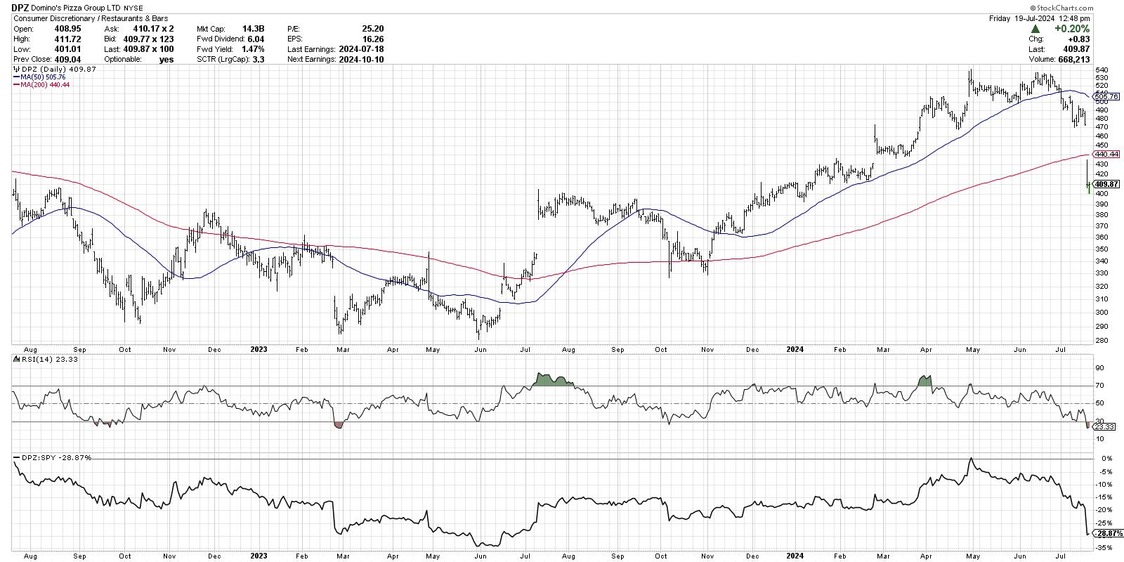
From the October 2023 low through the end of April 2024, Domino's experienced a classic Dow Theory uptrend formed by a pattern of higher highs and higher lows. Each move higher shows that buying power is overcoming any selling pressure that develops, and the higher lows show that dip buyers are interested in accumulating shares on short-term weakness. The price remained above two upward-sloping moving averages, and the RSI remained in a bullish range, generally above the 40 level.
The Checklist to Identify a Distribution Phase
Note how all of those factors changed in May and June. Instead of making another new 52-week high in June, the price stalled out at its previous peak. Instead of achieving another higher low on the next pullback, the price broke below the May swing low around $500. The RSI broke below 40 soon after, indicating a rapid deterioration in price momentum.
So while this week's gap lower surprised many market practitioners, mindful investors would have recognized all the classic signs of distribution before this week's sudden drop.
The Signs to Watch for the S&P 500
How does this relate to the S&P 500 chart? For now, the SPY is still in a primary uptrend of higher highs and higher lows. The price remains above two upward-sloping moving averages, and the RSI remained above 40 even after Friday's drop.
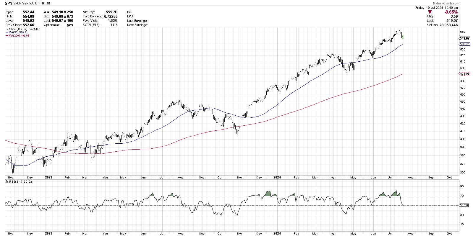
What would tell us that the S&P 500 has rotated to a distribution phase? Simply follow the playbook that DPZ displayed in recent months. Look for a failed attempt at a new high, which would suggest an exhaustion of buyers. Note if the subsequent pullback is unable to hold the late June low around $540, which would mean that dip buyers are no longer willing to buy on short-term weakness. And pay attention to the RSI, because if it breaks below 40 on a pullback, that is often a predecessor of much weaker price action.
No one knows what will happen next for the S&P 500. But the good news is that we can review the lessons of market history and notice what consistent patterns have occurred at previous market topics. As I was often reminded in my early days in the industry, "History doesn't repeat itself, but it often rhymes!"
RR#6,
Dave
P.S. Ready to upgrade your investment process? Check out my free behavioral investing course!
David Keller, CMT
Chief Market Strategist
StockCharts.com
Disclaimer: This blog is for educational purposes only and should not be construed as financial advice. The ideas and strategies should never be used without first assessing your own personal and financial situation, or without consulting a financial professional.
The author does not have a position in mentioned securities at the time of publication. Any opinions expressed herein are solely those of the author and do not in any way represent the views or opinions of any other person or entity.


