TAKEAWAYS
- Three consecutive declining days in the stock market increases risk appetite
- Semiconductors were the catalyst for the selloff and trading below two support levels
- Keep an eye on market breadth indicators to get indications of whether the stock market is correcting or if the selloff will be longer-term

Seasonally, the first two weeks of July have been great for the stock market. Now that the first two weeks of July are behind us, will the stock market take a breather until September? After how the market acted this week, it certainly feels that way.
Let's start with a synopsis of the broader indexes, followed by an analysis of market breadth indicators.
A July Pullback?
This week, there were some dynamics in the financial markets worth pondering. The S&P 500 index ($SPX) hit a record high on Tuesday and then gapped lower on Wednesday, with the selloff continuing on Thursday and Friday. Three substantial consecutive down days triggered fears among investors and led to a selloff in large-cap mega-growth tech stocks.
The Nasdaq Composite ($COMPQ) was hit the hardest. The daily chart of the Nasdaq below paints a picture of the magnitude of the selloff.
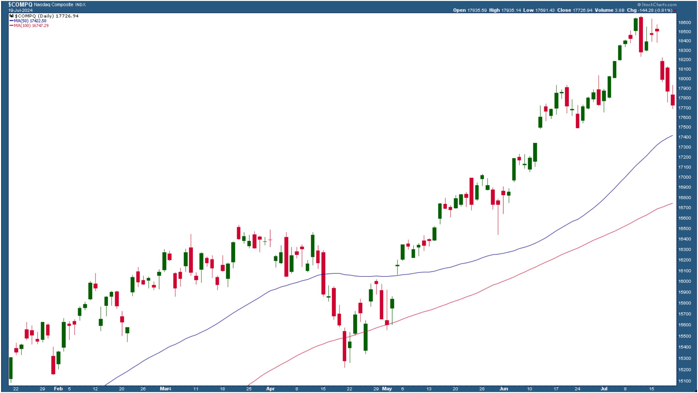
CHART 1. THE NASDAQ SELLOFF. The Nasdaq Composite went through a significant selloff for three consecutive days.Chart source: StockCharts.com. For educational purposes.
The selloff on July 11, a 1.95% drop, indicated how much the Nasdaq Composite could drop in one day. That's to be expected when the index is as toppy as it is. On a positive note, the Nasdaq is still trading above its 50-day simple moving average (SMA).
Semiconductor weakness brought down the Nasdaq and S&P 500. The strong bull rally in the stock market stemmed from the strength in semis, but the narrative changed this week.
The chart of the VanEck Semiconductor ETF (SMH) paints a grim picture of the fall in semiconductor stocks. SMH has broken below two important levels. One is the support level from previous lows. The second and more concerning one is that it dropped below its 50-day SMA and closed at the lower end of the candlestick bar.
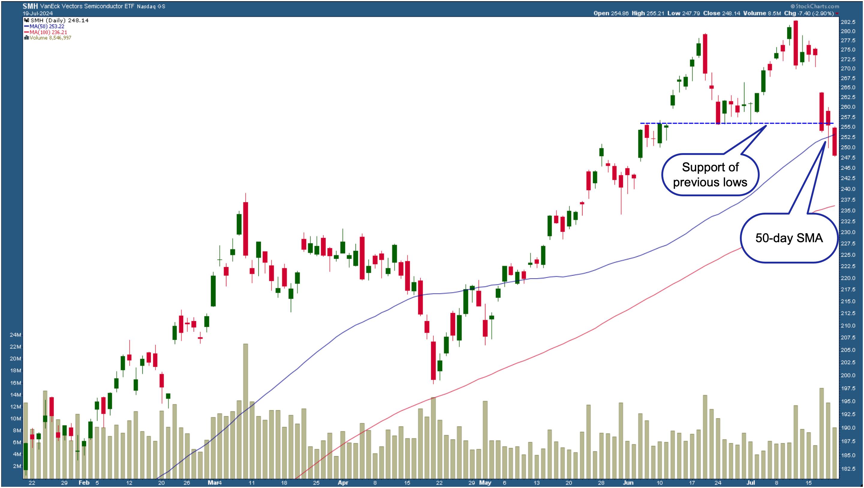
CHART 2. DAILY CHART OF THE VANECK VECTORS SEMICONDUCTOR ETF (SMH). The ETF has broken below the support of its previous lows and the 50-day SMA. The next level to watch is the 100-day SMA.Chart source: StockCharts.com. For educational purposes.
And while the S&P 500 and Nasdaq gapped lower, things were slightly different with the Dow Jones Industrial Average ($INDU). On Wednesday, the index hit an all-time high, but followed the S&P 500 and Nasdaq with a downward move on Thursday and Friday.
Can Small Cap Stocks Hold Their Ground?
If you were tuned in to the media, you'd have heard the word "rotation" mentioned several times. While the big broad indexes were selling off, small-cap stocks rose out of their slumber. Were investors selling off their big winners and investing in small caps? It's possible, given that interest rate cuts will likely occur in 2024.
But, on Friday, small caps also joined in the selloff (see chart below). However, the S&P 500 Small Cap Index ($SML) didn't break the support level of its previous highs. The lower panels show that market internals are weakening, so it's possible that small caps can fall below the blue-dashed support level if there's more of the same next week.
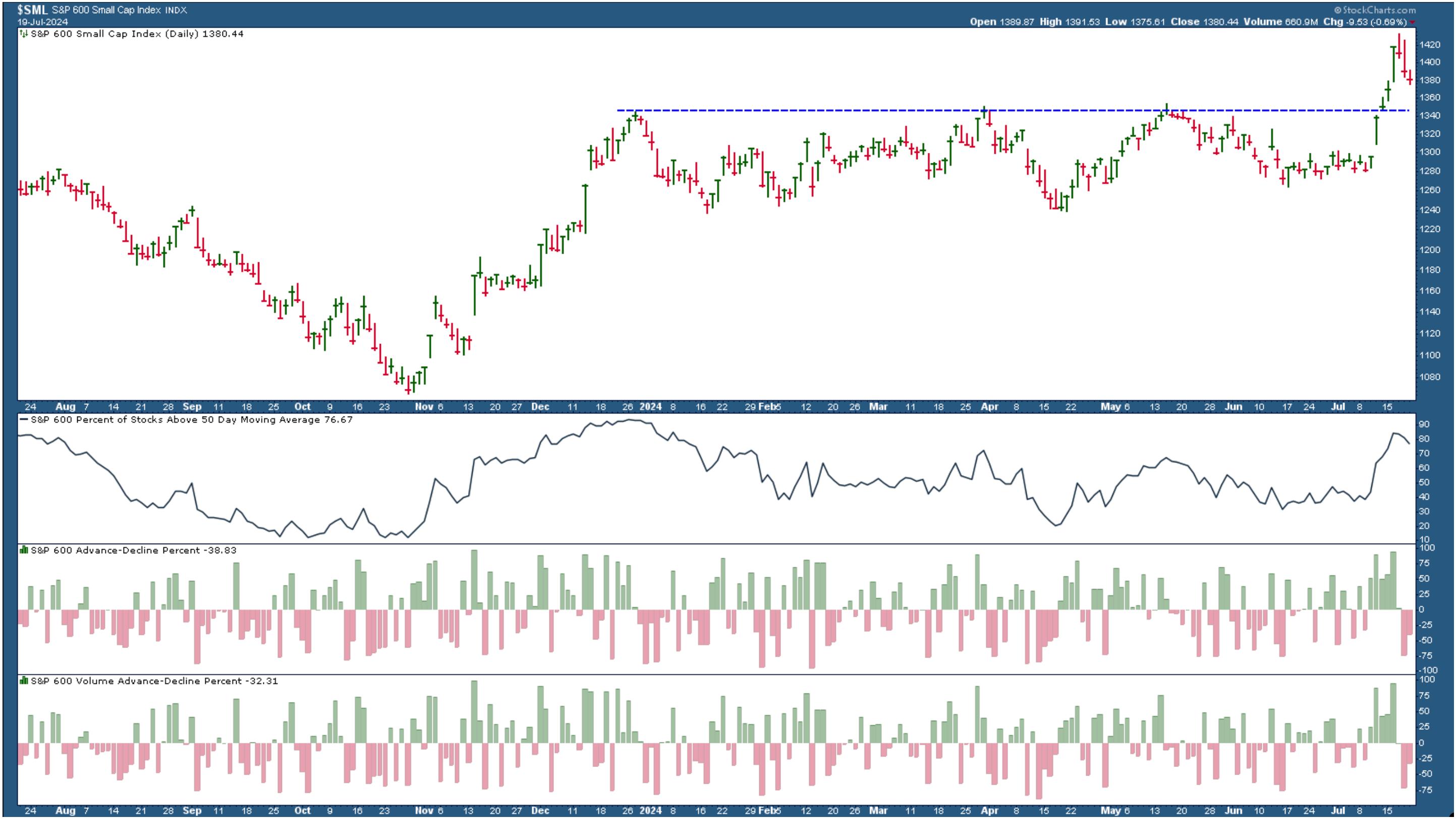
CHART 3. SMALL CAPS SELLOFF BUT HAVEN'T BROKEN BELOW SUPPORT. The market internals in small-cap stocks are weakening, which could lead to the index falling below its support level.Chart source: StockCharts.com. For educational purposes.
It was an all across-the-board sell-off. Even precious metals and bond prices fell. Very little of the market was in green territory on Friday. Head to the Market Summary page on your StockCharts platform and scroll down the long list, and you'll see there are a few greens in a sea of red.
Homebuilders, regional banks, and biotechs were some of the more relevant industries in the green. And, of course, cryptocurrencies were the winners, with Bitcoin leading the pack.
The Rise in Volatility
Given the magnitude of this week's selloff, it's no surprise the CBOR Volatility Index ($VIX) spiked higher. This suggests that fear amongst investors is on the rise. The bigger question is if this will remain this way for a while. The chart of the VIX below shows that it pulled back slightly toward the end of the trading day.
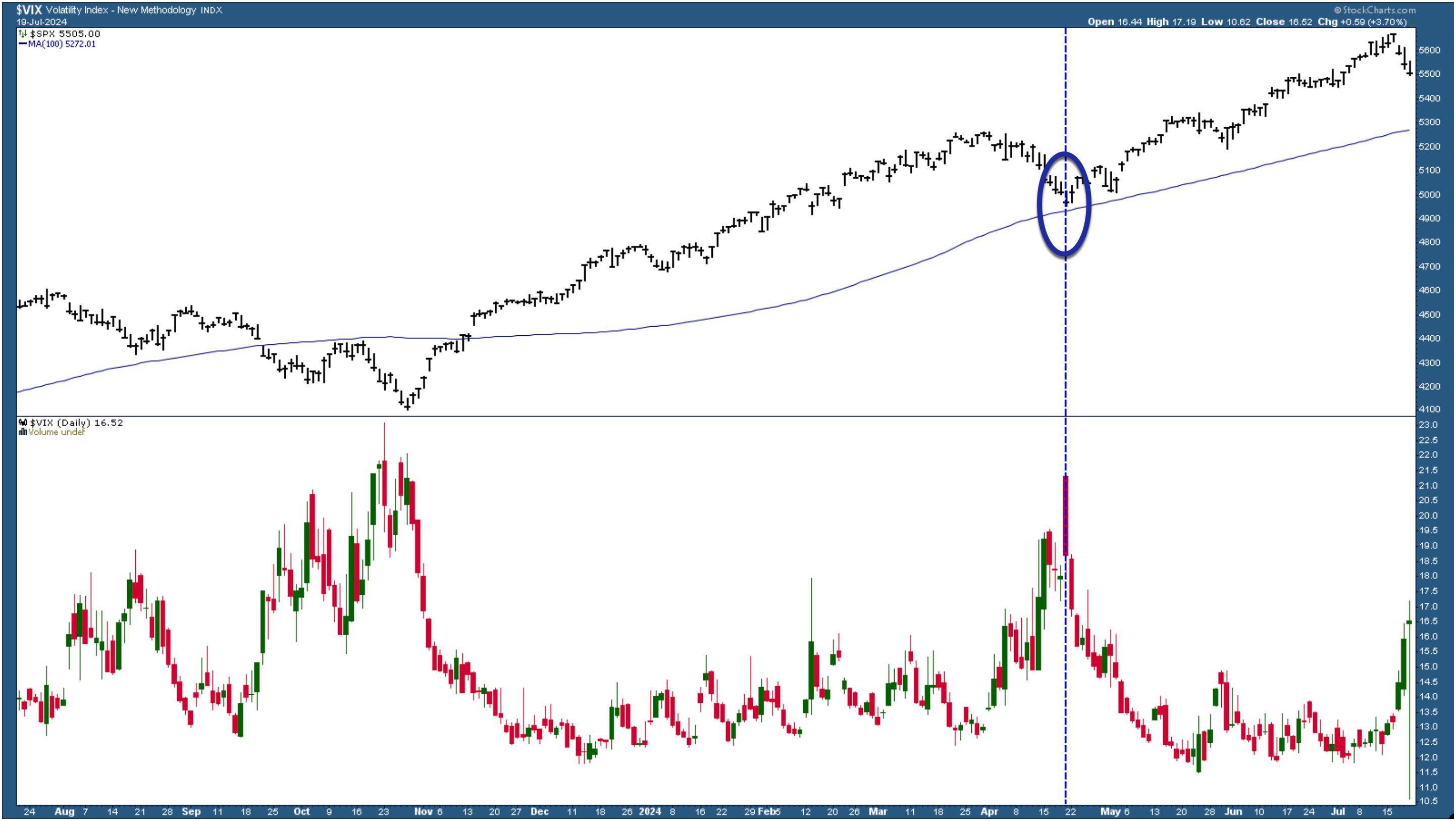
CHART 4. WATCH THE VIX. The VIX is a great fear gauge. The last time it spiked was when the S&P 500 corrected. Will this time be similar, or will it go even higher?Chart source: StockCharts.com. For educational purposes.
More important, notice how the VIX reacted in April 2024, the last time it spiked. That was when the S&P 500 corrected to its 100-day SMA, after which it resumed its uptrend. Can we expect a similar situation to take place this time? It's possible, although this time it may be more important to see if the S&P 500 falls below its 50-day SMA.
It Helps to Look at Stock Market Internals
In the daily chart of the S&P 500 below, you see the index is trading above its 50-day SMA. So far, breadth indicators suggest that the bullish trend is still in play.
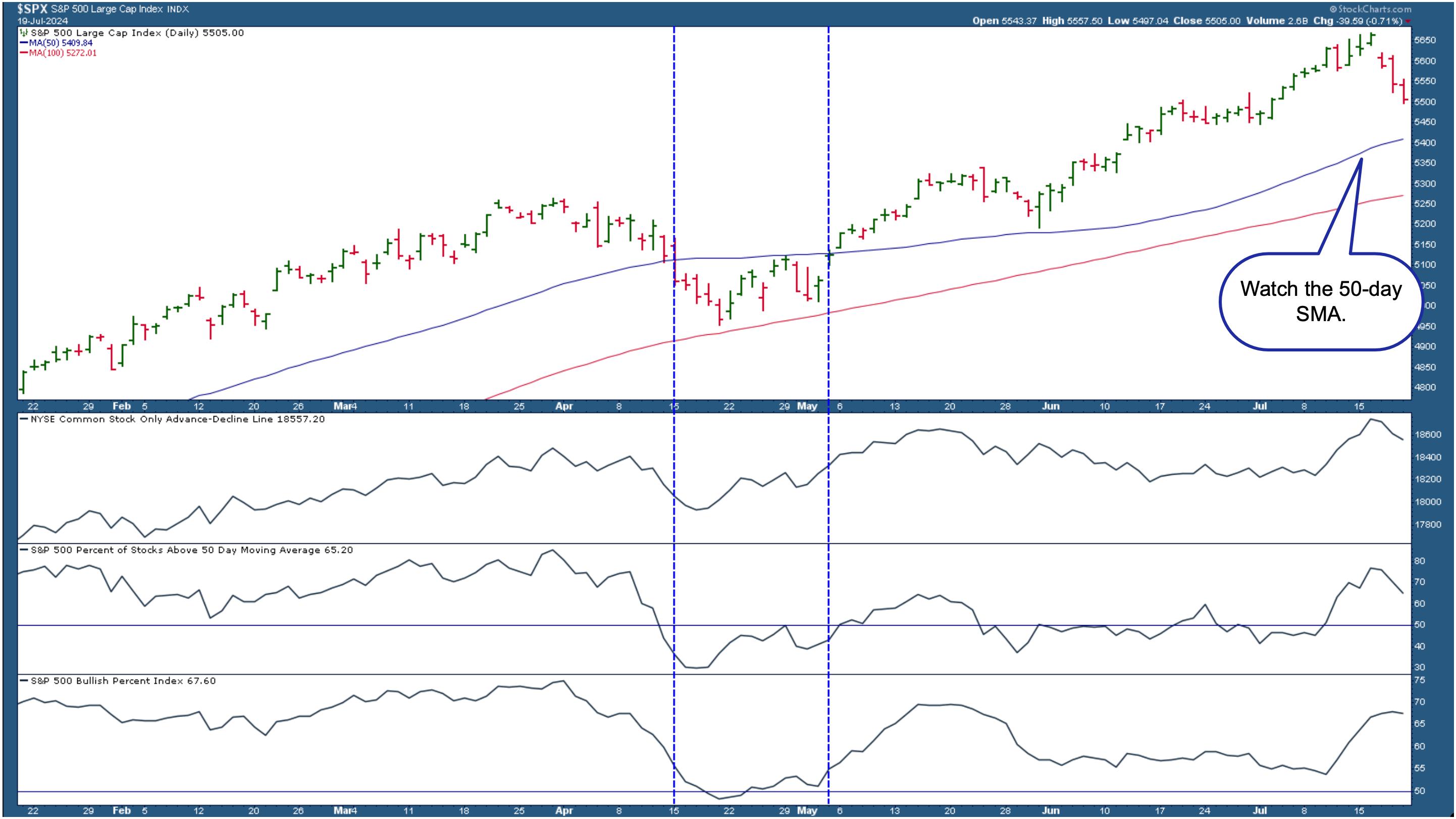
CHART 5. MARKET BREADTH INDICATORS AREN'T SIGNALING A BEAR MARKET YET. The S&P 500 is still above its 50-day SMA. Market breadth indicators, NYSE Advance-Decline Line, Percent of S&P 500 stocks trading above their 50-day SMA, and the S&P 500 Bullish Percent Index are showing signs of slowing down, but not necessarily weakness.Chart source: StockCharts.com. For educational purposes.
Points to note in the above chart are as follows:
- The NYSE Advance-Decline Line is starting to show signs of weakening but, relatively speaking, it's still high.
- The percentage of S&P 500 stocks trading above their 50-day SMA is above 50, although it also is starting to trend lower.
- The S&P 500 Bullish Percent Index is flattening out.
All three breadth indicators are indicating a slowing-down, but market breadth isn't weak. Compare this with what happened in April. Let's focus on the area between the two blue dashed vertical lines.
- The NYSE Advance-Decline line was in a downward trajectory, flattened out, and reversed.
- The percentage of S&P 500 stocks above its 50-day SMA fell drastically and went below the 50 level.
- The S&P 500 Bullish Percent Index fell below 50, but for a short time.
Closing Position
The charts presented here are an example. Feel free to apply different moving averages for your analysis. Assuming you're looking at the chart in Chart 5, if the S&P 500 falls below the 50-day SMA, it would be time to tread carefully. Corrections are healthy and necessary and, as long as they are corrections, they could open up opportunities to load up on some stocks or exchange-traded funds (ETFs). It depends on how weak the market internals are, which is why indicators included in the chart can be helpful.
Stay one step ahead of the market. Explore the different market breadth indicators available in StockCharts.
End-of-Week Wrap-Up

- S&P 500 closed down 1.97% for the week, at 5505; Dow Jones Industrial Average up 0.72% for the week at 40,287.53; Nasdaq Composite closed down 3.65% for the week at 17726.94
- $VIX up 32.58% for the week closing at 16.52
- Best performing sector for the week: Energy
- Worst performing sector for the week: Technology
- Top 5 Large Cap SCTR stocks: MicroStrategy, Inc. (MSTR); Insmed Inc. (INSM); Carvana Co. (CVNA); Arm Holdings (ARM); Robinhood Markets, Inc. (HOOD)
On the Radar Next Week
- June Existing Home Sales
- June PCE Price Index
- June Durable Goods Orders
- First estimate of Q2 GDP growth
- Earnings from Alphabet (GOOGL), Tesla (TSLA), Verizon Communications (VZ), Visa Inc. (V), Coca-Cola Co. (KO), Qualcomm Inc. (QCOM), PulteGroup (PHM), among many others.
Disclaimer: This blog is for educational purposes only and should not be construed as financial advice. The ideas and strategies should never be used without first assessing your own personal and financial situation, or without consulting a financial professional.
Happy charting!