Commentary Highlights: Bulk of the Evidence Is... // New Highs Outpace New Lows // Monthly S&P 500 Turns Bullish // Engulfings and Pullbacks in 2010 and 2011 // Consumer Discretionary Lags %Above 50-day // Finance and Tech Lead %Above 200-day // Russell 2000 Still Stalling // A Better Small-cap Index // Utilities Index Hits a Wall // Trend-Following, Momentum, NatGas, Tesla & More ////
Bulk of the Evidence is Bullish
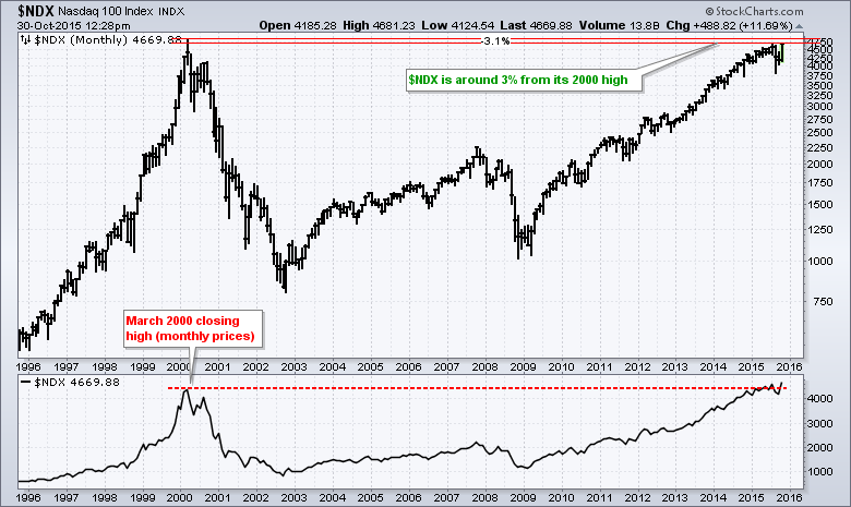
While there are certainly some pockets of weakness in the stock market, the overall market environment is clearly bullish right now. Small-caps, housing and retail are not performing well, but large-caps, banks, technology and consumer staples are performing well. As a result, the S&P 500 is around 2% from its all time closing high and the Nasdaq 100 is less than 1% from its July high. Oh, and the Nasdaq 100 is around 3% from its 2000 high. The Russell 2000 has been lagging the last few months, but this small-cap barometer broke its 2000 high way back in 2004 and then hit all time highs in 2013, 2014 and 2015. Also note that the Consumer Discretionary SPDR (XLY), Technology SPDR (XLK) and Consumer Staples SPDR (XLP) hit new 52-week highs this week. It is a market of stocks, styles, sectors and industry groups. Not all are on the same page, but enough are on the bullish page to warrant an uptrend in the S&P 500. As long as the broad market bias is bullish, our job as traders and investors is to avoid the weaker parts of the market and participate in the stronger parts.
More New Highs than Lows
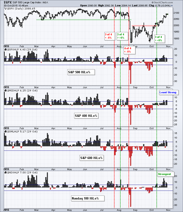
New highs expanded in October and this indicator group turned bullish in mid October. The chart below shows High-Low Percent for the S&P 500, S&P MidCap 400, S&P Small-Cap 600 and Nasdaq 100. I view the indicator group as bullish when three of the four break above +5% and bearish when three of four break below -5%. I prefer to keep my interpretation simple with either or signals. The bulls have the edge when there are more new highs and the bearish have the edge when there are more new lows.
The bulls had the edge from late October 2014 until late July 2015. There was a bearish signal in late July, but it flipped back to the bulls in early August before turning bearish again on August 20th. Whipsaws are all part of the game. The indicator group turned bullish on October 12th when three of the four exceeded +5%. Overall, the Nasdaq 100 is the strongest of the four because High-Low Percent hit +16% this month. The S&P MidCap 400 and S&P Small-Cap 600 are the least strong because both fell short of the 10% mark this month.
Monthly S&P 500 Turns Bullish
Since we are at the end of the month, I will show a ten year monthly chart for the S&P 500. Again, I am using three indicators to help quantify the trend and add some objectivity. The monthly close is above the 12-month EMA when the PPO(12,1,1) is positive. The 2-period Slope of MACD(12,0,1) is positive when the slope of the 12-month EMA turns up. MACD(12,0,1) is an indicator hack for the 12-month EMA and I am adding the Slope as an indicator of an indicator. CCI(12) is bullish after a cross above 0 and remains bullish until a cross below 0. The trend bias is up when two of the three indicators are positive and bearish when two of the three are negative.
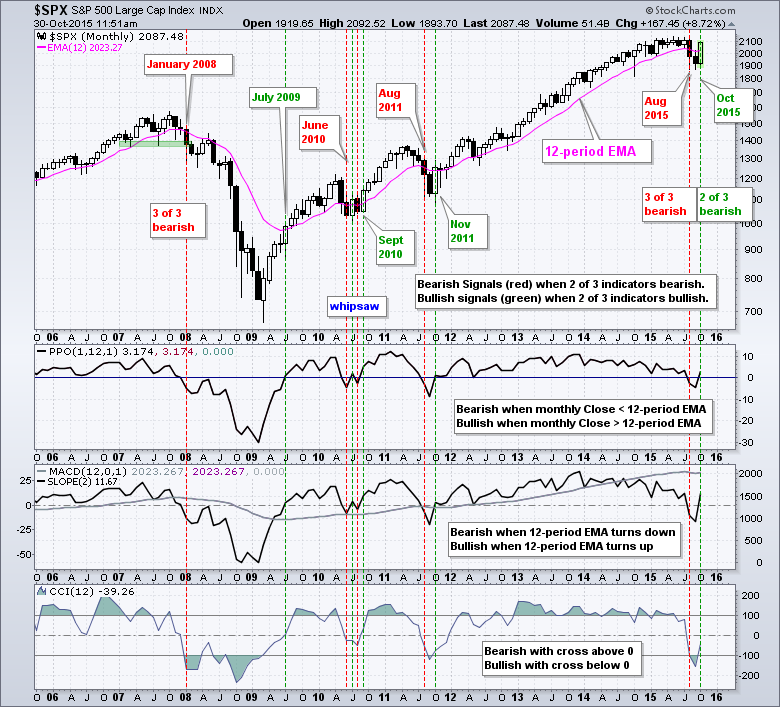
All three indicators turned bearish with the August plunge and two of the three are set to turn bullish again here in October. The S&P 500 is set to close above the 12-month EMA and the 12-month EMA turned back up. CCI(12) is lagging and has yet to move above zero. Note that CCI lagged in July 2010 and October 2011. As with all signals, I do not know how long it will last and how far the S&P 500 will extend. The trend bias is up right now and this favors further gains until there is a counter signal. The monthly chart for the Nasdaq 100 is bullish again, but the monthly chart for the Russell 2000 remains bearish. Note that I will return to the weekly charts next Friday.
Engulfings and Pullbacks in 2010 and 2011
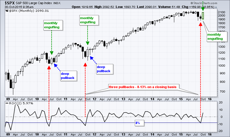
The next chart shows monthly bars for the S&P 500 and covers the entire bull run. On a closing basis, the August-September decline was the third pullback that exceeded 8%. The other two are marked with the red arrows. The 2010 and 2011 pullbacks ended with a monthly bullish engulfing pattern (green arrows). These long hollow candlesticks mark a weak open and a strong close. Even though these candlesticks marked the lows for 2010 and 2011, there was a pretty deep pullback the very next month (blue arrows). The S&P 500 closed below the mid point of the bullish engulfing in August 2010 and dipped below the mid point in November 2011. Even though I am showing a very small sample size, the S&P 500 is currently short-term overbought and this means we could see a pullback sometime in November.
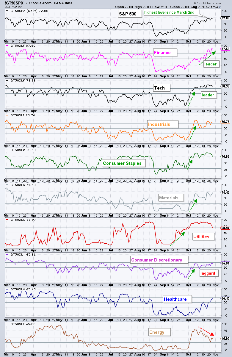
Consumer Discretionary Lags %Above 50-day
The chart below shows the percentage of stocks above the 50-day EMA for the S&P 500 and the nine sectors. This is a medium-term breadth indicator that measures the degree of participation within a group of stocks. The sectors are sorted by the indicator value with the finance sector at the top (87.5%) and the energy sector at the bottom (45%). Energy was one of the leaders in early October and it is now the laggard. Finance was dragging its feet in mid October, but the sector caught a bid the last two weeks and became the leader. We are also seeing medium-term leadership in technology, industrials and consumer staples. Overall, the indicator is above 60% for six of the nine sectors. Elsewhere, note that utilities moved into the bottom half of the table as the percentage of stocks above the 50-day EMA dipped below 70%. The consumer discretionary is lagging because it has yet to clear the 70% hurdle and it is in sixth place overall (blame retail and housing).
Finance and Tech Lead %Above 200-day
The next chart shows the percentage of stocks above the 200-day EMA for the S&P 500 and the nine sectors. I consider this as a long-term indicator because 200 trading days is around 9.5 months. First, notice that 60% of the stocks in the S&P 500 are above their 200-day EMA. This is a simply majority and this is net positive for the index. I use 40% and 60% as my bearish and bullish thresholds. A move below 40% means a clear majority of stocks are below their EMA and this is bearish. This remains bearish until a move back above 60%, which happened this week.
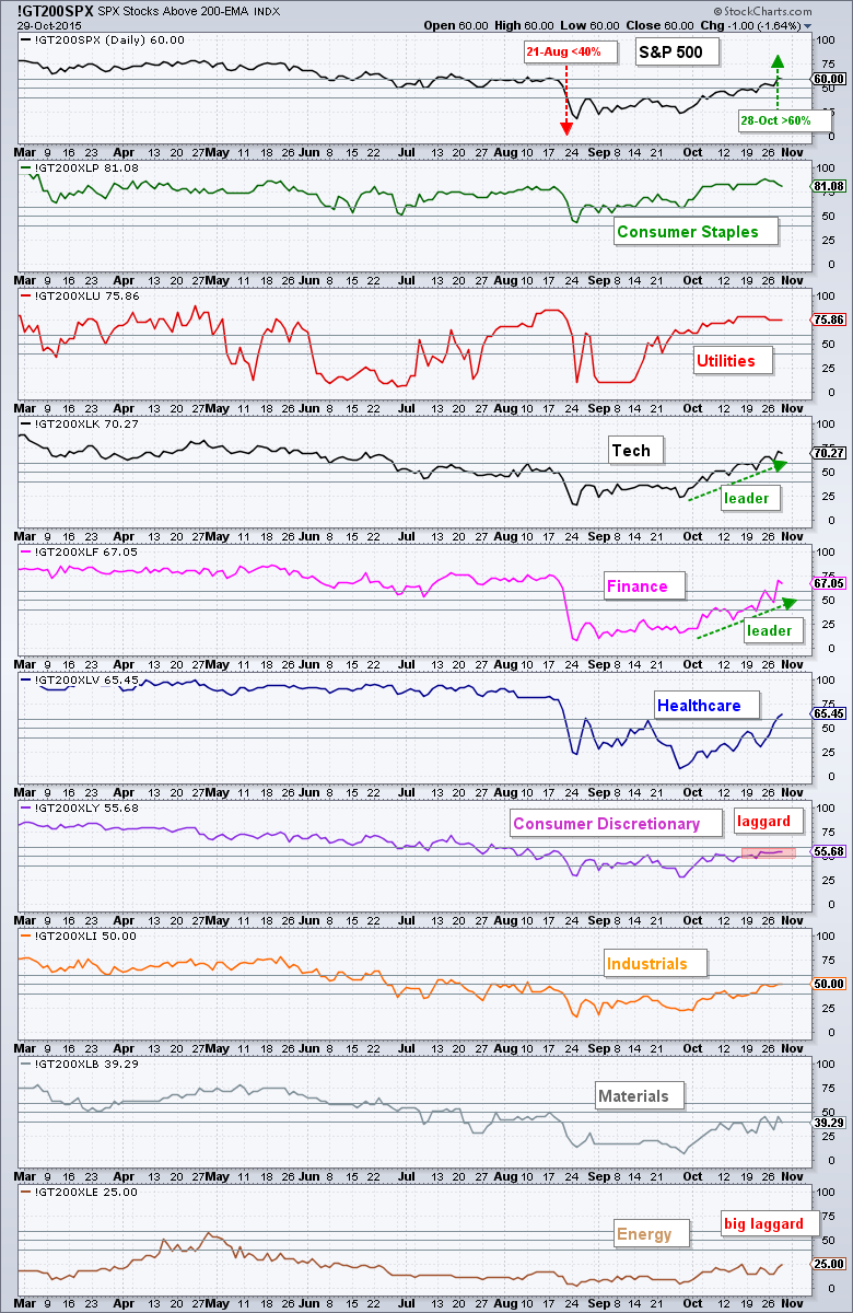
The sectors are again sorted by their indicator value with consumer staples at the top (81.08%) and energy (25%) at the bottom. Materials and energy are still best avoided because there are other sectors showing much more strength. In particular, notice how the indicator surged for the finance and technology sectors. How bad can things be with technology at 70% and finance at 67%? Not. That. Bad. Consumer discretionary remains a drag because only 55.68% of its stocks are above their 200-day EMA.
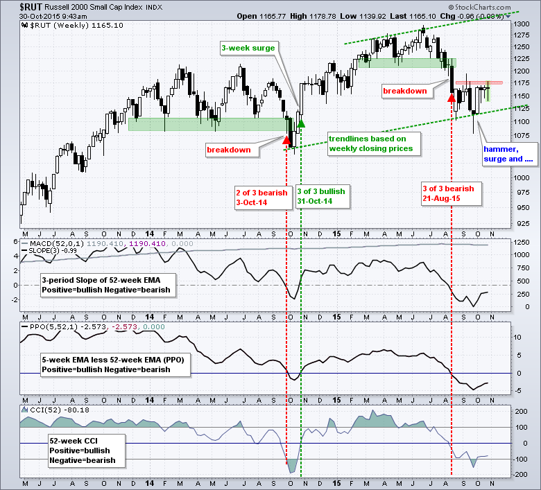
Russell 2000 Still Stalling
The Russell 2000 is the hold out and has yet to turn bullish on the weekly or monthly charts. As noted in last week's commentary, relative weakness in small-caps is normal in October. Historically, the "January" effect does not begin until late November and the Russell 2000 has outperformed the S&P 100 seventy four percent of the time in December over the last twenty years. Historical tendencies do not guarantee future performance and the Russell 2000 is not going anywhere until it breaks the resistance zone in the 1175 area. Also notice that all three trend indicators are still negative.
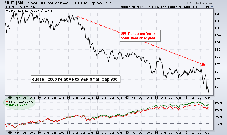
A Better Small-cap Index
The Russell 2000 seems to get all the press for small-caps, but it is not the best vehicle for investing in small-cap stocks. The chart below shows the Russell 2000 relative to the S&P Small-Cap 600 during the current bull market. It is not even close. The Russell 2000 chronically underperforms and the price relative ($RUT:$SML) hit a new low this week. On a performance basis, the Russell 2000 is up around 117% in the last seven years and the S&P Small-Cap 600 is up 140%. The same holds true when using the ETFs, Russell 2000 iShares (IWM) and S&P SmallCap iShares (IJR).
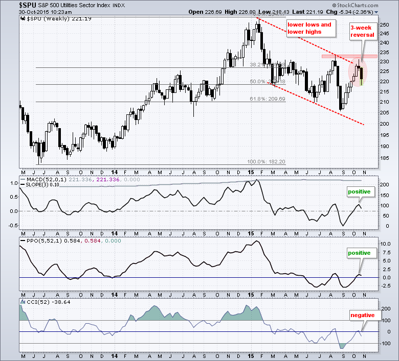
Utilities Index Hits a Wall
The S&P Utilities Sector ($SPU) was one of the best performing sector indices from early September to early October as the index advanced six weeks straight. Despite a strong move, the index did not exceed the August high and formed a reversal pattern over the last three weeks. It is not a textbook evening star, but you can see the long white candlestick, the shooting star last week and the long black candlestick this week. Overall, two of the three trend indicators are still positive so it will take a little more weakness for these to turn. Nevertheless, I think the trend is down for utilities because of the lower lows and lower highs since February.
Friday Food for Thought
- Savita Subramanian (BAML) notes: Since the start of the reporting season, every sector has seen revenue revisions downward except for technology. (Reformed Broker)
- Andreas Clenow notes: Natural gas has been falling consistently with only a few brief interludes and it has been one of the few big money makers on the short side. (TradingFloor.com)
- Michael Harries reports on A Significant Anomaly in Bonds. "This calendar effect is a significant anomaly and shows that markets are far from efficient" (PriceActionLab.com)
- What’s Going On in Your Brain? Common Investor Biases and Where They Come From. (CSFB - Hat tip: Gary Antonacci @GaryAntonacci)
- Does Trend Following Work? (White Paper from Cole Wilcox and Eric Crittenden)
- There are lots of reasons not to buy stocks with strong momentum. Nevertheless, the high momentum portfolio consistently outperforms. (SystematicRelativeStrength.com)
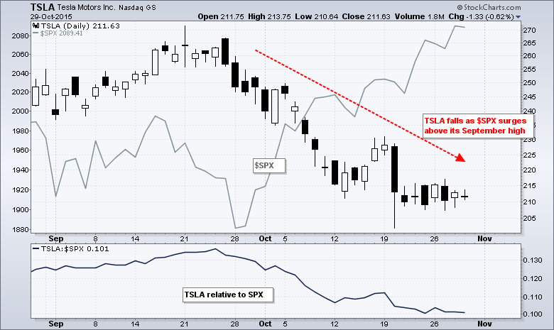
- Is Telsa's battery technology really unique? A legendary car executive thinks Tesla is facing the 'trifecta of doom'. (Business Insider)
- Also note that Telsa declined as the S&P 500 surged from late September to late October.
- Leveraged Funds Leading the Way (but which way). In 2009, investors who used the Direxion Shares Financial Bear 3X Shares ETF to bet financial shares would decline lost more than 70 percent of their money in the first four months of the year--even as their prediction came true. (Bloomberg). Back to Top

****************************************
Thanks for tuning in and have a good day!
--Arthur Hill CMT
Plan your Trade and Trade your Plan
*****************************************


