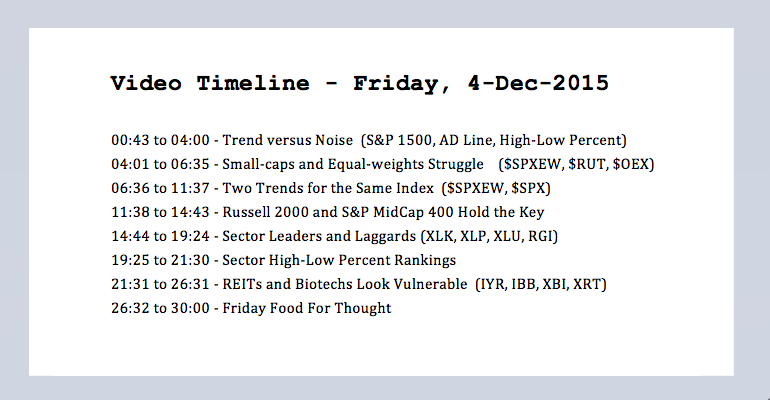
Click here for today's video // Trend versus Noise // Small-caps and Equal-weights Struggle // Two Different Trends for the Same Index // Russell 2000 and S&P MidCap 400 Hold the Key // Sector Leaders and Laggards // Sector High-Low Percent Rankings // REITs and Biotechs Look Vulnerable // Friday Food For Thought ////
Trend versus Noise
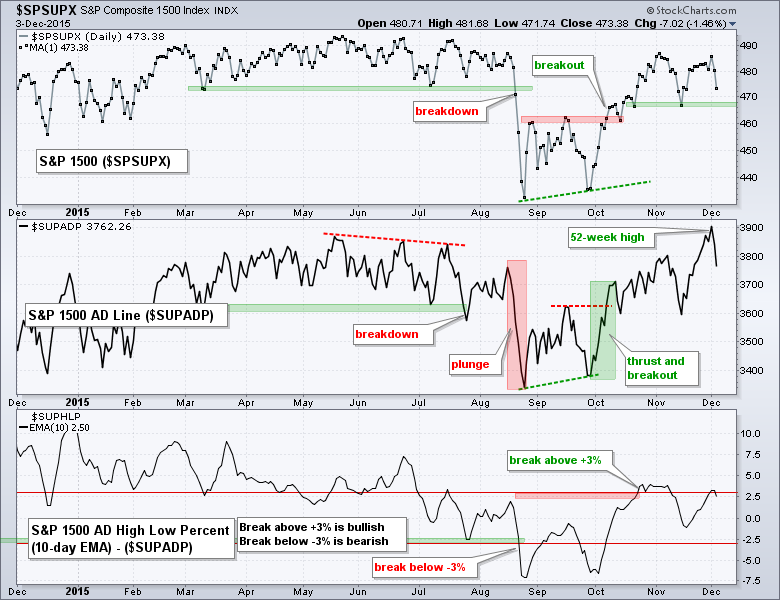
Trading turned quite volatile the last few weeks, but this noise is not yet enough to negate the October surge and breakout in the S&P 1500. Note that the S&P 1500 advanced with a sharp move from late September to early November. This move was pretty much straight up as the index rose around 12% in 26 trading days. Trading turned volatile in early November as the index fell 4%, rose 4% and then fell around 2.5% the last two days. Is this volatility bearish? Not just yet. Instead, I think these are just momentum swings within the trend, which is still up. The October surge and breakout are still the dominant features on the price chart, and they have yet to be negated. As noted below, the bullish case for the "stock market" is far from perfect because there are several pockets of weakness (energy, materials, utilities, small-caps). Nevertheless, I still think the pockets of strength outweigh the pockets of weakness and the bulls still have the edge. Pockets of strength include tech, staples, finance and large-caps, and they were highlighted in Tuesday's commentary. Note that the S&P 1500 AD Line ($SUPADP) hit a new high recently and we have yet to see a big increase in new lows.
Small-caps and Equal-weights Struggle
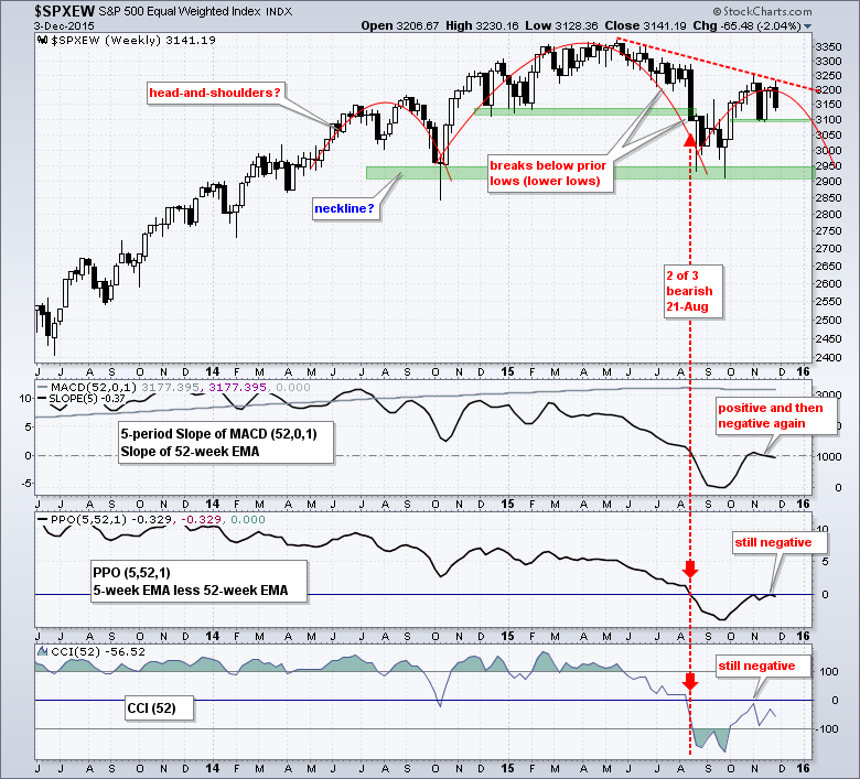
Relative strength in the cap-weighted S&P 500 and relative weakness in the equal-weight S&P 500 has been a theme for much of 2015. As the chart below shows the S&P 500 EW Index outperformed the S&P 500 from July 2012 to March 2015 as the price relative ($SPXEW:$SPX ratio) rose. The price relative turned down in April and hit a 52-week low in November. Relative strength in the equal-weight S&P 500 indicates that the average stock in the S&P 500 is having a much harder time than the large-caps in the S&P 500.
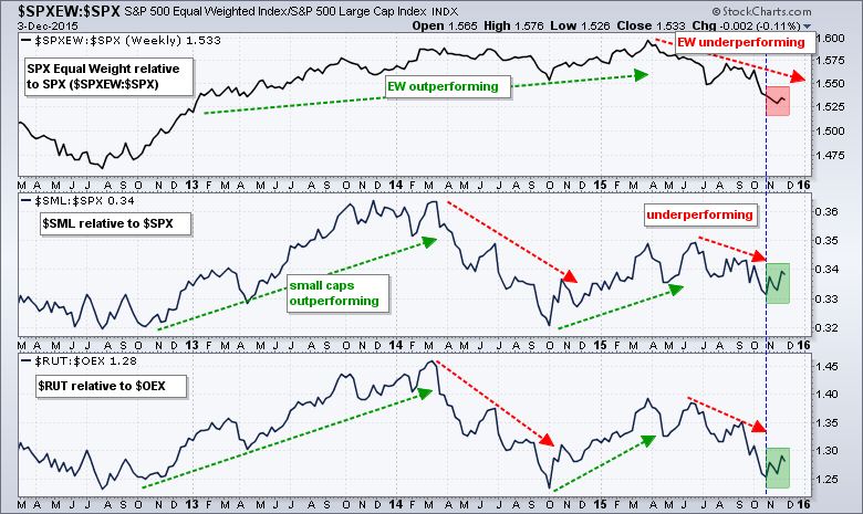
The middle window shows the S&P Small-Cap 600 relative to the S&P 500 ($SML:$SPX) and the lower window shows the Russell 2000 relative to the S&P LargeCap 100 ($RUT:$OEX). Small-caps underperformed from June to October as both price relatives fell. Even though the bigger trend remains down, small-caps have slightly outperformed over the last five weeks as the price relative bounced (green shading). This is promising, but more outperformance is needed to produce a meaningful breakout.
Two Trends for the Same Index
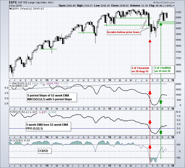
The performance discrepancy is also clear when we compare the charts for the S&P 500 EW Index and the S&P 500. The long-term trend indicators for the S&P 500 turned net bullish at the end of October and remain bullish. The index turned bullish with the October surge and break above the mid September high. This surge also included a Zweig breadth thrust in early October and the S&P 500 AD Line hit a new high in early November. The November low and a buffer mark support in the 2000 area. Even though trading has turned volatile the last five weeks, this just noise and we have not seen enough selling pressure to warrant a trend change. A weekly close below 1990 would break this support zone and argue for a reassessment. You can read about the long-term trend indicators in this article (with video).
A different picture emerges when we look at the S&P 500 Equal-Weight Index ($SPXEW). First, note that the trend indicators turned net bearish on August 21st and have yet to turn net bullish, which would require two of the three turning positive. Second, the large head-and-shoulders reversal pattern is still possible on this chart. The October surge in the S&P 500 EW Index was not as strong as the October surge in the S&P 500 and a lower high could be taking shape. A weekly close below the mid November low would break first support level and argue for a test of neckline support. The head-and-shoulders would not be confirmed until a break below neckline support in the 2900-2950 area.
Russell 2000 and S&P MidCap 400 Hold the Key
Here is the big question: will small-caps, mid-caps and equal-weights drag the S&P 500 down or will strength in the S&P 500 pull the others higher? The answer may lie with the Russell 2000 and the S&P MidCap 400. These two started moving lower in July and dipped below their March lows in late July. This weakness preceded the August breakdown and the S&P 500 did not exceed its March low until the August break down. The trend indicators remain negative for the Russell 2000 and S&P MidCap 400, but both indexes are in smaller uptrends since late September. These smaller uptrends could be corrective bounces or counter-trend rallies. The lows extending back to the second week of October mark support zones to watch. A weekly close below 1400 in the S&P MidCap 400 and a weekly close below 1130 in the Russell 2000 would reverse the two month uptrend and signal a continuation of the bigger downtrend. Such breakdowns would provide the early warning that the S&P 500 and Nasdaq 100 may follow.
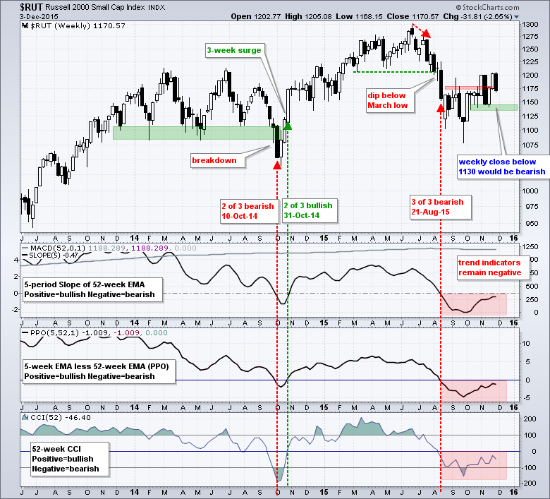
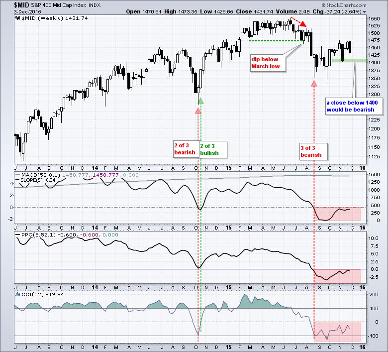
Before getting too bearish on the market, keep in mind that the November lows have yet to be broken. In other words, the two month trends are currently up for the Russell 2000, S&P MidCap 400 and S&P 500 EW Index. I would venture to call these medium-term trends. The long-term trends and two month trends are up for the S&P 500 and Nasdaq 100. We have certainly seen a lot of noise over the last five weeks, but these are just short-term momentum swings and they have yet to actually affect the trend. Bottom line: keep an eye on the support levels marked in the charts above. The bias will turn decidedly bearish when these support levels break. Until then I will respect the trend and try to ignore the momentum swings (noise).
Sector Leaders and Laggards
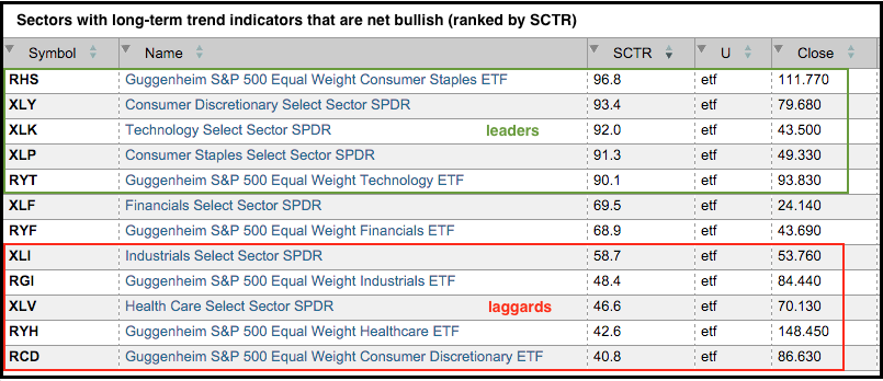
Chartists can break down the "stock market" by looking at the nine sectors. On the face of it, the market has an upward bias when at least 50% of the sectors are bullish and a downward bias when more than 50% are bearish. Using the long-term trend indicators, six of the nine sector SPDRs are net bullish and six of the nine equal-weight sector ETFs are net bullish. Net bullish is when two of the three trend indicators are positive. The equal-weight ETFs and sector SPDRs are bearish for energy, materials and utilities. Of the six bullish sectors, the technology and consumer staples sectors show the most relative strength. As the table below shows, the SCTRs for the EW Technology ETF (RYT), Technology SPDR (XLK), Consumer Staples SPDR (XLP) and EW Consumer Staples ETF (RHS) are above 90. These are the only two sectors where both the equal-weight ETF and the SPDR have SCTRs above 90. Even though the consumer discretionary, healthcare and industrials sectors have trend indicators that are net positive, their SCTRs are below 50 and they are not showing relative strength. The finance sector is the third strongest sector overall.
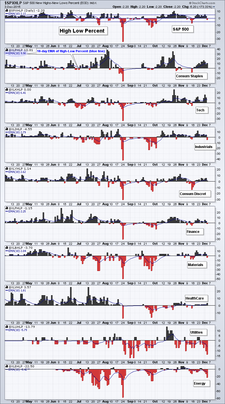
Sector High-Low Percent Rankings
Chartists can also use the sector High-Low Percent indicators to rank sectors and separate the pockets of strength from the pockets of weakness. The chart below shows the nine sectors ranked by the 10-day EMA of High-Low Percent, which is the difference between highs and lows divided by the total number of stocks. The technology and consumer staples sectors are the clear leaders with the most new highs. The 10-day EMA for High-Low Percent is around +2% for the industrials, consumer discretionary, finance, materials and healthcare sectors. This is not very strong, but there is a bullish tilt as long as this indicator remains positive. An increase in new lows would push the 10-day EMAs into negative territory and tilt the balance to the bears. The energy and utilities have the most new lows by far and show the most selling pressure over the last four weeks.
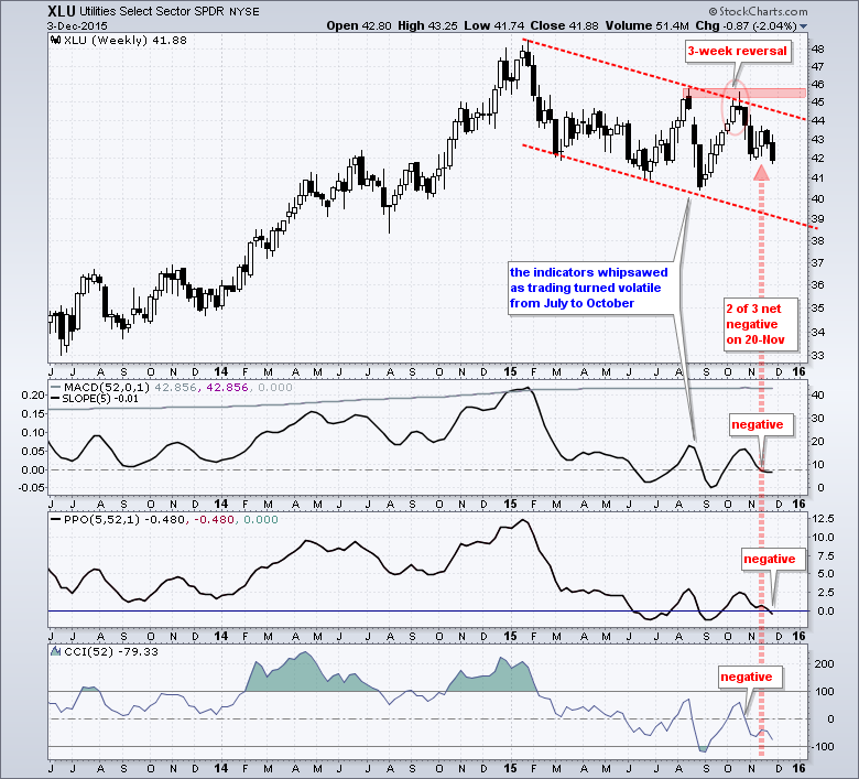
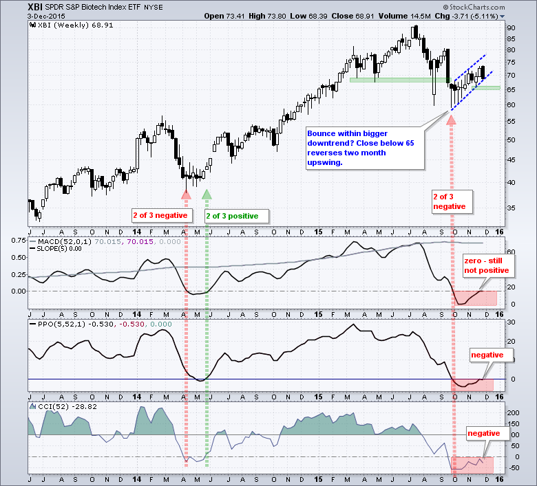
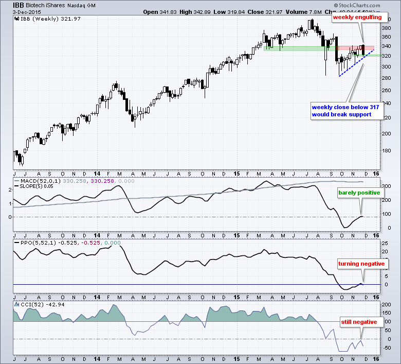
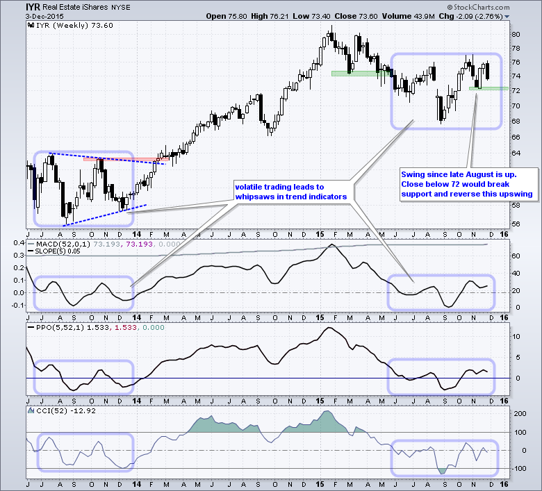
REITs and Biotechs Look Vulnerable
Friday Food For Thought
Andreas Clenow shows How the CLENOW Portfolio Makes a Fool out of the S&P 500. Basically, Clenow exposes the "highly inferior weighting system of the S&P 500, and most other equity indexes".
MAN AHL looks at Overfitting and Its Impact on the Investor. The key takeaway: an overfitted strategy will underperform in the future.
Wisdom Trading does its monthly update on the State of Trending Following. This is based on several trending-following systems using a diverse mix of global futures.
Cesar Alvarez looks at the Hi-Lo Index as a Market Timing Indicator. Alvarez worked with Connors Research for years and co-authored the book, Short-term Trading Systems that Work (with Larry Connors).
Jeff Hirsch of the Almanac Trader looks at how Early Gains Fade by Mid Month in December. This article also includes a nice chart that plots historical performance throughout December. Key takeaway: there is a dip in the second week of the December and prices then turn up in the third and fourth weeks.
****************************************
Thanks for tuning in and have a good day!
--Arthur Hill CMT
Plan your Trade and Trade your Plan
*****************************************


