SystemTrader // Crossing Over to the Dark Side! // Key Performance Metrics // Setting the Benchmark // Quantifying the Golden Cross // Risk-adjusted Returns versus Drawdowns // Winners versus Losers // Ratio Metrics // Backtesting Even Further
I have scrutinized charts for years, if not decades, and now I am making a step towards quantitative analysis. The Dark Side. Over the years, I have tried to incorporate a more systematic approach to my analysis by using quantifiable indicators. There is always an element of interpretation involved, but I am trying to reduce subjectivity and increase objectivity. Don't get me wrong here. I am not giving up my beloved charts. Instead, I want to quantify what I see on the charts and set some expectations based on historical performance.
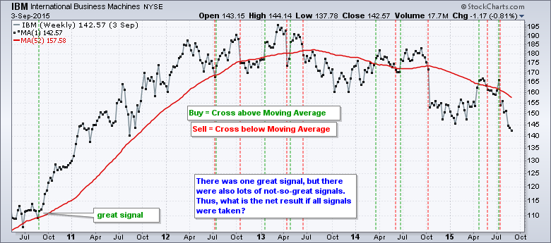
The chart above shows weekly closes for IBM and there is a 52-week moving average in red. There are lots of signals on this chart, but we don't know the net result of all signals. At the very least, I want to know what is the net profit, if any, from taking all these signals. Does a 52-week moving average cross really work?
This is the first of a new series of articles on trading strategy. These articles are designed to help chartists develop a systematic approach to trading and investing. Using the indicators at StockCharts, I will show different strategies and put these strategies to the test. We will crunch the numbers to determine what works and what doesn't work. These test results will give traders an idea of what to expect from certain strategies. Over the coming months I will cover trend following, momentum, rotation, mean reversion, risk management, exits and more. And, of course, I will put the PPO Strategy and the CCI-StochRSI Strategy through the wringer too. Let the journey begin!
The trading strategies will be tested with the help of Cesar Alvarez of AlvarezQuantTrading.com. Many of you may be familiar with Cesar because he has written several books on quantitative systems and was Director of Research at Connors Research. His books include High Probability ETF Trading and Short-term Trading Strategies that work. For more information about his testing and consulting services, click here.
Key Performance Metrics
A trading strategy is only as good as its performance, but there are many ways to measure performance. According to Merriam-Webster, a "metric" is "something set up as an example against which others of the same type are compared". Performance metrics, therefore, are used to compare different trading strategies and help us find the one that suits our trading style. The rest of this article will describe these key metrics using examples from a golden cross strategy.
 Profit is a very important metric because we would not consider a system that was not profitable. Profit, however, only tells part of the story. We need an array of performance metrics to fully understand the mechanics of a trading strategy. Among other things, traders need to know how often the strategy trades, the winning percentage and the size of the drawdowns. These performance metrics will then help us set realistic expectations when running the strategy in real time.
Note that there are many different trading strategies and styles out there. Some traders like high winning percentages and small profits, while others prefer larger profits and lower winning percentages. Your preferred performance metric might not suit someone else's preferred metric. This article simply shows some of the performance metrics that I deem important to trading strategy assessment.
Setting the Benchmark
First and foremost, we need a benchmark strategy to compare against other strategies. This is typically a buy-and-hold version using the asset classes involved in the strategy. A stock-only strategy would likely use the S&P 500 as its benchmark. A stock-bond strategy would be benchmarked against a buy-and-hold portfolio with stocks and bonds.
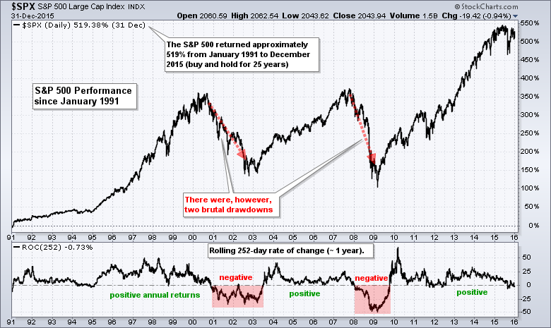
Chartists testing a long-only timing strategy for the S&P 500 over a 25-year period should compare its performance to buy-and-hold for the S&P 500 over that same 25 year period. The chart below shows the S&P 500 returning around 519% from January 1991 to December 2015 (25 years). We will look at the annual returns and the drawdowns a little later.
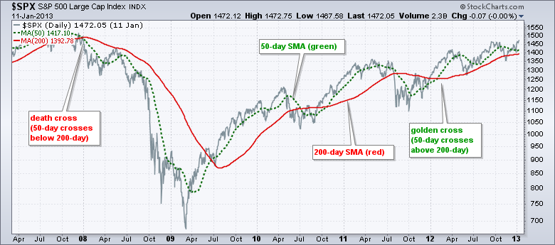
Testing the Golden Cross
Let's compare this buy-and-hold return with the golden cross strategy. This strategy buys when the 50-day SMA crosses above the 200-day SMA (golden cross) and sells when the 50-day crosses below the 200-day (death cross). This is a long-only strategy that moves to cash on a death cross. This strategy would have returned 667% over this same 25 year period. The return is higher because the golden cross strategy would have avoided the big drawdowns in 2001-2002 and 2008-2009.
Risk-adjusted Returns and Drawdowns
Compound Annual Return (CAR): This is the annualized rate of return based on system performance over the entire test period. This number is important because it gives us an idea of the annual return we can expect for a trading strategy. The golden cross strategy returned 8.48% annualized and buy-and-hold returned 7.55% annualized.
Exposure%: This is the average percentage of capital exposed to the market during the strategy test. Typically, we want a strategy that is using most of its capital. While unexposed capital can be used elsewhere and less exposure means less risk, I would not want a system with less than 50% exposure. On average, 75% of capital was exposed to the market (at risk) using the golden cross. This means 25% was not exposed because the strategy went to cash on a death cross. Holding cash helped immensely during the bear markets of 2001-2002 and 2008. Buy-and-hold, of course, was fully invested at all times and exposure was 100%.
 Risk-adjusted Return (RAR): This is the ratio of the Compound Annual Return and Exposure Percent. RAR equals CAR when exposure is 100%. The RAR rises as the exposure falls because there is less risk when not exposed to the market. A Compound Annual Return of 5% with 50% Exposure would produce a Risk-adjusted Return of 10%. The Risk-adjusted Return for the golden cross strategy jumped to 11.32%, but the Risk-adjusted Return for buy-and-hold stayed the same because of 100% exposure. The table below summarized the last three metrics and the Maximum Drawdown, which is next.
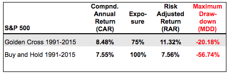 Maximum Drawdown (MDD): This is the maximum peak to trough drawdown of the trading strategy over the test period. This number is important because it gives us a worst-case scenario to consider. Notice that buy-and-hold had a maximum drawdown of -56.74% and this would be pretty difficult to stomach. This drawdown occurred in 2008, which was the financial crisis. The Maximum Drawdown was around -20% for the golden cross strategy and this occurred in May 2011 (scene of the flash crash). A simple moving average crossover system would not have prevented a loss, but it would have reduced the loss and this means there will be more capital available for the next signal.
Winners versus Losers
The next metric group breaks down the winners and losers. We need to know how often the strategy wins and losses, as well as the average win percent relative to the average loss percent.
 Winners and Average Win: This is the number of winning trades and the average percent gain from each win. Typically, we would like to see more winners than losers and the average gain outpace the average loss. The golden cross strategy worked very well from 1991 to 2015 with 10 winners and just 1 loser. The performance was not as good from 1960 to 1991 though. I will show a table with the performance metrics since 1960 at the end of this article.
Losers and Average Loss: This is the number of losing trades and the average loss from each loss. The fewer the losses and the lower the average loss the better. Traders can also figure the total number of traders by adding the winners and losers.
Ratio Metrics
The next group focuses on ratios to measure the return versus the drawdown, the profits relative to the losses and the percentage of winners.
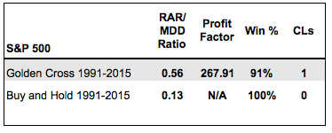 RAR/MDD: This ratio tells us the Risk-adjusted Return relative to the Maximum Drawdown. A number above 1 means the RAR is greater than the MDD, while a number below 1 means the RAR is less than the MDD. In general, I would like to see the RAR that is greater than the MDD.
Profit Factor: The total profit ($) from the winners divided by the total losses ($) from the losers. This is like an after the fact reward-to-risk ratio. It tells us how much we made relative to each loss. Anything over 1 shows a profitable trading strategy. A Profit Factor of 2.5 means we made a $2.5 profit for every $1 of loss.
Win%: This is the number of winners divided by the number of winners plus the number of losers. It is easy to say we want more than 50%, but the winning percentage will depend on the strategy. In baseball, a good batting average is 300 (.300). In basketball, shooting 50% from the field is considered good, real good.
Consecutive Losers (CLs): This is the number of consecutive losing trades. It is important because it gives us an idea of how much pain we may have to endure. There will be losing trades and it is important that we use proper position sizing to insure that we can absorb a string of losses.
Backtesting Even Further
The golden cross test from 1991 to 2015 produced just 11 signals, which is not a very big sample size. Also note that the S&P 500 was up substantially over this period. For a little more perspective, I ran this backtest from January 1960 to the present. The key performance metrics can be seen in the table below.
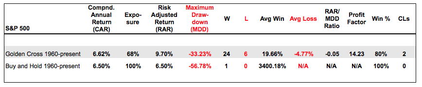 It is clear that there is an edge to be gained by using one of the simplest moving average crossover systems. There were 24 winners and 6 losers for an 80% win rate over the last 55 years. The annual rate of return was similar for buy-and-hold and the golden cross strategy, but the Risk-adjusted Return was much higher because the golden cross strategy limited exposure.
The biggest drawdown for the golden cross strategy occurred in 1987 with the market crash. Outside of this drawdown, the biggest drawdown was around 20%, which is much better than the buy-and-hold drawdown. Note that there were three drawdowns greater than -40% with buy-and-hold. At the very least, the golden cross strategy can reduce drawdowns and increase Risk-adjusted Returns.
Performance metrics provide a pretty good idea of how a strategy performs and how the process might unfold in real life. The real world situation, however, can turn out different. Past performance does not guarantee future performance. Nevertheless, these metrics will help us understand the trading strategy and set our expectations. This is vitally important because it will help us stick with the strategy and prevent unnecessary tweaking.
Next week I will expand on this test by looking at the Dow, Russell 2000, Nasdaq 100 and S&P 500 Equal-Weight Index. I will also see if an exponential moving average works better and then optimize to see what is the best moving average. Don't expect any holy grails tough. And finally, I will see if short positions add any value.
****************************************
Thanks for tuning in and have a great weekend!
--Arthur Hill CMT
Plan your Trade and Trade your Plan
*****************************************


