Weekly Market Review & Outlook .... All Time Highs Affirm Bull Market .... QQQ Continues to Lead on the Charts .... Small-caps Extend Stall .... Eight of Nine Sectors have Golden Crosses .... Tech, Industrials and Consumer Discretionary Lead .... Finance Breaks mid December low .... Energy Sports a Bullish Wedge .... Staples and Utilities Hit Potential Reversal Zones .... Healthcare Remains an Enigma .... Bond ETFs Resume Bigger Downtrend .... Utilities, Staples and Gold Could fall along with Bonds .... Gold Enters Potential Reversal Zone .... Oil Remains within Rising Channel .... Dollar Corrects within Bigger Uptrend.... //// ....
Weekly Market Review & Outlook
Using ETFs for analysis, today's Weekly Review & Outlook will cover the broad market, the sectors, bonds, yields, gold, oil and the Dollar. This will become a regular Friday feature to offer weekend chartists a thorough overview of current trends and conditions. I will take a step back by looking at one year bar charts and focusing on the bigger trends at work. I will also highlight patterns and setups within these trends when appropriate. I am still developing the format and coverage. Your feedback is always welcome (see comments section at bottom).

The stock market turned mixed over the last five weeks, but the bull market remains in place and any weakness should be seen as a mere correction within the bigger uptrend. Large-caps (SPY) stalled since mid December, small-caps (IJR) drifted lower and large-techs (QQQ) moved higher. One could interpret small-cap weakness as negative and large-tech leadership as positive. I will take the latter because the total market cap of these 100 large-cap tech stocks is much higher than the market cap of the 600 small-caps.
Chartists should consider watching bonds for the next move in stocks. The 20+ Yr T-Bond ETF bounced over the last few weeks and the decline in the 10-yr T-Yield weighed on banks. Falling yields also helped gold, consumer staples and utilities the last four to five weeks. This may be about to change because the bigger trend for the 10-yr yield is up. As shown in detail below, there are signs that the short-term pullback is reversing and this bigger uptrend in Treasury yields is resuming. I alluded to this in last Friday's commentary and it appears to be happening this week.
A rise in yields and decline in bonds would mean money moving out of relative safe-haven assets. This money has to go somewhere and usually finds its way into stocks, which are riskier assets. This is why we should watch TLT and IEF for clues on stocks, especially small-caps and banks.
All Time Highs Affirm Bull Market
Programming note: I will post a video on Saturday morning. The big trend is up for the S&P 500 SPDR (SPY). This is not an assumption, but a fact. The ETF hit a new all time high less than two weeks ago so the big trend can be nothing other than up. Also note that the 50-day EMA has been above the 200-day EMA since April 1st and the key breadth indicators have been on bull signals since late March. This is a bull market. Based on this long-term uptrend and bull market, I will assume that declines are pullbacks and pullbacks provide opportunities to partake in the bigger uptrend. The challenge, of course, is estimating the depth of any pullback and timing a subsequent short-term reversal. Sometimes there is no pullback and the market simply stalls before resuming its uptrend, which could happen now. The five week stall is, after all, a correction of sorts and the bigger uptrend remains the dominant force.
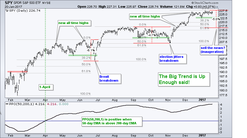 Last week I showed that the "support" breaks and "breakdowns" provided bullish opportunities in late June and early November. These support breaks were part of corrections because the bigger trend was up at the time. This is why I would not become concerned if SPY breaks its 30-Dec low at 222.73 (green line). I suspect that such a move would lead to a 4-6% pullback and I would then look for an opportunity in the 218 area. There are three Fibonacci Retracements on this chart (gray lines) and three 4-6% pullbacks (red lines). The first retracement was around 38.2% (June) and the second was around 50% (November). A 50% retracement of the prior advance would extend to the 218 area and the August highs are in this area (broken resistance turning support).
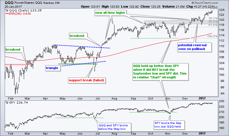
QQQ Continues to Lead the Charts
QQQ started showing relative chart strength in early November and continues to lead with a 52-week high again this week. QQQ is clearly the chart leader because SPY, IJR, IWM and MDY did not hit new highs this week. Chart strength started when QQQ held its September low and SPY did not. This was a nice precursor to QQQ's market leading advance since early December. The big trend is clearly up and I am marking the first potential reversal zone in the 118-120 area (broken resistance and the 38-50% retracement zone).
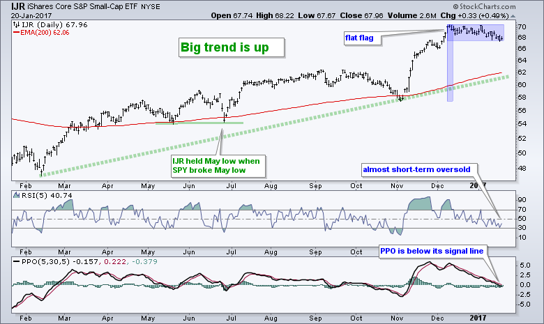
Small-caps Extend Stall
The S&P SmallCap iShares (IJR) peaked on 9-Dec and moved sideways the last five weeks. Actually, there is a slight downward drift because the ETF moved to its lowest point of the consolidation. I still consider this a bullish consolidation after a sharp surge. The ETF is also close to becoming oversold. Chartists looking for some sort of upturn can turn to the PPO (5,30,5), which remains below its signal line. A move above the signal line would signal an upturn in bullish momentum and provide the early sign that this consolidation is ending.
Eight of Nine Sectors have Golden Crosses
The next charts show the 9 sector SPDRs with the 50-day EMA and 200-day EMA, and either 10-day RSI or the PPO (5,30,5). RSI is used to identify oversold conditions (<30) when the bigger trend is up. I am using 10-day RSI instead of 5-day RSI because this Friday report is aimed at the medium-term. By extension, 10-day RSI is less volatile than 5-day RSI and generates fewer signals, which makes it more geared toward the weekend chartist. The PPO is shown when I am watching for an upturn or downturn.
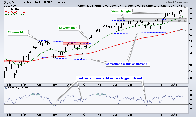
First, note that the 50-day EMA is above the 200-day EMA for eight of the nine sector SPDRs. The HealthCare SPDR (XLV) is the only one with the 50-day EMA below the 200-day EMA, which makes it the clear laggard and the weakest of the nine. Second, note that the Consumer Discretionary SPDR (XLY), the Industrials SPDR (XLI) and Technology SPDR (XLK) hit new highs this week and they are the clear chart leaders. Together, XLY, XLK and XLI account for around 43% of SPY. Throw in materials and finance, and well over 50% of the S&P 500 is performing well. I will now go through the individual charts in order of chart strength (strongest to weakest).
Tech, Industrials and Consumer Discretionary Lead
The Technology SPDR surged to new highs in early December and then worked its way higher the last four weeks. Broken resistance and the 50% retracement mark the first potential reversal zone to watch should we see a pullback. The indicator window shows 10-day RSI moving below 30 just three times since late April. In contrast, 5-day RSI moved below 30 seven times during the same timeframe. This is why 10-day RSI is for less aggressive traders and better suited for the weekend chartist.
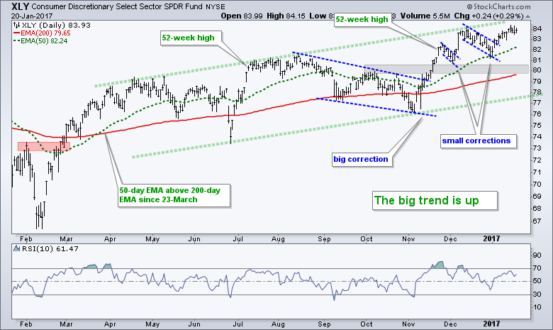
 The Consumer Discretionary SPDR (XLY) broke flag resistance with a surge in early January and hit a 52-week high this week. The overall trend is clearly up and the short-term breakout is holding. Should we get a pullback, I would mark the first potential reversal zone in the 80 area.
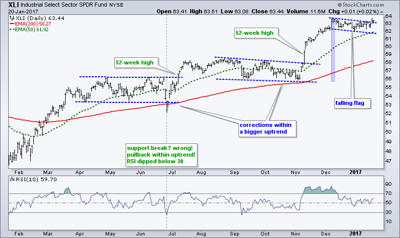
 The Industrials SPDR (XLI) surged to a new high in early December and then formed a falling flag, which is a bullish continuation pattern. The ETF broke flag resistance on Thursday and recorded another a new high in the process. No weakness here.
Finance Breaks mid December low
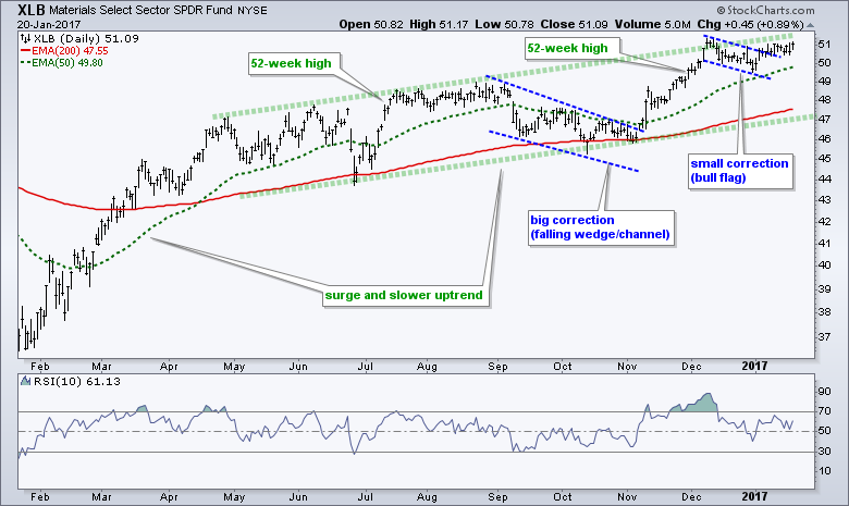
The Materials SPDR (XLB) broke flag resistance and then stalled. The flag breakout, however, it still holding and still bullish. In addition, the overall trend is clearly up with a rising channel since May. Even if the flag breakout fails, I would be more inclined to buy a pullback as long as the bigger trend is up.
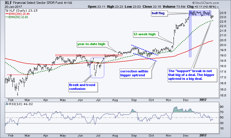
 The Finance SPDR (XLF) led the market from early November to early December and then formed a tight consolidation (flat flag). The ETF did not break to the upside and instead moved below the flag lows. This "failed flag" may seem bearish, but the bigger trend is still up and this means I am focusing only on bullish signals and setups. Perhaps a test of the rising 50-day EMA will provide an opportunity or RSI will become oversold (<30).
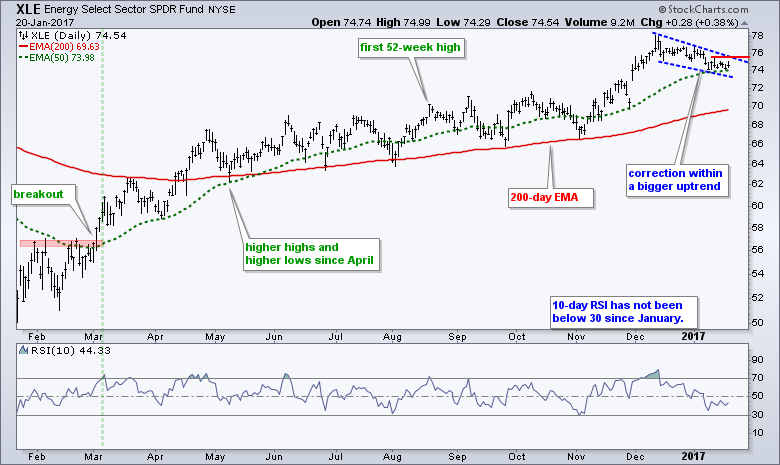
Energy Sports a Bullish Wedge
The Energy SPDR (XLE) hit 52-week highs in mid December and then corrected with a falling wedge. A wedge breakout at 76 would reverse this short-term downtrend and signal a continuation of the bigger uptrend. 10-day RSI has not been below 30 since January and this shows just how shallow the pullbacks were from May to November.
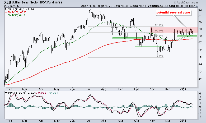
Staples and Utilities Hit Potential Reversal Zones
Even though the Consumer Staples SPDR (XLP) and the Utilities SPDR (XLU) are perking up, they are not on my bullish radar for two reasons. First, we are in a bull market and this favors the offensive sectors. Second, I think the 10-yr T-Yield is in a long-term uptrend and possibly turning back up again. This combination argues for underperformance from defensive groups like consumer staples and utilities. On the price chart, XLU is trading in a potential reversal zone marked by the 50-62% retracements. A break below this week's low and a PPO move into negative territory would be bearish.
XLP broke flag resistance with a surge this week and the 50-day edged above the 200-day. Nevertheless, the bigger trend is still down and XLP has one of the weakest charts of the nine sectors. A break below the early January low and a PPO move into negative territory would be bearish.

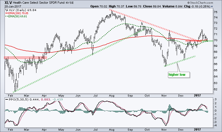
Healthcare Remains an Enigma
The HealthCare SPDR (XLV) is a difficult call because a few choice words could send the sector lower. It is also the weakest of the nine sectors and this means there are better choices out there right now. On the price chart, the 50-day EMA is just below the 200-day EMA, but the ETF is trading right at both EMAs. There is a slight uptrend since the November low and I am watching the breakout near 70 quite closely. A close below 69.8 would call for a re-evaluation.
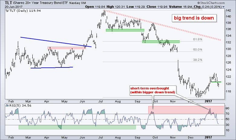
Bond ETFs Resume Bigger Downtrend
The 20+ YR T-Bond ETF (TLT) and the 7-10 YR T-Bond ETF (IEF) are in long-term downtrends and it looks like the counter-trend bounces reversed this week. First, both broke down in September-October and recorded 52-week lows in December. The ETFs then bounced from mid December to mid January and retraced around a quarter (25%) of the prior decline. Admittedly, this retracement is rather shallow because I would normally expect at least a 33.3% to 38.2% retracement. For those wondering where these numbers come from, 33.3% comes from Dow Theory and 38.2% is a Fibonacci number.
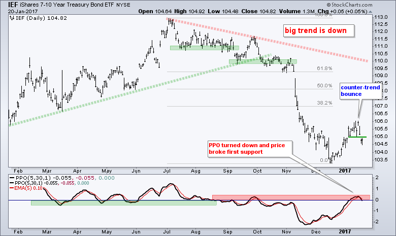 The shallow retracements point to a rather weak counter-trend bounce and subdued buying pressure. Moreover, this bounce appears to be ending as TLT and IEF broke their first support levels and the PPO (5,30,5) turned down. This is the first sign that the short-term uptrend, or counter-trend bounce, has reversed and the bigger downtrend is resuming.
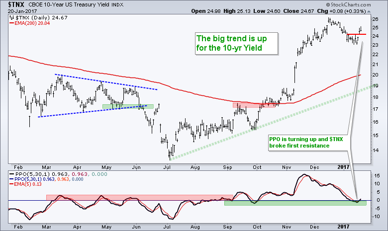
 The next chart shows the 10-yr T-Yield ($TNX) moving opposite of the T-bond ETFs. $TNX turned up and reversed the short-term downtrend. Also notice that the PPO turned up.
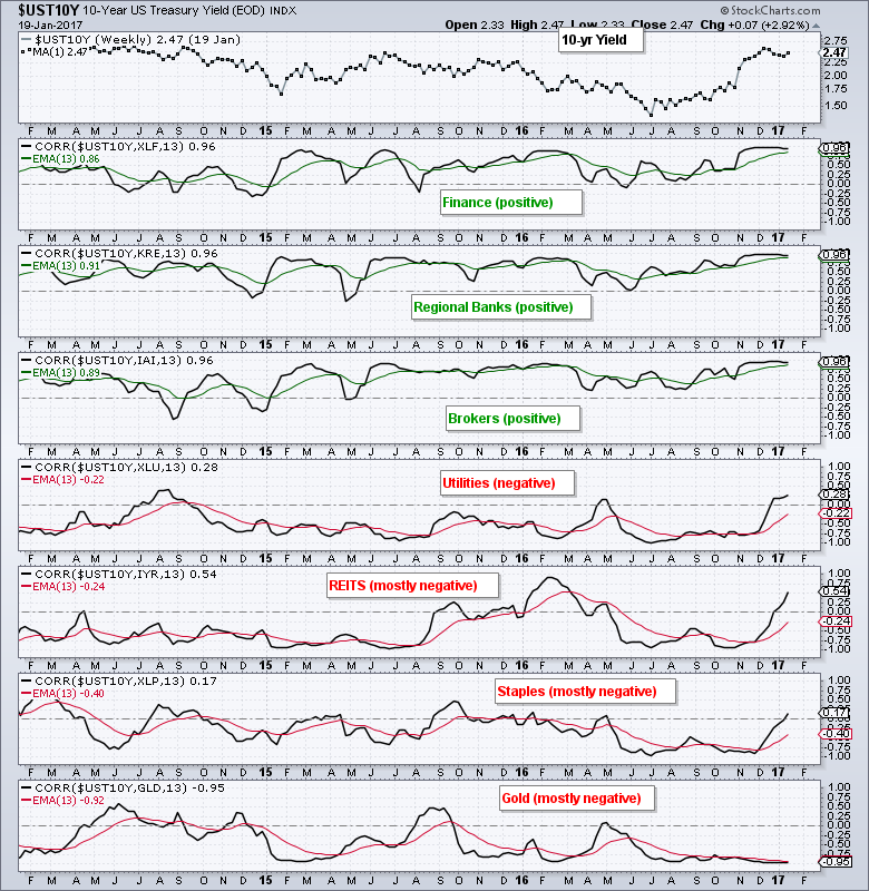
Utilities, Staples and Gold Could fall along with Bonds
Utilities, staples, REITs and gold bounced as the 10-yr T-Yield fell. As the Correlation Coefficients below suggest, these groups may come under selling pressure if this reversal in the 10-yr yield holds. Utilities, REITS, Staples and gold are negatively correlated to the 10-yr T-Yield. In contrast, the finance sector, banks and brokers are positively correlated. This means a resumption of the bigger uptrend in the 10-yr T-Yield could spark another leg higher for these groups.
Gold Enters Potential Reversal Zone
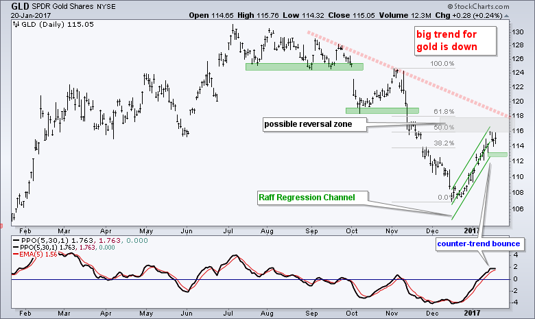
The Gold SPDR (GLD) chart looks similar to the TLT and IEF charts above. First and foremost, the long-term trend is down and this is the dominant force at work. I am one with the force and the force is with me (Chirrut Îmwe from Rogue One). Even though the surge from 107 to 116 (~8%) looks impressive from a five week stand point, it looks like a counter-trend bounce from a six month view. GLD hit the edge of a potential reversal zone marked by the 50-61.8% retracement. The green Raff Regression Channel and rising PPO define the short-term uptrend. A downturn in the PPO and support break would reverse this short-term uptrend and signal a continuation of the bigger downtrend.
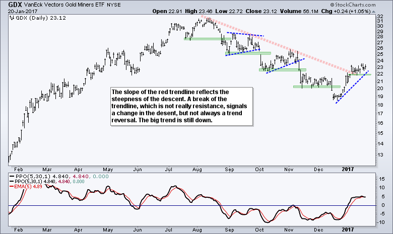
 The Gold Miners ETF (GDX) bounced along with gold, but I am not ready to call for a major trend reversal because gold remains in a long-term downtrend. A close below the mid January low would reverse the five week bounce and signal a continuation of the bigger downtrend.
Oil Remains within Rising Channel
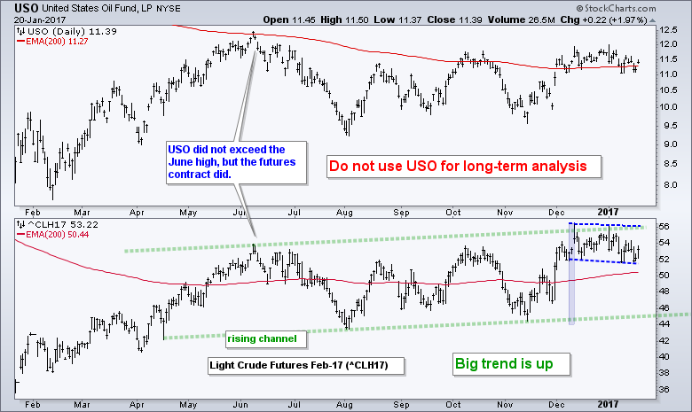
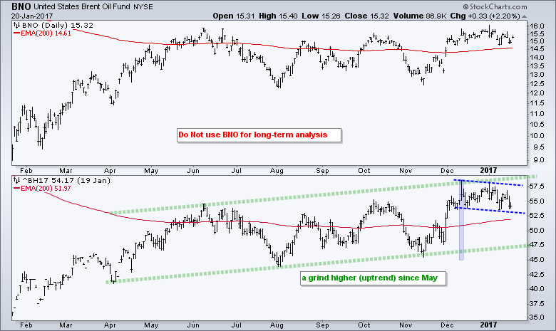
Oil remains in a rising channel since April and the big trend is up. Note that I am using February Light Crude (^CLH17) for analysis because it best reflects the overall trend for oil. Oil surged from 45 to 56 from mid November to mid December and then stalled the last five weeks - kind of like the S&P 500. This stall looks like a falling flag of sorts and oil is trading near its five-week lows (support?). Note that falling flags are bullish continuation patterns and this favors a bounce of the flag lows. The second chart shows February Brent (^BH17) with a similar chart.
Dollar Corrects within Bigger Uptrend
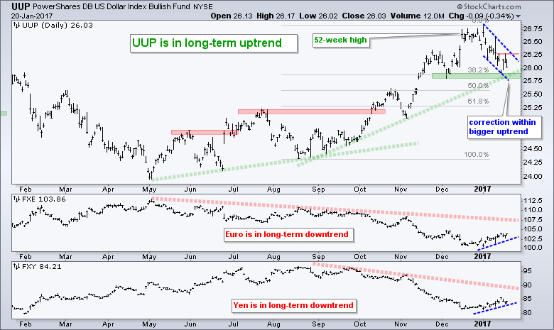
The next chart shows the US Dollar ETF (UUP) in a long-term uptrend with a 52-week high a few weeks ago. Conversely, the Euro ETF (FXE) and Yen ETF (FXY) are in long-term downtrends. The Dollar fell back over the last few weeks and this looks like a mere correction within the bigger uptrend. The 38.2% retracement and December low mark the first potential reversal zone in the 25.75-26 area. The blue trend lines define a falling flag and a break above 26.3 would be bullish for the greenback (and bearish for gold).
******************************************************
Spotting Pullbacks and Upturns within an Uptrend using RSI and MACD Histogram.
Difference between EMA and SMA - Using %Above 200-day EMA for Breadth Analysis.
Backtesting Different Moving Average Pairs with SPY, QQQ and IWM.
ETF Master ChartPack - 300+ ETFs organized in a Master ChartList and in individual groups.
Follow me on Twitter @arthurhill - Keep up with my 140 character commentaries.
****************************************
Thanks for tuning in and have a good day!
--Arthur Hill CMT
Plan your Trade and Trade your Plan
*****************************************


