.... XME - A Mere Correction or More? (plus COPX)
.... Steel Stocks Dominate XME
.... HACK and IGN Perk Up within Technology
.... Vanguard Finance ETF Stalls after Gap
.... Respect for Bank Analyst Dick Bové (plus GS)
.... Think you Really Know what Drives a Stock?....
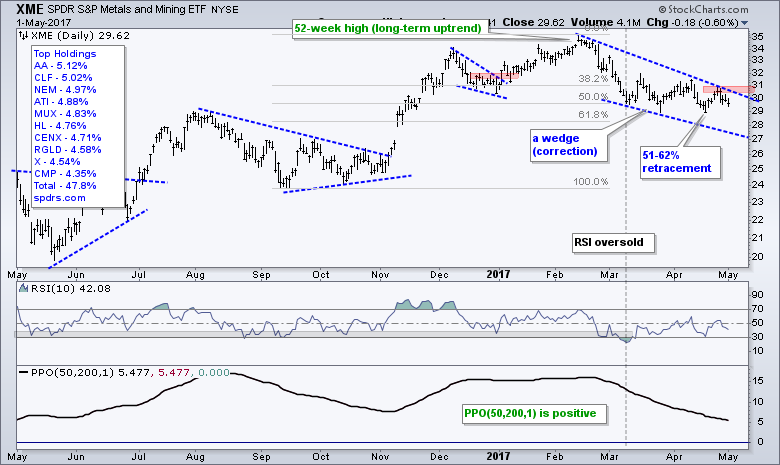
XME - A Mere Correction or More? (plus COPX)
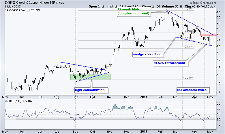
The Metals & Mining SPDR (XME) has lagged the market in 2017 and did not partake in the tech-led advance. Nevertheless, I still see an overall uptrend on this chart and a correction from mid February to now. My very first task as a technical analyst is to identify the bigger trend at work. In this case, the ETF hit a new high in mid February and the PPO(50,200,1) is positive, which means the 50-day EMA is above the 200-day EMA. Thus, the long-term evidence is still bullish. Assuming a bigger uptrend, this means I am assuming that the decline from 35 to 29 is a correction within that uptrend, not the start of a bigger downtrend. I could be wrong, but right now I view it as a correction. A falling wedge formed as XME retraced 50-62% of the prior advance (September to February). The pattern and the retracement are typical for corrections and I am on alert for a potential reversal. A close above 31 would provide the first sign that this correction is ending and the bigger uptrend is resuming. Elsewhere, note that the Copper Miners ETF (COPX) has s similar pattern and the Copper ETN (JJC) surged 2% on Monday. These two were highlighted in the Weekly Market Review & Outlook Video (~48 minute mark).
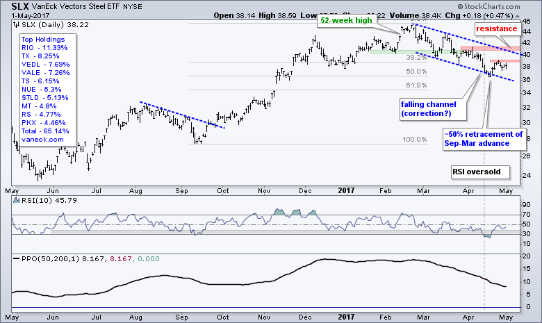
Steel Stocks Dominate XME
A look at SPDRs.com reveals that steel stocks dominate SLX because they account for 46% of the ETF. This means we should check in on the Steel ETF (SLX) for more clues. Unsurprisingly, SLX sports a similar chart with a 52-week high in February and a positive PPO(50,200,1). SLX also declined the last few months and this is considered a correction within a bigger uptrend. Note that I am not too concerned with the lines marking this correction or the pattern taking shape. These lines can form a wedge, channel or something in between the two. The key point is that I assume it is a correction when the bigger trend is up and I then look for signs that the correction is ending. There are two levels to watch for SLX. First, a close above 39 would show some follow through to the late April bounce. Second, a close above 41 would break the channel line and exceed the early April high.
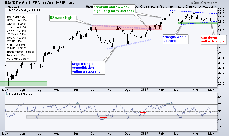
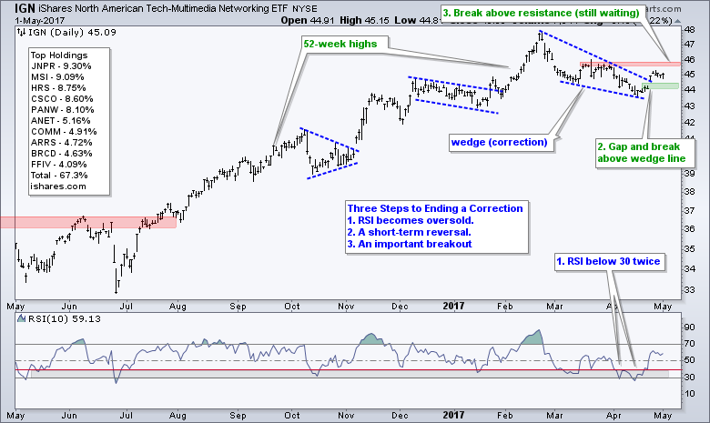
HACK and IGN Perk Up within Technology
The technology sector is leading the market in 2017, but the Cyber Security ETF (HACK) and the Networking iShares (IGN) are lagging since mid February. As with the XME and SLX charts above, I will go through the same exercise here. Both HACK and IGN are in long-term uptrends so I am assuming the patterns over the last few months are corrective in nature. A correction represents a rest within the trend. It can come in the form of a pullback, a sideways consolidation or a combination of the two. HACK formed a triangle and gapped down last Friday. The ETF is also making a bid to fill the gap and a breakout at 29.50 would signal an end to this correction.
The IGN chart highlights a three step process to ending a correction. First, IGN became oversold when RSI(10) moved below 30 and back above 30 twice. These signals were for the mean-reversion players. Second, IGN gapped up and broke the wedge line. This signal is for the early birds looking for a short-term upturn. The third signal has yet to materialize and this would be a break above the late March highs (close above 46). This signal is for the second mouse types looking for confirmation. The early bird gets the worm, but the second mouse gets the cheese because the first one gets caught in the trap! For now, I expect further strength as long as the gap holds at 44. A close below 44 would call for a re-evaluation.
Vanguard Finance ETF Stalls after Gap
When I take a position, bullish or bearish, I am looking for what could prove that position wrong. I am not too interested in agreement or reinforcement. In general, I am bullish on the banking sector and I think (thought) rising Treasury yields are positive. At least a simple chart shows the Correlation Coefficient ($TNX,VFH) in positive territory and this seems to prove it. The chart below shows the Vanguard Finance ETF (VFH) hitting a new high in February and correcting with a falling wedge into early April. The ETF gapped up last week and challenged resistance around 61. A close above 61.5 is needed to complete the breakout and signal a continuation of the bigger uptrend. Such a move would be quite positive for the broader market. The indicator windows show a strong positive correlation between the 10-yr T-Yield ($TNX) and VFH and a fairly positive correlation with the Yield Curve (10YR - 2YR).
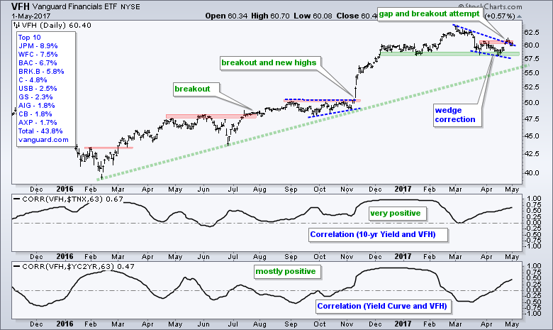
By noting the positive correlation with the 10-yr T-Yield ($TNX), I am building a "narrative" that ties bank performance with the 10-yr T-Yield and narratives are dangerous. In addition, keep in mind that correlation does not equate to causation. What happens if the correlation turns negative? My narrative would be proven wrong should yields go down and banks go up (or vice versa). I would then need to find a new narrative, which is a dangerous path. Simply replace the word "narrative" with "excuse" and you get the idea. This is why we should FOCUS on the price chart for the underlying asset and forget the narratives (excuses). VFH is bullish as long as its price chart says so. I now need to decide what it would take to turn this chart bearish and prove my bullish stance wrong. First, a close below 59 would fill the gap. Second, a close below the March-April lows would break support.
Respect for Bank Analyst Dick Bové
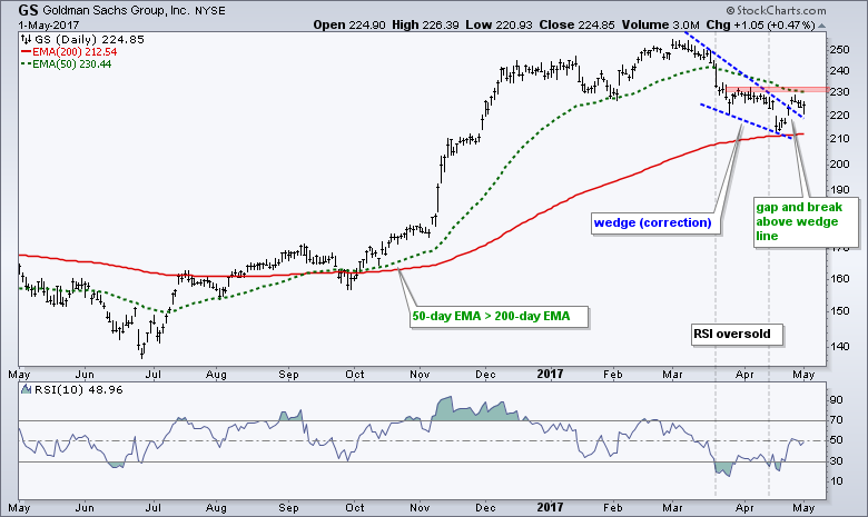
Having said all this, I will now link to a CNBC interview with Dick Bové, the legendary bank analyst who is bearish on banks. Bové throws the ice bucket on theory that bank stocks will rise if Treasury yields rise. Bové notes that banks make money by lending and lending fell in the first quarter. Truth be told, bank stocks rise and fall for lots of reasons (excuses). Treasury yields and the yield curve are but two inputs. When it comes to stocks, there are more inputs and narratives that we can imagine. Some will be right and some will be wrong. Price, however, will always be right. Bové notes that Goldman Sachs would be the biggest beneficiary if the big banks are forced to break up (Careful! That's a narrative).
Think you Really Know what Drives a Stock?
ETFs have changed the stock picking game because they are major stockholders. Most ETFs (90%) are passive and use an index for a benchmark. Active ETFs use quantitative analysis for a factor-driven process. ETFs do not buy-sell stocks because of narratives and narratives are not driving stock prices!
I listened to the Invest Like the Best podcast this past weekend (highly recommended). Patrick O'Shaughnessy interviews Danny Moses and delves into The Big Short, Buy-Sell Side Analysis and more. Here is a paraphrase from around the 32 minute mark.... If you pick a random company in the S&P 500, there is a chance, and probably more in the mid-cap and small-cap area, that 7 of the 10 largest shareholders of that company are ETFs. You are better off knowing what ETF holds your stock than what that company even does. That's scary to me (because) that’s when the fundamental investing theme goes by the wayside.....
Of note, the Vanguard Finance ETF (VFH) holds 6.3 million shares of JP Morgan, 8.4 million shares of Wells Fargo and 17.8 million shares of Bank of America. The Finance SPDR (XLF) has similar holdings, as do another dozen or so finance-related ETFs. ETF Database (ETFdb.com) has an exposure tool that will show how may ETFs hold certain stocks. Currently, 135 ETFs show Apple (AAPL) as a top 15 holding.
******************************************************
Spotting Pullbacks and Upturns within an Uptrend using RSI and MACD Histogram.
Difference between EMA and SMA - Using %Above 200-day EMA for Breadth Analysis.
Backtesting Different Moving Average Pairs with SPY, QQQ and IWM.
ETF Master ChartPack - 300+ ETFs organized in a Master ChartList and in individual groups.
Follow me on Twitter @arthurhill - Keep up with my 140 character commentaries.
****************************************
Thanks for tuning in and have a good day!
--Arthur Hill CMT
Plan your Trade and Trade your Plan
*****************************************


