 |
.... Sell in June to Avoid a Swoon |
Testing the Best Six Months Strategy
Seasonal patterns are the talk of the town with "go away in May" taking center stage. Thankfully, we have the means to test the classic six-month cycle and see how it actually performed over the last twenty years. Today I will put this cycle through the wringer and offer some adjustments for improvement. I will then build on these adjustments by adding some simple trend indicators for timing. The end result is pretty good and gives us something to watch as June draws near.
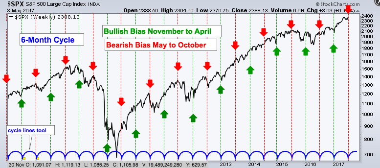
Popularized by The Stock Traders Almanac, the six-month cycle suggests that the period from May to October is the weakest six months of the year. In contrast, the period from November to April represents the strongest six-month period. The chart below shows the S&P 500 with the cycle lines marking six month periods, the red lines marking May and the green lines marking November.
A Twenty Year Testing Period
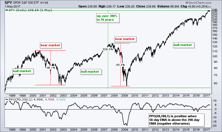
It is hard to measure a strategy's effectiveness with a visual inspection so I decided to put it to the test. The testing period ranges from May 1997 to May 2017 (20 years) and covers two bear markets, as well as three bull markets. Note that SPY was up over 300% during this timeframe with a Compound Annual Return of 5.62%. This buy-and-hold period, however, included two drawdowns that were around 50% each.
Best Six Months Versus Buy-and-hold and Golden Cross
The table below shows performance for buy-and-hold, the best six months, the worst six months and the golden cross (50-day EMA crossing above 200-day EMA). There is clearly some merit to the best-worst six month periods because the November to April period clearly outperformed the May to October period. Buying on November 1st and selling on May 1st returned +5.83% per year (green shading) while buying on May 1st and selling on November 1st resulted in negative returns (red shading -.21% per year).
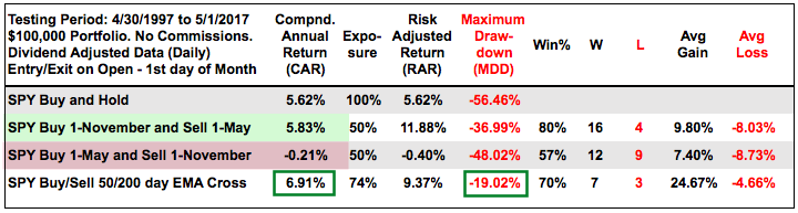 Note that the humble golden cross beat the best six months strategy with a higher return and much lower drawdown (green rectangles). Simply following the best six months strategy would not avoid the big drawdowns and this is why chartists should also employ some sort of timing mechanism.
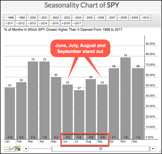
Four Months Stand Out on Seasonality Chart
A look at the Seasonality chart for the S&P 500 SPDR (SPY) shows a four month stretch between June and September with consistent weakness. On average, SPY closed higher just 52.75% of the time during these four months. Moreover, the ETF averaged a 1.1% loss over this stretch. In an interesting twist, July closed higher just 47% of the time, but the average gain/loss was a .40% gain.
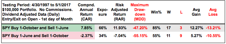
Testing the Strongest Eight Months
Based on the seasonality chart above, I ran some tests and came up with the best eight months strategy. Basically, one buys on October 1st and sells on June 1st, thus avoiding the dog days of summer and September. The table below shows the results outperforming the best six months strategy. Notice that the Compound Annual Return was 7.85% and the Win% was 85% (green shading). In contrast, the Compound Annual Return was a negative 2.37% when buying on June 1st and selling on October 1st (red shading). This four-month stretch is clearly the weakest of the year over the last twenty years.
 Seasonality Plus Timing Improves Returns
Seasonal patterns are interesting, but they cannot be used alone. Chartists need some sort of timing indicator to make sure the trend is on their side when seasonality is bullish. I will next test two trend signals during the bullish and bearish seasonal periods. Seasonality is bullish between October and May, and bearish between June and September. I will look for uptrends when seasonality is bullish and downtrends when seasonality is bearish. The chart below shows the two signals tested.
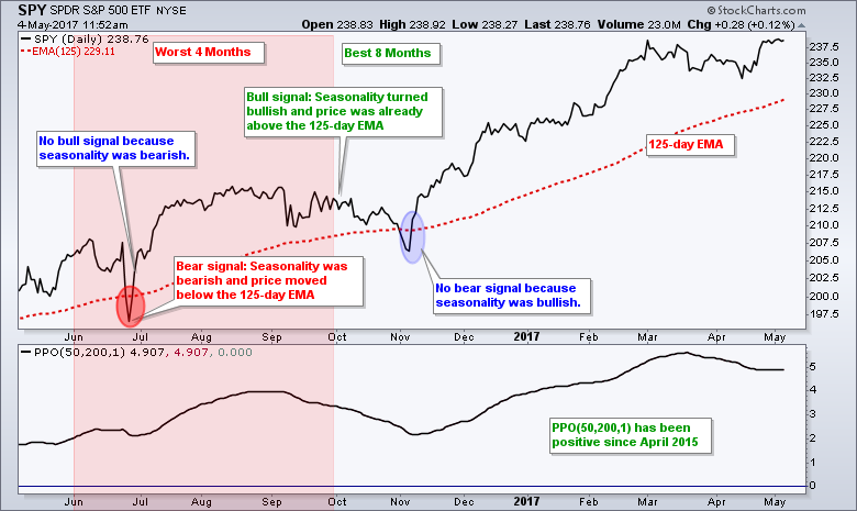 The first signal is simply when price is above or below the 125-day EMA (red dotted line). The second signal is when the 50-day EMA is above or below the 200-day EMA. I am measuring this with the PPO(50,200,1), which is positive when the 50-day EMA is above the 200-day EMA. Basically, a bullish signal triggers when seasonality is bullish AND price is already above the 125-day EMA or price subsequently moves above the 125-day EMA. A bearish signal triggers when seasonality is bearish AND price is below the 125-day EMA or subsequently moves below the 125-day EMA. A signal requires both a seasonal signal AND a trend signal, not just one or the other.
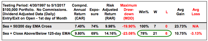
Backtest Results for Seasonality Plus Timing
The table below shows the results for seasonality and timing. The golden cross with seasonality worked a little better than the golden cross without seasonality (first table). Seasonality combined with the 125-day EMA cross returned almost 10% per year over the last twenty years. There were two big drawdowns during this period (-23.08% in 2002 and -18.76% in 2008). The five largest drawdowns averaged 16.3%, which is not too bad for a 9.8% Compound Annual Return and a 14.16% Risk-adjusted Return.
Conclusions
There is clearly something to be said for the worst four-month period, which includes the dog days of summer and September. The S&P 500 SPDR is up some 15% from its November low and still in bull mode with the worst four month period right around the corner. Even so, the trend is clearly up and the trend holds more sway than seasonality. Chartist can watch two things as June nears. First, a break below the April low (support) would be negative. Second, a close below the 125-day EMA during June would suggest that a correction is underway and the fish are biting. In other words, that might be the signal that it is a good time to go fishing!
The backests were conducting using Amibroker software.
******************************************************
Spotting Pullbacks and Upturns within an Uptrend using RSI and MACD Histogram.
Difference between EMA and SMA - Using %Above 200-day EMA for Breadth Analysis.
Backtesting Different Moving Average Pairs with SPY, QQQ and IWM.
ETF Master ChartPack - 300+ ETFs organized in a Master ChartList and in individual groups.
Follow me on Twitter @arthurhill - Keep up with my 140 character commentaries.
****************************************
Thanks for tuning in and have a good day!
--Arthur Hill CMT
Plan your Trade and Trade your Plan
*****************************************


