.... Vodafone in Dollars vs Pounds
.... Index versus ETF versus Currency
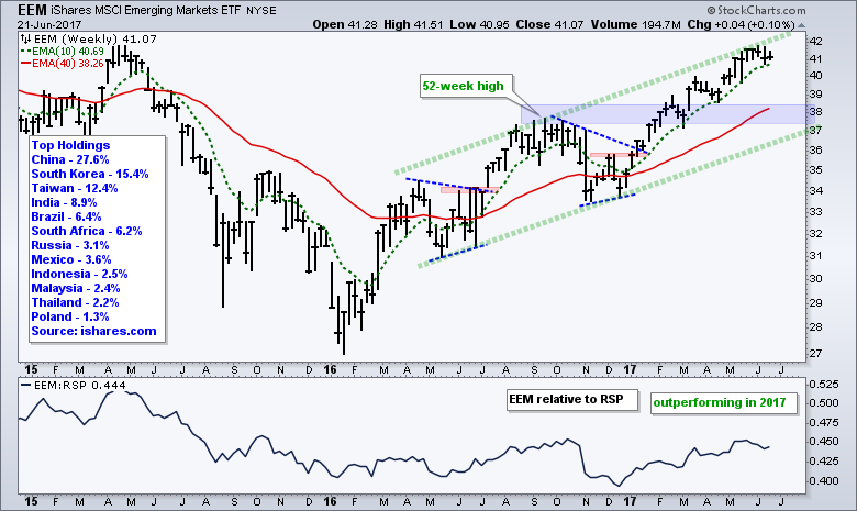
.... Emerging Markets ETF Hits Top of Channel
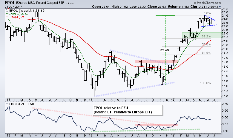
.... Poland ETF Stalls within Uptrend
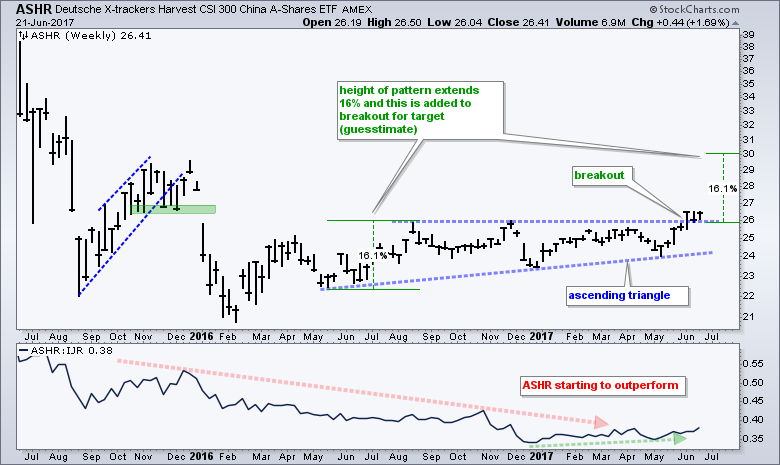
.... China A-Shares ETF Breaks Out
.... Italy and Spain Consolidate Gains ....
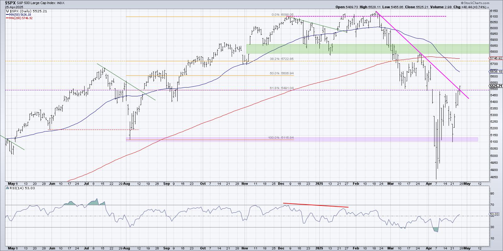
Vodafone in Dollars vs Pounds
Today I will take a look at some international ETFs. Before looking at some individual chart patterns, I would like to cover the currency effect. I will use Vodafone as an example because the Pound was hit hard with the Brexit vote. Vodafone in the US trades as an ADR (VOD). Basically, the ADR owns Vodafone in British Pounds (VOD.L) and converts the share values to Dollars. This means a rising Pound will be positive for the ADR and a falling Pound will be negative. The chart below shows Vodafone in Pounds (VOD.L) rising 10% from June 23rd to August 15th, and the British Pound ETF (BXP) falling 13.5%.
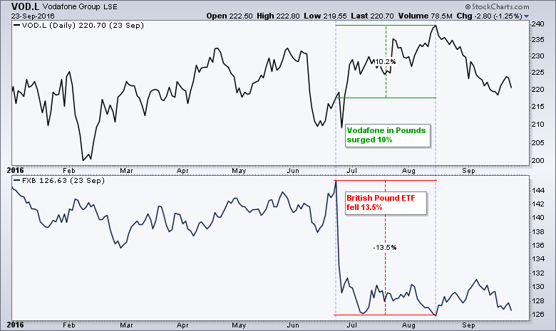
The next chart shows the Vodafone ADR (VOD) and Vodafone in Pounds (VOD.L) during this same timeframe. VOD in Dollars fell 3.3% while VOD.L in Pounds rose 10%. Vodafone in Dollars was negatively affected by the sharp drop in the Pound. Notice that VOD.L hit a new high in August, while VOD in Dollars did not come close to its pre-Brexit high.
I picked an extreme example to highlight an adverse currency effect, which is pretty hard to predict. The bigger question is: should we consider currencies separately when investing in international ETFs and ADRs? My short answer is no. The simple reason is that the currency effect will be reflected in the price chart of the ETF or ADR. If we truly wanted to separate the stock and the currency, we would need to analyze the stock in its local currency and the currency itself. The ETF or ADR puts these together with one price plot and that is all we need for trading or investing signals. The Vodafone ADR reflects what is happening with Vodafone in Pounds and the Pound itself.
Index versus ETF versus Currency
The next chart shows the German DAX Index ($DAX) in the top window, the Euro ETF (FXE), the Germany iShares (EWG) and the iShares Currency-Hedge Germany ETF (HEWG). As far as I am concerned, the price of German stocks in the local currency ($DAX) is the main driver for the Germany iShares and the Currency-Hedged Germany ETF. The Euro certainly has its effect, but the influence of the local-priced stocks is more often than not greater. There are three sections on this chart with blue vertical lines marking the dividers. The first section shows the German DAX, Germany iShares and Currency-Hedged Germany ETF falling as the Euro ETF rose. The second section shows the Euro ETF falling as the other three rose. Clearly, the DAX had a bigger influence than the currency. The third shows all four rising from December to June.
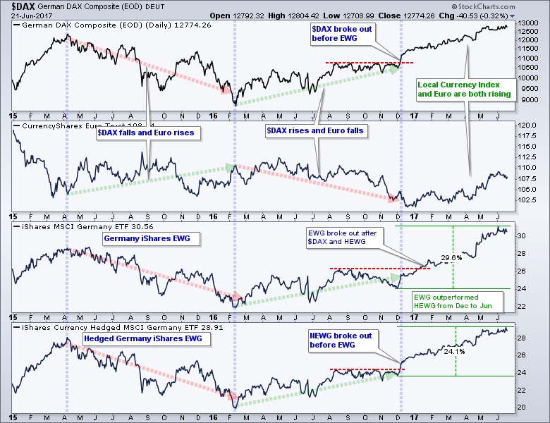
There are a lot of ETFs and charts to follow out there and we must pick our battles. If you want to know how Germans are feeling and their economic prospects, look at the German DAX Index ($DAX) because it is based on the local currency. If you are trading or investing in ETFs, then focus on the country ETF and ignore the currency (my choice). Remember, the currency effect is already baked in to the price of the ETF. If you are really concerned about the currency, then look at the hedged ETF. Hedging is not as easy as it seems though. On the chart above, notice that the Currency-Hedge Germany iShares broke out in December, while the Germany iShares did not break out until January. Even so, the Currency-Hedged Germany iShares underperformed the Germany iShares from December to June. Bottom line: analyze the chart you are trading and don't get bogged down with the rest.
Emerging Markets ETF Hits Top of Channel
The Emerging Markets ETF (EEM) is one of the leading international ETFs this year with a 20+ percent gain since mid December. I do not see a topping pattern, but the ETF is a bit extended and ripe for a rest. The green trend lines mark a rising channel and EEM is near the top of its channel. The blue zone marks broken resistance and the mid April low, as well as the rising 40-week EMA. EEM has been above its rising 10-week EMA since early January and this is the first level to watch. A weekly close below this level would show some weakness and suggest that a correction is unfolding. Chartists should then watch the 38 area as potential support on any pullback. Before leaving EEM, notice that Asian stocks dominate: China, South Korea, Taiwan and India account for over 60% of the ETF.
Poland ETF Stalls within Uptrend
The Poland ETF (EPOL) is one of the best performing emerging market countries with a 50% gain since mid November. The ETF is currently consolidating at high levels with a triangle of sorts. An upside breakout would signal a continuation of the bigger uptrend. While a downside break would be negative, I think it would set up the next opportunity. The March-April consolidation and 38% retracement mark potential support in the 21.5-22 area.
China A-Shares ETF Breaks Out
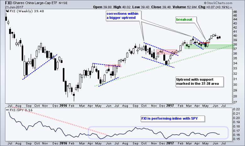
The CSI 300 China A-Shares ETF (ASHR) broke out of a long ascending triangle with a surge three week's ago and this breakout is holding. The ETF bottomed in February 2016, advanced until August 2016 and then stalled for almost a year. This breakout is bullish, as is a fresh 52-week high. The indicator window shows the ASHR:IJR ratio turning up as the China A-Shares ETF starts to outperforming US small-caps. The next chart shows the China iShares (FXI), which represents large-caps, for reference.
Italy and Spain Consolidate Gains
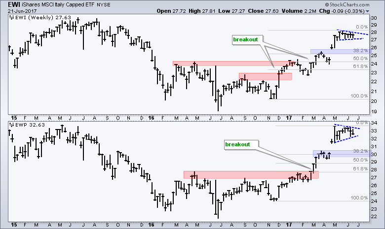
The Italy iShares (EWI) and Spain iShares (EWP) show similar patterns with breakouts early this year and sharp advances from November to May. Both stalled over the last five to seven weeks with consolidation patterns and chartists can watch these boundaries for the first direction clue. Upside breakouts would signal a continuation of the bigger uptrend, while downside breaks would argue for a correction. The late March high and 38% retracement mark a potential support/reversal zone on both charts (blue areas). Keep in mind that these reversal zones are guesstimates because we never know how far a pullback will extend.
******************************************************
ETF Master ChartPack - 300+ ETFs organized in a Master ChartList and in individual groups.
Follow me on Twitter @arthurhill - Keep up with my 140 character commentaries.
****************************************
Thanks for tuning in and have a good day!
--Arthur Hill CMT
Plan your Trade and Trade your Plan
*****************************************