 As with Charles Dow, I work under the assumption that the trend is in force until proven otherwise. And, in accordance with Dow Theory, neither the length nor the duration can be forecast. We can, however, identify trend changes and act accordingly.
The stock market is in a delicate spot right now. The long-term trend is still up for the S&P 500, but the senior index is in the midst of a correction (immediate downtrend). Even though the S&P 500 managed an intraday reversal on Friday and modest gain on Monday, I am not ready to call for an end to the correction.
Therein lies the rub: long-term uptrend and short-term downtrend (correction). I do not know how long or how far this correction will extend. Key indicators tell me the correction has yet to reverse and this means I expect the correction to extend (lower prices and/or choppy trading).
Mind the Falling Channel
The S&P 500 touched its 200-day SMA on Friday between 1 and 2 PM. This marked last week's low as the index surged into the close and gained another 1.4% on Monday. The index is now up around 4.5% since midday Friday.
The bounce off the 200-day SMA was not entirely unexpected (see Friday's report), but I am not impressed Monday's follow through. The index may be well off its low, but it also remains well below last week's closing high (~2700).
The chart below shows the current decline using 30 minute bars. I do not use intraday charts very often, but this decline is only 12 days long and 30 minute bars capture the downtrend quite well.
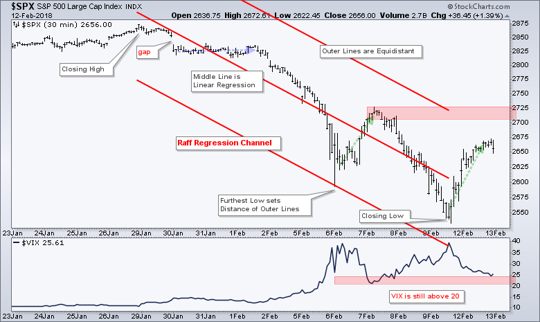
Working from the top left to the lower right, we have a gap down on 30-Jan, a sideways consolidation, a plunge on 5-Feb, a counter-trend bounce, another plunge to new lows and another counter-trend bounce.
Prices are clearly trending down with lower lows and lower highs. The Raff Regression Channel and 7-Feb high combine to mark a resistance zone in the 2700-2725 area. I will not entertain bullish thoughts until there is a breakout here and the VIX moves below 20.
New Lows Expand
New lows expanded last week with the most 52-week lows since February 2016. This expansion shows a serious increase in the number of stocks in strong downtrends and suggests that the correction is likely to extend before it ends.
The chart below shows new 52-week highs and new 52-week lows for the S&P 500, S&P Mid-Cap 400, S&P Small-Cap 600 and Nasdaq 100 over the last three years. The blue horizontal lines are set at plus 10% (new highs) and minus 10% (new lows) for each index (50/-50 for $SPX, +40/-40 for $MID etc...).
There are three periods on the chart worth highlighting. First, the red ovals show when new lows started expanding in July 2015. This new low expansion foreshadowed the market plunge in mid-August 2015.
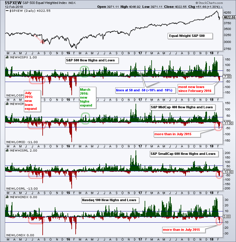 Stocks remained on the defensive until early 2016. The green ovals mark the second period in March 2016 and this is when new highs started expanding again. Notice that $SPX New Highs (!NEWHISPX) exceeded +10% (50) in mid-March and late March. $MID New Highs (!NEWHIMID) joined by moving above +10% in late March.
The red ovals in 2018 mark the third period and the recent expansion of new lows is similar to what we saw in July 2015. Notice that $MID New Lows (!NEWLOMID) exceeded 10% (40) and even exceeded 50, which is more than in July 2015. Also notice that $NDX New Lows (!NEWLONDX) hit 11 last week and this is more than in July 2015.
The expansion of new lows tells me that around 10% of stocks in the S&P 1500 are in strong downtrends and these stocks are weighing on the broader market. Counter-trend bounces are possible, but I would not look for an end to this correction until new highs take over again.
Chart Explanation: I am using "Price - Up/Down Pair" to plot the high-low indicators as a histogram on the chart. StockCharts members can click on this chart to open it in SharpCharts and see the settings.
High-Low Lines Turn Down
Chartists can also plot the High-Low Lines to identify corrective periods and the end of corrective periods. The High-Low Line is a cumulative measure of High-Low Percent, which is new highs less new lows divided by total issues.
The chart below shows the S&P 1500 High-Low Line turning down and moving below its 10-day EMA for the first time since August (red oval). The High-Low Line is quite smooth already so we can often use a short EMA to identify upturns and downturns.
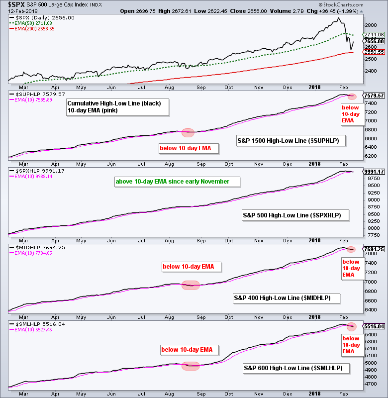
The S&P 500 High-Low Line remains above its 10-day EMA and has been above this EMA since early November 2016. The High-Low Lines for the S&P Small-Cap 600 and S&P Mid-Cap 400, however, moved below their 10-day EMAs last week. These are the first downturns since mid August 2017.
High-Low Line Signals Using the PPO
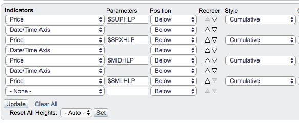
The chart above creates the High-Low Lines by selecting "Price" as the indicator, typing the symbol in the parameters box ($SUPHLP) and using "cumulative" as the style.
Chartists can also create a High-Low Line in the main window, add an EMA and then add the Percentage Price Oscillator (1,10,0) to identify crossovers. The chart below shows an example using S&P 1500 High-Low Percent ($SUPHLP). Note that the S&P 1500 consists of the S&P 500, S&P Mid-Cap 400 and S&P Small-Cap 600. This is the single best representative of for stock market breadth (IMHO, of course).
The PPO(1,10,0) turns negative when the High-Low Line moves below its 10-day EMA and positive when the High-Low Line moves above its 10-day EMA. The three year chart shows several whipsaw crosses as well as a few good trends. Whipsaws are all part of the game and one good trend usually pays for them all.
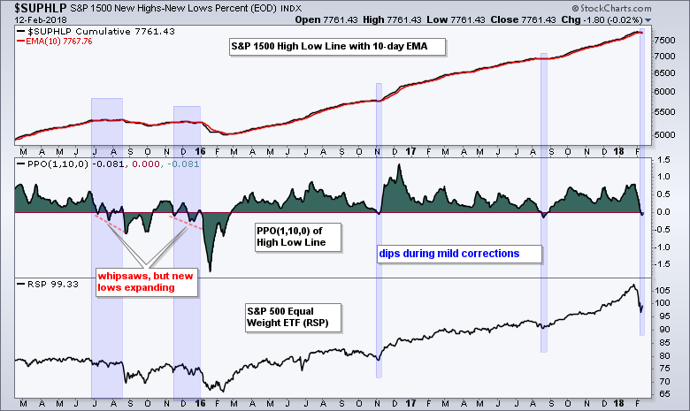
There are two things to point out. First, notice how the PPO forged lower lows in July 2015 and November-December 2015. These lower lows showed new lows expanding and foreshadowed the August plunge and the January-February plunge.
Second, notice that dips into negative territory came towards the end of corrections in November 2016 and August 2017. These were short corrections within a very strong uptrend.
The PPO turned negative recently, but it is too early to tell if this the end of a short correction or the start of an extended correction. I think we are starting an extended correction because of the first chart shows the most new lows since February 2016.
Plan Your Trade and Trade Your Plan.
- Arthur Hill, CMT
Senior Technical Analyst, StockCharts.com
Book: Define the Trend and Trade the Trend
Twitter: Follow @ArthurHill


