- The Main Driver for Stocks.
- Rate-of-Change Reaches an Extreme.
- Two Relatively Clean Bottoms.
- A Messy Bottom in 2011.
- Watching the 200-day First.
- Notes from the Art's Charts ChartList.
 The Main Driver for Stock Prices
Today's report will focus on the S&P 500 because the S&P 500 is the best benchmark we have for the stock market. Even though it is driven by large-caps, it is the most widely followed barometer and represents over 80% of the total US stock market.
I am focused on this index because it holds the key to the performance of other stocks and stock ETFs. In other words, most stocks and stock ETFs will go along with the S&P 500. The direction of the S&P 500, therefore, is the single most important factor when it comes to individual stocks and stock ETFs.
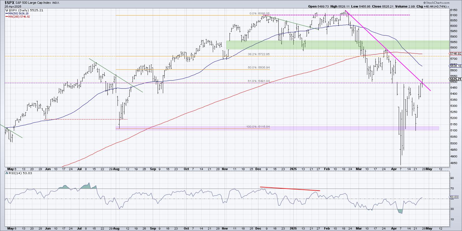
As noted in the Art's Charts Notes below, many ETFs are currently in 50-61.8% retracement zones and RSI is near 30 (short-term oversold). Many of these ETFs are down sharply over the last few weeks, but these declines started from 52-week highs. Thus, the declines are still considered corrections within a bigger uptrend.
Pullbacks and short-term oversold conditions within bigger uptrends are normally opportunities. However, the S&P 500 remains in corrective mode and this could override these bullish setups. As such, I prefer to wait for signs that the correction in the broader market is ending.
Today's commentary will look back at past corrections so we might learn what to look for in the coming weeks. No two corrections or bottoms are the same, but there are some similarities. I will first look at S&P 500 performance after a gut-wrenching decline and then show indicator setups to help identify a bottom.
Rate-of-Change Reaches an Extreme
The chart below shows the S&P 500 with the 9-day Rate-of-Change. I chose nine days because the current decline is nine days and I want to compare this with other nine day declines.
First, notice that 9-day ROC dipped below 10% for the third time since the March 2009 low. Second, notice that 9-day ROC dipped below 7% for at least the 10th time since the March 2009 low. In other words, this is the 10th time in nine years that the S&P 500 has fallen over 7% in nine days.
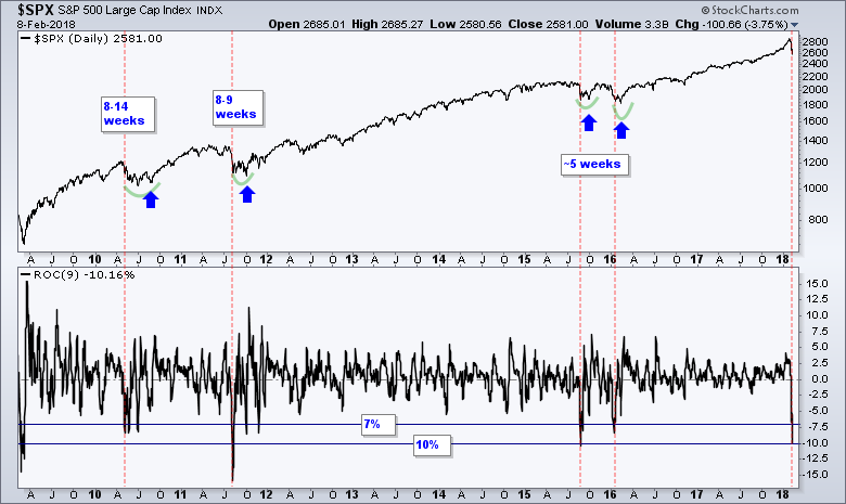
The red vertical lines mark the initial dip below 7% (May 2010, August 2011, August 2015, January 2016 and February 2018). Notice that the S&P 500 needed five to fourteen weeks to fully bottom after each dip. In addition, notice that the S&P 500 bounced and retested the initial low each time (blue arrows).
The current decline in the S&P 500 represents a blow to the bull market, but it is not a knockout punch. As with a prizefighter, the market is down for the count after a 10.16% decline in nine days. The market will likely attempt a bounce soon, but this bounce could be wobbly because of the recent blow. In other words, we could see a retest of the lows and it may take a little time to fully stabilize.
Two Relatively Clean Bottoms
The next chart shows the S&P 500 with the double dip bottoms in August-September and January-February. The red line shows when the 9-day Rate-of-Change dipped below 7% for reference.
There are three things to watch for a robust bottoming signal. First, RSI forms a bullish failure swing. Second, the S&P 500 Volatility Index ($VIX) moves below 20. Third, the S&P 500 %Above 50-day EMA (!GT50SPX) dips below 30%, bounces, forms a higher low and breaks out.
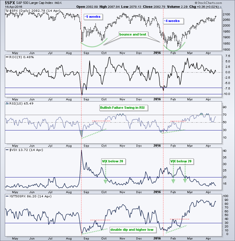
The bullish failure swing in RSI is independent of price action in the S&P 500. In other words, a positive divergence is not part of the signal. According to Wells Wilder, a bullish failure swing forms when RSI dips below 30, bounces above 30, falls again, holds above 30 and then breaks the intermittent high.
A Messy Bottom in 2011
The 2011 bottom was quite messy because there were some bad signals from mid-August to mid-September. Note that the S&P 500 recorded eights swings greater than 7% from early August to early October.
The price chart shows some interesting setups and signals. First, the S&P 500 broke below the August low in early October, but immediately rebounded to form a bear trap (which is bullish).
Second, the index broke resistance in late October and then pulled back with a 61.8% retracement. This pullback provided a second chance to partake in the reversal. Third, there was another small pullback with the falling wedge and this offered a third chance.
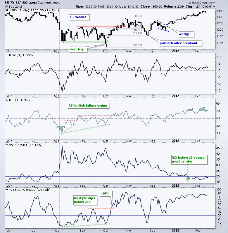
The indicators were all over the place in 2011 with a few early signals that proved to be bad signals. Chartists can reduce the number of bad signals by setting bullish thresholds for RSI and %Above 50-day EMA.
Notice that momentum got going when RSI broke above 60, which puts it firmly in the upper half of its range. The S&P 500 %Above 200-day EMA took off with a break above 50%, which means more than half the stocks in the index were above their 50-day EMA. There was, however, another dip below 30% in late November.
Note that the 2010 bottom was just as messy as the 2011 bottom. In both cases, the S&P 500 Volatility Index ($VIX) did not move below 20 until the S&P 500 was comfortably above a resistance level and the %Above 50-day EMA was above 80%.
Watching the 200-day First
Even though I know what to look for, this correction could be different because it is coming after two moonshots and a parabolic advance. The index was up 18% from August to January and 12.4% from mid November to late January. This correction is correcting an excess. There was an overshoot on the way up and there could also be an overshoot on the way down.
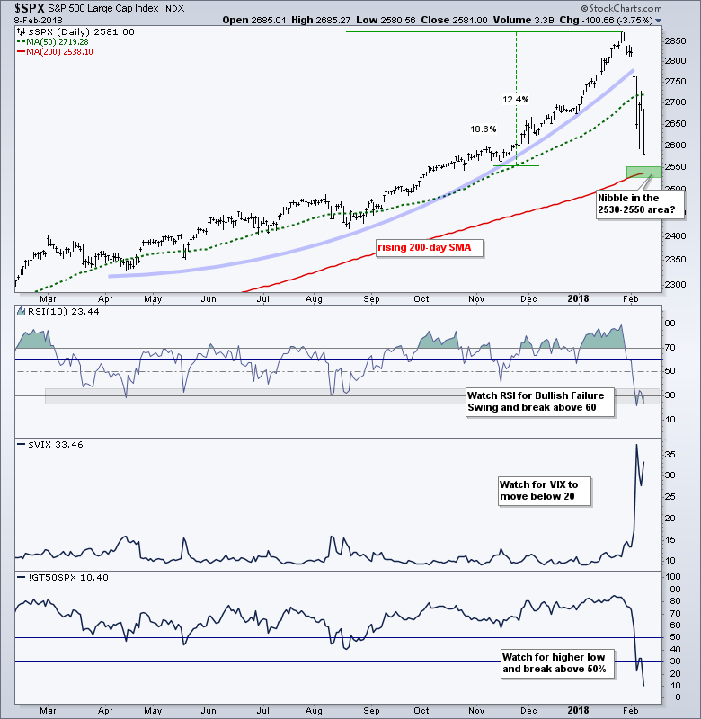
Picking support is a guesstimate because we are in a free fall, but I would hazard a guess that the 2530-2550 area might be a place to catch the falling knife. The rising 200-day SMA is in this area.
Other than catching the falling knife, I will just take it one day at a time and watch the indicators for signs. I would not worry about missing the bottom because the market usually provides a second chance with a pullback or retest of the lows.
Notes from the Art's Charts ChartList
- The Home Construction iShares (ITB) moved into the 50-61.8% retracement zone and RSI moved below 30 for the first time in over a year.
- The Cloud Computing ETF (SKYY) fell around 10% from a 52-week high and RSI moved below 30 for the first time since August.
- The Cyber Security ETF (HACK) fell around 8% from a 52-week high with a 50-61.8% retracement and RSI dipped below 30 twice.
- The Internet ETF (FDN) held up relatively well this month because it remains positive year-to-date and RSI did not dip below 30.
- The Semiconductor SPDR (XSD) led the tech-related ETFs lower with a 14% decline from its 52-week high.
- The Software iShares (IGV) is holding up better than most because it is still positive year-to-date. RSI is almost oversold at 30.56
- The Broker-Dealer iShares (IAI) fell back to the 50-61.8% retracement zone and RSI dipped to 30.51.
- The Regional Bank SPDR (KRE) fell back to the triangle consolidation with a 50% retracement and RSI neared 30 (31.83).
- The iShares Aerospace & Defense ETF (ITA) held up relatively well because it is still positive on the year and RSI did not dip below 30. Support is close at hand.
- The Biotech iShares (IBB) plunged after a 52-week high and is back in the top of the Nov-Dec consolidation. RSI is also oversold (29.61)
- The Biotech SPDR (XBI) held up relatively well because it is still positive year-to-date and RSI did not dip below 30. The Metals & Mining SPDR (XME) fell back to the 50-61.8% retracement zone and broken resistance zone. RSI is also oversold with two dips below 30.
Plan Your Trade and Trade Your Plan.
- Arthur Hill, CMT
Senior Technical Analyst, StockCharts.com
Book: Define the Trend and Trade the Trend
Twitter: Follow @ArthurHill