- SPY Continues to Meander.
- Sector Performance Remains Mixed.
- Seven Industry Group ETFs Stand Out.
- Regional Bank SPDR Forms Continuation Pattern.
- QQQ, Top Stocks and the 50-day SMAs.
- Leading Stocks with Bullish Charts.
 SPY Continues to Meander
The S&P 500 SPDR (SPY) got a nice oversold bounce the last two days and moved back above the mid point of the 2018 range. Frankly speaking, I could argue a bull case or a bear case on this chart. SPY is 8% above the February low, 5% below the January high and pretty much unchanged since February 2nd, one month ago.
While the two day recovery seems impressive, keep in mind that SPY was down 3.7% in three days after Thursday's close and a short-term oversold bounce is pretty normal.
With this Friday-Monday bounce, SPY forged a reaction low and we can now draw a proper trend line extending up from the February low (one that is not too steep). Would you like a trend line that seems less steep? Simply change the date range from six months to three months.
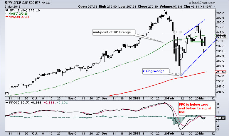
A rising wedge is taking shape since the February low. This is typically a bearish continuation pattern, but the wedge is actually bullish as long as it rises. After all, the wedge still has higher highs and higher lows, and these are what an uptrend is all about. I would speculate that Monday's low is the first level to watch for a reversal break. A close below 267 would break the wedge line and erase Monday's gain.
Sector Performance Remains Mixed
Year-to-date sector performance is mixed with two sectors standing out. The PerfChart below shows year-to-date Rate-of-Change for the nine equal-weight sectors in 2018. Four are up and five are down.
The EW Technology ETF (magenta) is the clear leader (+9.63%) with the largest gain and the EW Finance ETF (green) is a distant second (+3.04%). The EW Healthcare ETF (purple) is also up (2.60%) year-to-date and showing some strength.
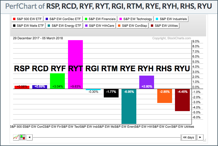
The EW Energy ETF (teal) is the clear laggard (-6.95%) with the EW Utilities ETF (cordovan) showing the second biggest loss (-4.45%). The EW S&P 500 ETF (red), which is the aggregate of the nine sectors, is up a fraction (+.58%) year-to-date. Thus, the broader market is flat and this means sector, industry group and stock selection are important.
Seven Industry Group ETFs Stand Out
The S&P 500 formed a peak January 26th, five weeks ago (25 days), and has yet to exceed this peak. This peak now marks a benchmark high that chartists can use for comparison. Sectors, industry groups and stocks trading at or above this high show strength and can be considered the leaders.
I ran a scan of 50 industry group ETFs and ranked the results by the 25-day Rate-of-Change to see which groups are leading and outperforming. For reference, note that SPY is down around 5% over the last 25 days. The image below shows the top 17 performers and only seven are positive since January 26th (above the green line).
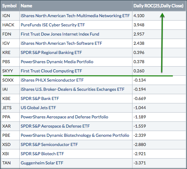
There are five technology-related ETFs in the top seven. In addition, we can also see strength in the Media ETF (PBS) and the Regional Bank SPDR (KRE). Elsewhere, the Semiconductor iShares (SOXX), Broker-Dealer iShares (IAI), Aerospace & Defense ETF (PPA) and Biotech SPDR (XBI) are down, but showing less weakness than SPY, which means relative strength.
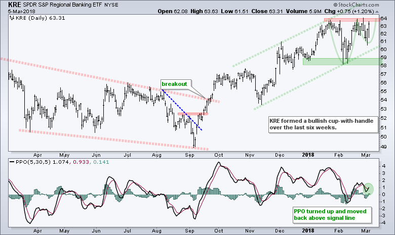
Regional Bank SPDR Forms Bullish Pattern
The Regional Bank SPDR (KRE) formed a cup-with-handle over the last six weeks and a breakout at 64 would extend the current uptrend. Note that a cup-with-handle is a bullish continuation pattern that forms within a bigger uptrend.
QQQ, Top Stocks and the 50-day SMAs
The next chart shows QQQ and the top five components, which account for around 45% of the ETF. The chart shows these with the 50-day SMA and 200-day SMA. I do not think a moving average offers any kind of special support or resistance. It is just a yardstick that chartists can use to compare performance and get a trend bias.
QQQ and three of the five components are above their 50-day SMAs. Facebook and Alphabet are still below these medium-term simple moving averages (red shading). Thus, FB and GOOGL are showing less strength than the others. QQQ would likely further strengthen if these two can retake their 50-day SMAs and join the other three top stocks.
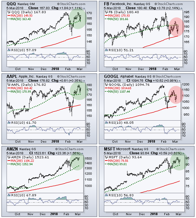
Chartists can also watch the 50-day SMAs for QQQ, AAPL, AMZN and MSFT (green shading). QQQ is in good shape as long as it holds the 50-day. Apple and Microsoft also need to hold. A break below the 50-day SMA by APPL and MSFT would tilt the balance negative and argue for a pullback in QQQ.
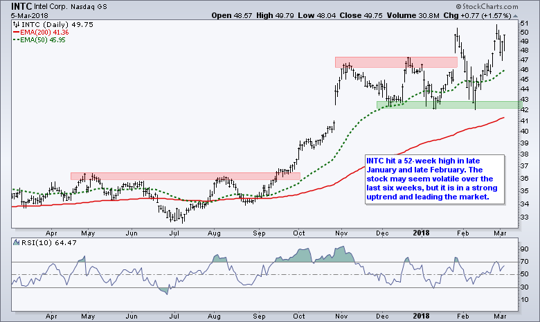
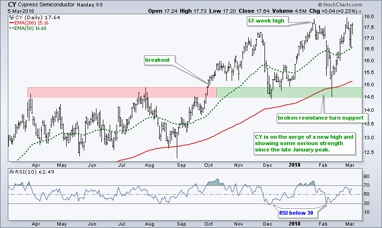
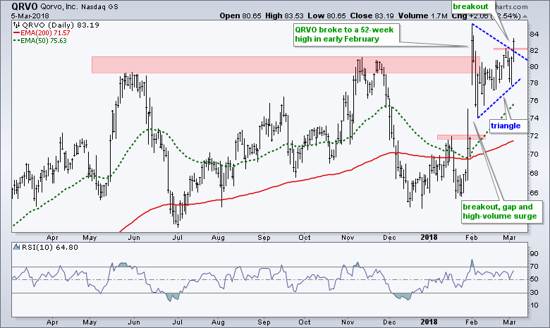
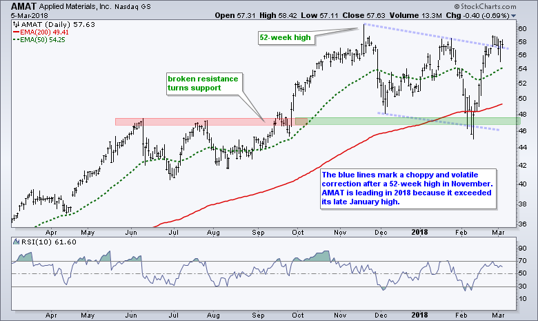
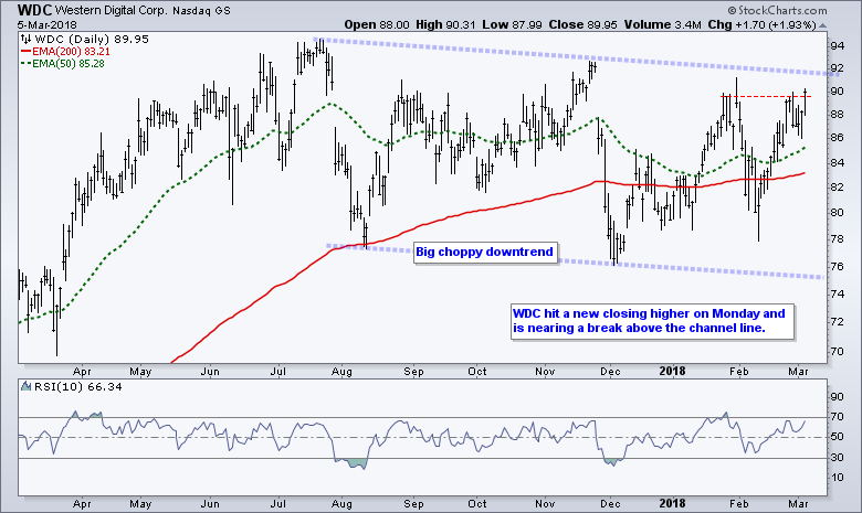
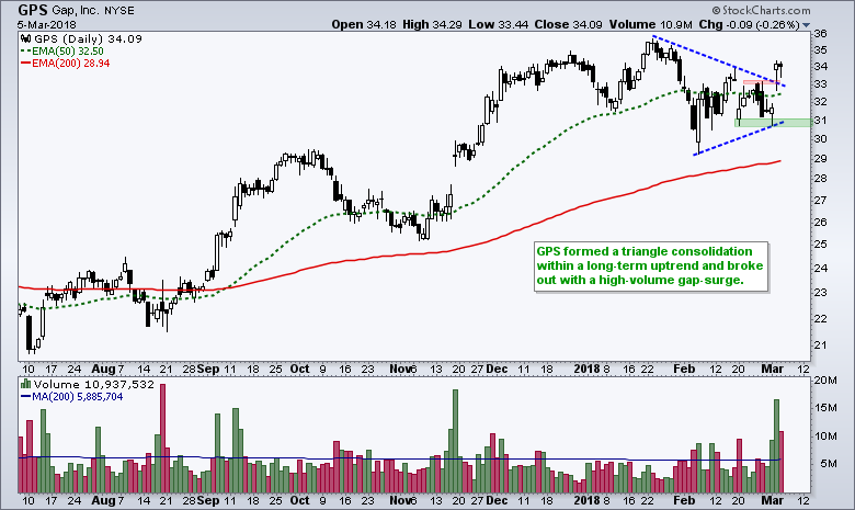
Leading Stocks with Bullish Charts
Even though I am rather lukewarm on the broad market environment, there are pockets of strength and there are leaders to be found. Technology and finance are the strongest sectors overall. The next charts will highlight some stocks showing bullish patterns and strength over the last 25 days.
Plan Your Trade and Trade Your Plan.
- Arthur Hill, CMT
Senior Technical Analyst, StockCharts.com
Book: Define the Trend and Trade the Trend
Twitter: Follow @ArthurHill


