- Turn of the Month Strategy.
- Testing the Last and First Days of the Month.
- Turn of the Month Results.
- Plotting the Equity Curve.
- Charting Recent Results.
- Conclusions and Takeaways.
 The turn of the month shows a strong bullish bias, regardless of the broad market trend.
Today we will examine stock market performance at the end of the month and the beginning of the month. Using the S&P 500 SPDR (SPY), I will measure daily performance for each of the last four days of the month and the first four days. I will then look at an eight-day period from the end of one month to the beginning of the next month.
Tom Bowley, author of the Trading Places blog, has also done a lot of work in this area and regularly updates his findings. Tom uses the S&P 500 from 1950 and his findings show a bullish bias at the beginning of the month.
This test will use SPY from June 1994 to March 2018. I chose these dates because SPY started trading in June 1994. Note that I am NOT testing a system that buys on a particular open and then sells. Instead, I am just looking at the 1-day Rate-of-Change for each day and the 8-day Rate-of-Change at the turn of the month.
Testing the Last and First Days of the Month
The first table shows daily statistics for eight days with three standing out. The first green oval highlights the fourth to the last day and the third to the last day of the month. The Compound Annual Return for each of these days was above 1%. This shows a strong bullish bias as the end of the month nears.
Line five shows the first day of the month with a Compound Annual Return of 3.17%, which is by far the strongest of the eight. This means you would have a 3.17% annual return if you bought on the close of the last day of the month and sold on the close of the first day of the month. This is equivalent to the 1-day Rate-of-Change for the first day of the month.
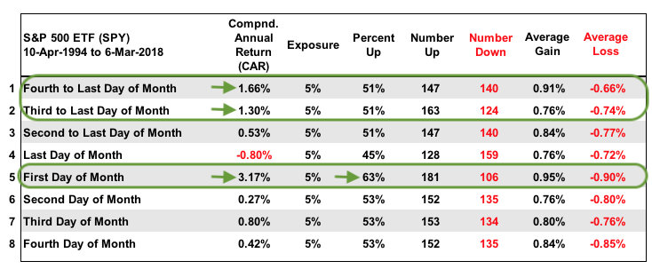
The "Percent Up" column on line 5 shows that the first trading day of the month closed higher 63% of the time. The other positive days are between 51% and 53% with the last trading day of the month showing the weakest numbers (CAR: -.80% and %Up: 45%).
Finally, I would like to point out the last two columns: the Average Gain (positive 1-day ROC) and the Average Loss (negative 1-day ROC). Line 1 (fourth to last day) has the best Average Gain/Loss ratio (.91%/.66%). This means the average gains is around a third more than the average loss. All told, lines 1, 2 and 5 stand out as the strongest.
Turn of the Month Results
I tested numerous day combinations near the turn of the month and it seems that the eight-day window beginning from the fourth to the last day of the month is the best. Since 1994, the 8-day ROC over this period produced a Compound Annual Return of 7.52%. This 8-day period also produced a positive Rate-of-Change two thirds (66%) of the time over the last 24 years. That's a pretty good batting average.
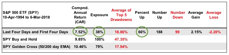 I added buy-and-hold for SPY and the golden EMA cross for reference. Before getting too judgmental on the relative returns, note that the "Turn of the Month" strategy is only exposed to the market 38% of the time. Buy-and-hold is 100% invested with two 50% drawdowns during this period and the golden cross is invested 79% of the time.
Plotting the Equity Curve
The next chart shows the equity curve if one had traded the Turn of the Month strategy (sans commissions and slippage). It is based on the 8-day Rate-of-Change from the fourth to the last day of the month to the fourth trading day of the month. It is a pretty nice equity curve for such a simple system that is invested just 38% of the time.
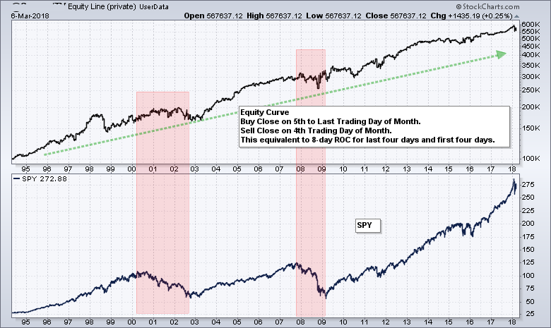
The equity line moves from the lower left to the upper right and sports a clear uptrend. There some clear hiccups (drawdowns) along the way and these are noted with the blue ovals.
The red zones show the two bear markets and the chaos of 2015. Notice that the system held up pretty well during these periods, even though it was taking trades during less than ideal market conditions.
Charting Recent Results
The chart below shows SPY over the past year with the last twelve periods. The green lines show when the 8-day Rate-of-Change was positive on the fourth day of the month, while the red lines shows when the 8-day ROC was negative. There were nine positive occurrences and three negative.
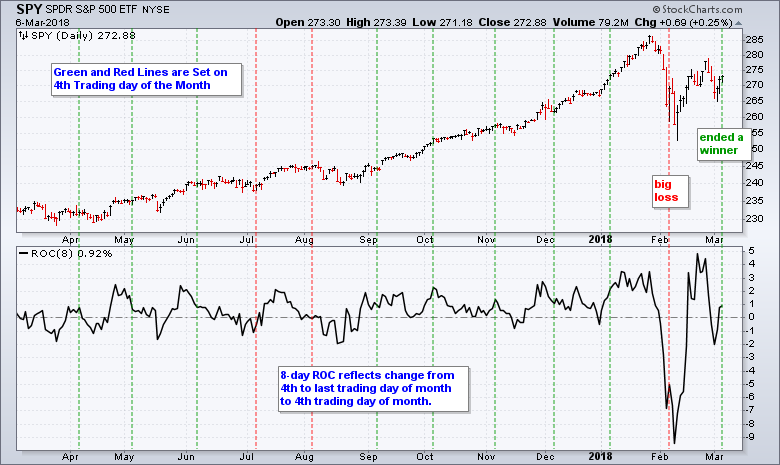
The early February period marked the 13th biggest loss since April 1994. Unsurprisingly, there were bigger losses in 1998, 2000, 2002, 2008, 2009, 2010 and 2011. Most recently, SPY ended February weak and fell on the first of March, but rebounded the last three days to produce a positive 8-day ROC.
Conclusions and Takeaways
There is clearly a bullish bias at the turn of the month and traders can use this to their benefit. This could be used to enhance trading for QQQ, IJR, DIA or other major index ETFs because all major index ETFs have a strong positive correlation to SPY.
Chartists can also use this data to time bullish setups in stocks. Bullish setups materializing towards the end of the month have a greater chance of succeeding when the seasonal pattern is bullish.
As with all seasonal tendencies, past performance is no guarantee of future performance. Chartists should also use these information in conjunction with other technical analysis techniques. Odds can be improved when combining different techniques for signals.
Consulting, Software and Data
Cesar Alvarez of AlvarezQuantTrading.com provided feedback for the code and system development. Cesar has a great blog and provides consulting services for system development (click here). I used Amibroker to test the code and Premium Data from Norgate. Just like StockCharts, the data is adjusted for dividends to reflect the total return. I also tested using historical constituents to avoid survivorship bias.
Plan Your Trade and Trade Your Plan.
- Arthur Hill, CMT
Senior Technical Analyst, StockCharts.com
Book: Define the Trend and Trade the Trend
Twitter: Follow @ArthurHill


