- Breadth Falls Short.
- Chart Links and Video.
- Looking for a Breadth Thrust.
- Still a Correction?
- %Above 200-day Indicator Waffles.
- The Weight of the Evidence.
- Where to Find the Symbols.
Breadth Falls Short
Enthusiasm among the bulls is waning and this is reflected in the breadth stats over the last two weeks. The first chart shows AD Percent for the S&P 500, S&P Mid-Cap 400 and S&P Small-Cap 600. AD Percent = (Advances - Declines) / Total Issues. The horizontal lines are set at +70% and -70%.
In general, a surge above +70% shows broad buying pressure because this means more than 425 stocks in the S&P 500 advanced, and 75 declines (425 - 75 = 350, 350/500 = .70). Conversely, a plunge below -70% show broad selling pressure because more than 425 stocks declined.
The chart below shows breadth falling short over the last two weeks (red arrows). Notice that AD Percent did not exceed +50% for the S&P 500, +25% for the S&P Mid-Cap 400 and +30% for the S&P Small-Cap 600 (red arrows). Even though we have yet to see a -70% down day, there have been several pushes below -50% and this shows more participation on the downside.
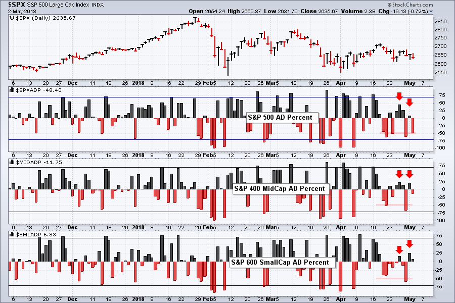
At this point, the bulls lack resolve and I am looking for an upside breadth surge above +70% to change this. Such a move would show broad buying pressure and increase the chances of further upside.
Chart Links and Video
You can open these charts by clicking on the chart and then clicking the "click here to see the live version" link at the top. From here, you can see the settings and save the SharpChart to one of your ChartList for future reference.
Also note that there is a companion video to this commentary that explains these breadth indicators. I also show how to create some of these charts at the end and show where you can find these symbols.
Looking for a Breadth Thrust
A one-day breadth surge, such as the one suggested above, would be short-term bullish. To get the broader market out of its correction or 2018 slump, I would look for a breadth thrust using the 10-day EMA of AD Percent. Think of a bullish breadth thrust as a rocket lifting off. You need a strong initial thrust to escape the pull of gravity (selling pressure).
The next chart shows this indicator for the same three indexes. The S&P Mid-Cap 400 and S&P Small-Cap 600 triggered bullish breadth thrusts in March 2016, while the S&P 500 followed suit in late June 2016. A move above +30% triggers this signal. Two of three were bullish in March 2016 and this was "net bullish" for the broader market.
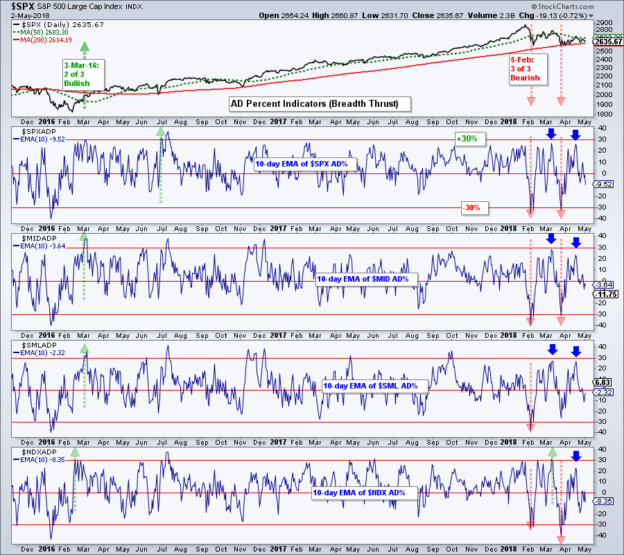
These bullish signals remained until early February when all three triggered bearish breadth thrusts with a move below -30% (red arrow lines). The S&P 500 and S&P Mid-Cap 400 repeated these signals in late March, but the S&P Small-Cap 600 stopped short of the -30% level and showed some relative strength.
The market bounced twice since the initial bearish breadth thrusts in early February, but each bounce fell short of a bullish signal. The blue arrows show each bounce falling short of the +30% level. This means participation was not broad enough and the bulls lack the resolve needed to end this correction.
I will be looking for at least two of these three indicators to surge above +30% to trigger a bullish breadth thrust and signal an end to the 2018 correction.
Still a Correction?
Why am I still referring to the 2018 slump as a correction? Three reasons. First, the 50-day SMA remains above the 200-day SMA for the S&P 500 (long-term uptrend). Second, the High-Low Percent indicators have yet to trigger bearish signals. Third, the %Above 200-day EMA indicators have yet to trigger bearish signals.
The chart below shows the High-Low Percent indicators with horizontal lines at +10% and -10%. High-Low Percent = (New Highs - New Lows)/Total Issues. A move above +10% triggers a bullish signal and this remains in play until a bearish signal triggers (move below -10%). On the far left of the chart, you can see $SPX and $MID triggering bullish in March 2016, while $SML triggered bullish in June 2016.
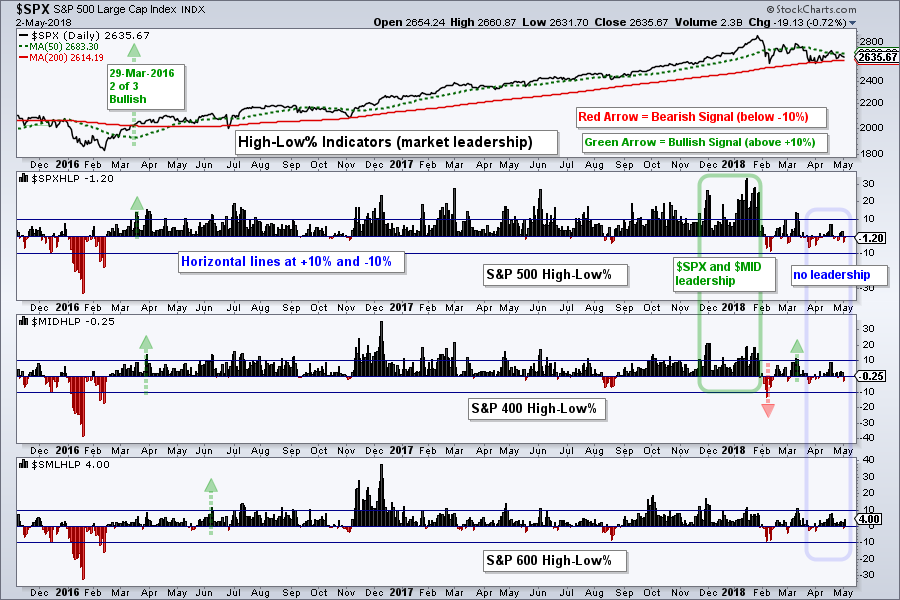
The current market is lacking leadership, on both the upside and downside. Notice that $SPX and $MID were leading the new high list in December and January (green outline). Also notice that High-Low Percent for the S&P 500 moved above +10 regularly from April 2016 to January 2018.
The blue outline shows the High-Low Percent indicators stuck between -10% and +10% since March 15th. We have yet to see an expansion of new lows to trigger bearish signals, but stocks are struggling to make new highs. Small-caps seem to be holding up better the last few weeks.
%Above 200-day Indicator Waffles
The next chart shows the last indicator trio: the Percentage of Stocks above the 200-day EMA for the three indexes. A move above 60% is bullish and this bullish signal remains until there is a move below 40%. $SPX and $MID triggered bullish in March 2016, while $SML followed suit in April 2016.
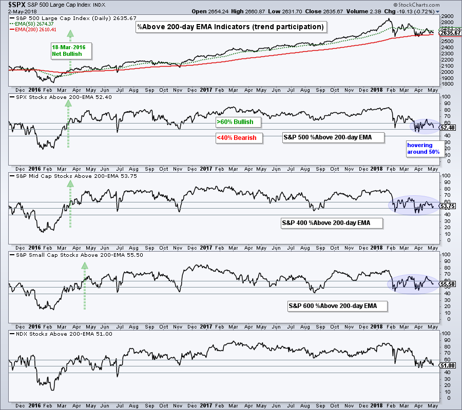
On the right side of the chart, all three moved toward the 50% line and waffled over the last six to eight weeks (blue shading). There have been several dips below 50%, but we have yet to see the final push below 40% to trigger bearish signals for these indicators.
I do not use the 50% line for signals because this causes too many whipsaws. Notice that I set the bullish threshold just above 50% and the bearish threshold just below. These levels are designed to identify the critical mass needed to get the market moving in one direction or another. Whipsaws still happen and signals are later, but that is the trade off.
The Weight of the Evidence
The table below sums up the breadth signals. The three bearish breadth thrusts are marked in red. The other six indicators are in green because they remain on bullish signals. The table turns net bearish when 5 of the 9 indicators are on bearish signals.
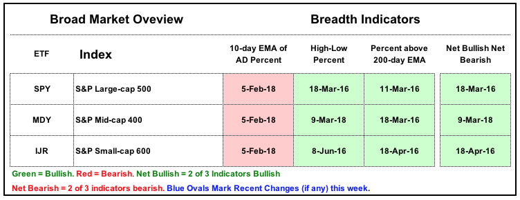
Note: This table was created in Excel and is periodically updated in Art's Charts.
Where to Find the Symbols
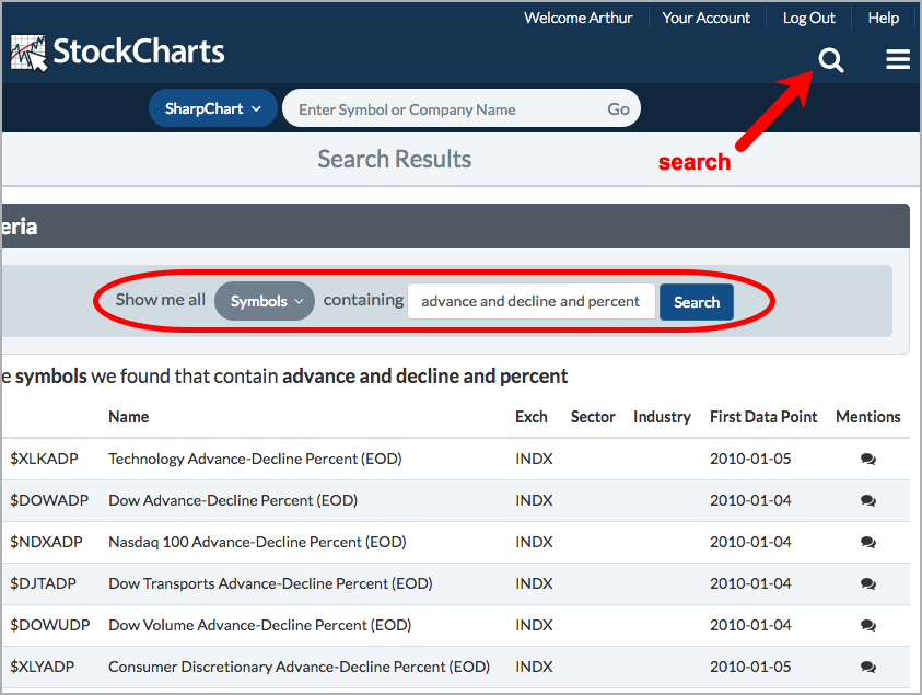
StockCharts calculates and publishes these breadth indicators for the major stock indexes, sectors and a few other indexes. These are unique datasets that give chartists the ability to look under the hood of an index. You can find these symbols by using the search box at the top right of any web page (magnifying glass icon). For reference, I provided the search terms in the parentheses below and links to the symbol lists. Joining the terms by “and” means all three are required.
AD Percent Symbols (advance and decline and percent)
High-Low Percent Symbols (high and low and percent)
%Above 200-day EMA Symbols (percent and stock and above)
Plan Your Trade and Trade Your Plan.
- Arthur Hill, CMT
Senior Technical Analyst, StockCharts.com
Book: Define the Trend and Trade the Trend
Twitter: Follow @ArthurHill


